


Beautiful Citrus Branch: Bringing the Fresh Beauty of Orange Branches Wall Art into Your Home
The world of interior decoration has witnessed a remarkable surge in appreciation for botanical elements, particularly artwork featuring natural produce and their organic structures. Among these treasures, visual representations showcasing orange fruit attached to their natural branches have emerged as sophisticated choices for homeowners seeking to infuse their living spaces with warmth, vitality, and a connection to nature. This comprehensive exploration delves into the captivating realm of citrus branch imagery, examining how these artistic pieces can transform ordinary rooms into extraordinary sanctuaries of style and natural beauty.
The Timeless Appeal of Citrus Branch Imagery in Contemporary Spaces
The enduring fascination with fruit-bearing branch imagery transcends fleeting design trends, rooting itself deeply in our collective appreciation for natural beauty and agricultural heritage. These artistic representations carry within them stories of sunlit orchards, Mediterranean landscapes, and the simple yet profound beauty of nature's bounty. When an orange hangs gracefully from its supporting branch, accompanied by verdant foliage, it creates a visual narrative that speaks to abundance, freshness, and the cyclical rhythms of the natural world.
Interior designers and homeowners alike have discovered that incorporating such imagery into living spaces creates an immediate sense of warmth and approachability. The rounded form of the citrus fruit, rendered in its characteristic sunset hues, naturally draws the eye and creates focal points that feel both intentional and effortlessly organic. Unlike more abstract or contemporary art forms that may feel cold or impersonal, these botanical representations invite viewers to pause and appreciate the familiar beauty of everyday natural objects elevated to artistic status.
The psychological impact of such imagery extends beyond mere aesthetics. Studies in environmental psychology have consistently demonstrated that exposure to natural elements, even in representational form, can reduce stress levels and promote feelings of well-being. When you introduce artwork depicting fresh fruit on living branches into your home environment, you create subtle connections to outdoor spaces, harvests, and the vitality of growing things. This connection proves particularly valuable in urban environments where direct contact with nature may be limited.
Furthermore, the versatility of citrus branch artwork allows it to complement an extraordinary range of design philosophies. Whether your aesthetic leans toward rustic farmhouse charm, sleek contemporary sophistication, traditional elegance, or eclectic bohemian freedom, there exists a style of orange-bearing branch artwork that will enhance your vision. This adaptability stems from the fundamental universality of the subject matter itself—fruit on branches is a motif that has appeared in artistic traditions across cultures and centuries, from ancient Roman frescoes to Dutch Golden Age still life paintings to contemporary digital illustrations.
Sophisticated Botanical Prints Featuring Orange-Laden Branches
The realm of botanical illustration has a distinguished history stretching back centuries, when artists and naturalists collaborated to document the plant kingdom with scientific precision and artistic sensitivity. Contemporary interpretations of this tradition focus on capturing the essential character of citrus fruits in their natural context, emphasizing the graceful curves of branches, the texture of bark, the delicate structure of leaves, and the luminous quality of ripening fruit.
High-quality botanical prints featuring oranges on their supporting structures offer collectors and decorators access to museum-worthy imagery at accessible price points. These works often begin with original watercolors, pen and ink drawings, or detailed pencil sketches that are then reproduced using advanced printing technologies that preserve every nuance of the original artwork. The result is pieces that possess the warmth and authenticity of hand-created art while offering the durability and affordability of prints.
When selecting botanical prints for your space, consider the artistic approach employed by the creator. Some artists favor a highly detailed, almost photographic realism that captures every imperfection in the fruit's skin, every vein in the leaves, and every subtle gradation of color. This approach creates artwork that serves almost as scientific documentation, celebrating the intricate complexity of natural forms. Other artists adopt a more interpretive stance, simplifying forms, emphasizing certain characteristics, and introducing artistic license that transforms observation into creative expression.
The color palette employed in these botanical works significantly influences their impact within a room. Traditional botanical illustrations often feature muted, naturalistic colors applied with watercolor transparency, creating pieces that feel refined and understated. These works integrate seamlessly into spaces with neutral color schemes, adding visual interest without overwhelming other design elements. Conversely, some contemporary botanical artists embrace saturated, vibrant colors that celebrate the intensity of the orange hue, creating statement pieces that command attention and energize their surroundings.
The substrate on which botanical prints are produced also merits consideration. Premium archival papers with subtle textures can enhance the organic quality of the imagery, while smooth, bright white papers create crisp, clean presentations that feel modern and fresh. Some printers offer specialized papers that mimic the appearance of watercolor paper, complete with irregular edges that enhance the handcrafted aesthetic. For those seeking maximum durability and a contemporary presentation, prints on canvas offer texture and presence that differs markedly from paper-based options.
Understated Artistic Representations of Citrus Branches
The philosophy of less-is-more has profoundly influenced contemporary art and design, giving rise to artistic expressions that celebrate simplicity, negative space, and essential forms. When applied to citrus branch imagery, this approach yields works of remarkable elegance and versatility. These pieces strip away extraneous detail, focusing instead on the fundamental shapes, lines, and relationships that define their subjects.
An artwork in this style might depict a single orange suspended from a gracefully curving branch with just a few carefully placed leaves. The background often remains unadorned—pure white, soft cream, or gentle gray—allowing the subject to exist in a pristine, almost meditative space. This restraint creates artwork that breathes, that allows the eye to rest, and that introduces natural beauty without visual clutter.
The power of such pieces lies in their ability to make dramatic impact through subtlety. In a world of constant visual stimulation, these quiet, contemplative works offer respite and reflection. They work particularly well in spaces designed for relaxation and restoration—bedrooms, reading nooks, meditation areas, and spa-like bathrooms. The simplicity of execution paradoxically requires great skill from the artist, who must determine precisely which elements to include and which to omit, ensuring that what remains conveys the essence of the subject without unnecessary embellishment.
Color treatment in these works typically follows the same philosophy of restraint. Rather than employing the full spectrum, artists working in this mode often limit themselves to a carefully curated palette. You might encounter pieces that use only shades of orange and green, rendered in subtle gradations that suggest form and dimension without heavy modeling. Others might adopt an even more restricted approach, presenting the subject in monochromatic tones or even simple line work with minimal color accents.
The framing and presentation of such works deserves equal attention. These pieces often benefit from generous matting that expands the sense of space and tranquility surrounding the image. Frame selections tend toward clean, simple profiles in natural wood tones, white, black, or metallic finishes that complement rather than compete with the artwork itself. The goal is to create a complete presentation where frame, mat, and image work together harmoniously, each element supporting the others in service of the overall aesthetic.
Translucent Watercolor Interpretations of Orange Branches
Watercolor painting possesses unique qualities that make it exceptionally well-suited to depicting the luminous character of citrus fruits and the delicate structures that support them. The transparent nature of watercolor pigments allows light to pass through the paint layers and reflect off the white paper beneath, creating a luminosity that perfectly captures the sun-kissed glow of ripe oranges hanging in warm light.
Artists working in watercolor to depict these subjects employ various techniques to achieve different effects. Wet-on-wet applications, where fresh paint is introduced to still-damp areas, create soft, diffused edges and subtle color transitions that can beautifully render the gradual shift from highlight to shadow on a rounded fruit surface. Alternatively, wet-on-dry techniques, where paint is applied to completely dry paper, yield more defined edges and greater control, ideal for depicting crisp leaf margins or the distinct separation between fruit and sky.
The unpredictability inherent in watercolor painting often results in happy accidents—unexpected blooms, surprising color mixtures, or organic textures that no amount of planning could produce. Skilled artists learn to embrace and incorporate these serendipitous elements, recognizing that they contribute to the freshness and vitality that make watercolor work so appealing. When these spontaneous qualities appear in citrus branch paintings, they can evoke the organic irregularity of nature itself, where no two leaves are identical and perfection lies in imperfection.
Layering represents another fundamental watercolor technique that proves particularly effective in botanical subjects. An artist might begin with pale, translucent washes that establish overall color relationships and basic forms. Subsequent layers gradually build depth, intensity, and detail, with the lightest areas often protected by leaving the initial washes exposed or by lifting pigment from dried areas. This process of gradual refinement mirrors the way we actually perceive natural objects, taking in overall impressions first before focusing on specific details.
The textural possibilities of watercolor further enhance its suitability for these subjects. Artists can create rough, organic textures suggesting bark or leaf surfaces by employing techniques like salt application, spattering, or painting on textured papers. Conversely, smooth, seamless gradations can capture the waxy perfection of fruit skin catching light. This range of textural expression within a single medium allows for remarkably nuanced and sophisticated interpretations.
Orange Branch Composed Scene Artistic Creation
The tradition of composed scene painting, where objects are carefully arranged to create aesthetically pleasing and symbolically meaningful compositions, stretches back centuries. When oranges on branches serve as the primary or featured subjects in such works, they bring specific qualities and associations that enrich the artistic statement.
These arrangements typically involve more than just the fruit and branch—they might include other objects that create visual interest, establish context, or introduce additional layers of meaning. A composition might feature an orange branch arranged in a ceramic vessel, with the container's form, color, and texture contributing to the overall aesthetic. The branch might be accompanied by other botanical elements, creating relationships between different plant forms. Sometimes these scenes include human-made objects like fabric, books, or tools that suggest stories and uses.
Lighting plays an absolutely crucial role in composed scene work. The way illumination falls across various surfaces, creating highlights and shadows, establishes mood and emphasizes three-dimensional form. Renaissance masters pioneered dramatic lighting techniques that contemporary artists continue to reference and reinterpret. In citrus branch compositions, light might stream from a window, creating a luminous glow around backlit leaves while throwing parts of the fruit into deep shadow. Alternatively, even, ambient lighting might create gentler effects that emphasize color and texture over dramatic contrasts.
The symbolic language of composed arrangements has been developed and refined over centuries. While contemporary viewers may not consciously recognize specific symbolic conventions, these works still communicate on intuitive levels. An orange branch in full fruit might symbolize abundance and successful cultivation. One showing both blossoms and fruit could represent the cycle of seasons and the passage of time. A fallen or damaged fruit might introduce notes of impermanence and natural decline. Artists working in this tradition make deliberate choices about what to include and how to arrange elements, creating visual poetry that rewards contemplation.
Color harmony receives careful attention in these works. The warm orange tones of the fruit must be balanced and complemented by other colors in the composition. Cool backgrounds can make the warm fruit tones advance and glow. Analogous color schemes using oranges, reds, and yellows create warmth and unity. Complementary approaches pairing oranges with blues create dynamic tension and visual excitement. Neutral backgrounds allow the fruit colors to command full attention without competition.
Textural variety adds richness to composed scene paintings. The smooth, slightly glossy surface of fruit skin contrasts with rougher branch bark, with the softer appearance of leaves, and with whatever other surfaces appear in the composition. These textural differences create visual interest and provide opportunities for artists to demonstrate technical skill in rendering diverse materials. When such works are successful, viewers can almost feel the different surfaces simply by looking at them.
Gentle-Toned Orange Branch Visual Studies
Color intensity significantly influences the emotional and aesthetic impact of imagery. While saturated, vibrant hues create energy and demand attention, gentler, more subdued colorations offer different pleasures and serve different decorative purposes. Citrus branch artwork executed in soft, muted tones creates environments of tranquility and understated elegance.
The creation of these gentler color effects can be achieved through various approaches. Watercolor techniques that emphasize transparency and allow substantial white paper to show through naturally produce luminous but unsaturated results. Colored pencil work that builds tone through light pressure and minimal layering creates similar effects. Digital artists can reduce saturation levels while maintaining value relationships, creating muted palettes that retain visual structure without color intensity.
These softer colorations work particularly well in spaces designed for rest and relaxation. Bedrooms benefit from artwork that doesn't stimulate or energize but rather soothes and calms. The reduced color intensity allows these pieces to create presence without demanding attention, supporting restful atmospheres conducive to sleep and relaxation. Similarly, spaces designed for meditation, yoga, or other contemplative activities benefit from artwork that enhances rather than disrupts the intentional tranquility of these environments.
The interplay between soft-toned artwork and wall colors deserves consideration. These gentle pieces can beautifully complement walls painted in equally subdued hues, creating harmonious, flowing environments where boundaries between wall and art blur softly. Alternatively, displaying soft-toned citrus imagery against slightly darker walls creates subtle contrast that allows the artwork to glow gently, like a window letting in diffused light.
From a technical standpoint, achieving successful results with limited color intensity requires skill and sensitivity. Without the crutch of saturated colors to create impact, artists must rely more heavily on value relationships, compositional strength, and subtle color variations. The forms must be clearly defined through careful attention to light and shadow. The composition must be strong enough to hold interest without relying on color excitement. When these elements come together successfully, the results possess a refined sophistication that appeals to viewers seeking subtlety over boldness.
These works also demonstrate particular versatility in pairing with various interior styles. The restraint in color allows them to integrate easily with neutral-dominated interiors popular in contemporary design. They complement natural materials like wood, linen, and stone without competing for attention. They can also serve as calming counterpoints in spaces that include bolder accent colors, providing visual rest areas amid more stimulating elements.
Orange Branch Imagery for Food Service Area Surfaces
Dining spaces, whether formal rooms devoted to meals or casual eating areas within kitchens or living spaces, benefit enormously from thoughtful artistic additions. The walls surrounding tables where people gather to share food and conversation influence the quality of these experiences, making artwork selection for these spaces worthy of careful consideration.
Citrus branch imagery offers numerous advantages for dining area decoration. The subject matter directly relates to food and its origins, creating thematic coherence that feels natural and appropriate. The warm colors associated with ripe oranges stimulate appetite and create welcoming, convivial atmospheres conducive to lingering over meals and enjoying company. The associations with freshness, health, and natural goodness align with contemporary attitudes toward food and eating.
The scale of artwork in dining spaces must be proportional to both the room itself and the furniture it contains. Above a sideboard or buffet, a substantial horizontal piece or a grouping of smaller works can fill the wall space without overwhelming. Above a dining table, artwork should be large enough to anchor the space and create presence but not so oversized that it feels precarious hanging above where people sit. As a general guideline, artwork above a dining table should span roughly two-thirds to three-quarters of the table's width, creating visual balance without appearing cramped or lost.
The height at which dining area artwork is installed influences viewing angles and impact. Pieces in these spaces are typically viewed while seated, meaning they should be installed slightly lower than artwork in spaces where viewing occurs primarily while standing. Center points at approximately 57 inches from the floor generally work well, though this can be adjusted based on ceiling height and furniture proportions.
Lighting represents another crucial consideration for dining area artwork. These spaces often include overhead fixtures that can create glare on glazed artwork. Careful positioning can minimize this issue, or matte glazing options can eliminate reflections altogether. Some homeowners choose to install dedicated picture lights that both highlight the artwork and contribute to the overall ambient lighting scheme. Dimmer controls allow lighting levels to be adjusted for different occasions, from bright family breakfasts to intimate dinner parties.
The specific style and mood of citrus branch artwork should align with how the dining space is used and the atmosphere desired. Formal dining rooms might call for more refined, traditional botanical treatments that echo the room's elegance. Casual breakfast nooks can embrace cheerful, playful interpretations that energize morning meals. Family dining areas benefit from approachable, friendly imagery that appeals across age ranges and creates welcoming environments for daily gathering.
True-to-Life Orange with Foliage and Supporting Structure
Photographic realism in painting represents a technical and artistic challenge that has fascinated artists for centuries. When applied to botanical subjects like oranges on branches, this approach yields works of remarkable presence and immediacy that can almost fool the eye into believing it perceives actual objects rather than representations.
Achieving convincing realism requires mastery of multiple artistic elements. Value relationships—the patterns of light and dark—must be carefully observed and accurately translated to establish three-dimensional form. Color must be precisely mixed and applied to match the subtle variations found in natural surfaces. Edges must be handled appropriately, with some rendered sharp and crisp while others soften and blur according to how the eye actually perceives objects at different distances and in different conditions. Textures must be convincingly suggested through careful handling of paint or drawing media.
The artistic merit of photorealistic work has been debated throughout art history. Some critics dismiss it as mere technical facility lacking interpretive vision. Others celebrate it as a demonstration of supreme skill and dedication. Many contemporary viewers, however, simply respond to the impressive presence and immediacy of skillfully executed realistic work without concerning themselves with theoretical debates about artistic value.
For collectors and decorators, realistic citrus branch imagery offers specific advantages. These works create strong visual impact through their illusionistic power. They can serve as focal points that draw and hold attention. They demonstrate obvious skill, which viewers often appreciate and respect. They also create interesting perceptual experiences as viewers' minds work to reconcile the flatness of the picture surface with the three-dimensionality of the depicted forms.
The relationship between photorealistic painting and actual photography deserves consideration. While both can produce highly realistic images, paintings maintain certain qualities that photographs cannot replicate. The artist's hand is still present, even if subtle, in the accumulated decisions about what to emphasize, how to handle various passages, and where to focus detail. The physical surface of paint has texture and presence that photographic prints lack. Original realistic paintings possess a preciousness and one-of-a-kind character that reproductions cannot match.
Display considerations for realistic citrus works include attention to lighting and viewing distance. These pieces often benefit from viewing at the distance from which they were painted, where all elements resolve into convincing wholes. Too close, the illusion may break down into visible brushstrokes and paint handling. Too far, fine details may be lost. Lighting should be even and adequate to allow the careful value relationships to read properly without washing out or obscuring the image.
Orange Branch Photographic Captures
Photography offers unique possibilities for capturing citrus branch imagery, bringing qualities of immediacy, precision, and documentary authenticity that differ from drawn or painted interpretations. Photographic prints featuring these subjects range from straightforward documentary images to highly artistic interpretations
Retry
S
Continue
Edit
that push the boundaries of the medium through creative lighting, composition, and post-processing techniques.
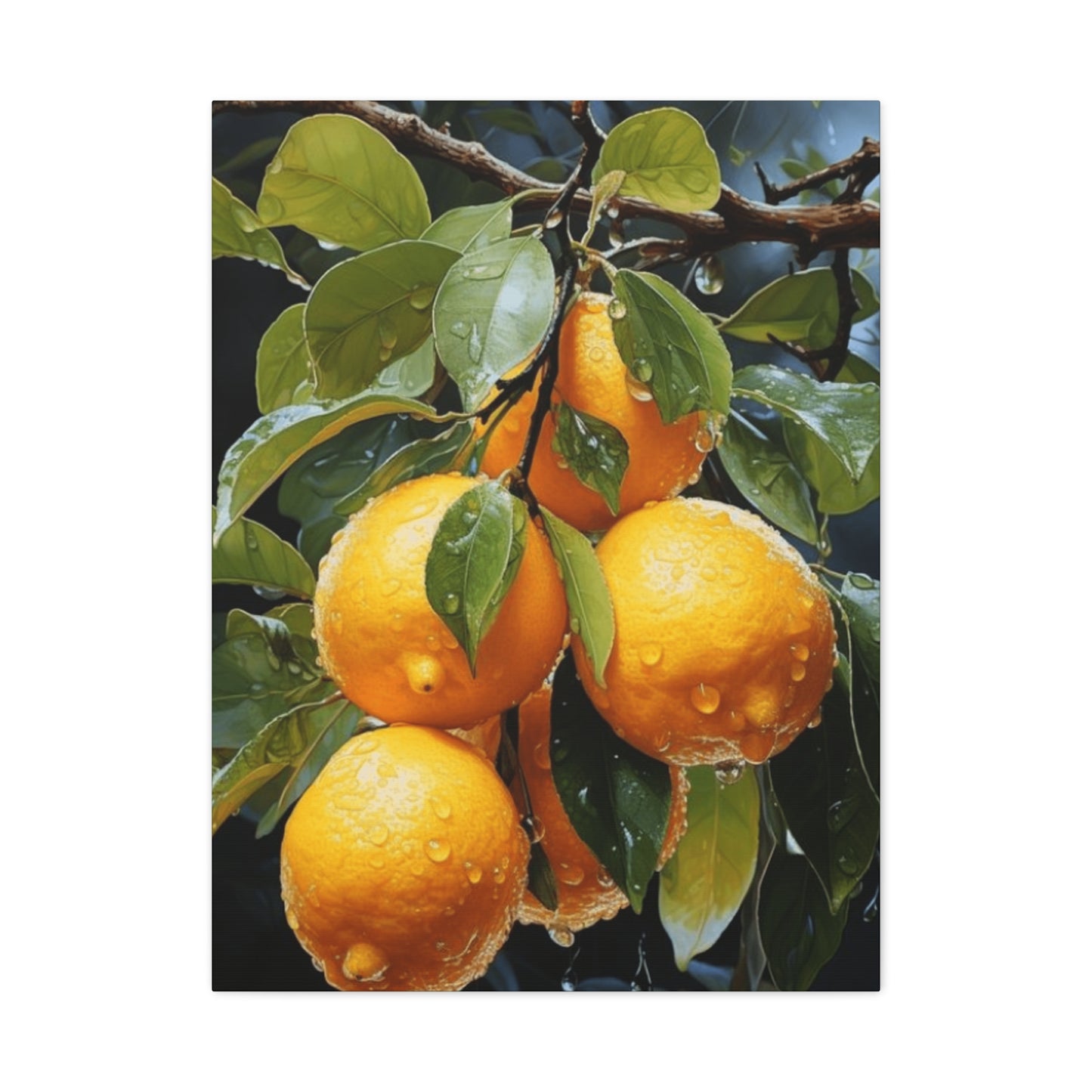
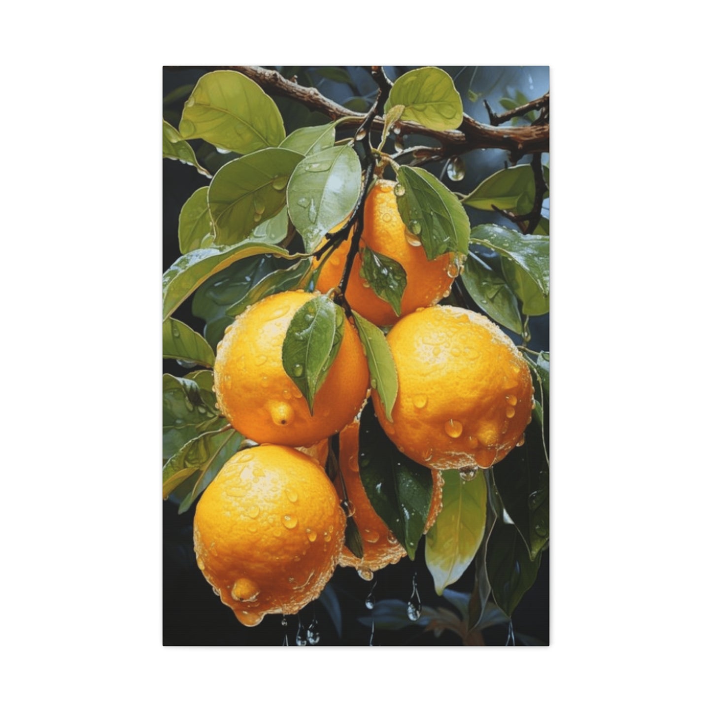
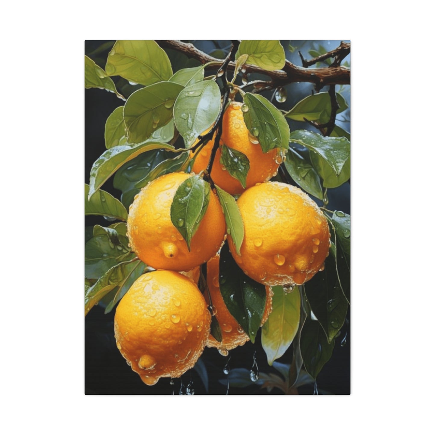
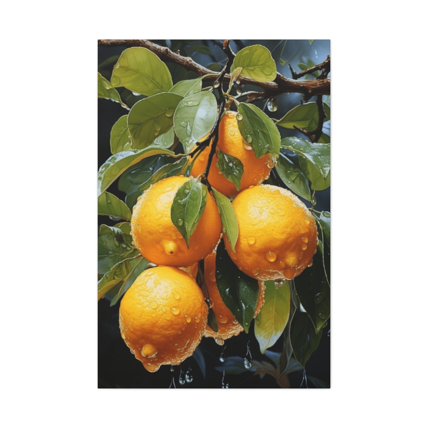
Documentary-style photography of oranges on branches serves important functions in both artistic and practical contexts. These images capture specific moments in time, preserving the exact appearance of particular fruits, branches, and lighting conditions. They can document seasonal changes, growth progression, or the unique characteristics of specific citrus varieties. When printed and displayed, these photographs bring a sense of authenticity and directness that other media cannot quite replicate—viewers understand they are seeing something that actually existed in the real world rather than an artist's interpretation.
Artistic photography of citrus subjects employs the full range of photographic techniques to create images that transcend mere documentation. Macro photography reveals intricate surface details invisible to casual observation—the texture of orange peel, the delicate veining in leaves, tiny water droplets clinging to surfaces. Close-up compositions that fill the frame with portions of fruit and branch create abstract qualities that emphasize form, color, and pattern over literal representation. Selective focus techniques blur backgrounds while keeping subjects sharp, creating dreamy, atmospheric effects that direct attention precisely where the photographer intends.
Lighting choices dramatically affect the character and mood of photographic citrus imagery. Natural daylight creates soft, even illumination that reveals colors accurately and creates gentle shadows. Direct sunlight produces dramatic contrasts between bright highlights and deep shadows, emphasizing three-dimensional form and creating dynamic, energetic images. Backlighting, where light sources are positioned behind the subject, can create glowing, translucent effects as light passes through leaves and illuminates fruit from behind. Studio lighting gives photographers complete control, allowing them to sculpt forms with precision and create exactly the effects they envision.
The technical quality of photographic prints significantly impacts their aesthetic success and longevity. Professional archival printing processes using pigment-based inks on acid-free papers can produce images that remain stable and vibrant for decades or even centuries when properly displayed and cared for. Paper selection influences the final appearance—glossy surfaces create maximum color saturation and contrast, while matte surfaces offer subtlety and eliminate reflective glare. Textured papers can add additional visual interest and tactile appeal.
Color treatment in photographic work ranges from naturalistic accuracy to creative manipulation. Some photographers strive for perfect color fidelity, ensuring that oranges appear exactly as they would to the eye under the photographed lighting conditions. Others embrace creative color grading, adjusting hues, saturation, and tones to create specific moods or artistic effects. Desaturated color treatments reduce color intensity while maintaining color information, creating subdued, contemplative images. High-saturation approaches amplify colors beyond natural levels, producing vibrant, energetic results that command attention.
Black and white photography strips away color entirely, forcing viewers to appreciate form, texture, contrast, and composition without the immediate impact of color. Citrus subjects translated to monochrome reveal unexpected beauty—the play of light across rounded surfaces becomes more apparent, textural differences gain emphasis, and the essential sculptural qualities of the forms emerge. These images possess timeless elegance and can integrate seamlessly into diverse decorative schemes without color coordination concerns.
Luminous and Uplifting Branch Imagery
The psychological impact of visual imagery extends far beyond simple aesthetic pleasure. Color psychology research has consistently demonstrated that warm hues, particularly oranges and yellows, create feelings of optimism, energy, and emotional warmth. When citrus branch artwork emphasizes these qualities through vibrant colors, strong lighting, and positive compositions, it can actively contribute to the emotional atmosphere of a space.
Artwork designed to uplift and energize typically employs several key characteristics. Colors are saturated and vibrant, celebrating the full intensity of natural orange hues. Lighting within the image is bright and cheerful, suggesting sunlit conditions and outdoor freshness. Compositions feel open and uncluttered, allowing forms to breathe and preventing any sense of darkness or heaviness. The overall effect should be immediately positive and welcoming, requiring no effort from viewers to appreciate and enjoy.
These uplifting pieces serve particular functions in home environments. In spaces where people begin their days, such as breakfast nooks or morning coffee stations, cheerful citrus imagery can help establish positive mindsets and energize morning routines. In common areas where families gather, bright, optimistic artwork contributes to atmospheres of warmth and togetherness. In home offices or creative spaces, energizing imagery can help combat afternoon fatigue and maintain motivation during long work sessions.
The color relationships within these uplifting works deserve attention. While orange serves as the primary hue, the colors surrounding and supporting it influence the overall effect. Bright whites create clean, fresh contexts that make orange hues appear even more vibrant by contrast. Sunny yellows harmonize with oranges while amplifying the warm, positive energy. Fresh greens provide natural complements while introducing associations with growth and vitality. Touches of bright blue can add unexpected sparkle and prevent the warmth from becoming overwhelming.
Compositional approaches that enhance uplifting qualities include showing fruit in abundance rather than isolation, suggesting plenty and generosity. Depicting branches reaching upward creates subliminal associations with growth and aspiration. Including suggestions of sunlight—whether through bright highlights, dappled lighting effects, or background sky hints—reinforces positive, outdoor associations. Avoiding heavy shadows or dark areas maintains the overall lightness and optimism of the piece.
These cheerful works also demonstrate practical advantages in terms of decorative flexibility. Their positive character makes them welcome in virtually any space—few people object to artwork that lifts spirits and brings brightness. They work across seasons, though they may feel particularly welcome during darker winter months when natural light is limited. They appeal across age ranges, making them excellent choices for family homes where artwork must satisfy diverse preferences.
Natural-Toned Orange Branch Plant Studies
The earth's palette of browns, tans, ochres, and rust tones creates a foundation of warmth and natural authenticity that has appealed to designers and homeowners throughout history. When citrus branch artwork emphasizes these earthy colorations, it creates connections to natural materials, agricultural roots, and the honest beauty of unrefined nature.
Artistic approaches that emphasize earth tones often begin with paper or canvas in warm, natural colors rather than bright white. This immediately establishes a different tonal foundation that influences all subsequent color relationships. The oranges themselves might be rendered in deeper, more russet tones rather than bright, vivid hues. Greens trend toward olive and sage rather than spring-fresh brightness. Backgrounds, when present, reference earth, bark, or aged surfaces rather than clear skies.
These earth-toned interpretations evoke specific associations and atmospheres. They feel grounded and stable rather than energetic and dynamic. They reference heritage and tradition rather than contemporary freshness. They suggest harvest time and agricultural abundance rather than springtime growth. They connect to natural materials like wood, leather, and natural fibers rather than manufactured surfaces. These qualities make them particularly appropriate for specific decorative contexts.
Rustic and farmhouse-style interiors naturally embrace earth-toned citrus imagery. These design approaches celebrate natural materials, simple forms, and connections to agricultural life and rural traditions. Artwork in complementary earth tones reinforces these themes while adding specific subject matter that enriches the overall narrative. The warm, honest colors feel appropriate alongside exposed wood beams, stone surfaces, and vintage furnishings that characterize these styles.
Traditional interiors with classic woodwork, oriental rugs, and formal furnishings also benefit from earth-toned botanical works. The subdued, sophisticated colorations feel appropriately refined for these settings, providing visual interest without disrupting the established elegance. The warm tones harmonize beautifully with the rich wood finishes typical of traditional spaces, creating cohesive color stories that flow throughout rooms.
Contemporary interiors incorporating natural materials and organic modernism find earth-toned citrus imagery equally appropriate. These spaces combine clean, contemporary lines with natural textures and materials, seeking warmth within minimalist frameworks. Artwork that balances botanical subject matter with earthy, understated colorations bridges the gap between natural and refined, organic and designed.
The specific earth tone palette selected significantly influences the final effect. Works emphasizing warmer earth tones—sienna, terra cotta, warm browns—create particularly cozy, inviting atmospheres. Those incorporating cooler earth tones—taupe, greige, cool browns—maintain the natural quality while introducing more sophisticated, reserved character. Mixed palettes that incorporate both warm and cool earth tones offer complexity and depth that rewards extended viewing.
Current-Era Orange on Branch Linear Representation
Line art strips visual communication to its most fundamental element—the drawn line. When citrus branches are interpreted through pure linear means, without shading, color, or tonal modeling, the results possess clarity, elegance, and a particular kind of visual sophistication that appeals to contemporary sensibilities.
Contemporary line art approaches citrus subjects with various technical means and stylistic philosophies. Some artists work in continuous line techniques, creating entire compositions without lifting pen from paper, resulting in fluid, interconnected drawings that feel energetic and spontaneous. Others employ carefully considered, deliberate mark-making, placing each line with precision to build form and suggest structure through accumulated linear information. Digital artists can create impossibly perfect lines, uniform in weight and absolutely precise, achieving effects traditional media cannot match.
Line weight variation provides one of the primary tools for creating interest and suggesting form in linear work. Thicker lines can define major forms and create emphasis, while finer lines suggest details and secondary elements. Lines that vary in weight along their length can suggest three-dimensionality and spatial relationships without any actual shading. Some artists maintain absolutely consistent line weight throughout, creating flatter, more graphic effects that emphasize pattern and design over dimensional illusion.
The background treatment in contemporary line art citrus pieces significantly impacts their character. Many works embrace negative space, allowing substantial white or neutral backgrounds to surround the linear subject matter. This creates breathing room and focuses absolute attention on the drawn elements. The contrast between marked and unmarked areas creates its own visual drama. Some artists incorporate subtle background tones—light washes of color or gentle gradients—that support without overwhelming the linear work.
Contemporary line art citrus pieces integrate beautifully into modern interior design. Their clean, uncluttered character aligns perfectly with minimalist and contemporary aesthetics that value simplicity and restraint. Their graphic quality gives them substantial visual impact despite their apparent simplicity. They work particularly well in spaces with clean lines, minimal ornamentation, and carefully edited furnishing selections where they can be appreciated without visual competition.
These works demonstrate remarkable versatility in terms of scale and arrangement. A single large-scale line drawing can serve as a commanding focal point, its simplicity preventing it from feeling overwhelming despite its size. Series of smaller line drawings arranged in grids or linear sequences create different kinds of impact, establishing pattern and rhythm while maintaining individual clarity. The scalability of line art—it often works equally well large or small—provides flexibility for various spaces and applications.
Framing approaches for contemporary line art typically emphasize its clean, modern character. Simple, minimal frames in black, white, or natural wood allow the artwork to speak without interference. Float mounting, where the paper appears to hover within the frame with space visible on all sides, creates particularly contemporary presentations. Large mats in generous proportions enhance the sense of space and breathing room that makes these works feel so peaceful and uncluttered.
Citrus-Focused Surface Adornment with Branch Elements
The current enthusiasm for themed decorating, where rooms or entire homes embrace cohesive design concepts, has created strong interest in artwork that clearly supports specific themes. Citrus-focused themes, celebrating these sunny fruits in various contexts, have gained particular popularity for their associations with freshness, health, Mediterranean living, and natural beauty.
Developing a citrus theme through artwork involves several considerations beyond simply selecting pieces featuring oranges or other citrus fruits. The specific style of the artwork should support the overall character of the theme. A bright, contemporary citrus theme might incorporate bold, graphic interpretations with saturated colors and clean compositions. A vintage citrus theme could emphasize aged papers, historical illustration styles, and softer colorations. A botanical citrus theme might focus on scientifically accurate renderings with educational elements.
Color coordination plays an important role in successful themed environments. While orange naturally dominates citrus-focused artwork, the supporting colors should align with the broader room palette. Spaces emphasizing fresh, clean aesthetics might pair citrus oranges with whites, soft greens, and pale blues. Warmer, more rustic themes could incorporate earth tones, deep greens, and golden yellows alongside the citrus colors. Contemporary themes might introduce unexpected accent colors that create dynamic relationships with the fruit tones.
Scale and distribution of citrus artwork throughout a space requires thoughtful planning. A single large statement piece can anchor the theme, with smaller supporting pieces throughout the space reinforcing it without overwhelming. Alternatively, multiple medium-sized pieces distributed across various walls can create a more pervasive presence that feels naturally integrated rather than concentrated. The goal is to establish the theme clearly while avoiding the monotony that comes from excessive repetition.
Mixing different types of citrus artwork creates visual interest while maintaining thematic cohesion. Combining photographic prints with painted interpretations, detailed botanical illustrations with abstract pieces, or vintage reproductions with contemporary works prevents the theme from feeling one-dimensional. The variety keeps the eye engaged and demonstrates the range of creative possibilities within the citrus subject matter.
Extending the citrus theme beyond two-dimensional artwork creates more immersive environments. Three-dimensional elements like ceramic fruit, vintage citrus crate labels, copper fruit molds, or actual citrus trees in decorative containers can support and extend the theme established by wall art. Textiles in citrus colors or patterns, pottery with citrus motifs, and other decorative objects can weave the theme throughout the space in layered, sophisticated ways.
The functional spaces where citrus themes work particularly well include kitchens, dining areas, breakfast rooms, and outdoor living spaces like sunrooms or screened porches. These areas naturally accommodate food-related themes and benefit from the fresh, appetizing character that citrus imagery provides. However, citrus themes can also work in bathrooms where fresh, clean associations feel appropriate, or in home offices where the energizing qualities of warm colors support productivity.
Uncomplicated Orange Fruit Branch Pattern
Visual complexity has its place and purpose, but simplicity possesses unique powers that should not be underestimated. When orange branch imagery embraces true simplicity—reducing forms to essentials, eliminating unnecessary elements, and presenting subjects with clarity and directness—the results can be remarkably impactful despite, or perhaps because of, their restraint.
Simple designs focusing on citrus subjects typically employ several characteristic approaches. Forms are rendered with minimal detail, capturing essential shapes without fussy elaboration. A fruit might be depicted as a simple circular form with perhaps a suggestion of a stem attachment point. Branches might be represented by elegant curves without detailed bark texture. Leaves could be simplified to basic ovoid shapes. This reduction to essentials creates clarity and immediate readability.
Color treatment in simple designs often follows similar principles of reduction. Rather than attempting to capture every subtle color variation found in natural subjects, these works might use flat, consistent colors. An orange appears as a single uniform tone rather than graduated modeling. Leaves might all be the same green rather than showing natural variation. Backgrounds typically remain simple and unobtrusive, often just white or a single solid color that supports without competing.
Compositional approaches in simple citrus designs emphasize clear arrangements and strong visual structure. A single piece of fruit might be centered on the page with its branch extending in an elegant line to one side. Three fruits might be arranged in a balanced triangle. A single branch with a few strategic elements might create a diagonal line across the composition. These clear, easily understood arrangements feel calm and balanced rather than busy or chaotic.
Orange and Verdant Branch Color Interaction
Color relationships form the foundation of visual design, and few pairings offer more natural appeal than the warm glow of orange fruit against the cool freshness of green foliage. This complementary relationship—orange and green sit opposite each other on the color wheel—creates inherent visual interest and balance that artists and designers have exploited for centuries.
The specific dynamics of orange-green color relationships merit close examination. Complementary colors create maximum contrast while somehow also feeling naturally harmonious. This apparent contradiction arises because complementary pairs each contain what the other lacks—orange contains red and yellow but no blue, while green contains yellow and blue but no red. When placed together, they create complete color experience that satisfies the eye.
The proportions of orange to green significantly influence the character of citrus branch artwork. Pieces dominated by orange tones with green serving as accent create warm, energetic effects. The warmth advances visually while the green recedes, creating spatial relationships and focusing attention on the fruit. Conversely, pieces with dominant green spaces punctuated by orange fruit create cooler, more peaceful effects with warm accents that draw and hold the eye.
The specific versions of orange and green selected matter enormously. Bright, saturated orange paired with vivid spring green creates maximum energy and contrast—dynamic, youthful, almost vibrating with visual excitement. Deep rust orange with sage or olive green creates earthier, more sophisticated relationships that feel mature and grounded. Pale peach orange with mint or sea green establishes soft, gentle relationships appropriate for calming, restful spaces.
Temperature mixing within each color family adds complexity and sophistication. Not all oranges in a piece need to be the same—warmer reddish oranges can coexist with cooler yellowish oranges, creating variety and visual richness. Similarly, warm yellow-greens and cool blue-greens can both appear, suggesting different leaf ages, lighting conditions, or spatial relationships. This internal variety prevents monotony while maintaining overall color harmony.
Neutral elements—whites, grays, blacks, or browns—influence how orange-green relationships read. White backgrounds make both colors appear more intense and pure. Gray backgrounds slightly mute both while creating sophisticated, contemporary feels. Cream or tan backgrounds warm the overall impression, while cool gray backgrounds emphasize the temperature contrast between warm orange and cool green. Dark backgrounds make the colors appear luminous and jewel-like, advancing from the darkness.
Understanding and successfully exploiting these color relationships enables artists to create citrus branch artwork with specific emotional and aesthetic impacts. Works intended to energize and stimulate employ high contrast versions of the complementary pair in relatively equal proportions. Pieces meant to soothe use gentler versions with one color clearly dominant. Contemporary interpretations might push the relationships to unexpected extremes or introduce additional colors that complicate the fundamental orange-green dialogue.
For decorators selecting citrus branch artwork, understanding these color dynamics helps with both selection and placement. Rooms with predominantly cool palettes benefit from artwork emphasizing warm oranges that introduce balance. Warm-toned spaces can use artwork with dominant greens to introduce cooling contrast. Neutral spaces accommodate the full range of orange-green relationships, allowing selection based purely on personal preference and desired energy level.
Manually-Created Orange Branch Display Piece
In an era of mass production and digital reproduction, objects bearing clear evidence of individual human creation possess special appeal. When artwork depicting citrus branches shows obvious signs of hand technique—visible brushstrokes, pencil marks, pen lines, or other traces of manual creation—it connects viewers directly to the artist's process and presence.
The various hand techniques employed in creating citrus branch artwork each produce characteristic visual qualities. Watercolor brushwork can remain loose and flowing, with edges that blur and colors that blend on the paper surface. Oil or acrylic painting might show pronounced brushstrokes with dimensional paint ridges that catch light. Colored pencil work displays the characteristic linear quality of accumulated marks, with colors built through layered strokes. Pen and ink drawings showcase the precision and control of linear mark-making, whether loose and gestural or tight and controlled.
Artists working by hand make countless small decisions as they create, each one influencing the final result. Pressure variations change line weight and tone. The angle of approach affects how strokes appear. The wetness of brush or paper influences how watercolors behave. The speed of execution impacts the character of marks. All these variables mean that even when an artist creates multiple versions of the same subject, each one possesses unique qualities that distinguish it from all others.
This uniqueness represents both a practical consideration and a philosophical point. From a collector's perspective, hand-created originals possess scarcity value that reproductions lack—there is only one original, making it inherently precious. From an aesthetic standpoint, the evidence of human touch creates warmth and personality that mechanical processes cannot replicate. From a philosophical viewpoint, celebrating handcraft represents a counter-cultural stance in an increasingly automated world, affirming the value of human skill, time, and individual creativity.
The display and presentation of overtly handmade citrus works should honor their handcrafted character. Frames might be selected from artisanal makers rather than mass manufacturers, extending the celebration of craft. The works might be grouped with other handmade objects—ceramics, textiles, carved wood—creating conversations between different craft traditions. The spaces where they are displayed might emphasize natural materials and authentic finishes over synthetic materials and perfect uniformity.
Collecting handmade citrus artwork often involves direct relationships with artists rather than anonymous retail transactions. Purchasing at art fairs, studio sales, or directly from artists creates personal connections and stories that enrich ownership. Learning about artists' processes, inspirations, and creative journeys deepens appreciation for the finished works. Supporting living artists through purchases enables them to continue creating, making collectors active participants in sustaining creative communities.
The value proposition of handmade original artwork differs from reproductions in ways that merit consideration. While reproductions offer lower prices and easier availability, originals offer uniqueness, direct artist connection, investment potential, and the particular aesthetic qualities that only handwork provides. For many collectors, these advantages justify the higher costs. For others, high-quality reproductions of handmade originals offer reasonable compromise, providing some hand-crafted aesthetic at more accessible prices.
Conclusion
The simple elegance of a citrus branch can transform any space, and Beautiful Citrus Branch Wall Art brings that fresh vitality directly into your home. With its vibrant oranges, lush green leaves, and delicate blossoms, this art celebrates the natural beauty and abundance of fruit-bearing branches, offering a visual experience that is both calming and invigorating. By incorporating citrus-inspired artwork, your walls evolve from mere surfaces into reflections of life, energy, and organic sophistication.
Citrus branch art captures more than botanical accuracy; it encapsulates the essence of freshness, growth, and seasonal vitality. Each leaf and fruit conveys texture, depth, and subtle movement, drawing the viewer’s eye and inviting them to pause, reflect, and appreciate the beauty of nature. When displayed in living rooms, kitchens, or dining areas, these paintings or prints create a sense of lightness and freshness, elevating the atmosphere and infusing spaces with a naturally cheerful ambiance.
One of the most striking aspects of orange branch wall art is its versatility in interior design. In modern minimalist settings, a single citrus branch print becomes a statement piece, offering color and organic flow without overwhelming the space. In rustic or farmhouse interiors, these artworks blend harmoniously with wooden textures, neutral tones, and natural fabrics, creating a cohesive, earthy aesthetic. Even in contemporary urban apartments, the vivid colors of citrus branches bring a touch of nature indoors, balancing industrial elements with softness and vitality.
Color plays a crucial role in the impact of citrus branch art. The bright, sunny oranges of the fruit contrast beautifully with deep green leaves, while subtle hints of blossoms or light-infused backgrounds add warmth and depth. These color combinations bring energy and life to a room, uplifting the mood and enhancing the overall ambiance. Depending on the medium—whether watercolor, oil painting, or digital print—the textures can either offer softness and fluidity or striking realism and detail, allowing the artwork to adapt to your personal taste and décor style.
Lighting can further enhance the natural vibrancy of citrus branch art. Soft ambient light accentuates the delicate leaves and fruit, highlighting the intricate details that make each piece unique. Strategic spotlighting or natural sunlight can intensify the richness of the colors, giving the impression that the branches are gently swaying in a sunlit orchard. This interaction of light and color creates an immersive experience, transforming walls into living canvases that bring nature into your everyday life.
Beyond aesthetic appeal, citrus branch art carries symbolic meaning. Oranges often represent vitality, energy, abundance, and optimism—qualities that naturally enhance the atmosphere of any room. Incorporating this art into your home is more than a visual choice; it’s a subtle celebration of life, growth, and positivity. For kitchens and dining spaces, in particular, it can evoke freshness and appetite appeal, while in living areas, it brings a cheerful energy that fosters comfort and connection.
