


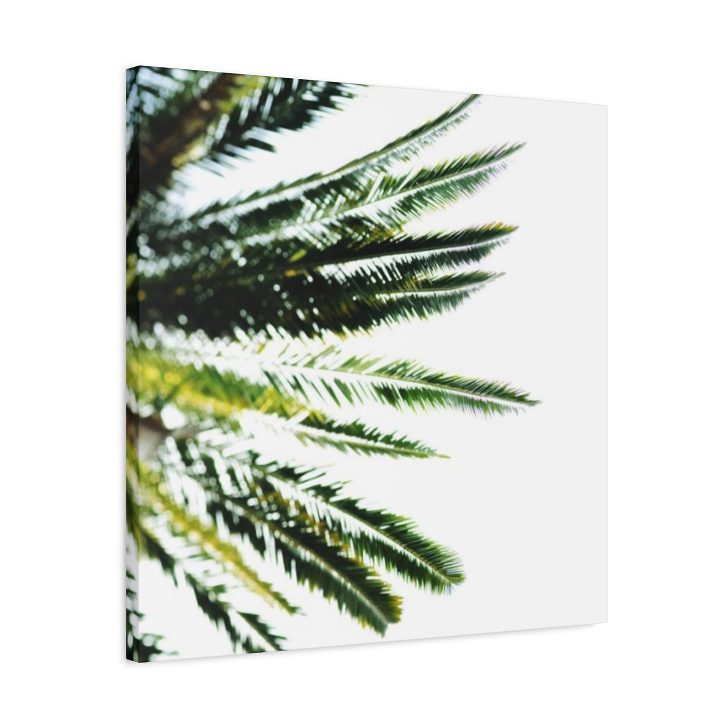
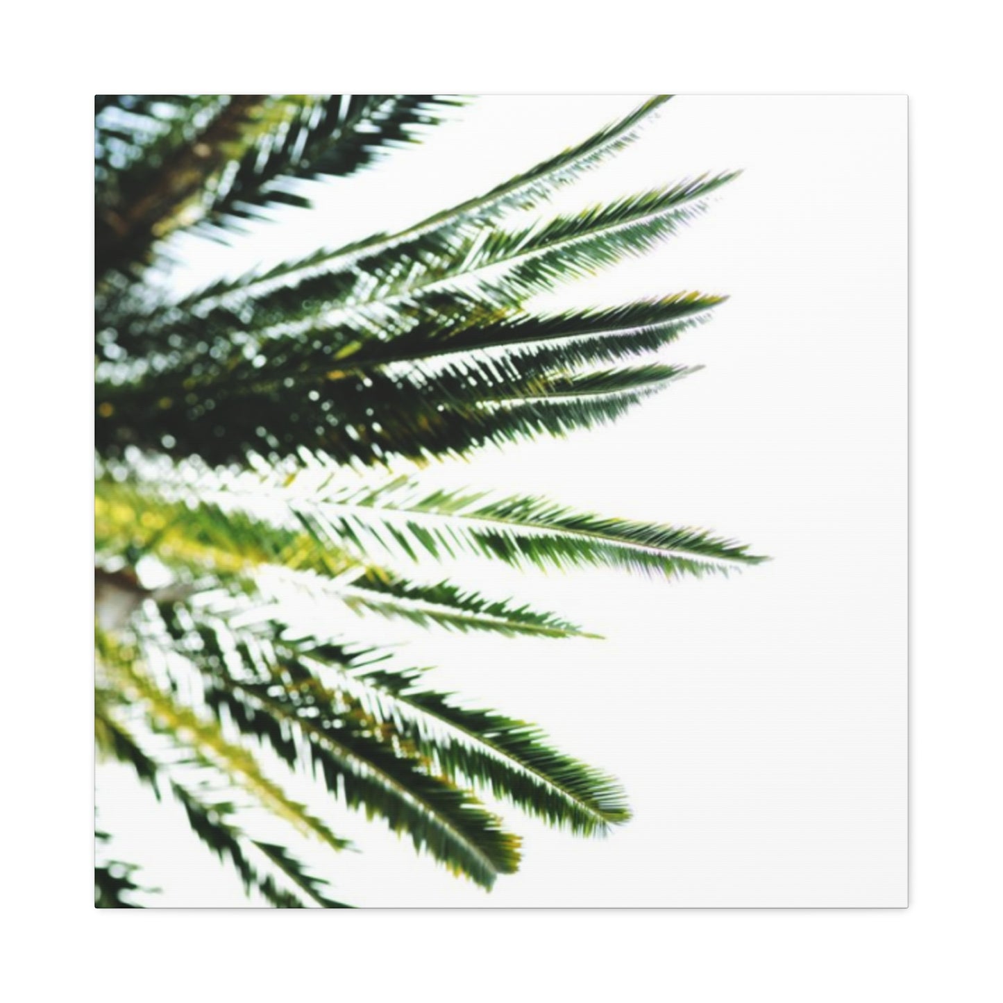

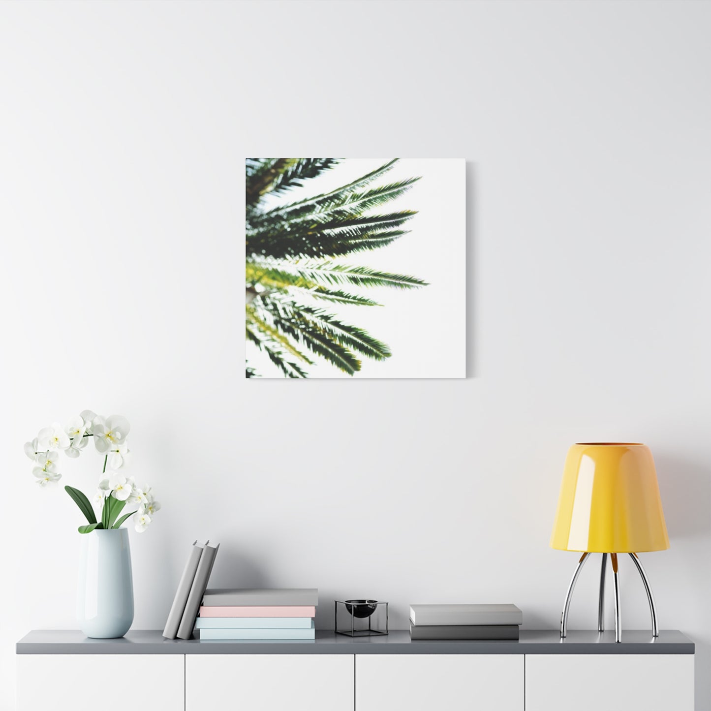
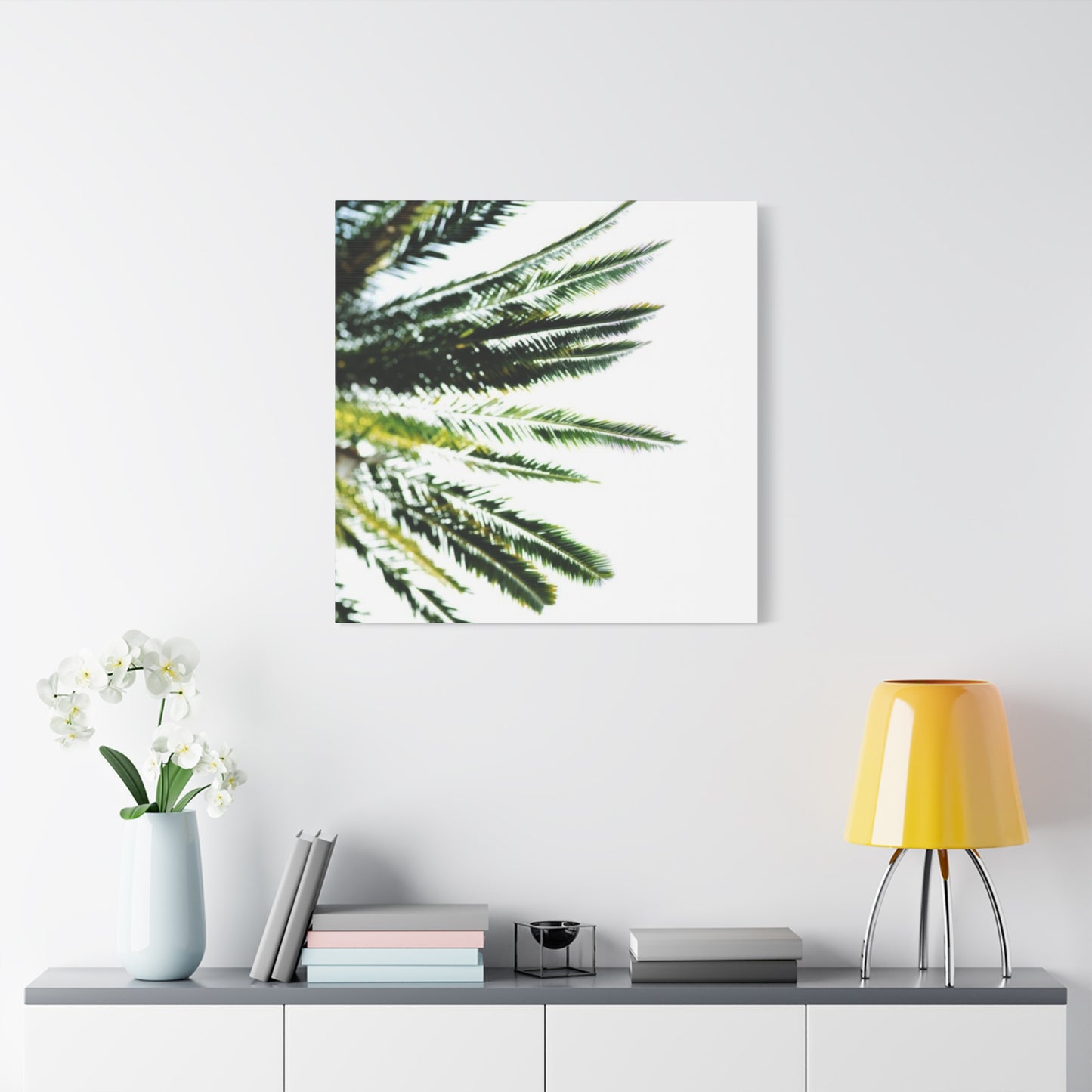
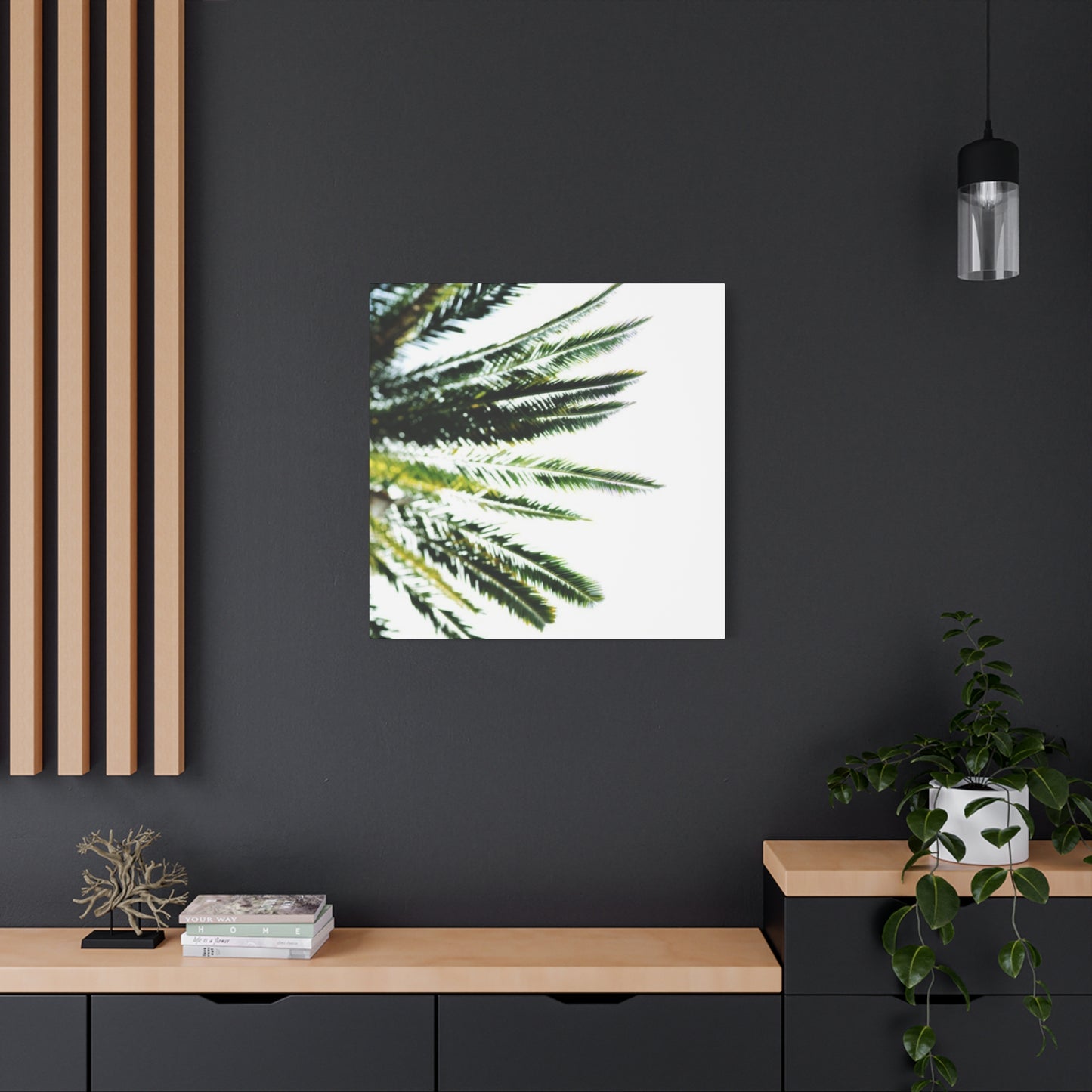

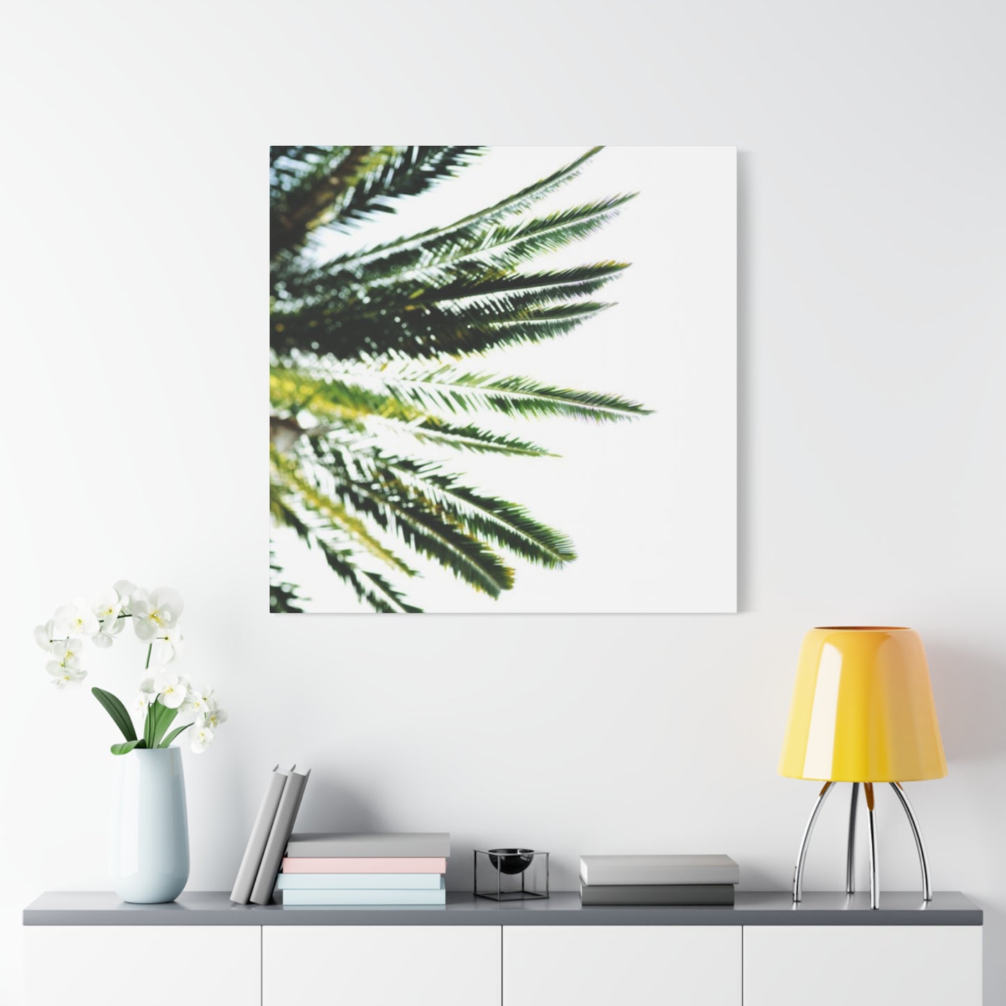
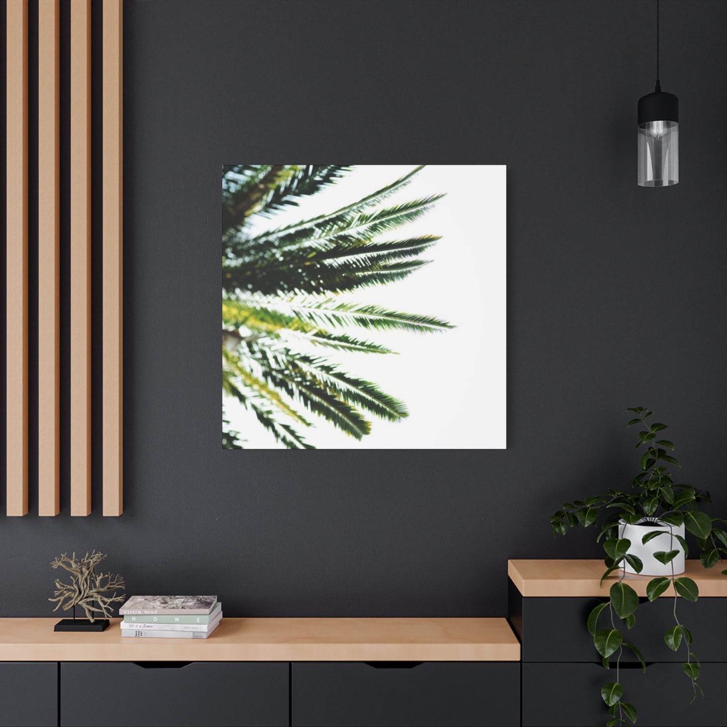
Bring Calm and Nature into Your Home with Palm Tree Leaves Wall Art
Transform your living environment into a refreshing sanctuary with the timeless beauty of palm leaf canvas art. These nature-inspired decorative pieces bring an organic touch to any interior, creating a connection between indoor spaces and the natural world. Whether you're looking to establish a tranquil retreat in your bedroom, add character to your living room, or create an inviting atmosphere in your entryway, palm-themed artwork offers versatile solutions that complement various design aesthetics while infusing spaces with a sense of calm and vitality.
The appeal of botanical artwork extends beyond mere decoration. These pieces serve as focal points that can completely transform the ambiance of a room, offering both visual interest and a psychological connection to nature. Research has shown that incorporating natural elements into interior design can reduce stress levels, improve mood, and enhance overall well-being. Palm motifs, in particular, evoke feelings of relaxation and escape, reminiscent of vacation destinations and peaceful natural settings.
This comprehensive guide explores numerous approaches to incorporating palm-themed canvas art into your home, offering detailed insights into various styles, placement strategies, and design considerations. From creating tropical-inspired sanctuaries to achieving minimalist sophistication, you'll discover how these versatile decorative elements can enhance every room in your home while reflecting your personal aesthetic preferences.
Bringing Island Paradise Indoors with Botanical Wall Decor
Creating an island-inspired atmosphere within your home begins with selecting the right botanical elements. Palm imagery instantly transports viewers to exotic locations, bringing memories of sandy beaches, swaying fronds, and endless summer days. This aesthetic works particularly well in spaces where you want to establish a relaxed, vacation-like atmosphere throughout the year.
When selecting pieces for this look, consider the color palette carefully. Traditional island aesthetics feature vibrant greens against bright blue skies or warm sunset tones. However, modern interpretations often incorporate muted tones, sepia finishes, or monochromatic schemes that maintain the essence of the theme while adapting to contemporary color preferences. The key is selecting imagery that resonates with your vision of paradise while complementing your existing furnishings.
Scale plays a crucial role in achieving the desired impact. Large-scale prints create dramatic focal points, particularly effective in spacious rooms with high ceilings or blank walls that need a substantial visual anchor. Conversely, smaller pieces work beautifully when arranged in collections, allowing you to create gallery-style displays that tell a visual story. Consider the proportions of your room and the viewing distance when making size decisions.
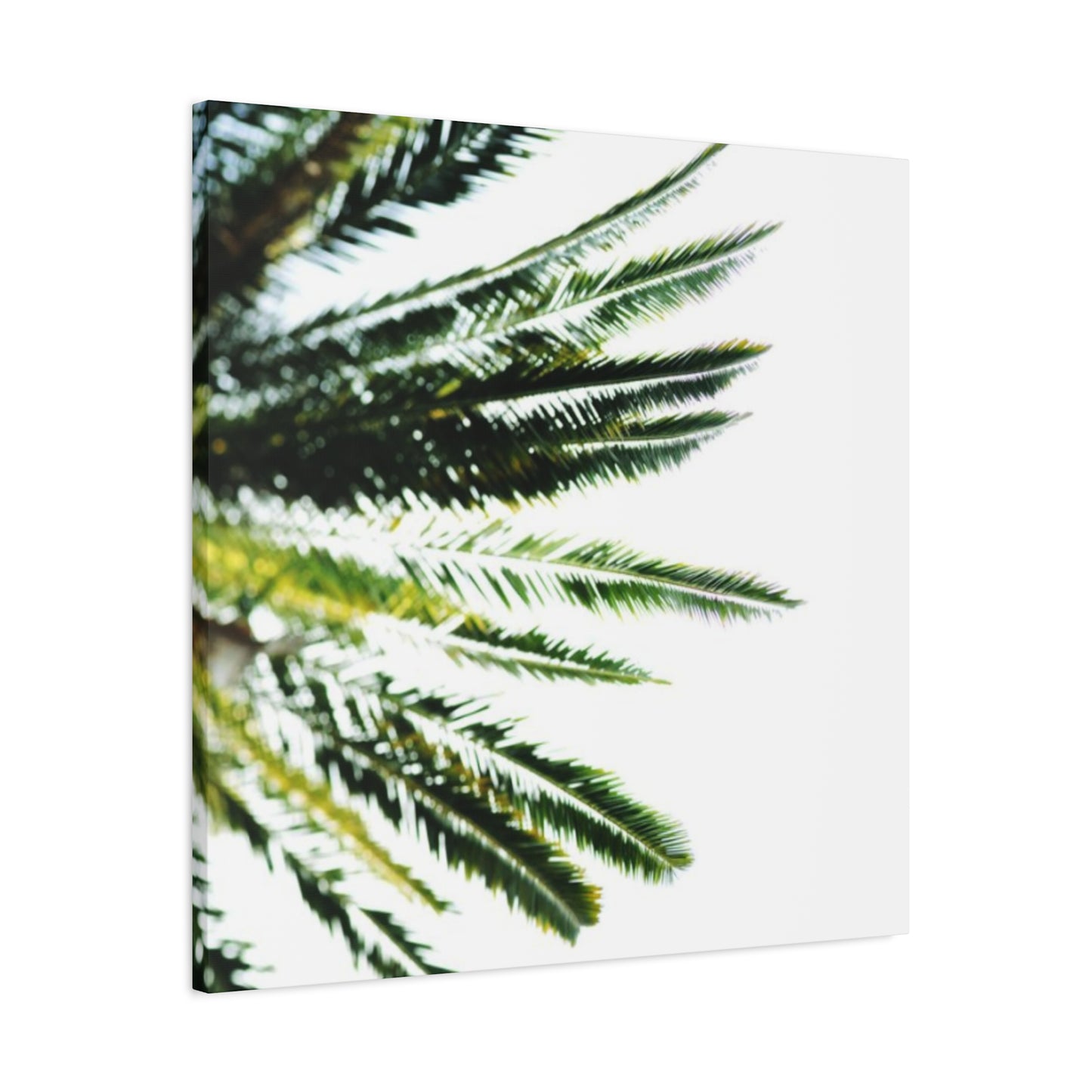
Texture adds another dimension to this aesthetic. Canvas prints offer inherent texture that enhances the organic nature of palm imagery. Some pieces feature additional textural elements such as gel overlays that create three-dimensional effects, mimicking the natural ridges and veins found in actual leaves. These textural variations catch light differently throughout the day, creating a dynamic display that changes with natural lighting conditions.
Framing choices significantly influence the overall presentation. Natural wood frames in light finishes like bamboo, driftwood, or whitewashed oak reinforce the organic theme and create cohesive connections with other natural materials in your space. Alternatively, frameless gallery-wrapped canvases offer a contemporary clean-lined appearance that allows the imagery itself to take center stage without competing visual elements.
Lighting considerations enhance the impact of botanical artwork. Natural light beautifully illuminates these pieces during daytime hours, but thoughtful artificial lighting extends their visual impact into evening hours. Consider installing picture lights above larger pieces or using strategically placed accent lighting to highlight specific artworks. Avoid direct sunlight on valuable pieces, as prolonged exposure can cause fading over time.
Placement within the room affects both aesthetic impact and functional considerations. Above sofas and seating areas, palm artwork creates a relaxing backdrop for conversation and entertainment. In dining spaces, these pieces contribute to a more casual, inviting atmosphere that encourages lingering over meals. When placed opposite windows, they can visually balance natural views or provide appealing focal points in rooms with limited window access.
Combining botanical artwork with other decorative elements creates layered, sophisticated interiors. Pair palm prints with natural fiber rugs, rattan furniture, and linen textiles to reinforce the organic theme. Incorporate live plants to create connections between artwork and actual botanical elements. Add decorative objects like coral, shells, or driftwood to complete the island-inspired aesthetic without overwhelming the space.
Revitalizing Your Environment with Botanical Imagery
Refreshing your living space doesn't always require extensive renovations or significant financial investment. Botanical prints offer an accessible yet impactful way to transform tired interiors into vibrant, energized spaces. The simple addition of palm imagery can shift the entire mood of a room, creating an atmosphere that feels both current and timeless.
The psychological impact of botanical imagery shouldn't be underestimated. Studies in environmental psychology consistently demonstrate that representations of nature in interior spaces contribute to reduced stress levels and improved mental clarity. Palm imagery specifically evokes associations with growth, renewal, and natural abundance, making these pieces particularly effective in spaces dedicated to relaxation or creative pursuits.
When selecting prints for space refreshment, consider the current state of your room. Spaces feeling dark or cramped benefit from lighter-toned artwork featuring pale greens, whites, and soft backgrounds. These lighter pieces reflect available light, making rooms feel more spacious and airy. Conversely, if your space feels too stark or lacks personality, deeper-toned artwork with rich greens and dramatic contrasts adds depth and character.
Print styles vary considerably, offering options for every aesthetic preference. Photographic prints provide realistic detail and can be selected to match specific color schemes precisely. Watercolor interpretations offer softer, more romantic presentations that work beautifully in bedrooms or reading nooks. Graphic designs with bold lines and simplified forms suit contemporary spaces seeking clean-lined sophistication.
Arrangement flexibility allows botanical prints to adapt to changing needs and preferences. Unlike permanent architectural features, canvas art can be relocated, regrouped, or replaced as your aesthetic evolves. This flexibility makes botanical prints an excellent choice for those who enjoy periodically refreshing their spaces or for renters who cannot make permanent modifications.
Creating visual flow through strategic placement connects different areas within open-concept spaces. Use similar botanical prints in varying sizes to create a cohesive thread that guides the eye through connected living areas. This technique is particularly effective in homes with kitchen-dining-living combinations, where maintaining visual unity while defining distinct zones presents challenges.
Balancing artwork with architectural features ensures pieces complement rather than compete with existing design elements. In rooms with interesting architectural details like exposed beams, crown molding, or built-in shelving, select botanical prints that enhance rather than distract from these features. Simpler designs often work best in architecturally rich spaces, while bolder artwork can become the defining feature in more neutral rooms.
Simplified Elegance in Botanical Canvas Selections
Minimalism doesn't mean sparse or cold; rather, it emphasizes intentionality, quality, and the beauty found in simplicity. Botanical canvas pieces fit beautifully within minimalist design principles, offering organic subject matter presented with restraint and sophistication. The key lies in selecting pieces that celebrate form and line while eliminating unnecessary complexity.
The minimalist approach to botanical art often features single fronds or branches isolated against neutral backgrounds. These compositions draw attention to the inherent beauty of plant structure without visual clutter. The negative space surrounding the subject becomes as important as the subject itself, creating balance and allowing the eye to rest. This approach works particularly well in spaces with clean lines and uncluttered surfaces.
Color palettes in minimalist botanical art tend toward monochromatic or analogous schemes. Black and white photography offers timeless elegance, emphasizing shape and shadow while eliminating color as a potential distraction. Sepia or neutral tones provide warmth while maintaining simplicity. When color appears, it's typically restricted to natural green tones in various values, creating subtle variation without overwhelming the composition.
Scale considerations become particularly important in minimalist applications. A single large-scale print makes a powerful statement without requiring multiple pieces or complex arrangements. The simplicity of one well-chosen image aligns perfectly with minimalist principles of edited possessions and intentional selection. This approach works exceptionally well above beds, sofas, or in entryways where a clear focal point enhances rather than complicates the space.
Framing choices for minimalist botanical art emphasize clean lines and neutral tones. Thin black frames offer crisp definition without heaviness. Natural wood in light finishes provides organic warmth while maintaining visual lightness. Frameless gallery wraps eliminate the frame entirely, creating seamless transitions between artwork and wall. Each option supports the minimalist aesthetic differently while maintaining overall simplicity.
Placement in minimalist spaces requires careful consideration of surrounding emptiness. Unlike maximalist approaches that fill available space, minimalist design celebrates blank walls as intentional elements. Position botanical artwork with generous empty space surrounding it, allowing the piece to breathe and command attention without competing elements. This spaciousness enhances the artwork's impact while maintaining the calming atmosphere central to minimalist design.
Integrating botanical art with minimalist furniture and accessories creates cohesive environments. Select pieces that echo the simplified forms found in your furnishings. If your furniture features geometric shapes and clean lines, choose botanical artwork with similar qualities in its composition. This visual consistency reinforces the minimalist aesthetic throughout the space.
Peaceful Atmospheres Through Botanical Interior Design
Creating serene interiors requires thoughtful selection of colors, textures, and imagery that promote relaxation and mental clarity. Botanical artwork serves as an excellent foundation for peaceful spaces, bringing the calming influence of nature indoors. The gentle curves of palm fronds, the organic variation in leaf patterns, and the connection to natural growth cycles all contribute to atmospheres conducive to rest and rejuvenation.
Color psychology plays a significant role in establishing serenity. Green, the predominant color in botanical artwork, is scientifically proven to reduce stress and promote feelings of balance. Softer shades of green, such as sage, seafoam, or mint, create particularly calming effects and work beautifully in bedrooms, meditation spaces, or areas dedicated to relaxation. Pairing botanical greens with neutral backgrounds in cream, soft gray, or warm white enhances the peaceful quality.
Composition style affects the calming quality of botanical artwork. Pieces featuring gentle curves and flowing lines promote relaxation more effectively than angular or chaotic compositions. Look for artwork where palm fronds arch gracefully or leaves overlap in natural, organic patterns. These compositions mirror the gentle rhythms found in nature, creating visual harmony that translates to emotional calm.
Repetition and pattern in botanical imagery contribute to meditative qualities. The repeating structure of palm fronds or the regular variation in leaf arrangement creates visual rhythm that the mind finds soothing. This natural patterning differs from rigid geometric repetition, offering variation within structure that maintains interest without creating tension.
Scale influences the calming effect of botanical artwork. Oversized pieces can create drama and excitement, which may not align with serenity goals. Instead, consider medium-scale pieces that provide visual interest without overwhelming the space. Multiple smaller pieces arranged with generous spacing between them creates a sense of abundance without crowding that might generate anxiety.
Placement considerations for serene spaces prioritize visibility from relaxation points. In bedrooms, position botanical artwork where it's visible from the bed, providing a calming focal point during pre-sleep wind-down time. In living areas, place pieces across from seating arrangements so they're easily viewed during leisure activities. Avoid placing artwork in high-traffic areas where they might be associated with movement and activity rather than rest.
Beach-Inspired Spaces with Botanical Canvas Elements
Coastal design aesthetics celebrate the relaxed atmosphere of beach living, incorporating natural materials, weathered finishes, and ocean-inspired colors. Botanical canvas elements fit naturally within this design approach, particularly when featuring palm imagery that evokes tropical coastlines. Creating authentic coastal interiors requires balancing recognizable beach elements with sophisticated design choices that avoid theme park clichés.
Color selection forms the foundation of coastal design. Traditional beach palettes feature various blues mimicking ocean waters, sandy neutrals, and crisp whites reminiscent of seafoam and seashells. Botanical artwork for coastal spaces works best when incorporating these color families, either through subject matter against blue skies or through toning and finishing techniques that shift greens toward blue-green hues. These color choices create immediate associations with seaside environments.
Texture plays a particularly important role in coastal aesthetics. The beach environment offers tremendous textural variety from smooth sea glass to rough driftwood, coarse sand to delicate shells. Canvas naturally provides texture through its woven surface, and botanical subjects offer additional textural interest through the representation of natural surfaces. Enhance this textural quality by selecting pieces with visible brushstrokes in painted versions or by choosing printing techniques that add dimensional quality.
Weathered and distressed finishes reinforce coastal authenticity. While tropical botanical imagery might initially seem too vibrant for weathered aesthetics, various artistic treatments create appropriate visual aging. Look for pieces with faded color palettes, vintage-style printing, or deliberate distressing that suggests sun-bleaching and salt-air exposure. These finishes help botanical artwork feel collected rather than purchased, adding to the casual, lived-in quality central to coastal design.
Material combinations create visual interest within coastal schemes. Pair canvas botanical artwork with decorative elements in natural fibers like jute, sisal, and seagrass. Incorporate wooden elements in weathered finishes or painted white with deliberate distressing. Add glass and metal in finishes suggesting age and exposure. These material combinations create rich, layered interiors that feel authentically coastal rather than artificially themed.
Furniture selection complements botanical artwork in coastal spaces. Opt for pieces in natural wood with visible grain, painted furniture in soft whites or coastal blues, and upholstered items in durable natural fabrics. Wicker and rattan furniture naturally complements palm imagery while reinforcing the relaxed, vacation-home atmosphere. Avoid overly formal or ornate furniture styles that might conflict with the casual nature of coastal design.
Layering decorative elements prevents spaces from feeling flat or one-dimensional. Beyond your primary botanical canvas pieces, incorporate dimensional elements like rope accents, collected shells displayed in glass vessels, driftwood sculptures, or coral specimens. These three-dimensional objects create depth and interest while reinforcing the coastal narrative established by your artwork.
Welcoming Entries with Botanical Statement Pieces
First impressions matter tremendously in home design, and your entryway serves as the introduction to your entire living space. Botanical statement pieces in entry areas immediately establish aesthetic direction while creating welcoming atmospheres for residents and guests. The natural beauty of palm imagery offers universal appeal, making it an excellent choice for these transitional spaces that bridge exterior and interior environments.
Scale considerations become particularly important in entryway applications. These spaces are typically smaller than primary living areas, yet they often feature vertical wall space ideal for artwork. A single large-scale botanical piece creates immediate impact without overwhelming limited square footage. The vertical nature of palm trees naturally suits the proportions of many entry halls, drawing the eye upward and making spaces feel more expansive.
Lighting challenges in entryways require special attention. Many entry spaces lack natural light or receive only indirect illumination from adjacent rooms. Select artwork with sufficient contrast to remain visually interesting in lower light conditions. Consider installing dedicated lighting above botanical pieces to ensure they're properly showcased. Picture lights or recessed spotlights add functionality while contributing to the welcoming atmosphere.
Color coordination between entryway artwork and connected spaces creates visual flow throughout your home. While your entry can establish its own character, maintaining color harmony with visible adjacent rooms prevents jarring transitions. If your living room features warm neutrals, select botanical artwork with similar tones. If cooler colors dominate visible spaces, choose pieces with cooler greens and backgrounds.
Functional considerations in entryways influence artwork placement. Avoid positioning pieces where they might be damaged by door swings, weather exposure, or contact with coats and bags. Maintain adequate clearance above furniture pieces like console tables or benches. Ensure artwork doesn't interfere with practical elements like coat hooks, mirrors, or lighting fixtures essential to entry function.
Durability matters in high-traffic transitional spaces. Entryways experience more traffic than most rooms, potentially exposing artwork to bumps, moisture, and temperature fluctuations from opening doors. Select pieces with protective finishes and sturdy construction. Canvas offers inherent durability compared to paper prints, and additional protective coatings extend longevity in challenging entry environments.
Creating vignettes around botanical artwork adds dimension to entry displays. Place a console table beneath your canvas piece and style it with complementary decorative objects. Include a table lamp for practical illumination and atmospheric lighting, add a small plant or botanical specimen to echo the artwork theme, and perhaps include a decorative bowl or tray for keys and mail. These layered presentations create polished, collected appearances.
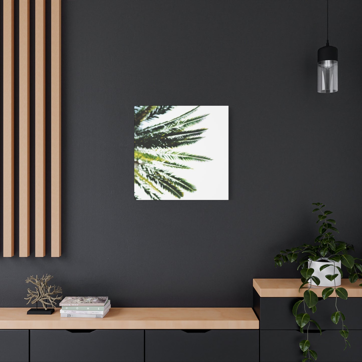
Contemporary Expressions in Botanical Wall Design
Modern design aesthetics embrace clean lines, innovative materials, and fresh interpretations of traditional elements. Botanical wall art fits seamlessly within contemporary interiors when selected and presented with attention to current design trends. Moving beyond conventional landscape-style compositions, contemporary botanical pieces offer bold graphic interpretations, unexpected perspectives, and innovative presentation techniques.
Graphic simplification characterizes many contemporary botanical pieces. Rather than detailed realistic representations, these works reduce palm imagery to essential elements of line, shape, and color. Simplified silhouettes, bold outlines, and flat color planes create striking visual impact while maintaining recognizable botanical references. This approach suits minimalist and contemporary spaces that prioritize clean visual language over decorative complexity.
Unexpected perspectives refresh familiar subject matter. Instead of conventional views, contemporary botanical artwork might feature extreme close-ups that abstract natural forms, aerial views looking down through palm canopies, or dramatic upward angles emphasizing height and structure. These unconventional perspectives create visual interest while maintaining organic subject matter that connects with nature.
Monochromatic treatments offer sophisticated contemporary presentations. Black and white botanical photography or artwork creates timeless appeal while emphasizing form, shadow, and texture over color. These pieces work particularly well in spaces with strong color elsewhere, providing visual rest while maintaining interest through compositional strength. Monochrome botanical art also offers tremendous flexibility, coordinating easily with changing color schemes.
Bold color applications push botanical imagery in unexpected directions. Contemporary interpretations might feature naturalistic subjects against vibrant backgrounds in unexpected hues like deep navy, rich burgundy, or even black. Alternatively, the botanical elements themselves might be rendered in non-naturalistic colors while maintaining realistic form. These bold color choices create dramatic impact while maintaining organic subject matter.
Mixed media approaches add dimensional quality to contemporary botanical pieces. Combining photography with painted elements, incorporating metallic leafing, or adding textural overlays creates unique artworks that transcend simple printed canvases. These dimensional qualities catch light dynamically and provide visual interest from multiple viewing angles, enhancing their presence in contemporary spaces.
Series and diptych arrangements suit contemporary aesthetics by creating deliberate, curated presentations. Rather than single pieces, contemporary approaches often feature multiple canvases designed to display together. These might show progression through seasonal changes, different perspectives of the same subject, or complementary compositions intended as unified installations. Multi-panel presentations create substantial visual impact appropriate for large contemporary spaces.
Innovative framing options distinguish contemporary presentations from traditional approaches. Float mounting creates shadow gaps between artwork and frames, emphasizing the canvas as an object rather than simply an image. Metal frames in brushed finishes offer industrial edge while maintaining clean lines. Acrylic face mounting provides high-gloss contemporary finish with enhanced color saturation and protection.
Organic Warmth Through Naturally-Inspired Canvas Designs
Creating interiors with rustic charm requires balancing natural elements, weathered materials, and comfortable informality. Botanical canvas designs fit beautifully within rustic aesthetics, particularly when presented with finishes and framing that enhance rather than conflict with the organic, aged quality central to this design approach. The natural subject matter of palm imagery inherently supports rustic themes while offering sophisticated visual interest.
Distressed finishes create appropriate rustic character in botanical artwork. Techniques that suggest age and use align botanical pieces with other rustic elements in your space. Look for prints with deliberately faded colors, crackle finishes suggesting age, or vintage-style color palettes in sepia tones or muted greens. These finishes help new artwork blend seamlessly with genuinely aged elements common in rustic interiors.
Wood framing becomes particularly important in rustic presentations. Select frames in natural wood with visible grain patterns, knots, and color variation. Reclaimed wood frames offer authentic aged character while supporting sustainable design practices. Chunky frame profiles provide substantial presence appropriate to rustic aesthetics. Consider frames in honey tones, weathered grays, or natural finishes that showcase wood's inherent beauty.
Canvas texture enhances rustic presentations through visible weave and material character. Unlike smooth paper prints, canvas celebrates its textile nature with visible texture that adds dimension and organic quality. Some canvases feature particularly heavy weaves that create pronounced texture, reinforcing the handcrafted, natural material aesthetic central to rustic design.
Subject selection influences rustic suitability. While dramatic tropical scenes might feel too vibrant, simplified botanical studies or softly rendered palm landscapes integrate more naturally. Look for compositions with organic, slightly imperfect quality rather than precise photographic perfection. Artistic interpretations with visible brushwork or intentional imperfections feel more handcrafted and appropriate to rustic settings.
Color palettes for rustic botanical pieces tend toward earth tones and muted hues. Rather than bright greens, seek artwork featuring sage, olive, or gray-green tones. Backgrounds in cream, tan, soft gray, or warm white complement rustic color schemes better than stark white or saturated colors. These subdued palettes create harmony with natural wood, stone, and textile elements common in rustic interiors.
Layering creates authentic rustic presentations. Rather than hanging botanical canvas in isolation, create dimensional displays by leaning pieces against walls on mantels or shelves, layering smaller pieces in front of larger ones, or combining canvas with other collected items like vintage botanical prints, pressed specimens, or natural objects. This collected appearance reinforces rustic aesthetics.
Material combinations enhance rustic character. Surround botanical canvas with other natural materials including rough-hewn wood, natural stone, wrought iron, and natural fiber textiles. These material combinations create rich, textured environments where botanical artwork feels integrated rather than merely decorative. Each material's inherent imperfections and natural variations contribute to overall rustic character.
Creating Custom Botanical Displays Through Personal Projects
Crafting your own botanical displays offers multiple advantages including cost savings, customization opportunities, and the satisfaction of creating personalized decorative elements. Numerous approaches allow creativity at various skill levels, from simple printing and framing to more complex artistic techniques. Personal projects ensure your botanical artwork precisely matches your vision while creating unique pieces unavailable in retail settings.
Digital download options provide accessible entry points for creating botanical displays. Numerous online sources offer high-resolution botanical images available for purchase and download. Once acquired, these files can be printed at copy shops, office supply stores, or through online printing services. This approach allows you to control size, paper or canvas selection, and finishing details while keeping costs modest compared to purchasing finished artwork.
Printing considerations significantly affect final results. Canvas printing creates the most gallery-ready finish with built-in texture and professional appearance. Photo paper offers crisp detail and color saturation but requires framing with glazing for protection. Cardstock provides an economical option for temporary or frequently changed displays. Discuss paper weights, finishes, and ink types with printing services to achieve desired results.
Frame selection transforms simple prints into finished artwork. Ready-made frames in standard sizes offer economical solutions available at craft stores and home retailers. Custom framing provides precise sizing and unlimited style options but increases costs. Consider creative alternatives like clipboard displays, stretched canvas over frames, or floating presentations between acrylic sheets for contemporary looks without traditional framing.
Painting techniques allow creating completely original botanical artwork. Even those without advanced painting skills can create attractive botanical pieces using simplified techniques. Silhouette paintings in single colors against contrasting backgrounds require minimal skill but create striking results. Watercolor studies capture organic, flowing quality appropriate to botanical subjects. Acrylic pouring techniques can suggest organic patterns and natural color variations.
Pressed botanical specimens create authentic dimensional displays. Collect palm fronds or similar local botanical materials, press them between heavy books until completely dry, then mount them on neutral backgrounds and frame under glass. These genuine specimens offer unique, site-specific character impossible to replicate with prints. Document collection locations and dates for additional personal significance.
Photography projects allow capturing personal botanical visions. Visit botanical gardens, conservatories, or travel destinations to photograph palm trees and tropical plants. Edit photos using free or subscription software to adjust colors, contrast, and composition. Print your photographs on canvas or paper to create artwork reflecting your specific experiences and artistic vision.
Peaceful Retreats with Botanical Bedroom Canvas
Bedrooms serve as personal sanctuaries dedicated to rest and rejuvenation, making them ideal locations for carefully selected botanical artwork. Palm imagery brings natural serenity to sleeping spaces, creating calming environments that support quality sleep and peaceful wakening. The organic forms and connection to nature help transition minds from daily stress to restful states conducive to sleep.
Placement considerations in bedrooms typically focus on the wall above beds as primary locations for artwork. This prominent position ensures botanical pieces remain visible from throughout rooms while creating focal points for these important spaces. Large-scale pieces or arranged groupings work well in this location, providing substantial presence without overwhelming spaces dedicated to rest rather than visual stimulation.
Color selection significantly impacts bedroom atmosphere. Softer, cooler botanical tones promote calm and relaxation more effectively than vibrant, warm hues that might prove stimulating. Look for artwork featuring sage greens, soft gray-greens, or blue-tinged botanical subjects. Pair these with neutral backgrounds in soft whites, warm grays, or gentle beiges that maintain serene atmospheres.
Symmetrical arrangements create subconscious feelings of balance and stability appropriate to restful environments. Position matching or complementary botanical pieces flanking bed centers, creating mirrored presentations that feel intentionally planned and peaceful. This balanced approach contrasts with more dynamic asymmetrical arrangements better suited to active living spaces.
Scale relationships between artwork and furniture affect visual harmony. Botanical pieces above beds should relate proportionally to bed widths without appearing too small or overwhelming. General guidelines suggest artwork measuring roughly two-thirds to three-quarters of bed width, though personal preference and specific circumstances allow variation from these recommendations.
Complementary bedroom styling reinforces botanical themes. Select bedding in colors coordinating with artwork hues, incorporate houseplants echoing canvas imagery, and choose furniture in natural materials and finishes. These consistent design choices create cohesive environments where botanical artwork feels integrated rather than arbitrarily placed.
Lighting control supports both artwork display and sleep quality. Install dimmer switches allowing adjustment from bright task lighting during dressing and activities to soft ambient lighting during wind-down periods. Position lighting to illuminate artwork during waking hours without creating glare or excessive brightness during evening hours when relaxation becomes priority.
Creating Productive Environments with Workplace Botanical Displays
Office and workspace environments benefit tremendously from thoughtful botanical artwork that enhances rather than distracts from productive activities. Research consistently demonstrates that nature imagery improves focus, reduces stress, and enhances creative thinking, making botanical pieces valuable additions to work environments. Understanding how to incorporate these elements while maintaining professional appearances creates spaces supporting both productivity and wellbeing.
Professional aesthetic requirements influence botanical selections for office spaces. Choose pieces with sophisticated artistic interpretation rather than overly decorative or casual presentations. Photography, graphic designs, or refined artistic renderings maintain professional character while providing natural imagery benefits. Avoid overly themed or vacation-centric presentations that might appear insufficiently serious for professional environments.
Scale appropriateness varies by office size and type. Executive offices and spacious professional spaces accommodate larger botanical pieces that establish authority and importance. Smaller individual workspaces benefit from medium or smaller pieces that provide natural connection without overwhelming limited areas. Shared workspaces require careful consideration of collective preferences rather than individual tastes.
Positioning relative to computer screens affects both aesthetics and functionality. Place botanical artwork within natural sight lines when looking up from screens, providing visual breaks that reduce eye strain and mental fatigue. Avoid positions requiring significant physical repositioning to view, as pieces in awkward locations receive less attention despite beneficial properties.
Color psychology influences botanical selections for specific work functions. Greens promote calm focus appropriate for detail-oriented tasks, while warmer tones encourage energy and communication valuable in collaborative spaces. Consider the primary activities occurring in spaces when selecting color tones for botanical pieces, aligning colors with desired psychological effects.
Frame selections maintain professional polish. Choose quality frames in finishes coordinating with office furniture and architectural details. Wood frames in medium to dark tones suit traditional professional environments, while metal frames in black, silver, or gold align with contemporary office aesthetics. Ensure frames appear intentional and quality rather than makeshift or obviously budget-conscious.
Lighting considerations ensure botanical pieces remain visible in artificially-lit office environments. Many offices lack natural light, requiring deliberate lighting design to showcase artwork properly. Install picture lights, adjust existing fixtures to illuminate artwork, or position pieces to capture available light sources. Proper lighting prevents artwork from disappearing into shadowy corners.
Multiple workstation considerations in open offices require diplomatic approaches. Selected botanical pieces should offer broad appeal rather than highly personal or potentially controversial imagery. Neutral, nature-focused pieces typically satisfy diverse preferences while providing beneficial natural imagery to all occupants.
Home office integration allows more personal expression. Remote work spaces in homes permit greater creative freedom in botanical selections, allowing personal preferences to guide choices. However, if video calls occur with visible artwork backgrounds, maintain appropriately professional aesthetics despite home settings.
Relaxed Sophistication Through Natural Design Elements
Achieving comfortable, inviting interiors with sophisticated design sensibility requires balancing casual organic elements with refined presentation. Botanical artwork contributes significantly to this aesthetic, offering natural beauty presented with artistic polish that bridges relaxed comfort and design sophistication. This balanced approach creates welcoming environments that feel both livable and thoughtfully curated.
Natural material combinations reinforce organic sophistication. Pair botanical canvas with furniture in natural wood, seagrass or jute rugs, linen textiles, and stone or ceramic accessories. These material combinations celebrate natural beauty while maintaining refinement through quality materials and thoughtful selection. Each element enhances others, creating synergistic presentations greater than individual components.
Artistic quality distinguishes sophisticated presentations from purely decorative applications. Select botanical pieces demonstrating artistic merit through composition, color relationships, or technical execution. Look for work by recognized artists or pieces showing creative interpretation rather than merely reproducing nature. This artistic quality elevates pieces beyond decoration to meaningful art.
Curation rather than accumulation prevents spaces from appearing cluttered despite natural element abundance. Select fewer, better pieces rather than filling all available space. This restraint maintains sophisticated calm while allowing each botanical piece appropriate attention. Empty wall space becomes intentional design element rather than oversight.
Color sophistication relies on subtle relationships rather than obvious matching. Rather than literally matching botanical greens throughout spaces, incorporate complementary earth tones, varied green values, and neutral foundations that create harmonious relationships without appearing formulaic. This nuanced color work demonstrates design sophistication while maintaining natural aesthetic.
Textile layers add physical comfort supporting visual sophistication. Combine botanical artwork with varied textiles including smooth linens, nubby weaves, and soft chenilles that provide tactile interest. These textile variations prevent spaces from appearing flat while maintaining the comfortable, inviting character central to relaxed aesthetics.
Furniture styles blend refinement and comfort. Select pieces with clean lines and quality construction that remain comfortable and inviting. Avoid both overly formal furniture that appears uncomfortable and extremely casual pieces that undermine sophisticated aspirations. This middle ground achieves both aesthetic and functional goals.
Lighting creates ambiance supporting sophisticated comfort. Use layered lighting including ambient, task, and accent options that can be adjusted for various activities and times. This lighting flexibility supports both active and restful pursuits while showcasing botanical artwork appropriately. Dimmer controls allow precise adjustments creating desired atmospheres.
Personal collections integrated with botanical themes add individual character. Include objects reflecting personal interests whether travel souvenirs, inherited pieces, or collected items displayed alongside botanical artwork. These personal elements prevent spaces from appearing impersonally designed while maintaining overall sophistication through thoughtful arrangement.
Nostalgic Character Through Vintage Botanical Presentations
Vintage aesthetics celebrate earlier eras through period-appropriate colors, patterns, and presentation styles. Botanical artwork integrates beautifully within vintage interiors, particularly when selected or treated to suggest age and history. Understanding various vintage periods and their characteristic approaches to botanical art allows creating authentic-feeling spaces that honor historical design while remaining functional for contemporary living.
Botanical illustration traditions offer rich vintage sources. Historical botanical illustrations from scientific texts feature detailed renderings with Latin nomenclature and technical accuracy. These illustrations, reproduced from vintage sources or created in vintage styles, provide intellectual interest alongside decorative appeal. The technical precision and educational purpose distinguish these pieces from purely decorative botanical art.
Color aging effects create authentic vintage appearances. Vintage botanical pieces typically show color shifts from age including yellowing papers, faded inks, and overall patina suggesting decades of display. Reproductions incorporating these aging effects appear genuinely vintage despite recent production. Look for sepia tones, faded colors, and subtle staining that suggests authentic age.
Framing styles indicate specific vintage periods. Victorian-era presentations feature ornate gilded frames with considerable decoration, while mid-century approaches favor simpler wood frames with clean lines. Understanding period-appropriate framing ensures botanical pieces authentically represent intended eras rather than creating anachronistic combinations.
Subject treatments vary across vintage periods. Earlier botanical art featured formal arrangements and scientific precision, while later periods embraced looser, more artistic interpretations. Select subject treatments aligning with your preferred vintage era, ensuring consistency between subject handling and overall period aesthetic.
Patina and wear contribute to vintage authenticity. Pieces showing appropriate wear including minor foxing on papers, crackle in frame finishes, or slightly faded colors appear genuinely vintage. However, damage should remain aesthetic rather than structural, adding character without compromising integrity or displayability.
Vintage botanical collections create impact through accumulated presentations. Rather than single pieces, vintage aesthetics often feature multiple botanical prints grouped together, suggesting collections assembled over time. This accumulated appearance reinforces vintage character while creating substantial visual presence.
Period-appropriate color palettes extend beyond botanical pieces throughout spaces. Victorian interiors featured rich, dark colors including burgundy, forest green, and navy, while mid-century palettes embraced coral, avocado, and gold. Coordinate botanical piece colors with broader period color schemes for authentic vintage results.
Furniture and accessory coordination reinforces vintage aesthetics. Surround vintage botanical pieces with period-appropriate furniture styles, vintage accessories, and materials common to specific eras. These consistent period references create believable vintage environments rather than confused mixtures of unrelated elements.
Botanical subject matter varies by period appropriateness. Tropical palms became popular in Victorian conservatory culture, making them period-appropriate for that era. Mid-century design embraced both realistic and stylized botanical imagery. Understanding which botanical subjects suit specific periods prevents anachronistic combinations.
Reproduction quality affects vintage believability. High-quality reproductions of vintage botanical illustrations maintain fine detail and authentic color, creating convincing vintage appearances. Lower-quality reproductions with poor color accuracy or lost detail appear obviously contemporary despite vintage subject matter.
Display methods reinforce period authenticity. Victorian presentations often featured symmetrical arrangements and salon-style hanging with multiple pieces covering walls, while mid-century approaches favored more spacious arrangements with breathing room between pieces. Adopt display methods appropriate to your chosen vintage period.
Lighting creates appropriate ambiance for vintage presentations. Softer, warmer lighting suits vintage aesthetics better than bright, cool contemporary lighting. Use vintage-style fixtures when possible, and consider how light quality affects botanical piece appearances, ensuring lighting enhances rather than contradicts vintage character.
Fresh Natural Aesthetics Through Verdant Design Choices
Creating interiors centered on green aesthetics celebrates nature's predominant color while establishing calm, healthful environments. Botanical canvas pieces naturally support green design schemes, offering varied green tones and organic subject matter that reinforces this nature-focused approach. Understanding how to work effectively with green as a dominant color creates sophisticated, cohesive spaces avoiding monotony despite limited color range.
Green value variation prevents monotonous presentations. Incorporate multiple green values from pale mint through medium sage to deep forest, creating tonal progressions that add depth and interest. Botanical artwork naturally provides this variation, showing highlights, midtones, and shadows within single pieces while offering different overall tones across multiple pieces.
Temperature shifts within green palettes add subtle complexity. Cool blue-greens create fresh, crisp feelings appropriate for contemporary spaces, while warmer yellow-greens appear more organic and relaxed. Combining both temperatures within green-dominant schemes creates sophisticated presentations with built-in variation preventing same-ness despite color consistency.
Neutral pairings allow green to dominate while providing visual rest. White, cream, warm gray, and natural wood tones complement green beautifully without introducing competing colors. These neutrals provide breathing room between green elements while allowing botanical pieces and green design choices to remain focal points.
Metallic accents add glamour to green schemes. Gold coordinates beautifully with warm greens, silver pairs well with cool greens, and copper complements olive tones. These metallic touches introduce light-catching elements and visual interest without introducing new colors that might dilute green focus.
Natural material integration reinforces organic character. Wood, stone, linen, and other natural materials share aesthetic affinity with green, creating harmonious presentations celebrating nature. These materials often contain subtle green undertones or complementary earth colors that enhance rather than conflict with green-dominant palettes.
Pattern mixing within green maintains interest through variation. Combine botanical prints with geometric patterns, organic abstracts, or traditional designs all working within green color families. This pattern variety prevents visual boredom while maintaining color consistency across varied surfaces and applications.
Texture emphasis becomes particularly important in limited-color schemes. With color providing less variation, textural differences create visual interest. Canvas texture, nubby upholstery, smooth leather, rough stone, and soft textiles provide tactile and visual variety preventing flat appearances despite color consistency.
Living plants extend green themes dimensionally. Incorporate houseplants alongside botanical canvas pieces, creating connections between representations and living specimens. Plants add oxygen, natural beauty, and literal nature connections while reinforcing green aesthetic foundations through varied living green tones.
Effective Display Strategies for Botanical Canvas Collections
Successfully incorporating botanical canvas artwork requires understanding fundamental display principles that ensure pieces enhance rather than clutter spaces. These strategies apply across various styles and rooms, providing foundational knowledge for confident artwork placement regardless of specific aesthetic preferences or spatial constraints.
Height placement significantly affects viewing comfort and aesthetic impact. Standard recommendations suggest hanging artwork with centers at eye level, typically 57-60 inches from floor level. However, this guideline adjusts based on ceiling heights, furniture relationships, and viewer heights. In spaces with seating, consider eye levels from seated positions ensuring botanical pieces remain comfortably viewable during typical room use.
Spacing between multiple pieces requires careful calculation. As general guidance, maintain 2-4 inches between grouped pieces, though spacing can increase with larger pieces or more casual aesthetics. Consistent spacing creates intentional, curated appearances, while varied spacing might appear haphazard despite identical total gap distances.
Furniture relationships anchor wall-mounted artwork. Pieces hung above furniture should relate proportionally, typically measuring roughly two-thirds of furniture width. Maintain 6-8 inches clearance above furniture tops preventing pieces from appearing to float disconnectedly or sit too heavily on furniture below.
Room proportion influences size selections. Large rooms with high ceilings accommodate substantial botanical pieces, while smaller spaces require more modest scales avoiding overwhelming. However, don't default automatically to small pieces in small rooms, as appropriately-scaled medium pieces often appear more intentional than numerous tiny pieces.
Visual weight distribution affects room balance. Distribute botanical pieces and other visual weight throughout rooms rather than concentrating heavily on single walls. This balanced distribution creates comfortable spaces without heavy, overweighted areas contrasting with barren zones.
Architectural features provide natural artwork locations. Walls between windows, spaces above mantels, areas flanking architectural elements, or positions emphasizing room geometry offer natural locations for botanical pieces. Working with rather than against architecture creates harmonious results.
Traffic flow considerations prevent artwork placement in vulnerable positions. Avoid hanging pieces where they might contact door swings, receive impacts from traffic movement, or position too close to high-activity areas where damage risks increase. Prioritize preservation alongside aesthetics.
Theme consistency creates cohesive presentations. When displaying multiple botanical pieces throughout single spaces or connected areas, maintain thematic connections through subject matter, color palettes, or artistic styles. These connections create intentional narratives rather than random collections.
Layer opportunities maximize display impact. Consider foreground, middle ground, and background opportunities through floating shelves holding leaned artwork, table surfaces with complementary objects, and wall-mounted pieces at varying depths. This dimensional layering creates sophisticated, curated presentations.
Rule flexibility allows personal expression. While guidelines provide useful starting points, personal preference and specific circumstances allow deviation. Trust instincts when standard rules don't quite suit situations, making adjustments serving specific spaces and preferences.
Mock-up testing prevents commitment regrets. Before installing mounting hardware, create paper templates matching artwork dimensions and tape them in intended positions. Live with templates for days assessing whether placements feel right from various room positions and lighting conditions. This testing prevents permanent mounting in suboptimal positions.
Hanging hardware quality ensures safe, level installation. Invest in appropriate hardware for artwork weights and wall types. Use leveling tools ensuring straight installation, and consider professional installation for valuable or particularly large pieces. Proper installation protects both artwork and walls.
Maintenance accessibility affects long-term satisfaction. Position pieces allowing access for periodic dusting and cleaning without requiring excessive furniture moving or awkward stretching. This accessibility ensures pieces receive proper care maintaining appearances over time.
Future flexibility supports changing preferences. Use hanging methods allowing repositioning without extensive wall repair. This flexibility accommodates changing layouts, design directions, or simple desires for freshness through relocated artwork.
Documentation through photography records successful arrangements. Photograph botanical displays from multiple angles, creating references for future rearrangements or similar projects. These records prove valuable when relocating or making changes, providing baselines for successful previous arrangements.
Conclusion:
Transforming living spaces through botanical canvas artwork represents an accessible yet profoundly impactful approach to interior design. Throughout this extensive exploration, we have examined numerous strategies for incorporating palm-themed and botanical imagery into diverse spaces, styles, and applications. The versatility of botanical artwork ensures relevance across virtually any interior design challenge, from creating tropical retreats to achieving minimalist sophistication, from establishing serene bedrooms to energizing professional workspaces.
The fundamental appeal of botanical canvas art stems from its inherent connection to nature, bringing organic beauty and psychological benefits into interior environments. Research consistently demonstrates that natural imagery reduces stress, improves focus, and enhances overall wellbeing. These scientifically-supported benefits extend beyond mere aesthetic considerations, making botanical artwork an investment in both beautiful spaces and healthier living.
