


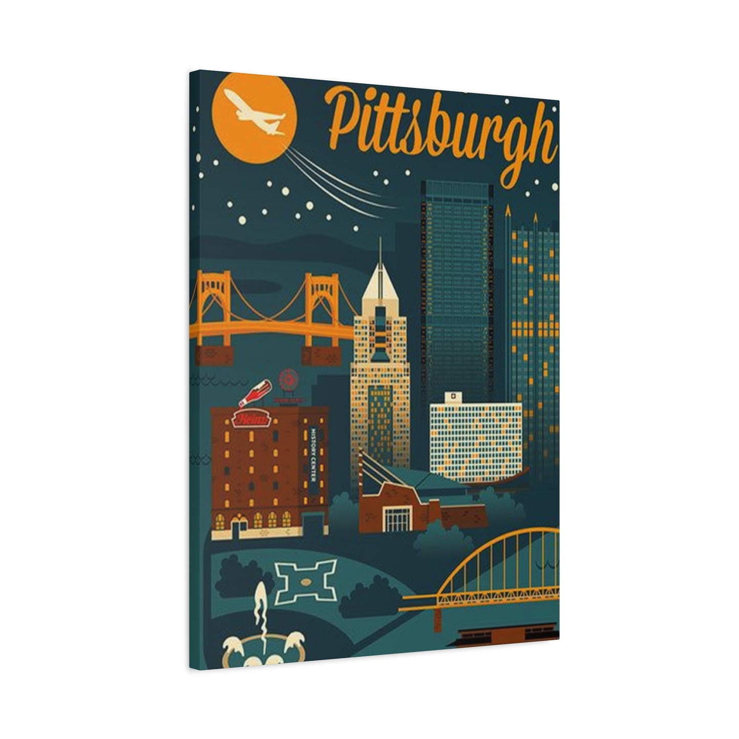
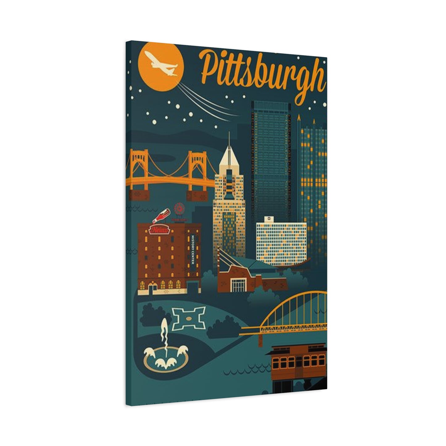

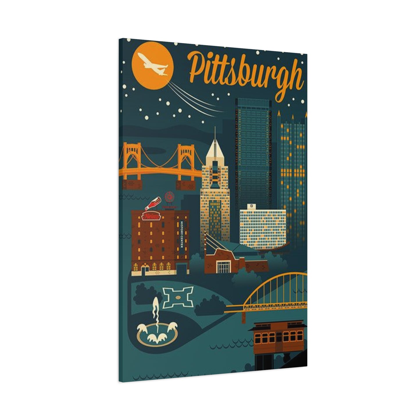
Celebrate Steel City Style: Pittsburgh Skyscraper Wall Art Ideas for Every Room
The allure of urban landscapes has captivated art enthusiasts and interior designers for generations, and few cities offer the architectural magnificence quite like Pittsburgh. The steel city's stunning skyline, punctuated by gleaming towers and historic structures, provides an endless source of inspiration for wall art that brings metropolitan sophistication into any living or working space. Pittsburgh skyscraper poster wall art represents more than mere decoration; it embodies the spirit of American industrial heritage, architectural innovation, and urban renaissance that has transformed this Pennsylvania city into a modern marvel.
When selecting artwork for your walls, the choice to feature skyscrapers from this iconic city creates an immediate connection to one of America's most photographed and artistically celebrated urban environments. These visual representations capture the essence of vertical architecture against natural backdrops, offering viewers a glimpse into the harmonious blend of human achievement and environmental beauty. The dramatic interplay of steel, glass, and sky creates compositions that work equally well in contemporary apartments, traditional offices, and eclectic home galleries.
The market for metropolitan-themed decorative prints has experienced remarkable growth as more people seek to infuse their personal spaces with cosmopolitan energy without leaving their homes. This trend reflects a broader appreciation for architectural photography and graphic design that celebrates human ingenuity. Tall building imagery from this particular location offers unique advantages over generic cityscape options, providing specific cultural and historical connections that resonate with residents, former inhabitants, and admirers of industrial American cities alike.
Understanding the Appeal of Urban Architecture in Home Decor
Metropolitan skyline imagery has become increasingly popular in residential and commercial interior design, reflecting society's fascination with vertical construction and urban development. The psychological impact of displaying towering structures in living spaces extends beyond aesthetic pleasure, creating associations with ambition, progress, and human achievement. These visual elements can dramatically alter the perceived dimensions of a room, drawing the eye upward and creating an illusion of expanded vertical space that makes smaller areas feel more open and dynamic.
The architectural diversity present in urban environments provides endless variation in artistic interpretation. From modernist glass facades to art deco detailing, from brutalist concrete forms to contemporary sustainable designs, each building style offers distinct visual characteristics that appeal to different aesthetic preferences. This variety ensures that buyers can find representations matching their personal taste, whether they prefer clean minimalist lines, ornate historical details, or bold contemporary statements.
Color psychology plays a significant role in the appeal of metropolitan architectural imagery. The cool grays and blues typically associated with steel and glass structures create calming, sophisticated atmospheres in interior spaces. When contrasted against warm sunset skies or dramatic storm clouds, these same buildings take on entirely different emotional qualities, offering versatility in mood creation. The interplay of natural and artificial light in architectural photography adds depth and dimension that static color fields cannot achieve, making each viewing experience slightly different depending on ambient lighting conditions.
The connection between urban imagery and professional environments has strengthened in recent decades as corporate culture has embraced more artistic approaches to office design. Conference rooms, executive suites, and reception areas increasingly feature large-scale architectural photographs that project competence, stability, and forward-thinking attitudes. The symbolism of reaching skyward resonates with business objectives of growth and achievement, making such artwork particularly appropriate for commercial settings while remaining sophisticated enough for residential applications.
The Unique Architectural Character of Steel City Structures
This Pennsylvania metropolis presents a distinctive architectural profile that sets it apart from other major American cities. The confluence of three rivers creates natural boundaries that have shaped development patterns and provided spectacular vantage points for capturing the urban skyline. The topographical challenges of the region forced architects and engineers to develop innovative solutions, resulting in structures that demonstrate both functional necessity and artistic ambition.
Historical context enriches the visual narrative present in imagery from this location. The transformation from industrial powerhouse to diversified modern economy is visible in the architectural evolution displayed across the skyline. Older structures built during the steel manufacturing heyday stand alongside contemporary towers housing technology firms and research institutions, creating a visual timeline of American economic development. This layering of architectural eras provides depth and storytelling potential that purely modern skylines cannot match.
The dramatic elevation changes throughout the metropolitan area create opportunities for perspective shots unavailable in flatter urban environments. Photographers can capture the skyline from hillside vantage points that provide comprehensive views showing the relationship between built environment and natural topography. These elevated perspectives add drama and scale to compositions, emphasizing the vertical thrust of tall buildings against horizontal river valleys. The resulting images possess a three-dimensional quality that draws viewers into the scene rather than presenting a flat facade.
Signature structures within the skyline serve as visual anchors that make the location immediately identifiable to those familiar with the city. These landmark buildings carry historical and cultural significance that adds layers of meaning to decorative prints featuring their forms. The presence of recognizable elements creates conversation starters and personal connections for viewers who have visited the area or maintain ties to the region, transforming generic decor into meaningful personal statements.
The color palette of the built environment in this location tends toward earth tones, industrial grays, and the warm amber of evening lights reflected in glass surfaces. This naturally sophisticated color scheme integrates seamlessly with most interior design approaches, from industrial chic to traditional elegance. The absence of overly bright or jarring colors makes architectural images from this city particularly versatile for spaces requiring subtle sophistication rather than bold visual statements.
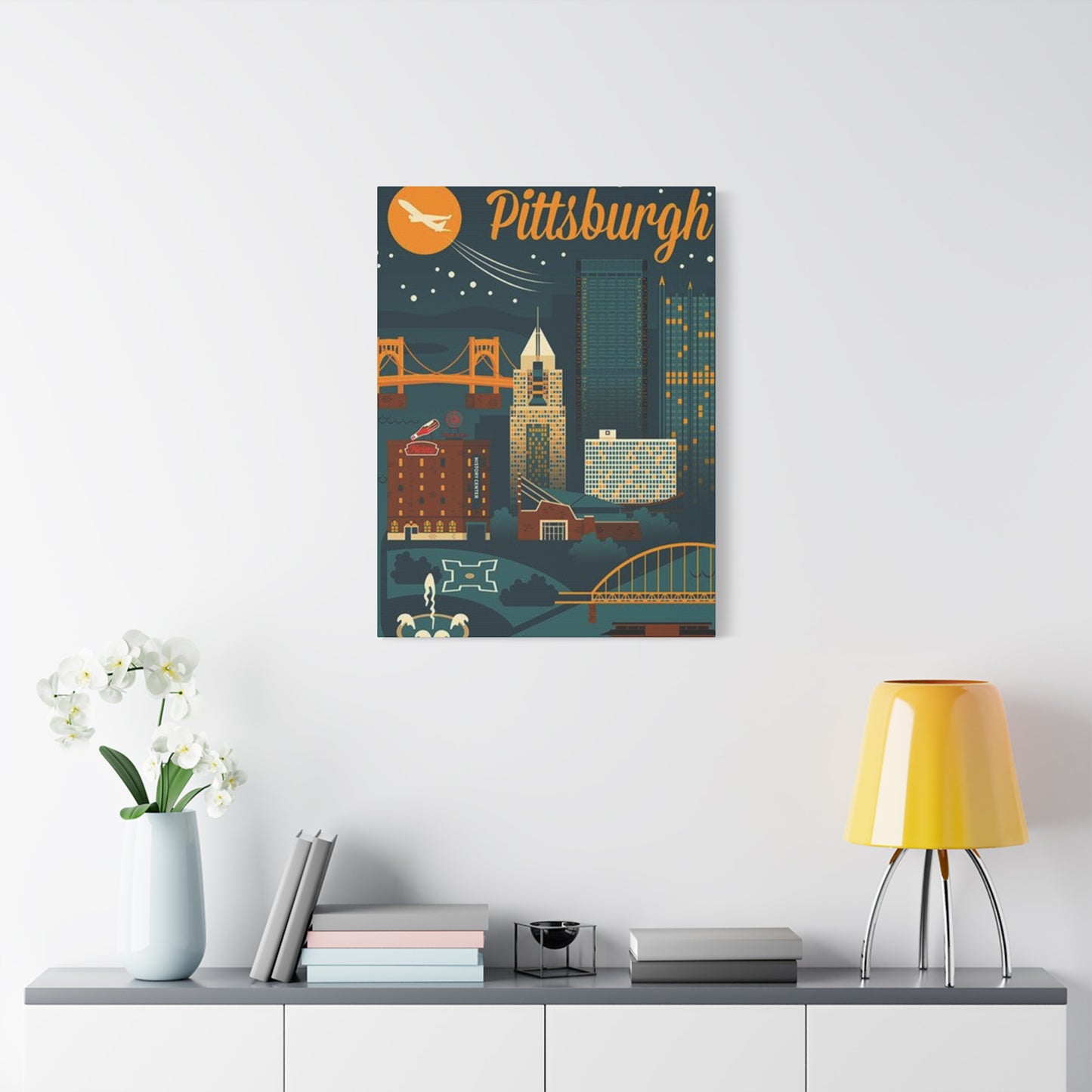
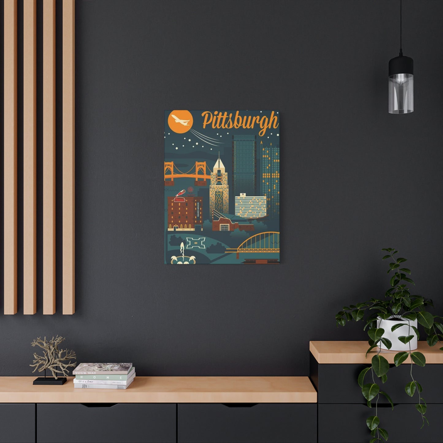
Selecting the Perfect Dimensions for Your Display Space
Proper sizing represents one of the most critical decisions when incorporating large-scale visual art into interior spaces. An undersized piece disappears on expansive walls, failing to create intended impact, while oversized selections overwhelm rooms and create visual imbalance. Understanding the relationship between wall dimensions, viewing distance, and artwork scale ensures successful integration that enhances rather than detracts from overall design schemes.
General design principles suggest that artwork should occupy approximately sixty to seventy-five percent of available wall width to achieve visual harmony. For a standard sofa measuring about seven feet in length, a print spanning five to six feet across creates appropriate proportions. However, these guidelines serve as starting points rather than rigid rules; architectural photography often benefits from larger-than-typical sizing that creates immersive experiences and statement pieces within rooms.
Vertical versus horizontal orientation significantly impacts spatial perception and composition effectiveness. Horizontal formats emphasizing panoramic skyline views work exceptionally well above furniture pieces like sofas, beds, and console tables, where they complement existing horizontal lines. Vertical orientations featuring single towers or groups of buildings suit narrower wall spaces beside windows, in hallways, or flanking architectural elements like fireplaces. The inherent verticality of skyscraper subjects makes portrait orientation particularly powerful for creating dramatic height emphasis in rooms with tall ceilings.
Multi-panel arrangements offer flexible solutions for large walls requiring substantial visual interest. Triptych and multi-panel compositions can span impressive widths while maintaining manageable individual panel sizes for easier handling and installation. These configurations allow for creative arrangements that can follow wall contours, wrap corners, or create rhythmic patterns across extended surfaces. The separation between panels adds visual interest through negative space while maintaining cohesive overall composition.
Ceiling height considerations influence appropriate artwork proportions significantly. Standard eight-foot ceilings benefit from moderately sized pieces that don't draw attention to vertical limitations, while ten-foot and higher ceilings can accommodate proportionally larger works that fill vertical space effectively. In rooms with dramatic ceiling heights, oversized vertical prints celebrating architectural height become particularly appropriate, creating visual connections between floor and ceiling that unify the space.
The intended viewing distance affects optimal sizing choices substantially. Artwork in dining rooms and bedrooms, where viewers spend extended periods at relatively close distances, can feature more detailed compositions with intricate elements visible upon closer inspection. Conversely, pieces in entryways, above stairwells, or in commercial lobbies viewed primarily from distance should emphasize bold compositions with strong silhouettes and high contrast that read clearly from afar.
Material Choices and Print Quality Considerations
The physical substrate upon which images are reproduced dramatically affects both aesthetic presentation and longevity of decorative prints. Paper remains the traditional medium for photographic reproduction, offering advantages in color accuracy, fine detail rendering, and archival stability when properly manufactured. Museum-quality papers using acid-free bases and pigment-based inks can preserve images for generations without significant fading or deterioration, making them suitable for valuable or personally meaningful pieces.
Canvas printing has gained tremendous popularity for architectural subjects due to the gallery-wrapped presentation that eliminates need for separate framing. The textile texture of canvas adds subtle dimensionality that complements the structural subjects of architectural photography. Modern printing technologies produce canvas reproductions with remarkable detail retention despite the textured surface, though extremely fine details may appear slightly softer compared to paper prints. The ability to wrap images around stretcher bars creates a finished, ready-to-hang product particularly appealing for those seeking convenient installation.
Metal printing represents an increasingly popular premium option for contemporary architectural imagery. The process of infusing dyes directly into specially coated aluminum panels creates luminous, vibrant images with exceptional depth and clarity. The reflective properties of metal substrates add brilliance to highlights and create subtle dimensional effects as viewing angles change. This modern medium particularly suits sleek architectural subjects, reinforcing the industrial and technological themes inherent in urban imagery. The waterproof and scratch-resistant nature of metal prints makes them practical for high-traffic commercial environments.
Acrylic face-mounting provides a high-end presentation option that adds substantial depth and luminosity to photographic images. This process involves mounting prints to rigid backing boards and then laminating a thick acrylic panel to the face, creating a glossy, frameless presentation with exceptional color vibrancy. The optical properties of acrylic enhance color saturation and contrast while protecting the print surface from environmental damage. The substantial physical presence of acrylic-mounted pieces makes them ideal for corporate settings and contemporary residential spaces where premium materials reinforce quality positioning.
Wood mounting offers an alternative that combines natural materials with urban imagery, creating interesting contrast between organic substrates and architectural subjects. Images printed directly onto prepared wood surfaces retain the visible grain and natural variations of the wood, adding warmth and texture to metropolitan scenes. This approach works particularly well with rustic, industrial, or eclectic interior design schemes where the juxtaposition of natural and urban elements creates visual interest.
Color Schemes and Their Impact on Interior Design
The color composition of architectural artwork significantly influences its integration with existing interior color schemes and its ability to set or complement room ambiance. Black and white imagery offers timeless sophistication that transcends temporary design trends, creating elegant statements that work across diverse decorating styles. The absence of color focuses attention on form, light, shadow, and texture, emphasizing the structural qualities of architectural subjects. Monochromatic presentations particularly suit minimalist, modern, and traditional design schemes where color restraint maintains visual coherence.
Full-color photography captures the complete visual experience of urban landscapes, including the warm amber glow of evening lights, the blue depth of twilight skies, and the varied hues of building materials and architectural details. Color photography provides richer storytelling potential and creates more specific mood associations compared to monochromatic alternatives. The challenge lies in coordinating colored artwork with existing room palettes; selecting pieces whose dominant colors complement or intentionally contrast with wall colors, furnishings, and accessories ensures harmonious integration.
Blue-dominant compositions featuring twilight or evening scenes create calm, sophisticated atmospheres particularly appropriate for bedrooms, offices, and professional spaces. The psychological associations of blue with stability, trust, and tranquility make such imagery effective for environments intended to promote focus and relaxation. The natural occurrence of blue tones in architectural glass and evening skies ensures abundant options within this color family.
Warm-toned images capturing golden hour light or sunset conditions introduce energy and warmth into spaces that might otherwise feel cool or sterile. The amber and orange hues of setting sun illuminating building facades create inviting, optimistic atmospheres suitable for living rooms, dining areas, and social spaces. These warmer palettes also complement wood furnishings and earth-toned interior schemes more naturally than cooler color compositions.
High-contrast dramatic compositions featuring stormy skies, strong shadows, or night scenes with illuminated buildings against dark backgrounds create bold visual statements with strong emotional impact. These assertive presentations work well as focal points in rooms with otherwise neutral decorating schemes, providing visual punctuation without requiring coordinating multiple colored elements. The dramatic quality suits spaces intended to make strong impressions, such as entryways, dining rooms, or executive offices.
Selective color techniques, where specific elements appear in color against otherwise monochromatic compositions, offer compromise solutions that provide color interest while maintaining the graphic strength of black and white presentations. This approach might highlight particular buildings, emphasize sunset skies, or draw attention to specific architectural elements while keeping surrounding context subdued. The technique creates contemporary, artistic presentations that stand out from conventional photographic reproductions.
Framing Options to Enhance Architectural Imagery
Proper framing protects artwork while significantly influencing its presentation and integration with surrounding decor. The frame selection process requires balancing aesthetic preferences, artwork characteristics, and interior design context to achieve results that enhance rather than compete with the featured image. Understanding available framing options and their appropriate applications ensures choices that maximize visual impact while providing necessary physical protection.
Traditional wood frames offer endless variation in profile, finish, and color that can complement or contrast with artwork and room decor. Dark woods like walnut or espresso create sophisticated, weighty presentations appropriate for formal settings and traditional interiors. Lighter woods such as oak, maple, or natural ash provide casual, approachable aesthetics suited to contemporary and transitional spaces. The profile width influences formality; narrow frames create subtle boundaries that let artwork dominate, while substantial moldings make bold statements appropriate for larger pieces in spacious rooms.
Metal frames deliver clean, modern aesthetics particularly suited to architectural subjects and contemporary interiors. The industrial character of metal framing creates thematic connections with urban imagery, reinforcing subject matter through presentation materials. Available in various finishes including brushed aluminum, polished steel, and matte black, metal frames offer options ranging from subtle to bold. The thin profiles common in metal framing maximize visible image area while providing structural support, making them particularly effective for larger pieces where thick wooden frames might become visually overwhelming.
Floating frames create contemporary presentations where artwork appears suspended within a frame with visible space between image edges and frame interior. This technique adds dimensional interest and draws attention to the artwork itself rather than its boundary. Floating presentations work exceptionally well with canvas prints and thick paper stocks, where the visible edge becomes part of the overall aesthetic. The shadow gap created by floating mounts adds subtle depth that enhances the three-dimensional quality of architectural subjects.
Mat boards serve multiple functions in framed presentations, providing physical separation between artwork and glazing while creating visual buffers between images and frames. The mat color selection influences artwork perception significantly; white and off-white mats create clean, gallery-style presentations with maximum brightness and contemporary feel. Colored mats can pull specific hues from artwork, creating cohesive color relationships, though they require careful selection to avoid dated appearances. Mat width affects formality and proportion; wider mats create more formal, traditional presentations, while narrow mats or matless presentations suit contemporary aesthetics.
Glazing options protect artwork while affecting its visual appearance and maintenance requirements. Standard glass provides basic protection at economical price points but can create reflective glare that obscures images under certain lighting conditions. Non-reflective or museum glass eliminates these reflections through special coatings, creating nearly invisible barriers that don't interfere with viewing experience. Acrylic glazing offers shatter-resistant protection with weight advantages for larger pieces, though it scratches more easily than glass and may develop static electricity that attracts dust.
Frameless presentations including gallery-wrapped canvas, mounted prints, and metal panels offer clean, contemporary alternatives to traditional framing. These approaches eliminate visual borders, allowing images to exist as objects rather than traditionally framed pictures. The seamless quality suits modern interiors and creates less formal presentations appropriate for casual residential spaces and contemporary commercial environments. The absence of protective glazing makes maintenance easier while creating more direct visual connection with artwork.
Installation Techniques for Various Wall Types and Surfaces
Proper installation ensures artwork remains securely mounted while avoiding wall damage and maintaining intended presentation. The installation approach must account for artwork weight, wall construction, desired adjustability, and potential for future relocation. Understanding available hardware options and their appropriate applications prevents installation failures and facilitates successful outcomes regardless of wall type or artwork characteristics.
Drywall represents the most common residential wall surface, offering relatively straightforward installation with appropriate hardware. Lightweight pieces under ten pounds can hang from simple picture hooks or adhesive strips designed for removable installation. Medium-weight pieces between ten and twenty-five pounds benefit from anchoring systems that distribute weight across larger wall areas or engage wall studs for maximum support. Heavy pieces exceeding twenty-five pounds require substantial mounting systems including toggle bolts, threaded anchors, or direct stud mounting to prevent failure.
Locating wall studs provides optimal mounting points for heavy artwork, as the solid wood framing members offer far greater load-bearing capacity than hollow drywall. Electronic stud finders simplify this process, though alternative methods including magnet detection of drywall screws or careful wall-tapping can identify stud locations. When stud spacing doesn't align with desired artwork positioning, french cleat systems allow flexible horizontal positioning while maintaining secure stud mounting.
Plaster walls common in older construction require different hardware approaches than modern drywall. The dense, brittle nature of plaster demands careful drilling with masonry bits to prevent cracking and crumbling. Plastic anchors designed specifically for plaster walls expand behind the surface, creating secure mounting points for medium-weight pieces. Heavy artwork benefits from molly bolts that distribute loads across larger surface areas, though installation requires precise hole sizing to ensure proper function.
Masonry walls including brick, concrete block, and poured concrete present unique challenges requiring specialized hardware and installation techniques. Masonry bits and hammer drills create holes in these hard surfaces, into which plastic or metal expansion anchors seat firmly. The permanent nature of masonry holes encourages careful planning of artwork positioning before installation. Alternative approaches including adhesive mounting systems designed for masonry applications avoid drilling while providing reasonable holding power for lighter pieces.
French cleat mounting systems offer advantages for heavy pieces and situations requiring easy removal or adjustment. This approach uses interlocking beveled strips mounted to both wall and artwork back, creating secure hanging systems that distribute weight along entire mounting lengths. The horizontal slot formed by cleat systems allows lateral adjustments without remounting hardware, simplifying the achievement of perfect positioning. The substantial holding power of properly installed cleats supports extremely heavy pieces including oversized canvases and multiple-panel installations.
Wire hanging systems provide flexibility for gallery-style arrangements and situations requiring frequent repositioning. Cables or rods mounted to walls or ceilings support suspended artwork via adjustable wire or cable attachments. This approach eliminates need for multiple wall penetrations when creating multi-piece displays and facilitates easy height adjustments and composition modifications. The visible hardware can become design elements when selected thoughtfully, or remain subtle using slim cables and minimal mounting points.
Creating Gallery Walls with Metropolitan Themes
Gallery wall arrangements transform individual pieces into cohesive installations that create substantial visual impact beyond what single items achieve. These curated collections allow expression of personal style, development of visual narratives, and efficient use of architectural features including large blank walls, stairwell walls, and challenging spaces where single large pieces might not fit effectively. Success requires careful planning of composition, spacing, and thematic coherence.
Symmetrical arrangements create formal, balanced presentations appropriate for traditional interiors and spaces requiring visual order. Grid layouts with uniform spacing and frame sizes deliver clean, organized appearances particularly effective in modern and contemporary settings. The regularity of symmetrical arrangements provides visual calm and suits spaces where artwork should complement rather than dominate existing design elements. Planning symmetrical galleries requires careful measurement and often benefits from temporary mock-ups using paper templates to visualize final arrangements before installation.
Asymmetrical organic arrangements offer more dynamic, casual presentations that create visual interest through varied piece sizes, frame styles, and spacing patterns. These compositions require stronger design instincts to achieve balanced results, as successful asymmetrical arrangements must maintain overall visual weight distribution while avoiding predictable patterns. The informal quality suits eclectic, transitional, and contemporary casual interiors where rigid formality might feel out of place. Starting with a central anchor piece and building outward often simplifies the design process for asymmetrical galleries.
Thematic coherence elevates gallery walls from random collections to intentional artistic statements. When focusing on metropolitan architecture, consistency in subject matter, color treatment, and style creates unity across multiple pieces. Galleries might feature various views of the same skyline, architectural details from different buildings, or progressive time-of-day sequences showing changing light conditions. The connecting thread between pieces clarifies overall vision and creates narrative flow that engages viewers beyond what individual pieces provide.
Scale variation within gallery arrangements adds visual interest and hierarchy, allowing certain pieces to function as focal points while others provide supporting context. Mixing larger statement pieces with smaller complementary images creates dynamic relationships and efficient use of available wall space. The scale progression can follow intentional patterns, with pieces graduating in size from center to edges, or maintain more random variation for organic, collected-over-time aesthetics.
Color coordination influences gallery cohesiveness significantly when arrangements include multiple colored pieces. Strategies include limiting palettes to complementary color families, varying color intensity while maintaining consistent hues, or intentionally contrasting limited bright accents against predominantly neutral selections. Black and white photographs simplify color coordination challenges while maintaining flexibility for future additions, as new monochromatic pieces integrate easily without requiring specific color matching.
Spacing between pieces affects overall gallery density and formality. Tighter spacing creates more unified, mural-like presentations where individual pieces merge into collective whole. Wider spacing maintains piece individuality while creating more relaxed, gallery-style presentations. Standard spacing between two and three inches provides balanced results suitable for most applications, though personal preference and available wall space may justify variations from this baseline.
Lighting Considerations for Architectural Art Display
Proper illumination dramatically influences artwork visibility, color accuracy, and overall presentation quality. Lighting design must balance aesthetic goals with conservation concerns, as excessive light exposure accelerates fading and deterioration of printed materials. Understanding lighting options and their characteristics enables creation of displays that showcase artwork effectively while preserving it for long-term enjoyment.
Natural light provides the most accurate color rendering and creates dynamic viewing experiences as changing sun angles and weather conditions alter appearances throughout days and seasons. However, direct sunlight poses significant risks to artwork longevity, as ultraviolet radiation causes irreversible fading of inks and paper degradation. Positioning artwork away from direct sun exposure or using UV-filtering window treatments protects pieces while still benefiting from ambient natural light that creates pleasant viewing conditions without harsh artificial characteristics.
Dedicated picture lighting including adjustable spotlights and picture lights mounted above frames creates focused illumination that draws attention to featured pieces while adding dramatic emphasis. Adjustable fixtures allow precise aiming to eliminate glare on glazed surfaces while providing even illumination across entire artwork surfaces. LED technology now dominates picture lighting applications, offering energy efficiency, minimal heat generation, and extended bulb life compared to traditional incandescent and halogen options. The reduced heat output of LED sources particularly benefits artwork conservation by eliminating thermal stress on papers and inks.
Track lighting systems provide flexible illumination solutions for gallery walls and multiple-piece installations. Individual fixtures along tracks can be positioned and aimed to highlight specific pieces, adjusted as arrangements change, and controlled independently to create varied emphasis patterns. The visible hardware of track systems suits contemporary and industrial interior styles while remaining subtle enough for most applications. Quality track lighting with adjustable color temperature capabilities allows matching light character to artwork and room design.
Recessed ceiling fixtures offer subtle lighting solutions that provide ambient illumination without visible hardware. Adjustable recessed lights can serve artwork-specific lighting functions while maintaining clean ceiling planes. The permanent installation nature of recessed lighting requires careful planning during initial room design or renovation, as relocating fixtures proves significantly more difficult than adjusting track or surface-mounted options.
Wall washing techniques using indirect lighting create soft, even illumination across entire wall surfaces, showcasing artwork without creating dramatic emphasis or visible light sources. This approach particularly suits gallery-style arrangements where multiple pieces deserve equal visual weight. Wall washing eliminates the shadowing that can occur with direct spotlighting while maintaining sufficient brightness for comfortable viewing.
Color temperature selection influences how artwork appears under artificial light. Cooler color temperatures around 4000-5000K create bright, energizing atmospheres that enhance blues and cooler tones in artwork. Warmer temperatures around 2700-3000K produce more intimate, cozy ambiances that complement warm-toned artwork and traditional interiors. Neutral white temperatures around 3500K offer compromise solutions that render most colors reasonably accurately without strong cool or warm bias.
Dimming capabilities provide control over lighting intensity for different times of day and varied uses of spaces. Bright illumination during active daytime hours showcases artwork clearly, while reduced evening levels create ambient mood lighting. Dimming also extends artwork life by reducing overall light exposure. Modern LED dimming systems provide smooth, flicker-free control across wide brightness ranges, maintaining color consistency at all intensity levels.
Seasonal and Occasional Display Rotation Strategies
Rotating displayed artwork prevents visual fatigue, allows enjoyment of larger collections in limited spaces, and provides opportunities for seasonal décor variation. Strategic rotation keeps interiors feeling fresh and dynamic while protecting pieces from continuous light exposure that accelerates deterioration. Implementing practical rotation systems maximizes collection value without requiring permanent installation of every owned piece.
Seasonal rotation aligns artwork with changing calendar periods, creating homes that evolve with the year while maintaining cohesive design. Metropolitan imagery particularly suits cooler months when urban energy and sophisticated aesthetics complement indoor-focused lifestyles. Summer months might feature different subjects including landscapes, botanicals, or vacation destinations, while returning to architectural themes as autumn arrives creates pleasant ritual and renewed appreciation for familiar pieces.
Storage considerations become essential for rotation strategies, as properly stored artwork remains in excellent condition awaiting future display. Flat storage protects unframed prints, with individual pieces separated by acid-free tissue or interleaving sheets to prevent surface contact and transfer. Vertical storage works well for framed pieces, preventing warping pressure that can occur in horizontal stacking. Climate-controlled environments protect against humidity fluctuations and temperature extremes that cause paper expansion, contraction, and mold growth.
Room-to-room rotation distributes favorite pieces throughout homes rather than concentrating collections in limited areas. This approach allows residents to enjoy pieces from different perspectives and in varied contexts as artwork circulates between bedrooms, offices, living areas, and guest spaces. The changing contexts often reveal new aspects of familiar pieces, maintaining interest and appreciation over extended ownership periods.
Event-based rotation provides opportunities to temporarily display pieces appropriate for specific occasions. Hosting gatherings might prompt installation of conversation-starting pieces, while private family periods allow more personal selections. The flexibility to adjust displays for different audiences and purposes makes spaces more responsive to actual usage patterns rather than maintaining static presentations regardless of circumstances.
Documentation of rotation schedules and storage locations prevents pieces from remaining forgotten in storage indefinitely. Simple spreadsheets or notebook logs tracking when pieces last hung, where they currently reside, and planned future rotations ensure all collection items receive display time. Photography of various hanging arrangements preserves successful configurations for future reference when repeating particularly effective displays.
Incorporating Urban Themes Across Various Room Types
Different room functions and characteristics influence appropriate artwork selection and presentation approaches. Understanding how spaces are used, who occupies them, and desired atmospheres enables choices that enhance rather than conflict with room purposes. Metropolitan architectural imagery adapts successfully to varied applications through thoughtful selection of specific subjects, presentations, and installation approaches.
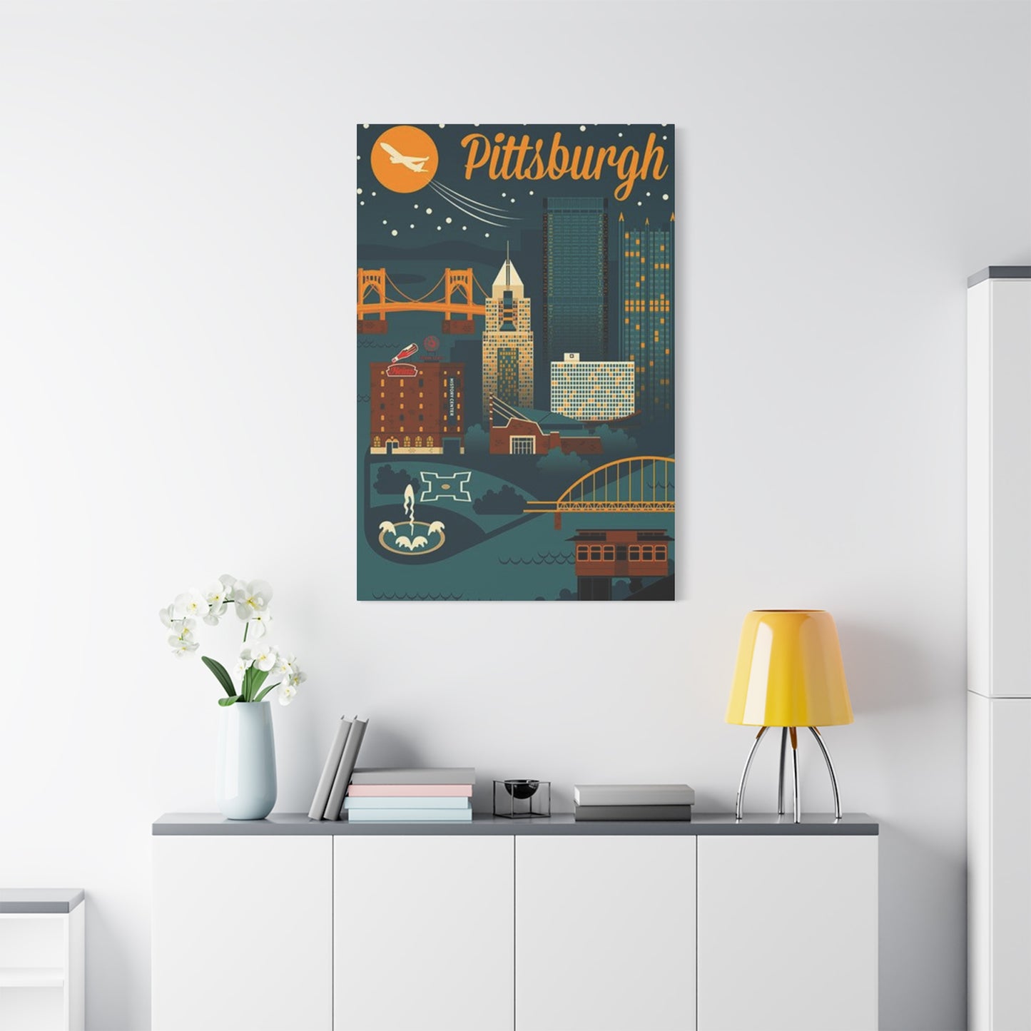
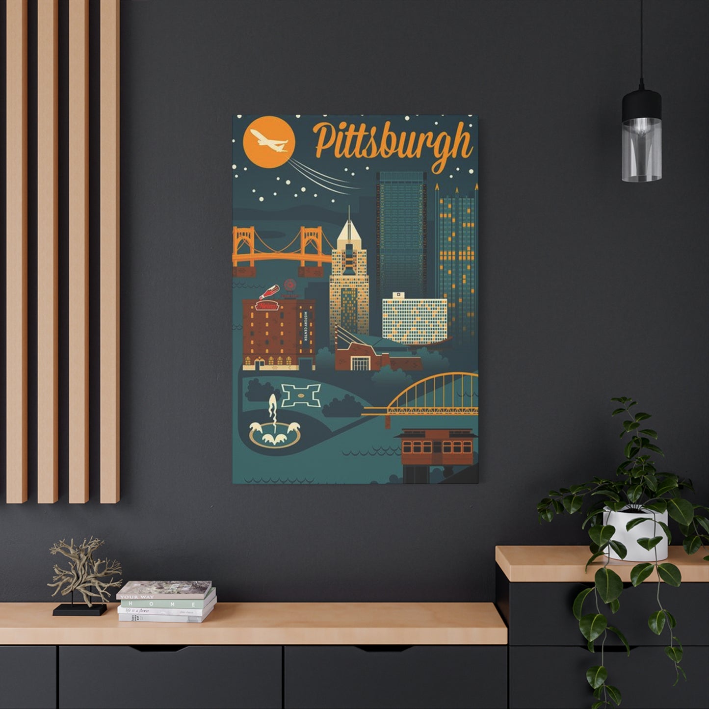
Living rooms serve as primary gathering spaces where families and guests congregate, making them ideal locations for statement artwork that reflects personal style and creates conversation topics. Larger-scale pieces above sofas or fireplace mantels anchor seating arrangements and provide visual focal points. The social nature of living spaces encourages artwork selections with broader appeal that engage diverse audiences while maintaining owner preferences. Architectural imagery suits living rooms particularly well due to generally accessible subject matter that requires no specialized knowledge for appreciation while offering depth for those interested in design and urban development.
Dining areas benefit from artwork that creates pleasant ambiance without demanding constant attention during meals and conversations. Slightly smaller pieces than those in living rooms maintain appropriate proportion for typically more intimate dining spaces. The importance of creating appetizing environments suggests careful consideration of color palettes; cooler tones and neutral compositions generally work better than images dominated by unusual colors that might conflict with food presentation. Architectural subjects provide sophisticated visual interest without dominating dining experiences.
Bedroom artwork influences the last images seen before sleep and first upon waking, making selections that promote calm and personal connection particularly important. Individual preferences dominate bedroom decisions more than in public spaces, as these private retreats need please only their primary occupants. Smaller, more intimate pieces suit bedrooms better than dramatic large-scale works that might prove overwhelming in spaces intended for rest. Positioning artwork where it's visible from bed but doesn't face directly overhead prevents pieces from falling into line of sight when trying to sleep.
Home offices require artwork that inspires productivity while avoiding distraction from work tasks. The aspirational qualities of architectural imagery make it particularly appropriate for work environments, symbolizing achievement and ambition while maintaining professional appearance. Clean, uncluttered compositions work better in offices than busy images with numerous competing elements that might fragment attention. Positioning artwork visible from desk chairs but not directly behind computer monitors provides pleasant views during breaks without creating distractions during focused work.
Entryways and hallways present opportunities for impactful first impressions while solving the challenge of decorating transitional spaces. Architectural imagery works exceptionally well in entries, immediately establishing sophisticated tone and urban sensibility. The vertical proportions of hallways suit vertical orientations or gallery arrangements of multiple pieces that lead viewers through spaces. Lighting considerations become particularly important in often-darker transitional areas where natural light may be limited.
Bathrooms traditionally receive less consideration for art installation, yet these frequently used spaces benefit from personal touches that transform purely functional rooms into pleasant retreats. Moisture-resistant substrates including metal, acrylic, and properly sealed canvas withstand humid bathroom environments better than unprotected paper prints. Smaller-scale pieces suit typical bathroom dimensions while providing visual interest for occupants.
The Role of Architecture in Cultural Identity and Connection
Urban landscapes serve as visual shorthand for complex cultural identities, economic histories, and regional characteristics. Displaying imagery of specific metropolitan areas creates tangible connections to places of personal significance, whether current residences, former homes, or locations holding emotional meaning. These connections transform decorative objects into personal statements that communicate identity and values to both residents and visitors.
For individuals who have relocated from urban areas to suburban or rural settings, architectural imagery maintains links to previous lifestyles and urban identities. The visual reminder of metropolitan energy and cultural resources can help mitigate feelings of disconnection that sometimes accompany major relocational changes. Similarly, those preparing for moves to urban environments might incorporate city imagery as aspirational visualization of upcoming lifestyle changes.
Academic and professional connections to specific cities create natural affinities for their visual representation. Alumni maintaining ties to universities display imagery of their educational homes, while professionals in location-specific industries might feature landmarks from industry centers. These displays signal tribal affiliations and shared experiences with others having similar backgrounds, creating immediate common ground with visitors who recognize significance of featured locations.
Family heritage linked to particular regions makes related imagery particularly meaningful for descendants maintaining connections to ancestral homes. For families whose stories include immigration, industrial employment, or regional cultural traditions, architectural representations of significant cities become touchstones to broader family narratives. Displaying such imagery honors heritage while making abstract historical connections concrete and present in daily life.
Tourism and travel experiences create emotional attachments to visited cities that may develop into lasting appreciation for their visual characteristics. Travelers often seek reminders of particularly meaningful destinations, with architectural imagery providing more sophisticated alternatives to typical tourist souvenirs. These pieces commemorate experiences while maintaining aesthetic standards appropriate for serious interior design rather than casual vacation memorabilia.
The aspirational qualities of urban imagery appeal to those who appreciate metropolitan culture and aesthetics without necessarily having specific personal connections to featured cities. The sophisticated, cosmopolitan associations of urban environments create desired identity projections that align with how individuals wish to present themselves. In such cases, the specific city matters less than the broader symbolic meanings carried by urban architectural subjects.
Pairing Typography and Graphics with Photographic Elements
Contemporary design trends increasingly combine photographic imagery with typographic elements, graphic overlays, and mixed media approaches that create layered, complex compositions. These hybrid presentations offer additional personalization options and contemporary aesthetics that appeal to younger demographics and those seeking less traditional artwork presentations. Understanding available approaches enables informed decisions about incorporating text and graphic elements with architectural photography.
City name typography overlaid on or adjacent to skyline imagery creates clear identification while adding graphic strength to compositions. Font selection dramatically influences overall aesthetic; clean sans-serif types create modern, minimalist presentations while script fonts add elegance and formality. The size, placement, and color of typography must balance visibility and readability against avoiding excessive dominance over photographic elements. Successful integration makes text feel intentional and cohesive rather than applied as afterthought.
Coordinate information including latitude and longitude provides alternative identification approach with contemporary, technical aesthetic. The numerical specificity appeals to those appreciating precision and data-driven presentation while remaining visually subtle due to coordinate meanings being less immediately obvious than text names. This approach creates sophisticated insider quality where those familiar with location recognize coordinates while casual viewers might simply appreciate graphic quality.
Inspirational quotes, poetry, or literary references paired with architectural imagery add conceptual depth and personal meaning beyond what photographs alone provide. Selecting text with thematic connections to urban life, ambition, building metaphors, or specific cultural references to featured cities creates cohesive relationships between visual and verbal elements. The challenge lies in avoiding cliché or overly obvious pairings that feel forced rather than genuinely meaningful.
Abstract graphic elements including geometric overlays, color blocks, and pattern integrations create contemporary mixed-media presentations that push beyond pure photography toward graphic design. These approaches suit modern and contemporary interiors where artistic experimentation and bold visual statements align with overall design philosophies. The graphic additions must enhance rather than obscure underlying photographic content, maintaining balance between elements.
Vintage-style treatments including distressed effects, sepia toning, and retro typography create nostalgia-infused presentations that reference historical poster design and mid-century travel advertisements. These treatments particularly suit architectural subjects from cities with strong industrial heritage, where vintage aesthetics align with historical narratives. The aging effects add character and warmth to subjects that might otherwise feel cold or impersonal in straight photographic presentations.
Budget Considerations and Value Assessment
Artwork pricing varies tremendously based on factors including size, production quality, substrate materials, framing inclusion, artist reputation, and edition limitations. Understanding these variables enables budget-appropriate selections that maximize value without compromising quality standards. Strategic approaches to acquiring architectural artwork make sophisticated displays accessible across varied budget levels.
Print-on-demand services have democratized access to high-quality photographic reproductions, allowing consumers to acquire museum-quality prints at prices far below traditional fine art markets. These services typically offer standard sizes with various substrate options, providing flexibility to match budgets and quality expectations. The trade-off involves less exclusivity, as unlimited reproduction potential means owned pieces lack scarcity value. For those prioritizing aesthetic enjoyment over investment potential, this represents ideal balance of quality and affordability.
Limited edition prints carry higher prices reflecting restricted availability that creates collectible status. Editions might be limited by number, production timeframe, or both, with lower edition numbers generally commanding premium prices. Signed and numbered editions add authentication and artist connection that increases both actual and perceived value. For serious collectors, limited editions represent more appropriate acquisitions than unlimited reproductions, though casual decorators may find the premium pricing unjustified for purely decorative applications.
Original photography commands highest prices due to true uniqueness, direct artist creation, and established fine art market conventions. Acquiring original prints makes sense for serious collectors, as investment appreciation potential and cultural cachet justify premium expenditures. However, the vast majority of consumers seeking attractive décor rather than investment holdings find reproduction options more practical and financially sensible.
DIY framing provides significant cost savings compared to professional custom framing, though it requires comfort with measuring, basic tools, and assembly processes. Standard-sized prints pair with ready-made frames available from retailers at fractions of custom framing costs. The limitations include fewer style options and requirement that artwork conform to standard dimensions. For those with multiple pieces to frame or larger collections in development, learning basic framing skills offers ongoing savings that quickly offset initial learning investments.
Professional framing delivers superior quality, custom sizing, preservation-grade materials, and expert design guidance that justifies premium pricing for valuable or personally significant pieces. The consultation process helps customers make appropriate material selections and avoid common errors that compromise results. Many framers offer pricing tiers matching varied budgets, with cost-conscious options delivering satisfactory results for less demanding applications while premium services address collector-grade needs.
Sales, promotions, and seasonal discounts provide opportunities for budget-conscious acquisition without compromising quality. Many vendors offer regular promotional periods around holidays, during seasonal transitions, or as inventory management strategies. Subscribing to vendor communications and monitoring preferred sources identifies these opportunities for strategic purchases. Patience to wait for favorable pricing rather than impulse buying at full retail results in significant cumulative savings for those building collections.
Maintenance and Long-Term Preservation Strategies
Dust accumulation represents the most common maintenance challenge for displayed artwork. Regular gentle dusting using soft, dry microfiber cloths or feather dusters removes surface particles before they embed in textures or create abrasion during cleaning attempts. For glazed frames, slightly dampened cloths can clean glass surfaces, though moisture should never contact artwork directly or seep behind glazing. Unglazed canvas and other exposed surfaces require extra care, as excessive pressure or rough materials can damage printed surfaces or transfer oils from hands.
Environmental control significantly impacts artwork longevity by managing factors that accelerate deterioration. Relative humidity between forty and fifty percent provides ideal conditions for paper-based artwork, preventing both the brittleness caused by excessive dryness and the mold growth and expansion promoted by high humidity. Temperature stability matters more than specific temperature ranges, as fluctuations cause expansion and contraction cycles that stress materials and mounting systems. Avoiding placement near heating vents, air conditioning outlets, and exterior walls subject to temperature extremes protects pieces from harmful environmental variation.
Light exposure management requires balancing visibility with preservation, as all light causes gradual fading and deterioration of printed materials. Limiting direct sunlight exposure provides the single most effective preservation measure, as ultraviolet radiation causes disproportionate damage relative to visible light. Window treatments including UV-filtering films, curtains, and blinds block harmful radiation while permitting filtered natural light. For artificial lighting, LED sources generate minimal UV radiation compared to older lighting technologies, making them preferred choices for artwork illumination.
Regular inspection identifies developing problems before they become severe. Checking for signs of fading, discoloration, moisture damage, insect activity, and mounting system integrity allows early intervention when remediation remains relatively simple. Common warning signs include yellowing paper, lifting corners, visible mold spots, tiny holes suggesting insect damage, and frames pulling away from walls. Addressing these issues promptly prevents progression to more serious damage requiring professional conservation intervention.
Professional cleaning and conservation services become necessary when artwork experiences significant soiling, damage, or deterioration beyond what simple maintenance addresses. Conservators possess specialized knowledge and equipment for treating damaged pieces, though their services command professional fees reflecting training and expertise. The decision to pursue professional conservation depends on artwork value, both monetary and sentimental, weighed against intervention costs. Preventive maintenance and proper storage eliminate most situations requiring conservation services.
Documentation including purchase receipts, certificates of authenticity, edition information, and condition photographs creates records valuable for insurance purposes and potential future sales. Digital photographs taken at acquisition and periodically thereafter track condition changes and verify provenance. Storing this documentation separately from artwork ensures information preservation even if pieces are damaged or stolen. For valuable collections, maintaining detailed inventory with descriptions, dimensions, acquisition dates, and locations within home facilitates insurance claims and estate planning.
Conclusion
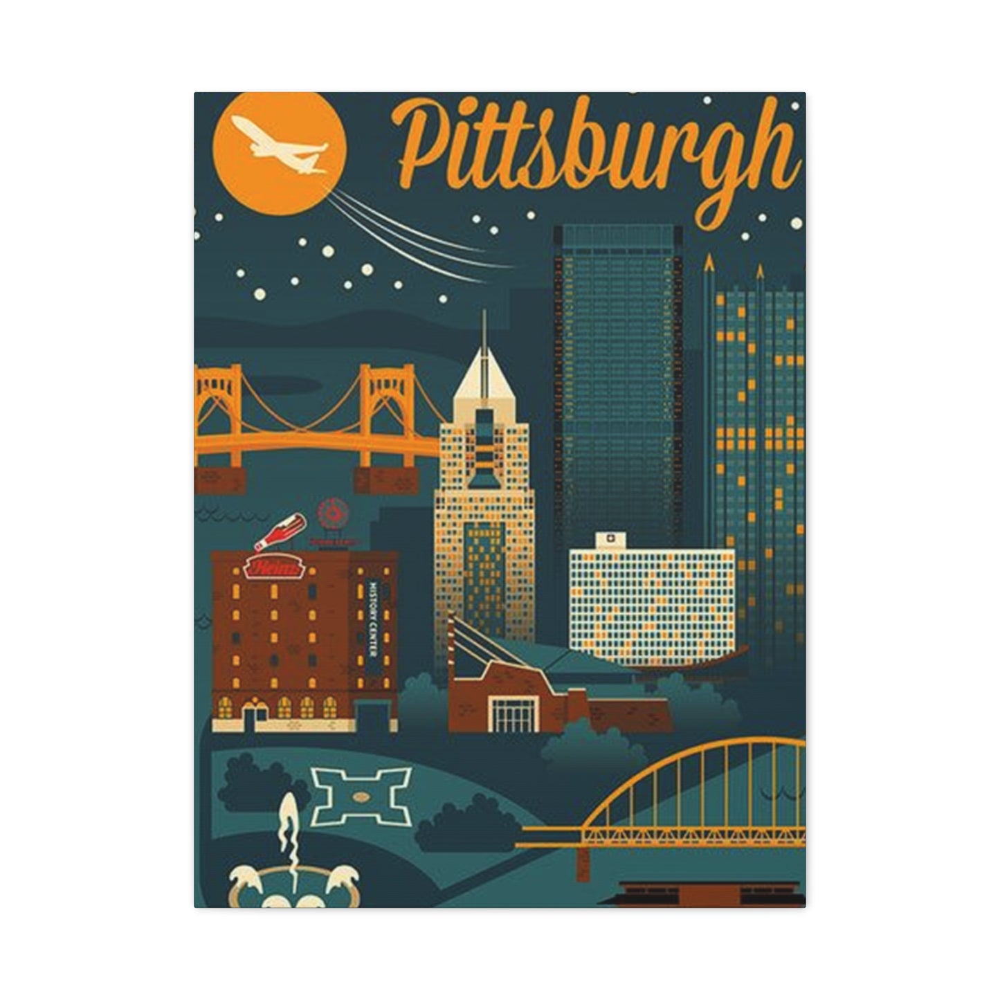
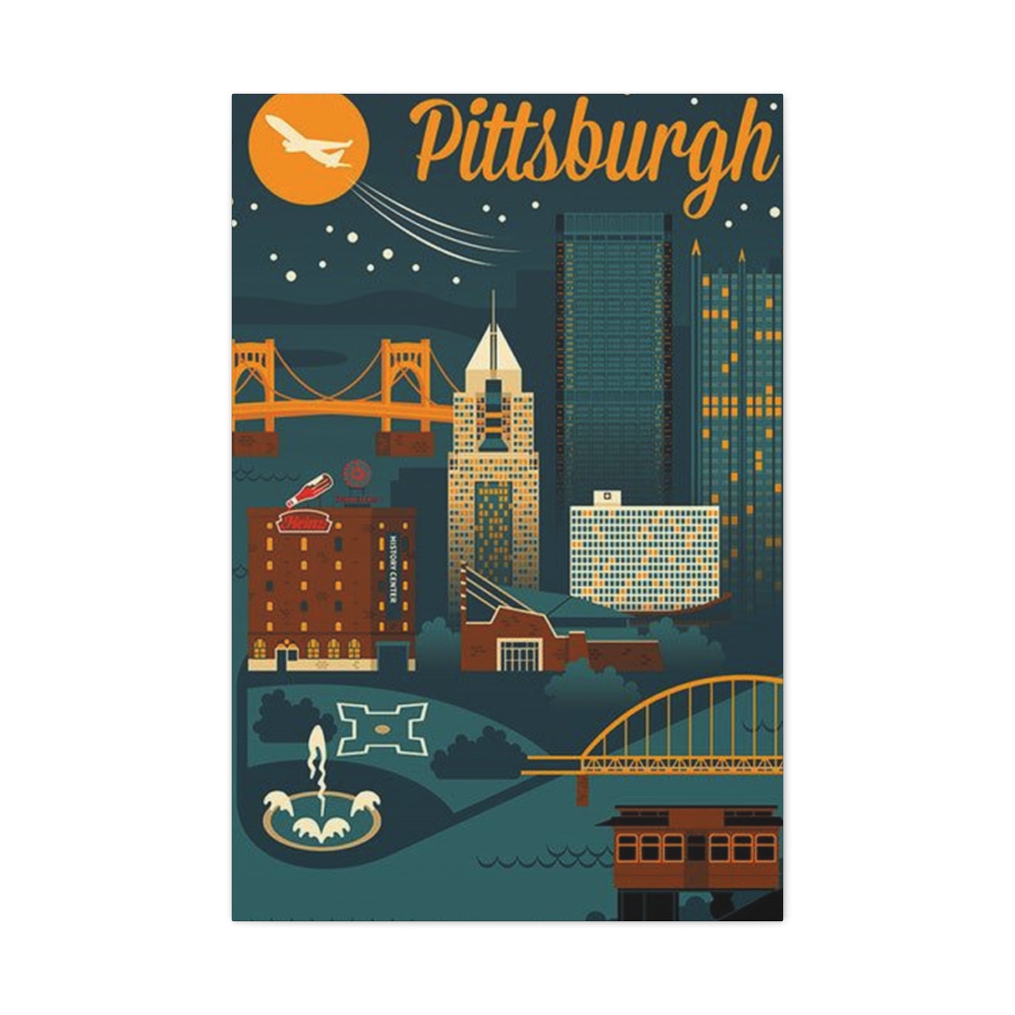
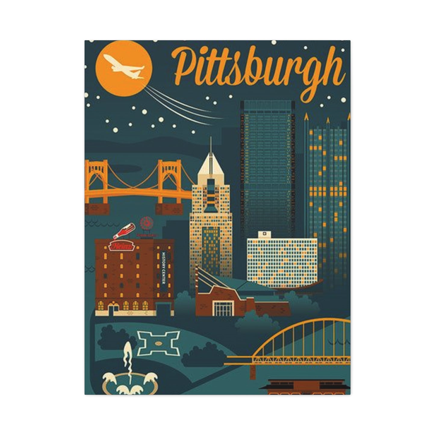
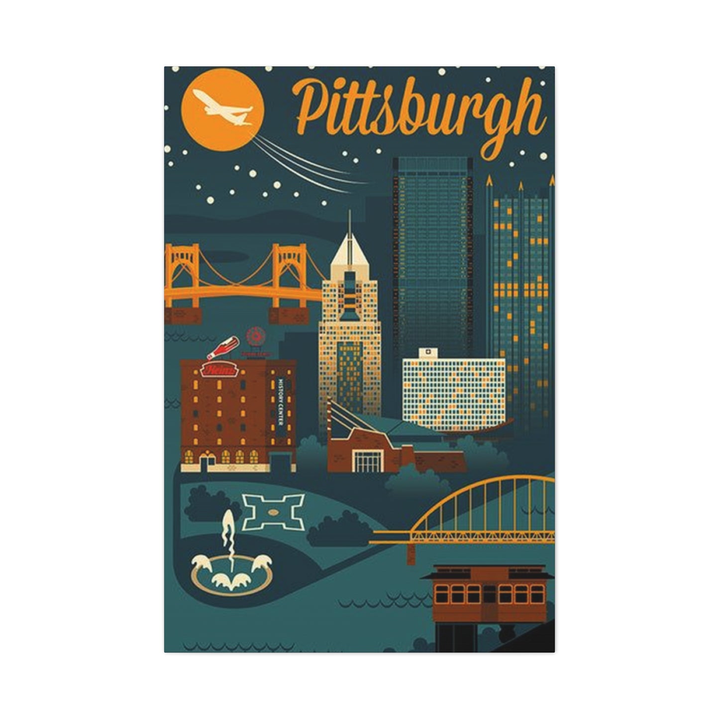
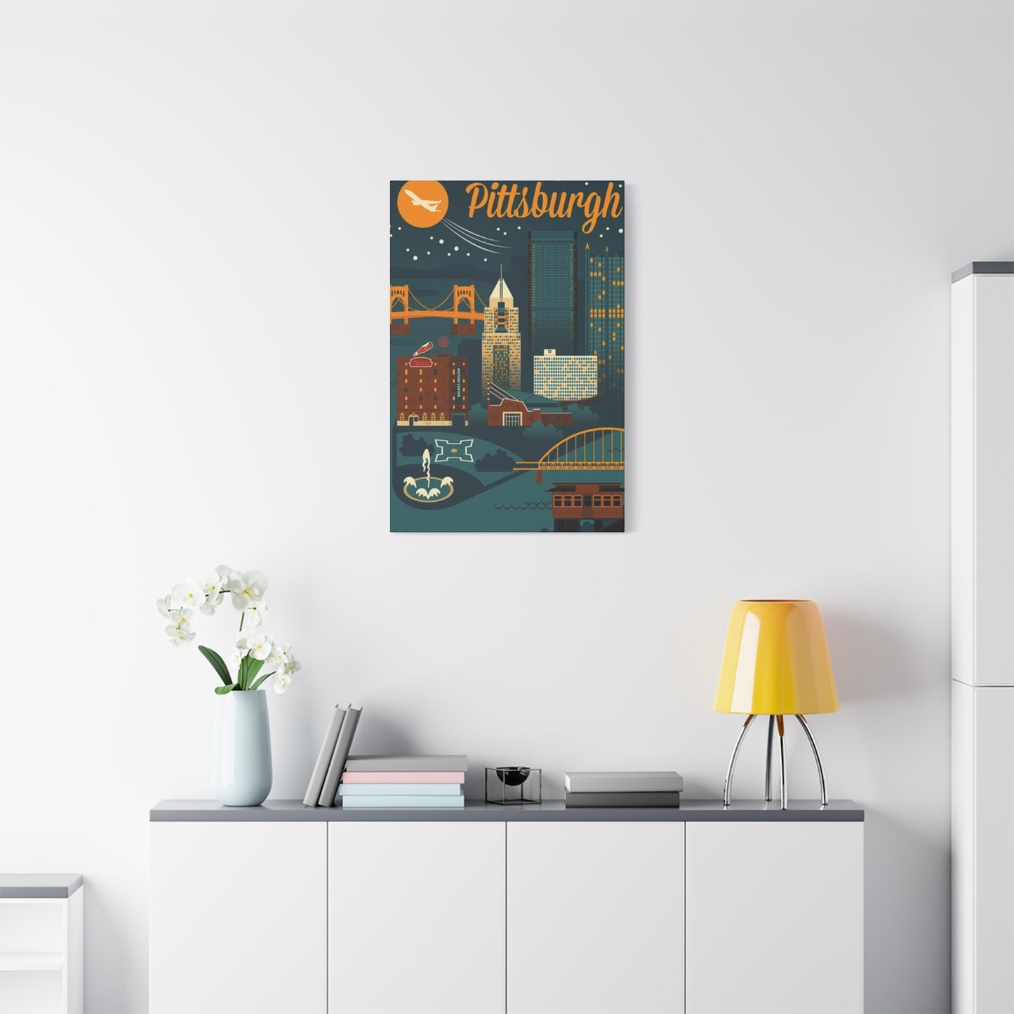
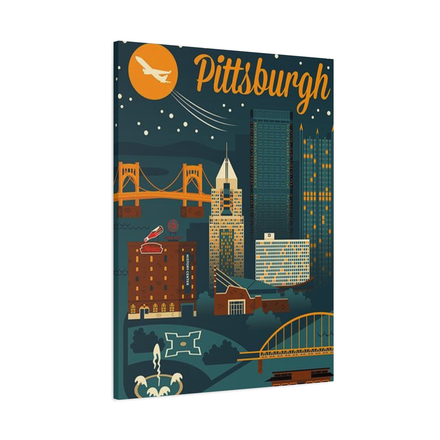
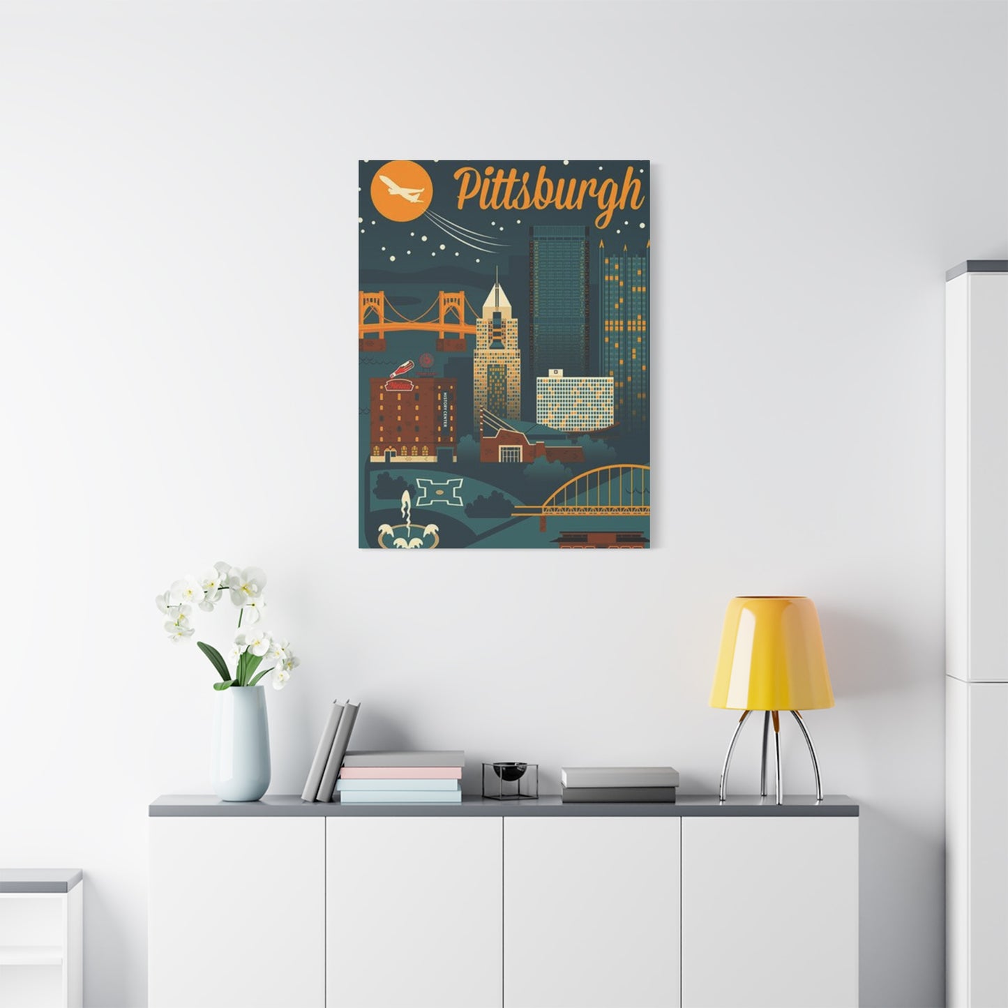
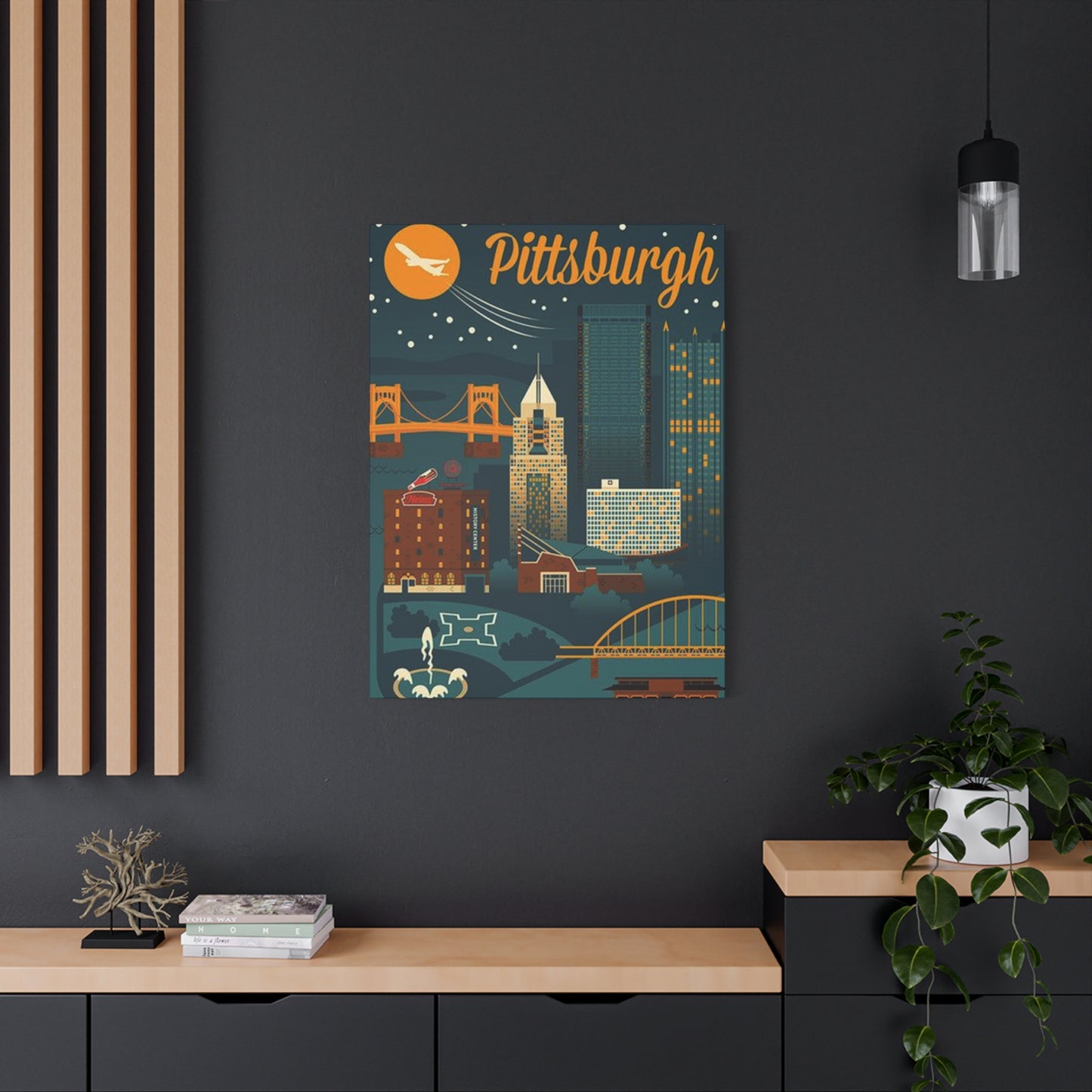
Pittsburgh’s skyline, with its soaring skyscrapers and unmistakable architectural silhouettes, offers a rich visual vocabulary to celebrate the city’s unique identity. Whether you call it the Steel City or simply love the urban pulse, incorporating Pittsburgh skyscraper wall art into your décor is a compelling way to bring a sense of place, history, and modern style into every room.
Throughout this exploration, it’s clear that the bold lines and dynamic forms of Pittsburgh’s tallest buildings—like the U.S. Steel Tower, PPG Place, and the BNY Mellon Center—can be transformed into captivating artworks that suit a variety of aesthetics. From minimalist black-and-white prints that highlight structural elegance to vibrant, colorful depictions that capture the city’s energy, these pieces allow you to express your connection to Pittsburgh with flair and sophistication.
One of the most exciting aspects of Pittsburgh skyscraper art is its adaptability. In a living room, a large-scale canvas or panoramic print becomes a dramatic focal point, anchoring the space with urban energy and visual interest. In a home office or study, a detailed architectural drawing or subtle monochrome photograph can inspire focus and a sense of ambition. Even in bedrooms or dining areas, these artworks add texture and character, blending the city’s history with your personal style.
The interplay of light, shadow, and form in skyscraper imagery also offers a unique way to influence mood. Sharp angles and steel surfaces evoke strength and resilience, qualities synonymous with Pittsburgh’s industrial heritage. Meanwhile, softer depictions of twilight cityscapes or reflections on river waters introduce calm and sophistication, making the artwork not just decorative but emotionally resonant.
Moreover, Pittsburgh skyscraper wall art is a celebration of community and pride. For locals, these pieces are daily reminders of home and heritage. For visitors or newcomers, they serve as invitations to explore the city’s rich culture and history. Displaying such art can spark conversations, sharing stories about Pittsburgh’s evolution from steel mills to a thriving hub of technology, education, and culture.
Artists and photographers capturing these skyscrapers contribute to a vibrant creative ecosystem, blending contemporary techniques with timeless subject matter. Their work offers endless possibilities—from abstract interpretations that focus on shapes and textures to realistic portrayals that showcase architectural details. This variety ensures that there’s a perfect piece for every taste and every room.
In conclusion, celebrating Steel City style through Pittsburgh skyscraper wall art is more than an aesthetic choice — it’s a statement of identity and connection. These artworks transform spaces, bringing the city’s dynamic spirit indoors and allowing you to live surrounded by the structures that define Pittsburgh’s skyline and soul.
