


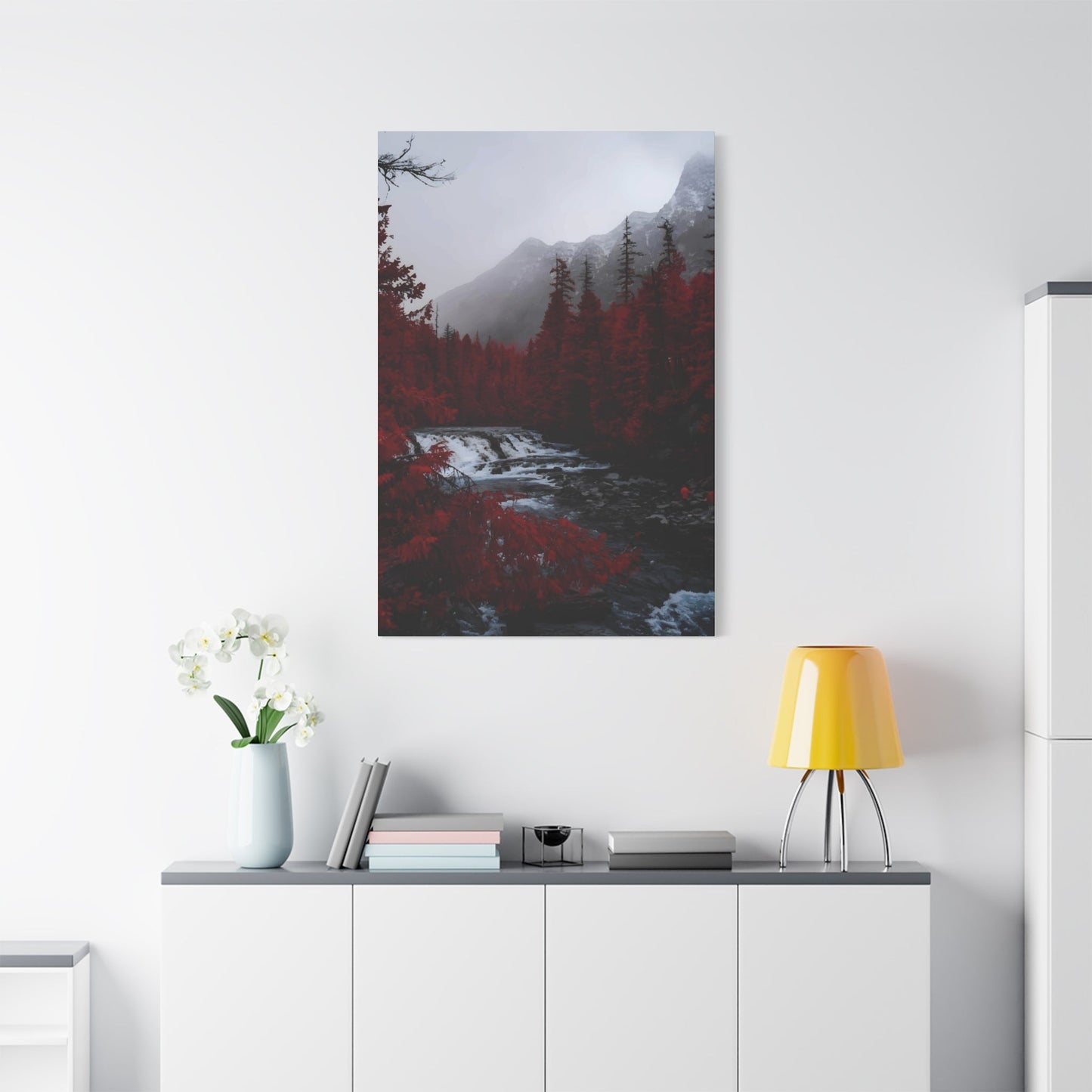
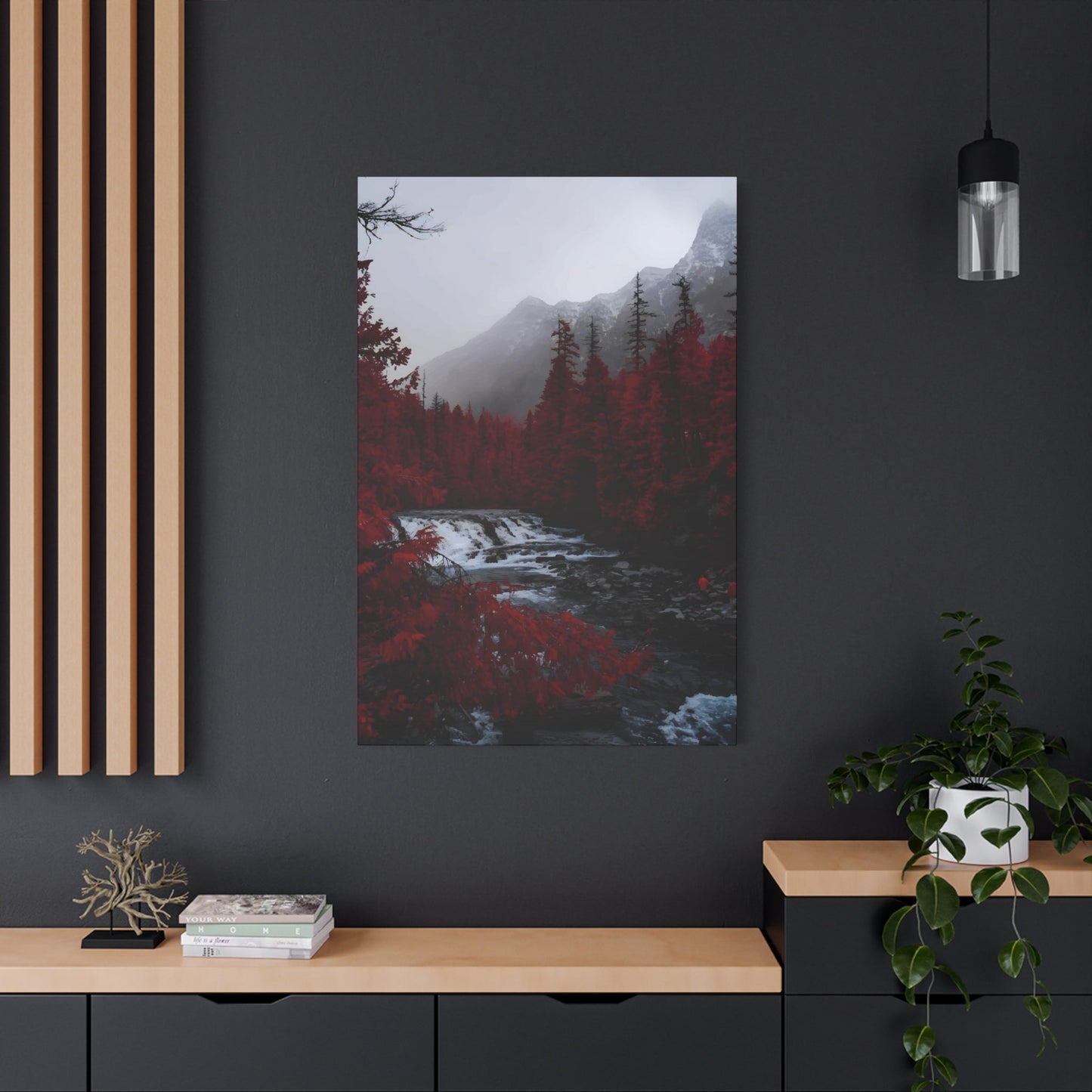
Mixing Red View Wall Art with Neutrals: A Guide to Balanced Interiors
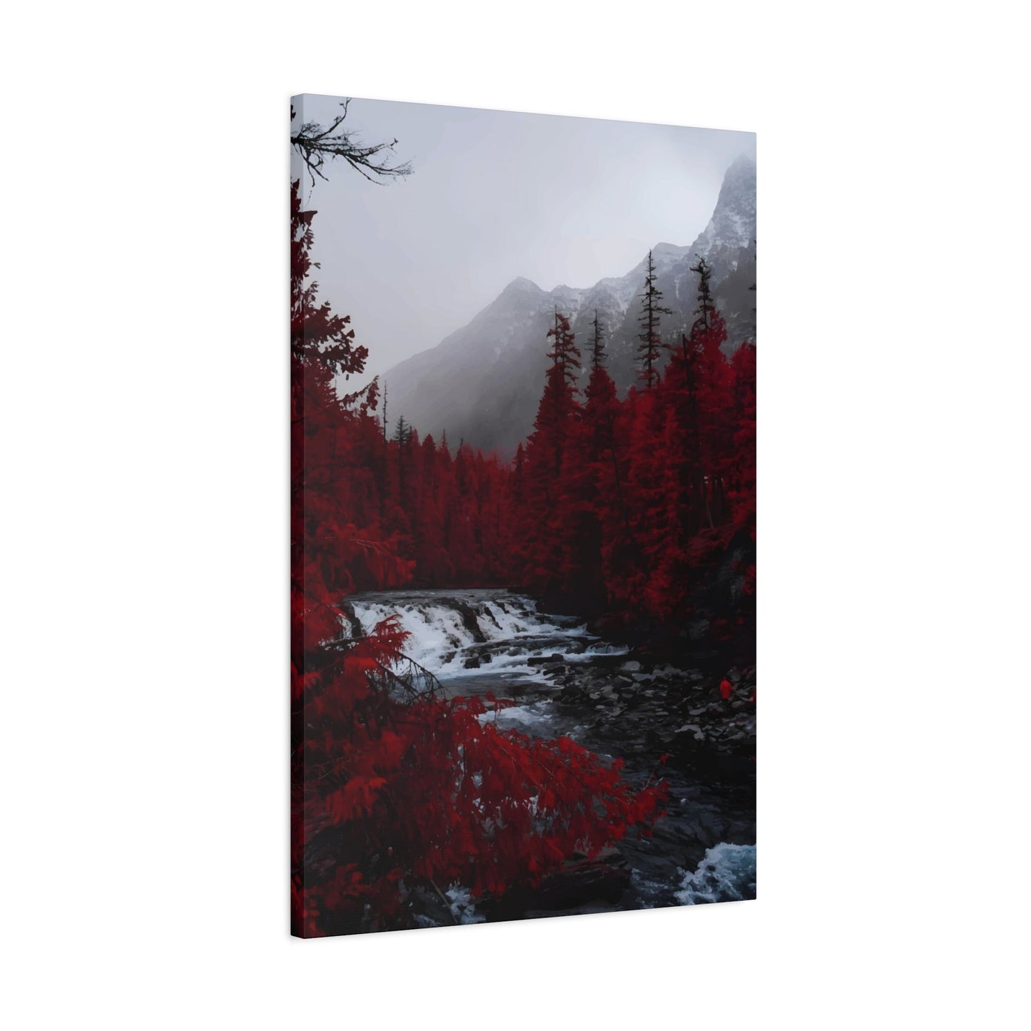
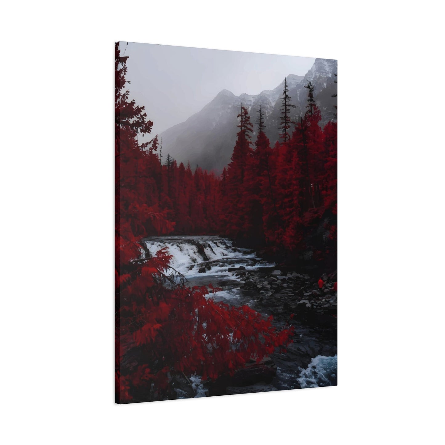
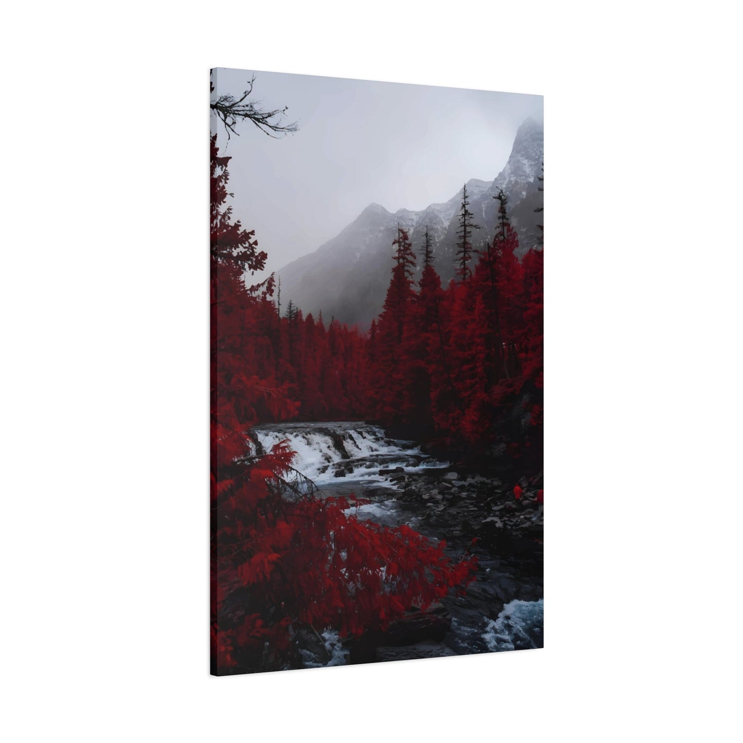
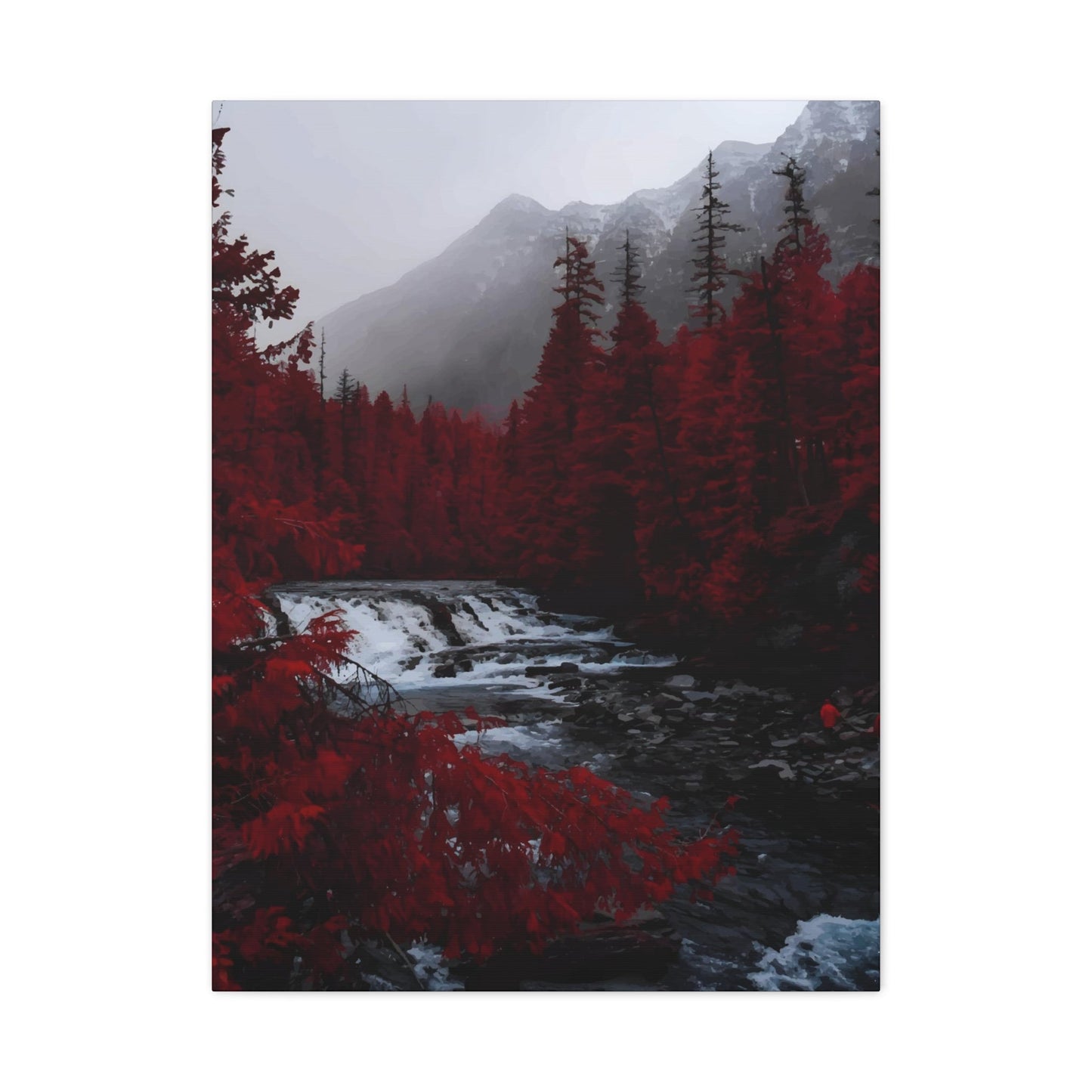
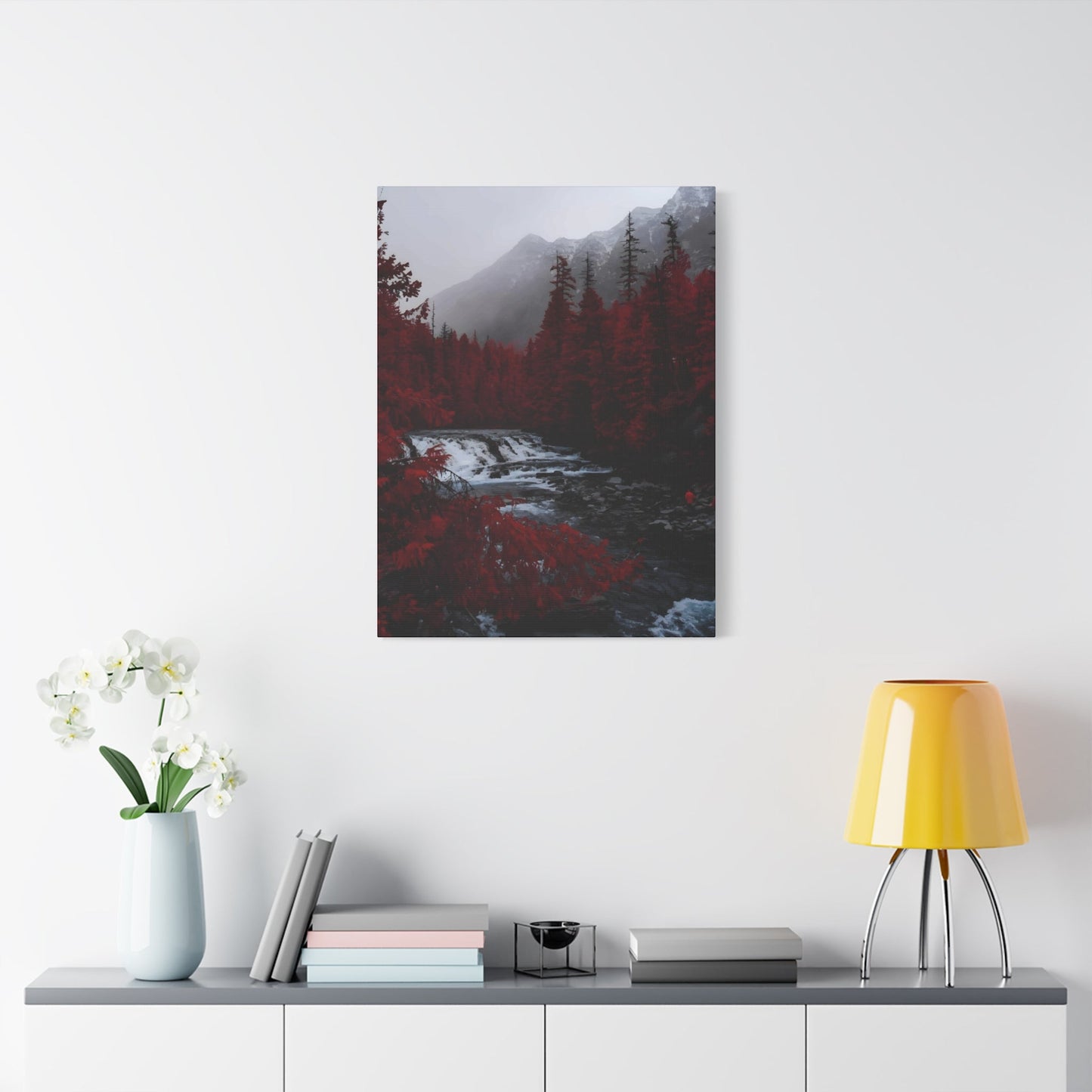
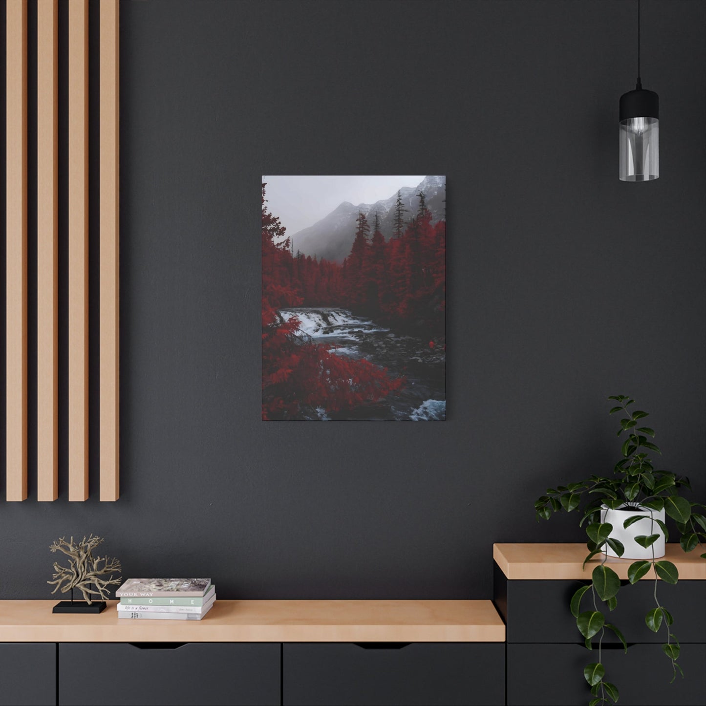
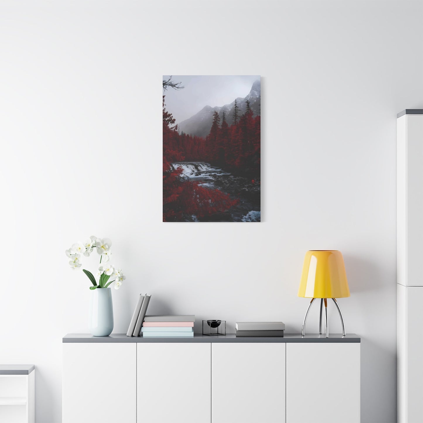
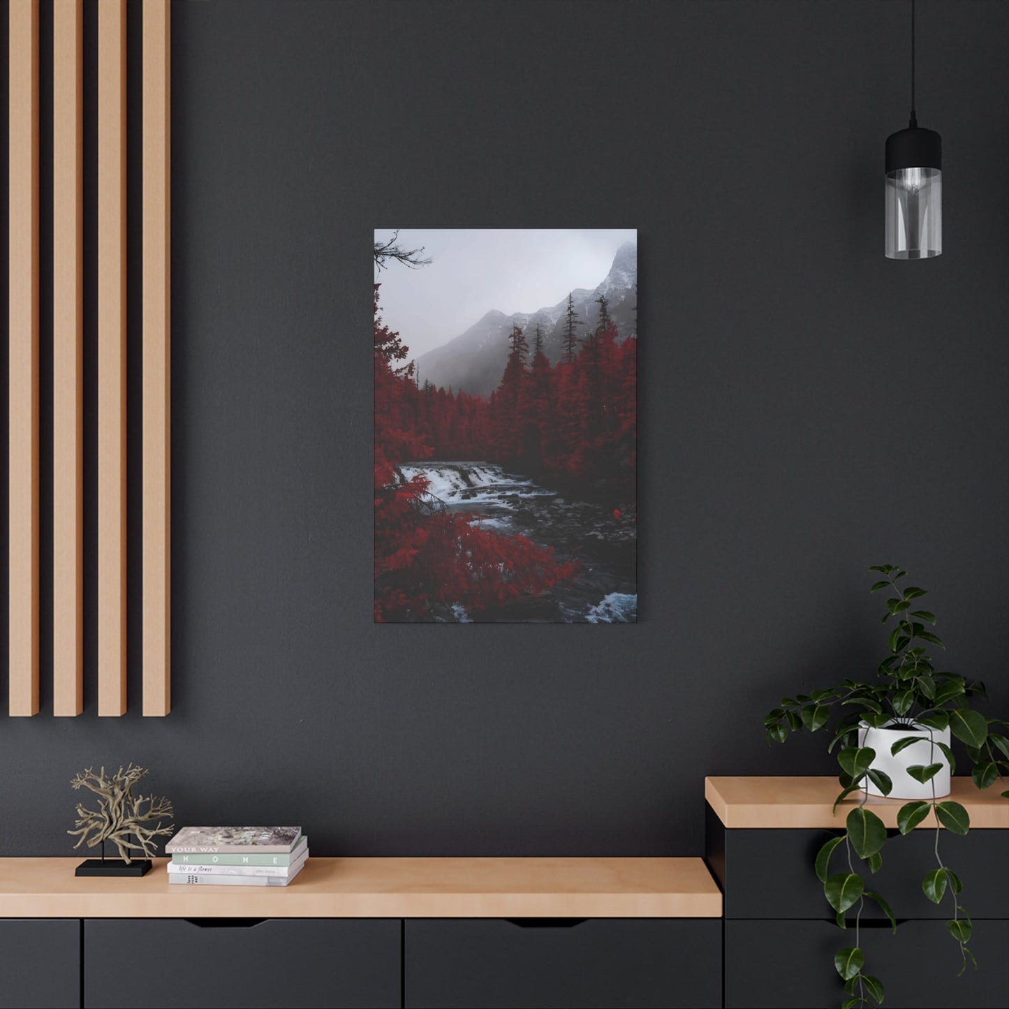
Red view wall art possesses an extraordinary ability to transform any environment into a dramatic and emotionally charged atmosphere. This powerful visual element serves as more than mere decoration; it becomes the heartbeat of a room, pulsing with energy and commanding attention from every angle. The magnetic pull of crimson landscapes, scarlet sunsets, and ruby-toned vistas creates an immediate emotional response that few other color palettes can achieve.
When examining the psychological impact of red-themed artwork, we discover its profound connection to human emotions and physiological responses. The color red stimulates the sympathetic nervous system, increasing heart rate and creating a sense of urgency and excitement. This biological reaction translates into artwork that doesn't simply hang on walls but actively participates in the emotional landscape of a home or office environment.
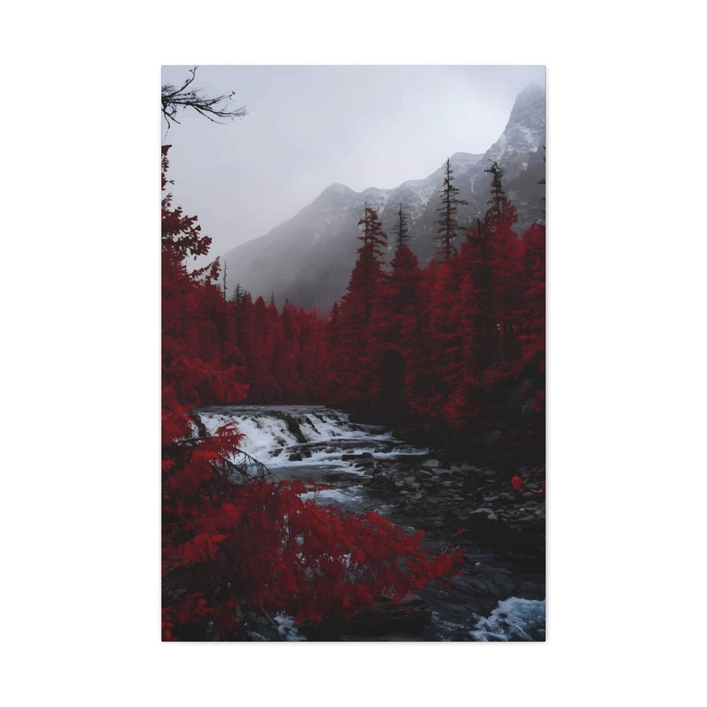
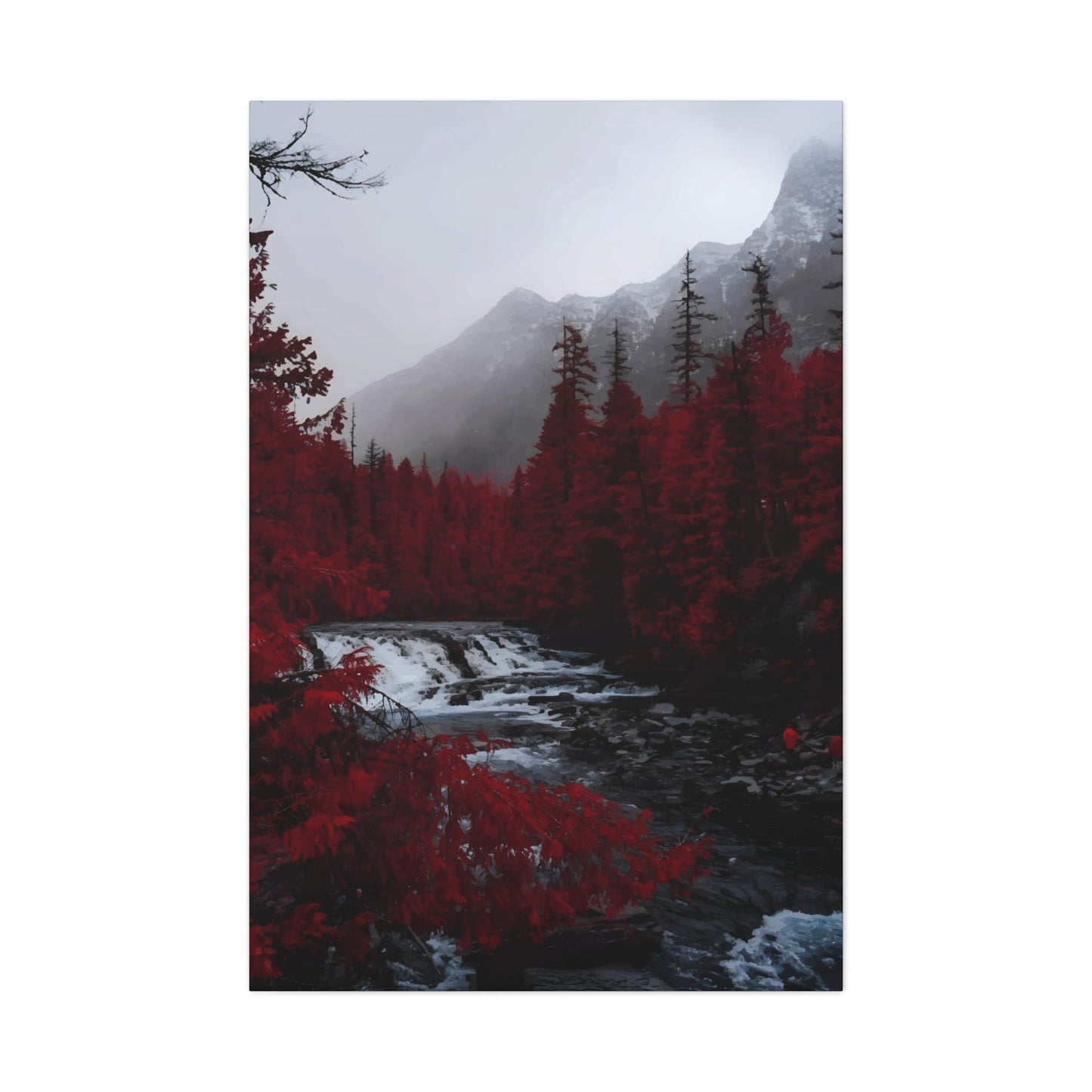
The drama inherent in red view wall art stems from its ability to evoke powerful memories and associations. Crimson sunsets over mountain ranges remind viewers of romantic evenings and adventurous travels. Cherry blossom trees in full bloom transport observers to moments of natural wonder and seasonal celebration. Abstract interpretations of red landscapes challenge perception and invite contemplation, creating conversation pieces that engage visitors and residents alike.
Contemporary artists have mastered the art of incorporating various red tones to create depth and complexity within their compositions. From deep burgundy shadows to bright coral highlights, the spectrum of red offers endless possibilities for artistic expression. These variations allow red view wall art to complement a wide range of decorating schemes while maintaining its distinctive character and visual impact.
The placement of red view wall art requires careful consideration of lighting conditions and surrounding elements. Natural light enhances the vibrancy of red tones throughout the day, creating dynamic changes in appearance as shadows shift and sunlight moves across the artwork. Evening illumination from artificial sources can transform the same piece into something entirely different, often deepening the reds and creating a more intimate, cozy atmosphere.
Professional artists who specialize in red-themed landscapes understand the technical challenges involved in working with such an intense color palette. Balancing warm and cool undertones within the red spectrum requires expertise and artistic intuition. The most successful pieces incorporate subtle variations that prevent the artwork from becoming overwhelming while maintaining the bold impact that makes red view wall art so desirable.
The versatility of red view wall art extends beyond traditional landscape representations. Modern interpretations might include abstract cityscapes painted in various shades of red, creating urban environments that feel both familiar and fantastical. These contemporary approaches allow homeowners to enjoy the emotional benefits of red artwork while embracing more modern aesthetic sensibilities.
Cultural significance plays an important role in the appreciation of red view wall art. Different societies associate red with various meanings, from prosperity and good fortune to passion and strength. This cultural richness adds layers of meaning to red-themed artwork, making it personally significant to viewers from diverse backgrounds while maintaining universal appeal through its inherent visual power.
The creation process for quality red view wall art involves multiple steps and careful attention to color theory. Artists must consider how different red pigments interact with one another and how they respond to various painting techniques. Oil paintings allow for rich, saturated reds with excellent longevity, while watercolor techniques can create ethereal, translucent effects that capture the fleeting beauty of red sunsets and autumn foliage.
Digital art has opened new possibilities for red view wall art creation and reproduction. High-quality printing techniques can now accurately reproduce the subtle variations in red tones that make original paintings so compelling. This technological advancement has made exceptional red view wall art more accessible to a broader audience while maintaining the visual impact that makes these pieces so desirable for home and office decoration.
Using Red Tones to Create Bold Wall Views
The strategic implementation of red tones in wall art requires understanding the complex relationship between different shades and their psychological effects on viewers. Master artists recognize that crimson, scarlet, burgundy, and coral each carry distinct emotional weights and visual properties that must be carefully balanced to achieve maximum impact without overwhelming the observer.
Professional color theory guides the creation of effective red-toned wall views through principles of harmony, contrast, and visual hierarchy. Warm reds like vermillion and cadmium create feelings of energy and excitement, while cooler reds such as alizarin crimson and burgundy evoke sophistication and depth. The skillful combination of these various red families within a single composition creates dynamic tension that keeps viewers engaged and emotionally invested in the artwork.
Temperature variations within the red spectrum allow artists to create dimensional effects that make two-dimensional artwork appear to have depth and movement. Warmer reds naturally advance toward the viewer, creating the illusion of proximity, while cooler reds recede into the background, establishing atmospheric perspective. This technique proves particularly effective in landscape compositions where artists want to suggest vast distances and multiple layers of terrain.
The saturation levels of red tones significantly impact the overall mood and energy of wall art pieces. Highly saturated reds create vibrant, attention-grabbing focal points that energize any room, while muted or grayed reds provide subtle sophistication that complements rather than dominates surrounding decor. Understanding when to employ intense versus subdued red tones requires artistic judgment and consideration of the intended viewing environment.
Complementary color relationships enhance the effectiveness of red-toned wall views through carefully orchestrated contrast. Green elements within red compositions create visual excitement through their opposing positions on the color wheel, while analogous colors like orange and purple create harmonious transitions that feel naturally comfortable to the eye. These color relationships prevent red artwork from becoming monotonous while maintaining cohesive visual unity.
Lighting considerations play a crucial role in the success of red-toned wall views. Natural daylight reveals the true character of red pigments, while incandescent lighting enhances warm undertones and creates cozy, intimate atmospheres. LED lighting systems offer the flexibility to adjust color temperature throughout the day, allowing red artwork to maintain optimal appearance under varying illumination conditions.
The application techniques used in creating red-toned wall views significantly influence the final aesthetic result. Smooth, blended applications create serene, contemplative moods suitable for relaxation areas, while bold, textured brushstrokes add energy and movement that work well in active gathering spaces. Mixed-media approaches combining various red materials and techniques can produce unique visual textures that add tactile interest to wall displays.
Proportion and scale considerations become especially important when working with bold red tones that naturally command attention. Large-scale red artwork can dominate smaller rooms, while appropriately sized pieces create balanced focal points that enhance rather than overwhelm living environments. The relationship between artwork dimensions and wall proportions requires careful calculation to achieve optimal visual harmony.
Contemporary artists experiment with unconventional red applications that challenge traditional expectations while maintaining the emotional impact associated with this powerful color family. Gradient techniques that transition from deep burgundy to bright coral create sunset-like effects that change appearance throughout the day. Layered transparent applications build complex color relationships that reward close examination while maintaining strong visual impact from a distance.
The durability and longevity of red pigments vary significantly depending on their chemical composition and application methods. Professional-grade materials ensure that red-toned wall views maintain their vibrancy and emotional impact for decades when properly cared for and appropriately displayed. Understanding pigment stability helps collectors and homeowners make informed decisions about artwork placement and maintenance requirements.
Regional and seasonal considerations influence the effectiveness of red-toned wall views in different geographic locations and climate conditions. Warm climates might benefit from cooler red tones that provide visual relief from intense heat, while cooler regions often welcome the warming effects of vibrant, saturated reds that counteract dreary weather conditions.
Cultural associations with specific red tones can enhance or complicate the reception of red-themed wall art in different social contexts. Understanding these cultural nuances allows artists and homeowners to select red tones that align with their intended emotional and aesthetic goals while avoiding unintended cultural conflicts or misunderstandings.
Popular Styles in Red-Themed Landscape Art
Traditional impressionist approaches to red-themed landscape art emphasize the fleeting effects of light and atmosphere, capturing moments when natural environments are bathed in warm, rosy illumination. These works often feature loose brushstrokes and visible texture that invite viewers to participate in the artistic process while experiencing the emotional warmth associated with golden hour lighting and seasonal color changes.
Realistic representational styles in red landscape art focus on accurate depiction of natural phenomena where red tones occur organically, such as autumn foliage, desert rock formations, and dramatic sunset skies. Artists working in this tradition must possess exceptional technical skills to convincingly render the complex relationships between red elements and their surrounding environments while maintaining believable spatial relationships and atmospheric effects.
Contemporary abstract interpretations of red landscapes liberate artists from literal representation, allowing pure color relationships and compositional elements to convey emotional and spiritual responses to natural environments. These works might suggest rather than depict specific locations, using red tones as expressive tools that communicate feelings and memories associated with particular places and experiences.
Minimalist approaches to red landscape art strip away extraneous details to focus attention on essential color relationships and compositional elements. These simplified compositions often achieve maximum emotional impact through careful selection of red tones and strategic placement within the overall design. The resulting artworks provide calm focal points that complement modern decorating sensibilities while maintaining the warming effects of red color palettes.
Mixed-media techniques combine traditional painting methods with collage elements, textural materials, and digital processes to create unique red landscape compositions that reflect contemporary artistic sensibilities. These hybrid approaches allow artists to incorporate found materials, photographic elements, and unconventional textures that add visual interest and conceptual depth to red-themed landscape works.
Photorealistic styles in red landscape art push technical boundaries to create paintings that rival photographic accuracy while maintaining the warmth and emotional resonance of hand-crafted artwork. Artists working in this demanding style must master advanced color mixing techniques and possess extraordinary observational skills to achieve convincing results with challenging red-dominated palettes.
Expressionist interpretations of red landscapes prioritize emotional content over accurate representation, using bold brushstrokes, exaggerated colors, and dynamic compositions to convey the artist's passionate response to natural environments. These energetic works often feature intense red applications that create powerful emotional connections with viewers who respond to the raw authenticity of expressive artistic approaches.
Surrealistic red landscape art combines realistic rendering techniques with impossible or dreamlike scenarios that challenge viewer expectations and invite contemplation. These imaginative works might feature red skies in unexpected contexts, crimson vegetation in fantastical arrangements, or landscape elements that defy natural laws while maintaining visual coherence and emotional resonance.
Neo-traditional styles blend classical landscape painting techniques with contemporary color sensibilities and subject matter choices, creating red-themed works that feel both timeless and current. Artists working in this mode often reference historical landscape masters while incorporating modern color relationships and compositional approaches that speak to contemporary audiences.
Digital art techniques enable artists to create red landscape compositions that would be impossible or impractical using traditional media. Digital tools allow for precise color control, unlimited revision possibilities, and the ability to combine photographic and painted elements seamlessly. These technological capabilities expand creative possibilities while maintaining the emotional impact associated with red landscape themes.
Plein air painting traditions emphasize direct observation and immediate response to natural environments, capturing the authentic effects of red lighting conditions as they occur in real outdoor settings. Artists working in this demanding approach must work quickly to capture changing light effects while managing the technical challenges of working with red pigments under varying outdoor conditions.
Folk art interpretations of red landscape themes often incorporate cultural symbols, simplified forms, and traditional color relationships that connect contemporary viewers with historical artistic traditions. These accessible works celebrate regional landscape features and seasonal celebrations while maintaining the warming effects that make red-themed artwork so appealing for home decoration.
Contemporary urban landscape interpretations adapt traditional red landscape themes to city environments, depicting urban sunsets, architectural elements bathed in red light, and metropolitan scenes that glow with warm artificial illumination. These modern adaptations make red landscape art relevant to urban dwellers while maintaining the emotional benefits associated with nature-themed artwork.
Botanical landscape focuses specifically on plant life rendered in various red tones, from autumn tree studies to exotic flowering specimens that naturally display red coloration. These specialized works appeal to nature lovers and gardening enthusiasts while providing the visual warmth and emotional comfort associated with red color palettes in home decoration applications.
Abstract vs Realistic Red View Prints
The fundamental distinction between abstract and realistic red view prints lies in their approach to representing natural phenomena and emotional experiences through artistic interpretation. Realistic prints strive for accurate depiction of observable red elements in natural environments, while abstract works use red tones as expressive tools freed from literal representation requirements, each offering unique advantages for different decorating goals and personal preferences.
Realistic red view prints excel in creating immediate connections between viewers and familiar natural experiences. These works might accurately depict a crimson sunset over mountain peaks, autumn trees in peak color, or desert landscapes bathed in warm evening light. The technical precision required for realistic rendering demands exceptional artistic skill and deep understanding of color relationships, light effects, and atmospheric perspective principles.
The appeal of realistic red prints stems from their ability to transport viewers to specific locations and moments in time. A expertly rendered painting of red rock formations in canyon country can evoke memories of personal travels or inspire dreams of future adventures. This literal connection to recognizable imagery provides comfort and familiarity that many homeowners find appealing for long-term display in living environments.
Technical challenges in realistic red view prints include accurately mixing red tones that match natural phenomena while maintaining color harmony throughout the composition. Artists must understand how red pigments behave under different lighting conditions and how they interact with surrounding colors to create convincing spatial relationships and atmospheric effects.
Abstract red view prints liberate artists and viewers from the constraints of literal representation, allowing pure color relationships and compositional elements to convey emotional and spiritual responses to landscape experiences. These works might suggest the feeling of standing in a red canyon rather than depicting specific geological features, creating universal connections that transcend individual experiences.
The interpretive nature of abstract red prints invites active viewer participation in creating meaning and emotional connections. Each observer brings personal experiences and associations to abstract works, potentially discovering new relationships and interpretations with repeated viewing. This dynamic quality makes abstract red prints excellent conversation pieces that remain engaging over time.
Contemporary abstract techniques in red view prints might incorporate gestural brushstrokes that suggest movement and energy, color field approaches that create meditative focal points, or geometric interpretations that impose structural order on natural chaos. Each approach offers different benefits for specific decorating applications and personal taste preferences.
The versatility of abstract red view prints makes them adaptable to a wider range of decorating schemes than their realistic counterparts. Abstract works can complement modern, traditional, or eclectic decor depending on their compositional approach and color relationships, while realistic prints might require more specific stylistic compatibility.
Hybrid approaches combine abstract and realistic elements within single compositions, creating red view prints that offer the best of both artistic traditions. These works might feature recognizable landscape elements rendered with abstract color relationships, or realistic backgrounds with abstract foreground elements that add contemporary visual interest.
The emotional impact of abstract versus realistic red view prints depends largely on viewer preferences and personal associations with different artistic approaches. Some individuals respond more strongly to literal representation that connects with specific memories and experiences, while others prefer the open-ended interpretive possibilities offered by abstract compositions.
Production considerations differ significantly between abstract and realistic red view prints. Realistic works require careful color matching and quality control to maintain accurate representation, while abstract pieces might allow more variation in printing processes without compromising artistic intent. These technical differences can affect both pricing and availability of different print options.
Framing and display requirements might vary between abstract and realistic red view prints depending on their compositional characteristics and intended visual impact. Realistic works often benefit from traditional framing approaches that enhance their representational qualities, while abstract pieces might work better with contemporary presentation methods that emphasize their modern aesthetic sensibilities.
The longevity and timelessness of abstract versus realistic red view prints depends on their artistic quality and relevance to changing decorating trends. High-quality works in both categories can remain visually compelling and emotionally resonant for decades, while lesser works might feel dated as artistic fashions evolve.
Market considerations reflect different audience preferences for abstract versus realistic red view prints, with realistic works often appealing to broader audiences who prefer familiar imagery, while abstract pieces might attract more sophisticated art collectors and design-conscious consumers who appreciate artistic innovation and interpretive possibilities.
How Red View Art Energizes Your Environment
The physiological and psychological effects of red view art create immediate and lasting changes in environmental energy levels through complex interactions between color perception and human neurological responses. Scientific research demonstrates that red wavelengths stimulate the sympathetic nervous system, increasing heart rate, blood pressure, and alertness levels while triggering evolutionary responses associated with fire, sunset, and other significant natural phenomena.
Circadian rhythm influences amplify the energizing effects of red view art throughout daily cycles, with red tones naturally complementing evening hours when warm artificial lighting enhances their appearance and creates cozy, intimate atmospheres. Morning light reveals different aspects of red artwork, often emphasizing cooler undertones that provide gentle energy boosts without overwhelming early-day sensibilities.
Seasonal affective responses to red view art become particularly pronounced during winter months when natural red light becomes scarce and artificial alternatives provide psychological comfort and energy supplementation. The warming visual effects of red artwork can counteract feelings of isolation and depression associated with shortened daylight hours and cold weather conditions.
Social dynamics within environments featuring red view art often shift toward increased conversation, activity, and emotional expression. The stimulating effects of red encourage more animated interactions and can make gathering areas feel more welcoming and energetically charged. This social activation makes red artwork particularly effective in dining areas, family rooms, and other social gathering locations.
Workplace applications of red view art must balance energizing effects with potential overstimulation that could negatively impact productivity and concentration. Strategic placement in meeting areas and break rooms can provide energy boosts without interfering with tasks requiring sustained attention and calm focus. The key lies in understanding when energy enhancement benefits outweigh potential concentration disruption.
Creative inspiration often increases in environments featuring thoughtfully selected red view art, as the stimulating properties of red tones can unlock artistic thinking and innovative problem-solving approaches. Writers, artists, and other creative professionals frequently report enhanced creative flow when working in environments that include appropriate red visual elements.
Exercise and physical activity areas benefit significantly from the motivating effects of red view art, as the color naturally encourages physical exertion and competitive behaviors. Fitness rooms, dance studios, and recreational areas often incorporate red elements to enhance motivation and energy levels during physical activities.
The energizing effects of red view art can be modulated through strategic combination with calming elements that prevent overstimulation while maintaining beneficial energy enhancement. Neutral backgrounds, natural materials, and soft lighting can temper intense red artwork effects while preserving their positive energizing qualities.
Personal energy levels and sensitivity to color stimulation vary significantly among individuals, requiring customized approaches to incorporating red view art in living and working environments. Some people thrive with bold, saturated red artwork that would overwhelm more sensitive individuals who prefer subtle, muted red tones that provide gentle energy enhancement.
Architectural considerations influence how red view art energizes different environments, with ceiling height, natural light exposure, and room proportions affecting the perceived intensity and impact of red artwork. High-ceilinged rooms can accommodate larger, more intense red pieces, while smaller, darker areas might benefit from smaller works or lighter red tones.
Cultural background and personal associations significantly impact individual responses to red view art energy effects, as different cultural traditions assign varying meanings and emotional values to red color symbolism. Understanding these cultural nuances helps ensure that red artwork choices align with intended energy enhancement goals.
Therapeutic applications of red view art in healthcare and wellness environments focus on its ability to stimulate circulation, enhance alertness, and provide psychological warmth in institutional settings that might otherwise feel cold and impersonal. Careful selection and placement ensure therapeutic benefits without causing anxiety or overstimulation in vulnerable populations.
Long-term exposure effects to red view art generally remain positive when appropriate pieces are selected and properly placed within living environments. The human visual system adapts to consistent color exposure while maintaining sensitivity to the energizing effects of red tones, allowing for sustained benefits without diminishing returns over time.
Technology integration with red view art, including programmable LED lighting systems and digital display capabilities, enables dynamic energy management that adjusts red intensity and tone throughout daily cycles. These advanced systems can optimize energizing effects while preventing overstimulation during rest periods or concentration-intensive activities.
Best Rooms for Hanging Red View Wall Art
Living rooms represent ideal environments for red view wall art due to their social function and flexible lighting conditions that can accommodate various red tones throughout different times of day. The central gathering role of living areas makes them perfect showcases for conversation-starting red artwork that energizes family interactions while creating warm, welcoming atmospheres for guests and residents alike.
Dining rooms naturally complement red view art through their association with food, warmth, and social gathering rituals that align perfectly with the stimulating and appetizing effects of red color palettes. The intimate lighting typical of dining environments enhances red tones during evening meals while creating sophisticated ambiances that encourage leisurely conversation and memorable dining experiences.
Kitchen applications of red view art require careful consideration of humidity, heat, and cleaning requirements, but appropriately selected pieces can transform utilitarian cooking areas into inspiring culinary environments. Red artwork in kitchens should be protected from grease and moisture while positioned to energize meal preparation activities without interfering with food safety and cleanliness requirements.
Bedroom placement of red view art involves balancing energizing effects with sleep quality considerations, as excessive red stimulation might interfere with relaxation and rest. Muted red tones or strategic placement away from direct bedside viewing can provide warmth and romance without disrupting healthy sleep patterns, making red artwork suitable for master bedroom environments with careful selection.
Home office environments can benefit from the motivating and attention-focusing effects of red view art when pieces are selected and positioned to enhance productivity without causing distraction or overstimulation. Red artwork positioned to be visible during breaks but not directly in the primary work field of view can provide energy boosts without interfering with concentration-intensive tasks.
Entryways and foyers provide excellent opportunities for red view art to create memorable first impressions and establish the emotional tone for entire homes. Red artwork in entry areas welcomes visitors with warmth and energy while providing daily inspiration for residents as they begin and end their daily journeys outside the home environment.
Exercise rooms and fitness areas naturally align with the energizing and motivating properties of red view art, creating environments that encourage physical activity and goal achievement. The stimulating effects of red can enhance workout motivation and energy levels while creating visually exciting environments that make exercise more enjoyable and sustainable.
Bathroom applications of red view art must address humidity and moisture concerns while taking advantage of opportunities to create spa-like environments that enhance daily grooming and self-care rituals. Properly protected red artwork can transform utilitarian bathrooms into luxurious personal retreat areas that begin and end each day with positive energy.
Family room and recreation area placements of red view art support active family interactions, game playing, and entertainment activities that benefit from increased energy levels and social stimulation. Red artwork in these environments can create exciting backdrops for family gatherings while maintaining comfortable atmospheres for relaxation and leisure activities.
Stairway and hallway applications use red view art to energize transitional areas that might otherwise feel neglected or purely functional. Red artwork in circulation areas provides visual interest and emotional warmth while guiding movement through homes in positive, uplifting ways that enhance daily living experiences.
Guest room considerations for red view art focus on creating welcoming environments that provide comfort and energy for visitors while reflecting host hospitality and good taste. Carefully selected red artwork can make guest areas feel special and memorable without overwhelming visitors who might have different color preferences or sensitivities.
Basement and lower-level applications of red view art can counteract the naturally cool, potentially dreary characteristics of below-grade areas by providing visual warmth and energy that transforms underutilized areas into comfortable, inviting gathering areas for family activities and entertainment.
Seasonal room usage patterns influence the effectiveness of red view art placement, with some areas benefiting from red artwork during specific seasons when natural light conditions and activities align optimally with red color stimulation effects. Understanding these seasonal patterns helps optimize artwork placement decisions for maximum year-round benefit and enjoyment.
Multi-functional room applications require red view art selections that support various activities and mood requirements within single environments, necessitating careful consideration of red tone intensity, size, and placement to ensure compatibility with diverse functional requirements throughout different times of day and different types of activities.
Framing Tips for Red View Canvas Prints
Professional framing approaches for red view canvas prints require understanding how different frame materials, colors, and styles interact with red tones to enhance rather than compete with the artwork's visual impact and emotional resonance. The frame serves as a crucial transition between the artwork and its surrounding environment, influencing how viewers perceive and respond to red color relationships within the composition.
Material selection for red view print frames involves considering how different substances reflect light and complement red color temperatures. Natural wood frames often enhance warm red tones through their organic warmth, while metal frames might provide contemporary contrast that makes red colors appear more vibrant through visual opposition. The choice between materials should align with both the artwork's style and the intended decorating environment.
Color relationships between frame finishes and red artwork require careful consideration of complementary and analogous color principles. Neutral frame colors like black, white, and natural wood allow red artwork to dominate visually, while colored frames might create harmonious or contrasting relationships that either support or challenge the red color scheme depending on specific color choices and intensity levels.
Matting considerations for red view prints involve selecting colors and proportions that enhance the artwork without overwhelming its visual impact. White and cream mats provide neutral backgrounds that make red colors appear more vibrant, while colored mats might create sophisticated color relationships that add complexity to the overall presentation. Mat width proportions should balance with artwork size and frame dimensions for optimal visual harmony.
Glass and glazing options protect red view prints while influencing their appearance under different lighting conditions. Standard glass provides basic protection with minimal color distortion, while museum-quality glazing offers superior protection with reduced reflection and UV filtering that helps preserve red pigments over time. Anti-reflective coatings prevent glare while maintaining color accuracy in various lighting situations.
Scale and proportion relationships between frames and red artwork require mathematical precision to achieve visually pleasing results. Frame width should generally relate proportionally to artwork dimensions, with larger pieces typically requiring wider frames and smaller works benefiting from more delicate framing treatments. These proportional relationships affect how red artwork integrates with surrounding wall areas and furniture arrangements.
Contemporary framing trends for red view prints might include floating mount presentations that create subtle shadow effects, minimalist frames that emphasize the artwork over framing elements, or mixed-media approaches that incorporate multiple materials and textures. These modern techniques can enhance the contemporary appeal of red artwork while maintaining its traditional emotional warmth.
Conservation framing techniques ensure long-term preservation of red view prints through acid-free materials, appropriate spacing between artwork and glazing, and archival mounting methods that prevent deterioration over time. Investment in conservation framing protects valuable artwork while maintaining its appearance and value for future generations.
Lighting integration with framed red view prints involves considering how different illumination types affect red color perception and frame material appearance. Picture lighting, track systems, and integrated LED solutions can enhance red artwork presentation while protecting it from harmful UV exposure that might cause fading or color shifts over extended periods.
Budget considerations for framing red view prints range from economical ready-made options to custom professional framing services that provide optimal presentation and protection. Understanding the relationship between framing investment and long-term artwork preservation helps make informed decisions that balance immediate budget constraints with long-term value protection.
Installation requirements for framed red view prints include proper wall anchor selection, level placement, and secure mounting that ensures safety and optimal viewing angles. Heavy frames might require specialized hardware and professional installation to prevent accidents while ensuring that red artwork displays at appropriate heights and angles for maximum visual impact.
Maintenance and cleaning protocols for framed red view prints help preserve both artwork and framing elements through appropriate cleaning methods and regular inspection routines. Different frame materials require specific care approaches, while glazing surfaces need careful cleaning to maintain clarity and prevent damage to underlying artwork.
Custom framing options allow for personalized solutions that address specific requirements for red view prints, including unusual sizes, special mounting needs, or unique aesthetic preferences. Professional framers can create custom solutions that optimize the presentation of red artwork while addressing particular environmental or decorative requirements.
Multiple print displays might involve consistent framing approaches that create unified gallery wall presentations, or varied framing techniques that add visual interest while maintaining overall harmony. Understanding how different frames interact when displayed together helps create sophisticated red artwork installations that enhance rather than compete with individual pieces.
Combining Red View Art with Neutral Decor
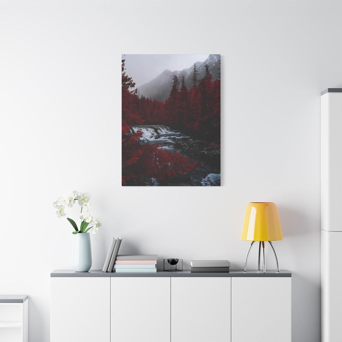
The strategic integration of red view art within neutral decorating schemes creates dynamic visual tension that prevents beige, white, and gray environments from appearing bland while maintaining sophisticated, timeless aesthetic appeal. Neutral backgrounds provide ideal showcases for red artwork by eliminating competing colors that might diminish the impact of crimson, scarlet, and burgundy tones within the composition.
Color temperature considerations become crucial when combining red view art with neutral decor, as warm neutrals like cream and beige naturally complement red tones while cool neutrals like gray and white create striking contrast that makes red colors appear more vibrant and attention-grabbing. Understanding these temperature relationships helps create cohesive design schemes that feel intentionally coordinated rather than accidentally assembled.
Texture variation within neutral environments helps prevent monotony while providing sophisticated backdrops for red view art that add visual interest without competing for attention. Natural materials like wool, linen, wood, and stone introduce organic textures that complement the warmth of red artwork while maintaining the calming effects that make neutral decorating schemes so enduringly popular.
Scale and proportion relationships between red artwork and neutral furniture require careful consideration to achieve balanced compositions that feel neither overwhelming nor insignificant within the overall design scheme. Large red pieces can serve as dramatic focal points against neutral backgrounds, while smaller works might be grouped to create gallery wall presentations that add visual interest without dominating neutral environments.
Lighting design becomes especially important when combining red view art with neutral decor, as appropriate illumination can enhance both the warmth of red tones and the sophistication of neutral color schemes. Layered lighting approaches using ambient, task, and accent illumination create flexible environments that can emphasize red artwork during social occasions while maintaining comfortable everyday functionality.
Metallic accent integration provides opportunities to bridge the gap between bold red artwork and neutral base colors through carefully selected gold, silver, copper, or bronze elements that complement red tones while adding glamour to otherwise understated neutral schemes. These metallic touches can appear in frames, hardware, lighting fixtures, or decorative accessories that support the overall design narrative.
Pattern introduction within neutral environments requires restraint to avoid overwhelming red view art while adding sufficient visual interest to prevent blandness. Subtle geometric patterns, organic textures, or traditional motifs in neutral colorways can provide background complexity that makes red artwork appear more integrated rather than simply applied to neutral backgrounds.
Seasonal adaptation strategies allow neutral environments featuring red view art to evolve throughout the year without requiring major decorating changes. Swapping textiles, adding seasonal plants, or adjusting lighting can emphasize different aspects of red artwork while maintaining the flexibility that makes neutral base schemes so practical for long-term decorating applications.
Furniture selection for neutral rooms featuring red view art should consider how different neutral tones and materials interact with red colors to create harmonious relationships. Natural wood finishes often complement red artwork warmth, while painted neutral furniture provides cleaner backgrounds that make red colors appear more vibrant and contemporary.
Architectural element treatment in neutral rooms can enhance red view art presentation through careful paint selection, trim finishing, and structural emphasis that creates sophisticated backdrops without competing for visual attention. Crown molding, wainscoting, and other architectural details in appropriate neutral tones can frame and enhance red artwork placement.
Accessory selection for neutral rooms with red view art requires discipline to maintain the sophisticated restraint that makes neutral schemes successful while providing sufficient personality and warmth to prevent sterile appearances. Carefully chosen accessories in neutral tones with subtle red accents can reinforce artwork themes without creating visual chaos.
Plant integration adds life and natural beauty to neutral environments while providing green elements that create pleasing color relationships with red view art through complementary color principles. Living plants also introduce organic shapes and textures that soften the potentially stark effects of extensive neutral color usage.
Window treatment considerations affect how red view art appears throughout daily light cycles while supporting the overall neutral decorating scheme. Natural fiber window treatments in neutral tones can filter light beautifully while maintaining the sophisticated aesthetic that makes neutral decorating schemes timeless and versatile.
Long-term flexibility represents one of the primary advantages of combining red view art with neutral decor, as neutral base schemes can accommodate changing artwork preferences and evolving personal tastes without requiring complete redecorating projects. This adaptability makes neutral environments with red accent art practical choices for homeowners who anticipate changing circumstances or preferences.
Red View Art in Modern and Contemporary Homes
Contemporary architectural environments provide ideal backdrops for red view art through their emphasis on clean lines, open floor plans, and sophisticated material palettes that complement rather than compete with bold artwork statements. Modern homes typically feature neutral color schemes and minimalist aesthetics that allow red artwork to serve as dramatic focal points within carefully curated living environments.
Open floor plan considerations require strategic red view art placement that creates visual anchors within flowing areas without disrupting sight lines or impeding traffic patterns. Large-scale red pieces can define different functional zones within open concepts while maintaining the spatial continuity that makes contemporary floor plans so appealing for modern lifestyle requirements.
Material compatibility between red view art and contemporary finishes like concrete, steel, glass, and engineered materials creates sophisticated contrasts that enhance both architectural elements and artistic components. The juxtaposition of warm red tones against cool contemporary materials adds emotional warmth to potentially austere modern environments while maintaining their cutting-edge aesthetic appeal.
Technology integration possibilities in contemporary homes allow for dynamic red view art presentations through digital displays, programmable lighting systems, and automated environmental controls that can adjust artwork presentation throughout daily cycles. These technological capabilities enable red artwork to respond to changing light conditions and functional requirements while maintaining optimal visual impact.
Minimalist philosophy alignment with red view art requires careful selection of pieces that provide maximum emotional impact through refined artistic execution rather than decorative complexity. Contemporary homes benefit from red artwork that demonstrates sophisticated color relationships and compositional excellence while avoiding ornamental excess that might conflict with minimalist design principles.
Furniture scale relationships in contemporary environments often feature oversized seating and architectural elements that require proportionally significant red view art to maintain visual balance within large, open rooms. Contemporary furniture proportions influence artwork sizing decisions and placement strategies that ensure red pieces integrate successfully with modern lifestyle requirements.
Color palette coordination in contemporary homes typically emphasizes monochromatic or limited color schemes that make red view art stand out dramatically while requiring careful consideration of undertones and color temperatures to maintain sophisticated visual harmony. The restricted color palettes common in contemporary decorating make red artwork selection especially critical for overall aesthetic success.
Natural light optimization in contemporary homes through extensive glazing and skylights affects how red view art appears throughout daily cycles, often requiring pieces that maintain visual interest under varying illumination conditions. The abundant natural light typical in contemporary architecture can enhance red artwork vibrancy while requiring consideration of potential UV damage and color shifting over time.
Architectural feature integration allows red view art to complement contemporary elements like accent walls, geometric ceiling treatments, and structural elements that can frame and enhance artwork presentation. Modern architectural details provide opportunities to create sophisticated display environments that elevate red artwork while reinforcing contemporary design themes.
Gallery wall concepts adapted for contemporary environments might feature multiple red view pieces arranged in systematic grids or asymmetrical compositions that reflect modern aesthetic sensibilities while maintaining the emotional impact associated with red color schemes. Contemporary gallery wall approaches can create impressive focal points within modern living areas.
Indoor-outdoor living integration common in contemporary homes requires red view art selections that can transition visually between interior and exterior environments while maintaining their impact in both natural and artificial lighting conditions. The blurred boundaries between indoor and outdoor areas in contemporary design influence red artwork placement and selection strategies.
Smart home system integration enables sophisticated environmental control that can optimize red view art presentation through automated lighting adjustments, climate control settings, and security monitoring that protects valuable artwork while maintaining convenient access and optimal viewing conditions throughout changing daily requirements.
Sustainable design considerations in contemporary homes align well with red view art that demonstrates environmental responsibility through sustainable materials, local sourcing, and longevity characteristics that support green building philosophies. Contemporary homeowners often prioritize artwork that reflects their environmental values while providing lasting beauty and emotional satisfaction.
Investment value perspectives on red view art in contemporary homes consider both aesthetic appreciation and potential financial returns from carefully selected pieces that demonstrate artistic merit and market appeal. Contemporary art markets often favor red-themed works that demonstrate innovation and artistic excellence while maintaining broad appeal for diverse collector preferences and decorating applications.
Final Thoughts
Incorporating red view wall art into neutral interiors is a dynamic design choice that breathes life and energy into any space without overwhelming it. As we wrap up this guide, it’s evident that balancing bold reds with calming neutrals creates an engaging harmony that transforms rooms into vibrant yet serene environments.
Red is a powerful color—evoking passion, warmth, and intensity. When used thoughtfully, red view wall art becomes a captivating focal point that commands attention while energizing the atmosphere. The key to successful integration lies in pairing these vivid hues with a foundation of soft, neutral tones like beige, gray, taupe, or white. This balance prevents the red from overpowering the space, instead allowing it to shine with sophistication and impact.
Neutral interiors, known for their understated elegance and timeless appeal, provide the perfect backdrop for red artwork. Their muted palettes act as a canvas that showcases the rich reds in the art, making each detail pop. This contrast not only highlights the artwork but also adds depth and dimension to the room, preventing the design from feeling flat or monotonous.
One of the benefits of mixing red view wall art with neutrals is the versatility it offers. Whether your style leans toward modern minimalism, classic chic, or eclectic warmth, this combination adapts effortlessly. For instance, a bold red cityscape or abstract piece can invigorate a sleek, minimalist living room, while a softer, muted red floral print might bring subtle charm to a cozy, neutral-toned bedroom.
