


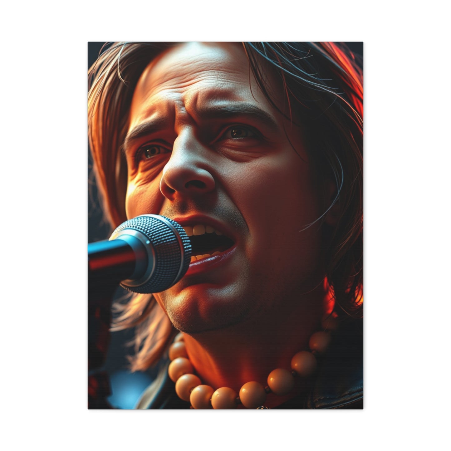
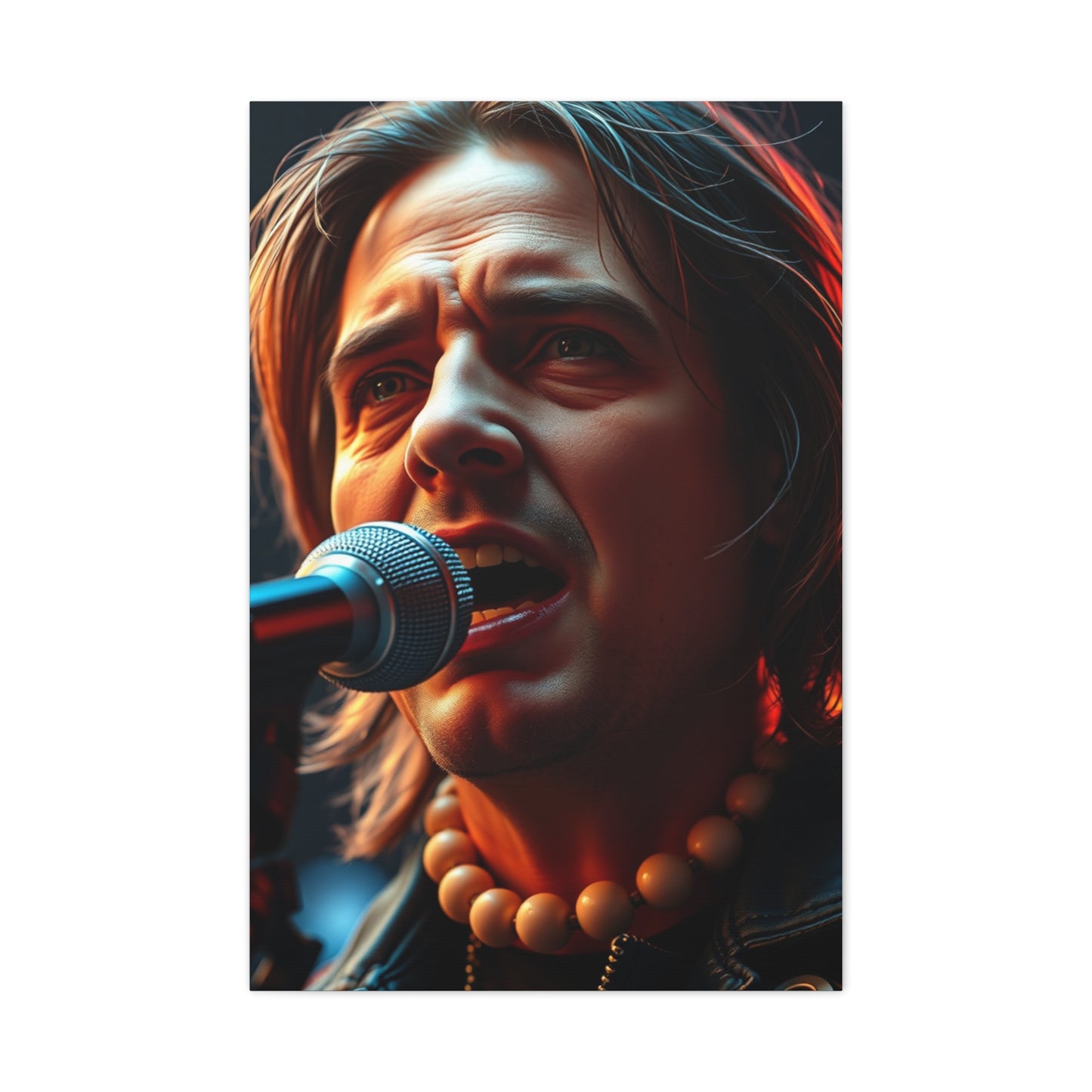


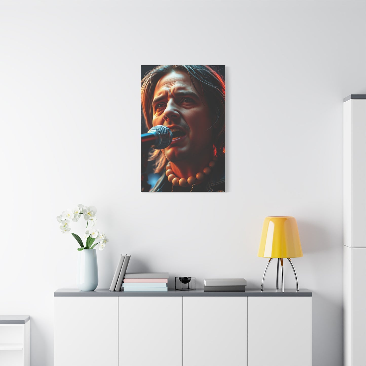

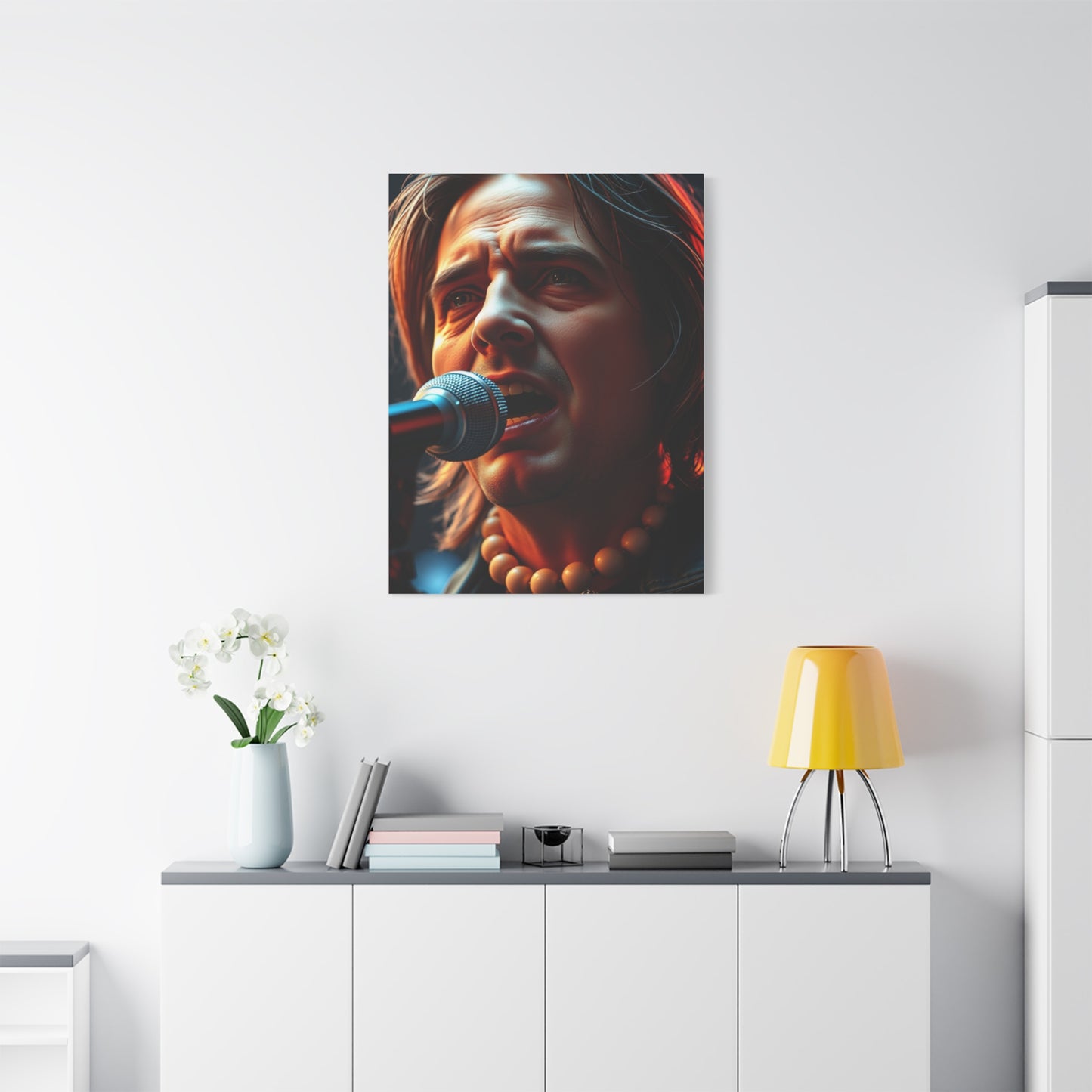
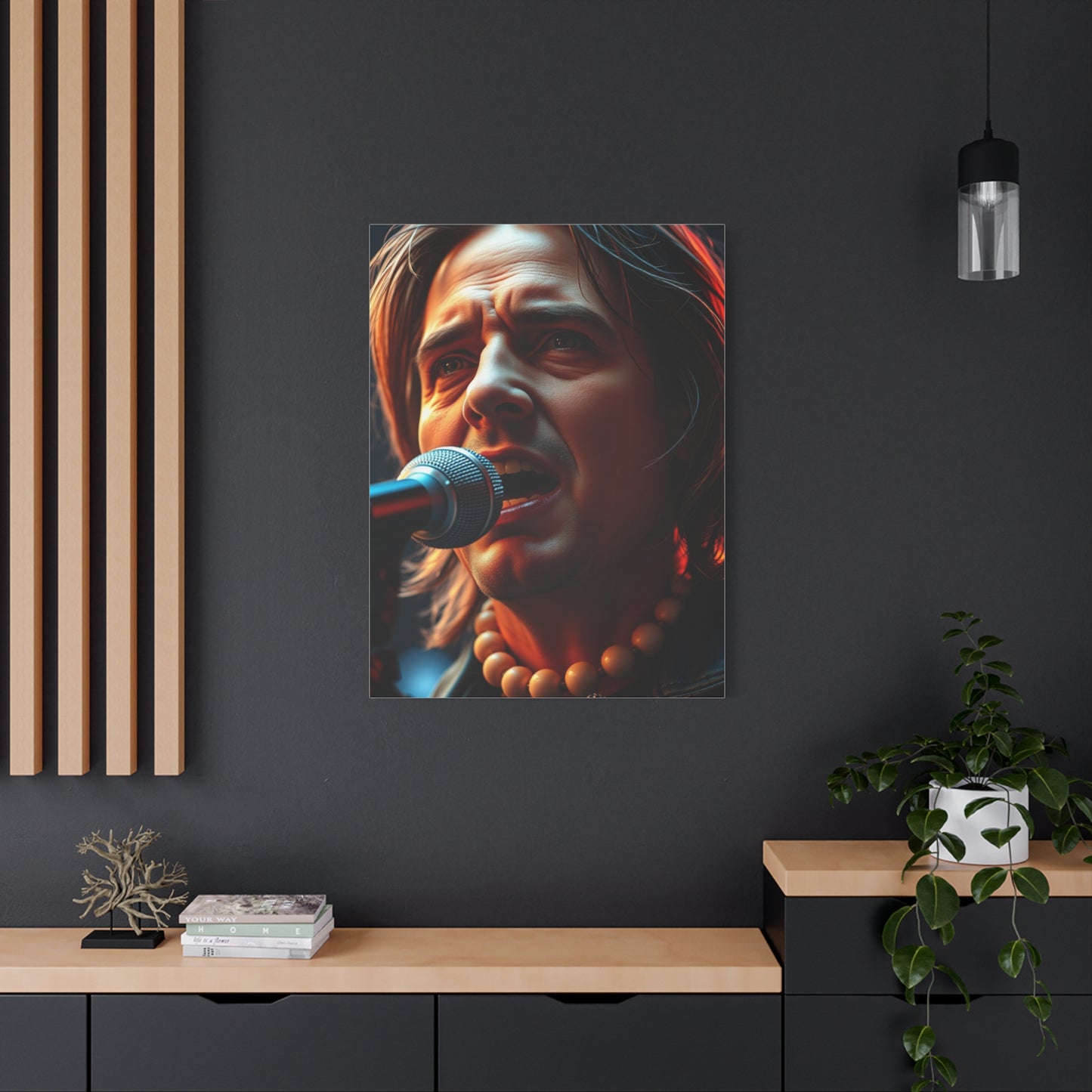
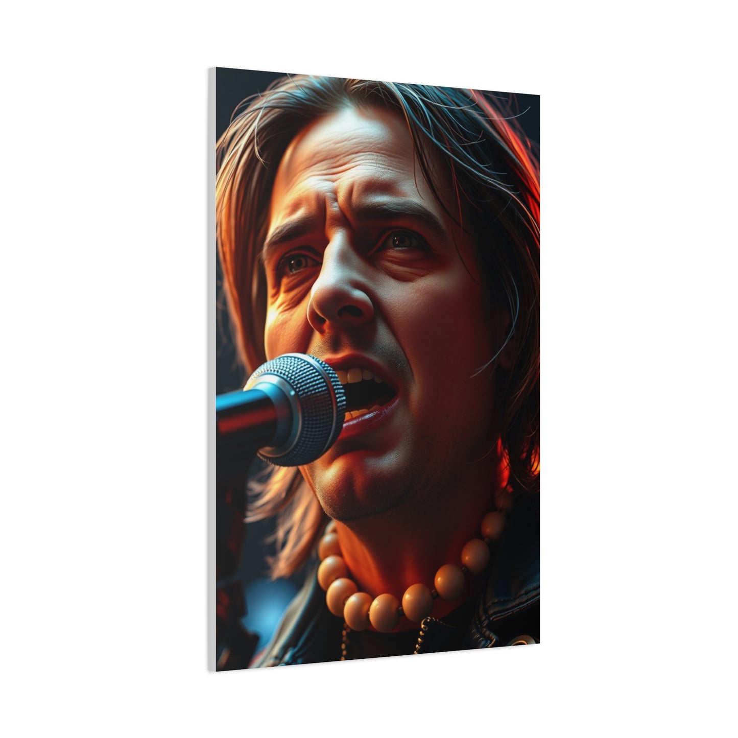
Rhythmic Elegance Wall Art: Creating Harmonious Visual Flow in Your Home
The concept of rhythmic elegance in wall art represents a sophisticated approach to decorating that combines visual movement with refined aesthetics. This style of artistic expression captures the essence of fluidity and grace through carefully composed elements that guide the eye across the canvas in a measured, harmonious dance. When selecting pieces that embody this aesthetic philosophy, homeowners and decorators discover opportunities to infuse their environments with both energy and tranquility simultaneously.
Rhythmic elegance canvases feature patterns, shapes, and color transitions that create a sense of motion without overwhelming the viewer. These artworks often incorporate flowing lines, graduated tones, and balanced compositions that evoke feelings of sophistication and calm. The beauty of this artistic approach lies in its versatility, as it complements various decorating styles from contemporary to transitional settings.
The growing popularity of this art form reflects a broader cultural appreciation for pieces that offer visual interest while maintaining a sense of harmony. Unlike chaotic or overly complex artworks, rhythmic elegance pieces provide focal points that enhance rather than dominate a room. They create atmosphere through subtle sophistication rather than bold statements, making them ideal for those who appreciate refined aesthetics.
Understanding the principles behind this artistic style helps in making informed decisions when selecting pieces for your home or office. The interplay of movement and balance, energy and calm, creates artwork that remains engaging over time without becoming tiresome. This enduring appeal makes rhythmic elegance canvases a wise investment for anyone looking to create environments that feel both dynamic and peaceful.
Optimal Palette Selections for Harmonious Flow Canvases
Choosing the right color combinations for rhythmic elegance canvases requires understanding how different hues interact to create visual harmony and movement. The most successful color schemes balance vibrancy with subtlety, creating pieces that energize without overwhelming. Monochromatic palettes featuring graduated shades of a single color family offer seamless visual flow, with tones transitioning from light to dark in gentle progressions that guide the eye naturally across the canvas.
Analogous color schemes work exceptionally well for this artistic style, combining colors that sit adjacent on the color wheel. A palette of blues transitioning into greens, or warm oranges flowing into deep reds, creates natural harmony while maintaining visual interest. These combinations mirror patterns found in nature, such as sunset gradations or ocean depths, making them inherently pleasing to viewers. The key lies in selecting shades with similar intensity levels to maintain balance throughout the composition.
Complementary color schemes, when executed with restraint, can add dynamic tension to rhythmic elegance pieces. Pairing colors opposite on the color wheel, such as blue and orange or purple and yellow, creates vibrant contrast. However, successful implementation requires careful attention to proportion and saturation. Using one color as the dominant presence while incorporating its complement as strategic accents prevents visual discord while maintaining the flowing quality essential to this style.
Neutral-based palettes with metallic accents represent another sophisticated approach. Combinations of charcoal, cream, and taupe with touches of gold, silver, or bronze create refined elegance suitable for various environments. These schemes provide versatility, allowing the artwork to coordinate with changing decor elements while maintaining its distinctive presence. The metallic elements catch light differently throughout the day, adding subtle dimension that enhances the sense of movement within the piece.
Earthy color combinations draw inspiration from natural landscapes, incorporating shades of terracotta, sage, ochre, and sand. These palettes create warmth and groundedness while maintaining the flowing quality characteristic of rhythmic elegance. They work particularly well in environments seeking to establish connections with nature or create calming, restorative atmospheres. The organic quality of these color combinations makes them timeless choices that transcend temporary design trends.
Jewel-tone palettes offer richness and depth, incorporating saturated hues like emerald, sapphire, ruby, and amethyst. When balanced with neutral transitions or lighter tones, these vibrant colors create luxurious visual experiences without overwhelming viewers. The key to success with jewel tones lies in thoughtful composition, ensuring that the richness of color enhances rather than dominates the rhythmic flow of the piece.
Pastel combinations provide gentle sophistication, perfect for environments requiring soft, soothing aesthetics. Blush pinks, powder blues, mint greens, and lavender create dreamlike qualities when combined in flowing compositions. These lighter palettes work beautifully in bedrooms, nurseries, or any environment where creating peaceful ambiance takes priority. Despite their softness, well-executed pastel pieces maintain visual interest through careful attention to tonal variation and compositional flow.
Gradient schemes that transition smoothly from one color to another create particularly effective rhythmic elegance pieces. These ombre effects, whether moving from light to dark within a single color family or transitioning between different hues, naturally guide the eye across the canvas. The seamless blending required for successful gradient work demands skilled execution, but the results offer mesmerizing visual experiences that embody the essence of flowing elegance.
Black and white with strategic color accents represents a classic approach that never loses appeal. The high contrast of monochrome provides strong visual structure, while carefully placed color accents create focal points and guide eye movement. This combination works exceptionally well in modern and contemporary settings, offering timeless sophistication that adapts to evolving design preferences.
Understanding color psychology enhances selection decisions, as different hues evoke specific emotional responses. Blues promote calm and concentration, making them excellent choices for bedrooms and offices. Greens connect viewers with nature and encourage balance and renewal. Warm colors like reds and oranges energize and stimulate, suitable for social areas. Purples suggest creativity and luxury, while yellows bring optimism and energy. Selecting palettes aligned with the intended emotional atmosphere of a room ensures that the artwork supports the overall environmental goals.
Abstract Motion in Flowing Elegance Prints
Abstract movement forms the foundation of many rhythmic elegance prints, offering viewers dynamic visual experiences without representational constraints. These pieces utilize non-literal forms to suggest motion, energy, and flow through careful manipulation of line, shape, color, and composition. The abstract nature allows for personal interpretation, making each viewing experience unique while maintaining the core qualities of harmony and balance that define this artistic style.
Curved lines and organic shapes create the most natural sense of movement in abstract compositions. Sweeping arcs, spiral formations, and undulating waves guide the eye across the canvas in patterns that feel inherently dynamic. These elements mirror movement found in nature, from wind-blown grasses to water currents, creating subconscious connections that make the artwork feel familiar and comfortable despite its abstract nature. The repetition of curved elements at varying scales adds depth and complexity without sacrificing the overall sense of flow.
Gestural brushwork contributes significantly to the perception of movement in abstract pieces. Visible brush strokes that sweep across the canvas in deliberate directions create pathways for the eye to follow. The energy captured in these marks conveys the artist's physical movements during creation, transferring that kinetic quality to the finished piece. This technique adds human connection to abstract work, reminding viewers of the creative process behind the finished artwork.
Color gradients and transitions serve as powerful tools for suggesting movement in abstract compositions. As hues shift gradually across the canvas, they create visual progression that draws the eye along defined paths. These transitions can be subtle, with barely perceptible changes, or more dramatic, with distinct zones of color blending into one another. The speed and character of these transitions affect the perceived tempo of movement within the piece, from slow, contemplative flows to rapid, energetic progressions.
Overlapping forms and transparent layers add dimensional complexity to abstract movement pieces. When shapes appear to pass over or through one another, they create spatial relationships that suggest motion through implied depth. This technique engages viewers in visual problem-solving as they mentally reconstruct the spatial relationships, adding intellectual interest to the aesthetic experience. The interplay of opaque and transparent elements creates luminous qualities that enhance the overall elegance of the composition.
Repetitive patterns with variations create rhythm in abstract works, much like musical compositions use repeated motifs. Elements that recur across the canvas with slight modifications in size, color, or orientation establish visual cadence. This rhythmic quality gives coherence to abstract compositions that might otherwise feel chaotic or disconnected. The variations prevent monotony while maintaining the structured flow essential to rhythmic elegance.
Directional composition guides viewer attention through strategic placement of elements. By arranging forms, lines, and color concentrations along deliberate paths, artists control how viewers experience the piece over time. Diagonal compositions typically feel more dynamic than horizontal or vertical arrangements, creating stronger sensations of movement and energy. Circular compositions create continuous visual loops, encouraging prolonged engagement with the artwork.
Negative space plays a crucial role in abstract movement pieces, providing visual rest areas that prevent compositions from feeling cluttered or overwhelming. The empty areas between and around forms allow the eye to pause before continuing its journey across the canvas. This balance between active and passive areas maintains the elegance aspect of rhythmic elegance, ensuring that energy remains controlled and purposeful rather than chaotic.
Textural contrasts add tactile dimensions to visual movement, creating additional layers of interest. Smooth areas juxtaposed with heavily textured sections create varied experiences as light interacts differently with each surface. These textural variations can enhance the sense of depth and dimension, making flat canvases feel more sculptural and engaging. The interplay of textures adds sophistication that elevates purely visual compositions.
Scale variations within compositions contribute to perceived depth and movement. Larger elements typically advance visually while smaller components recede, creating spatial relationships that suggest three-dimensional space on two-dimensional surfaces. This size progression can guide the eye from foreground to background or across the picture plane, adding another layer of directional movement to the composition.
The balance between chaos and order in abstract movement pieces determines their success as rhythmic elegance works. Too much disorder creates uncomfortable viewing experiences, while excessive order becomes static and uninteresting. The finest examples maintain tension between these extremes, offering enough structure to feel harmonious while retaining sufficient spontaneity to feel alive and energetic. This delicate balance requires skilled artistic judgment and often develops through extensive experimentation and refinement.
Installation Guidelines for Flowing Elegance Canvas Artwork
Proper installation of rhythmic elegance canvas artwork ensures that pieces display to their full advantage while remaining securely mounted. The process begins with careful consideration of placement, taking into account lighting conditions, viewing distances, and relationships with surrounding furnishings. Strategic positioning maximizes the visual impact of these flowing compositions while integrating them seamlessly into the overall room design.
Height placement significantly affects how artwork is experienced. The general guideline suggests centering pieces at eye level, typically between 57 and 60 inches from the floor to the center of the artwork. This standard works well for most residential settings where viewers will be standing. However, adjustments may be necessary based on ceiling height, furniture arrangements, and the specific viewing context. In dining rooms where people will be seated, slightly lower placement ensures comfortable viewing during meals.
Measuring and marking before installation prevents costly mistakes. Use painter's tape to outline the exact position on the wall, allowing you to visualize the placement before making any holes. This temporary marking lets you step back and assess whether the position feels right within the overall room composition. It also helps identify any potential conflicts with light switches, outlets, or other wall features that might interfere with ideal placement.
Wall composition matters when hanging multiple pieces. Gallery walls featuring several rhythmic elegance canvases require careful planning to create cohesive arrangements. Lay out the pieces on the floor first, experimenting with different configurations until finding an arrangement that balances individual pieces while creating unified visual flow. Maintain consistent spacing between pieces, typically 2-3 inches, to create visual connection without allowing the works to compete with one another.
Lighting dramatically affects how rhythmic elegance pieces appear, influencing color perception and the visibility of textural details. Natural light creates ideal viewing conditions for most artworks, but its changing quality throughout the day means colors and details will appear different at various times. Artificial lighting requires consideration of both intensity and color temperature. Warm light enhances reds and oranges while cool light favors blues and greens. Adjustable track lighting or picture lights allow for customized illumination that can be modified to suit different viewing conditions.
Hardware selection ensures secure mounting appropriate to the weight and size of the canvas. Standard picture hangers work for lightweight pieces, but larger, heavier canvases require more substantial support. D-rings attached to the back of the stretcher bars provide secure hanging points for wire or direct wall hook mounting. For heavy pieces, installing anchors in drywall or locating wall studs provides the necessary support to prevent accidents. Always use hardware rated for weights exceeding that of the artwork to provide a safety margin.
Leveling ensures professional-looking installation. Use a spirit level to verify that the canvas hangs perfectly horizontal unless intentional tilting serves a specific design purpose. For gallery wall arrangements, establish a level baseline and ensure that all pieces align properly with this reference. Small adjustments during installation make significant differences in the overall appearance of the display.
Avoiding common mistakes prevents damage and disappointment. Never hang valuable artwork in locations exposed to direct sunlight for extended periods, as UV radiation causes fading and deterioration. Avoid placement above heating vents or in bathrooms where humidity fluctuations can damage canvas and affect adhesives. Keep artwork away from areas where it might be bumped or knocked by doors, traffic flow, or active children and pets.
Wire hanging systems offer flexibility for adjusting positions without creating new wall holes. These rail systems mount at ceiling level with cables or cords that descend to hold artwork at desired heights. They allow for easy reconfiguration when redecorating or acquiring new pieces. Though initially more expensive than traditional hanging methods, wire systems provide long-term versatility that justifies the investment for serious collectors or those who frequently refresh their displays.
Command strips and similar adhesive hangers provide damage-free alternatives for renters or those hesitant to put holes in walls. These removable hanging solutions work well for lightweight canvases but have weight limitations that must be carefully observed. Follow manufacturer instructions precisely regarding wall surface preparation and weight capacities to ensure secure mounting. Allow adhesive to cure for the recommended time before hanging artwork to prevent failures.
Professional installation services offer expertise for valuable pieces or complex arrangements. Experienced installers possess specialized tools and knowledge for handling artwork safely while achieving perfect positioning. They understand weight distribution, proper anchoring techniques, and how to work with various wall types. For significant investments in artwork or when creating elaborate multi-piece installations, professional assistance provides peace of mind and ensures optimal results.
Statement Wall Solutions with Oversized Canvas Prints
Large-format canvas prints create dramatic focal points that anchor room designs and establish visual hierarchy. These substantial pieces command attention immediately upon entering a room, making them ideal for creating statement walls that define the character of entire areas. The scale of these works allows for impressive detail and presence that smaller pieces simply cannot achieve, making them particularly effective for spacious environments with generous wall areas.
Proportion matters significantly when selecting oversized canvases for particular walls. A piece should typically occupy 60-75 percent of the available wall width to create appropriate visual weight without overwhelming the surrounding area. For walls behind sofas, the canvas should extend at least two-thirds of the furniture width, creating clear visual connection between the artwork and the furnishing below. These proportional relationships ensure that large pieces feel intentionally integrated rather than awkwardly placed.
Vertical versus horizontal orientation affects spatial perception within rooms. Horizontal canvases emphasize width, making walls appear broader and creating expansive feelings. They work particularly well above low, horizontal furnishings like sofas or console tables. Vertical pieces draw the eye upward, emphasizing ceiling height and creating impressions of elevated, soaring areas. They suit spaces with high ceilings or narrow wall sections where horizontal pieces would appear cramped. Square formats offer balanced presence without directional emphasis, working well in various contexts.
Color relationships between large canvases and existing room elements require careful consideration. Since oversized pieces constitute significant portions of visible wall area, their colors substantially influence overall room atmosphere. They can either complement existing color schemes by incorporating similar hues or create intentional contrast by introducing different color families. When working with bold, vibrant pieces, balance them with neutral furnishings and surroundings to prevent visual overload. Conversely, rooms with colorful furnishings benefit from more subdued artwork that provides visual rest.
Triptychs and multi-panel large-scale works offer alternatives to single massive canvases. These divided compositions spread the same total size across multiple pieces, creating visual interest through the gaps between panels. The separation allows wall color to show through, integrating the artwork more closely with its environment. Multi-panel arrangements also offer practical advantages for transportation and installation, as individual sections are easier to handle than single enormous canvases. The divided format works particularly well with rhythmic elegance compositions, as the separations can emphasize the flowing movement across the complete work.
Placement height for oversized pieces requires adjustment from standard guidelines. With very large canvases, centering at typical eye level may result in excessive floor clearance or insufficient wall area above the piece. Instead, position these works to create balanced relationships with both floor and ceiling, typically slightly lower than standard eye level. This adjustment creates grounded, stable feelings while maintaining comfortable viewing angles for appreciating details throughout the composition.
Architectural features influence oversized canvas placement and selection. Pieces must work around windows, doors, fireplaces, and built-in elements rather than competing with them. In rooms with prominent architectural details, select artwork that complements rather than conflicts with these features. Sometimes the best approach involves creating symmetry, placing the canvas centrally between architectural elements. Other situations call for asymmetrical arrangements that create dynamic tension and visual interest.
Lighting becomes increasingly important with oversized pieces due to their substantial surface areas. Inadequate illumination leaves large portions of the canvas in shadow, diminishing impact and making colors appear dull. Consider installing dedicated picture lights or adjustable track lighting that can be directed specifically at the artwork. For pieces with varied tones across their surfaces, multiple light sources may be necessary to illuminate the entire composition evenly without creating harsh shadows or glare spots.
The surrounding decor should support rather than compete with statement wall canvases. Keep adjacent walls relatively minimal, avoiding clutter that fragments viewer attention. Select furnishings and accessories that complement the artwork's style and color palette without duplicating its visual qualities. This supporting approach allows the large canvas to serve its intended purpose as the room's focal point, creating clear visual hierarchy that guides how people experience the environment.
Budget considerations for large-format pieces include not only the artwork itself but also installation and potentially structural modifications. Very large canvases become heavy, sometimes requiring reinforced hanging systems or even wall modifications to support their weight safely. Professional installation becomes more important as size increases, adding to the total investment. However, the dramatic impact of properly selected and installed oversized pieces often justifies these additional expenses, as they fundamentally transform spaces in ways smaller works cannot achieve.
Room function influences large canvas selection. In formal living rooms or dining areas, elegant, refined compositions maintain sophisticated atmospheres appropriate to these gathering areas. Bedrooms benefit from calming, peaceful large-scale works that promote relaxation and rest. Home offices and studies can incorporate pieces with energizing qualities that stimulate focus and creativity. Matching artwork character to room purpose enhances the overall functionality of each area while maintaining aesthetic coherence throughout the home.
Streamlined Flowing Elegance Canvas Concepts
Minimalist approaches to rhythmic elegance combine the flowing, dynamic qualities of this artistic style with the restraint and clarity characteristic of minimalism. These compositions achieve maximum impact through careful editing, including only essential elements while eliminating anything superfluous. The result offers sophisticated visual experiences that feel both calming and engaging, providing interest without overwhelming viewers with excessive complexity or detail.
Limited color palettes form the foundation of most minimalist rhythmic elegance pieces. Restricting compositions to two or three carefully selected hues creates instant visual coherence while simplifying color relationships. Monochromatic schemes using various shades of a single color provide the ultimate in minimalist restraint while still offering tonal variety. These limited palettes direct viewer attention to composition, form, and the subtle interplay of elements rather than dramatic color contrasts.
Simple geometric forms provide structure in minimalist flowing elegance works. Circles, lines, and basic curves combine in refined arrangements that suggest movement through their relationships rather than complex detailing. The purity of these elemental shapes creates clarity and immediate visual comprehension. When arranged thoughtfully, even the simplest geometric elements can create compelling rhythmic compositions that guide the eye across the canvas in deliberate, elegant progressions.
Abundant negative space distinguishes minimalist rhythmic elegance from more complex interpretations. Rather than filling the entire canvas with active elements, minimalist approaches embrace empty areas as compositional components of equal importance. This breathing room prevents visual fatigue and creates peaceful, meditative qualities. The balance between mark-making and emptiness becomes the defining characteristic, with each carefully placed element gaining significance through its isolation within the generous surrounding openness.
Subtle tonal variations replace dramatic contrasts in minimalist pieces. Rather than bold shifts from light to dark, these works employ gentle gradations that require attentive viewing to fully appreciate. This subtlety rewards contemplative engagement, revealing nuances that aren't immediately apparent to casual glances. The refined quality of these gentle transitions embodies elegance in its purest form, creating sophisticated viewing experiences for those who appreciate restraint.
Single-line compositions represent perhaps the most extreme minimalist interpretation of flowing elegance. A continuous line that traverses the canvas, varying in thickness, direction, and rhythm, can create surprising complexity despite its singular nature. These deceptively simple pieces demonstrate how much visual interest can emerge from apparently minimal means. The continuous quality of single-line works emphasizes flow and connection, core concepts in rhythmic elegance aesthetics.
Minimalist texture applications add dimension without clutter. Rather than heavily worked surfaces with varied textures throughout, minimalist pieces might feature a single textured area contrasting with smooth surroundings, or uniformly subtle texture that adds interest without dominating. This restrained approach to surface treatment maintains the clean, uncluttered feeling essential to minimalist work while providing tactile interest that enhances the viewing experience.
Asymmetrical balance in minimalist compositions creates visual interest while maintaining the clean clarity this approach requires. Rather than symmetrical arrangements that can feel static, carefully considered asymmetry introduces dynamic tension. A small element placed strategically can balance a much larger form through position, color intensity, or visual weight, creating sophisticated compositions that feel both balanced and alive.
Edge treatments affect the minimalist character of pieces. Bleeding colors to the canvas edges creates seamless integration between artwork and mounting surface, emphasizing the flatness inherent to canvas works. Alternatively, leaving borders of raw canvas creates frames within the piece itself, drawing attention to the artwork's materiality and boundaries. Either approach can succeed, but the choice affects how viewers perceive and interact with the work.
The relationship between minimalist rhythmic elegance pieces and their surroundings becomes particularly important. These works rely partially on their context for full effect, with surrounding wall color and nearby furnishings influencing how the artwork appears and functions. Clean, uncluttered environments allow minimalist pieces to shine, while busy surroundings may overwhelm their subtle qualities. Careful consideration of placement and context ensures that minimalist works achieve their intended impact.
Philosophical connections to minimalist living make these pieces particularly appealing to those embracing simplified lifestyles. The visual restraint mirrors choices to reduce physical possessions and eliminate unnecessary complications from daily life. Selecting minimalist rhythmic elegance canvases aligns artistic choices with broader lifestyle philosophies, creating harmony between aesthetic preferences and personal values. This deeper connection makes these works more meaningful than purely decorative elements, transforming them into visual representations of chosen life approaches.
Integrating Multiple Textures with Flowing Elegance Prints
Combining various textures with rhythmic elegance prints creates rich, layered environments that engage multiple senses and add dimensional depth to room designs. This approach moves beyond purely visual considerations to incorporate tactile elements that make surroundings feel more inviting and complex. The key lies in selecting textures that complement the flowing qualities of the artwork while adding contrast that prevents monotony.
Fabric selections provide primary opportunities for texture integration. Smooth silk or satin throws might echo the fluidity visible in flowing canvas compositions, creating visual continuity between artwork and textiles. Conversely, chunky knit blankets or nubby linen upholstery introduce tactile contrast that makes both the smooth artwork and textured fabrics more noticeable through comparison. Velvet pillows add luxurious softness that enhances the elegance aspect of rhythmic elegance pieces, creating cohesive sophisticated atmospheres.
Natural materials bring organic textures that pair beautifully with flowing artwork. Jute or sisal rugs introduce earthy, rough textures that ground rooms while allowing smooth canvases to float visually above them. Wooden furniture with visible grain patterns adds linear texture that can echo directional elements within the artwork. Stone or ceramic accessories introduce cool, hard textures that contrast with canvas surfaces, creating sensory variety that makes environments more interesting.
Metallic accents contribute reflective textures that interact dynamically with lighting conditions. Brushed brass, hammered copper, or polished chrome surfaces catch and reflect light differently throughout the day, adding movement that complements the visual motion in rhythmic elegance pieces. These metallic elements might appear in picture frames, decorative objects, or furniture hardware, creating sparkle and shine that elevates the overall sophistication of the setting.
Woven elements like baskets, wall hangings, or rattan furniture introduce intricate, detailed textures formed through repetitive craftsmanship. These handmade qualities add human warmth to rooms that might otherwise feel too sleek or impersonal. The rhythmic nature of weaving patterns creates subtle connections with the flowing rhythms visible in the artwork, establishing visual conversations between different room elements.
Glass and crystal contribute smooth, transparent textures that add elegance without visual weight. Vases, decorative bowls, or glass-topped tables allow light to pass through, creating luminous qualities that enhance airy, flowing feelings. The reflective and refractive properties of glass add subtle movement as light conditions change, supporting the dynamic qualities inherent in rhythmic elegance compositions.
Layering rugs introduces both textural and visual complexity. A plush, high-pile rug layered over a flat-weave base creates dimensional interest underfoot while establishing clear zones within larger rooms. This layered approach mirrors the visual layering often present in flowing elegance artwork, creating aesthetic continuity between different design elements. The texture contrast between smooth and fluffy adds sensory richness that makes rooms feel more finished and intentional.
Wall textures beyond the canvas itself contribute to overall environmental character. Smooth, painted walls provide neutral backgrounds that allow artwork to stand forward clearly. Textured wall treatments like venetian plaster, grasscloth wallpaper, or exposed brick add dimension that must be carefully balanced with canvas pieces to avoid visual competition. Generally, when walls feature significant texture, artwork should maintain relative smoothness, and vice versa, to maintain clear visual hierarchy.
Plant materials introduce living textures that change over time, adding organic elements that connect interiors with nature. Glossy-leaved plants like rubber trees or fiddle leaf figs contrast with matte canvas surfaces, while fuzzy-leaved specimens like African violets add soft texture. The natural growth patterns and forms of plants often echo the organic flowing qualities present in rhythmic elegance pieces, strengthening thematic connections within the design scheme.
Leather furnishings contribute distinctive texture with character that develops over time. The smooth yet substantial feel of leather adds quality and permanence to settings. As leather ages and develops patina, it gains visual interest that complements artwork selected for enduring appeal rather than temporary trends. The natural variations and subtle sheen of leather create sophisticated foundations that allow rhythmic elegance pieces to shine without competing for attention.
Balance remains crucial when combining multiple textures. Too many competing textures create chaotic, uncomfortable feelings, while insufficient variety results in flat, uninteresting environments. Aim for a mix of three to five distinct textures within a single room, ensuring that they relate to one another through color, style, or scale. This careful curation creates richness without confusion, establishing environments that feel thoughtfully designed rather than randomly assembled.
Flowing Elegance in Contemporary Living Areas
Incorporating rhythmic elegance canvases into contemporary living rooms creates focal points that enhance the clean lines and open concepts characteristic of current design trends. These gathering areas benefit from artwork that introduces visual interest and personality without disrupting the uncluttered aesthetics that define contemporary style. The flowing, elegant qualities of these pieces add movement and warmth to settings that might otherwise feel too minimal or stark.
Furniture arrangement around rhythmic elegance artwork establishes clear visual relationships. In contemporary settings, sofas often face canvas pieces mounted on primary walls, creating natural viewing orientation for conversation areas. The artwork becomes a visual anchor that draws people into the room and provides a reference point for arranging other furnishings. Maintaining adequate viewing distance allows the piece to be appreciated as a whole rather than requiring viewers to scan from side to side, typically meaning furniture positioned at least six to eight feet from the wall.
Color coordination between canvases and contemporary furnishings creates cohesive design schemes. Many contemporary living rooms utilize neutral foundations of white, gray, black, and beige, providing perfect backgrounds for introducing color through artwork. Rhythmic elegance pieces with vibrant hues become jewel-like focal points that energize neutral surroundings. Alternatively, selecting canvases that maintain the neutral palette but introduce subtle color variations adds sophistication without bold contrast.
Scale appropriate to contemporary proportions ensures artwork integrates successfully rather than appearing awkwardly placed. Contemporary living rooms often feature generous proportions with high ceilings and expansive walls, calling for substantial canvases that fill vertical and horizontal dimensions appropriately. Undersized pieces appear lost on large walls, while properly scaled works create impact and purpose. When wall dimensions exceed what single canvases can address, multi-panel arrangements or gallery walls provide solutions.
Lighting design in contemporary living rooms enhances both the architectural qualities of the area and displayed artwork. Recessed lighting, track systems, and strategically placed floor lamps illuminate canvases while maintaining the clean ceiling planes contemporary style favors. Avoid ornate chandeliers or busy light fixtures that conflict with contemporary simplicity. Instead, select lighting with sculptural qualities that complement the flowing forms visible in rhythmic elegance pieces.
Material palettes common in contemporary design harmonize naturally with canvas artwork. Glass, metal, and polished surfaces create sleek environments where rhythmic elegance pieces introduce organic warmth. The contrast between hard, manufactured materials and artistic expression creates balanced environments that feel both sophisticated and livable. Incorporating natural materials like wood or stone softens contemporary settings while maintaining their essential character.
Open floor plans require careful consideration of how artwork appears from multiple angles and viewing positions. In loft-style or open-concept homes, living room canvases remain visible from dining areas, kitchens, and hallways, making their impact more significant. Select pieces that read clearly from various distances and angles, maintaining their flowing elegant character whether viewed straight-on or obliquely. Consider how the artwork appears when approaching from different entrances and positions throughout the connected areas.
Minimalist contemporary living rooms benefit particularly from rhythmic elegance pieces because the artwork provides visual interest that spare furnishings cannot. A single significant canvas might serve as the room's primary decorative element, making its selection critically important to the overall design success. The piece must carry sufficient interest to fulfill this role without becoming overwhelming or requiring excessive visual processing.
Media integration remains a challenge in contemporary living rooms where large televisions compete with artwork for wall real estate. Creative solutions include mounting televisions on different walls from primary canvases, incorporating screens into built-in cabinetry that conceals them when not in use, or selecting artwork positions above or beside media components. The goal involves creating clear hierarchy where artwork and technology each maintain their intended functions without diminishing one another.
Seasonal refresh opportunities allow contemporary living rooms to evolve without requiring complete redesign. Swapping canvas pieces or rotating works from other rooms creates new energy as seasons change. This approach particularly suits contemporary style's emphasis on flexibility and evolution rather than static traditional arrangements. Building collections of compatible rhythmic elegance pieces enables this rotation while maintaining overall design coherence.
Entertainment functionality must coexist with artistic display in most contemporary living rooms. Ensuring that artwork placement doesn't interfere with traffic flow to seating, viewing angles for media, or functionality of storage pieces maintains the room's primary purpose as a gathering and relaxation area. Beauty and function should enhance rather than compromise one another, requiring thoughtful planning during initial layout and design phases.
Professional Environment Enhancement with Flowing Elegance Canvas Artwork
Office environments benefit significantly from thoughtful artwork selection, as pieces influence mood, productivity, and professional image. Rhythmic elegance canvases bring sophistication and visual interest to workplaces without the distraction of overly complex or provocative imagery. The flowing, harmonious qualities inherent to this style create atmosphere conducive to focused work while establishing professional credibility through aesthetic refinement.
Reception and entrance areas create first impressions that set expectations for client experiences. Significant rhythmic elegance pieces in these locations communicate attention to detail, appreciation for quality, and sophisticated taste. Select works that align with brand identity and corporate culture, whether leaning toward bold, energetic compositions or subtle, contemplative pieces. The artwork becomes part of the company narrative, visually representing organizational values and character.
Private office artwork personalizes individual workspaces while maintaining professional standards. Executives and managers can select pieces that resonate personally while remaining appropriate for business settings. Rhythmic elegance works offer sufficient sophistication for client meetings while providing visual interest during long work hours. The calming yet engaging qualities help maintain focus during intensive work periods while offering brief visual respites during breaks.
Conference room selections should facilitate rather than distract from meetings and presentations. Avoid pieces with excessive detail that might capture attention during important discussions. Instead, choose compositions with clear, flowing qualities that can be appreciated peripherally without demanding focused engagement. Neutral or analogous color schemes work better than high-contrast combinations that might prove visually competing. The artwork should enhance the professional atmosphere without becoming a conversational distraction.
Collaborative work areas benefit from energizing rhythmic elegance pieces that stimulate creativity and interaction. More dynamic compositions with vibrant colors can enliven these gathering points, encouraging the active exchange of ideas characteristic of effective collaboration. The visual energy contributes to the atmosphere of possibility and innovation that organizations seek in creative teamwork settings.
Corridor and hallway artwork transforms transitional areas into gallery-like experiences. Rather than leaving these spaces bare or minimally considered, thoughtful canvas placement creates continuous visual interest throughout the workplace. This attention to detail demonstrates organizational values around environment and employee experience. Gallery walls featuring multiple coordinated rhythmic elegance pieces work particularly well in extended hallways, preventing monotony through varied yet cohesive compositions.
Break rooms and casual gathering areas allow for more relaxed, playful artwork selections. While maintaining professionalism, these spaces can incorporate pieces with lighter, more approachable qualities. The rhythmic elegance style adapts easily to this need, with compositions that remain sophisticated while feeling less formal than works in client-facing areas. These pieces contribute to creating workplace areas where employees genuinely want to spend time.
Color psychology considerations gain importance in office artwork selection. Blues promote focus, calm, and productivity, making them excellent choices for individual work areas. Greens reduce eye strain and create balanced, restorative environments. Warmer colors in moderate amounts can energize without overstimulating. Understanding how colors affect mood and performance helps in making selections that support specific workplace functions and employee wellbeing.
Scale matching to architectural proportions ensures professional appearance. Corporate buildings often feature generous ceiling heights and substantial wall expanses that demand appropriately sized artwork. Undersized pieces appear amateurish and suggest insufficient attention to detail. Taking careful measurements and visualizing scale relationships before purchasing prevents costly mistakes and ensures investments achieve their intended impact.
Budget allocation for office artwork represents a worthwhile investment in company culture and employee satisfaction. Quality pieces from emerging artists or reputable print producers offer accessible price points while maintaining professional standards. Building collections gradually allows for budget distribution over time while creating growing visual interest as new works are added. Some organizations allocate annual budgets specifically for workplace art, recognizing its contribution to employee retention and recruitment.
Maintenance and care requirements suit busy professional environments. Canvas pieces typically require minimal upkeep beyond occasional dusting, making them practical for high-traffic commercial settings. Their durability exceeds that of paper-based works, reducing replacement frequency. This practicality combined with aesthetic value makes rhythmic elegance canvases particularly suitable for corporate installations where beauty must coexist with functionality.
Maintenance and Preservation of Flowing Elegance Canvas Prints
Proper care and maintenance are essential to preserving the timeless beauty and value of Flowing Elegance canvas prints. These artistic pieces, with their rhythmic composition and graceful imagery, are not only decorative but also a meaningful investment. Over time, exposure to environmental elements such as dust, moisture, light, and fluctuating temperatures can degrade canvas materials, leading to discoloration, fading, or warping. However, with consistent yet simple preservation efforts, these prints can maintain their original vibrancy and structural integrity for many years.
To begin, it’s crucial to display canvas prints in a stable indoor environment—away from direct sunlight, high humidity, or heat sources like radiators and fireplaces. Ultraviolet (UV) rays are especially damaging, so placing prints in shaded areas or using UV-protective glass or coatings can prevent color fading. Regular cleaning is also vital. Gently dusting the surface with a soft, dry microfiber cloth prevents buildup without scratching the canvas. Avoid using water or cleaning agents, as these may stain or weaken the fabric and ink.
When moving or storing the artwork, handle it with clean, dry hands or wear cotton gloves to avoid transferring oils or dirt. Prints should be stored upright in a cool, dry place, ideally wrapped in acid-free materials for added protection.
Conclusion
Rhythmic Elegance Wall Art is a powerful design element that brings harmony, movement, and refined beauty into your living space. By capturing the flow of lines, forms, and patterns, this art style reflects the graceful motion found in nature, music, and architecture—translating it into a visual language that enhances interior design with subtle sophistication.
Throughout this guide, we’ve explored how rhythmic elegance wall art introduces a sense of continuity and balance in your home. Whether through abstract swirls, flowing brushstrokes, or layered geometric arrangements, each piece contributes to a visual rhythm that invites the eye to travel effortlessly across the wall. This “movement” creates more than just aesthetic appeal—it generates a calming energy that makes your environment feel more cohesive and complete.
What sets this art style apart is its ability to complement a wide range of interiors. From minimalist spaces seeking a soft, dynamic touch to more eclectic rooms that embrace artistic contrast, rhythmic elegance blends effortlessly without overpowering the room. It’s ideal for living rooms, hallways, bedrooms, or workspaces—anywhere you want to introduce beauty, flow, and intention.
Color and composition also play key roles. Monochromatic or muted palettes can evoke serenity, while bolder color schemes add drama and impact without disrupting the underlying rhythm. When thoughtfully placed, rhythmic wall art helps define zones within open-concept living areas, guide the eye through transitional spaces, and unify rooms with varying décor themes.
Beyond design, rhythmic elegance wall art also contributes to emotional well-being. Much like music or poetry, these artworks influence mood by offering a sense of peace, balance, and movement. They remind us that beauty can be found in fluidity—not everything needs to be rigid or loud to be powerful.
In conclusion, Rhythmic Elegance Wall Art is a transformative choice for anyone looking to create a harmonious visual flow in their home. It merges aesthetics with emotion, structure with softness, and movement with mindfulness. Whether you’re curating a gallery wall or selecting a single statement piece, rhythmic elegance brings lasting refinement and grace to your interior.
