


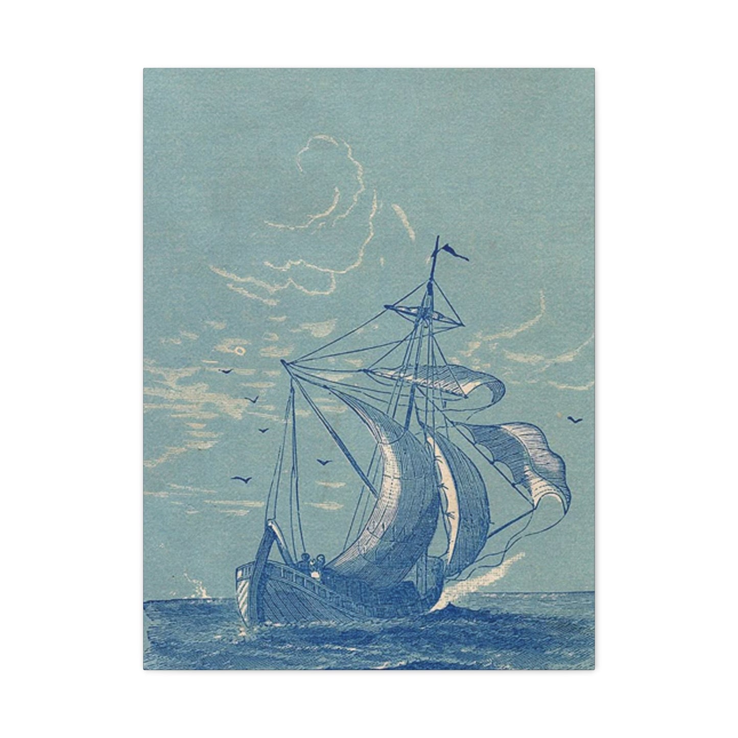
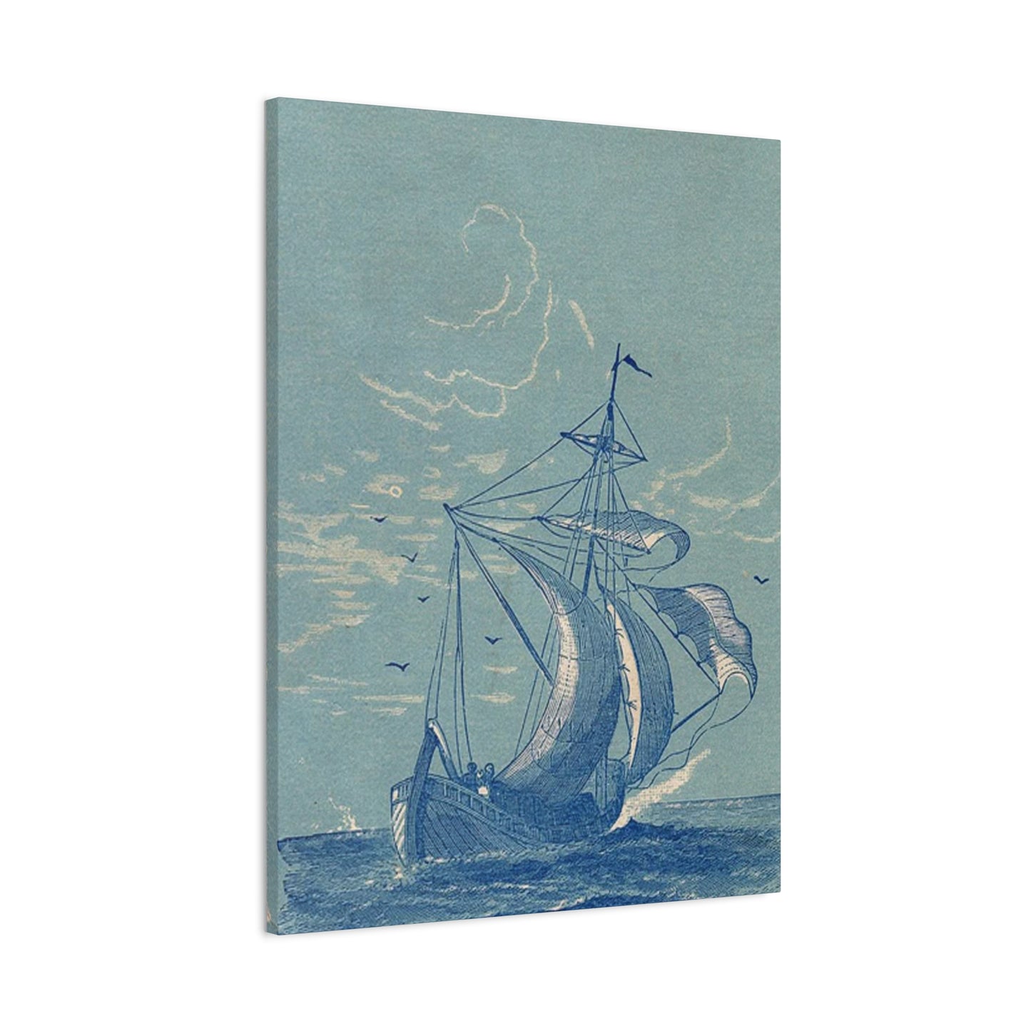
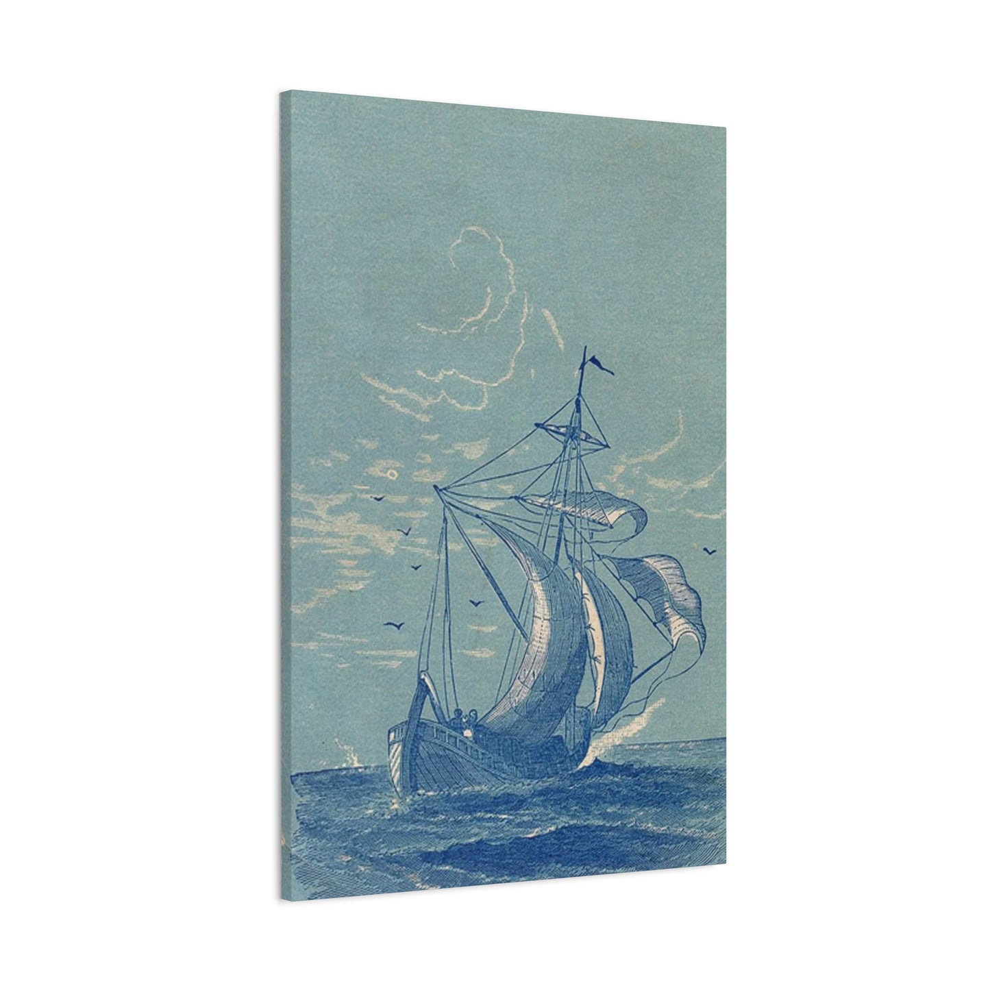
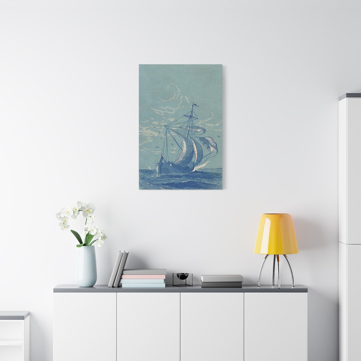

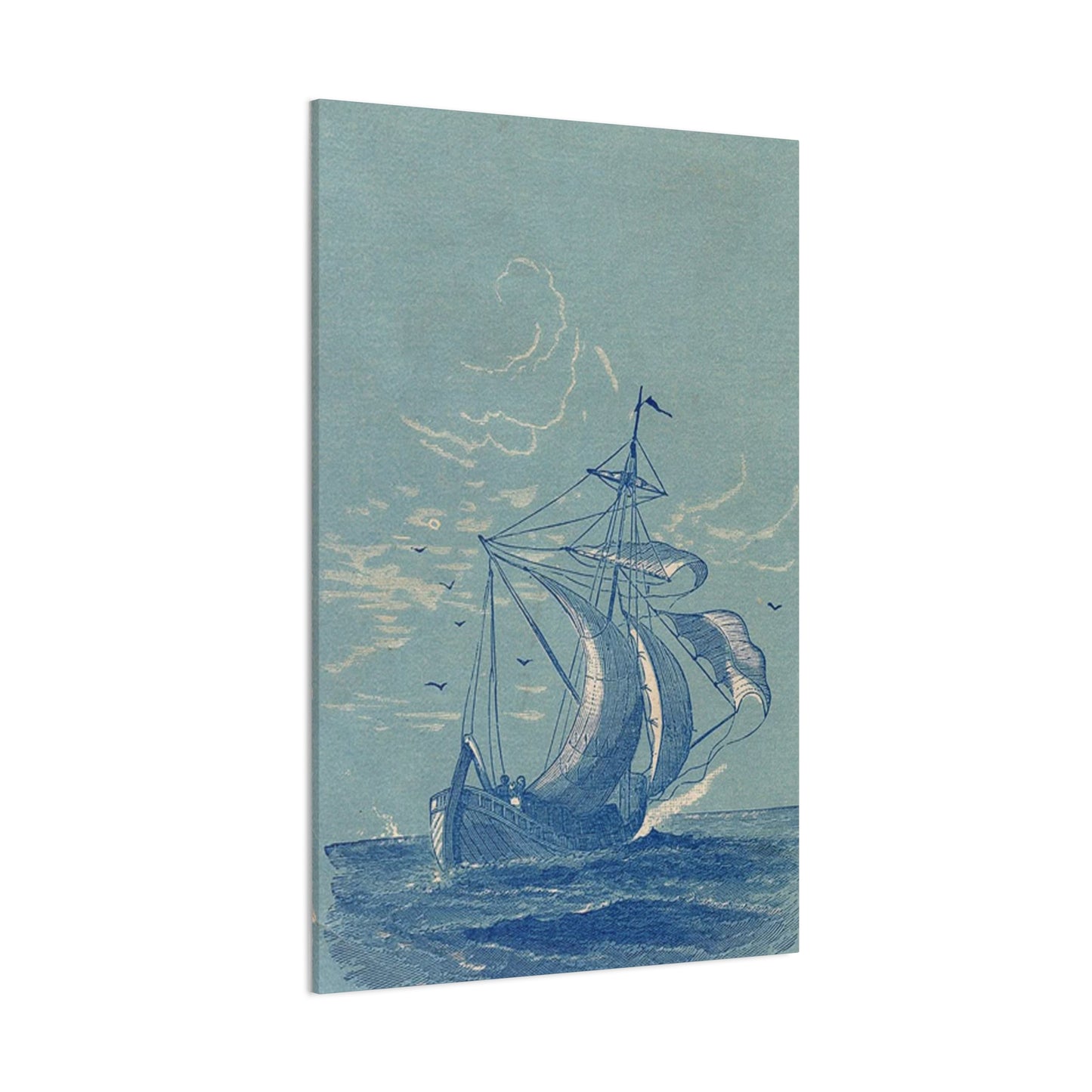
A Nautical Escape: How Ship Sailing in Sea Wall Art Creates a Tranquil Coastal Ambiance
Incorporating classic nautical prints into your living space offers an effortless way to introduce sophistication and character. These artistic pieces capture the essence of maritime heritage, featuring vessels cutting through waves under expansive skies. The timeless appeal of these prints lies in their ability to connect us with the romance of seafaring adventures while maintaining relevance in contemporary interior design schemes.
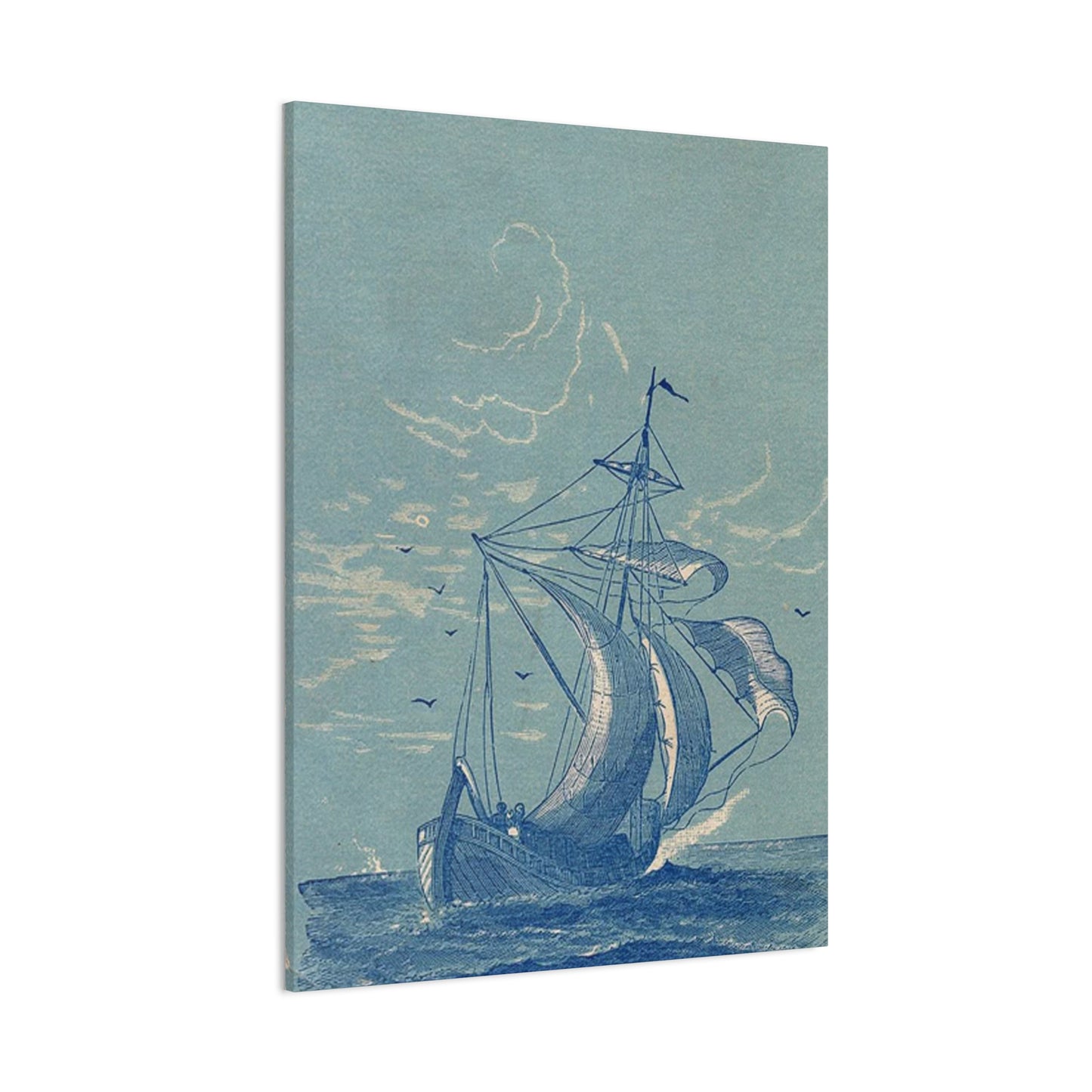
When selecting classic nautical prints, consider pieces that showcase historical sailing vessels, from majestic clipper ships to traditional schooners. These artworks often feature rich details like billowing sails, intricate rigging, and weathered wooden hulls that tell stories of distant voyages. The color palettes typically range from deep navy blues and ocean greens to warm sepia tones that evoke vintage photography, making them versatile additions to various decorating styles.
The placement of these prints significantly impacts their effectiveness in elevating a room. Consider positioning them in spaces where they can command attention without overwhelming the environment. Living rooms, home offices, and libraries particularly benefit from the contemplative nature of nautical imagery. The horizontal orientation of many ship prints naturally complements wide wall spaces above sofas, console tables, or mantels.
Quality matters tremendously when investing in classic nautical prints. Look for reproductions that use archival-quality paper and fade-resistant inks to ensure longevity. Original vintage prints, while more expensive, offer authentic character with their aged patinas and historical significance. Many collectors appreciate the authenticity these pieces bring, as they may have originated from actual maritime journals, navigation charts, or period publications.
Framing choices can dramatically enhance the presentation of nautical prints. Traditional wood frames in rich mahogany, teak, or weathered driftwood finishes complement the maritime theme naturally. For a more contemporary approach, consider sleek black or white frames that allow the artwork to stand out while maintaining a clean aesthetic. Matting in neutral tones provides breathing room around the image and adds a professional gallery-quality finish.
These prints work beautifully in both formal and casual settings. In a traditional study, they contribute to an atmosphere of learned refinement, suggesting worldliness and appreciation for maritime history. In a beach cottage or coastal home, they reinforce the connection to the ocean environment while adding artistic merit. Even in urban apartments far from any coastline, nautical prints can serve as windows to adventure and escape.
The educational aspect of classic nautical prints should not be overlooked. Many feature historically significant vessels or depict important moments in maritime history. Displaying these pieces can spark conversations and provide opportunities to share knowledge about naval architecture, exploration history, or the golden age of sail. Children especially benefit from exposure to these images, which can inspire curiosity about geography, history, and marine science.
Collecting nautical prints can become a rewarding hobby that grows with your appreciation for maritime art. Starting with a single statement piece, you might gradually build a curated collection that reflects specific interests, whether in a particular era of shipbuilding, a specific type of vessel, or works by favored maritime artists. This evolving collection adds personal meaning to your decor while increasing in both monetary and sentimental value.
Bring Ocean Adventure Home with Ship Canvas Art
Ship canvas art transforms ordinary walls into gateways of imagination, inviting the spirit of ocean adventure directly into your home. These substantial pieces go beyond mere decoration, creating immersive experiences that transport viewers to windswept decks and salt-sprayed horizons. The tactile quality of canvas adds depth and authenticity that paper prints simply cannot match, with visible texture that catches light and creates subtle shadows enhancing the dimensional quality of the artwork.
The scale possibilities with canvas art allow for truly dramatic presentations. Large-format pieces measuring several feet across can serve as room-defining focal points, commanding attention and setting the tone for entire spaces. These oversized works particularly suit open-concept living areas, where they help define zones and add visual weight to expansive walls that might otherwise feel empty or unfinished. The maritime subject matter brings organic movement and energy that prevents large pieces from feeling static or imposing.
Canvas art featuring ships offers remarkable variety in artistic interpretation. Photorealistic renderings capture every detail of rigging and sail with technical precision, appealing to maritime enthusiasts and history buffs who appreciate accuracy. Impressionistic approaches emphasize mood and atmosphere, using loose brushwork and color to convey the feeling of being at sea rather than documenting exact details. Abstract interpretations reduce ships to essential forms and movements, creating contemporary pieces that reference nautical themes while fitting seamlessly into modern design schemes.
The durability of canvas makes it practical for various home environments. Unlike paper-based prints that may curl, tear, or show damage easily, properly prepared canvas withstands humidity fluctuations better, making it suitable for bathrooms, kitchens, and coastal homes where moisture might be a concern. Gallery-wrapped canvases, where the image continues around the edges, eliminate the need for framing, offering a contemporary presentation that works particularly well in casual or modern settings.
Choosing ship canvas art involves considering both the vessel type and the scene composition. Action-packed images showing ships battling storms or racing through whitecaps bring dynamic energy to spaces where you want to inspire motivation or conversation. Calm scenes featuring vessels at anchor in peaceful harbors or gliding across glassy waters promote relaxation and contemplation, making them ideal for bedrooms, reading nooks, or meditation spaces.
Color schemes in ship canvas art significantly influence how pieces interact with existing decor. Monochromatic works in blues and grays offer sophisticated restraint that coordinates easily with various color palettes. Sunset scenes incorporating oranges, pinks, and purples add warmth and drama, working beautifully in spaces with earth-tone furnishings. Storm scenes with dark, moody palettes create atmospheric tension that can anchor a room's emotional character.
Timeless Elegance: Ships on the Open Sea
The image of ships on the open sea represents one of the most enduring themes in visual art, carrying meanings that resonate across cultures and generations. This timeless subject matter embodies human aspirations for exploration, freedom, and adventure while simultaneously acknowledging the vast power of nature. The elegance inherent in these compositions stems from the graceful lines of sailing vessels contrasted against the organic, ever-changing forms of waves and clouds.
Historical context enriches our appreciation for maritime art featuring ships at sea. For centuries before modern transportation, ships represented humanity's primary means of crossing oceans, making them symbols of connection between distant lands, cultures, and peoples. The artistic tradition of depicting vessels stretches back to ancient civilizations, with each era contributing unique perspectives and techniques. Dutch Golden Age masters like Willem van de Velde brought unprecedented realism to marine painting, while Romantic era artists emphasized the sublime power of nature with ships often shown as small, vulnerable craft against towering waves and dramatic skies.
The compositional elements that make ship-at-sea imagery so compelling remain consistent across artistic styles and periods. The horizon line, whether positioned high or low in the frame, creates a fundamental division between sky and water that organizes the visual space. The ship itself, often positioned according to the rule of thirds, provides a focal point that draws the eye and anchors the composition. The interplay between the rigid geometry of the vessel and the fluid, organic forms of water and clouds generates visual tension that keeps these images interesting even after repeated viewing.
Light plays a crucial role in establishing mood and atmosphere in maritime scenes. Morning light with its cool, clear quality suggests fresh beginnings and new voyages. Midday sun creates strong contrasts and saturated colors that convey energy and vitality. Late afternoon golden hour bathes everything in warm, honeyed tones that evoke nostalgia and romance. Moonlight scenes, though less common, offer mysterious, contemplative qualities that transform the familiar ocean into something strange and otherworldly.
Weather conditions dramatically affect the character of ship-at-sea artwork. Calm seas with mirror-smooth water and ships barely heeling suggest peace, stability, and mastery over nature. Moderate winds filling sails show vessels in their element, purposefully cutting through waves in harmony with natural forces. Storm scenes present ships battling overwhelming elements, creating drama and showcasing human courage and determination against adversity. Each weather condition speaks to different aspects of the maritime experience and appeals to different emotional states in viewers.
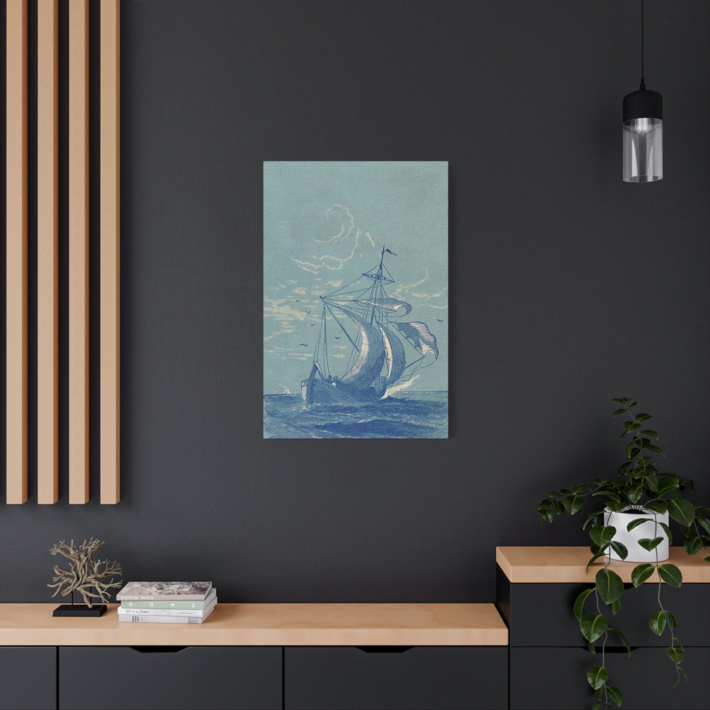
How to Style Ship Sailing Prints in Modern Spaces
Integrating ship sailing prints into modern spaces requires thoughtful approaches that honor both the historical character of the artwork and the clean, contemporary aesthetic of current design trends. The key lies in creating deliberate contrasts that allow each element to enhance the other rather than compete for attention. Modern interiors characterized by minimalism, neutral palettes, and streamlined furniture provide excellent backdrops that allow nautical prints to shine as artistic statements.
Scale considerations become paramount in modern spaces where less-is-more philosophies prevail. Rather than grouping multiple small prints, consider selecting one or two larger pieces that can hold their own against expansive walls and open floor plans typical of contemporary architecture. An oversized ship print becomes a legitimate focal point, equivalent in visual weight to modern furniture pieces and architectural features. This approach maintains the uncluttered aesthetic modern design demands while introducing historical and artistic depth.
Frame selection offers opportunities to bridge historical subject matter with contemporary sensibilities. Ultra-thin metal frames in matte black, brushed steel, or brass create clean lines that complement modern furnishings while adding slight industrial edge. Frameless mounting, where prints are face-mounted to acrylic or mounted on rigid backing without visible frames, creates floating appearances that feel current and gallery-like. For warmer modern spaces incorporating natural materials, simple wood frames in light oak or walnut finishes connect with mid-century modern aesthetics while respecting the maritime theme.
Color coordination requires strategic thinking in modern spaces often built around restricted palettes. Identify dominant colors in your ship print and echo them in accent pieces like throw pillows, vases, or small furniture items to create intentional connections throughout the space. If your modern interior features predominantly neutral grays, whites, and blacks, nautical prints with similar restrained palettes integrate seamlessly. For spaces craving color injection, ship prints featuring sunset skies or tropical waters can introduce blues, oranges, and teals as deliberate accent colors.
Placement strategies in modern spaces should emphasize architectural features rather than fighting them. Position ship prints to complement clean lines of windows, doorways, and built-in shelving. In open-concept spaces, use large nautical pieces to define zones, placing a significant print above a sofa to anchor the living area or positioning one in a dining zone to create subtle separation without physical barriers. Modern homes with high ceilings accommodate vertically oriented ship prints that draw eyes upward, enhancing the sense of spaciousness.
Mixing artistic styles creates visual interest in modern interiors that might otherwise feel too homogeneous. A single nautical print among abstract pieces or modern photography creates an eclectic, curated appearance that suggests sophisticated collecting rather than themed decorating. This approach works particularly well in spaces where you want the ship print to feel like a discovered treasure or inherited piece rather than a coordinated purchase. The contrast between old and new, representational and abstract, becomes an intentional design statement.
Coastal Decor Ideas with Ship Wall Art
Creating authentic coastal decor goes beyond simply adding beach-themed accessories, requiring thoughtful integration of elements that capture the essence of seaside living. Ship wall art serves as an anchor for coastal decorating schemes, providing both thematic relevance and artistic substance. The key to successful coastal design lies in achieving a relaxed, unpretentious atmosphere that evokes the ease and beauty of life near the water without resorting to cliched or overly literal interpretations.
Color palettes inspired by coastal environments provide the foundation for rooms featuring ship wall art. Start with a base of soft whites, creams, and sandy beiges that reference sun-bleached wood and shoreline sand. Layer in various shades of blue, from pale sky tones to deep navy, echoing different aspects of water and atmosphere. Introduce weathered grays that suggest driftwood and storm clouds. Accent with natural rope colors, aged brass tones, and occasional pops of coral or seafoam green. This palette creates a cohesive environment where ship artwork feels inherently at home.
Furniture selections should emphasize natural materials and comfortable, lived-in qualities rather than formal perfection. Slipcovered sofas in white or neutral linen create casual elegance that welcomes relaxation. Wooden furniture with visible grain and weathered finishes references driftwood and boat timbers, connecting with the maritime theme of ship artwork. Wicker and rattan pieces bring texture and organic form that complements coastal settings. Avoid overly matched furniture suites in favor of collected, eclectic combinations that suggest accumulation over time rather than one-time purchases.
Textile choices reinforce coastal themes while adding comfort and warmth. Striped fabrics in navy and white reference classic maritime design and coordinate naturally with ship wall art. Linen and cotton materials in natural, undyed states bring textural interest and casual sophistication. Rope details on curtain tiebacks, pillow trims, or lamp bases echo rigging and sailing equipment. Keep patterns relatively simple and organic, avoiding busy prints that compete with your ship artwork for attention.
Lighting in coastal spaces should maximize natural illumination while adding ambient warmth for evening hours. Sheer curtains or woven shades filter bright sunlight without blocking it entirely, creating the luminous quality characteristic of seaside homes. Table lamps with ceramic bases in textured whites or blues, topped with simple drum shades, provide practical lighting that enhances the coastal aesthetic. For spaces displaying valuable ship artwork, position lighting to prevent direct sun exposure that could cause fading while still maintaining the bright, airy feel coastal design requires.
Accessorizing coastal rooms requires restraint to avoid creating theme-park atmospheres. Select a few meaningful objects with genuine maritime connections rather than accumulating obvious beach decor. A vintage brass telescope, authentic ship's wheel, or collection of antique navigation instruments complement ship wall art while maintaining sophistication. Natural elements like coral specimens, driftwood pieces, or shells displayed in glass vessels bring the outside in without overwhelming. Quality over quantity remains the guiding principle.
Flooring choices impact the overall coastal feeling and how ship wall art is perceived within the space. Light hardwoods in whitewashed or natural finishes suggest weathered dock planks and keep spaces feeling open and bright. If carpet is preferred, choose low-pile natural fibers in sandy or sea-glass tones that won't compete with artwork. Area rugs in jute, sisal, or flat-weave cottons define spaces while maintaining casual, coastal character. Avoid heavy, dark, or ornate flooring that would contradict the light, airy goals of coastal design.
The Beauty of Movement in Nautical Canvas Prints
Movement stands as one of the most captivating qualities in nautical canvas prints, transforming static images into dynamic experiences that engage viewers viscerally. The inherent motion of ships cutting through water, sails billowing with wind, and waves rolling across oceans creates visual energy that brings spaces alive. This sense of movement operates on multiple levels simultaneously, from the literal depiction of physical motion to the psychological effect of implied movement that keeps eyes traveling across the composition.
The technical representation of movement in maritime art requires artistic skill and understanding of natural forces. Water movement presents unique challenges, as artists must capture the translucent, reflective, and constantly changing nature of waves. Successful nautical prints show water with directional energy, whether gentle ripples suggesting light breezes or towering swells indicating powerful storms. The angle and size of waves communicate speed and power, with steeper, larger waves suggesting more dramatic conditions and faster vessel movement.
Sail configuration provides another movement indicator in nautical prints. Fully deployed sails stretched tight indicate strong winds and purposeful travel. Partially furled sails suggest moderated conditions or intentional speed reduction. The shape of sails, whether bellying out with wind or hanging relatively flat, communicates wind strength and direction. The skilled artist captures these nuances, allowing knowledgeable viewers to read environmental conditions and understand the vessel's relationship with natural forces.
Cloud formations contribute significantly to the sense of movement in maritime scenes. Streaked or stretched clouds indicate wind, with their direction and intensity corresponding to sailing conditions below. Cumulus clouds piled high suggest fair weather and moderate conditions, while dark, roiling storm clouds imply turbulent motion throughout the scene. The relationship between cloud movement and water conditions creates atmospheric cohesion that makes scenes feel observed rather than constructed.
The position and angle of ships within compositions affect the perceived movement dramatically. Vessels shown head-on or stern-to appear relatively static, though this can be used intentionally for dramatic effect. Ships shown in three-quarter view, with both bow and side visible, convey forward movement naturally. Vessels heeling significantly suggest speed and wind power, creating dynamic diagonal lines that activate the entire composition. The wake trailing behind ships provides direct evidence of movement and speed, with size and turbulence of the wake indicating vessel velocity.
Brushwork and mark-making techniques contribute to movement perception in painted or hand-finished canvas prints. Directional strokes following wave contours create flow and rhythm. Loose, gestural marks suggesting spray or foam add spontaneity and energy. Impressionistic techniques that capture the feeling of movement rather than precise details often convey motion more effectively than photorealistic approaches. The texture of canvas itself, especially in gallery-wrapped presentations, adds subtle three-dimensionality that enhances the perception of movement as viewing angles change.
Ship Sailing Art That Inspires Wanderlust
Wanderlust, that deep longing for travel and exploration, finds perfect visual expression in ship sailing art that captures the romance and freedom of maritime adventure. These pieces function as more than decoration, serving as daily reminders of vast possibilities beyond familiar horizons. The psychological impact of surrounding yourself with imagery of ships departing harbors, crossing oceans, or discovering new lands creates subtle but persistent encouragement to embrace adventure and remain open to new experiences.
The specific qualities that make certain sailing art particularly effective at inspiring wanderlust include emphasis on journey rather than destination. Images showing ships in mid-voyage, with neither departure nor arrival points visible, suggest ongoing adventure and the experience of travel itself. Vast horizons stretching beyond the frame imply infinite possibilities and unmapped territories. Single vessels traveling alone emphasize individual journeys and personal exploration rather than commercial or military purposes, making scenes more relatable to viewers' own wanderlust dreams.
Atmospheric conditions in wanderlust-inspiring sailing art typically suggest favorable circumstances and possibility rather than danger or hardship. Clear skies or partially clouded conditions with visible blue create optimism and openness. Moderate seas that show the vessel confidently handling conditions suggest achievable adventure rather than foolhardy risk. Warm, golden lighting evokes the romance of travel photography and suggests the magical quality of distant places. These elements combine to make adventure appear inviting rather than threatening.
Historical sailing vessels particularly resonate with wanderlust because they represent ages when travel meant true exploration and discovery. Clipper ships racing across oceans, merchant vessels trading exotic goods, and exploration craft seeking new lands all carry romantic associations with adventure. Unlike modern container ships or cruise vessels, historical sailing craft required skill, courage, and acceptance of uncertainty, qualities that appeal to the adventurous spirit. Art featuring these vessels taps into collective cultural memory of the age of sail as a time of romance and possibility.
Exotic destinations suggested in sailing art amplify wanderlust appeal. Ships approaching tropical islands with palm-lined shores promise paradise and escape. Vessels navigating among dramatic coastal cliffs suggest adventure in wild, unspoiled places. Ships in foreign harbors with distinctive architecture visible in the background offer glimpses of different cultures and ways of life. Even without specific geographical identification, skillful artists suggest the exotic through color palettes, light quality, and atmospheric effects that speak of distant latitudes.
The solitary nature of many sailing art compositions appeals to wanderlust by suggesting the possibility of solitude and self-discovery through travel. A single ship on vast waters becomes a metaphor for individual journeys of exploration, both external and internal. This resonates with viewers seeking not just new places but personal transformation through travel experiences. The ship becomes a symbol of the self, navigating through life's vast possibilities with autonomy and purpose.
Ocean Breeze Vibes: Nautical Wall Decor Ideas
Creating ocean breeze vibes through nautical wall decor involves capturing the sensory essence of coastal environments, particularly that refreshing, invigorating feeling of sea air and open horizons. This aesthetic goes beyond visual appearance to suggest atmosphere and mood, transforming interior spaces into retreats that feel psychologically and emotionally connected to maritime environments. The goal is creating spaces that breathe, feel light, and evoke the restorative qualities of time spent near the ocean.
Color strategies for ocean breeze aesthetics emphasize cool, airy tones that suggest wind, water, and sky. Pale blues ranging from almost-white to soft cerulean create the foundation, referencing both clear skies and shallow coastal waters. Mint and seafoam greens add subtle variation while maintaining cool tones. Crisp whites and soft creams represent sea foam, clouds, and sun-bleached surfaces. Occasional touches of deeper navy anchor the palette without heaviness. Silver and brushed nickel metallics suggest wet sand and glistening water surfaces. This palette creates psychological coolness and openness essential to ocean breeze vibes.
Texture plays a crucial role in suggesting the tactile qualities of coastal environments. Smooth, glossy finishes on some decor elements reference wet surfaces and water itself. Matte, chalky finishes suggest sun-dried driftwood and weathered beach finds. Woven materials like jute, rope, and linen bring organic texture that suggests beach grass and natural fibers used in maritime applications. Glass elements, whether in vases, decorative objects, or even glass-topped furniture, introduce transparency and light reflection reminiscent of water. The combination of varied textures creates sensory richness while maintaining the light, airy quality essential to this aesthetic.
Wall treatment options beyond framed artwork contribute to ocean breeze atmospheres. Shiplap or beadboard painted in soft whites or pale blues references coastal architecture while adding subtle texture. Limewash or color-washed techniques create translucent, layered color effects suggesting atmospheric depth. Wallpaper featuring subtle wave patterns, weathered wood textures, or nautical motifs can create immersive environments, though restraint is important to avoid overwhelming spaces. One accent wall with pattern or texture, combined with simpler treatments on remaining walls, often achieves better balance than full-room applications.
Arrangement strategies for nautical wall decor should emphasize asymmetry and organic grouping rather than rigid grids or symmetrical placements. This approach suggests the unplanned, collected-over-time quality of beach finds rather than deliberate decorating. Vary sizes, shapes, and frame styles within grouped arrangements. Include three-dimensional objects like floating shelves holding shells, coral, or small sailboat models among flat artwork. Allow some negative space within groupings so individual pieces can breathe, preventing the cluttered feel that contradicts ocean breeze lightness.
Incorporating natural elements directly into wall decor strengthens ocean breeze connections. Driftwood pieces can become mounting surfaces for smaller artwork or sculptural elements themselves. Shadow boxes displaying shells, sand dollars, or sea glass create dimensional variation among flat prints. Rope used as decorative elements, whether framing mirrors, hanging artwork, or creating purely sculptural wall pieces, reinforces maritime themes while adding organic texture. Live plants, particularly air plants or succulents that suggest coastal vegetation, can be incorporated into wall-mounted displays.
Large Canvas Prints That Make a Statement
Large canvas prints command attention and define spaces in ways smaller artworks simply cannot match, offering dramatic impact that justifies their prominent placement and investment. When featuring maritime subjects, oversized canvases create immersive experiences that transport viewers to ocean environments, with scale allowing fine details to remain visible while overall compositions maintain commanding presence. The decision to incorporate large-scale nautical artwork represents a commitment to making the maritime theme central rather than accessory to your design scheme.
Determining appropriate size requires considering room dimensions, ceiling heights, and viewing distances. As a general guideline, artwork should occupy roughly two-thirds to three-quarters the width of the furniture piece it hangs above, though large-scale pieces may intentionally exceed this to create dramatic effect. In rooms with standard eight-foot ceilings, pieces up to 48 inches tall typically work well. Higher ceilings accommodate even larger dimensions, with some statement pieces reaching six feet or more in either dimension. Consider that viewers typically stand six to ten feet away from wall-mounted artwork in residential spaces, and the piece should remain comfortably viewable from this distance.
Subject selection becomes especially critical in large-format pieces, as whatever you choose will dominate the visual environment. Panoramic ocean scenes with ships positioned within expansive seascapes create natural fits for horizontal large formats, complementing the typical proportions of walls above sofas or beds. Dramatic vertical pieces showing tall ships with full sail configurations or looking upward at masts and rigging suit vertical spaces flanking windows, doors, or other architectural features. The complexity of the subject matter should match the scale, with larger pieces able to sustain interest through detailed compositions that reward extended viewing.
Photographic versus painted approaches each offer distinct advantages in large formats. Photorealistic images create immediate impact and allow viewers to study details as if looking through windows into actual scenes. The clarity and precision possible in large photographic prints brings unprecedented detail to maritime subjects, from individual rigging lines to water droplets on sail canvas. Painted approaches, whether original works or high-quality reproductions, introduce artistic interpretation and handmade qualities that can feel warmer and more personal at large scale. Abstract or impressionistic treatments prevent large pieces from feeling static or photographic, maintaining visual interest through texture and mark-making.
Color considerations become amplified at large scale, as colors will significantly influence room ambiance. A large canvas dominated by deep blues and grays creates dramatically different atmosphere than one featuring sunny skies and tropical waters. Consider how the artwork's color palette relates to existing furnishings and whether you want the piece to coordinate harmoniously or provide intentional contrast. Large pieces with predominantly neutral or monochromatic palettes offer flexibility as surrounding decor changes over time, while more colorful works require greater commitment to coordinating schemes.
Why Ship Art Works in Both Classic and Modern Homes
The remarkable versatility of ship art across diverse design styles stems from several fundamental qualities that allow maritime imagery to adapt while maintaining essential character. Unlike some decorative themes that lock firmly into specific periods or aesthetics, nautical subject matter possesses timeless appeal rooted in universal human experiences with exploration, nature, and the sea. Understanding why ship art succeeds in both traditional and contemporary contexts allows for confident integration regardless of your home's overall style.
Historical depth gives ship art legitimacy in classic interiors where period authenticity and traditional craftsmanship are valued. Maritime painting has been a respected artistic genre for centuries, with masters from Dutch Golden Age painters to American luminists creating works that now hang in major museums. Incorporating ship art into classic homes connects with this established tradition, suggesting refined taste and appreciation for art historical significance. The subjects themselves, particularly historical sailing vessels, belong to periods that classic design often references, creating natural thematic alignment.
The graphic qualities of ships, with their strong linear elements, geometric sail shapes, and defined silhouettes, translate beautifully into modern design vocabularies that emphasize clean lines and bold forms. Simplified or abstracted ship imagery particularly suits contemporary spaces, where representational art that's too detailed or romantic might feel out of place. Even realistic ship depictions work in modern contexts when their compositional strength and formal qualities are emphasized over narrative or sentimental associations. The inherent geometry of nautical subjects provides visual interest that complements modern architecture's angular clarity.
Color palette adaptability allows ship art to coordinate with both classic and modern color schemes. Traditional interiors often feature rich, saturated colors and warm wood tones that pair well with ship art emphasizing deep blues, sunset golds, and vintage sepia tones. Modern spaces typically employ more restricted, neutral palettes with occasional bold accents, which ship art can support through monochromatic treatments, high-contrast compositions, or selective color pops. Artists and photographers working with maritime subjects create versions spanning the full stylistic spectrum, ensuring options exist for any color requirement.
The subject matter itself carries meanings that resonate across design philosophies. In classic interiors, ships represent heritage, tradition, exploration history, and romantic adventure, all values consistent with traditional design's respect for the past. In modern spaces, the same ships can symbolize forward movement, innovation, human ingenuity, and the tension between human achievement and natural forces, themes aligned with modernism's progressive outlook. This semantic flexibility allows identical imagery to feel appropriate despite radically different surrounding aesthetics.
Scale and presentation methods offer opportunities to tailor ship art appropriately for different design contexts. Classic interiors often feature ornate gold or wood frames with substantial profiles, traditional matting, and formal hanging heights and arrangements. The same maritime image, when mounted frameless on acrylic, hung in an asymmetrical grouping, or presented as a large-scale statement piece, reads as entirely contemporary. The ship subject remains constant while presentation adapts to stylistic requirements, demonstrating the content's fundamental versatility.
Sailing into Calm: Ocean-Themed Wall Art
Ocean-themed wall art emphasizing calm, peaceful qualities serves psychological and aesthetic functions distinct from more dramatic maritime imagery. These serene compositions featuring gentle waters, quiet harbors, and vessels at rest or moving peacefully create sanctuaries of tranquility in increasingly hectic modern lives. Understanding how to select and incorporate calming ocean art allows creation of restorative spaces that promote relaxation, reflection, and psychological well-being.
Color psychology plays a fundamental role in calming ocean art, with specific hues proven to reduce stress and promote relaxation. Soft blues in the pale to medium range lower heart rate and blood pressure while encouraging mental calmness. Gentle aquas and seafoam greens combine blue's tranquility with green's associations with nature and renewal. Lavenders and soft purples suggesting twilight or dawn skies add contemplative qualities. Warm neutrals like sandy beiges and pearl grays provide grounding without stimulation. Calming ocean art typically avoids intense, saturated colors or high contrasts that create visual excitement rather than peace.
Subject matter selection determines whether ocean art soothes or stimulates. Calm water conditions, whether glassy-smooth or showing only gentle ripples, convey peace most directly. Vessels at anchor or moving slowly suggest stillness and stability rather than urgent action. Sunrise or sunset scenes, particularly those with pastel color palettes, evoke transitional moments conducive to reflection. Empty beaches, quiet coves, and protected harbors all reinforce feelings of safety and refuge. Avoid stormy scenes, dramatic wave action, or compositions emphasizing struggle or conflict when the goal is creating calm.
Perfect for Beach Houses: Ship Wall Prints
Beach houses present unique opportunities and challenges for incorporating ship wall prints, as these coastal locations create natural thematic alignment while requiring consideration of environmental factors and stylistic approaches that honor the setting. The relationship between ship art and actual ocean environments creates layered meanings and enhanced impact unavailable in inland locations. Understanding how to maximize these special circumstances while respecting the beach house context allows creation of deeply satisfying, place-appropriate interiors.
Environmental durability becomes paramount in beach locations where humidity, salt air, and temperature fluctuations challenge artworks. Select prints produced with marine-grade inks and protective coatings that resist moisture damage and fading. Canvas offers better humidity tolerance than paper-based prints, though proper sealing remains important. Frame selections should avoid materials susceptible to rust or corrosion, favoring aluminum, stainless steel, or well-sealed wood. Consider acrylic glazing rather than glass in hurricane-prone regions, as acrylic weighs less and shatters less dangerously. Some collectors rotate valuable pieces seasonally, displaying them during occupancy periods while storing them in climate-controlled environments during off-seasons.
Authenticity considerations guide ship print selections for beach houses, where forced or overly cute nautical themes feel inappropriate given the genuine coastal location. Choose pieces with artistic merit and authentic maritime character rather than souvenir-shop quality reproductions. Historical accuracy in vessel depictions demonstrates respect for maritime heritage. Local or regional maritime subjects create meaningful connections to the specific coastal area. If your beach house sits on the Atlantic versus Pacific, consider ship art reflecting that particular ocean's maritime history and vessel types.
View relationships between ship wall prints and actual ocean views require thoughtful orchestration. Position ship art on walls perpendicular to view walls rather than competing directly with windows framing real ocean scenes. Use maritime art to extend nautical themes into interior spaces where views are limited or absent, such as hallways, powder rooms, and bedrooms facing away from water. Consider ship prints as complements to views rather than substitutes, enhancing overall maritime immersion rather than attempting to replicate what windows already provide more effectively.
Scale approaches in beach houses often benefit from relaxed, casual presentations rather than formal, gallery-style displays. Beach environments encourage ease and informality, which rigid, perfectly matched prints arrangements may contradict. Mix sizes freely, creating organic groupings that suggest collection over time. Lean larger pieces against walls on mantels or shelves rather than hanging everything. This casual approach suits beach living's relaxed character while protecting walls from hanging hardware holes that landlords or future owners might object to in rental or investment properties.
Color coordination with beach house environments requires attention to naturally occurring palettes. Observe actual colors in your location: the specific blue of local waters, sand tones that may range from white to pink to gray, vegetation colors from beach grasses to palms. Select ship prints incorporating these local colors to create harmonious integration with the surrounding environment. This color connection between interior art and exterior reality creates satisfying unity that makes ship prints feel inevitable rather than arbitrary decorating choices.
Provenance and local artists add meaningful dimensions to ship print selections for beach houses. Seek work by artists connected to your coastal region, whether historical maritime painters who worked in the area or contemporary artists currently active in local art scenes. Visit nearby galleries, art festivals, and studios to discover artists whose work reflects authentic connections to the place. These pieces carry stories beyond their imagery, connecting your beach house to local culture and creative communities while supporting regional artists.
Nautical Wall Decor That Tells a Story
Narrative power distinguishes memorable nautical wall decor from merely attractive pieces, transforming walls into conversation starters and sources of sustained interest. Story-telling maritime art engages viewers beyond initial visual impact, inviting investigation, questioning, and imagination. Creating displays with narrative depth requires intentional selection of pieces with inherent stories and thoughtful curation that allows individual narratives to emerge while contributing to larger thematic tales.
Historical maritime events provide rich narrative material for wall decor with story-telling power. Famous voyages like Magellan's circumnavigation, Cook's explorations, or the tea clipper races between China and England offer dramatic tales of competition, discovery, and human achievement. Naval battles from various periods carry narratives of conflict, strategy, and historical turning points. Whaling expeditions, merchant trading routes, and immigration journeys all represent story-rich maritime subjects. Selecting art depicting these events invites viewers to engage with history, often prompting research and discussion extending well beyond the artwork itself.
Individual vessel stories create focused narratives with specific details that capture imagination. Famous ships like Cutty Sark, Constitution, or Mayflower carry known histories documented in books and records, allowing artwork featuring them to serve as entry points to historical education. Even lesser-known vessels may have documented histories accessible through maritime archives and museums. Displaying information about depicted ships, whether through small plaques, framed text, or digital frames with rotating information, enhances story-telling aspects and demonstrates knowledgeable appreciation beyond decorative interest.
Personal maritime connections create the most meaningful narrative decor when genuine relationships to seafaring exist. Photographs or artwork featuring vessels family members served aboard carry family history significance. Ships connected to ancestral immigration journeys represent literal links to heritage. Vessels from hometown ports or regions tie personal geography to maritime tradition. These personally meaningful pieces anchor narrative collections with authentic emotion that mass-produced generic maritime art cannot match. Share these stories with guests to bring the artwork alive beyond visual appreciation.
Sequential storytelling through multiple pieces arranged to suggest narrative progression creates engaging wall displays. A series showing different stages of a voyage, from departure through various sea conditions to arrival, guides viewers through temporal progression. Multiple views of the same vessel in different circumstances or locations build understanding of the ship's character and capabilities. Before-and-after depictions showing peaceful and stormy conditions demonstrate the range of maritime experience. These sequential approaches reward extended viewing as viewers piece together the complete narrative.
Technical and operational details visible in artwork provide narrative fodder for knowledgeable viewers while inviting questions from others. Accurate depictions of sail configurations, flags, and rigging allow maritime experts to read sea conditions, nationality, and vessel purpose from visual evidence. These details aren't mere decoration but information that tells stories about the moment depicted. Selecting artwork with such authentic details demonstrates serious engagement with maritime subjects while providing endless material for examination and discussion.
Blue Tones and Waves for a Peaceful Interior
Blue, the color most associated with water and sky, creates psychological effects that make it ideal for peaceful interiors, particularly when combined with wave motifs connecting directly to calming ocean imagery. Understanding blue's various shades and their specific impacts allows strategic use in maritime-themed spaces designed to promote tranquility, rest, and mental clarity. The combination of blue tones with wave imagery specifically taps into deep human responses to water that operate below conscious awareness.
Color psychology research consistently identifies blue as having calming, stress-reducing properties. Blue wavelengths actually lower heart rate and blood pressure while reducing feelings of anxiety and promoting mental calmness. These physiological responses occur automatically, making blue a powerful tool for creating genuinely relaxing environments rather than spaces that merely look peaceful. Different blue tones produce subtle variations in these effects, with lighter blues feeling more ethereal and spacious while deeper blues create cocooning, secure sensations. For maximum peacefulness, emphasize pale to medium blues while using deeper tones as accents rather than dominants.
Wave imagery reinforces blue's calming properties through associations with rhythmic, predictable movements. Ocean waves represent natural cycles and flows that subconsciously communicate order and continuity. The repetitive nature of wave motion, whether depicted in realistic detail or suggested abstractly, creates visual rhythm that encourages mental synchronization similar to meditation breathing exercises. Selecting maritime art featuring gentle waves rather than dramatic breakers maximizes peaceful associations while maintaining visual interest through organic, flowing forms.
Layering multiple blue shades creates depth and sophistication while maintaining peaceful unity. Start with pale sky blues on largest surfaces like walls, establishing airy, open foundations. Introduce medium ocean blues through larger furniture pieces or significant artworks. Add deeper navy accents through smaller decor items, pillows, or trim details. This graduated approach creates visual interest without disruption, as the eye moves comfortably through related tones rather than jumping between contrasting colors. Maritime art featuring similar blue progression, from pale sky through mid-tone water to deep wave shadows, reinforces this layered color strategy.
Pairing blues with neutrals provides essential grounding that prevents blue-dominated rooms from feeling cold or unwelcoming. Warm neutrals like cream, sand, and soft beige offset blue's coolness while maintaining peaceful character. Natural wood tones, whether light driftwood shades or medium oak hues, add warmth and organic texture. Soft grays complement blues beautifully while adding sophistication. White in its various temperatures can brighten blue spaces or create crisp contrast depending on quantities and placements. Maritime art incorporating these neutral elements alongside blues creates balanced compositions that guide successful color coordination throughout rooms.
Natural light dramatically affects how blues appear and feel in spaces. Morning light enhances blue's freshness and clarity, creating alert yet calm atmospheres. Afternoon light may bring out subtle green undertones in certain blues, adding complexity. Evening light requires attention to artificial illumination that maintains blue's character without dulling or distorting tones. Select warm white bulbs rather than cool white, as warm light enhances rather than clashes with blue. In rooms with limited natural light, lighter blue tones prevent spaces from feeling dark or claustrophobic while darker blues may make dim rooms feel smaller and gloomier.
Decorating with Nautical Art Made Simple
Simplifying the nautical art decorating process removes intimidation and makes maritime-themed design accessible to anyone drawn to ocean imagery, regardless of design experience or confidence. By breaking the process into manageable steps and focusing on essential principles rather than complex rules, anyone can successfully incorporate ship and ocean art into their homes. The following streamlined approach provides clear guidance while encouraging personal expression and enjoyment of the decorating journey.
Start with a single significant piece rather than attempting to design entire rooms at once. Select one maritime artwork that genuinely speaks to you, whether due to colors, subject matter, emotional resonance, or simply immediate appeal. This anchor piece guides subsequent decisions and prevents overwhelming yourself with too many simultaneous choices. Position this primary piece in your most-used space where you'll see it daily, ensuring regular enjoyment and justifying its importance in your home. Living with this piece for some time reveals how it affects the space and your experience before committing to additional purchases or changes.
Identify dominant colors in your chosen artwork and pull them into surrounding space through simple additions. If your maritime piece features prominent blues, add blue pillows to nearby seating. If warm sunset tones appear, introduce similar warmth through throws or small accessories. This color echoing creates automatic coordination without requiring design expertise. Keep initial color connections simple and obvious rather than attempting subtle or complex coordinating schemes. As confidence builds, you can refine color relationships, but initial simplicity ensures success and prevents costly mistakes.
Keep backgrounds simple to allow nautical art to shine rather than compete with busy surroundings. Paint walls in neutral tones or soft single colors that support rather than fight artwork. Clear surfaces of unnecessary clutter to create visual calm around displayed pieces. Remove or minimize competing focal points like excessive collections or brightly colored furniture that draws attention away from maritime art. The most common decorating mistake is adding too much rather than too little, so practice restraint and allow breathing room around your nautical pieces.
Conclusion
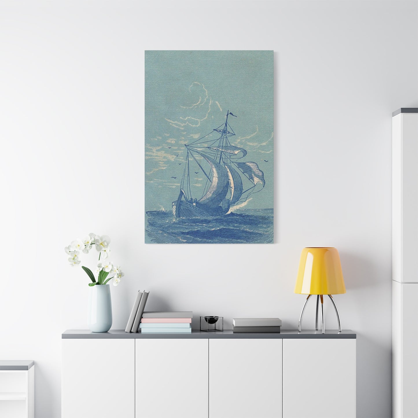
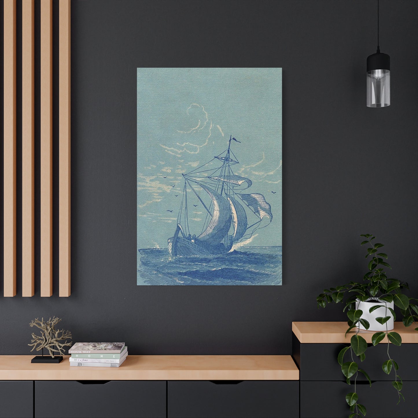
Ship sailing in sea wall art offers more than a beautiful image—it creates a serene and immersive experience that brings the tranquility of the ocean into your home. These artworks evoke the gentle rhythm of the sea, the soft movement of sails, and the endless horizon, instantly transforming ordinary walls into calming coastal escapes. Whether displayed in a living room, bedroom, hallway, or dining area, ship sailing art sets a tone of peace, reflection, and timeless maritime charm.
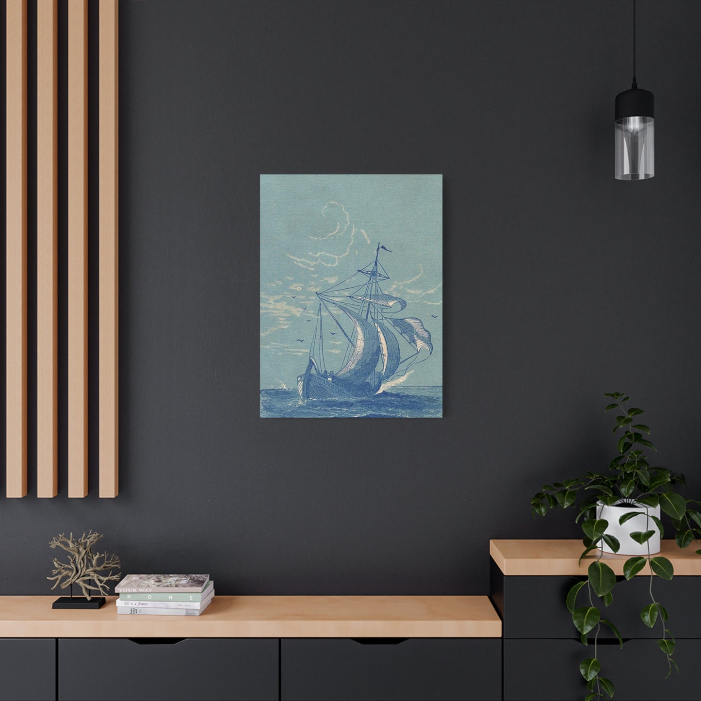
One of the greatest strengths of this art style is its ability to complement a variety of interior designs. In coastal-themed homes, it naturally enhances the breezy, airy aesthetic with ocean blues, sandy neutrals, and crisp whites. In modern spaces, the sleek lines of a sailing vessel can provide an elegant focal point that balances contemporary elements with the softness of the sea. Even in rustic or bohemian interiors, sailing art introduces a sense of openness and natural beauty that feels both grounding and uplifting.
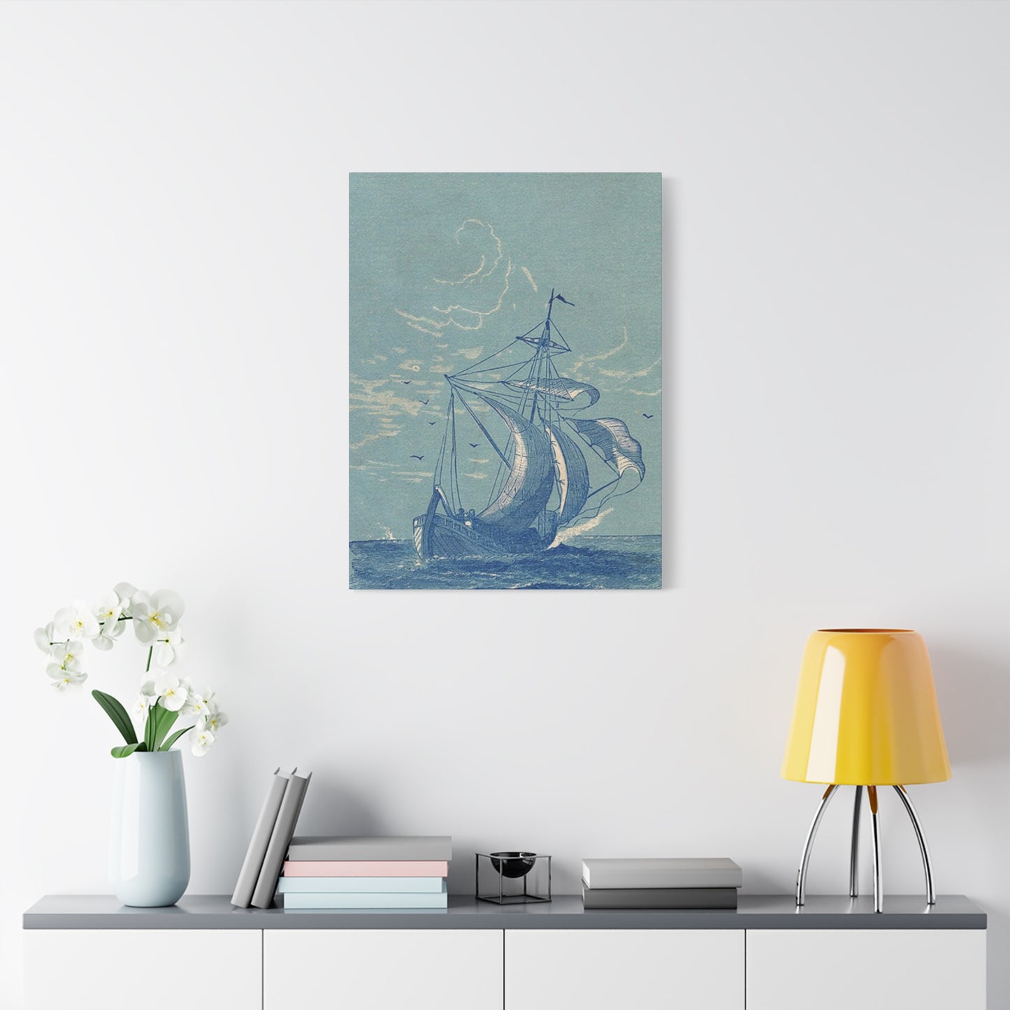
Lighting and placement are key to fully capturing the essence of ship sailing art. A large, centered piece above a sofa, bed, or console table can anchor a space, while smaller works arranged as a gallery wall can create a layered narrative of maritime adventure. Warm, soft lighting enhances the ocean’s natural hues and highlights subtle details, allowing the artwork to shine without overwhelming the room.
In addition to its visual appeal, ship sailing art carries symbolic meaning. Sailing ships represent freedom, exploration, and resilience—values that resonate deeply in modern living spaces. The calm seas depicted in these pieces serve as gentle reminders of balance and peace, making them ideal for spaces designed for rest, conversation, or contemplation.Incorporating complementary décor can further enhance the coastal ambiance. Natural textures like rattan, linen, driftwood, and woven rugs pair beautifully with sailing imagery, creating a cohesive and inviting environment. Soft blues, whites, and sandy beiges echo the colors of the sea, making the room feel fresh, open, and harmonious.
