


Authentic Street Culture Comes Alive with Skateboard Graffiti Wall Art
The intersection of skateboarding culture and graffiti artistry has created one of the most dynamic and expressive movements in contemporary visual expression. This fusion represents more than just aesthetic appeal; it embodies a rebellious spirit, creative freedom, and the raw energy of urban landscapes. When you bring these elements into your home through canvas prints and carefully curated pieces, you're not simply decorating walls but making a statement about authenticity, youth culture, and the celebration of alternative artistic movements that have shaped modern creativity.
Skateboard culture and graffiti have shared parallel histories, both emerging from the streets as forms of self-expression that challenged conventional norms. The vibrant colors, dynamic compositions, and bold statements found in graffiti naturally complement the action-oriented, boundary-pushing ethos of skateboarding. Together, they create visual narratives that speak to individuals who appreciate art with attitude, pieces that refuse to blend into the background and instead demand attention and provoke conversation.
The beauty of incorporating these artistic elements into residential or commercial environments lies in their versatility and impact. Whether you're drawn to the explosive color palettes that characterize spray paint artistry, the intricate layering techniques that create depth and texture, or the cultural symbolism embedded within skateboard graphics, these pieces offer endless possibilities for personal expression. They work equally well in modern lofts, creative studios, youth-oriented environments, or any location where conventional art feels too restrictive or impersonal.
The Electric Pulse of Urban Skate Graffiti Vibes
Urban skate graffiti vibes capture the heartbeat of city streets where concrete becomes canvas and movement becomes art. This aesthetic draws directly from the environments where skateboarding thrived, the underpasses, abandoned warehouses, school yards, and alleyways where young artists found freedom to express themselves without permission or validation from traditional art establishments. The energy contained within these pieces is palpable, translating the kinetic motion of skateboarding into static visual form while maintaining the spontaneity and improvisation that defines both disciplines.
When you examine authentic urban skate graffiti compositions, you'll notice they rarely feel calculated or overly refined. Instead, they embrace imperfection as part of their charm. Drips, overspray, layered tags, and partially obscured elements all contribute to a sense of history and authenticity. These aren't sanitized representations of street culture but rather honest reflections of how art develops in unrestricted environments. The roughness, the seemingly chaotic composition, and the unpolished execution all serve a purpose, creating works that feel alive and connected to their origins.
The architectural elements frequently incorporated into these pieces ground them in physical reality. You'll often see representations of skate parks, halfpipes, rails, stairs, and other features that define skateboarding terrain. These elements aren't just background details but essential components that contextualize the artwork within its cultural framework. They remind viewers that this art form emerged from specific places and practices, carrying with it the DNA of outdoor recreation, physical risk-taking, and community building that happens in these urban athletic environments.
Color selection in urban skate graffiti tends toward high contrast combinations that ensure visibility even from a distance. This practical consideration from street application translates beautifully to canvas, where bold color choices create focal points that anchor entire rooms. The palette often includes fluorescent tones, deep blacks, bright whites, and saturated primaries that reflect both the spray paint medium and the high-energy culture from which these aesthetics emerged. These color decisions aren't arbitrary but rather serve both functional and symbolic purposes within the broader visual language.
Texture plays an equally important role in authentic urban skate graffiti aesthetics. Even when reproduced on canvas, the most effective pieces maintain a sense of dimensional depth through shadowing, highlighting, and the suggestion of physical layers. Quality reproductions often incorporate techniques that mimic the appearance of actual spray paint application, including gradient transitions, spatter patterns, and the distinctive cap patterns created by different nozzle types. These details separate genuine appreciation for the art form from superficial imitation, creating pieces that resonate with those who understand the craft.
Typography in urban skate graffiti follows distinctive stylistic conventions developed over decades of street writing. Whether it's wildstyle lettering with intricate interlocking forms, bubble letters with rounded, accessible shapes, or sharp angular constructions that suggest speed and aggression, the text elements carry meaning beyond their literal content. For many artists working in this tradition, letter forms become abstract designs that challenge viewers to decode messages while simultaneously appreciating them as pure visual composition. This dual functionality adds intellectual engagement to the immediate visual impact.
The relationship between figure and ground in urban skate graffiti often deliberately subverts traditional compositional rules. Rather than clearly defined subjects against neutral backgrounds, these works frequently feature complex layering where multiple elements compete for attention. This reflects the actual urban environments where these styles developed, locations where visual information competes for limited attention spans. The resulting compositions train viewers to look more carefully, discovering new details with repeated viewing rather than absorbing everything in a single glance.
Environmental context matters significantly when incorporating urban skate graffiti vibes into residential or commercial settings. These pieces thrive in environments with complementary aesthetic sensibilities, locations that already embrace industrial materials, exposed construction elements, or minimalist furnishings that allow the artwork to dominate. Placing these bold compositions in overly traditional or ornate settings creates cognitive dissonance rather than harmonious integration. The surrounding environment should enhance rather than compete with the raw energy these pieces bring.
Scale considerations become particularly important with urban skate graffiti inspired works. While these aesthetics can function at various dimensions, they often benefit from generous proportions that mirror their street art origins. Large format presentations allow the full impact of gestural marks, sweeping color fields, and complex compositions to register properly. Undersized versions can feel timid or apologetic, contradicting the confident, unapologetic nature of authentic graffiti expression. When wall dimensions permit, going bigger generally produces more satisfying results.
Authentication and artist attribution present interesting considerations within this genre. Unlike traditional fine art where provenance and signatures are paramount, graffiti culture has complex relationships with authorship. Many street artists work anonymously or under pseudonyms, and the collaborative nature of graffiti scenes means individual attribution can be ambiguous. However, recognizing influential styles, documenting creative lineages, and supporting artists who advance the form remains important even within this democratized art movement. Collectors should seek pieces that honor the culture rather than merely appropriating its aesthetics for commercial purposes.
Explosive Impact Through Bold Colors in Graffiti Art
Bold colors in graffiti art represent one of the most immediately recognizable characteristics of this creative movement. The color intensity serves multiple purposes, from ensuring visibility in cluttered urban environments to expressing emotional states and cultural affiliations. When translated to canvas for residential display, these vivid palettes bring unprecedented energy to living environments, creating focal points that animate entire rooms and establish mood with undeniable authority. The psychological impact of saturated hues cannot be overstated, particularly when deployed with the confidence characteristic of graffiti compositions.
The history of bold color use in graffiti connects directly to available materials and practical necessities. Early graffiti writers worked primarily with spray paint, a medium that naturally produces intense, opaque color coverage. The technology of aerosol paint delivery systems meant that subtle gradations and muted tones were technically challenging, while saturated colors applied at full strength came easily. This material constraint became an aesthetic choice, defining the visual language of the movement. Even as artists gained access to broader color ranges and application techniques, the preference for maximum color intensity remained a cultural signature.
Color theory operates differently in graffiti art compared to traditional painting disciplines. While classical approaches emphasize harmony, balance, and carefully calibrated relationships between hues, graffiti aesthetics often embrace collision and contrast. Complementary colors appear at full saturation directly adjacent to each other, creating optical vibration that would feel excessive in conventional contexts but reads as appropriately energetic within this framework. The goal isn't visual comfort but rather impact, memorability, and the communication of vitality and presence.
Specific color associations carry cultural meaning within graffiti communities. Certain hue combinations reference geographic locations, crew affiliations, or particular stylistic movements within the broader practice. These color codes function as visual shorthand for those familiar with the culture while remaining accessible as pure aesthetic choices for general audiences. A piece featuring specific color relationships might resonate on multiple levels, offering surface appeal while encoding deeper meanings for initiated viewers. This layered communication strategy exemplifies the sophistication often overlooked in graffiti art.
The technical execution of bold colors on canvas requires different approaches than actual spray paint application. Quality reproductions must capture not just the hues themselves but also the distinctive characteristics of how aerosol paint behaves when applied to surfaces. This includes the slight overspray halos that surround crisp edges, the varying opacity that occurs when different paint densities overlap, and the particular sheen associated with spray enamel as opposed to traditional painting media. Attention to these details separates convincing graffiti-inspired canvas art from generic interpretations that lack authenticity.
Color blocking strategies in graffiti art create dynamic compositions through the juxtaposition of large, unmodulated color fields. Rather than subtle transitions and graduated tones, these pieces often feature hard boundaries between distinct color zones. This approach derives partly from the technical limitations of spray paint application but has evolved into a deliberate aesthetic choice that emphasizes graphic impact over naturalistic rendering. The resulting compositions possess a directness and immediacy that suits contemporary tastes for bold, unambiguous visual statements.
Neon and fluorescent pigments occupy a special position within graffiti color vocabularies. These colors, which appear artificially bright and seem to generate their own light, became particularly popular during certain periods of graffiti history. Their use signals specific cultural moments and stylistic preferences while creating artwork that commands attention even in visually competitive environments. When incorporated into canvas pieces, fluorescent elements require careful consideration of lighting conditions, as these special pigments respond dramatically differently under natural light versus artificial illumination.
The relationship between color and typography becomes especially important in graffiti compositions that incorporate letter forms. Color choices can enhance legibility or deliberately obscure it, depending on artistic intent. Outline colors, fill colors, and background selections all interact to determine whether text elements read clearly or dissolve into abstract pattern. Sophisticated graffiti artists manipulate these relationships to control viewer experience, guiding attention and revelation according to compositional strategies that reward careful observation.
Seasonal and temporal associations influence color perception in ways that affect how graffiti-inspired artwork functions within living environments. Warm color palettes dominated by reds, oranges, and yellows create energizing, active atmospheres appropriate for social contexts and creative work environments. Cool palettes featuring blues, purples, and greens tend toward more contemplative, relaxed experiences. Understanding these psychological dimensions helps in selecting pieces appropriate for specific functional contexts, ensuring that the emotional tone matches the intended use of the room or facility.
Color preservation presents important considerations for collectors of graffiti-inspired canvas art. The same pigment intensity that makes these pieces visually striking can make them vulnerable to fading when exposed to direct sunlight or improper lighting. UV-protective glazing, controlled light exposure, and awareness of pigment lightfastness ratings all contribute to maintaining color vibrancy over time. Discussing these technical considerations with galleries or artists before purchase ensures that the bold impact that attracted you to a piece remains intact through years of display.
Cultural appropriation concerns arise when bold graffiti color aesthetics are separated from their cultural contexts and origins. The visual vocabulary developed by predominantly urban, often marginalized communities carries historical weight and cultural significance beyond pure decoration. Collectors and decorators should approach these aesthetics with awareness of their origins, supporting artists who emerged from or remain connected to authentic graffiti communities rather than merely extracting surface aesthetics for commercial purposes. This ethical dimension adds depth to collecting practices and ensures that the culture that created these powerful visuals receives appropriate recognition and support.
Authentic Expression Through Skate Culture on Canvas
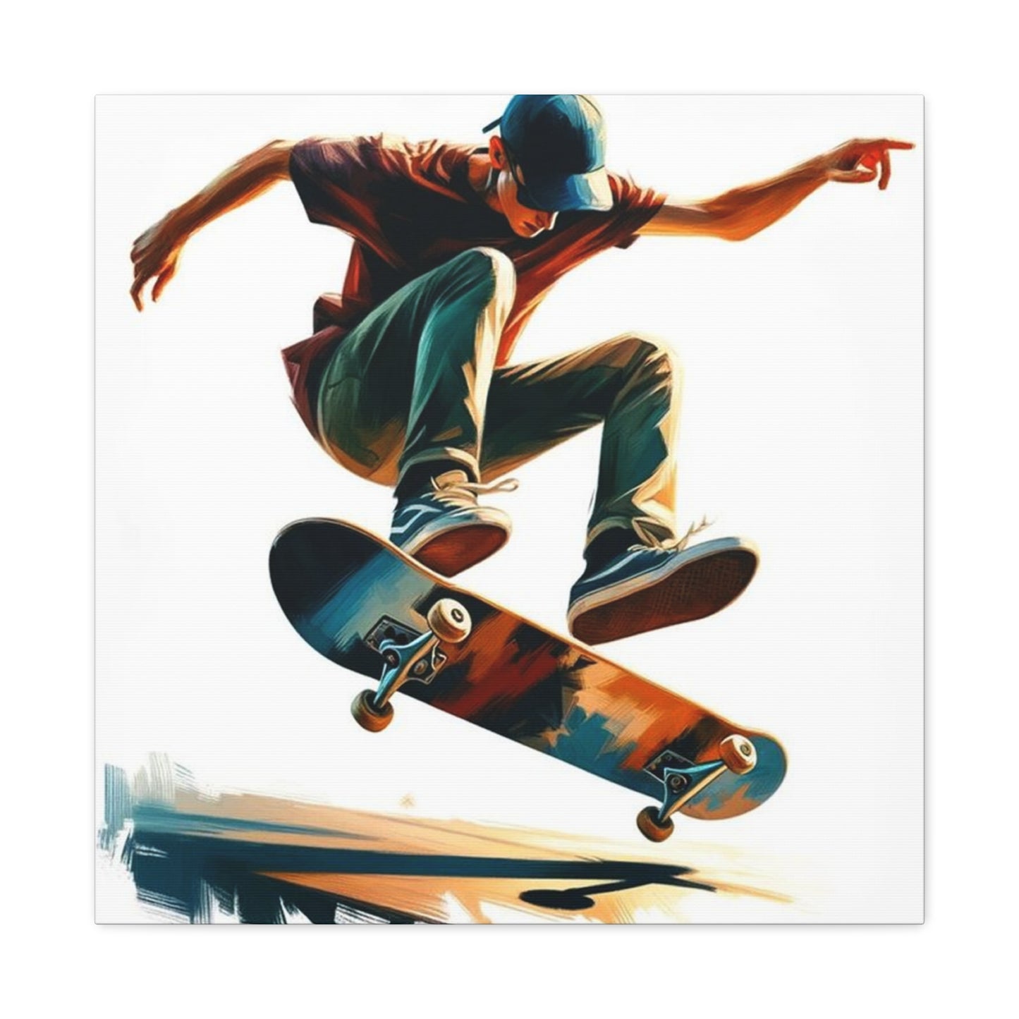
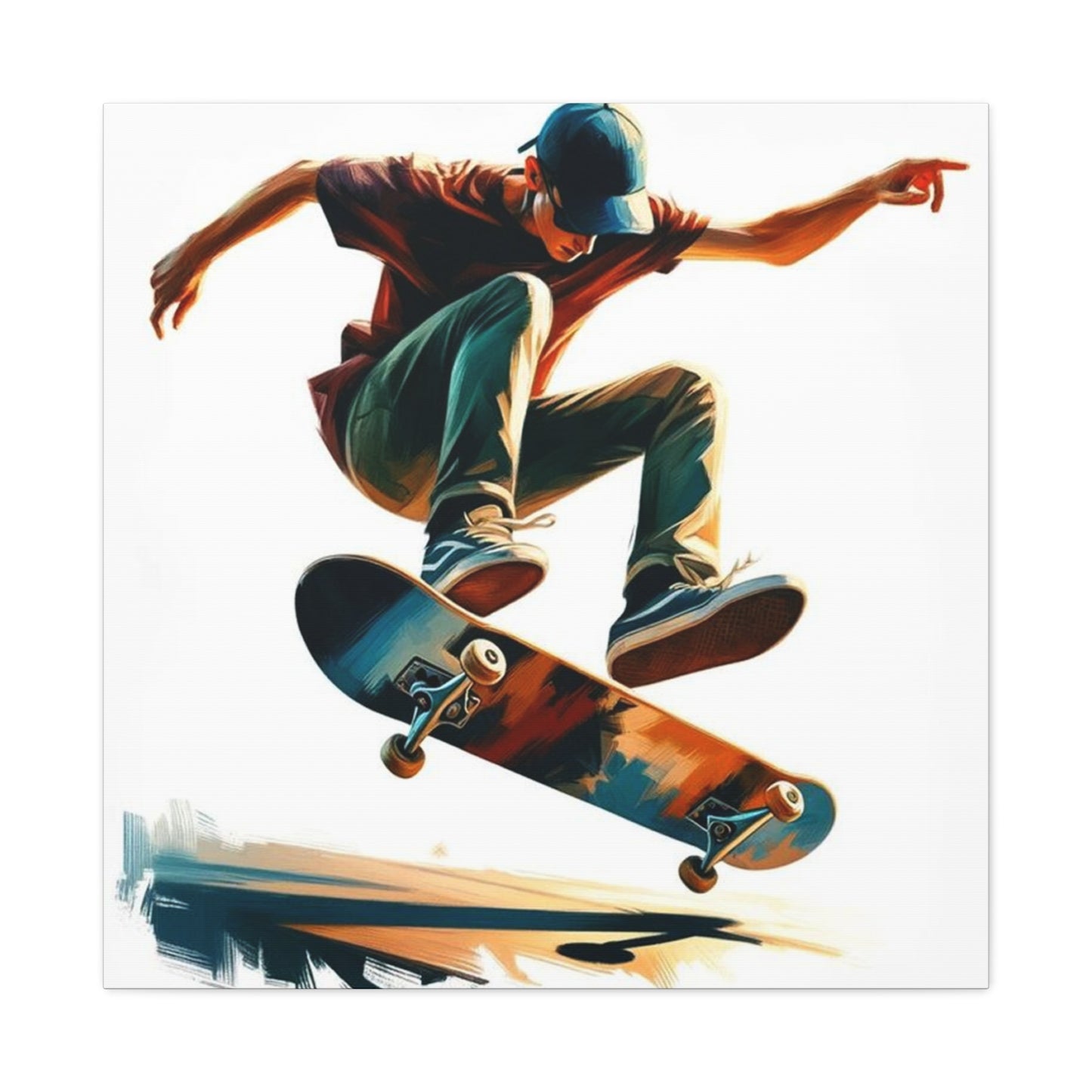
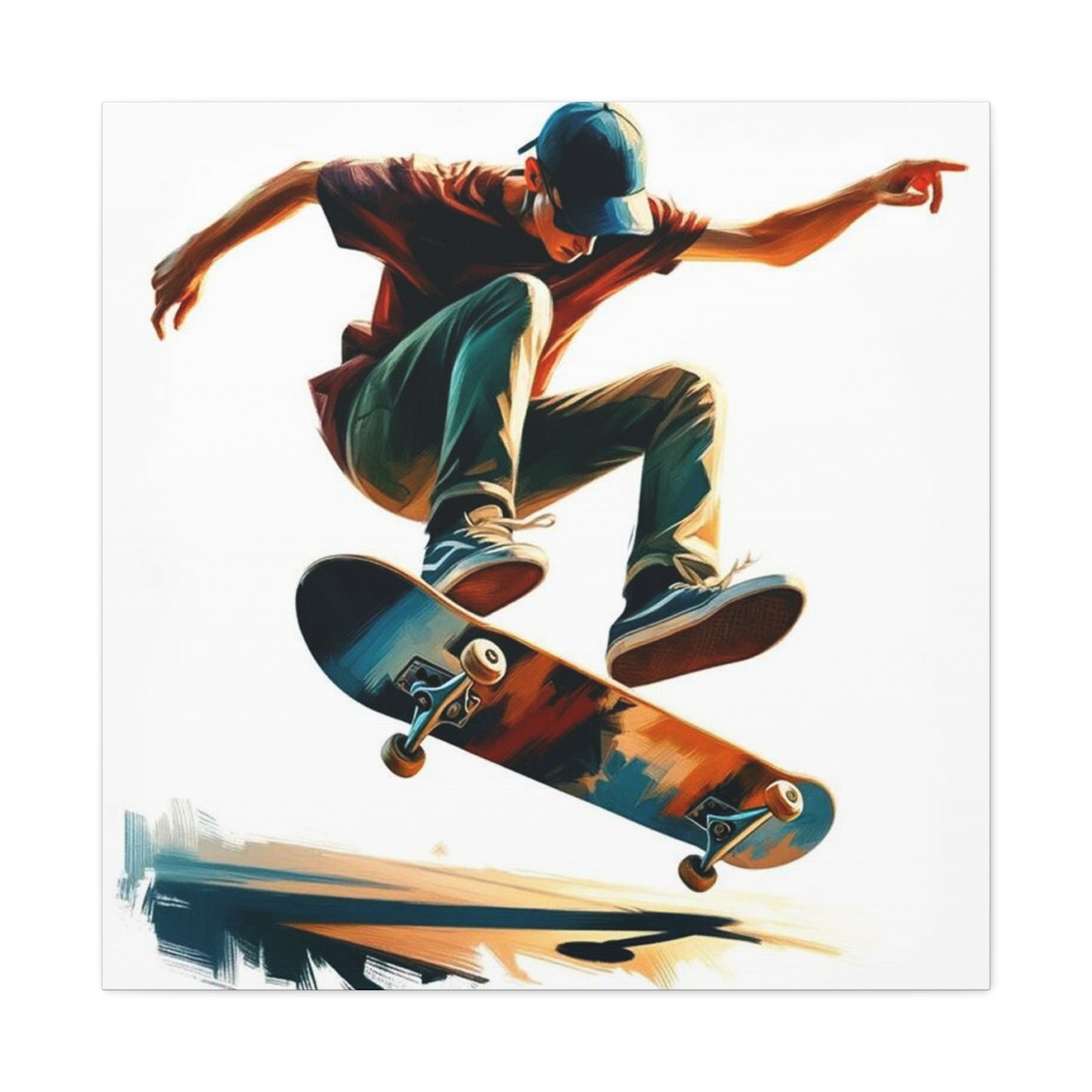
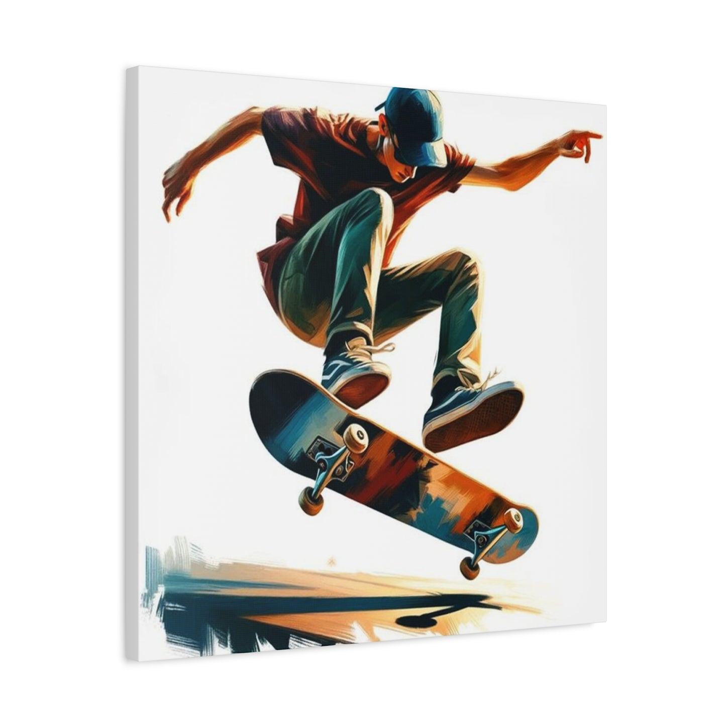
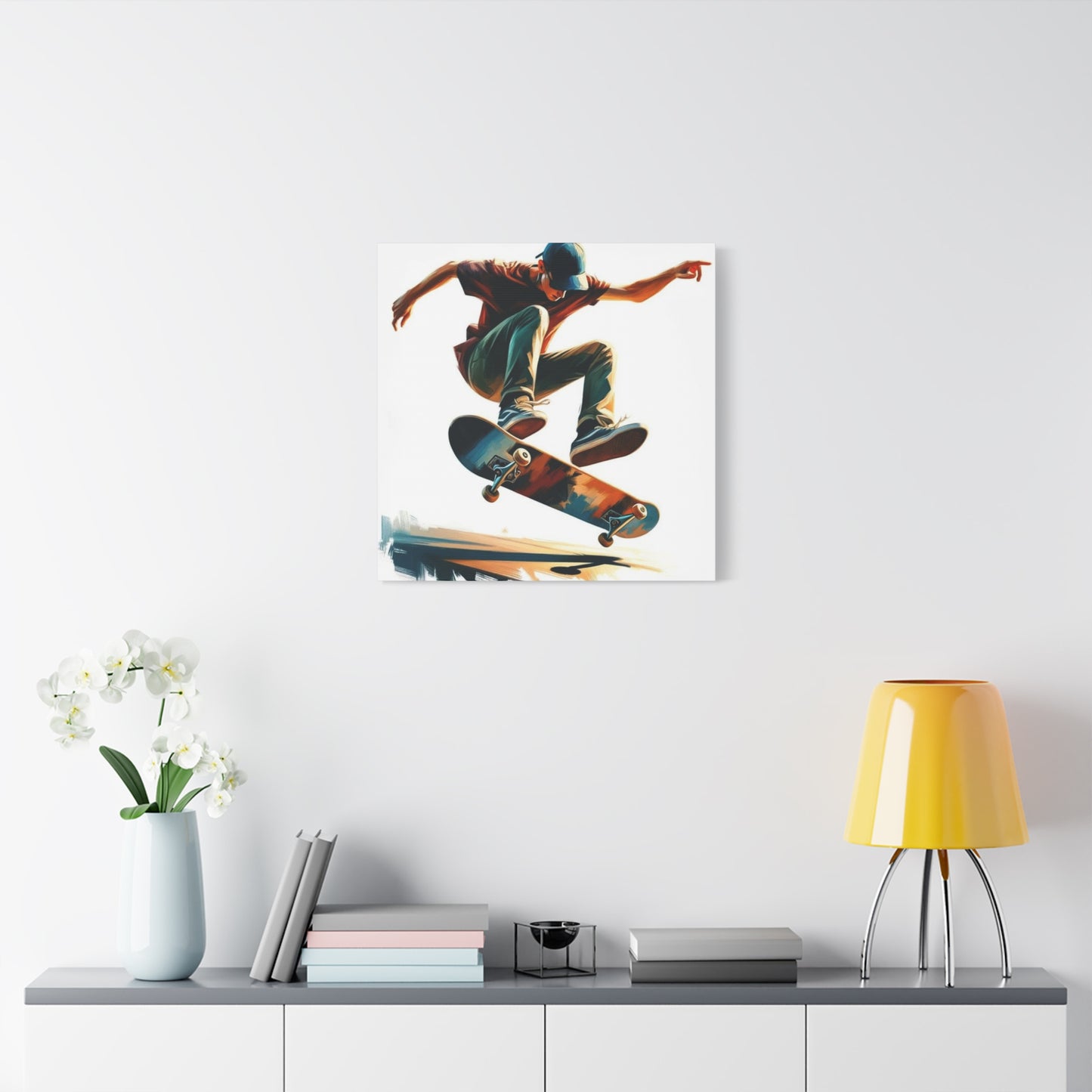
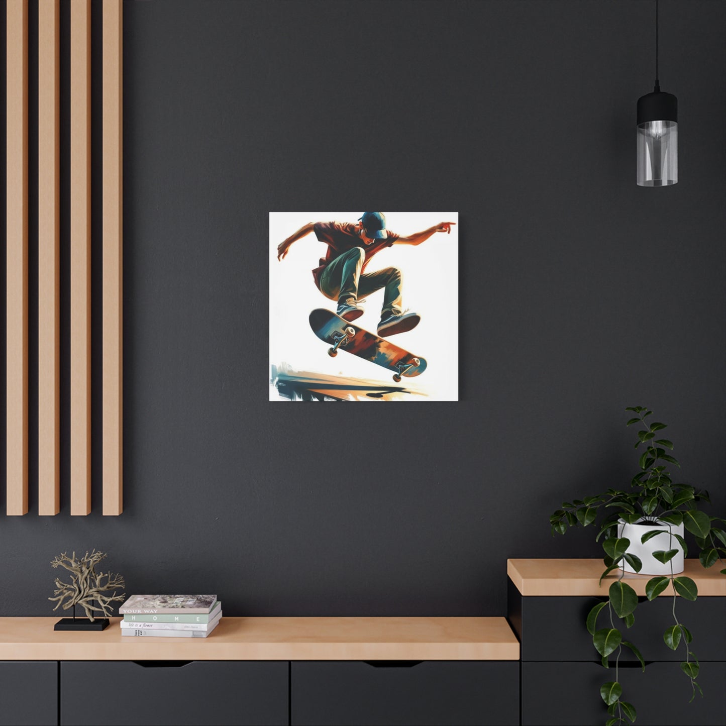
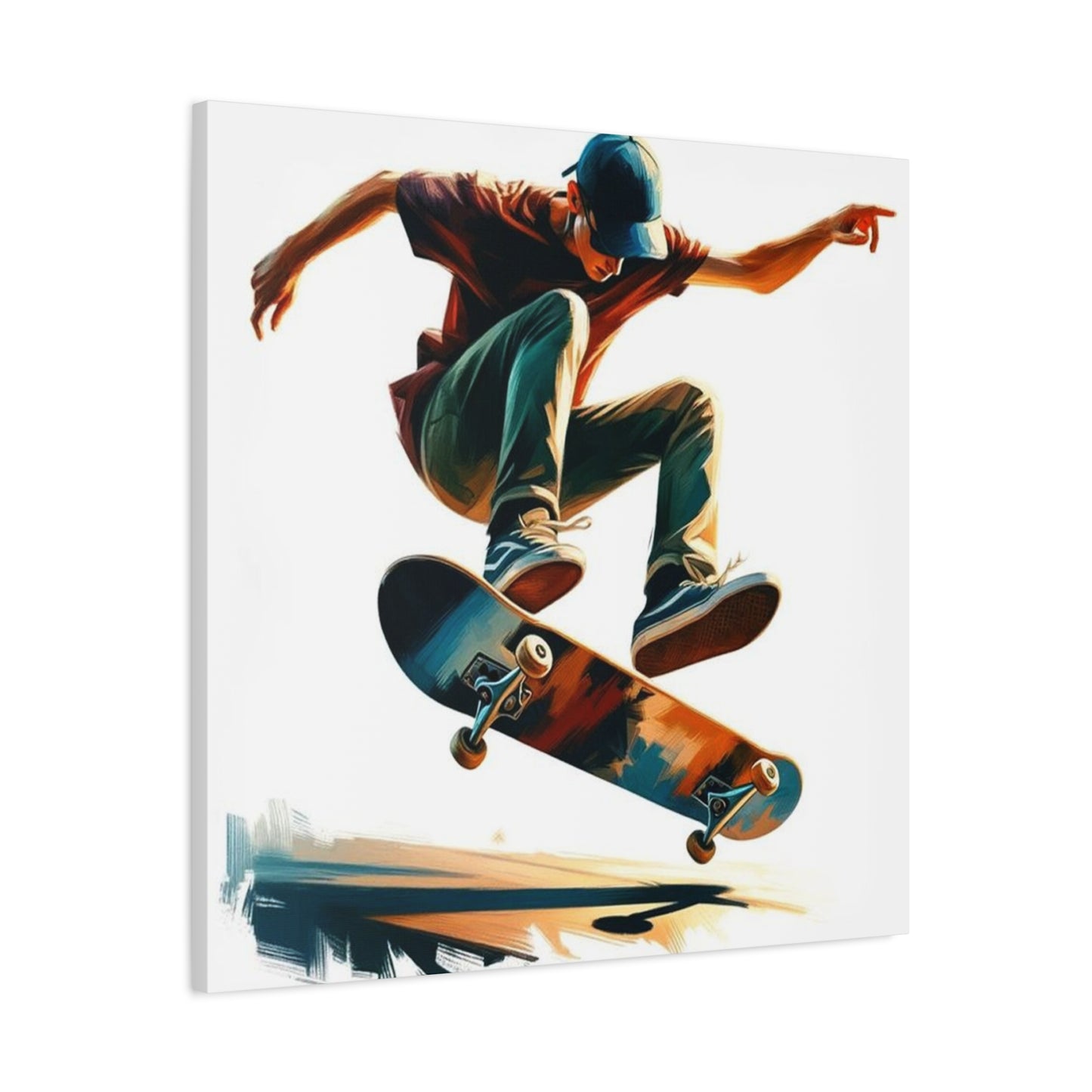
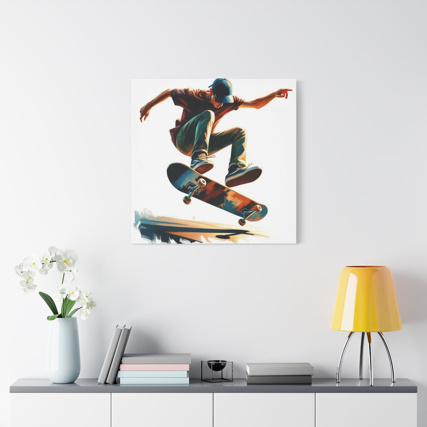
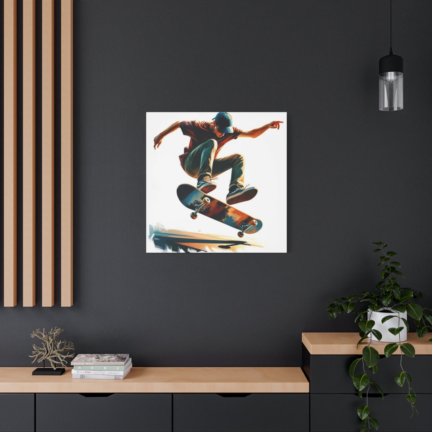
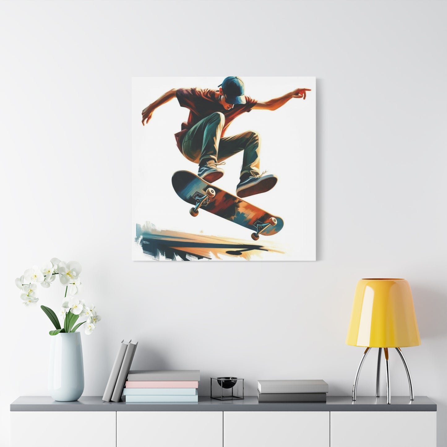
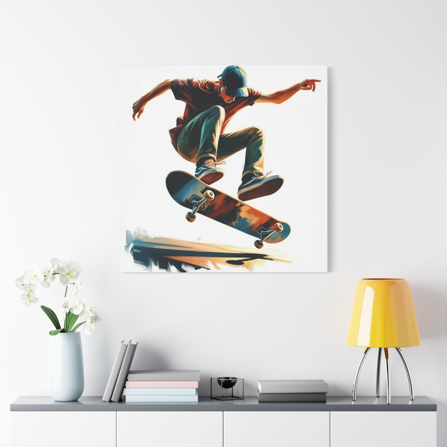
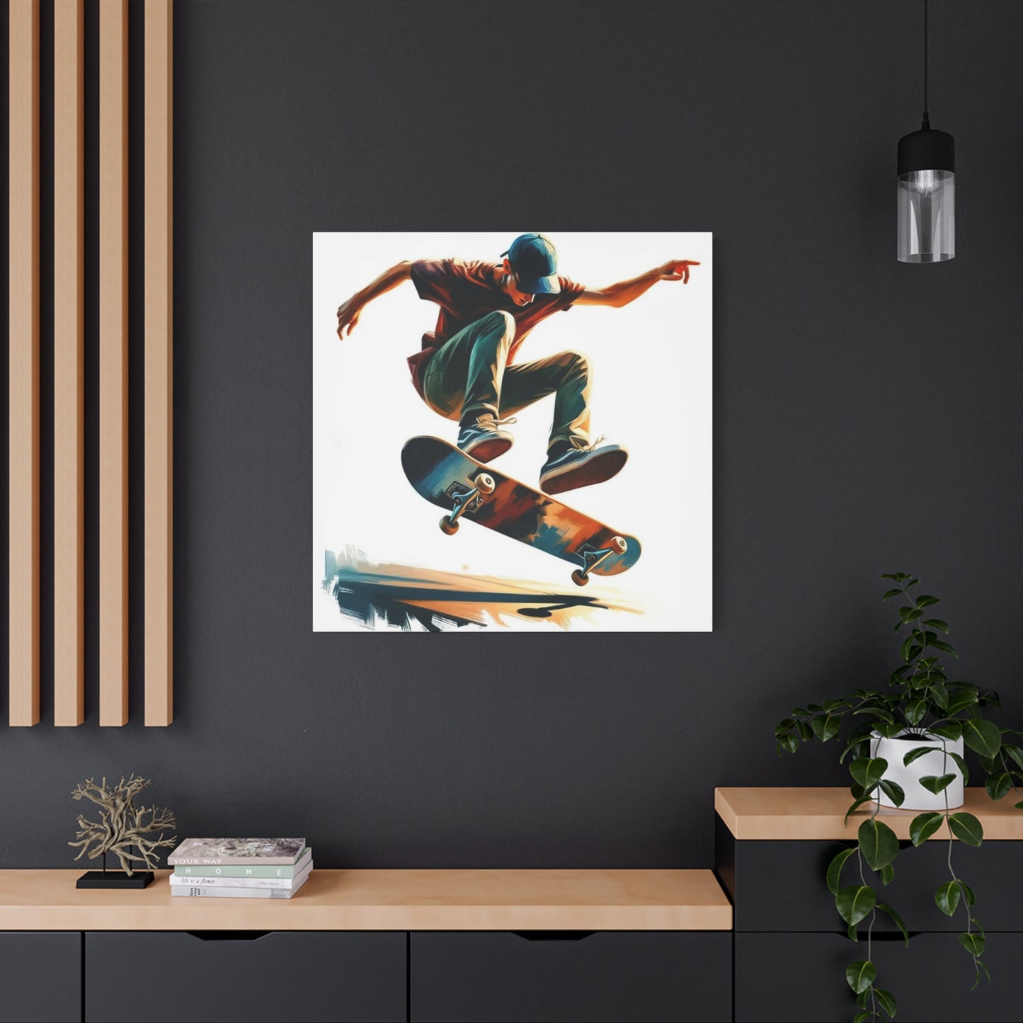
Skate culture on canvas captures the distinctive visual language that has developed around skateboarding over decades of evolution as both sport and lifestyle. This artistic expression extends beyond simple representations of skateboarders in action to encompass the graphics, symbols, attitudes, and aesthetic sensibilities that define skateboarding as a cultural phenomenon. When effectively translated to canvas, these elements create powerful visual statements that resonate with participants in the culture while remaining accessible and appealing to broader audiences who appreciate rebellious creativity and athletic dynamism.
The iconography of skateboarding provides rich material for artistic interpretation. Skateboard decks themselves have served as canvases for graphic artists since the earliest days of commercial skateboarding, with companies commissioning distinctive designs that became as important as the boards' functional characteristics. These graphics drew from punk rock aesthetics, comic book illustrations, horror movie imagery, and countless other influences to create a distinctive visual vocabulary. When these elements appear in canvas artwork, they carry decades of cultural associations and creative evolution, connecting contemporary pieces to a continuous artistic tradition.
Action and movement present fundamental challenges and opportunities when depicting skateboarding in static visual media. The sport is defined by motion, flow, and the constant negotiation between rider, board, and terrain. Effective skateboarding artwork captures this kinetic energy through compositional strategies that suggest movement even in frozen moments. Blurred edges, diagonal orientations, sequential imagery, and dynamic cropping all contribute to creating visual experiences that feel active rather than static. These technical approaches allow canvas pieces to maintain connection to the physical reality of skateboarding while functioning as independent artistic compositions.
The architecture of skateboarding, its ramps, bowls, street obstacles, and terrain features, provides structural elements that ground artwork in recognizable reality while offering strong geometric forms for composition. These environmental features aren't merely background details but essential components that define the skateboarding experience. A skilled artist understands how these shapes interact with the human figure and board, creating compositions where architectural elements and human action form integrated wholes rather than separate figure-ground relationships. This sophisticated approach produces more compelling and authentic representations than simple skater portraits against neutral backgrounds.
Skateboarding's relationship with urban environments fundamentally shapes its visual culture. Unlike sports that occur in purpose-built facilities, skateboarding appropriates existing architecture, reimagining stairs, handrails, ledges, and plazas as terrain for creative expression. This subversive relationship with public environments infuses skateboarding artwork with undertones of rebellion, creativity, and the reclamation of regulated space for playful purposes. Canvas pieces that successfully capture this dynamic communicate ideas beyond skateboarding itself, touching on broader themes of individual freedom, creative problem-solving, and questioning established uses for shared resources.
Portraiture within skateboarding artwork serves different purposes than traditional portraiture. Rather than primarily capturing physical likeness or psychological depth, skateboarding portraits often emphasize style, attitude, and the relationship between rider and equipment. Body position, clothing choices, board graphics, and environmental context all contribute to creating complete statements about identity and values. These portraits function as cultural documents, recording not just individuals but moments in the evolution of skateboarding style and the communities that sustain the culture.
The DIY ethic fundamental to skateboarding culture influences aesthetic choices in artwork depicting the scene. Rough production values, hand-drawn elements, collage techniques, and other approaches that suggest individual creation rather than commercial polish align with skateboarding's roots in self-made culture. Even when executed with considerable technical skill, effective skateboarding artwork often retains traces of this handmade quality, signaling authenticity and connection to grassroots culture rather than corporate appropriation of subcultural aesthetics.
Color palettes in skateboarding artwork frequently reflect the era or substyle being referenced. Classic skateboarding from the seventies and eighties featured earth tones, warm colors, and palettes influenced by the California landscape where much skateboarding culture originated. Later developments introduced brighter, more intense colors influenced by punk and new wave aesthetics. Contemporary skateboarding artwork might embrace any of these historical palettes or develop entirely new approaches, creating pieces that dialogue with skateboarding history while pushing visual boundaries.
Equipment details matter significantly in authentic skateboarding artwork. The specific characteristics of boards, trucks, wheels, and hardware evolve constantly as technology advances and styles shift. Artists familiar with skateboarding culture understand these technical elements and represent them accurately rather than relying on generic or outdated equipment depictions. This attention to detail signals respect for the culture and creates artwork that resonates with knowledgeable audiences while maintaining accessibility for general viewers who respond primarily to overall composition and energy.
Humor and irreverence appear frequently in skateboarding artwork, reflecting the playful attitude that defines much of skate culture despite the sport's physical demands and risks. This can manifest as satirical takes on mainstream culture, self-deprecating commentary on skateboarding itself, or absurdist imagery that rejects serious artistic pretension. These lighter approaches don't diminish the artwork's impact but rather align it with cultural values that prize authenticity and resist taking oneself too seriously. Canvas pieces incorporating this sensibility bring levity and personality to environments while maintaining visual sophistication.
The community dimension of skateboarding influences how artwork functions within living environments. Skateboarding has always been fundamentally social, with crews, teams, and friend groups forming around shared participation. Artwork that captures this collective aspect, whether through group portraits, scenes of shared sessions, or symbolic representations of skateboarding community, resonates differently than individual-focused pieces. These works acknowledge that skateboarding culture isn't just about individual athletic achievement but about relationships, mentorship, and the bonds formed through shared commitment to the activity.
Concentrated Impact with Small Skate Graffiti Prints
Small skate graffiti prints offer a unique approach to incorporating street culture aesthetics into living environments, providing concentrated visual impact without requiring extensive wall coverage. These compact compositions challenge artists to distill the energy and complexity of larger works into limited formats, often resulting in pieces with remarkable intensity and focus. The scale limitations force compositional economy, eliminating extraneous elements and highlighting essential visual information that communicates most effectively. For collectors and decorators, small prints provide accessible entry points into graffiti-inspired artwork while offering flexibility in placement and arrangement possibilities.
The compositional strategies required for effective small-format graffiti prints differ significantly from large-scale work. Elements that might occupy minor supporting roles in extensive compositions must carry greater weight in compact pieces. Detail density increases, with every square inch containing significant visual information rather than expansive gestural marks or large color fields. This concentration creates viewing experiences that reward close examination, revealing complexity and craftsmanship that might go unnoticed in more expansive works. The resulting pieces punch above their weight class, delivering visual impact disproportionate to their physical dimensions.
Typography faces particular challenges in small graffiti prints, as the intricate letter forms characteristic of many graffiti styles require sufficient scale to remain legible and effective. Artists working in compact formats must either simplify letter construction, reducing decorative elements while maintaining stylistic character, or embrace abstraction where letter forms function primarily as design elements rather than readable text. Both approaches can succeed when executed with skill and understanding of how visual information scales. The choice between legibility and pure design depends on artistic intent and the specific message or feeling the piece aims to communicate.
Color relationships intensify in small formats where hues sit in close proximity without intervening neutral zones. This proximity amplifies interactions between colors, making harmony or contrast more pronounced. Small graffiti prints often feature bold, simplified color schemes rather than the extensive palettes possible in larger works. This limitation encourages artists to make decisive color choices, selecting hues that carry maximum impact and clearly communicate intended mood or energy. The resulting color economics often produce more memorable and striking images than busier compositions where attention disperses across multiple competing elements.
Grouping strategies allow small graffiti prints to create cumulative impact exceeding individual pieces. Gallery wall arrangements, grid patterns, or thematic series can transform modest individual prints into substantial visual statements. This approach offers flexibility, allowing collectors to start small and expand over time while maintaining coherent aesthetic direction. The arrangement possibilities also provide creative opportunities, as different configurations create different overall effects. A linear sequence emphasizes narrative progression, while scattered placement suggests spontaneity and organic development characteristic of actual street graffiti accumulation.
Price accessibility makes small graffiti prints particularly appealing for younger collectors or those beginning to explore this aesthetic category. Lower price points relative to larger works reduce financial risk, encouraging experimentation and impulse acquisition rather than requiring extensive deliberation before purchase. This accessibility helps maintain the democratic, anti-elitist spirit fundamental to graffiti culture, ensuring that appreciation for the art form doesn't require substantial financial resources. The affordability also makes these pieces appropriate for gift-giving, introducing recipients to graffiti aesthetics in approachable formats.
Production methods for small graffiti prints span from original hand-created pieces to limited edition reproductions of larger works. Original small-format graffiti art often appears on unconventional substrates reflecting street art origins, including cardboard, wood panels, found materials, or unconventional paper stocks. These material choices add character and authenticity while keeping production costs reasonable. Limited edition prints typically employ high-quality reproduction techniques that capture the textural qualities and color accuracy of originals, making artwork by recognized artists available to broader audiences at accessible price points.
Framing considerations for small graffiti prints significantly affect their presentation and impact. While larger works often succeed unframed, allowing edges to remain raw and immediate, small prints frequently benefit from framing that provides visual weight and protection. Frame selection should complement rather than compete with the artwork, with simple modern frames in black, white, or metal finishes typically working best. Mat boards can provide breathing room around compact compositions, preventing visual crowding, though direct mounting without mats maintains a more contemporary, immediate feeling appropriate for street-inspired aesthetics.
Environmental versatility represents a significant advantage of small graffiti prints. Unlike large-scale works that require substantial dedicated wall area and dominate their surroundings, compact pieces integrate easily into various contexts. They work well in smaller rooms, narrow hallways, bathroom environments, or mixed with other artwork and personal items on gallery walls. This flexibility makes them ideal for apartments, dorm rooms, offices, or any location where available display area is limited. The same pieces can move through different spaces as living situations change, maintaining relevance across various contexts.
Collectibility patterns differ for small versus large graffiti prints, with compact formats often attracting series collectors who pursue complete sets or representative examples from particular artists, time periods, or stylistic movements. This collecting approach resembles strategies common in other print media, where completist impulses and documentary interests drive acquisition patterns. Series designed specifically for collection, with numbered editions, consistent dimensions, and thematic coherence, appeal particularly to this collecting mentality, creating frameworks that guide and motivate continued acquisition over time.
Gift-giving contexts particularly suit small graffiti prints, as their compact dimensions and moderate price points align well with typical gift parameters. These pieces work for various occasions and recipient relationships, from birthday presents for friends to housewarming gifts for new homeowners. The youthful energy and contemporary appeal make them particularly appropriate for younger recipients, while the serious artistic craft ensures they don't read as novelty items. Including information about the artist, style, or cultural context adds educational value and demonstrates thoughtfulness beyond simple aesthetic selection.
Commanding Presence Through Large Graffiti Wall Art
Large graffiti wall art transforms living environments with unprecedented visual authority, creating focal points that define entire rooms and establish powerful aesthetic statements. These substantial pieces harness the scale and ambition characteristic of actual street murals, translating that commanding presence into formats appropriate for residential or commercial display. The psychological impact of encountering genuinely large artwork differs qualitatively from viewing smaller pieces, creating immersive experiences where viewers feel surrounded by rather than merely observing the composition. This environmental transformation represents the primary appeal and challenge of incorporating large-format graffiti artwork into designed contexts.
Scale selection for large graffiti pieces requires careful consideration of architectural context and viewing distances. Artwork that feels appropriately sized in gallery photographs may overwhelm or underwhelm actual installation environments depending on ceiling heights, viewing distances, and surrounding architectural elements. Professional installations often involve mockups or digital visualization before final commitment, ensuring that proposed pieces will function effectively in their intended locations. The goal is achieving visual balance where the artwork feels substantial and impactful without appearing cramped or dwarfed by its surroundings.
Compositional strategies effective at modest scales may fail when expanded to large formats without modification. Simple designs can feel empty or unfinished when executed at monumental proportions, while extremely detailed compositions may appear cluttered or illegible when viewed from distances typical in residential rooms. The most successful large graffiti works strike balances between bold, readable primary elements that register immediately from across rooms and secondary details that reward closer examination. This hierarchical organization of visual information creates satisfying experiences across multiple viewing distances and durations.
Installation logistics for large graffiti artwork present practical challenges requiring advance planning. Multi-panel constructions allow very large compositions to ship and install more practically than single massive pieces, though seams between panels require careful alignment and finishing. Wall preparation, hanging hardware sufficient for substantial weights, and professional installation services may be necessary for the largest pieces. These logistical considerations should factor into purchasing decisions, as the delivered cost of very large artwork extends beyond the purchase price to include installation expertise and materials.
Room proportion relationships guide appropriate sizing for large graffiti art. Design principles suggest that major artwork should occupy roughly two-thirds to three-quarters of available wall width to achieve visual balance, though these guidelines remain flexible based on specific compositions and aesthetic goals. Vertical proportions matter equally, with overly tall pieces in rooms with standard ceiling heights potentially feeling cramped, while very horizontal pieces may appear awkwardly low when centered at standard heights. Considering the complete three-dimensional environment rather than thinking only in two-dimensional wall coverage produces better results.
Color considerations intensify with scale, as hue relationships that work in small formats may become overwhelming when expanded. Large areas of saturated color generate powerful psychological effects, potentially creating energizing or exhausting environments depending on specific color choices and personal sensitivity. Balancing bold color passages with neutral areas prevents visual fatigue, allowing eyes to rest while still delivering the impact characteristic of graffiti aesthetics. This doesn't require abandoning vibrant palettes but rather deploying them strategically within compositions that provide visual breathing room.
Lighting requirements for large graffiti artwork ensure that substantial investments in major pieces receive proper presentation. Track lighting, picture lights, or integrated architectural lighting can dramatically enhance artwork while providing necessary illumination for detailed viewing. Light quality matters significantly, with color temperature affecting how pigments appear and intensity determining whether subtle gradations and textural elements remain visible or disappear. Professional lighting design consultation can help develop schemes that complement specific artworks while serving broader room lighting needs.
Investment considerations distinguish large graffiti art from smaller pieces, both financially and in terms of spatial commitment. Major works represent significant purchases requiring confidence in aesthetic choices and long-term commitment to particular pieces. Unlike smaller artwork that can rotate easily or relocate to different walls, large pieces tend toward permanent positions around which other design decisions orbit. This permanence demands careful selection, ensuring chosen works will maintain appeal and relevance through changing trends and personal evolution. Purchasing decisions should reflect genuine connection rather than temporary enthusiasm.
Acoustic properties of large canvas artwork provide unexpected practical benefits beyond aesthetics. Substantial textile surfaces help absorb sound, reducing echo and reverberation in rooms with hard surfaces and minimal soft furnishings. This acoustic dampening effect is particularly valuable in modern or industrial environments featuring concrete, glass, and metal where sound management can be challenging. The practical sound-absorption benefit represents a functional justification for large artwork beyond pure decoration, particularly in commercial environments like restaurants, offices, or retail locations where managing ambient noise matters.
Resale and secondary market considerations affect large graffiti artwork differently than smaller pieces. While recognized artists may maintain or increase value over time, very large pieces face limited buyer pools due to display requirements and installation challenges. Collectors should acquire large works primarily for personal enjoyment rather than investment speculation, as exit strategies for oversized artwork can prove complicated. Documentation of provenance, condition reports, and professional photography helps maintain value and facilitates eventual resale should circumstances require, but the primary value proposition should remain personal satisfaction rather than financial appreciation.
The relationship between large graffiti art and surrounding design elements requires careful choreography. Such commanding pieces can either anchor cohesive design schemes or clash disastrously with incompatible aesthetics. Supporting design choices, including furniture selection, color schemes, and decorative accessories, should generally defer to the artwork rather than competing for attention. This doesn't require matching colors exactly or creating slavish thematic coordination, but rather establishing harmonious relationships where the artwork serves as the visual centerpiece and other elements provide appropriate context without distraction.
Preservation Techniques Through Caring for Graffiti Canvas
Caring for graffiti canvas artwork ensures that these vibrant pieces maintain their visual impact and structural integrity through years or decades of display. While canvas is a relatively durable substrate, graffiti-inspired pieces present specific conservation challenges related to pigment composition, surface treatments, and the environmental factors that affect their appearance over time. Understanding proper care techniques protects financial investments while preserving the cultural artifacts these pieces represent. The conservation approaches appropriate for graffiti canvas differ somewhat from traditional painting care due to materials and techniques employed in creating this distinctive art form.
Environmental conditions profoundly affect canvas artwork longevity, with temperature, humidity, and light exposure representing the primary concerns. Stable environments with moderate temperatures and relative humidity between forty and fifty percent provide ideal conditions for canvas preservation. Extreme fluctuations stress canvas fabric and any sizing or priming layers, potentially causing cracking, delamination, or dimensional changes that compromise structural integrity. While maintaining museum-quality environmental controls may be impractical in residential settings, avoiding placement near heating vents, air conditioning returns, exterior doors, or windows exposed to direct sunlight significantly extends artwork lifespan.
Ultraviolet radiation represents perhaps the single greatest threat to graffiti canvas pieces, as UV exposure degrades pigments and causes fading over time. This danger is particularly acute for pieces featuring vibrant colors and fluorescent pigments that provide much of graffiti art's visual appeal. UV-filtering glazing for framed pieces or UV-protective varnishes applied to unframed canvases provide substantial protection while remaining invisible to viewers. For particularly valuable or irreplaceable pieces, combined approaches using both protective coatings and controlled lighting ensure maximum preservation while maintaining display quality.
Cleaning procedures for graffiti canvas require gentle approaches that remove accumulated dust and surface contamination without damaging paint layers or canvas substrates. Dry cleaning using soft brushes or compressed air removes loose particulates, while slightly damp microfiber cloths can address more stubborn surface dirt. Chemical cleaners should be avoided entirely unless specifically recommended by conservation professionals for particular situations, as residues or reactions with paint media can cause permanent damage. Regular gentle cleaning prevents buildup that would eventually require more aggressive intervention carrying greater risk.
Handling protocols minimize physical damage from direct contact, impact, or improper support. Canvas artwork should always be lifted and carried by supporting the frame or stretcher bars rather than pulling on canvas fabric, which can stress and distort material. When moving or storing pieces, protective wrapping prevents scratches, punctures, or surface scuffing. For unframed canvas, glassine paper or acid-free tissue provides protection without adhering to painted surfaces. Padded blankets or purpose-made art moving supplies offer appropriate protection for valuable pieces during transport or storage.
Framing decisions significantly impact long-term preservation, with quality framing providing multiple protective benefits. Glazing creates a barrier against dust, pollution, insects, and physical contact while potentially incorporating UV-filtering properties. Proper mounting and backing prevent mechanical stress on canvas and provide rigid support that maintains flat presentation. Sealed backing boards exclude environmental contaminants and pests while managing moisture exchange. Although professional framing represents upfront investment, the protection provided justifies costs for valuable or personally meaningful pieces.
Storage practices for graffiti canvas not currently displayed require careful attention to prevent damage during dormant periods. Canvas should be stored vertically rather than stacked horizontally, as weight from pieces above can cause deformation or surface impressions. Climate-controlled storage prevents temperature and humidity extremes that stress materials. Wrapping individual pieces in acid-free materials and storing in rigid containers protects against physical damage. Periodic inspection during storage catches developing problems before they become severe, allowing timely intervention when necessary.
Repair and restoration needs occasionally arise despite preventive care, requiring professional conservation expertise for valuable pieces. Amateur repair attempts frequently cause greater damage than original problems, as inappropriate materials and techniques can prove irreversible. Professional conservators possess training, experience, and specialized materials for addressing tears, losses, delamination, and other canvas artwork problems. While conservation services represent significant expense, proper professional intervention preserves value and extends artwork lifespan far beyond quick fixes or neglected damage.
Documentation practices support conservation efforts by recording artwork condition and any interventions over time. Detailed photographs from multiple angles and distances create visual records showing original state and any subsequent changes. Written descriptions noting dimensions, materials, visible condition issues, and provenance information provide reference for future conservation decisions. This documentation proves invaluable for insurance purposes, authentication, and tracking artwork history through ownership changes. Regular updates to documentation as condition evolves create comprehensive records supporting informed stewardship.
Insurance considerations become relevant for valuable graffiti canvas collections, providing financial protection against theft, damage, or loss. Specialized fine art insurance policies offer coverage specifically designed for artwork, often including restoration costs and guaranteed value provisions not available through standard homeowner policies. Proper documentation, including professional appraisals, photography, and provenance records, facilitates insurance coverage and claims processes. While insurance represents ongoing expense, the protection provided justifies costs for collections of significant financial or personal value.
Education about artwork care should be shared among household members or facility users to ensure everyone understands proper interaction protocols. Clear communication about avoiding touching painted surfaces, maintaining safe distances, and reporting any observed problems prevents accidental damage from ignorance rather than malice. For commercial installations where public access occurs, additional protective measures like barriers, protective glazing, or elevated mounting heights prevent casual contact while still allowing viewing. Balancing accessibility with protection requires thoughtful planning but ensures artwork remains both visible and safe.
Creative Fusion Through Mixing Graffiti with Street Art
Mixing graffiti with street art creates rich visual vocabularies that draw from multiple related but distinct artistic traditions. While graffiti and street art share urban origins and anti-establishment attitudes, they developed somewhat different aesthetic languages, technical approaches, and cultural meanings. Graffiti historically emphasized text-based letter forms, tags, and the development of personal styles recognizable to other writers. Street art encompassed broader approaches including stencils, wheat paste posters, installations, and figurative imagery often carrying social or political messages. Combining these traditions produces hybrid works that leverage strengths from both lineages while creating fresh visual experiences.
The textual focus of traditional graffiti merges productively with street art's figurative and narrative tendencies. Letter-form compositions can incorporate representational elements, creating pieces where words and images integrate rather than occupying separate compositional zones. This integration might involve letters constructed from or incorporating relevant imagery, text that wraps around or interacts with figures, or layered compositions where text and image alternate in visual hierarchy. These sophisticated combinations require substantial skill as artists balance legibility against compositional unity, ensuring neither text nor image dominates to the detriment of overall effectiveness.
Stencil techniques borrowed from street art bring precision and reproducibility to work that might otherwise feature the gestural spontaneity characteristic of spray-painted graffiti. Stenciled elements can provide tight control over specific compositional areas while surrounding freehand sections maintain loose, expressive qualities. This technical contrast creates visual interest through the juxtaposition of different mark-making approaches within single compositions. The mechanical precision of stencil work also enables complex photorealistic imagery or intricate pattern work that would prove extremely difficult through freehand spray paint application alone.
Political and social commentary, more commonly associated with street art than traditional graffiti, adds conceptual depth when incorporated into graffiti-influenced work. While graffiti often focused on self-expression, style development, and subcultural communication, street art frequently engaged explicitly with social issues, political critique, and cultural commentary. Merging these approaches produces artwork that satisfies both aesthetic and intellectual engagement, appealing simultaneously to viewers drawn to bold visuals and those seeking meaningful content. This conceptual dimension expands potential audiences beyond pure style enthusiasts to include socially conscious collectors.
Wheat paste and collage techniques characteristic of street art provide additional layering possibilities when combined with graffiti elements. These approaches introduce textural variety and opportunity for incorporating photographic or printed materials alongside hand-painted elements. The archeological feeling of layered paper echoes the natural accumulation visible on urban surfaces where multiple artists and campaigns overlap over time. This built-up quality suggests history and process, transforming single artworks into documents of creative development rather than polished finished products that reveal nothing of their own creation.
Conclusion
In conclusion, skateboard graffiti wall art is a vibrant and authentic celebration of street culture that brings the raw energy, creativity, and rebellious spirit of urban life directly into your living space. This dynamic form of art captures the essence of skateboarding and graffiti—two intertwined subcultures rooted in self-expression, freedom, and community. By embracing skateboard graffiti art, you’re not only adding eye-catching visuals to your walls but also honoring a powerful cultural movement that continues to inspire generations worldwide.
What makes skateboard graffiti wall art truly special is its unfiltered originality. Each piece tells a story of bold individuality and youthful defiance, often created with spontaneous flair and vivid colors. The fusion of graffiti’s graphic styles with skateboard imagery creates a compelling aesthetic that’s both edgy and approachable. This art form reflects the streets themselves—ever-evolving, diverse, and full of life—making it a perfect choice for those who crave authenticity and vibrancy in their décor.
Skateboard graffiti art also carries a deeper cultural significance. Beyond its visual appeal, it represents the voice of urban youth and the power of creativity as a form of resistance and identity. It’s an art born from communities that challenge the status quo, celebrate diversity, and find beauty in unexpected places. Displaying this art pays tribute to these values and invites conversations about culture, art, and social dynamics.
Versatility is another hallmark of skateboard graffiti wall art. Whether you’re decorating a modern loft, a casual hangout spot, or a creative workspace, this art adds an energetic focal point that sparks inspiration. The bold colors and dynamic lines contrast beautifully with minimalist interiors, while also complementing eclectic and industrial styles. It’s an ideal choice for anyone looking to infuse their space with personality and urban edge.
Furthermore, the mixed-media nature of many skateboard graffiti pieces—combining spray paint, stencils, markers, and collage—adds texture and depth that draw viewers in. These layers not only enhance visual interest but also reflect the complexity and creativity of street art culture.
Ultimately, authentic skateboard graffiti wall art is more than decoration; it’s a vibrant homage to a thriving cultural movement that celebrates freedom, creativity, and community. Incorporating this art into your home or office breathes life into your space, transforming it into a bold, dynamic environment that truly reflects the spirit of the streets.
