


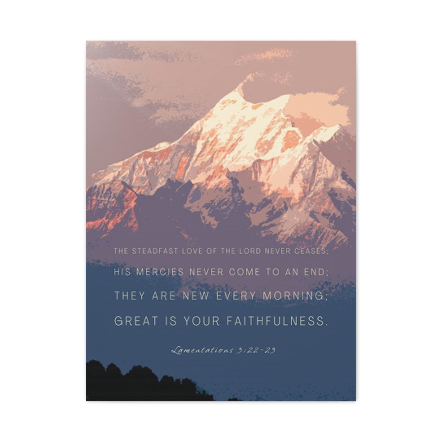

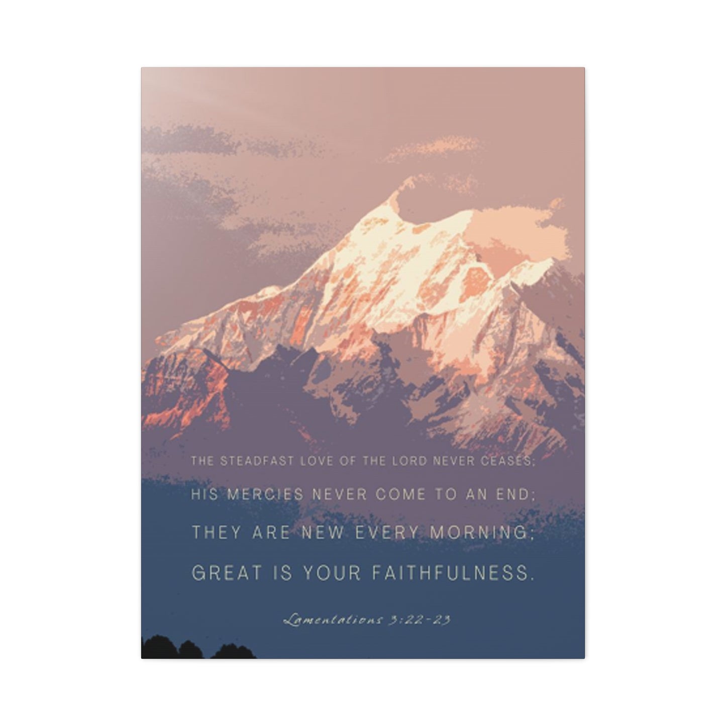
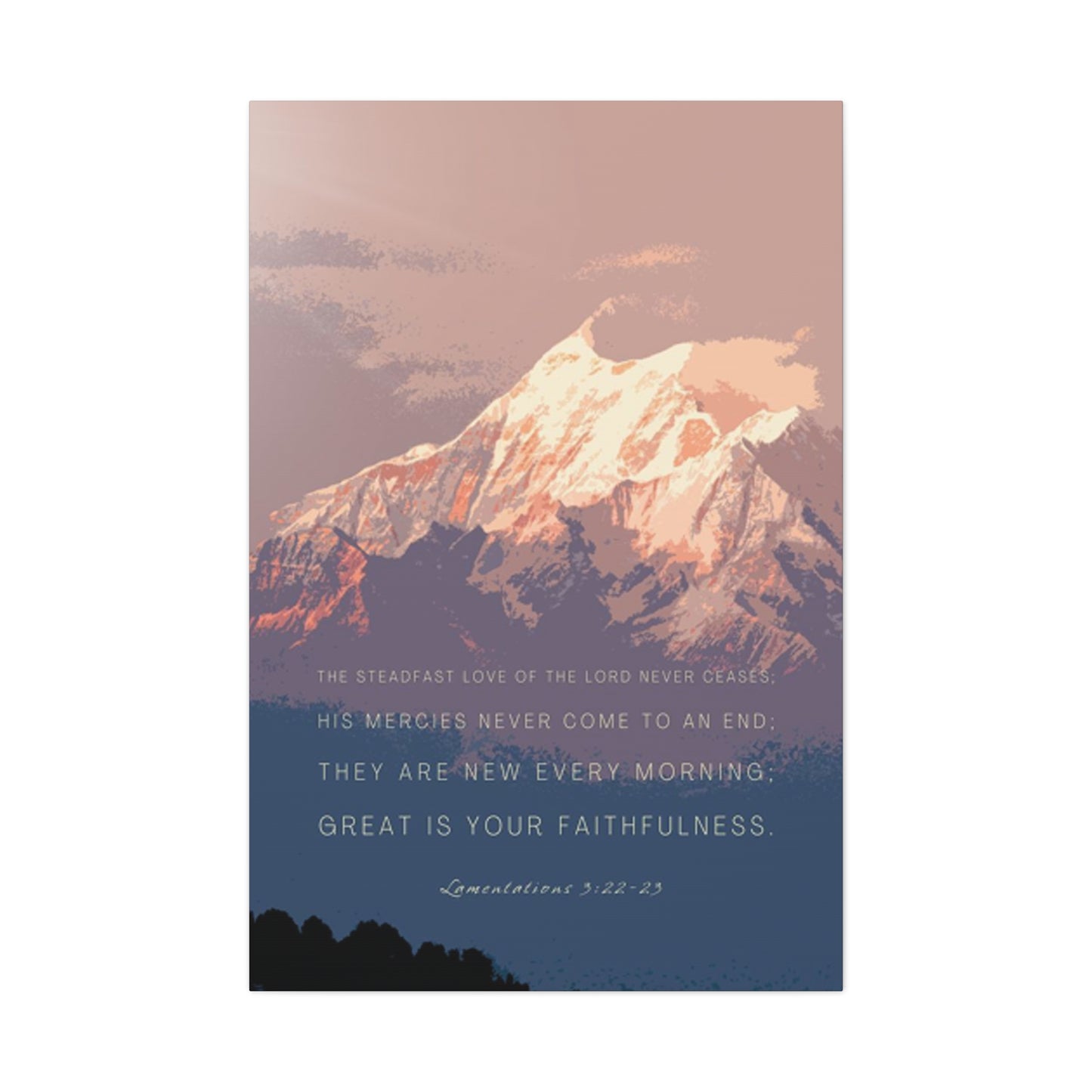
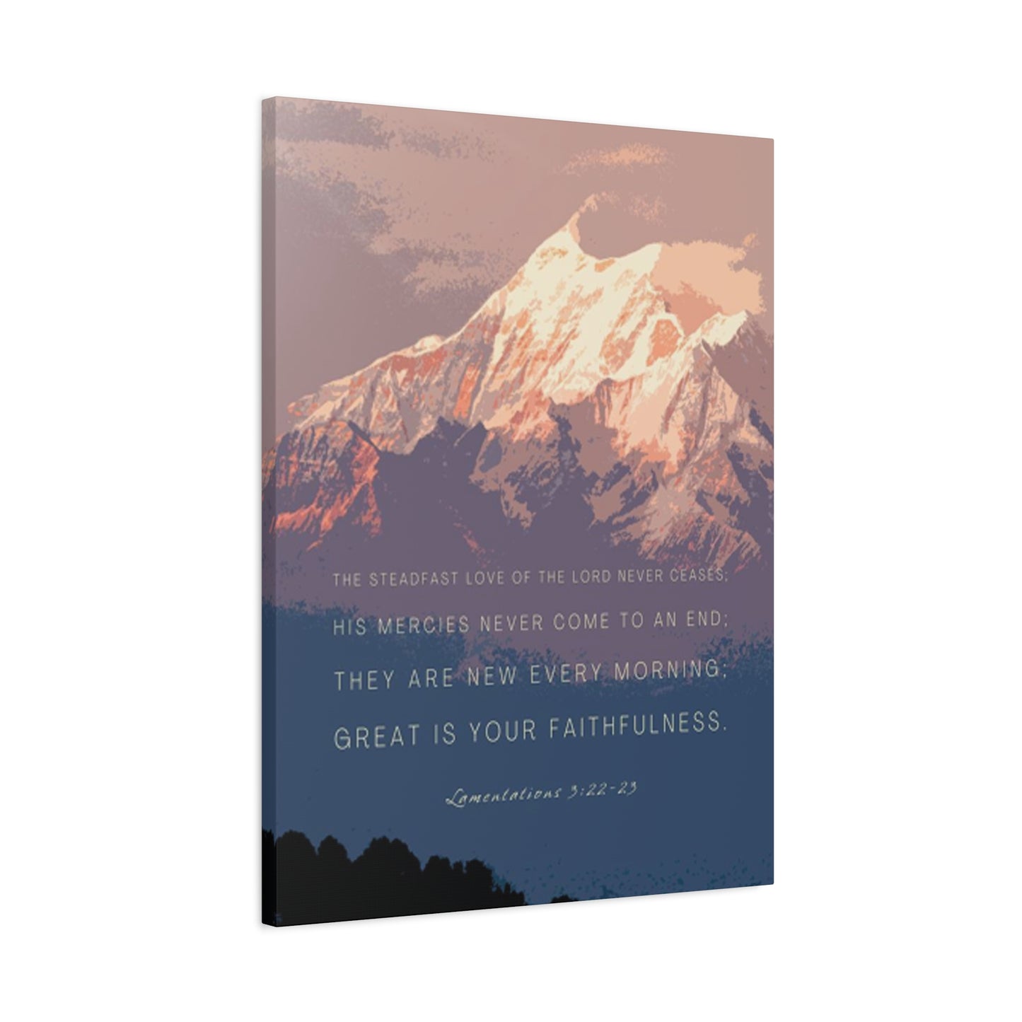
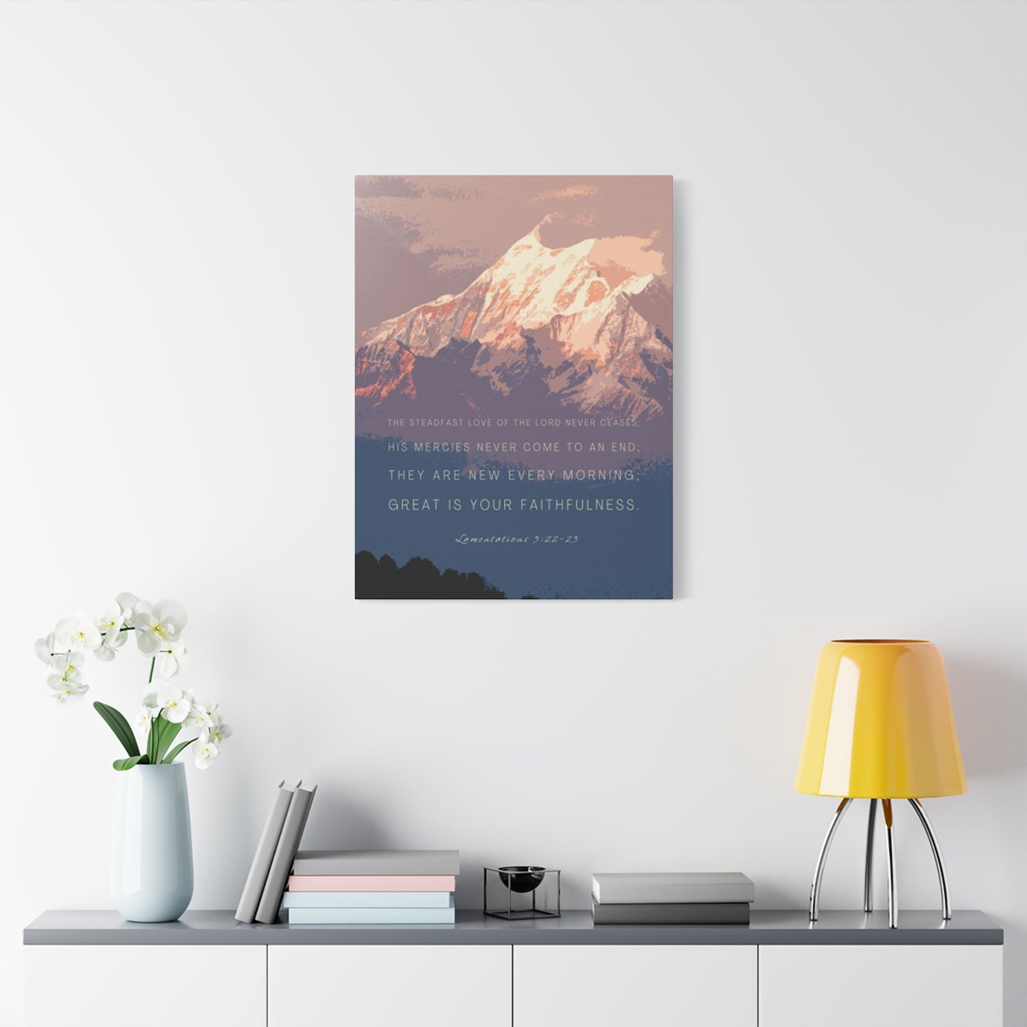
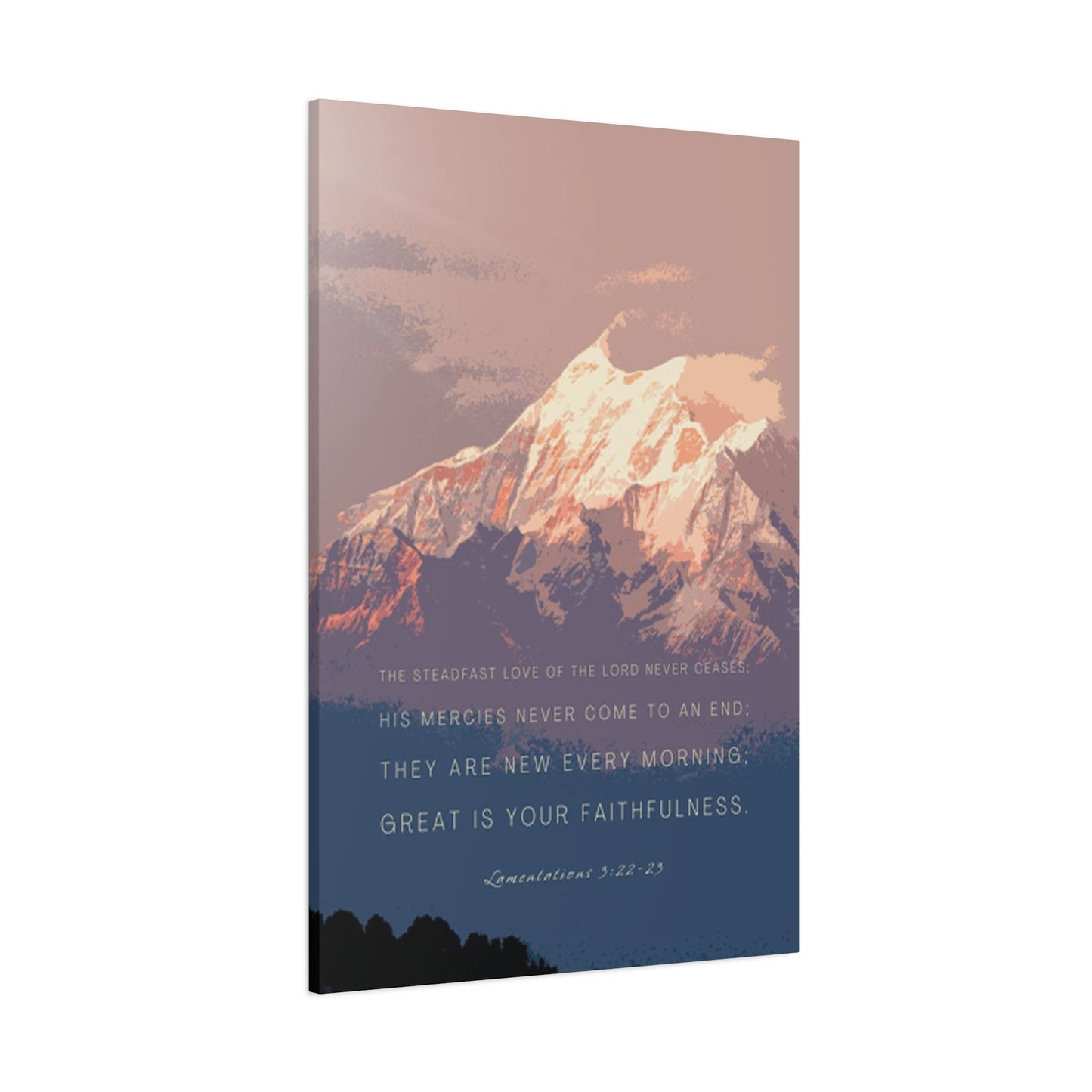
Snowy Mountain Quotes Wall art That Transform Your Living Space Into a Sanctuary of Peace
The allure of towering snow-capped peaks has captivated humanity for centuries, serving as both a physical challenge and a metaphorical representation of life's obstacles and triumphs. When combined with powerful words of wisdom, these majestic landscapes create a profound visual and emotional experience that can fundamentally transform any interior space. The marriage of pristine winter scenery with carefully chosen phrases offers more than mere decoration; it provides daily inspiration, moments of reflection, and a constant reminder of nature's magnificent beauty right within the comfort of your home or workspace.
In recent years, the trend of incorporating nature-inspired artwork with motivational text has exploded across interior design circles, with homeowners, office managers, and creative professionals seeking ways to bring the tranquility of mountain environments into their daily surroundings. This movement goes beyond simple aesthetics, tapping into our deep psychological need for connection with the natural world, especially in increasingly urbanized settings where access to wilderness may be limited. The visual impact of snow-covered mountains paired with resonant words creates a powerful focal point that can shift the energy of an entire room, offering both visual interest and emotional sustenance.
The psychological benefits of surrounding ourselves with imagery of natural landscapes have been extensively documented by researchers studying environmental psychology and biophilic design principles. Studies consistently demonstrate that viewing natural scenes, particularly those featuring mountains, water, or forests, can reduce stress hormones, lower blood pressure, and improve overall mental wellbeing. When we add inspirational language to these images, we create a dual-action effect that engages both our visual cortex and our language centers, making the message more memorable and impactful. This combination serves as a daily touchstone, a visual mantra that can anchor us during challenging times or celebrate our achievements during moments of success.
Bringing Alpine Tranquility Into Modern Interiors
The concept of bringing mountain imagery into residential and commercial spaces represents more than a passing decorative trend; it reflects a fundamental human need to maintain connection with the natural world even as we spend increasing amounts of time indoors. Snow-covered peaks, with their pristine white blankets and dramatic topography, offer a sense of peace and permanence that contrasts beautifully with the rapid pace of contemporary life. These images serve as windows to wild places, reminding us that beyond our walls exists a world of vast beauty and untamed power.
When selecting imagery for your space, consider the specific qualities that draw you to mountain environments. Perhaps it's the sense of solitude and contemplation that comes from standing at elevation, surrounded by silence broken only by the whisper of wind through rocky crags. Maybe it's the visual drama of light playing across snow fields, creating subtle gradations from brilliant white to deep blue shadow. Or possibly it's the metaphorical weight mountains carry in our collective consciousness as symbols of achievement, persistence, and the rewards that come from difficult climbs. Whatever your specific attraction, identifying these elements helps you choose pieces that will resonate on a deeper level rather than serving as mere decoration.
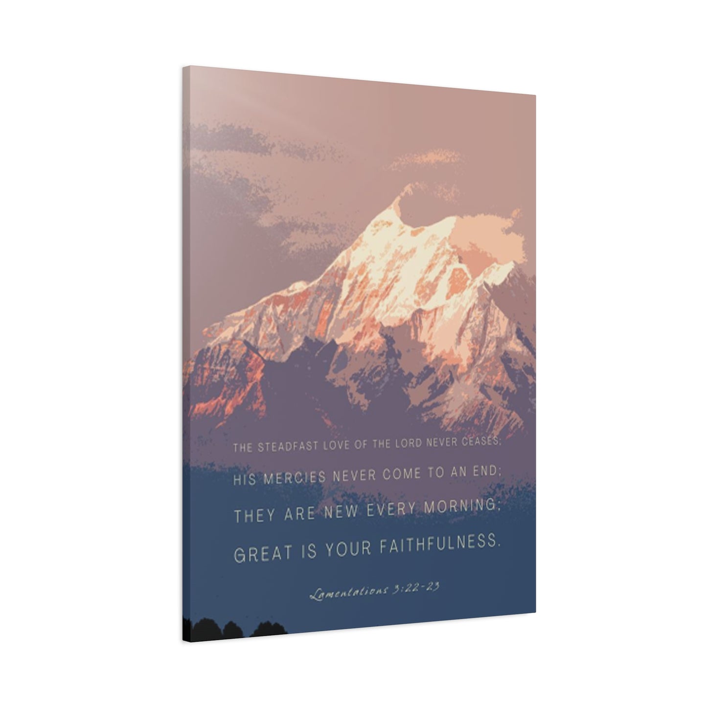
The color palette of snowy mountain scenes offers remarkable versatility for various interior design schemes. The predominant whites and cool blues can brighten darker spaces, create a sense of openness in smaller rooms, or provide a calming counterpoint to warmer accent colors elsewhere in your decor. The neutral tones work exceptionally well in minimalist and contemporary settings, where the simplicity of snow against sky creates clean lines and uncluttered visual spaces. Simultaneously, these same images can complement more traditional or rustic interiors, where the rugged nature of mountain terrain echoes exposed wood beams, stone fireplaces, or other natural materials.
Words That Resonate With Mountain Majesty
Selecting the right phrases to accompany your mountain imagery requires thoughtful consideration of both the message you want to reinforce and the emotional tone you wish to establish in your space. The most effective combinations create synergy between image and text, where each element strengthens the other rather than competing for attention. When words and visuals work in harmony, the result transcends either component alone, creating something greater than the sum of its parts.
Adventure-themed phrases pair naturally with mountain imagery, speaking to the explorer within us all. These messages often encourage action, celebrate courage, or acknowledge the transformative power of stepping beyond comfort zones. Such phrases work particularly well in home offices, fitness spaces, or areas dedicated to planning and dreaming about future travels. They serve as daily reminders that life extends beyond routine, that opportunities for growth and discovery await those willing to venture into unknown territory, whether that means literal mountain climbing or metaphorical peaks in personal or professional development.
Contemplative and philosophical statements offer another approach, using mountain imagery as a backdrop for deeper reflection on life's meaning and purpose. These pieces work beautifully in meditation spaces, bedrooms, or quiet corners designated for reading and thought. The stillness inherent in snow-covered landscapes creates the perfect visual environment for words that encourage introspection, mindfulness, or spiritual awareness. The mountains become silent witnesses to our interior journeys, their permanence offering reassurance that while our thoughts and circumstances change, certain truths remain constant.
Minimalist approaches that use only a few carefully chosen words can prove remarkably powerful when paired with dramatic mountain photography or artwork. Sometimes a single word like "breathe," "believe," or "ascend" provides all the guidance needed, allowing the viewer to project their own meaning and interpretation onto the piece. This restraint prevents the artwork from becoming preachy or overwhelming while still delivering a clear message. The simplicity mirrors the elemental nature of mountain environments themselves, where survival depends on reducing life to its essentials.
Creating Focal Points That Command Attention
Strategic placement of mountain-themed pieces can dramatically affect both the visual flow of a room and the emotional impact of the artwork itself. Consider these items not merely as decorative accents but as anchors that can organize and energize your entire space. The size, positioning, and surrounding context all contribute to how effectively these pieces communicate their intended message and create the desired atmosphere.
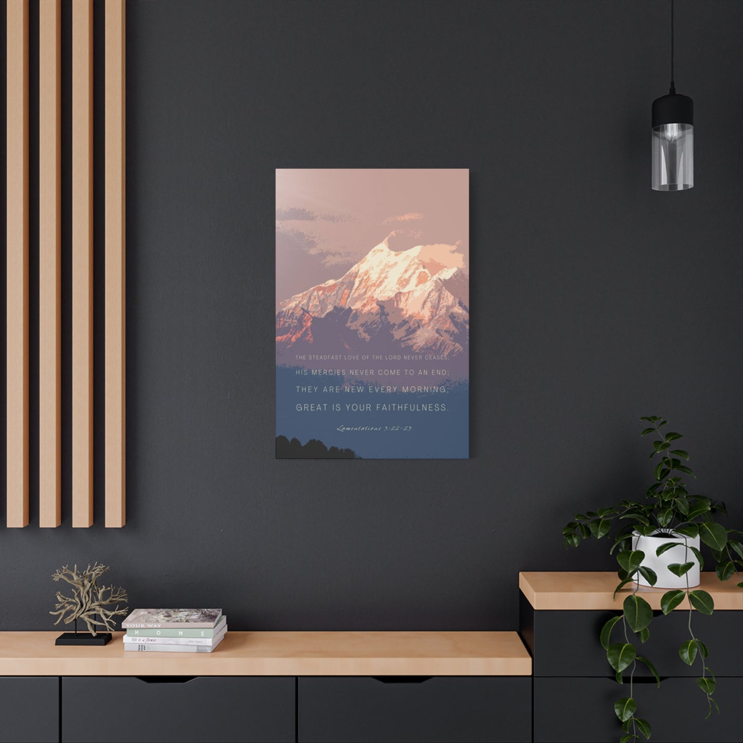
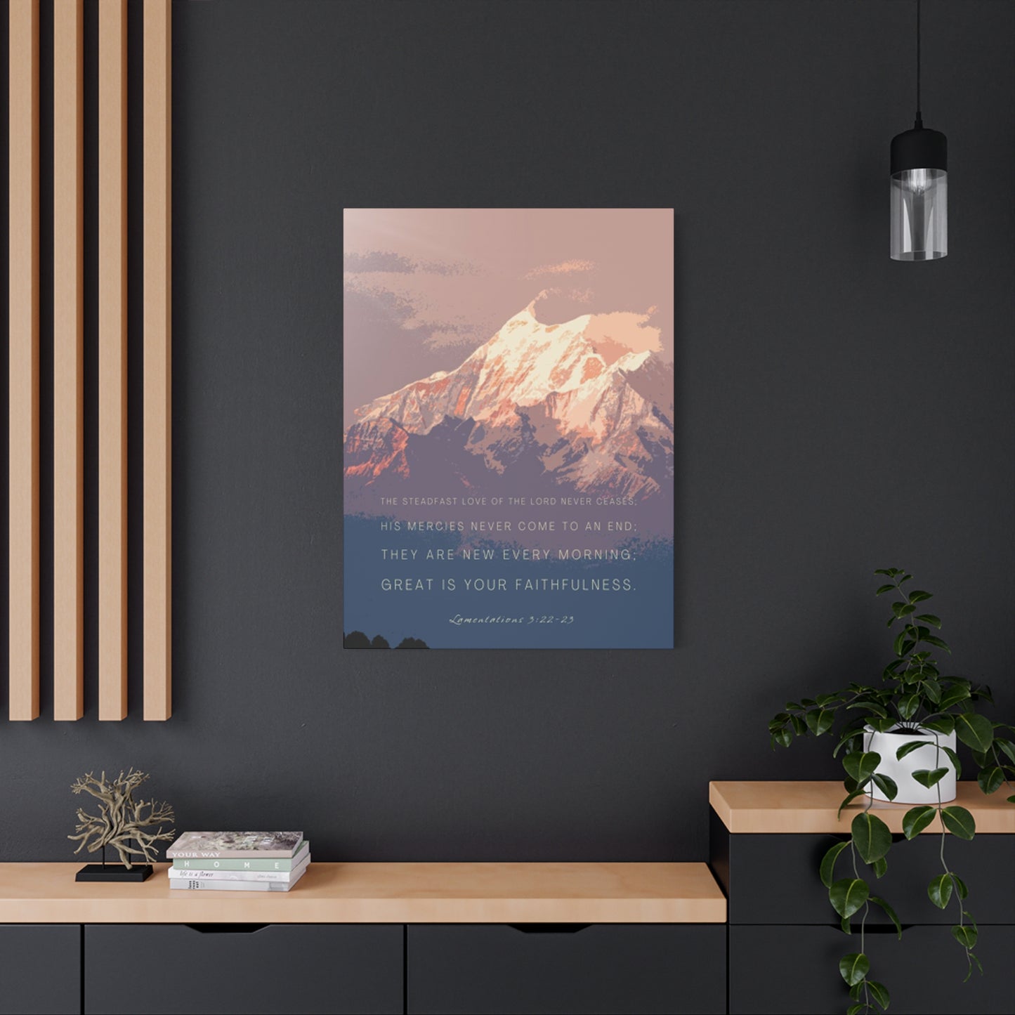
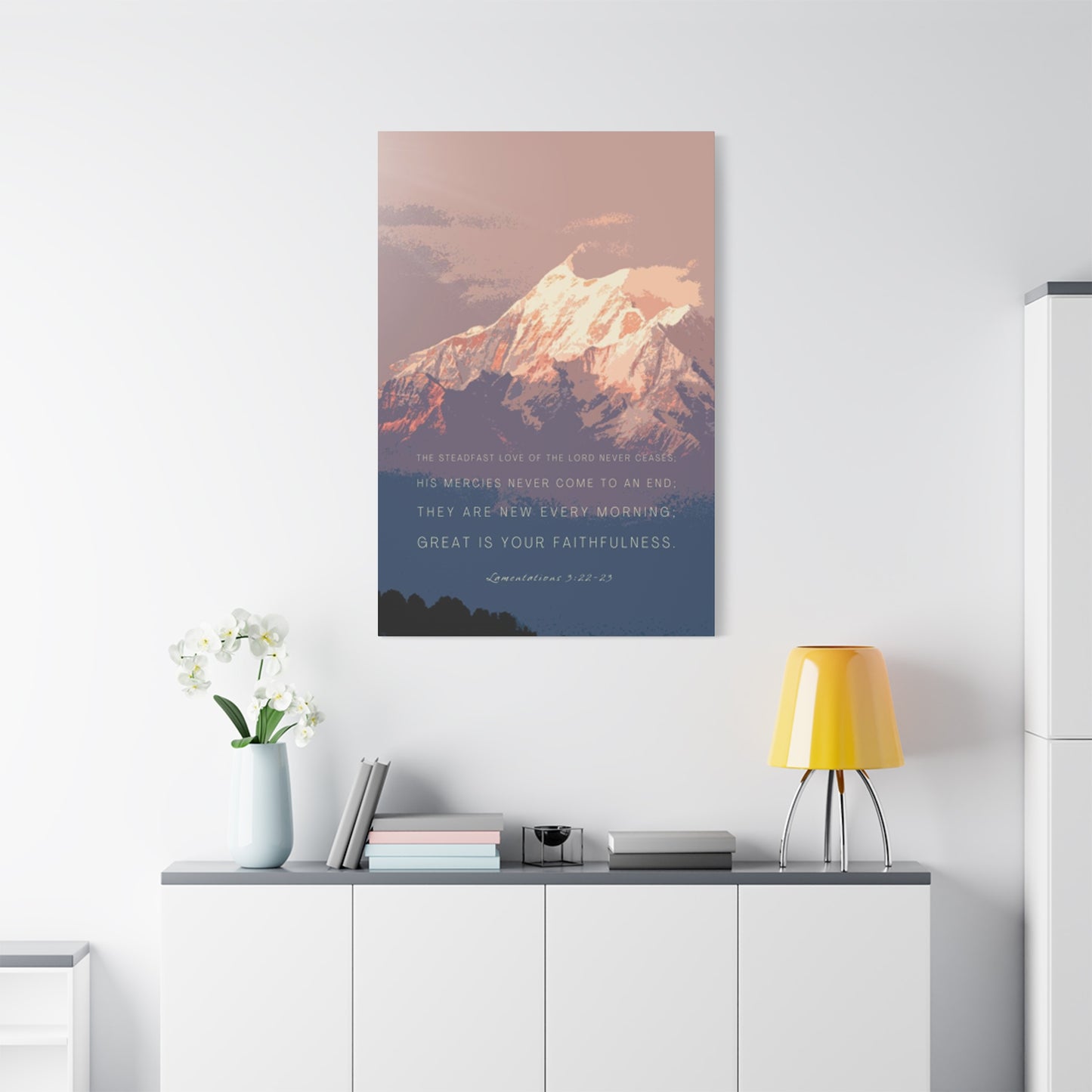
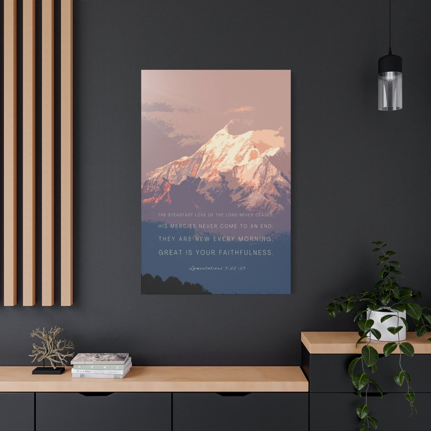
Large format pieces work exceptionally well as statement artwork in living rooms, above sofas, or on expansive walls that need a strong focal point. The scale of these presentations mirrors the grandeur of actual mountain ranges, creating an immersive effect that can transport viewers mentally even while they remain physically present in their homes. When a piece commands significant wall space, it naturally draws the eye and becomes a conversation starter, inviting guests to pause, look more closely, and perhaps reflect on their own relationships with nature and the outdoors.
Gallery wall arrangements offer flexibility for those who want to explore multiple aspects of mountain themes or combine various artistic styles and perspectives. By grouping several smaller pieces together, you can create a narrative arc that explores different moods, seasons, or philosophical approaches to mountain symbolism. This format works particularly well in hallways, stairwells, or larger walls where a single piece might feel lost. The key to successful gallery arrangements lies in finding balance between unity and variety, ensuring the pieces relate to each other without becoming repetitive or monotonous.
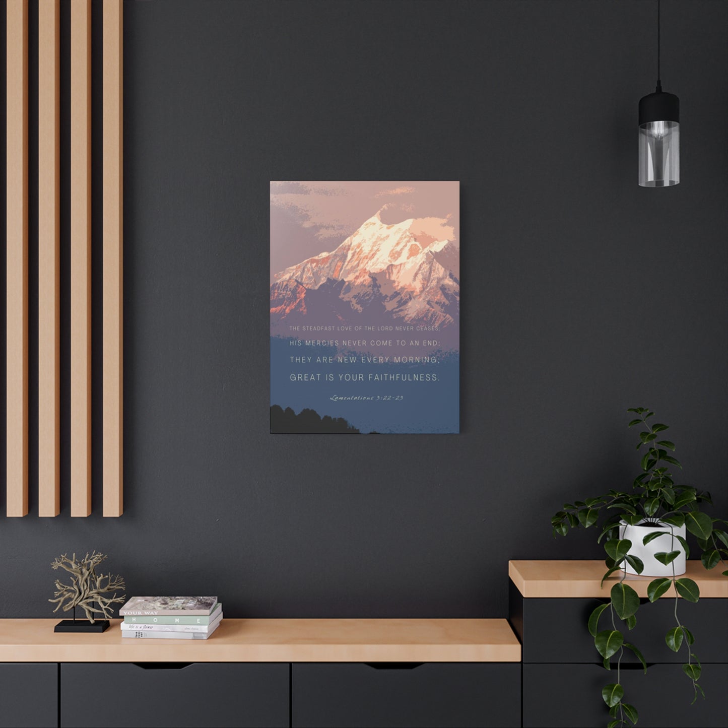
Unexpected placements can yield surprising and delightful results, challenging conventional thinking about where artwork belongs. Consider positioning a mountain piece in a bathroom, where the serene imagery can enhance the spa-like quality of your bathing rituals. Or place a powerful mountain scene in your entryway, setting an intentional tone for everyone who crosses your threshold. Home offices benefit enormously from inspirational mountain artwork, providing visual relief during long work sessions and reinforcing messages about persistence, achievement, and thinking from elevated perspectives. Even kitchens and dining areas can accommodate mountain themes, particularly pieces that celebrate gathering, abundance, or the simple pleasures of shared meals after demanding physical exertion.
Behind Mountain Symbolism
Mountains occupy a unique position in human psychology and mythology, serving as powerful symbols across virtually all cultures and throughout recorded history. Understanding this deep symbolic resonance helps explain why mountain imagery continues to affect us so profoundly and why combining these landscapes with carefully chosen words creates such potent visual statements. The psychological impact extends far beyond simple aesthetic appreciation, tapping into archetypal patterns embedded in our collective consciousness.
The vertical dimension of mountains naturally suggests aspiration, achievement, and transcendence. Throughout history, humans have associated height with spiritual elevation, divine presence, and expanded perspective. Climbing upward requires effort and determination, making summit achievement a perfect metaphor for any goal-directed activity. When we place images of mountain peaks in our environments, we're surrounding ourselves with visual reminders of our capacity to overcome obstacles and reach new heights in whatever endeavors we undertake. This symbolism operates both consciously and unconsciously, subtly influencing our mindset and approach to challenges.
Mountains also represent permanence and stability in our rapidly changing world. While human civilizations rise and fall, mountains endure through millennia, their basic forms unchanged by the brief flicker of human lifespans. This quality makes them powerful symbols of eternal truths, fundamental values, and the things in life that truly matter. In times of uncertainty or transition, mountain imagery can provide psychological anchoring, reminding us that some things remain solid and dependable despite surface turbulence. The snow that covers these peaks adds another layer of meaning, representing both purity and the constant cycle of seasons, change, and renewal.
The solitude associated with mountain environments speaks to our need for occasional withdrawal from social complexity. High altitude spaces offer escape from the demands and distractions of daily life, providing mental space for reflection, creativity, and authentic self-connection. By bringing mountain imagery into our homes, we create visual cues that give ourselves permission to step back, breathe deeply, and reconnect with our inner landscape. This becomes increasingly valuable in our hyper-connected age, where constant communication and information flow can fragment our attention and deplete our mental resources.
Design Principles For Maximum Impact
Creating truly effective mountain-themed pieces requires more than simply combining any photograph with any phrase. The most powerful designs demonstrate careful attention to composition, typography, color relationships, and the subtle interplay between text and image. Whether you're commissioning custom work, purchasing ready-made pieces, or creating your own designs, understanding these principles helps ensure your finished product delivers the emotional and aesthetic impact you desire.
Compositional balance determines how the eye moves across the piece and where attention ultimately settles. In mountain scenes paired with text, consider whether the words should dominate the foreground, overlay the image with transparency, or appear as subtle accents that emerge only upon closer inspection. Each approach creates a different viewing experience and communicates different relationships between message and landscape. Foreground text makes the verbal message primary, using the mountain as supporting context. Overlaid text integrates language and landscape more equally, suggesting that the words emerge from or belong to the natural setting. Subtle placement emphasizes the visual beauty of the scene itself while allowing attentive viewers to discover the textual element as a reward for careful looking.
Typography selection profoundly affects both readability and emotional tone. Clean, modern sans-serif fonts create contemporary, accessible feelings that work well for motivational messages and action-oriented phrases. Serif fonts with their traditional associations can lend weight and gravitas to more philosophical or contemplative statements. Script and handwritten styles inject personality and warmth but require careful application to maintain legibility, especially from distance. The font weight matters too; lighter weights disappear into busy images, while heavy bold fonts can overwhelm delicate photographic details. Finding the right balance requires experimentation and willingness to revise until the text enhances rather than fights the underlying image.
Color choices in both image and text create psychological effects that operate below conscious awareness. Cool blue tones dominate most snowy mountain photography, creating feelings of calm, spaciousness, and contemplation. These can be reinforced or contrasted with text color choices; white or pale text maintains the cool serenity, while warmer accent colors like copper, gold, or even red can inject energy and create visual pop that draws the eye. Consider how the colors in your artwork will interact with existing room colors, either harmonizing with your current palette or providing deliberate contrast that makes the piece stand out as a focal point.
Seasonal Variations And Changing Displays
While snow-covered peaks offer timeless appeal, some people prefer to rotate their artwork seasonally, creating environments that reflect and celebrate the changing year. This approach keeps your space feeling fresh and responsive to natural cycles while allowing you to explore different aspects of mountain environments and associated messaging. Seasonal rotation also lets you build a larger collection over time without overwhelming any single space, storing pieces during their off-season and anticipating their return as the year progresses.
Winter presentations naturally emphasize snow and ice, showcasing mountains in their most pristine and austere beauty. Messages during this season might focus on rest, renewal, contemplation, and the quiet strength found in stillness. The stark beauty of winter landscapes stripped to their essentials mirrors the introspective quality of the season, when nature withdraws energy inward and encourages us to do the same. Color palettes remain predominantly cool, with whites, silvers, and blues creating serene, peaceful environments perfect for the darker months when we spend more time indoors.
Spring mountain scenes capture the transition period when snow begins retreating up the slopes, revealing new growth at lower elevations while peaks remain white against increasingly blue skies. This imagery naturally supports messages about new beginnings, potential, growth, and the patience required for meaningful change. The contrast between lingering snow and emerging life becomes a powerful visual metaphor for the coexistence of past and future, old patterns and new possibilities. These pieces work beautifully as we shake off winter's heaviness and feel renewed energy for projects and goals.
Summer and autumn mountain presentations might feature less snow overall, emphasizing instead the dramatic peaks above treeline or the play of golden hour light across rocky faces. Summer messages can celebrate adventure, exploration, achievement, and the rewards of effort, while autumn pieces might reflect on harvest, gratitude, preparation, and the wisdom that comes from experience. Even without extensive snow cover, mountains retain their symbolic power, and the changing light and vegetation create entirely different moods and visual experiences.
Crafting Personal Meaning Through Customization
While mass-produced pieces offer convenience and affordability, customized creations allow you to craft deeply personal statements that reflect your specific experiences, values, and aspirations. Custom work transforms generic inspiration into intimate expression, creating pieces that hold private meaning beyond their public presentation. This personalization can take many forms, from incorporating specific locations that hold significance in your life story to selecting phrases from literature, philosophy, or even personal writing that resonates with your individual journey.
Location-specific imagery creates powerful connections for those who have actually visited or lived near particular mountain ranges. A piece featuring your favorite hiking destination or the peaks visible from your childhood home carries emotional weight that generic mountain photography cannot match. These images function as visual memoirs, preserving memories and feelings associated with specific places and times. When paired with text that captures something essential about those experiences or their meaning in your life, the result transcends decoration entirely, becoming a genuine artifact of personal history.
Family phrases and sayings offer another avenue for customization, turning inherited wisdom into visual form. Perhaps your grandmother always said something specific about persistence that perfectly encapsulates your family's values. Or maybe during a particularly challenging period, someone offered words that became a lifeline, and you want those words permanently present as a reminder of your resilience and the support you've received. These highly personal texts transform your walls into galleries of your own story, surrounding you with the voices and values that shaped who you are.
Aspirational customization looks forward rather than backward, using your wall art to define and reinforce the person you're becoming rather than celebrate who you've been. This might mean selecting phrases that embody qualities you're working to develop, goals you've set, or the legacy you hope to leave. Placed where you'll see them daily, these pieces function as visual affirmations, keeping your attention focused on what matters most amid all the distractions and demands competing for your time and energy. The mountain imagery reinforces the message that worthy goals require sustained effort, that progress happens step by step, and that the view from the summit makes the climb worthwhile.
Materials And Presentation Methods
The physical form your mountain artwork takes significantly impacts both its visual effect and its longevity. Modern printing and manufacturing technologies offer remarkable variety in how images and text can be reproduced and presented, each with distinct characteristics, advantages, and ideal applications. Understanding these options helps you make informed decisions that align with your aesthetic preferences, budget constraints, and the specific requirements of the space where the piece will live.
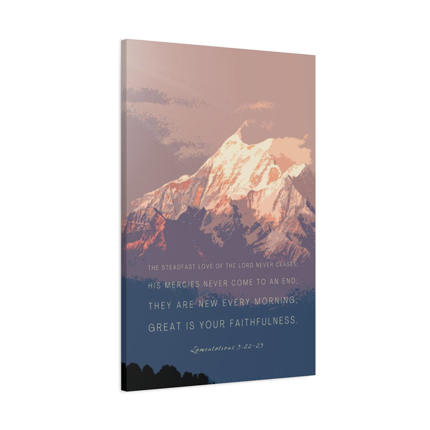
Traditional framed prints remain popular for good reason, offering flexibility, established aesthetic appeal, and relatively easy installation. Quality photographic or fine art prints protected behind glass or acrylic create refined presentations suitable for any environment from casual to formal. Frame selection becomes part of the creative process, with options ranging from sleek modern metals that nearly disappear to substantial wood frames that add their own presence and character. Matting choices further affect the final presentation, creating visual breathing room around the image or allowing it to extend to the frame edges for maximum impact. These traditional presentations work particularly well in established interior design schemes where you want new pieces to integrate seamlessly with existing artwork and furniture.
Canvas wraps offer a more contemporary, casual presentation that works beautifully in modern and transitional spaces. The printing process wraps the image around the sides of the frame, eliminating the need for traditional framing and creating a three-dimensional object that projects slightly from the wall. The texture of canvas adds tactile interest and lends a hand-crafted quality even to photographic reproductions. Many people appreciate the cleaner lines and less formal feeling of canvas presentations, finding they integrate more naturally into living spaces rather than feeling like capital-A Art that demands reverent attention.
Metal prints represent cutting-edge presentation technology that creates stunning depth, vibrancy, and durability. The process infuses dyes directly into specially coated aluminum sheets, resulting in images that seem to glow from within. The smooth, reflective surface creates incredible color saturation and sharpness that makes mountain scenes particularly striking, emphasizing the brilliant whites of snow fields and the deep blues of high altitude skies. Metal prints resist fading, moisture, and scratches far better than paper-based options, making them ideal for high-humidity environments like bathrooms or for spaces that receive intense direct sunlight. The contemporary aesthetic fits naturally in modern and industrial interiors but can create interesting tension in more traditional settings.
Acrylic face mounting creates the most luxurious and gallery-worthy presentations, with prints sandwiched between acrylic sheets that add remarkable depth and protect the image. Light passes through the acrylic, interacting with the print and creating a three-dimensional quality that makes mountain scenes appear almost holographic. The substantial weight and thickness of these pieces communicate quality and permanence, making them investment purchases that elevate any space. The glass-like surface requires careful placement to manage reflections but rewards thoughtful installation with truly stunning visual impact.
Typography As Visual Art
The words you choose to pair with mountain imagery obviously matter, but how those words appear visually proves equally important in creating effective pieces. Typography exists at the intersection of language and visual art, functioning simultaneously as communication and design element. Masterful typographic treatment can elevate simple phrases into powerful statements while poor font choices can undermine even the most profound wisdom.
Font personality should align with message content and intended emotional effect. Sans-serif fonts with their clean, modern lines communicate clarity, accessibility, and forward-thinking attitudes. These work beautifully for action-oriented messages about achievement, adventure, and seizing opportunities. The simplicity of sans-serif letterforms prevents them from competing with complex photographic backgrounds, making them reliable choices when your mountain imagery contains significant detail or dramatic lighting that could clash with more decorative typography.
Serif fonts carry historical weight and traditional associations that lend gravitas to philosophical statements, timeless wisdom, and reflective messages. The small decorative strokes that define serif typefaces create subtle connections between letters, encouraging the eye to move smoothly along the text and inviting more careful reading. These fonts work particularly well for longer phrases or when you want to slow viewers down, encouraging contemplation rather than quick consumption. The traditional feeling of serif faces pairs beautifully with black and white or subtly toned mountain photography, creating cohesive vintage or classic aesthetics.
Script and handwritten fonts inject warmth, personality, and human touch into designs, suggesting intimacy and personal connection. These styles work wonderfully for pieces destined for private spaces like bedrooms or when the message itself is deeply personal. However, script fonts require careful handling; ornate options can become illegible especially at distance or small sizes, and overuse can make designs feel cluttered or amateurish. The key lies in selecting scripts with good readability that maintain their personality without sacrificing function.
Letter spacing, line height, and overall text layout affect readability and visual impact as much as font selection itself. Tight spacing creates density and urgency, while generous spacing suggests thoughtfulness and allows each word room to breathe. Centered text creates formal, balanced compositions while left-aligned or asymmetrical placements inject energy and contemporary feeling. Consider how text interacts with the underlying image; placing words in areas of visual calm within the photograph ensures legibility while strategic placement over more active areas can create interesting layering effects when handled skillfully.
Color Theory In Mountain Themed Designs
Understanding how colors interact psychologically and visually elevates your mountain-themed pieces from pleasant decoration to powerful environmental influencers. Color affects mood, energy levels, perceived room temperature, and even how we experience time passing in a space. Mountain photography naturally tends toward cooler palettes dominated by whites, blues, and grays, but how you handle color in text, accents, and complementary design elements dramatically impacts the final emotional effect.
Cool color dominance in snowy mountain scenes creates naturally calming environments. Blues, associated with sky and ice, trigger physiological relaxation responses, actually lowering heart rate and blood pressure in some studies. Whites suggest purity, clarity, and spaciousness, making rooms feel larger and more open. Grays provide sophisticated neutrality that grounds a space without adding emotional charge. Spaces dominated by these cooler tones work beautifully for areas designated for rest, contemplation, or focused work requiring calm concentration. Bedrooms, meditation spaces, and home offices all benefit from the inherent tranquility of cool mountain palettes.
Warm accent colors introduced through text or design elements create dynamic tension that energizes cool-dominated compositions. Touches of copper, gold, amber, or even coral prevent mountain pieces from feeling too cold or distant, adding human warmth to austere natural beauty. These warm notes draw the eye and create focal points, directing attention to your chosen text and ensuring the message registers clearly. The contrast between cool backgrounds and warm text also enhances legibility, making phrases easier to read from across a room. Warm metallics like gold or bronze particularly complement mountain themes, suggesting sunrise or sunset light painting peaks with color and fire.
Monochromatic approaches using primarily one color family create sophisticated, cohesive presentations that feel intentional and professionally designed. A piece that explores various tones of blue, from pale ice blue through royal to deep navy, creates visual interest through tonal variation rather than contrasting colors. These monochromatic designs integrate especially well in rooms where you've already established a clear color scheme, adding depth and interest without introducing conflicting hues. The unity of single-color palettes also creates meditative qualities, reducing visual stimulation and promoting mental quiet.
Complementary color schemes employing colors opposite each other on the color wheel create maximum visual impact and energy. Orange text on blue mountain backgrounds creates vibrant contrast that commands attention, though such bold choices require confident application to avoid garishness. More subtle approaches might use blue-violet mountains with yellow-orange text accents, creating interest while maintaining sophistication. These high-contrast combinations work well in spaces where you want the artwork to energize the room and serve as a bold statement piece rather than gentle background element.
Considerations For Different Spaces
Scale relationships between artwork and the walls or furniture they accompany dramatically affect visual harmony and impact. Pieces that are too small for their location disappear and fail to create the intended effect, while oversized options can overwhelm spaces and make rooms feel cramped or unbalanced. Understanding proper sizing principles helps you select or create pieces that feel perfectly suited to their environment, neither dominating inappropriately nor getting lost in the visual landscape.
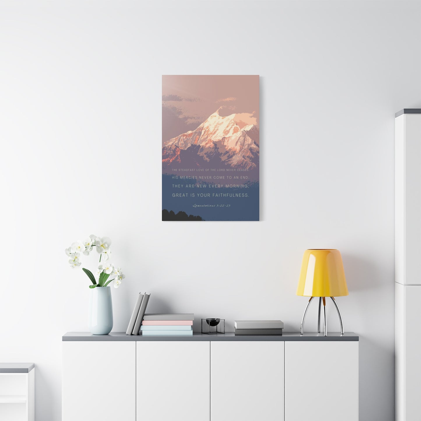
Large walls above sofas, beds, or in spacious living areas demand substantial pieces that can command the space without appearing timid or inadequate. As a general guideline, artwork above furniture should span roughly two-thirds to three-quarters the width of the furniture piece below it, creating visual harmony and appropriate weight distribution. A 96-inch sofa, for example, works beautifully with a single large piece measuring 60-72 inches wide or a grouped arrangement filling similar dimensions. At this scale, mountain imagery achieves its most immersive effect, creating window-like openings that transport viewers mentally to alpine environments.
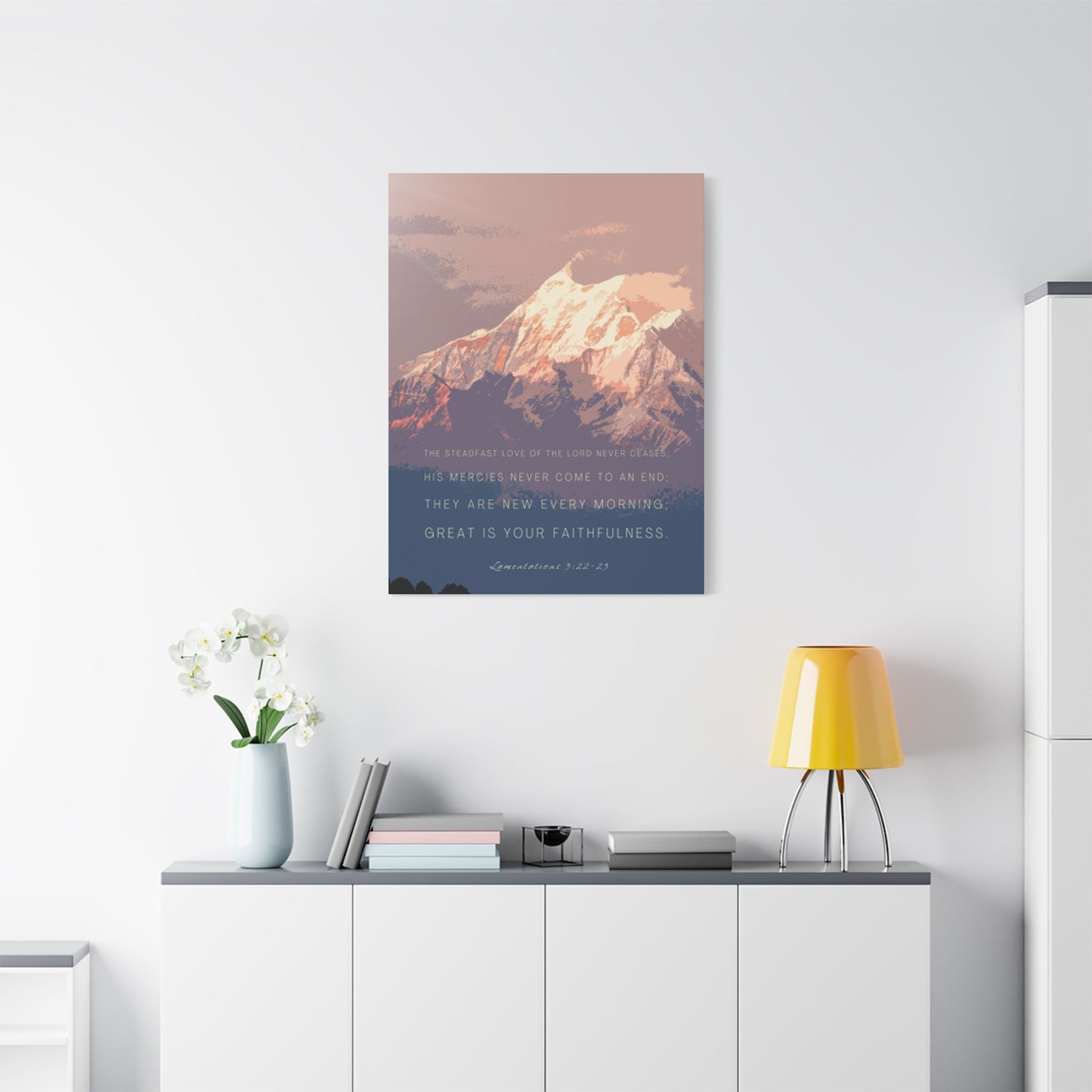
Medium-sized pieces measuring roughly 24-40 inches work well as secondary focal points, in gallery wall arrangements, or in smaller rooms where larger options would overwhelm. These dimensions suit hallways, home offices, bedrooms with limited wall space, or positions flanking larger central pieces. At this size, you maintain enough detail to appreciate photographic quality and read text comfortably while creating manageable installations that don't require professional hanging services or specialized hardware. Multiple medium pieces can be grouped to fill larger spaces while maintaining flexibility for rearrangement as your needs or tastes evolve.
Small format prints and poster designs under 24 inches serve best as part of larger groupings, in very small spaces like powder rooms, or as personal pieces for desks and shelving units. While individual impact remains limited at this scale, thoughtful arrangements of multiple small pieces create gallery wall effects that provide visual interest and flexibility. Small pieces also offer entry points for beginning collectors or those testing a new design direction before committing to larger, more expensive options. The lower price points of smaller works allow experimentation with different images, phrases, and styles as you refine your personal aesthetic.
Oversized statement pieces exceeding 60-72 inches require confident application but create undeniable impact when appropriately used. These dramatic presentations work in large, open-concept spaces, above king beds, or as lobby or commercial installation centerpieces. The scale allows for incredible detail and immersive quality that smaller reproductions cannot match. Viewers can stand close and appreciate fine details or step back and experience the grand sweep of mountain panoramas. These investment pieces become defining features of their spaces, around which other design elements naturally organize.
Techniques For Professional Results
Even the most beautifully designed piece loses impact if poorly installed. Professional-looking hanging creates visual order, protects your walls and artwork, and ensures pieces remain secure and level over time. While complex installations might warrant professional services, understanding proper techniques allows you to handle most projects yourself with confidence and success.
Finding proper height represents the most common installation challenge. The standard gallery guideline places the vertical center of artwork at approximately 57-60 inches from the floor, corresponding to average eye level and creating comfortable viewing for most people. This measurement works well for hallways, offices, and walls viewed primarily while standing. Spaces where you'll typically be seated while viewing the art, such as above a sofa or across from dining chairs, benefit from slightly lower placement that accommodates the reduced eye level. The goal is creating comfortable viewing angles that don't require tilting your head upward or downward awkwardly.
Centering artwork horizontally requires measuring both the wall or furniture beneath and the piece itself to find the true center point of each. A common mistake involves eyeballing placement rather than measuring, resulting in pieces that appear subtly off-center and create visual discomfort even if the viewer can't immediately identify the problem. Take time to measure carefully, mark lightly with pencil, and verify your measurements before making permanent holes. When hanging pieces above furniture, center them on the furniture rather than the entire wall unless the furniture itself is centered, creating visual relationships between elements rather than treating them as unrelated objects.
Hardware selection depends on both wall type and piece weight. Standard framed pieces on drywall typically mount securely with picture hangers rated for their weight, with the angled nails distributing load through the drywall into the stud or relying on the nail's friction within the wall material. Heavier pieces, especially those exceeding 30 pounds, benefit from installation directly into wall studs using appropriate screws or hollow-wall anchors rated for substantial weight. Canvas wraps and other pieces with wire hanging systems require two-point mounting to prevent tilting, using bumpers on bottom corners to maintain parallel positioning with the wall. Metal and acrylic pieces often include specialized mounting hardware that must be installed according to manufacturer specifications to ensure security and proper weight distribution.
Level installation seems obvious but proves challenging without proper technique. Use a quality level rather than eyeballing, and check both during installation and after tightening all hardware, as final tightening can shift pieces slightly. For gallery wall arrangements with multiple pieces, establish a level baseline from which all other placements derive, ensuring the overall arrangement maintains horizontal and vertical harmony even if individual pieces vary in size and shape. Laser levels prove invaluable for complex installations, projecting perfectly straight lines across long distances and making it easy to keep multiple elements aligned.
Creating Gallery Wall Arrangements
Gallery walls transform multiple individual pieces into cohesive visual statements greater than their component parts. These arrangements allow creative expression, tell complex stories, and provide flexibility to incorporate various sizes, styles, and subjects while maintaining overall unity. Mountain-themed gallery walls might explore different locations, seasons, perspectives, or philosophical approaches to mountain symbolism, creating rich visual narratives that reward repeated viewing and contemplation.
Planning gallery arrangements before installation prevents costly wall damage from experimental hanging and ensures balanced results. Create paper templates matching each piece's dimensions and experiment with arrangements using painter's tape to position templates on your wall. This allows unlimited rearranging without consequences, helping you discover optimal layouts before picking up hammer and nails. Some designers recommend laying arrangements out on the floor first, creating the complete grouping and then transferring measurements to the wall systematically. Digital planning tools and apps allow virtual arrangement experimentation, particularly helpful for visualizing how different groupings interact with existing furniture and room elements.
Symmetrical gallery arrangements create formal, orderly presentations with predictable visual rhythm. These might feature a large central piece flanked by matching pairs of smaller works, or a grid of same-sized pieces creating geometric patterns. Symmetrical approaches work beautifully in traditional interiors or formal spaces where you want to communicate order, stability, and classical sensibility. The predictability of symmetrical arrangements makes them easier to plan and install while reducing risk of unbalanced or chaotic results. For mountain themes, symmetrical arrangements might showcase different peaks in a range, seasonal variations of a single location, or complementary philosophical concepts exploring related themes.
Asymmetrical arrangements inject energy, contemporary feeling, and visual interest through unexpected relationships and varied spacing. These layouts require more careful planning to achieve balance without symmetry, distributing visual weight through strategic positioning rather than mirroring. A large piece might anchor one side while several smaller works on the opposite side collectively balance its weight. Asymmetrical galleries feel more casual and collected-over-time, suggesting personal curation rather than decorator prescription. They accommodate adding new pieces more easily than rigid symmetrical arrangements, growing and evolving as your collection develops.
Salon-style arrangements maximize wall coverage with varied pieces hung closely together, creating dense visual tapestries. This traditional European approach showcases extensive collections while creating cozy, intimate feelings. Mountain-themed salon walls might include photographs, paintings, sketches, maps, and text pieces all contributing to an overall exploration of alpine environments and their meanings. The density requires careful color and style coordination to prevent chaos, typically working best with a unifying element like consistent framing, a limited color palette, or thematic coherence that ties diverse pieces together.
Text Selection Strategies
The words you pair with mountain imagery should reflect careful thought about audience, purpose, and the emotional or intellectual effect you want to create. Generic platitudes rarely create lasting impact, while texts that feel authentic and meaningful transform simple decoration into daily touchstones that genuinely influence mood and mindset. Consider multiple dimensions when selecting phrases, ensuring your choices align with both personal resonance and broader communicative goals.
Personal relevance should drive text selection for private spaces where the primary audience is you and your family. What challenges do you face regularly where a visual reminder would provide support? What values do you want to reinforce in your household? What achievements do you hope to accomplish that benefit from daily focus? The phrases that serve you best emerge from honest self-examination rather than external prescription. A competitive athlete might choose texts emphasizing persistence and physical courage, while someone in creative fields might prefer phrases about vision, originality, or trusting the process. The message should feel like it speaks directly to your situation, almost as if written specifically for you.
Universal wisdom offers another approach, selecting phrases that resonate across diverse audiences and circumstances. These might come from philosophy, literature, spiritual traditions, or common sayings that have endured because they capture something essentially true about human experience. Universal texts work well in shared spaces like living rooms where diverse visitors will encounter them, or in commercial settings like offices where you want to inspire teams without appearing to favor particular viewpoints. The challenge with universal approaches lies in avoiding clichés that have lost impact through overuse; seek lesser-known wisdom or fresh phrasings of timeless truths that catch attention through originality.
Action-oriented messages motivate movement, encouraging viewers to take concrete steps toward goals or to engage with life actively rather than passively. These texts often begin with verbs—"Climb," "Explore," "Challenge," "Pursue"—immediately establishing imperative tone and calling for response. Action messages pair naturally with dramatic mountain photography showing summits, ascents, or extreme terrain that visually reinforces the call to effort. These work wonderfully in exercise spaces, offices, or anywhere you want to combat complacency and maintain forward momentum. The energy must feel authentic to you, however, or action-oriented texts become sources of guilt or pressure rather than genuine motivation.
Contemplative phrases slow us down, inviting reflection rather than demanding action. These might pose questions, observe paradoxes, or simply name states of being worth cultivating like peace, presence, or gratitude. Paired with serene mountain scenes showing stillness, space, or soft light, contemplative texts create havens from our achievement-obsessed culture's relentless forward drive. These pieces remind us that simply being holds its own value, that not every moment requires productivity or progress. Rest, reflection, and receptivity all deserve celebration and visual representation in our environments.
Seasonal And Holiday Applications
While mountain imagery offers year-round appeal, certain times and celebrations create opportunities for specially themed pieces that commemorate occasions while maintaining aesthetic coherence with your overall mountain collection. These seasonal variations add festivity without abandoning your established design direction, allowing you to celebrate various times of year within a consistent visual language.
Winter holiday presentations naturally incorporate snow-covered peaks with festive messaging or seasonal greetings. These might feature traditional phrases like "Peace on Earth" or "Joy to the World" overlaid on pristine winter mountain scenes, creating greeting card effects perfect for December display. The cool palette and snowy imagery align perfectly with winter holiday aesthetics while the mountain majesty elevates beyond purely decorative holiday kitsch. These pieces can remain displayed throughout the winter season rather than only during specific holidays, extending their use beyond brief celebration periods.
New Year presentations featuring mountain imagery with resolution-oriented text bridge the transition from old year to new with both celebration and forward focus. Messages about fresh starts, new possibilities, and ambitious goals pair naturally with mountain summit imagery, the peak symbolizing the elevated perspective and achievement you hope to reach in the coming year. These pieces work well as personal vision boards or focal points for planning sessions, keeping your attention fixed on what you hope to accomplish.
Summer adventure themes celebrate the season when mountain recreation peaks and outdoor enthusiasts tackle challenging climbs and explorations. Pieces emphasizing freedom, adventure, challenge, and the rewards of physical effort align with the active energy of summer months. Imagery might showcase hikers on ridgelines, dramatic summit views, or the brilliant blue skies of high altitude summer days. Text could reference famous mountaineers, celebrate personal outdoor achievements, or simply encourage getting outside and engaging with nature actively.
Autumn pieces might combine high mountain snow with lower elevation fall colors, creating stunning contrasts between seasons. Messages during this transition period could explore themes of change, letting go, harvest, and gratitude for abundance. The visual drama of gold aspens against white peaks creates spectacularly beautiful imagery that captures both endings and persistence, the changing and the eternal coexisting in single frames.
Conclusion
Snowy mountain quotes wall art offers more than just aesthetic appeal—it transforms your living space into a sanctuary of peace and inspiration. By integrating these serene landscapes adorned with motivational quotes, you invite the tranquility of nature and the wisdom of timeless words into your home. This fusion of art and inspiration creates an environment that nurtures the soul, encourages reflection, and fosters a sense of calm amidst the hustle and bustle of daily life.
The allure of snowy mountain scenes lies in their ability to evoke a sense of awe and wonder. The majestic peaks, blanketed in pristine snow, symbolize resilience, purity, and the sublime beauty of the natural world. When paired with thoughtful quotes, these images transcend mere decoration; they become daily reminders of our own capacity for growth, perseverance, and inner peace.
Incorporating snowy mountain quotes wall art into your living space can have profound effects on your well-being. The calming imagery of snow-covered landscapes has been shown to reduce stress and anxiety, promoting a peaceful atmosphere conducive to relaxation and mindfulness. The addition of inspirational quotes further enhances this effect, providing gentle encouragement and motivation to navigate life's challenges with grace and determination.
Moreover, these artworks serve as focal points that spark conversation and connection. Sharing the meanings behind the quotes and discussing the symbolism of the mountain scenes can deepen relationships and create a shared sense of purpose within the household. They also offer a unique way to express personal values and aspirations, allowing your living space to reflect your inner journey and the ideals you hold dear.
The versatility of snowy mountain quotes wall art makes it suitable for various settings within the home. Whether placed in the living room to inspire family gatherings, in the bedroom to promote restful sleep, or in the home office to encourage productivity and focus, these pieces adapt seamlessly to different environments. Their timeless appeal ensures that they remain relevant and resonant, continuing to inspire and uplift long after they've been hung on the wall.
In conclusion, snowy mountain quotes wall art is more than just a decorative choice—it's a transformative addition to your living space. By blending the serene beauty of snowy landscapes with the wisdom of carefully chosen quotes, you create an environment that nurtures peace, inspires growth, and reflects your personal journey. As you surround yourself with these reminders of nature's grandeur and life's possibilities, you cultivate a sanctuary that supports your well-being and enriches your daily life.
