


Elevate Your Living Space with Stunning Southwest Wall Art Prints
The allure of arid terrains, golden sunsets, and distinctive cultural elements has captivated interior design enthusiasts for generations. Bringing the essence of these warm, expansive environments into residential spaces creates atmospheres filled with warmth, character, and timeless beauty. Southwest wall art prints capture the spirit of rugged landscapes, iconic flora like the saguaro cactus, and the vibrant hues of desert skies, offering a unique way to infuse any room with personality and a sense of place.
This comprehensive exploration delves into various aspects of incorporating Southwest-inspired décor into modern living spaces, offering detailed insights into selecting the perfect prints, styling approaches that harmonize with different design themes, and the transformative power of carefully chosen visual elements. Whether you prefer bold, dramatic sunsets or subtle desert motifs, Southwest art can evoke feelings of tranquility, resilience, and natural wonder.
From the choice of color palettes to the balance between rustic charm and contemporary minimalism, understanding these elements allows homeowners to craft inviting environments that reflect both their aesthetic tastes and a deep appreciation for the cultural heritage of the American Southwest. This guide aims to inspire and empower you to elevate your home with stunning Southwest wall art prints that celebrate nature’s beauty and timeless artistry.
Capturing the Essence of Desert Regions Through Visual Elements
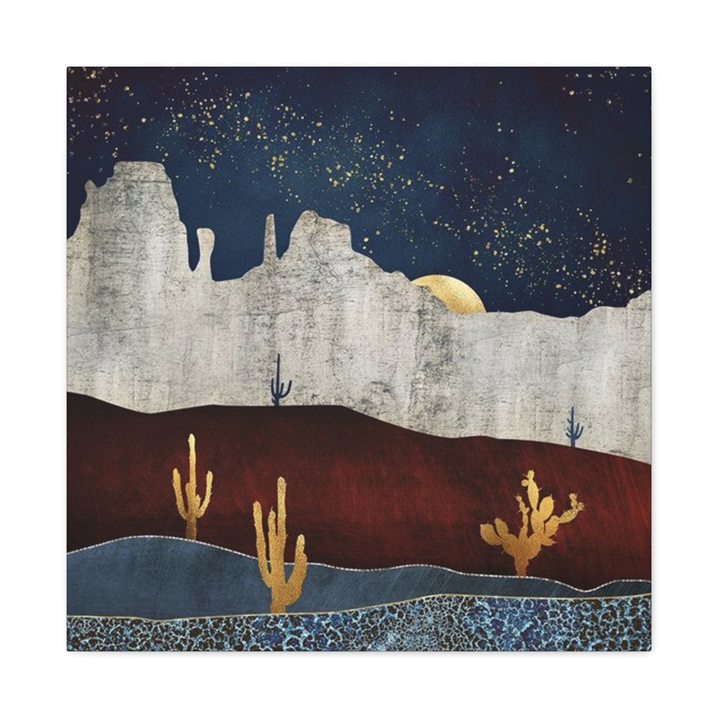
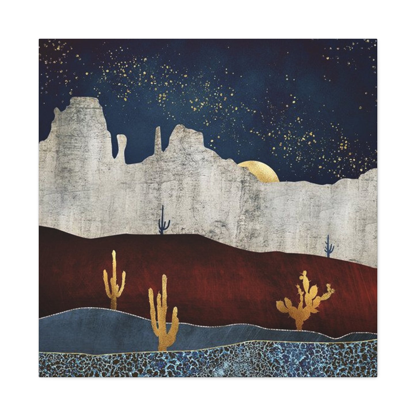
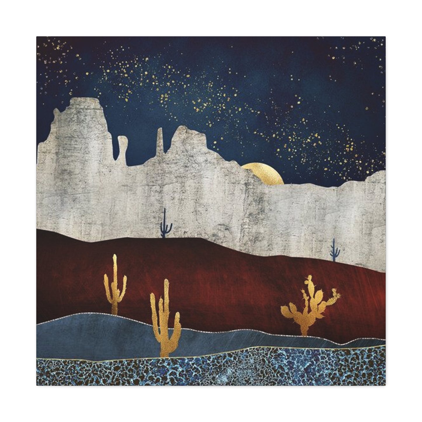
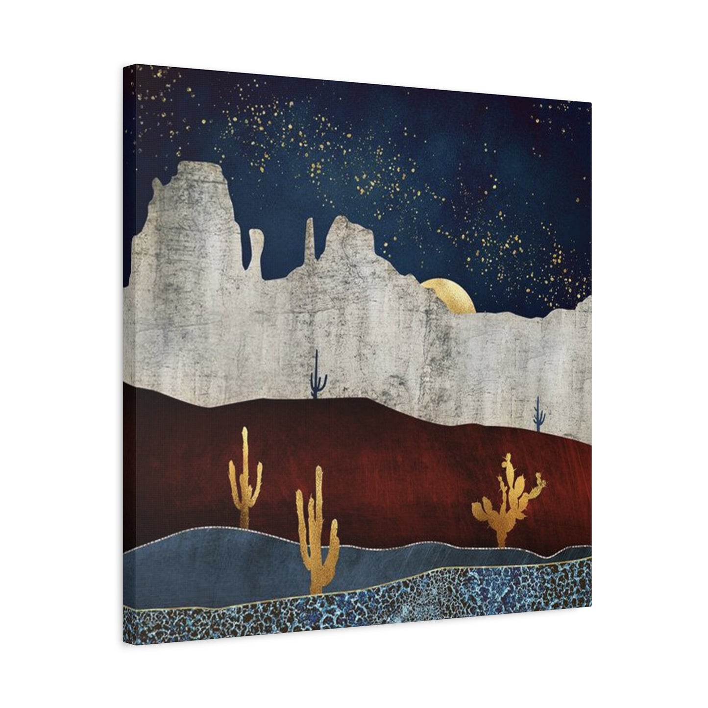
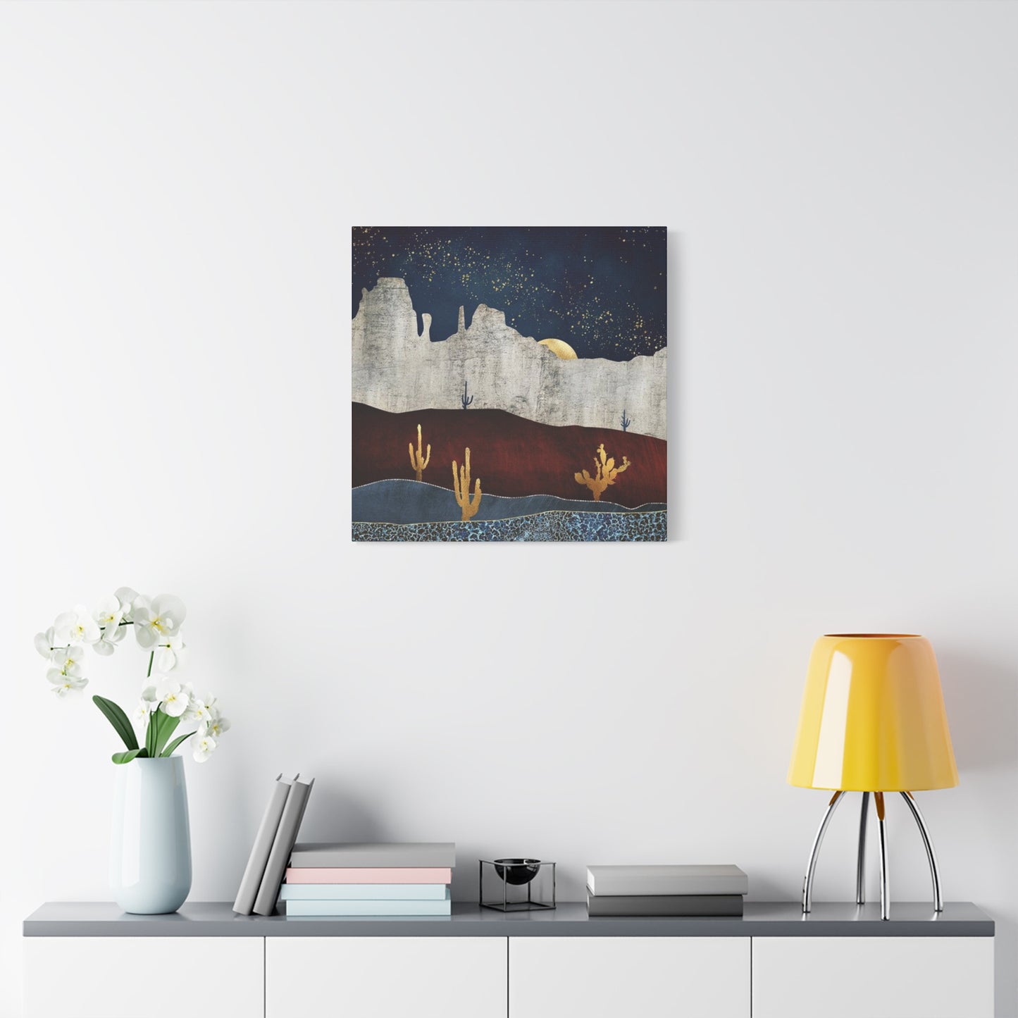
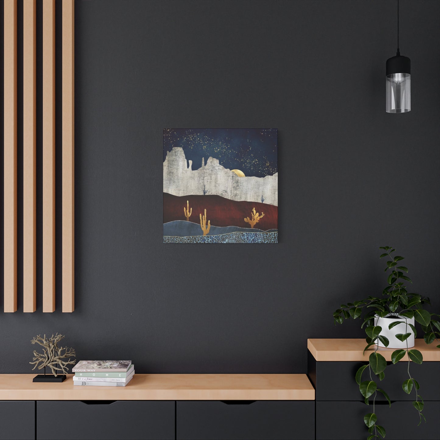
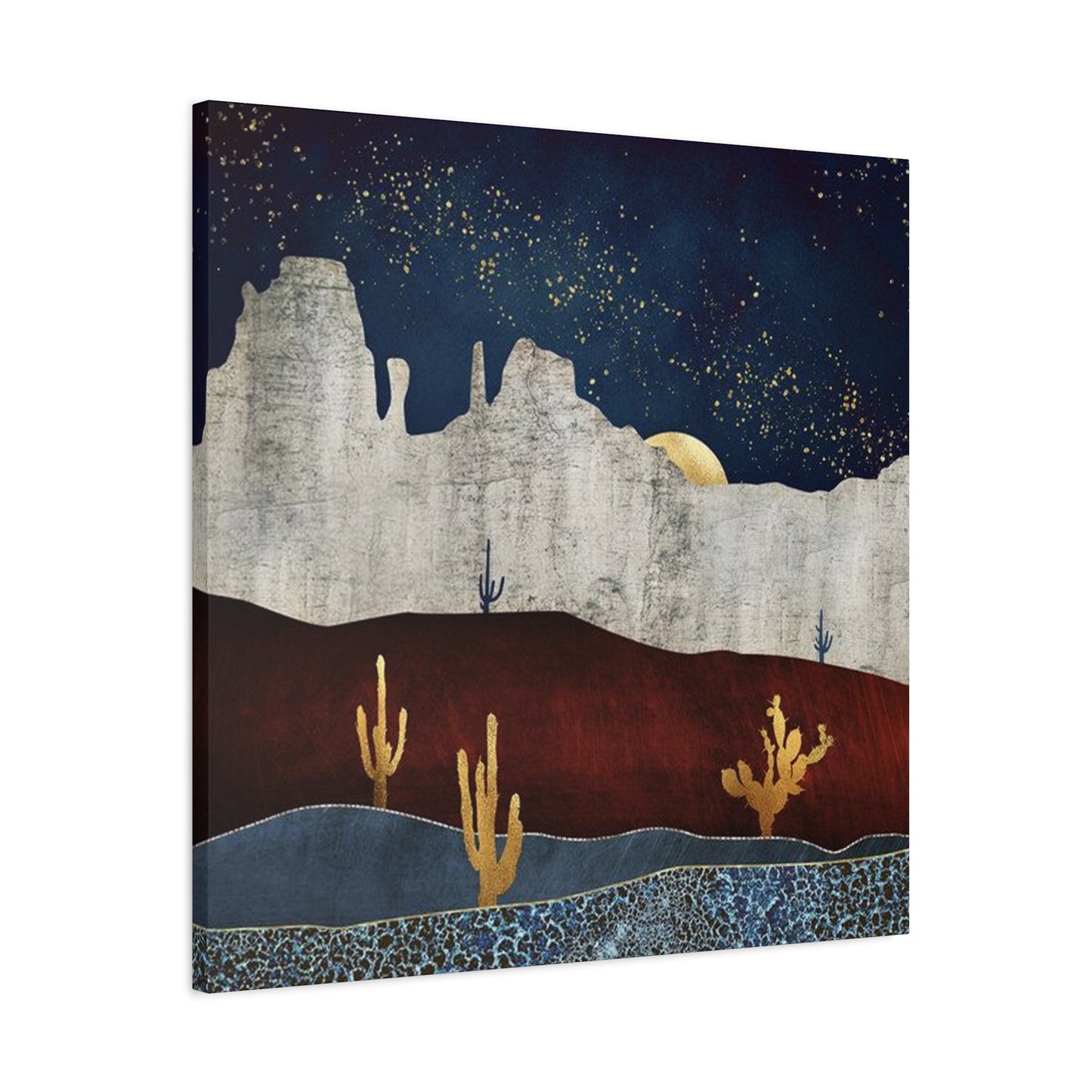
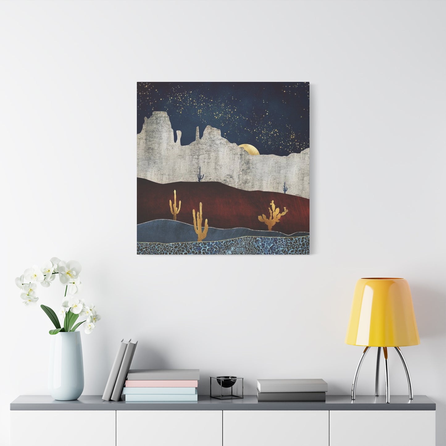
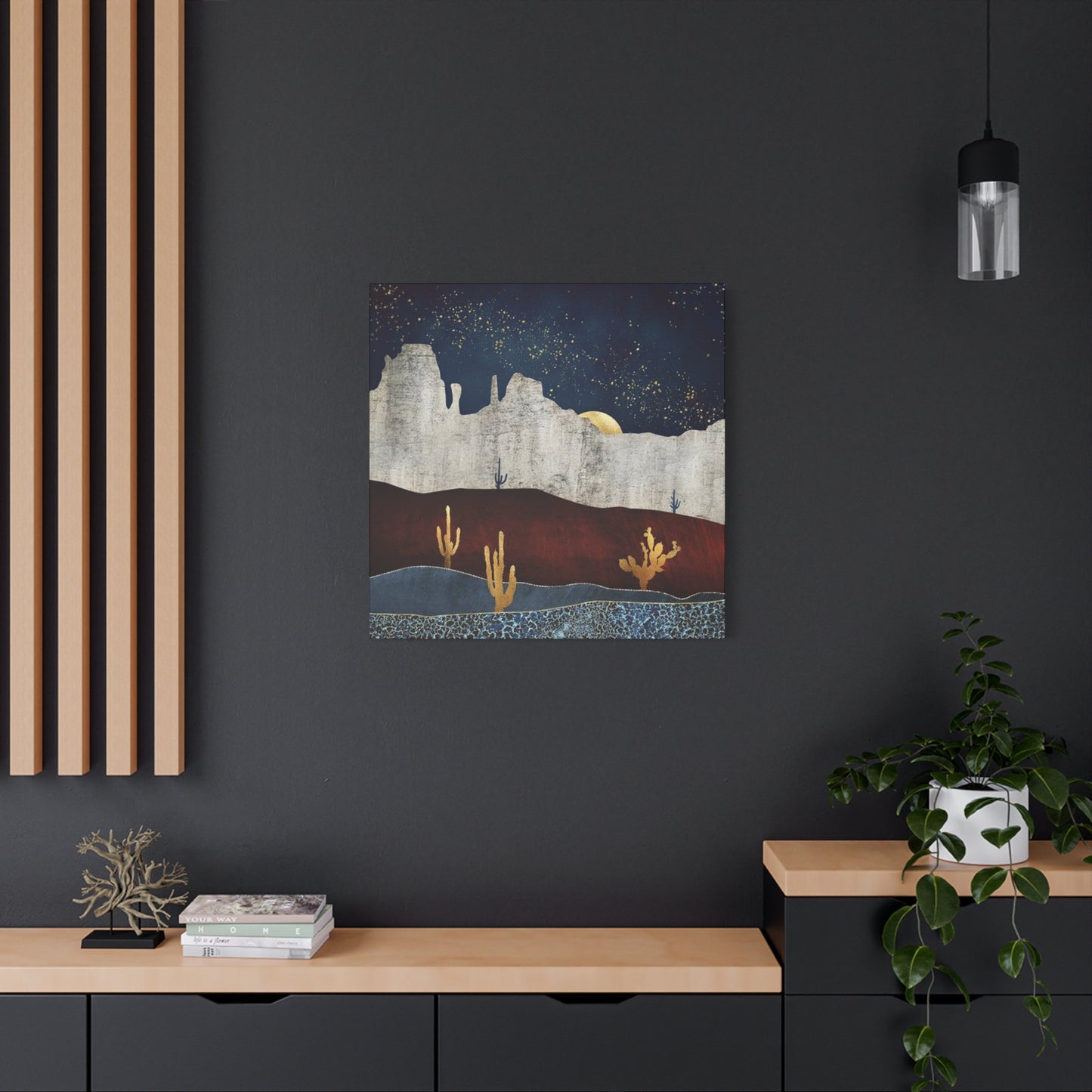
The visual representation of arid landscapes has become increasingly popular in contemporary interior design. These artistic interpretations capture the raw beauty of vast open spaces, dramatic rock formations, and the unique flora that thrives in challenging climates. When selecting pieces that showcase these environments, homeowners discover endless opportunities to infuse their living areas with natural warmth and organic textures.
The appeal of these artistic representations lies in their ability to transport viewers to serene, expansive settings without leaving the comfort of home. Each brushstroke or photographic capture preserves the unique character of these remarkable ecosystems. The interplay of light across sandy surfaces, the dramatic shadows cast by towering rock formations, and the subtle color variations throughout different times of day all contribute to creating visually stunning compositions.
These visual elements work particularly well in various residential settings, from minimalist modern apartments to traditional family homes. The versatility stems from the natural color palette inherent in these scenes, which typically features earth tones, warm ambers, soft terracottas, and muted greens. Such colors create harmonious relationships with diverse furniture styles and existing décor elements, making integration into established design schemes remarkably straightforward.
Beyond aesthetic appeal, these artistic interpretations carry deeper significance for many individuals. They represent freedom, adventure, and the untamed spirit of nature. For those who have traveled through these regions or hold personal connections to such landscapes, displaying these images creates meaningful touchstones that evoke cherished memories and emotional responses. The psychological impact of surrounding oneself with representations of open, natural spaces can promote feelings of calm, reduce stress, and create sanctuary-like atmospheres within busy households.
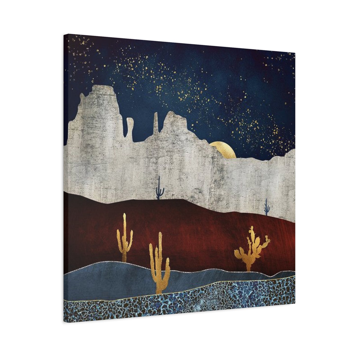
The technical execution of these artistic pieces has evolved considerably with advancing reproduction technologies. High-quality printing methods now capture subtle color gradations, textural details, and atmospheric qualities with remarkable fidelity. Gallery-wrapped canvases offer frameless presentations that emphasize the artwork itself, while the depth of the wrapped edges creates dimensional interest on walls. Various finishing options, including matte, satin, or gloss protective coatings, allow customization based on lighting conditions and personal preferences.
Natural Scenery Reproductions for Contemporary Living Areas
Translating the majesty of untouched wilderness into tangible décor pieces requires careful consideration of composition, color accuracy, and emotional resonance. The best reproductions capture not just visual elements but the feeling of standing amid these remarkable landscapes. Whether depicting the soft light of dawn illuminating distant mountains or the dramatic contrasts of midday sun creating stark shadows, these pieces bring dynamic energy to interior walls.
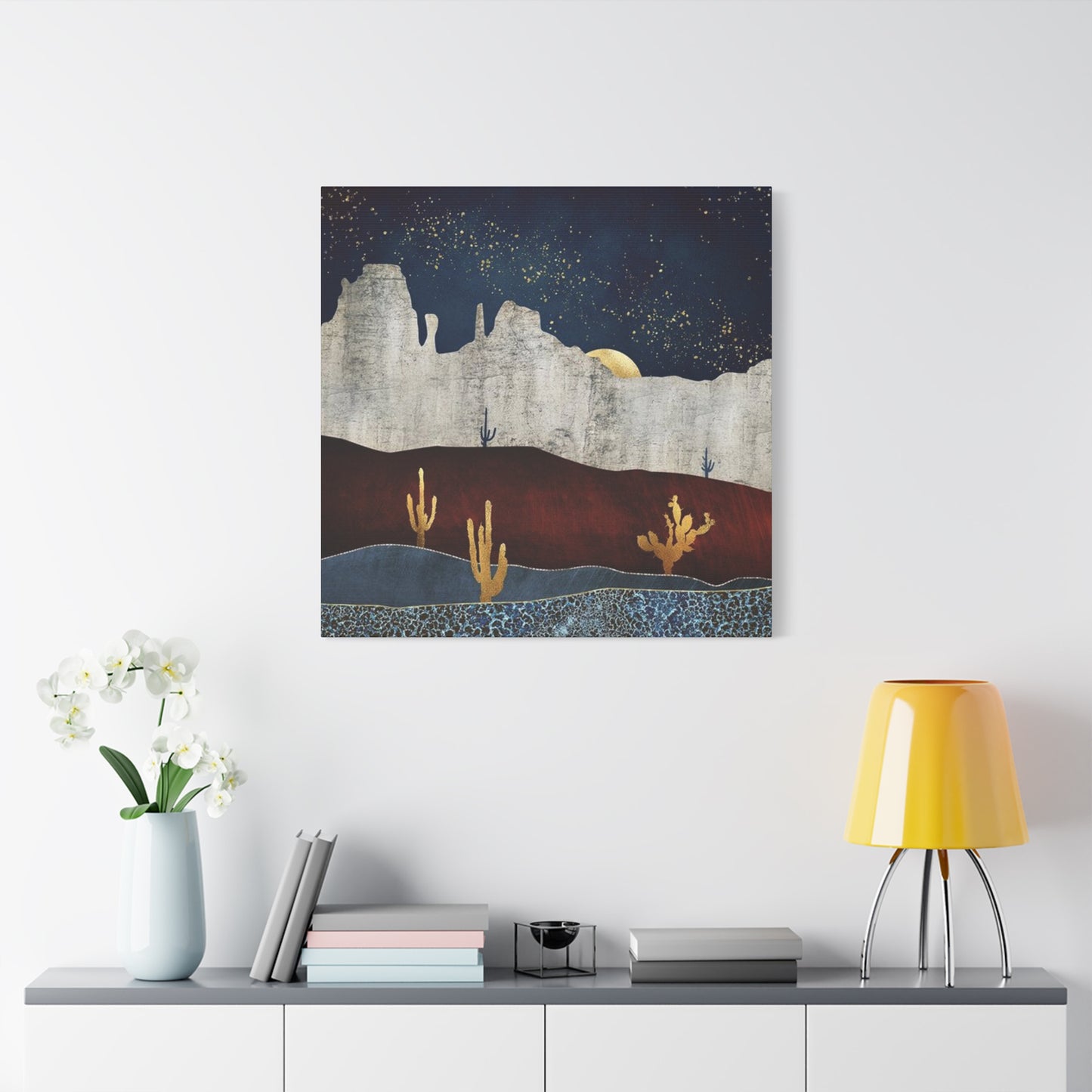
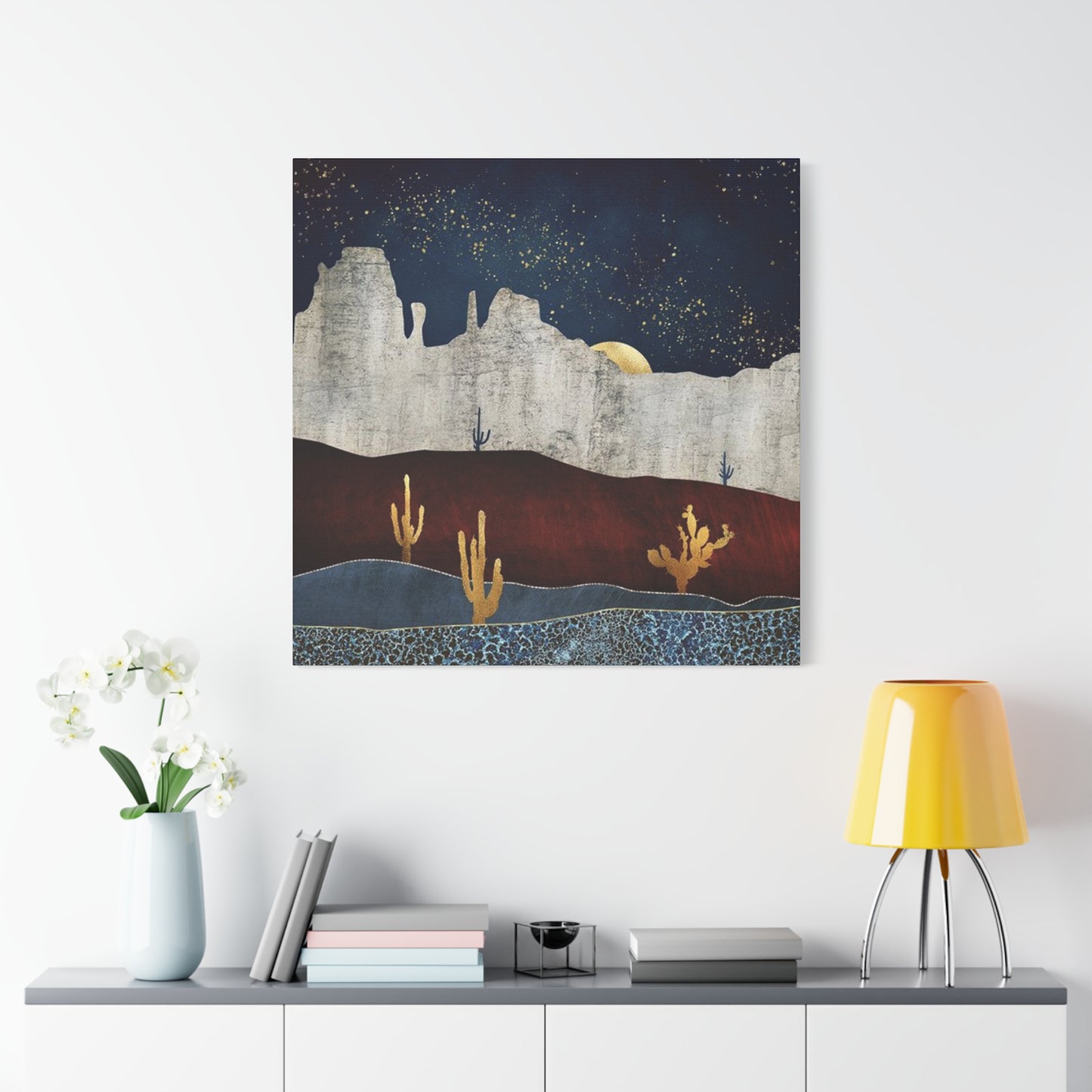
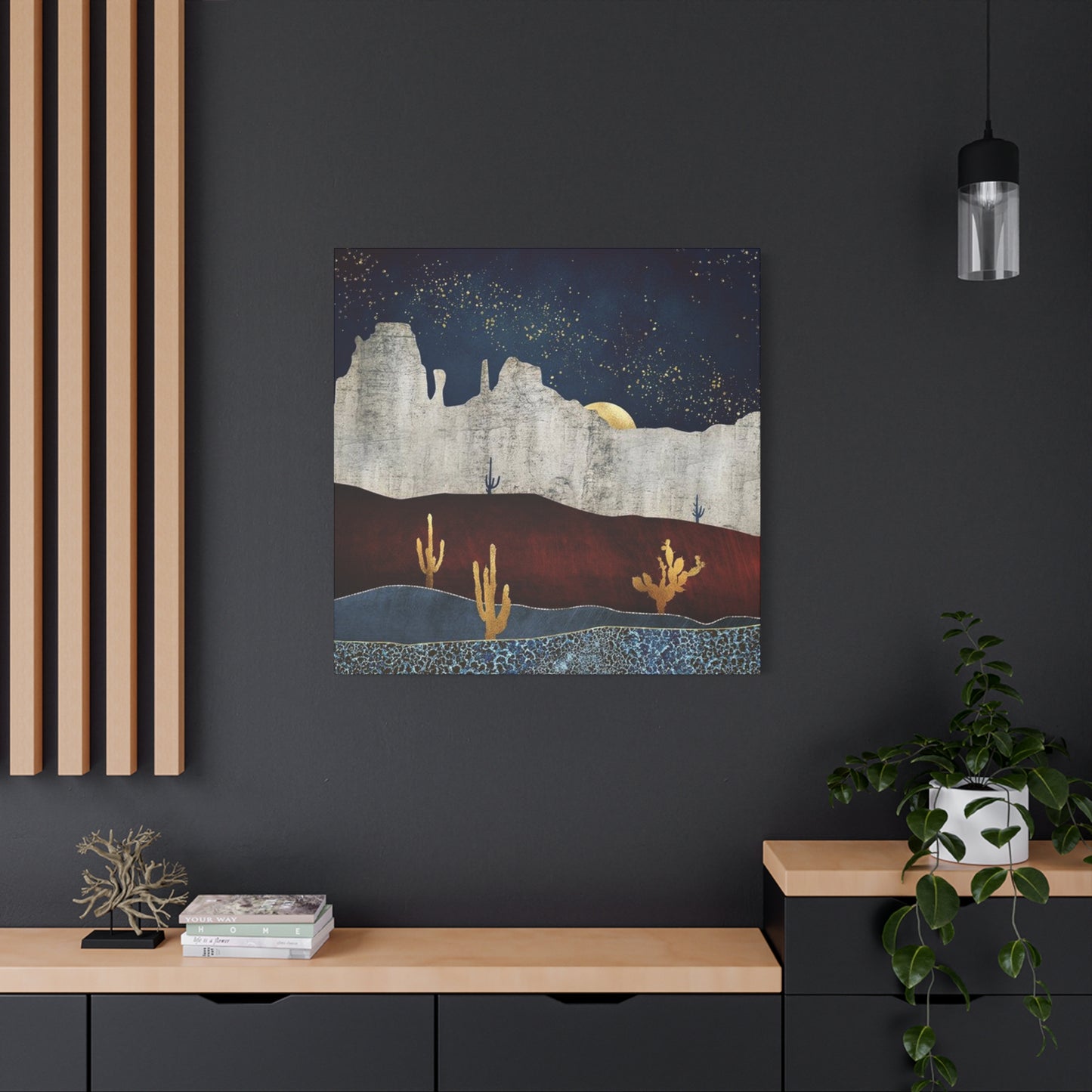
The selection process for landscape reproductions should account for several important factors. Room size plays a crucial role in determining appropriate dimensions. Larger spaces benefit from substantial pieces that command attention and serve as focal points, while smaller rooms often work better with modest dimensions that enhance without overwhelming. The viewing distance also matters; pieces intended for hallways or entryways can incorporate finer details, while those displayed in larger rooms should feature bolder compositions visible from across the space.
Color relationships between the artwork and existing room elements deserve careful attention. While complementary color schemes create harmonious flows, strategic contrast can add visual interest and define specific zones within open floor plans. The warm tones prevalent in desert landscapes naturally complement wood furnishings, leather upholstery, and metallic accents commonly found in contemporary interiors. These natural affinities simplify the integration process and create cohesive design narratives.
Lighting considerations significantly impact how these reproductions appear in different settings. Natural daylight reveals subtle color variations and textural qualities that artificial lighting might diminish. However, well-planned artificial lighting can enhance dramatic elements and create ambiance during evening hours. Adjustable track lighting, picture lights, or strategically positioned floor lamps allow flexibility in highlighting specific features and adapting the presentation to different times and occasions.
The emotional impact of landscape imagery extends beyond mere decoration. Environmental psychology research suggests that exposure to natural scenes, even through artistic representations, provides measurable benefits for mental wellbeing. These effects include reduced anxiety, improved focus, and enhanced mood. For urban dwellers or those living in regions far removed from such landscapes, these artistic pieces provide valuable connections to natural environments and the restorative qualities they offer.
Seasonal considerations also influence landscape reproduction selections. While these images maintain year-round relevance, certain compositions resonate more strongly during specific seasons. The warm, golden tones of sunset scenes create particularly welcoming atmospheres during autumn and winter months, while images featuring vibrant spring wildflower blooms bring freshness to spaces during warmer seasons. Rotating displays seasonally keeps interiors feeling current and responsive to natural cycles.
Enhancing Residential Environments with Regional Aesthetic Elements
Creating cohesive interior environments inspired by specific geographic regions involves more than simply hanging artwork. It requires thoughtful integration of various design elements that work together to evoke the character and atmosphere of those places. This approach to interior styling draws upon architectural features, color palettes, textile selections, and accessory choices that collectively transport inhabitants and guests to distant locales.
The foundation of regionally inspired interiors often begins with color selection. Earth-based hues dominate these schemes, including terracotta, adobe, sandstone, sage, and turquoise. These colors appear not only in wall treatments but also in upholstery fabrics, throw pillows, area rugs, and decorative objects. Layering various shades and tones within this palette creates depth and visual interest while maintaining cohesion. Accent colors might include deeper burnt oranges, rich browns, or vibrant blues that reference traditional pottery and textile arts from these regions.
Textural variety plays an equally important role in authentic regional styling. Rough-hewn wood beams, either structural or decorative, immediately establish character. Exposed brick or stone surfaces contribute rustic charm and tactile interest. Plaster walls with slightly irregular surfaces evoke traditional building methods and add warmth that perfectly smooth surfaces cannot achieve. These architectural elements provide ideal backdrops for complementary decorative pieces and create environments with genuine character.
Furniture selections should reflect the casual, comfortable ethos associated with these regions. Substantial pieces crafted from solid wood with visible grain patterns and natural imperfections celebrate materiality and craftsmanship. Leather furnishings, whether smooth or distressed, contribute authenticity and age gracefully, developing character over time. Wrought iron elements in table bases, light fixtures, or decorative accessories reference traditional metalworking techniques and provide visual weight that grounds compositions.
Textile choices offer opportunities to introduce pattern, color, and softness into these environments. Handwoven textiles featuring geometric patterns or natural fiber rugs with organic textures add layers of visual and tactile interest. Throws and pillows in rich colors and varied textures invite touch and create inviting seating arrangements. Window treatments might include simple linen panels that filter light gently or wooden blinds that provide privacy while maintaining the natural aesthetic.
Lighting design deserves special attention in regionally inspired spaces. Traditional architectural forms from these areas often feature distinctive lighting fixtures crafted from metals with decorative detailing. These might include hammered copper pendant lights, wrought iron chandeliers with candelabra bulbs, or wall sconces with mica or art glass shades. Such fixtures provide ambient lighting while serving as sculptural elements that reinforce the overall design narrative. Layering different light sources creates flexibility and allows adjustment of atmosphere throughout the day.
Accessorizing these spaces provides the finishing touches that personalize environments and tell stories. Pottery in traditional forms and glazes adds authentic cultural references. Woven baskets offer both decorative appeal and practical storage solutions. Collections of natural objects like interesting rocks, weathered wood pieces, or preserved plant materials connect interiors to the natural world. Carefully curated books about regional art, history, or natural environments add intellectual dimension and conversation-starting opportunities.
Distinctive Flora Representations in Interior Visual Displays
The unique plant life adapted to thrive in harsh, arid conditions possesses remarkable visual appeal that translates beautifully into decorative artwork. These resilient organisms have evolved distinctive forms, often architectural in nature, that create striking silhouettes and interesting compositions. Their representation in interior displays brings organic elements into spaces while requiring none of the maintenance living specimens demand.
Artistic interpretations of these plants range from realistic botanical illustrations to abstract representations that capture essence rather than precise detail. Realistic renderings appeal to those interested in natural history and botanical accuracy, offering educational value alongside aesthetic pleasure. These detailed depictions often showcase the intricate patterns of spines, the subtle color variations in plant tissues, or the delicate beauty of ephemeral blooms that appear only briefly after rare rainfall events.
More stylized or abstract approaches to depicting this flora emphasize form, color, and emotional impact over scientific accuracy. Simplified silhouettes against colorful backgrounds create bold, graphic statements that work particularly well in modern or minimalist interiors. Watercolor interpretations capture the soft, diffused quality of desert light while maintaining the distinctive shapes that make these plants instantly recognizable. Mixed media pieces might incorporate actual plant materials, creating three-dimensional interest and textural variety.
The symbolic meanings associated with desert plants add deeper significance to their decorative use. These organisms represent resilience, adaptation, and survival against challenging odds. For individuals facing personal challenges or seeking reminders of inner strength, surrounding themselves with images of these tenacious plants provides daily inspiration. The slow growth and remarkable longevity of many species also symbolize patience and the rewards of persistent effort over time.
Scale considerations influence the impact of plant-themed artwork significantly. Oversized representations of single specimens create dramatic focal points and allow viewers to appreciate details often overlooked in nature. Compositions featuring multiple plants at various scales might depict realistic groupings or imaginative arrangements that prioritize aesthetic balance over botanical accuracy. Series of smaller pieces arranged in grids or linear patterns create rhythm and can fill larger wall expanses effectively.
The color palettes associated with these plants extend beyond the greens typically associated with vegetation. Blue-grey tints, purple undertones, and silvery surfaces appear frequently, along with the vibrant blooms in yellows, oranges, pinks, and reds that punctuate the muted backgrounds. These varied colors provide flexibility in coordinating artwork with existing interior color schemes and offer opportunities to introduce unexpected pops of color into neutral environments.
Placement strategies for plant-themed artwork should consider both visual impact and thematic coherence. Grouping multiple pieces featuring different species creates natural history gallery effects and provides opportunities for educational labeling if desired. Mixing plant imagery with landscape scenes builds comprehensive environmental narratives that transport viewers more completely. Pairing botanical artwork with actual living plants, even non-desert varieties, strengthens connections to the natural world and creates layered, dimensional displays.
Atmospheric Light Transitions Captured on Display Surfaces
The dramatic transformation of light across vast open landscapes during twilight hours creates some of nature's most breathtaking spectacles. Capturing these fleeting moments and translating them onto display surfaces allows people to experience this daily miracle repeatedly within their personal spaces. The warm, golden light gradually shifting to deep oranges, vibrant pinks, and rich purples creates emotional responses that few other natural phenomena can match.
The technical challenges of accurately reproducing these atmospheric conditions require sophisticated color management and printing technologies. The subtle gradations between hues, the glowing quality of backlit clouds, and the interplay of warm and cool tones across the composition demand precision in reproduction. High-quality giclée printing processes using archival inks on premium canvas substrates preserve these qualities and ensure longevity, allowing these moments to remain vibrant for decades.
Compositional elements within sunset imagery significantly influence emotional impact and visual effectiveness. Silhouetted foreground elements create depth and scale, whether they include distinctive plant forms, rock formations, or architectural features. The relationship between earth and sky in the composition affects mood; images with expansive skies emphasize openness and possibility, while those with substantial land masses feel more grounded and intimate. The position of the sun itself, whether centered, offset, or just beyond the frame, guides viewer attention and creates different narrative qualities.
These atmospheric pieces function exceptionally well in specific locations within homes. Living areas where families gather in evening hours benefit from the warm, welcoming ambiance these images create. The colors naturally complement candlelight or warm-toned artificial lighting, enhancing cozy atmospheres. Bedrooms represent another ideal location, as the calming color progressions promote relaxation and peaceful mindsets conducive to rest. Even in spaces with limited natural light, these vibrant pieces introduce brightness and warmth that counteract potential dreariness.
Psychological research into color preferences and emotional responses supports the popularity of sunset imagery. Warm colors trigger associations with comfort, security, and positive social interactions. The natural progression from light to dark reflected in these scenes resonates with daily biological rhythms and can help establish temporal awareness in spaces without windows. For individuals who work during daylight hours and miss actual sunsets, these artistic representations provide consolation and connection to natural cycles.
The versatility of sunset-themed pieces extends to various design styles. In contemporary settings, clean compositions with minimal foreground elements and emphasis on color fields align with modernist aesthetic principles. Traditional interiors accommodate more detailed scenes with recognizable landscape features and potentially wider ranges of colors. Transitional spaces benefit from balanced approaches that incorporate both abstraction and representation, satisfying diverse preferences within multi-use areas.
Pairing sunset imagery with complementary design elements enhances overall impact. Warm metallic accents in copper, bronze, or rose gold echo the colors in the artwork and create cohesive schemes. Textile selections in coordinating warm tones layer color throughout spaces and soften architectural hardness. Strategic lighting that enhances the artwork during evening hours extends its impact and creates ambient illumination that serves functional purposes while highlighting aesthetic investments.
Weathered Aesthetic Elements from Regional Traditions
The appeal of objects showing signs of age, use, and exposure to elements has grown considerably in contemporary design circles. This appreciation for patina and imperfection represents a departure from mass-produced uniformity and celebrates uniqueness, history, and authentic materials. Incorporating elements with these qualities into interior spaces creates warmth, character, and visual interest that pristine surfaces cannot achieve.
The weathered aesthetic draws inspiration from architectural traditions developed in response to specific environmental conditions. Thick walls, exposed timber, and handcrafted details characterize structures built to withstand intense heat, occasional heavy rains, and dramatic temperature fluctuations. Modern interpretations of these features through decorative elements and finishes allow homeowners to evoke this heritage without undertaking major architectural renovations.
Wood elements displaying natural aging processes contribute significantly to weathered aesthetics. Reclaimed timber with checking, fading, and nail holes tells stories of previous uses and adds instant history to new constructions. Furniture pieces with distressed finishes, whether authentically aged or artfully replicated, provide similar character. The irregular surfaces, varied colors, and tactile qualities of weathered wood create visual and sensory richness that smooth, uniform materials lack.
Metal elements with developed patinas add another layer to weathered aesthetics. Rusted iron suggests exposure to rain and time, while oxidized copper displays distinctive blue-green tones. These natural chemical processes create colors and textures impossible to achieve through painting or other artificial means. In moderation, weathered metals introduce unexpected colors and material variety that prevent spaces from feeling monotonous or overly coordinated.
Stone and plaster surfaces contribute foundational weathered qualities. Natural stone displays inherent color variations, textural irregularities, and sometimes fossil inclusions that make each piece unique. Aged plaster develops subtle color shifts, minor cracks, and surface variations that add depth and prevent flat, lifeless appearances. These materials connect contemporary interiors to building traditions spanning centuries and across cultures.
Artwork within weathered aesthetic frameworks might feature subjects consistent with this approach or employ techniques that create aged appearances. Images printed on textured substrates or with intentionally faded color palettes reinforce the overall design direction. Frames with distressed finishes, whether wooden or metal, complement the artwork and strengthen visual coherence. Alternative mounting approaches using weathered planks or metal sheets instead of traditional frames create custom presentations aligned with rustic sensibilities.
Balancing weathered elements with cleaner contemporary features prevents spaces from feeling too theme-driven or dated. Mixing rough textures with smooth surfaces, aged materials with newer ones, and organic forms with geometric precision creates dynamic tension that keeps interiors interesting. This approach also allows personalization and evolution over time as preferences shift and new pieces enter the collection.
The sustainability aspect of weathered aesthetics deserves recognition. Valuing aged materials and finding beauty in imperfection extends object lifespans and reduces demand for new production. Salvaging architectural elements, refinishing vintage furniture, and appreciating rather than replacing items showing wear aligns with environmental consciousness and combats disposable consumer culture. This ethical dimension adds satisfaction beyond aesthetic pleasure for many homeowners.
Traditional Design Patterns for Interior Applications
Cultural heritage expressed through distinctive patterns, symbols, and motifs provides rich material for interior design applications. These traditional elements carry historical significance while offering timeless visual appeal that transcends temporary trends. Incorporating authentic patterns or respectful interpretations into contemporary spaces creates layers of meaning and connects inhabitants to broader cultural narratives.
Geometric patterns feature prominently in traditional design vocabularies from arid regions. Triangles, diamonds, zigzags, and stepped formations appear repeatedly in textiles, pottery, architecture, and other artistic expressions. These angular forms create visual rhythm and can be scaled from small decorative accents to large architectural features. The mathematical precision underlying many geometric patterns reflects sophisticated understanding of proportion and balance developed over generations.
Color symbolism within traditional design systems adds depth to pattern applications. Specific colors held cultural significance related to natural materials, spiritual beliefs, or social structures. While modern interpretations need not adhere strictly to historical color assignments, understanding original meanings can inform thoughtful contemporary applications. The traditional palette, derived from natural pigments and dyes, features earth tones punctuated by more vibrant blues, greens, and occasional reds.
Stylized representations of natural elements constitute another major category of traditional motifs. Rain clouds, lightning, plants, animals, and celestial bodies appear in simplified, often geometric forms. These symbols connected communities to their environments and reflected the importance of natural phenomena to agricultural societies. Modern applications of these motifs maintain visual appeal while potentially carrying symbolic meaning for those who research their origins.
Border patterns and repeat designs offer versatile applications in contemporary interiors. These elements can define spaces, draw attention to architectural features, or add visual interest to plain surfaces. Applied as painted details, stenciled patterns, or incorporated into textiles and wallcoverings, traditional border designs bring cultural richness to various locations. The repetitive nature of these patterns creates rhythm and continuity that guides visual movement through spaces.
Authentic reproduction of traditional patterns requires careful research and respect for cultural origins. Many patterns hold specific meanings within their original contexts and may be considered sacred or restricted to particular uses. Working with artists or companies that collaborate with cultural communities ensures appropriate use and supports continuation of artistic traditions. This ethical approach prevents cultural appropriation while celebrating and preserving heritage.
Contemporary interpretations of traditional motifs allow creative freedom while acknowledging historical sources. Designers might abstract traditional patterns further, combine elements from different cultural traditions, or apply traditional motifs in unconventional ways or scales. These modern approaches keep design vocabularies fresh and relevant while maintaining connections to historical sources. The key lies in balancing innovation with respect and avoiding trivializing culturally significant elements.
Layering different pattern scales and types creates visual richness without overwhelming. Large-scale patterns make bold statements and work well as focal points, while smaller patterns add texture and detail without dominating. Mixing geometric patterns with more organic forms prevents rigidity and introduces contrast. Limiting color palettes while varying patterns maintains cohesion and prevents chaotic appearances.
Rich Earth-Based Color Selections for Interior Surfaces
The color palette associated with arid landscapes and regional architectural traditions offers remarkable versatility for interior applications. These hues, drawn from natural materials and environmental observations, create warm, welcoming atmospheres that feel both grounded and sophisticated. Understanding the range of available colors and their psychological effects helps homeowners make informed choices that support their lifestyle and aesthetic preferences.
Terracotta tones, ranging from pale peachy pinks to deep burnt oranges, serve as primary colors in many regionally inspired schemes. These warm hues immediately create welcoming atmospheres and pair beautifully with natural materials like wood and stone. The color derives from clay-rich soils and fired pottery, connecting interior spaces to both landscape and cultural heritage. Terracotta works effectively as wall colors, textile choices, or accent pieces depending on desired intensity.
Adobe colors occupy a similar but slightly cooler position in the warm spectrum. These dusty rose-beige tones reference traditional building materials and provide neutral backgrounds that support diverse accent colors. The subtle complexity of adobe shades prevents them from reading as flat or boring despite their understated nature. These colors create excellent foundations for layered color schemes and allow artwork and furnishings to command appropriate attention.
Sandstone and cream tones offer lighter options that brighten spaces while maintaining warmth. These pale neutrals work particularly well in smaller rooms or spaces with limited natural light, where darker colors might feel oppressive. The slight warmth in these shades differentiates them from stark whites or grays, contributing to cohesive schemes that feel intentionally coordinated rather than accidentally neutral.
Sage and olive greens introduce cooler elements to warm-dominated palettes. These muted green tones reference desert vegetation and provide visual relief from unrelenting warmth. Used strategically as accent colors or in spaces where cooling effects are desirable, these greens add sophistication and prevent color schemes from feeling predictable. The dusty, greyed quality of appropriate green shades ensures they harmonize with warmer tones rather than clashing.
Turquoise stands apart as the most vibrant and saturated color commonly associated with regional aesthetics. This distinctive blue-green appears in mineral deposits, traditional jewelry, and decorative arts throughout these areas. Small doses of turquoise create striking accents that energize otherwise neutral schemes. The color's cultural significance adds meaning beyond pure aesthetics for many individuals with connections to these regions.
Deep browns and blacks provide necessary contrast and grounding in color schemes dominated by lighter, warmer tones. These darker values create visual anchors and prevent spaces from feeling washed out or lacking definition. Chocolate browns bring warmth and richness, while charcoal or black accents add contemporary edge and graphic clarity. These dark tones appear effectively in furniture pieces, window treatments, light fixtures, or decorative accessories.
Application strategies significantly influence how these colors function within spaces. Large expanses of intense colors can overwhelm, making strategic use of more saturated hues as accents often more successful than applying them to entire walls. Creating color progressions from lighter to darker or warmer to cooler guides visual movement and can make spaces feel larger or more intimate depending on the direction of change. Testing colors under different lighting conditions before committing to large applications prevents disappointment with unexpected color shifts.
The psychological impact of warm, earth-based color palettes has been well documented. These hues generally promote feelings of comfort, security, and connection to nature. They create inviting atmospheres that encourage relaxation and social interaction. For homes in colder climates or urban environments dominated by concrete and glass, introducing these warm colors provides psychological comfort and refuge from outside conditions.
Contemporary Interpretations of Regional Visual Themes
The evolution of design sensibilities has led to fresh approaches to traditional regional themes. Contemporary artists and designers reinterpret classic elements through modern lenses, creating work that honors heritage while speaking to current aesthetic preferences. These updated interpretations allow broader audiences to appreciate regional character without feeling constrained by strict adherence to historical styles.
Minimalist approaches to regional themes emphasize essential forms and colors while eliminating decorative details. Simplified landscape compositions might reduce scenes to color fields representing earth and sky with minimal foreground detail. Plant forms could be rendered as pure silhouettes without texture or internal detail. These pared-down interpretations align with contemporary preferences for clean, uncluttered aesthetics while maintaining recognizable connections to source material.
Abstract expressionist interpretations capture the emotional essence of landscapes and regional character without representing specific places or identifiable features. Bold brushstrokes in characteristic colors might suggest terrain or atmospheric conditions through gestural energy rather than precise description. These works appeal to viewers seeking emotional resonance and visual impact over literal representation. The interpretive freedom allows personal projection and varied readings that literal works cannot accommodate.
Photographic approaches to regional subjects have evolved beyond traditional landscape photography. Contemporary photographers might isolate small details, emphasize graphic patterns, or employ unusual perspectives that challenge conventional ways of seeing. Black and white photography strips away color, focusing attention on form, texture, and light quality. High-contrast treatments create dramatic impacts, while softer approaches emphasize subtlety and nuance.
Mixed media techniques combine traditional art materials with found objects, textural elements, or digital manipulation. These hybrid approaches create dimensional interest and invite closer inspection. Incorporating actual materials from featured regions, such as sand, plant matter, or mineral fragments, adds authenticity and tactile appeal. Digital enhancement of hand-created artwork allows color adjustments and reproduction at various scales while maintaining artistic sensibility.
Contemporary color palettes might push beyond traditional earth tones while remaining rooted in regional inspiration. Intensifying certain colors creates more vibrant, energetic pieces that appeal to modern sensibilities. Introducing unexpected color combinations or shifting entire palettes warmer or cooler generates fresh perspectives on familiar subjects. These chromatic explorations keep regional themes feeling current and prevent them from seeming locked in the past.
Scale manipulations create contemporary impact from traditional subjects. Extremely large pieces command attention in open contemporary spaces with high ceilings and minimal furniture. Conversely, series of small works arranged in grids or patterns create rhythm and pattern from individual images. Unusual proportions, such as extra-wide horizontal or narrow vertical formats, emphasize specific aspects of subjects and create distinctive appearances.
Integration with contemporary interior styles requires thoughtful consideration of context. In industrial loft spaces, regional artwork might contrast with raw architectural elements or complement them depending on presentation choices. Mid-century modern interiors accommodate regional themes through shared appreciation for organic forms and warm woods. Scandinavian-inspired spaces can incorporate regional elements by focusing on natural materials, warm tones, and connection to landscape, finding common ground despite geographic distance.
Traditional Landscape Depictions on Modern Display Materials
Translating timeless landscape subjects onto contemporary canvas materials creates interesting dialogues between old and new. Modern production techniques allow unprecedented quality and accessibility while maintaining artistic integrity and visual impact. Understanding available options helps collectors make informed decisions that balance aesthetic preferences, budget considerations, and practical requirements.
Canvas as a substrate offers numerous advantages for landscape reproduction. The woven texture of quality canvas adds subtle surface interest that enhances rather than detracts from images. This texture mimics traditional painting surfaces and contributes to artistic authenticity. Canvas also provides dimensional depth when gallery-wrapped around substantial frames, creating shadow lines and presence that flat prints cannot achieve. The material's flexibility allows for various display options, from traditional framing to contemporary frameless presentations.
Print quality variations depend primarily on technologies and materials used in production. Giclée printing represents the current standard for fine art reproduction, employing multiple ink colors and sophisticated color management to achieve exceptional accuracy and tonal range. Archival pigment inks resist fading and maintain color integrity for generations when properly displayed. These technical specifications matter for pieces intended as long-term investments or future heirlooms.
Canvas weight and weave tightness affect both appearance and durability. Heavier canvases provide more substantial feel and resist sagging better than lightweight alternatives. Tighter weaves produce smoother surfaces appropriate for highly detailed images, while more open weaves emphasize texture and suit looser, more impressionistic works. Matching canvas characteristics to image style enhances overall presentation and demonstrates attention to quality.
Gallery wrapping techniques extend images around frame edges, eliminating the need for separate framing while creating finished appearances. This approach works particularly well with images featuring strong centers and less critical edge content. The wrapped edges typically mirror adjacent image areas or continue patterns in visually pleasing ways. The resulting pieces mount directly to walls with minimal hardware, creating clean, contemporary presentations.
Protective coatings extend canvas print longevity by guarding against moisture, UV damage, and physical wear. These treatments, available in matte, satin, or gloss finishes, can be applied during production or afterward. Finish selection affects appearance significantly; matte coatings minimize glare and create subtle presentations, while glossy finishes intensify colors and create more dramatic impacts. Satin finishes offer compromise positions between these extremes.
Mounting systems range from simple wire hangers to sophisticated French cleat arrangements. The choice depends on piece weight, wall type, and desired adjustability. Proper mounting ensures pieces hang level and secure while minimizing wall damage. For valuable pieces or rental situations, removable mounting solutions prevent permanent alterations to walls while maintaining display quality.
Size considerations balance available wall space, viewing distances, and budget constraints. Oversized pieces create dramatic focal points but require substantial investment and appropriate display locations. Medium-sized works offer versatility and fit comfortably in various settings. Small pieces work well in groupings or intimate spaces but can disappear on large empty walls. Accurate measurement and visualization prevent disappointment after acquisition.
Natural Panoramas Suitable for Current Architectural Spaces
The clean lines, open floor plans, and minimalist sensibilities characterizing contemporary architecture create both opportunities and challenges for artwork selection. Landscape imagery particularly suited to these spaces balances visual impact with the restraint that prevents competing with architectural features. Successful selections enhance environments without overwhelming or contradicting design intentions.
Contemporary homes often feature neutral color schemes with strategic pops of color. Landscape pieces can provide these color moments while maintaining sophisticated appearances. Images emphasizing particular color families coordinate with existing décor elements or introduce desired hues in controlled ways. The organic origins of landscape colors prevent them from feeling artificial or jarring even when quite saturated.
Open concept floor plans require careful consideration of sightlines and flow. Artwork visible from multiple angles should maintain appeal from various distances and perspectives. Large-scale landscapes make sense in these situations, providing consistent visual interest throughout connected spaces. Alternatively, series of related pieces displayed in sequence create visual rhythm that guides movement and defines separate zones within larger areas.
High ceilings and abundant natural light in many contemporary homes allow for bolder artwork choices than traditional spaces accommodate. Pieces that might overwhelm in small rooms with low ceilings achieve appropriate scale in contemporary contexts. The interplay between natural light streaming through large windows and landscape images depicting outdoor scenes creates harmonious relationships and blurs boundaries between interior and exterior.
Minimalist interiors benefit from landscape selections that emphasize simplicity and essential elements. Compositions with strong horizontal lines reinforce the low-slung furniture and streamlined architectural details common in contemporary design. Limited color palettes within images complement the restrained color schemes typical of minimalist spaces. Absence of fussy details or overly complex compositions maintains visual calm.
Material honesty valued in contemporary design extends to artwork display methods. Gallery-wrapped canvases without additional framing respect material authenticity and create clean presentations. If framing is desired, simple profiles in natural materials or metal finishes align better with contemporary sensibilities than ornate traditional frames. The focus remains on artwork itself rather than decorative presentation.
Technological integration represents another consideration in contemporary spaces. Smart lighting systems allow for programmable illumination that highlights artwork at specific times or adjusts based on natural light levels. Motorized hanging systems enable easy artwork rotation, allowing collections to be displayed in sequence without reinstallation. These technological enhancements complement contemporary aesthetics while providing practical benefits.
Sustainability concerns influence many contemporary homeowners' purchasing decisions. Seeking artwork produced using environmentally responsible methods, printed with eco-friendly inks, or sourced from artists committed to conservation aligns aesthetic choices with ethical values. The subject matter of natural landscapes reinforces these connections and creates coherent narratives about valuing and protecting natural environments.
Resilient Flora Representations on Contemporary Substrates
The architectural qualities and survival adaptations of desert vegetation create naturally compelling subjects for artistic interpretation. When reproduced on high-quality contemporary materials, these images bring botanical interest and organic forms into interior spaces. The variety of available representations, from scientific accuracy to artistic abstraction, ensures options suitable for diverse design preferences and functional requirements.
Botanical accuracy appeals to natural history enthusiasts and those appreciating educational content in their artwork. Detailed renderings showing spine arrangements, flower structures, and growth patterns serve both decorative and informative purposes. These scientifically grounded images work particularly well in studies, libraries, or spaces dedicated to learning and contemplation. The precision required for accurate botanical illustration creates its own aesthetic appeal rooted in observation and careful draftsmanship.
Artistic interpretations prioritize visual impact and emotional resonance over scientific accuracy. Stylized forms, unexpected color choices, and compositional liberties create more expressive and personal visions. These approaches allow artists to emphasize particular qualities such as resilience, beauty, or strangeness that scientific illustration might underemphasize. The resulting works spark imagination and encourage viewers to see familiar subjects in new ways.
Monochromatic treatments focusing on form and texture rather than color create sophisticated, restrained presentations. Black and white photography or drawings emphasize the sculptural qualities of plant forms and dramatic light-shadow interplay. These works coordinate easily with any color scheme and bring graphic clarity to contemporary interiors. The absence of color allows texture and shape to dominate visual experience.
Series approaches featuring multiple related images create more comprehensive botanical surveys and offer flexible display options. Sets might include various species, different perspectives on single specimens, or sequential views showing growth stages or seasonal changes. Displaying these series together creates cohesive presentations with more visual weight than individual pieces, while maintaining options to separate components if design needs change.
Scale considerations dramatically affect how plant imagery functions in spaces. Life-sized representations allow viewers to appreciate botanical details often missed in passing. Oversized treatments transform modest plants into commanding presences and emphasize forms that might otherwise seem insignificant. Miniature depictions encourage close inspection and work well in collections or gallery-wall arrangements.
Background treatments influence mood and style significantly. Pure white backgrounds create clean, contemporary feelings and allow plant forms to float with maximum clarity. Natural habitat backgrounds provide context and create more narrative content. Abstract or textured backgrounds add artistic flair and can coordinate with specific interior color schemes. Neutral backgrounds offer versatility and prevent artwork from limiting future design changes.
Grouping strategies combine multiple plant images into unified presentations. Symmetrical arrangements create formal, balanced appearances suitable for traditional or transitional interiors. Asymmetric groupings feel more casual and contemporary while still maintaining visual connections between pieces. Mixing different frame sizes, mat widths, or spacing creates dynamic tension and prevents rigidity. Consistent framing or matting across varied images provides unity amidst diversity.
Time-Honored Regional Expressions Reimagined for Contemporary Interiors
Cultural heritage embodied in traditional art forms provides rich inspiration for contemporary interior decorative elements. Thoughtfully updated versions of historical designs maintain connections to cultural roots while speaking to current aesthetic sensibilities. This balance honors tradition without replicating it exactly, creating objects that function effectively in modern contexts while carrying meaningful historical references.
Textile arts represent one of the most significant traditional forms suitable for contemporary interpretation. Handwoven textiles featuring traditional patterns and natural dyes carry forward skills developed over generations. Contemporary weavers might maintain traditional techniques while introducing new patterns or color combinations responsive to modern preferences. These textiles function as wall hangings, throw blankets, or pillow covers, bringing handcrafted quality and cultural authenticity into current homes.
Pottery forms developed to meet practical needs while expressing aesthetic sensibilities offer another avenue for contemporary interpretation. Traditional vessel shapes can be appreciated purely for their visual qualities when used decoratively rather than functionally. Contemporary ceramists might reference traditional forms while employing modern glazing techniques or surface treatments. The resulting objects bridge past and present while functioning effectively as decorative accessories.
Metalworking traditions produce distinctive objects that translate well into contemporary decorative applications. Traditional techniques like hammering, etching, or patination create surface qualities impossible to achieve through industrial processes. Contemporary metal artists might apply these historical techniques to modern forms or traditional forms with updated finishes. The resulting pieces add textural interest and artisanal quality to interiors dominated by mass-produced objects.
Conclusion:
In conclusion, stunning Southwest wall art prints offer a remarkable way to elevate your living space by bringing the vibrant colors, rich culture, and timeless spirit of the American Southwest into your home. Rooted in a distinctive blend of Native American, Spanish, and Western influences, Southwest art encapsulates a unique aesthetic that resonates deeply with those seeking warmth, authenticity, and connection to nature. Whether displayed as bold focal pieces or subtle accents, these prints transform ordinary walls into evocative landscapes filled with history, meaning, and artistic beauty.
One of the most captivating aspects of Southwest wall art prints is their vivid use of color and texture. The earthy reds, warm terracottas, deep turquoise blues, and sunbaked ochres reflect the natural environment of the region—its deserts, canyons, and expansive skies. These tones not only bring warmth and vibrancy to any room but also create a grounded, calming atmosphere that invites relaxation and contemplation. The tactile qualities often depicted—woven textiles, rugged terrain, and handcrafted pottery—add layers of visual interest that enhance the sensory experience of the space.
Beyond their visual appeal, Southwest wall art prints carry deep cultural significance. They celebrate the artistry and heritage of Indigenous peoples and early settlers, weaving stories of resilience, spirituality, and community into every brushstroke or photographic capture. Symbols such as the Kokopelli flute player, Navajo patterns, and desert flora evoke traditions and narratives that have been passed down through generations. Incorporating such art into your living space is a way to honor these histories and bring a sense of reverence and authenticity to your home decor.
The versatility of Southwest prints allows them to complement a variety of interior design styles. Whether your aesthetic leans toward rustic farmhouse, bohemian chic, modern minimalism, or eclectic layers, Southwest art can be adapted to suit your vision. A large-scale desert landscape might serve as a striking centerpiece in a modern living room, while smaller, detailed prints of pottery or tribal patterns can add subtle texture to a cozy nook. This adaptability makes Southwest art accessible and appealing to a broad audience, each finding a way to personalize their space with its unique charm.
In addition to their cultural and aesthetic value, Southwest wall art prints foster a connection to nature and the outdoors. They capture the expansive horizons, dramatic sunsets, and quiet beauty of the desert landscape—elements that inspire feelings of freedom, adventure, and tranquility. For urban dwellers or those seeking respite from hectic lifestyles, these prints offer a visual escape, transporting the viewer to wide-open spaces and timeless vistas. This connection to the natural world enhances wellbeing, making Southwest art a perfect addition to spaces dedicated to relaxation or meditation.
Southwest art also inspires creativity and storytelling within the home. Its rich motifs and symbolic imagery encourage viewers to explore meanings and histories behind the art, sparking curiosity and conversation. Families can use these prints to introduce cultural education and appreciation, fostering respect for diverse artistic traditions. For artists and creatives, the dynamic compositions and vibrant palettes provide endless inspiration, fueling their own work and personal expression.
When it comes to selecting Southwest wall art prints, consider the story you want your space to tell. Whether you are drawn to panoramic desert vistas, intricate textile patterns, or evocative portraits of Indigenous life, each piece offers a chapter of a larger narrative. Mixing and matching prints can create a curated gallery wall that reflects multiple facets of Southwest culture and landscape. Framing choices—from rustic wood to sleek metal—further personalize the display, allowing the art to integrate seamlessly into your home’s overall design.
Maintenance of Southwest wall art is also straightforward, especially when prints are mounted on durable materials like canvas or high-quality paper. Their colors remain vibrant over time, and with minimal care, these pieces continue to enhance your living environment for years. This longevity makes them a worthwhile investment in both style and sentiment.
Ultimately, stunning Southwest wall art prints do more than decorate walls; they transform spaces by infusing them with warmth, meaning, and cultural richness. They serve as daily reminders of the beauty and spirit of a region known for its resilience, creativity, and deep connection to the earth. By choosing Southwest art, you embrace a lifestyle that values authenticity, heritage, and the profound power of place.
Incorporating these prints into your living space invites you and your guests to experience the magic of the Southwest every day—its colors, stories, and landscapes becoming a vibrant part of your home’s identity. Whether you’re seeking inspiration, comfort, or simply a beautiful aesthetic, Southwest wall art offers a timeless and soulful solution to elevate your environment and enrich your life.
