


Bringing the Galaxy Home: Star Wars movie Posters Wall art as Premium Wall Decoration
Star Wars has transcended its origins as a simple space opera to become a cultural phenomenon that spans generations. For millions of fans worldwide, the franchise represents more than entertainment—it embodies adventure, heroism, and the eternal struggle between light and darkness. One of the most effective ways to celebrate this beloved universe is through carefully selected poster artwork that brings the magic of a galaxy far, far away into your living space. These pieces serve as more than mere decoration; they function as portals to cherished memories, conversation starters, and expressions of personal identity.
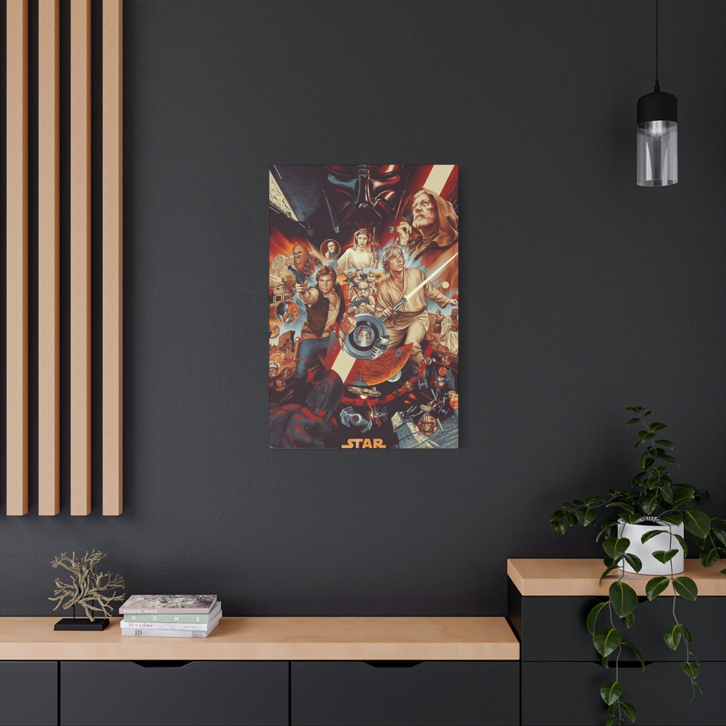
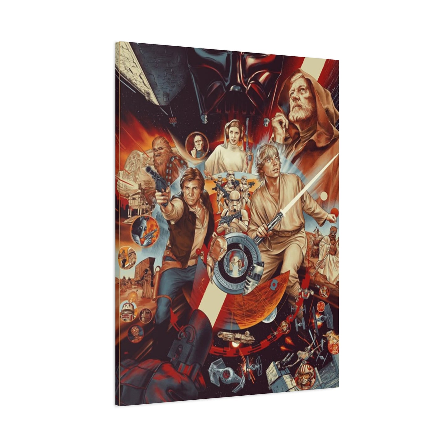
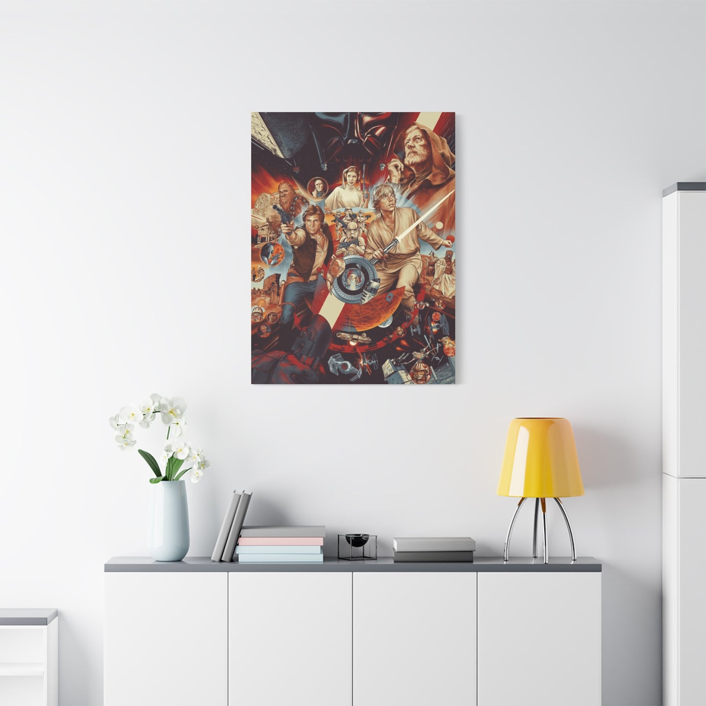
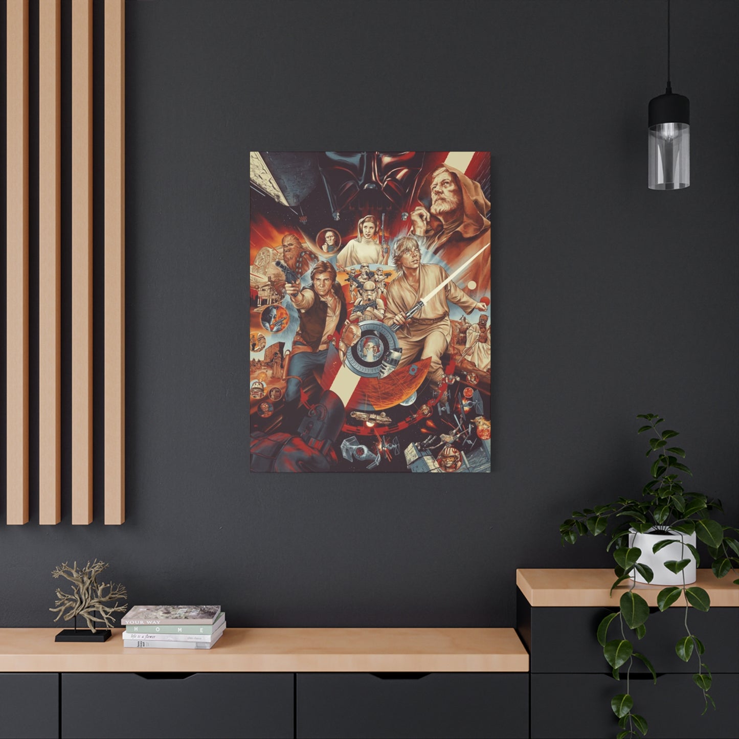
The visual language of Star Wars has always been distinctive and powerful. From the moment audiences first glimpsed the looming Star Destroyer chasing the Rebel blockade runner in 1977, the franchise established a visual vocabulary that would influence cinema and design for decades to come. Poster artwork captures this essence, distilling epic narratives into single, powerful images that resonate with viewers on multiple levels. Whether showcasing the menacing silhouette of Darth Vader, the determined expression of Luke Skywalker, or the iconic twin suns of Tatooine, these visual representations carry tremendous emotional weight.
When considering wall decoration options, many people overlook the sophisticated aesthetic that film posters can provide. The assumption that such items belong only in teenage bedrooms or basement recreation rooms severely underestimates their potential. High-quality poster prints, when properly selected and displayed, can elevate interior spaces with the same impact as traditional art prints. The key lies in understanding how to integrate these pieces into your existing decor while maintaining visual harmony and intentional design choices.
The market for Star Wars poster artwork has evolved considerably since the franchise's inception. Early promotional materials were designed primarily for theater lobbies and bus shelters, created to attract audiences to screenings. Today's offerings range from faithful reproductions of these original designs to contemporary reimaginings by talented artists who bring fresh perspectives to familiar characters and scenes. This diversity means that regardless of your aesthetic preferences or interior design style, options exist that can seamlessly integrate into your space while celebrating your passion for the saga.
Understanding the various categories of available artwork helps in making informed decisions. Original theatrical release posters represent historical artifacts, capturing the marketing approach of specific time periods. These designs often reflect the artistic trends and commercial strategies of their era, providing fascinating glimpses into how the franchise was positioned to audiences. Alternative movie posters, created by independent artists and design studios, offer innovative interpretations that range from minimalist compositions to elaborate illustrations. Character-focused prints zoom in on beloved heroes and villains, while location-based artwork showcases the diverse worlds within the Star Wars universe.
Why Star Wars Artwork Excels as Premium Wall Decoration
The question of why Star Wars posters function so effectively as wall decoration deserves thorough examination. Multiple factors contribute to their enduring appeal and decorative success. First and foremost is the universal recognition factor. Even individuals with only passing familiarity with the franchise can identify its most iconic imagery. This broad cultural penetration means that these pieces communicate effectively to diverse audiences, making them excellent choices for spaces that welcome various visitors.
The emotional resonance these images carry cannot be overstated. For many, Star Wars represents formative childhood experiences—the thrill of seeing the Millennium Falcon escape Imperial pursuit, the shock of learning Darth Vader's true identity, or the triumph of the Rebel Alliance's final victory. Displaying artwork from the franchise creates an environment infused with these positive associations. Every glance at a well-chosen print can trigger pleasant memories, reduce stress, and enhance overall mood. This emotional dimension elevates the posters beyond simple decoration to become genuine sources of daily joy.
From a purely visual standpoint, Star Wars imagery offers remarkable compositional strength. The franchise has always employed talented designers and artists who understand principles of visual hierarchy, color theory, and symbolic representation. Classic posters frequently feature dynamic diagonal compositions that create movement and energy, drawing the eye through the image. The contrast between light and dark—both literal and metaphorical—provides visual drama that translates beautifully to wall displays. Color palettes often include rich, saturated hues that command attention without overwhelming spaces.
The versatility of available designs means these posters can adapt to virtually any interior style. Minimalist spaces benefit from simplified character silhouettes or single-color prints that maintain clean aesthetic lines. Industrial interiors pair beautifully with weathered, vintage-style prints that embrace texture and patina. Mid-century modern rooms can incorporate poster designs from the original trilogy era, which share aesthetic sensibilities with that design movement. Even highly traditional spaces can accommodate carefully selected prints, particularly when employing sophisticated framing techniques and strategic placement.
Collection potential represents another compelling advantage. Unlike standalone art pieces, Star Wars posters naturally suggest opportunities for expansion. A single print depicting A New Hope might inspire additions featuring The Empire Strikes Back and Return of the Jedi, creating a cohesive trilogy display. Character enthusiasts might develop galleries featuring various representations of favorite personalities across different films and artistic styles. This growth potential means your wall decoration can evolve alongside your interests and available space, providing ongoing engagement with your interior design.
The conversation-starting power of these pieces should not be underestimated. Guests invariably notice and comment on Star Wars artwork, often sharing their own experiences with the franchise. These interactions transform your wall decoration into social catalysts, facilitating connections between people through shared cultural touchstones. For those who value hospitality and meaningful guest interactions, this aspect alone justifies the decorative choice.
Classic Film Posters for Residential Display
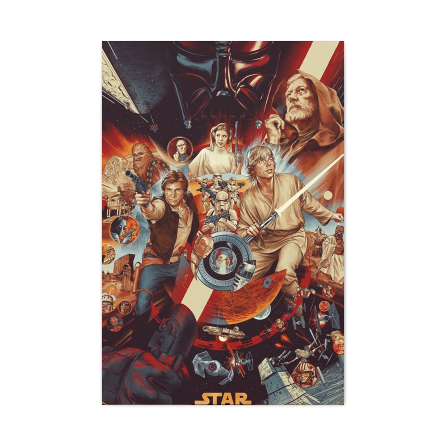
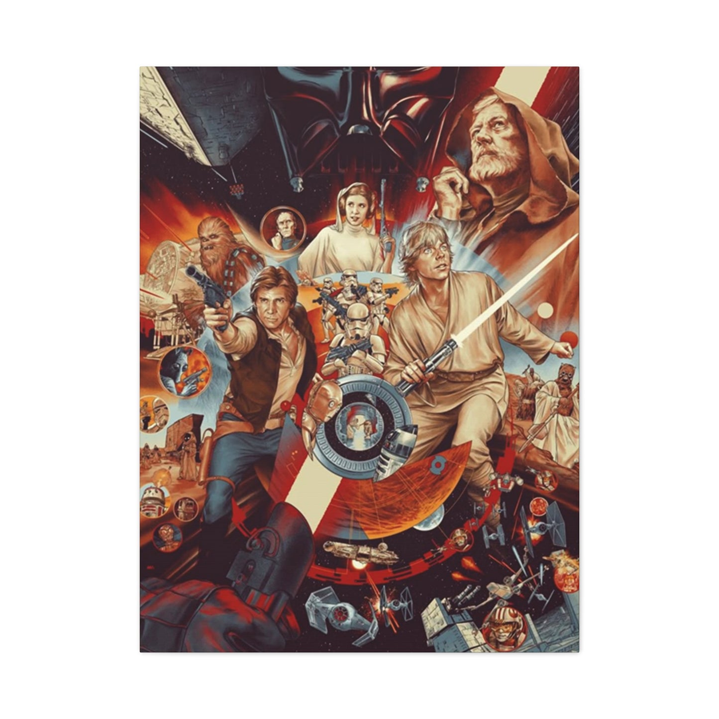
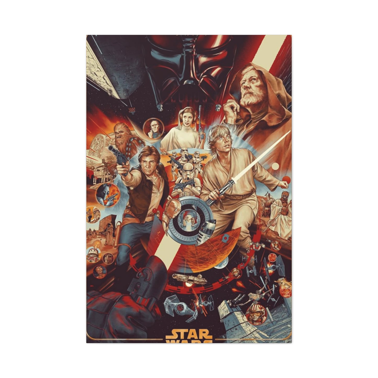
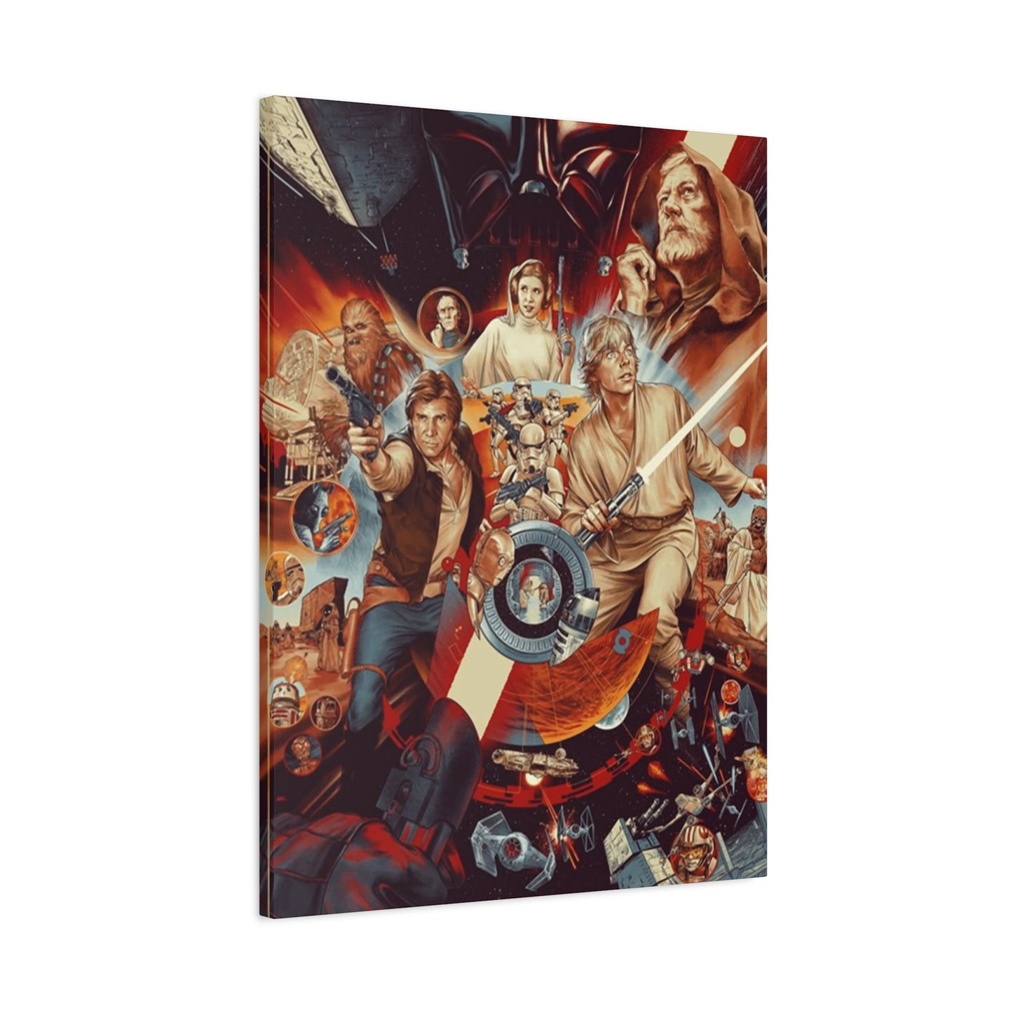
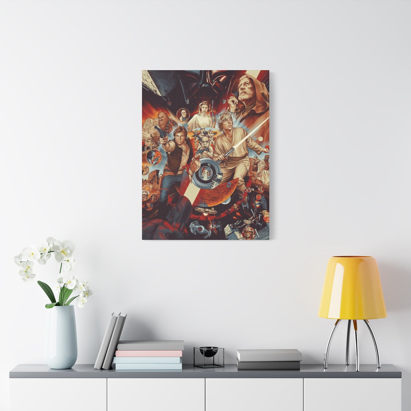
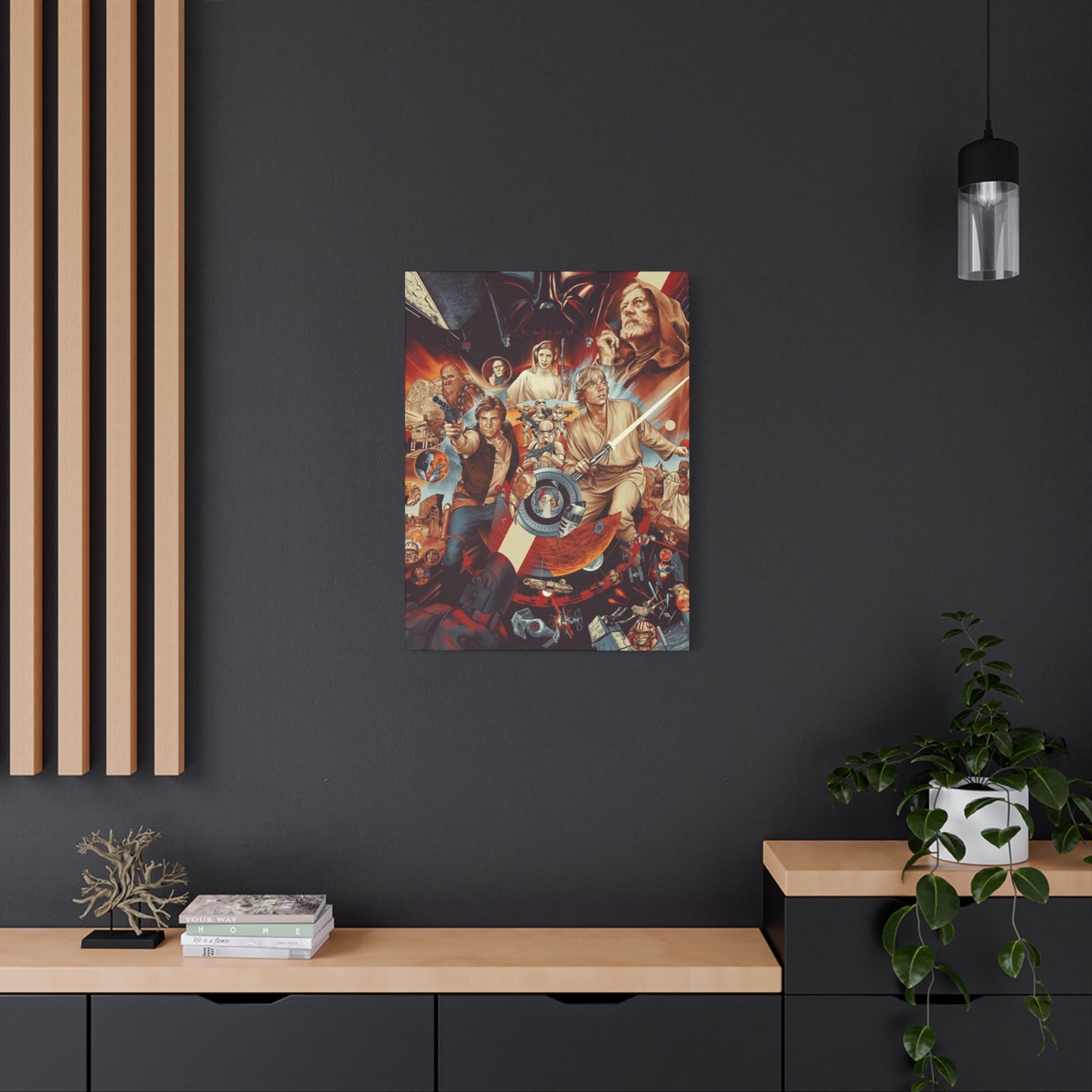
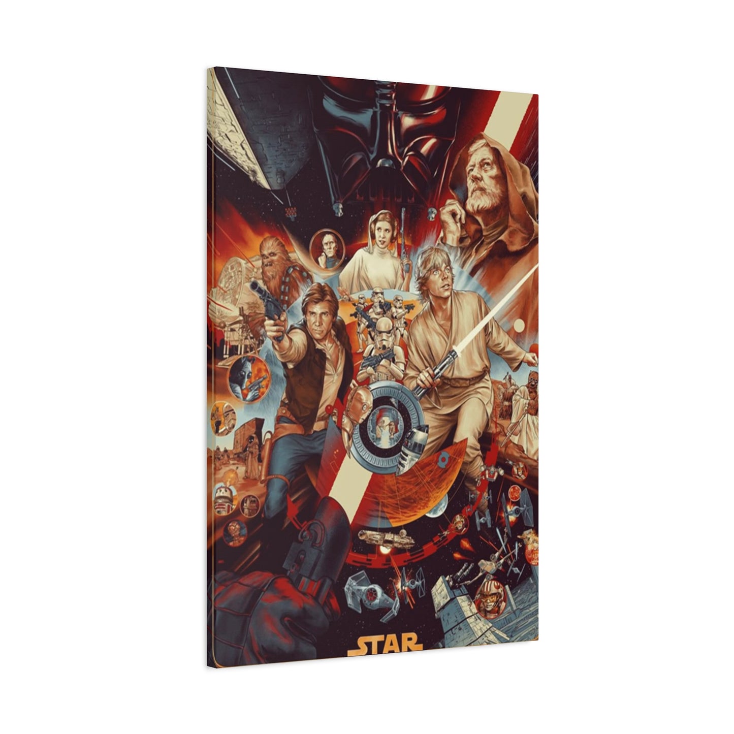
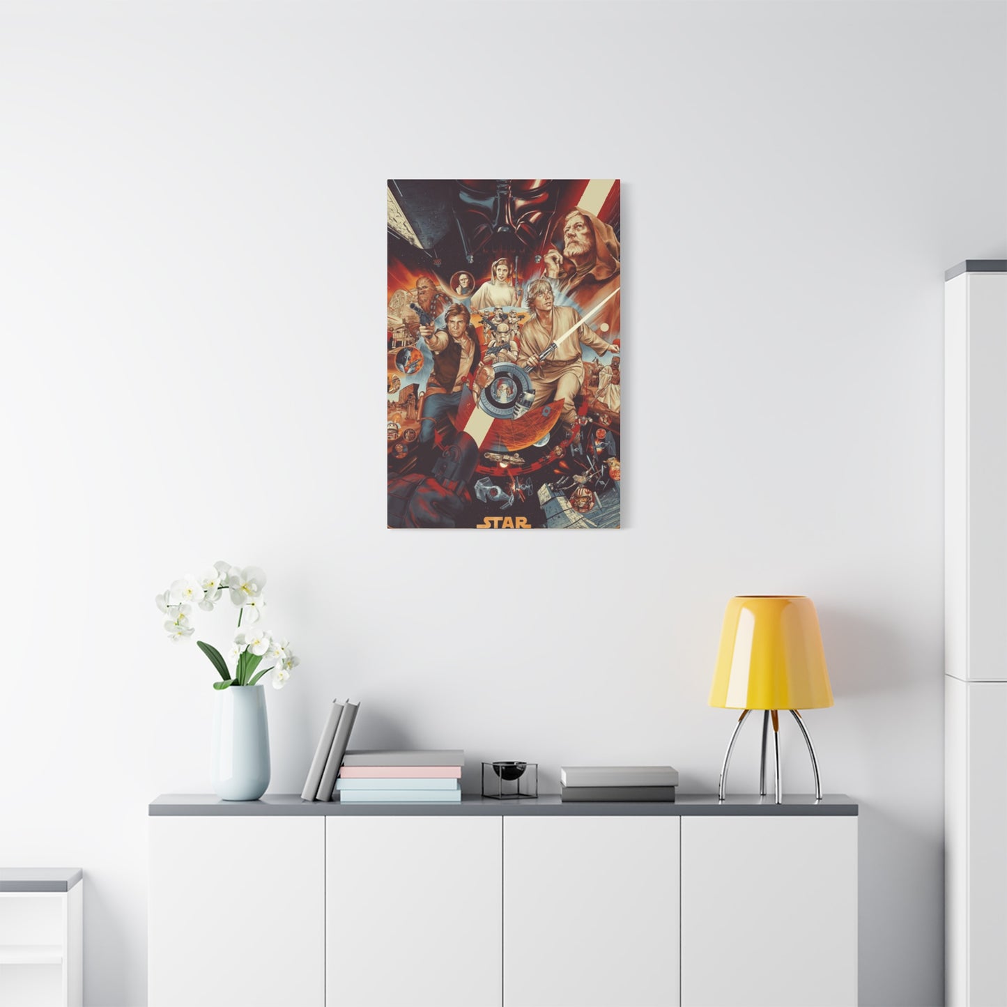
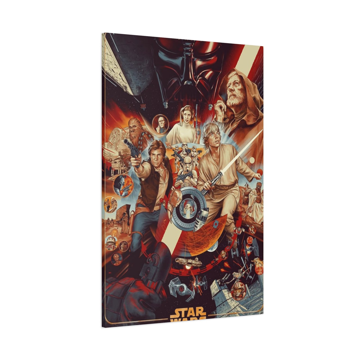
When exploring options for home decoration, the original trilogy posters merit special consideration. These designs represent not only the franchise's foundation but also exemplary examples of film poster art from the late twentieth century. The original 1977 poster, painted by brothers Greg and Tim Hildebrandt, epitomizes the fantasy illustration style prevalent in that era. Its sweeping composition places Luke Skywalker at the center, lightsaber raised triumphantly, while surrounding him with other key characters and scenes. This baroque approach, cramming maximum visual information into a single frame, reflects an era before minimalist design trends dominated.
The Empire Strikes Back poster, illustrated by Roger Kastel, demonstrates a more refined approach. The composition maintains dramatic energy while allowing more breathing room between elements. The brooding presence of Darth Vader looms over the proceedings, establishing the film's darker tone. The image of Han and Leia's kiss, positioned prominently, signals the growing romantic subplot. For home display, this poster offers sophisticated visual appeal with its muted color palette and classical composition structure.
Return of the Jedi poster artwork varies significantly across international markets, providing numerous options for collectors and decorators. The American version features a dramatic confrontation between Luke and Vader against a backdrop of space battles and forest action. The composition employs a pyramidal structure that guides viewers' attention naturally through the hierarchy of visual information. Alternative international versions emphasize different aspects of the narrative, offering variety for those seeking distinctive displays.
The prequel trilogy introduced new aesthetic directions in poster design. These films arrived during a transitional period in marketing design, as digital techniques increasingly replaced traditional illustration. The Phantom Menace poster features young Anakin Skywalker casting Darth Vader's shadow, a symbolic representation that telegraphs the character's destiny. This conceptual approach marks a shift from the action-packed compositions of earlier posters toward more metaphorical visual storytelling. For modern interiors, these designs often feel more contemporary than original trilogy posters, despite being over two decades old themselves.
Sequel trilogy posters embrace fully digital aesthetics, with photo-based compositions and extensive digital manipulation. These designs prioritize the faces of new characters like Rey, Finn, and Kylo Ren while incorporating legacy characters and spacecraft. The visual density remains high, maintaining franchise traditions while employing modern production techniques. For those whose primary Star Wars experiences involve these recent films, these posters carry the same nostalgic weight that original trilogy designs hold for earlier generations.
Beyond official theatrical releases, special edition prints and limited releases offer unique options. Anniversary editions, IMAX releases, and premium formats often receive specially commissioned artwork that provides fresh takes on familiar stories. These limited releases can become valuable decorative pieces that combine aesthetic appeal with collectible status. The exclusivity factor adds an additional dimension of satisfaction for owners who appreciate owning something relatively rare.
Selecting the Perfect Poster for Your Personal Space
The process of choosing appropriate poster artwork requires consideration of multiple factors beyond simple personal preference. Understanding your space's existing characteristics provides the foundation for successful selection. Room dimensions directly impact ideal poster size and orientation. Large, open walls can accommodate oversized prints or multiple-poster arrangements, while smaller spaces require more restrained approaches. Vertical walls suit portrait-oriented posters, whereas horizontal expanses work better with landscape compositions or horizontal gallery arrangements.
Color relationships between your poster and existing decor require careful attention. Rooms dominated by cool colors—blues, grays, and greens—pair beautifully with posters featuring space scenes, ice planets, or Imperial aesthetics. These cool palettes create cohesive, calming environments. Conversely, warm-toned rooms with reds, oranges, and yellows harmonize with desert planet imagery, Rebel Alliance color schemes, and sunset-lit scenes. For neutral spaces decorated in whites, beiges, and grays, nearly any poster works, though high-contrast images create particularly striking effects.
Lighting conditions significantly influence poster appearance and longevity. Direct sunlight causes gradual fading, making such locations poor choices for valuable or beloved prints. Rooms with abundant natural light benefit from fade-resistant printing techniques or strategic placement away from window exposure. Artificial lighting offers more control; spotlights or picture lights can dramatically enhance poster presentation, creating gallery-quality displays. The interplay between light and dark elements within the image itself should inform placement decisions—high-contrast posters shine in well-lit environments, while moodier prints suit dimmer spaces.
Existing furniture and architectural elements should inform poster selection. A poster hung above a sofa should relate to that furniture piece in scale and style. The poster's lower edge typically sits eight to ten inches above the sofa back, creating visual connection without crowding. In dining areas, artwork should complement the formality level; elegant, understated prints suit formal dining rooms, while action-packed compositions work in casual eating spaces. Architectural features like fireplaces, built-in shelving, or prominent windows create focal points that either compete with or complement poster displays, requiring strategic decisions about prominence and placement.
The room's primary function influences appropriate subject matter and tone. Bedrooms, being personal retreats, welcome emotionally resonant images that reflect the occupant's deepest fandoms and preferences. Living rooms, as semi-public spaces, might benefit from more universally appealing designs that spark conversation without overwhelming guests who might not share your enthusiasm. Home offices can feature motivational or inspiring imagery—perhaps heroes overcoming adversity or moments of triumph. Entertainment spaces naturally accommodate bolder, more dramatic selections that enhance the viewing experience.
Personal connection to specific films, characters, or scenes should guide final decisions. A poster depicting your favorite moment or beloved character will provide more lasting satisfaction than one chosen solely for aesthetic reasons. This emotional investment transforms the piece from mere decoration into a meaningful personal statement. Consider which images make you genuinely happy when you see them, which moments from the saga resonate most deeply, and which characters embody qualities you admire. These gut-level preferences should carry substantial weight in your selection process.
The Timeless Attraction of Retro Star Wars Prints
Original theatrical release posters from the late 1970s and early 1980s possess a special allure that transcends their role as movie marketing materials. These pieces represent historical artifacts from a pivotal moment in popular culture when an unknown science fiction film transformed the entertainment landscape. The artwork reflects the aesthetic sensibilities and production techniques of that era, employing hand-painted illustrations at a time when photography-based designs dominated film advertising. This distinctive approach gives these posters a warmth and character that digital compositions rarely achieve.
The artistic technique employed in creating these posters deserves appreciation. Commissioned illustrators worked from production stills, costume designs, and conceptual artwork to create paintings that captured each film's essence. This interpretive process meant that the resulting images weren't merely documentary representations but artistic visions that synthesized the films' emotional cores. Minor inaccuracies in costume details or character proportions contribute to their charm, reflecting the human hands and creative decisions behind their creation. This handcrafted quality resonates with contemporary audiences increasingly weary of digital perfection.
Nostalgia represents a powerful component of vintage poster appeal. For those who experienced the original trilogy during its initial theatrical runs, these images trigger visceral memories of anticipation, excitement, and wonder. The distinctive color palettes, typography, and compositional approaches transport viewers back to specific moments in their lives—standing in theater lobbies, reading about upcoming releases, or decorating childhood bedrooms. Even younger fans who encountered these designs later in life respond to the retro aesthetic, which has become inseparable from the franchise's identity.
The scarcity and collectibility of authentic vintage posters adds another dimension to their appeal. Original prints from 1977-1983 have become increasingly valuable, with pristine examples commanding substantial prices in collector markets. While most decorators opt for modern reproductions rather than costly originals, even these reproductions carry the cachet of reproducing something rare and valuable. This connection to collectible culture elevates the decorative piece beyond ordinary wall art, imbuing it with additional cultural and potential monetary value.
The design evolution visible across vintage posters provides fascinating insights into changing marketing strategies. Early Star Wars posters emphasized action and adventure, positioning the film as an exciting space adventure. As the franchise's cultural impact became evident, subsequent posters could rely more on established brand recognition, allowing for more sophisticated and subtle designs. Comparing posters across the original trilogy reveals this maturation, offering viewers a visual history of the franchise's growing confidence and cultural dominance.
Reproduction quality significantly impacts the decorative success of vintage poster prints. High-quality reproductions employ advanced printing techniques that capture the texture and color depth of original painted illustrations. Inferior reproductions flatten these qualities, resulting in muddy colors and lost detail. When seeking vintage-style prints, investigating the production process and requesting samples when possible ensures satisfaction with the final product. The difference between excellent and mediocre reproductions profoundly affects the final display's impact and your long-term satisfaction with the piece.
Framing Techniques for Maximum Visual Impact
The framing process dramatically influences a poster's final appearance and longevity. Far from being an afterthought or unnecessary expense, proper framing elevates prints from simple paper sheets to legitimate artwork worthy of prominent display. Understanding framing fundamentals empowers you to make informed decisions that enhance your investment and create visually sophisticated presentations.
Frame material selection forms the foundation of effective framing. Wood frames offer warmth and traditional appeal, with species ranging from light oak to dark walnut providing color options that coordinate with various decor schemes. Metal frames deliver contemporary sophistication, with options including sleek black aluminum, brushed steel, and even copper or gold finishes. The frame material should complement both the poster and your existing decor rather than competing for attention. As a general principle, the frame should enhance the artwork rather than dominating it.
Frame width and profile significantly impact presentation. Wide frames create substantial borders that command attention and work well with oversized prints or gallery wall arrangements where visual weight matters. Narrow frames maintain focus on the image itself, suiting minimalist approaches and smaller prints where frame bulk might overwhelm the artwork. Profile refers to the frame's cross-sectional shape—some frames sit flat against the wall while others project outward, creating shadow boxes that add dimensional interest.
Matting represents one of the most effective tools for elevating poster presentation. A mat creates a border between the image and frame, providing visual breathing room that prevents the composition from feeling cramped. Mat color choices range from pure white and off-white to black, gray, and colored options. White mats create clean, gallery-style presentations that work universally well. Black mats add drama and sophistication, particularly effective with posters featuring dark color palettes or space scenes. Colored mats can pull accent colors from the poster itself, though this approach requires careful color matching to avoid clashing.
Double matting involves layering two mats with different colors, with the inner mat visible as a thin reveal between the outer mat and image. This technique adds depth and sophistication, creating a custom, high-end appearance. For Star Wars posters, a black outer mat with a thin red or blue inner reveal can echo Imperial or Rebel Alliance color schemes, subtly reinforcing thematic connections. The additional cost of double matting usually proves worthwhile for pieces intended as room focal points.
Glazing protects prints while influencing how they appear. Standard glass provides basic protection but creates glare that can obscure the image under certain lighting conditions. Non-glare glass reduces reflections through special surface treatments but can slightly soften image appearance, particularly when viewing from angles. Museum glass or acrylic represents the premium option, virtually eliminating glare while maintaining perfect clarity. Though expensive, museum glazing proves worthwhile for valuable prints or pieces in high-light locations. The choice between glass and acrylic involves trade-offs—glass offers superior clarity but weighs more and breaks more easily, while acrylic resists breakage but scratches more readily and can develop static that attracts dust.
Conservation considerations matter for pieces you intend to keep long-term. Acid-free mats and backing boards prevent chemical reactions that cause yellowing and deterioration over time. UV-protective glazing prevents sunlight damage that fades colors and weakens paper. These conservation measures add cost but preserve your poster's condition for decades, protecting your investment and maintaining visual quality. For rare or valuable prints, conservation framing represents essential protection rather than optional luxury.
Decorating Your Environment with Film Poster Artwork
Successfully incorporating movie posters into home decor requires strategic thinking about placement, scale, and contextual relationships. These pieces work best when integrated thoughtfully rather than simply hung wherever empty wall space exists. Developing a coherent approach ensures that your poster displays enhance rather than clutter your living environment.
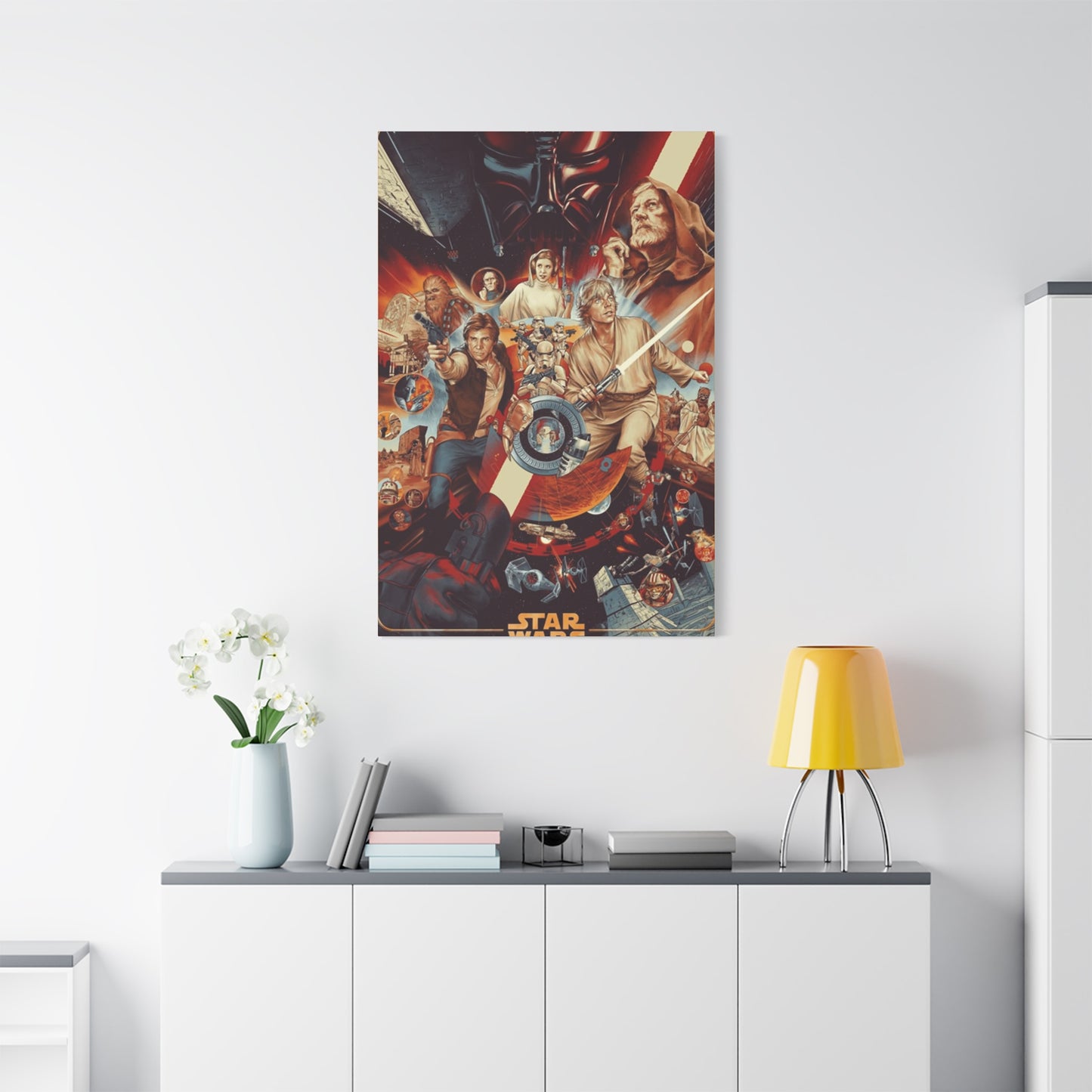
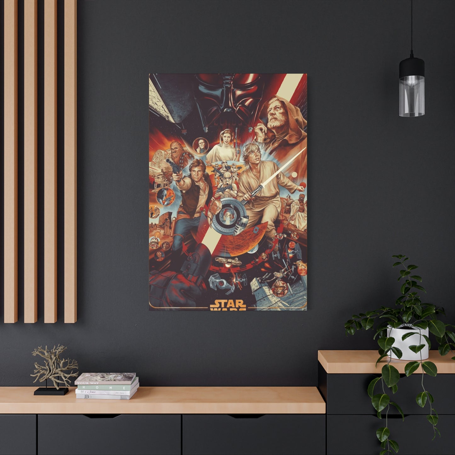
Living rooms serve as primary gathering spaces where poster displays can make significant impacts. Above the sofa represents the most common placement location, providing a natural focal point that anchors the seating area. For this location, poster size should relate proportionally to furniture scale—a standard sofa measuring six to eight feet long pairs well with a poster measuring 24 by 36 inches or larger. Smaller prints risk appearing insignificant in this prominent position, while oversized posters might overwhelm the space. Consider the viewing distance as well; posters hung in living rooms are typically viewed from six to twelve feet away, requiring images with strong overall composition rather than intricate details that disappear at distance.
Bedroom poster placement follows different principles than public spaces. These personal retreats welcome more passionate, specific displays that reflect individual preferences without concern for broad appeal. Above the bed represents one option, though safety considerations require secure hanging methods that prevent falls during earthquakes or accidents. Opposite the bed provides an excellent alternative, creating a view that greets you each morning. Bedroom posters can indulge in more specific character focuses or niche references that might feel too particular for living rooms or other shared spaces.
Home office poster selections can serve motivational and inspirational purposes beyond mere decoration. Images depicting heroes overcoming obstacles, rebels challenging overwhelming odds, or moments of triumph can subtly reinforce positive mindsets during work hours. The view from your desk becomes particularly important in office spaces, as this sightline dominates your daily work experience. A well-chosen poster placed in direct sightline provides regular inspiration and pleasant mental breaks during intensive work periods.
Hallways and transitional spaces offer underutilized opportunities for poster displays. These areas typically lack furniture or other decor elements, making them perfect for linear gallery arrangements. A series of character portraits or chronologically arranged film posters can transform a utilitarian hallway into an engaging passage that rewards transit through your home. The narrow dimensions of most hallways suit vertical poster orientations particularly well, though horizontal arrangements work when wall length permits.
Entertainment rooms and home theaters represent ideal environments for bold, dramatic poster displays. These spaces explicitly celebrate media enjoyment, making film posters thematically appropriate regardless of decor style. Multiple posters arranged gallery-style can create immersive environments that enhance the viewing experience. In these spaces, practical concerns about universal appeal or stylistic restraint can yield to enthusiastic displays that maximize visual impact and clearly communicate the room's purpose.
Bathrooms rarely receive consideration for poster placement, but powder rooms—half-baths used primarily by guests—can accommodate playful poster displays. Smaller prints or character-focused images work well in these compact spaces. Humidity concerns require proper framing with moisture-resistant materials, but the unexpectedness of encountering Star Wars artwork in a bathroom creates memorable impressions that guests invariably mention.
The Progression of Star Wars Poster Design
Examining how Star Wars poster art has evolved across nearly five decades reveals fascinating shifts in marketing strategies, artistic trends, and cultural positioning. This evolution reflects broader changes in graphic design, film marketing, and the franchise's relationship with popular culture. Understanding this progression enriches appreciation for various poster styles and helps decorators choose prints that resonate with specific aesthetic preferences.
The original 1977 poster established visual conventions that would influence the franchise for years. The hand-painted illustration approach reflected the fantasy and science fiction paperback cover art tradition, positioning Star Wars within established genre contexts while simultaneously transcending them. The maximalist composition packed numerous characters and action scenes into a single frame, operating under the marketing assumption that more visual information would better sell the unfamiliar property. The color palette emphasized warm tones—golds, oranges, and reds—that conveyed adventure and excitement rather than the cool, austere aesthetic often associated with science fiction.
The Empire Strikes Back marked a maturation in poster design philosophy. With Star Wars established as a cultural phenomenon, marketing materials could rely on audience familiarity rather than exhaustively explaining the property. The resulting poster employs a more refined composition with better figure-ground relationships and more sophisticated color harmonies. The inclusion of romantic imagery alongside action elements acknowledged the sequel's expanded emotional scope. This poster demonstrates how established franchises can embrace more artistically ambitious designs that might confuse or alienate audiences encountering the property fresh.
Return of the Jedi continued this refinement while grappling with the challenge of concluding the trilogy. Various international markets received different poster designs, reflecting both localized marketing strategies and the creative exhaustion of conveying essentially similar information across three films. Some versions emphasized the Luke-Vader confrontation, positioning the conclusion as primarily about their relationship. Others foregrounded new elements like Jabba the Hutt or the forest moon battle, attempting to highlight fresh content that justified another theatrical visit.
The prequel trilogy emerged into a dramatically different media landscape. By 1999, the internet had transformed marketing, allowing for targeted messages to specific audience segments rather than single designs that needed to appeal universally. Poster art became one component of multimedia campaigns rather than the primary marketing vehicle. This shift allowed for more experimental, conceptual designs like The Phantom Menace's Darth Vader shadow poster, which prioritized symbolic resonance over comprehensive visual information. The prequels also introduced fully digital poster production, replacing hand-painted illustrations with photo-based compositions assembled in software.
The sequel trilogy embraced contemporary design trends emphasizing clean layouts, strong typography, and photo-realistic imagery. These posters feel distinctly modern, reflecting current graphic design preferences for minimalist compositions and bold color blocking. The character-focused approach, with faces dominating the compositions, aligns with contemporary celebrity-driven marketing that emphasizes actors' recognizability. For decorators seeking prints that feel current and contemporary rather than nostalgic, sequel trilogy posters often integrate more seamlessly with modern interior design trends.
Special releases and anniversary editions provide opportunities for artistic reinterpretation. Limited edition prints commissioned from contemporary artists demonstrate how new creative voices can reimagine familiar material through fresh aesthetic lenses. Minimalist interpretations reduce scenes to essential geometric forms and limited color palettes. Vintage-inspired designs apply retro printing techniques and period-appropriate typography to contemporary content. These alternative visions expand decorative options beyond official theatrical releases, offering distinctive pieces that stand apart from familiar designs.
Introducing Vibrant Color Through Film Artwork
Color represents one of the most powerful tools in interior design, capable of transforming mood, altering perceived room dimensions, and creating emotional responses. Star Wars posters offer abundant opportunities to introduce specific colors into your space, whether complementing existing palettes or adding dramatic contrasts that energize environments. Understanding how different poster designs employ color enables strategic selections that achieve specific decorative goals.
The original trilogy demonstrates distinctive color personalities across the three films. Star Wars features warm, optimistic color schemes dominated by yellows, oranges, and golds. These sun-drenched palettes reflect Luke's desert origins and the film's fundamentally hopeful tone despite its conflict premise. Posters emphasizing these warm colors create inviting, energetic environments that feel welcoming and optimistic. The Empire Strikes Back shifts toward cooler palettes with blues, grays, and whites reflecting ice planet Hoth and the film's darker narrative direction. These cooler compositions create calmer, more contemplative environments suited to relaxation spaces. Return of the Jedi balances warm and cool, incorporating forest greens alongside space blacks and the red-orange glow of lightsabers and explosions.
Prequel trilogy posters employ more saturated, digitally enhanced colors that reflect their production era's aesthetic preferences. Vibrant reds dominate The Phantom Menace marketing, from Darth Maul's crimson visage to the red-orange deserts of Tatooine. These intense hues create bold, attention-commanding displays that work well as room focal points. Attack of the Clones and Revenge of the Sith incorporate deeper, moodier palettes with purples, deep blues, and ominous reds reflecting the trilogy's tragic trajectory. These sophisticated color schemes suit more formal or dramatic interior approaches.
The sequel trilogy presents cleaner, more primary color applications. The Force Awakens employs strong reds and blues with minimal graduation, creating graphic, modern compositions. These clear color applications work exceptionally well in contemporary interiors where bold, simple forms dominate. The Last Jedi introduces more complex color relationships with deep reds contrasting against stark whites, while The Rise of Skywalker embraces darker, more ominous palettes appropriate to its conclusion status.
Character-focused posters allow for targeted color selection based on associated palettes. Darth Vader-centric prints naturally emphasize blacks and deep grays, offering sophisticated, masculine color schemes that work in offices, dens, or modern minimalist spaces. Luke Skywalker posters typically incorporate blues from his lightsaber and flight suit, providing cool, heroic color notes. Princess Leia artwork often features whites and beiges from her iconic costume, offering neutral palettes that coordinate with virtually any decor scheme. Yoda-focused prints introduce distinctive green tones rarely found in film poster art, providing unique color opportunities for nature-inspired or eclectic interiors.
Location-based posters deliver specific color stories tied to their planetary settings. Tatooine imagery saturates spaces with warm desert tones—sand yellows, sunset oranges, and sky blues. Hoth prints introduce crisp, clean whites and ice blues perfect for minimalist or Scandinavian-inspired interiors. Endor posters provide rich forest greens and earth tones that connect with natural, organic design approaches. Coruscant cityscapes offer urban palettes of steely grays, neon blues, and artificial lighting effects suited to industrial or metropolitan decor styles.
Strategic poster selection can address specific color needs in your space. Rooms feeling cold and unwelcoming benefit from warm-palette posters featuring desert planets or sunset-lit scenes. Overly warm spaces gain balance from cool-toned prints showcasing ice planets or deep space. Neutral rooms lacking color personality transform through strategically placed vibrant posters that introduce controlled splashes of specific hues. This intentional color introduction through artwork provides more flexibility than repainting or replacing furniture, allowing for seasonal changes or evolving preferences.
Using Film Posters as Central Design Elements
Certain spaces benefit from bold design choices that establish clear focal points commanding immediate attention. Star Wars posters, particularly oversized or visually dramatic options, excel as statement pieces that anchor room designs around their presence. This approach requires confidence and commitment but delivers powerfully distinctive interiors that clearly express personality and interests.
The statement piece concept involves designing around a single dominant element rather than distributing visual weight equally across multiple components. When a poster serves this role, other design decisions should support and complement rather than compete with it. This doesn't require matchy-matchy coordination but rather thoughtful consideration of how colors, styles, and themes relate to the central piece. The resulting interior feels intentional and cohesive rather than randomly assembled.
Oversized posters measuring four feet or larger create immediate impact that's impossible to ignore. These substantial prints transform from decorative accents to architectural features that alter how we perceive the spaces they inhabit. A six-foot-tall poster depicting the Millennium Falcon in flight doesn't merely decorate a wall—it opens that wall to the vastness of space, fundamentally changing the room's perceived boundaries. Such dramatic installations require adequate wall space free from competing elements like windows, doors, or heavy furniture that would visually clash with the poster's scale.
Lighting design becomes crucial when treating a poster as a statement piece. Dedicated picture lights, track lighting, or strategically placed floor lamps can spotlight the artwork, creating gallery-style presentations that elevate the poster to fine art status. The dramatic shadows and highlights produced by directional lighting add depth and drama, transforming flat prints into dynamic features that change appearance throughout the day as natural light shifts. Dimmer switches allow for mood adjustments, from bright display lighting during gatherings to subtle accent illumination during relaxation.
Supporting decor should enhance rather than distract from statement posters. Color schemes might pull specific hues from the poster itself, using paint colors, textiles, or accessories that echo the artwork. A poster featuring predominantly blue space scenes could inspire accent pillows in matching blues, an area rug incorporating similar tones, or decorative objects that harmonize with the color story. This approach creates visual relationships that tie the room together while keeping the poster as the clear primary element.
Furniture arrangement should acknowledge and respond to statement poster placement. Seating arrangements naturally orient toward prominent artwork, creating conversation areas where the poster provides a backdrop to social interactions. In bedrooms, statement posters opposite the bed create focal points that draw the eye and anchor the space. The poster's themes and mood should align with the room's intended atmosphere—energetic action scenes suit entertainment spaces while contemplative character studies work better in private areas.
The commitment required for statement piece displays shouldn't be underestimated. These bold choices create strong reactions, clearly communicating interests and aesthetic preferences. Visitors will invariably notice and comment on such prominent displays, making them excellent conversation starters but potentially overwhelming for those preferring subtler decor. The satisfaction of living with a powerful statement piece that genuinely excites you outweighs any concerns about broad appeal. Your home should reflect your authentic interests rather than hypothetical future buyers' preferences or generic design magazine advice.
Building a Star Wars Poster Collection on Your Wall
Gallery walls—curated arrangements of multiple artworks creating cohesive displays—offer sophisticated ways to showcase poster collections while creating visual interest through varied compositions. Successfully executing gallery wall designs requires planning regarding spacing, arrangement, and thematic connections. The result transforms ordinary wall expanses into engaging displays that reward extended viewing and evolve as your collection grows.
Planning begins with understanding your available space and poster inventory. Measure the wall area carefully, accounting for furniture below and architectural features like windows or doors that influence usable space. Gather or catalog your poster collection, noting each print's dimensions, orientation, and visual characteristics. Laying out your arrangement on the floor before hanging helps visualize relationships between pieces and allows for experimentation without creating wall damage. Alternatively, create paper templates matching poster sizes and use removable tape to position them on the wall, providing a preview of the final arrangement.
Arrangement strategies range from rigid grid patterns to organic, asymmetrical compositions. Grid arrangements employ consistent spacing between uniformly sized posters, creating orderly, structured displays that feel calm and organized. This approach works beautifully with matching frames and related content—perhaps the original trilogy posters arranged horizontally, or a vertical stack of character portraits. The visual consistency creates impact through repetition while clearly indicating these pieces form an intentional collection.
Asymmetrical arrangements offer more dynamic, energetic presentations. Mixing poster sizes and orientations creates visual variety that holds attention and allows for flexible growth as you acquire additional prints. The key to successful asymmetrical galleries lies in establishing visual balance rather than symmetrical matching. Larger posters carry more visual weight and should balance with multiple smaller prints or strategic negative space. Distributing colors relatively evenly prevents the arrangement from feeling lopsided. Planning your layout so the overall collection forms a rough rectangular or square boundary creates order within the asymmetry.
Spacing decisions significantly impact the arrangement's overall feel. Tight spacing—one to two inches between frames—creates unified, cohesive displays where individual pieces feel like components of a larger whole. This approach works particularly well with matching frames and related content. Generous spacing—three to five inches between frames—allows each poster to read independently while maintaining visual relationships with neighbors. This breathing room suits eclectic collections mixing different styles, time periods, or poster types.
Thematic organization provides conceptual structure that strengthens gallery walls. Chronological arrangements displaying posters in release order create visual timelines documenting the franchise's evolution. Character-based galleries focusing on specific personalities or groups create focused tributes that appeal to fans with strong favorite character preferences. Color-coordinated arrangements position posters with similar palettes together, creating color-blocked galleries with strong graphic impact. Stylistic groupings might separate original theatrical releases from alternative artist interpretations, allowing viewers to compare approaches.
Frame consistency versus variety represents a key decision point. Matching frames across all posters creates clean, unified presentations that feel professionally designed. This approach particularly suits formal spaces or grid arrangements where visual consistency reinforces structural order. Varying frame styles, materials, and colors creates more eclectic, personal displays that feel collected over time rather than purchased as sets. This approach suits asymmetrical arrangements and casual spaces where personality trumps polish.
Growth planning ensures your gallery wall can expand as your collection develops. Leaving strategic empty spaces allows for future additions without requiring complete reorganization. Designing your arrangement so it extends naturally in specific directions accommodates growth while maintaining compositional balance. This forward thinking prevents the frustration of perfect current arrangements that allow no room for exciting new acquisitions.
Why Film Posters Remain Perpetually Relevant
Fashion and design trends cycle through endless iterations, with yesterday's cutting-edge choices becoming today's dated embarrassments. Star Wars posters, however, demonstrate remarkable staying power, remaining culturally relevant and aesthetically appealing across generations and evolving tastes. Understanding why these pieces resist obsolescence provides confidence in their long-term decorative value.
Cultural penetration represents the foundation of this enduring relevance. Star Wars has achieved rare status as truly intergenerational entertainment, with grandparents, parents, and children sharing genuine enthusiasm for the franchise. This multigenerational appeal means that poster displays resonate across age groups rather than dating the decorator within a specific demographic. A teenager hanging Star Wars posters today makes a different statement than their parent or grandparent making similar choices, but all three choices feel equally valid within their contexts. Few cultural properties achieve this universal flexibility.
The archetypal nature of Star Wars storytelling contributes to its timelessness. The saga traffics in universal themes—good versus evil, personal growth, redemption, sacrifice, and hope—that resonate across cultures and time periods. These fundamental human concerns never go out of style, keeping the franchise's core narratives perpetually relevant. Posters depicting these themes visually encode these timeless ideas, giving them enduring emotional resonance that transcends their science fiction trappings.
Visual design quality ensures continued aesthetic appeal. The franchise has consistently employed talented artists and designers whose work exhibits fundamental compositional strength and color sophistication. Well-designed posters don't depend on trendy effects or dated techniques but instead employ classical design principles that remain effective regardless of changing fashions. The original 1977 poster looks distinctively vintage, certainly, but its strong composition and color relationships prevent it from appearing badly designed or aesthetically offensive even through a contemporary lens.
The ongoing nature of the franchise ensures continued cultural presence. New films, television series, books, and other media regularly reintroduce Star Wars to public consciousness, preventing it from fading into nostalgia-only territory. Each new entry brings renewed attention to the entire saga, refreshing interest in classic elements while introducing new visual motifs and characters. This continuous cultural churning keeps even vintage poster designs feeling connected to current entertainment conversations rather than relics of past enthusiasms.
Conclusion:
Bringing the Galaxy Home: Star Wars Movie Posters Wall Art as Premium Wall Decoration is more than just a way to decorate your space—it's an invitation to immerse yourself in the grandeur, adventure, and timeless legacy of the Star Wars universe. For decades, Star Wars has captured the imaginations of fans around the world, becoming a cultural touchstone that transcends generations. The iconic movie posters, which have graced theater walls and collectors' homes alike, offer a perfect way to bring a piece of that galaxy far, far away into your own environment. With their vibrant designs, rich symbolism, and emotional resonance, Star Wars movie posters are not just decorative pieces; they are works of art that embody the spirit of a saga that has influenced cinema, pop culture, and storytelling in profound ways.
The beauty of Star Wars movie poster wall art lies in its ability to evoke memories of the films, rekindling the thrill and excitement of watching the saga unfold on the big screen. Each poster is a visual representation of the epic battles between good and evil, the heroes’ journeys, and the unforgettable characters that have become icons. From the first striking poster of A New Hope to the visually stunning promotional material for The Force Awakens, these posters capture the heart and soul of the films and invite fans to relive those moments in a dynamic, larger-than-life way.
As premium wall decoration, Star Wars movie posters elevate any room with their cinematic scale and deep connection to popular culture. They instantly transform a plain wall into a visual homage to the saga, bringing the energy of Star Wars into your space. Whether you’re drawn to the bold, graphic design of the original trilogy posters or the sleek, modern artwork from the sequels, there’s a poster for every fan's aesthetic. The posters are not only captivating in their designs but also serve as conversation pieces, sparking discussions about the characters, themes, and unforgettable moments from the films.
One of the most striking aspects of Star Wars movie posters as premium wall art is the sheer variety of design styles available. You can find everything from the classic, iconic minimalist posters with silhouettes of the characters to more complex and detailed designs featuring battle scenes, portraits, and even abstract interpretations of the films’ themes. Some posters feature original artwork, while others pay homage to the film’s promotional material, capturing the retro charm of the 70s and 80s. Regardless of style, each poster serves as a visual testament to the bold creativity of the Star Wars franchise and is a great way to showcase your love for the saga.
Another factor that makes these posters a premium addition to any home is their high-quality craftsmanship. Many Star Wars posters are printed on premium paper or canvas, using archival-quality inks that ensure the artwork remains vibrant and true to its original colors for years to come. Limited-edition prints, artist-signed posters, and special collector’s items add an extra layer of exclusivity and value to your collection. Whether you’re framing a special piece or simply pinning it to the wall, the quality of the print ensures that these pieces stand the test of time, just like the films they represent.
For collectors, Star Wars movie posters offer an endless opportunity to personalize your space with rare and vintage prints. From the original 1977 A New Hope poster to limited-edition releases tied to The Mandalorian or The Rise of Skywalker, finding the right piece can feel like a treasure hunt. Many posters are designed with a specific film or series in mind, but there are also stunning series that include art for the entire saga or showcase iconic symbols, such as the Death Star, the Millennium Falcon, or the Jedi Order's lightsaber. By curating your Star Wars movie poster collection, you create a unique space that reflects your favorite elements of the franchise.
Additionally, Star Wars posters offer a chance to bring a sense of nostalgia and excitement into your home. For long-time fans, these pieces represent a shared cultural experience, evoking fond memories of watching the films as a child, introducing the saga to new generations, or attending Star Wars-themed events. For newer fans, the posters become a connection to a rich, expanding universe that continues to evolve. Whether you're decorating a home theater, a living room, or even a dedicated Star Wars room, these posters become a constant reminder of the series’ ability to transport you to a galaxy full of adventure, mystery, and hope.
Moreover, the symbolism in these posters cannot be overlooked. Each design element, whether it's the fiery glow of a lightsaber, the ominous shape of the Imperial fleet, or the iconic helmet of Darth Vader, speaks volumes about the themes of the franchise: the eternal struggle between light and dark, the importance of hope and courage, and the timeless nature of the heroes’ journey. Displaying Star Wars posters in your home allows these powerful symbols to be part of your daily life, continually reminding you of the profound messages that permeate the films.
