


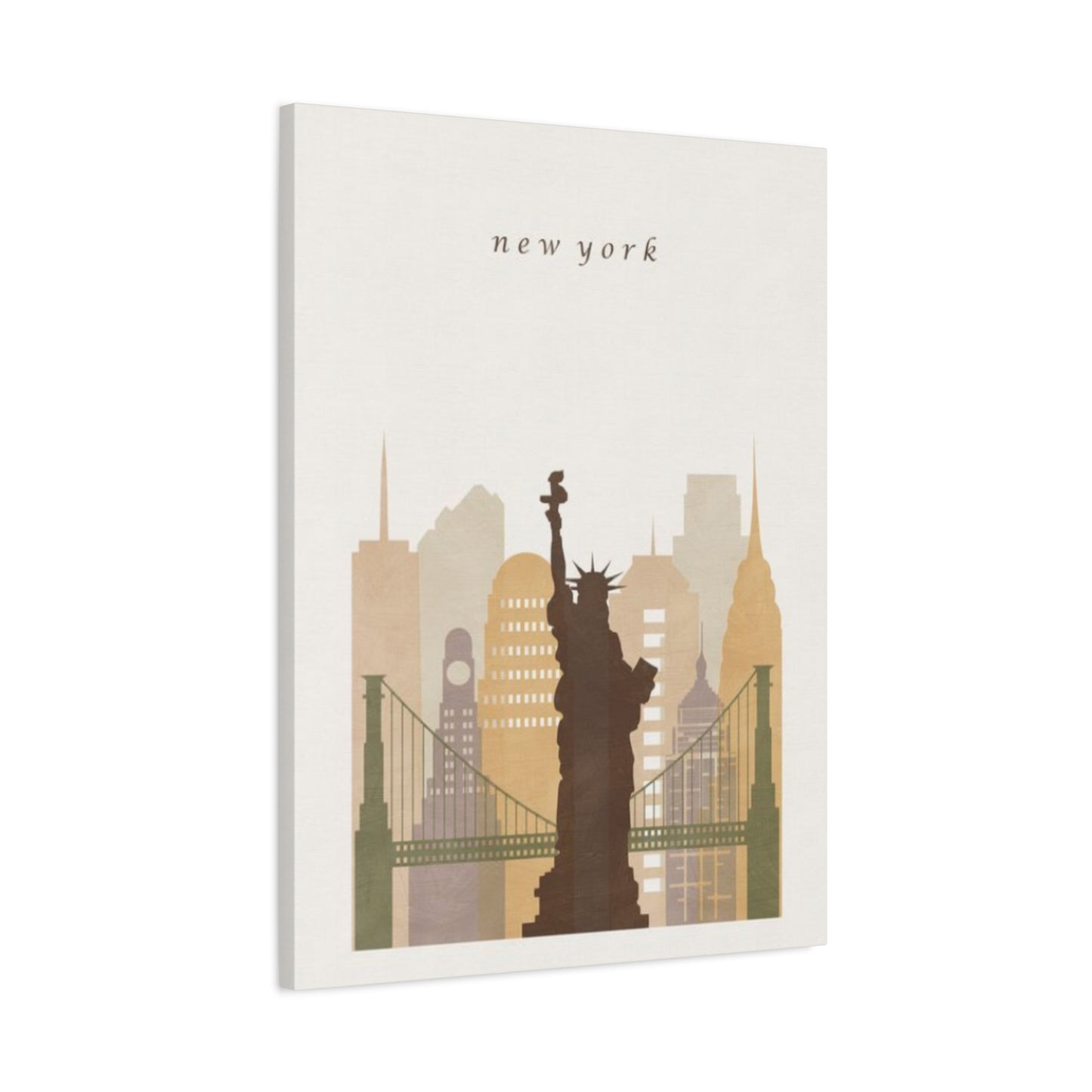

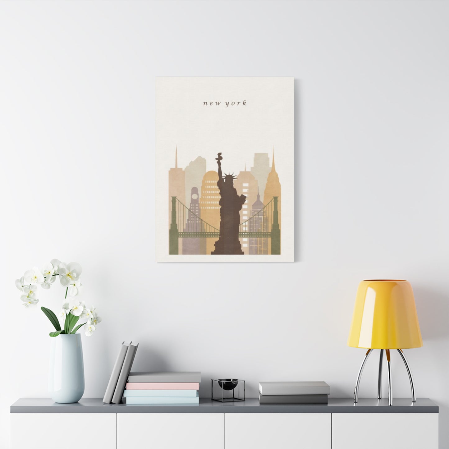
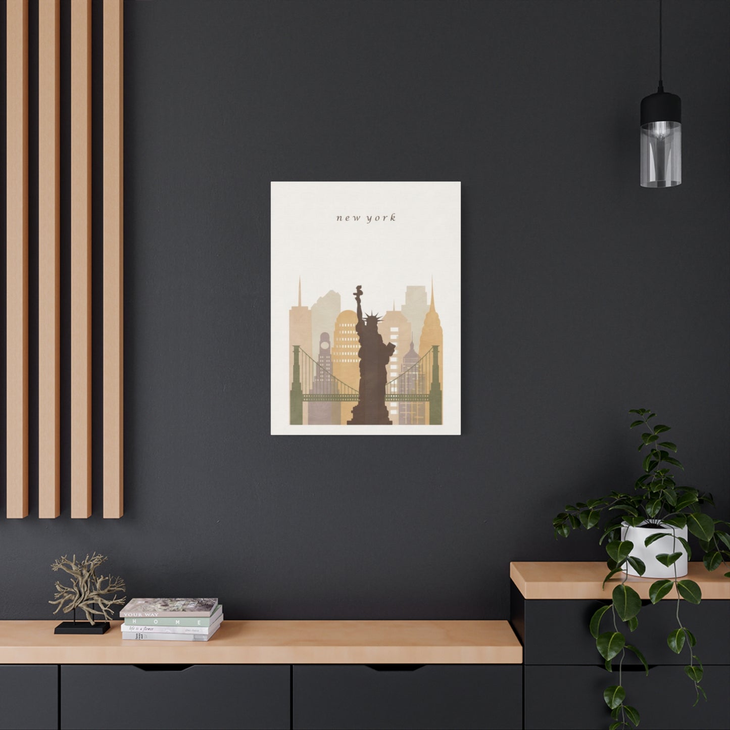
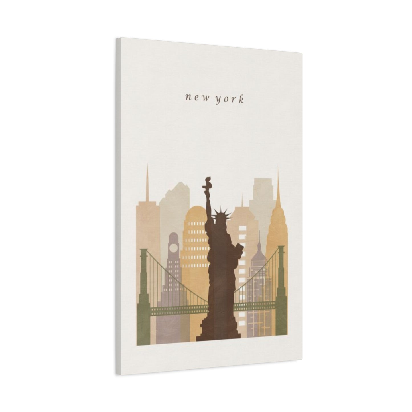

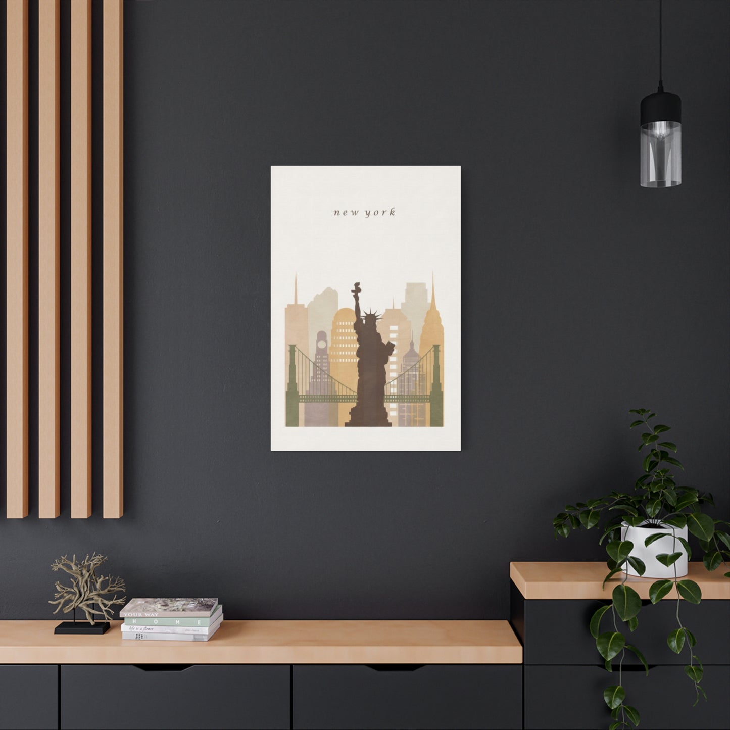
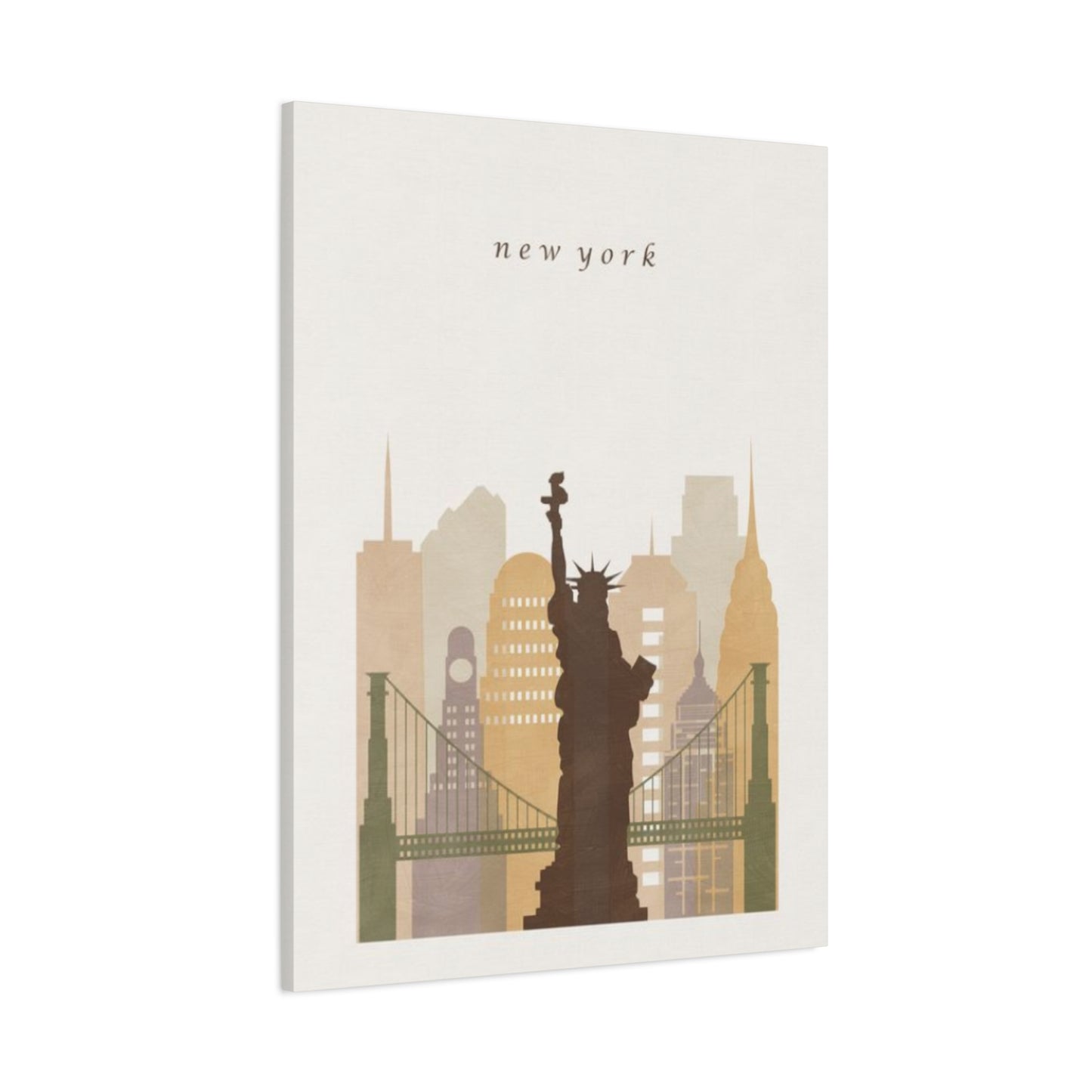
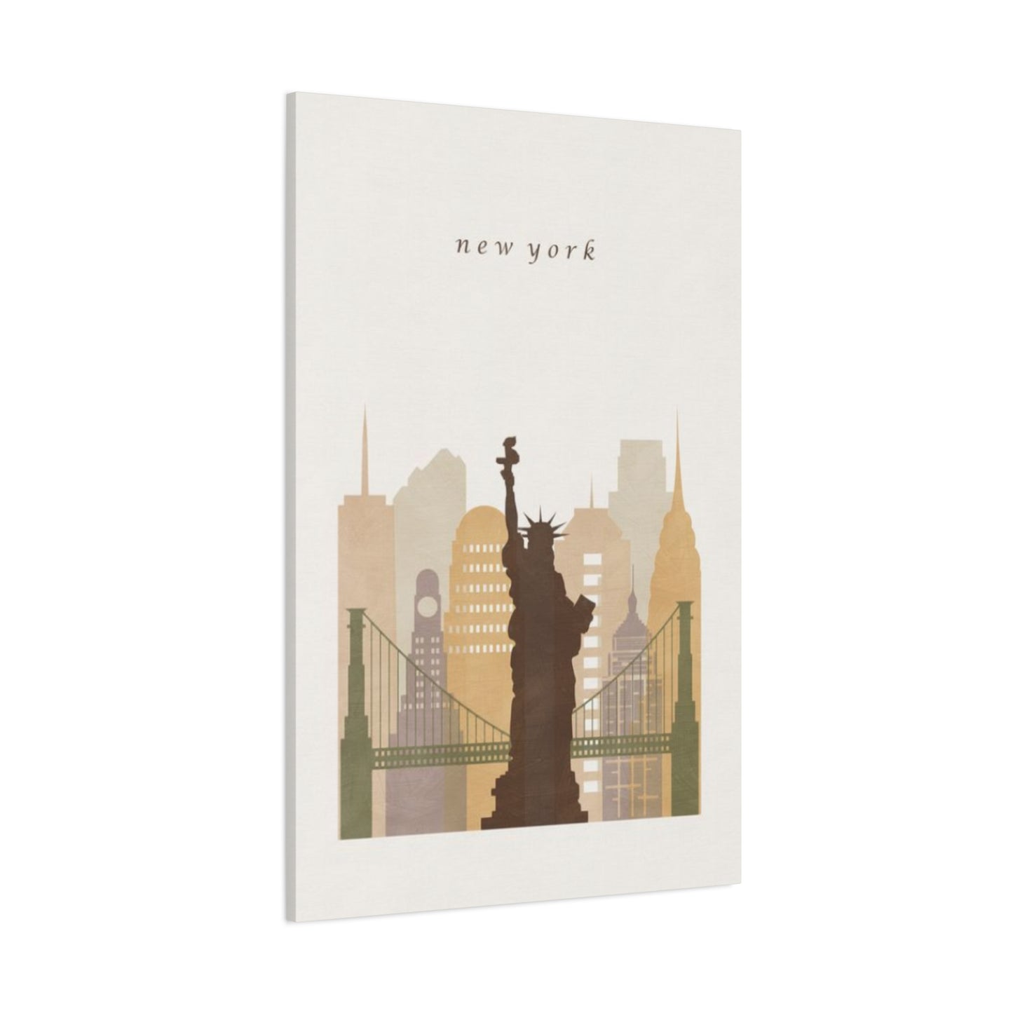
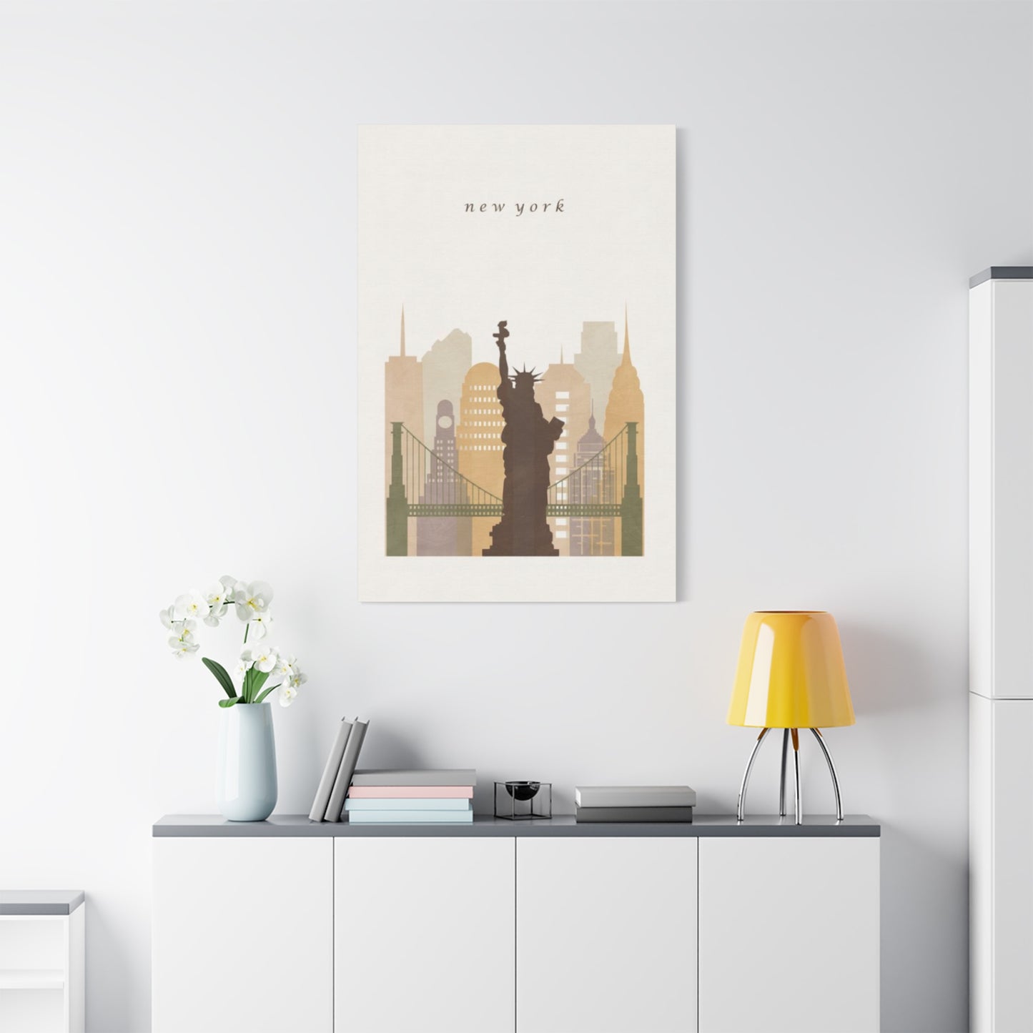
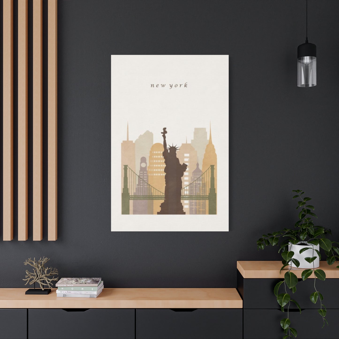
Elevating Interior Spaces with Sepia New York City skyline Wall art Liberty Monument Artwork
The allure of New York City has captivated artists, photographers, and interior designers for generations. When combined with the nostalgic warmth of sepia tones and the majestic presence of one of America's most recognizable monuments, these artistic elements create powerful visual statements in residential and commercial spaces. This exploration delves into how these design choices transform ordinary rooms into sophisticated environments that tell stories, evoke emotions, and celebrate urban heritage.
The Magnetic Pull of Sepia-Toned New York Artwork
Sepia photography and illustrations of New York City carry an undeniable nostalgic quality that transports viewers to different eras. The warm brown tones characteristic of this photographic treatment create an emotional bridge between past and present, making contemporary spaces feel grounded in history. When you incorporate sepia-toned artwork featuring the city's iconic architecture, bustling streets, or famous landmarks, you're not simply decorating walls but creating portals to another time.
The technical aspects of sepia toning originally came from a chemical process used in traditional photography to increase print longevity. Today, this aesthetic choice serves primarily artistic purposes, softening harsh contrasts and creating cohesive visual harmony. In New York imagery, sepia tones particularly complement the city's architectural heritage, from brownstone buildings to art deco skyscrapers. The monochromatic warmth unifies diverse architectural styles, creating visual coherence even when depicting the city's eclectic mix of structures.
Interior designers frequently select sepia New York artwork because it functions as a neutral element that complements various color schemes while maintaining visual interest. Unlike stark black and white photography, sepia introduces warmth that makes spaces feel inviting rather than clinical. The aged appearance also adds perceived value and sophistication, suggesting curated collections acquired over time rather than mass-produced decorative items.
When positioning sepia New York artwork in residential settings, consider how natural and artificial lighting will interact with the warm tones throughout the day. Morning light enhances golden undertones, while evening illumination can deepen the richness of brown hues. This dynamic quality means the artwork continually reveals new aspects, maintaining interest over years of daily viewing. Strategic placement near windows or under picture lights can maximize these shifting visual effects.
The psychological impact of sepia-toned imagery extends beyond mere aesthetics. Research in environmental psychology suggests that warm color temperatures create perceptions of comfort and relaxation. When applied to urban imagery that might otherwise feel cold or overwhelming, sepia toning humanizes cityscapes, making them feel approachable and intimate. This balance between urban energy and warmth makes sepia New York artwork particularly effective in creating spaces that feel both sophisticated and comfortable.
The Enduring Inspiration Behind Liberty Monument Wall Displays
Few symbols resonate as powerfully across cultures and generations as the monument representing freedom and opportunity that stands in New York Harbor. This colossal figure has inspired countless artistic interpretations, from realistic renderings to abstract representations. The monument's appeal as a subject for wall art stems from its universal symbolic value combined with its striking visual form that commands attention in any setting.
Artists have approached this subject from every conceivable angle and medium. Traditional realistic representations capture the monument's neoclassical details, impressive scale, and weathered copper patina. Abstract interpretations distill the form to essential lines and shapes, emphasizing symbolic rather than literal meaning. Vintage-style posters reference early twentieth-century travel advertisements, while contemporary digital art explores the monument through modern graphic design sensibilities. This diversity ensures options exist for every design aesthetic and personal preference.
The monument's symbolic associations extend far beyond American patriotism. It represents hope, new beginnings, perseverance, and the pursuit of better futures. These universal themes resonate with people regardless of their personal connection to New York or American history. When incorporated into residential spaces, artwork featuring this monument can serve as daily reminders of these aspirational values, making it particularly popular in home offices, entryways, and personal spaces where motivation matters.
From a purely compositional standpoint, the monument offers exceptional visual appeal. Its vertical thrust creates dynamic movement in rectangular frames, while the torch, crown, and tablet provide recognizable focal points. The surrounding water and sky offer opportunities for atmospheric effects and color variation, even in monochromatic interpretations. When photographed or illustrated from different angles—ground level looking upward, aerial views, or from the harbor—each perspective creates distinct emotional impacts and spatial relationships.
Interior designers appreciate artwork featuring this monument because it functions effectively at multiple scales. A small print in a gallery wall arrangement contributes vertical interest without overwhelming neighboring pieces. Large-scale installations create dramatic focal points that anchor entire rooms. The monument's familiar silhouette remains recognizable even in partial views or extreme close-ups, allowing for creative cropping and composition while maintaining immediate identification. This flexibility makes it adaptable to diverse interior design challenges and spatial constraints.
Transforming Living Environments with Manhattan Skyline Displays
The Manhattan skyline represents one of the world's most recognizable urban panoramas, with its distinctive profile of towering structures creating instant visual impact. When translated into poster format, this cityscape becomes a powerful design element that introduces energy, sophistication, and urban character into residential and commercial spaces. The horizontal sweep of skyline imagery offers compositional opportunities that differ significantly from vertical architectural studies or portrait-oriented artwork.
Skyline posters serve multiple design functions simultaneously. They establish clear geographic identity, instantly communicating New York associations and the cultural values attached to the city—ambition, creativity, diversity, and possibility. The horizontal format naturally draws eyes across wall spaces, making rooms feel wider and more expansive. This makes skyline artwork particularly effective in narrow spaces, above furniture pieces, or in rooms where creating perceived width enhances comfort and functionality.
The architectural diversity captured in skyline views provides inherent visual interest through varied building heights, styles, and shapes. Each structure contributes unique silhouettes to the overall composition, creating rhythmic patterns that guide viewer attention across the image. Iconic buildings serve as anchor points—recognizable landmarks that help viewers orient themselves within the composition while lesser-known structures provide contextual richness and authentic urban texture.
Time of day dramatically affects skyline imagery's emotional tone and design impact. Daytime views emphasize architectural details and the relationship between structures and sky, offering clarity and precision. Golden hour photography bathes buildings in warm light that complements wood furnishings and warm-toned interiors. Twilight images capture the magical transition period when building lights begin glowing against deepening blue skies, creating romantic and dramatic moods. Nighttime skylines transform into abstract patterns of illuminated windows and architectural lighting, offering graphic boldness that works particularly well in contemporary settings.
When selecting skyline posters for specific spaces, consider the viewing distance and available wall dimensions. Larger spaces can accommodate detailed panoramic prints where viewers can appreciate individual building characteristics. Smaller rooms benefit from simplified skyline interpretations that maintain visual impact without overwhelming limited square footage. The surrounding decor should inform whether to choose realistic photographic representations, graphic illustrations, or artistic interpretations that emphasize mood over architectural accuracy.
Nostalgic Qualities: Understanding Sepia's Aesthetic Draw
The sepia aesthetic connects contemporary audiences to photographic history while offering distinct design advantages in modern interiors. Originally resulting from chemical toning processes that replaced silver in photographic prints with more stable sepia compounds, this treatment has evolved into a deliberate artistic choice that conveys specific moods and historical associations. Understanding why sepia remains popular despite technological advances that enable full-color reproduction reveals important insights about human aesthetic preferences and the psychological dimensions of interior design.
Nostalgia forms the core of sepia's appeal. The warm brown tones immediately suggest age and history, even when applied to contemporary photographs. This temporal ambiguity creates interesting perceptual effects—viewers often cannot definitively determine whether sepia images are genuinely vintage or modern recreations. This uncertainty adds mystery and perceived depth, encouraging extended viewing and contemplation. In residential settings, this quality helps new construction feel established and personally meaningful rather than generic and impersonal.
From a color theory perspective, sepia's monochromatic nature eliminates color discordance with surrounding decor. While color photographs must harmonize with room palettes, sepia artwork functions more neutrally, complementing rather than competing with furniture, textiles, and wall colors. The warm undertones provide sufficient character to avoid appearing cold or stark while maintaining enough neutrality to work across design styles from traditional to contemporary. This versatility explains sepia's enduring popularity among interior designers facing diverse client preferences and existing decor constraints.
The unifying effect of sepia toning proves particularly valuable in gallery wall arrangements or when displaying multiple images together. Different photographs taken at various times with different equipment naturally vary in color temperature, saturation, and tonal qualities. Converting to sepia standardizes these variables, creating visual coherence that helps disparate images function as a cohesive collection. This technique allows homeowners to combine personal photographs with acquired artwork or mix different photographers' work without creating visual chaos.
Sepia also offers practical advantages in certain lighting conditions. In spaces with warm artificial lighting or abundant natural light that shifts throughout the day, color photographs can appear inconsistent as lighting changes. Sepia images maintain more stable appearance across varying illumination because they lack the color information that our eyes register as shifting under different light sources. This consistency ensures the artwork always looks intentional rather than poorly lit or color-mismatched with its environment.
Liberty Monument as Symbolic Representation in Visual Art
The monument that welcomes arrivals to New York Harbor has transcended its physical form to become one of history's most potent visual symbols. Artists across movements and mediums have engaged with this subject, each interpretation adding layers of meaning that extend far beyond the structure's original commemorative purpose. Examining how different artistic approaches transform copper and steel into powerful statements about freedom, democracy, immigration, and national identity reveals the monument's remarkable versatility as subject matter.
Classical realistic representations focus on accurately depicting the monument's physical characteristics—the neoclassical design inspired by ancient Roman goddesses, the seven-pointed crown representing continents and seas, the tablet inscribed with the date of American independence, and the torch symbolizing enlightenment. These faithful renderings appeal to viewers who appreciate technical skill and historical accuracy. They serve educational purposes while providing aesthetically pleasing decor that celebrates craftsmanship and attention to detail.
Impressionistic interpretations emphasize atmosphere and emotional response over precise representation. Loose brushwork, suggested rather than defined forms, and emphasis on light effects create dreamy, romantic visions that prioritize feeling over documentation. These approaches work particularly well in residential settings where creating mood matters more than conveying information. The softer aesthetic integrates more seamlessly with comfortable, lived-in spaces compared to sharply detailed photographic reproductions.
Abstract and modernist treatments distill the monument to essential geometric forms, exploring its visual structure divorced from literal representation. These interpretations might emphasize vertical thrust through elongated proportions, reduce the figure to silhouette against contrasting backgrounds, or fragment the form into cubist facets that examine it from multiple perspectives simultaneously. Such approaches appeal to collectors who appreciate conceptual rigor and want artwork that stimulates intellectual engagement rather than simple recognition.
Pop art and graphic design approaches often employ bold color palettes, simplified forms, and commercial printing techniques that reference mass media and popular culture. These interpretations acknowledge the monument's status as an icon that exists as much in reproduced images as in physical form. The self-aware nature of these works—openly artificial and stylized—creates ironic distance while simultaneously celebrating the monument's continuing cultural relevance. They work exceptionally well in contemporary, minimalist, or industrial-style interiors where bold graphic statements enhance rather than conflict with architectural simplicity.
Political and social commentary represents another important artistic tradition. Throughout history, artists have used the monument as a vehicle for examining American ideals, critiquing failures to live up to stated values, or celebrating progress toward greater equality and inclusion. These works layer additional meaning onto the familiar form, transforming it from simple decoration into conversation starters that invite viewers to consider complex social issues. In residential settings, such pieces reflect homeowners' values and intellectual engagement with contemporary discourse.
Introducing Urban Sophistication Through Metropolitan Artwork
Urban imagery brings distinct energy and character to interior spaces, transforming ordinary rooms into environments that feel connected to the vitality and cultural richness of city life. New York artwork particularly excels at conveying urban sophistication because the city itself functions as a global symbol of culture, commerce, creativity, and possibility. Understanding how to harness this symbolic power through thoughtful artwork selection and placement enables homeowners and designers to create spaces that feel cosmopolitan and culturally engaged.
The concept of urban elegance balances energy with refinement. Raw urban imagery—graffiti, construction sites, crowded subway platforms—conveys authenticity but can feel chaotic in residential settings. Refined urban imagery—architectural studies, composed street scenes, iconic landmarks—maintains connection to city energy while introducing order and aesthetic intentionality. Striking this balance ensures spaces feel connected to urban culture without resembling industrial warehouses or underground clubs.
Scale plays crucial roles in how urban imagery impacts spaces. Large-scale installations create immersive experiences that transport viewers into cityscapes, making them feel present in depicted scenes. This approach works magnificently in spaces designed around dramatic focal points—above fireplaces, on accent walls, or in entryways where making strong first impressions matters. Conversely, smaller urban images work better in collections or gallery walls where multiple pieces create cumulative impact without individual dominance.
Framing choices significantly affect how urban artwork reads in refined interiors. Raw, unframed prints on canvas or mounted to board emphasize casual, loft-like aesthetics appropriate for industrial or contemporary spaces. Simple, modern frames in black, white, or metal finishes maintain urban edge while introducing polish that helps artwork integrate into more traditional or transitional interiors. Ornate or antique frames create interesting juxtapositions—urban subjects in traditional presentations that bridge different design vocabularies and time periods.
Lighting design determines how effectively urban artwork conveys intended moods and maintains visual impact throughout daily use cycles. Urban imagery often features strong contrasts—bright windows against dark building facades, illuminated streets against night skies, sunlit structures against shadowed foregrounds. Proper lighting preserves these contrasts and prevents artwork from appearing muddy or losing definition. Picture lights, track lighting, or strategically positioned accent lamps ensure artwork receives adequate illumination regardless of natural light availability.
The cultural associations surrounding New York contribute significantly to the sophistication that artwork featuring the city conveys. The city represents the pinnacle of American urban achievement—the financial capital, cultural center, fashion industry headquarters, and home to world-class museums, theaters, and educational institutions. Displaying New York imagery signals connection to these associations, suggesting cultural literacy, cosmopolitan values, and appreciation for achievement and excellence. This makes such artwork particularly popular in professional spaces, home offices, and social areas where projecting sophistication matters.
Sepia Metropolitan Artwork for Enduring Residential Aesthetics
Creating home environments that feel personally meaningful while maintaining aesthetic appeal over time presents ongoing challenges for homeowners and designers. Trends come and go, personal tastes evolve, and what feels fresh initially can appear dated surprisingly quickly. Sepia-toned New York artwork offers solutions to these challenges through its inherent timelessness—qualities that allow it to remain relevant and aesthetically pleasing across decades rather than seasons.
The timeless quality of sepia imagery stems partly from its removal from specific temporal contexts. Without color information that might date photographs to particular eras, sepia images exist in indeterminate time. This ambiguity prevents artwork from appearing obviously contemporary in ways that might later read as dated. A sepia photograph taken yesterday can appear vintage, while genuinely old sepia images often look surprisingly fresh. This temporal flexibility ensures the artwork ages gracefully alongside changing interior trends.
Architectural subject matter contributes additional longevity. While fashion, automobiles, and technology quickly appear dated in photographs, buildings change slowly enough that architectural images remain relevant for extended periods. New York's most iconic structures have maintained their essential character for decades or even centuries. Artwork featuring these landmarks connects to continuous architectural heritage rather than fleeting moments, creating decor that feels established rather than trendy.
The neutral color palette of sepia imagery provides practical longevity advantages. Homeowners typically repaint rooms multiple times throughout extended residence periods, change furniture as needs evolve, and update textiles and accessories to refresh spaces. Color photographs that coordinate beautifully with current decor might clash dramatically after repainting or furniture replacement. Sepia artwork's neutral warmth works across paint colors, furniture styles, and accessory palettes, eliminating the need to replace artwork with each design refresh.
Emotional resonance creates another dimension of timelessness. Artwork that connects with personal memories, values, or aspirations remains meaningful regardless of shifting design trends. For people with personal histories in New York, sepia imagery of familiar locations maintains emotional significance that transcends aesthetic considerations. For those without direct connections, the city's symbolic associations with opportunity, creativity, and cultural achievement provide enduring meaning that survives changing decorative preferences.
Investment value considerations also favor timeless artwork choices. Quality pieces in classic styles retain or appreciate in value more reliably than trendy items that quickly lose appeal. While genuine vintage sepia photographs of New York landmarks can command significant prices in art markets, even high-quality contemporary prints styled with vintage sensibilities offer better long-term value than disposable fast-fashion decor. This makes sepia New York artwork both aesthetically and financially sound for homeowners concerned with investment aspects of furnishing decisions.
Generating Visual Interest with Liberty Monument Displays
The dramatic potential of artwork featuring the harbor monument stems from the subject's inherent grandeur and symbolic weight. Successfully translating this monumentality into effective interior design requires understanding how scale, composition, perspective, and context influence emotional impact. When thoughtfully selected and positioned, such displays transform walls from simple boundaries into commanding focal points that anchor rooms and create memorable impressions.
Scale relationships prove critical to achieving drama. The monument itself stands over three hundred feet tall, dominating its surroundings through sheer physical presence. Artwork that emphasizes this scale differential—showing the monument towering over boats, buildings, or human figures—translates that imposing quality into visual form. Large-format prints that allow viewers to perceive fine details recreate the experience of encountering the actual monument, where size overwhelms and humbles observers.
Perspective choices dramatically affect emotional response to monument imagery. Ground-level views looking upward emphasize height and power, placing viewers in positions of reverence or awe. These perspectives work exceptionally well in vertical spaces or rooms with high ceilings where the upward thrust complements architectural proportions. Eye-level or slightly elevated perspectives create more intimate relationships with the subject, emphasizing the monument's figurative humanity rather than architectural scale. Aerial views that show the monument within its island context or amidst harbor waters emphasize isolation and independence while showcasing the complete sculptural form.
Lighting and atmospheric conditions within the artwork contribute significantly to dramatic impact. Storm-threatening skies create tension and emphasize the monument's steadfast presence against natural forces. Dramatic sunrise or sunset lighting produces golden or crimson glows that transform copper surfaces into glowing beacons. Fog and mist create mystery and romance, partially obscuring the monument and inviting viewers to imagine the complete form. Clear, bright conditions emphasize clarity and optimism, celebrating the monument's role as a welcoming symbol.
Compositional isolation enhances drama by eliminating visual competition and focusing attention exclusively on the monument. Images that crop tightly on the figure against simple sky backgrounds create bold graphic statements that command attention through visual simplicity. Negative space surrounding the monument generates tension between empty areas and the solid sculptural form. This approach works particularly well in minimalist or contemporary interiors where visual clarity and reduced ornamentation already characterize the design vocabulary.
Conversely, contextual composition that shows the monument within its environment creates drama through relationships rather than isolation. Including harbor waters introduces horizontal movement that contrasts with vertical thrust. Showing nearby Manhattan skylines establishes scale relationships and urban connections. Including boats or ferries adds human activity and suggests the monument's role within living city fabric rather than as isolated icon. These richer compositions work well in spaces where visual complexity enhances rather than overwhelms, such as large open-concept areas or rooms with substantial furniture and accessory collections.
Contemporary Minimalism Versus Historical Styling in Liberty Monument Artwork
The monument's long history and changing cultural contexts have inspired vastly different artistic interpretations that reflect evolving aesthetic values. Comparing vintage-inspired representations with contemporary approaches reveals how the same subject can serve completely different design purposes and appeal to distinct sensibilities. Understanding these stylistic poles helps homeowners and designers select artwork that aligns with overall interior design goals and personal aesthetic preferences.
Vintage-style representations typically reference early twentieth-century poster art, when lithographic printing dominated commercial and travel advertising. These pieces feature simplified color palettes, bold outlines, flattened perspective, and stylized rather than realistic rendering. Typography often appears integrated into compositions, with period-appropriate fonts announcing destinations or slogans. The overall effect evokes nostalgia for early tourism, immigration waves, and mid-century American optimism. These pieces work beautifully in eclectic, traditional, or transitional interiors where referencing design history feels appropriate and enriching.
The appeal of vintage styling extends beyond pure aesthetics to cultural associations. These representations connect to specific historical moments—the immigration experience at nearby processing facilities, post-war prosperity and confidence, or mid-century design movements. For viewers, these pieces function as visual time machines that evoke specific eras and their associated values, anxieties, and aspirations. In homes designed around antique or vintage furnishings, these artistic approaches maintain period consistency while celebrating American cultural heritage.
Contemporary interpretations prioritize current aesthetic values—minimalism, abstraction, technological precision, or conceptual rigor. Digital photography and editing enable previously impossible effects, from extreme high-resolution close-ups revealing surface textures to composited scenes combining elements from multiple images. Graphic design approaches reduce the monument to essential forms and limited color palettes, creating bold statements that function as much as design elements as representational images. Fine art photography emphasizes composition, light, and printing quality over documentary accuracy.
Modern treatments often engage critically or ironically with the monument's symbolic meanings rather than simply celebrating them. Contemporary artists might juxtapose the monument with contradictory imagery, digitally manipulate it in ways that question historical narratives, or present it in unexpected contexts that challenge comfortable assumptions. These approaches appeal to collectors who value intellectual engagement and want artwork that stimulates thought rather than simply pleasing the eye. They work particularly well in contemporary, industrial, or artistically ambitious interiors where challenging conventional representations feels appropriate.
Technological considerations influence stylistic choices significantly. Vintage-style pieces deliberately reference limitations of historical printing technologies—reduced color ranges, visible halftone patterns, registration imperfections—as aesthetic choices that convey authenticity and handcrafted quality. Modern pieces exploit digital perfection, presenting flawlessly sharp images, seamlessly composited scenes, or mathematically precise geometric abstractions impossible in analog media. These technical characteristics signal different values—handcraft versus precision, nostalgic charm versus technological sophistication.
The choice between vintage and modern styling ultimately reflects broader interior design philosophy. Spaces that embrace layered, collected aesthetics benefit from vintage representations that suggest accumulated treasures and personal history. Environments designed around clean lines, reduced ornamentation, and contemporary furniture require modern approaches that complement rather than conflict with architectural simplicity. Many successful interiors mix both approaches, using stylistic variety to create visual interest and depth while maintaining overall coherence through careful curation and thoughtful placement.
Harmonizing Sepia Artwork with Simplified Contemporary Design
The apparent contradiction between warm, historically-inflected sepia imagery and cool, minimal contemporary design creates opportunities for sophisticated interiors that balance opposing qualities. Successfully combining these elements requires understanding the principles underlying both aesthetics and identifying common ground where they reinforce rather than undermine each other. When executed skillfully, this combination creates spaces that feel both emotionally warm and visually refined.
Minimalist design philosophy emphasizes reduction to essential elements, clean lines, uncluttered spaces, and neutral color palettes. These principles create visual calm and spatial clarity but can read as cold or unwelcoming when taken to extremes. Introducing sepia artwork provides organic warmth that humanizes stark environments without compromising the fundamental minimalist commitment to simplicity and order. The monochromatic nature of sepia images maintains visual restraint while the warm tones counteract potential coldness.
Subject matter selection proves crucial when combining sepia imagery with minimalist environments. Highly detailed, busy scenes can overwhelm minimal spaces and contradict the aesthetic of reduction. Instead, choose sepia images with strong compositional simplicity—single architectural elements, expansive skies with simple silhouettes, or abstracted forms that emphasize shape over detail. These selections honor minimalist values while introducing historical warmth and visual interest through tonal variation rather than compositional complexity.
Framing approaches significantly affect integration success. Heavy, ornate frames contradict minimalist principles and create jarring stylistic conflicts. Simple, thin frames in materials like brushed aluminum, black metal, or light natural wood maintain clean lines while providing necessary definition between artwork and walls. Alternatively, frameless mounting techniques—floating frames, face mounting to acrylic, or gallery wrapping—eliminate visual weight and allow images themselves to provide interest without competing frame elements.
Scale and placement strategies differ slightly when introducing sepia artwork into minimalist spaces compared to more decorative environments. Minimalist design tolerates or even celebrates generous negative space, allowing single artworks to command attention without competing visual elements. Rather than filling every wall, select fewer, larger pieces that make deliberate statements. Position these with careful attention to spatial relationships—centered on walls, aligned with furniture edges, or creating intentional asymmetries that feel considered rather than accidental.
Color coordination requires special attention when combining warm sepia tones with cool minimalist palettes. Many contemporary interiors favor grays, whites, blacks, and cool metallics. Sepia's warmth can either pleasantly contrast these cool tones or create uncomfortable discord. Test this relationship by considering existing warm elements—wood flooring, leather furniture, brass fixtures—that provide precedent for warm tones within the space. If these elements already exist, sepia artwork extends the warm accent palette. If the space reads entirely cool, introduce additional warm elements beyond artwork to avoid isolated, conflicting warmth.
Lighting design becomes especially important in these combinations. Minimalist spaces often feature dramatic lighting strategies—stark spotlights, edge-lit panels, or carefully controlled natural light. Ensure sepia artwork receives adequate illumination to reveal tonal subtleties without creating hot spots that wash out detail. The warm tones of sepia images generally appear more attractive under warm white or neutral LED lighting compared to cool daylight-temperature bulbs that can make brown tones appear muddy or undersaturated.
Wall Composition Strategies with Metropolitan Skyline Displays
Skyline imagery presents unique opportunities and challenges for wall composition due to its characteristically horizontal format and panoramic scope. Successfully integrating these pieces requires understanding both the artwork's internal composition and its relationship to surrounding architectural elements and furniture. Strategic styling transforms skyline posters from simple decoration into integral design components that enhance spatial perception and create visual harmony.
Horizontal artwork naturally complements furniture arrangements by reinforcing lateral movement and connecting separate pieces into unified compositions. Positioning skyline posters above sofas, beds, consoles, or dining tables creates visual continuity between furniture and wall displays. The artwork's width should generally relate proportionally to furniture width—slightly narrower than the furniture piece creates comfortable relationships while avoiding overwhelming or appearing too small. For a standard three-seat sofa approximately seven to eight feet wide, skyline artwork measuring five to six feet wide typically creates pleasing proportions.
Height placement significantly affects both artwork visibility and room proportions. The common rule suggesting center points at eye level works for portrait-oriented pieces but often positions horizontal works too high, especially above furniture. Instead, position skyline posters so the bottom edge sits six to twelve inches above furniture tops. This creates visual connection between furniture and artwork while ensuring comfortable viewing angles. In spaces without furniture beneath artwork, center points at approximately sixty to sixty-five inches from the floor—average eye height—ensure comfortable viewing.
Layering techniques add depth and visual interest to skyline presentations. Rather than hanging a single poster in isolation, consider surrounding it with complementary elements that create richer, more complex compositions. Smaller framed pieces flanking the skyline create triptych effects. Floating shelves positioned below the skyline hold sculptural objects, books, or plants that physically project into the room and cast shadows that add dimension. Wall-mounted lighting fixtures positioned above or to the sides provide both practical illumination and additional compositional elements.
Color coordination between skyline imagery and surrounding walls influences overall effect dramatically. Skyline artwork featuring predominantly light tones pops against dark walls, creating dramatic contrast and making the cityscape appear luminous. Conversely, dark or heavily saturated skyline images command attention against light walls through bold graphic presence. Monochromatic coordination—sepia skylines against warm beige or tan walls—creates subtle, sophisticated relationships where artwork integrates seamlessly rather than contrasting sharply. No approach is universally superior; the choice depends on desired effects and existing room characteristics.
Gallery wall integration offers opportunities to combine skyline posters with complementary imagery for richer storytelling and visual variety. Pair skyline views with street-level scenes, architectural details, or landmark close-ups that explore the same city from multiple perspectives. This approach transforms single statements into comprehensive city portraits that reveal different aspects and scales. Maintain visual coherence through consistent framing styles, color palettes, or image treatments like uniform sepia toning that unify diverse subjects into cohesive collections.
Seasonal and lighting variations affect skyline artwork differently than other subjects. Daytime skyline images depend heavily on natural light to appear vibrant and properly saturated. In rooms with limited natural light, these pieces can appear flat or dull without adequate artificial lighting. Evening and nighttime skyline imagery featuring illuminated buildings and twilight skies often appear more dynamic under artificial lighting conditions when their internal light sources contrast with ambient room lighting. Consider primary viewing times when selecting skyline imagery—daytime views for naturally bright spaces used mainly during day, nighttime views for rooms used primarily with artificial lighting.
The Monument's Commanding Visual Impact in Artistic Expression
The harbor monument's enduring presence in artistic expression stems from its successful combination of immediate visual recognition and deep symbolic resonance. Few subjects offer such rich potential for varied interpretation while maintaining instant identification. This unique combination explains why artists continually return to this subject across movements, media, and generations, each finding new approaches and meanings within the familiar form.
The monument's design incorporates classical artistic principles that contribute to its visual effectiveness. The contrapposto stance—weight shifted to one leg with the other relaxed—creates dynamic balance and suggests potential movement despite static medium. The raised torch establishes strong vertical emphasis while the extended arm creates diagonal movement that breaks potential rigidity. The flowing robes introduce organic curves that soften the otherwise geometric form. These design elements combine to create visual interest from every angle, making the monument photographically successful from virtually any perspective.
Symbolic layering enables diverse interpretations that extend far beyond the monument's official commemorative purpose. The torch represents enlightenment and knowledge, suggesting education and intellectual freedom. The crown's seven points reference continents and seas, indicating universal rather than exclusively American significance. The broken chains at the figure's feet symbolize liberation from oppression. The tablet bearing independence dates anchors the monument to specific historical moments while the whole composition suggests transcendent, timeless ideals. Artists emphasizing different elements create works with correspondingly different meanings and emotional tones.
The monument's island location provides dramatic natural settings that enhance artistic compositions. Water surroundings create opportunities for reflections, approaches by boat, and integration of seascapes and skies. The relative isolation emphasizes independence and steadfastness, themes that resonate in imagery showing the monument standing alone against vast skies or turbulent seas. Harbor traffic including ferries, sailboats, and cargo ships introduces human activity and connects the monument to contemporary life rather than presenting it as historical relic.
Changing light conditions throughout days and seasons provide endless variation for photographers and painters working with this subject. Morning light from the east illuminates the monument's back when viewed from Manhattan, creating dramatic backlighting effects and silhouettes. Afternoon western light hits the front facade, revealing surface textures and architectural details. Golden hour lighting produces warm glows that transform oxidized copper into seemingly luminous bronze. Overcast conditions create even illumination that emphasizes form over texture. Each lighting condition suggests different moods and encourages distinct compositional approaches.
The monument's evolution over time adds additional layers of meaning and visual interest. Originally copper-colored, the statue gradually developed its characteristic green patina through natural oxidation. This transformation metaphorically suggests growth, aging, and endurance—themes artists explore through emphasizing patina variations, contrasting historical depictions with contemporary conditions, or digitally manipulating colors to explore hypothetical appearances. The monument exists simultaneously as unchanging symbol and continuously evolving physical object, paradox that enriches artistic engagement.
Sepia Aesthetics in Contemporary Living Environments
The integration of historically-inflected sepia imagery into modern residential spaces requires navigating apparent contradictions between old and new, past and present. Successfully combining these elements creates interiors with temporal depth—spaces that feel simultaneously contemporary and connected to broader historical continuities. Understanding why sepia works in modern contexts despite or perhaps because of its vintage associations reveals important principles about effective interior design.
Contemporary interior design has evolved beyond strict modernist rejection of historical reference toward more inclusive approaches that value curated eclecticism. Today's sophisticated interiors often intentionally mix periods, styles, and references, creating richer, more personalized environments than strict adherence to single design vocabularies permits. Within this context, sepia artwork functions as a bridge element that introduces historical warmth without requiring comprehensive period design schemes. The imagery reads as contemporary enough through modern framing and presentation while maintaining clear connections to photographic history.
The current cultural moment's nostalgic tendencies make sepia particularly resonant. In an era of rapid technological change and social transformation, many people seek connections to seemingly more stable pasts, even if these connections are more emotional than historically accurate. Sepia imagery satisfies these impulses by providing visual access to earlier eras without requiring authentic antiques or period-specific design commitments. The aesthetic offers nostalgia's comfort without its potential stuffiness or the practical limitations of genuinely old furnishings.
From a color theory perspective, sepia's warm neutrality serves similar functions in modern interiors as it did historically. Contemporary design often emphasizes neutral backgrounds—whites, grays, beiges—that provide flexible canvases for furniture, art, and accessories. Sepia artwork introduces warmth and visual interest within these neutral schemes without introducing color that might clash with furniture textiles, accent pillows, or other changeable elements. The monochromatic quality ensures long-term compatibility as homeowners refresh spaces with new accessories or repaint walls.
Texture and materiality considerations also favor sepia imagery in contemporary contexts. Modern interiors increasingly value textural variety as a strategy for adding interest to spaces with simplified color palettes and reduced ornamentation. Sepia photographs, particularly when printed on textured papers or canvas, introduce subtle surface variation that creates visual and sometimes tactile interest. The grain structures visible in many sepia images add organic patterns that soften potentially stark modern environments.
The accessibility of high-quality sepia prints makes the aesthetic feasible across budget ranges. While original vintage sepia photographs can command significant prices, contemporary photographers and print services offer excellent quality reproductions and new sepia-toned images at accessible price points. This democratization allows renters, first-time homeowners, and budget-conscious decorators to achieve sophisticated looks without substantial investment, making sepia's vintage appeal available regardless of financial constraints.
Metropolitan Wall Art in Residential Spaces
Incorporating urban imagery, particularly of cities with rich histories like New York, introduces temporal depth and cultural resonance that transform houses into homes with character and story. This approach to residential decoration extends beyond simple aesthetics to engage with ideas about place, identity, memory, and connection. Understanding the multiple ways historical urban artwork functions in homes helps explain its enduring appeal and guides thoughtful selection and placement.
Urban imagery serves memorial functions, preserving and honoring places, moments, and cultural achievements. For people with personal histories in depicted locations, such artwork functions like external memory—triggers for recollections of formative experiences, important relationships, or meaningful life stages. A photograph of a particular street corner might remind someone of their first apartment, daily commute, or favorite restaurant. This memorial quality makes urban artwork deeply personal even when the images themselves are publicly available rather than unique personal photographs.
Conclusion:
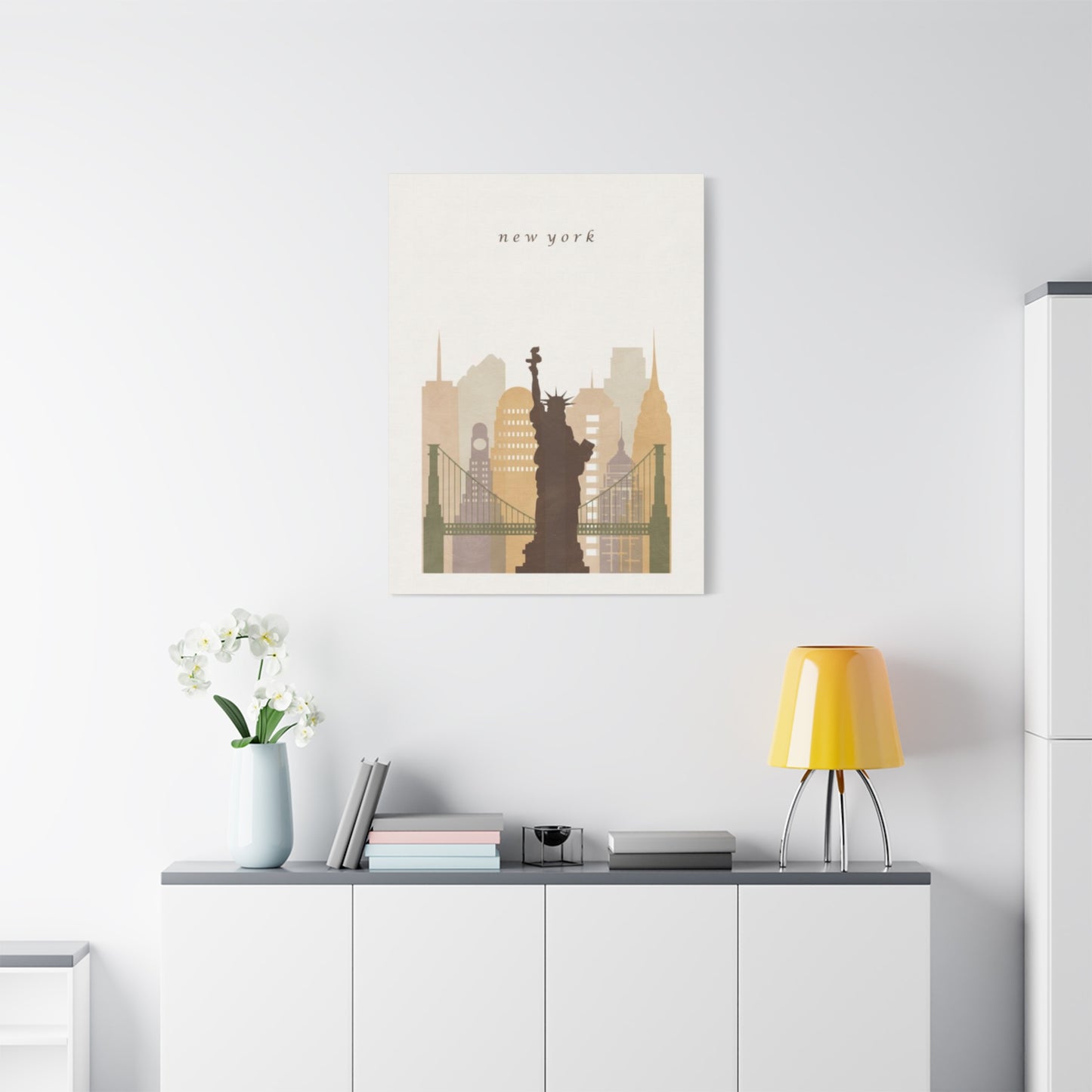
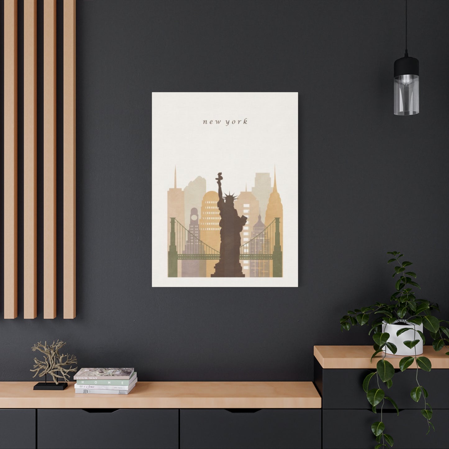
In conclusion, Sepia New York City Skyline Wall Art featuring the Liberty Monument is an elegant and timeless way to elevate your interior spaces. The sepia tones bring a vintage, sophisticated feel to the iconic New York City skyline, offering a rich contrast to the city’s modern, fast-paced energy. By pairing this classic color palette with the powerful symbol of the Statue of Liberty, the artwork not only showcases the city’s architectural beauty but also honors its legacy as a beacon of freedom and hope. It’s a perfect addition for those who want to incorporate a sense of history, grandeur, and refinement into their décor.
The sepia hue, with its warm, earthy tones, offers a softer, more nostalgic take on the vibrant energy typically associated with the city, making it versatile enough to complement various interior styles—from contemporary and minimalist to more traditional and rustic settings. The presence of the Liberty Monument, one of the most iconic symbols of New York and America itself, brings a sense of pride, strength, and freedom into your home, creating a space that feels both inspiring and welcoming.
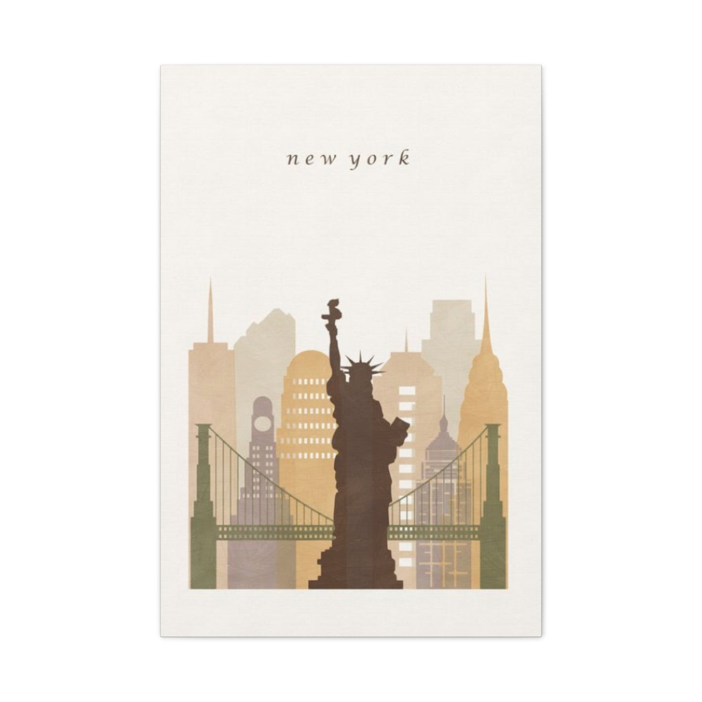
Incorporating Sepia New York City Skyline Wall Art into your home allows you to bring a piece of one of the world’s most dynamic cities into your own space. Whether displayed above a sofa, in an entryway, or as the centerpiece of a gallery wall, the artwork acts as a visual focal point that blends historical significance with modern design sensibilities. It infuses your room with a sense of timeless beauty, inviting reflection on the city’s cultural importance and the enduring symbol of liberty.
Ultimately, this wall art is more than just a depiction of the New York skyline—it’s a piece that captures the essence of a city that has shaped the world’s imagination and continues to inspire people globally. The combination of sepia tones and the Liberty Monument adds a sophisticated, evocative touch to your décor, allowing you to celebrate both the beauty of the city and the values it represents. Whether you’re a proud New Yorker or an admirer of the city’s rich history, this artwork will elevate your space with elegance, warmth, and a powerful sense of place.
