


The Magic of Morning: Sunrise Mountain Panoramas in Wall Art
The allure of mountain landscapes at dawn has captivated humanity for centuries. When the first rays of sunlight pierce through mountain peaks, they create a spectacle that speaks to something deep within our souls. Panoramic mountain sunrise wall art brings this magnificent natural phenomenon into our living environments, offering a window to wilderness and tranquility that can transform any room into a sanctuary of natural beauty.
In recent years, the popularity of panoramic mountain sunrise wall art has surged dramatically. Homeowners, decorators, and art enthusiasts have discovered that these expansive visual pieces do more than simply fill empty walls. They create focal points that draw the eye, establish mood, and bring the majesty of nature into everyday living environments. Whether you're decorating a modern apartment, a rustic cabin, or a traditional family home, panoramic mountain sunrise imagery offers versatile appeal that complements virtually any aesthetic.
This comprehensive guide explores every aspect of panoramic mountain sunrise wall art, from understanding the visual elements that make these pieces so compelling to practical considerations about display and collection. We'll examine the technical aspects of how artists capture and represent these scenes, the emotional resonance they create, and the many ways you can incorporate them into your living environments. Whether you're a seasoned collector or someone just beginning to explore decorative art, this guide will provide valuable insights into making the most of panoramic mountain sunrise wall art in your home.
The Beauty of Panoramic Mountain Sunrises
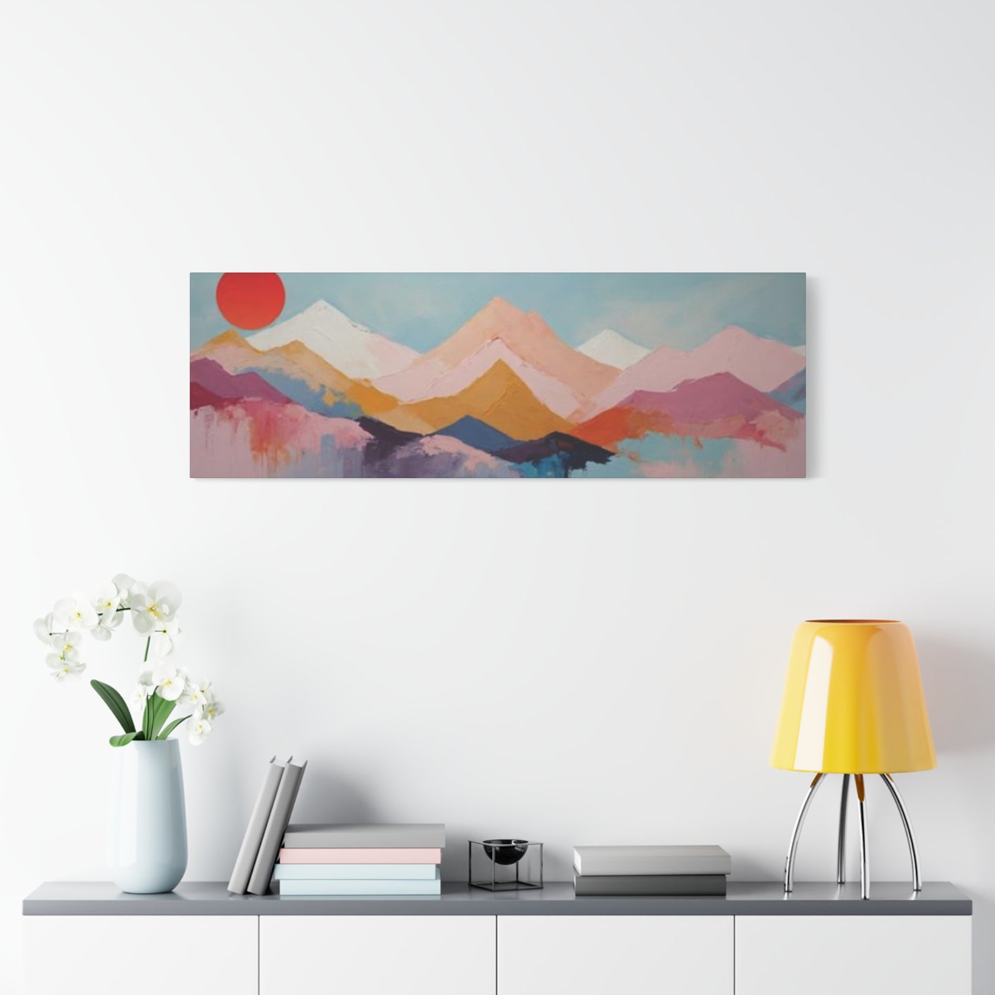
Panoramic mountain sunrises represent one of nature's most spectacular displays, and capturing this beauty in wall art requires both technical skill and artistic vision. The horizontal format of panoramic compositions allows artists and photographers to convey the full sweep of a mountain range as dawn breaks, creating an immersive visual experience that transports viewers to alpine heights.
What makes these sunrise scenes particularly captivating is the interplay of multiple visual elements happening simultaneously. As the sun crests the horizon, it bathes mountain peaks in warm golden light while valleys below remain shrouded in cool blue shadows. This dramatic contrast between warm and cool tones creates visual tension that keeps the eye engaged and exploring the composition. The graduated color transitions from deep purples and blues in the pre-dawn sky through pinks, oranges, and finally to brilliant yellows and whites create a natural color spectrum that is both harmonious and dynamic.
The majesty of mountain sunrise panoramas also lies in their ability to convey scale and grandeur. Mountains are among Earth's most imposing natural features, and when captured in panoramic format, their magnitude becomes even more apparent. The extended horizontal composition emphasizes the vastness of the landscape, creating a sense of expansiveness that can make even modest rooms feel more open and connected to the natural world.
Another compelling aspect of panoramic mountain sunrise art is its universal appeal. Across cultures and throughout history, mountains have held symbolic significance, representing challenges to overcome, spiritual elevation, and the enduring power of nature. Sunrise, similarly, carries universal associations with new beginnings, hope, and renewal. When combined in a single artistic composition, these elements create imagery that resonates on both aesthetic and symbolic levels.
The technical achievement required to capture or create panoramic mountain sunrise art also adds to its appeal. Photographers must wake before dawn, hike to elevated positions, and wait for precisely the right moment when atmospheric conditions and sunlight align. Painters must understand complex color theory and atmospheric perspective to convincingly render the subtle gradations of light that characterize these scenes. This investment of skill and effort imbues the finished work with value that goes beyond mere decoration.
Furthermore, panoramic mountain sunrise art offers endless variety within its genre. Each mountain range has distinctive characteristics, from the jagged peaks of the Alps to the rounded summits of the Appalachians, from the snow-capped volcanoes of the Cascades to the red rock formations of the American Southwest. Similarly, atmospheric conditions, seasonal variations, and the specific moment of capture ensure that no two sunrise panoramas are ever quite the same. This diversity means collectors can continually discover new variations on the theme without exhausting its possibilities.
The emotional impact of panoramic mountain sunrise art cannot be overstated. These images tap into deep psychological responses to natural beauty and grandeur. Research in environmental psychology has shown that exposure to nature imagery, even in the form of artwork, can reduce stress, lower blood pressure, and improve overall mood. The specific combination of mountains and sunrise seems particularly effective at evoking feelings of peace, inspiration, and optimism. When you place such art in your living environment, you create an ongoing opportunity for these positive psychological effects.
Creating Depth in Mountain Sunrise Panoramas
Depth perception is crucial in panoramic mountain sunrise art because it transforms a flat, two-dimensional surface into a window that appears to extend into distant horizons. Artists and photographers employ multiple techniques to create this illusion of depth, making the viewer feel as though they could step into the scene and begin hiking toward those distant peaks.
Atmospheric perspective, also called aerial perspective, is perhaps the most important technique for creating depth in mountain panoramas. This principle, observed and documented by Leonardo da Vinci centuries ago, describes how the atmosphere affects the appearance of distant objects. As mountains recede into the distance, they appear progressively lighter in value, cooler in color temperature, and less distinct in detail. In a sunrise panorama, foreground mountains might appear in sharp detail with warm, rich colors, while those in the middle distance take on cooler, slightly hazier tones, and the most distant peaks fade to pale blue or lavender silhouettes against the sky.
Layering is another essential depth-creating technique in panoramic mountain compositions. By arranging multiple mountain ridges at varying distances from the viewer, artists create a sense of spatial recession. Each successive layer should be rendered with slightly less contrast and detail than the one before it, reinforcing the sense that they are farther away. In sunrise scenes, these layers often create a beautiful stacking effect where each ridge is defined by its own distinctive color value, ranging from dark silhouettes in the foreground through increasingly lighter tones as distance increases.
Scale relationships also contribute significantly to perceived depth. By including elements of known size in the foreground such as trees, rocks, or buildings, artists provide visual references that help viewers understand the true scale of the distant mountains. This contrast between foreground details and distant peaks emphasizes the vast expanse of the landscape. In panoramic compositions, these scale relationships become even more important because the extended horizontal format can sometimes flatten the sense of depth if not carefully managed.
Leading lines serve as another powerful tool for creating depth in mountain sunrise panoramas. Natural features like ridgelines, rivers, trails, or even the arrangement of clouds can guide the viewer's eye from foreground through middle ground to background, creating a visual journey through the composition. In sunrise scenes, the radiating patterns of light itself can serve as leading lines, drawing attention from the horizon toward the foreground and creating dynamic visual movement through the picture plane.
Overlapping elements provide one of the most straightforward yet effective depth cues. When one mountain partially obscures another, our brains immediately understand that the hidden peak must be farther away. In panoramic compositions, artists can maximize this effect by carefully choosing viewpoints that present multiple overlapping ridgelines, creating a complex interweaving of forms that clearly communicates spatial relationships.
The play of light and shadow in sunrise scenes offers unique opportunities for depth creation. As the sun rises, it illuminates peaks and ridges at different times depending on their orientation and distance from the light source. This selective illumination creates patterns of light and dark that can be used to emphasize depth. Brightly lit foreground elements advance toward the viewer, while shadowed valleys recede. The gradual illumination of successively more distant peaks as the sun rises higher can create a magnificent sense of spatial depth that unfolds across the panoramic composition.
Textural gradation also contributes to depth perception. Foreground elements in panoramic mountain art should display rich, detailed textures such as the rough bark of trees, the granular surface of rocks, or the individual blades of alpine grasses. As distance increases, these textures should gradually simplify until distant mountains appear as smooth, relatively featureless forms. This progressive simplification of texture mimics how our eyes actually perceive landscapes and strengthens the illusion of depth.
Blending Colors in Panoramic Sunrise Art
Color blending in panoramic sunrise art is both a technical challenge and an opportunity for artistic expression. The smooth gradations and harmonious transitions that characterize successful sunrise panoramas require skill, patience, and understanding of color theory. When executed well, these color blends create the seamless, atmospheric quality that makes panoramic mountain sunrise art so visually compelling.
The sunrise color palette presents unique challenges because it encompasses such an enormous range of hues, values, and saturations. A single sunrise scene might include deep purples and blues in the shadows, vibrant oranges and pinks along the horizon, warm yellows and golds on illuminated peaks, and cool lavenders in the distant atmosphere. Successfully blending these diverse colors into a coherent whole requires understanding how colors interact and influence each other.
Gradual transitions are the hallmark of professional sunrise panoramas. Rather than abrupt color changes, skilled artists create smooth progressions where one hue gradually transforms into another. This is particularly important in the sky portion of panoramic compositions, where the gradation from pre-dawn darkness to bright sunrise light should flow seamlessly across the extended horizontal format. Digital artists might use gradient tools and blending modes, while traditional painters might employ techniques like glazing, where thin, transparent layers of paint are built up gradually to create luminous color transitions.
Color temperature plays a crucial role in convincing sunrise panoramas. Warm colors such as reds, oranges, and yellows appear to advance toward the viewer, while cool colors like blues, purples, and greens recede into the distance. By carefully managing the distribution of warm and cool colors throughout the composition, artists reinforce depth and create visual harmony. Sunrise scenes naturally provide this warm-cool contrast, with the warm tones concentrated around the rising sun and cooler tones dominating shadowed areas and distant atmospheric haze.
Complementary color relationships create visual excitement in panoramic sunrise art. The classic sunrise palette of oranges and blues represents a near-complementary relationship on the color wheel, creating natural visual tension that keeps the eye engaged. Artists can enhance this effect by carefully balancing the proportions of warm and cool colors, ensuring neither dominates to the point of monotony. Small accents of complementary colors in unexpected places can add visual interest and sophistication to the overall composition.
Saturation control is essential for creating realistic and aesthetically pleasing sunrise panoramas. While sunrises can indeed produce intensely saturated colors, using maximum saturation throughout the composition creates visual chaos and lacks subtlety. Skilled artists vary saturation levels across the panorama, reserving the most intense colors for key focal areas such as the sky near the sun or illuminated mountain peaks, while using more muted, desaturated tones in shadows, distant elements, and transition areas. This selective use of saturation creates visual hierarchy and prevents the composition from becoming overwhelming.
Analogous color schemes, where adjacent colors on the color wheel are used together, create harmony and unity in panoramic sunrise art. The progression from purple through red and orange to yellow represents an analogous sequence that naturally occurs in many sunrise scenarios. By working within this limited range of related hues, artists can create compositions that feel cohesive and restful to the eye, even while depicting the drama of sunrise over mountains.
The technique of color modulation involves varying colors slightly throughout areas that might initially appear uniform. For example, rather than painting a mountain slope in a single flat color, an artist might modulate between several related hues, creating subtle variations that suggest form, texture, and the complex play of light. This technique is particularly important in panoramic formats, where large expanses of similarly lit surfaces could become monotonous without careful color variation.
Using Panoramic Prints to Brighten Rooms
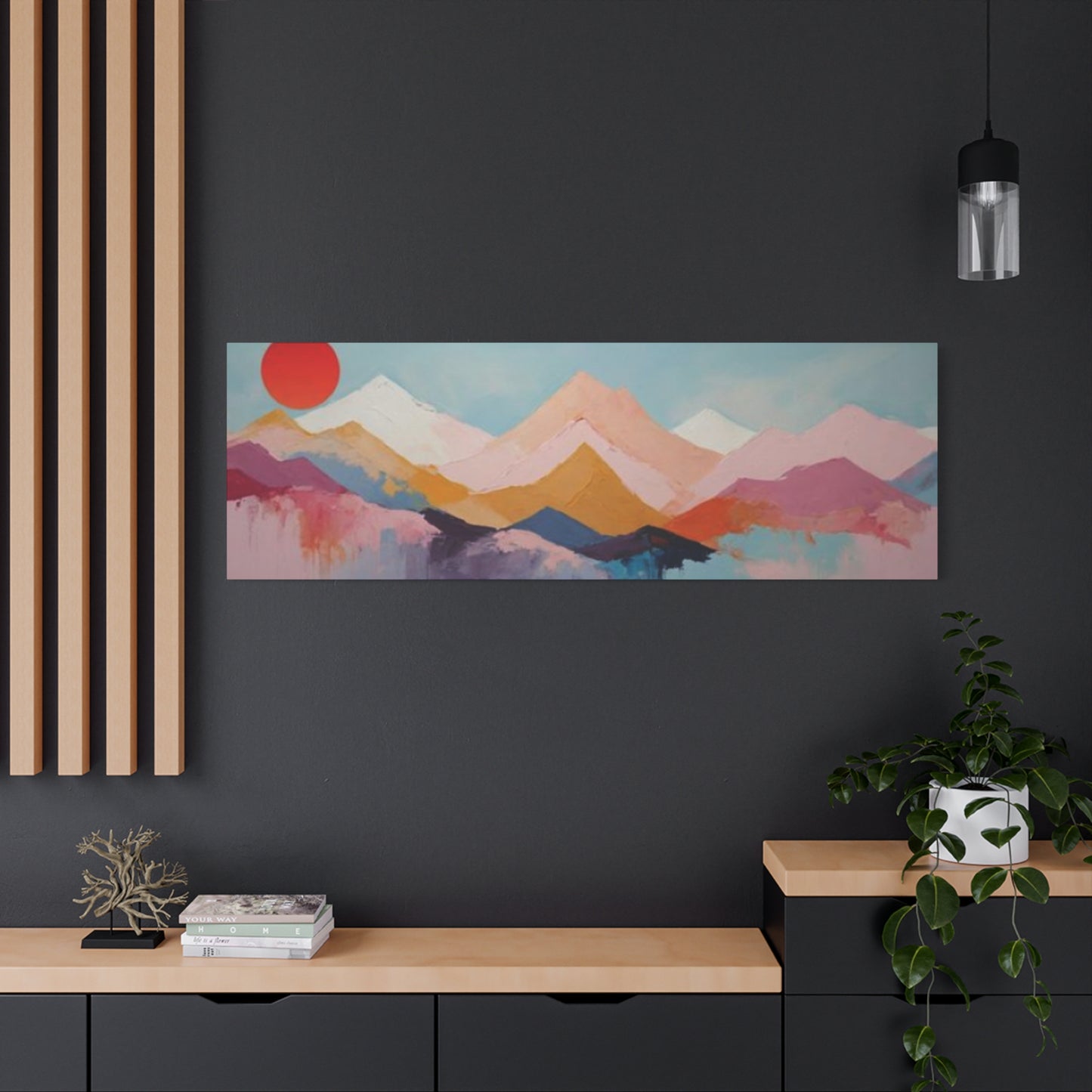
Panoramic prints featuring mountain sunrises possess a unique ability to brighten rooms, both literally and atmosphically. The warm, luminous colors inherent in sunrise imagery naturally bring a sense of light and energy to living environments, while the expansive horizontal format of panoramic compositions creates visual openness that can make rooms feel more spacious and welcoming.
The psychological impact of sunrise imagery should not be underestimated when considering how panoramic prints brighten rooms. Sunrises are universally associated with new beginnings, hope, and positive energy. When you introduce this symbolism into a living environment through wall art, it creates a subtle but persistent influence on mood and atmosphere. Rooms adorned with panoramic sunrise prints often feel more optimistic and energizing than those with darker or more somber artwork, even when actual lighting conditions remain unchanged.
Placement strategy is crucial for maximizing the brightening effect of panoramic mountain sunrise prints. Positioning these pieces on walls opposite windows allows natural light entering the room to illuminate the artwork, making the colors appear more vibrant and luminous. This creates a beautiful interplay between the natural light in your room and the depicted sunrise in the artwork. Alternatively, placing panoramic sunrise prints on walls that receive limited natural light can compensate for dimness, bringing a sense of brightness to areas that might otherwise feel shadowy or neglected.
The color palette of sunrise panoramas naturally complements and enhances ambient lighting. The warm yellows, oranges, and pinks typical of sunrise scenes have a warming effect on their surroundings, similar to how candlelight or warm LED bulbs create cozy, inviting atmospheres. When these warm tones are present in a large-scale panoramic print, they influence the perceived color temperature of the entire room, making it feel warmer and more welcoming. This effect is particularly valuable in rooms with cool-toned finishes or abundant blue-gray natural light.
Scale considerations significantly impact how effectively panoramic prints brighten rooms. A properly sized panoramic piece should be substantial enough to make a visual impact without overwhelming the surroundings. Generally, panoramic prints should span approximately two-thirds to three-quarters of the available wall width to achieve optimal presence. When sized appropriately, these pieces become focal points that draw the eye and command attention, their bright sunrise colors dominating the visual experience of the room.
The reflective qualities of different print substrates and glazing materials affect how panoramic prints brighten rooms. Prints on glossy paper or canvas with gloss varnish will reflect more ambient light, creating a luminous quality that can literally brighten surroundings. However, this reflectivity can also create glare problems in certain lighting conditions. Matte finishes reduce glare but may appear slightly less luminous. The choice between glossy and matte should be made based on the room's lighting conditions and viewing angles.
Color coordination between panoramic sunrise prints and other room elements amplifies the brightening effect. When you echo the warm tones from the sunrise panorama in other decorative elements such as throw pillows, area rugs, or accent furniture, you create color harmony that distributes the brightening effect throughout the entire living environment. This doesn't require exact color matching; rather, selecting complementary warm tones that resonate with the artwork creates a cohesive, bright atmosphere.
Lighting design specifically targeting panoramic prints can dramatically enhance their brightening effect. Picture lights mounted directly above the artwork or track lighting focused on the print can make the colors appear more vivid and saturated, increasing their visual impact. LED strip lights installed behind or beneath the print can create a dramatic glowing effect, making the artwork appear to emit light rather than merely reflect it. This approach is particularly effective with translucent print materials like backlit films or certain types of acrylic prints.
The Role of Shadows in Mountain Panoramas
Shadows are as essential to compelling mountain panoramas as the illuminated areas, providing contrast, depth, and visual drama that bring these compositions to life. In sunrise panoramas specifically, the interplay between emerging light and lingering darkness creates the dynamic tension that makes these scenes so visually arresting. Understanding how shadows function in mountain panoramas helps viewers appreciate the complexity and artistry involved in creating these works.
The primary function of shadows in mountain panoramas is to create visual contrast. Without shadows, mountain landscapes would appear flat and lifeless, lacking the dimensional quality that makes them compelling. In sunrise scenes, this contrast is particularly pronounced because the low angle of sunlight creates long, dramatic shadows while simultaneously illuminating peaks and ridges with warm, golden light. This contrast between shadowed valleys and illuminated summits creates a natural visual hierarchy that guides the viewer's eye through the composition.
Shadows provide essential information about form and topography in mountain panoramas. The way shadows fall across mountainsides reveals the contours, ridges, and valleys that define the landscape. Deep shadows in ravines indicate steep terrain, while gentle shadow gradations suggest more moderate slopes. In panoramic compositions, this shadow information extends across the entire width of the scene, creating a comprehensive map of the terrain that helps viewers understand the three-dimensional reality of the landscape.
Color within shadows is far more complex than many viewers realize. Shadows in mountain sunrise panoramas are rarely simple black or gray. Instead, they contain rich, nuanced colors influenced by reflected light from the sky, surrounding terrain, and atmospheric scattering. Morning shadows might appear in various shades of blue, purple, or even warm brown, depending on atmospheric conditions and the time of sunrise. Skilled artists recognize and represent this color complexity, creating shadows that feel luminous and vibrant rather than dead or muddy.
The pattern and direction of shadows provide important information about light source position and time of day. In sunrise panoramas, shadows typically extend toward the viewer or to the side, indicating the low angle of the rising sun. These shadow directions help establish the narrative of the scene, telling viewers that they're witnessing the early morning transformation of the landscape. The specific angle and length of shadows can even suggest approximate time, distinguishing between the very first light of dawn and the fuller illumination of later morning.
Shadows create rhythm and movement in panoramic compositions through their repetitive patterns. When multiple mountain ridges are present, each casts its own shadow onto the valleys and slopes behind it, creating a rhythmic pattern of light and dark that leads the eye across the composition. This rhythm adds visual interest to panoramic formats, which might otherwise feel static due to their extended horizontal orientation. The interplay of illuminated ridges and shadowed valleys creates a sense of undulation and movement that brings life to the composition.
Edge quality in shadows significantly impacts the perceived realism and mood of mountain panoramas. Sharp-edged shadows indicate clear atmospheric conditions and direct sunlight, creating a crisp, dramatic feeling. Soft-edged shadows suggest atmospheric haze or diffuse light, creating a gentler, more ethereal mood. During sunrise, shadows often begin with soft edges as diffuse pre-dawn light fills the landscape, then gradually sharpen as the sun rises and light becomes more directional. Artists can manipulate these edge qualities to control the mood and atmosphere of their panoramas.
The relationship between shadows and atmospheric perspective is particularly important in panoramic mountain compositions. As distance increases, shadows tend to lighten in value and become less distinct, following the same atmospheric rules that affect all distant elements. This gradual lightening of shadows from foreground to background reinforces depth perception and creates a convincing sense of spatial recession across the extended panoramic format.
Modern vs Classic Panoramic Mountain Art
The distinction between modern and classic approaches to panoramic mountain art reflects broader trends in artistic philosophy, techniques, and aesthetic preferences. Both styles have their devoted followers, and understanding the characteristics of each helps viewers identify what resonates most strongly with their personal taste and decorating goals.
Classic panoramic mountain art typically emphasizes faithful representation of natural scenes with careful attention to realistic detail. These works often feature traditional painting techniques or straight documentary photography that aims to capture mountain landscapes as they actually appear. Color palettes tend toward naturalistic hues, compositions follow conventional rules of balance and proportion, and the overall effect prioritizes beauty and grandeur over conceptual innovation. Classic mountain panoramas often evoke the traditions of 19th-century Romantic landscape painting or the documentary approach of early 20th-century photography pioneers.
The appeal of classic panoramic mountain art lies in its timelessness and universal accessibility. These works don't require specialized art knowledge to appreciate; their beauty is immediately apparent and their subject matter straightforward. For many homeowners, classic mountain panoramas represent safe, reliable decorating choices that won't become dated or clash with changing aesthetic trends. The emphasis on natural beauty and realistic representation creates art that most people find easy to live with and enjoy over long periods.
Modern panoramic mountain art, in contrast, often takes liberties with realistic representation in favor of artistic interpretation, emotional expression, or conceptual exploration. Modern approaches might involve heightened color saturation, simplified forms, unusual perspectives, or incorporation of abstract elements. Some modern mountain panoramas employ digital manipulation techniques that would be impossible to achieve through traditional photography or painting. The emphasis shifts from documentary accuracy toward the artist's personal vision and emotional response to mountain landscapes.
Contemporary minimalist interpretations of panoramic mountain art strip away detail and complexity to focus on essential forms and colors. These works might reduce a complex mountain landscape to a series of simple geometric shapes or limit the color palette to just two or three hues. The resulting compositions feel clean, sophisticated, and suited to modern architectural environments where visual simplicity is prized. This minimalist approach can be particularly effective in panoramic format, where the extended horizontal composition naturally lends itself to elegant, uncluttered arrangements.
Mixed media approaches represent another distinctly modern take on panoramic mountain art. Contemporary artists might combine photography with painting, integrate digital effects with traditional printing, or layer multiple techniques to create works that exist somewhere between categories. These hybrid pieces often have complex visual textures and unexpected elements that reward close examination. The boundary-pushing nature of mixed media mountain panoramas appeals to collectors who value innovation and artistic experimentation.
Color treatment provides one of the most obvious distinctions between modern and classic panoramic mountain art. Classic works typically employ naturalistic color schemes that closely match what you might see in an actual mountain sunrise. Modern interpretations might push colors toward intensity and saturation levels that nature rarely achieves, or alternatively, might employ unexpected color schemes that bear little relationship to natural mountain hues. Some modern artists create mountain panoramas entirely in unexpected colors like purples and teals, or even monochromatic schemes that completely reimagine the traditional sunrise palette.
Compositional approaches also differ significantly between modern and classic panoramic mountain art. Classic compositions typically follow traditional rules like the rule of thirds, leading lines, and balanced arrangements of visual elements. Modern panoramic mountain art often deliberately violates these conventions, placing key elements in unexpected positions, creating deliberately unbalanced compositions, or employing unusual cropping that cuts off parts of the landscape that traditional compositions would include. These unconventional approaches create visual tension and surprise that some viewers find exciting and others find unsettling.
Textures in Sunrise Mountain Panoramas
Texture is a fundamental element that brings dimension, interest, and realism to panoramic mountain sunrise art. Whether tactile texture that can actually be felt or visual texture that creates the illusion of three-dimensional surface qualities, textural elements significantly impact how viewers perceive and respond to these works. The interplay of various textures across a panoramic composition creates visual complexity that keeps the eye engaged and exploring.
Natural textures abound in mountain landscapes, providing rich material for artists to represent. The rough, jagged surfaces of rocky peaks contrast beautifully with the smooth gradients of morning sky. The fine texture of pine needles on foreground trees differs from the generalized texture of distant forests. The granular quality of exposed stone differs from the softer appearance of snow-covered slopes. In panoramic compositions, these diverse textures are displayed across an extended horizontal canvas, creating opportunities for rich textural variation from one side of the composition to the other.
Rendering techniques significantly impact how texture appears in panoramic mountain sunrise art. Photographers capture actual surface textures through sharp focus and appropriate lighting that reveals dimensional qualities. Painters create the illusion of texture through brushwork techniques such as impasto, where thick paint creates actual three-dimensional surface variation, or through careful manipulation of color and value to suggest textural qualities on a smooth surface. Digital artists can enhance or exaggerate textures through various filters and processing techniques, or create entirely synthetic textures that don't exist in the natural scene.
Foreground textures are particularly important in creating engaging panoramic compositions. Because panoramic prints are often displayed at large sizes, foreground elements receive considerable viewer attention. Rich, detailed textures in the foreground draw viewers into the scene and provide a sense of immediate presence. The rough bark of a weathered tree, the intricate patterns of frost on grass, or the complex crystalline structure of exposed rock all create tactile interest that makes viewers feel as though they could reach out and touch these elements.
The contrast between smooth and rough textures creates visual interest and emphasizes the diversity of elements within mountain landscapes. The glassy smoothness of a calm mountain lake contrasts dramatically with the jagged roughness of surrounding cliffs. The soft, diffuse texture of clouds contrasts with the hard, defined edges of rocky peaks. In sunrise panoramas, the smooth gradients of the color-washed sky provide a peaceful backdrop against which the complex textures of the mountainous terrain appear even more dramatic and engaging.
Textural gradation across the panoramic composition reinforces depth perception and atmospheric perspective. As discussed in earlier sections, elements should become progressively smoother and less textured as distance increases. This gradual simplification of texture mimics how our eyes actually perceive distance and creates a convincing sense of spatial depth. In panoramic compositions, this textural progression extends across the entire width of the piece, guiding the eye from detailed foreground through simplified middle ground to the smooth, atmospheric appearance of distant elements.
Seasonal variations significantly impact the textural character of mountain sunrise panoramas. Winter scenes might feature the smooth, uniform texture of fresh snow punctuated by the dark, linear textures of bare tree branches. Spring panoramas might include the soft, fuzzy textures of emerging vegetation and the rough, exposed textures of slopes where snow has melted. Summer brings the fine, detailed textures of full foliage and lush alpine meadows. Autumn introduces the crackling texture of dried leaves and grasses. Artists who specialize in mountain panoramas often develop expertise in rendering these season-specific textural qualities.
Print materials and framing choices affect how texture is perceived in finished panoramic mountain art. Canvas prints naturally have a woven texture that adds dimensional interest, particularly when viewed up close. This canvas texture can enhance the artwork by adding tactile quality, though it can also compete with intended textural elements in the image itself. Metal prints create smooth, glossy surfaces that appear almost liquid, particularly effective for sunrise reflections and water elements. Acrylic prints combine smoothness with depth and luminosity. The choice of material should complement the textural character of the artwork itself.
Panoramic Views for Large Wall Surfaces
Large wall surfaces present both opportunities and challenges in residential and commercial settings. Empty expanses of wall can make rooms feel unfinished or institutional, while poorly scaled or placed art can emphasize rather than solve the problem. Panoramic mountain sunrise views are particularly well-suited to addressing large wall surfaces because their extended horizontal format naturally matches the proportions of these challenging architectural features.
The psychological impact of properly filling large wall surfaces should not be underestimated. Empty walls can create feelings of incompleteness or discomfort, as though something essential is missing from the environment. When a large wall is thoughtfully adorned with appropriately scaled panoramic art, it transforms from a blank void into an engaging focal point. The vastness of mountain landscapes displayed in panoramic format complements the scale of large walls, creating visual proportion that feels right rather than overwhelming or inadequate.
Appropriate sizing for panoramic prints on large walls requires careful calculation. The general principle is that wall art should occupy approximately sixty to seventy-five percent of the available wall width to achieve proper visual balance. For a twelve-foot wide wall, this suggests a panoramic print somewhere between seven and nine feet wide. This substantial presence ensures the artwork commands appropriate attention without leaving awkward gaps on either side. When prints are too small for their wall, they appear timid and fail to anchor the arrangement, while oversized prints might overwhelm adjacent furniture or architectural features.
Multiple panels offer an alternative approach to filling large wall surfaces with panoramic mountain sunrise imagery. Instead of a single continuous print, triptychs or multi-panel arrangements divide the panoramic composition across several separate pieces, typically three to five panels. This segmented approach has several advantages including easier handling and installation, dynamic visual rhythm created by gaps between panels, and flexibility in arrangement. The separation between panels can either follow natural divisions in the landscape or create deliberate interruptions that add visual interest to the overall composition.
Vertical placement on large walls requires as much consideration as horizontal sizing. Panoramic prints should typically be positioned so their center point falls at average eye level, generally around fifty-seven to sixty inches from the floor. However, this standard might be adjusted based on ceiling height, furniture arrangement, and viewing angles. In rooms with very high ceilings, placing panoramic art slightly higher than standard eye level can help balance vertical proportions and prevent the artwork from feeling too grounded or heavy.
The relationship between panoramic wall art and surrounding furniture significantly impacts how successfully large walls are addressed. Panoramic mountain sunrise prints work particularly well above substantial furniture pieces like sofas, sideboards, or beds, where the horizontal format of the artwork echoes the horizontal lines of the furniture below. The width of the artwork should relate proportionally to the width of the furniture beneath it, typically extending beyond the furniture edges by six to twelve inches on each side to create visual connection without perfect alignment.
Architectural features on large walls must be factored into panoramic art placement. Windows, doors, built-in shelving, or other interruptions create challenges that require creative solutions. Sometimes panoramic prints can be positioned to span between architectural features, unifying a divided wall surface. In other cases, the panoramic format might need to be confined to one section of the wall, with other decorative elements balancing the remaining portion. The goal is creating visual harmony that acknowledges architectural realities while still delivering the impact of panoramic mountain sunrise imagery.
Lighting considerations become particularly important when displaying panoramic prints on large wall surfaces. Substantial artwork requires adequate illumination to be appreciated, particularly in larger rooms where ambient light might not reach all walls equally. Track lighting, adjustable spotlights, or dedicated picture lights can ensure panoramic mountain sunrise prints remain visually prominent regardless of natural light conditions. The extended horizontal format of panoramic pieces often requires multiple light sources distributed across the width of the artwork to avoid uneven illumination.
Abstract Interpretations of Mountain Sunrises
Abstract approaches to mountain sunrise panoramas liberate artists from the constraints of literal representation, allowing them to capture the emotional essence and atmospheric qualities of these scenes through non-realistic means. These interpretations prioritize feeling, mood, and personal artistic vision over documentary accuracy, resulting in works that can be simultaneously recognizable as mountain sunrises and completely unlike any actual landscape.
The appeal of abstract mountain sunrise panoramas lies in their ability to distill complex natural scenes to fundamental visual elements. Rather than depicting every tree, rock, and cloud, abstract interpretations identify the essential qualities that define the experience of mountain sunrises and the sense of expansiveness, the interplay of warm and cool colors, the layering of horizontal forms, the gradation from light to dark. By focusing on these essentials while eliminating realistic details, abstract works create powerful, emotionally direct statements that can resonate more strongly than literal representations.
Color becomes even more crucial in abstract panoramic mountain art because it must carry expressive weight without the support of realistic forms. Artists might push sunrise colors toward unprecedented intensity, creating vibrant orange and pink fields that pulsate with energy. Alternatively, they might work with muted, sophisticated palettes that suggest sunrise through subtle color relationships rather than obvious warm tones. Some abstract interpretations employ unexpected color schemes entirely, representing mountain sunrises in cool blues and greens, or monochromatic arrangements that focus on value relationships rather than color variety.
Geometric abstraction offers one approach to interpreting mountain panoramas. In these works, mountain forms are reduced to simple triangular or trapezoidal shapes, perhaps overlapping in layers that suggest depth. The sunrise sky might become a series of horizontal color bands, each precisely delineated from the next. This geometric approach emphasizes the underlying structural relationships within mountain landscapes, revealing the elemental forms that realistic details often obscure. The clean, ordered quality of geometric mountain abstractions makes them particularly compatible with contemporary architectural settings.
Gestural abstraction provides a contrasting approach, emphasizing spontaneity, movement, and emotional intensity. These mountain sunrise panoramas might feature sweeping brushstrokes that suggest mountain forms without explicitly defining them, or dynamic color applications that convey the energy and drama of dawn without depicting specific landscape features. The gestural approach captures the feeling of experiencing a mountain sunrise, the awe, the sense of witnessing something profound and beautiful, rather than the visual facts of the scene.
Layering and transparency techniques in abstract mountain panoramas create complex visual effects that suggest depth and atmosphere. Translucent color layers applied over one another create luminous effects similar to atmospheric haze, while also introducing color mixtures that wouldn't occur with opaque paint application. Digital artists can employ blending modes that create unexpected color interactions, while traditional painters might use glazing techniques or even physical materials like resin to achieve transparency effects. These layering approaches can create ethereal, dreamlike mountain sunrise compositions that feel simultaneously substantial and immaterial.
The degree of abstraction can vary considerably within the category of abstract mountain sunrise panoramas. Some works might be only slightly abstracted, retaining recognizable mountain forms while simplifying details and manipulating colors. These semi-abstract pieces provide comfortable entry points for viewers who appreciate artistic interpretation but prefer some connection to visual reality. At the other extreme, highly abstract mountain panoramas might be completely non-representational, evoking mountain sunrises through color relationships, compositional structures, and painterly qualities without depicting any recognizable forms.
Texture plays a unique role in abstract mountain sunrise panoramas, where it can become a primary means of expression rather than simply representing surface qualities of depicted objects. Thick impasto applications create physical texture that catches light and creates shadows, adding literal dimensionality to the artwork. Techniques like sgraffito, where paint is scratched away to reveal underlying layers, create complex textural effects that suggest the layered nature of mountain landscapes without explicitly depicting them. In abstract panoramas, texture becomes an expressive element in its own right rather than a means of representing something else.
Seasonal Changes in Mountain Panoramas
The cyclical transformation of mountain landscapes through seasons provides endless variety for panoramic sunrise art. Each season brings distinctive visual characteristics, atmospheric qualities, and emotional associations that skilled artists capture in their mountain panoramas. Collecting or displaying seasonal variations of mountain sunrise panoramas allows viewers to maintain visual freshness in their living environments, rotating artworks to match the current season or personal mood preferences.
Winter mountain sunrise panoramas possess a stark, crystalline beauty characterized by high contrast and simplified forms. Snow coverage unifies the landscape under a blanket of white or pale blue, reducing visual complexity and emphasizing fundamental shapes. In sunrise light, this snow takes on warm pink and golden tones on directly illuminated slopes, while shadowed areas appear in cool blues and purples. The bare branches of deciduous trees create intricate linear patterns against snow and sky, adding detailed textural interest to otherwise simplified compositions. Winter panoramas often convey feelings of serenity, purity, and quiet contemplation.
The atmospheric conditions typical of winter create unique opportunities for dramatic mountain sunrise panoramas. Cold air holds less moisture, often resulting in exceptional clarity where distant peaks appear remarkably sharp and well-defined. Conversely, valley fog and low clouds can create mysterious conditions where only the highest peaks emerge above a sea of white, appearing to float in isolation. Frost and ice crystals in the air can create optical effects like sun pillars or halos that add ethereal quality to winter sunrise scenes.
Spring mountain panoramas capture the transitional quality of landscapes awakening from winter dormancy. The transformation happens at different elevations simultaneously, creating interesting visual patterns where lower slopes green up while higher elevations remain snow-covered. This mixture of seasons within a single vista creates natural color contrast with fresh greens against white snow, all bathed in the warm light of sunrise. Spring brings dynamic atmospheric conditions with dramatic cloud formations as weather systems transition, providing material for compelling sunrise compositions.
The emerging vegetation of spring creates textural variety in mountain panoramas as bare branches begin to leaf out and ground vegetation reappears. Early spring flowers add spots of color to otherwise subdued landscapes, while flowing water from snowmelt introduces movement and reflective elements. Spring panoramas often convey feelings of renewal, hope, and emerging vitality, making them particularly popular for living environments where these associations are desired.
Final Thoughts:
Sunrise mountain panoramas capture a moment of pure magic—when the world transitions from night’s quiet embrace to the vibrant awakening of a new day. These breathtaking vistas, immortalized in wall art, bring not only stunning visuals but also a profound sense of calm, hope, and renewal to any living space. As we conclude this guide, it’s clear that incorporating sunrise mountain art into your home décor offers more than decoration—it creates an atmosphere charged with inspiration and serenity.
One of the most captivating qualities of sunrise mountain panoramas is their ability to convey both grandeur and intimacy. The vastness of mountain ranges stretching into the horizon speaks to nature’s majesty, while the gentle hues of dawn—the soft pinks, fiery oranges, and delicate purples—invite a quiet moment of reflection. This blend of scale and subtlety makes such artwork a perfect choice for those seeking to balance awe with tranquility in their environment.
Sunrise mountain art is incredibly versatile, fitting seamlessly into a range of design styles. Whether your décor leans towards rustic cabin charm, modern minimalism, or cozy bohemian warmth, these panoramas add a layer of natural beauty and depth. Their dynamic colors can brighten neutral spaces or complement earth tones, creating a harmonious balance that draws the eye without overwhelming it.
Beyond aesthetics, sunrise mountain panoramas serve as daily reminders of new beginnings and the promise each day holds. Hanging such artwork in your bedroom or living area can inspire positivity, mindfulness, and a sense of grounding. The imagery encourages us to pause, breathe, and appreciate the present—qualities especially valuable in today’s fast-paced world.
Placement is key to maximizing the impact of these panoramas. Ideally, position the artwork where it can catch natural light, allowing the colors to glow and shift throughout the day. Large-format prints can become striking focal points, while smaller pieces can enhance cozy corners or gallery walls. Pair these images with natural materials like wood, stone, and linen to evoke the tactile sensations of mountain mornings.
Finally, the magic of morning captured in mountain panoramas is a testament to the power of art to transform spaces and moods. It invites viewers to embrace calm, renewal, and the quiet grandeur of nature. By bringing these images into your home, you’re not just decorating—you’re cultivating a sanctuary where every sunrise feels within reach.
