


Ocean to Your Walls: The Timeless Appeal of Surfing Poster Wall Art
The allure of ocean sports imagery has captivated interior design enthusiasts for generations, bringing the raw energy and serene beauty of coastal environments directly into living spaces. Canvas prints featuring surfing themes have evolved from niche decorative items into sophisticated art pieces that complement various design aesthetics, from minimalist modern to eclectic bohemian. These visual representations of wave riding culture offer more than mere decoration; they serve as windows to adventure, freedom, and the perpetual dance between humanity and nature's most powerful forces.
The contemporary market for surfing-themed canvas artwork reflects a broader cultural appreciation for outdoor sports, environmental consciousness, and lifestyle aesthetics. Whether adorning residential walls, commercial spaces, or recreational areas, these artistic pieces carry significant emotional resonance for water sports enthusiasts and design-conscious individuals alike. The medium of canvas printing has revolutionized how these images are presented, offering durability, texture, and visual depth that traditional paper prints cannot match.
Understanding the various aspects of selecting, displaying, and appreciating surfing-themed wall art requires exploration into multiple dimensions including artistic styles, production quality, placement strategies, and cultural significance. This comprehensive examination delves into every facet of incorporating these powerful visual statements into your environment, ensuring that your investment brings lasting satisfaction and aesthetic value.
Artistic Styles and Visual Approaches in Surfing Canvas Artwork
The diversity of artistic interpretations within surfing canvas prints spans numerous creative approaches, each offering distinct emotional impacts and design compatibility. Photorealistic captures freeze moments of athletic precision, showcasing surfers mid-maneuver against spectacular backdrops of curling waves and dramatic skies. These images often emphasize the human element within vast oceanic landscapes, creating powerful contrasts between vulnerability and courage, tranquility and explosive motion.
Abstract representations transform wave riding experiences into compositions of color, form, and movement that transcend literal depiction. These pieces may focus on the flowing curves of water, the geometric patterns created by surfboard designs, or the color gradients found in tropical waters and sunset sessions. Such interpretations allow viewers to experience the essence of surfing without requiring explicit narrative, making them versatile choices for various interior design schemes.
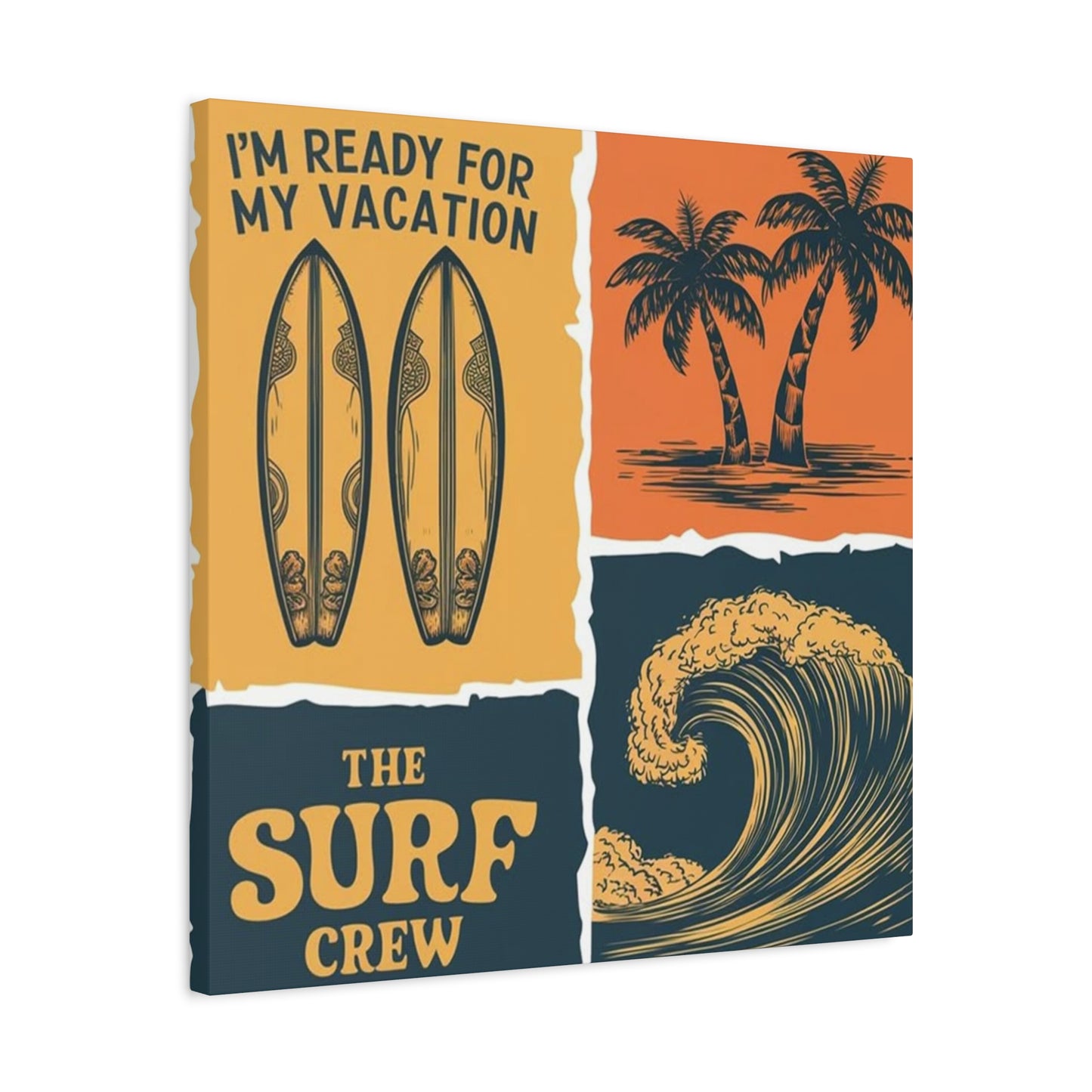
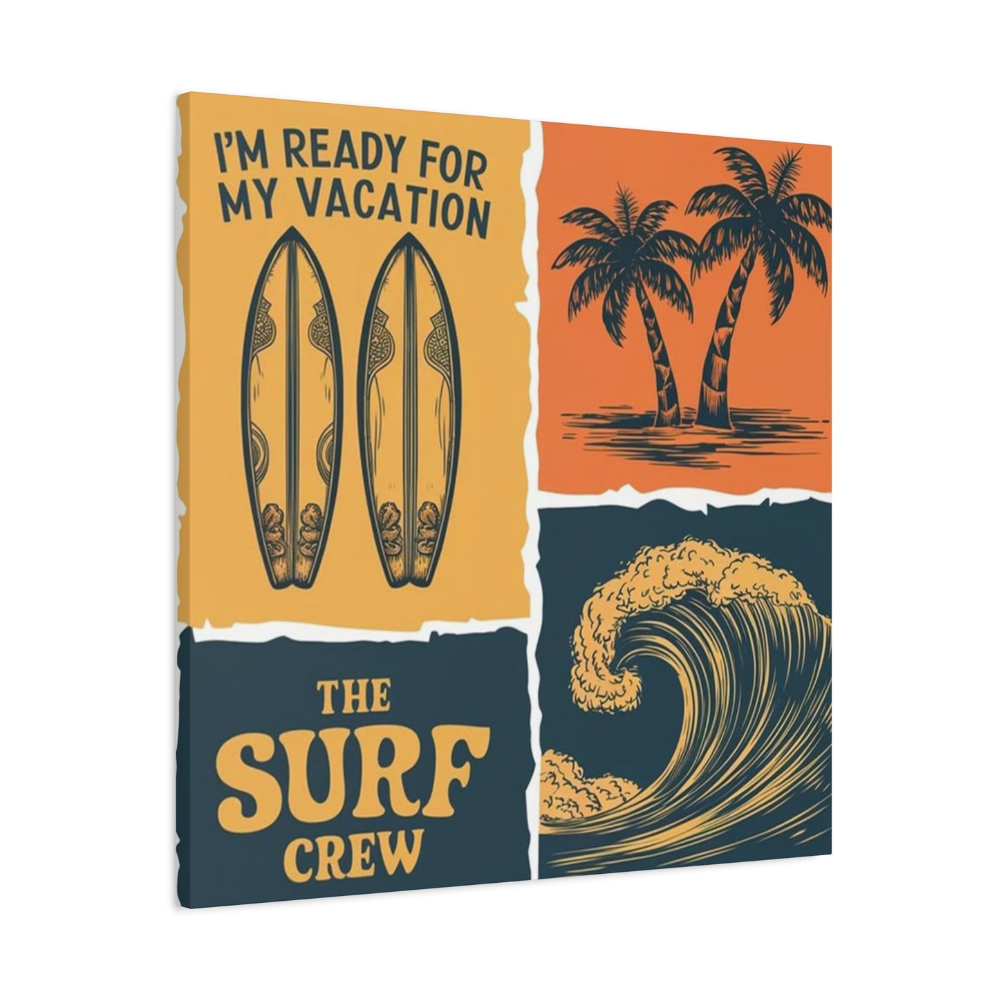
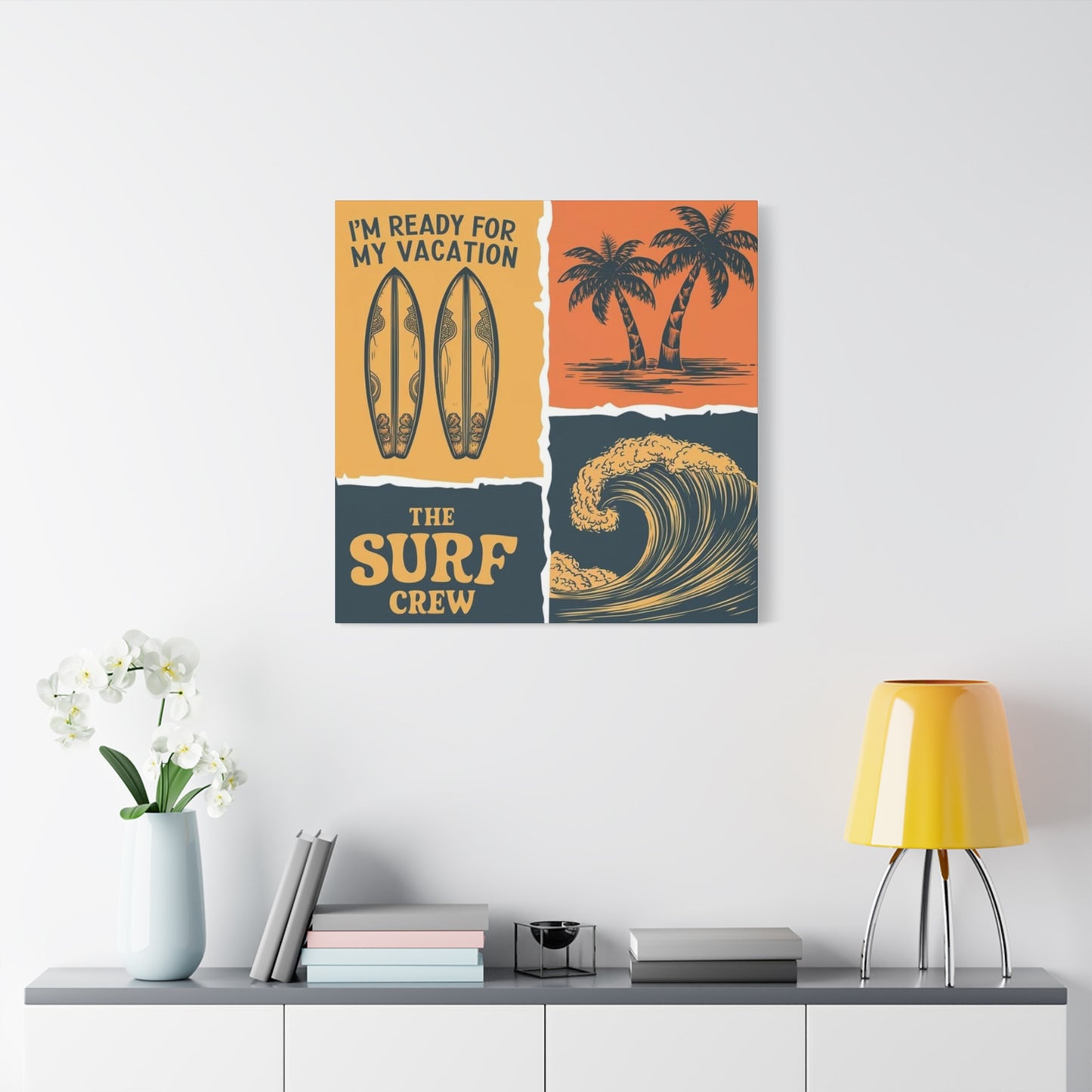
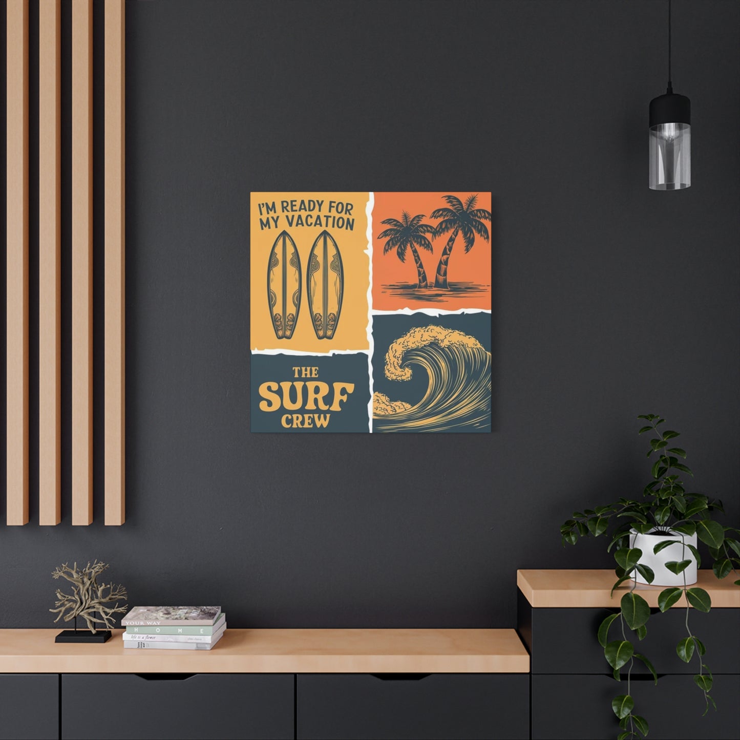
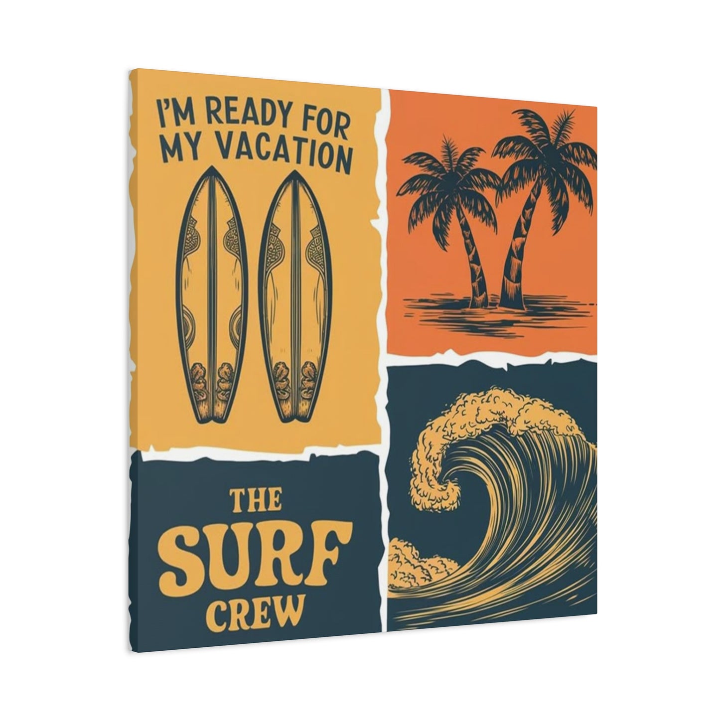
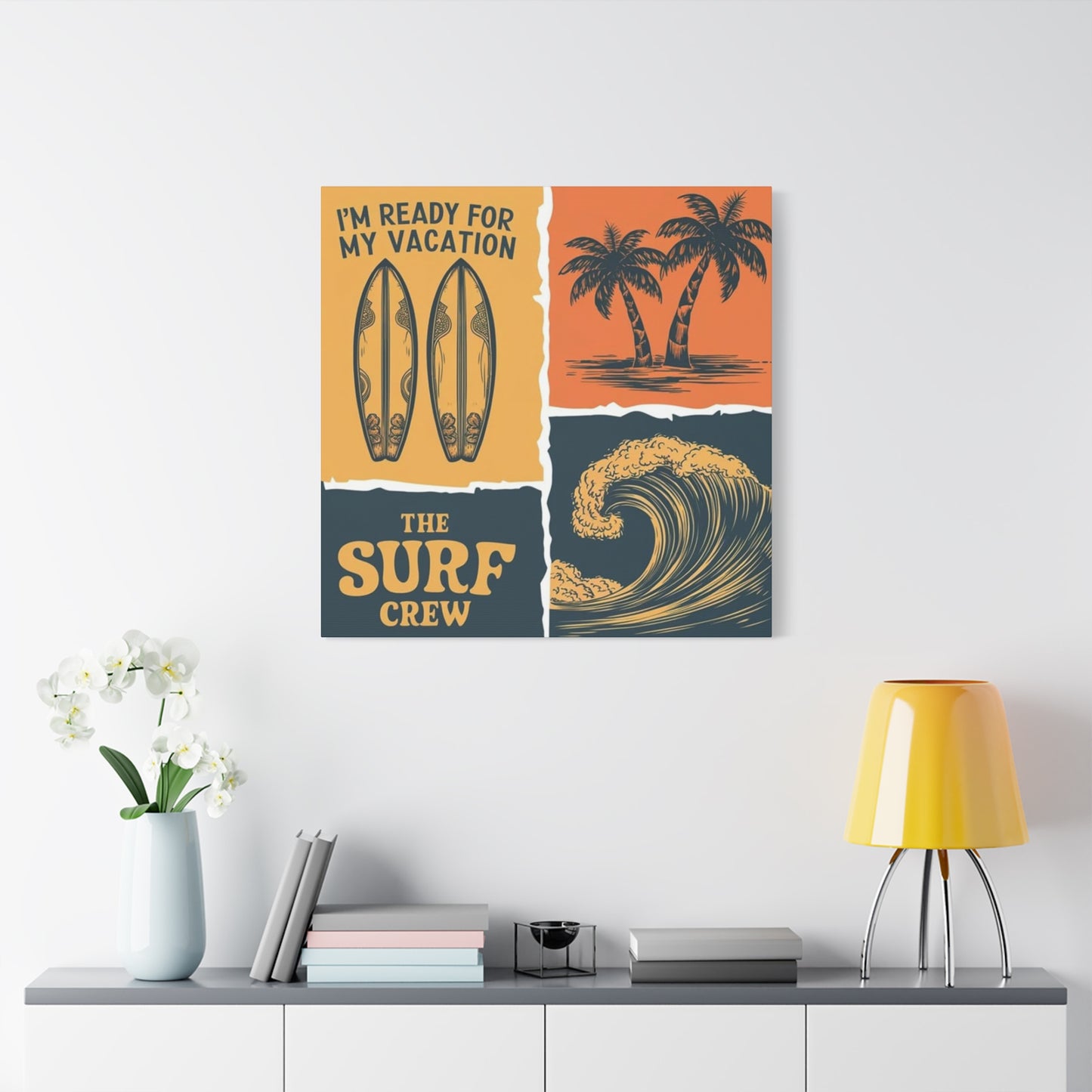
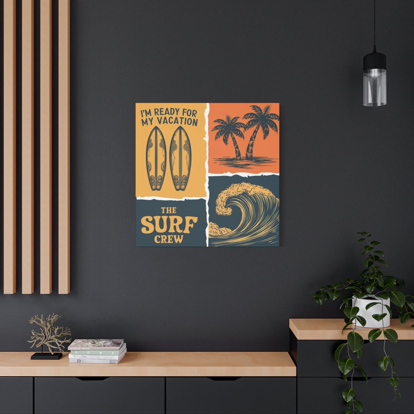
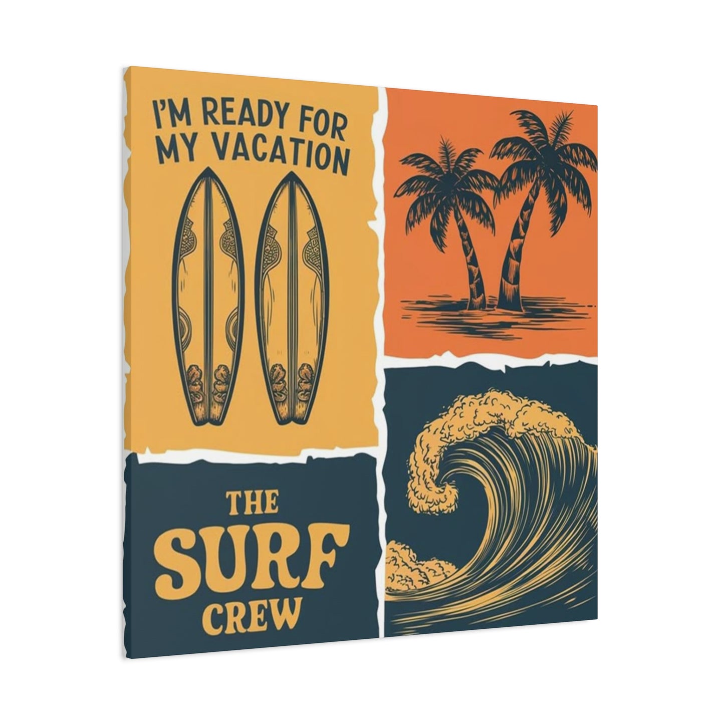
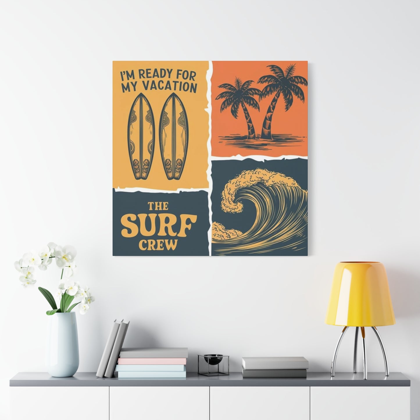
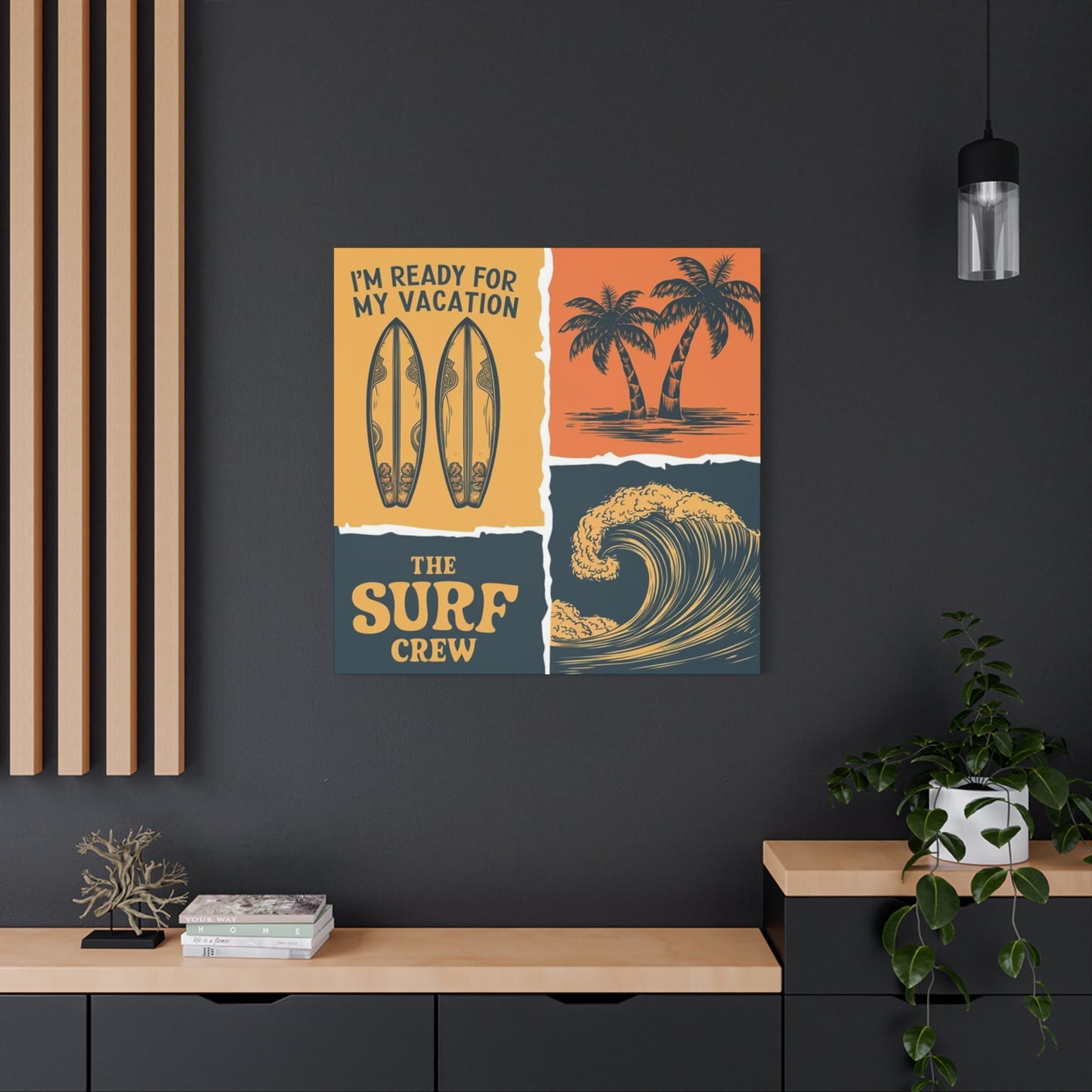
Vintage-inspired artwork channels the golden era of surf culture, incorporating retro color palettes, distressed textures, and nostalgic typography that evokes mid-century beach communities and the pioneering days of modern surfing. These pieces often feature classic longboard shapes, woody station wagons, and simplified illustrative styles that appeal to those seeking connections with surfing's heritage and the romanticized lifestyle associated with coastal living.
Minimalist approaches strip surfing imagery to essential elements, perhaps featuring solitary figures against expansive ocean vistas or simple silhouettes that suggest rather than detail the activity. This aesthetic aligns perfectly with contemporary design trends emphasizing clean lines, negative space, and subtle sophistication. The restraint in these compositions allows them to integrate seamlessly into refined interiors without overwhelming other design elements.
Contemporary digital art brings innovative perspectives to surfing imagery through creative manipulation, composite imaging, and artistic effects that push beyond traditional photography or illustration. These pieces might incorporate multiple exposures, color grading that emphasizes particular moods, or graphical elements that blend realism with stylization. The result is artwork that feels fresh, dynamic, and aligned with modern visual culture.
Traditional painting styles translated to canvas prints offer texture-rich alternatives that mimic the appearance of original artwork. Whether rendered in oil painting effects, watercolor aesthetics, or acrylic-style compositions, these pieces provide the visual richness of handcrafted art at accessible price points. The brushstroke textures and layered color approaches add dimensional quality that flat photography cannot achieve.
Action-focused imagery captures the explosive energy of critical surfing moments including tube rides, aerial maneuvers, and powerful bottom turns. These dramatic compositions emphasize athleticism, risk, and the spectacular nature of high-performance wave riding. Such pieces naturally draw the eye and create focal points within rooms, making them ideal statement pieces for spaces seeking dynamic energy.
Lifestyle and cultural imagery extends beyond the act of surfing itself to encompass the broader beach culture including surf camps, oceanfront gatherings, equipment preparations, and contemplative moments between sessions. These narrative-rich pieces tell stories about community, passion, and the rituals surrounding wave riding, appealing to those who connect with the lifestyle dimensions as much as the sport itself.
Environmental and conservation-themed artwork highlights the natural beauty of coastal ecosystems while sometimes addressing themes of ocean protection and environmental stewardship. These pieces may showcase pristine breaks, marine life, or the delicate balance of coastal environments, appealing to the growing demographic of environmentally conscious consumers who view surfing as inseparable from ocean advocacy.
Canvas Material Quality and Production Methods
The substrate quality of canvas prints fundamentally determines their longevity, appearance, and value. Premium cotton canvas offers superior texture, color absorption, and durability compared to synthetic alternatives. The thread count of canvas fabric affects print resolution and texture, with higher counts providing smoother surfaces that capture fine details while lower counts offer more pronounced fabric texture that adds artistic character.
Polyester canvas blends provide cost-effective alternatives with enhanced moisture resistance and dimensional stability. These materials resist warping and sagging better than pure cotton in humid environments, making them practical choices for coastal properties where humidity levels fluctuate. However, they may lack the organic texture and traditional aesthetic appeal that cotton provides, representing a trade-off between practicality and conventional artistic presentation.
The preparation and priming of canvas surfaces directly impacts print quality and longevity. Multiple gesso layers create smooth, receptive surfaces that prevent ink absorption into raw fibers while providing archival protection. Proper priming ensures consistent color reproduction across the entire print surface and prevents the textile weave from interfering with image clarity in detailed compositions.
Printing technology selection dramatically influences the final product quality. Giclée printing represents the premium standard, utilizing archival-grade pigment inks that resist fading for decades when properly displayed. This museum-quality approach produces exceptional color accuracy, smooth gradations, and detail preservation that lesser printing methods cannot match. The investment in giclée printing pays dividends through superior visual impact and extended lifespan.
Dye-sublimation printing offers vibrant color saturation and smooth finishes particularly suited to photographic images. This heat-transfer method embeds inks into fabric fibers rather than layering them on surfaces, creating prints highly resistant to scratching and moisture. The technology excels at reproducing the bright blues of ocean water and vivid sunset colors common in surfing imagery, though it may sacrifice some detail resolution compared to giclée methods.
Ink quality determines color permanence and fade resistance over time. Archival pigment inks contain lightfast compounds that maintain color integrity for seventy-five years or more under proper conditions, while dye-based inks may fade noticeably within months when exposed to direct sunlight. Understanding ink specifications becomes crucial when selecting canvas prints intended as long-term investments rather than temporary decorations.
UV protective coatings applied after printing shield artwork from the degrading effects of sunlight and ambient light exposure. These clear layers act as barriers against ultraviolet radiation while enhancing color vibrancy and providing some moisture resistance. Quality protective coatings maintain transparency and flexibility, avoiding the yellowing and cracking that inferior products develop over time.
Texture enhancement techniques add dimensional quality that distinguishes premium canvas prints from flat reproductions. Gel overlays, varnish applications, and embossing processes create tactile surfaces that mimic original paintings, adding depth perception and artistic authenticity. These finishing touches transform printed reproductions into art objects with physical presence that commands attention within spaces.
Color calibration and profile management ensure accurate reproduction of original images across different printing systems and viewing conditions. Professional color management accounts for how different lighting environments affect perceived colors, adjusting prints so they appear as intended whether displayed under warm incandescent, cool fluorescent, or natural daylight conditions. This technical precision separates professional-grade prints from amateur productions.
Framing Structures and Mounting Systems
Gallery wrap construction represents the most popular mounting method for canvas prints, stretching printed fabric around wooden frame structures so images continue around edges. This presentation eliminates the need for additional framing while creating a three-dimensional object that projects from walls with architectural presence. The depth of stretcher bars typically ranges from three-quarters of an inch to two inches, with deeper profiles creating more dramatic shadow effects and sculptural quality.
Traditional wooden stretcher bars constructed from kiln-dried pine or similar materials provide sturdy frameworks that maintain canvas tension without warping. Corner joints employ either stapled construction for economy or mortise-and-tenon joinery for superior strength and longevity. Quality stretcher bars include cross-braces on larger formats to prevent sagging and maintain perfect planar surfaces essential for proper image display.
Floating frame additions surround gallery-wrapped canvases with decorative borders that create visual separation from walls while adding refined finishing touches. These frames typically mount slightly away from canvas edges, creating shadow gaps that emphasize the three-dimensional nature of canvas art. Material choices range from natural woods to metallic finishes, allowing customization that aligns with specific interior design schemes.
Metal frame systems offer contemporary alternatives with slim profiles and industrial aesthetics. Aluminum and steel constructions provide exceptional strength-to-weight ratios, supporting large-format prints without bulky appearance. These systems often include integrated hanging mechanisms and sometimes feature interchangeable frame components that allow aesthetic updates without replacing entire artworks.
Frameless mounting systems utilize specialized hardware that secures canvases to walls while maintaining clean, minimalist presentations. Clips, standoffs, and bracket systems keep artwork floating away from wall surfaces, creating modern installations that emphasize the artwork itself without decorative borders. These approaches work particularly well in contemporary spaces where architectural simplicity is valued.
Protective frame options incorporate acrylic or glass panels that shield canvas surfaces from physical contact, dust accumulation, and environmental contaminants. While traditional canvas displays leave surfaces exposed, protective glazing extends longevity in high-traffic areas or challenging environments. Anti-reflective coatings on protective panels maintain visual clarity while preventing glare that would otherwise interfere with viewing experiences.
Corner protection hardware reinforces vulnerable areas where frames naturally experience stress from handling and environmental changes. Metal or plastic corner guards distribute forces that would otherwise concentrate at joints, preventing separation and maintaining structural integrity through years of display. This seemingly minor detail significantly impacts the practical lifespan of canvas artworks.
Hanging hardware selection affects both installation security and adjustment flexibility. Wire hanging systems with D-rings offer traditional reliability and allow minor leveling adjustments after mounting. French cleat systems provide superior load distribution and security for larger, heavier pieces while enabling effortless removal for cleaning or relocation. Sawtooth hangers offer simplicity for smaller formats but lack the adjustment capabilities of more sophisticated systems.
Moisture barrier backing boards protect canvas reverses from environmental humidity, dust infiltration, and insect intrusion. Acid-free materials prevent chemical interactions that could degrade canvas fibers over decades, while sealed construction maintains the integrity of internal stretcher assemblies. These protective elements rarely receive attention but substantially contribute to artwork preservation.
Size Selection and Spatial Proportions
Determining appropriate canvas dimensions requires careful consideration of wall dimensions, viewing distances, and surrounding design elements. Undersized artwork appears lost on expansive walls, failing to create visual impact or anchor furniture arrangements effectively. Conversely, oversized pieces overwhelm intimate spaces, dominating rooms rather than enhancing them. The relationship between canvas size and wall area should follow proportional guidelines that create balanced, harmonious presentations.
Single large-format canvases make bold statements appropriate for primary walls in living rooms, above sofas, or as focal points in entryways. Dimensions exceeding forty inches in width or height command attention and work best when given adequate surrounding space to breathe visually. These statement pieces should represent carefully considered selections since their prominence makes them central to overall room aesthetics.
Medium-sized options ranging from twenty to forty inches suit diverse applications including bedroom walls, dining areas, hallways, and office spaces. Their versatility allows effective display in both prominent and secondary locations without overwhelming or disappearing within contexts. Multiple medium pieces can be arranged in gallery configurations that create cohesive visual narratives larger than individual components.
Small-format canvases under twenty inches function as accent pieces that complement rather than dominate spaces. These modest dimensions work beautifully in powder rooms, small bedrooms, office cubicles, or as components within larger gallery wall arrangements. Their scale makes them accessible entry points for those beginning art collections or working within limited budgets.
Multi-panel installations distribute single images across multiple separate canvases, creating contemporary presentations with built-in visual rhythm. Triptychs split compositions into three sections, while polyptychs may include five or more panels. The spacing between panels becomes a design element itself, with gaps typically ranging from two to six inches depending on overall dimensions and aesthetic preferences. These installations suit large walls where single oversized canvases might prove impractical.
Panoramic formats emphasize horizontal or vertical orientations that complement specific architectural features. Horizontal panoramas work beautifully above low furniture pieces, emphasizing room width and creating visual flow. Vertical formats suit narrow wall spaces, emphasize ceiling height, and draw eyes upward in ways standard proportions cannot achieve. Surfing imagery particularly suits panoramic formats that mirror the horizontal expanse of ocean horizons.
Square formats offer balanced compositions that work effectively in modern interiors and can be easily arranged in grid patterns. While less common for landscape-oriented surfing imagery, square presentations focus attention on central subjects and work beautifully when multiple pieces are displayed together. Their geometric simplicity aligns with minimalist and contemporary design philosophies.
Custom sizing accommodates specific spatial requirements and unique design visions. While standard sizes offer economic advantages through production efficiencies, custom dimensions ensure perfect proportions for particular locations. Architectural elements like fireplace mantels, stairwell walls, or unusual alcoves may require non-standard dimensions that maximize visual impact within constrained spaces.
Aspect ratio considerations affect how compositions feel within spaces. Traditional photographic ratios like three-to-two or four-to-three create familiar, balanced presentations. Wider ratios emphasize horizontal sweep and work particularly well for beach scenes and wave formations. Understanding how different ratios affect visual perception helps in selecting pieces that align with both image content and spatial requirements.
Color Palette Coordination with Interior Design
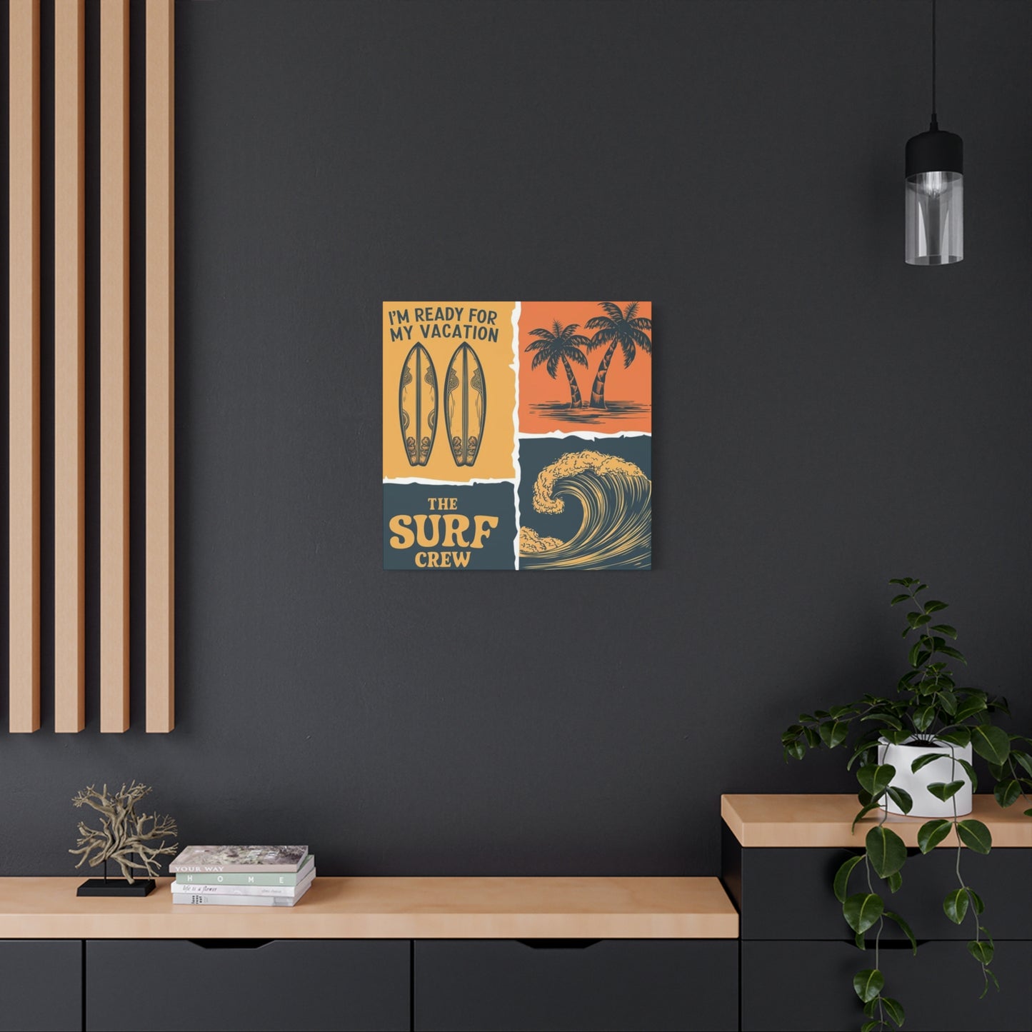
Coordinating canvas artwork colors with existing interior palettes creates cohesive environments where art enhances rather than conflicts with surrounding elements. Analyzing dominant room colors establishes foundation points for artwork selection. Walls, major furniture pieces, flooring, and window treatments typically establish color contexts that artwork should either complement or purposefully contrast against.
Monochromatic color schemes within surfing artwork emphasize tonal variations of single hues, creating sophisticated, restrained presentations. Black and white imagery offers timeless elegance that transcends decorating trends while providing dramatic visual impact through contrast and composition. Sepia or blue monochrome variations add subtle color while maintaining simplified palettes that integrate easily into diverse design schemes.
Complementary color relationships place opposite hues together for maximum visual vibration and energy. Surfing imagery naturally incorporates blue ocean tones that complement orange sunset skies, creating dynamic color interactions. Understanding color wheel relationships helps predict how artwork will interact visually with surrounding room elements, ensuring planned aesthetic outcomes rather than accidental clashes.
Analogous color harmonies utilize adjacent hues on color wheels, creating subtle, sophisticated relationships. Blues transitioning through teals to greens mirror natural ocean color progressions while maintaining visual coherence. These gentle color relationships create soothing, unified environments particularly suitable for bedrooms, meditation spaces, or areas intended for relaxation.
Neutral base palettes with accent colors allow artwork to introduce visual interest into otherwise restrained environments. Rooms dominated by whites, grays, and beiges provide blank canvases where colorful surfing imagery becomes the primary source of chromatic energy. This approach ensures artwork receives maximum attention while maintaining overall environmental sophistication.
Seasonal color considerations recognize how changing natural light affects color perception throughout the year. Colors appearing vibrant under summer sunlight may seem dull in winter's weaker illumination. Selecting artwork with adequate color saturation ensures visual impact remains consistent across seasonal lighting variations, preventing pieces from fading into backgrounds during darker months.
Temperature balance between warm and cool tones affects emotional responses to spaces. Cool blue ocean tones create calming, serene environments while warm sunset oranges energize and invigorate. Understanding the psychological effects of color temperatures helps select artwork that reinforces intended room atmospheres, whether seeking relaxation retreats or energizing creative workspaces.
Metallic accent integration through frame selections or within artwork itself adds contemporary sophistication and light-reflective qualities. Gold tones introduce warmth and luxury while silver and chrome create modern, crisp aesthetics. Bronze and copper provide middle-ground options with organic warmth. Metallic elements catch and reflect ambient light, adding dynamic qualities that shift throughout days as lighting conditions change.
Pattern and texture coordination extends beyond pure color matching to consider how canvas textures, frame materials, and image compositions interact with surrounding textiles, flooring, and architectural details. Smooth minimalist interiors might welcome textural contrast from pronounced canvas weaves, while busy patterned rooms benefit from simpler, smoother art surfaces that provide visual resting places.
Placement Strategies and Display Considerations
Strategic positioning maximizes both artwork visibility and environmental harmony. The sixty-inch rule suggests center points of artwork should align approximately sixty inches from floor levels, mirroring average eye heights and museum display standards. This guideline ensures comfortable viewing without neck strain while creating visually balanced relationships with furniture and architectural features.
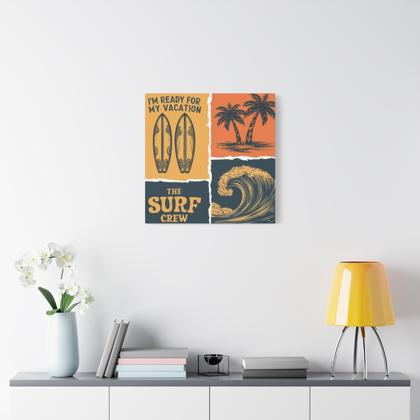
Above-furniture placement follows specific spacing principles for optimal visual relationships. Canvas bottom edges should sit six to twelve inches above furniture tops, creating connected relationships without artwork appearing to float disconnectedly. This spacing proves particularly important above sofas, beds, and console tables where too much gap destroys visual anchoring while insufficient clearance creates cramped, uncomfortable arrangements.
Focal wall identification determines which surfaces receive primary artistic attention. Walls immediately visible upon entering rooms, those behind seating arrangements, or surfaces lacking architectural features like windows often serve as ideal focal points. Concentrating significant artwork on these walls creates intentional visual hierarchies that guide attention and establish room organization.
Lighting integration dramatically affects artwork visibility and impact. Natural light from windows provides ideal illumination but requires careful consideration of sun paths to prevent direct exposure that accelerates fading. Artificial lighting through track lights, picture lights, or adjustable spotlights allows precise control over artwork illumination, creating dramatic presentations that highlight textures and colors while controlling glare.
Gallery wall configurations arrange multiple pieces into cohesive installations that function as unified visual statements. Symmetrical grid arrangements create orderly, formal presentations while asymmetrical organic layouts offer casual, collected aesthetics. Maintaining consistent spacing between frames, typically two to six inches, creates visual rhythm that unifies diverse pieces into coherent installations.
Corner placement utilizes often-neglected spaces to create unexpected visual moments. Wrapping artwork around corners or positioning pieces where walls meet draws attention to architectural transitions while making efficient use of available surfaces. This approach works particularly well in narrow hallways or small rooms where traditional wall centers lack adequate space.
Ceiling height considerations affect artwork scale and positioning. Standard eight-foot ceilings limit oversized artwork while rooms with ten or twelve-foot heights accommodate larger pieces and vertical arrangements that emphasize architectural volume. Vaulted or cathedral ceilings present unique opportunities for dramatic displays that would overwhelm standard-height rooms.
Grouping related themes creates narrative relationships between multiple pieces. Collections showing different surfing locations, various wave conditions, or progressive action sequences tell visual stories that single images cannot convey. Thematic unity through subject matter, color palette, or artistic style binds separate pieces into cohesive presentations with greater cumulative impact than individual components.
Negative space appreciation recognizes that empty wall areas surrounding artwork contribute equally to overall presentations. Crowding walls with excessive art diminishes individual piece impact while generous negative space allows each work to command attention. Balancing filled and empty areas creates sophisticated environments that feel curated rather than cluttered.
Cultural Significance and Lifestyle Connections
Surfing culture represents more than athletic pursuit; it embodies philosophical approaches to life emphasizing harmony with nature, present-moment awareness, and pursuit of passion over material accumulation. Canvas artwork depicting wave riding connects with these deeper cultural currents, allowing individuals to signal alignment with lifestyle values even when geographic or practical constraints prevent regular ocean access.
The spiritual dimensions of surfing resonate through visual representations that capture moments of flow state, where riders achieve complete mental presence and unity with natural forces. These transcendent experiences translate into imagery that speaks to universal human desires for meaning, connection, and escape from mundane concerns. Displaying such artwork creates daily reminders of these elevated states and the possibility of accessing them through various life pursuits.
Environmental consciousness deeply intertwines with surfing culture, as practitioners maintain intimate relationships with ocean ecosystems and witness firsthand the impacts of pollution, climate change, and coastal development. Artwork celebrating pristine breaks and powerful waves implicitly advocates for environmental protection, allowing spaces to reflect conservation values. This alignment proves increasingly important to demographics prioritizing sustainability and ecological responsibility.
Community aspects of surf culture emphasize camaraderie, local traditions, and shared experiences in pursuit of waves. Imagery depicting lineups, beach gatherings, or cultural rituals surrounding surfing speaks to human needs for belonging and meaningful social connection. These pieces resonate particularly with those who've experienced surf communities or aspire to participate in such cultures.
The freedom mythology surrounding surfing appeals broadly to modern sensibilities constrained by urban living, demanding careers, and technological saturation. Visual representations of individuals engaged in primal interaction with natural forces tap into archetypal longings for liberation from societal constraints. This symbolic resonance explains why surfing imagery appeals far beyond actual practitioners to include those simply drawn to the lifestyle's perceived freedom.
Athletic excellence showcased in action imagery celebrates human capability, determination, and the pursuit of mastery. These representations inspire viewers through demonstrations of skill, courage, and dedication required to perform at high levels in challenging environments. The universal appeal of athletic achievement transcends specific sport interest, making dynamic surfing imagery broadly accessible.
Geographical associations connect specific surf breaks with particular cultural identities and regional characteristics. Pipeline imagery evokes Hawaiian culture and island aesthetics, California beach scenes channel Golden State casual lifestyle, while Australian breaks suggest rugged frontier independence. These geographical connections allow artwork to represent specific places and associated cultural qualities without literal depiction.
Historical progression within surfing culture, from ancient Polynesian traditions through mid-century California development to contemporary global proliferation, provides rich visual vocabulary. Vintage-styled artwork channels specific historical periods, accessing nostalgia and romanticism associated with surfing's past. Understanding these historical dimensions adds depth to artwork appreciation beyond purely aesthetic considerations.
The countercultural heritage of surfing, with roots in rejecting conventional career paths and mainstream values, maintains contemporary relevance. Despite surfing's increased commercialization, its imagery still carries rebellious undertones and associations with alternative lifestyles. This cultural positioning appeals to those maintaining or aspiring toward non-conformist identities even within conventional societal roles.
Maintenance Practices and Longevity Preservation
Regular dusting prevents particle accumulation that dulls colors and embeds into canvas textures. Soft microfiber cloths gently swept across surfaces remove loose dust without grinding particles into fabric weaves. Feather dusters provide alternative approaches, particularly effective for textured surfaces where cloth fibers might catch. Establishing monthly cleaning routines prevents buildup that requires more aggressive intervention.
Humidity control protects canvas from dimensional changes that cause warping, sagging, or mold development. Maintaining relative humidity between forty and sixty percent prevents excessive moisture absorption while avoiding brittleness from over-drying. Dehumidifiers in damp climates and humidifiers in arid regions help maintain optimal conditions. Coastal properties face particular challenges from salt-laden air requiring extra vigilance against moisture-related degradation.
Temperature stability prevents expansion and contraction cycles that stress canvas and mounting systems. Avoiding placement near heating vents, fireplaces, or exterior doors subject to temperature fluctuations extends artwork lifespan. Ideal display temperatures range from sixty-five to seventy-five degrees Fahrenheit with minimal daily variation. Climate-controlled environments provide ideal preservation conditions for valuable pieces.
Sunlight protection represents the single most important preservation factor for canvas artwork. Direct sunlight accelerates fading even in prints using archival inks, while ultraviolet radiation causes chemical breakdown of canvas fibers and protective coatings. Window films, UV-filtering glass, curtains, and strategic positioning away from direct sun exposure all contribute to preservation. Even indirect bright light causes cumulative damage over years, warranting consideration of light exposure in placement decisions.
Cleaning methods for soiled canvases require gentle approaches that avoid damaging delicate surfaces. Slightly damp microfiber cloths remove surface grime from protective coatings without saturating canvas backing. Commercial canvas cleaning products designed specifically for artwork provide safe alternatives to household cleaners containing harsh chemicals. Testing cleaning methods on inconspicuous areas prevents widespread damage from incompatible products or techniques.
Professional conservation services address serious damage or valuable pieces requiring expert attention. Conservators can repair tears, restore faded colors, replace damaged stretcher bars, and apply fresh protective coatings. While representing significant investment, professional intervention often proves cost-effective compared to replacing damaged pieces, particularly for limited editions or artwork with sentimental value.
Rotation strategies distribute light exposure and environmental stress across multiple pieces rather than subjecting single works to continuous display. Periodically swapping displayed artwork with stored pieces extends overall collection longevity while refreshing interior appearances. This approach particularly benefits those maintaining larger collections than wall space accommodates simultaneously.
Storage protocols for artwork not currently displayed require acid-free materials and stable environments. Canvas should be stored flat rather than rolled when possible to prevent creasing. Protective wrapping prevents dust accumulation and physical damage while allowing air circulation to prevent moisture entrapment. Climate-controlled storage spaces protect against temperature and humidity extremes during extended storage periods.
Insurance documentation through photographs, purchase receipts, and condition reports protects investment value. Regularly updated documentation proves essential for insurance claims following damage, theft, or loss. Detailed records including dimensions, edition numbers, artist information, and purchase prices facilitate accurate valuation and replacement should unfortunate circumstances occur.
Psychological Impacts and Emotional Resonance
Color psychology influences mood and mental states through visual stimulation of specific neural pathways. Blue tones predominant in ocean imagery promote calmness, reduce stress, and lower blood pressure according to numerous psychological studies. The prevalence of blue in surfing artwork contributes to its effectiveness in creating relaxing environments, particularly valuable in bedrooms, meditation spaces, or areas designated for unwinding.
Biophilic design principles recognize humans' innate connection to natural environments and the psychological benefits of nature representation within built spaces. Surfing imagery provides powerful biophilic elements through depictions of water, sky, and natural landscapes. These connections to nature reduce stress, improve cognitive function, and enhance overall wellbeing even when actual nature access remains limited.
The escapism facilitated by engaging ocean imagery allows mental transportation from current circumstances to imagined coastal environments. This temporary psychological displacement provides valuable stress relief and mental restoration. The effectiveness of artwork as mental escape depends partly on personal associations, with those having positive beach memories experiencing stronger responses to coastal imagery.
Motion and energy conveyed through action photography or dynamic compositions stimulate viewer engagement and create room energy. Static imagery generally produces calming effects while dynamic scenes energize and invigorate. Understanding these psychological impacts helps select artwork appropriate to intended room purposes, whether seeking energizing spaces for creative work or calming environments for rest.
Personal identity expression through display choices allows individuals to communicate values, interests, and aspirations to visitors while reinforcing self-concept. Surfing artwork signals connections to outdoor culture, athletic pursuits, and environmental awareness. This identity broadcasting serves important social functions while also reminding owners of personal values and priorities.
Nostalgia activation through imagery recalling past experiences or idealized periods generates positive emotions and life satisfaction. Vintage surf imagery particularly excels at triggering nostalgic responses, even in those who didn't personally experience depicted eras. This emotional time travel provides comfort and connection to broader cultural narratives beyond individual experience.
Aspiration and goal reinforcement occurs when artwork depicts activities or lifestyles individuals pursue or wish to achieve. Surfing imagery for non-surfers may represent aspirational goals, while active surfers find reinforcement of their commitment to the pursuit. Visual reminders of aspirations maintain motivational focus and strengthen identity alignment with desired lifestyle directions.
Conversation facilitation through interesting artwork creates social opportunities and eases interpersonal interactions. Distinctive pieces provide natural discussion topics, helping guests feel comfortable while revealing shared interests. This social lubrication function proves particularly valuable in spaces where previously unacquainted individuals interact.
Mood regulation through environmental design recognizes that surroundings significantly impact emotional states. Strategic artwork selection contributes to environments supporting desired psychological conditions whether energy, calm, creativity, or focus. Understanding one's emotional responses to different imagery types enables intentional environmental design that supports mental health and daily functioning.
Economic Considerations and Investment Value
Price ranges for surfing canvas prints span from affordable decorative pieces under fifty dollars to investment-grade limited editions commanding thousands. Understanding value determinants helps make informed purchasing decisions aligned with both aesthetic preferences and financial parameters. Reproduction quantity, artist reputation, image licensing costs, production quality, and size all influence pricing structures.
Mass-produced prints using standard printing processes and inexpensive materials provide accessible entry points for those prioritizing decoration over investment. These pieces fulfill aesthetic functions without significant financial commitment, suiting rental properties, temporary installations, or those exploring style preferences before substantial investment. Understanding their limited lifespan and lack of appreciation potential manages expectations appropriately.
Limited edition prints signed and numbered by photographers or artists carry collectibility and potential appreciation value. Smaller edition sizes generally command higher prices and better appreciation prospects. Documentation including certificates of authenticity, edition information, and artist signatures substantially affects resale value. These pieces occupy middle ground between mass production and original artwork.
Commissioned custom work represents the premium tier, offering unique pieces tailored to specific preferences. Working directly with photographers or artists to create custom surfing imagery ensures absolute uniqueness while supporting creative professionals. These investments suit those seeking one-of-a-kind statements or having specific vision elements unavailable through existing work.
Resale market considerations affect purchasing decisions for those viewing artwork partly as financial investment. Researching artists' secondary market performance, tracking auction results, and understanding collectibility factors helps identify pieces most likely to appreciate. While art should primarily be selected for personal enjoyment, understanding financial dimensions provides additional decision-making information.
Quality versus cost analysis examines whether premium pricing truly reflects superior materials and production or simply represents brand markup. Comparing specifications including canvas material, ink types, protective coatings, and frame construction across price points identifies best values. Sometimes mid-priced options offer ninety percent of premium quality at fifty percent of the cost.
Volume discounts through multi-piece purchases or periodic sales provide cost savings for those acquiring multiple works. Many retailers offer gallery wall collections at reduced per-piece pricing or seasonal promotions reducing regular prices. Patient shoppers willing to wait for sales can significantly reduce acquisition costs without quality compromise.
Financing options make premium artwork accessible through installment payment plans spreading costs over time. Some galleries and online retailers offer interest-free payment scheduling, eliminating barriers to acquiring desired pieces. This accessibility democratizes art collecting, though careful consideration of total committed expenditure remains important.
Comparative value assessment weighs artwork costs against alternative expenditures like dining out, entertainment subscriptions, or other discretionary spending. Quality canvas prints provide years of daily enjoyment, potentially offering superior value per use compared to ephemeral experiences. This perspective helps justify seemingly significant upfront costs when considered across anticipated ownership duration.
Environmental Impact and Sustainable Production
Eco-conscious consumers increasingly consider environmental implications of purchasing decisions including artwork acquisition. Canvas production sustainability varies dramatically based on material sourcing, manufacturing processes, and company practices. Cotton canvas from organic, responsibly farmed sources minimizes agricultural chemical usage and water consumption compared to conventional cotton requiring heavy pesticide applications.
Ink formulation environmental impact ranges from solvent-based products releasing volatile organic compounds to water-based alternatives with minimal atmospheric impact. Pigment-based archival inks generally demonstrate better environmental profiles than dye-based alternatives while also offering superior longevity. Understanding ink specifications addresses both preservation and environmental considerations simultaneously.
Manufacturing location affects carbon footprints through transportation requirements. Locally produced artwork minimizes shipping emissions while supporting regional economies. Conversely, overseas production may offer cost advantages but carries environmental costs through international freight. Balancing these considerations requires weighing priorities around price, environmental impact, and economic support preferences.
Packaging materials generate waste ranging from minimal paper wrapping to elaborate multi-material protection systems. Environmentally conscious producers utilize recycled cardboard, biodegradable corner protectors, and minimal plastic components. Requesting minimal packaging or selecting companies with demonstrated sustainability commitments reduces acquisition environmental impact.
Company environmental practices beyond specific product considerations include renewable energy usage, waste reduction programs, and carbon offset participation. Researching producer commitments to environmental responsibility helps direct purchases toward aligned businesses. Third-party certifications including B Corp status or specific environmental standard compliance provide objective validation of environmental claims.
Longevity as sustainability recognizes that durable goods requiring infrequent replacement demonstrate better environmental profiles than disposable alternatives despite potentially higher production impacts. Quality canvas prints lasting decades generate far less cumulative environmental impact than cheap alternatives requiring frequent replacement. This perspective argues for quality investment over budget economy.
Secondhand market participation through purchasing vintage or previously owned artwork maximizes item utility while avoiding new production resource consumption. Though less common for canvas prints than original artwork, secondary markets exist particularly for limited editions. This approach combines sustainability with potential cost savings and access to discontinued designs.
End-of-life considerations address disposal when artwork finally reaches unusable condition. Canvas and wooden stretcher components offer recyclability or biodegradability superior to plastic-based alternatives. Minimizing synthetic materials in frame construction and finishes facilitates environmentally responsible disposal when pieces ultimately need replacement.
Conscious consumption overall represents the most significant environmental consideration, questioning whether acquisition genuinely serves needs or represents impulse purchasing contributing to overconsumption. Thoughtfully selecting fewer high-quality pieces that truly resonate creates more meaningful environments while reducing overall consumption impacts compared to accumulating numerous marginal items.
Contemporary Trends in Surfing Artwork
Drone photography perspectives provide unprecedented aerial viewpoints showcasing wave formations, surfer positioning, and coastal geography from birds-eye angles. These dramatic vantage points create striking compositions impossible from ground level, offering fresh perspectives on familiar subjects. The technology's accessibility has democratized these perspectives while its novelty maintains strong contemporary appeal.
Underwater perspectives capture the aquatic environment from surfers' experiential viewpoint, showing wave structures from below and creating immersive visual experiences. Specialized camera housings and waterproof equipment enable photographers to document the underwater dimension of surfing, revealing aspects invisible to beach observers. These images offer unique aesthetic qualities through water distortion, lighting effects, and intimate perspectives.
Women surfers receive increased representation reflecting the sport's growing gender diversity and broader cultural movements toward equality and representation. Contemporary artwork increasingly showcases female athletes and recreational surfers, moving beyond historically male-dominated imagery. This shift appeals to expanding demographics while reflecting authentic current surfing culture.
Diversity and inclusion in subject representation acknowledges surfing's global reach across cultures, ages, and body types. Moving beyond stereotypical depictions of young, fit, Western surfers, contemporary imagery embraces the activity's authentic diversity. This inclusivity resonates with broader audiences seeing themselves represented while avoiding limiting stereotypes.
Minimalist aesthetic continuation dominates contemporary design across disciplines including art, with surfing imagery adapting through simplified compositions, limited color palettes, and emphasis on negative space. These pared-down approaches align with modern interior design trends while offering timeless qualities transcending temporary fads. The aesthetic proves particularly compatible with Scandinavian, Japanese, and contemporary Western design philosophies.
Retro revival cycles through vintage aesthetics from various eras, currently emphasizing nineteen-seventies and nineteen-eighties styles. Color palettes, graphic treatments, and compositional approaches from these periods appear in contemporary work, appealing to nostalgia while offering alternatives to ultra-modern aesthetics. These cyclical trends demonstrate how design continuously reinterprets historical influences.
Environmental messaging integration addresses ocean conservation, climate change, and pollution through imagery and sometimes accompanying text. Artists increasingly use their platforms for advocacy, creating work that celebrates oceans while raising awareness about threats. This purpose-driven art appeals to environmentally conscious consumers seeking alignment between aesthetic choices and values.
Abstract and impressionistic interpretations move beyond photorealistic documentation toward artistic interpretation emphasizing color, form, and emotional expression over literal representation. These approaches offer aesthetic versatility and personal interpretation space, creating art that functions decoratively while suggesting rather than dictating narrative content.
Technology-enhanced imagery incorporates digital manipulation, composite creation, and artistic effects that push beyond traditional photography or illustration. These processed images create dreamlike or hyper-realistic aesthetics impossible to capture through straight photography. The approach appeals to those seeking contemporary, distinctive aesthetics reflecting current visual culture.
Final Thoughts
The allure of the ocean is undeniable. Its vastness, rhythm, and raw power have captivated people for centuries. And within that allure lies the exhilarating and adventurous world of surfing. Surfing Poster Wall Art is more than just a decoration; it’s a tribute to the freedom, spirit, and beauty of the ocean. It brings the timeless appeal of surfing right into your home, capturing the essence of the sport and the natural beauty that surrounds it.
Surfing, as an art form, is defined by motion, energy, and the connection between nature and the individual. This is exactly what Surfing Poster Wall Art aims to showcase—whether it’s the silhouette of a surfer carving through an early morning wave or the crashing surf beneath a vibrant sunset, these posters transform your walls into a celebration of adventure. The dynamic imagery reflects the unique relationship surfers have with the ocean, highlighting moments of both serenity and intensity, and inviting you to experience that same sense of freedom every time you gaze upon the artwork.
One of the key reasons Surfing Poster Wall Art has such enduring appeal is its ability to connect with people on a personal level. For some, it’s a reminder of their own surfing experiences—whether it's the thrill of riding a perfect wave, the sound of the ocean, or the tranquility of a sunset surf session. For others, it’s the embodiment of an ideal lifestyle—one that celebrates nature, exploration, and the pursuit of adventure. No matter the connection, surfing posters evoke emotions tied to freedom, excitement, and an appreciation for the natural world.
Beyond the emotional connection, these artworks also serve as a striking visual statement in any space. The sweeping expanses of the ocean, the action-packed moments of surfing, and the vivid, often bold colors used in these posters create an atmosphere that is at once vibrant and relaxed. They work particularly well in coastal homes, beach houses, or any space where the goal is to create a relaxed, adventurous vibe. However, their appeal isn’t limited to just those with an affinity for the beach—surfing posters bring a sense of movement, vitality, and style to any room.
The beauty of Surfing Poster Wall Art is that it can seamlessly integrate with a variety of interior design styles. Whether you're going for a laid-back, bohemian look, or a more modern, minimalist aesthetic, these posters add character and depth. In a living room, they can act as conversation starters, drawing attention and adding a sense of drama to your walls. In a bedroom or office, they can evoke a sense of calm and inspiration, transporting you to the beach even if you're miles away from the ocean.
For those who appreciate the artistry behind the sport, these posters are more than just images; they’re works of art in their own right. The photographers and artists behind Surfing Poster Wall Art capture moments that reflect the power, beauty, and grace of both the ocean and the sport. Every wave, every turn, and every splash is captured with precision and passion, resulting in images that feel as alive as the sport itself.
In conclusion, Surfing Poster Wall Art is an investment in both style and spirit. It transcends trends, offering a timeless appeal that will continue to inspire and captivate for years to come. Whether you’re a surfer at heart or someone who simply admires the beauty of the ocean, these posters bring the energy, excitement, and serenity of surfing into your home, forever capturing the dynamic relationship between the surfer and the sea. It’s a piece of the ocean, a slice of adventure, and a reminder of the boundless beauty that exists just beyond the shore—all within the comfort of your own space.
