


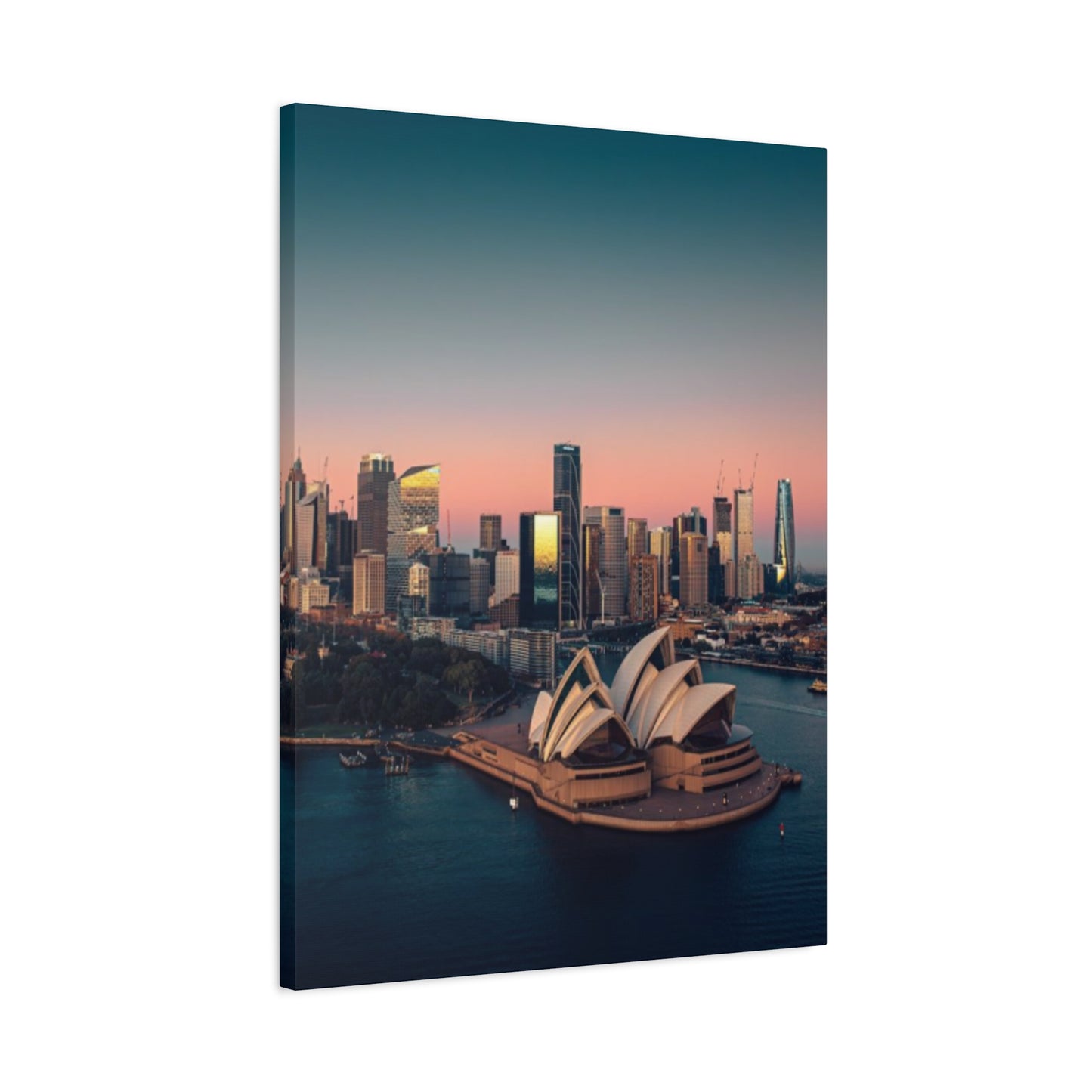
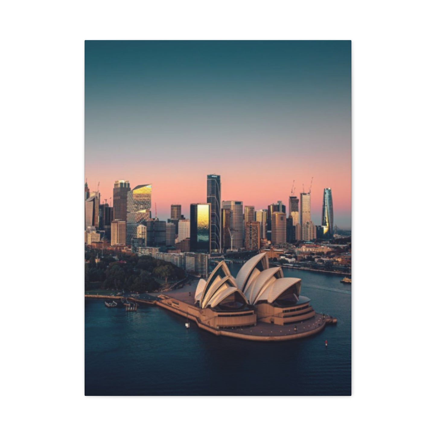
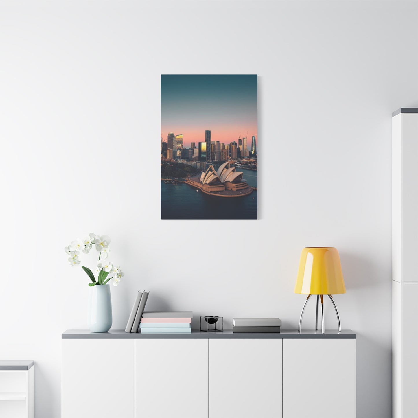


Sydney Skyline Wall Art: Complete Guide to Cityscape Prints and Paintings
The allure of city silhouettes has captivated art enthusiasts and homeowners for generations, with the Australian metropolis offering one of the most recognizable and breathtaking urban landscapes in the world. When you bring these magnificent harbor views into your home or workplace through carefully selected prints and paintings, you create an immediate connection to one of the planet's most celebrated cities. The iconic Opera House, Harbour Bridge, and glittering towers combine to form compositions that resonate with both residents and admirers from around the globe. Whether you're drawn to photographic precision or artistic interpretation, the market offers countless options to suit every aesthetic preference and budget.
This comprehensive exploration delves into every aspect of selecting, displaying, and appreciating cityscape artwork, from understanding different artistic styles to maintaining your investment for years to come. The journey through these topics will equip you with knowledge about sizing considerations, display techniques, emotional connections, gift-giving ideas, and much more. By examining each element thoroughly, you'll gain confidence in making informed decisions that enhance your living or working environment while celebrating the architectural magnificence of this harbor city.
Day vs Night Views of Sydney Skyline Art
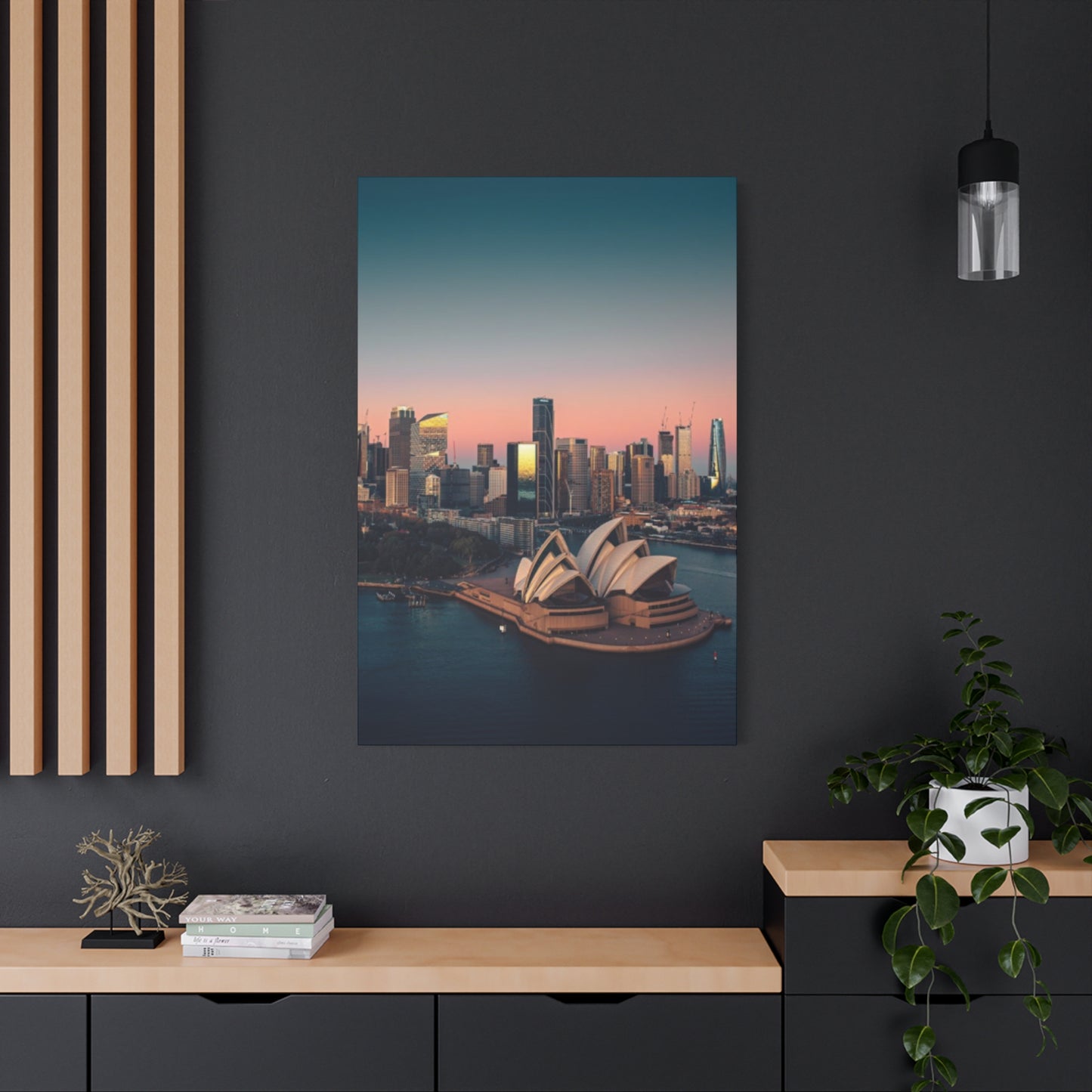
The transformation of the harbor city between daylight hours and evening darkness presents two dramatically different artistic opportunities that appeal to distinct aesthetic sensibilities. Daytime representations capture the brilliant Australian sunshine reflecting off glass towers, the vivid blue of the harbor waters, and the crisp definition of architectural details that make landmarks instantly recognizable. Artists working with daylight scenes often emphasize the clarity of the atmosphere, the texture of building surfaces, and the interplay between natural elements like clouds and water with manmade structures. These pieces typically feature brighter color palettes with azure blues, whites, and the warm tones of sandstone that characterize many older buildings throughout the city. The energy of daylight compositions tends to feel vibrant and optimistic, making them popular choices for professional environments and living areas where an uplifting atmosphere is desired.
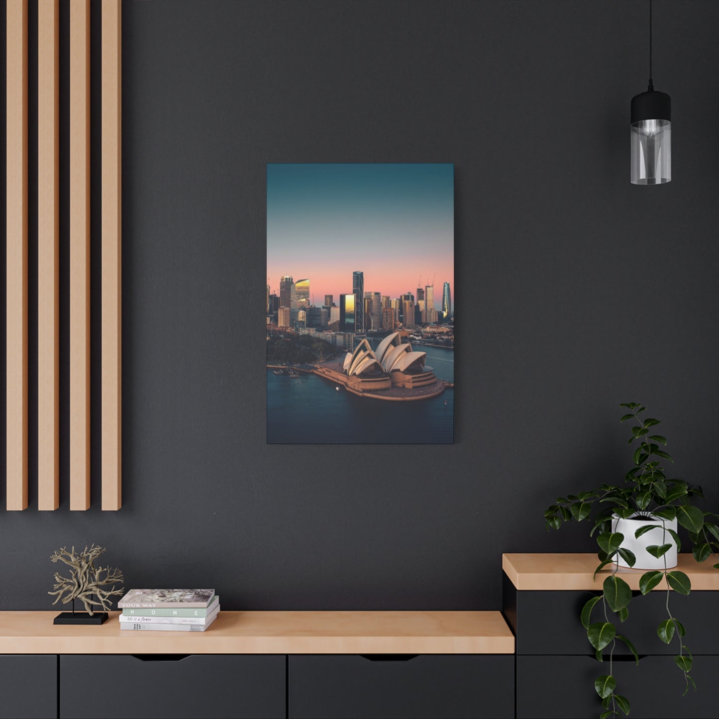
Conversely, nocturnal interpretations offer an entirely different emotional landscape, with illuminated windows creating patterns of light against darkened facades, streetlights tracing the curves of roadways, and the famous landmark structures bathed in dramatic artificial lighting. Night scenes allow artists to explore deeper color relationships, working with purples, deep blues, oranges, and yellows that rarely appear in daytime compositions. The reflections of lights on harbor waters create shimmering effects that photographers and painters alike find irresistible, adding a layer of visual complexity that distinguishes evening scenes from their daylight counterparts. Many collectors find that nocturnal cityscapes evoke feelings of romance, mystery, and sophistication, making them particularly suitable for bedrooms, dining areas, or entertainment rooms where a more intimate atmosphere is appropriate.
The choice between these two temporal perspectives often depends on the existing color scheme of your room and the mood you wish to establish. Daytime views work exceptionally well in areas with abundant natural light, where the artwork can echo the brightness of the surroundings and maintain visual consistency throughout the day. They pair beautifully with light-colored walls, minimalist furniture, and contemporary design schemes that emphasize openness and clarity. The straightforward nature of daylight scenes makes them accessible to a wide range of viewers, requiring less interpretation and offering immediate visual satisfaction through their crisp, easily readable compositions.
Night views, meanwhile, excel in creating focal points within darker color schemes or rooms with controlled lighting where the glowing elements within the artwork can truly shine. These pieces often become conversation starters because they reveal details that might go unnoticed in daytime representations, such as the architectural lighting design of individual buildings or the way the city creates its own constellation of lights. The dramatic contrast between illuminated and shadowed areas gives these works a cinematic quality that appeals to those who appreciate bold visual statements. Additionally, nocturnal scenes often feel more timeless because the specific details of individual buildings become less important than the overall pattern of light and the emotional atmosphere created by the composition.
Some artists and photographers have cleverly created diptychs or series that show the same viewpoint during different times of day, allowing collectors to appreciate the full transformation of the cityscape. These paired works can be displayed together to create a narrative about time's passage or to emphasize the city's diverse character. For those who cannot decide between the two options, acquiring complementary day and night pieces provides flexibility in seasonal rotation or allows different rooms to feature contrasting temporal perspectives, creating variety throughout your home while maintaining thematic consistency.
The practical considerations of lighting in your display location should heavily influence this choice. Artwork depicting daylight scenes can sometimes appear washed out if placed in very bright conditions without proper lighting control, while extremely dark rooms might not provide sufficient ambient light to appreciate the subtleties of daytime compositions. Night scenes, conversely, can benefit from theatrical spotlight illumination that mimics the drama of the scene itself, but they may feel too heavy or oppressive in already dark environments. Testing how different pieces interact with your existing lighting conditions before making a final purchase ensures that your investment will be visually effective in its intended location.
Small vs Large Sydney Skyline Canvas Prints
The dimensional considerations of cityscape artwork significantly impact both the visual effect and the practical integration into your existing environment. Smaller prints, typically ranging from twelve to twenty-four inches in their longest dimension, offer versatility and accessibility that makes them excellent starting points for new collectors or for those working with limited wall availability. These compact pieces can be grouped to create gallery walls, positioned on shelves or mantels without overwhelming other decorative elements, or placed in intimate viewing areas like hallways, bathrooms, or personal office corners where larger works would feel cramped. The affordability of smaller formats also allows collectors to experiment with different artistic styles or to acquire multiple pieces representing various viewpoints around the harbor without substantial financial commitment.
Despite their reduced scale, quality small prints can deliver remarkable detail and emotional impact when properly produced and positioned. Modern printing technologies allow even modestly sized canvases to capture intricate elements like individual windows, boat details in the harbor, or the architectural ornamentation of historic buildings. The key to successfully incorporating smaller works lies in appropriate placement and complementary framing choices that give these pieces the visual weight they deserve. Clustering several small prints in a considered arrangement can create an installation that commands attention comparable to a single large statement piece while offering more visual variety and narrative complexity through multiple viewpoints or styles.
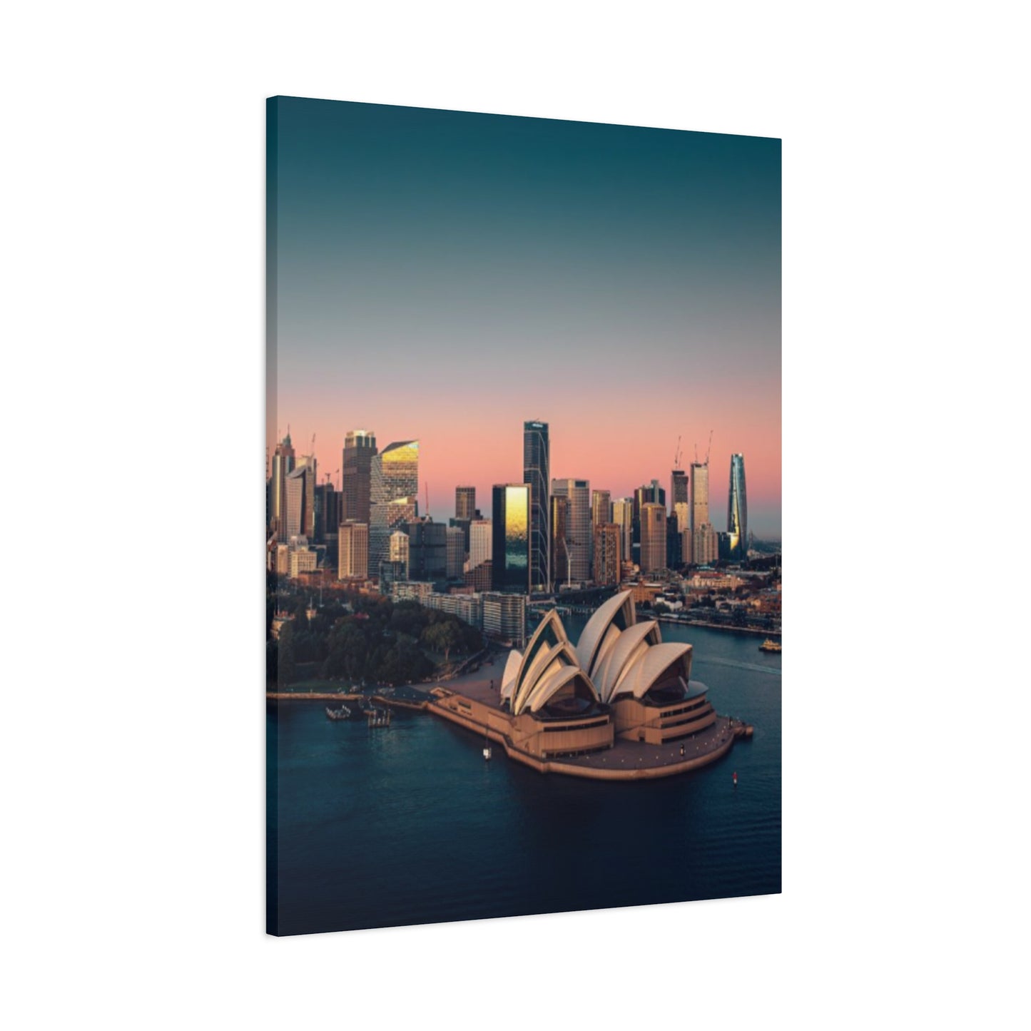
Large-scale prints, measuring from three feet to eight feet or more in their longest dimension, transform walls into windows overlooking the harbor city, creating immersive experiences that dominate their surroundings. These substantial works serve as primary focal points within rooms, immediately drawing attention and establishing the aesthetic tone for the entire environment. The impact of walking into a room and encountering a wall-sized harbor vista cannot be understated; it creates an immediate sense of connection to the city and can even influence the perceived dimensions of the room itself. Horizontal compositions tend to make rooms feel wider, while vertical formats can emphasize ceiling height and create a sense of grandeur.
The investment in large-format prints extends beyond the artwork itself to include considerations of professional installation, appropriate wall reinforcement, and often custom framing solutions that can substantially increase the overall cost. However, for those with the budget and appropriate display locations, these commanding pieces offer unmatched presence and can serve as defining elements in home or office design. Commercial environments particularly benefit from large-scale cityscapes, which convey professionalism and local connection in reception areas, conference rooms, or executive offices. The ability to appreciate fine details even from across a room makes these pieces functional as well as decorative, rewarding both distant viewing and close examination.
Size selection should account for viewing distance as a fundamental principle of art placement. The general guideline suggests that viewers should stand at a distance equal to one and a half to two times the artwork's diagonal measurement for optimal appreciation. This means that a forty-inch wide print should ideally be viewed from approximately five to seven feet away, while a massive six-foot print requires considerably more distance for proper perspective. Rooms with limited floor area may not provide sufficient viewing distance for very large pieces, resulting in a cramped feeling or inability to appreciate the composition as a whole. Conversely, placing a small print on a vast empty wall can create an awkward, unbalanced appearance that diminishes both the artwork and the architectural features of the room.
The architectural features of your walls themselves provide important guidance for size selection. Walls broken up by windows, doors, or built-in features often benefit from smaller pieces that fit within the available sections without competing with architectural elements. Continuous, uninterrupted wall surfaces, especially those serving as focal points in open-plan living areas, call out for substantial artwork that fills the available canvas without appearing lost or insignificant. The furniture arrangement below the intended display location also influences appropriate sizing; artwork should typically span fifty to seventy-five percent of the width of furniture pieces positioned beneath it to create visual cohesion.
Budget considerations naturally play a significant role in size decisions, as printing costs, framing expenses, and shipping fees all increase substantially with dimensions. However, the price-per-impact ratio often favors larger pieces for those who can accommodate them, as a single commanding work can eliminate the need for multiple smaller decorative elements while making a stronger unified statement. For those working within tighter budget constraints, manufacturers increasingly offer high-quality prints in mid-range sizes that balance impact with affordability, typically in the thirty to forty-inch range that suits most residential applications while remaining accessible to average buyers.
Caring for Fine Skyline Wall Art
Preserving the vibrant colors, structural integrity, and overall condition of your cityscape artwork requires understanding the environmental factors that threaten these pieces and implementing straightforward protective measures. The primary enemies of printed and painted artworks include ultraviolet radiation, excessive humidity, temperature fluctuations, physical contact, and airborne contaminants that gradually degrade materials over time. Canvas prints face particular vulnerability because the fabric substrate can absorb moisture, warp with temperature changes, and suffer damage from inappropriate cleaning methods. Establishing a preservation routine from the moment you acquire a piece ensures that your investment maintains its visual appeal and monetary value for decades rather than showing premature signs of deterioration.
Ultraviolet radiation from sunlight and certain artificial lighting sources represents the single greatest threat to artwork longevity, causing colors to fade, materials to become brittle, and protective coatings to break down. Direct sunlight should never fall on valuable prints or paintings, as even brief daily exposure over months and years produces noticeable degradation. Positioning artwork on walls perpendicular to windows rather than opposite them minimizes light exposure while still allowing the room to benefit from natural illumination. For locations where some light exposure is unavoidable, UV-filtering glazing on frames or UV-protective spray coatings on unframed canvases provide substantial defense against radiation damage. Window treatments like curtains or blinds that can be closed during peak sunlight hours offer additional protection while maintaining flexibility in room lighting throughout the day.
Humidity control proves equally critical, particularly in coastal areas where moisture levels naturally run high. Canvas materials expand and contract with humidity changes, eventually leading to warping, sagging, or separation from mounting frames. Ideal conditions maintain relative humidity between forty and fifty percent, which prevents both the dryness that makes materials brittle and the dampness that encourages mold growth. Dehumidifiers in particularly moist climates or humidifiers in very dry environments help maintain this optimal range. Avoid hanging artwork in bathrooms where steam from showers creates extreme humidity spikes, or in kitchens where cooking produces both moisture and airborne grease particles that can settle on and discolor artwork surfaces over time.
Temperature stability matters almost as much as humidity control, with consistent conditions being more important than specific temperature ranges. Dramatic temperature swings cause expansion and contraction cycles that stress both canvas materials and the adhesives binding different layers together in printed works. Exterior walls that get very hot in summer sun or cold in winter weather create particularly challenging conditions, as do locations near heating vents or air conditioning returns where artwork experiences constant airflow at temperatures substantially different from the surrounding room. Maintaining gallery conditions of sixty-five to seventy-five degrees Fahrenheit provides ideal preservation, though most residential environments naturally fall within acceptable ranges as long as extreme fluctuations are avoided.
Physical cleaning of canvas artwork requires gentle approaches that remove dust without damaging delicate surfaces. Soft, natural-bristle brushes designed specifically for artwork can lightly sweep away accumulated dust from textured canvas surfaces, working with gentle strokes that follow the canvas weave rather than pressing into it. Microfiber cloths work well for smooth, coated surfaces, but should never be used with cleaning solutions unless specifically recommended by the manufacturer. Water and conventional cleaning products can dissolve protective coatings, blur printed inks, or create permanent staining on canvas materials. Professional art conservators should handle any cleaning beyond simple dust removal, particularly for valuable or irreplaceable pieces where amateur intervention might cause irreversible damage.
Framing decisions impact long-term preservation significantly, with proper framing providing physical protection against accidental contact while creating a microenvironment that buffers against environmental fluctuations. Frames with glazing completely isolate artwork from direct contact with airborne contaminants and create a stable air pocket between the glass and the piece itself. For canvas prints traditionally displayed without glass, regular monitoring for signs of deterioration becomes more important, with early intervention preventing minor issues from becoming major restoration projects. Backing boards behind canvas pieces prevent damage from behind and discourage insects from accessing the canvas from the rear, where they might otherwise nest or feed on sizing materials in the fabric.
Professional conservation assessments every five to ten years provide expert evaluation of artwork condition and recommendations for any preservation measures beyond routine care. Conservators can identify early warning signs of degradation that untrained eyes might miss, and can perform stabilization treatments that arrest deterioration before it becomes visually apparent. While these consultations involve additional expense, they represent wise investments for valuable pieces where preventive care costs far less than restoration after substantial damage occurs. Documentation through regular photography also helps track any changes in condition over time, providing valuable information if restoration eventually becomes necessary and offering evidence for insurance purposes should loss or damage occur.
Framing Ideas for Sydney Skyline Paintings
The presentation choices surrounding your harbor cityscape artwork profoundly influence its visual impact and integration with your existing design aesthetic. Traditional framing approaches using wooden or metal frames with matting and glass protection offer classic elegance that suits both contemporary and traditional environments while providing excellent physical protection for valuable pieces. Wide mats in neutral colors like white, cream, or light gray create breathing room between the artwork and frame, drawing the eye inward toward the composition while preventing visual crowding. This approach works particularly well with photographic prints or watercolor paintings where the delicate nature of the medium benefits from the formal presentation that framing provides. The frame material itself should complement both the artwork and the surrounding room, with warm wood tones suiting traditional settings while sleek metals align with contemporary aesthetics.
Gallery-style framing, which places artwork directly against backing with minimal or no matting and slim, understated frames, creates a modern presentation that emphasizes the artwork itself over decorative surroundings. This approach has gained considerable popularity in contemporary settings where clean lines and uncluttered presentations align with minimalist design principles. The reduced visual noise of simple frames allows colors and compositions to command full attention without competition from elaborate moldings or wide mats. Black, white, and natural wood frames in slim profiles represent the most common choices for this style, with the specific selection depending on whether you wish to create contrast (black frames on white walls), harmony (white frames on white walls), or warmth (wood frames throughout).
Float mounting techniques suspend artwork slightly away from backing materials, creating subtle shadows that give pieces dimensional presence within their frames. This treatment works exceptionally well with canvas prints, where the visible edges become part of the overall presentation and the floating effect emphasizes the substantial nature of canvas as a medium. The three-dimensional quality this creates helps artwork stand out from walls more dramatically than flat-mounted pieces, particularly under directional lighting where shadows become more pronounced. Float mounting typically requires deeper frame profiles to accommodate the mounting hardware and create the necessary depth, resulting in more substantial overall presentations that command attention in ways that shallow frames cannot achieve.
Frameless presentation options have emerged as popular alternatives, particularly for modern canvas prints with painted or printed edges that extend the composition around all sides of the stretcher bars. These gallery-wrapped canvases can hang directly on walls without any additional framing, creating seamless transitions between wall surfaces and artwork that some viewers prefer for its lack of visual barriers. The absence of frames reduces costs and simplifies installation while maintaining artistic integrity, though it does sacrifice the physical protection that frames provide. This approach works best with high-quality prints on substantial canvas with professional edge finishing, as lower-quality pieces may have visible staples or raw canvas edges that appear unfinished without frame coverage.
Creative framing solutions using unconventional materials or approaches can make standard prints into unique decorative elements that reflect personal style. Reclaimed wood frames bring rustic character and environmental consciousness to presentations, particularly appropriate for artwork featuring the harbor city's historic areas or industrial heritage. Metal frames constructed from materials like copper, bronze, or brushed aluminum introduce industrial aesthetics that complement urban themes while offering durability and contemporary appeal. Ornate vintage frames sourced from antique dealers or flea markets create interesting juxtapositions when paired with modern cityscape imagery, blending historical and contemporary elements in ways that generate visual interest and conversation.
Color considerations in frame selection should account for dominant tones within the artwork itself and the surrounding environment. Frames that pick up accent colors from the artwork create cohesive presentations that feel intentional and curated, while deliberately contrasting frames can make pieces pop away from walls more dramatically. Neutral frame colors provide the safest choices for those uncertain about color coordination, as whites, blacks, grays, and natural woods complement virtually any artwork and adapt well if surrounding décor changes over time. Brightly colored or highly decorative frames risk overwhelming artwork or creating dated appearances as design trends evolve, though they can be stunning when executed with careful consideration of all visual elements.
The decision to include glass or acrylic glazing balances protection against aesthetic concerns and budget constraints. Standard glass provides excellent clarity and protection at moderate cost but adds significant weight and fragility, particularly in larger formats. Museum-quality glass with UV filtering and anti-reflective coatings offers superior protection and viewing experience but commands premium prices that may exceed the value of the artwork itself for lower-priced prints. Acrylic glazing weighs considerably less than glass and resists shattering, making it ideal for large formats or high-traffic areas, though it scratches more easily and can generate static electricity that attracts dust to its surface. Weighing these practical considerations against your specific needs and circumstances guides appropriate glazing choices for each piece in your collection.
Using Sydney Skyline Art to Enhance Rooms
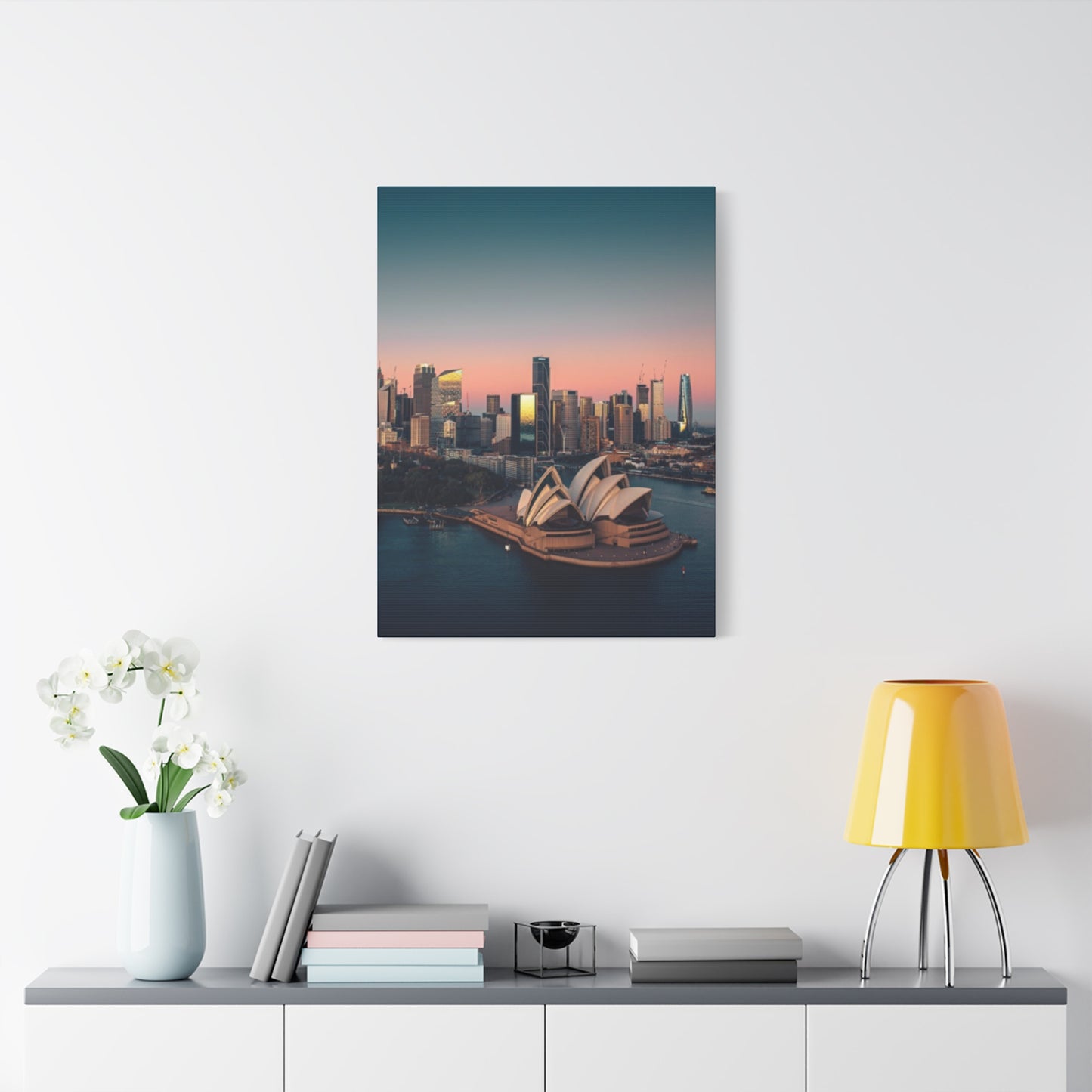
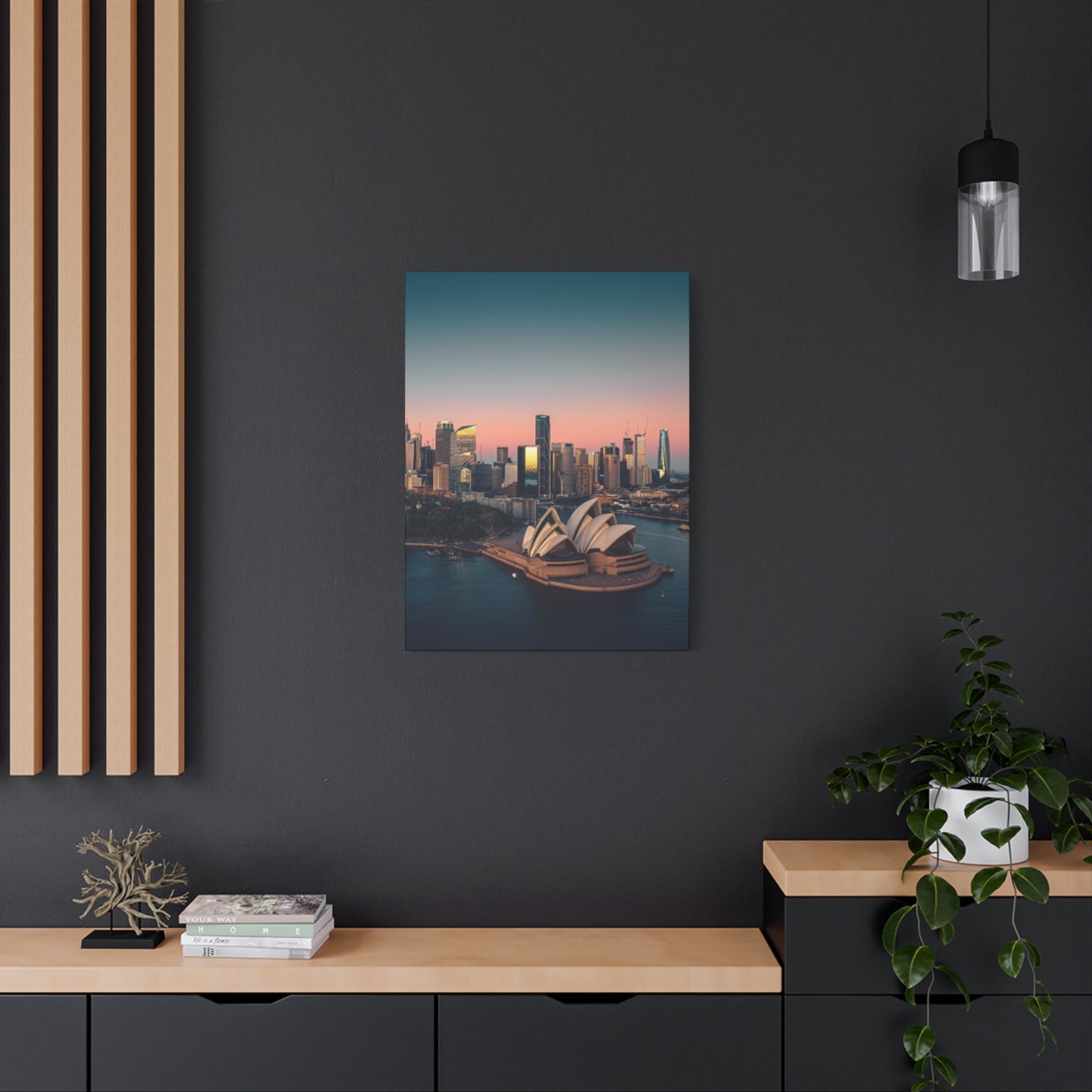
Strategic placement of harbor cityscape artwork can fundamentally alter the character and perceived attributes of living and working environments through color relationships, scale dynamics, and thematic resonance with existing design elements. Living rooms benefit tremendously from substantial cityscapes positioned as focal points above sofas or on walls visible from main entry points, where they immediately establish the room's aesthetic direction and create visual anchors around which other decorative elements can organize. The horizontal orientation of most skyline compositions naturally complements the low, horizontal emphasis of typical living room furniture, creating visual harmony that feels balanced and intentional. Coordinating throw pillows, area rugs, or curtains with colors pulled from the artwork strengthens the connection and creates cohesive design schemes that feel professionally considered rather than randomly assembled.
Bedroom applications of cityscape artwork require more thoughtful consideration of the emotional tones these pieces project and their compatibility with the restful atmosphere bedrooms should provide. Nocturnal harbor views with their quieter colors and romantic lighting effects often suit bedroom environments better than bright daytime scenes that might feel too energizing for relaxation-focused rooms. Positioning artwork opposite the bed creates a focal point for attention upon waking, while placement above headboards requires careful sizing to avoid overwhelming the bed itself. The personal connection many residents feel toward their city makes these images particularly appropriate in bedrooms, where they reinforce sense of place and belonging as part of the private, intimate environment.
Home offices and professional workplaces gain particular benefits from cityscape artwork that reinforces geographic location and professional identity simultaneously. For businesses operating in or serving the harbor city market, prominent display of local landmarks communicates connection to the community and understanding of regional character. The sophisticated, metropolitan associations of skyline imagery align well with professional environments across industries, from financial services to creative agencies, conveying competence and awareness of broader contexts beyond immediate business concerns. Positioning behind desks ensures that artwork appears in video conference backgrounds, subtly reinforcing location and professionalism to remote participants without distracting from the human subject of the call.
Dining areas provide unique opportunities for dramatic artwork presentations because diners often face walls for extended periods during meals, creating sustained viewing opportunities that reward detailed, contemplative pieces. The social nature of dining spaces makes conversation-starting artwork particularly valuable, with recognizable landmarks providing natural discussion topics for guests unfamiliar with the city while allowing residents to share their experiences and connections with various locations. The formality or casualness of your dining style should influence artwork selection, with elegant evening views suiting formal dining rooms while more casual daytime scenes or abstract interpretations align with everyday eating areas.
Hallways and transitional passages often receive insufficient attention in design planning despite offering excellent opportunities for artwork display. The extended viewing time as people travel these passages allows for more detailed or complex compositions that reward sustained attention rather than single glances. Linear arrangements of multiple smaller prints can transform boring corridor walls into engaging gallery experiences, while single large pieces can serve as destination points that draw movement through otherwise uninviting passages. The typically narrower width of hallways limits viewing distance, making appropriately scaled pieces essential to avoid overwhelming these compressed environments.
Bathrooms might seem unlikely locations for valuable artwork, but powder rooms and guest bathrooms without showers can successfully accommodate prints if proper environmental controls prevent moisture damage. Small-scale prints bring unexpected sophistication to these utilitarian areas while offering engaging visuals during the time guests spend in these private moments. The intimate scale of most bathrooms suits smaller artwork dimensions, and the limited wall availability typically means that a single well-chosen piece provides sufficient visual interest without overcrowding.
Kitchen environments pose challenges for artwork due to heat, moisture, and airborne grease that can damage unprotected pieces over time. However, breakfast nooks or dining zones within kitchen areas that avoid direct exposure to cooking activity can successfully incorporate cityscape artwork that enlivens these functional areas. Glass-fronted frames provide essential protection in kitchen applications, creating barriers against environmental contaminants while allowing the artwork to contribute to the overall design scheme. The casual nature of kitchens pairs well with less formal artistic approaches, including photographic prints or contemporary interpretations rather than fine art paintings that might feel overly formal for these workaday environments.
Abstract vs Realistic Sydney Skyline Art
The stylistic approach artists employ when representing harbor cityscapes dramatically affects the emotional resonance, visual impact, and design versatility of the resulting artwork. Realistic representations prioritize accurate depiction of architectural details, correct proportions, and faithful color reproduction that allows viewers to identify specific buildings, landmarks, and viewing angles with precision. Photographic prints epitomize this realistic approach, capturing the city exactly as it appears at specific moments in time with technological fidelity that painting cannot match. Traditional realistic paintings employ similar observational accuracy but introduce the artist's hand through brushwork variations, subtle color interpretations, and compositional choices that distinguish artistic representations from mechanical photographic capture. These realistic works appeal strongly to viewers seeking immediate recognition and connection with specific locations, making them particularly popular with residents who want artwork reflecting places they know intimately or visitors who cherish memories of time spent in the city.
Abstract interpretations liberate artists from representational accuracy, allowing them to respond to the city's emotional essence, energy, and character through color relationships, gestural marks, and compositional structures that may bear little literal resemblance to actual geography. Highly abstract cityscapes might reduce the skyline to geometric shapes, color fields, or expressive brushstrokes that convey urban energy without depicting any identifiable structures. These pieces challenge viewers to engage more actively with the artwork, finding their own meanings and connections rather than receiving pre-determined subject matter. The ambiguity of abstract work makes it versatile across design contexts, as the absence of specific identifiable content allows the piece to function primarily through its formal qualities of color, composition, and texture rather than through representational subject matter.
Semi-abstract approaches occupy a middle ground that many collectors find particularly appealing, maintaining enough representational content to establish recognizable subject matter while incorporating abstract elements that add visual interest and artistic interpretation. Artists might simplify architectural details into geometric patterns, emphasize certain structural elements while minimizing others, or apply expressive color choices that deviate from natural appearances while maintaining overall compositional accuracy. These hybrid works offer the best of both worlds for many viewers: the immediate connection and sense of place that representational elements provide combined with the visual excitement and emotional depth that abstract approaches introduce. The Opera House's distinctive profile, for instance, remains recognizable even when rendered in unexpected colors or with heavy stylization, maintaining its iconic status while allowing artistic freedom.
Impressionistic treatments of the cityscape apply the soft focus and atmospheric effects associated with late nineteenth-century French painters to contemporary urban subjects. These pieces emphasize light effects, color harmonies, and overall atmospheric qualities over precise details, creating dreamy, romanticized visions of the city that feel more emotionally evocative than photographically accurate. The broken brushwork and vibrant color typical of Impressionism translates remarkably well to harbor scenes where water, sky, and glass architecture create naturally shimmering, light-filled environments. These works particularly appeal to collectors who appreciate traditional painting techniques applied to contemporary subjects, bridging historical artistic movements with current urban realities.
Expressionistic approaches infuse cityscape subjects with strong emotional content through dramatic color choices, exaggerated forms, and visible evidence of the artist's emotional state during creation. Bold, even violent brushwork might convey the frenetic energy of urban life, while somber, muted palettes might emphasize isolation or melancholy aspects of city existence. These emotionally charged interpretations move far beyond simple representation to offer commentary or emotional responses to urban experience itself. While less immediately accessible than realistic work, expressionistic pieces create powerful visual statements that reward contemplation and can serve as remarkable focal points in design schemes bold enough to accommodate their intensity.
Contemporary digital art techniques have introduced entirely new possibilities for cityscape representation, with artists manipulating photographs, creating composite images, or generating entirely digital paintings that blur boundaries between traditional media categories. These works might combine multiple viewpoints impossible in reality, introduce fantastical elements into otherwise realistic scenes, or apply effects and textures unavailable through traditional media. The endless reproducibility of digital work makes it particularly accessible to buyers at various price points, though this same quality raises questions about originality and collectibility that concern some traditional collectors. Nevertheless, the distinctive aesthetic of digital art and its resonance with contemporary visual culture make it increasingly popular, particularly among younger collectors.
The choice between abstract and realistic approaches should consider both personal aesthetic preferences and the practical design context where artwork will live. Realistic pieces make stronger statements about specific geographic connections and can serve as conversation pieces about actual locations, while abstract works offer greater design flexibility and can adapt to changing décor over time without appearing mismatched. Rooms with bold, complex design schemes might benefit from abstract artwork that adds visual interest without competing with existing patterns and colors, while minimalist environments might showcase realistic photography where precise details become the primary source of visual engagement in otherwise restrained settings.
Display Tips for Skyline Canvas Prints
Optimal presentation of harbor cityscape canvases requires attention to hanging height, lighting conditions, grouping strategies, and relationship to surrounding furnishings that collectively determine whether artwork achieves its full visual potential. The standard guideline for hanging height positions artwork so that its center falls between fifty-seven and sixty inches from the floor, approximating average eye level for standing viewers and matching the standard height used in professional galleries and museums. This positioning feels naturally balanced to most viewers and facilitates comfortable viewing without requiring awkward head angles. However, this rule requires adjustment based on ceiling height and furniture relationships; pieces hung above sofas or consoles should position so that four to eight inches of clearance separates the furniture top from the artwork bottom, creating visual connection while preventing the cramped appearance that results from insufficient spacing.
Lighting dramatically influences how colors, details, and overall composition register with viewers, making dedicated artwork lighting worthy of investment for valuable pieces. Picture lights mounted directly on frames or above them provide focused illumination that highlights artwork while creating dramatic contrast with surrounding walls. Track lighting systems offer flexibility to adjust light direction and intensity while accommodating multiple pieces within single rooms. The color temperature of bulbs significantly affects color perception, with cooler daylight-temperature LEDs showing colors most accurately while warmer bulbs create cozier atmospheres that may alter how hues appear. Avoiding direct bulb visibility prevents glare that obscures details and creates uncomfortable viewing conditions, so proper shielding and angle adjustment ensure light illuminates artwork surfaces without bouncing directly into viewers' eyes.
Grouping multiple canvas prints requires careful planning to create cohesive installations rather than haphazard collections. Gallery wall arrangements combine multiple pieces of varying sizes into unified compositions where the overall shape of the grouped pieces matters as much as individual works. Templates created from paper cut to match each piece's dimensions allow experimentation with arrangements before committing to wall holes, preventing the frustration of multiple hanging attempts. Maintaining consistent spacing between pieces, typically two to four inches, creates visual unity and prevents compositions from appearing too loose or too cramped. Aligning edges or centers along invisible grid lines helps organize seemingly random arrangements into structured patterns that feel intentional despite surface complexity.
Triptychs and series designed to hang together require precise spacing and alignment to function as intended. Many panoramic cityscape images are divided across three panels to create wide-format presentations that work better than single massive canvases in terms of both production and installation. These related pieces must hang level with each other and with consistent gaps between panels, typically one to three inches, so the overall composition reads as unified rather than disconnected. Laser levels or digital leveling tools ensure accuracy that eyeball estimation cannot match, preventing the crooked installations that undermine even beautiful artwork.
The relationship between artwork and furniture requires consideration to create harmonious rather than competing focal points. Large pieces positioned above sofas should generally span roughly two-thirds of the sofa's width to feel appropriately scaled without dwarfing or being dwarfed by the furniture below. Console tables, buffets, and media centers similarly benefit from artwork scaled in relationship to their dimensions, creating vertical visual stacks that feel balanced and intentional. Extremely large furniture pieces might require multiple artworks or single massive pieces to hold their own visually, while delicate occasional tables look best with smaller-scale artwork that doesn't overwhelm their proportions.
Color coordination between artwork and surrounding elements strengthens cohesion while preventing jarring clashes that fragment visual experience. Pulling accent colors from canvas prints into throw pillows, blankets, or decorative objects creates intentional connections that make design schemes feel curated and professional. However, exact matching appears forced and unsophisticated; instead, aim for complementary tones within similar color families that harmonize without identical matching. Neutral surrounding palettes allow colorful artwork to command maximum attention, while rooms already rich with color might benefit from more restrained artwork that adds interest without overwhelming already complex schemes.
Rotation strategies keep long-term installations fresh and prevent visual fatigue with pieces that have become too familiar through constant exposure. Seasonal rotations align artwork with changing natural light conditions and shifting color preferences throughout the year, with brighter pieces suiting longer summer days while moodier options complement shorter winter periods. This approach requires adequate storage for pieces currently out of display and implies building collections larger than immediate hanging capacity, but it preserves artwork from constant light exposure while maintaining visual interest in your environment. Documentation of various arrangements through photographs helps remember successful combinations and can guide future installations as collections grow and living situations change.
Emotional Impact of Cityscape Wall Art
The psychological effects of incorporating urban landscape imagery into daily environments extend far beyond simple decoration, influencing mood, productivity, sense of place, and emotional wellbeing in ways that subtly but significantly shape lived experience. For residents of the harbor city, artwork depicting familiar landmarks creates powerful connections to home and community, reinforcing identity and belonging through daily visual reminders of place. The pride many citizens feel for their city's beauty translates into positive emotional responses when encountering these familiar views, creating uplifting effects that counter the stress and challenges of everyday life. Even for those living in other locations, cityscape artwork representing places visited or aspirational destinations can evoke pleasant memories or inspire future travel plans, serving as daily motivation and sources of positive daydreaming that enhance mental wellness.
The architectural magnificence displayed in quality skyline artwork subtly elevates the perceived sophistication and cultural awareness of environments where it appears. Surrounding yourself with images of iconic buildings and impressive urban design creates associations with achievement, progress, and human creativity that can inspire and motivate. The implicit message that you appreciate and value these architectural accomplishments positions you as someone with refined tastes and cultural interests, shaping both self-perception and how others perceive you. Professional environments particularly benefit from these associations, as cityscape artwork in offices signals connection to broader communities and awareness beyond narrow business concerns.
Color psychology plays a significant role in the emotional effects of cityscape artwork, with different palettes creating distinct psychological responses. Warm orange and gold tones common in sunset harbor views create feelings of warmth, comfort, and optimism that can make cold or impersonal environments feel more welcoming. Cool blues and purples typical of twilight scenes promote calmness and contemplation, making them excellent choices for areas designated for relaxation or focused work. Vibrant, saturated colors in contemporary artistic interpretations energize and stimulate, raising alertness and creating dynamic atmospheres in social or creative workspaces. Understanding these color psychology principles helps select artwork that reinforces the intended emotional character of different rooms rather than working against it.
The presence of water in harbor cityscape compositions introduces additional emotional dimensions beyond those of landlocked urban scenes. Water universally registers as calming and meditative for most viewers, with psychological research consistently demonstrating that proximity to water or even viewing water imagery reduces stress and promotes mental wellbeing. The harbor element in these cityscapes thus provides double benefits, combining the architectural interest and human achievement represented by the built environment with the natural tranquility symbolized by water. This combination makes harbor views particularly effective in high-stress environments where any opportunity for psychological respite contributes to overall wellness and productivity.
Personal memories and experiences associated with depicted locations dramatically amplify emotional responses to cityscape artwork for individuals with direct connections to shown places. A view capturing the area where someone once lived, worked, or experienced significant life events becomes far more than decorative imagery; it transforms into a repository of personal history and emotional significance. These pieces serve almost as talismans, maintaining connections to important life phases and significant experiences through visual representation. Gifting such personally meaningful artwork demonstrates thoughtfulness and understanding that generic decorative pieces cannot match, creating treasured possessions that increase in sentimental value over time.
The aspirational dimension of cityscape artwork affects viewers who dream of visiting or living in depicted locations, with images serving as goal visualization tools that maintain focus on future possibilities. The inspirational quality of seeing this sophisticated, beautiful city daily can motivate viewers to work toward travel goals, career advancement, or lifestyle changes that would bring them closer to experiencing the real location. This forward-looking emotional dimension makes cityscape artwork functional beyond aesthetics, contributing to goal-setting and achievement motivation in subtle but meaningful ways that passive decoration cannot provide.
Social connection through shared recognition of depicted locations creates common ground for conversation and relationship building. Guests who recognize landmarks in your artwork immediately have conversation topics and can share their own experiences with those places, creating bonding opportunities through mutual familiarity. For international visitors, recognizing imagery from their travels demonstrates your worldliness and creates welcoming atmospheres where diverse backgrounds find common reference points. These social functions of cityscape artwork extend its value beyond private enjoyment to include facilitation of human connection and community building.
Gift Ideas Featuring Sydney Skyline Prints
Harbor cityscape artwork represents exceptionally thoughtful gift choices for numerous occasions and relationships, combining aesthetic appeal with personal significance that demonstrates genuine consideration of recipients' interests and connections. For individuals relocating away from the city, whether domestically or internationally, framed skyline prints provide tangible connections to the home they're leaving, helping maintain emotional bonds with place and community despite physical distance. These gifts acknowledge the difficulty of separation while celebrating the city's importance in the person's life, offering daily visual reminders that can ease homesickness and maintain identity connections during transition periods. The portable nature of prints makes them practical for those moving households, while the emotional significance ensures they'll find prominent display positions in new homes.
Wedding gifts featuring customized cityscape artwork that highlights locations significant to the couple's relationship create meaningful commemorations of their shared history. Prints depicting the venue where they met, became engaged, or married transform generic gift giving into personalized celebrations of their unique story. Some artists offer customization services that can incorporate text noting dates and locations, creating combination artwork and documentary pieces that serve as both decoration and relationship memorabilia. The romantic associations of harbor views at sunset or twilight particularly suit wedding contexts, symbolizing the beginning of new journeys together while honoring shared pasts.
Conclusion
Sydney skyline wall art captures the vibrant essence and iconic beauty of one of the world’s most stunning cities, making it a perfect addition to any home or office. Whether you’re drawn to the dramatic silhouette of the Harbour Bridge, the elegance of the Opera House, or the dynamic cityscape that stretches across the harbor, cityscape prints and paintings offer a unique way to celebrate Sydney’s charm and energy.
As this guide has shown, there is an impressive variety of styles, mediums, and designs available to suit different tastes and décor themes. From minimalist line art and black-and-white photography to vivid, impressionistic paintings bursting with color, Sydney skyline wall art allows you to bring a piece of this iconic metropolis into your space. You can choose prints that focus on architectural details, panoramic views, or abstract interpretations that add a modern flair.
Selecting the right cityscape art for your home involves considering the scale, color scheme, and mood you want to create. Larger prints can serve as statement pieces in living rooms or offices, while smaller works can complement other décor elements in bedrooms, hallways, or study areas. Framing options also play a key role in enhancing the artwork’s impact and protecting your investment.
Moreover, Sydney skyline art is not just decoration—it’s a way to connect with the city’s culture, inspire wanderlust, or honor personal memories. Whether you’re a local, an admirer from afar, or a traveler who has fallen in love with the city, these artworks bring a sense of place and identity to your surroundings.
Incorporating Sydney skyline wall art into your interior design offers endless creative possibilities. From modern apartments to classic homes, these prints and paintings provide a timeless visual anchor that blends beauty, sophistication, and urban spirit.
