


The Rise of Tan Wall Art: A Neutral Trend in Modern Interiors
Tan wall art has emerged as one of the most versatile and appealing choices for homeowners and decorators seeking to create welcoming, sophisticated environments. This earthy, neutral hue brings a sense of groundedness and timelessness to any room, working seamlessly across various design aesthetics from contemporary minimalism to rustic farmhouse charm. The beauty of tan lies in its ability to serve as both a statement piece and a subtle backdrop, making it an invaluable addition to any art collection.
The popularity of tan-toned artwork continues to grow as more people recognize the psychological and aesthetic benefits of incorporating natural, muted colors into their living environments. Unlike bold, saturated hues that can overwhelm or clash with existing décor, tan shades offer flexibility and longevity, ensuring that your art investment remains relevant and appealing for years to come. Whether you're furnishing a new home, refreshing a tired room, or simply seeking to add warmth to your surroundings, tan wall art provides endless possibilities for creative expression and visual harmony.
The Warmth of Tan Tones in Wall Art
Tan tones in wall art possess an inherent warmth that transforms rooms into inviting havens. This color family, ranging from pale beige to rich caramel, carries undertones that evoke natural elements like sand, stone, and dried earth. When incorporated into artwork, these shades create an immediate sense of comfort and accessibility that few other colors can match. The warmth radiates from the canvas, influencing not just the visual atmosphere but also the emotional temperature of the room.
The psychological impact of tan cannot be overstated. This color triggers associations with stability, reliability, and organic beauty. In wall art, tan tones work particularly well because they don't compete for attention aggressively. Instead, they invite contemplation and create a backdrop that allows other design elements to shine while maintaining a cohesive visual narrative. The warmth inherent in tan shades makes rooms feel more lived-in and personal, countering the sometimes sterile appearance of purely white or gray color schemes.
From a design perspective, tan tones offer remarkable versatility in their ability to adapt to different lighting conditions throughout the day. Morning light brings out the golden undertones, while evening illumination enhances the deeper, more amber qualities of tan. This dynamic quality means that tan wall art never appears static or dull; it evolves with your daily rhythms, providing subtle visual interest that remains engaging without becoming tiresome.
The warmth of tan also has practical applications in creating visual balance within a room. In north-facing rooms that receive cooler, indirect light, tan artwork can compensate by introducing warmth that counteracts the bluish cast. Similarly, in rooms with harsh artificial lighting, tan tones soften the environment, making it feel more natural and welcoming. This adaptability makes tan wall art an excellent choice for spaces where lighting conditions vary or present challenges.
Artists working with tan palettes often leverage this warmth to create pieces that feel immediately accessible and emotionally resonant. Whether through abstract compositions, landscape representations, or figurative work, tan provides a foundation that feels both contemporary and timeless. The warmth doesn't rely on intensity or brightness; instead, it comes from the color's inherent connection to natural materials and organic forms that humans instinctively find appealing and comforting.
Using Tan Shades to Create Calm Atmospheres
Tan shades excel at establishing calm, peaceful atmospheres in residential and commercial settings alike. The muted quality of these colors naturally reduces visual stimulation, allowing the mind to relax and the body to unwind. When selecting tan wall art specifically to promote tranquility, consider pieces that feature soft gradations, gentle brushwork, or smooth textures that enhance the soothing qualities of the color itself.
The relationship between tan tones and calmness stems from their low saturation and moderate brightness. These characteristics prevent the color from demanding attention or creating visual tension. In bedrooms, tan artwork supports restful sleep by avoiding the stimulation that brighter colors can trigger. In living areas, tan pieces facilitate conversation and relaxation by creating a backdrop that feels secure and enveloping rather than exciting or agitating.
Creating calm through tan artwork involves more than simply choosing the right color. The subject matter, composition, and style all contribute to the overall effect. Horizontal compositions tend to promote feelings of stability and rest, making them ideal for calming environments. Abstract pieces with flowing, organic shapes enhance the peaceful qualities of tan, while geometric patterns in tan shades can provide structure without introducing tension or harsh contrast.
The layering of different tan shades within a single piece amplifies the calming effect. Subtle variations in tone create depth and interest without disrupting the peaceful atmosphere. This approach works particularly well in larger artworks where the eye can wander across the composition, discovering nuances without encountering jarring transitions. The monochromatic or near-monochromatic use of tan creates visual unity that the brain processes as harmonious and restful.
Placement of tan artwork significantly impacts its ability to create calm. Positioning pieces at eye level in seating areas ensures they can be easily viewed during moments of rest. In bedrooms, placing tan art opposite the bed allows it to be the first thing seen upon waking and the last before sleep, bookending the day with visual tranquility. The combination of strategic placement and appropriate tan artwork transforms ordinary rooms into sanctuaries of calm.
Small vs Large Tan Canvas Prints
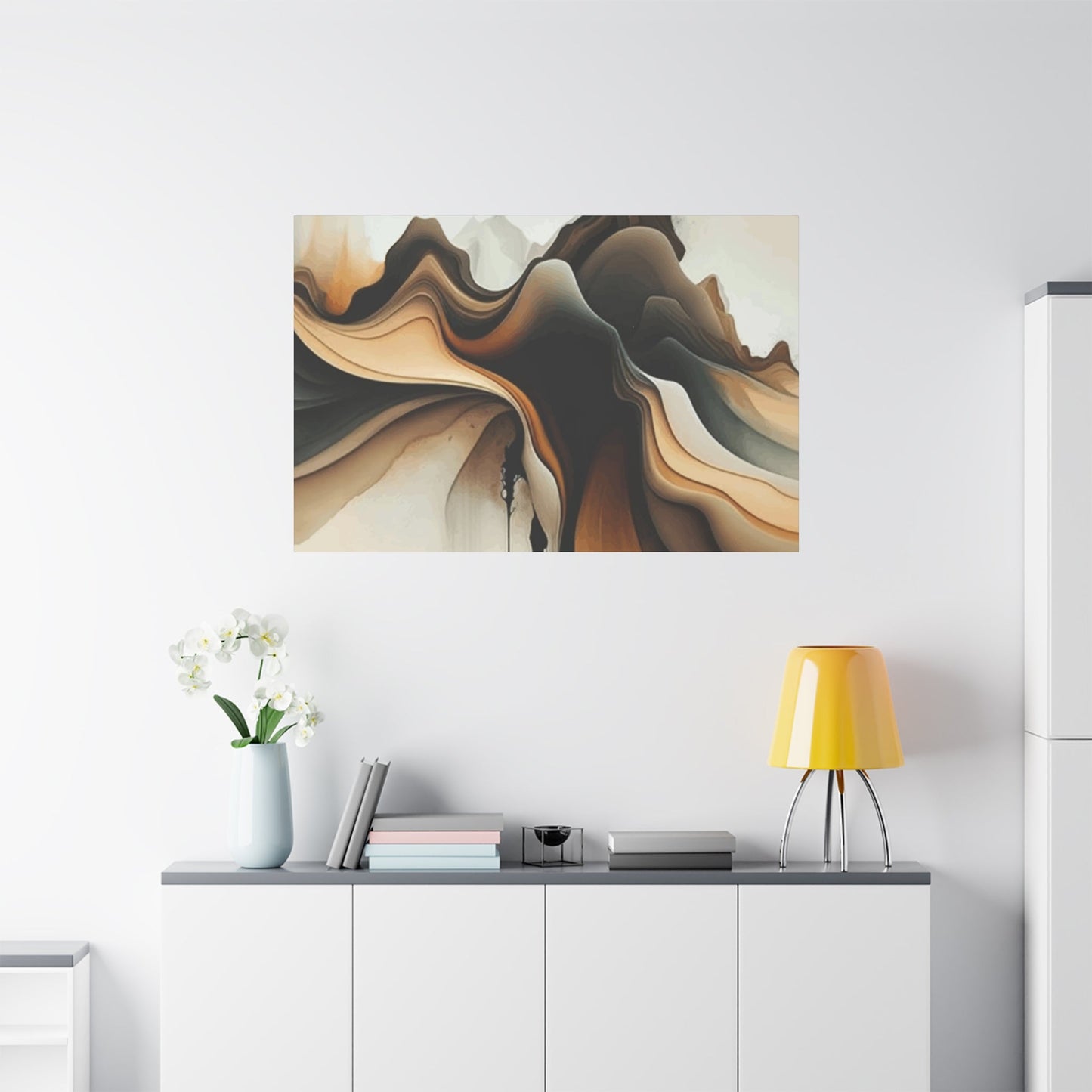
The decision between small and large tan canvas prints involves considerations of visual impact, room proportions, and intended effect. Small tan prints, typically ranging from eight by ten inches to sixteen by twenty inches, offer intimacy and charm. These pieces work beautifully in gallery wall arrangements, where multiple small prints can be combined to create a cohesive display. The advantage of smaller prints lies in their flexibility and affordability, allowing collectors to acquire multiple pieces without significant investment.
Small tan canvas prints excel in creating visual interest on a micro level. Viewers naturally draw closer to examine details, making these pieces perfect for areas where people linger, such as reading nooks, entryways, or beside bedside tables. The smaller scale also makes them ideal for spaces with limited wall area or where architectural features like windows, doors, or built-ins fragment available hanging surfaces. A thoughtfully chosen small tan print can have surprising impact when placed in just the right location.
Large tan canvas prints, typically measuring thirty by forty inches or greater, make bold statements and serve as focal points within rooms. These substantial pieces command attention while maintaining the subtle, sophisticated qualities inherent in tan tones. The larger canvas allows artists to explore textures, layering, and compositional elements that might be lost at smaller scales. For collectors, a large tan canvas represents an investment piece that can anchor an entire room's design scheme.
The psychological impact of scale cannot be ignored when choosing between small and large tan prints. Large pieces create a sense of expansiveness and can make rooms feel more generous and open. They work particularly well above substantial furniture pieces like sofas or beds, where their size feels proportionate and balanced. Conversely, oversized art in small rooms can feel overwhelming, while tiny prints in vast rooms may appear lost and insignificant.
Budget considerations often influence the choice between small and large tan canvas prints. While larger pieces typically cost more, they may offer better value when considering impact per dollar spent. However, several well-chosen small prints can provide visual richness and complexity that a single large piece cannot match. Many collectors find satisfaction in mixing scales, using one or two large tan canvases as anchors while filling surrounding areas with smaller complementary pieces.
Caring for Tan-Toned Artwork
Proper care ensures that tan-toned artwork maintains its beauty and value for generations. The relatively neutral color palette of tan pieces requires specific attention to prevent discoloration, fading, or deterioration. Canvas prints, in particular, need protection from environmental factors that can compromise their appearance over time. Establishing a regular care routine prevents minor issues from becoming major problems and preserves your investment.
Lighting presents the primary concern for tan canvas artwork. Direct sunlight contains ultraviolet rays that break down pigments and canvas fibers, causing fading and yellowing. Position tan artwork away from windows that receive intense direct light, or use UV-filtering glass in frames. Even artificial lighting can contribute to degradation; LED bulbs produce minimal UV radiation compared to incandescent or halogen alternatives, making them the preferred choice for illuminating tan artwork.
Dust accumulation dulls the appearance of tan canvases and can work its way into the weave of unframed pieces. Regular dusting with a soft, dry microfiber cloth or a clean, soft-bristled brush removes particulates without damaging the surface. Always work from top to bottom, using gentle strokes that follow the direction of any visible brushwork or texture. Never use liquid cleaners, which can stain or damage the canvas and alter the appearance of tan pigments.
Humidity and temperature fluctuations pose significant risks to canvas artwork. Excessive moisture can lead to mold growth, while very dry conditions cause canvas to become brittle and crack. Tan pigments may be particularly susceptible to moisture-related discoloration. Maintain consistent environmental conditions between 40-50% relative humidity and temperatures around 70 degrees Fahrenheit. Avoid hanging tan canvas prints in bathrooms, kitchens, or other areas prone to humidity or temperature extremes.
For framed tan artwork, periodically inspect the frame and mounting for signs of damage or deterioration. Loose frames can allow dust and moisture to reach the canvas. Check that hanging hardware remains secure and that the artwork hangs level and flush against the wall. If the piece includes glazing, clean the glass or acrylic with appropriate cleaners applied to the cloth, never directly to the glazing where liquid might seep behind and contact the artwork.
Professional conservation should be considered for valuable or antique tan artwork. Conservators possess specialized knowledge and materials to address issues beyond basic maintenance. If you notice discoloration, canvas loosening, paint flaking, or other deterioration, consult a qualified professional rather than attempting repairs. Even well-intentioned amateur efforts can cause irreversible damage that decreases both the aesthetic appeal and monetary value of tan-toned pieces.
Framing Ideas for Tan Wall Art
Framing choices significantly impact how tan wall art integrates with surrounding décor and architectural elements. The frame serves as a transition between the artwork and the environment, and thoughtful selection enhances both the piece and the room. For tan artwork, frames can either complement the neutral palette or introduce contrast that makes the piece more prominent. The key lies in understanding the relationship between frame style, artwork characteristics, and overall design goals.
Natural wood frames represent the most intuitive choice for tan artwork, creating a harmonious connection between the earthy tones in the art and the organic qualities of wood. Light woods like maple, ash, or blonde oak extend the neutral palette while adding subtle texture and warmth. Darker woods such as walnut or mahogany create sophisticated contrast while maintaining an organic feel that respects the natural qualities of tan tones. The wood grain itself adds visual interest without competing with the artwork.
Metal frames offer contemporary alternatives that work beautifully with tan wall art. Brushed brass or antique gold frames pick up warm undertones in tan shades, creating cohesion while adding a touch of elegance. Silver, pewter, or aluminum frames provide cool contrast that can make tan artwork appear warmer by comparison. Black metal frames deliver crisp definition and work particularly well with tan abstract pieces or modern compositions where clean lines and minimal ornamentation support the overall aesthetic.
The profile or depth of the frame affects how the artwork relates to the wall. Deep frames create shadow boxes that give tan pieces dimensional presence, making them appear to float within the frame. This approach works well for textured tan canvases where the three-dimensional qualities deserve emphasis. Flat or minimal profiles keep the focus on the artwork itself and work best when the composition doesn't require additional depth cues.
Matting provides another dimension of framing possibility for tan artwork. Cream, ivory, or off-white mats extend the neutral palette while providing visual breathing room between the art and frame. Double matting with layered neutral tones adds sophistication and can incorporate subtle color variations that enhance specific tones within the tan artwork. For a more dramatic approach, consider deep-toned mats in charcoal, navy, or forest green that make tan shades appear luminous by contrast.
Float mounting presents an increasingly popular framing option for tan canvas prints. This technique suspends the canvas within the frame using hidden supports, allowing all four edges of the artwork to remain visible. Float mounting emphasizes the objecthood of the canvas and works beautifully with gallery-wrapped edges in complementary tan or neutral tones. The resulting presentation feels modern and fresh while respecting the artwork's inherent qualities.
Combining Tan Art with Neutral Décor
Tan art and neutral décor create partnerships that exemplify sophisticated, timeless style. The key to successfully combining these elements lies in creating visual interest through texture, scale, and subtle tonal variation rather than relying on color contrast. This monochromatic or near-monochromatic approach requires careful attention to detail but rewards with rooms that feel cohesive, elegant, and deeply calming.
When working with an all-neutral palette, texture becomes paramount. Pair smooth tan canvas prints with textured neutral fabrics like linen upholstery, wool throws, or nubby cotton pillows. The interplay between the flat surface of the artwork and the dimensional textures of furnishings creates visual complexity that prevents the room from feeling flat or boring. Consider incorporating natural materials like rattan, jute, or wood alongside tan artwork to amplify the organic feel of the neutral scheme.
Tonal variation within the neutral range prevents monotony while maintaining cohesion. If your primary décor features cool-toned neutrals like gray or greige, select tan artwork with similar cool undertones. Conversely, warm cream or beige furnishings pair beautifully with tan art featuring golden or peachy undertones. The subtle coordination of temperature within the neutral family creates harmony while the slight variations in value and intensity provide visual interest.
Layering neutrals of different values creates depth in rooms featuring tan artwork. Use darker neutrals in foundational elements like flooring or larger furniture pieces, medium neutrals for walls and primary seating, and lighter neutrals in accessories and textiles. Position tan artwork where it bridges these value levels, serving as a visual connector between light and dark elements. This approach creates a balanced composition where the eye moves comfortably throughout the room.
The risk of neutral schemes appearing too bland can be mitigated through careful attention to pattern and form. Introduce geometric patterns in neutral tones through pillows, rugs, or window treatments. These patterns provide visual stimulation without disrupting the calm foundation established by tan artwork and neutral furnishings. Similarly, vary furniture shapes and profiles to create visual interest through form even when color remains restrained.
Metallic accents provide sparkle and sophistication in neutral rooms featuring tan art. Brass, copper, or bronze finishes echo warm undertones in tan pieces and catch light in ways that add dimension and luxury. Silver, chrome, or nickel finishes offer cool contrast that can sharpen the overall composition. Use metallic elements strategically in lighting fixtures, hardware, and accessories to punctuate the neutral palette without overwhelming it.
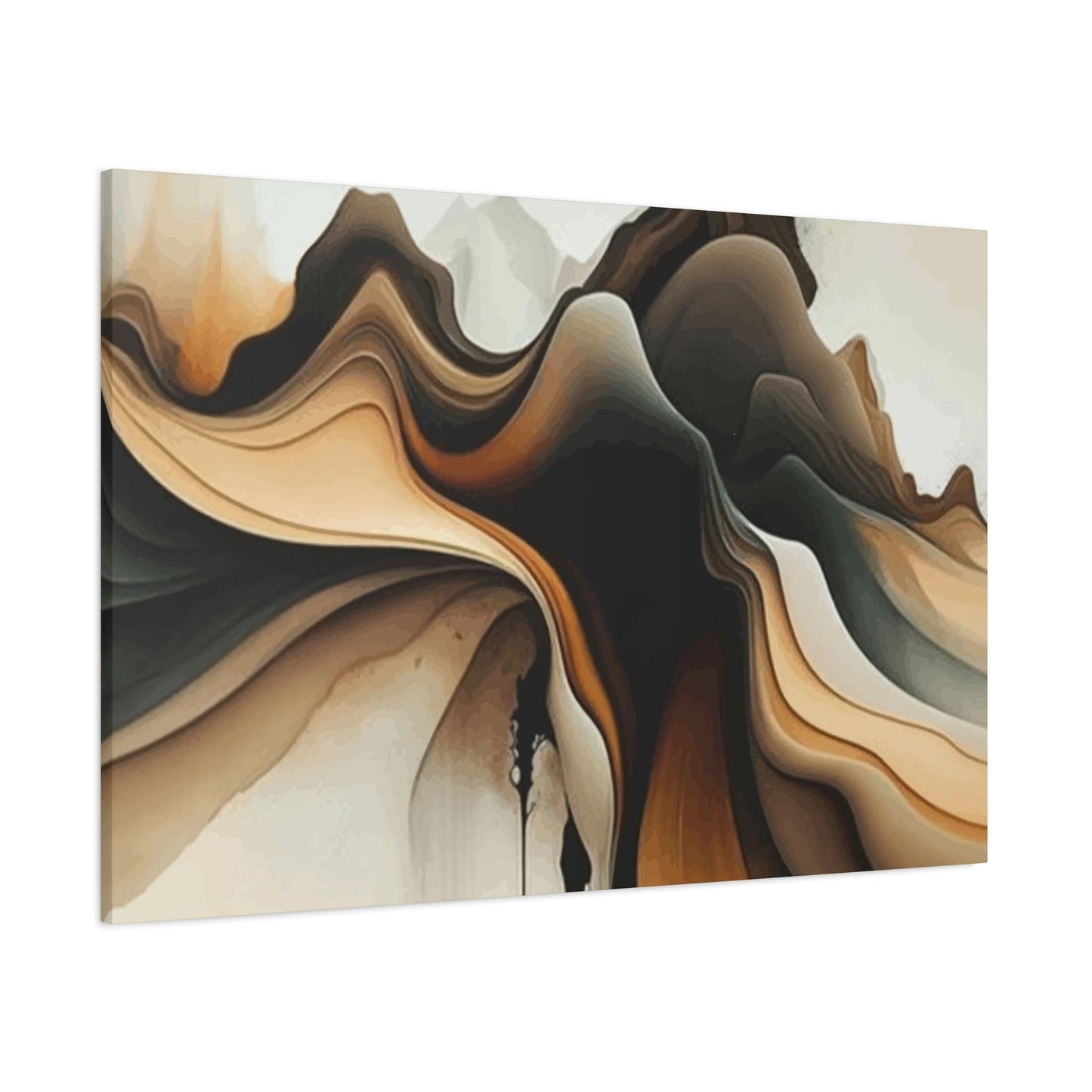
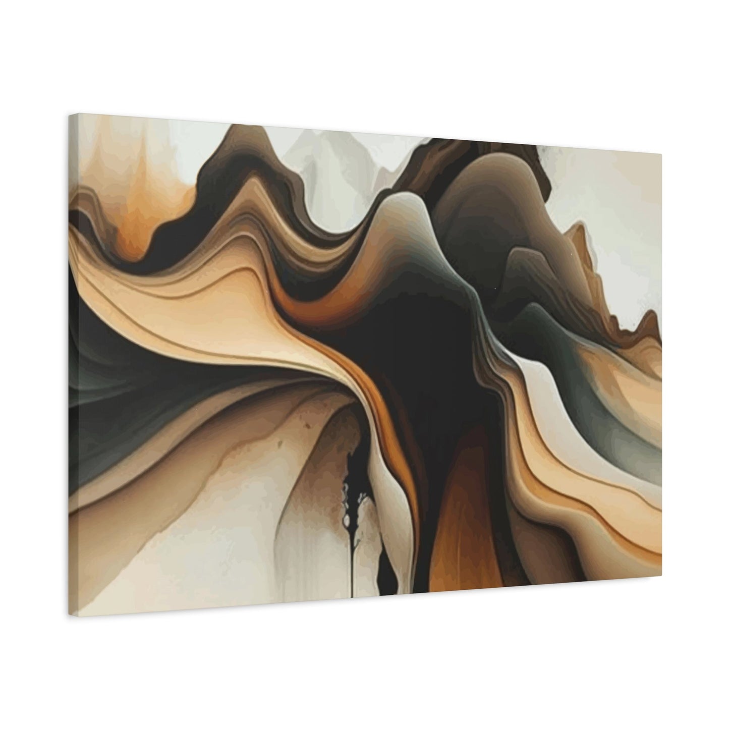
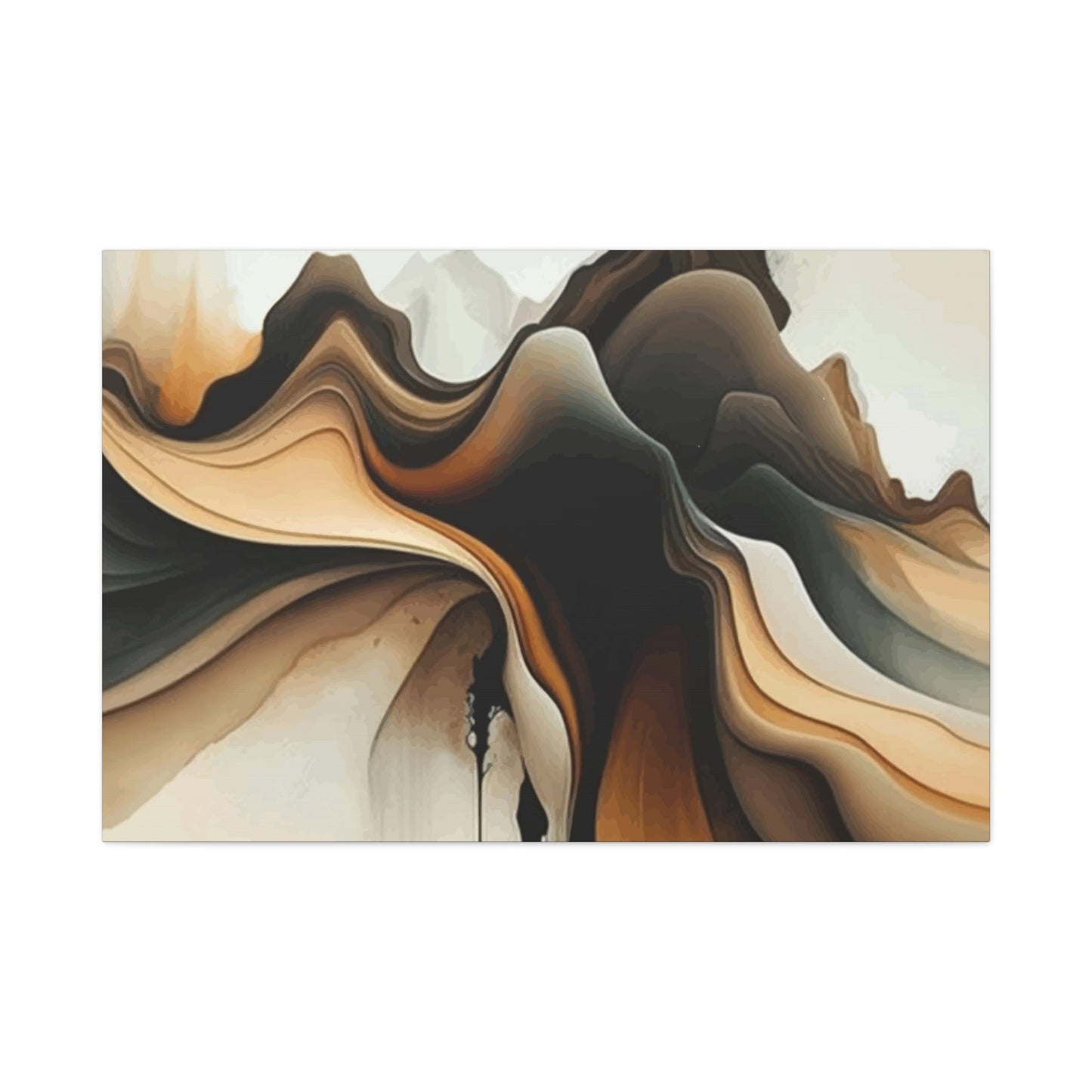
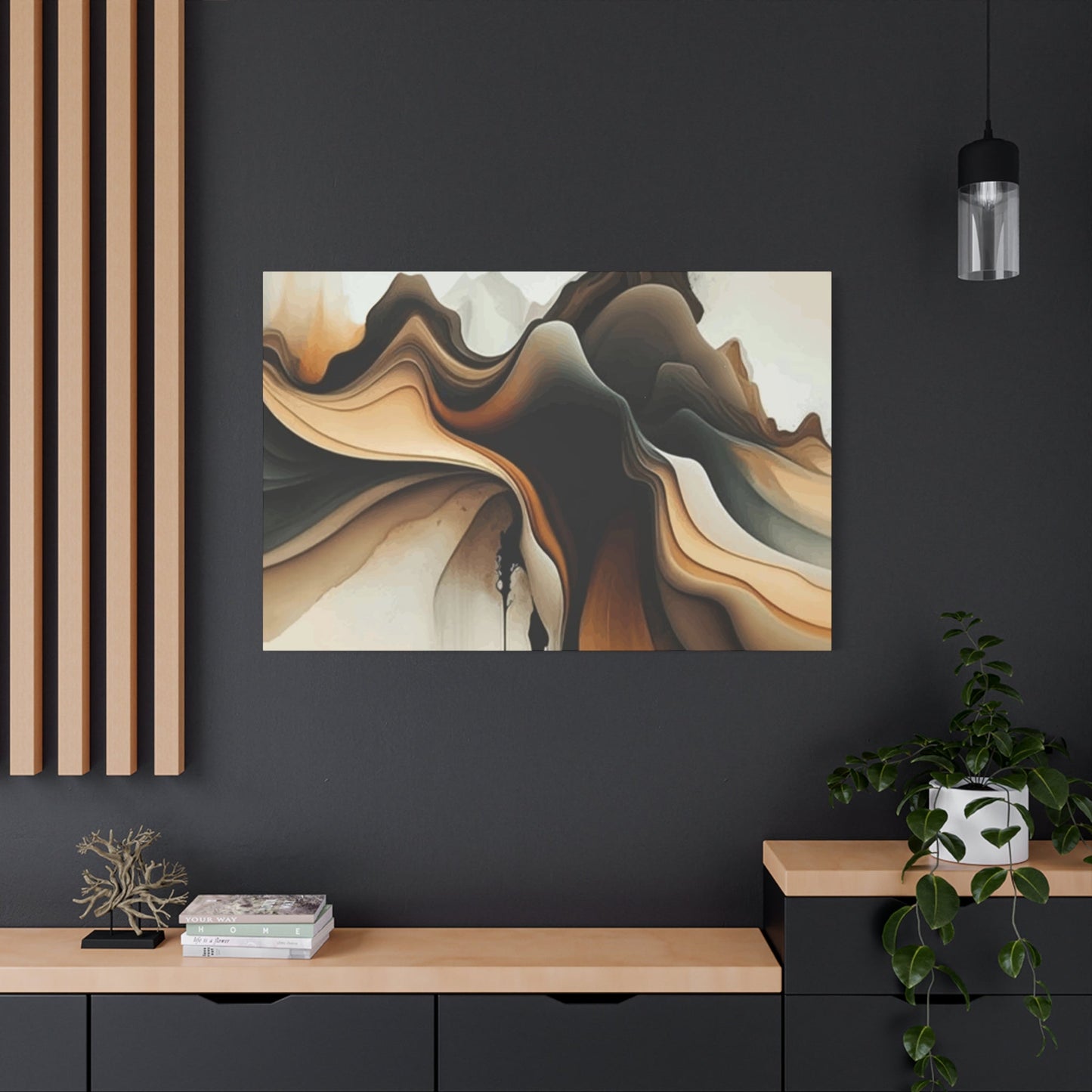
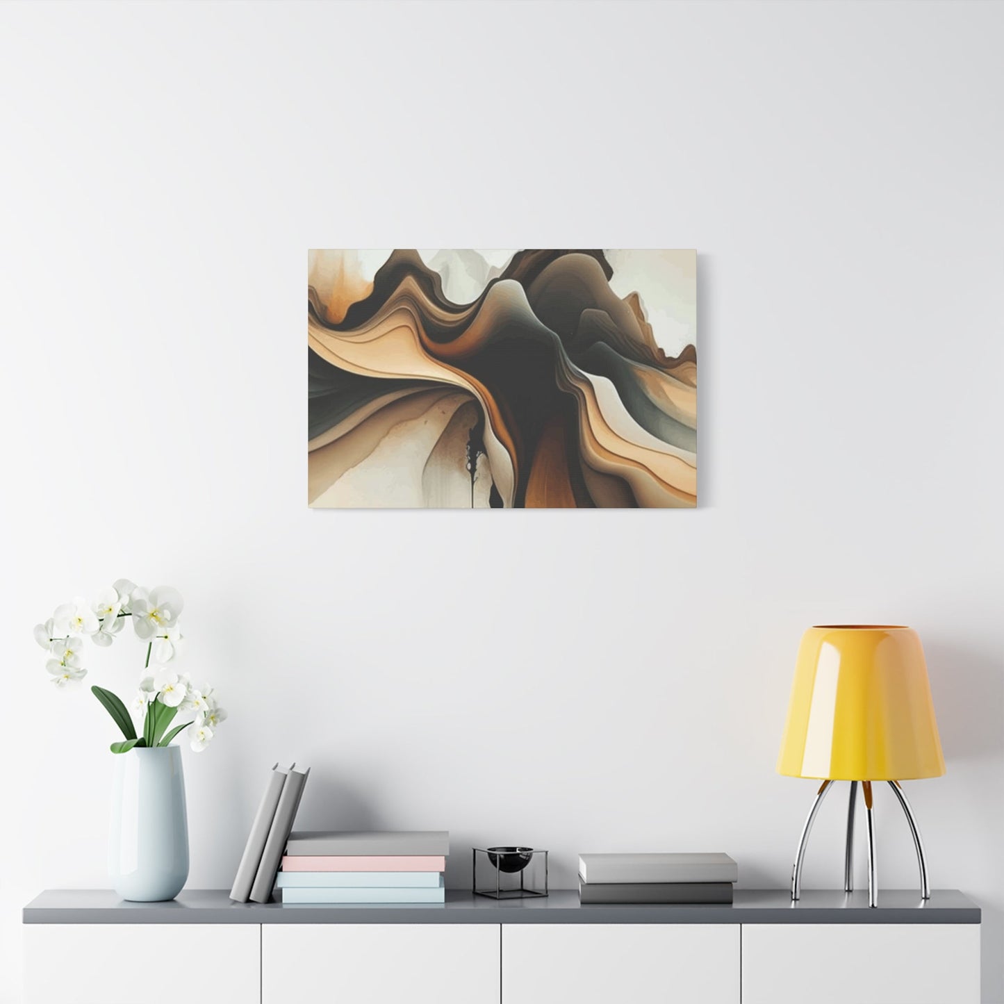
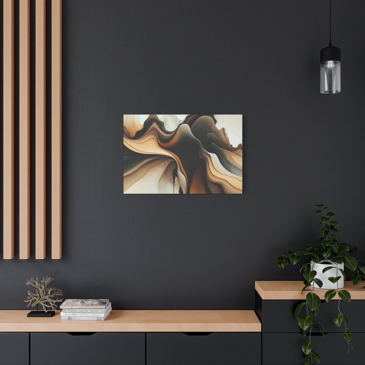
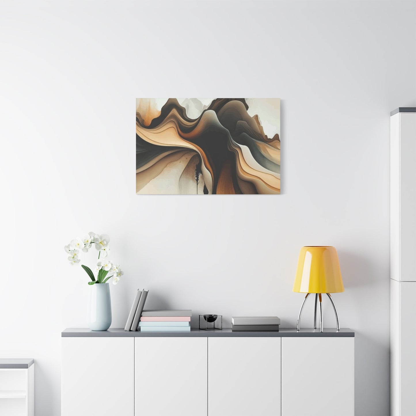
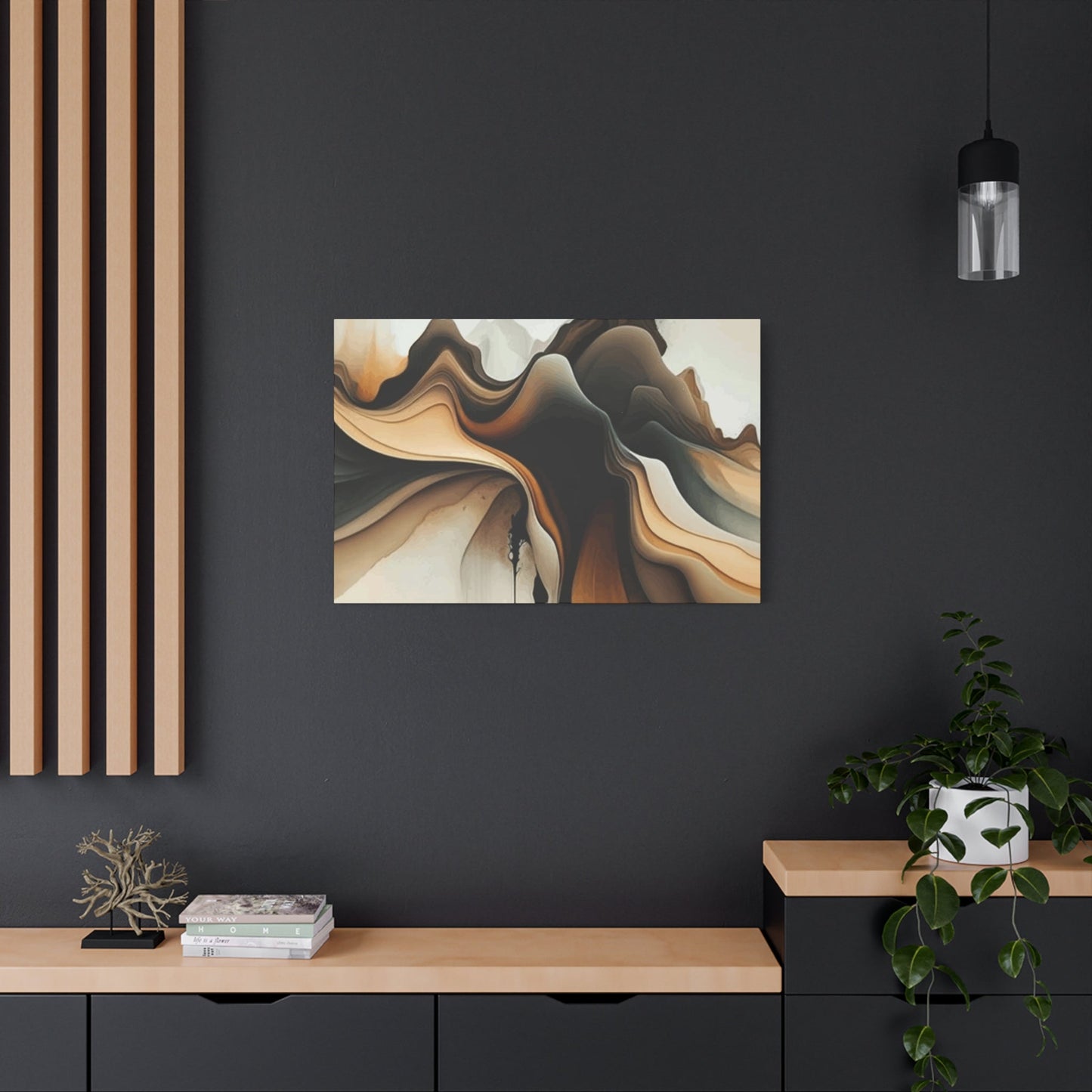
Abstract Designs Featuring Tan Hues
Abstract art in tan hues offers unparalleled versatility for collectors and decorators seeking pieces that suggest rather than dictate meaning. The absence of recognizable imagery allows viewers to project their own interpretations and emotional responses, making tan abstract pieces deeply personal despite their apparent simplicity. The neutral color palette ensures these works complement existing décor while the abstract nature invites ongoing contemplation and discovery.
Gestural abstracts in tan shades capture movement and energy through brushwork, drips, or other marks that record the artist's physical engagement with materials. These pieces bring dynamism to tan palettes that might otherwise feel static. The energy inherent in gestural marks creates visual excitement while the muted tan tones maintain overall calm, resulting in artwork that feels both alive and peaceful. This combination works particularly well in contemporary settings where energy and serenity need to coexist.
Geometric abstracts use tan tones to create compositions based on shape, line, and spatial relationships rather than color contrast. Overlapping circles, intersecting lines, or tessellating patterns rendered in various tan shades develop visual complexity through form alone. These pieces appeal to viewers who appreciate order and structure while desiring the warmth and approachability of neutral palettes. Geometric tan abstracts work beautifully in modern settings where clean lines and organized spaces predominate.
Color field abstracts in tan present large areas of unified color with subtle variations in tone or texture. These contemplative pieces create meditative focal points that support mindfulness and reflection. The expansiveness of color field compositions in tan shades can make rooms feel more generous while the soft hue prevents the overwhelming sensation that brighter color fields might produce. These works function almost architecturally, serving as visual anchors around which entire rooms can be organized.
Mixed media abstracts incorporating tan allow artists to explore texture, dimension, and material contrast. Collage elements, embedded objects, or layered materials create physical relief that casts shadows and catches light. When executed primarily in tan tones, these pieces achieve remarkable visual interest without relying on bright colors. The neutral palette allows the textures and materials themselves to become the focus, rewarding close viewing and revealing new details with each observation.
Minimalist abstracts reduce compositions to essential elements, often featuring just a few marks or shapes in tan against neutral backgrounds. These spare works require confidence from both artist and collector, as there's nowhere to hide in such stripped-down presentations. The power of minimalist tan abstracts lies in their restraint and the breathing room they provide. In increasingly busy visual environments, these quiet pieces offer respite and demonstrate that powerful art need not shout to be heard.
Display Tips for Tan Canvas Prints
Displaying tan canvas prints effectively requires consideration of height, spacing, lighting, and relationship to surrounding elements. Proper display ensures artwork can be comfortably viewed and appreciated while contributing to the overall composition of the room. While personal preference ultimately guides display decisions, certain principles consistently produce successful results regardless of individual taste or specific room characteristics.
Height placement fundamentally affects how artwork is experienced. The standard recommendation places the center of the artwork at eye level, typically between 57 and 60 inches from the floor. This guideline accommodates average human height and allows comfortable viewing whether standing or seated. In dining rooms where viewers are primarily seated, consider lowering artwork slightly. Above furniture, maintain 6-8 inches between the top of the furniture and the bottom of the frame to create visual connection without crowding.
Gallery wall arrangements allow multiple tan canvas prints to work together creating impact greater than individual pieces could achieve. Plan layouts on the floor before committing to wall placement, experimenting with different configurations. Maintain consistent spacing between pieces, typically 2-4 inches, to create unified appearance. Mix sizes and orientations while ensuring the overall arrangement forms a cohesive shape, whether rectangular, organic, or geometric. Tan pieces work beautifully in gallery walls as their neutral palette creates unity across diverse subject matter or styles.
Lighting dramatically affects how tan canvas prints appear and how much visual impact they deliver. Natural light provides ideal illumination but must be indirect to prevent damage. Picture lights mounted above artwork create focused illumination that makes pieces glow and enhances texture. Track lighting offers flexibility for highlighting multiple pieces. LED strips behind floating-mounted canvases create dramatic halo effects. Whatever lighting approach you choose, ensure bulbs have appropriate color temperature; 2700-3000K enhances warmth in tan tones while 3500-4000K provides more neutral illumination.
Negative space around tan artwork allows pieces to breathe and prevents walls from feeling cluttered. Resist the urge to fill every inch of wall surface. The area surrounding artwork contributes to its impact as much as the piece itself. In rooms with tan artwork, embrace the quiet that neutral palettes provide. Allow substantial wall areas to remain open, letting the artwork punctuate rather than dominate. This approach creates sophisticated, gallery-like presentations that elevate both the art and the environment.
Consider sight lines when placing tan canvas prints. Position pieces where they can be seen from multiple vantage points within the room and from adjacent areas. Artwork visible from hallways or through doorways creates visual continuity throughout the home. Avoid placing pieces where doors will swing into them or where they'll be partially obscured by window treatments. Think about how the artwork will be encountered as people move through the room, ensuring it can be appreciated from various angles and distances.
Emotional Effects of Tan Color in Art
The emotional effects of tan in art extend beyond simple aesthetic pleasure to influence mood, behavior, and psychological wellbeing. Color psychology research demonstrates that neutral, earthy tones like tan produce measurable effects on human psychology and physiology. Understanding these effects allows collectors to make intentional choices about artwork that supports their emotional goals for different rooms and contexts.
Tan evokes stability and security, fundamental emotional needs that find expression in our visual preferences. Rooms featuring tan artwork feel grounded and safe, qualities particularly valuable in private areas like bedrooms or in homes serving as sanctuaries from stressful external environments. The color's association with earth and natural materials triggers deep-seated responses that connect us to our evolutionary past when earth tones signaled solid ground, shelter, and safety.
The calming effect of tan has been documented in various studies measuring physiological responses to color. Heart rate and blood pressure often decrease in environments dominated by neutral, warm tones. Tan artwork contributes to these effects, creating visual environments that support relaxation and stress reduction. For individuals dealing with anxiety or high-stress lifestyles, incorporating tan art into living and working environments can provide measurable psychological benefits.
Tan's association with natural materials and organic forms contributes to feelings of comfort and authenticity. In an increasingly digital and artificial world, the earthy qualities of tan artwork provide visual connection to the natural world. This connection satisfies biophilic impulses—the innate human need to affiliate with other living systems and natural elements. Even abstract tan pieces that don't explicitly depict nature can trigger these responses through color alone.
The understated quality of tan produces emotional effects through what it doesn't do as much as what it does. Unlike stimulating bright colors that demand attention and emotional response, tan allows emotions to develop organically without external provocation. This quality makes tan artwork ideal for meditation rooms, therapy offices, or any setting where authentic emotional processing is desired without artificial manipulation through environmental factors.
Tan's versatility means it can support a wide range of emotional states without imposing specific feelings. The same tan artwork might feel cozy and nurturing in one context, sophisticated and refined in another, or calm and meditative in a third. This emotional flexibility allows tan pieces to adapt to the viewer's needs and the situation rather than dictating a singular emotional response. This adaptability contributes to tan artwork's longevity; as our emotional needs change over time, tan pieces continue to serve us well.
Gift Ideas: Tan Wall Art Prints
Tan wall art prints make exceptional gifts for numerous occasions, offering recipients tasteful décor that enhances their homes without imposing specific style requirements. The neutral palette ensures compatibility with existing furnishings while the inherent warmth of tan tones communicates care and thoughtfulness. Selecting appropriate tan artwork as a gift requires consideration of the recipient's taste, their home's aesthetic, and the occasion being celebrated.
For housewarming gifts, tan landscape prints provide new homeowners with artwork that transforms empty walls into personal, finished rooms. Choose pieces depicting serene natural scenes—coastlines, deserts, or forests—rendered primarily in tan and neutral tones. These works bring the calming influence of nature indoors while remaining stylistically neutral enough to work in various rooms. Frame the piece professionally to create a gift that's immediately ready to hang and enjoy.
Wedding gifts benefit from the timeless quality of tan abstract prints. Select pieces large enough to make statements in primary living areas where couples entertain and relax together. Abstract subjects avoid assumptions about the couple's specific tastes while tan palettes ensure the work will coordinate with whatever design direction they pursue. Consider commissioning custom pieces in tan tones that incorporate dates, coordinates, or other personally meaningful elements subtly integrated into the abstract composition.
Anniversary gifts can commemorate years together through tan artwork that reflects shared memories or dreams. A tan-toned print depicting a meaningful location—where the couple met, got engaged, or honeymooned—provides both aesthetic value and emotional resonance. The neutral palette ensures the piece feels sophisticated rather than sentimental, allowing it to function as genuine art rather than merely decorative remembrance.
For friends who appreciate minimalism, small tan prints suitable for gallery wall arrangements demonstrate understanding of their aesthetic preferences. Group three to five coordinating pieces in consistent frames, ready to hang as a collection. This approach provides recipients with curated artwork that creates immediate visual impact while respecting their preference for clean, uncluttered environments. Include installation hardware and layout suggestions to make the gift as turnkey as possible.
Office or professional milestone gifts benefit from the sophistication of tan artwork. When colleagues retire, launch businesses, or achieve professional accomplishments, tan canvas prints suitable for office display demonstrate respect for their achievements. Choose pieces that convey professionalism—geometric abstracts, subtle textures, or minimalist compositions—that enhance work environments without distraction. The neutral palette ensures the artwork remains appropriate regardless of how office décor evolves over time.
Budget-conscious gift-giving finds an ally in tan artwork prints. High-quality reproductions of significant works or original pieces by emerging artists often cost less than colorful alternatives while delivering equal visual impact. Group smaller tan prints together to create generous gifts without excessive expense. The perceived value of neutral artwork often exceeds its actual cost because the sophisticated appearance suggests greater investment than was actually required.
Popular Artists Using Tan Palettes
Throughout art history, numerous significant artists have explored tan palettes, recognizing the expressive potential in these earthy, neutral tones. From old masters to contemporary practitioners, artists working primarily or substantially with tan create works that demonstrate the color's range and emotional depth. Familiarity with these artists helps collectors understand the tradition of tan in art and discover new works that might enhance their collections.
Giorgio Morandi, the Italian painter known for contemplative still life compositions, frequently employed tan and neutral palettes to create hauntingly beautiful arrangements of bottles, bowls, and vessels. His muted tones and subtle handling of light transformed ordinary objects into meditative subjects. Morandi's work demonstrates how tan palettes can convey profound quietness and introspection, influencing generations of artists interested in minimalism and contemplative practice.
Agnes Martin, a key figure in American abstract expressionism and minimalism, created works predominantly in neutral tones including tan. Her grid paintings and stripe compositions used barely-there variations in tan and cream to produce pieces of remarkable subtlety and spiritual presence. Martin's work shows how tan can serve deeply philosophical and emotional purposes, creating art that invites prolonged meditation and rewards patient viewing.
Contemporary artist Mark Rothko, though often associated with his color field works in vibrant hues, produced significant works in tan, brown, and neutral palettes particularly in his later career. These pieces maintain the emotional intensity of his brighter works while introducing qualities of introspection and gravitas. Rothko's neutral works demonstrate that tan can carry profound emotional weight and serve serious artistic intentions.
Robert Ryman, known exclusively for white paintings, often incorporated tan and cream tones as he explored the nuances of white and neutral pigments. His investigation into subtle color variation, surface texture, and paint application elevated neutral palettes to primary subject matter. Ryman's work challenges viewers to see complexity and beauty in apparent simplicity, making him essential for understanding contemporary approaches to tan and neutral art.
Contemporary artist Anselm Kiefer frequently employs tan and earth tones in his monumental mixed-media works addressing history, mythology, and memory. His use of actual straw, ash, and earth materials creates physically textured pieces in natural tan tones. Kiefer demonstrates how tan palettes can convey weighty subjects and historical consciousness, connecting viewers to deep time and collective memory through color choices rooted in earthly materials.
Julie Mehretu, a contemporary abstract artist, creates densely layered works that often incorporate tan and neutral tones alongside more vibrant colors. Her architectural drawings and gestural marks in tan shades provide grounding elements in otherwise complex compositions. Mehretu's work shows how tan functions in contemporary art practice, serving as both foundation and subject while addressing themes of globalization, migration, and urban experience.
Tan Art in Modern and Classic Styles
Tan artwork transcends stylistic boundaries, functioning equally well in modern and classic contexts. This versatility stems from the color's fundamental neutrality and its connection to timeless natural materials. Understanding how tan operates within different stylistic frameworks allows collectors to select pieces that either harmonize with or thoughtfully contrast against their existing décor schemes.
In modern contexts, tan artwork embraces clean lines, minimal ornamentation, and emphasis on form and composition over decorative detail. Modern tan pieces often feature geometric shapes, asymmetrical balance, and bold simplicity. The neutral palette supports modernism's aesthetic goals of clarity, functionality, and rejection of unnecessary embellishment. Large-scale tan canvas prints with single-color fields or simple geometric divisions exemplify how the color serves modern sensibilities.
Mid-century modern design, a subset of modern style experiencing renewed popularity, pairs beautifully with tan artwork. The warm woods, organic forms, and connection to nature characteristic of mid-century aesthetics find perfect partners in tan-toned prints. Abstract compositions, botanical subjects, or landscape scenes rendered in tan shades enhance the relaxed sophistication of mid-century rooms while respecting the era's preference for natural materials and muted palettes.
Contemporary interpretations of modern design incorporate tan artwork to soften sometimes austere modern aesthetics. While maintaining clean lines and minimal approaches, contemporary designers often introduce warmth through color choices. Tan art serves this goal perfectly, preserving modern clarity while making rooms feel more inviting and livable. Mixed-media works, photographic prints, or digital art in tan tones bring current artistic practices into modern settings.
Classic styles ranging from traditional to colonial to French country all accommodate tan artwork beautifully. In these contexts, tan pieces often feature more ornate framing, representational subject matter, or romantic compositions. Classic tan artwork might depict pastoral landscapes, architectural studies, or still life arrangements executed with attention to realistic detail. The tan palette connects these works to historical art traditions while ensuring they don't appear dated or overly nostalgic.
Transitional style, which bridges modern and traditional aesthetics, relies heavily on neutral palettes where tan artwork shines. Rooms blending contemporary furniture with classic architectural details benefit from tan pieces that don't favor either extreme. Abstract works with subtle references to natural forms, minimalist landscapes, or texture-focused pieces work beautifully in transitional contexts, satisfying both modern and classic sensibilities simultaneously.
Eclectic approaches mixing multiple styles find tan artwork particularly valuable as unifying elements. When rooms incorporate diverse furniture styles, varied patterns, or multiple design eras, tan pieces provide visual rest and coherence. The neutral palette serves as common ground that ties disparate elements together, demonstrating good curatorial judgment while allowing individual pieces their moment. Tan artwork in eclectic settings proves that neutrality need not mean boring.
Mixing Tan with Other Earth Tones
Combining tan artwork with other earth tones creates richly layered visual experiences that celebrate natural color harmony. Earth tones—including browns, terracottas, ochres, olives, and deeper tans—work together seamlessly because they share organic origins and similar undertones. Building color schemes around tan art and complementary earth tones produces rooms that feel grounded, cohesive, and deeply connected to the natural world.
Layering different values within the tan and brown family creates sophisticated monochromatic schemes. Pair pale tan artwork with chocolate brown furnishings and mid-tone taupe walls for a cohesive look with clear visual hierarchy. The variation in value provides necessary contrast while the unified color family maintains harmony. This approach works particularly well in formal rooms like dining rooms or libraries where sophistication and calm are desired.
Terracotta introduces warmth and slight color saturation to schemes built around tan artwork. The reddish-orange tones in terracotta complement tan beautifully, creating combinations that feel sun-baked and Mediterranean. Use terracotta in accent pieces like pottery, pillows, or textiles alongside tan canvas prints for rooms that feel warm without becoming overly intense. The combination works especially well in rooms receiving abundant natural light where the warmth feels appropriate and inviting.
Olive green and tan create organic pairings that reference landscapes where earth and vegetation meet. Tan artwork provides neutral foundation while olive accents in furnishings or accessories introduce subtle color without dramatic contrast. This combination feels particularly appropriate in casual living areas, sunrooms, or rooms with views of natural surroundings. The pairing emphasizes connection to nature and outdoor living.
Ochre and mustard tones, while more saturated than pure tan, belong to the same earth tone family and complement tan artwork beautifully. These golden yellows add energy and optimism to neutral schemes without abandoning the earthy foundation. Use ochre sparingly as accent colors in pillows, throws, or small accessories alongside tan canvas prints. The combination maintains overall neutrality while introducing cheerful notes that prevent rooms from feeling too serious or somber.
Rust and burnt orange sit slightly outside the core tan family but complement tan artwork through shared warmth and earth-tone heritage. These more saturated colors work best as occasional accents—a single rust pillow, a burnt orange vase—that punctuate rather than dominate. Against tan artwork, these richer tones create focal points and visual interest while maintaining the overall neutral character of the space.
Deep browns and near-blacks ground schemes featuring tan artwork, providing necessary visual weight and definition. Without darker tones, all-tan rooms can lack structure and feel washed out. Incorporate deep brown through flooring, larger furniture pieces, or window treatments to anchor lighter tan artwork. The contrast between light tan art and dark foundational elements creates dynamic tension that makes both more effective.
Using Tan Art to Create Cozy Vibes
Tan artwork excels at creating cozy, inviting atmospheres that encourage relaxation and contentment. The inherent warmth of tan tones, combined with thoughtful styling and complementary elements, transforms ordinary rooms into havens of comfort. Creating genuine coziness requires attention to multiple sensory factors, with tan art serving as visual foundation for warm, welcoming environments.
Layering textures amplifies the cozy feeling initiated by tan artwork. Pair smooth tan canvas prints with plush textiles like velvet pillows, chunky knit throws, or soft wool rugs. The contrast between the flat artwork and dimensional, tactile furnishings creates multisensory richness that defines true coziness. The visual warmth of tan art cues visitors that the room will feel physically warm and comfortable as well.
Scale contributes to coziness in unexpected ways when working with tan artwork. While large statement pieces can feel impressive, multiple smaller tan prints create intimate, personal arrangements that enhance coziness. Gallery walls of family photos in tan tones, small landscape prints clustered together, or series of coordinating pieces suggest curation and care that make rooms feel personally tended and welcoming.
Lighting dramatically affects how cozy tan artwork appears and how much it contributes to overall room warmth. Avoid harsh overhead lighting that flattens appearance and creates cold ambiance. Instead, use table lamps, floor lamps, and wall sconces with warm bulbs to create pools of soft light. Position lighting to graze tan artwork at angles, enhancing any texture and making pieces appear to glow from within.
Incorporating natural materials alongside tan art reinforces organic coziness. Wooden furniture, woven baskets, stone accessories, and living plants all share the earthy character of tan tones. These elements create coherent environments where everything feels connected to nature and genuine rather than artificial. The authenticity inherent in natural materials and tan artwork produces coziness that feels real rather than styled.
Furniture arrangement influences how cozy rooms feel regardless of artwork. Position seating to encourage conversation and connection rather than theater-style facing a television. Create multiple seating areas in larger rooms, each anchored by appropriate tan artwork. Ensure every seat has access to surfaces for setting drinks or books. These practical considerations, combined with tan artwork's visual warmth, produce genuinely cozy spaces rather than merely pretty rooms.
Conclusion
The rise of tan wall art marks a significant shift in modern interior design, reflecting the growing appreciation for neutral tones that bring warmth, sophistication, and versatility to living spaces. As homeowners and designers increasingly seek calm and inviting environments, tan has emerged as an ideal color choice that harmonizes effortlessly with a wide range of styles—from minimalist and contemporary to bohemian and rustic.
Tan wall art stands out not only for its aesthetic appeal but also for its ability to create balance and depth without overpowering a room. Unlike bold or overly vibrant colors, tan offers subtlety, allowing other elements in the space, such as furniture, textiles, and natural light, to shine. This neutrality makes tan a perfect backdrop that complements diverse color palettes and textures, encouraging creativity in interior styling.
Another important aspect contributing to the popularity of tan wall art is its timelessness. Trends come and go, but neutral shades like tan have enduring appeal. This quality ensures that investing in tan-toned artwork provides both immediate visual impact and long-term value, as it remains relevant through shifting design trends. Moreover, tan’s connection to natural materials and earth tones aligns with the growing movement toward sustainability and biophilic design, which prioritize organic, calming environments.
In addition to its aesthetic benefits, tan wall art fosters a sense of warmth and comfort. The color evokes feelings of coziness and groundedness, helping transform interiors into serene sanctuaries—something increasingly important in today’s fast-paced, digital world. It invites relaxation and mindfulness, making homes not just places to live, but spaces to thrive.
Ultimately, the rise of tan wall art reflects a broader cultural desire for simplicity, authenticity, and harmony in our environments. By embracing this neutral trend, modern interiors can achieve timeless elegance that feels both fresh and welcoming, proving that sometimes, the most understated choices make the most powerful statements.
