


Teis Albers Wall Art: A Complete Guide to His Canvas Prints and Artistic Vision
Teis Albers has emerged as a distinctive voice in the contemporary art scene, celebrated for his ability to blend minimalism with emotional resonance. His artistic approach represents a fascinating intersection of Scandinavian sensibility and modern abstraction, creating pieces that speak to viewers on multiple levels. The Danish artist's work is characterized by an understated elegance that never sacrifices depth for simplicity, making his creations particularly appealing to those who appreciate thoughtful composition and subtle complexity.
The foundation of Albers' artistic style lies in his masterful use of geometric forms and organic shapes that coexist in harmonious tension. Unlike many contemporary artists who lean heavily toward either rigid structure or complete fluidity, Albers navigates a middle path that allows both elements to inform and enhance each other. His compositions often feature rectangular blocks of color that appear to float against more textured backgrounds, creating a sense of layered dimensionality that invites prolonged contemplation. This approach reflects a sophisticated understanding of how the human eye processes visual information and seeks meaning in abstract forms.
Texture plays a crucial role in defining Albers' signature aesthetic. Rather than relying solely on smooth, digitally perfect surfaces, he incorporates visible brushstrokes, subtle gradations, and occasionally weathered or distressed effects that give his work a tactile quality even in print form. This textural richness prevents his pieces from feeling cold or impersonal despite their often muted color schemes and geometric precision. The artist understands that texture creates visual interest and invites viewers to imagine the physical experience of the artwork, bridging the gap between the visual and the tangible.
Albers' relationship with negative space demonstrates another hallmark of his mature style. He treats empty areas not as absence but as active compositional elements that shape the viewer's experience just as powerfully as the marks and forms he places on the canvas. This sophisticated use of negative space reflects influences from traditional Asian aesthetics, particularly Japanese concepts of ma, or meaningful emptiness. By allowing breathing room within his compositions, Albers creates artworks that feel meditative rather than cluttered, offering visual rest points that enhance rather than diminish the overall impact.
The artist's approach to balance and asymmetry reveals his deep understanding of visual dynamics. While many of his pieces feature centered focal points or symmetrical arrangements, Albers frequently introduces subtle imbalances that prevent his work from becoming static or predictable. A shape might sit slightly off-center, a color field might extend further on one side than the other, or a textural element might appear in an unexpected location. These deliberate imperfections create visual tension that keeps the eye moving across the composition, discovering new relationships and subtleties with each viewing.
Layering techniques distinguish Albers' work from more straightforward abstract compositions. He builds his images through successive applications of paint, glaze, or digital layers that create depth and complexity without overwhelming the viewer. This approach allows earlier layers to show through subsequent ones, creating ghostly echoes and visual histories that suggest the passage of time or the accumulation of memory. The layering process itself becomes a metaphor for how we construct meaning and understanding through accumulated experiences, making his work resonate on both aesthetic and conceptual levels.
Discovering the Artist Behind the Canvas
Teis Albers is a contemporary Dutch mixed-media artist who has made significant waves in the modern art world with his distinctive approach to visual storytelling. Based in Berlicum, the Netherlands, Albers didn't follow a traditional fine arts path. Instead, he studied graphic design at the Design Academy in Eindhoven, an educational background that profoundly shapes his artistic vision today. After completing his studies, he made the bold decision to establish his own art studio, where he could fully explore the intersection of graphic design principles and fine art expression. This combination of commercial design sensibility with artistic creativity has proven to be his greatest strength, allowing him to create works that are both visually striking and deeply layered with meaning.
What makes Albers particularly fascinating in the contemporary art landscape is his ability to bridge multiple aesthetic worlds simultaneously. He draws primary inspiration from music album covers and vintage movie posters, mediums that must convey complex narratives and emotions through a single powerful image. This influence is evident in how his compositions command attention immediately while revealing deeper layers upon prolonged viewing. His work operates on multiple levels—offering instant visual gratification for the casual observer while providing endless discovery for those who take time to explore every detail. Albers has built an international following among collectors who appreciate art that rewards engagement, where each viewing session reveals something previously unnoticed. His canvas prints have become highly sought after because they bring museum-quality artistic sophistication into residential and commercial spaces, transforming ordinary walls into conversation pieces that never grow stale.
The Signature Albers Aesthetic and Style
The visual language Teis Albers has developed is immediately recognizable yet difficult to categorize neatly into a single artistic movement. His work exists at the fascinating intersection of multiple aesthetic traditions, creating something entirely his own. At the foundation of most Albers pieces are natural elements—birds, flowers, botanical specimens, and organic forms that provide universal beauty and accessibility. However, these natural subjects are never presented in straightforward botanical illustration style. Instead, Albers layers them with urban textures, graffiti-inspired marks, vintage typography, and pop art colors, creating a tension between nature and culture, past and present, elegance and edge. This juxtaposition is what gives his work its distinctive energy and contemporary relevance.
The mood Albers creates is often described as mysterious and nostalgic, with dramatic use of light and shadow that adds cinematic quality to his compositions. He frequently employs a darker, more atmospheric palette punctuated by vibrant color accents, creating focal points that draw the eye through the composition. His background in graphic design manifests in his masterful use of negative space, strong compositional structure, and the integration of text elements that feel integral rather than decorative. Typography appears throughout his work—sometimes legible, sometimes abstracted into pure form—adding another layer of meaning and visual interest. The overall effect is artwork that feels both carefully constructed and spontaneously created, planned yet organic. This balance makes his pieces versatile enough to complement various interior design styles, from industrial lofts to contemporary homes to traditional spaces seeking a modern edge. Collectors appreciate that Albers' work brings sophistication without pretension, artistry without inaccessibility.
Understanding His Mixed-Media Technique
What truly sets Teis Albers apart from many contemporary artists is his innovative mixed-media approach that combines digital precision with hands-on artistic craftsmanship. His process is neither purely digital nor traditionally analog, but rather a sophisticated hybrid that leverages the strengths of both methods. Albers typically begins his creative process in the digital realm, using professional design software to compose, arrange, and experiment with various elements. This digital foundation allows him unlimited flexibility to try different compositions, adjust colors, scale elements, and perfect every aspect of the design before committing to physical materials. For his celebrated Bouquet series, he photographs individual flowers under controlled lighting conditions, then digitally combines dozens of these specimens into lush, impossibly perfect arrangements that could never exist in nature.
He layers these photographic elements with painted marks, graphic shapes, textures, and typography, building complex compositions with dozens or even hundreds of individual layers.However, Albers doesn't stop at digital output. What elevates his canvas prints beyond typical digital reproductions is his commitment to adding physical dimension and texture after printing. Once a composition is printed onto high-quality canvas, Albers returns to traditional art-making techniques, applying actual paint, varnish, and sometimes collage elements directly onto the printed surface. This hands-on intervention adds tangible artistic presence, catching light differently than flat prints and creating subtle variations that make each piece unique.
He might add gestural brushstrokes, drips, splatters, or carefully placed accents that enhance certain areas of the composition. Some works incorporate three-dimensional collage elements—fragments of vintage paper, found materials, or textured substances that literally project from the canvas surface. This labor-intensive process explains why Albers' canvas prints command premium prices compared to standard reproductions; they're not merely printed images but genuine mixed-media artworks. The combination of digital perfection and analog imperfection, controlled design and spontaneous mark-making, creates visual richness that engages viewers on multiple sensory levels. It's this technical sophistication that has earned Albers recognition in both the fine art world and the design community.
Popular Collections and Iconic Series
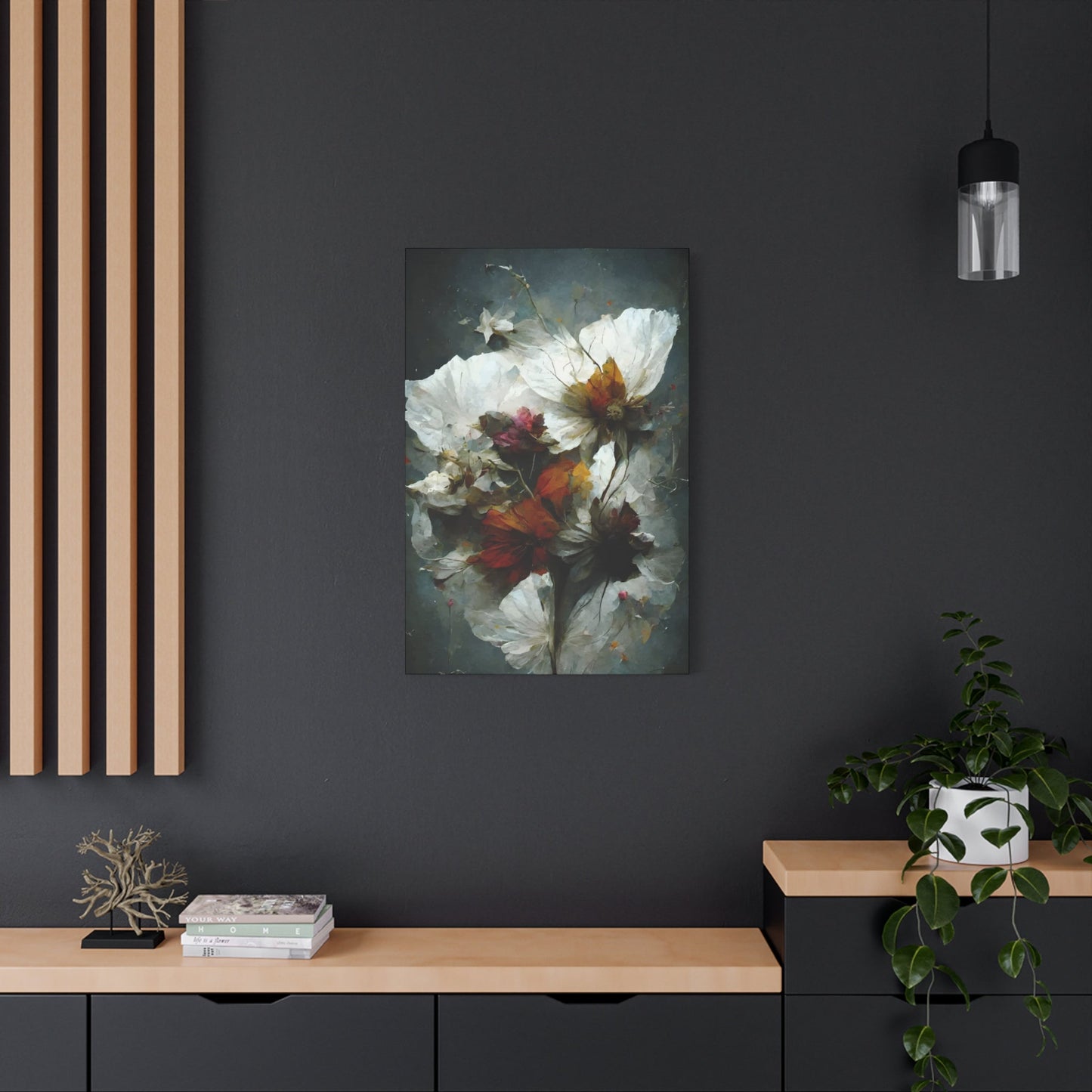
Teis Albers has developed several distinct bodies of work, each exploring different themes while maintaining his signature aesthetic approach. His Bouquet series has become perhaps his most recognized and commercially successful collection, featuring elaborate floral arrangements that reimagine Dutch Golden Age still life paintings for the contemporary era. These pieces combine photographically realistic flowers with graffiti marks, dripping paint, geometric shapes, and urban textures, creating striking contrasts between natural beauty and street art energy. Each bouquet composition is meticulously balanced, with flowers arranged to create visual flow and rhythm, often set against darker backgrounds that make the vibrant blooms pop dramatically.
The series resonates with collectors who want botanical art with edge, something more dynamic and contemporary than traditional floral paintings.His bird-themed works represent another significant collection, featuring various avian species rendered with the same mixed-media approach. Parrots, owls, peacocks, and exotic birds become subjects for exploring color, pattern, and personality. These pieces often incorporate vintage encyclopedia illustrations, scientific diagrams, handwritten text, and layered graphics that tell stories about each species while celebrating their visual magnificence. The bird works tend to have a slightly more masculine or adventurous quality compared to the romantic florals, making them popular for office spaces and bachelor pads.
Albers also creates urban landscape and abstract compositions that lean more heavily into street art aesthetics, with fragmented cityscapes, architectural elements, and purely graphic explorations. His portrait work occasionally appears, featuring anonymous faces layered with textures and graphics that obscure and reveal simultaneously. What unifies all these collections is Albers' commitment to creating visual complexity—no matter the subject matter, each piece contains enough detail and nuance to sustain long-term interest. Collectors often describe discovering new elements months or even years after purchasing an Albers piece, which is precisely the artist's intention and greatest achievement.
Selecting and Displaying Albers Canvas Prints
Choosing the right Teis Albers canvas print for your space involves considering both aesthetic compatibility and the emotional response you want to create. His work is versatile but has strong personality, so it works best when given prominence rather than blending into the background. In contemporary or industrial spaces with clean lines and neutral palettes, Albers' darker, more atmospheric pieces create stunning focal points without competing with the architecture. The layered textures and urban elements complement exposed brick, concrete, and metal finishes beautifully. For more traditional interiors, his floral bouquets can bridge classic and contemporary sensibilities, updating the familiar still life genre with modern energy.
Consider the existing color palette in your room—many Albers pieces feature dominant darks and neutrals with selective pops of color, making them surprisingly adaptable to various color schemes.Scale matters significantly with Albers' detailed work. While his compositions reward close inspection, they're also designed to have impact from across a room. Large-format pieces work magnificently as statement walls in living rooms, above sofas, or in entry halls where they create immediate impression. Medium-sized works excel in dining rooms, bedrooms, or office spaces where they'll be viewed from moderate distances.
Some collectors create gallery walls combining multiple smaller Albers prints, though this requires careful curation to avoid visual chaos—his pieces are already complex, so groupings should be thoughtfully balanced. Regarding placement height, follow the standard gallery rule of positioning artwork so the center sits at approximately 57-60 inches from the floor, which aligns with average eye level. In terms of lighting, Albers' work benefits from directional illumination that highlights the physical textures he adds to the canvas. Picture lights or track lighting positioned to graze across the surface at an angle will emphasize dimensionality and create subtle shadows that enhance the viewing experience. Avoid placing these pieces in direct sunlight, which can fade pigments over time despite their archival quality.
Investing in Albers Art
Teis Albers' canvas prints represent both aesthetic investments and financial ones, as his growing international reputation has steadily increased the value of his works. Proper care ensures your piece maintains its condition and value over time. Canvas prints should be dusted regularly using a soft, dry microfiber cloth or gentle brush, working from top to bottom to avoid pushing dust into textured areas. Because Albers often applies actual paint and varnish to his canvases, they have varying surface textures that can trap dust more easily than flat prints. Never use liquid cleaners directly on the canvas surface, as this can damage both the printed elements and any hand-applied media.
If your piece has a protective glass or acrylic covering, clean only the glass using appropriate cleaner sprayed onto your cloth, not directly onto the frame where it might seep behind the glass.Environmental conditions significantly impact longevity. Keep Albers pieces away from direct sunlight, which causes fading even in archival-quality prints. If your room receives strong natural light, position the artwork on walls perpendicular to windows rather than directly opposite them. Maintain stable temperature and humidity levels—extreme fluctuations can cause canvas to expand and contract, potentially leading to cracking or warping over time. Avoid hanging valuable pieces above radiators, fireplaces, or in bathrooms where moisture levels fluctuate dramatically.
When it comes to investment potential, limited edition Albers prints typically hold and appreciate in value better than open edition reproductions. Original mixed-media pieces, where the canvas itself has been worked on extensively by the artist, command premium prices and have the strongest investment potential. Documentation matters—retain all certificates of authenticity, edition numbers, and provenance information. If you're purchasing specifically as an investment, research which series and sizes have performed best in secondary markets. However, the primary reason to acquire a Teis Albers piece should always be personal connection to the work itself. Art investments perform best over long holding periods, so choose pieces you'll genuinely enjoy living with for years while their value appreciates.
Popular Themes in Teis Albers Wall Art
The thematic concerns that run through Teis Albers' body of work reveal an artist deeply interested in the intersection of natural phenomena and human emotional experience. While his visual language remains consistently abstract, certain themes emerge repeatedly, creating a coherent artistic vision that explores fundamental aspects of existence through non-representational means. These recurring themes give collectors and admirers frameworks for understanding and connecting with his diverse portfolio of pieces.
Landscape abstraction forms one of the most prominent themes in Albers' oeuvre. Though his works rarely include recognizable natural features, many pieces evoke the feeling of being within or observing natural environments. Horizontal bands of color suggest distant horizons, textured areas recall weathered stone or water-marked surfaces, and atmospheric effects create depth reminiscent of fog or mist. These landscape-inspired pieces don't attempt to represent specific locations but instead capture the essence of being in nature, the emotional and psychological experience of encountering the natural world rather than its literal appearance.
The passage of time and the marks it leaves constitute another central theme in Albers' artistic exploration. Many of his pieces incorporate distressed surfaces, faded colors, or layered elements that suggest age, wear, and the accumulation of history. This engagement with temporal themes connects his work to broader concerns in contemporary art about memory, preservation, and decay. By incorporating visual markers of time's passage, Albers creates pieces that feel lived-in and authentic rather than artificially pristine, acknowledging that beauty often emerges through weathering and change rather than despite them.
Meditation and contemplative practice inform much of Albers' thematic content, even when not explicitly referenced. The calm, centered quality of his compositions invites viewers to slow down and engage with the artwork on a deeper level than superficial visual consumption. This meditative quality aligns with growing contemporary interest in mindfulness and intentional living, making his work particularly resonant for audiences seeking visual experiences that promote reflection and inner peace. The unhurried nature of his compositions provides a counterpoint to the frenetic pace of modern life, offering viewers a momentary respite.
Architectural themes appear throughout Albers' work, though expressed through abstract means rather than literal representation. Rectangular forms suggest walls, windows, or doorways, while linear elements might evoke beams, columns, or built structures. This architectural vocabulary connects his work to the human habit of creating structured environments within the natural world, exploring the relationship between constructed and organic forms. These pieces often feel simultaneously enclosed and expansive, suggesting how architecture both shelters and frames our experience of the wider world.
Teis Albers Prints for Modern Decor
Incorporating Teis Albers prints into contemporary living environments offers homeowners and designers an opportunity to add sophisticated visual interest while maintaining the clean, uncluttered aesthetic that defines modern decor. The artist's work proves particularly well-suited to modern settings because his minimalist sensibility and refined color palettes complement rather than compete with the architectural features and furnishing choices typical of contemporary design. Successfully integrating his prints requires thoughtful consideration of scale, placement, color relationships, and the overall visual narrative you wish to create within your environment.
The living room presents perhaps the most obvious location for displaying Albers prints, where they can serve as focal points that anchor the visual design of the area. In modern living rooms characterized by clean lines and neutral palettes, his artwork provides necessary visual interest without introducing excessive complexity or color saturation. Consider positioning a large Albers print above a streamlined sofa, where its horizontal orientation can echo the furniture's linear form while providing upward visual movement that draws the eye and creates a sense of expanded vertical dimension. The key lies in selecting pieces whose dimensions create appropriate proportional relationships with surrounding furniture rather than overwhelming or disappearing within the environment.
Bedroom applications of Albers prints offer opportunities to create serene, contemplative atmospheres conducive to rest and relaxation. The artist's often muted color schemes and calming compositions align perfectly with the psychological requirements of sleep environments. Positioning a horizontal Albers piece above the headboard can create a visual connection between the artwork and the bed's linear form while providing a focal point that doesn't overstimulate before sleep. Alternatively, consider flanking the bed with matching or complementary Albers prints hung on the walls adjacent to the headboard, creating a triptych effect that frames the sleeping area without requiring wall mounting above the bed itself.
Home office environments benefit particularly from Albers' contemplative aesthetic, which can help create focused, productive atmospheres. Modern home offices often struggle with feeling either too clinical or too cluttered, but thoughtfully selected Albers prints can strike the necessary balance between visual interest and professional restraint. Consider positioning a vertical Albers piece on the wall behind your desk, where it can provide a pleasing background for video calls while offering something restful to look at during moments of mental pause. The abstract nature of his work prevents distraction while still providing visual relief from screens and documents.
The Color Palette of Teis Albers' Work
The color strategies employed by Teis Albers represent one of his most distinctive and immediately recognizable artistic signatures. Rather than embracing the bold, saturated hues that characterize much contemporary abstract art, Albers demonstrates a consistent preference for subdued, sophisticated palettes that evoke natural materials, weathered surfaces, and atmospheric conditions. This restrained approach to color creates artwork that feels timeless rather than trendy, capable of integrating into diverse environments without overwhelming them or quickly falling out of stylistic favor as design trends evolve.
Neutral tones form the foundation of much of Albers' color work, with various shades of gray, beige, taupe, and off-white appearing throughout his portfolio. These neutrals never feel generic or boring because the artist invests them with subtle complexity through layering, textural variation, and careful attention to undertones. A gray in an Albers piece might contain hints of blue, green, or even pink that only become apparent through sustained viewing, creating color experiences that reveal themselves gradually rather than announcing themselves immediately. This complexity within apparent simplicity rewards patient observation and prevents his neutral-heavy pieces from feeling flat or monotonous.
Earth tones constitute another major category in Albers' color vocabulary, drawing on the browns, ochres, siennas, and umbers found in soil, stone, and wood. These warm, grounded colors connect his work to natural materials and organic processes, creating pieces that feel rooted in physical reality even when their compositions remain thoroughly abstract. The artist's earth tones rarely appear in pure, unmixed form but instead show the subtle variations found in actual natural materials, where colors shift and modulate across surfaces. This naturalistic approach to earth tones prevents them from feeling artificial or decorative, instead suggesting the authentic complexity of real-world materials.
Blue occupies a special place in Albers' color system, appearing in numerous variations from pale, almost-white cerulean to deep, moody navy and nearly black midnight blue. His blues often carry atmospheric or aquatic associations, evoking sky, water, or the quality of light at different times of day. The artist demonstrates particular skill in creating blue-gray hybrids that hover between warm and cool, creating ambiguous color experiences that shift in appearance based on surrounding colors and lighting conditions. These chameleon-like blues contribute to the contemplative quality of his work, offering colors that resist simple categorization and invite extended consideration.
Muted greens and sage tones appear regularly in Albers' palette, bringing organic, living qualities to pieces without introducing overt brightness or saturation. These subdued greens often feel aged or weathered, like copper patina or lichen on stone rather than fresh spring growth. The artist uses green to introduce cool notes that balance warmer earth tones without creating jarring color contrasts, maintaining the overall sense of color harmony that characterizes his approach. His greens rarely dominate compositions but instead provide accent notes that enrich the overall color story without demanding exclusive attention.
Warm tones including soft pinks, corals, and terracottas punctuate many Albers pieces, offering gentle warmth without the aggressive energy of pure reds or oranges. These warm accents often appear in small doses, providing crucial counterpoints to the cooler grays and blues that dominate much of his work. The artist's warm colors feel sun-faded or diffused rather than intense, suggesting late afternoon light or the gentle warmth of aged materials. This restraint in handling warm colors prevents them from unbalancing his carefully calibrated compositions while still allowing them to fulfill important roles in creating visual interest and emotional temperature.
Black appears in Albers' work not as pure darkness but as rich, complex near-blacks that contain subtle color information. His darkest values might lean slightly toward blue, brown, or green, creating what traditional painters call colored blacks that feel more sophisticated than flat, lifeless pure black. These complex darks provide necessary contrast and grounding in compositions while maintaining the overall sense of color subtlety that distinguishes his approach. The artist uses black sparingly and strategically, understanding that its visual weight can quickly dominate a composition if not carefully controlled.
Abstract Elements in Teis Albers Wall Art
The abstract vocabulary employed by Teis Albers creates a distinctive visual language that communicates emotional and aesthetic experiences without relying on recognizable imagery. His approach to abstraction balances geometric precision with organic variation, creating pieces that feel both carefully structured and naturally evolved. Understanding the specific abstract elements he favors provides insight into how his work achieves its particular character and emotional resonance, offering viewers frameworks for engaging with pieces that might initially seem impenetrably non-representational.
Geometric rectangles and squares form the structural backbone of many Albers compositions, providing clear focal points and organizational frameworks. These rectangular forms rarely appear in perfect isolation but instead interact with backgrounds, overlap with other shapes, or emerge partially from surrounding areas. The artist's rectangles often feature soft or irregular edges that prevent them from feeling mechanically precise, introducing human warmth into geometric structure. This softening of geometry creates forms that feel contemplative rather than coldly mathematical, inviting emotional engagement rather than purely intellectual appreciation.
Horizontal bands appear frequently throughout Albers' work, creating compositions that echo landscape structures without literally depicting natural scenes. These horizontal divisions might suggest horizon lines, geological strata, or simply abstract color fields that organize the picture plane into manageable visual zones. The artist varies the width, placement, and edge quality of these bands to create different emotional effects, from stable, grounded compositions with wide, centered bands to more dynamic arrangements where narrow strips create visual rhythms. The horizontal emphasis in these pieces creates inherently calming effects, as horizontal lines psychologically suggest rest, stability, and landscape.
Vertical elements provide counterpoint and tension to Albers' horizontal tendencies, creating compositional dynamics that prevent static balance. These vertical forms might appear as narrow strips, elongated rectangles, or simply as the vertical edges of other compositional elements. When the artist combines vertical and horizontal elements, he creates implicit grid structures that organize the picture plane while avoiding the rigid predictability of perfect geometric grids. The interplay between horizontal and vertical establishes visual rhythms and creates implied movement as the eye traces relationships between these perpendicular elements.
Textured surfaces constitute crucial abstract elements in Albers' work, adding visual interest and implied tactility to compositions that might otherwise feel flat or purely optical. His textures range from subtle, barely-there surface variations to more pronounced distressed or weathered effects that create significant visual information. These textured areas often appear in strategic locations, providing focal points or creating visual weight that balances smoother, more minimal sections. The presence of texture connects his abstract work to physical reality and material authenticity, preventing his pieces from feeling purely conceptual or disconnected from tangible experience.
Caring for Teis Albers Canvas Prints
Proper maintenance and care of Teis Albers canvas prints ensures they retain their visual impact and physical integrity for years or even decades. While canvas prints prove more durable than works on paper, they still require thoughtful handling and appropriate environmental conditions to prevent deterioration. Understanding the specific vulnerabilities of canvas prints and implementing protective measures from the moment of acquisition helps collectors preserve their investment while continuing to enjoy the aesthetic benefits these artworks provide.
Initial handling upon receiving a Teis Albers canvas print sets the foundation for its long-term preservation. Always handle canvas prints by their edges or frames rather than touching the printed surface, as skin oils can transfer to the canvas and create permanent marks or discoloration over time. When unpacking a new arrival, work on a clean, soft surface that won't scratch or damage the artwork, and take care when removing protective wrapping to avoid tearing or scratching the canvas surface. If the print arrives with protective corner guards, retain these for future storage or moving situations rather than immediately discarding them.
Appropriate display location dramatically impacts the longevity of canvas prints. Avoid hanging Albers pieces in locations that receive direct sunlight, as ultraviolet radiation causes ink and canvas fibers to degrade over time, leading to fading and physical weakening. While some fading might align with the weathered aesthetic of certain Albers pieces, uncontrolled deterioration differs significantly from intentional artistic effects. If you must display prints in naturally lit rooms, position them perpendicular to windows rather than opposite them, and consider installing UV-filtering window treatments that reduce harmful radiation while maintaining natural light.
Humidity control proves crucial for canvas print preservation, as excessive moisture promotes mold growth while extreme dryness can cause canvas fibers to become brittle and crack. Maintain consistent humidity levels between 40-60% relative humidity, using humidifiers or dehumidifiers as needed to counteract seasonal variations or regional climate extremes. Avoid displaying canvas prints in bathrooms or other high-moisture environments unless you've verified appropriate humidity protection in the print's construction. Similarly, keep prints away from heating vents, radiators, or other sources of dry heat that can desiccate canvas fibers and cause warping or cracking.
Temperature stability complements humidity control in creating optimal preservation conditions. Maintain consistent temperatures between 65-75 degrees Fahrenheit, avoiding rapid temperature fluctuations that can cause expansion and contraction of canvas and frame materials. Never store canvas prints in attics, basements, or garages where temperatures fluctuate dramatically with seasons, as these cycles of expansion and contraction can cause canvas to sag, warp, or separate from its stretcher bars. If seasonal temperature variations are unavoidable, make them as gradual as possible and ensure they occur within the acceptable range rather than reaching extremes.
Regular dusting represents the most important ongoing maintenance task for canvas prints. Use a soft, dry microfiber cloth or a soft-bristled brush to gently remove dust accumulation from the surface, working from top to bottom with light, careful strokes. Avoid applying pressure or scrubbing, as this can damage the printed surface or push dust particles into the canvas weave where they become more difficult to remove. Perform this gentle dusting every few months or whenever visible dust accumulation occurs, establishing a consistent maintenance schedule rather than waiting until neglect becomes obvious.
Cleaning beyond simple dusting requires more caution and should generally be reserved for situations where dust alone won't address visible soiling. For canvas prints, never use water-based cleaning solutions or commercial art cleaners without first testing them on an inconspicuous area or consulting a professional conservator. The safest approach involves using a slightly dampened lint-free cloth to gently dab at specific soiled areas, never rubbing or scrubbing. For more serious cleaning needs, consider consulting a professional art conservator rather than risking damage through amateur intervention.
Proper storage becomes necessary when rotating displayed artwork or when moving to new locations. Store canvas prints in climate-controlled environments away from temperature and humidity extremes, never in damp basements or hot attics. If possible, store prints upright rather than flat to prevent pressure on the canvas surface, and separate multiple stored pieces with acid-free tissue paper or foam board to prevent surface-to-surface contact. Cover stored prints with clean cotton sheets or acid-free paper rather than plastic, which can trap moisture and promote mold growth. Always store prints in the darkest possible conditions to minimize light exposure during storage periods.
Framing considerations impact both aesthetic presentation and long-term preservation. While many canvas prints arrive gallery-wrapped and ready to hang without additional framing, adding a frame provides extra protection against physical damage and environmental factors. If framing a canvas print, ensure adequate clearance between the canvas surface and any glazing material to prevent contact that could cause sticking or transfer. Consider using UV-filtering acrylic rather than glass if adding glazing, as it provides protection against ultraviolet damage while weighing less and posing less breakage risk than traditional glass.
Framing Ideas for Teis Albers Artwork
Framing choices significantly impact how Teis Albers artwork integrates into your environment and how viewers experience the pieces themselves. While the artist's work possesses sufficient visual strength to stand alone, thoughtful framing enhances presentation, provides protection, and helps artwork relate appropriately to surrounding architectural and decorative contexts. Selecting appropriate framing approaches requires considering the artwork's character, the display environment's aesthetic, and practical concerns including budget and maintenance requirements.
Gallery-wrapped canvas presentation represents perhaps the most popular framing approach for Albers prints, allowing the artwork to wrap around the edges of the stretcher frame and creating a three-dimensional object that needs no additional framing. This approach emphasizes the artwork itself without introducing framing elements that might compete for attention or complicate the visual experience. Gallery wrapping proves particularly appropriate for Albers' minimalist aesthetic, as the clean, unadorned presentation aligns with his refined sensibility. The image continuation around the canvas edges creates seamless appearance from multiple viewing angles, important for pieces viewed in the round or from oblique positions.
Float mounting within deep frames creates sophisticated presentation that emphasizes artwork as precious object. This approach suspends the canvas print within a frame box using hidden mounting hardware, creating shadow gap between artwork and frame that adds dimension and visual interest. The floating effect draws attention to the artwork's edges and emphasizes its existence as a distinct object rather than simply decoration applied to the wall. Deep frames in neutral finishes including natural wood, black, or white complement Albers' aesthetic without overwhelming his subtle color palettes and refined compositions.
Traditional picture framing with mats and glazing offers maximum protection and formal presentation suitable for more conservative or traditional environments. When using this approach with Albers prints, select mat colors that pick up subtle tones within the artwork rather than introducing jarring contrasts. Off-white, gray, or tan mats typically work well with his neutral palettes, while deeper colored mats can create more dramatic presentation if they harmonize with colors present in the specific piece. Ensure adequate space between any glazing and the canvas surface to prevent contact, and consider UV-filtering acrylic to protect against fading without the weight and fragility of glass.
Conclusion
Teis Albers wall art offers a unique window into a captivating artistic vision, blending abstract expression with a nuanced exploration of color, form, and emotion. His canvas prints stand as vibrant testaments to contemporary art’s ability to evoke profound feelings and challenge traditional boundaries. Whether you are a seasoned art collector or a casual admirer, incorporating Teis Albers’ work into your home or office décor brings a dynamic and sophisticated energy that transforms any space into an inspiring gallery.
At the core of Albers’ artistry is his masterful use of color and texture to create compositions that feel both spontaneous and deeply intentional. His paintings invite viewers to engage actively with the artwork, encouraging personal interpretation and emotional connection. The abstract nature of his work allows each observer to experience the art in a unique way, making Albers’ canvas prints particularly versatile for diverse tastes and interior styles. From bold, saturated hues to subtle, muted tones, his palette enriches any room with vibrancy and depth.
Teis Albers’ artistic vision is marked by a balance between chaos and harmony, complexity and simplicity. His brushwork and layering techniques create dynamic movements and focal points that draw the eye and invite prolonged contemplation. This balance makes his pieces perfect for modern and contemporary spaces, as well as eclectic environments where art serves as a conversation starter. By displaying Albers’ work, you not only enhance your décor aesthetically but also bring an element of intellectual and emotional engagement to your environment.
Canvas prints of Teis Albers’ work offer a tangible way to appreciate the texture and detail of his paintings. The canvas medium adds depth and richness to the colors, preserving the vibrancy and energy of the original pieces. Whether hung as a single statement artwork or as part of a curated collection, Albers’ prints create a compelling visual narrative that enlivens walls and elevates spaces. Their durability and timeless appeal ensure that these works remain focal points for years to come.
In addition to their aesthetic value, Teis Albers’ works inspire creativity and reflection. His art challenges viewers to look beyond the surface and explore the interplay of shapes, colors, and emotions. This quality makes his pieces ideal for creative spaces such as studios, offices, or living rooms where inspiration and innovation are nurtured. Albers’ wall art serves not only as decoration but as a catalyst for imagination and dialogue.
Furthermore, Teis Albers canvas prints make thoughtful and sophisticated gifts for art enthusiasts, collectors, or anyone looking to enrich their environment with meaningful artwork. His distinctive style and artistic depth offer a unique present that stands out from conventional décor items, symbolizing appreciation for creativity and modern art.
In conclusion, Teis Albers wall art is a powerful expression of contemporary artistic vision, combining abstract beauty, emotional depth, and visual intrigue. His canvas prints provide an accessible yet profound way to bring this vision into your daily life, transforming spaces with color, texture, and meaning. Whether you seek a bold statement piece or a subtle accent, Albers’ artwork offers versatility and inspiration that resonates deeply. Embrace the rich textures and vibrant hues of Teis Albers’ art, and let your walls become a canvas for creativity and thoughtful expression.
