


Skywalker Poster Collection Wall art: Decorative Wall Display Options for Modern Homes
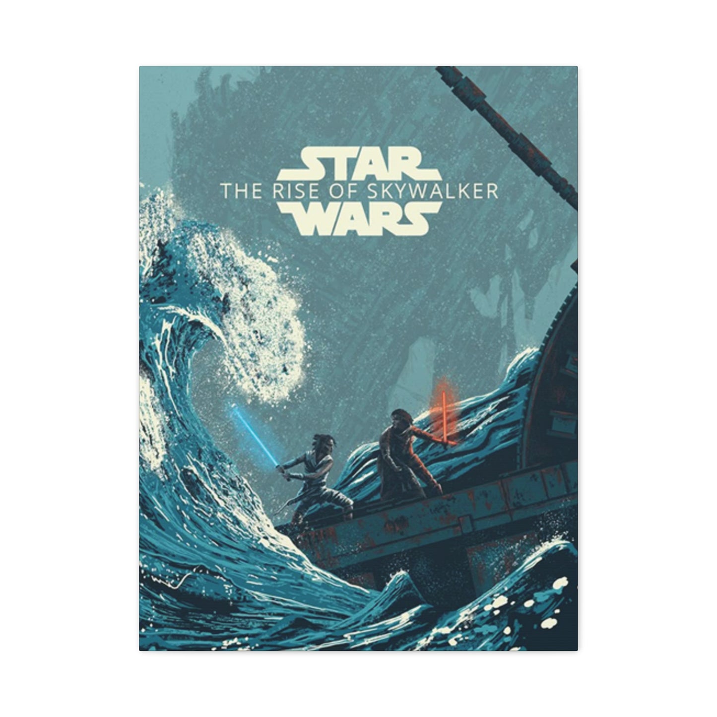
The final chapter of the Skywalker saga brought an epic conclusion to over four decades of storytelling that captivated generations of fans worldwide. When Episode IX arrived in theaters, it marked the end of an era that began in 1977 with a simple tale of good versus evil set in a galaxy far, far away. The visual marketing campaign for this momentous film produced some of the most striking and memorable poster designs in franchise history, combining nostalgic callbacks with fresh artistic interpretations. These promotional artworks have since become highly sought-after pieces for home decoration, offering fans a way to celebrate their connection to the saga while enhancing their living spaces with professionally designed visual art.
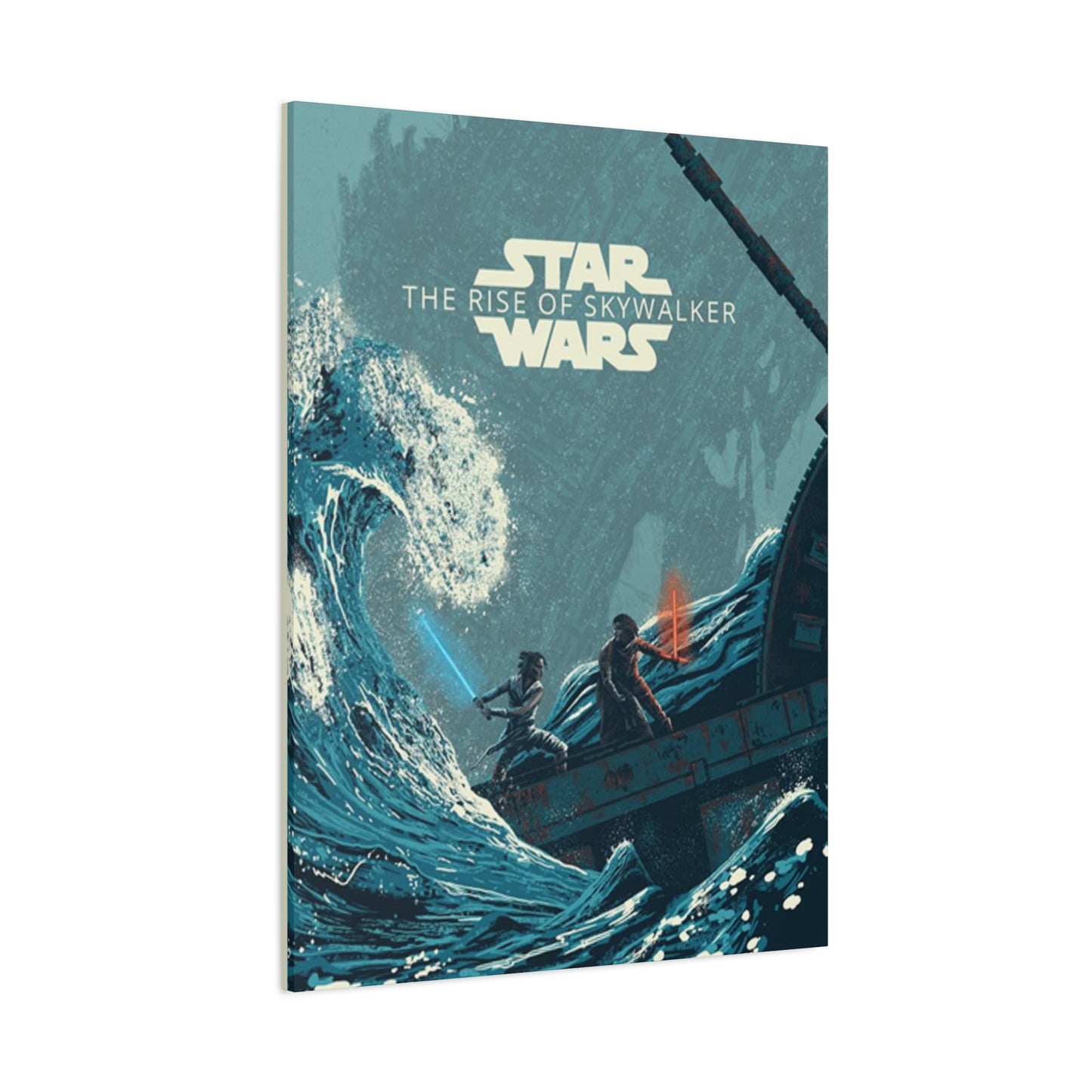
The poster designs created for this film represent a culmination of cinematic promotional art that spans generations. Each piece tells a story within itself, featuring carefully composed imagery that hints at character arcs, plot developments, and thematic elements. The color palettes employed range from deep cosmic purples to fiery reds and oranges, creating visual drama that commands attention whether displayed in a home theater, living room, bedroom, or dedicated entertainment space. The artistic choices made in these designs reflect both the gravity of the narrative conclusion and the celebratory nature of completing such an ambitious storytelling endeavor.
Character Portrait Designs in Promotional Artwork
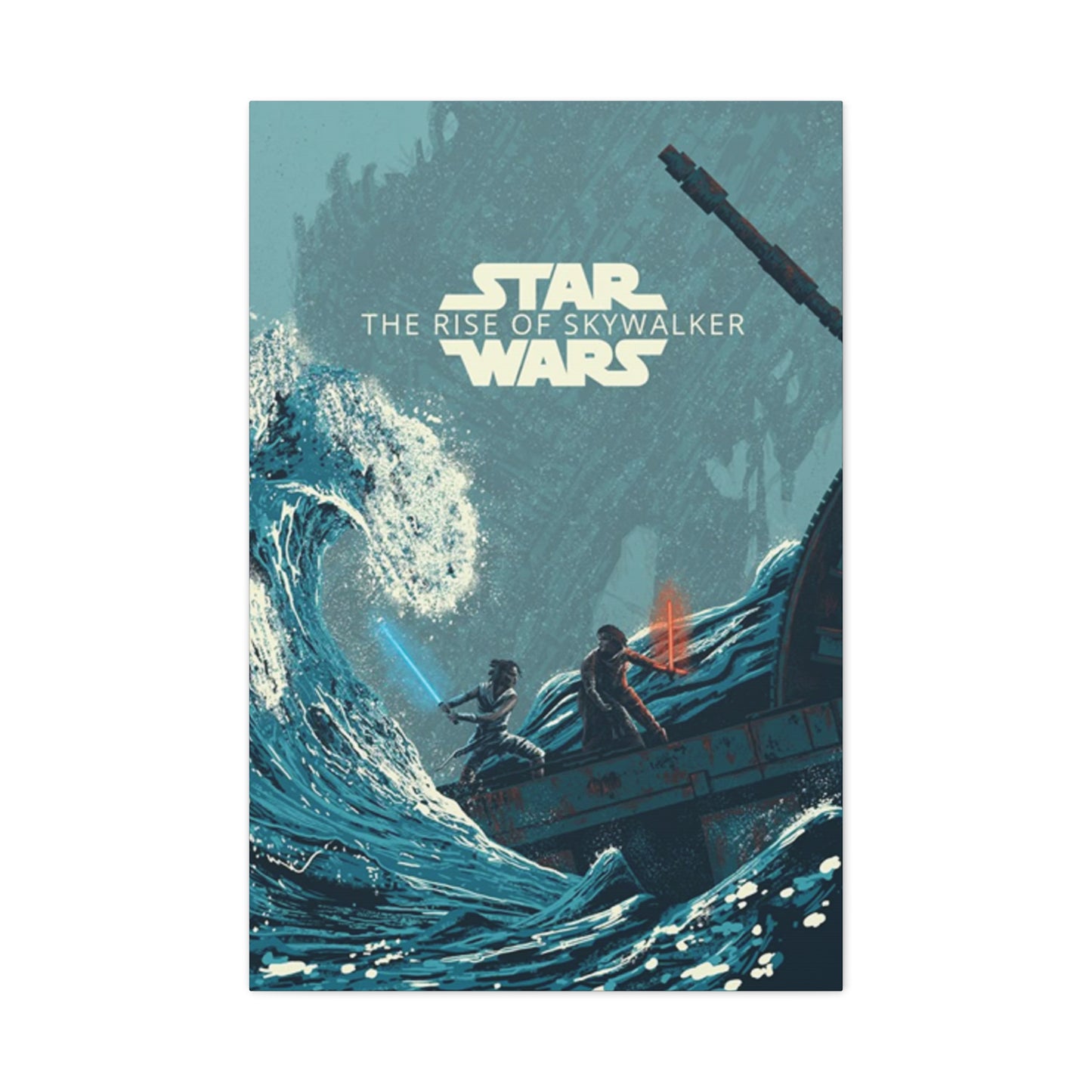
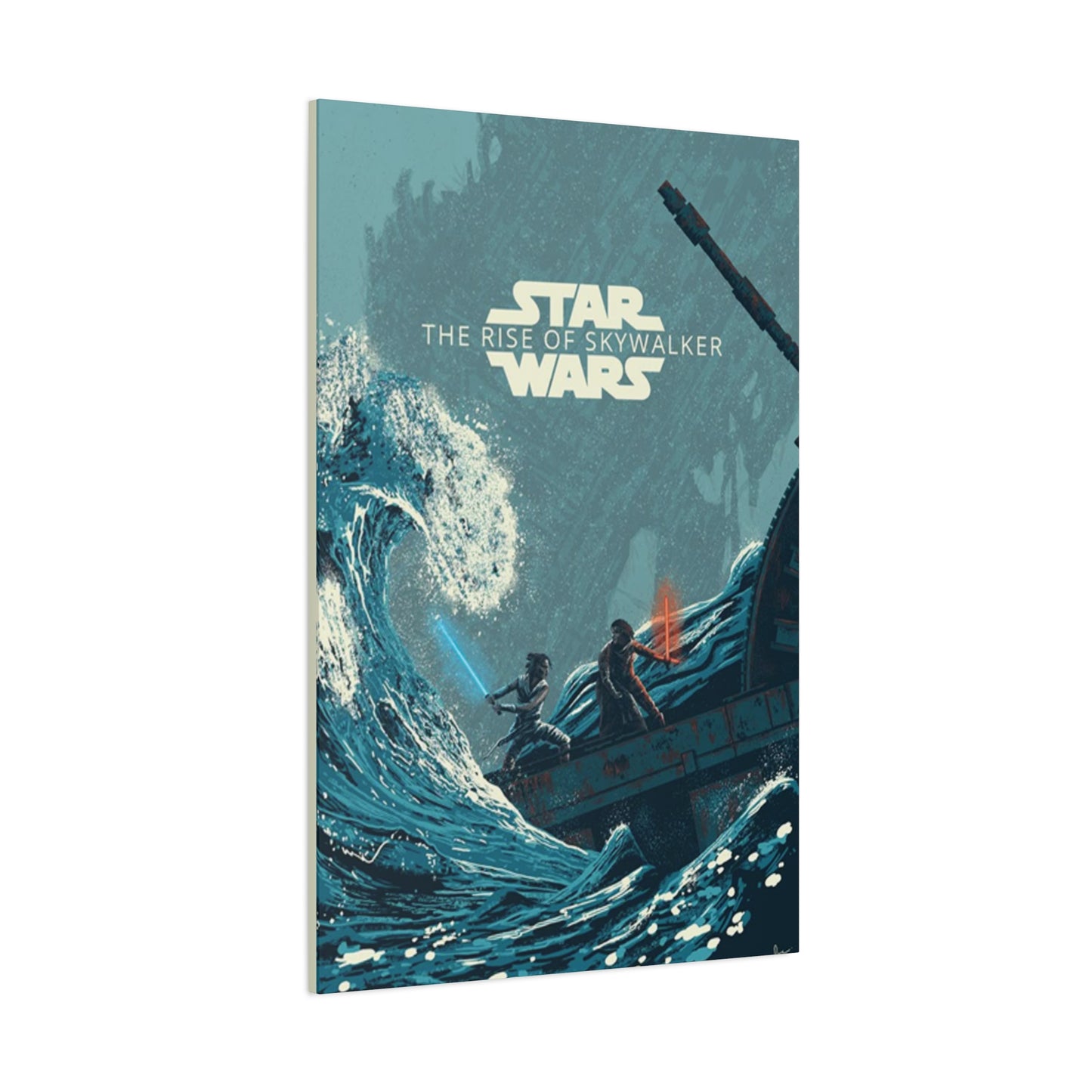
The character-focused promotional materials for the ninth episode showcase the ensemble cast in ways that emphasize both individual journeys and collective destiny. Rey stands prominently in many compositions, her determined expression and iconic weapon placement symbolizing her evolution from scavenger to the hope of the resistance. The visual representation of her character throughout these designs charts a transformation that mirrors her narrative arc, with lighting and positioning choices that elevate her from supporting player to central hero. Her costume design, featuring practical wrappings and functional gear, translates beautifully into poster format, providing textural interest and visual authenticity.
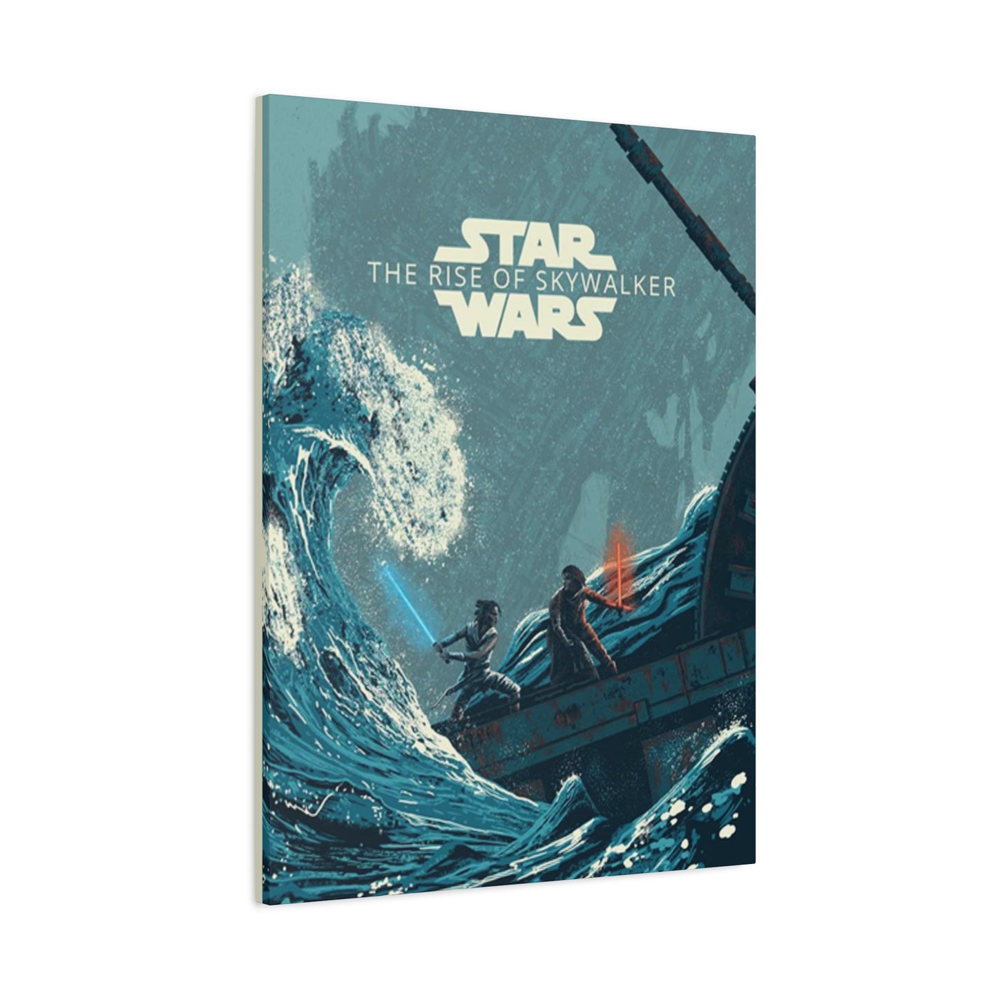
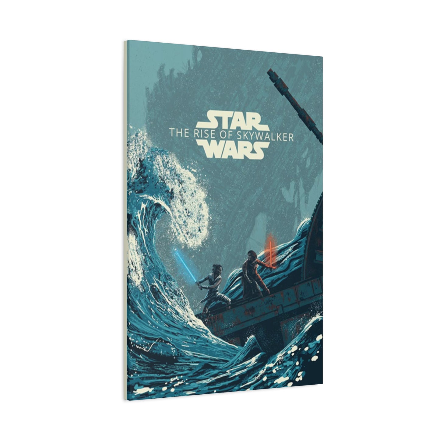
Kylo Ren appears across multiple design variations, his imposing silhouette and distinctive helmet creating instant recognition. The artistic treatment of this conflicted character often employs dramatic lighting that splits his figure between shadow and illumination, visually representing his internal struggle between inherited darkness and potential redemption. The shattered mask imagery that appeared in some promotional materials became particularly iconic, serving as a metaphor for fractured identity and the possibility of choosing a different path. The crimson accents from his unique weapon provide bold color contrast against darker backgrounds, creating focal points that draw the eye and maintain visual interest.
The supporting cast members receive thoughtful representation across various poster designs, each character positioned and lit to reflect their role in the larger narrative. Finn's progression from reluctant participant to committed leader shows through in his confident stances and determined expressions. Poe's presence conveys the swagger and courage of someone who has grown into leadership responsibilities. The returning veterans of previous trilogy installments appear with the weight of their experiences visible in every detail, bridging past and present in single visual compositions. These ensemble pieces demonstrate sophisticated graphic design principles, balancing multiple focal points while maintaining coherent overall compositions.
Symbolic Imagery and Thematic Visual Elements
The promotional artwork extensively employs symbolic imagery that resonates with longtime followers while remaining accessible to newcomers. Celestial bodies, particularly the recurring motif of twin suns or distant planets, evoke the franchise's foundational imagery while suggesting vast scope and cosmic significance. These astronomical elements create depth in compositions, providing layered backgrounds that suggest the infinite possibilities of space-based storytelling. The use of nebulas, star fields, and other cosmic phenomena adds both literal and metaphorical depth to designs, transforming simple character portraits into windows onto entire universes.
Lightsaber imagery pervades these designs, but never in redundant or predictable ways. The crossed weapons motif appears in several variations, sometimes suggesting conflict and other times implying balance or choice. The glowing blades provide convenient light sources within compositions, allowing designers to create dramatic illumination effects that highlight faces, create silhouettes, or draw attention to specific compositional elements. The distinct colors associated with different alignments—blue, green, red, and purple—carry symbolic weight that fans immediately recognize while also functioning as pure design elements that create visual harmony or intentional discord depending on artistic intent.
Architectural and technological elements from the narrative appear throughout poster designs, grounding the fantastic elements in tangible visual details. Massive star destroyers dwarf human figures, emphasizing the scale of the conflict and the courage required to face overwhelming odds. Ancient temples and desert landscapes reference the spiritual and archaeological dimensions of the story, connecting present action to deep history. These environmental elements transform posters from simple character showcases into narrative capsules that hint at plot developments and thematic concerns. The careful integration of background and foreground elements demonstrates professional design thinking that elevates promotional art to gallery-worthy status.
Promotional Design Choices
The color schemes employed across various poster designs for this film demonstrate sophisticated understanding of color psychology and its impact on viewer perception. The dominant use of warm tones—oranges, reds, and golds—creates feelings of intensity, passion, and approaching climax appropriate for a saga conclusion. These warm palettes evoke desert sunsets, explosive combat, and the inner fire of characters facing ultimate tests. The saturation levels vary across different designs, with some opting for highly saturated, almost hyper-real color while others employ more muted, naturalistic palettes that suggest documentary realism despite the fantastic subject matter.
Cool tones appear strategically throughout the poster collection, providing necessary contrast and visual breathing room. Deep blues and purples suggest the vastness of space, the mystery of the Force, and the contemplative moments between action sequences. These cooler sections often frame warmer central elements, creating visual hierarchy that guides viewer attention through carefully planned pathways. The interplay between warm and cool creates dynamic tension within single compositions, mirroring the narrative conflicts between characters and ideologies. This sophisticated color blocking demonstrates professional design principles that transcend simple subject matter representation.
The symbolic use of specific colors carries narrative weight that enhances the storytelling function of these posters. Red frequently appears in connection with danger, passion, and the dark side of the Force, while blue suggests hope, tradition, and connection to Jedi legacy. Gold and yellow tones reference desert origins and the twin suns of the franchise's birthplace, creating nostalgic resonance for longtime fans. Purple, that rare and distinctive color associated with a particular character's unique approach to Force philosophy, appears in select designs as a reminder that rigid binaries rarely capture the full complexity of moral choice. These color associations work subconsciously on viewers, communicating meaning through visual channels that bypass linguistic processing.
Typography and Text Integration in Poster Compositions
The typographic choices made for these promotional materials reflect careful balance between tradition and innovation. The franchise possesses one of the most recognizable title treatments in cinema history, and any deviation from that familiar form risks alienating fans who have internalized its specific characteristics. The designers maintained core elements of the established typography while introducing subtle variations appropriate for this particular chapter. Letter spacing, color treatment, and dimensional effects all received thoughtful consideration to ensure the title commanded attention without overwhelming the visual composition or clashing with photographic elements.
Actor credits and production information appear in traditional positions following established conventions of film poster design, but the specific typographic treatments vary across different poster variants. Some designs employ minimalist sans-serif fonts that recede into the background, allowing images to dominate. Others use more decorative typefaces that complement the fantasy genre positioning, with serifs and flourishes that suggest epic scope and historical weight. The color of text elements receives as much consideration as body copy, with designers choosing tones that either harmonize with or strategically contrast against background imagery to ensure legibility while maintaining aesthetic cohesion.
Taglines and supplementary text appear in select poster designs, providing additional narrative context or thematic framing. These brief phrases must work extremely hard in limited space, conveying emotional tone and story stakes in just a few words. The positioning of such text requires careful consideration of visual flow and compositional balance. Placing words across empty sky areas maintains clean sight lines to character faces, while overlaying text directly on figures creates more complex layered effects that demand careful color and transparency adjustments. The most successful designs integrate typography so seamlessly that text feels inevitable rather than imposed, as though the words grew organically from the imagery rather than being added as afterthought.
Composition Techniques in Film Promotional Art
The compositional structures employed across this poster collection demonstrate sophisticated understanding of visual hierarchy and viewer psychology. Many designs utilize classic triangular compositions, with the most important character or element positioned at the apex and supporting figures arranged below to create stable, satisfying geometric relationships. This time-tested approach creates inherent visual balance while allowing for dynamic energy through diagonal lines and asymmetrical element placement. The eye naturally follows these compositional pathways, moving through the image in designer-intended sequences that reveal information in carefully orchestrated order.
Alternative compositional approaches appear throughout the collection, offering variety while maintaining professional coherence. Circular compositions create sense of enclosure and completeness appropriate for a saga conclusion, with characters arranged around implied or explicit circles that suggest unity, cycle completion, or gathering of forces. Linear compositions employ strong horizontal or vertical elements that create order and structure, often using architectural or technological forms to establish these organizing principles. The negative space in these designs receives as much attention as positive elements, with empty areas providing visual rest and serving as compositional counterweights that prevent overcrowding.
Layering techniques create depth and visual interest across multiple poster variations. Foreground elements frame and contextualize background figures, establishing spatial relationships that suggest narrative hierarchy. Atmospheric perspective—the gradual lightening and blurring of distant elements—enhances three-dimensional illusion on fundamentally two-dimensional surfaces. Some designs employ extreme foreground elements, with character faces or weapons extending beyond compositional borders to create dynamic energy and suggest action extending beyond frame edges. These sophisticated layering choices transform simple character portraits into complex visual experiences that reward extended viewing and reveal new details upon repeated examination.
Limited Edition and Specialty Poster Variants
The theatrical release campaign included numerous specialty poster variants targeting different audiences and distribution channels. International markets received region-specific designs that sometimes featured alternative compositions, different taglines in local languages, or color adjustments to align with regional aesthetic preferences. These variations provide collectors with fascinating comparative material, revealing how universal narratives receive culturally specific visual interpretation. Japanese market posters, for instance, often employ different compositional principles reflecting distinct aesthetic traditions, with more prominent text integration and alternative color balancing compared to Western market designs.
IMAX and premium format screenings received exclusive poster designs emphasizing the enhanced viewing experience these presentations offered. These variants often featured more expansive compositions with additional background detail and wider aspect ratios reflecting the different screen proportions. The taglines and supplementary text on these specialty designs emphasized scale, immersion, and technical achievement, appealing to audience members seeking premium theatrical experiences. Collecting these format-specific variants allows enthusiasts to appreciate how single source material generates multiple artistic interpretations tailored to specific exhibition contexts.
Cast and crew members received personalized poster variants as gifts and mementos, with some of these exclusive designs eventually reaching collector markets. These variants sometimes feature alternative crops, different color grading, or unique compositional choices not seen in mass-market releases. Convention exclusives and promotional giveaways represent another category of specialty variants, often featuring distinctive finishing techniques like foil stamping, embossing, or unique paper stocks that create tactile interest beyond purely visual appeal. The existence of these numerous variants transforms poster collecting from simple acquisition into curatorial practice requiring research, discrimination, and strategic pursuit of particularly desirable examples.
Material Quality and Print Production Considerations
The physical production of these posters involves numerous technical considerations that significantly impact final appearance and longevity. Paper stock selection affects everything from color reproduction to durability and archival stability. Glossy finishes enhance color saturation and create dramatic light reflection, making images appear more vivid and dynamic. Matte finishes reduce glare and provide more even viewing under varied lighting conditions, often preferred for fine art applications. The weight and thickness of paper stock influences both the quality impression and the practical durability of the piece, with heavier stocks suggesting premium quality and resisting handling damage better than lighter alternatives.
Printing technologies employed range from offset lithography for mass production runs to digital printing for smaller batches and specialty variants. Offset printing provides excellent color consistency across large production runs and handles fine detail reproduction exceptionally well, making it ideal for photographic source material. Digital printing offers flexibility for limited editions and custom variations, allowing for economical short runs without requiring expensive plate creation. The most premium poster variants sometimes employ specialized techniques like screen printing, which builds up layers of ink to create rich, saturated colors and occasionally incorporates metallic or fluorescent inks impossible to achieve through conventional printing processes.
Color management throughout the production pipeline requires careful attention to ensure final prints match designer intentions. Digital files must account for color space conversions between screen display and physical printing, with adjustments necessary to compensate for how different media render identical color values. Proofing processes catch potential issues before full production runs commence, allowing for corrections that prevent costly waste and disappointing results. The best reproduction houses maintain rigorous quality control standards, checking registration accuracy, color consistency, and surface finish across production batches to ensure every print meets established specifications. These technical considerations separate professional-quality poster reproductions from inferior products that disappoint purchasers with muddy colors, soft details, or poor material durability.
Framing and Display Options for Wall Art
Proper framing transforms a simple poster into a polished decorative element worthy of prominent display. Frame selection involves multiple aesthetic and practical considerations, with choices significantly impacting how viewers perceive and respond to the artwork. Black frames offer classic, versatile styling that suits almost any décor while providing strong contrast that makes imagery pop. The simplicity of black allows artwork to dominate without competing with ornate frame designs. White and lighter frames create airy, contemporary looks that work particularly well in modern minimalist spaces or bright rooms where heavy dark frames might feel oppressive. Metal frames in silver, gold, or bronze tones add upscale polish and complement the science fiction subject matter through their futuristic associations.
Wood frames introduce organic warmth and textural interest that softens the high-tech subject matter. Different wood tones—from light oak and maple to rich walnut and mahogany—create distinct aesthetic effects. Lighter woods suit casual, relaxed spaces while darker woods convey sophistication and gravitas appropriate for formal settings. The profile depth of frames affects visual impact, with thin profiles nearly disappearing to let artwork dominate, while deeper profiles create substantial shadow lines and dimensional presence that makes framed pieces feel more sculptural and important. Corner treatments, whether clean miters or decorative flourishes, further customize the framing aesthetic.
Matting decisions require thoughtful consideration of color relationships and proportional balance. White and off-white mats provide clean, gallery-standard presentation that works universally well, creating breathing room between artwork and frame while maintaining focus on the image. Black mats create dramatic, sophisticated presentations particularly effective with darker artwork or when seeking bold decorative statements. Colored mats offer opportunities to pull specific tones from the artwork, creating harmonious relationships or strategic contrasts. Double matting, with an inner mat in a different color than the outer, adds depth and luxury while allowing for more complex color relationships. Mat width affects the overall proportions of framed pieces, with wider mats creating more imposing presence and providing additional wall coverage while narrower mats maintain intimacy and directness.
Protective Glazing and Conservation Concerns
Glazing selection represents a critical decision point for anyone seriously investing in poster display. Standard glass provides adequate protection for casual display situations but brings significant drawbacks including weight, fragility, and reflective glare that can obscure viewing under certain lighting conditions. Non-glare glass addresses the reflection issue through chemical etching or coating that scatters light, preventing direct glare bounce but sometimes slightly softening image appearance through the light diffusion effect. For valuable or particularly meaningful pieces, these compromises prove unacceptable, leading collectors toward premium glazing options.
Acrylic glazing offers impact resistance and lighter weight compared to glass, making it safer and easier to handle during installation and adjustment. Quality acrylic products provide excellent clarity and UV protection approaching that of premium glass options. The lighter weight of acrylic makes it particularly suitable for larger format posters where glass weight becomes prohibitive. However, acrylic scratches more easily than glass, requiring careful cleaning with appropriate materials and techniques. Static charge on acrylic surfaces can attract dust particles, demanding more frequent maintenance compared to glass alternatives. Anti-static treatments reduce but do not eliminate this concern.
Museum-quality glazing represents the premium tier of protective options, incorporating advanced coatings that nearly eliminate reflections while providing superior UV protection. These materials filter harmful light wavelengths that gradually fade colors and damage paper fibers, significantly extending artwork lifespan. The optical clarity of museum glazing surpasses standard alternatives, creating an almost invisible barrier that allows pure, unmediated viewing of artwork. The cost premium for these materials is substantial but justified for irreplaceable pieces or when pursuing the highest presentation standards. Conservation-minded collectors consider this investment essential for protecting long-term value and ensuring artwork remains vibrant and intact for decades or generations.
Strategic Placement in Home Environments
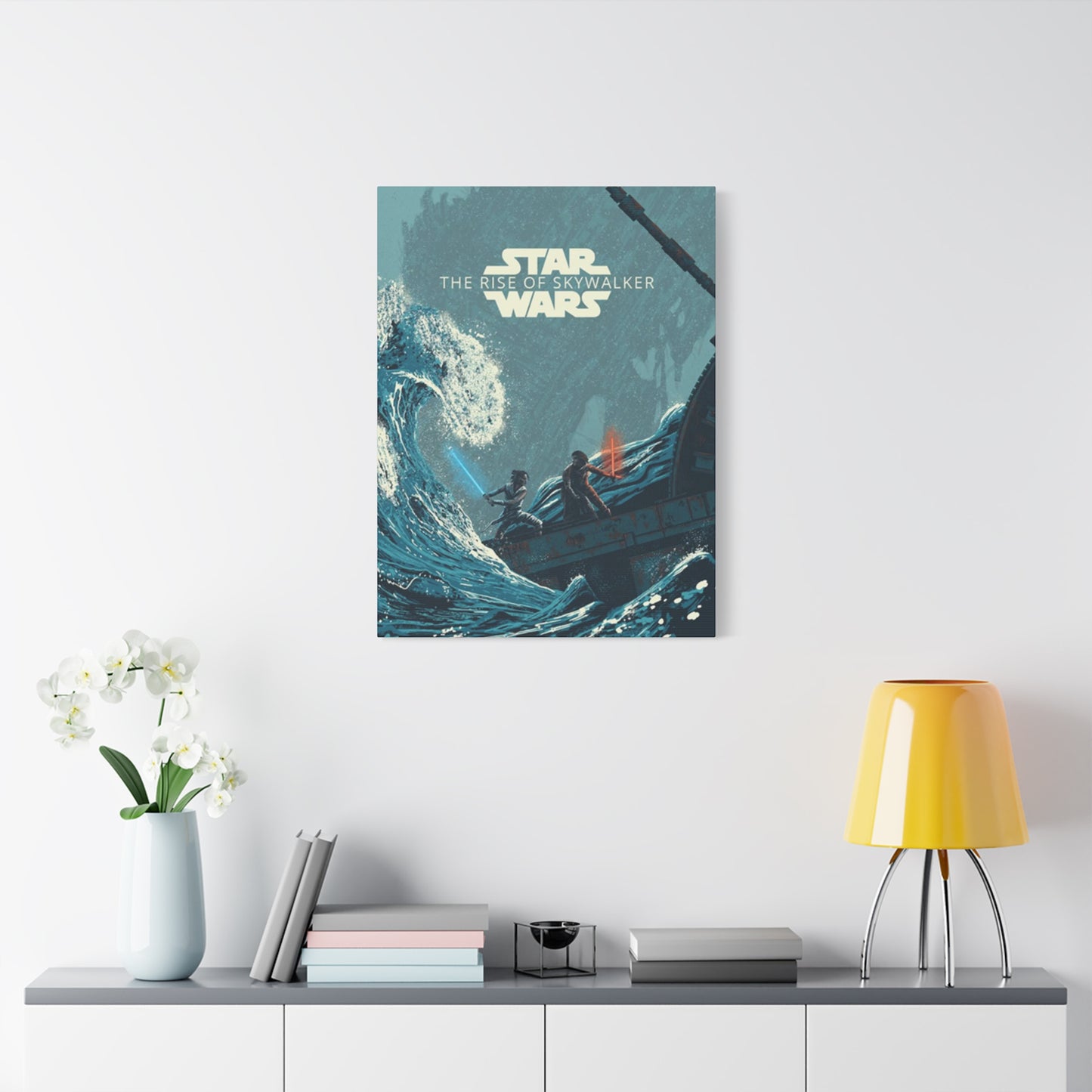
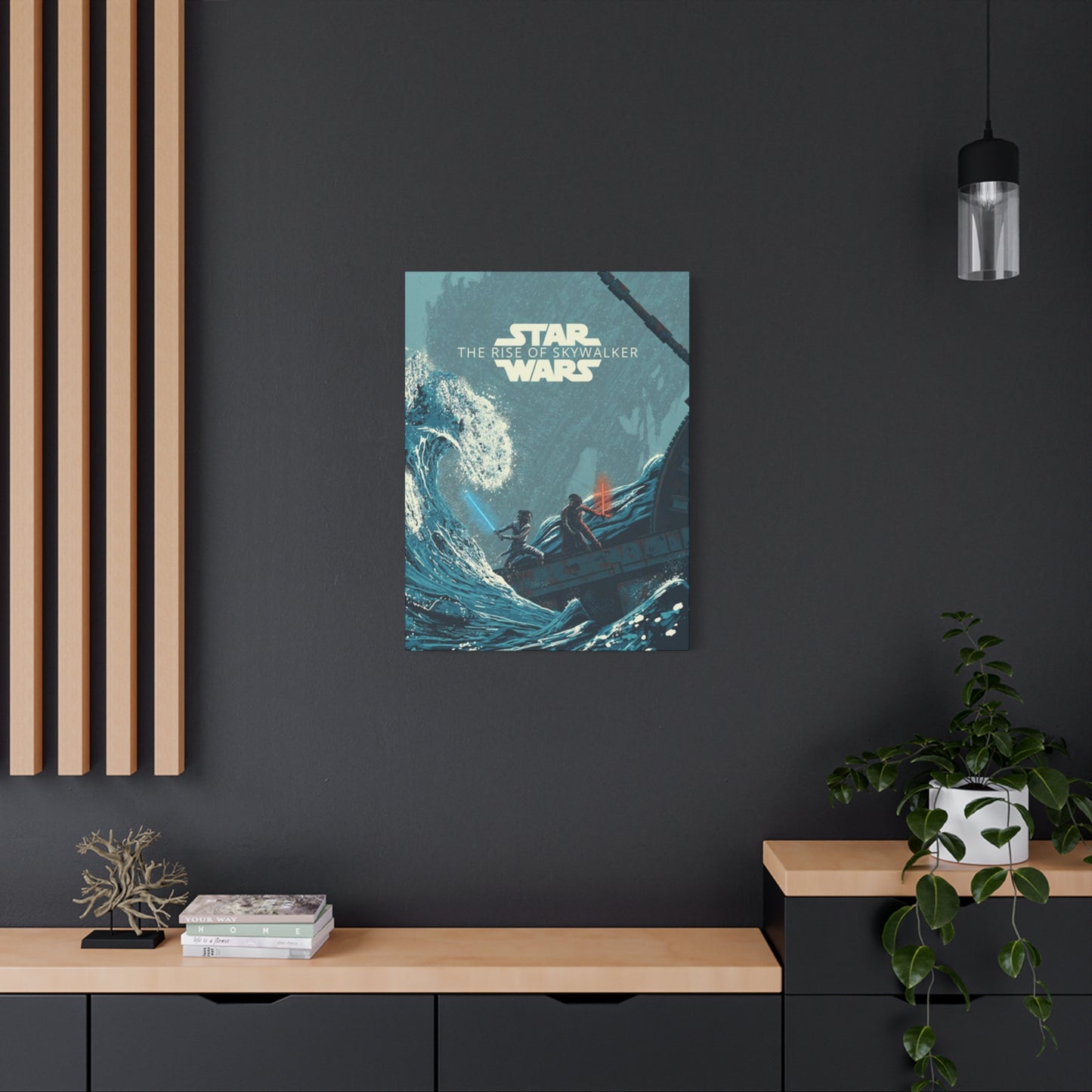
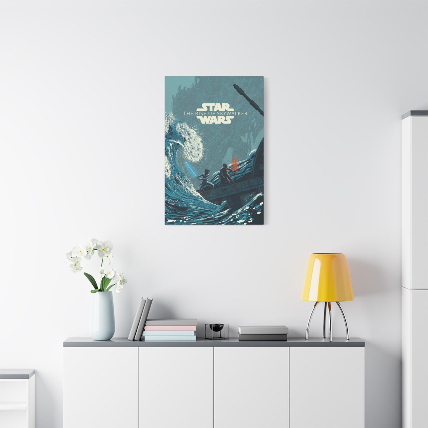
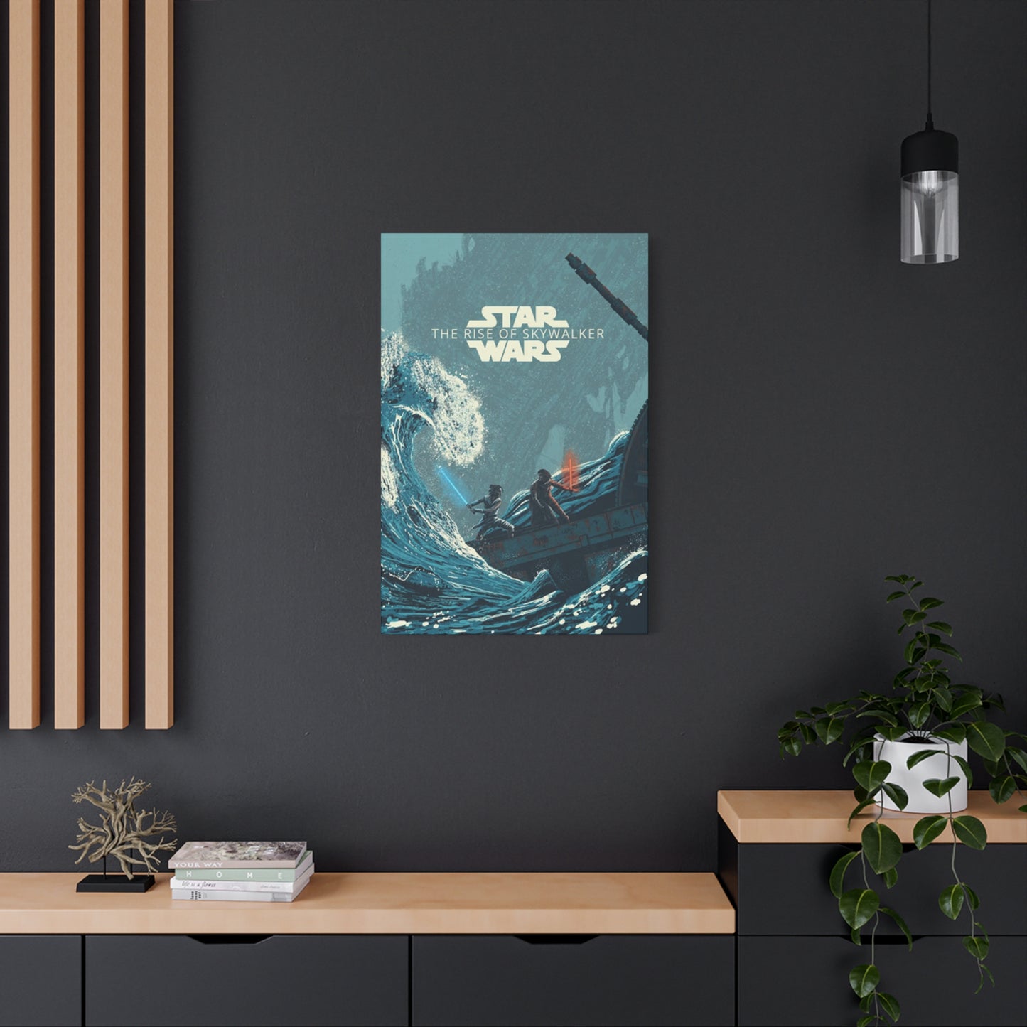
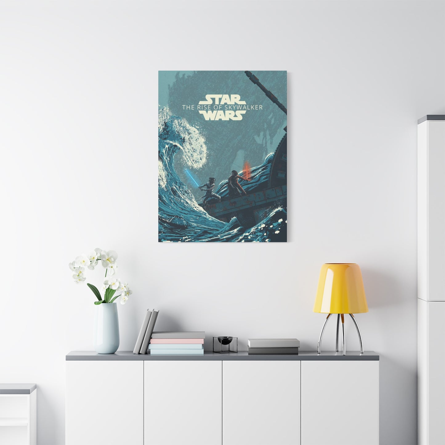
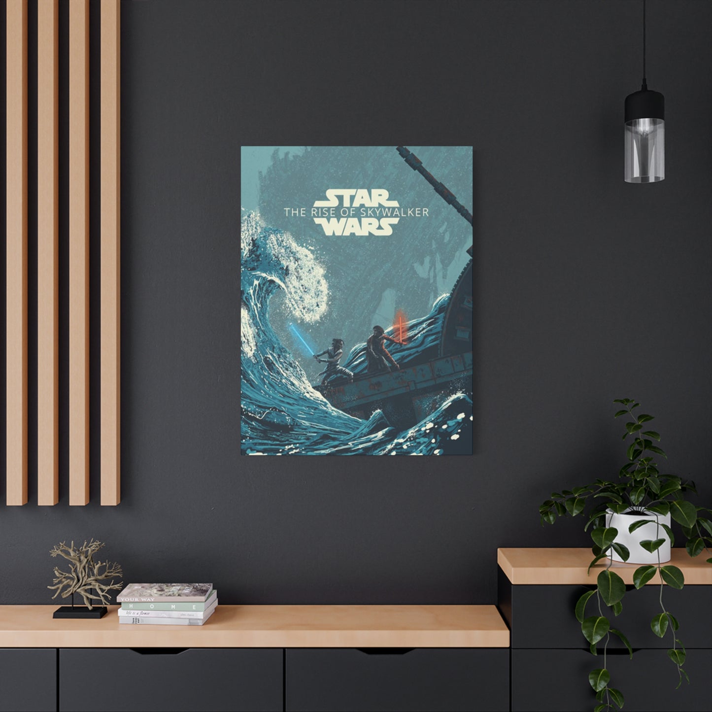
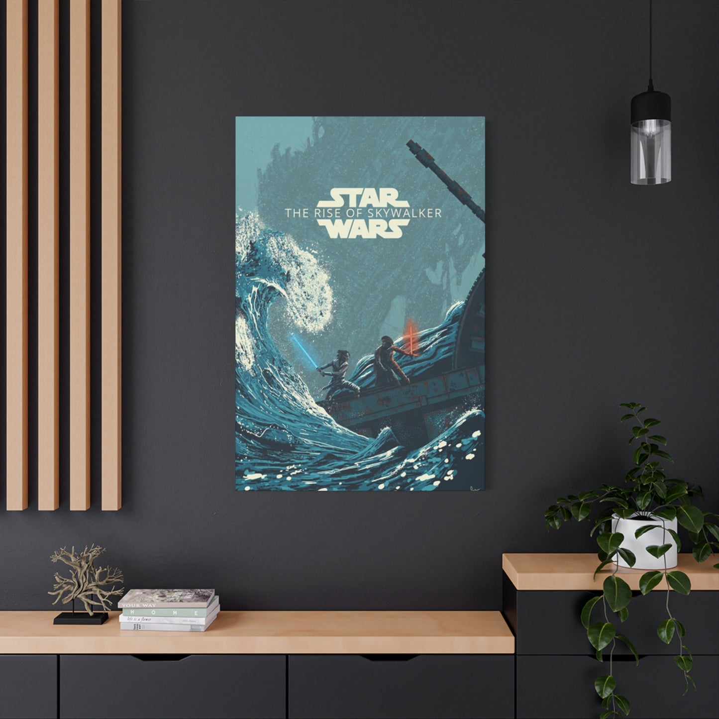
Determining optimal placement for poster displays requires consideration of both aesthetic impact and practical constraints. Living rooms and main entertainment spaces represent natural homes for film-related artwork, particularly when the resident maintains a home theater setup or dedicated media viewing area. Placing movie posters near television displays or sound equipment creates thematic consistency and transforms entertainment zones into intentional, curated spaces rather than mere equipment storage areas. The size relationship between poster and surrounding space matters significantly, with oversized prints in small rooms feeling oppressive while modest prints in vast spaces disappear into insignificance.
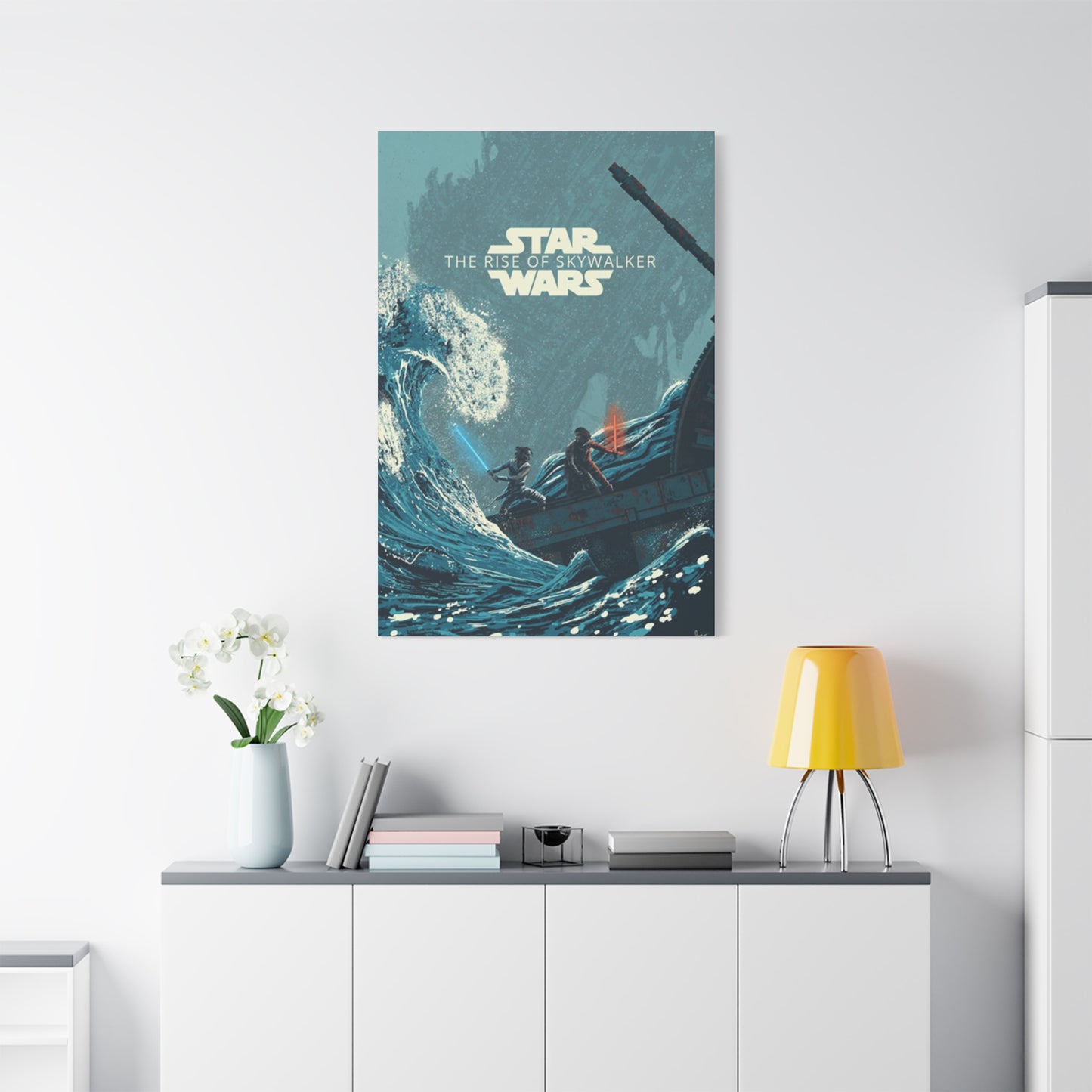
Bedroom placement offers opportunities for more personal expression since these private spaces see limited outside viewing. Positioning posters as focal points above beds creates strong visual anchors that ground room design, though careful consideration of subject matter ensures nighttime appropriateness and doesn't create unsettling viewing experiences from prone positions. Alternative bedroom placements on accent walls or above dressers and desks provide visual interest without dominating the entire space. Lighting in bedrooms typically runs softer than public spaces, which affects how framed artwork appears and may influence frame and matting choices to ensure adequate visibility without harsh glare.
Home offices and personal study spaces benefit from inspirational artwork that energizes and motivates during work hours. Film posters suggesting adventure, heroism, and triumph over adversity can provide psychological boosts during challenging work moments. The key involves selecting images that inspire rather than distract, avoiding overly busy compositions that fragment attention when focus is required for professional tasks. Hallways and transitional spaces utilize wall art to transform otherwise neglected areas into gallery experiences, guiding movement through homes while providing visual interest and personality to spaces that might otherwise feel merely functional rather than deliberately designed.
Lighting Techniques for Artwork Display
Appropriate lighting transforms adequately displayed artwork into showcase presentations that command attention and reveal fine details. Natural lighting offers obvious appeal but introduces significant conservation concerns since sunlight contains UV radiation that damages artwork over time. Positioning posters to receive indirect natural light provides ambient illumination without direct exposure to damaging rays. Rooms with abundant natural light often benefit from UV-filtering window treatments that reduce harmful wavelength penetration while maintaining visible light transmission, protecting artwork without completely blocking beneficial daylight.
Artificial lighting solutions offer greater control and eliminate UV concerns when appropriate bulbs are selected. LED technology has revolutionized artwork lighting through cool operation that eliminates heat damage risks while providing excellent color rendering and energy efficiency. Picture lights mounted directly to frames or walls create focused illumination that highlights specific pieces, though installation requires careful positioning to avoid casting shadows or creating glare on glazing surfaces. The warm versus cool color temperature of bulbs affects how artwork appears, with warmer tones enhancing reds and yellows while cooler temperatures favor blues and greens.
Track lighting and recessed spotlights allow for adjustable, directed illumination that can be fine-tuned to achieve optimal lighting angles and intensities. These systems provide flexibility to accommodate seasonal sunlight changes or furniture rearrangements that affect viewing conditions. Dimmer controls add another dimension of adjustment, allowing lighting intensity modifications to suit different times of day or moods. The most sophisticated home gallery installations employ multiple lighting layers combining ambient, accent, and task lighting that creates rich, dimensional illumination revealing artwork at its best while maintaining flexibility for various living situations and practical needs.
Collecting Strategies and Investment Perspectives
Approaching poster acquisition from a collecting standpoint involves strategies beyond simple décor shopping. Focusing collection efforts on specific themes creates coherence and purpose, whether concentrating on character-specific designs, particular artists, regional variants, or complete series encompassing all official releases. Themed collecting provides intellectual satisfaction beyond mere accumulation, transforming collections into curated exhibitions with narrative logic. Documentation of acquisition details—purchase date, source, condition notes, and any provenance information—adds historical dimension to collections and proves invaluable for insurance purposes or eventual sale.
Condition assessment requires trained observation and honest evaluation. Mint condition posters show no wear, damage, or defects, commanding premium prices from serious collectors. Near-mint pieces display only minor imperfections invisible from normal viewing distances. Working down through excellent, very good, and good grades, condition issues become progressively more evident, affecting both display suitability and market value. Common condition problems include edge wear, corner dings, fold lines, pin holes, tape residue, and fading. Understanding condition grading helps collectors make informed purchasing decisions and avoid disappointment with pieces that looked acceptable in listing photographs but disappoint upon arrival.
Authentication concerns arise primarily with limited editions and artist-signed variants where forgeries could prove financially lucrative for unscrupulous sellers. Purchasing from reputable dealers with established track records and satisfaction guarantees provides important protection. Provenance documentation tracing ownership history back to verified original sources offers additional authentication assurance. For particularly valuable pieces, professional authentication services provide expert evaluation and certification documenting authenticity. While theatrical release posters have less forgery risk than fine art prints, vigilance remains appropriate when significant money changes hands or when acquisition involves particularly rare variants.
Market Values and Price Variation Factors
Poster values fluctuate based on numerous intersecting factors creating complex market dynamics. Rarity stands as perhaps the most significant value driver, with limited production runs and exclusive variants commanding premiums over widely distributed versions. First prints generally exceed later reproductions in collector desirability and market value. Regional exclusives and convention giveaways benefit from artificial scarcity that intensifies collector competition. Condition grades dramatically affect prices, with mint examples potentially worth multiples of comparable damaged pieces. Professional restoration can improve condition grades but rarely achieves the value premium of originally maintained pristine examples.
Cultural trends and franchise popularity create market momentum affecting values across entire poster categories. Anniversary celebrations, new release announcements, and significant cultural moments drive increased interest and corresponding price appreciation. Conversely, long dormant properties see softening markets as collector attention shifts toward currently relevant franchises. The death of major franchise contributors—directors, lead actors, or key creative personnel—typically triggers immediate price spikes as collectors seek memorabilia honoring the departed. These emotional market reactions sometimes prove temporary with prices stabilizing over subsequent months, though truly iconic figures may sustain permanent value increases.
Size and format variations create distinct market segments with different pricing structures. Standard one-sheet theatrical posters represent the most common and accessible category. Larger formats like bus shelters and billboards achieve premium prices through sheer visual impact and display rarity, though their size creates practical challenges that limit buyer pools. Smaller formats like lobby cards and mini posters appeal to collectors with space constraints or those preferring more intimate presentations. International size standards differ from domestic formats, creating collecting subcategories that attract specialists pursuing comprehensive global coverage. Understanding these market segments helps collectors target efforts toward areas matching their interests, budgets, and display capabilities.
Alternative Display Formats Beyond Traditional Framing
While conventional framing remains the standard presentation approach, alternative display methods offer creative options for different aesthetic preferences and practical situations. Poster hangers utilizing top and bottom rails with cord or chain suspension provide streamlined, contemporary presentations particularly suited to minimalist décor. These systems allow easy poster swapping without frame disassembly, appealing to collectors who rotate displays seasonally or when mood strikes. Magnetic systems work similarly, using magnetically attracted top and bottom pieces that clamp poster edges, creating clean presentations without visible frame borders or complex mounting hardware.
Canvas wrapping transforms posters into gallery-wrap presentations resembling painted canvases. The process involves mounting the poster print to rigid backing then wrapping edges around wooden stretcher frames, creating dimensional objects that hang without additional framing. This approach works particularly well with certain poster designs but requires careful consideration since edge areas become wrapped surfaces rather than visible fronts, potentially compromising compositions that extend fully to borders. The dimensional presence of gallery-wrapped pieces creates bold visual statements that project confidence and contemporary styling.
Digital frames represent emerging alternatives that transform poster display from static presentation to dynamic rotation. High-resolution screens sized like conventional picture frames display digital poster files, allowing collectors to rotate through extensive libraries without physical storage demands or wall space limitations. These devices suit modern homes already embracing smart technology while offering practicality for collectors with extensive holdings exceeding available display space. Programming capabilities allow automatic rotation on schedules or manual selection matching moods. The technology continues improving with better color reproduction, higher resolutions, and more convincing matte screen surfaces that reduce the electronic appearance of earlier generation devices.
Maintenance and Long-Term Care Practices
Proper maintenance preserves poster condition and appearance across years and decades. Dusting represents the most frequent maintenance task, requiring appropriate tools and techniques to avoid damage. Microfiber cloths trap dust particles without scratching glazing surfaces when used with gentle wiping motions. For glass glazing, standard glass cleaners work effectively though overspray must be prevented from seeping behind glass and contacting artwork. Acrylic requires specialized cleaners formulated to avoid crazing or clouding, with many household products causing permanent damage through chemical incompatibility.
Periodic inspection catches developing problems before they become serious. Checking frame corners for separation and tightening hardware as needed prevents frames from literally falling apart. Examining artwork edges visible behind mats reveals whether acid migration from inferior mat materials is causing yellowing or brittleness. Monitoring for insect damage proves particularly important in humid climates or older structures where paper-eating pests find hospitable conditions. Evidence of moisture penetration demands immediate attention since water damage progresses rapidly and causes irreversible harm. Removing affected pieces to controlled environments and potentially consulting conservation professionals can salvage situations that would otherwise result in total loss.
Climate control provides passive protection against numerous degradation factors. Maintaining stable temperature and humidity levels prevents paper from repeatedly expanding and contracting with environmental fluctuations, reducing stress that causes brittleness and damage over time. Avoiding extreme conditions proves even more critical than maintaining specific ideal parameters, though keeping conditions within reasonable ranges optimizes long-term preservation. Dehumidifiers in damp climates and humidifiers in arid environments help maintain stable conditions. Storage of unframed or backup posters requires similar climate consideration, with acid-free boxes and tissue paper providing protection in appropriately conditioned closets or storage rooms rather than attics, basements, or garages where temperature and humidity swing wildly.
Integration with Broader Home Design Concepts
Successfully incorporating film posters into holistic home design requires consideration beyond simply hanging favorite images. Color coordination between poster palettes and room color schemes creates visual harmony preventing jarring clashes. Posters dominated by warm tones complement similar room palettes while providing acceptable contrast against cooler walls and furnishings. Monochromatic approaches using black-and-white poster variants create sophisticated presentations that integrate seamlessly with any color scheme while providing graphic punch through high contrast rather than color vibrancy.
Scale relationships between artwork and surrounding furniture establish visual balance and proper hierarchical relationships. Posters hung above sofas should span roughly two-thirds of furniture width, creating clear visual association without overwhelming or underwhelming the space. Gallery walls assembling multiple smaller pieces collectively match the visual weight of surrounding furniture groupings, maintaining proportional balance. Leaving adequate space between furniture tops and lower artwork edges prevents cramped feelings while establishing enough proximity to maintain clear associational relationships.
Style consistency across artwork selections and with broader room aesthetics creates intentional, designed appearances rather than haphazard accumulations. Mixing frame styles within single spaces generally fails unless deliberate eclectic approaches are competently executed, which requires sophisticated design sense most people lack. Sticking with consistent frame choices creates foolproof coherence. Similarly, mixing artwork that spans wildly different aesthetic approaches—hyper-realistic photography alongside abstract expressionism alongside pop art—demands curatorial skill most casual decorators lack. Recognizing limitations and maintaining consistency proves wiser than ambitious mixing that produces chaotic results.
Psychological and Emotional Dimensions of Display Choices
The artwork surrounding us affects mood and psychology in measurable ways, making display choices more consequential than purely aesthetic concerns suggest. Action-oriented imagery with dynamic compositions and intense color schemes energizes spaces and their occupants, making such choices appropriate for areas intended for activity and alertness. Contemplative images with calmer compositions and muted palettes create different psychological effects more suitable for relaxation spaces. The specific emotional content of imagery matters beyond pure visual characteristics, with triumphant, hopeful representations generating different feelings than darker, more ominous alternatives.
Personal connection to displayed artwork amplifies these psychological effects. Images representing beloved stories or characters trigger positive associations and memories, surrounding viewers with affirming reminders of meaningful cultural experiences. This emotional resonance explains why subjectively less important artwork that carries personal significance often provides greater satisfaction than objectively superior pieces lacking personal connection. The memories and feelings associated with initial viewing experiences, whether watching specific films during formative years or sharing them with important people, embed themselves in artwork representing those narratives.
Creating personal sanctuaries through intentional space curation serves legitimate psychological functions beyond superficial decoration. Spaces filled with personally meaningful imagery provide comfort, inspiration, and identity affirmation. Particularly during challenging times, these intentionally constructed environments offer reliable sources of positive emotion and psychological grounding. The nesting instinct driving humans to create comfortable, personalized spaces serves evolutionary functions related to safety and wellbeing. Satisfying these deep drives through thoughtful space curation represents self-care as much as aesthetic expression.
Social and Cultural Dimensions of Displayed Artwork
Displayed artwork communicates identity and values to visitors, functioning as nonverbal autobiography. The specific cultural properties represented reveal interests and affiliations, while display quality suggests aesthetic sophistication and resource allocation priorities. Visitors form impressions based on observed artwork, making snap judgments about hosts based on partial information extracted from environmental cues. Someone displaying film posters signals engagement with popular culture and willingness to embrace entertainment media as legitimate art worthy of formal presentation. The specific franchises represented reveal generational markers and subcultural affiliations.
Conversation starter potential represents pragmatic social value beyond pure decoration. Interesting artwork provides natural discussion topics for guests seeking connection points with hosts. Shared enthusiasm over represented properties generates bonding opportunities and reveals compatibility. These social functions prove particularly valuable during initial visits when guests and hosts still navigate relationship boundaries and search for common ground. Artwork serves as social lubricant easing interaction and providing structured topics preventing awkward silences.
Community building through shared interests extends beyond individual social interactions to broader cultural participation. Collecting and displaying artwork connects individuals to larger communities of fellow enthusiasts who gather at conventions, participate in online forums, and create content celebrating shared passions. These communities provide social infrastructure supporting identity formation and maintenance, particularly for interests outside mainstream acceptance. The increasing cultural legitimacy of genre entertainment and geek culture has reduced stigma around displaying related artwork, allowing fans to openly express affiliations previously hidden to avoid social penalties.
Poster Design Evolution Across Franchise History
Examining poster design evolution across the complete franchise reveals fascinating insights into changing marketing approaches, artistic trends, and cultural contexts. The original promotional materials from the late 1970s employed painted illustration techniques universal in pre-digital poster production. These hand-crafted artworks possess distinct aesthetic qualities valued by collectors who appreciate traditional artistic skill and the particular look of painted promotional art. The compositions from this era emphasize adventure and spectacle through dynamic action poses and dramatic environmental backdrops.
Subsequent decades saw gradual digital transition transforming poster production workflows and aesthetic possibilities. Photographic elements increasingly dominated compositions as photography reproduction quality improved and digital manipulation made seamless integration practical. The prequel trilogy's marketing utilized then-cutting-edge digital techniques while maintaining compositional traditions established by original trilogy campaigns. Character-focused designs remained standard, though the specific photographic treatments and compositing approaches reflected evolving capabilities and contemporary aesthetic preferences.
The most recent trilogy's promotional materials demonstrate full maturity of digital design processes, with sophisticated color grading, seamless element integration, and effects impossible through traditional methods. These designs reference historical franchise marketing while incorporating contemporary design sensibilities that keep presentations feeling current rather than dated. The interplay between tradition and innovation mirrors the narrative's relationship with franchise history, honoring what came before while establishing new directions. Collecting across these different production eras allows appreciation of how promotional art reflects both technological capabilities and cultural contexts of creation.
Ethical Considerations in Poster Acquisition and Display
Approaching poster collecting and display with ethical consciousness involves several considerations beyond simple transaction legality. Purchasing from legitimate sources that compensate rights holders ensures creative people receive fair payment for their work and that intellectual property protections remain economically viable. While temptingly cheap unauthorized reproductions flood certain marketplaces, buying such products undermines the economic foundations supporting creative industries. The marginal savings rarely justify compromising ethical standards or risking inferior product quality typical of bootleg operations.
Respecting artist attribution when known provides appropriate credit for creative labor. Poster designs often result from collaborative processes involving multiple contributors, but lead designers or distinctive artistic voices sometimes receive specific credit. Acknowledging these contributions when discussing or displaying work honors creative labor and helps educate others about the human effort behind mass-produced commercial art. This awareness combats the unfortunate tendency to view commercial art as somehow less worthy than gallery art, recognizing that immense skill and creativity produce effective promotional design.
Environmental considerations increasingly influence purchasing decisions as awareness grows about production impacts and material lifecycles. Seeking posters produced through environmentally responsible methods and from sustainably sourced materials aligns collections with broader ecological values. Supporting smaller producers and artists who employ greener practices rather than defaulting to mass-market options from large corporations with questionable environmental records represents meaningful individual action. Considering longevity and timelessness when acquiring pieces reduces consumption churn as fleeting interests get abandoned and replaced, with discarded items adding to waste streams.
Photography and Digital Documentation Practices
Creating quality photographic documentation of poster collections serves multiple practical purposes. Insurance documentation requires clear images establishing item existence and condition at specific points in time. Quality photographs support insurance claims by providing evidence of prior condition before damage events. Maintaining organized digital archives with acquisition dates, source information, and condition notes creates valuable historical records. These archives prove particularly useful for tracking collection evolution, identifying acquisition gaps, or researching specific items.
Sharing collection photographs through social media and enthusiast forums connects collectors with broader communities while providing opportunities to display holdings to wider audiences than physical space visitors. Quality photography elevates these digital presentations, with attention to lighting, composition, and resolution producing images that accurately represent physical pieces. Learning basic photography principles transforms documentation from functional record-keeping to presentation-quality imagery suitable for sharing. Understanding how to manage reflections on glazing surfaces, balance ambient and artificial lighting, and frame shots that accurately convey scale and detail separates amateur snapshots from professional-looking documentation.
Creating catalog systems organizing collection documentation facilitates reference and research. Digital asset management software designed for photography collections adapts well to poster documentation, providing tools for tagging, searching, and organizing extensive image libraries. Including metadata like acquisition dates, sources, condition notes, and estimated values creates searchable databases supporting collection management. These systems prove invaluable as collections grow beyond casual familiarity into sizes requiring systematic organization. Cloud storage solutions protect documentation against local device failures while enabling access from multiple devices for convenient reference anywhere.
Creating Dedicated Display Spaces and Home Galleries
Enthusiasts with sufficient space and commitment sometimes create dedicated display areas functioning as personal galleries. Converting spare bedrooms, finished basements, or bonus rooms into showcase spaces allows concentrated display exceeding what scattered placement throughout homes achieves. These dedicated spaces enable thematic organization impossible when artwork disperses across multiple rooms serving different functions. Creating chronological displays showing franchise evolution or thematic groupings exploring specific characters or narrative elements provides intellectual satisfaction beyond mere accumulation.
Lighting design in dedicated gallery spaces deserves particular attention since display rather than general living represents the primary function. Track lighting systems with adjustable heads allow precise illumination of individual pieces, with beam angles and intensities customizable for optimal presentation. Combining ambient lighting maintaining comfortable base illumination with focused accent lighting highlighting specific pieces creates layered, sophisticated presentations rivaling professional gallery standards. Dimmer controls add flexibility for different viewing modes and special occasions when dramatic presentations prove desirable.
Climate control in dedicated display spaces protects collections from environmental damage while maintaining comfortable viewing conditions. Maintaining stable temperature and humidity prevents paper degradation and frame damage from expansion and contraction cycles. Avoiding direct sunlight through window placement or heavy window treatments eliminates UV damage risks. Dehumidifiers in damp climates and humidifiers in dry areas help maintain optimal conditions. These environmental controls represent significant advantages of dedicated spaces over general living areas where comfort preferences might conflict with optimal preservation conditions or where retrofitting environmental controls proves impractical.
Conclusion
In conclusion, a Skywalker Poster Collection wall art provides a captivating and dynamic way to enhance modern home interiors with both nostalgia and contemporary style. These posters, often inspired by the legendary Star Wars saga, transcend simple decoration to become iconic symbols that connect generations of fans to a universal narrative of adventure, heroism, and the timeless battle between light and dark. The timeless appeal of the Skywalker family, coupled with the bold visual language of poster art, allows these pieces to seamlessly integrate into a variety of modern home environments, making them an ideal choice for those looking to combine pop culture with sophisticated home design.
The beauty of Skywalker-themed wall art lies in its versatility. Whether you’re curating a home theater, a study, or a living room, these posters offer a perfect blend of narrative depth and visual impact. The character-driven designs—featuring iconic figures like Luke, Leia, and Darth Vader—serve as both statement pieces and conversation starters. Each poster captures the essence of its character and storyline, drawing on vibrant colors, bold compositions, and striking imagery that makes the artwork pop. For fans of the Star Wars franchise, these posters bring a beloved universe into the very fabric of their homes, allowing them to celebrate the saga in a personal and creative way.
What makes the Skywalker poster collection particularly appealing for modern homes is its ability to merge pop culture with minimalist or maximalist design sensibilities. For those who appreciate sleek, contemporary aesthetics, these posters can serve as a focal point in an otherwise minimalist room, injecting energy and character without overwhelming the space. Alternatively, when integrated into a more eclectic or maximalist home, the posters can effortlessly fit into an environment filled with other thematic art and collectibles, contributing to an immersive atmosphere of storytelling and imagination.
The adaptability of these posters is also reflected in the wide array of framing and display options available. From minimalist black frames to more ornate, vintage-style borders, the Skywalker poster collection can be tailored to suit various interior design preferences. Grouping multiple posters together in a gallery wall setup further enhances the visual appeal and creates a narrative thread across the pieces. This ability to curate a personalized display allows homeowners to showcase their unique style while simultaneously paying homage to a cultural phenomenon that has shaped pop culture for decades.
Ultimately, the Skywalker Poster Collection wall art offers an exciting way to merge nostalgia, pop culture, and contemporary design. Whether as a bold centerpiece or part of a larger decorative scheme, these posters allow homeowners to express their love for the Star Wars universe while elevating their interior spaces. With its timeless appeal, the collection serves as a bridge between past and present, ensuring that the legacy of the Skywalker family remains a central part of modern home design for years to come.
