


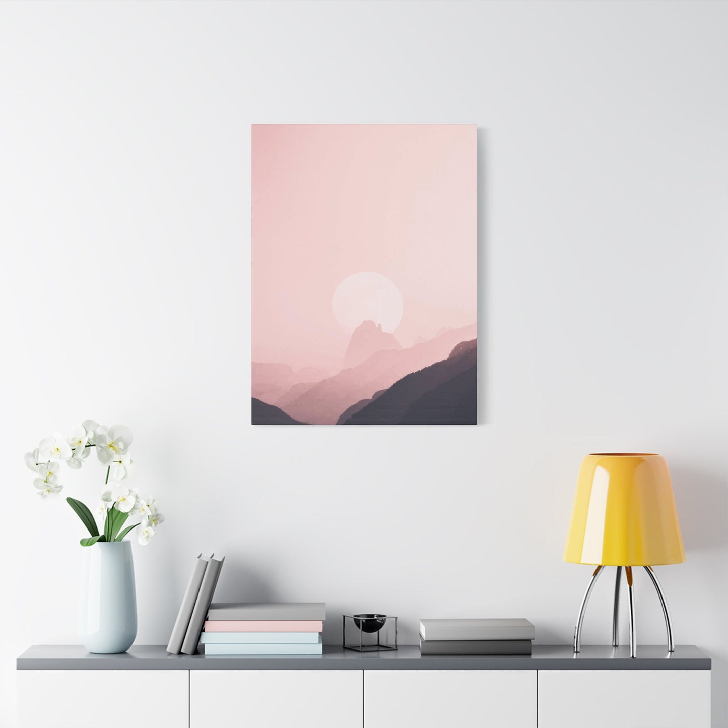
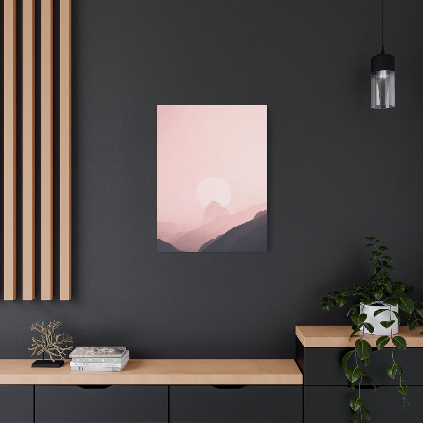
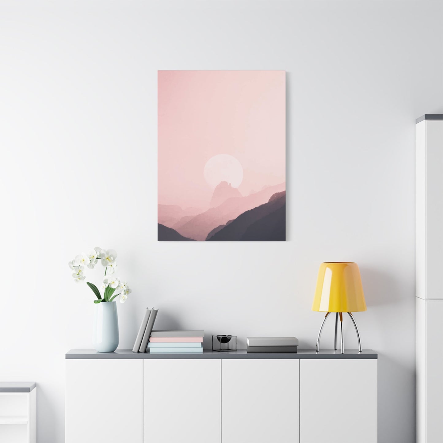
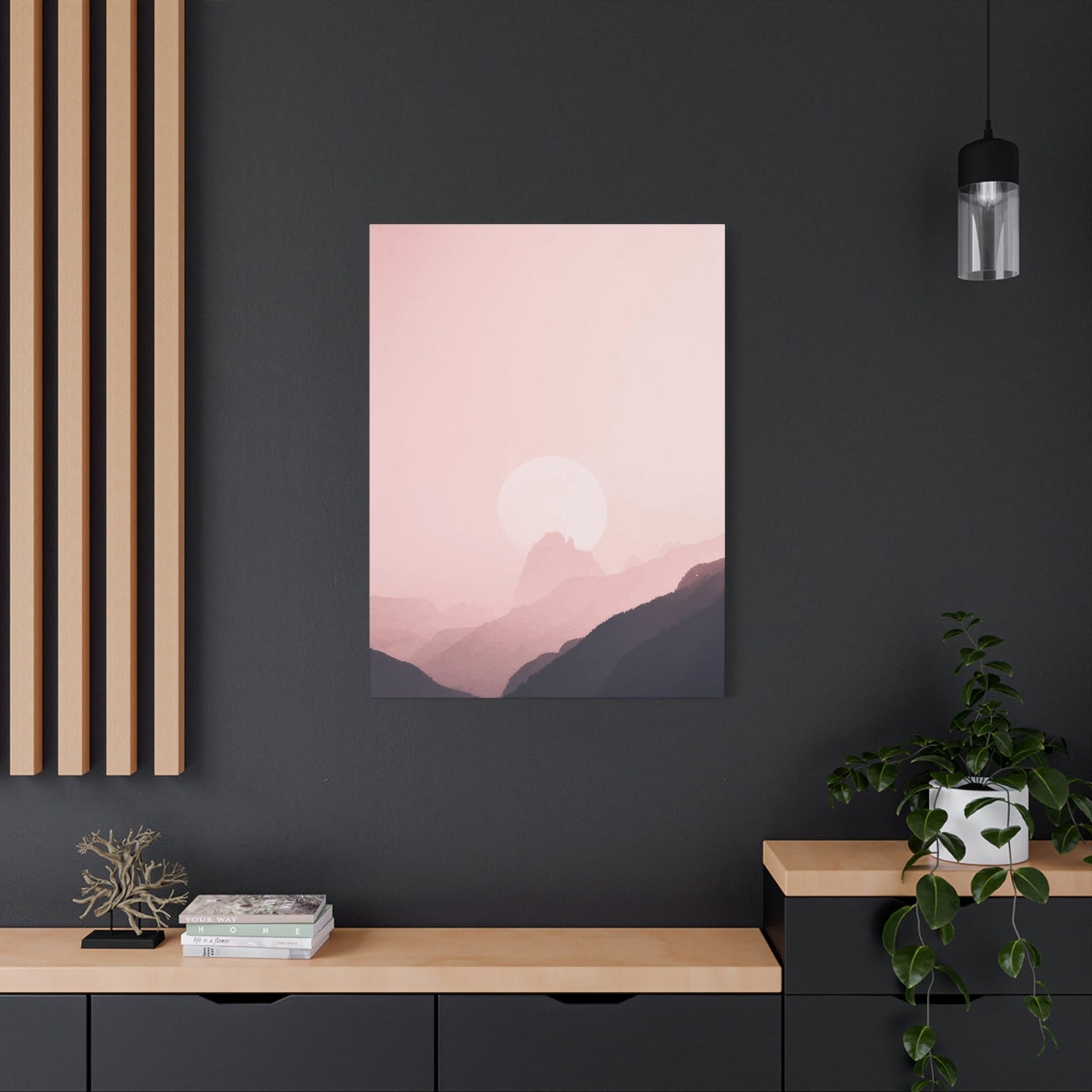
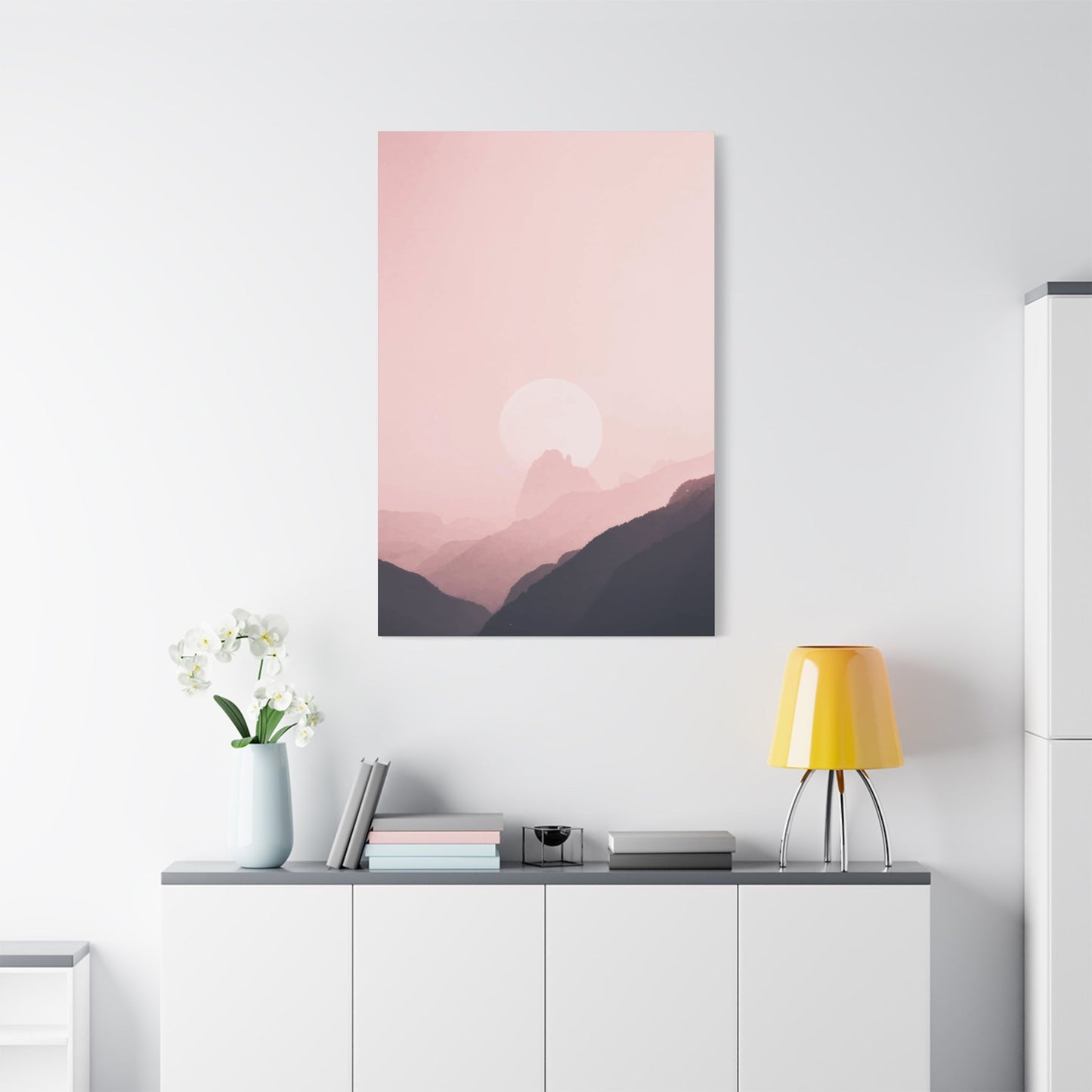
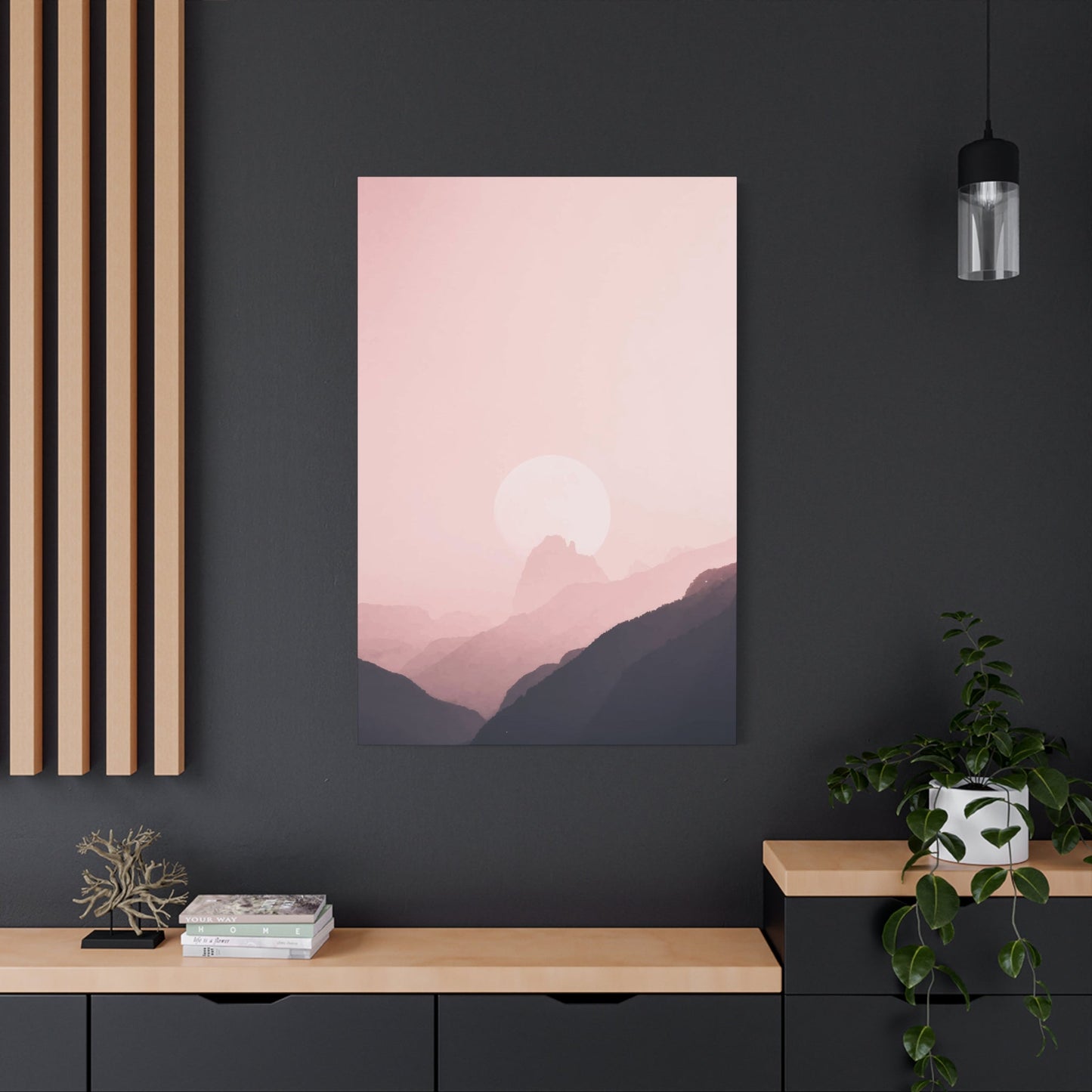
A Touch of Romance: How Sky Is Pink Wall Art Enhances Emotional Spaces
When we talk about decorating living spaces with extraordinary visual elements, few subjects capture the imagination quite like celestial artwork featuring rosy-hued atmospheres. This particular style of interior decoration has emerged as one of the most sought-after trends in contemporary home styling, offering homeowners and design enthusiasts an opportunity to infuse their environments with warmth, tranquility, and sophisticated beauty.
The phenomenon of incorporating atmospheric imagery into residential and commercial spaces represents more than just a passing aesthetic preference. It reflects a deeper human connection to natural beauty and our innate desire to bring elements of the outside world into our personal sanctuaries. When you select pieces that showcase cotton candy-colored firmaments, you're not merely hanging decoration on your walls; you're creating portals to moments of breathtaking natural wonder that can transform the emotional landscape of any room.
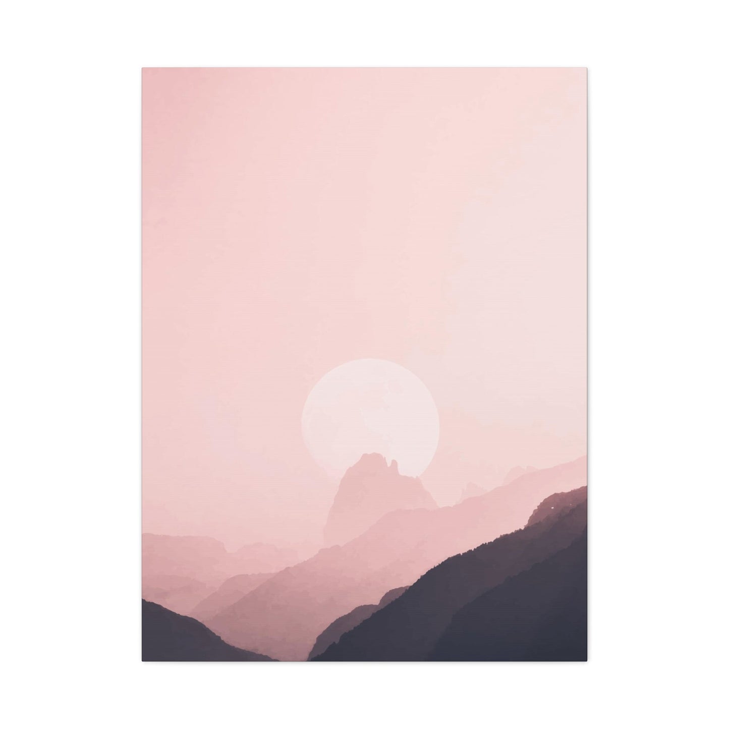
These artistic representations typically capture those magical moments during dawn and dusk when sunlight interacts with atmospheric particles to create spectacular displays of color. The science behind these natural phenomena involves the scattering of light waves through the atmosphere, with shorter wavelengths being scattered more than longer ones. During sunrise and sunset, sunlight travels through more atmosphere, allowing reds, oranges, and various shades of rose to dominate the visible spectrum. Artists who specialize in this genre understand both the scientific basis and the emotional resonance of these moments, translating them into visual masterpieces that can grace your walls.
The versatility of this decorative approach means it can complement virtually any interior design scheme. Whether your aesthetic leans toward minimalist Scandinavian simplicity, bohemian eclecticism, modern industrial chic, or traditional elegance, there exists a variation of celestial artwork that will enhance your existing decor rather than clash with it. The key lies in selecting pieces with the right tonal qualities, compositional elements, and size proportions for your particular space.
For those concerned about matching existing color schemes, these artworks offer remarkable flexibility. The spectrum of tones available ranges from soft peachy blushes to deep magenta purples, from coral-tinged oranges to lavender-infused violets. This broad palette ensures that you can find pieces that either complement your current color story or serve as the foundation for an entirely new decorative direction. Interior designers frequently recommend starting with a statement piece of atmospheric artwork and building the room's color palette around it, allowing the natural harmony of sunset hues to guide furniture, textile, and accessory selections.
The psychological impact of surrounding yourself with imagery of colorful atmospheres should not be underestimated. Color psychology research has consistently demonstrated that warm tones like those found in sunset imagery can evoke feelings of comfort, optimism, and emotional warmth. These shades have been associated with reduced stress levels, enhanced creativity, and improved mood states. By incorporating these visual elements into spaces where you spend significant time, you're essentially creating an environment that actively supports your emotional well-being and mental health.
Beyond their aesthetic and psychological benefits, these decorative pieces serve as excellent conversation starters. Guests invariably find themselves drawn to striking imagery of natural phenomena, often sharing their own memories of spectacular sunsets they've witnessed during travels or special moments in their lives. This ability to spark meaningful connections and shared experiences adds a social dimension to your decorating choices that extends beyond mere visual appeal.
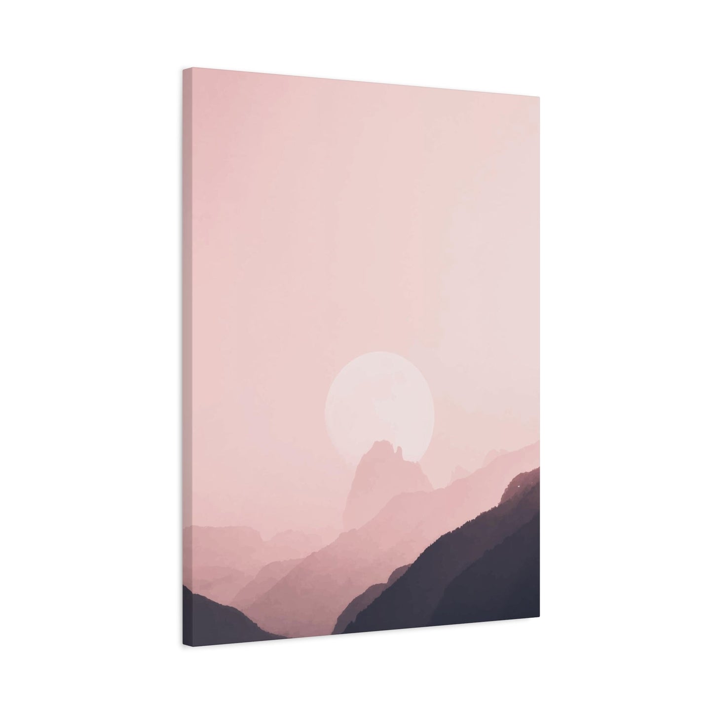
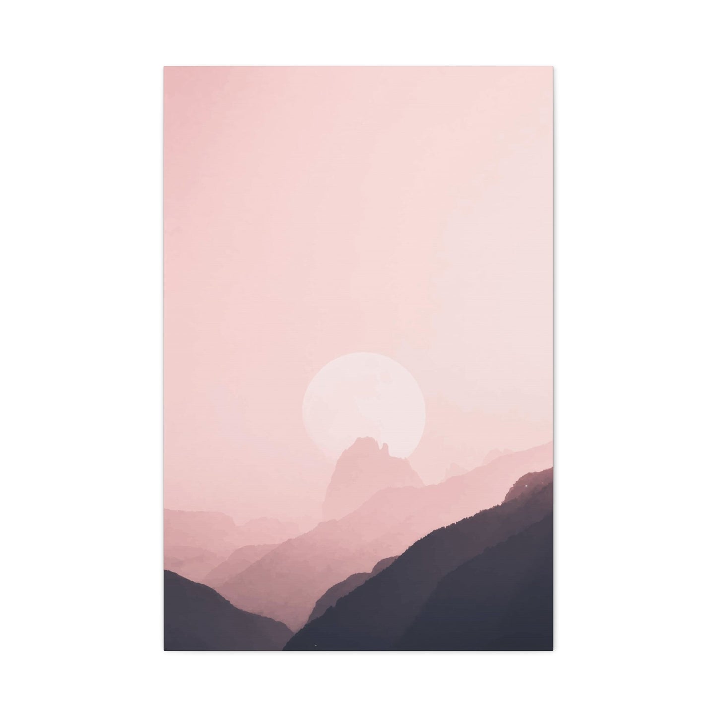
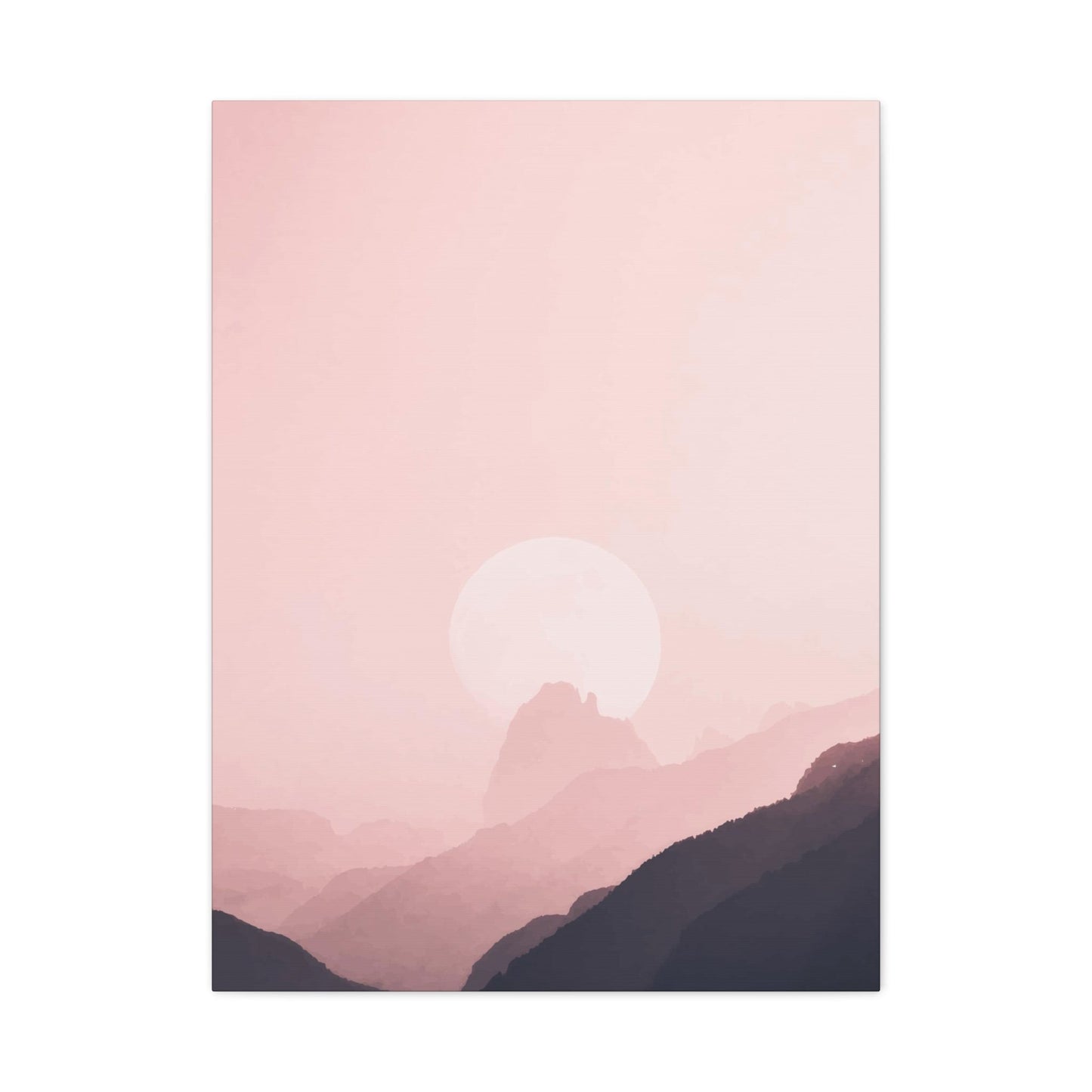
Pink Sky Canvas Prints
The medium through which atmospheric imagery is presented fundamentally shapes its visual impact and longevity within your space. Material selection represents one of the most important decisions in the artwork acquisition process, as it affects everything from color vibrancy to texture to durability. This particular printing substrate has become increasingly popular among both artists and consumers due to its unique combination of practical advantages and aesthetic qualities.
The texture inherent in this material adds a tactile dimension that flat paper prints simply cannot match. The woven surface creates subtle variations in how light reflects off the artwork, adding depth and visual interest that changes depending on viewing angle and lighting conditions. This textural quality lends an organic, handcrafted feel to the finished piece, even when the original image was created photographically or digitally. Many people find this quality particularly appealing when depicting natural subjects, as the texture reinforces the organic nature of the subject matter.
From a technical standpoint, this substrate offers excellent ink absorption and retention properties. The porous nature of the material allows printing inks to penetrate and bond with the fibers, rather than merely sitting on the surface as they would with some other materials. This penetration creates exceptional color vibrancy and saturation, with hues appearing rich and true-to-life. The absorption also contributes to longevity, as the inks are less susceptible to surface abrasion and environmental factors that might cause fading or deterioration over time.
The structural integrity of this material makes it ideal for large-format prints. Unlike paper, which can buckle, warp, or tear when stretched across significant dimensions, the inherent strength and flexibility of textile-based substrates allow for impressive sizes without compromising structural stability. This strength becomes particularly important for statement pieces intended to serve as room focal points. A large-scale atmospheric image printed on this substrate can command attention and anchor an entire room's design scheme without the worry of deterioration that might plague lesser materials.
The stretching and mounting process for this type of artwork involves wrapping the printed material around a wooden frame structure, creating a three-dimensional object that projects from the wall rather than lying flat against it. This depth adds shadow and dimension that enhance the piece's presence within the room. The sides of the frame can be handled in various ways: some artists extend the image around the edges for a wrapped appearance, while others opt for solid colors or mirrored edges. Each approach creates a slightly different aesthetic effect, allowing for customization based on personal preference and the specific image being displayed.
Maintenance requirements for this type of artwork are remarkably minimal, making it a practical choice for busy households. The material naturally resists dust accumulation better than glass-covered pieces, and when cleaning becomes necessary, a simple gentle dusting with a soft cloth is typically sufficient. For more stubborn marks, a slightly damp cloth can be used without risking damage to the print quality. This low-maintenance character makes these pieces particularly appropriate for high-traffic areas or homes with children and pets, where more delicate artwork might require constant vigilance.
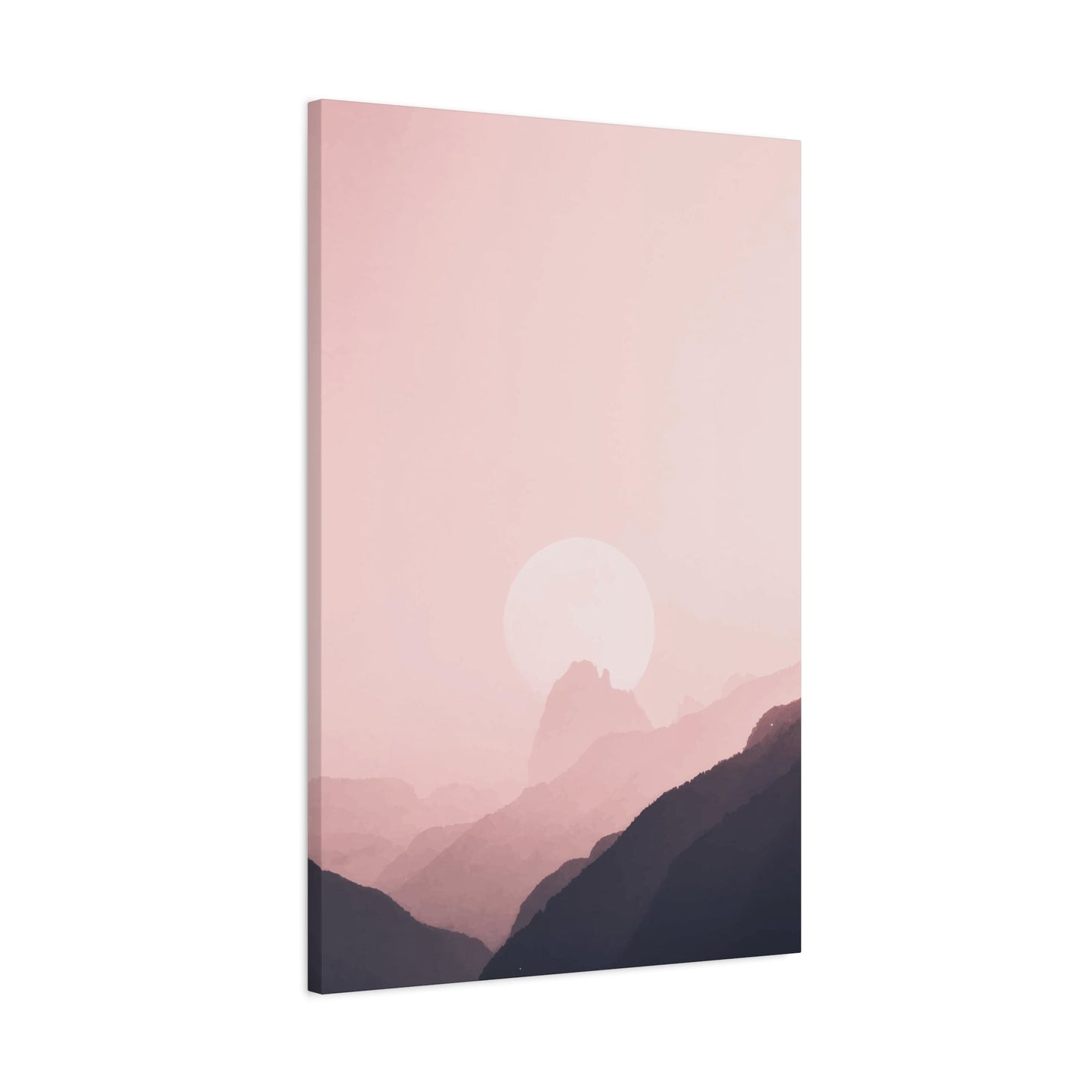
Dreamy Sunset Wall Decor
Creating an atmosphere of tranquility and wonder within residential spaces requires thoughtful selection of decorative elements that resonate on both visual and emotional levels. The concept of incorporating ethereal atmospheric imagery into interior environments speaks to a universal human appreciation for natural beauty and our desire to capture fleeting moments of extraordinary splendor. This decorating approach transforms ordinary living spaces into sanctuaries that inspire reflection, creativity, and peace.
The term itself evokes a sense of softness and fantasy, suggesting imagery that transcends mere photographic documentation to enter the realm of artistic interpretation. These pieces typically feature diffused light, soft focus elements, and color palettes that emphasize pastels and gentle gradations rather than harsh contrasts. The resulting aesthetic creates a soothing visual experience that invites contemplation rather than demanding attention, making it ideal for spaces intended for relaxation and restoration.
Compositional elements play a crucial role in achieving this aesthetic quality. Artists and photographers working in this genre often employ techniques that enhance the otherworldly character of their subjects. Shallow depth of field can blur foreground or background elements, creating a sense of depth while maintaining a soft, approachable feel. Long exposure techniques might be used to smooth water surfaces or blur moving clouds, transforming recognizable landscape elements into abstract forms that suggest rather than define. These technical approaches combine with natural phenomena to create images that feel simultaneously familiar and fantastical.
The emotional resonance of this decorative style stems from its ability to evoke personal memories and associations. Most people have experienced moments of stopping to watch a spectacular sunset, feeling temporarily transported from daily concerns into a state of appreciation for natural beauty. By bringing imagery of these moments into living spaces, you create visual anchors that can help recreate those feelings of wonder and peace on a daily basis. This emotional accessibility makes the style broadly appealing across different demographics and cultural backgrounds.
Color temperature considerations significantly impact how these pieces function within a space. Warmer tones with pronounced coral, peach, and golden notes create cozy, welcoming environments that feel intimate and protective. Cooler interpretations featuring more lavender, violet, and blue undertones generate a serene, spa-like atmosphere that feels expansive and calming. Many successful pieces incorporate both warm and cool elements, creating visual complexity that prevents the imagery from feeling monotonous while maintaining overall harmony.
The integration of this decorative style into existing room designs requires consideration of both color relationships and stylistic coherence. If your space already features warm wood tones, terracotta elements, or earthy textiles, atmospheric artwork with pronounced warm tones will create a cohesive, harmonious environment. Spaces dominated by cool grays, whites, and blues benefit from either cooler-toned atmospheric imagery that reinforces the existing palette, or warmer pieces that introduce contrast and visual interest. The principle of working with two-thirds harmony and one-third contrast often yields visually dynamic results that feel intentional rather than accidental.
Layering techniques can enhance the impact of your atmospheric artwork within the broader decorating scheme. Consider the artwork as one element within a thoughtfully composed vignette that might include complementary textiles, sculptural objects, or botanical elements. A wool throw in coordinating tones draped over a nearby chair, a ceramic vase in a harmonious hue, or fresh flowers echoing colors from the artwork all work together to create a cohesive visual story. This layered approach makes the artwork feel integrated into the room rather than simply hung on a wall as an afterthought.
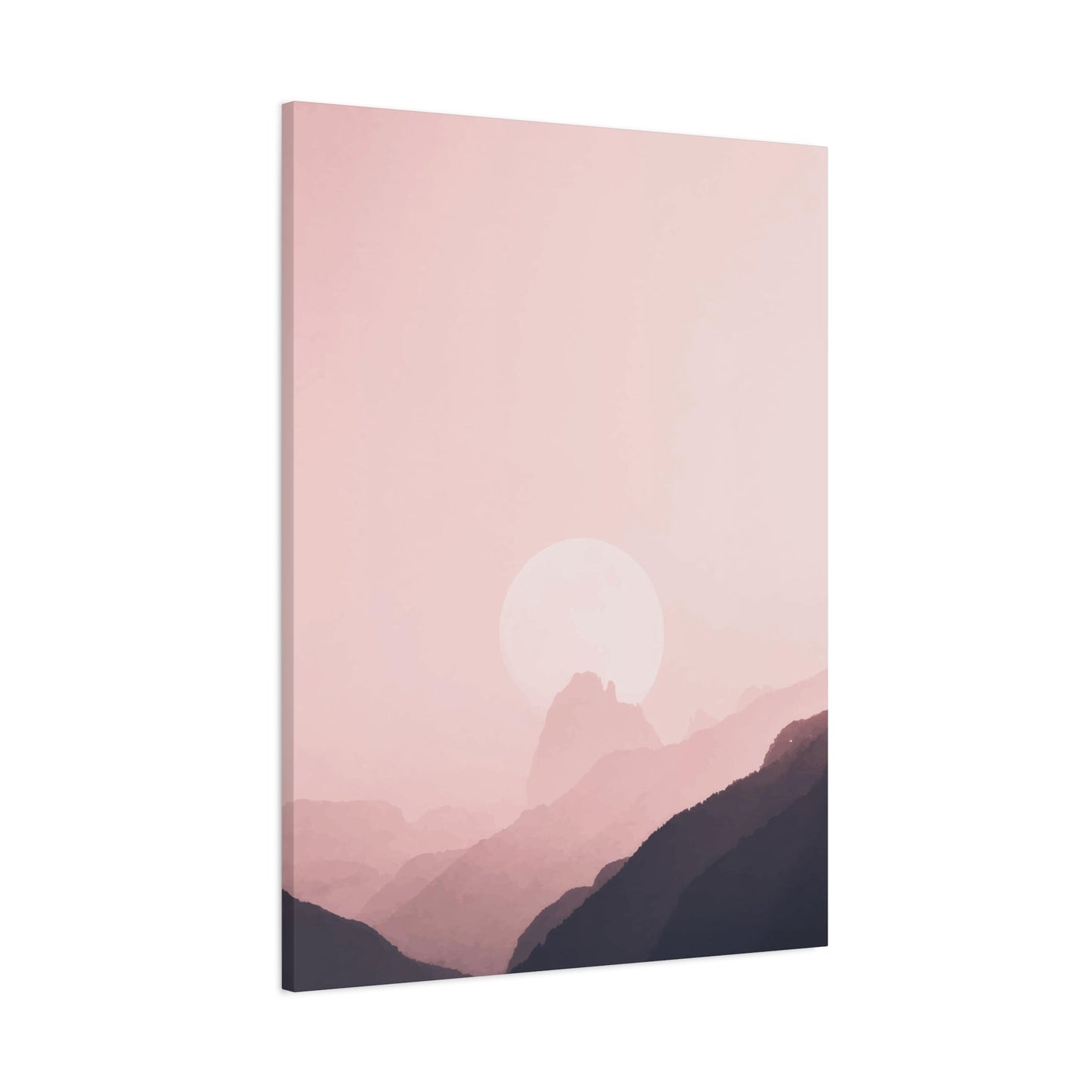
Blush Horizon Canvas Art
The intersection of specific color theory and landscape representation creates unique opportunities for sophisticated interior design applications. When we examine artwork that emphasizes the delicate transitional zone where earth meets atmosphere, rendered in soft, warm-toned palettes, we discover pieces that offer both visual impact and emotional resonance. This particular aesthetic has gained significant traction among design-conscious consumers who appreciate subtlety and elegance in their decorating choices.
The color itself carries specific cultural and psychological associations that influence how viewers respond to artwork featuring it prominently. Traditionally associated with femininity, romance, and gentleness in Western cultures, these associations have broadened in recent years as contemporary design has embraced the color for its versatility and sophistication. Modern applications demonstrate that these hues can feel equally appropriate in masculine, feminine, or gender-neutral spaces when paired with appropriate complementary elements and presented with the right aesthetic context.
The horizon line serves as one of the most fundamental compositional elements in landscape imagery, dividing the visual field and creating relationships between earth and atmosphere. The placement of this line dramatically affects the emotional character of the composition. A low horizon line that dedicates most of the visual space to atmospheric phenomena creates a sense of expansiveness and freedom, suggesting unlimited possibilities and open futures. Conversely, a high horizon line that emphasizes foreground landscape elements creates a sense of groundedness and stability, connecting viewers to the tangible earth beneath their feet. Artists working in this genre carefully consider horizon placement to achieve specific emotional effects.
Atmospheric perspective, the optical phenomenon where distant objects appear hazier and bluer than near objects, plays a crucial role in creating depth and dimension within landscape imagery. When rendered in warm-toned palettes, this effect creates beautiful transitions from saturated foreground colors to pale, ethereal distant tones. This natural gradation prevents the image from feeling flat or two-dimensional, instead creating layers of visual interest that reward sustained viewing. The eye naturally travels through these layers, creating a meditative viewing experience that draws the observer into the scene.
The specific shade variations within this color family offer remarkable versatility for coordinating with existing interior elements. Peachy tones with orange undertones complement natural wood finishes and warm metal accents like brass or copper. Rosier versions with blue undertones harmonize beautifully with cooler palettes featuring grays, whites, and silver accents. True coral tones that balance warm and cool properties serve as excellent bridge colors, working successfully in diverse contexts. This versatility makes it easier to integrate atmospheric artwork into your space without requiring major redecorating.
The emotional character of artwork in this palette tends toward the romantic and contemplative rather than the energetic or dramatic. These pieces create environments that feel peaceful and welcoming rather than stimulating or challenging. This emotional tenor makes them particularly appropriate for bedrooms, where promoting relaxation and tranquility supports healthy sleep patterns. Similarly, they excel in living spaces intended for conversation and connection, as their gentle character creates an atmosphere conducive to meaningful interaction without visual distraction.
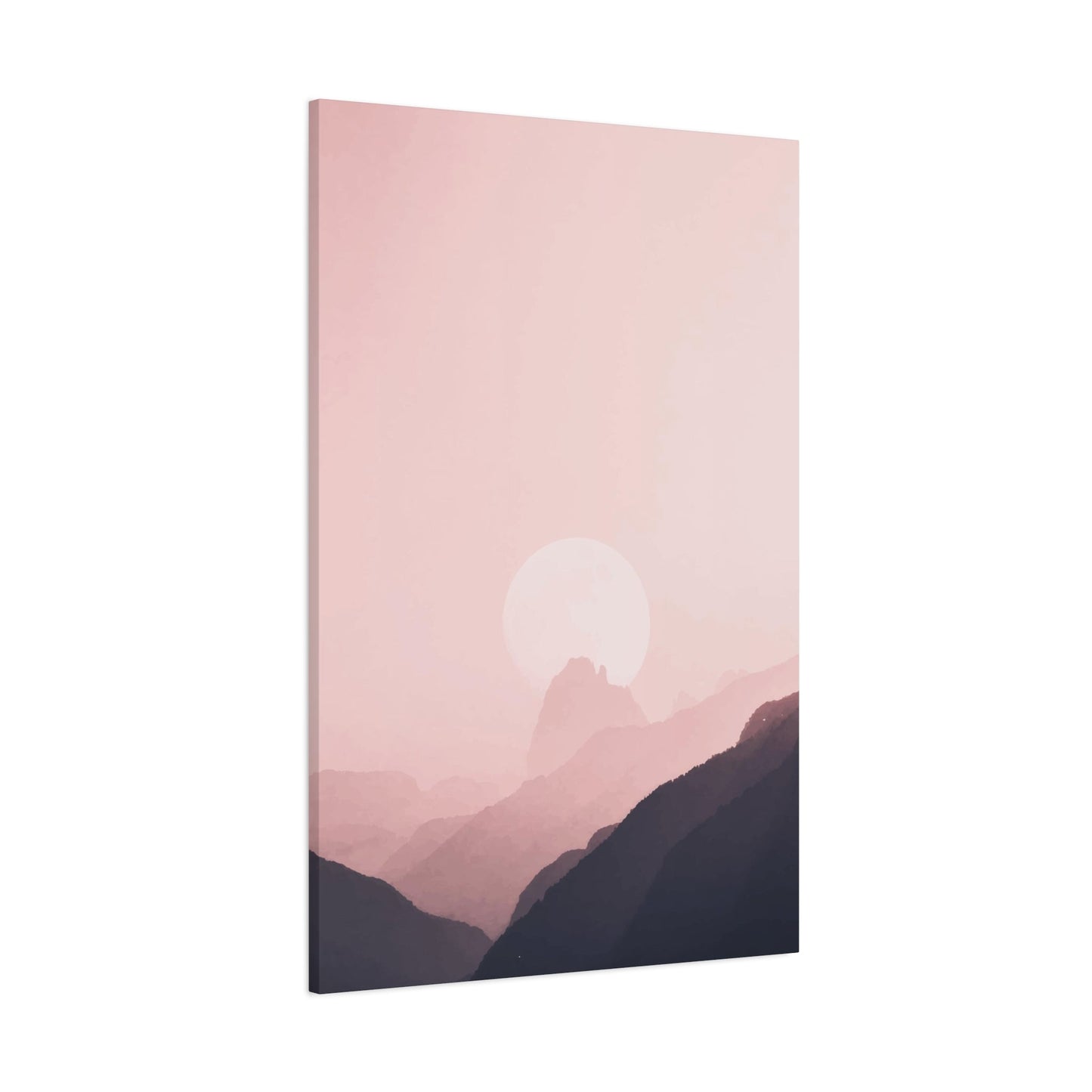
Pastel Sky Wall Prints
The aesthetic movement embracing softened, lighter-toned color palettes has fundamentally influenced contemporary interior design, creating spaces that feel open, airy, and emotionally accessible. When applied to atmospheric imagery, this approach yields decorative pieces that combine visual interest with emotional gentleness, creating environments that support wellbeing while maintaining sophisticated design credentials. This particular category of wall decoration has become increasingly prominent as homeowners seek to create residential spaces that serve as retreats from increasingly hectic external worlds.
The technical definition of this color approach involves taking saturated hues and mixing them with white, reducing intensity while maintaining the underlying color identity. This process creates colors that feel soft and approachable rather than bold and demanding. When applied to atmospheric imagery, the result captures the ethereal quality of certain natural light conditions: early morning mist, overcast twilight, or the diffused light of cloudy days. These conditions create naturally subdued color palettes that translate beautifully to interior applications.
The psychological impact of surrounding oneself with these gentler colors has been extensively studied. Research consistently demonstrates that environments featuring lighter, less saturated colors promote relaxation, reduce anxiety, and support cognitive processes requiring sustained attention. These effects make such decorative approaches particularly valuable in bedrooms, home offices, and other spaces where stress reduction and mental clarity prove important. The calming influence doesn't create drowsiness or depression; rather, it provides a neutral emotional baseline that allows for balanced emotional states.
Compositional simplicity often characterizes successful work in this aesthetic. Rather than complex, busy compositions filled with numerous competing elements, these pieces typically embrace minimalism and negative space. A simple horizon line with bands of gently transitioning color, a few wispy cloud formations against open atmosphere, or a minimal landscape silhouette provide sufficient visual interest without overwhelming the viewer. This restraint proves particularly appropriate for smaller spaces or rooms that already contain significant visual complexity through furniture, textiles, or collections.
The challenge in creating compelling work within this aesthetic lies in maintaining interest without relying on bold color contrasts or dramatic compositions. Artists achieve this through subtle gradations, delicate tonal variations, and careful attention to color temperature shifts. A composition might transition from warm peachy tones through neutral cream notes into cool lavender, creating a journey for the eye that rewards attention without demanding it. These subtle shifts prevent the work from reading as flat or monotonous while maintaining the overall gentle character.
Lighting design becomes particularly important when displaying work in this palette. These lighter tones can appear washed out or disappear entirely in overly bright lighting conditions, while insufficient illumination might make them read as gray or muddy. The ideal lighting approach provides even, moderate illumination that allows the subtle color variations to remain visible without creating glare or overwhelming the piece. Natural daylight, particularly the indirect northern light prized by artists for its consistency, often provides the most flattering illumination for work in this palette.
The versatility of this approach for coordinating with diverse interior styles makes it popular among both homeowners and professional designers. These gentle colors serve as excellent bridges between different decorating approaches, allowing for eclectic combinations that might otherwise clash. A room combining Scandinavian minimalism with bohemian textiles, or industrial elements with traditional furniture, can find unity through artwork in this softened palette that complements rather than competes with the various style elements.
Pink Evening Sky Art
The transitional period between day and night has captivated human imagination across cultures and throughout history, representing both endings and new beginnings, completion and anticipation. Artistic representations of this liminal time, particularly those emphasizing rosy atmospheric tones, offer viewers opportunities to connect with these universal themes while enjoying the aesthetic beauty of natural light phenomena. This category of decorative art has developed its own conventions and audience, appealing to those who appreciate the contemplative quality of twilight hours.
The specific timing of evening atmospheric displays creates color palettes distinct from dawn phenomena, despite superficial similarities. Evening light passes through atmosphere already filled with the day's accumulated dust, pollen, and other particles, creating enhanced scattering effects that often produce more intense and varied colors than morning light. The air temperature gradients differ between morning and evening, affecting how moisture and particles distribute through the atmosphere and thus how light interacts with these elements. These physical differences translate into visual distinctions that sensitive viewers and artists recognize and appreciate.
The symbolic resonance of evening imagery carries particular emotional weight. The end of the day represents completion, reflection, and preparation for rest. Artwork capturing these moments can help reinforce healthy circadian rhythms by visually signaling transition time between active day and restful evening. Displayed in bedrooms, such imagery can support sleep hygiene by creating visual cues that help the mind recognize bedtime approaches. In living spaces, evening imagery creates an atmosphere conducive to unwinding and transitioning from work mode to relaxation mode.
Compositional elements common in evening atmospheric work often include foreground silhouettes of landscape features, architecture, or vegetation against illuminated atmospheres. These silhouettes provide compositional structure and visual interest while the atmospheric colors provide emotional impact and aesthetic beauty. The contrast between dark earth forms and luminous atmospheres creates dramatic visual impact despite the generally soft color palette, preventing the work from feeling too passive or unengaging.
The duration of evening atmospheric displays varies significantly by latitude, season, and weather conditions, creating diverse aesthetic possibilities. Long summer evenings in northern latitudes feature extended twilight periods with slowly shifting colors that might span hours. Brief tropical sunsets create rapid, dramatic color changes that compress impressive displays into mere minutes. These temporal variations influence both the feeling of the captured moment and practical photography considerations, with longer twilights allowing for more careful composition and multiple exposure options.
Cultural associations with evening time vary globally, influencing how viewers from different backgrounds respond to imagery from these hours. Many cultures associate evening with family time, as working members return home and share meals together. This association lends evening imagery a warm, welcoming quality that resonates across cultures. Other traditions emphasize evening as meditation or prayer time, adding contemplative or spiritual dimensions to the temporal moment. Artists and decorators can leverage these associations to enhance the emotional character of spaces through appropriate imagery selection.
The color temperature of evening light tends toward warmer tones than morning light, creating opportunities for artwork that emphasizes coziness and warmth. These warmer temperatures complement interior lighting designed for evening use, creating harmony between artificial and represented natural light. This synchronization between represented and actual lighting conditions can make spaces feel more cohesive and intentional, as if the artwork actively participates in the room's lighting design rather than existing independently of it.
Weather variations during evening hours create diverse aesthetic possibilities within this category. Clear evening atmospheric displays feature clean, distinct color bands that transition smoothly from horizon to zenith. Partly cloudy conditions create dramatic interplay between illuminated and shadowed cloud formations, adding compositional complexity and visual drama. Overcast evenings produce more subtle, diffused color effects that feel meditative and calm rather than dramatic and attention-grabbing. Each weather condition creates distinct aesthetic possibilities that appeal to different preferences and serve different decorating purposes.
Serene Sunset Wall Art
The pursuit of tranquility within residential environments has become increasingly important as modern life presents ever-greater demands on attention and emotional resources. Decorative choices that actively contribute to creating peaceful, restorative spaces provide value beyond mere aesthetic appeal, serving functional purposes related to mental health and wellbeing. Artwork that captures atmospheric phenomena during the quiet transition from day to evening, presented with an emphasis on peace and beauty rather than drama and spectacle, serves this purpose admirably.
The concept of serenity in visual art involves several key characteristics: balanced composition, harmonious color relationships, absence of jarring elements, and an overall feeling of stability and peace. Sunset imagery meeting these criteria typically avoids dramatic cloud formations, intense color contrasts, or complex compositional elements that might create visual tension. Instead, these works favor smooth gradations, gentle curves, and compositional simplicity that allows viewers to absorb the image without effort or analysis.
The meditative quality of contemplating such imagery has been recognized across various spiritual and philosophical traditions. The practice of watching sunsets appears in mindfulness exercises, meditation guidance, and stress reduction protocols precisely because the experience naturally quiets mental chatter and draws attention to the present moment. Artwork that successfully captures this quality allows viewers to access similar mental states without requiring actual sunset viewing, making these beneficial experiences available regardless of weather, schedule, or location.
Color harmony proves essential to achieving the serene quality that defines this category. Colors must relate to one another through shared undertones or logical progressions, creating visual coherence that the eye reads as pleasurable and restful. Analogous color schemes, using adjacent colors from the color wheel, typically succeed in creating harmony. For sunset imagery, this might mean warm tones progressing from golden yellow through peach and coral to soft lavender and periwinkle. These smooth transitions prevent the visual jumps and contrasts that might introduce tension or unease.
The absence of human elements or obvious human impact often characterizes the most serene atmospheric imagery. Pure natural phenomena, uninterrupted by architecture, power lines, or other infrastructure, create a sense of timelessness and escape from daily concerns. This quality makes the artwork feel like windows into unspoiled natural environments, offering psychological escape and restoration even while remaining in urban or suburban settings. For viewers feeling overwhelmed by civilization's demands and complications, these pure natural scenes provide valuable respite.
The horizontal orientation common in landscape imagery inherently feels more restful than vertical formats, as the horizontal line suggests rest and stability while vertical lines imply activity and striving. Sunset imagery emphasizing broad, horizontal expanses of atmosphere thus reinforces serene qualities through its fundamental compositional structure. This orientation also typically works better with standard furniture arrangements, fitting comfortably above sofas, beds, and tables without requiring awkward spatial relationships.
The psychological research supporting nature exposure for stress reduction and mental restoration applies equally to nature imagery. The attention restoration theory suggests that natural environments engage attention effortlessly, allowing directed attention mechanisms used for work and problem-solving to rest and recover. Even photographs and paintings of natural settings provide this restorative attention experience, making nature imagery more than mere decoration—it becomes a functional element supporting cognitive health.
The scale of serene atmospheric work influences its meditative potential. Larger pieces allow for immersive viewing experiences where peripheral vision remains within the image, creating stronger absorption into the scene. This immersion enhances the meditative quality by reducing visual distraction from surrounding elements. However, smaller pieces viewed from appropriate distances can achieve similar effects, proving that impact depends more on viewing relationship than absolute size.
The mounting height for serene atmospheric artwork affects viewer engagement. Positioning the piece at or slightly below seated eye level encourages relaxed, contemplative viewing from comfortable furniture. Higher placement might suit spaces where the artwork serves more as decorative element than meditative focus. Consider how you'll most often view the piece: from a seated position on a sofa, lying in bed, or standing while moving through the space. Optimize placement for your most frequent viewing scenario.
The longevity of emotional response to serene imagery exceeds that for more dramatic alternatives. While initially exciting artwork may become tiresome with daily exposure, truly serene compositions maintain their peaceful impact over years of viewing. This enduring quality makes them excellent long-term design investments that continue providing value well beyond initial installation. The timeless aesthetic also resists dating, avoiding the risk of appearing trendy or tied to specific design moments.
Pink Clouds Canvas Decor
The dynamic element of atmospheric formations adds movement, texture, and visual interest to what might otherwise become static expanses of color. When these formations appear illuminated in rosy tones, they create spectacular natural displays that translate beautifully to interior decoration. The infinite variety of cloud formations ensures that no two pieces sharing this theme appear identical, offering collectors and decorators endless options for finding precisely the aesthetic that resonates with their particular vision.
The scientific classification of cloud types provides a framework for understanding the diverse aesthetic possibilities within this category. High, wispy formations create delicate, ethereal compositions that feel light and airy. Middle-altitude layers produce more substantial visual presence while maintaining softness and approachability. Lower, more dramatic formations create bold compositions with strong visual impact. Each type offers distinct aesthetic qualities suitable for different decorating intentions and spatial contexts.
The interplay between illuminated and shadowed areas within cloud formations creates natural contrast and dimensional interest. The three-dimensional structure of clouds means that surfaces facing light sources become brilliantly illuminated while receding surfaces fall into shadow, creating volume and form. This natural modeling provides compositional complexity without requiring additional elements, as the clouds themselves become the primary subject rather than merely background for other features.
The ephemeral nature of cloud formations adds poignancy and value to successful captures. Unlike permanent landscape features that remain available for repeated photography attempts, specific cloud formations exist for minutes or at most hours before wind and changing conditions transform them beyond recognition. This temporal limitation means that successful cloud imagery represents not just technical skill but also readiness, patience, and often considerable luck. The knowledge that captured moments will never recur identically adds appreciation for images documenting these fleeting arrangements.
The scale perception within cloud imagery creates interesting psychological effects. Clouds exist at considerable distances and possess enormous actual dimensions, yet appear soft and approachable in photographs. This contradiction between actual and perceived scale creates dreamlike qualities where massive atmospheric formations feel intimate and accessible. This psychological effect makes cloud-focused imagery feel simultaneously expansive and cozy, suitable for both creating spacious feelings and intimate atmospheres depending on presentation context.
The color saturation variations within illuminated cloud formations provide natural focal points and compositional movement. Areas of most intense illumination where sunlight strikes clouds directly create spots of maximum color saturation that naturally draw viewer attention. Gradual transitions to less saturated areas create pathways for eye movement through the composition, preventing static viewing and maintaining engagement. These natural light effects provide compositional structure without requiring artificial manipulation or enhancement.
The technical challenges of properly exposing cloud formations require sophisticated understanding of photographic principles. The bright illumination of directly lit clouds contrasts sharply with darker sky areas, creating exposure challenges that can result in blown highlights or blocked shadows if handled improperly. Successful work maintains detail throughout the tonal range, preserving delicate texture in bright areas while preventing dark regions from becoming featureless black. This technical accomplishment separates amateur snapshots from professional-quality artwork worthy of display.
The symbolic associations with clouds span cultures and time periods, adding layers of meaning beyond pure visual appeal. Clouds represent change, transformation, and the temporary nature of all phenomena. They evoke dreams and imagination, associated with daydreaming and creative thought. These symbolic dimensions allow cloud imagery to carry meanings beyond literal representation, enriching viewer experience and creating opportunities for personal interpretation and projection.
The seasonal variations in cloud formation patterns create distinct aesthetic possibilities throughout the year. Summer cumulus clouds build vertically into towering formations that create dramatic compositions with strong vertical elements. Autumn and spring often feature layered cloud systems that create horizontal banding and subtle color gradations. Winter sometimes produces stark, clean atmospheric conditions with minimal cloud cover, or alternatively, flat overcast conditions that diffuse light uniformly. Understanding these seasonal patterns helps in selecting imagery that reflects or contrasts with current conditions outside your windows.
Romantic Sky Wall Art
The association between atmospheric beauty and romantic sentiment runs deep in human culture, with sunset viewing representing a quintessential romantic activity across societies. Artwork that captures these moments naturally carries romantic connotations, making it popular for spaces associated with intimacy and connection. This category extends beyond simple subject matter to encompass aesthetic approaches that emphasize beauty, emotion, and the stirring of deep feelings.
The soft focus aesthetic common in romantic imagery serves both technical and emotional purposes. Technically, it might result from shooting through atmospheric haze, using lens techniques that create natural vignetting, or selective focus approaches that blur less important elements. Emotionally, this softness removes harsh reality, creating idealized visions that emphasize beauty while minimizing imperfection. This aesthetic choice creates imagery that feels gentle, flattering, and emotionally accessible rather than starkly realistic.
The warm color dominance typical of romantic atmospheric imagery creates psychological warmth that parallels emotional warmth. Colors trending toward reds, corals, and peachy tones trigger associations with fire, warmth, and passion, making them naturally suitable for conveying romantic sentiment. The biological and cultural associations humans hold with these warm tones make them effectively communicate desired emotional content without requiring explicit romantic imagery or obvious symbolism.
The golden hour lighting that produces the most romantic atmospheric conditions occurs during brief windows around sunrise and sunset when sunlight passes through maximum atmosphere, creating warm, diffused illumination that flatters everything it touches. This flattering quality, well-known to photographers and filmmakers, creates natural beauty enhancement that elevates ordinary scenes into something special. The transient nature of this lighting adds urgency and specialness—these moments must be appreciated when they occur because they won't last.
The compositional simplicity often characterizing romantic atmospheric work allows emotional content to take precedence over intellectual engagement. Rather than complex, puzzle-like compositions that challenge viewers to decode meaning or understand relationships between elements, romantic work offers immediate emotional impact that requires no analysis. This accessibility makes it broadly appealing and appropriate for spaces where relaxation and emotional connection take priority over intellectual stimulation.
The nostalgic quality frequently present in romantic atmospheric imagery connects with universal human experiences and memories. Most people carry memories of special moments witnessed during beautiful atmospheric conditions: proposals, first dates, meaningful conversations, or simply peaceful moments of reflection. Artwork that evokes these personal memories becomes more than decoration—it becomes a trigger for accessing positive emotional states and cherished reminiscences.
The coupling symbolism inherent in sunset imagery, though not always explicit, adds romantic dimension to the subject matter. The day ending suggests completion and rest, mirroring the way romantic relationships provide completion and peaceful resolution. The temporary nature of sunsets reminds us of time's passage and the importance of appreciating beautiful moments while they last, adding poignancy that deepens emotional impact. These symbolic layers operate subconsciously, adding depth without requiring conscious recognition.
The intimate scale preferences for romantic imagery differ from more public or dramatic work. While impressive statement pieces might serve well in living rooms or entryways, romantic imagery often succeeds better in more modest dimensions suitable for bedrooms, dressing areas, or cozy reading nooks. These intimate spaces benefit from artwork that feels personal and special rather than grand and impressive, creating environments that support private moments and personal reflection.
The pairing possibilities with romantic atmospheric artwork include complementary decorative elements that reinforce the emotional tenor. Soft textiles in coordinating tones, candlelight or warm-toned lighting, fresh flowers or botanical elements, and comfortable furniture all contribute to creating cohesively romantic environments. The artwork serves as inspiration and anchor for these supporting elements, establishing the emotional tone that other choices reinforce.
The gift-giving applications for romantic atmospheric artwork make it popular for occasions celebrating relationships: anniversaries, weddings, Valentine's Day, or simply as expressions of affection. The universal appeal of beautiful atmospheric imagery combined with romantic associations creates gifts that feel both personal and safe, meaningful without being overly intimate or presumptuous. The lasting nature of quality artwork means these gifts continue expressing sentiment long after flowers fade or chocolates disappear.
The gender neutrality of atmospheric imagery, despite traditional associations of certain colors with femininity, makes it appropriate for couples' spaces without skewing too strongly toward either partner's preferences. The natural subject matter appeals across gender identities, while the emotional resonance connects with human experiences that transcend demographic categories. This inclusivity makes romantic atmospheric artwork excellent for shared spaces where both partners' tastes must be accommodated.
Pink Dusk Canvas Prints
The specific temporal moment between day and night when sunlight has dipped below the horizon but residual atmospheric illumination persists creates unique visual conditions distinct from both full sunset and complete darkness. This transitional period, often called the blue hour despite sometimes producing rosy tones, offers photographers and artists particularly beautiful and challenging conditions. Artwork capturing these moments carries distinct aesthetic and emotional qualities that set it apart from other atmospheric imagery.
The indirect illumination characteristic of this period creates remarkably even, soft light without harsh shadows or bright highlights. This quality produces subtle, sophisticated color palettes that feel refined and elegant rather than bold and dramatic. The absence of direct sunlight means colors result entirely from scattered light interactions with atmospheric particles, creating ethereal effects that can seem almost otherworldly. This unusual lighting creates memorable imagery that stands apart from more common direct-light sunset captures.
The extended color transitions possible during this period allow for complex, multi-hued compositions. Rather than the limited palette of direct sunset light, post-sunset conditions often display simultaneous warm tones near the horizon where the sun recently set, cool blues and purples in the overhead atmosphere, and transitional pinks and lavenders between these zones. This color complexity provides rich visual interest while maintaining overall harmony through natural atmospheric processes that ensure colors relate logically rather than clashing arbitrarily.
The quiet, contemplative mood associated with this temporal moment makes imagery from this period particularly suitable for spaces dedicated to rest and restoration. The approaching night and absence of direct sunlight create inherently calming visual conditions that translate into artwork supporting relaxation and peaceful states of mind. Bedrooms, meditation spaces, and quiet reading areas all benefit from artwork that embodies the peaceful transition from active day to restful night.
The technical requirements for capturing quality imagery during this period challenge even experienced photographers. The low light levels require longer exposures, higher sensor sensitivities, or both, potentially introducing technical complications like motion blur or digital noise. Successfully navigating these challenges while maintaining image quality and capturing fleeting color conditions demonstrates significant skill and dedication. This technical achievement adds value to successful work, representing not just artistic vision but also technical mastery.
The cultural associations with this transitional time vary globally but often include themes of rest, family gathering, and spiritual reflection. Many religious traditions include evening prayers or rituals during this period, lending it spiritual significance. The return home from work and gathering for evening meals gives it associations with family and domesticity. These cultural dimensions add layers of meaning that viewers may unconsciously recognize, enhancing emotional resonance beyond purely visual appeal.
The color temperature cooling that occurs during this period creates interesting chromatic effects. While initial sunset colors skew warm, the progressive cooling as blue hour advances creates subtle shifts that sophisticated viewers appreciate. This temporal progression means that images from different moments within this period can appear surprisingly different despite being captured only minutes apart. This variation provides choices for decorators seeking specific color relationships to coordinate with existing interior palettes.
The silhouette opportunities during this period create strong compositional possibilities. The even background illumination of the atmosphere combined with unlit foreground elements creates high-contrast silhouettes with smooth, clean edges. These silhouettes might include landscape features, architectural elements, or vegetation, providing compositional structure and visual interest without competing with the atmospheric colors that provide the image's primary beauty.
The star emergence that sometimes occurs during later stages of this period adds additional visual elements to atmospheric compositions. The appearance of first stars, often including bright planets like Venus, creates focal points within otherwise smooth atmospheric gradients. These celestial additions connect the atmospheric display to the broader cosmos, adding scale and wonder to the composition. The cultural and symbolic associations with stars add additional meaning layers that enrich viewer experience.
The Sky Is Pink Poster
The accessibility and versatility of paper-based artwork makes it an important category for bringing atmospheric beauty into diverse spaces and budgets. While sometimes dismissed as less prestigious than other substrates, quality paper-based work offers distinct advantages that make it appropriate for many applications. The lighter weight, reduced cost, and easier installation all contribute to making atmospheric imagery accessible to broader audiences who might find other formats prohibitive.
The archival quality paper stocks now available ensure longevity that rivals more expensive alternatives when properly cared for and displayed. Acid-free papers resist yellowing and deterioration that plagued earlier paper-based artwork, while pigment-based inks resist fading even under extended light exposure. These technical improvements mean that paper-based work can serve as long-term design elements rather than temporary decorations, providing value that justifies the investment despite lower initial costs.
The matting and framing possibilities for paper-based work offer creative opportunities for customization and personalization. Mats in coordinating or contrasting colors can extend visual impact, create breathing room around the image, or integrate the piece into existing color schemes. Frame selection dramatically affects presentation style, from minimalist metal frames for contemporary spaces to ornate traditional frames for classic interiors. This customization potential means the same basic image can be adapted to serve very different aesthetic purposes through presentation choices.
The texture variations available in paper stocks influence final appearance and aesthetic character. Smooth, glossy papers create sharp, vibrant presentations with saturated colors and crisp details. Matte papers produce softer, more subdued presentations that reduce glare and create sophisticated, understated elegance. Textured papers add tactile interest and can create artistic effects that distance the work from straightforward photography, adding interpretive layers that enhance creative expression.
The size flexibility of paper-based work accommodates everything from intimate studies suitable for small wall spaces to impressive large-format pieces that command attention in substantial rooms. Unlike some substrates with practical size limitations, paper can be produced in virtually any dimension, allowing for perfect proportions relative to available wall space. This scalability ensures that atmospheric imagery can successfully fill any space regardless of architectural constraints or spatial limitations.
The protective glazing required for paper-based work presents both challenges and opportunities. Standard glass provides basic protection but adds weight, fragility, and potential for glare and reflection. Non-reflective glass eliminates viewing problems but typically costs more and may slightly subdue color vibrancy. Acrylic glazing offers lighter weight and greater impact resistance but requires careful cleaning to avoid scratching. Each option presents trade-offs that should be considered based on specific application requirements and priorities.
The gallery wall applications particularly suit paper-based work, where multiple coordinated pieces create greater impact than any single image could achieve alone. The relative affordability of paper-based work makes creating these multi-image installations more financially accessible than similar arrangements using more expensive substrates. The ability to easily swap or rearrange pieces within the arrangement provides flexibility for refreshing the display over time without requiring complete replacement.
Twilight Glow Wall Art
The luminous quality of residual atmospheric light after sunset creates spectacular natural displays where the atmosphere itself becomes the primary light source rather than merely filtering sunlight. This phenomenon produces unique color effects and moods distinct from other atmospheric conditions. Artwork capturing these moments offers viewers opportunities to experience beauty from temporal windows they might miss in daily life due to indoor evening routines or simple inattention to natural phenomena.
The gradient complexity achievable during this period surpasses other atmospheric conditions due to the absence of direct light source and complete dependence on scattered and reflected illumination. Multiple simultaneous atmospheric processes create layers of color that transition smoothly through a wide spectrum. These complex gradients provide endless visual interest, with the eye discovering new subtleties and relationships with repeated viewing. This complexity prevents the artwork from becoming background wallpaper that fades from consciousness with familiarity.
The mysterious quality inherent in this low-light period adds intrigue and atmosphere to imagery captured during these conditions. The approaching darkness creates slight uncertainty and mystery, engaging imagination in ways that bright, clearly lit scenes cannot. This mysterious quality makes such imagery particularly suitable for creating atmospheric, moody interiors that feel sophisticated and intriguing rather than straightforward and obvious. The psychological engagement this mystery creates adds depth to the viewing experience beyond simple aesthetic appreciation.
Conclusion
In the end, “Sky Is Pink” wall art stands as more than just a decorative choice—it’s an emotional experience that infuses warmth, serenity, and poetic beauty into your space. The gentle hues of pink skies evoke a sense of balance between peace and passion, making any room feel both comforting and inspiring. Whether displayed in your bedroom, living room, or a quiet reading nook, this artwork serves as a visual reminder of calm mornings, heartfelt moments, and the beauty of simplicity.
By choosing pieces that feature soft gradients, delicate clouds, or abstract interpretations of twilight skies, you invite emotional depth and tranquility into your home. Pink is a color that naturally lifts the spirit, softens harsh interiors, and creates harmony between light and mood. When paired with minimalist furniture, natural textures, or metallic accents, “Sky Is Pink” wall art becomes the centerpiece of an atmosphere that celebrates calmness and self-expression.
Ultimately, decorating with pink sky imagery isn’t about following trends—it’s about embracing a feeling. It’s about transforming ordinary walls into emotional landscapes that reflect optimism and romance. The timeless appeal of this color palette ensures it will always hold a place in the world of art and interior design. So, if you’re seeking to elevate your surroundings with warmth and subtle sophistication, let the gentle charm of a pink sky guide your aesthetic journey.
