


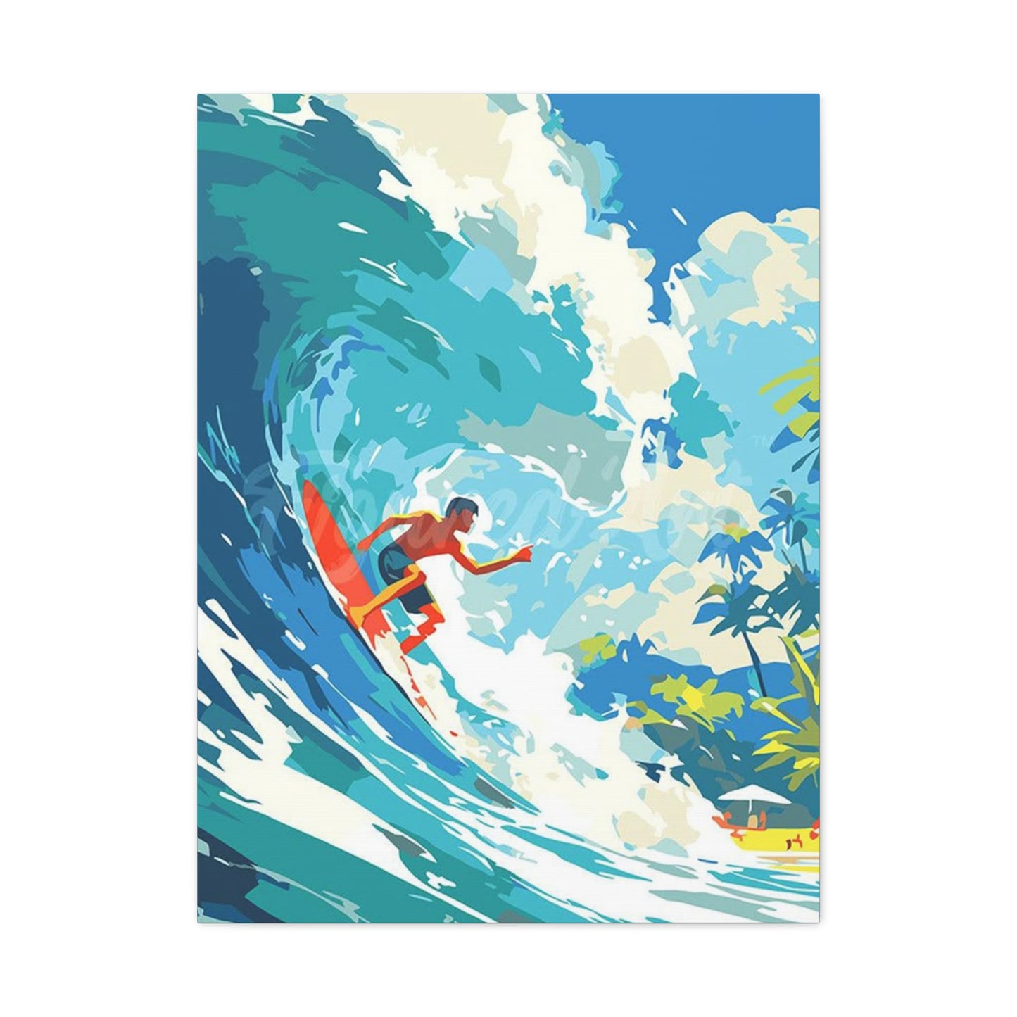
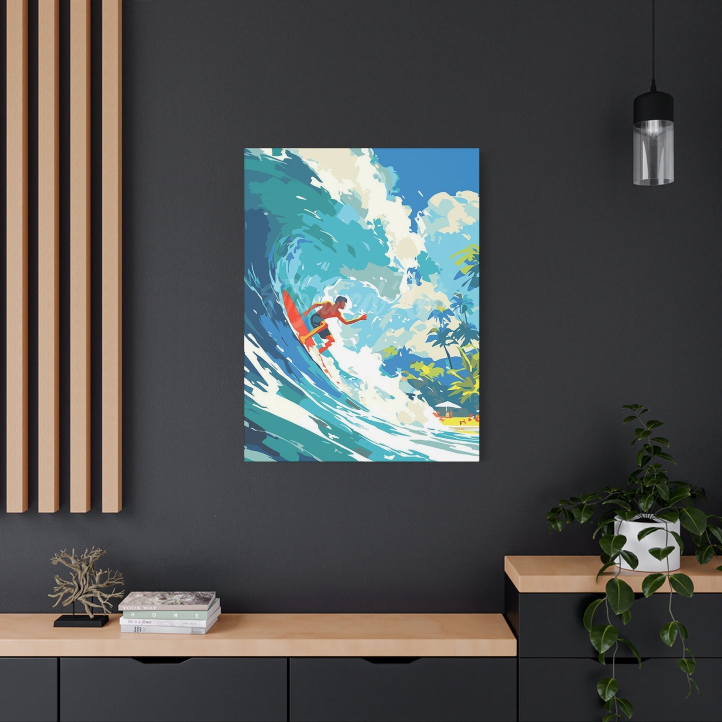
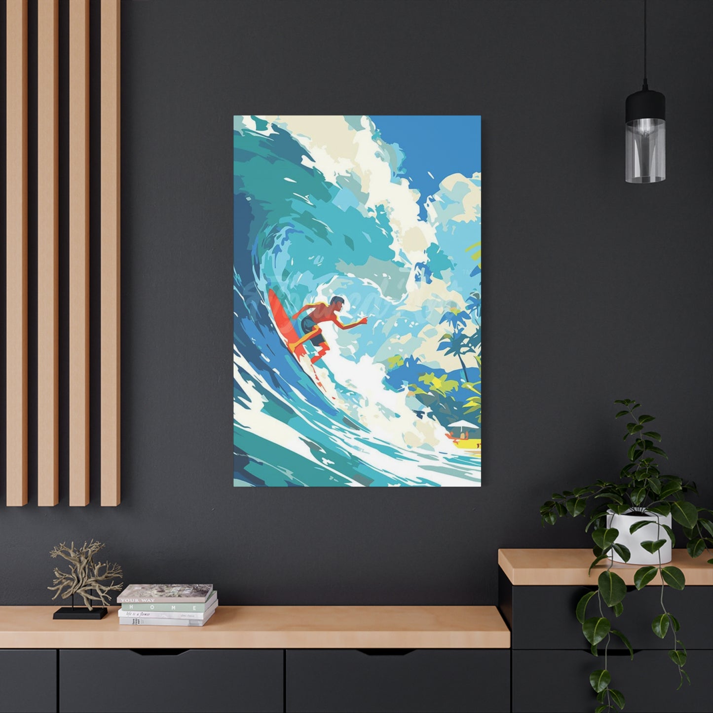
Elevate Your Interior: Dynamic Wave Surfing Posters Wall art Abstract Ocean for Every Home
The intersection of ocean artistry and interior design has given rise to a powerful visual movement that brings the raw energy of coastal waters directly into living spaces. Wave surfing posters and abstract ocean artwork have become essential elements for those seeking to infuse their environments with vitality, motion, and the untamed spirit of the sea. This comprehensive exploration delves into the multifaceted world of surfing-inspired wall art, examining how these pieces transform ordinary rooms into extraordinary spaces filled with energy and character.
The connection between humans and the ocean runs deep in our collective consciousness. From ancient maritime cultures to modern coastal communities, the sea has always represented freedom, adventure, and boundless possibility. Wave surfing art captures this essence in visual form, translating the dynamic movement of water and the thrill of riding waves into powerful imagery that resonates with both surfing enthusiasts and art lovers alike. These pieces serve as more than mere decoration; they function as windows to the ocean, bringing the beach lifestyle into homes miles from any coastline.
Contemporary interior design increasingly embraces artwork that tells a story and evokes emotion. Wave surfing posters accomplish both objectives with striking effectiveness. Whether rendered in realistic photographic detail or interpreted through abstract artistic expression, these pieces command attention and spark conversation. They represent a lifestyle choice, a connection to nature, and an appreciation for the athletic artistry of surfing culture. The beauty of this art form lies in its versatility—it can complement minimalist modern aesthetics, enhance bohemian coastal themes, or add unexpected energy to traditional spaces.
The rising popularity of surfing art reflects broader cultural trends toward wellness, outdoor recreation, and mindful living. As people seek to create homes that reflect their values and passions, artwork depicting ocean waves and surfing scenes has surged in demand. These pieces offer daily reminders of the natural world's beauty and power, encouraging viewers to embrace adventure and maintain connections to outdoor experiences even within urban environments.
The Boldness of Surfing Wave Art
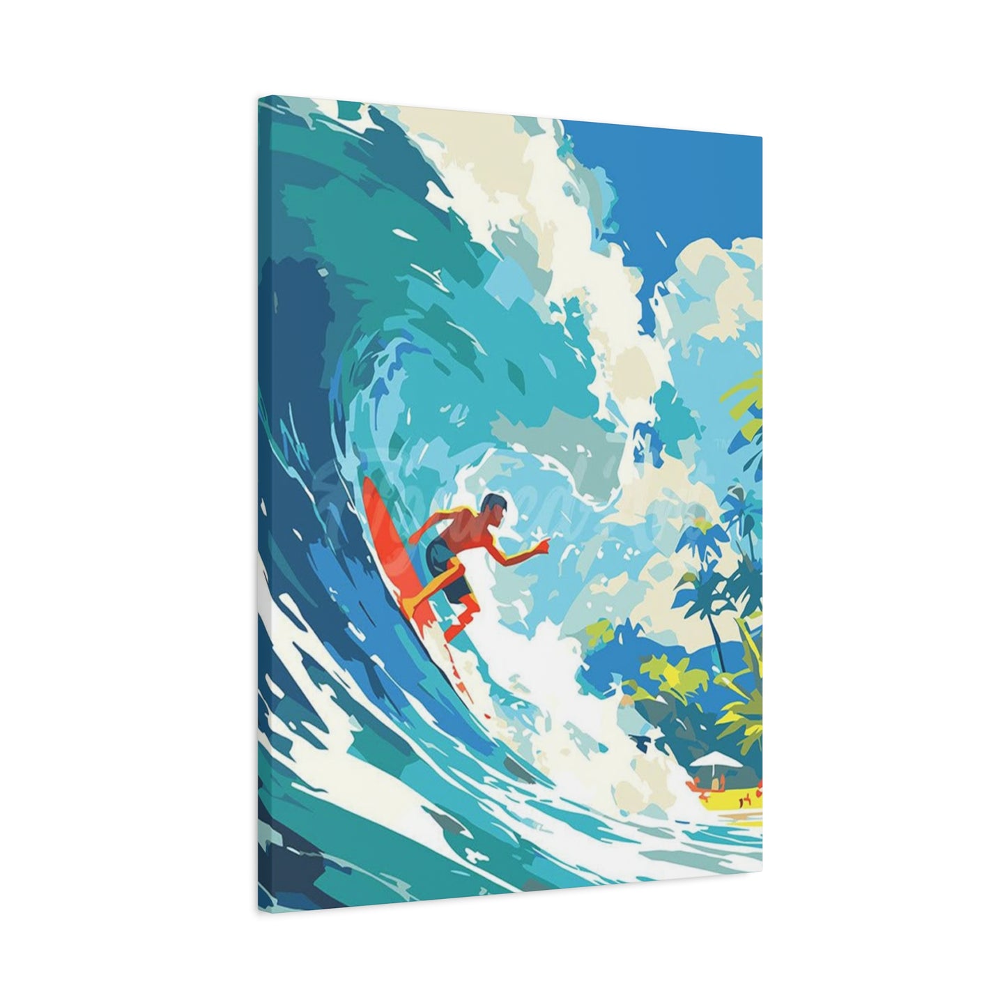
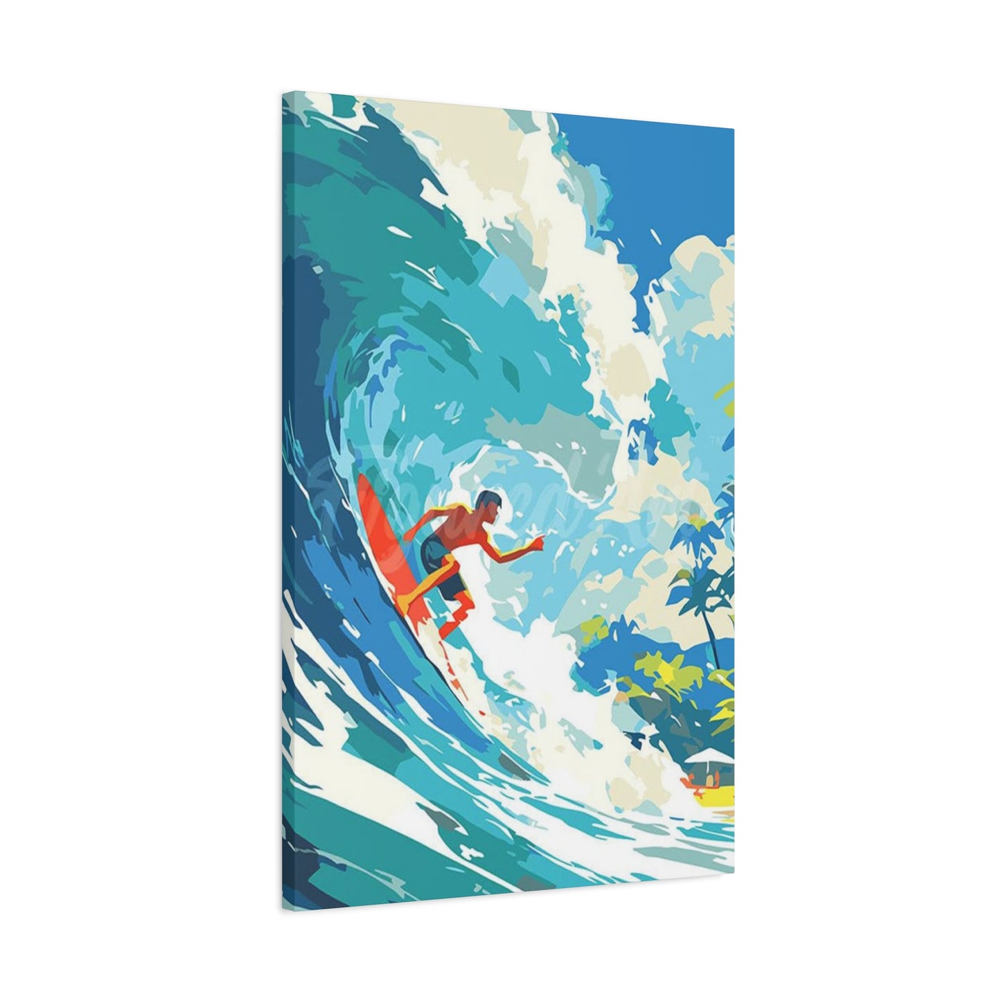
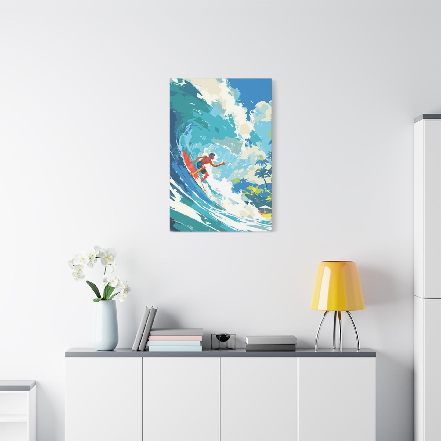
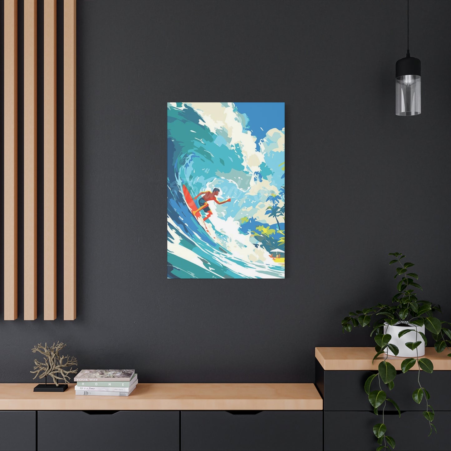
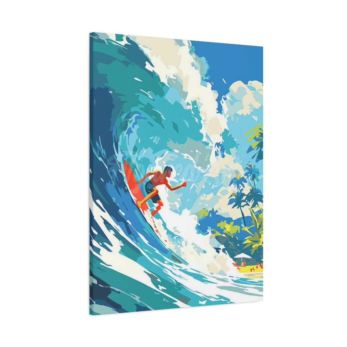
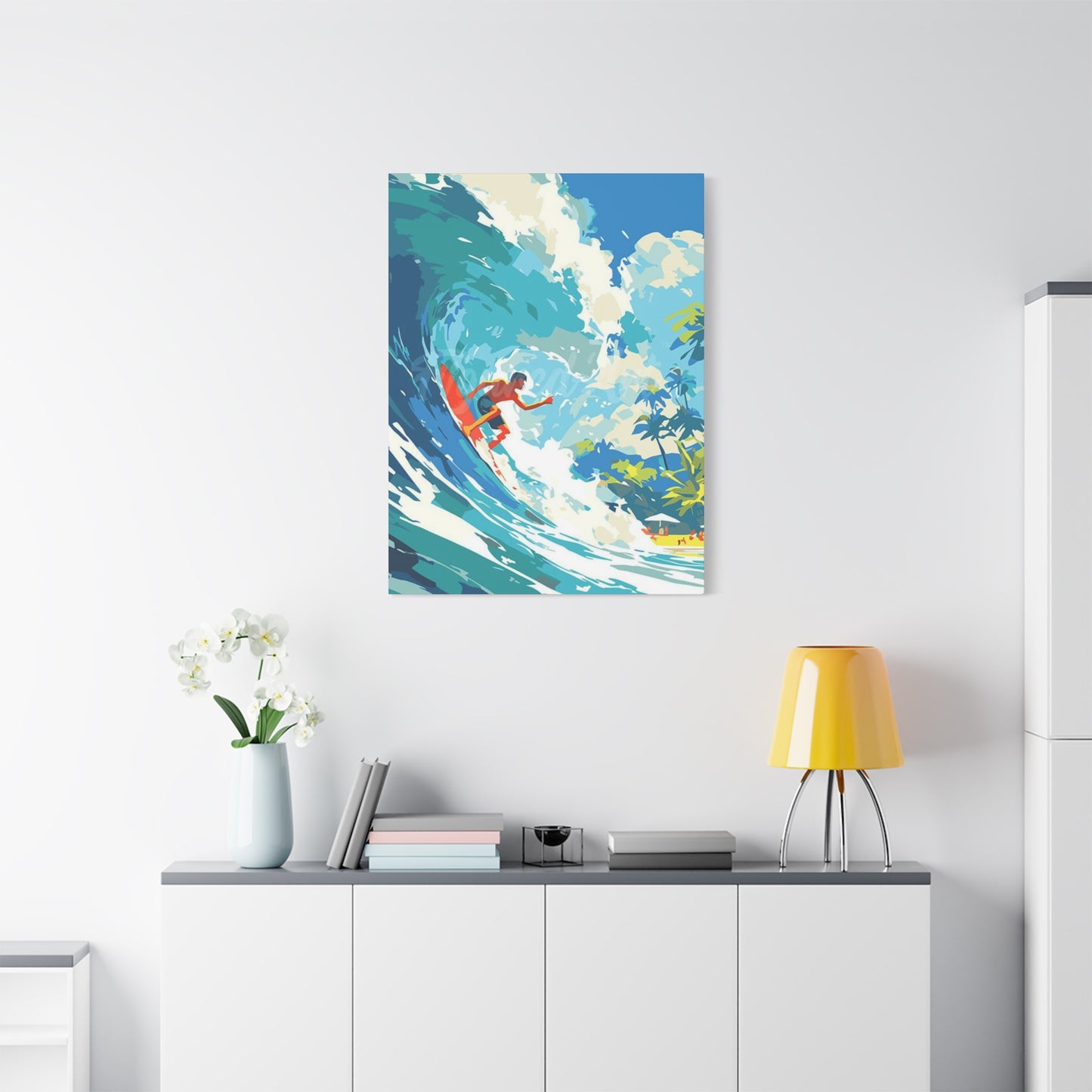
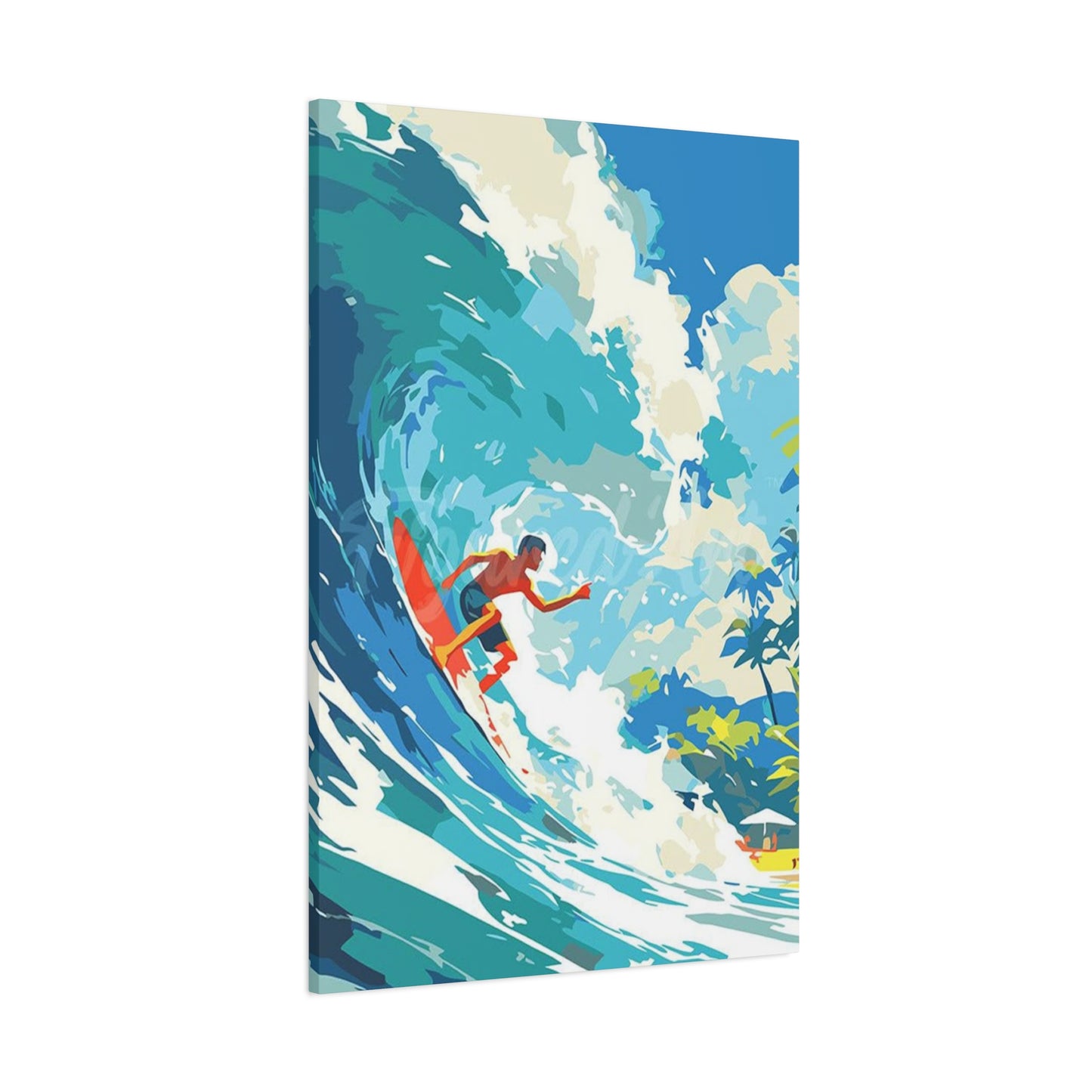
Surfing wave art possesses an inherent boldness that distinguishes it from other decorative styles. The dramatic curl of a breaking wave, the spray of foam against azure water, the silhouette of a surfer carved against the horizon—these elements create visual impact that immediately draws the eye and energizes any space. This boldness stems from the subject matter itself: waves represent nature's raw power, unpredictable yet beautiful, dangerous yet alluring. When captured in artistic form, this energy transfers directly into your living environment.
The color palettes associated with wave surfing art contribute significantly to its bold character. Deep oceanic blues ranging from navy to turquoise dominate many pieces, creating depth and movement that simulate the feeling of being immersed in water. These blues often contrast with brilliant whites representing foam and spray, creating dynamic visual tension. Some artists incorporate unexpected color combinations—purples, teals, greens, and even warm sunset hues of orange and pink—that push creative boundaries while maintaining connection to oceanic themes. These bold color choices make surfing wave art particularly effective for spaces needing visual excitement or emotional uplift.
Scale plays a crucial role in maximizing the boldness of surfing wave art. Large-format pieces create immersive experiences, allowing viewers to feel almost enveloped by the wave's energy. A substantial canvas or poster depicting a towering wave can serve as the focal point of an entire room, anchoring the design scheme and setting the tone for all other decorative elements. However, boldness need not always mean size—sometimes a smaller piece with intense color saturation or dramatic composition can create equally powerful impact through concentrated visual energy.
The subject matter itself carries inherent drama. Waves frozen at their moment of maximum power, just before breaking, contain enormous potential energy visible in every curve and texture. Surfers positioned at critical points within these waves—whether carving across a wave's face, tucked inside a barrel, or launching aerial maneuvers—add human elements that heighten the drama and provide scale reference. This combination of natural force and human courage creates narrative tension that keeps viewers engaged, discovering new details with each viewing.
Composition techniques in surfing wave art often employ diagonal lines and dynamic angles that create visual movement and energy. Unlike static landscapes with horizontal stability, wave art frequently features dramatic diagonals that lead the eye through the piece, creating a sense of motion and urgency. These compositional choices mirror the actual experience of wave riding, where balance, momentum, and precise timing determine success or failure. The resulting artwork feels alive, almost kinetic, as if the wave might continue its journey beyond the frame's boundaries.
Texture adds another dimension to the boldness of surfing wave art. Whether achieved through photographic clarity that reveals every water droplet, painterly brushstrokes that suggest movement, or mixed media techniques that create actual three-dimensional relief, texture enhances the tactile quality of the artwork. Viewers often feel compelled to reach out and touch these pieces, drawn by the illusion of water's fluid surface or the rough energy of crashing foam. This textural richness adds depth and complexity that elevates surfing art beyond simple representational imagery.
The emotional resonance of bold surfing wave art cannot be overstated. These pieces evoke feelings of exhilaration, freedom, and connection to something greater than ourselves. For surfers, they trigger memories of perfect sessions and the pursuit of ideal conditions. For non-surfers, they provide access to experiences outside their daily routines, offering vicarious thrills and reminders that adventure remains available. This emotional connectivity makes surfing wave art particularly meaningful, transforming walls into sources of inspiration and daily motivation.
Cultural associations further enhance the boldness of surfing wave art. Surfing represents counterculture, rebellion against conventional lifestyles, and embrace of natural rhythms over industrial schedules. Displaying surfing art signals alignment with these values—a preference for authenticity over pretension, experience over possessions, and connection over isolation. This cultural shorthand communicates volumes about the inhabitant's identity and priorities, making the artwork a form of personal expression beyond its aesthetic qualities.
Decorating with Wave Surfing Posters
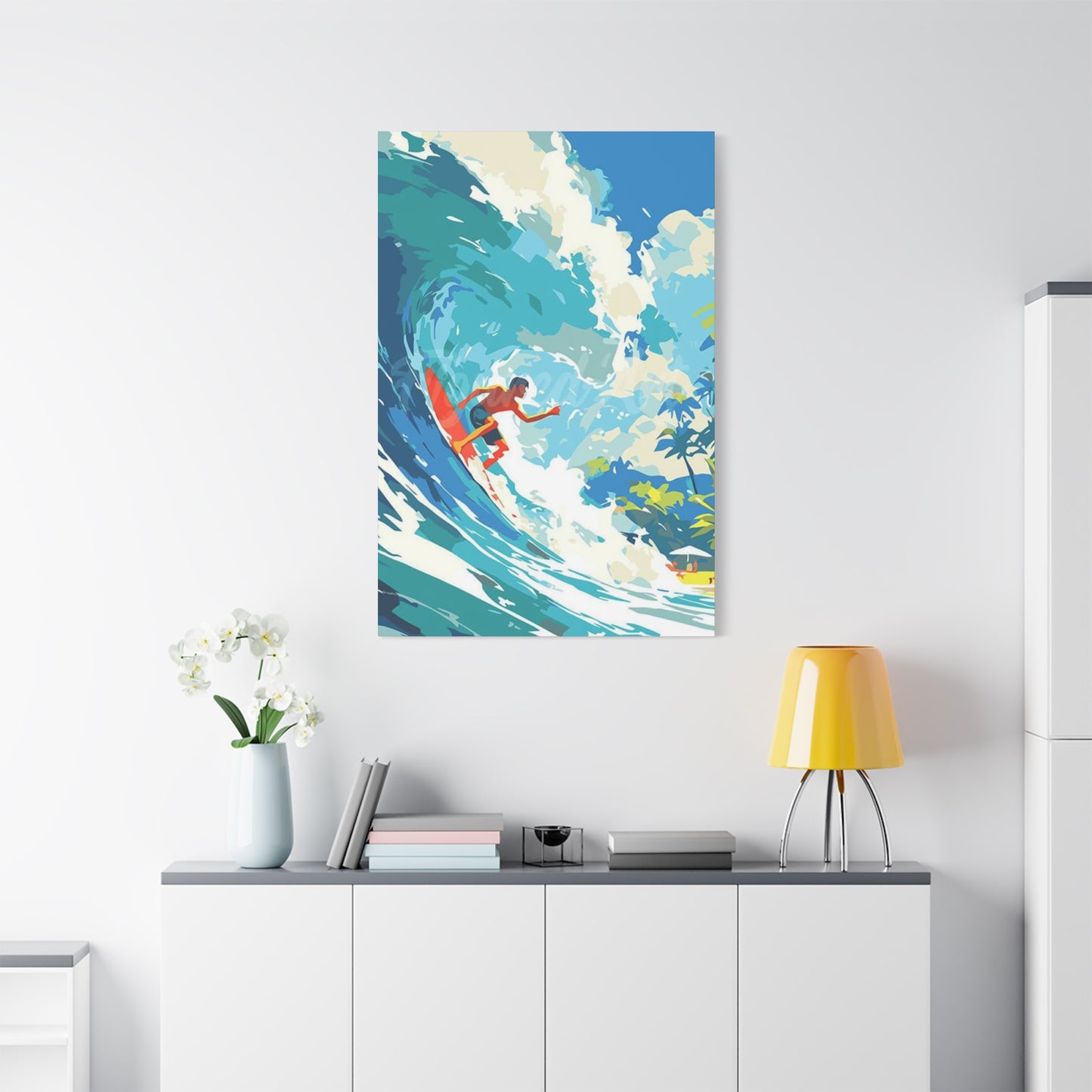
Decorating with wave surfing posters requires thoughtful consideration of space, lighting, color coordination, and overall design objectives. These versatile pieces adapt to numerous decorating strategies, from creating themed coastal environments to providing unexpected accents in eclectic spaces. Success lies in understanding how to integrate oceanic imagery into existing design schemes while allowing the artwork to shine without overwhelming other elements.
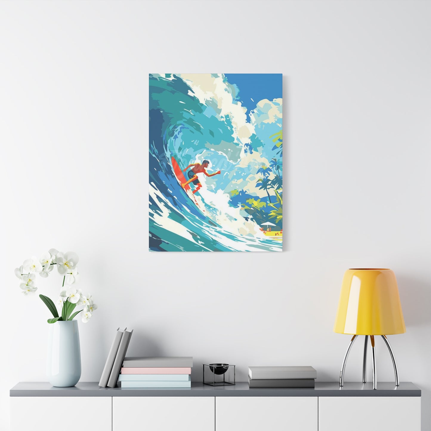
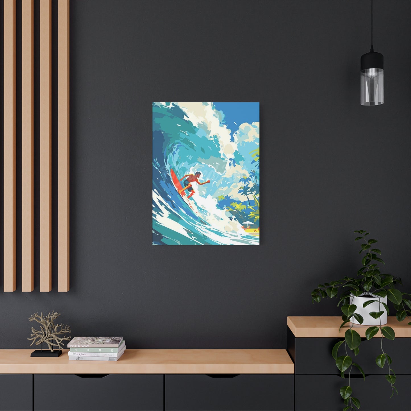
The first consideration when decorating with wave surfing posters involves selecting the appropriate size and orientation for your space. Vertical posters work exceptionally well in areas with limited horizontal wall space, such as narrow hallways, beside doorways, or in vertical gallery wall arrangements. These vertical pieces draw the eye upward, creating an illusion of height that can make rooms feel more spacious. Horizontal formats suit spaces above sofas, beds, or console tables, where they can span considerable width while maintaining proportional balance with furniture below.
Color coordination between wave surfing posters and existing room elements creates cohesion without requiring exact matching. The natural color palette of ocean scenes provides flexibility—blues can complement or contrast with various color schemes. In rooms with neutral foundations of whites, grays, or beiges, surfing posters inject vital color interest. In spaces already featuring bold colors, selecting posters with tones that echo existing hues creates harmonious relationships. Consider the undertones of your surfing art—cooler blues with green undertones versus warmer blues with hints of turquoise or teal—and how these relate to your room's color temperature.
Lighting dramatically affects how wave surfing posters appear and the mood they create. Natural light reveals the full depth and detail of quality prints, with changing sunlight throughout the day offering evolving perspectives on the same piece. Positioning posters where they receive indirect natural light prevents fading while maximizing visual appeal. For rooms lacking natural light, strategic artificial lighting enhances artwork effectiveness. Picture lights mounted above frames, track lighting aimed at wall displays, or even backlighting for floating frame installations create gallery-quality presentation that elevates inexpensive posters to fine art status.
Framing choices significantly impact the final presentation of wave surfing posters. Simple frames in black, white, or natural wood allow the artwork itself to dominate, suitable for both modern and coastal design themes. Floating frames create shadow boxes that add dimension and sophistication, particularly effective with abstract surfing art or minimalist compositions. For casual spaces like bedrooms, game rooms, or beach houses, frameless hanging using clips, magnets, or adhesive methods maintains laid-back authenticity appropriate to surfing culture while simplifying art rotation when you desire fresh looks.
Creating gallery walls with multiple wave surfing posters allows for storytelling through curated collections. You might arrange posters chronologically showing wave formation from swell to break, create contrast through varying artistic styles from photorealistic to abstract, or build visual rhythm through size variation and spacing. Gallery walls work particularly well on large empty walls in living rooms, stairways, or long hallways where single pieces might appear lost. Planning layout on the floor before hanging ensures balanced composition and prevents unnecessary wall damage from repositioning.
Integrating wave surfing posters with three-dimensional elements adds depth and interest to wall displays. Floating shelves positioned near or around posters provide platforms for complementary objects—shells, driftwood, surfboard fins, wax containers, or small sculptures. These elements create layers that transform flat walls into dimensional displays engaging multiple senses. However, restraint prevents clutter—select few meaningful objects rather than crowding every available surface, allowing the artwork to remain the focal point while supporting elements enhance rather than compete.
Thematic consistency versus eclectic mixing represents an important decorating decision. Some spaces benefit from concentrated surfing themes, with multiple wave posters creating immersive coastal atmospheres particularly appropriate for beach houses, surf shops, or dedicated recreation rooms. Other spaces benefit from surfing posters as unexpected elements within diverse collections, where the ocean imagery provides refreshing contrast to other art styles. Both approaches succeed when executed with attention to overall balance, scale relationships, and intentional placement rather than haphazard accumulation.
Seasonal rotation keeps decorating fresh and responsive to changing moods. Warm-toned surfing posters featuring golden-hour waves or sunset sessions complement autumn and winter aesthetics, while crisp blue wave imagery suits spring and summer sensibilities. Maintaining a rotation strategy allows you to build a larger collection over time while preventing visual fatigue from constant exposure to the same pieces. This approach also provides opportunities to redistribute posters throughout your home, discovering new appreciation for familiar pieces in different contexts.
Abstract Waves: Energy for Your Walls
Abstract wave art interprets oceanic motion through non-representational forms, colors, and compositions that capture the essence and energy of waves without literal depiction. This artistic approach offers unique advantages for interior design, providing visual interest and emotional impact while maintaining flexibility for integration into diverse decorating schemes. Abstract interpretations of wave movement translate the ocean's power into pure form and color, creating artwork that resonates on intuitive and emotional levels rather than through recognizable imagery.
The freedom of abstraction allows artists to emphasize particular aspects of wave energy that resonate most powerfully. Some abstract wave pieces focus on the swirling, circular motion of water, rendering these movements through spirals, curves, and flowing lines that guide the eye through continuous journeys across the canvas. Others emphasize the explosive power of breaking waves through fragmented shapes, sharp angles, and bold color contrasts that convey force and drama. Still others capture the rhythmic, repetitive nature of wave sets through pattern repetition and visual cadence that suggests the ocean's eternal pulse.
Color theory plays an expanded role in abstract wave art, freed from the constraints of realistic representation. While traditional ocean colors remain popular, abstract artists often explore unexpected palettes that convey emotional responses to oceanic experiences rather than visual accuracy. Deep purples and magentas might represent the mysterious depths, vibrant oranges and corals could capture sunset surf sessions, or monochromatic schemes in varying shades of a single color create sophisticated interpretations of wave movement. These unconventional color choices make abstract wave art particularly versatile for matching specific interior color schemes while maintaining connection to oceanic themes.
Texture becomes especially significant in abstract wave artwork, with many artists employing impasto techniques, mixed media applications, or layered processes that create actual physical dimension on the artwork's surface. These textural elements engage viewers' sense of touch, inviting closer inspection and creating changing appearances as light shifts throughout the day. Glossy finishes might simulate water's reflective qualities, while matte textures absorb light, creating depth and shadow that enhances the sense of movement. Some pieces incorporate actual materials like sand, shells, or resin, blurring boundaries between painting and sculpture while creating direct physical connections to beach environments.
The ambiguity of abstract wave art provides interpretive flexibility that allows viewers to project their own experiences and emotions onto the work. Unlike representational surfing art that depicts specific moments or locations, abstract pieces function as visual metaphors for oceanic experiences. One viewer might see the chaos of storm surf, another the peaceful rhythm of gentle swells, and yet another the exhilaration of a perfect ride—all within the same abstract composition. This interpretive openness makes abstract wave art particularly valuable in shared spaces where diverse individuals bring varied perspectives and associations.
Scale and proportion in abstract wave art create different effects than representational pieces. Oversized abstract waves work beautifully as statement pieces, with their non-representational nature preventing them from overwhelming spaces as literal imagery might. The lack of recognizable references like horizons, surfers, or beaches means abstract pieces can scale up or down without losing coherence, adapting seamlessly to walls of any dimension. Multiple smaller abstract wave pieces can be grouped to create larger compositions, offering installation flexibility that changes with your needs and preferences.
The energy abstract wave art brings to walls stems from implied rather than depicted motion. Dynamic brushstrokes suggest movement, color transitions indicate flow, and compositional tension creates visual momentum that keeps eyes traveling through the piece. This kinetic quality energizes spaces without literal representation, making abstract wave art suitable even for formal or professional environments where overtly recreational imagery might feel inappropriate. The sophistication of abstraction elevates surfing themes beyond casual beach decor, demonstrating that oceanic inspiration can inform serious artistic expression.
Contemporary abstract wave art often incorporates influences from various artistic movements. Some pieces echo action painting's gestural energy, with spontaneous brushwork capturing the improvisation required in wave riding. Others draw from color field painting, using expansive areas of saturated hues to create immersive color experiences that envelop viewers. Minimalist approaches reduce wave motion to its essential elements—a few carefully placed lines or shapes that suggest rather than describe. These artistic lineages connect abstract wave art to broader art historical contexts, adding intellectual depth to aesthetic appeal.
Surfing Art for Modern Spaces
Modern interior design emphasizes clean lines, functional simplicity, and uncluttered environments where each element serves clear purposes. Surfing art fits surprisingly well within these parameters, despite the subject matter's association with organic natural forms and free-spirited cultural values. The key lies in selecting and presenting surfing artwork in ways that honor modern design principles while bringing warmth, energy, and personality to spaces that might otherwise feel cold or impersonal.
Minimalist surfing art thrives in modern spaces, with simple compositions featuring limited elements against ample negative space. A single surfer silhouette on an expanse of wave, a clean wave line against clear sky, or abstract interpretation using geometric shapes to suggest wave motion all exemplify how surfing themes can be distilled to their essential elements. These pared-down compositions respect modern design's preference for restraint while maintaining the subject matter's inherent energy. The simplicity prevents visual competition with modern furniture's sleek profiles and allows the artwork to integrate seamlessly into carefully curated spaces.
Monochromatic and limited color palettes align surfing art with modern aesthetic preferences. Black and white surfing photography offers dramatic contrast and timeless appeal that complements modern spaces' frequent use of neutral color schemes. The removal of color focuses attention on form, composition, and tonal range, creating sophisticated interpretations of surfing scenes that avoid any hint of kitsch or casual beach decor. Alternatively, pieces using only shades of blue or gray maintain oceanic connection while providing the color restraint modern design favors.
Large-format single pieces work better than multiple smaller artworks in truly modern spaces. The principle of "one great piece rather than several good ones" aligns with modern design's emphasis on quality over quantity and visual simplicity over abundance. A substantial surfing photograph or painting becomes an architectural element itself, commanding wall space with authority and creating focal points that anchor room design. This approach also reflects modern appreciation for investment in fewer, finer objects rather than accumulation of numerous lesser items.
The intersection of surfing culture and modern design finds expression in artwork depicting contemporary surfboard design. Modern surfboards themselves represent functional sculpture—hydrodynamic forms refined through decades of evolution, shaped from high-tech materials, featuring bold graphics and precise craftsmanship. Artwork showcasing these boards from interesting angles, arranged in patterns, or isolated against minimal backgrounds celebrates both surfing culture and industrial design aesthetics. These pieces bridge the gap between recreational passion and design appreciation, suitable for modern homes and offices alike.
Clean presentation methods suit modern spaces better than ornate framing or busy hanging arrangements. Simple frames in matte black, brushed aluminum, or light natural wood provide necessary boundaries without decorative distraction. Frameless mounting options like acrylic face-mounting or metal prints align particularly well with modern aesthetics, creating seamless integration between artwork and wall. Edge-to-edge printing on gallery-wrapped canvas eliminates frame necessity entirely while maintaining professional presentation appropriate for design-conscious environments.
Modern architecture's emphasis on natural light and indoor-outdoor connections creates ideal contexts for surfing art. Floor-to-ceiling windows, open floor plans, and visual relationships between interior spaces and outdoor environments all benefit from artwork that reinforces these connections. Surfing art serves as a bridge between indoor comfort and outdoor adventure, reminding inhabitants of natural world beauty while enjoying modern convenience. In spaces with ocean views, surfing art extends and emphasizes these vistas; in urban settings distant from coasts, it provides vital connection to nature's power and beauty.
The growing recognition of surfing as both athletic pursuit and artistic expression has elevated its cultural status, making surfing art increasingly acceptable in sophisticated modern contexts. Professional surf photography and fine art interpretations of wave riding now appear in galleries, museums, and design publications alongside other recognized art forms. This cultural shift allows modern design enthusiasts to embrace surfing art without compromising their aesthetic standards or design credibility, knowing the pieces reflect legitimate artistic merit rather than merely themed decoration.
Bringing Movement with Surfing Posters
Static spaces feel lifeless and uninspiring, lacking the dynamic energy that makes environments engaging and emotionally resonant. Surfing posters excel at introducing movement into interior spaces, creating visual energy that transforms walls from passive boundaries into active participants in room atmosphere. This sense of movement operates on multiple levels—literal depiction of motion within the imagery, compositional techniques that create visual flow, and psychological effects that stimulate viewer perception and imagination.
The inherent motion captured in surfing photography provides immediate visual dynamism. Waves never stay still—they rise, curl, break, and reform in constant evolution. Surfers carving across wave faces, performing aerials, or navigating tube sections add human movement to natural motion, creating layered dynamism that keeps eyes engaged. Quality surfing posters freeze these fleeting moments, preserving split-second positioning and expressions that convey speed, balance, and athletic flow. Even when viewed repeatedly, these frozen moments retain their kinetic energy, suggesting continuation beyond the frame's boundaries.
Diagonal lines and angles create stronger sense of movement than horizontal or vertical elements. Surfing imagery naturally incorporates diagonals—wave faces angle across frames, surfboards cut diagonal paths through water, trajectories of spray and foam follow diagonal vectors. These compositional elements guide viewer eyes through images along paths suggesting motion and direction. Strategic placement of surfing posters can extend this visual movement beyond individual pieces, with multiple posters arranged so their internal diagonal lines create larger patterns that activate entire walls or rooms.
Implied motion through blur and focus effects enhances movement perception in surfing photography. Techniques like motion blur, where moving elements appear slightly softened while other elements remain sharp, directly convey speed and movement. Panning shots that follow surfers result in sharp subjects against blurred backgrounds, creating sense of rapid horizontal movement. These photographic techniques translate three-dimensional motion into two-dimensional images, helping viewers experience rather than merely observe the action depicted.
Sequential arrangements of surfing posters can create narrative movement across wall space. Multiple images showing progression—a wave building, reaching peak, breaking, and reforming—tell visual stories that unfold across wall length. Similarly, sequences showing different stages of a surfing maneuver guide viewers through action over time, creating cinematic experiences from still images. These arrangements transform walls into timelines, adding temporal dimension to spatial presentation.
Color progression introduces another form of movement to surfing poster displays. Arranging multiple posters along gradients—from dark to light, cool to warm, or monochrome to saturated color—creates visual flow that draws eyes along intended paths. This technique works particularly well in hallways, above long furniture pieces, or on expansive walls where viewer position changes as they move through space. The color progression creates rhythm and directionality that encourages physical movement through the environment while providing constantly changing perspectives on the display.
The psychological effect of movement imagery influences viewer energy levels and mood. Spaces featuring static, calm imagery promote relaxation and contemplation, while environments displaying dynamic action encourage activity and alertness. Surfing posters, with their inherent movement and energy, stimulate rather than sedate, making them particularly valuable in spaces meant for productivity, creativity, or social interaction. Home offices, exercise areas, creative studios, and entertainment spaces all benefit from the activating influence surfing imagery provides.
Seasonal and periodic rotation maintains movement at a meta level, preventing static displays that become invisible through overfamiliarity. Regularly changing surfing posters introduces fresh visual experiences that keep spaces feeling current and responsive. This rotation need not be frequent—even semi-annual changes provide enough variation to maintain engagement while allowing sufficient time to fully appreciate each arrangement. The rotation process itself becomes a form of creative expression, offering opportunities to respond to seasonal changes, personal evolution, or simply desire for different energy in your space.
Wave Surfing Art: Perfect for Coastal Décor
Coastal décor embraces the aesthetic and emotional qualities of seaside living, incorporating natural materials, oceanic color palettes, and nautical themes to create relaxed, beach-inspired environments. Wave surfing art represents the ideal artistic expression of coastal design principles, providing authentic connections to ocean culture while offering visual interest and decorative impact. Unlike generic beach-themed accessories or clichéd nautical motifs, surfing art brings genuine coastal credibility and dynamic energy to spaces inspired by seaside lifestyles.
Authenticity distinguishes surfing art from generic beach décor. Surfing culture emerges from actual relationships with ocean environments, requiring understanding of tides, swells, weather patterns, and wave behavior. Artwork depicting surfing scenes carries this authenticity, resonating with anyone who has experienced coastal living or ocean recreation. This genuine connection prevents coastal décor from sliding into theme-park territory, maintaining the sophisticated relaxation coastal design seeks rather than cartoonish beach stereotypes.
The color palette of wave surfing art naturally aligns with coastal décor standards. Ocean blues in infinite variation—from pale aqua to deep navy—provide foundational colors that coordinate effortlessly with coastal design's typical neutral backgrounds of white, sand, and driftwood gray. The foamy whites of breaking waves echo the crisp white elements common in coastal interiors, while occasional warm accents in sunset-lit waves complement the natural wood tones and rope textures that frequently appear in coastal spaces. This inherent color harmony means surfing art integrates easily into existing coastal schemes without requiring significant adjustments.
Natural materials common in coastal décor find echoes in surfing art presentation. Driftwood frames, weathered wood backgrounds, or reclaimed wood mounting boards connect artwork physically to coastal environments while adding textural interest and organic imperfection. Rope hanging systems, shell embellishments, or incorporation of actual beach elements in mixed-media pieces strengthen connections between artwork and coastal themes. These material choices enhance rather than distract from the imagery, creating cohesive presentations that feel collected from beach environments rather than purchased as matching sets.
Surfing art provides focal points that anchor coastal design schemes. In living rooms decorated with neutral sandy tones and weathered wood furniture, a vibrant surfing poster introduces necessary color and energy. In bedrooms featuring white linens and natural fiber rugs, wave photography above the bed creates dramatic visual interest while maintaining serene coastal atmosphere. These focal points prevent coastal décor from becoming bland or monotonous, providing visual destinations that reward attention and spark imagination.
The relaxed informality of surfing culture aligns perfectly with coastal décor's emphasis on comfort and livability. Unlike formal decorating styles requiring precise symmetry and rigid rules, coastal design embraces the slightly imperfect, the casually arranged, and the personally meaningful. Surfing art fits naturally into this framework—a collection of favorite surf spots, a gallery wall showing various wave types, or a single powerful image of a perfect barrel all communicate personal passion rather than designer calculation. This authenticity makes spaces feel genuinely lived-in rather than staged for photography.
Layering surfing art with other coastal elements creates rich, textured environments. Rather than relying solely on artwork for oceanic connection, successful coastal décor combines multiple elements that reference sea and shore. Surfing posters might share wall space with vintage surfboards, weathered oars, rope-wrapped mirrors, or maritime lanterns. These layers create depth and story, suggesting accumulated experiences rather than single shopping trips. The key lies in thoughtful curation rather than overwhelming abundance—each element should contribute meaningfully to the overall coastal narrative.
Regional variations in coastal environments inspire corresponding diversity in surfing art selection. Pacific coast aesthetics might favor dramatic big-wave imagery reflecting the powerful swells of California, Oregon, or Hawaii. Atlantic coast spaces might incorporate surfing art showing the different wave character of Eastern breaks, with different water colors and coastal landscapes. Tropical coastal décor calls for surfing imagery featuring warm clear waters and palm-fringed beaches, while rugged northern coastal themes suit dramatic storm-surf photography in cooler tones. Matching surfing art to specific regional character creates stronger sense of place and authenticity.
How to Style with Abstract Surfing Art
Abstract surfing art demands different styling approaches than representational ocean imagery, offering unique opportunities and challenges for interior design. The non-literal nature of abstraction provides flexibility for integration into diverse decorating schemes while requiring more intentional consideration of color relationships, compositional balance, and thematic coherence. Successfully styling with abstract surfing art means understanding how to harness its energy and emotion while maintaining visual harmony within your space.
Color extraction provides an effective starting point for styling around abstract surfing art. Identify the dominant and accent colors within your chosen piece, then echo these hues throughout your space in varying intensities and proportions. If your abstract wave art features bold turquoise and coral, incorporate these colors in throw pillows, area rugs, or decorative accessories, using neutral backgrounds to prevent color overload. This color coordination creates intentional relationships between artwork and environment, making pieces feel integral to design schemes rather than arbitrary additions.
Balancing abstract surfing art with other decorative elements requires consideration of visual weight and complexity. Abstract pieces often feature busy compositions with multiple colors, textures, and movements. Pairing these with simpler, more restrained furnishings prevents visual chaos and allows the artwork to shine. Clean-lined furniture, solid-color upholstery, and minimal pattern mixing create calm contexts that make abstract surfing art stand out effectively. Conversely, if your space already contains pattern and color variety, selecting more subdued abstract pieces prevents competing visual interests.
Scale relationships between abstract surfing art and surrounding elements significantly impact overall effect. Oversized abstract pieces work beautifully above substantial furniture like sofas or beds, where their size creates appropriate balance. Smaller abstract works risk getting lost above large furnishings, working better in tighter groupings or above more modestly scaled elements like side tables or desks. Consider the negative space surrounding your artwork—sufficient breathing room allows pieces to make statements without feeling cramped, while too much emptiness can make art appear insignificant or poorly placed.
Mixing abstract surfing art with representational pieces creates interesting contrasts and visual variety. A gallery wall combining abstract wave interpretations with realistic surf photography offers multiple perspectives on oceanic themes, engaging viewers through stylistic diversity. The abstract pieces provide emotional and energetic resonance, while representational images ground the display in recognizable reality. This mixing works best when pieces share color palettes or compositional elements that create subtle connections despite stylistic differences.
Lighting choices dramatically affect abstract surfing art's appearance and impact. Adjustable track lighting allows you to highlight specific pieces while dimming ambient illumination, creating gallery-style drama that emphasizes artwork's importance. Natural lighting reveals color subtleties and texture details that artificial light might miss, but excessive direct sunlight risks fading and should be avoided. Experiment with lighting angles and intensities to discover how your abstract surfing art transforms under different conditions, then select permanent solutions that optimize appearance during times you most use the space.
Seasonal styling adjustments keep abstract surfing art feeling fresh and responsive to changing moods. In warmer months, emphasize artwork's cooler tones and pair pieces with lightweight, breezy fabrics in your space. During colder seasons, highlight warmer accents within the artwork and surround it with cozy textures like wool throws or sheepskin rugs. These seasonal shifts create dynamic relationships between permanent artwork and temporary decorative elements, preventing spaces from feeling static while avoiding expense and effort of frequently changing major pieces.
Creating dialogue between abstract surfing art and three-dimensional objects adds depth to styling. Position sculptural elements with curving lines near abstract wave art to echo the artwork's flowing forms. Display glass or ceramic pieces in colors that mirror the artwork's palette. Incorporate natural elements like driftwood, coral, or stones that connect abstractly rendered oceanic themes to physical coastal materials. These carefully chosen objects create conversations between two-dimensional wall art and three-dimensional space, enriching overall design complexity and interest.
Vibrant Wave Surfing Posters for Your Room
Color psychology demonstrates that vibrant hues significantly impact mood, energy levels, and emotional states, making vibrant wave surfing posters powerful tools for influencing room atmosphere and inhabitant wellbeing. Unlike muted or monochromatic alternatives, vibrant surfing imagery injects immediate vitality into spaces through saturated colors, high contrast, and bold visual statements that demand attention and stimulate response. Understanding how to effectively incorporate these energetic pieces ensures they enhance rather than overwhelm your environment.
Vibrant blues dominate many surfing posters, ranging from electric azure to deep cobalt, each shade producing distinct psychological effects. Bright tropical blues evoke vacation mindsets, sunny beach days, and carefree attitudes, making them ideal for spaces dedicated to relaxation and recreation. Deeper navy and sapphire tones convey depth, stability, and sophistication while maintaining oceanic connections, working well in more formal settings or adult spaces. The cool temperature of blue hues generally promotes calm and focus, even when vibrant, preventing overstimulation despite high saturation.
Warm accent colors within vibrant surfing posters—oranges, yellows, and pinks from sunset sessions—create energizing contrasts that activate spaces differently than cool-dominated pieces. These warm tones stimulate appetite and conversation, making them excellent choices for dining areas, kitchens, or entertainment spaces where social interaction occurs. The warmth also balances the cooling effect of blue, creating visual tension that engages viewers and prevents the potentially sedative effect of monochromatic blue schemes. Golden hour surf imagery offers these warm-cool combinations naturally, providing built-in color complexity.
Contrast levels in vibrant surfing posters affect their energy and impact. High-contrast pieces with bright colors against dark backgrounds or white foam against deep blue water create visual pop that commands attention across rooms. These high-energy pieces suit spaces where you want stimulation and alertness—home offices, workout areas, or social spaces. Lower-contrast vibrant pieces, where colors remain saturated but value differences are minimized, provide color excitement without visual aggression, working better in bedrooms or quiet spaces where excessive stimulation proves counterproductive.
Balancing vibrant surfing posters with room color schemes prevents chromatic chaos while maximizing artwork impact. The complementary approach pairs poster colors with their opposites on the color wheel—vibrant blue surfing art against warm orange-toned walls creates dynamic tension and makes both elements more vivid. The analogous approach uses colors adjacent on the color wheel—blue surfing art in rooms with green or purple accents creates harmonious progressions. The neutral approach places vibrant artwork against white, gray, or beige backgrounds, allowing the poster to provide all color interest while maintaining overall calm.
Size and placement considerations differ for vibrant versus subtle artwork. Vibrant pieces work effectively even at smaller sizes because their intense colors create visual weight disproportionate to actual dimensions. A modest-sized vibrant surfing poster can balance a large furniture piece or anchor a wall section through color intensity alone. However, oversized vibrant pieces create maximum impact, transforming entire rooms through sheer presence and color saturation. Consider your tolerance for visual stimulation when selecting sizes—what feels energizing initially might become overwhelming if too large or too vibrant for daily exposure.
Multiple vibrant surfing posters in single spaces require careful coordination to avoid visual competition and chaos. Unifying elements like consistent framing, similar color palettes, or intentional spacing patterns help disparate pieces feel cohesive despite individual vibrancy. Alternatively, embracing eclectic energy through varied frames, mixed sizes, and diverse color schemes can work in casual spaces like game rooms, teen bedrooms, or creative studios where organized chaos matches the room's purpose. Success depends on intentionality—planned diversity reads as curated while haphazard mixing creates clutter.
The energizing effect of vibrant surfing posters makes them particularly valuable in spaces suffering from insufficient natural light or depressing views. Dark rooms with limited windows or spaces overlooking uninspiring urban landscapes benefit enormously from vibrant ocean imagery that provides visual escape and chromatic excitement. The posters function as artificial windows, offering views of colorful natural beauty that compensate for actual environmental limitations. This psychological benefit improves mood and space perception, making confined or dreary spaces feel more open and pleasant.
Surfing and Abstract Art: A Perfect Pair
The relationship between surfing and abstract art runs deeper than surface-level aesthetic compatibility, reaching into fundamental connections between the sport's experiential nature and abstraction's emphasis on emotion over representation. Both surfing and abstract art prioritize feeling, energy, and subjective experience over literal description or objective reality. This philosophical alignment makes their pairing in interior design feel natural and meaningful rather than arbitrary or merely decorative.
Surfing itself represents an abstract experience in many ways. Riders respond instinctively to constantly changing conditions, making split-second adjustments based on feeling rather than conscious calculation. The experience of riding waves defies easy verbal description—surfers resort to metaphors, sounds, and gestures when attempting to convey the sensations involved. Abstract art operates similarly, communicating through color, form, and composition rather than representational imagery, evoking responses that bypass language and logic to connect directly with emotion and intuition.
Movement stands as the crucial shared element between surfing and abstraction. Abstract art frequently explores motion through various techniques—gestural brushstrokes, flowing lines, dynamic compositions, and kinetic sculptures. Surfing embodies physical movement as its essential characteristic, with riders executing continuous fluid adjustments in response to moving water. When abstract artists interpret surfing themes, they distill the activity to its essence of motion and energy, creating visual equivalents of physical sensations rather than mere pictures of surfers and waves.
Color relationships in abstract surfing art mirror the sport's visual experience more accurately than realistic representation. Anyone who has surfed knows that wave color varies dramatically based on depth, bottom composition, light angle, and atmospheric conditions. Abstract artists capture this chromatic complexity and variation, using unexpected hues to convey emotional truths rather than photographic accuracy. A wave might appear purple, orange, or multicolored in abstract interpretation, reflecting how the experience felt rather than how it literally appeared, accessing deeper truth through apparent distortion.
Compositional freedom in abstract surfing art allows emphasis on elements that matter most experientially. Rather than including entire scenes with horizons, beaches, and context, abstract pieces might zoom into specific moments—the curl of a breaking lip, the texture of foam, the pattern of ripples on a wave's face. This selective focus mirrors how surfers actually perceive waves—not as complete landscapes but as sequences of critical features demanding attention and response. The abstraction recreates the surfer's perspective rather than the spectator's viewpoint.
Conclusion
Elevate Your Interior: Dynamic Wave Surfing Posters Wall Art Abstract Ocean for Every Home offers a refreshing and vibrant way to transform any living space into a serene yet dynamic environment. The beauty of surfing posters—especially those with abstract ocean waves—lies not only in their striking aesthetic but in their ability to evoke a sense of freedom, movement, and adventure. Whether you’re a seasoned surfer, a lover of the ocean, or simply someone who appreciates the calming yet exhilarating qualities of the sea, these art pieces have the power to infuse your space with energy and tranquility at once. In this conclusion, we’ll explore why dynamic wave surfing posters make an ideal addition to any home, enhancing your interior with both visual excitement and spiritual calm.
First and foremost, surfing posters with abstract ocean waves capture the essence of the sea in a unique and vibrant way. The ocean, with its ever-changing tides, is a symbol of freedom, fluidity, and adventure. These prints channel that same energy, allowing you to bring the power and beauty of the ocean into your home. The bold lines, swirling colors, and fluid shapes of abstract wave art create a dynamic focal point that immediately grabs attention, transforming any wall into a lively and thoughtful visual experience. The fluidity of the waves represents movement, while the use of color and texture in the abstract design mirrors the varying moods of the sea, from tranquil to wild. This mix of dynamism and calm makes these art pieces perfect for creating a space that feels alive, yet peaceful.
These surfing posters also bring an adventurous spirit into your home. For those who love the surf culture, the posters serve as a tribute to a lifestyle that values freedom, exploration, and connection to nature. Surfing, at its core, is not just a sport but an expression of a deeper connection to the ocean, and these prints capture that essence beautifully. Even for those who aren’t surfers themselves, the idea of surfing—the thrill of riding the waves and the connection to nature it represents—adds a layer of energy to your home that’s both inviting and inspiring. The combination of abstract art and surfing imagery allows the viewer to experience the joy of the waves without needing to step into the water themselves.
In addition to their energy, these prints also bring a sense of serenity to any space. The ocean has long been associated with peace, relaxation, and clarity of mind. The sight of the waves can evoke a sense of calm, reminding us of the beauty of nature and the tranquility found in open water. Surfing posters that feature abstract ocean waves do more than just create a visual focal point—they help foster an atmosphere of peacefulness and clarity within the room. Whether hung in a living room, bedroom, or meditation space, these pieces contribute to a balanced environment that encourages relaxation and inner peace. They become a gentle reminder of the soothing power of nature, offering a serene backdrop for your daily life.
From an interior design perspective, dynamic wave surfing posters are incredibly versatile, making them suitable for a variety of design styles and home settings. Whether you have a modern, coastal, or bohemian aesthetic, the abstract ocean wave art can seamlessly blend into your decor, adding a touch of nature-inspired elegance without overwhelming the space. The boldness of the waves can pair beautifully with minimalist or industrial styles, offering a pop of color and movement. Alternatively, for more beachy or laid-back coastal themes, these posters can serve as the perfect finishing touch, complementing the natural textures of wood, linen, or wicker furniture.
