


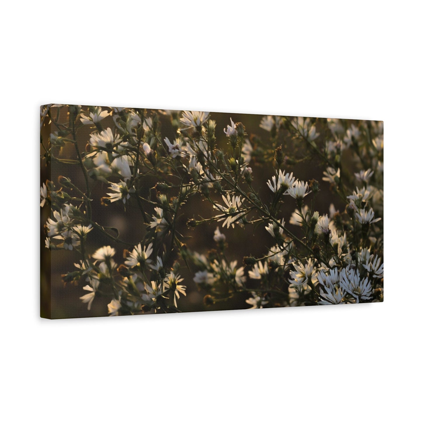
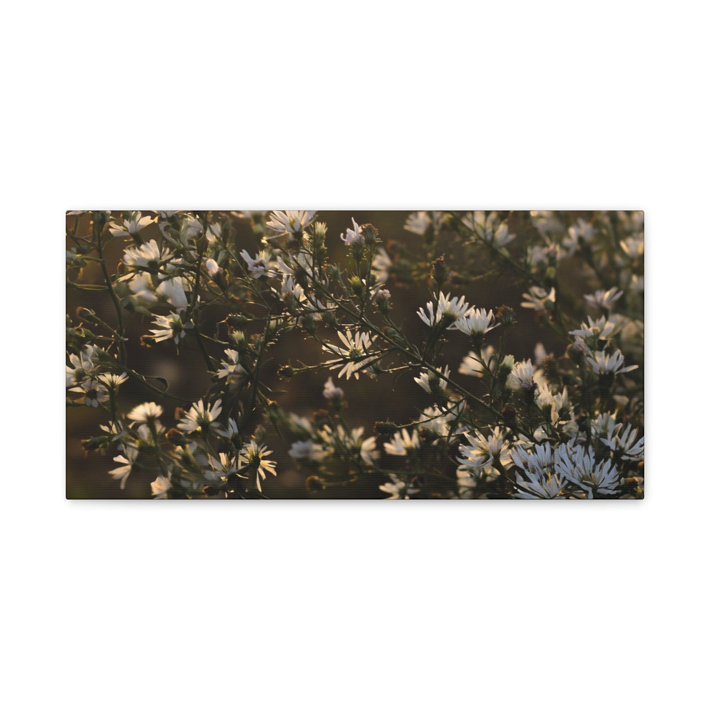

White Wall Art: The Timeless Design Choice That Elevates Every Interior
White wall art has emerged as one of the most sought-after design elements in contemporary interior styling, offering homeowners and decorators an unmatched combination of elegance, versatility, and visual impact. This understated yet powerful design choice transcends temporary trends and seasonal fads, providing spaces with a foundation of sophistication that works harmoniously with virtually any aesthetic approach. Whether you're furnishing a compact urban apartment, redesigning a sprawling suburban home, or refreshing a single room, incorporating artwork with white tones creates an atmosphere of refinement that feels both intentional and effortlessly chic.
The beauty of incorporating white artwork into your living spaces lies in its remarkable ability to serve multiple functions simultaneously. It acts as a visual anchor that grounds a room's design scheme while simultaneously opening up the space and creating an airy, breathable quality. This dual nature makes it an invaluable tool for anyone looking to craft interiors that feel both thoughtfully curated and genuinely livable.
In today's design landscape, where personalization and individual expression reign supreme, white artwork offers a blank canvas upon which homeowners can project their unique vision. It doesn't compete with other design elements or demand center stage; instead, it elevates everything around it, allowing furniture, textiles, and architectural features to shine while providing a cohesive visual thread that ties disparate elements together. This collaborative quality makes it particularly valuable in homes where multiple styles coexist or where design preferences evolve over time.
The psychological impact of incorporating white artwork cannot be overstated. In our increasingly hectic world, filled with constant visual stimulation and digital noise, these pieces offer a visual respite that calms the mind and soothes the spirit. They create pockets of tranquility within our homes, spaces where the eye can rest and the mind can decompress. This restorative quality transforms ordinary rooms into sanctuaries of peace and contemplation.
From practical perspectives, white artwork demonstrates exceptional longevity in design applications. Unlike trend-driven pieces that quickly feel dated, these works maintain their relevance and appeal across decades. This enduring quality represents a sound investment for homeowners who value both aesthetic excellence and long-term value. The timelessness of white artwork means that pieces selected today will continue to enhance your spaces years into the future, adapting gracefully as your tastes evolve and your surroundings change.
The accessibility of white artwork also deserves recognition. Whether you're working with a generous budget that allows for commissioned pieces from established artists or seeking affordable options that don't compromise on style, the world of white artwork offers choices at every price point. This democratic quality ensures that the transformative power of these pieces remains available to anyone who appreciates their unique aesthetic contributions.
Why White Artwork Completes Every Interior Space
The completion of a room's design often hinges on those final touches that bring together all the individual elements into a cohesive whole, and white artwork excels in this crucial role. When you step into a space that features thoughtfully selected white pieces, there's an immediate sense of intentionality and finish that signals careful consideration and design awareness. This completion quality stems from the way these pieces interact with their surroundings, creating visual relationships that enhance rather than overwhelm.
White artwork functions as a sophisticated mediator between different design elements in a room. Consider a space that combines vintage furniture with contemporary lighting, or traditional architectural details with modern textiles. Without a unifying element, these disparate pieces might feel disjointed or chaotic. White artwork bridges these potential gaps, providing a neutral ground where different styles can coexist harmoniously. Its presence validates each individual element while simultaneously creating a conversation between them.
The completion that white artwork provides extends beyond visual harmony to encompass emotional and atmospheric dimensions. A room might contain all the necessary furniture and functional elements yet still feel incomplete or lifeless. Adding white artwork introduces an artistic dimension that elevates the space from merely functional to genuinely inspiring. This transformation occurs because art engages different parts of our consciousness than practical objects do, speaking to our aesthetic sensibilities and emotional needs.
In living rooms, white artwork completes the social function of the space by creating focal points that draw people together and provide conversation starters. The subtle nuances within white pieces invite closer inspection and discussion, facilitating the kind of meaningful interaction that transforms a house into a home. Guests feel welcomed by spaces that demonstrate this level of thoughtfulness, and residents experience daily satisfaction from living among elements that reflect their values and aesthetic preferences.
Bedrooms achieve completion through white artwork by establishing the serene, restful atmosphere essential for quality sleep and personal rejuvenation. The calming presence of these pieces signals to our nervous systems that this is a space for relaxation and restoration. Unlike bold, vibrant artwork that might energize or stimulate, white pieces support the bedroom's primary function while still providing visual interest and artistic merit.
Dining spaces find completion in white artwork through the creation of an elegant backdrop that enhances rather than competes with the dining experience. These pieces contribute to the ambiance without distracting from food presentation or table settings. During gatherings, they provide a sophisticated context that elevates everyday meals into special occasions, helping hosts create memorable experiences for their guests.
Home offices and workspaces achieve functional completion through white artwork that promotes focus and clarity. In environments where concentration and productivity are paramount, these pieces provide visual interest without the distraction of complex imagery or jarring colors. They support mental clarity and creative thinking, making them ideal companions for professional endeavors and intellectual pursuits.
The completion quality of white artwork also manifests in transitional spaces like hallways, entryways, and staircases. These areas often receive less attention in design planning, yet they significantly impact our daily experience of home. White artwork transforms these overlooked zones into intentional design moments, ensuring that every corner of your home reflects the same level of care and aesthetic consideration.
Bathrooms, often relegated to purely functional status, achieve unexpected sophistication through carefully selected white artwork. These pieces introduce an element of luxury and personal expression into spaces that might otherwise feel utilitarian. The result is a spa-like atmosphere that transforms daily routines into moments of self-care and indulgence.
Children's rooms and nurseries benefit from the completion that white artwork provides by creating spaces that grow with the child. Unlike theme-based decorations that quickly become outdated, white pieces provide a timeless foundation that accommodates changing interests and developmental stages. Parents appreciate this longevity, avoiding the need for frequent redecoration while maintaining spaces that feel current and appropriate.
Styling Interior Spaces with White Artwork
The art of incorporating white pieces into your design scheme requires understanding both the characteristics of these works and the unique attributes of your space. Successful styling begins with careful observation of your room's existing elements, including architectural features, natural light sources, furniture arrangements, and color palettes. This foundational assessment reveals opportunities for artistic intervention and identifies locations where white artwork can make the most significant impact.
When styling with white artwork, consider the relationship between the piece and its immediate surroundings. A work placed above a sofa should relate proportionally to the furniture's scale, typically spanning two-thirds to three-quarters of the sofa's width. This sizing creates visual balance and ensures the artwork commands appropriate attention without overwhelming the seating area. The same principle applies to pieces hung above beds, consoles, and other furniture pieces, though specific measurements may vary based on the furniture's dimensions and the room's scale.
The height at which you hang white artwork dramatically affects its impact and the room's overall aesthetic. Professional designers generally recommend positioning artwork so that its center sits at eye level, typically around fifty-seven to sixty inches from the floor. However, this guideline should be adjusted based on ceiling height, furniture placement, and viewing angles. In dining rooms where people primarily experience the space while seated, slightly lower placement may prove more effective. Conversely, in spaces with high ceilings, raising artwork above standard height can emphasize vertical dimensions and create a sense of grandeur.
Gallery walls represent an increasingly popular approach to styling with white artwork, offering opportunities to combine multiple pieces into a cohesive display. Successful gallery walls balance consistency with variety, perhaps mixing different sizes and formats of white pieces while maintaining a unified color palette. The arrangement itself becomes an artistic statement, with the negative space between pieces playing as important a role as the artworks themselves. When planning a gallery wall, lay out your arrangement on the floor first, photographing different configurations until you discover one that feels balanced and dynamic.
Styling white artwork on shelves and mantels introduces three-dimensional layering that adds depth and personality to your displays. Rather than hanging every piece, experiment with leaning artwork against walls on floating shelves or mantelpieces, perhaps overlapping multiple pieces to create visual interest. This approach feels more casual and collected, suggesting that your home has evolved organically over time rather than being decorated all at once. Combine framed white artwork with decorative objects, books, and plants to create vignettes that tell stories about your interests and experiences.
In open-concept spaces, white artwork helps define different zones without resorting to physical barriers. A large piece positioned behind a dining table clearly delineates the eating area, while a series of smaller works in the living zone establishes that space's boundaries. This visual zoning maintains the open, flowing quality that makes these floor plans appealing while providing the definition necessary for spaces to feel purposeful and organized.
Seasonal styling offers opportunities to refresh your white artwork displays throughout the year. While the pieces themselves remain constant, surrounding elements can change to reflect different seasons. In spring and summer, pair white artwork with fresh flowers and light, airy textiles. As autumn arrives, introduce warmer textures through throws and pillows that complement the artwork's cool tones. Winter styling might incorporate metallic accents and evergreen elements that create festive atmospheres while allowing the white artwork to maintain its central role.
The relationship between white artwork and lighting deserves special attention in styling considerations. During daylight hours, observe how natural light interacts with your pieces, noting whether certain times of day cast particularly beautiful illumination. In the evening, ensure that artificial lighting showcases your artwork effectively without creating glare or harsh shadows. Picture lights, track lighting, or strategically placed table lamps can transform white artwork into luminous focal points after dark.
Styling white artwork in spaces with bold wall colors requires confidence and careful consideration. Rather than avoiding colored walls, embrace the dramatic contrast they create with white pieces. A white artwork against a navy, charcoal, or forest green wall becomes even more striking, with the wall color serving as a saturated backdrop that emphasizes the artwork's luminous quality. This approach works particularly well in powder rooms, accent walls, and smaller spaces where bold color choices make powerful statements.
The Power of Simplicity Through White Artwork
Embracing simplicity in design represents one of the most sophisticated and challenging approaches to creating beautiful spaces, and white artwork serves as a cornerstone of this philosophy. The power of simplified design lies not in deprivation or absence, but in the careful curation of elements that truly matter, each selected for its contribution to the overall aesthetic and functional vision. White artwork exemplifies this approach, offering maximum impact through restrained means.
Simplified design through white artwork teaches us to appreciate subtlety and nuance. When bold colors and complex imagery are removed from the equation, we become more attuned to variations in tone, texture, and composition. A piece that might initially appear uniformly white reveals itself, upon closer inspection, to contain multiple shades, each interacting with light and shadow to create depth and dimension. This discovery process rewards contemplation, encouraging us to slow down and truly see what's before us rather than merely glancing and moving on.
The psychological benefits of simplified spaces centered around white artwork are substantial and well-documented. Research in environmental psychology demonstrates that clutter and visual complexity increase stress levels and decrease cognitive function. By contrast, spaces that embrace simplicity through thoughtfully selected artwork support mental clarity, emotional regulation, and creative thinking. This isn't merely aesthetic preference; it's a matter of genuine wellness and quality of life.
Simplified design challenges the consumer culture that equates more possessions with greater happiness or success. By investing in fewer, higher-quality pieces of white artwork rather than filling walls with numerous items, we make a statement about values and priorities. This approach aligns with growing movements toward conscious consumption, sustainability, and intentional living. Each piece in a simplified scheme carries greater significance because it wasn't selected hastily or added merely to fill empty space.
The practice of living with simplified white artwork cultivates appreciation for the present moment. Without constant visual stimulation competing for attention, we become more aware of our immediate environment and experiences. The play of afternoon light across a white canvas becomes a source of pleasure. The way shadows shift and change throughout the day provides entertainment and contemplation. These simple pleasures, easily overlooked in more cluttered environments, emerge as sources of daily satisfaction.
Simplified spaces centered on white artwork also demonstrate respect for architecture and spatial qualities. Rather than covering every surface with decoration, this approach allows the room's inherent characteristics to shine. Beautiful moldings, interesting ceiling details, quality flooring, and thoughtful proportions receive the attention they deserve when not competing with excessive ornamentation. The white artwork enhances these architectural features rather than obscuring them.
For individuals feeling overwhelmed by decision fatigue in our choice-saturated world, simplified design offers relief. Fewer pieces means fewer decisions about arrangement, coordination, and styling. A well-selected piece of white artwork requires little maintenance or adjustment, providing reliable visual satisfaction without constant tweaking or rearranging. This low-maintenance quality appeals particularly to busy professionals, parents, and anyone seeking to simplify their domestic responsibilities.
The financial wisdom of simplified design becomes apparent over time. Rather than purchasing numerous inexpensive pieces that quickly feel disposable, investing in quality white artwork creates lasting value. These pieces withstand changing trends and personal style evolution, eliminating the need for frequent replacement. The long-term cost per year of ownership often proves lower than constantly updating cheaper alternatives, making simplified design both aesthetically superior and economically sensible.
Simplified spaces featuring white artwork also photograph beautifully, a consideration that matters in our image-conscious culture. Clean, uncluttered backgrounds allow the space itself to be the star, creating the kind of aspirational imagery that inspires others. For those who enjoy sharing their spaces on social media or with guests, simplified design provides a consistently photogenic backdrop that requires minimal staging or preparation.
How White Artwork Refreshes Your Living Environment
The refreshing quality of white artwork transforms tired, stagnant spaces into environments that feel renewed and revitalized. This transformative power doesn't require extensive renovation or complete redecoration; often, introducing the right white pieces creates the sensation of an entirely new space. The freshness stems from the way these works interact with light, air, and other design elements to create atmospheres that feel clean, current, and energizing.
Seasonal changes often leave our homes feeling out of sync with the current time of year, and white artwork provides an elegant solution to this common challenge. As winter transitions to spring, spaces that felt cozy and appropriate suddenly seem heavy and dated. Rather than undertaking major redecoration, introducing white artwork immediately lightens the atmosphere, welcoming the new season. This refreshing quality works in reverse as well, with white pieces providing cool contrast during warmer months when temperatures rise and natural light intensifies.
The psychological freshness that white artwork introduces relates to its associations with cleanliness, new beginnings, and possibility. In color psychology, white represents purity, innocence, and fresh starts. When we introduce white artwork into our spaces, we unconsciously tap into these associations, experiencing our homes as renewed and full of potential. This emotional refreshment can be particularly valuable during life transitions, after stressful periods, or when seeking to establish new patterns and habits.
White artwork refreshes spaces by updating their perceived style without requiring changes to existing furniture or major decorative elements. A room furnished with pieces from various periods and styles might feel eclectic or confused. Adding unified white artwork creates a contemporary framework that recontextualizes existing pieces, making them feel intentional and curated rather than mismatched or outdated. This refreshing reframing saves money and resources while achieving dramatic aesthetic improvement.
The reflective qualities of many white artworks contribute to their refreshing impact by bouncing light around rooms and creating a sense of openness. This physical freshness manifests as improved illumination, enhanced perception of spaciousness, and an overall brightening effect that makes spaces feel more welcoming and pleasant. The difference becomes particularly noticeable in rooms with limited natural light or awkward layouts that create dim corners and dead zones.
Refreshing your space with white artwork also offers opportunities to experiment with new artistic movements and styles without committing to bold statements that might quickly feel regrettable. Abstract white pieces introduce contemporary art into traditional spaces, bridging historical and modern aesthetics. Photographic white works bring realistic elements into highly stylized interiors, grounding them with references to the natural world. This artistic exploration keeps your mind engaged and your space feeling dynamic rather than static.
The tactile freshness of textured white artwork adds another dimension to this refreshing quality. Three-dimensional pieces with sculptural elements or heavy impasto bring physical interest that enlivens flat walls and smooth surfaces. Running your fingers across these textured surfaces provides sensory pleasure and connects you more deeply with the artwork, transforming it from mere decoration into an interactive element of your home environment.
White artwork refreshes commercial and professional spaces with equal effectiveness, transforming offices, clinics, salons, and retail environments. In these contexts, freshness directly impacts business success by influencing client perceptions and employee morale. A medical office featuring white artwork feels cleaner and more trustworthy. A corporate boardroom with refined white pieces projects professionalism and forward-thinking values. A retail space incorporating white artwork creates an aspirational shopping environment that encourages browsing and purchasing.
For rental properties or temporary living situations, white artwork provides refreshing personalization without the permanence of paint colors or built-in features. Renters can transform bland, neutral spaces into personalized homes through carefully selected white pieces that reflect their aesthetic sensibilities. When it's time to move, these pieces transition seamlessly to new spaces, providing continuity and comfort during potentially stressful relocations.
White Artwork as the Ultimate Neutral Element
The neutral nature of white artwork represents one of its most valuable characteristics, offering unparalleled flexibility and compatibility with virtually any design scheme. Understanding how to leverage this neutrality allows designers and homeowners to create sophisticated spaces that feel cohesive regardless of how many different elements they incorporate. The term neutral, in this context, doesn't imply boring or bland; rather, it describes artwork's ability to complement without competing, to enhance without overwhelming.
White artwork serves as a universal connector, capable of bridging vastly different colors, patterns, and styles. A room that combines jewel-toned velvet furniture with natural wood accents and metallic light fixtures might seem chaotic without a unifying element. White artwork provides this essential connection, offering visual rest between competing elements and creating pathways for the eye to travel smoothly around the space. This connecting quality makes white artwork invaluable in eclectic interiors where multiple design influences coexist.
The neutrality of white artwork extends to its compatibility with different metals and finishes. Whether your space features warm brass and gold accents, cool chrome and silver elements, or industrial iron and steel, white artwork complements them all. This versatility eliminates the common dilemma of choosing between warm and cool metallic tones, as white provides a neutral ground that flatters both. For homeowners who enjoy mixing metals, white artwork supports this approach by preventing visual confusion.
In spaces dominated by pattern, white artwork provides essential visual relief. Rooms featuring patterned upholstery, printed curtains, decorative rugs, and textured wallpaper can quickly become overwhelming without areas where the eye can rest. White artwork creates these crucial breathing spaces, allowing pattern to make an impact without causing visual fatigue. This balancing act is particularly important in smaller rooms where pattern might otherwise feel oppressive.
The neutral quality of white artwork also makes it ideal for spaces where the view itself serves as primary decoration. In homes with spectacular natural vistas, dramatic cityscapes, or beautiful garden outlooks, interior decoration should support rather than compete with these views. White artwork provides sophisticated wall coverage that doesn't fight for attention with what's happening outside the windows. During evening hours when views disappear, the artwork ensures the interior maintains visual interest.
White artwork's neutrality extends to its relationship with seasonal decorations and temporary styling changes. Unlike pieces in specific colors that might clash with holiday decorations or seasonal updates, white artwork accommodates all these changes gracefully. Christmas reds and greens, autumn oranges and browns, summer brights and pastels all work beautifully against white artwork, which serves as a constant backdrop for evolving seasonal expressions.
For individuals whose personal style is still developing or frequently evolves, white artwork represents a safe yet sophisticated choice. Rather than committing to artwork in specific colors or styles that might quickly feel limiting, white pieces provide flexibility for experimentation and change. As your preferences develop and crystallize, your white artwork collection adapts, continuing to serve your spaces regardless of how your other choices evolve.
The investment wisdom of choosing neutral white artwork becomes clear when considering resale value and broad appeal. Should you decide to sell your home, white artwork appeals to the widest possible range of potential buyers. Unlike personal collections that might alienate certain viewers, white pieces demonstrate taste and sophistication without imposing specific aesthetic preferences on observers. This universal appeal can actually enhance property presentation and perceived value.
In professional settings where neutrality is essential for serving diverse clientele, white artwork provides the perfect solution. Law offices, medical practices, hotels, and corporate environments benefit from artwork that doesn't favor particular demographics, cultures, or aesthetic preferences. White pieces project professionalism and good taste while remaining appropriately neutral for environments serving varied populations.
Optimal Locations for Hanging White Artwork
Identifying the ideal locations for white artwork within your home requires understanding both the technical aspects of hanging practices and the aesthetic considerations that make certain placements more effective than others. The right location maximizes an artwork's impact while supporting the room's overall function and flow. Beginning with the most public spaces and moving toward private areas helps establish a cohesive approach that extends throughout your entire home.
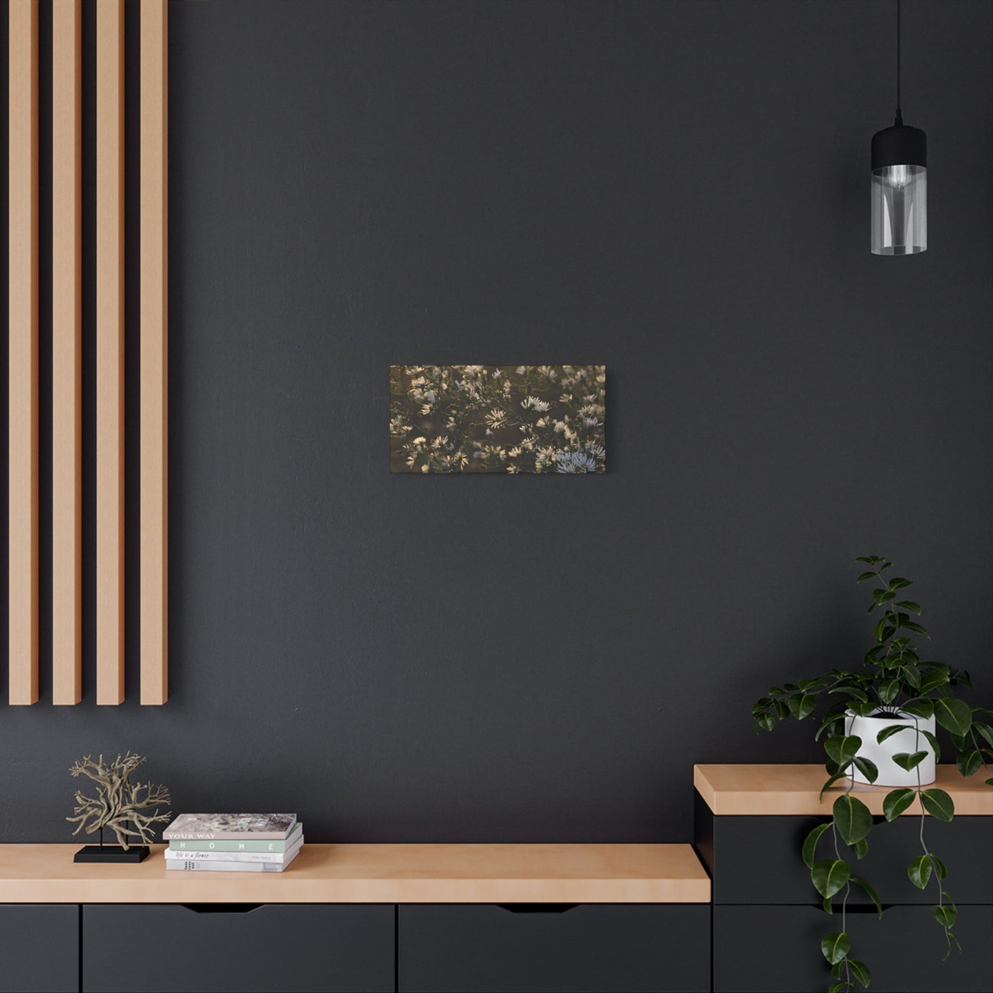
Entryways and foyers present prime opportunities for white artwork, as these spaces create first impressions for both residents and guests. A striking piece positioned prominently near the entrance establishes the home's aesthetic tone and welcomes visitors with visual sophistication. In narrow entryways where large-scale pieces might overwhelm, consider vertical formats that draw the eye upward, creating the illusion of additional height and spaciousness. The artwork should be visible immediately upon entering, but not positioned so close to the door that it risks damage from traffic or weather.
Living rooms typically offer multiple suitable locations for white artwork, with the wall behind the main seating area serving as a traditional focal point. However, contemporary design often favors less predictable placements that create visual interest and encourage exploration of the space. Consider positioning a significant piece on the wall perpendicular to seating, where it can be appreciated from multiple angles and doesn't compete directly with the television or fireplace. In living rooms with architectural features like built-in shelving or exposed brick, white artwork can soften these elements while highlighting their character.
Dining rooms benefit from white artwork placed at a height that remains visible and attractive even when people are seated. Unlike living areas where standing viewers predominate, dining spaces should account for the seated perspective, typically positioning artwork slightly lower than in other rooms. The wall behind a buffet or sideboard provides an excellent location, creating a layered display when combined with table lamps, decorative objects, or fresh flowers. Alternatively, a dramatic piece positioned opposite the dining table gives seated guests an attractive focal point throughout the meal.
Kitchen walls, often overlooked in artwork placement, offer surprising opportunities for white pieces. Modern open-concept kitchens incorporate dining and living functions, making them appropriate for artistic treatment. Select locations away from cooking areas to avoid grease and heat exposure, such as walls adjacent to breakfast nooks or peninsula ends visible from adjacent rooms. White artwork in kitchens should be sealed behind glass or acrylic for protection, and cleaning accessibility should factor into placement decisions.
Bedroom locations for white artwork should prioritize the wall visible upon waking, as this view significantly influences morning mood and energy. The wall behind the bed serves as the most common placement, but artwork positioned opposite the bed provides a more functional focal point for daily appreciation. Bedside walls work well for smaller pieces or paired works that create symmetry. Master bedrooms with seating areas benefit from artwork that defines this secondary zone, distinguishing it from the sleeping area.
Bathrooms accommodate white artwork surprisingly well, despite humidity concerns. Modern printing technologies and proper sealing make artwork bathroom-appropriate, and the unexpected presence of sophisticated pieces elevates these utilitarian spaces. Position artwork away from direct water contact, such as walls opposite showers or tubs rather than directly above them. In powder rooms where guests spend brief but focused time, white artwork contributes to memorable impressions and demonstrates attention to detail throughout the home.
Home offices require thoughtful artwork placement that supports productivity without creating distraction. Positioning white artwork within the peripheral vision range, rather than directly in the line of sight when working, provides visual interest for breaks without interrupting concentration. The wall opposite the desk works well, offering a attractive view during phone calls or contemplative moments. Avoid placing artwork directly behind monitors, as this creates visual competition and potential glare.
Hallways and corridors, often neglected in decoration planning, transform into gallery-like spaces through strategic white artwork placement. These transitional zones offer opportunities for creative displays, including gallery walls that tell stories through multiple related pieces. Stairway walls present unique challenges with their angled sight lines, but properly positioned artwork makes climbing stairs more pleasant and visually engaging. Consider rhythm and repetition in hallway placements, perhaps positioning similarly sized pieces at regular intervals to create cohesive visual flow.
Children's bedrooms benefit from lower artwork placement that accommodates their eye level and allows them to develop personal relationships with the pieces. As children grow, white artwork placed with room for vertical adjustment can be raised gradually, evolving with the child's development. Playrooms should position artwork high enough to avoid damage from active play while remaining visible and appreciated. White artwork in children's spaces provides sophisticated style that doesn't infantilize or limit their developing aesthetic sensibilities.
How White Artwork Amplifies Natural Illumination
The relationship between white artwork and natural light creates one of the most compelling arguments for incorporating these pieces into interior design. This synergy between artwork and illumination transforms ordinary daylight into an active design element, enhancing spaces in ways that artificial lighting alone cannot replicate. Understanding and maximizing this relationship elevates white artwork from simple decoration to dynamic architectural feature.
White surfaces possess inherent reflective properties that redirect light throughout spaces, and artwork specifically designed with white tones amplifies this effect. When positioned strategically relative to windows and light sources, white artwork becomes a secondary light source itself, bouncing illumination into areas that might otherwise remain shadowed. This practical function proves particularly valuable in rooms with limited windows or awkward layouts where natural light struggles to reach all areas effectively.
The quality of natural light changes dramatically throughout the day, and white artwork responds to these shifts in beautiful, ever-changing ways. Morning light, typically cool and clear, brings crisp definition to white pieces, emphasizing texture and subtle tonal variations. As the day progresses and light warms toward afternoon, white artwork takes on golden undertones that create cozy, inviting atmospheres. Evening light, often softer and more diffused, gives white pieces a ethereal, luminous quality. This constant transformation means your artwork never looks exactly the same twice, providing ongoing visual interest and discovery.
Seasonal variations in natural light further enhance white artwork's dynamic qualities. Summer light, intense and abundant, makes white pieces almost glow with radiant energy. Winter light, scarcer and more precious, interacts differently with white surfaces, creating subtle plays of shadow and highlight that reward close observation. Spring and autumn offer their own distinct light qualities, ensuring that white artwork provides year-round visual pleasure that evolves with the seasons.
Rooms with northern exposure, which receive consistent but cooler light throughout the day, particularly benefit from white artwork's illumination-enhancing properties. These spaces often feel dim or cold without intervention, but white artwork reflects and amplifies available light, making rooms feel brighter and more welcoming. The cool cast of northern light actually complements white artwork beautifully, creating crisp, gallery-like qualities that serious art collectors appreciate.
Southern-facing rooms, blessed with abundant light throughout the day, require thoughtful management to prevent glare and overexposure. White artwork in these spaces should be positioned to avoid direct sunlight that might cause fading or create uncomfortable glare. Instead, place pieces on perpendicular walls where they receive reflected rather than direct light, allowing them to brighten the space without suffering potential damage or creating visual discomfort.
Eastern and western exposures present unique opportunities and challenges for white artwork placement. East-facing walls receive beautiful morning light but spend afternoons in relative shadow, making them ideal for artwork intended to energize morning routines. West-facing placements capture dramatic afternoon and evening light, creating striking displays during the day's final hours. Consider your room usage patterns when deciding which exposure works best for your white artwork.
The size and placement of windows relative to white artwork significantly impacts the illumination relationship. Large windows flooding rooms with light require substantial artwork that can hold visual weight against bright backgrounds. Conversely, smaller windows with limited light benefit from strategically placed white artwork that maximizes whatever natural illumination enters the space. Windows positioned high on walls create interesting top-down lighting that dramatically highlights texture in white artwork.
Architectural features like skylights create unique opportunities for white artwork placement directly below or adjacent to these overhead light sources. The downward flow of natural light from skylights can transform white artwork into luminous focal points that draw the eye upward and emphasize vertical space. This placement works particularly well in double-height spaces or rooms with cathedral ceilings where standard artwork placement might feel lost.
Window treatments and their interaction with white artwork deserve careful consideration. Sheer curtains or light-filtering blinds create diffused, even illumination that flatters white artwork without creating harsh contrasts or shadows. Heavier treatments that block light when closed mean artwork will primarily be viewed under artificial light during evenings and overcast days. This dual existence requires ensuring your pieces look equally beautiful under both natural and artificial illumination.
Creating Serene Atmospheres with White Artwork
The capacity of white artwork to generate genuinely calming environments represents one of its most valuable yet often underappreciated qualities. In our overstimulated modern world, creating pockets of tranquility within our homes has become not merely desirable but essential for maintaining mental health and emotional equilibrium. White artwork contributes to this sanctuary-making process through multiple mechanisms that work synergistically to promote relaxation and inner peace.
The visual quietness of white artwork immediately distinguishes it from more stimulating alternatives. Where bold colors activate the nervous system and complex imagery engages analytical thinking, white pieces allow the mind to rest. This cognitive rest shouldn't be confused with boredom; rather, it represents a gentler form of engagement that soothes rather than excites. The brain appreciates this respite from constant processing, responding with decreased stress hormones and increased production of calming neurotransmitters.
White artwork creates calm partly through what it doesn't do. It doesn't demand interpretation or elicit strong emotional reactions. It doesn't tell stories that require following or present problems that need solving. This absence of cognitive burden makes white artwork ideal for spaces dedicated to rest and restoration. Bedrooms, meditation areas, and reading nooks all benefit from artwork that supports rather than interrupts the intended activity.
The association between white and purity, cleanliness, and new beginnings contributes to its calming effect. These subconscious connections tap into deep-seated psychological frameworks that equate order and cleanliness with safety and control. When we surround ourselves with white artwork, we unconsciously feel that our environment is more organized and manageable, reducing the ambient anxiety that disorder creates. This psychological comfort translates into physical relaxation and emotional ease.
Textural variations within white artwork provide subtle points of interest that engage attention without overwhelming it. The eye can wander across a textured white surface, discovering small variations and details that reward close observation. This gentle engagement promotes a meditative state similar to watching clouds drift or waves roll in, activities long recognized for their calming properties. The repetitive, non-demanding nature of this visual interaction soothes the mind and promotes present-moment awareness.
White artwork's calming qualities make it particularly appropriate for therapeutic environments. Therapists' offices, counseling centers, and wellness facilities all benefit from artwork that supports clients' emotional work without introducing additional stimulation. The neutral, non-threatening presence of white pieces helps clients feel safe and contained, essential prerequisites for productive therapeutic engagement. Healthcare facilities likewise recognize white artwork's capacity to reduce patient anxiety and promote healing.
The relationship between white artwork and breath deserves exploration in understanding its calming effects. Visual experiences influence breathing patterns, with stimulating imagery often leading to shallow, rapid breathing, while calming visuals promote deeper, slower respiration. White artwork encourages the latter, supporting the kind of breathing associated with relaxation and stress reduction. This subtle physical influence contributes to overall feelings of calm and wellbeing.
Creating layered calm through combinations of white artwork with other design elements amplifies these peaceful effects. Pairing white pieces with natural materials like wood, stone, and linen creates environments that feel grounding and organic. Adding plants brings living energy that complements the serene quality of white artwork. Incorporating water features provides soothing sound that works synergistically with the visual calm white pieces provide. These layered approaches create multisensory sanctuaries optimized for restoration.
The permanence and reliability of white artwork also contributes to the sense of calm it generates. In a world of constant change and uncertainty, elements that remain stable and consistent provide psychological anchoring. Your white artwork looks essentially the same each day, offering familiar comfort and predictability. This constancy shouldn't be mistaken for monotony; instead, it represents the kind of dependable presence that allows us to relax rather than remaining vigilantly alert for changes.
For individuals dealing with anxiety, insomnia, or other stress-related conditions, white artwork can serve as part of a broader environmental intervention. While not a substitute for professional treatment, creating calm living spaces supports healing and recovery. The cumulative effect of spending hours each day in environments featuring calming white artwork can significantly impact overall stress levels and emotional resilience. This long-term exposure to calming visual stimuli helps reset baseline stress responses and promote lasting wellbeing.
White Artwork for Contemporary Modern Aesthetics
The clean modern aesthetic that dominates contemporary design finds its perfect artistic companion in white artwork. This pairing feels almost inevitable, as both the design philosophy and the artistic choice prioritize simplicity, clarity, and intentionality. Understanding how white artwork specifically serves modern design principles helps maximize its effectiveness and ensures your spaces achieve the sophisticated, current look that modern aesthetics demand.
Modern design's emphasis on function and form aligns perfectly with white artwork's straightforward presence. There's no pretense or unnecessary ornamentation, just honest artistic expression that serves the space without apology. This directness appeals to modern sensibilities that reject fussiness and favor clean lines and uncluttered surfaces. White artwork doesn't try to be something it isn't; this authenticity resonates with the honesty that modern design values.
The geometric precision often found in modern interiors finds harmony with white artwork that features strong compositional structure. Abstract pieces with bold shapes and clear divisions create dialogue with architectural elements like exposed beams, linear furniture, and rectangular windows. Even when the artwork itself contains organic or irregular elements, its white palette ensures it reads as clean and modern rather than traditional or romantic.
Modern design's frequent use of industrial materials like concrete, steel, and glass could feel cold or harsh without softening elements. White artwork provides this essential warmth while maintaining the modern aesthetic. Unlike rustic or traditional softening approaches that might feel incongruous in modern spaces, white artwork offers refinement that complements rather than contradicts the industrial foundation. This balance between hard and soft, cold and warm, makes modern spaces livable and inviting.
The open floor plans characteristic of modern architecture benefit enormously from white artwork's ability to define zones without physical barriers. A large piece positioned strategically can signal the transition from living to dining areas, or from public to private spaces, all while maintaining visual flow. This subtle definition respects the openness that makes modern floor plans appealing while providing the structure that prevents them from feeling chaotic or undefined.
Modern design's love affair with natural light receives support from white artwork's reflective properties. Floor-to-ceiling windows, a hallmark of modern architecture, flood spaces with illumination that white artwork captures and redirects. This interaction between natural light and reflective surfaces creates the bright, airy quality that modern spaces aspire to achieve. The result feels effortless and organic rather than forced or contrived.
Technology integration, increasingly central to modern living, coexists more gracefully with white artwork than with more traditional artistic choices. Flat-screen televisions, smart home controls, and charging stations all feel appropriate in spaces featuring white artwork, which doesn't compete with or comment on technological presence. This peaceful coexistence between art and technology reflects contemporary reality where both elements play important roles in daily life.
Final Thoughts:
White wall art is often seen as the epitome of simplicity and elegance, and it has proven itself as a timeless design choice for any interior. Whether in a minimalist setting or a more eclectic space, the use of white art adds a layer of sophistication and versatility that transcends trends. It is both subtle and bold in its own right, offering a clean, neutral canvas that complements and elevates the surrounding decor. As we step back and consider the multifaceted impact of white wall art, it becomes clear that its power lies in its ability to transform any space into a harmonious and serene environment, enhancing the overall aesthetic and mood.
One of the most striking qualities of white wall art is its neutrality. White is often seen as the color of purity, simplicity, and openness, and when used in art, it provides an expansive feeling, making spaces feel more open and airy. This quality is especially useful in smaller or more confined spaces, where white art can help create the illusion of a larger, more expansive room. The purity of white also reflects light, enhancing the brightness of a room, which is particularly important in areas with limited natural light. By incorporating white wall art, you invite a fresh, clean energy into the space, making it feel inviting and calming.
The beauty of white wall art lies in its versatility. Because it doesn’t overpower or compete with other colors, it can seamlessly integrate into almost any interior design style. Whether in a contemporary living room, a cozy bedroom, or a classic dining area, white wall art adapts to its surroundings and enhances the overall design narrative. It can serve as a focal point in a minimalist space, where its simplicity speaks volumes, or it can add subtle texture and depth to a more maximalist setting, where it contrasts with more colorful or bold elements. The flexibility of white wall art ensures that it will never feel out of place, no matter how the rest of the room evolves over time.
Additionally, white wall art has the unique ability to highlight other design elements in a room. Because of its understated elegance, it doesn’t dominate the space but instead complements the other objects around it. It can serve to accentuate furniture, lighting, and architectural features, allowing them to take center stage while still contributing to the overall visual appeal of the room. The neutral tone allows for the layering of colors, patterns, and textures, creating a dynamic and balanced space without overwhelming the viewer’s senses.
Another significant advantage of white wall art is its timeless nature. Unlike trends that come and go, white art remains a constant. It’s a choice that can endure through the years, evolving with the changing tastes and needs of its owners. Whether you choose a minimalist abstract piece, a classic photograph, or a modern sculpture, white art has a longevity that other, more saturated color palettes may lack. Over time, it can blend seamlessly with new furniture, decor styles, or room updates, ensuring that it never feels dated. In this way, white wall art is a smart investment, as it transcends fleeting trends and retains its beauty over the years.
On a deeper level, white as a color in art often represents purity, clarity, and even a sense of spiritual calm. The absence of strong color invites introspection, offering a space for the mind to wander without distraction. It can create a meditative atmosphere, perfect for spaces designed for relaxation or contemplation, such as bedrooms, bathrooms, or reading corners. The simplicity of white art allows for a mental break from the complexity of daily life, encouraging a sense of peace and mindfulness.
Moreover, the use of white in art opens up a dialogue with light and shadow. White art doesn’t just sit on the wall; it interacts with its environment. The way light changes throughout the day, casting soft shadows or illuminating the piece in different ways, adds a dynamic, ever-changing aspect to the artwork. This makes white art not only a visual experience but also a sensory one, as it invites the viewer to appreciate the play of light in relation to the piece, creating a deeper connection with the room.
In conclusion, white wall art is much more than just a design choice—it is a statement of timeless elegance, simplicity, and versatility. It has the ability to elevate any interior by creating a harmonious, serene environment that enhances the overall aesthetic of the space. Whether used as a minimalist focal point, a subtle accent, or a complementary piece, white wall art adds an undeniable sense of clarity and peace. Its adaptability to different design styles, combined with its enduring nature, ensures that it will remain a beloved and valuable element of interior decor for years to come. As such, white wall art is not just an addition to a room; it is a transformative choice that enhances both the beauty and the ambiance of any home or office.
