


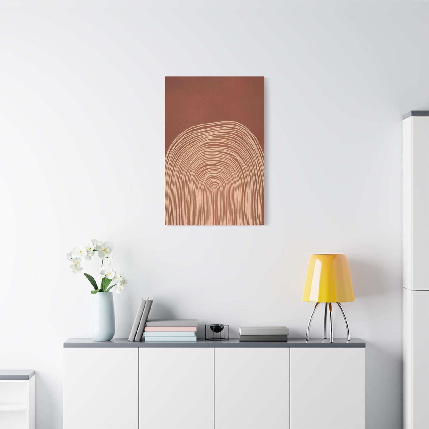
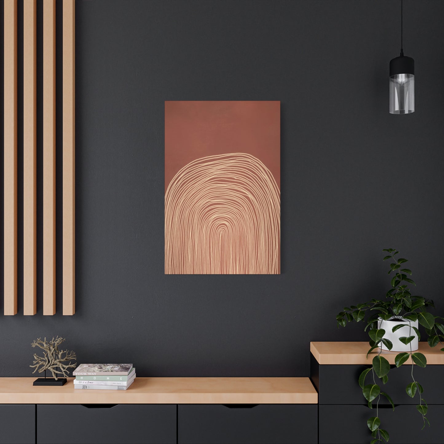
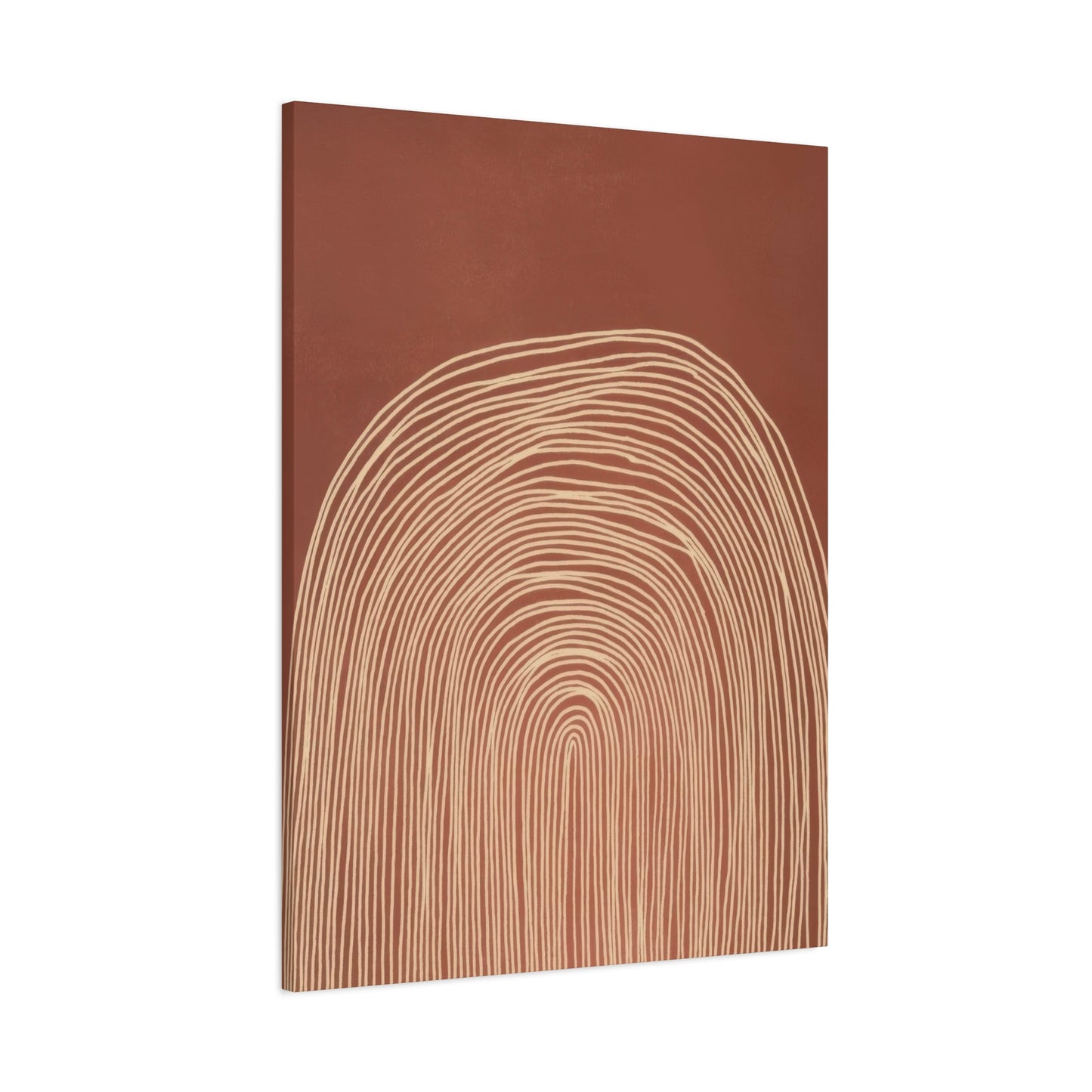
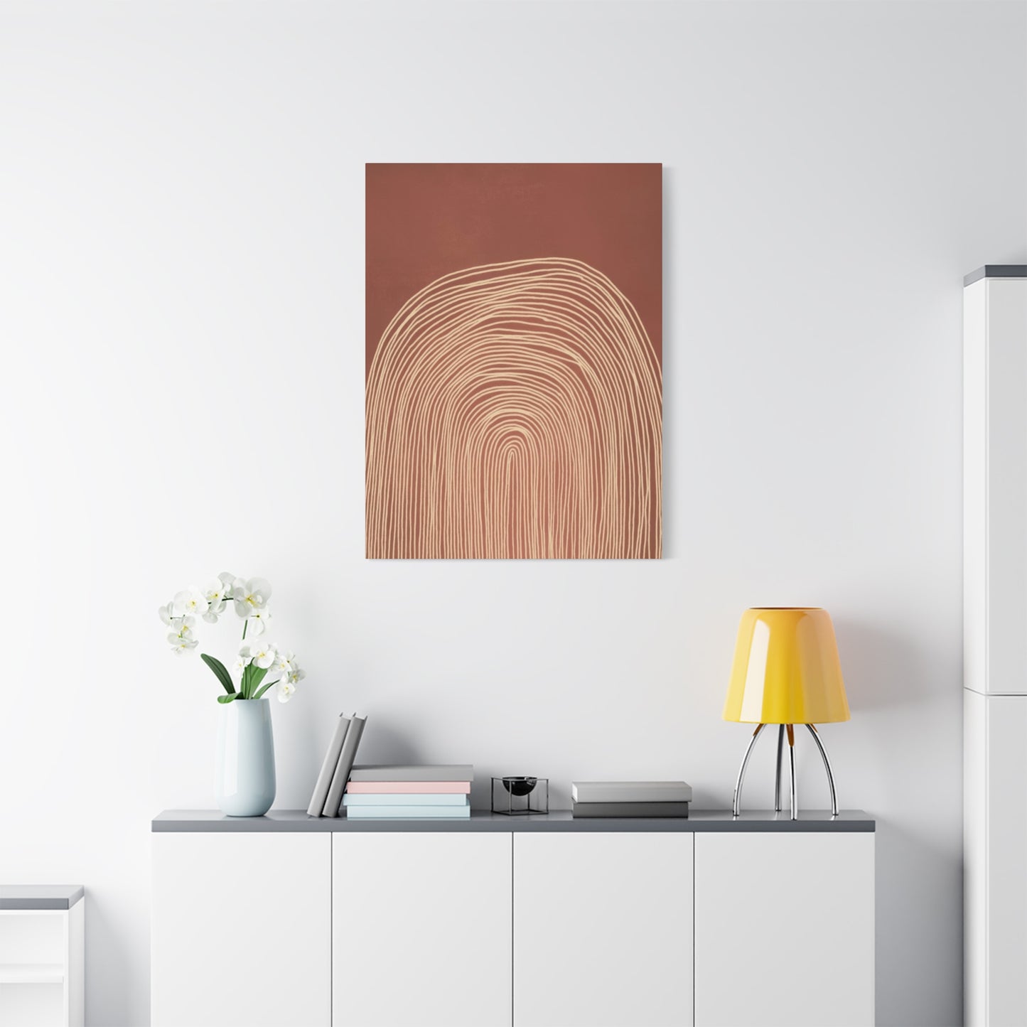
Abstract Concentrix Curves Earth Tones Wall Art & Canvas Prints
Abstract Concentrix Curves Earth Tones Wall Art & Canvas Prints
Couldn't load pickup availability
The Complete Guide to Abstract Concentrix Curves in Earth Tones for Wall Art
The world of interior design has witnessed a remarkable transformation in recent years, with homeowners and designers increasingly drawn to pieces that combine natural aesthetics with contemporary artistic expression. Among the most captivating trends emerging in modern decor is the use of curved abstract compositions rendered in warm, natural color palettes. These artistic creations offer a unique opportunity to bring the soothing essence of nature indoors while maintaining a distinctly modern sensibility that speaks to contemporary tastes.
The appeal of these designs lies in their ability to bridge multiple aesthetic worlds simultaneously. They carry the organic warmth found in natural landscapes while presenting it through a lens of modern abstraction that feels fresh and current. The flowing lines create visual movement that draws the eye across the composition, while the earthy color selections ground the piece in a sense of stability and calm. This combination creates artwork that functions as both a statement piece and a harmonizing element within diverse interior spaces.
Understanding why these particular artistic elements work so effectively requires examining both the psychological impact of curved forms and the emotional resonance of natural color schemes. Curves in visual art have been proven to create feelings of comfort and ease, as they mirror the organic shapes found throughout the natural world. When these curves are rendered in tones borrowed from soil, stone, sand, and vegetation, the effect is amplified, creating pieces that feel inherently welcoming and grounding.
The versatility of these artworks makes them suitable for virtually any room in the home or office. Whether placed in a living area where they can serve as a conversation starter, a bedroom where their calming presence promotes relaxation, or a professional space where they project sophistication without coldness, these pieces adapt beautifully to their surroundings. Their neutral yet rich color palettes ensure they complement rather than compete with existing decor elements.
The Natural Appeal of Warm Color Palettes in Contemporary Art
The human connection to natural color schemes runs deep in our evolutionary history. Colors drawn from the earth have surrounded humanity throughout our existence, creating an innate sense of familiarity and comfort when we encounter them in our living spaces. Shades of brown, tan, terracotta, olive, rust, and cream speak to something fundamental in our psychology, evoking feelings of security, warmth, and connection to the natural world.
In contemporary abstract compositions, these hues take on new life and meaning. Rather than simply replicating natural scenes, artists use these colors to create entirely new visual experiences that capture the essence of nature without literally depicting it. The abstract approach allows for emotional interpretation and personal connection, as viewers bring their own experiences and associations to the piece. A swirl of burnt sienna might remind one person of desert landscapes while another sees autumn leaves, yet both experience the warmth and comfort the color naturally evokes.
The sophistication of working with earth-toned palettes lies in their subtlety and depth. Unlike bold, bright colors that immediately command attention, natural hues reveal their beauty gradually. They invite closer inspection and repeated viewing, with different tones becoming apparent in varying light conditions throughout the day. Morning sunlight might highlight warmer orange undertones, while evening light brings out cooler brown and gray notes, creating a dynamic piece that evolves with the natural light cycle.
These color selections also possess remarkable staying power in terms of design trends. While vivid color schemes may feel dated after a few years, natural palettes maintain their relevance across decades. This timelessness makes them a wise investment for those seeking artwork that will remain aesthetically pleasing for years to come. The colors age well both literally and figuratively, developing character while never appearing out of step with contemporary design sensibilities.
The psychological effects of surrounding oneself with these warm, natural tones extend beyond mere aesthetic pleasure. Research in environmental psychology has demonstrated that earthy colors can reduce stress levels, lower blood pressure, and create feelings of stability and security. In our increasingly digital and fast-paced world, bringing these grounding elements into our personal spaces serves an important function in maintaining emotional balance and mental well-being.
Understanding the Visual Impact of Curved Abstract Forms
Curves represent one of the most fundamental and universally appealing visual elements available to artists and designers. Unlike the sharp angles and straight lines that dominate much of our built environment, curves feel organic and natural, echoing the shapes we encounter in nature from river bends to rolling hills to the human form itself. This inherent naturalness makes curved compositions particularly effective in creating spaces that feel welcoming and comfortable.
The way the human eye processes curved forms differs significantly from how it interprets angular shapes. Our vision naturally follows curves in a smooth, flowing motion, creating a sense of movement and rhythm within a static image. This visual journey across the artwork engages viewers in an active rather than passive way, drawing them into the composition and encouraging extended contemplation. The curves create pathways for the eye to travel, establishing a visual narrative that unfolds as one examines the piece.
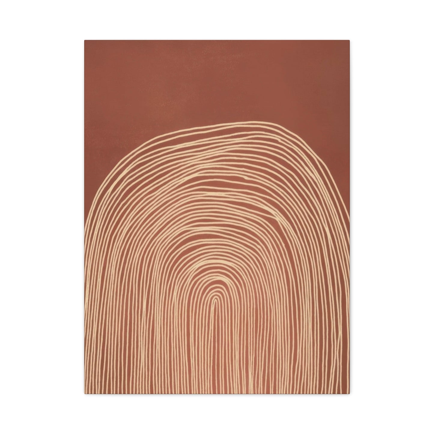
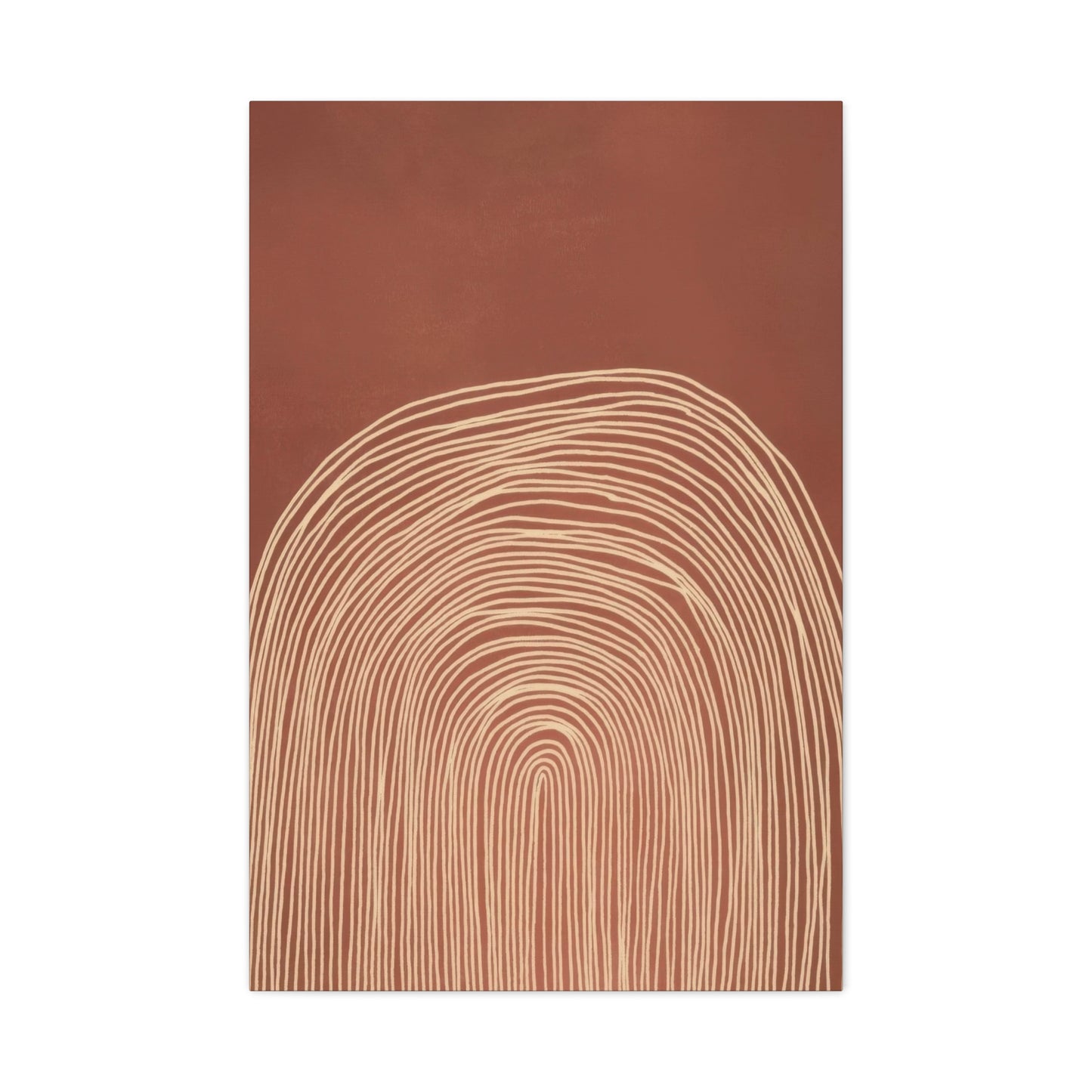
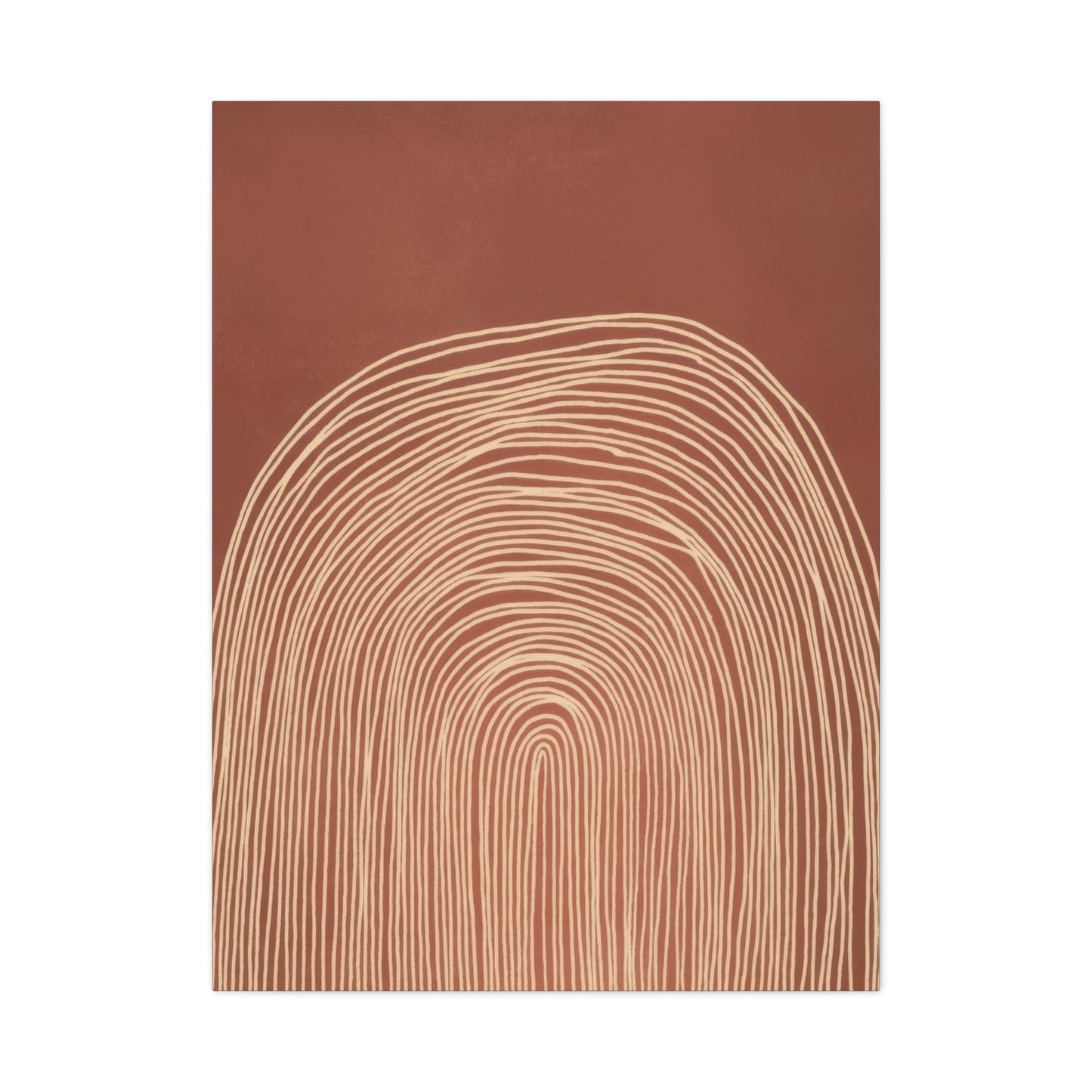
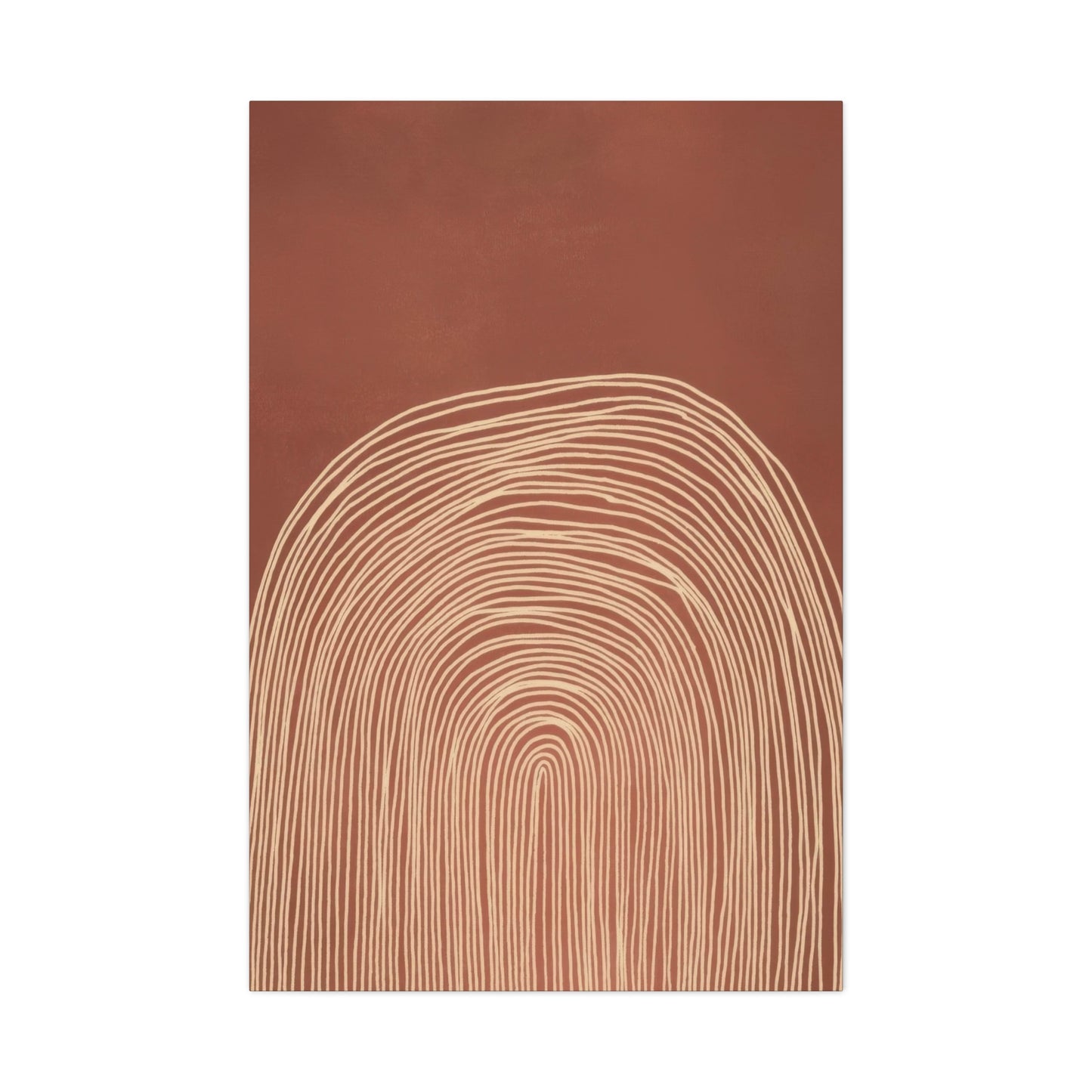
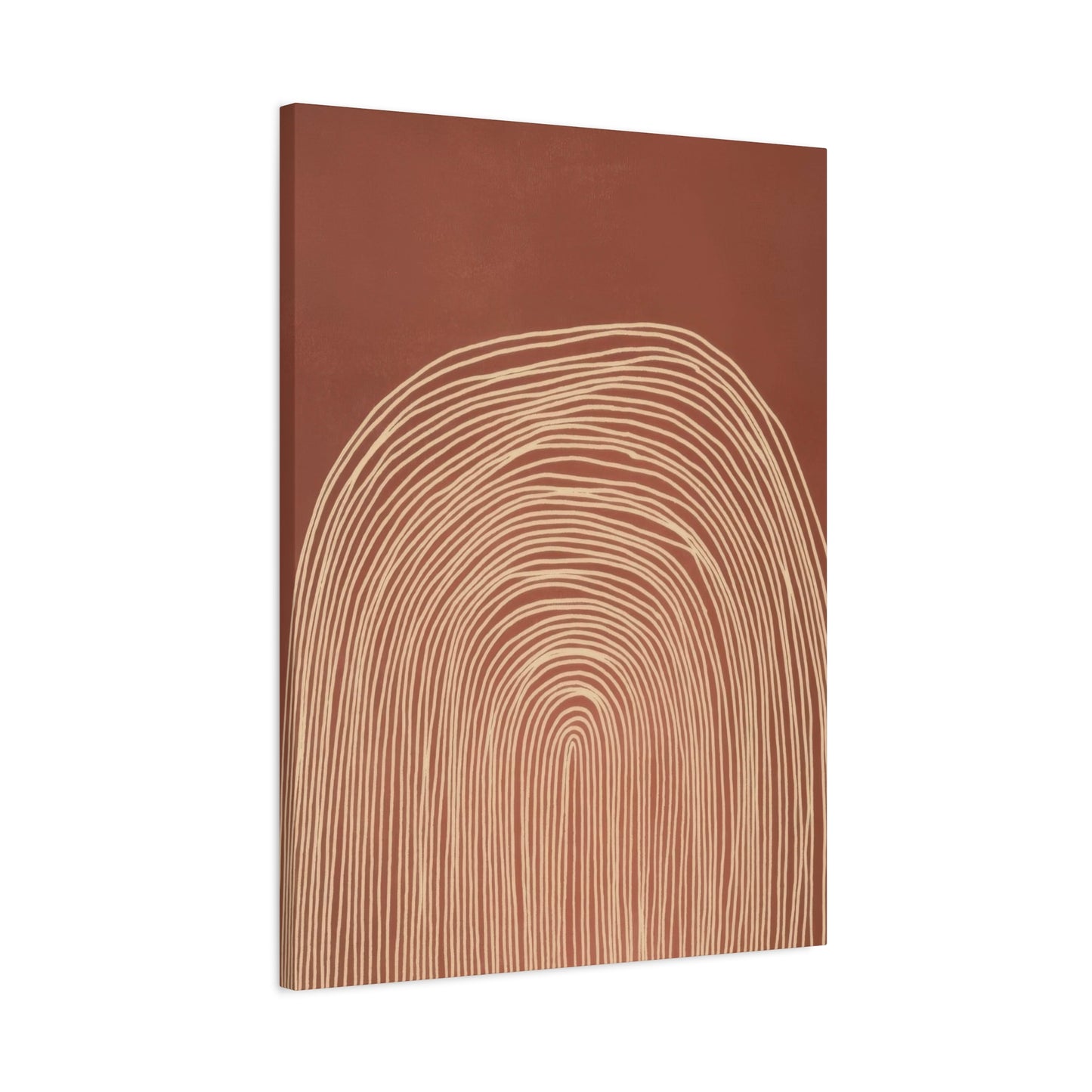
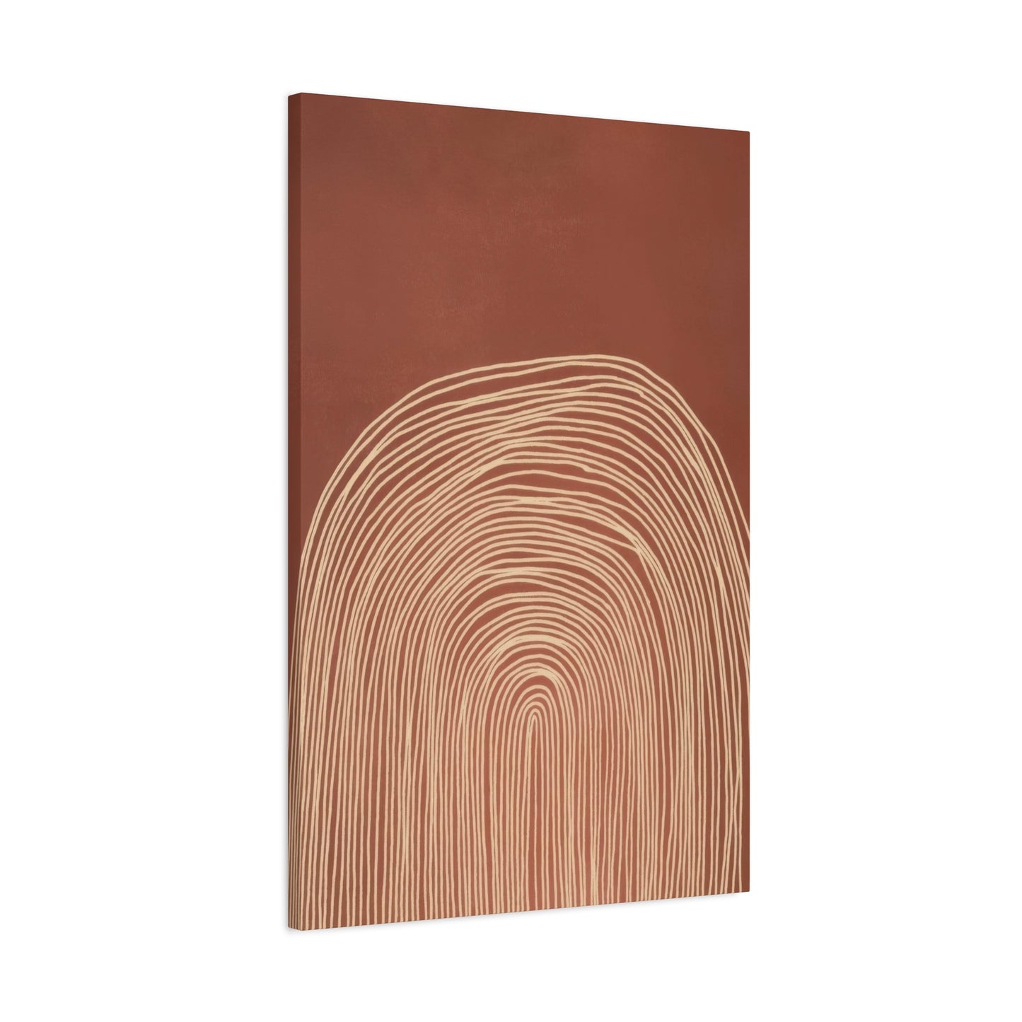
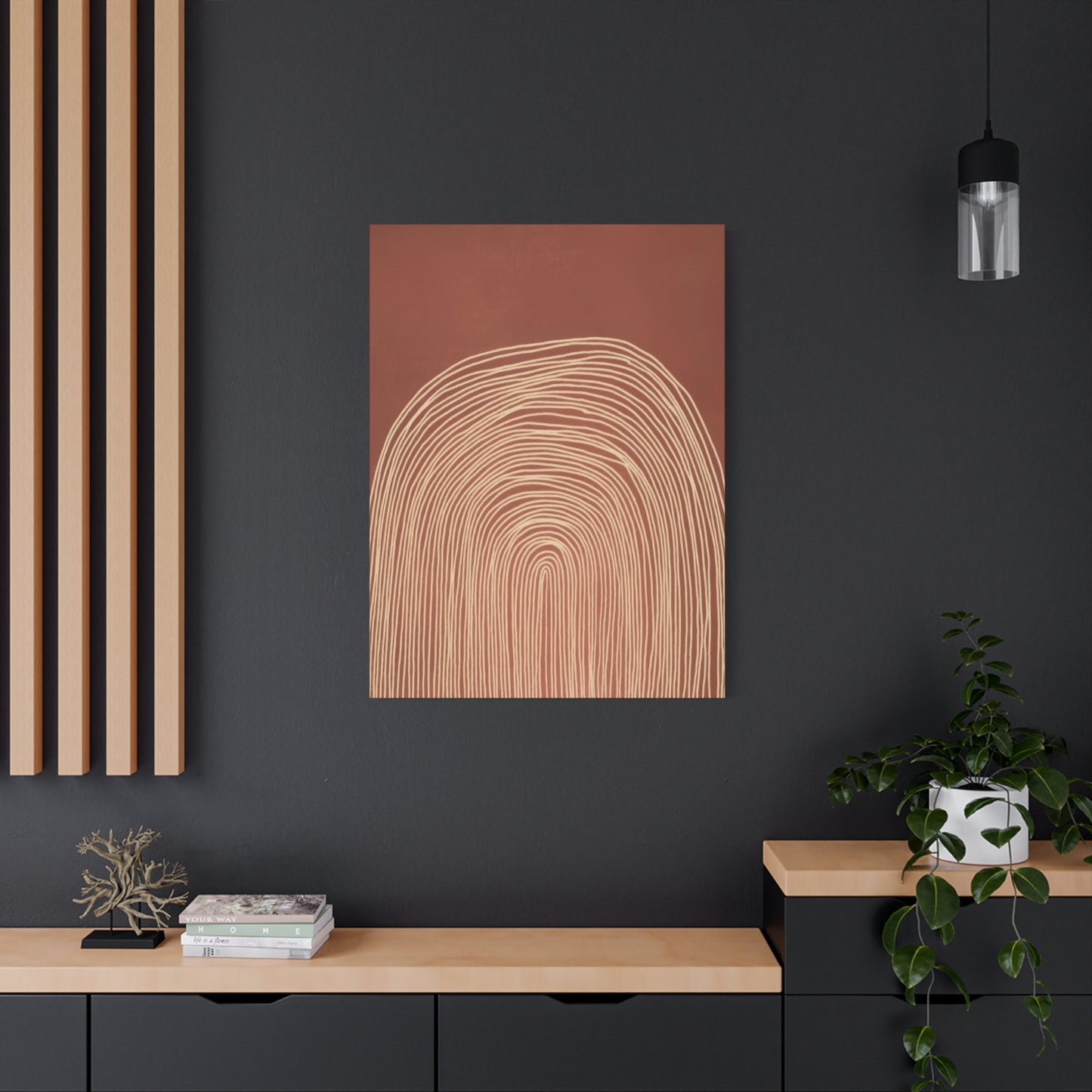
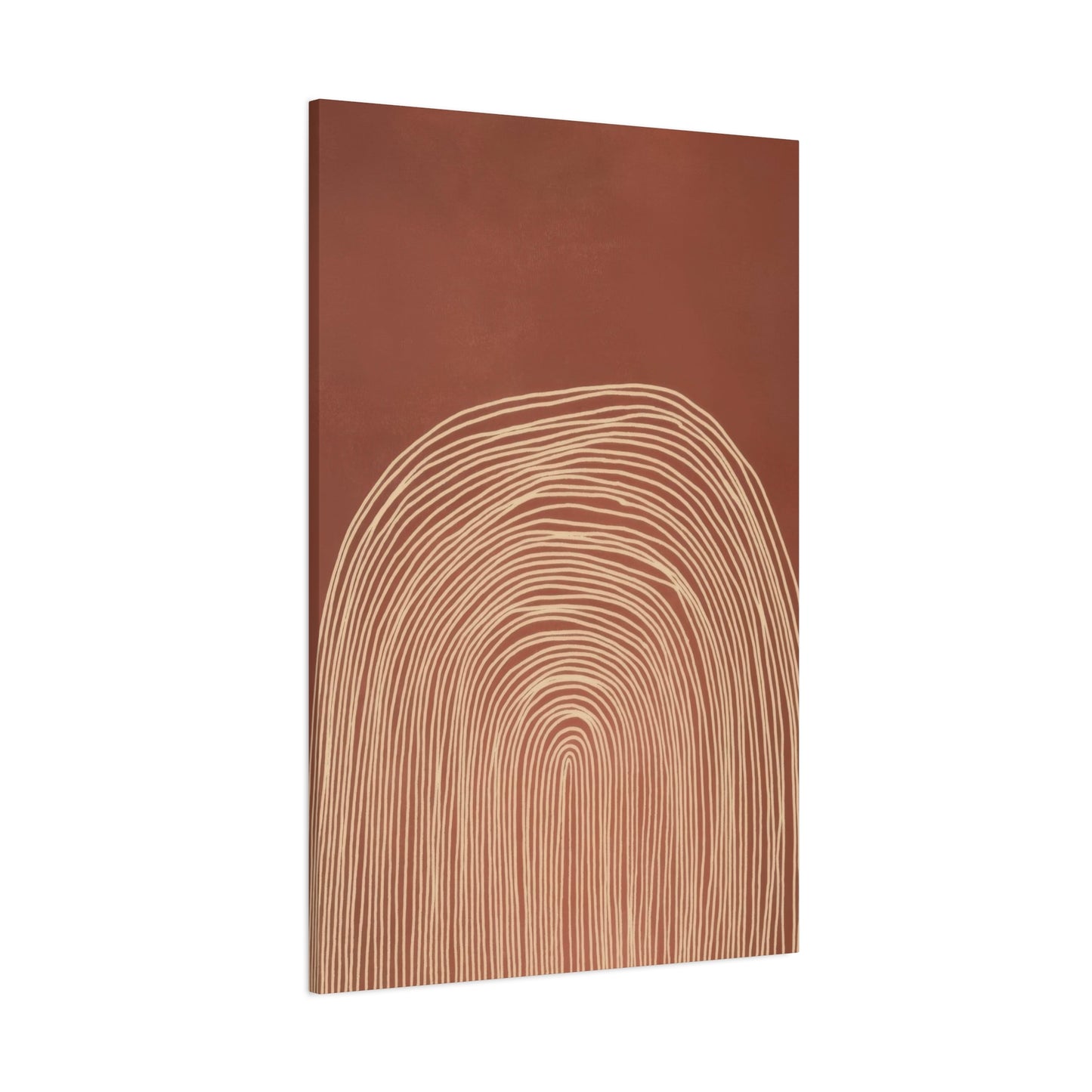
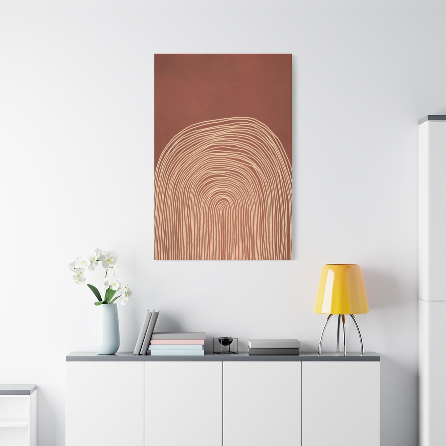
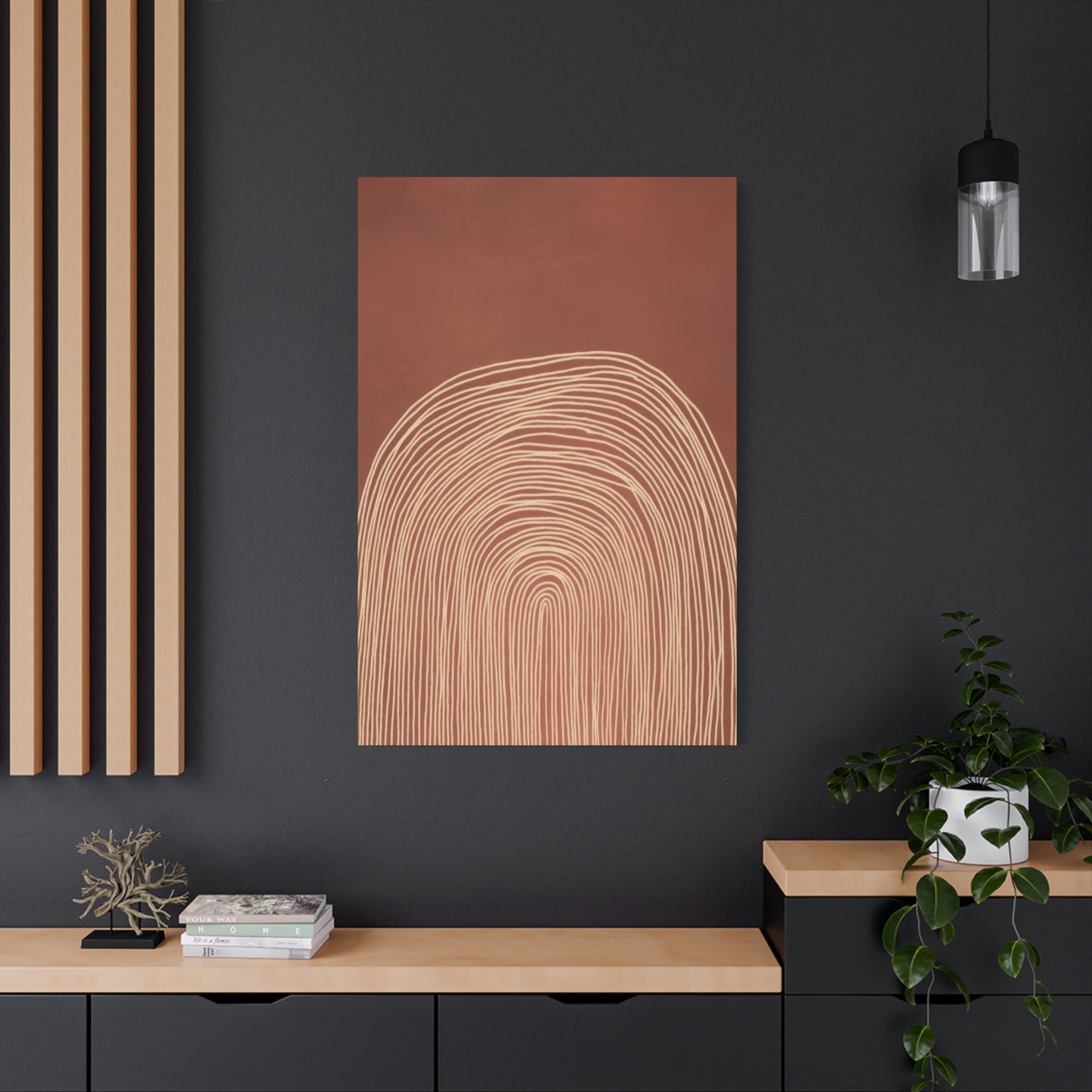
In abstract compositions utilizing concentrix curve patterns, where multiple curves emanate from or revolve around central points, the effect becomes even more dynamic. These patterns create focal points that anchor the composition while simultaneously suggesting expansion or contraction, movement or stillness. The interplay between the curves generates negative space that becomes as important as the shapes themselves, creating a complete visual ecosystem within the artwork.
The mathematical precision often underlying these curved designs adds another layer of interest. While the overall effect appears organic and natural, many such compositions are based on geometric principles like the golden ratio, spiral patterns found in nature, or other mathematical relationships. This hidden structure provides a sense of harmony and balance that viewers may not consciously recognize but subconsciously respond to, creating artwork that feels right even if one cannot articulate exactly why.
Curves also possess the unique ability to convey emotion and energy through their characteristics. Gentle, flowing curves suggest calmness and serenity, while tighter, more dramatic curves can convey energy and dynamism. The specific nature of the curves used in a piece significantly impacts its overall emotional tone. Artworks featuring sweeping, gradual curves create very different atmospheres than those with tight, spiraling forms, even when using identical color palettes.
The dimensional quality that curves can create, even in two-dimensional artworks, adds depth and visual interest. Through careful arrangement and shading, curved forms can appear to recede into the background or emerge toward the viewer, creating an illusion of three-dimensional space on a flat surface. This depth makes the artwork more engaging and prevents it from reading as merely decorative, elevating it to a piece worthy of genuine artistic consideration.
Creating Spatial Harmony Through Abstract Wall Compositions
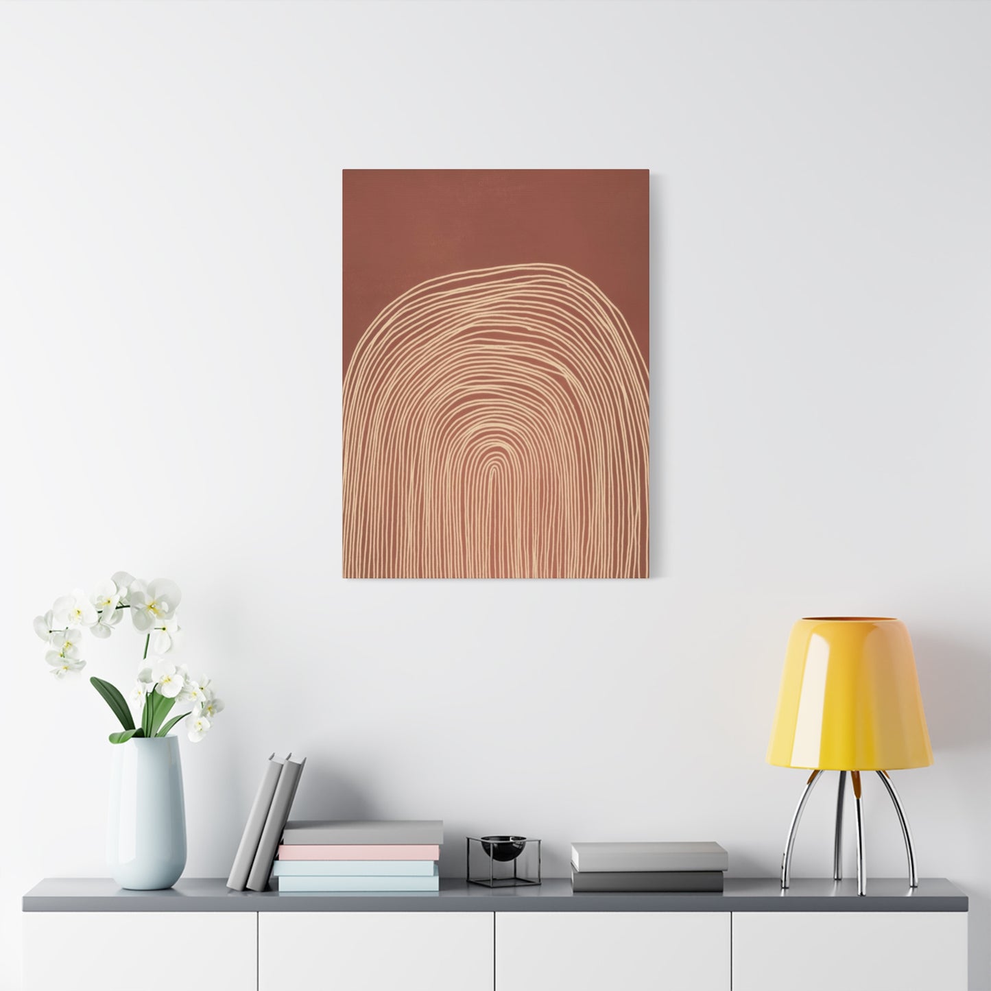
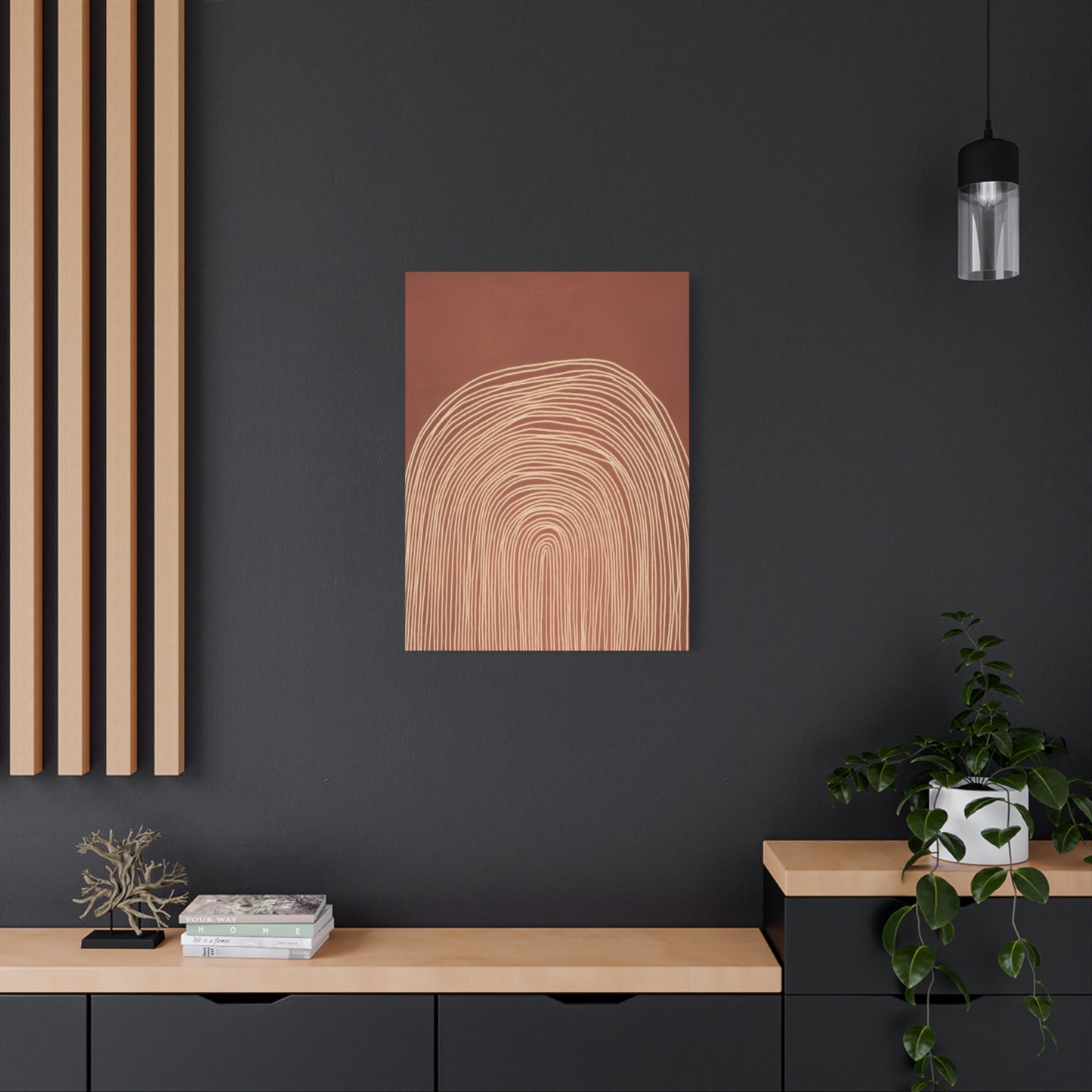
The placement and integration of abstract artwork within a living space requires thoughtful consideration of multiple factors including room size, existing color schemes, furniture arrangements, and lighting conditions. When these elements align properly, the artwork becomes an integral part of the room's overall design rather than simply an afterthought. Understanding how to achieve this harmony transforms a space from merely decorated to genuinely designed.
Scale represents one of the most critical factors in successful art placement. A piece must be appropriately sized for both the wall and the furniture grouping it accompanies. Too small, and the artwork appears insignificant and lost. Too large, and it can overwhelm the space and create visual imbalance. For compositions featuring curves and natural tones, which tend to be more subtle than bold, graphic pieces, ensuring adequate size becomes even more important. These works need sufficient scale to allow their details and color variations to be appreciated from typical viewing distances.
The relationship between the artwork and surrounding furniture creates visual connections that either enhance or detract from both elements. Ideally, the artwork should span approximately two-thirds to three-quarters the width of the furniture piece below it, creating a pleasing proportion. However, this guideline can be adjusted based on the specific characteristics of both the furniture and the art. Pieces with strong horizontal emphasis might work well spanning a greater width, while more vertical compositions might succeed with narrower coverage.
Color coordination between the artwork and room palette does not mean everything must match perfectly. In fact, too much matching can create a monotonous environment lacking visual interest. Instead, the artwork should pick up accent colors from the room while introducing new tones that complement the existing scheme. Abstract pieces in natural tones excel at this function, as their neutral base allows them to harmonize with virtually any color scheme while their varied hues add depth and complexity to the palette.
Lighting dramatically affects how artwork is perceived and should be carefully considered during placement. Natural light changes throughout the day, revealing different aspects of the piece at different times. Morning light tends to be cooler and more blue-toned, while afternoon and evening light shifts warmer and more golden. Artworks featuring natural color palettes respond beautifully to these shifts, appearing to change subtly as the day progresses. Artificial lighting should be positioned to illuminate the artwork without creating glare or hot spots that obscure portions of the composition.
The height at which artwork is hung significantly impacts its effectiveness within the space. The standard guideline suggests centering artwork at approximately eye level, typically around fifty-seven to sixty inches from the floor to the center of the piece. However, this can be adjusted based on ceiling height, furniture arrangement, and the specific characteristics of the artwork. In spaces with very high ceilings, hanging art slightly higher can help it feel more integrated with the architecture rather than floating in empty space.
The Psychological Benefits of Natural Color Schemes in Interior Spaces
The colors we surround ourselves with exert a powerful influence on our emotional states and psychological well-being. This connection between color and mood has been extensively studied, revealing that different hues trigger distinct psychological and even physiological responses. Natural color palettes, drawn from the earth and organic materials, tend to promote feelings of calm, security, and groundedness that are increasingly valuable in our fast-paced modern lives.
Brown tones, reminiscent of soil, wood, and stone, create feelings of stability and reliability. These colors ground us, providing a sense of being connected to something solid and enduring. In interior spaces, brown hues can make rooms feel more intimate and cozy, particularly in larger areas that might otherwise seem cold or impersonal. The psychological association with nature and the outdoors brings an element of the natural world inside, satisfying a deep-seated human need for connection to our environment.
Warm tones like terracotta, rust, and burnt orange energize without overwhelming. Unlike bright reds or intense oranges that can feel aggressive or overstimulating, these muted warm colors provide gentle invigoration. They create spaces that feel alive and welcoming without the visual assault of more saturated hues. These colors work particularly well in social spaces where you want to encourage conversation and interaction while maintaining a comfortable, relaxed atmosphere.
Neutral tones such as cream, tan, and sand create a sense of spaciousness and calm. These lighter natural hues reflect more light, making spaces feel larger and more open. They provide visual rest, allowing the eye to relax rather than constantly processing intense color stimulation. In bedrooms and personal retreat spaces, these peaceful neutrals promote relaxation and stress reduction, creating environments conducive to rest and rejuvenation.
Green-influenced earth tones connect us to the natural world in particularly powerful ways. Sage, olive, and moss shades carry associations with plant life and growing things, evoking feelings of renewal, growth, and vitality. These colors have been shown to reduce eye strain and promote concentration, making them excellent choices for work spaces or areas where focus is important. The calming effect of green tones also makes them suitable for any room where stress reduction is a priority.
The absence of harsh, artificial colors in natural palettes reduces visual stress and creates more harmonious environments. Our brains evolved in natural settings dominated by earth tones, and we remain most comfortable when surrounded by similar color schemes. Modern life bombards us with bright, artificial colors designed to grab attention, leaving us in a constant state of mild sensory overload. Creating personal spaces dominated by natural colors provides necessary relief from this overstimulation, allowing our nervous systems to settle into a more relaxed baseline state.
Integrating Modern Abstract Aesthetics into Traditional Spaces
One of the most appealing aspects of abstract artwork rendered in natural color palettes is its remarkable versatility across different decorating styles. These pieces can successfully bridge the gap between traditional and contemporary design aesthetics, making them valuable tools for creating eclectic, layered interiors that feel collected rather than rigidly styled. Understanding how to integrate these modern pieces into more traditional settings opens up exciting decorating possibilities.
In classically styled rooms featuring traditional furniture and architectural details, abstract art provides a crucial counterpoint that prevents the space from feeling like a museum or period recreation. The contemporary nature of abstract compositions introduces current energy while the natural color palette ensures the piece does not clash with the warmer tones typically found in traditional interiors. The curves in the artwork can echo the curved elements often present in traditional furniture, creating visual connections that help the piece feel integrated rather than incongruous.
The key to successful integration lies in finding common threads between the traditional elements and the contemporary artwork. Color represents the most obvious connection point. If the traditional furniture features warm wood tones, selecting abstract pieces that incorporate similar brown hues creates immediate visual harmony. If upholstery includes rust or terracotta accents, choosing artwork that picks up these colors strengthens the relationship between old and new elements.
Scale and proportion become even more critical when mixing styles. In rooms with substantial traditional furniture pieces, artwork needs sufficient size and presence to hold its own visually without appearing overwhelmed. Conversely, in spaces with more delicate traditional elements, overly large contemporary pieces can appear to dominate and overpower the room. Finding the right balance ensures that all elements contribute to a cohesive whole rather than competing for attention.
Frame selection plays an important role in helping contemporary artwork sit comfortably in traditional settings. While modern pieces are often displayed without frames or in minimal metal frames, adding a simple wooden frame in a finish that complements the traditional furniture can help the artwork feel more at home. The frame need not be ornate or traditional in style, but should provide a transitional element that softens the contrast between old and new.
Grouping strategies can also facilitate successful integration. Rather than hanging a single large contemporary piece in isolation, creating a gallery wall that mixes contemporary abstracts with more traditional pieces can help both styles feel more comfortable together. This approach suggests an intentional eclecticism rather than an awkward mismatch of styles, creating a sophisticated collected look that suggests the space has evolved over time.
The Role of Texture and Dimension in Abstract Compositions
While color and form capture immediate attention in abstract artwork, texture and dimensional qualities add layers of interest that reward closer inspection and repeated viewing. These tactile and visual elements transform flat surfaces into dynamic compositions that change as viewing angles and lighting conditions shift throughout the day. Understanding and appreciating these subtle qualities deepens our engagement with abstract art and enhances its impact within interior spaces.
Physical texture created through paint application techniques adds visual and sometimes actual tactile interest to artwork. Thick application methods that leave visible brushstrokes or palette knife marks create surfaces that catch and reflect light differently across the composition. These variations in surface texture create subtle shadows and highlights that shift as the viewer moves around the piece or as natural light changes throughout the day, ensuring the artwork never appears exactly the same way twice.
The illusion of texture through painterly technique represents another dimension of visual interest. Even when the actual surface remains relatively smooth, skilled artists can create the appearance of varied textures through color application and technique. Areas might appear rough and stony, smooth and polished, or soft and flowing, all on the same flat surface. This visual texture adds complexity and depth to the composition, giving the eye more to explore and discover.
Dimensional effects created through layering and color relationships can make curves appear to recede into deep space or emerge forward toward the viewer. This illusory depth transforms two-dimensional surfaces into seemingly three-dimensional experiences. The careful manipulation of warm and cool tones, light and dark values, and sharp versus soft edges creates spatial relationships that feel tangible despite existing only as visual effects.
The interplay between matte and glossy surface treatments adds another level of visual interest. Different finishes reflect light in distinct ways, with matte surfaces absorbing light and glossy areas bouncing it back toward the viewer. Strategic use of varied finishes within a single composition can emphasize certain elements while allowing others to recede, creating focal points and visual hierarchy that guides the viewer through the piece.
Shadow and highlight created by actual dimensional elements bring abstract compositions into physical space. Some contemporary artists incorporate raised elements, cutouts, or layered panels that create genuine three-dimensional relief. These physical protrusions cast real shadows that change with lighting conditions, creating an ever-evolving visual experience. The interaction between the artwork and its environment becomes part of the piece itself.
Surface quality considerations extend beyond the artwork itself to include the relationship between the piece and its surrounding wall surface. The contrast or harmony between wall texture and artwork surface affects how the piece is perceived. Smooth artwork on textured walls creates an interesting juxtaposition, while matching surface qualities can create a more integrated, cohesive feel. These relationships should be considered when selecting and placing artwork to ensure optimal visual impact.
Selecting the Perfect Curved Abstract Piece for Your Environment
Choosing artwork that will bring lasting satisfaction requires consideration of multiple factors beyond simple aesthetic appeal. While initial emotional response to a piece remains important, ensuring the selection works practically within your specific space and with your existing design elements helps guarantee long-term enjoyment. A systematic approach to selection helps navigate the abundant options available and leads to choices you will appreciate for years to come.
Assessing your existing color palette provides the foundation for successful art selection. Take inventory of the dominant colors in your space, including wall colors, major furniture pieces, window treatments, and accent elements. Look for both the primary colors and the undertones, as these subtle color characteristics significantly impact how new elements will integrate. Abstract pieces in natural tones offer flexibility, but ensuring the specific shades work with your existing palette prevents clashing or discord.
Evaluating the emotional tone you want to create in the space guides selection of artwork with appropriate characteristics. Spaces meant for relaxation benefit from pieces featuring gentle curves and softer color transitions, while areas designed for energy and creativity can handle more dynamic compositions with stronger contrasts and more dramatic curves. Consider the room's primary function and the feelings you want to encourage when occupying that space.
Analyzing the architectural features of your space helps determine what style and scale of artwork will complement rather than fight the room's inherent characteristics. Rooms with strong horizontal elements like long windows or low, modern furniture benefit from artwork that echoes these proportions. Spaces with vertical emphasis from high ceilings or tall architectural details work well with vertically oriented pieces. Matching the artwork's proportions to the room's dominant directions creates visual harmony.
Considering viewing distances helps ensure you select appropriately scaled and detailed artwork. Pieces meant to be viewed from across a room need bold enough composition and sufficiently large scale to read well from that distance. Artwork in spaces where you will spend time in close proximity can feature finer details and more subtle color variations that reward closer inspection. Consider where you will typically be in relation to the artwork when occupying the space.
Evaluating lighting conditions, both natural and artificial, helps predict how artwork will appear in your specific environment. If possible, view potential artwork in similar lighting to what exists in your space. Colors can appear dramatically different under warm versus cool lighting, and what looks perfect in a gallery's carefully controlled lighting might appear quite different in your home. Natural light exposure also affects artwork over time, so consider sun exposure when planning placement.
Budget considerations extend beyond the initial purchase price to include framing and installation costs. Quality framing appropriate to the artwork can represent a significant additional expense but protects your investment and enhances its presentation. Professional installation ensures proper mounting and positioning, particularly for larger or heavier pieces. Factor these associated costs into your budget planning to avoid surprises and ensure proper presentation of your chosen artwork.
The Evolution of Abstract Art in Contemporary Interior Design
Abstract art has traveled a fascinating journey from its early twentieth-century origins as a radical departure from representational traditions to its current position as a mainstream element in contemporary interior design. Understanding this evolution provides context for appreciating how abstract compositions featuring curves and natural tones fit into the broader landscape of art and design history. This perspective enriches our engagement with contemporary pieces while highlighting their connections to artistic traditions.
The early pioneers of abstract art sought to free painting from the obligation to depict recognizable subjects, believing that pure form and color could convey meaning and emotion as effectively as representational imagery. This revolutionary idea initially met with resistance and confusion but gradually gained acceptance as viewers learned to engage with artwork on its own terms rather than judging it by its fidelity to external reality. This shift in perspective opened new possibilities for artistic expression that continue to evolve today.
Mid-century modern design embraced abstract art enthusiastically, recognizing its compatibility with the clean lines and simplified forms characteristic of that aesthetic. The integration of abstract artwork into everyday living spaces, not just museums and galleries, democratized access to contemporary art and established abstraction as appropriate for residential interiors. This period established many of the principles still guiding how we incorporate abstract art into our homes today.
The return to natural materials and organic forms in contemporary design has created perfect conditions for abstract artwork emphasizing curves and earthy colors to flourish. As design trends have moved away from the cool minimalism that dominated the early twenty-first century toward warmer, more layered aesthetics, artwork featuring natural color palettes has gained prominence. These pieces satisfy the contemporary desire for spaces that feel both current and comfortable, sophisticated yet approachable.
Digital technology has expanded the possibilities for creating and reproducing abstract artwork, making it more accessible while also raising questions about authenticity and value. High-quality prints now allow more people to enjoy abstract compositions in their homes, while purists debate whether reproductions carry the same artistic merit as unique originals. This democratization has certainly increased exposure to abstract art and contributed to its mainstream acceptance in interior design.
The increasing emphasis on wellness and connection to nature in interior design has elevated artwork featuring natural colors and organic forms to particular prominence. As people recognize the psychological benefits of surrounding themselves with elements evoking the natural world, abstract pieces offering these qualities without literal representation have become highly sought after. These works provide the emotional benefits of nature-inspired design while maintaining the visual sophistication of contemporary abstract art.
Contemporary artists continue pushing the boundaries of abstraction while also revisiting and reinterpreting earlier movements. This creates a rich, varied landscape of abstract artwork spanning from pieces that would look at home in mid-century modern settings to works incorporating the latest materials and techniques. This diversity ensures that regardless of your specific tastes and the characteristics of your space, abstract options exist that will work beautifully.
Color Theory Fundamentals Applied to Abstract Earth-Toned Artwork
Understanding basic color theory principles enriches appreciation of how artists create harmonious and effective abstract compositions. While formal study of color theory can become quite complex, grasping fundamental concepts helps viewers recognize why certain color combinations feel pleasing while others create discord. This knowledge proves particularly valuable when evaluating abstract artwork for your space or attempting to coordinate pieces with existing design elements.
The color wheel organizes hues in a circular arrangement showing relationships between colors. Primary colors cannot be created by mixing other colors, while secondary colors result from combining two primaries. Tertiary colors emerge from mixing primary and secondary hues. Earth tones typically fall into the tertiary category, representing complex combinations that cannot be achieved through simple primary mixing. This complexity contributes to their sophistication and visual interest.
Warm and cool color classifications affect how colors interact and the psychological responses they evoke. Warm colors including reds, oranges, and yellows advance visually and feel energizing, while cool colors like blues and greens recede and feel calming. Earth tones span both categories, with warm browns and terracottas contrasting with cool grays and sage greens. Abstract compositions often play with these warm-cool relationships to create depth and visual interest.
Complementary colors sit opposite each other on the color wheel and create maximum contrast when placed adjacent to each other. While earth-toned palettes rarely employ stark complementary relationships, understanding this principle helps explain why certain earth tones work beautifully together. Muted complements create sophisticated tension without the visual shock of pure complementary pairs, adding visual interest while maintaining overall harmony.
Analogous color schemes use colors adjacent to each other on the color wheel, creating harmonious, unified compositions. Many successful earth-toned abstract pieces employ analogous schemes, perhaps combining various browns, oranges, and yellows for a warm, cohesive effect. These schemes feel naturally harmonious because the colors share common undertones, creating visual unity that feels effortless and organic.
Value refers to the lightness or darkness of a color, independent of its hue. Value contrast creates visual interest and helps establish focal points within compositions. Abstract artwork gains much of its dimensional quality through careful manipulation of value, with lighter areas appearing to come forward while darker regions recede. Even when working within limited color palettes, skilled use of value variation creates rich, complex compositions.
Saturation describes color intensity or purity. Highly saturated colors appear vivid and bright, while desaturated colors appear muted and subtle. Earth tones typically feature low to moderate saturation, contributing to their subtle, sophisticated character. The relatively low saturation of natural color palettes makes them easy to live with over time, as they do not create the visual fatigue that highly saturated colors can produce.
The Influence of Natural Landscapes on Abstract Curved Compositions
Many abstract artists draw inspiration from natural forms and landscapes even when creating works that bear no literal resemblance to specific places. The curves of rolling hills, the patterns in geological formations, the flow of water across varied terrain, and countless other natural phenomena provide endless inspiration for abstract compositions. Recognizing these connections deepens appreciation for how abstract art can evoke natural experiences without directly depicting them.
Desert landscapes offer particularly rich inspiration for abstract work in earth tones. The sweeping curves of sand dunes, the layered colors in canyon walls, and the subtle variations in arid earth provide both formal and chromatic material for abstraction. Artists might capture the essence of these environments through flowing curves in sandy beiges, dusty oranges, and warm browns, creating pieces that feel like the desert without showing a single recognizable feature.
Mountainous terrain provides inspiration for more dramatic, angular compositions while still offering opportunities for curved elements. The rounded shoulders of ancient, weathered peaks, the curves of valleys carved by glacial action, and the flowing patterns of sedimentary rock layers all translate beautifully into abstract forms. The natural colors of stone, exposed earth, and mountain vegetation supply authentic earth-toned palettes grounded in real geological phenomena.
Water-carved landscapes where rivers and streams have shaped the earth over millennia offer inspiration for particularly dynamic curved compositions. The flowing lines created by water movement, the curves of river bends, the circular patterns of eddies and whirlpools, and the layered deposits in floodplains all provide formal elements that translate naturally into abstract art. The earth tones of riverbanks, sandbars, and water-carved stone create authentic natural color palettes.
Forest and woodland environments contribute inspiration through their organic, irregular forms and their rich palette of browns, greens, and earth tones. The curves of tree trunks and branches, the irregular patterns of bark, the layered forms of forest floors, and the interplay of light and shadow through leaf canopies all offer material for abstract interpretation. These elements can be distilled into compositions that feel organic and natural without depicting any specific plant or forest scene.
Agricultural landscapes shaped by human interaction with nature provide another source of inspiration, particularly the geometric curves of contoured fields following natural terrain. The patterns of plowed fields, the curves of terraced hillsides, and the color variations in different crops create striking visual compositions. These elements combine natural earth tones with the added structure of human agricultural practices, creating a bridge between natural and designed environments.
Coastal environments where land meets water offer inspiration through their particular combinations of curves and earth tones. The curves of beaches and shorelines, the patterns in sand and stones, the colors of weathered driftwood and sun-bleached shells, and the earth tones of coastal cliffs create distinct aesthetic combinations. These environments provide cooler earth tone palettes dominated by grays, tans, and muted blues that differ from the warmer desert and forest palettes.
Creating Focal Points and Visual Interest in Neutral Spaces
Rooms decorated primarily in neutral tones benefit enormously from carefully chosen artwork that provides visual interest without disrupting the calm, sophisticated atmosphere neutrals create. Abstract compositions in earth tones excel at this function, offering enough color and visual complexity to prevent neutral rooms from feeling bland while maintaining the overall sense of restraint and sophistication that makes neutral palettes appealing. Understanding how to use artwork to create focal points in neutral environments enhances both the art and the space.
The principle of controlled contrast guides successful focal point creation in neutral rooms. While you want artwork to stand out enough to draw attention and provide visual interest, too much contrast can feel jarring and disrupt the intentional calm of neutral environments. Earth-toned abstract pieces offer the perfect amount of contrast against neutral walls, providing distinction without shock value. The subtle color variations within the artwork reward attention without demanding it aggressively.
Placement strategies for focal point artwork require consideration of room layout and traffic patterns. Ideally, the primary artwork should be positioned where it will be naturally viewed upon entering the room or when seated in the main seating area. This placement allows the artwork to serve its function as a focal point without requiring awkward positioning or neck craning to view properly. The focal wall for artwork should be determined by the room's architecture and furniture arrangement rather than arbitrary choice.
Scale manipulation creates impactful focal points even when color contrast remains relatively subtle. In rooms dominated by neutral tones, a substantial piece of earth-toned abstract art can command attention through sheer size while maintaining tonal harmony with the overall palette. Large-scale artwork creates drama and presence without the aggressive visual impact of bold colors, making it ideal for neutral environments where maintaining sophistication is paramount.
Layering techniques add dimension and interest to neutral spaces by combining artwork with other three-dimensional elements. Placing sculpture, plants, or decorative objects near or in front of artwork creates visual depth and complexity that prevents the space from reading as flat and one-dimensional. These layered arrangements feel more collected and intentional than simply hanging artwork directly on bare walls.
Strategic lighting transforms artwork from simple wall decoration into true focal points. Dedicated picture lights or adjustable track lighting can highlight artwork, creating pools of visual interest in otherwise neutral spaces. This approach proves particularly effective in larger rooms where artwork might otherwise get lost against expansive neutral walls. The contrast between illuminated artwork and the surrounding wall creates focal impact without requiring jarring color contrasts.
Multiple focal points can work in larger neutral spaces if carefully balanced. Rather than forcing attention to a single element, creating several areas of visual interest allows the eye to move around the room, discovering different points of engagement. In neutral environments, this might involve several coordinated abstract pieces in earth tones, each providing visual interest while working together as a harmonious collection.
The Impact of Abstract Art on Mood and Atmosphere
The psychological effects of our visual environment extend far beyond simple aesthetic pleasure, significantly influencing our emotional states, stress levels, and overall sense of well-being. Abstract artwork plays a meaningful role in shaping these psychological effects, with different types of abstractions creating distinctly different atmospheric qualities. Understanding these effects helps in selecting artwork that will support the specific mood and function you intend for each space.
Calming abstractions typically feature gentle curves, subtle color transitions, and balanced compositions without jarring elements or high contrast. These pieces create restful, peaceful atmospheres appropriate for bedrooms, meditation spaces, or any room where stress reduction and relaxation are priorities. Earth-toned palettes particularly support these calming effects, as the natural colors instinctively feel safe and comforting. The visual rhythm of curved elements guides the eye in a smooth, flowing manner that feels relaxing rather than agitating.
Energizing abstractions employ more dynamic curves, stronger contrasts, and more complex compositions that stimulate attention and engagement. While still working within earth-toned palettes, these pieces use the full range of values from deep browns to light creams, creating visual energy through contrast rather than color saturation. These works suit social spaces, creative studios, or areas where you want to encourage alertness and engagement rather than relaxation.
Contemplative artwork creates an atmosphere conducive to thought and reflection through complexity that reveals itself gradually upon extended viewing. These pieces reward patience and attention, offering new details and relationships with continued observation. The depth in well-executed abstract compositions using natural colors provides this contemplative quality naturally, as the subtle color variations and complex curved forms invite close study and reflection.
Grounding artwork helps create feelings of stability and security through composition and color choices that feel solid and anchored. Pieces dominated by darker earth tones or featuring strong horizontal elements create this grounding effect effectively. These works help spaces feel established and permanent rather than temporary or transitional, making them valuable in homes where creating a sense of rootedness is important.
Uplifting abstractions use lighter tones, upward-moving compositional elements, and open space to create feelings of expansion and possibility. While maintaining earth-toned palettes, these pieces emphasize the lighter end of the spectrum with generous use of cream, tan, and sandy tones. The visual airiness they create makes spaces feel more open and optimistic without requiring the aggressive brightness of highly saturated colors.
Harmonizing artwork brings together diverse elements within a space through colors and forms that relate to multiple design elements in the room. These pieces serve as visual bridges, connecting disparate furniture styles, colors, or periods through their inclusive palettes and universal appeal. Earth-toned abstracts excel at this harmonizing function due to their neutrality and complexity, which allow them to pick up colors from varied sources while remaining cohesive as individual pieces.
Technical Considerations for Displaying Abstract Wall Art
Proper display of artwork involves technical considerations beyond simple aesthetic placement. Understanding the practical aspects of hanging, lighting, and maintaining artwork ensures your pieces look their best while remaining safely secured and protected from damage. Attention to these technical details reflects respect for the artwork and ensures your investment brings lasting enjoyment.
Wall anchoring methods must match both the weight of the artwork and the type of wall material. Drywall requires appropriate anchors rated for the artwork's weight, while solid walls offer more straightforward mounting but may require special tools and techniques. Underestimating the importance of proper anchoring risks damage to both artwork and walls when inadequately supported pieces come loose. Professional installation makes sense for valuable or heavy pieces where secure mounting is critical.
Hanging height guidelines provide starting points but should be adjusted for specific situations. The standard recommendation of centering artwork at eye level translates to approximately fifty-seven to sixty inches from floor to center for average ceiling heights. However, this should be modified based on furniture heights, viewer heights, and ceiling heights. In dining rooms where artwork will primarily be viewed while seated, slightly lower placement often works better.
Leveling artwork properly seems basic but significantly impacts how professional and finished the installation appears. Even slight tilts become glaringly obvious once pointed out, creating an amateurish appearance that detracts from even the finest artwork. Using a quality level during installation and checking from multiple distances ensures the piece hangs true. For larger pieces, it often helps to have a second person verify level from across the room where minor tilts become more apparent.
Spacing considerations in gallery wall arrangements require careful planning to create cohesive groupings that feel intentional rather than haphazard. Generally, maintaining consistent spacing between pieces of approximately two to three inches creates unified groupings. However, varying spacing slightly based on the specific pieces can help create visual hierarchy and prevent the arrangement from appearing too rigidly geometric.
Protection from environmental damage extends the life and beauty of artwork. Direct sunlight can fade colors over time, particularly in works using organic pigments or less lightfast materials. Placing valuable artwork away from direct sun exposure or using UV-filtering glass in frames helps prevent fading. Climate control also matters, as extreme temperature fluctuations or high humidity can damage artwork, particularly pieces on paper or canvas.
Maintenance requirements vary by medium and surface finish. Dust accumulation dulls artwork over time, but cleaning methods must match the specific piece to avoid damage. Generally, gentle dusting with soft, clean brushes suffices for most artwork, while glass-covered pieces can be cleaned with appropriate glass cleaners applied to the cloth rather than directly to the glass. Avoiding harsh chemicals or abrasive materials prevents damage to frames and artwork surfaces.
Final Thoughts:
In conclusion, the fusion of abstract concentric curves and earth tones offers a unique and timeless aesthetic that can transform any space into a sanctuary of calm and balance. This combination of organic forms and nature-inspired hues has become a beloved choice in modern interior design, and for good reason. It taps into our innate connection with nature, grounding us and creating an atmosphere that feels both serene and engaging.
The beauty of concentric curves lies in their simplicity and versatility. They offer a sense of movement and flow while maintaining an inherent sense of harmony. Whether they are delicately layered in subtle gradients or boldly emphasized in thicker lines, these shapes naturally draw the eye, guiding the viewer's focus inward. This makes them perfect for creating a focal point in a room while still maintaining a tranquil energy. The circles suggest continuity and cyclical patterns, echoing the rhythms of nature and life, which makes them a powerful symbol of balance and renewal.
When paired with earth tones, the result is even more compelling. Earth tones, with their warm and natural palette, can evoke feelings of comfort, safety, and connection. These colors are timeless because they reflect the world around us—whether in the rich browns of the earth, the muted greens of the forest, or the golden yellows of the setting sun. The softness and warmth of earth tones allow the art to integrate effortlessly into almost any space, making it both visually pleasing and adaptable to different design styles.
Another key element in incorporating abstract concentric curves in earth tones into your home is the ability to adapt them to your personal taste and the specific needs of the space. Whether your home is minimalist, bohemian, or even industrial, these elements can be tailored to fit. By adjusting the size, layering, and color intensity of the artwork, you can ensure that it complements your room’s overall vibe, whether it’s a cozy retreat or an open, airy living area.
As we’ve explored, abstract concentric curve art in earth tones also brings a sense of balance and calm to the space, providing a soothing counterpoint to the fast-paced world outside. Whether used as a striking feature or a subtle accent, these pieces allow you to bring a piece of nature’s tranquility indoors. They serve as reminders to pause, reflect, and appreciate the beauty and harmony around us.
Incorporating abstract concentric curves into your home décor isn’t just about choosing art—it’s about creating an environment that fosters peace, connection, and mindfulness. Whether it’s the gentle flow of a curve or the grounding power of earthy hues, this style invites you to experience art that feels both contemporary and deeply connected to nature.
