


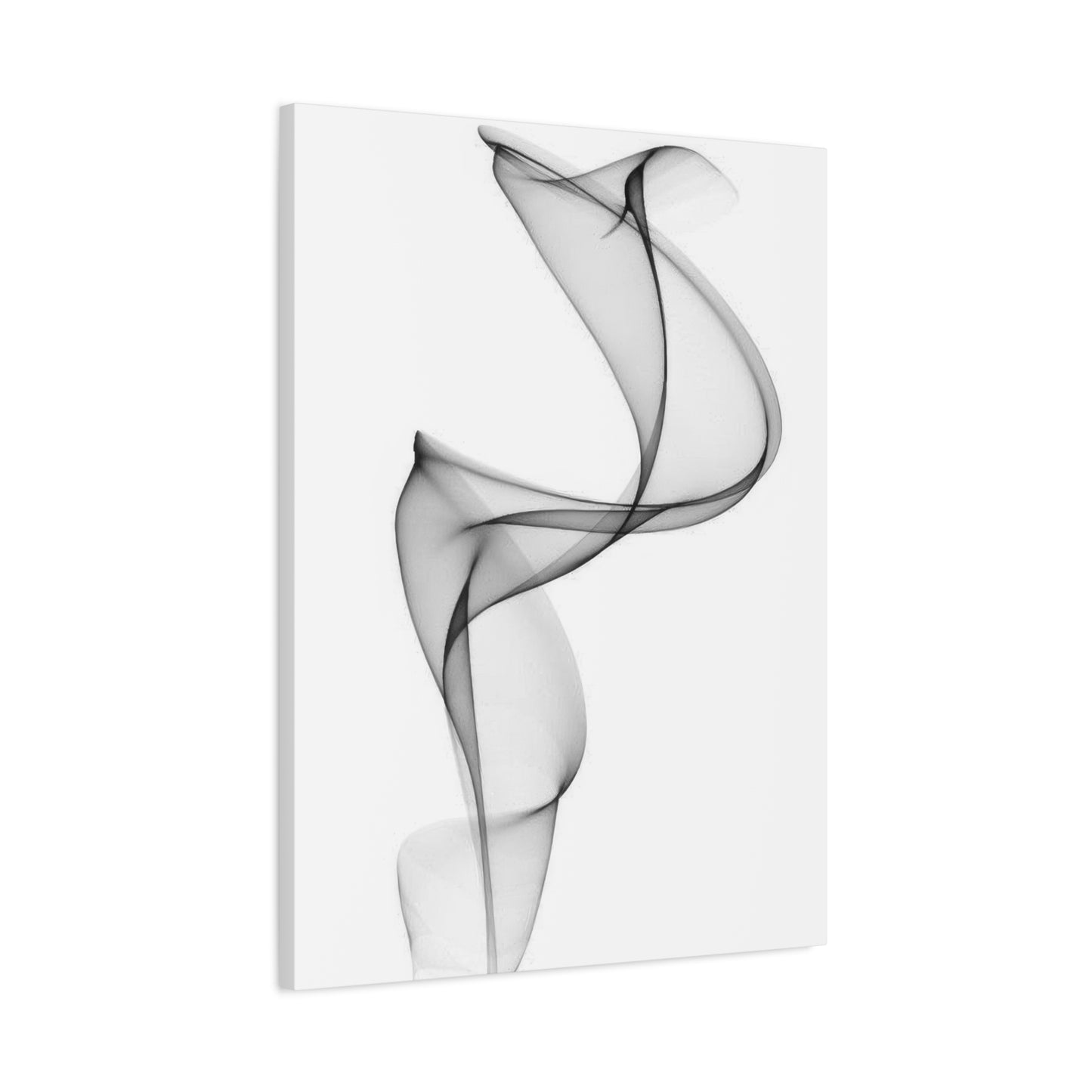
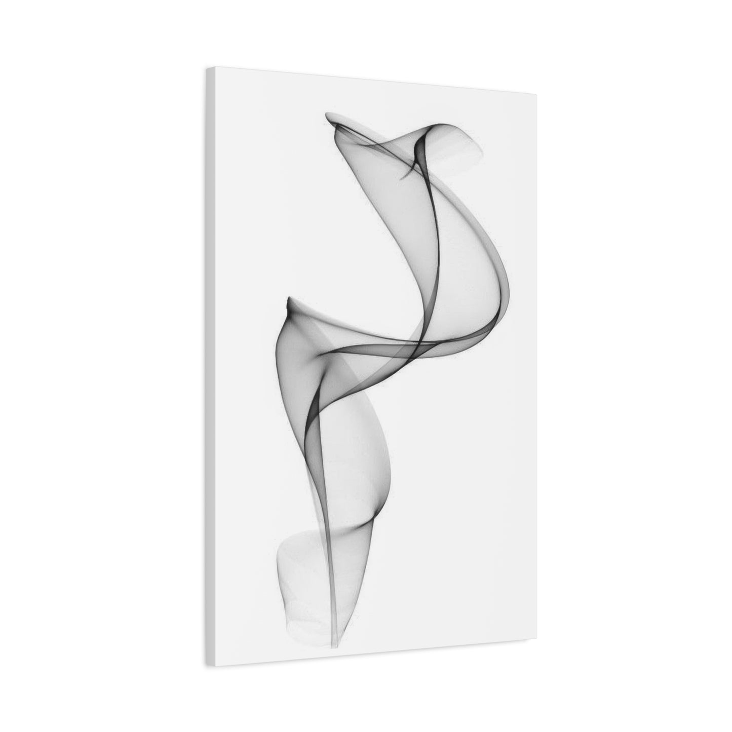
Abstract Grey Wall Art & Canvas Prints
Abstract Grey Wall Art & Canvas Prints
Couldn't load pickup availability

Mastering Modern Elegance with Abstract Grey Wall Art: A Step-by-Step Guide
The world of interior design has witnessed a remarkable transformation over the past few decades, with neutral palette artwork emerging as a cornerstone of contemporary aesthetic preferences. When we explore the realm of sophisticated visual elements featuring grey tones and abstract compositions, we discover an art form that transcends temporary trends and speaks to something fundamental in human aesthetic appreciation. These pieces represent more than mere decorative elements; they embody a philosophy of design that values subtlety, sophistication, and the power of restraint.
The popularity of these neutral-toned artistic creations stems from their remarkable versatility and their ability to create visual harmony within diverse interior environments. Unlike bold, vibrant pieces that demand attention and can quickly overwhelm a space, these subdued compositions offer a gentler approach to decorating. They provide visual interest without creating discord, allowing other design elements to shine while still maintaining their presence as focal points. This balance makes them particularly appealing to homeowners, interior designers, and art enthusiasts who appreciate sophistication without ostentation.
The psychological impact of these muted artistic expressions cannot be overstated. Grey, as a color, occupies a unique position in the spectrum of human color perception. It represents balance, neutrality, and stability. When combined with abstract forms that eschew literal representation in favor of shapes, lines, and textures, the result is artwork that invites contemplation and interpretation. Each viewer brings their own experiences and emotions to their interaction with these pieces, creating a deeply personal connection that evolves over time. This quality of perpetual discovery ensures that these artworks remain engaging year after year, never losing their ability to capture attention and spark imagination.
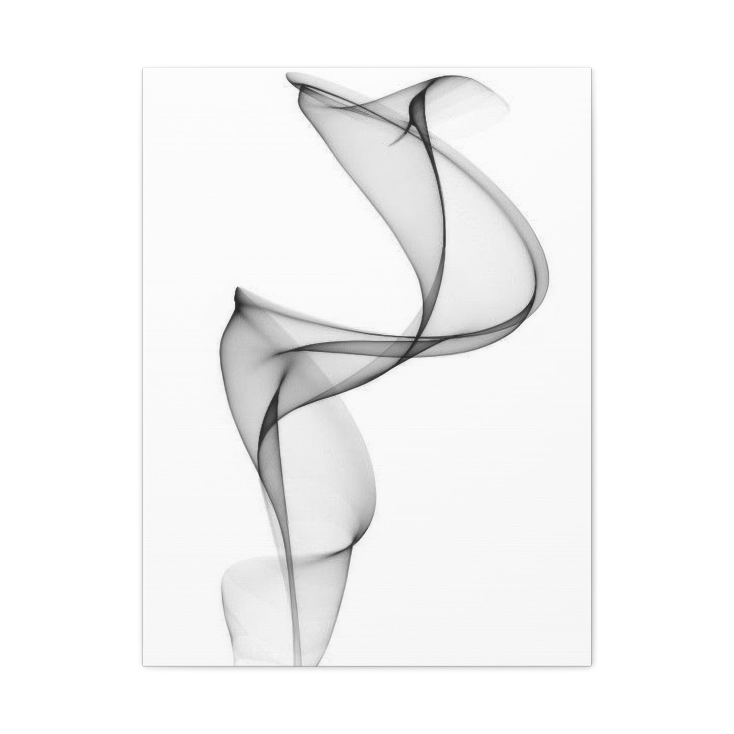
Behind Monochromatic Decorative Pieces
Delving deeper into the psychological dimensions of neutral-toned visual compositions reveals fascinating insights into human cognition and emotional response. Color psychology has long established that different hues evoke distinct emotional and physiological reactions. Grey occupies a particularly interesting position in this spectrum, often associated with sophistication, formality, and emotional balance. Unlike the warmth of reds and yellows or the coolness of blues and greens, grey provides a neutral foundation that neither stimulates nor sedates but instead creates a sense of equilibrium.
When individuals enter a space adorned with these neutral artistic expressions, they experience an immediate sense of calm and order. The absence of aggressive color stimulation allows the mind to relax, reducing visual stress and creating an environment conducive to both productivity and relaxation. This makes such artwork particularly suitable for spaces where mental clarity is valued, such as home offices, studies, meditation rooms, and bedrooms. The abstract nature of these compositions further enhances this effect by avoiding the cognitive demands of interpreting realistic imagery, allowing viewers to project their own meanings and emotions onto the canvas.
Research in environmental psychology suggests that the visual environment significantly impacts mood, behavior, and cognitive function. Spaces dominated by neutral tones with carefully selected artistic focal points tend to promote feelings of stability and security. This is particularly important in contemporary society, where many individuals struggle with stress and overstimulation. By incorporating these calming visual elements into living and working spaces, people can create refuges from the chaos of modern life, sanctuaries where the mind can rest and rejuvenate.
The abstract quality of these pieces introduces another psychological dimension. Abstract art requires active engagement from the viewer, inviting interpretation and personal meaning-making. This cognitive engagement, while subtle, keeps the artwork interesting over time. Unlike representational art, which reveals its content immediately, abstract compositions offer layers of discovery. A shape noticed one day might go unobserved for weeks before suddenly capturing attention again. This quality of perpetual novelty within familiarity makes these pieces valuable long-term investments in home decor, as they continue to provide visual interest and emotional resonance long after their initial installation.
Exploring Different Styles Within Neutral Abstract Compositions
The category of neutral-toned abstract artwork encompasses an remarkably diverse range of styles, techniques, and aesthetic approaches. Understanding these variations helps art enthusiasts and interior decorators make informed decisions that align with their personal taste and design objectives. From minimalist geometric compositions to richly textured organic forms, the possibilities within this genre are virtually limitless, offering options for every conceivable design aesthetic.
Minimalist interpretations represent one prominent style within this category. These pieces embrace simplicity and restraint, often featuring clean lines, geometric shapes, and vast expanses of subtle coloration. The beauty of minimalist compositions lies in their ability to create impact through absence rather than presence. By eliminating unnecessary elements and focusing on essential forms, these artworks achieve a zen-like quality that promotes mental clarity and emotional tranquility. They work particularly well in contemporary and modern interior designs, where clean lines and uncluttered spaces are paramount.
In contrast, textured approaches introduce tactile dimensions to visual experiences. These pieces might incorporate thick applications of paint, mixed media elements, or surface manipulations that create physical depth and dimensional interest. The interplay of light and shadow across textured surfaces adds complexity and visual intrigue, transforming a flat canvas into a three-dimensional object that changes appearance throughout the day as lighting conditions shift. This dynamic quality makes textured pieces particularly engaging, as they offer different viewing experiences at different times and from different angles.
Gestural and expressive styles bring energy and movement into the realm of neutral abstraction. These compositions feature bold brushstrokes, sweeping marks, and dynamic forms that suggest motion and emotional intensity despite their restrained color palette. The contradiction between the calming effect of neutral tones and the energetic quality of gestural mark-making creates fascinating tension that captures attention and sustains interest. These pieces work well in spaces that benefit from visual energy without the stimulation of bright colors, such as creative studios, offices, and social areas.
Geometric abstractions offer yet another approach, employing precise shapes, calculated compositions, and mathematical relationships to create visual harmony. These pieces appeal to viewers who appreciate order, logic, and structural beauty. The use of grey tones in geometric compositions emphasizes form and structure over color, allowing the purity of shape and the sophistication of compositional relationships to take center stage. This style complements architectural interiors beautifully, echoing the structural elements of buildings while adding artistic interest.
Material Considerations for Long-Lasting Visual Impact
The physical materials used in creating and presenting these artistic expressions significantly impact their appearance, durability, and suitability for different environments. Understanding these material considerations enables collectors and decorators to make choices that ensure their investments maintain their beauty and structural integrity over time. From canvas and paper to more unconventional substrates, each material brings unique characteristics that influence the final aesthetic and practical qualities of the artwork.
Traditional canvas remains the most popular support for painted compositions in this genre. Canvas offers several advantages, including durability, flexibility, and a texture that enhances the visual quality of paint. High-quality cotton or linen canvas, properly prepared and stretched over solid wooden frames, can last for generations with appropriate care. The slight texture of canvas adds subtle visual interest even to smooth paint applications, while also providing tooth that helps paint adhere properly. When selecting canvas-based pieces, attention to the quality of both the fabric and the stretcher bars ensures structural stability that prevents warping or sagging over time.
Paper-based works offer different aesthetic qualities and practical considerations. Archival-quality papers provide smooth or textured surfaces that interact beautifully with various media, from graphite and charcoal to ink and watercolor. Paper artworks typically require framing behind glass or acrylic for protection, which adds both cost and visual presence. However, the clarity and precision achievable on paper, particularly in works featuring delicate linework or subtle tonal gradations, can be stunning. When properly framed with acid-free materials and UV-protective glazing, paper artworks can maintain their pristine condition indefinitely.
Metal substrates have gained popularity in contemporary artistic practice, offering industrial aesthetics and exceptional durability. Aluminum panels provide perfectly smooth surfaces that showcase clean, modern compositions beautifully. Metal artworks resist warping, are impervious to moisture and pests, and can be displayed without frames, creating sleek, contemporary presentations. The reflective qualities of metal can add subtle luminosity to compositions, particularly when special metallic or pearlescent paints are employed. These pieces work exceptionally well in modern and industrial interior design schemes.
Size and Scale Principles for Maximum Impact
Selecting appropriately sized artwork for specific spaces represents one of the most critical decisions in interior decoration. The relationship between artwork dimensions and the architectural features of a room profoundly influences visual harmony and the emotional impact of the space. Understanding fundamental principles of scale and proportion empowers decorators to create environments that feel balanced, intentional, and aesthetically pleasing.
For walls above substantial furniture pieces such as sofas, beds, or consoles, artwork should typically span between two-thirds and three-quarters of the furniture width. This proportion creates visual connection between furniture and art while maintaining appropriate negative space. A piece that is too small appears lost and insignificant, failing to anchor the space or justify its presence. Conversely, artwork that extends beyond furniture edges can create visual confusion and make both elements appear poorly considered. When working with sectional sofas or king-sized beds, which present exceptionally wide expanses, multiple coordinated pieces or extra-large single works may be necessary to achieve proper proportional relationships.
Ceiling height significantly influences appropriate artwork dimensions. Standard eight-foot ceilings accommodate works ranging from small accent pieces to substantial compositions approximately five feet in height. Rooms with higher ceilings can support dramatically scaled works that would overwhelm spaces with lower ceilings. In great rooms, entryways, and other spaces with soaring ceilings, artwork measuring six feet tall or more can create stunning focal points that properly utilize vertical space and establish human scale within expansive volumes. The key is ensuring artwork feels substantial enough to hold its own within the architectural context without appearing to strain against spatial limitations.
Gallery walls and multi-piece installations offer solutions for spaces that benefit from distributed rather than concentrated visual interest. These arrangements work particularly well on stairway walls, in long hallways, and in rooms with awkward architectural features that interrupt wall space. When creating gallery walls with neutral abstract pieces, maintaining consistent spacing between works creates cohesion, typically ranging from two to four inches depending on the overall scale of the installation. Color coordination across multiple pieces ensures visual harmony, though variations in shade, texture, and style within the neutral palette add interest and prevent monotony.
Vertical versus horizontal orientation represents another crucial consideration. Horizontal compositions naturally suit spaces above sofas, beds, and other wide furniture pieces, emphasizing lateral expansion and creating restful, stable visual effects. Vertical works naturally draw the eye upward, making them ideal for narrow wall spaces, beside doorways, and in areas where increased perceived height is desirable. Square formats offer versatility, working well in various orientations and spaces, though they particularly complement contemporary design aesthetics that embrace geometric regularity.
Empty wall space, often called negative space, should not be viewed as wasted space but rather as an essential element of composition. Artwork surrounded by adequate negative space commands attention and achieves maximum impact. Overcrowding walls with too many pieces or placing artwork too close to architectural features creates visual chaos that diminishes the effect of individual works. As a general principle, leaving margins of at least six to twelve inches between artwork and room elements such as furniture, moldings, and corners creates breathing room that enhances rather than diminishes visual presence.
Placement Strategies for Different Room Functions
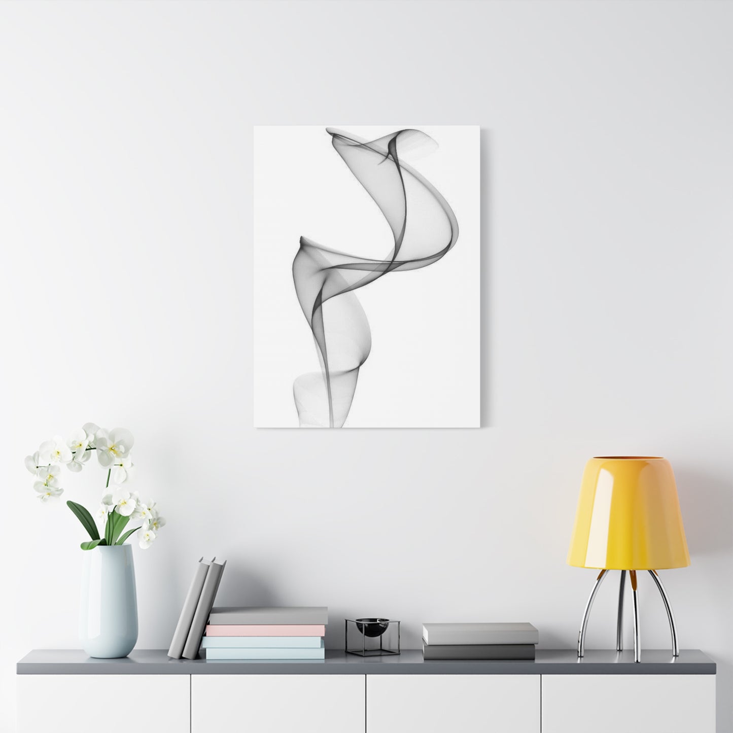
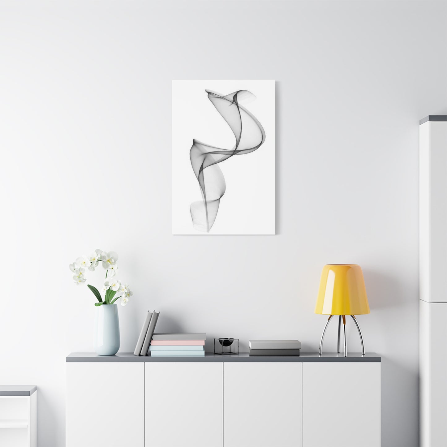
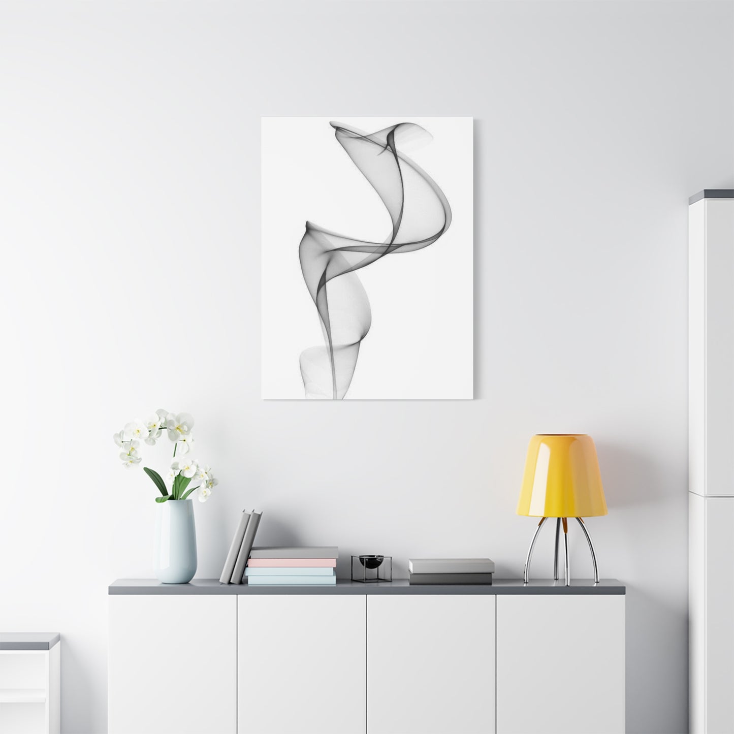
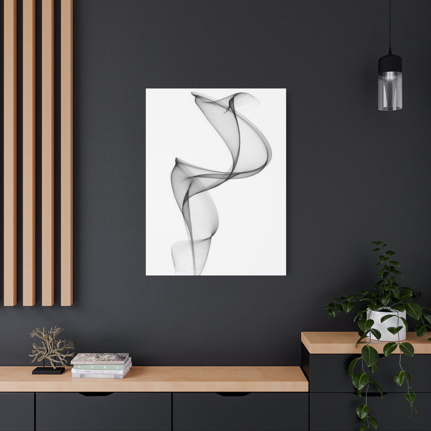
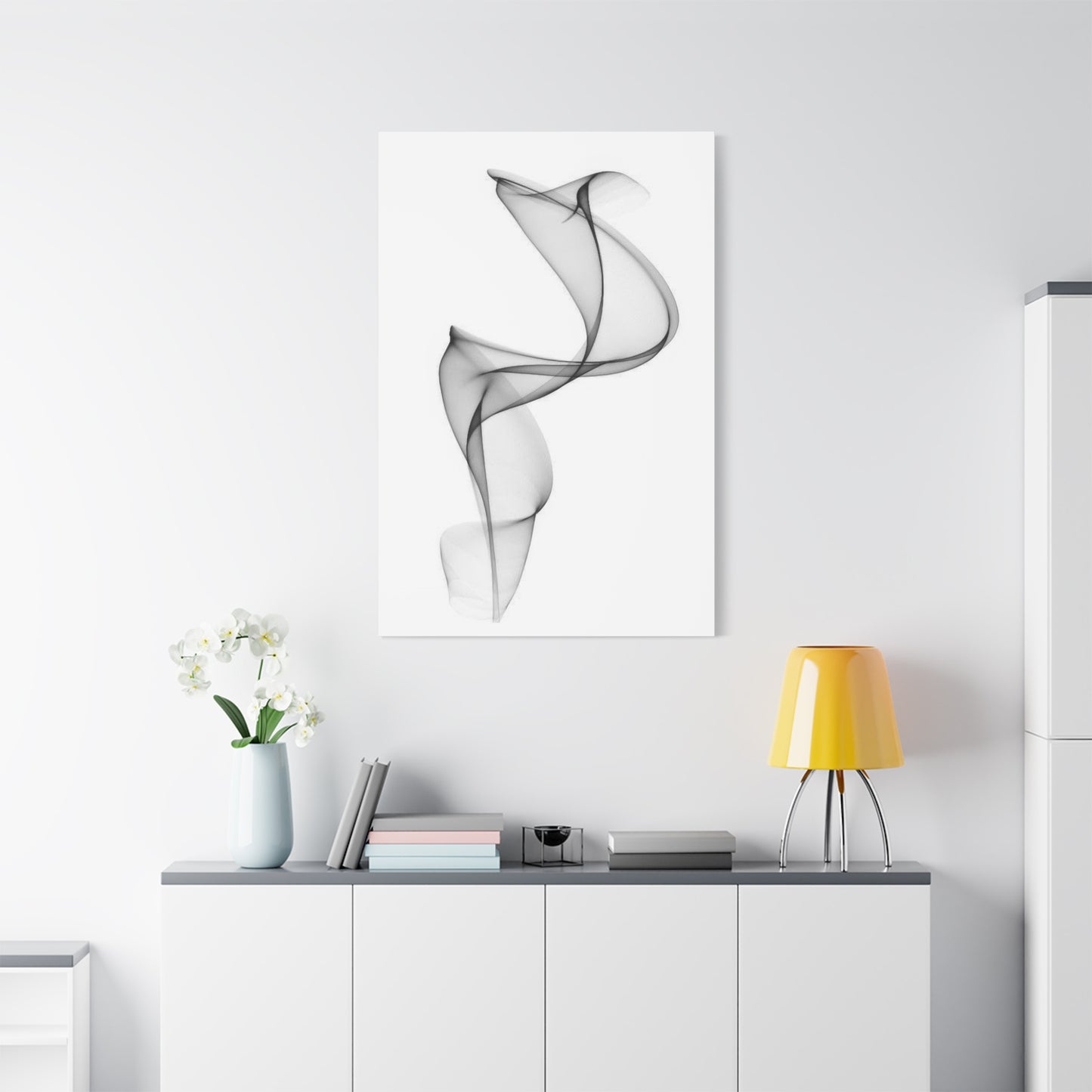
Living rooms serve as primary gathering spaces for families and guests, requiring artwork that promotes conversation and creates welcoming atmospheres without overwhelming social interaction. Neutral abstract pieces excel in this context by providing sophisticated focal points that complement rather than dominate. Placement above the sofa creates a natural visual anchor, while positioning at eye level for seated viewers ensures comfortable viewing. In living rooms with multiple seating areas, coordinating but not identical pieces in different zones creates visual continuity while respecting the distinct character of each area. The calming nature of grey tones promotes relaxation and comfortable conversation, while abstract forms provide interesting visual elements that stimulate discussion without dictating specific interpretations.
Bedrooms demand particularly careful consideration, as these intimate spaces profoundly influence sleep quality and emotional wellbeing. Neutral abstract artwork in bedrooms should promote tranquility and personal reflection rather than stimulation or agitation. Pieces positioned above the headboard create focal points visible upon entering the room while remaining outside the direct line of sight when lying in bed, preventing visual stimulation that might interfere with sleep. Soft, organic forms work better than harsh geometric compositions in most bedroom contexts, though personal preference should ultimately guide selection. The psychological calming effect of neutral tones supports healthy sleep patterns and creates sanctuaries from daily stress.
Home offices and study spaces benefit from artwork that promotes focus and creativity while reducing stress. Neutral abstract pieces positioned within the line of sight during computer work or desk tasks provide valuable opportunities for visual breaks that reduce eye strain and mental fatigue. However, placement directly behind monitors should be avoided, as this can create distracting visual competition. Instead, positioning artwork on perpendicular walls or slightly outside the primary work zone creates accessible visual refuges without encouraging distraction from tasks. The mental clarity associated with neutral color palettes supports productivity and sustained concentration.
Dining rooms present opportunities for more dramatic artistic statements, as these spaces are typically used intermittently rather than continuously. Substantial neutral abstract compositions centered on the primary wall create elegant focal points that elevate dining experiences without overwhelming table conversation. The sophisticated aesthetic of these pieces complements fine dining and entertaining, creating refined atmospheres that make meals feel special. In open-plan spaces where dining areas flow into kitchens or living rooms, artwork selection should coordinate with pieces in adjacent areas while maintaining distinct identity appropriate to dining contexts.
Framing Options That Complement Contemporary Aesthetics
Frame selection represents a critical decision that profoundly influences how artwork is perceived and how effectively it integrates into interior design schemes. Frames serve multiple functions simultaneously: they provide physical protection for artwork, establish visual boundaries that separate art from surroundings, and contribute their own aesthetic qualities that either enhance or detract from overall presentation. Understanding framing principles specific to neutral abstract compositions enables decorators to make choices that maximize artistic impact while ensuring long-term preservation.
Minimalist metal frames have emerged as contemporary favorites for neutral abstract artwork, offering clean lines and subtle presence that complement rather than compete with the art itself. Thin aluminum or steel frames in brushed silver, matte black, or bronze finishes provide just enough definition to separate artwork from walls while maintaining focus on the composition itself. These frames work particularly well with geometric abstractions and modern interiors, reinforcing contemporary aesthetics through material and form. The durability of metal frames makes them practical choices for high-traffic areas and commercial installations where longevity is essential.
Wood frames offer warmth and versatility that metal cannot match, bridging contemporary artwork with traditional or transitional interior styles. Natural wood finishes in light oak, ash, or maple complement the cool neutrality of grey-toned artwork without introducing jarring contrast. Darker woods such as walnut or espresso create more dramatic framing that works well with pieces featuring deeper charcoal or black elements. The width of wood frames significantly impacts their visual presence; narrow frames maintain focus on artwork while wider frames create more substantial presence and can help smaller pieces achieve appropriate visual weight on large walls. Sustainable wood sources and non-toxic finishes represent important considerations for environmentally conscious consumers.
Float mounting represents an increasingly popular framing technique that creates the illusion of artwork floating within the frame by positioning the piece slightly forward of the backing and leaving a gap between artwork edges and frame interior. This presentation method works beautifully with neutral abstract compositions, adding dimensional interest and contemporary sophistication. Float mounting particularly enhances canvas works by revealing wrapped edges and emphasizing the artwork's status as a three-dimensional object rather than merely an image. The visible gap typically measures between one-quarter and one-half inch, enough to create the floating effect without creating such distance that dust accumulation becomes problematic.
Shadow box framing introduces even more depth than simple float mounting by creating substantial space between artwork and frame front. This technique works particularly well for mixed-media pieces or works on paper that benefit from separation from protective glazing. Shadow box frames protect artwork from physical contact while creating exhibition-quality presentation that signals artistic significance. The depth of shadow boxes also allows for inclusion of multiple layers in a single frame, enabling creative presentations of series or related works.
Creating Cohesive Multi-Piece Arrangements
Displaying multiple artworks together creates opportunities for visual storytelling and dramatic impact impossible with single pieces. However, successful multi-piece installations require careful planning to achieve cohesion while avoiding chaos. Understanding fundamental principles of arrangement, spacing, and coordination enables decorators to create gallery-quality presentations that elevate entire rooms rather than merely filling wall space.
Diptychs and triptychs, works intentionally created as two or three coordinated panels, offer built-in cohesion that simplifies installation while providing substantial combined presence. These multi-panel works should be installed with consistent spacing between panels, typically two to four inches depending on overall scale. Precise alignment is critical; even slight vertical or horizontal misalignment creates jarring visual discord. Using laser levels or careful measurement ensures professional results. The beauty of intentionally created multi-panel works lies in how they create single unified compositions across multiple surfaces, encouraging eye movement across the entire installation and creating dynamic visual experiences.
Gallery walls composed of varied individual pieces require more complex planning but offer exceptional flexibility and personality. Successful gallery walls in neutral abstract styles maintain cohesion through careful color coordination while incorporating enough variation to create visual interest. Starting with the largest or most visually striking piece as an anchor helps organize surrounding works. One effective approach arranges pieces on the floor in various configurations before committing to wall installation, allowing experimentation with relationships and spacing. Photographing potential arrangements facilitates comparison and enables consultation with others before making final decisions.
Symmetrical arrangements create formal, orderly presentations that work well in traditional or transitional interior styles. Symmetry might involve identical pieces flanking a central element, mirror-image arrangements, or grid-based layouts. These arrangements communicate stability and deliberate intention, creating calm, balanced visual effects. However, perfect symmetry requires precise execution; even small deviations become obvious and appear as mistakes rather than stylistic choices. The formality of symmetrical arrangements may feel too rigid for very contemporary or eclectic interiors, where asymmetrical arrangements might be more appropriate.
Asymmetrical arrangements offer contemporary dynamism while requiring careful balancing to avoid appearing haphazard or accidental. Visual weight balancing becomes critical in asymmetrical arrangements, with size, color intensity, and compositional complexity all contributing to perceived weight. Darker or more visually complex pieces carry more weight than lighter or simpler works, requiring thoughtful positioning to achieve equilibrium. One effective approach creates asymmetrical balance by positioning a large piece on one side balanced by multiple smaller works on the opposite side, similar to a balanced scale with unequal weights at different distances from the fulcrum.
Maintenance and Preservation Best Practices
Proper care and maintenance ensure that neutral abstract artwork retains its beauty and value over decades. While these pieces often feature durable materials and robust construction, environmental factors, handling errors, and inadequate cleaning can cause deterioration that diminishes both aesthetic appeal and monetary value. Understanding fundamental preservation principles enables collectors to protect their investments while enjoying them daily.
Dust accumulation represents the most common and easily preventable form of artwork deterioration. Airborne particles settle on horizontal surfaces and gradually accumulate on artwork, creating dulling films that obscure colors and details. Regular gentle dusting prevents buildup that becomes increasingly difficult to remove over time. For canvas works without glass protection, soft natural-fiber brushes or microfiber cloths remove dust without scratching or abrading surfaces. Dusting should always be done with gentle vertical or horizontal strokes rather than circular motions, which can grind particles into surfaces. Feather dusters, while popular, can actually scratch delicate surfaces and should be avoided.
For framed works behind glass or acrylic, cleaning the protective glazing maintains clarity and visual quality. Glass cleaners can be used, but should be sprayed onto cleaning cloths rather than directly onto glass to prevent liquid from seeping behind glass and contacting artwork. Microfiber cloths clean effectively without streaking, while newspaper provides a traditional lint-free alternative. Acrylic glazing requires more care than glass, as it scratches more easily. Cleaners specifically formulated for acrylic should be used, and only soft, non-abrasive cloths should contact the surface. Any grit should be blown or gently brushed away before wiping to prevent scratching.
Humidity control represents a critical but often overlooked aspect of artwork preservation. Both excessive humidity and extreme dryness can damage artwork, with ideal conditions typically ranging from forty to fifty-five percent relative humidity. High humidity can cause canvas to slacken and warp, paper to buckle, and adhesives to fail. It also promotes mold growth, which can irreversibly damage artwork. Low humidity causes materials to dry and become brittle, leading to cracking in paint layers and embrittlement of paper and canvas. Maintaining consistent humidity through HVAC systems, humidifiers, or dehumidifiers protects artwork while also benefiting wooden furniture, musical instruments, and human comfort.
Temperature stability matters nearly as much as humidity control. Extreme temperatures can damage artwork, but temperature fluctuations pose even greater threats. Expansion and contraction cycles caused by heating and cooling stress materials and can cause cracking, delamination, and structural failure. Artwork should never be positioned near heating vents, air conditioning returns, fireplaces, or radiators where temperature swings are most dramatic. Unheated or un-air-conditioned spaces like garages, attics, and some basements present unsuitable environments for artwork storage or display.
Protection from physical damage requires awareness of traffic patterns and household activities. Artwork hung in high-traffic areas where it might be bumped or struck should be secured carefully to prevent falls. In homes with children or pets, fragile works might be better suited to rooms with limited access rather than family rooms or play areas. Furniture arrangement should prevent chair backs or other elements from contacting wall-mounted artwork. When cleaning nearby surfaces or rearranging spaces, temporarily covering nearby artwork with clean sheets prevents accidental contact with cleaning solutions or moving furniture.
Investment Potential and Value Considerations
Neutral abstract artwork represents not merely decorative purchases but potential financial investments that may appreciate over time. Understanding factors that influence artwork value enables collectors to make informed acquisition decisions that balance aesthetic preferences with financial prudence. While enjoyment should remain the primary motivation for artwork purchases, awareness of investment considerations adds another dimension to collecting.
Artist reputation represents the single most significant factor influencing artwork value. Works by established artists with exhibition histories in respected galleries and museums, critical recognition, and presence in significant collections command premium prices and tend to hold or increase in value. Emerging artists with promising trajectories represent opportunities to acquire works before reputation and prices rise significantly. Researching artists' educational backgrounds, exhibition records, critical reviews, and market performance provides insight into their positions within the art world and potential for value appreciation.
Provenance, the documented history of artwork ownership and exhibition, significantly impacts value and authenticity verification. Works with prestigious exhibition histories or previous ownership by notable collectors carry enhanced value. For investment purposes, maintaining documentation of purchase including receipts, certificates of authenticity, condition reports, and exhibition records preserves and potentially enhances value. This documentation proves authenticity and legal ownership while providing future buyers with confidence in the work's legitimacy.
Rarity and uniqueness directly influence value in predictable economic fashion. Original one-of-a-kind paintings command higher prices than limited edition prints, which in turn are more valuable than unlimited reproduction prints. Within limited editions, lower-number impressions often carry slightly higher values, while artist's proofs command premiums due to their special status. The size of editions matters significantly; editions of twenty-five or fewer maintain scarcity that supports values, while larger editions may have difficulty maintaining market support.
Condition profoundly impacts value in ways that compound over time. Works maintained in excellent condition retain value far better than identical pieces showing deterioration or damage. Even professional restoration typically diminishes value compared to unrestored works in similar condition, as restoration always involves some alteration of original materials. This reality reinforces the importance of proper care and preservation from the moment of acquisition. Insurance coverage appropriate to artwork value protects financial investment against catastrophic loss from fire, theft, or disaster.
Market trends influence artwork values in both short and long terms. Broad art market conditions follow economic cycles, with values typically rising during prosperous periods and stagnating or declining during recessions. However, exceptional works by important artists tend to maintain value better than lesser works during downturns. The specific market for neutral abstract work has shown steady growth over recent decades as this aesthetic has become increasingly popular in both residential and commercial interior design. This sustained demand provides foundation for stable values, though specific artists and works still show significant individual variation.
Authentication and documentation become increasingly important as artworks age and change hands. Maintaining clear chains of ownership, certificates of authenticity from artists or galleries, and any correspondence or documentation from artists adds to both monetary and historical value. For works by deceased artists or very established artists, authentication from officially recognized experts or committees may be necessary for sales, particularly at higher price points. Maintaining all original documentation from purchase simplifies this process immensely.
Commissioning Custom Pieces for Personal Spaces
Commissioning original artwork created specifically for a particular space and owner's preferences represents an alternative to acquiring existing works. Custom commissions offer unique advantages including perfect size matching, color coordination, and personal meaning impossible with ready-made pieces. Understanding the commission process enables collectors to navigate relationships with artists effectively, resulting in satisfying outcomes for both parties.
Selecting the right artist represents the critical first step in successful commissioning. Portfolio review reveals artistic styles, technical capabilities, and whether particular artists' aesthetics align with desired outcomes. Social media platforms and artist websites provide access to extensive portfolios that facilitate comparison among multiple artists. Beyond stylistic compatibility, professionalism, communication skills, and reliability matter enormously. Artists who respond promptly to inquiries, maintain clear communication, and honor commitments prove far more satisfying to work with than those who lack these professional qualities regardless of artistic talent.
Budget discussion should occur early in commission conversations, before significant time investment by either party. Custom artwork pricing reflects multiple factors including size, complexity, materials, artist experience, and time requirements. Established artists with strong demand command higher prices than emerging artists, though emerging artists sometimes offer comparable quality at more accessible prices. Being forthright about budget constraints helps artists propose appropriately scaled projects and prevents disappointment when proposals exceed affordable ranges. Many artists offer payment plans for substantial commissions, dividing total costs across deposit, midpoint, and completion payments.
Commission agreements should be documented in written contracts protecting both artists and collectors. Effective contracts specify dimensions, general subject matter or aesthetic approach, color palette, materials, timeline, payment schedule, revision policies, and delivery terms. While some flexibility should be maintained to allow artistic creativity, basic parameters should be clear before work begins. Discussion of reproduction rights clarifies whether artists may photograph work for portfolios and social media, and whether collectors may reproduce images for personal purposes. Most commission agreements grant artists rights to document work for professional purposes while restricting commercial reproduction by collectors.
The creative process requires trust and appropriate balance between direction and artistic freedom. Overly specific instructions constrain artists and prevent them from exercising the creative judgment that initially attracted commissioners. Conversely, insufficient guidance may result in work that doesn't meet expectations. Most successful commissions provide clear parameters regarding size, general aesthetic direction, color preferences, and intended location while leaving specific compositional decisions to artists' expertise. Some artists provide preliminary sketches or digital mockups for approval before proceeding, while others prefer working more intuitively. Clarifying preferred processes prevents misunderstandings.
Digital Versus Traditional Medium Comparisons
The emergence of digital art technologies has introduced new possibilities for creating neutral abstract compositions while raising questions about the relative merits of digital versus traditional approaches. Both methodologies offer distinct advantages and limitations that influence aesthetic outcomes, practical considerations, and collector perceptions. Understanding these differences enables informed decisions about which approaches best suit specific needs and preferences.
Traditional media including oil paint, acrylic, watercolor, and mixed media offer tactile, handcrafted qualities that many collectors prize. The physical substance of paint layered onto canvas or paper creates dimensional texture and surface variation that engages viewers through both visual and tactile senses. Light interacts with traditional paint surfaces in complex ways, creating subtle color shifts and highlights impossible to replicate digitally. Brushstrokes and application marks become part of the artwork's character, bearing witness to the artist's hand and creative process. This direct connection between artist and material resonates with viewers who value craftsmanship and the evidence of human touch in an increasingly digital world.
The uniqueness of traditional artworks represents another significant advantage. Each brush stroke, each color mixture, each moment of application creates singular results that can never be exactly duplicated. Even when artists create multiple similar works, subtle variations ensure each remains unique. For collectors valuing exclusivity and investment potential, this guaranteed uniqueness provides appeal that reproductions cannot match. The presence of original artwork in living spaces carries psychological weight different from reproduced images, contributing to environments that feel personally curated rather than generically decorated.
Traditional media also age and develop patina over time, adding historical dimension that connects present viewers to the moment of creation. Subtle changes in paint texture, minor yellowing of varnishes, and the settled appearance of aged artwork contribute to character and authenticity. While conservation aims to minimize deterioration, the inevitable passage of time adds layers of meaning and story that new work lacks. Antique artwork carries its history visibly, connecting viewers across decades or centuries.
Digital creation offers contrasting advantages centered on precision, flexibility, and reproducibility. Digital tools enable artists to work with mathematical precision impossible by hand, creating perfectly regular geometric forms, flawlessly smooth gradients, and complex patterns that would require countless hours to execute traditionally. The ability to undo actions, save multiple versions, and experiment without wasting materials encourages creative exploration and iteration. Artists can try numerous color combinations, compositional arrangements, and stylistic approaches quickly, refining concepts before committing to final versions.
The reproducibility of digital artwork fundamentally changes its economic model. Single digital files can generate unlimited identical prints, making artwork accessible at various price points. Limited edition fine art prints maintain scarcity and value while remaining more affordable than unique originals. Open edition prints provide maximally accessible pricing, democratizing art ownership. For decorators working with limited budgets or furnishing multiple properties, high-quality digital prints offer compelling value. Modern printing technologies achieve remarkable color accuracy and detail that approaches or matches traditional media in visual quality, particularly when viewed from typical display distances.
Color Palette Coordination Throughout Living Spaces
Successfully integrating neutral abstract artwork into comprehensive interior design requires understanding how color palettes function across interconnected spaces. While individual rooms may feature distinct color schemes, visual coherence across an entire home or building creates harmonious environments where movement between spaces feels natural rather than jarring. Neutral toned compositions play vital roles in achieving this cohesion while allowing for variation and personality.
Foundational neutral palettes establish baseline continuity across all spaces. These typically include wall colors, flooring, and major architectural elements that remain consistent or closely coordinated throughout properties. Within this consistent foundation, variation in accent colors, textures, and furnishings creates distinct character for individual rooms. Neutral abstract artwork bridges foundation and variation, echoing baseline neutrals while incorporating touches of room-specific accent colors. This dual function makes these pieces invaluable for creating both unity and variety.
Analogous color schemes using colors adjacent on the color wheel create harmonious, calming effects ideal for spaces flowing directly into each other. In homes with open floor plans where living, dining, and kitchen areas occupy single large volumes, analogous palettes prevent visual fragmentation. Neutral grey artwork incorporating warm undertones coordinates beautifully with beige, taupe, and cream palettes, while cool-toned greys complement blue-grey, sage, and cooler neutral schemes. The abstract nature of these pieces allows undertones and secondary colors to vary between areas while maintaining cohesive neutral dominance.
Monochromatic schemes using single colors in varying shades, tints, and tones create sophisticated, unified aesthetics. Grey monochromatic interiors ranging from pale silver through charcoal achieve dramatic elegance through variation in value rather than hue. Neutral abstract artwork in monochromatic spaces should span the value range present in the environment, incorporating both light and dark tones that echo surfaces and furnishings. Texture becomes especially important in monochromatic schemes, as it provides visual interest where color variation cannot. Heavily textured artwork adds critical tactile dimension that prevents monochromatic spaces from appearing flat or boring.
Complementary accent colors introduce controlled contrast and visual energy into neutral-dominated spaces. While walls, major furnishings, and artwork remain neutral, accent pillows, accessories, and small decorative elements in complementary colors like soft blues, muted greens, or warm terracottas add life and personality. Neutral abstract artwork can incorporate subtle hints of these accent colors, connecting artwork to overall design schemes without allowing accent colors to dominate compositions. This approach maintains the calming effect of neutral palettes while preventing sterility or coldness.
Transitional spaces including hallways, staircases, and entryways require special consideration as they connect discrete areas that may have different color personalities. Neutral abstract artwork in transitional spaces should reference colors present in adjacent rooms without committing fully to any single scheme. This bridges function maintains visual flow as inhabitants and guests move through properties. Gallery walls in hallways might include varied neutral pieces that each echo different connected rooms, creating visual journey that prepares viewers for changing aesthetics ahead.
Architectural Style Compatibility Across Design Eras
Neutral abstract compositions demonstrate remarkable versatility across architectural styles ranging from historical revivals to cutting-edge contemporary designs. This adaptability stems from their fundamental aesthetic restraint and their abstract nature, which avoids specific historical or cultural references that might clash with architectural contexts. Understanding how these pieces function within different architectural vocabularies enables designers to deploy them effectively regardless of stylistic framework.
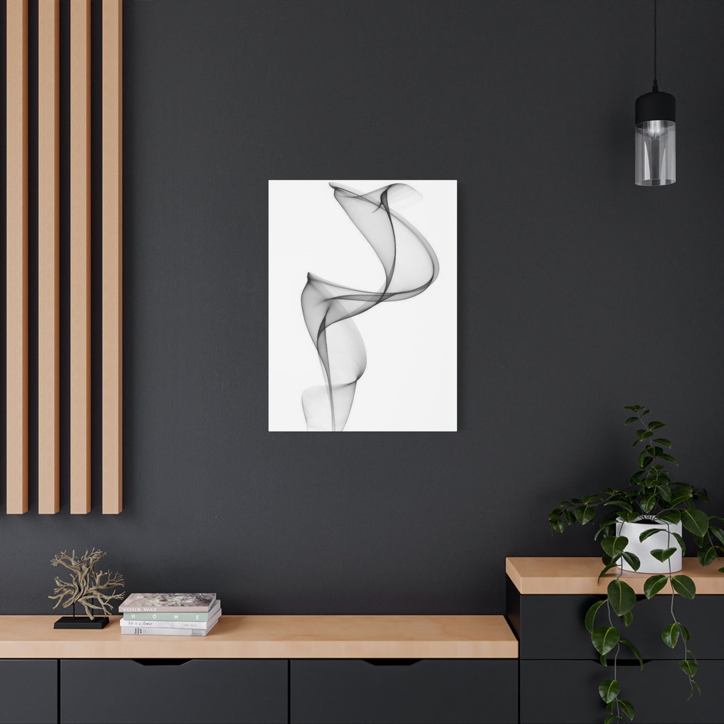
Contemporary and modern architecture with clean lines, minimal ornamentation, and emphasis on materials and form creates ideal contexts for neutral abstract artwork. The philosophical alignment between modernist architectural principles and abstract art aesthetics creates natural harmony. Both reject unnecessary decoration in favor of essential forms, both value restraint and precision, and both emphasize visual purity. Floor-to-ceiling windows characteristic of modern architecture flood interiors with natural light that beautifully illuminates neutral artwork without overwhelming it. Open floor plans common in contemporary homes accommodate large-scale pieces that would overwhelm traditionally compartmentalized spaces.
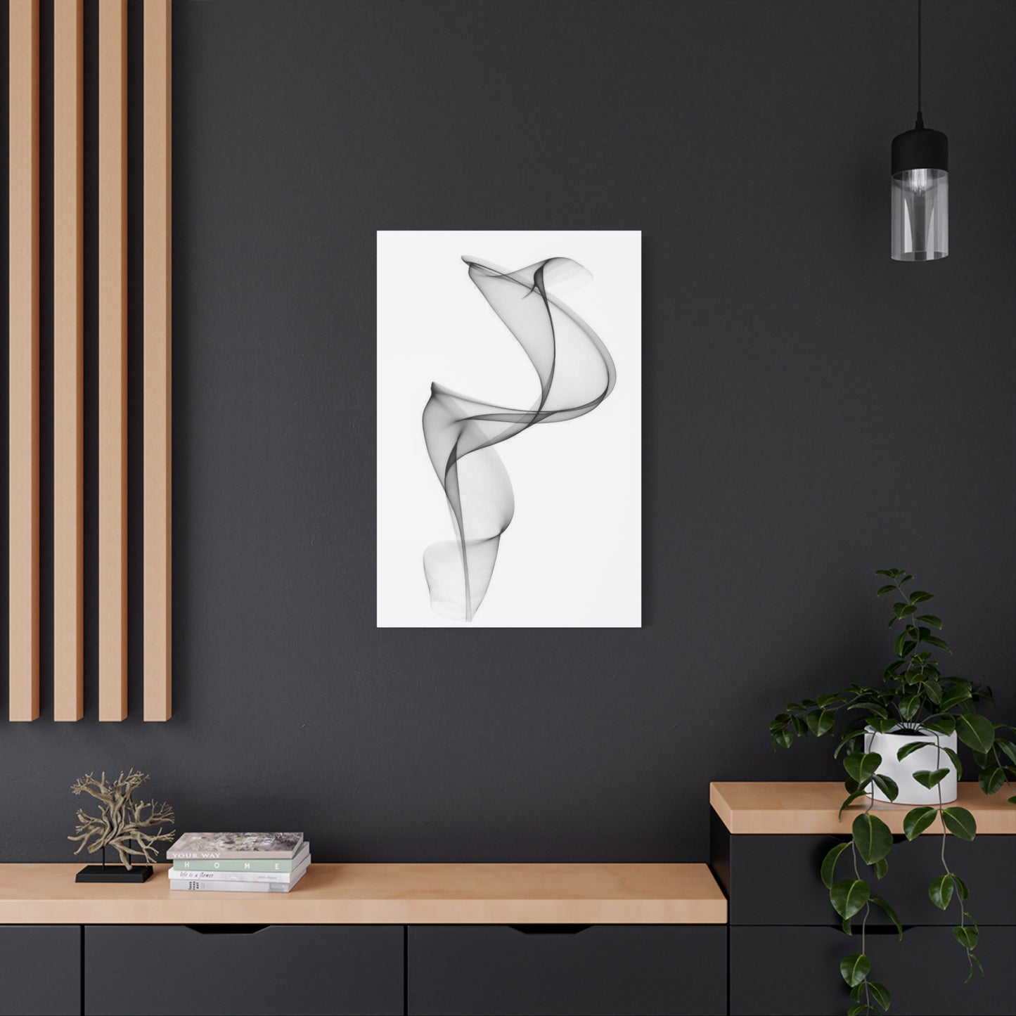
Industrial and urban loft spaces with exposed structural elements, concrete floors, and raw material aesthetics provide striking backdrops for neutral abstract compositions. The rough textures and utilitarian character of industrial spaces contrast beautifully with refined artwork, creating dynamic tension between raw and refined elements. The large wall expanses typical of converted industrial buildings accommodate substantial artworks that might overwhelm residential-scale rooms. The cool tones of concrete, steel, and glass harmonize naturally with grey-based color palettes, creating cohesive environments where architecture and art feel mutually supportive rather than competitive.
Minimalist interiors defined by extreme restraint, absence of clutter, and rigorous editing benefit enormously from carefully selected neutral abstract pieces. In spaces where every element must justify its presence through both function and aesthetics, artwork serves critical roles as focal points and sources of visual interest that prevent minimalist spaces from appearing stark or unwelcoming. The contemplative quality of abstract compositions aligns perfectly with minimalist philosophy emphasizing mindfulness and intentionality. Single carefully chosen pieces often prove more effective in minimalist contexts than multiple works that would compromise desired simplicity.
Scandinavian design with its emphasis on functionality, natural materials, and connection to nature creates welcoming contexts for neutral abstract artwork. The light wood tones, white walls, and abundant natural light characteristic of Nordic interiors provide bright, airy settings where neutral artwork appears crisp and clear. The Scandinavian principle of hygge, creating cozy contentment through thoughtful environment design, embraces artwork that promotes tranquility and reflection. Organic abstract forms coordinate particularly well with natural materials and biophilic elements common in Scandinavian spaces.
Traditional interiors featuring classical architectural details, symmetrical arrangements, and historically referenced furnishings can successfully incorporate neutral abstract artwork despite apparent stylistic contradiction. The key lies in framing and presentation choices that bridge contemporary art and traditional settings. Substantial wood frames in classical profiles create visual connection between modern artwork and traditional architecture. Symmetrical hanging arrangements respect traditional spatial organization principles while displaying contemporary pieces. Neutral palettes prevent color clashes between artwork and traditional interiors often featuring rich wood tones and traditional color schemes.
Transitional design that blends traditional and contemporary elements creates particularly receptive environments for neutral abstract artwork. By definition seeking balance between historical reference and contemporary sensibility, transitional interiors need artwork that can bridge both influences. Neutral abstract pieces achieve this perfectly, appearing neither exclusively contemporary nor traditional but rather timelessly sophisticated. Their restraint prevents them from pulling transitional spaces too far toward either extreme while providing contemporary edge that keeps spaces feeling current rather than dated.
Conclusion:
In the world of interior design, abstract grey wall art has emerged as a powerful tool for creating modern elegance in any space. Its understated sophistication, versatility, and ability to complement various design styles make it a perfect choice for those looking to enhance their homes with a touch of artistic refinement. As we’ve seen, the subtlety of grey combined with abstract forms creates a perfect balance between simplicity and complexity, allowing it to effortlessly elevate any room, whether it’s a living room, bedroom, or office.
One of the standout qualities of abstract grey wall art is its versatility. Grey, often seen as a neutral or even understated color, carries a quiet elegance that can blend seamlessly with any color scheme. Whether you’re working with a minimalist aesthetic that relies on clean lines and muted tones or a more eclectic design featuring bold colors and diverse patterns, grey art provides a grounding effect that ties everything together. Abstract designs—whether fluid, geometric, or textured—allow for an expression of creativity and depth, without overwhelming the space. They invite intrigue and contemplation while maintaining an air of sophistication and calm.
Abstract grey wall art also has the unique ability to create a sense of balance and harmony in a room. The monochromatic nature of grey allows the art to serve as a focal point without competing with other design elements. This makes it ideal for spaces where tranquility and relaxation are paramount, such as bedrooms or living areas meant for unwinding after a long day. When placed strategically, abstract grey pieces can create visual interest without disrupting the flow of a room, making them perfect for creating a serene yet captivating atmosphere.
Furthermore, grey is a timeless color—one that doesn't easily fall out of fashion. Unlike trends that can be fleeting, grey has remained a staple in interior design due to its neutral quality and adaptability. Whether you choose a light silvery grey for an airy, open feel or a deep charcoal for a more dramatic, sophisticated ambiance, abstract grey wall art will retain its appeal for years to come. The enduring nature of grey art ensures that your space will continue to look fresh and relevant, even as trends evolve.
The elegance of abstract grey wall art also comes from its ability to convey emotion and meaning through simplicity. Abstract art, by its very nature, leaves room for interpretation. The use of grey tones adds an additional layer of nuance, allowing the piece to evoke a variety of feelings—from calm and serenity to contemplation and introspection. As viewers engage with the art, they are invited to find their own personal connection to the work, creating a deeper emotional bond with their space. This connection is what makes abstract grey wall art not just a decorative element but a meaningful addition to any home.
For those who are looking to create a more personalized and unique space, abstract grey wall art offers endless opportunities for customization. Whether you're drawn to sweeping, fluid brushstrokes, sharp geometric patterns, or textured layers, abstract art can be tailored to suit your individual style and preferences. You can even commission a piece from an artist who specializes in modern abstraction, ensuring that your artwork is truly one-of-a-kind. This sense of personalization makes abstract grey art an investment in both the aesthetics and emotional resonance of your home.
