


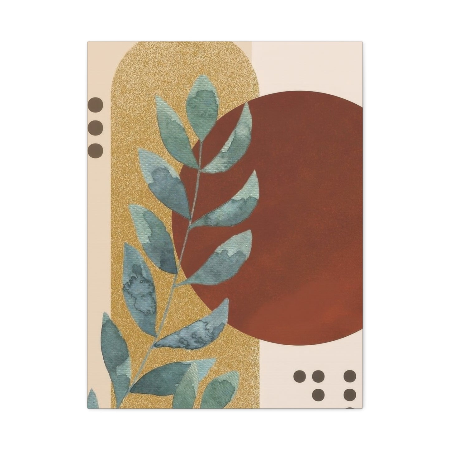
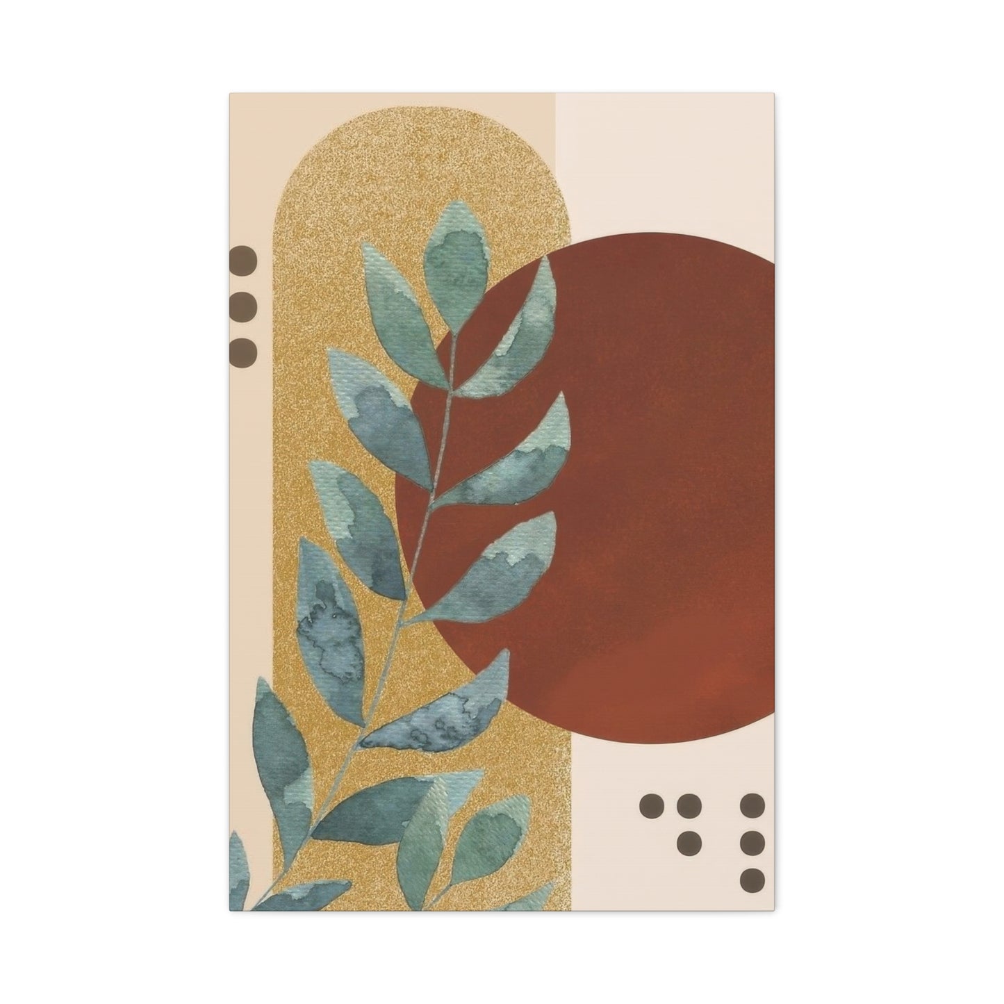
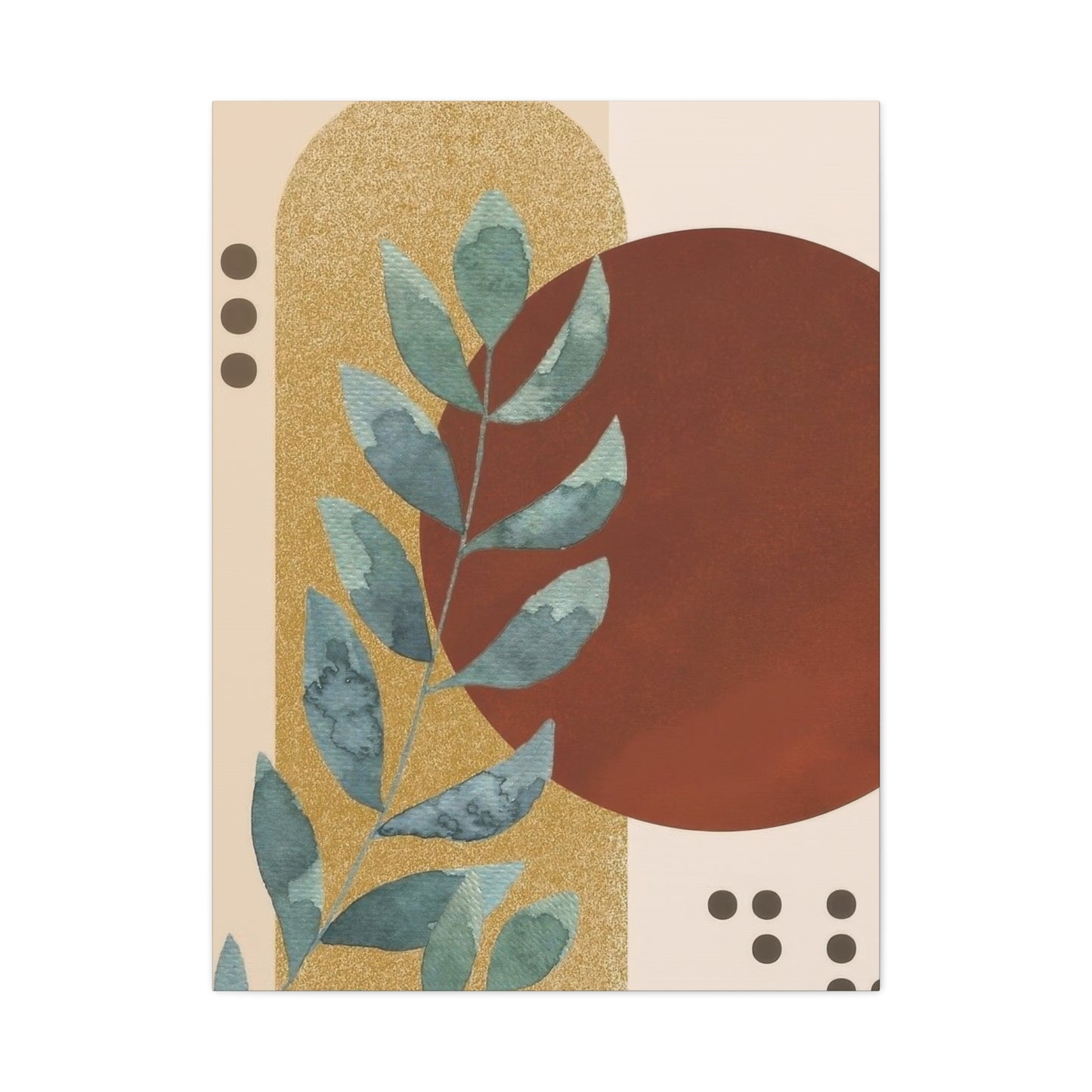
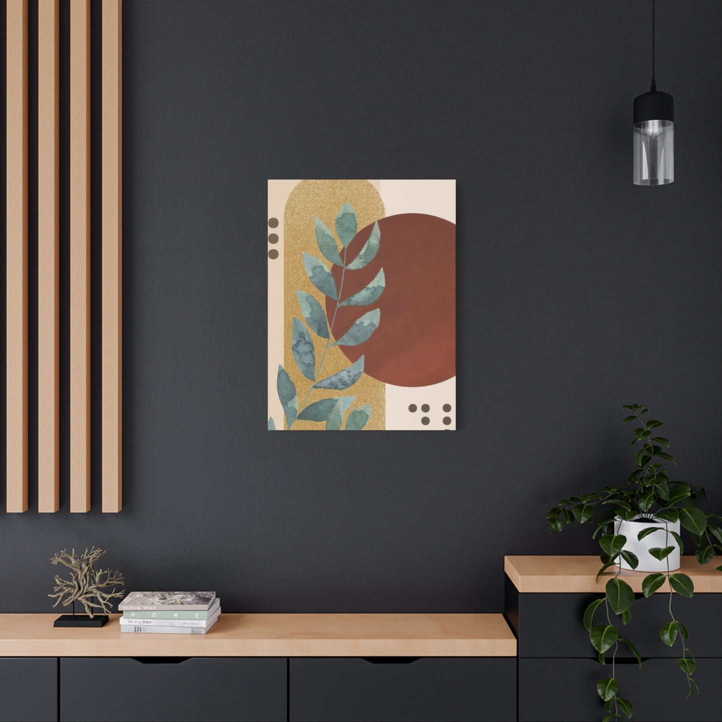
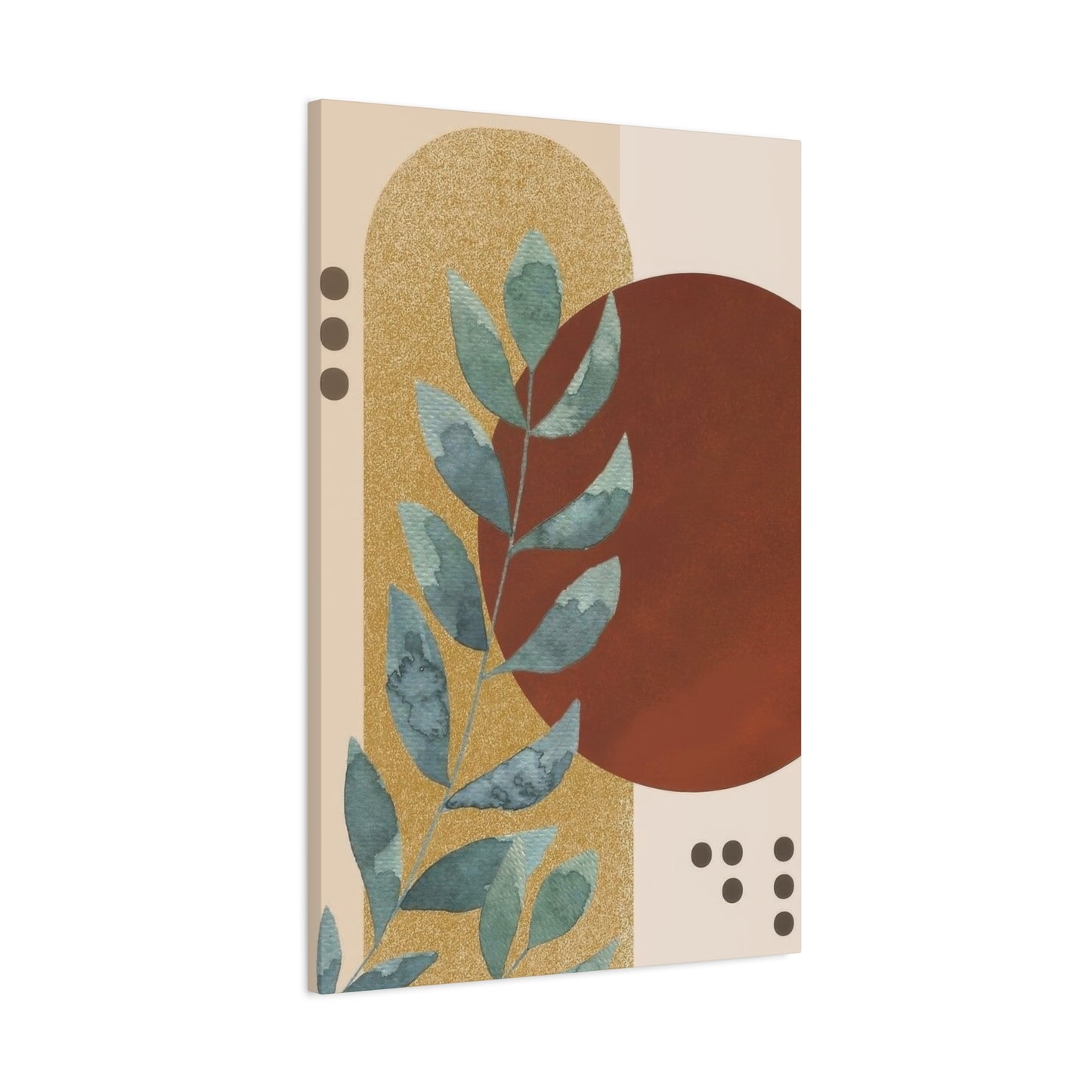
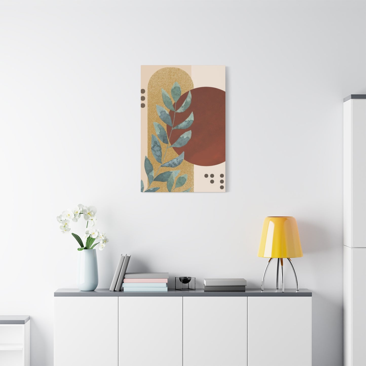
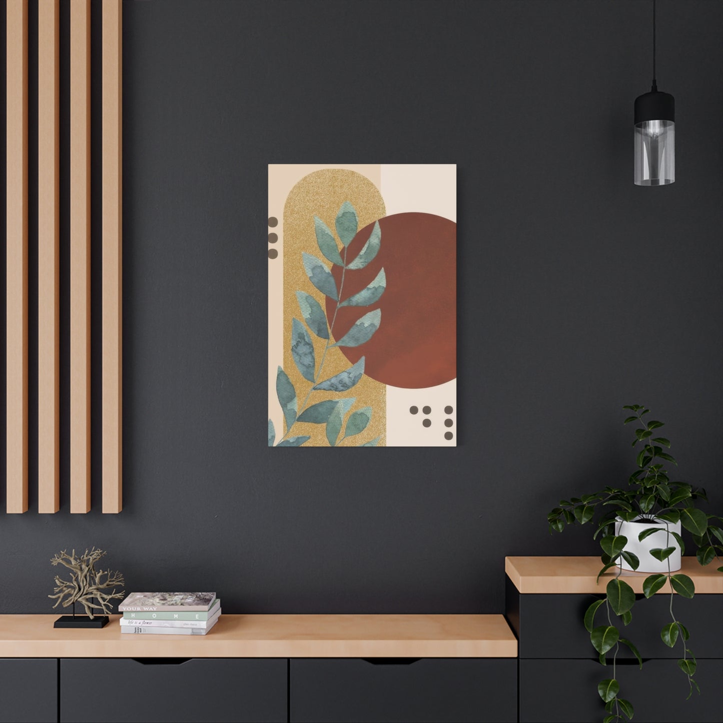
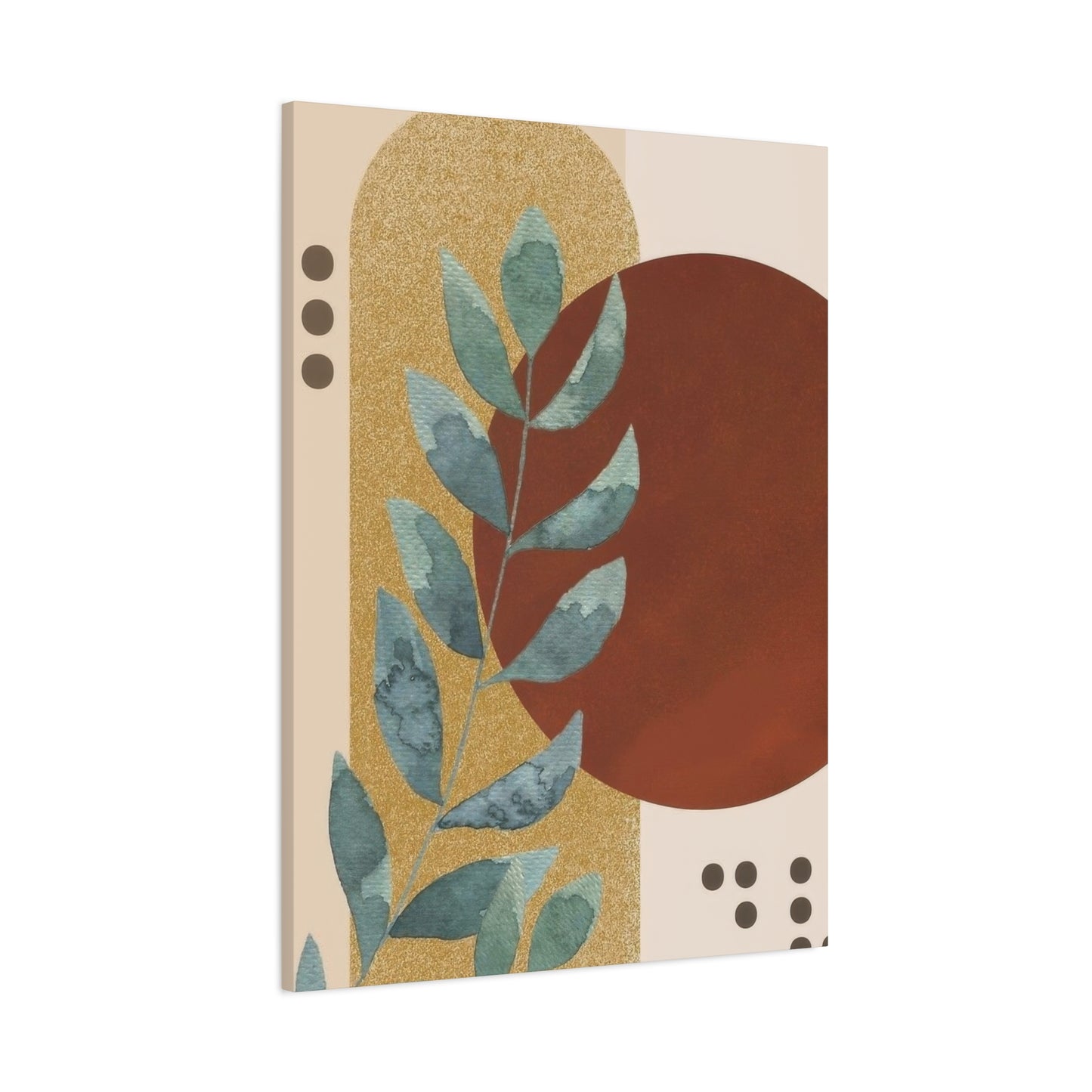
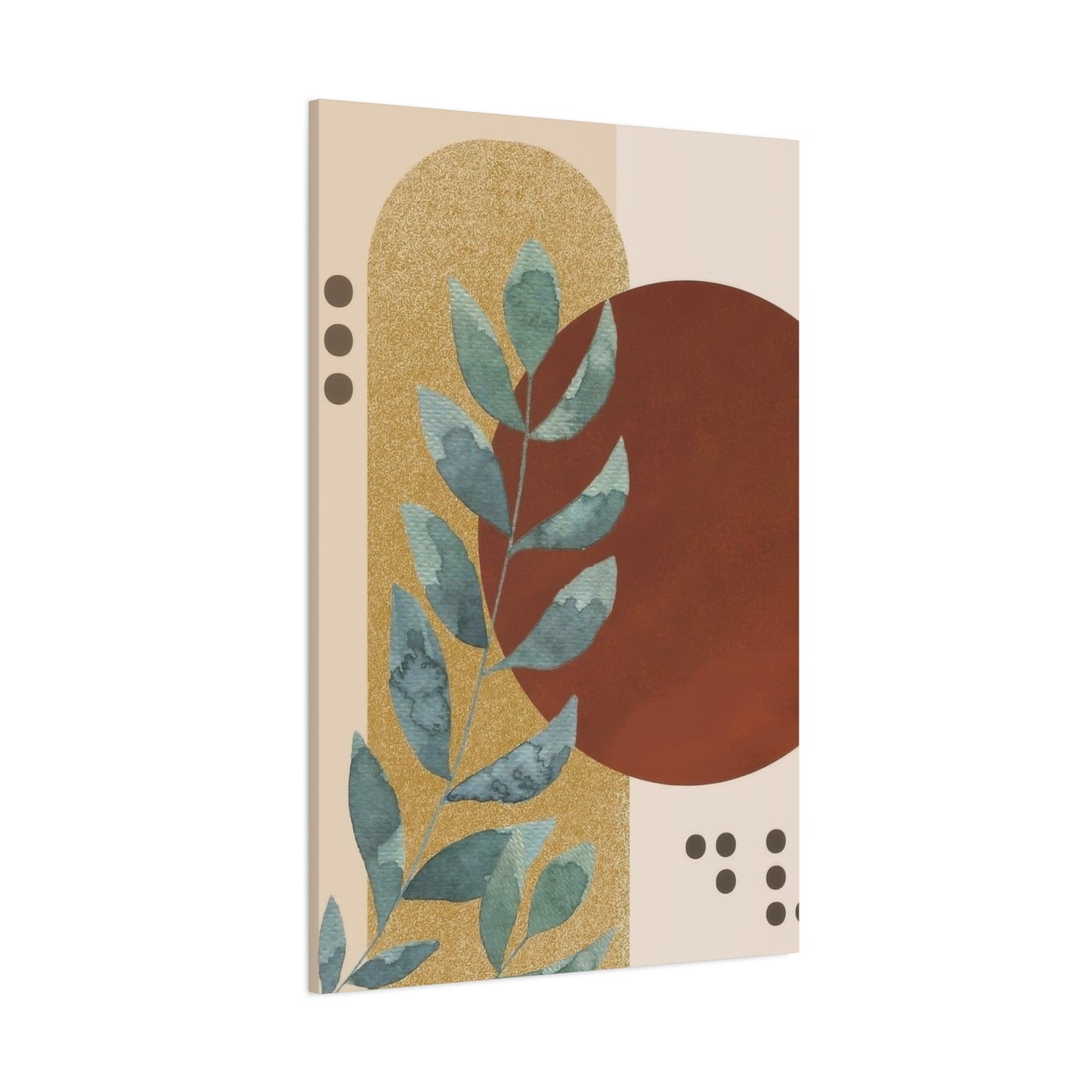
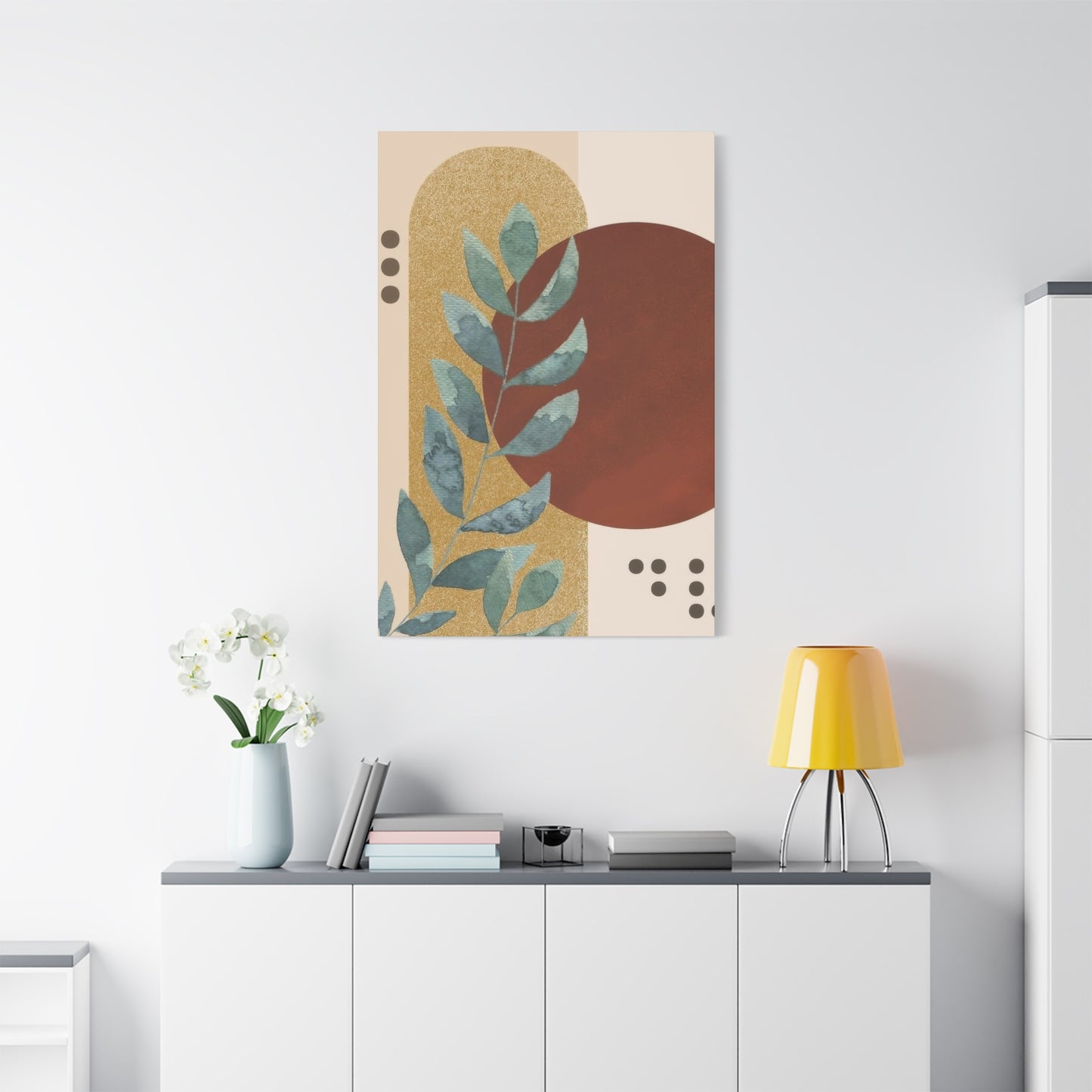
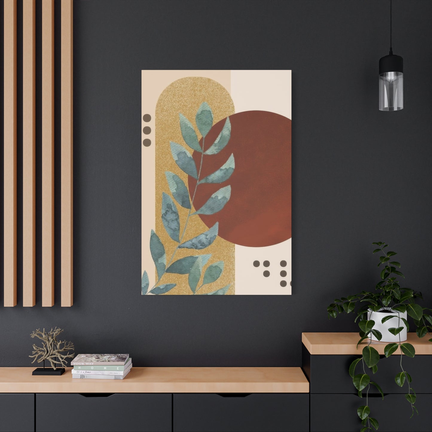
Abstract Plant Earth Tones Wall Art & Canvas Prints
Abstract Plant Earth Tones Wall Art & Canvas Prints
Couldn't load pickup availability


Abstract Plant Earth Tones Wall Art: A Complete Guide to Natural Elegance in Interior Design
The world of interior design has witnessed a remarkable transformation in recent years, with homeowners and designers increasingly gravitating toward pieces that blend natural elements with artistic expression. Abstract plant earth tones wall art represents a perfect fusion of organic beauty and contemporary aesthetics, creating spaces that feel both grounded and sophisticated. This comprehensive guide explores every aspect of incorporating these stunning pieces into your living spaces, from understanding their origins to mastering the art of placement and styling.
Color Coordination and Palette Development
Successfully integrating abstract plant earth tones wall art into existing decor requires thoughtful consideration of color relationships. The earth tone palette offers remarkable versatility, but achieving harmonious results still demands attention to undertones and color temperature. Earth tones generally fall into warm or cool categories based on their underlying hues. Warm earth tones contain red, orange, or yellow undertones, while cool earth tones lean toward blue or green. Identifying whether your space predominantly features warm or cool tones helps in selecting artwork that enhances rather than clashes with existing elements.
Monochromatic schemes built around earth tones create sophisticated, cohesive environments. By selecting abstract plant wall art that shares the dominant earth tone in your space while incorporating lighter and darker variations, you establish visual continuity. For example, a room featuring tan walls and brown furniture might incorporate abstract plant artwork with beiges, deep chocolates, and warm grays. The variation in value provides visual interest while the shared color family maintains harmony.
Analogous color schemes use colors adjacent to each other on the color wheel, creating gentle, pleasing combinations. Within earth tones, this might mean combining green-browns, yellow-browns, and orange-browns. Abstract plant compositions naturally lend themselves to analogous schemes, as these color relationships appear frequently in nature. Leaves transition from green to yellow to brown as seasons change, and soil contains multiple brown variations. Artwork reflecting these natural progressions feels inherently balanced.
Complementary accents can energize earth tone schemes without overwhelming them. While maintaining earth tones as the dominant palette, small touches of complementary colors add visual excitement. For abstract plant artwork primarily rendered in earth tones, subtle inclusions of muted blues or soft purples can create dynamic interest. These touches might appear as shadows, background elements, or hints of flowers within the botanical abstraction.
Neutral earth tones serve as excellent foundations for more colorful rooms. If your space features vibrant furnishings or bold accent walls, abstract plant earth tones wall art can provide visual rest and prevent overwhelming sensory input. The natural, grounded quality of earth tones balances brighter colors, creating spaces that feel collected rather than chaotic. This approach works particularly well in eclectic interiors where diverse elements need unifying influences.
Testing color relationships before committing to artwork purchases prevents costly mistakes. Many retailers and artists offer return policies or viewing periods, but you can also use digital tools to preview how pieces might look in your space. Photograph your room and use design apps to digitally place artwork options on the walls. This technique helps visualize color interactions and scale relationships before making final decisions. Pay attention to how natural and artificial lighting affects both your room colors and the artwork throughout different times of day.
Framing and Presentation Options for Maximum Impact
The manner in which abstract plant earth tones wall art is framed and presented dramatically affects its visual impact and integration with surrounding decor. Frame selection involves considering style, color, material, and profile dimensions. Traditional wood frames complement earth tone artwork naturally, as wood itself represents an organic material with inherent earth tones. Options range from raw, natural wood finishes that maintain visible grain to stained woods in various depths and colors. Lighter woods like maple or ash create airy, Scandinavian-inspired presentations, while darker woods such as walnut or mahogany add richness and formality.
Metal frames offer contemporary alternatives that work especially well with abstract compositions. Black metal frames provide clean, modern presentations that allow artwork to take center stage. Their neutral quality prevents competition with the earth tones within the piece. Gold or brass metal frames introduce warmth that harmonizes beautifully with earth tone palettes, adding subtle elegance without overwhelming the natural aesthetic. Brushed silver or aluminum frames suit cooler earth tone compositions, particularly those featuring prominent grays or cool greens.
Frame profile, referring to the width and depth of the framing material, influences how artwork relates to the wall. Narrow profiles create minimal separation between artwork and wall, allowing pieces to feel integrated with the architecture. Wider profiles establish greater presence and formality, making artwork feel more substantial and important. For abstract plant earth tones wall art, medium-width profiles often strike the ideal balance, providing definition without heaviness.
Matting adds another dimension to framing choices. Mat boards create visual breathing room between artwork and frame, particularly important for smaller pieces or works with busy compositions. Earth tone artwork pairs beautifully with natural fiber mats in linen, cotton, or recycled materials. These textured mats enhance the organic quality of the artwork. Traditional white or cream mats offer clean, gallery-style presentations, while colored mats in complementary earth tones can extend the artwork's palette and create additional visual cohesion with room colors.
Floating frames represent specialized options where artwork appears to float within the frame, separated from the frame edge by a small gap. This presentation style works particularly well with abstract plant compositions on canvas or board, creating a modern, dimensional effect. The shadow gap adds subtle depth that enhances the three-dimensional quality of textured pieces.
Canvas wraps eliminate framing entirely, allowing printed or painted artwork to wrap around thick stretcher bars with the image continuing on the sides. This frameless presentation creates clean, contemporary looks suited to casual spaces. For abstract plant earth tones wall art, canvas wraps emphasize the artwork itself without competing elements. However, they work best in rooms where the informal aesthetic aligns with overall design goals.
Glass and acrylic glazing protect artwork while affecting its appearance. Regular glass provides basic protection but can create glare under certain lighting conditions. Non-reflective or museum glass eliminates glare, ensuring artwork remains visible from all angles regardless of lighting. Acrylic glazing offers lighter weight and shatter resistance, important considerations for large pieces or homes with children. However, acrylic scratches more easily than glass and may develop static that attracts dust. For earth tone artwork, the reduced glare of museum-quality glazing often justifies the additional expense, ensuring the subtle color variations remain visible.
Strategic Placement Throughout Different Rooms
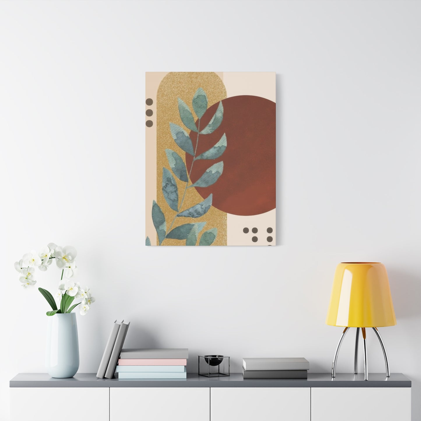
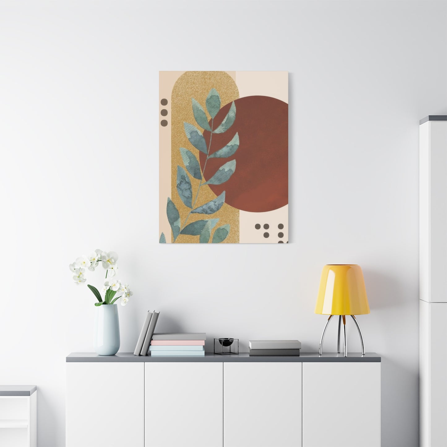
Each room in a home serves distinct functions and creates different moods, requiring thoughtful consideration when placing abstract plant earth tones wall art. Living rooms serve as primary gathering spaces where families relax and entertain guests. These rooms benefit from larger, statement pieces that establish the aesthetic tone and provide conversation focal points. Positioning artwork above the main seating area creates a natural viewing opportunity for everyone in the room. In living rooms with multiple seating arrangements, consider incorporating several coordinated pieces that maintain visual dialogue across the space.
Dining rooms present opportunities for artwork that enhances the dining experience without overwhelming it. Abstract plant compositions in warm earth tones can stimulate appetite and conversation while maintaining sophisticated atmospheres. The wall most visible upon entering the dining room makes an ideal location, creating immediate impact. Alternatively, positioning artwork to be viewed from seated positions ensures diners enjoy the art throughout meals. Consider how candlelight or dimmed lighting affects artwork appearance during evening dining.
Bedrooms require artwork that promotes relaxation and tranquility. Abstract plant earth tones wall art naturally supports these goals through its calming color palette and organic forms. The wall behind the bed traditionally hosts artwork, creating a headboard effect or complementing existing headboards. However, positioning pieces on walls visible from the bed allows you to enjoy the artwork while lying down, perhaps the last thing you see before sleep and first upon waking. Bedrooms also accommodate more personal, intimate pieces that might not suit public spaces.
Home offices demand artwork that inspires productivity without creating distraction. Abstract plant compositions strike this balance effectively, providing visual interest during breaks while maintaining professional appearances for video calls. Positioning artwork within your line of sight but not directly behind your screen placement allows for brief visual respites during work sessions. The grounding quality of earth tones helps maintain focus and reduces anxiety, valuable qualities in work environments.
Bathrooms often get overlooked in artwork planning, yet these spaces offer excellent opportunities for smaller pieces. The connection between water, self-care, and nature makes abstract plant earth tones wall art particularly appropriate. Ensure any artwork placed in bathrooms can withstand moisture, using proper framing and glazing or selecting canvas or metal prints designed for humid environments. Position pieces where they can be enjoyed during morning and evening routines.
Kitchens blend function and social interaction, requiring artwork that tolerates higher traffic while contributing to the room's warmth. Abstract plant compositions in warm earth tones complement wood cabinetry and natural materials frequently found in kitchens. Avoid placing valuable artwork directly adjacent to cooking areas where grease and moisture might cause damage. Instead, position pieces in breakfast nooks, above sideboards, or on walls opposite cooking zones.
Entryways and hallways serve as transitional spaces that benefit from artwork creating welcoming first impressions. These areas often lack natural light, making the warm, grounded quality of earth tone artwork particularly valuable. Hallways accommodate gallery wall arrangements or series of related pieces that create visual rhythm as people move through the space. Entryways suit single statement pieces that establish your home's aesthetic immediately upon entry.
Stairways present unique challenges and opportunities, with angled walls and continuous sight lines. Ascending or descending arrangements of abstract plant earth tones wall art can enhance the architectural flow while providing visual interest along the journey. Consider how pieces will be viewed from multiple levels and angles, ensuring they remain effective from all vantage points.
Integrating Artwork With Existing Furniture and Decor
Successful integration of abstract plant earth tones wall art requires consideration of how pieces interact with furniture, textiles, and decorative objects sharing the space. Creating visual connections between artwork and furnishings establishes cohesion while avoiding overly matched, catalog-styled appearances. One effective approach involves echoing specific earth tones from the artwork in throw pillows, blankets, or upholstery. This repetition creates visual rhythm without requiring exact color matching, which can feel forced and unnatural.
The relationship between artwork and furniture profiles deserves attention. Horizontal artwork compositions suit placement above horizontal furniture pieces like sofas and console tables, creating visual harmony through parallel lines. Vertical compositions pair well with taller, narrower furniture or can balance wide, low pieces by providing contrasting orientation. Square artwork offers versatile neutral options that work with most furniture configurations.
Layering creates depth and collected charm by positioning decorative objects in front of or around artwork. For abstract plant compositions, this might include placing actual potted plants on surfaces below the artwork, creating dialogue between artistic representation and living specimens. Sculptural objects, books, or decorative bowls arranged on furniture beneath artwork establish visual anchoring while preventing the artwork from appearing to float disconnectedly.
Textile choices throughout the room impact how artwork integrates with the overall aesthetic. Natural fiber textiles including linen, cotton, jute, and wool complement abstract plant earth tones wall art through their organic origins and often naturally earth-toned colors. Patterns in textiles should be considered in relation to artwork complexity. Busy, patterned artwork benefits from simpler, solid-colored textiles, while more minimal artwork can anchor spaces featuring patterned fabrics.
Lighting fixtures interact significantly with wall art, both functionally and aesthetically. The materials and finishes of light fixtures should harmonize with artwork framing choices. Natural materials like wood, rattan, or ceramic light fixtures enhance the organic quality of plant-inspired artwork. Positioning adjustable lighting to illuminate artwork emphasizes its importance and ensures colors appear accurate. Picture lights, track lighting, or strategically placed floor lamps can dramatically improve artwork visibility and impact.
Window treatments frame views and control natural light, both of which affect artwork presentation. Heavy curtains in earth tones can create monochromatic schemes that feel cocooning and intimate. Lighter, sheerer curtains allow more natural light while providing softness. Consider how window treatments and nearby artwork interact visually, particularly whether they compete for attention or work together cohesively.
Rugs ground spaces and define areas, creating foundations upon which furniture and artwork arrangements are built. Earth-toned rugs featuring natural patterns like abstract botanicals, organic shapes, or simple geometric designs reinforce themes established by abstract plant wall art. The rug's color palette should include some tones present in the artwork, creating vertical visual connections that travel from floor through furniture to wall art.
Creating Gallery Walls and Multi-Piece Installations
Gallery walls transform collections of individual artworks into cohesive, impactful installations. When working with abstract plant earth tones wall art, gallery walls offer opportunities to explore variations on the theme while maintaining unity through shared palette and subject matter. Planning represents the crucial first step in successful gallery wall creation. Lay out pieces on the floor or use kraft paper templates taped to the wall to experiment with arrangements before making nail holes.
Symmetrical gallery wall arrangements create formal, organized impressions through balanced, often grid-like compositions. This approach suits traditional or transitional spaces where order and predictability feel appropriate. When using symmetrical layouts with abstract plant artwork, consider alternating between vertical and horizontal orientations or varying sizes within the established grid to prevent monotony.
Asymmetrical arrangements feel more casual and collected, suggesting pieces were gathered over time rather than purchased as a set. This approach accommodates diverse frame sizes and orientations more easily. The key to successful asymmetrical gallery walls lies in achieving visual balance without symmetry. Distribute visual weight evenly across the arrangement, using larger or darker pieces to anchor the composition while smaller or lighter pieces fill in around them.
Salon-style hanging creates dense, eclectic displays where frames nearly touch, covering walls extensively. This traditional approach works beautifully with abstract plant earth tones wall art, particularly when mixing different artistic styles within the earth tone palette. Salon walls suit spaces with architectural character and abundant personality, transforming entire walls into art displays. Starting with a central anchor piece and building outward helps maintain cohesion in salon arrangements.
Linear gallery walls arrange pieces in single rows, creating clean, modern presentations. This approach works well in hallways, above sofas, or in spaces with limited vertical wall space. Maintaining consistent spacing between pieces establishes rhythm and order. Consider whether to align pieces along their tops, bottoms, or centers based on the specific artworks and surrounding architecture.
Geometric arrangements use specific shapes as organizing principles, such as arranging pieces within an imaginary square, circle, or triangle. This technique creates intentional, designed appearances while allowing for varied piece sizes. For abstract plant earth tones wall art, a circular arrangement might echo organic forms found in nature, while angular arrangements could create interesting contrast with the flowing, natural subject matter.
Spacing between pieces affects how gallery walls read visually. Closer spacing, around one to two inches between frames, creates unified, cohesive looks where the gallery reads as a single installation. Wider spacing, three to six inches, allows each piece more individual presence while still functioning as a group. Very wide spacing begins to break the gallery wall effect, making pieces read as separate entities sharing a wall.
Color distribution within gallery walls requires attention to prevent awkward visual clustering. When working with earth tone artwork, distribute warmer and cooler pieces throughout the arrangement rather than grouping all warm pieces together. Similarly, vary value distribution, mixing lighter and darker pieces to create visual interest and balance. Step back frequently during installation to assess how colors interact from viewing distance.
Sourcing and Selecting Quality Pieces
Finding abstract plant earth tones wall art that meets quality standards while fitting budgets requires knowing where and how to shop. Multiple sources offer different advantages regarding selection, price, authenticity, and customer service. Understanding these options helps make informed purchasing decisions that result in satisfying acquisitions.
Original artwork from individual artists represents the most unique, investment-worthy option. Original pieces are one-of-a-kind, carrying intrinsic value beyond their decorative function. Purchasing directly from artists ensures they receive full compensation for their work while allowing you to learn about their processes and inspirations. Many artists maintain websites or social media presences showcasing available works. Others sell through galleries, either exclusively or alongside other artists. Gallery purchases provide curated selections and often include expertise from gallery staff who can guide selections based on your needs.
When evaluating artwork quality, examine several factors regardless of source. Materials quality affects both appearance and longevity. Canvas should be tightly woven and properly stretched. Papers should be acid-free and appropriate weight for the medium. Paints and inks should be lightfast, meaning resistant to fading. Examine surfaces for consistent color application, appropriate texture, and absence of defects like cracks, scratches, or discoloration.
Framing quality matters even when purchasing pre-framed pieces. Frames should be sturdy, with tight joints and smooth finishes. Glazing should be clean and properly fitted. Matting should be acid-free and cut precisely. Backing should be sealed and include hanging hardware appropriate for the piece's weight. Poor framing diminishes even excellent artwork, while quality framing enhances and protects investments.
Artist reputation and history provide context for evaluating purchases, particularly for investment purposes. Research artists' backgrounds, including education, exhibitions, awards, and critical reception. Established artists with strong reputations command higher prices but offer better value retention. Emerging artists present opportunities to acquire quality work affordably while supporting developing careers. Some emerging artists become established, causing early acquisitions to appreciate significantly.
Provenance, or documented ownership history, matters primarily for vintage or high-value artwork. Solid provenance verifies authenticity and can increase value. For contemporary purchases from living artists or reputable galleries, provenance begins with your purchase documentation. Retain all receipts, certificates of authenticity, and correspondence regarding purchases for future reference and potential resale.
Understanding Different Media and Their Characteristics
Abstract plant earth tones wall art appears in numerous media, each offering distinct aesthetic qualities and practical considerations. Understanding these differences helps in selecting pieces appropriate for specific spaces and preferences. Traditional painting media have served artists for centuries, each with unique characteristics affecting appearance and technique.
Oil painting produces rich, luminous colors with exceptional blending capabilities. Oil paints dry slowly, allowing artists extensive working time to achieve subtle transitions and complex layering. This medium excels at creating depth and atmosphere, particularly valuable in abstract plant compositions suggesting light filtering through foliage or atmospheric perspective in landscapes. Oil paintings possess substantial presence and traditional fine art associations. However, oils require proper support materials, as improper preparation causes deterioration. Finished oil paintings benefit from protective varnishing but should never be placed behind glass, as they need air circulation to cure properly.
Acrylic painting offers versatility and practicality suited to contemporary art production. Acrylics dry quickly, allowing rapid layering and production. These paints adhere to diverse surfaces and can mimic both watercolor and oil painting effects depending on application techniques. Acrylic paintings resist moisture and temperature variations better than some traditional media, making them practical for various home environments. The colors in acrylic paintings remain stable and vibrant, though they may appear slightly different when wet versus dry. Acrylics work particularly well for abstract compositions involving bold colors, defined edges, or textural experimentation.
Watercolor creates delicate, luminous effects perfect for suggesting ethereal botanical forms. The transparent nature of watercolors allows for building subtle color variations through layering. This medium naturally creates soft edges and flowing transitions that echo organic growth patterns. Watercolors require paper as support, making them lighter and easier to frame than canvas paintings. However, watercolors are vulnerable to moisture damage and light exposure, necessitating careful placement and protective glazing. The delicate quality of watercolor suits intimate spaces and contemplative viewing.
Mixed media artwork combines multiple materials and techniques, creating complex, textured surfaces. Artists might incorporate acrylic paints with ink, collage elements, natural materials, or various application tools. Mixed media pieces offer unique, one-of-a-kind qualities difficult to reproduce. These works add dimensional interest that changes with lighting conditions and viewing angles. The complexity of mixed media can create focal points in minimalist spaces or contribute to eclectic, layered interiors. Preservation requirements vary based on specific materials incorporated.
Drawing media including charcoal, graphite, colored pencil, and pastel create intimate, immediate artwork. These media emphasize line quality and mark-making, offering different aesthetics than painting. Charcoal and graphite drawings in earth tones suggest shadows, forms, and atmosphere through value variations rather than color diversity. Colored pencil and pastel allow for precise color control and delicate blending. Drawings require protective glazing and careful handling, as many drawing media smudge easily.
Printmaking encompasses multiple techniques producing editions from single matrices. Relief printing includes woodcuts and linocuts, where artists carve images into blocks, ink surfaces, and transfer impressions to paper. The resulting prints often feature bold, graphic qualities with visible texture from carving marks. Intaglio printing involves incising images into metal plates, then filling incisions with ink and pressing paper into these recessed areas. Techniques include etching, engraving, and aquatint. Intaglio prints display rich, velvety blacks and precise lines. Lithography uses chemical processes on smooth stones or plates, producing prints with painterly qualities and subtle tonal variations. Screen printing forces ink through stenciled screens, creating flat, graphic images with crisp edges. Each printmaking technique produces characteristic appearances, and understanding these helps appreciate artistic choices and value.
Photography and digital art represent contemporary media increasingly common in wall art. Photographic abstract plant compositions might capture botanical subjects through unusual perspectives, macro techniques, or experimental processes. Digital art created using software offers limitless possibilities for manipulation, color adjustment, and compositional experimentation. Both media require quality printing processes to achieve longevity and color accuracy. Archival inkjet printing on museum-quality papers or canvas produces photographs and digital art rivaling traditional media for permanence. However, lower-quality printing fades quickly and looks inferior, making print quality crucial when purchasing photographic or digital artwork.
Incorporating Cultural and Global Influences
Abstract plant earth tones wall art draws inspiration from diverse cultural traditions, each contributing unique perspectives on representing the natural world. Understanding these cultural contexts enriches appreciation while informing selection of pieces resonating with personal values and aesthetic preferences. Japanese aesthetic traditions emphasize simplicity, natural materials, and profound connections with nature. The concepts of wabi-sabi celebrate imperfection and transience, reflected in artwork embracing organic irregularities and earthy, subdued palettes. Japanese-influenced abstract plant compositions might feature asymmetrical balance, significant negative space, and economical mark-making suggesting rather than depicting. These pieces create contemplative atmospheres aligned with minimalist interiors.
Scandinavian design traditions prioritize functionality, natural materials, and connection with nature despite harsh climates. Abstract plant artwork influenced by Nordic aesthetics typically features clean lines, limited palettes, and emphasis on light. Earth tones in Scandinavian-inspired pieces tend toward cooler ranges including grays, muted greens, and pale woods. These artworks complement contemporary interiors emphasizing hygge concepts of coziness and contentment.
Mediterranean influences bring warmth and vibrancy to earth-tone artwork while maintaining organic connections. Terracotta, olive green, sandy beige, and sun-bleached tones reference landscapes surrounding the Mediterranean Sea. Abstract plant compositions drawing from these traditions might suggest olive groves, wild herbs, or sun-drenched gardens. These pieces bring vacation-like relaxation and European sophistication to interiors.
African art traditions contribute bold patterns, symbolic meanings, and earthy color palettes derived from natural pigments. Abstract plant artwork influenced by African aesthetics might incorporate geometric patterns alongside organic forms, referencing textile traditions, body art, or ceremonial objects. Earth tones in African-influenced pieces often include rich reds, deep browns, and golden ochres. These works add cultural depth and visual strength to eclectic or globally-inspired interiors.
Indigenous American art traditions from various tribal cultures offer deep spiritual connections with plant life and land. Abstract interpretations might reference traditional symbolism, natural dye colors, or ceremonial uses of specific plants. Approaching Indigenous-influenced artwork requires cultural sensitivity and awareness regarding appropriation versus appreciation. Purchasing from Indigenous artists or galleries representing them respectfully ensures authentic representation and appropriate compensation.
Middle Eastern influences contribute intricate patterns, rich symbolism, and sophisticated color usage. While often associated with jewel tones, Middle Eastern design also incorporates earthy desert palettes. Abstract plant compositions influenced by these traditions might feature stylized botanical forms referencing Persian gardens, Islamic geometric patterns, or desert vegetation. These pieces add exotic elegance and historical depth.
South Asian traditions from India and surrounding regions celebrate abundant natural imagery, symbolic plant representations, and complex layering. Earth-toned abstract plant artwork drawing from these influences might suggest monsoon forests, sacred plants like lotus or bodhi, or traditional textile patterns. The resulting pieces often feature dense compositions and rich visual complexity.
Australian Aboriginal art traditions use earth pigments to create works deeply connected to land and spiritual beliefs. Dot painting techniques, natural ochre colors, and dreamtime narratives inform contemporary abstract compositions. These pieces carry profound cultural significance beyond decoration, making respectful acquisition and display important.
Latin American influences bring vibrant energy even to earth-tone palettes, reflecting diverse ecosystems from rainforests to deserts. Abstract plant artwork influenced by Latin American aesthetics might reference indigenous traditions, colonial-era botanical illustrations, or contemporary movements like Mexican modernism. These pieces typically feature bold compositions and confident color usage even within earth-tone restrictions.
Pairing Artwork With Architectural Styles
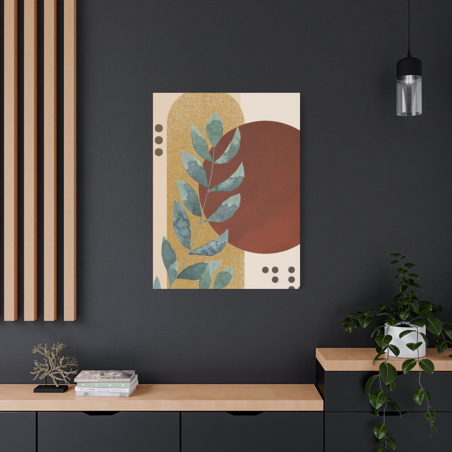
Successfully integrating abstract plant earth tones wall art requires considering architectural context, as different building styles create distinct aesthetic frameworks. Understanding how artwork relates to architectural elements ensures harmonious rather than conflicting results. Traditional architecture featuring ornate moldings, detailed woodwork, and formal symmetry accommodates abstract plant artwork providing contemporary contrast or complementary organic elements. When introducing modern abstract pieces into traditional spaces, consider scale and framing that acknowledge the architectural formality. Substantial frames with classical profiles bridge stylistic gaps, while the abstract nature of the artwork prevents excessive formality or dated appearance.
Craftsman and Arts and Crafts architecture emphasizes natural materials, handcrafted details, and organic design principles. Abstract plant earth tones wall art aligns naturally with these values, sharing appreciation for nature and artisan quality. The warm woods, built-in cabinetry, and earth-tone palettes typical of Craftsman interiors create ideal backdrops for botanical abstractions. Choose pieces with visible artistic technique and quality materials that honor the craftsmanship evident in the architecture.
Mid-century modern architecture features clean lines, integration with nature, and minimal ornamentation. Abstract plant artwork suits these spaces perfectly, maintaining the aesthetic's connection to organic forms while providing visual interest without clutter. The earth tone palette complements period-appropriate furniture often incorporating natural woods, and the abstract nature aligns with mid-century artistic movements. Consider pieces with graphic qualities, bold compositions, or retro color variations reflecting the era's aesthetic.
Contemporary architecture with open floor plans, large windows, and minimal detailing provides flexible backdrops for various artwork styles. Abstract plant earth tones wall art can define spaces within open concepts, create focal points on expansive walls, or soften angular modern materials like concrete and steel. The scale possibilities in contemporary spaces allow for oversized statement pieces or extensive gallery wall installations.
Industrial loft spaces featuring exposed brick, ductwork, concrete, and steel benefit from artwork softening hard materials while respecting the aesthetic. Abstract plant compositions in earth tones complement industrial elements through shared organic-inorganic balance. Unframed canvas or simple metal frames maintain the casual, utilitarian sensibility. The natural subject matter introduces warmth without conflicting with the deliberately unfinished industrial aesthetic.
Commissioning Custom Abstract Plant Artwork
Commissioning original abstract plant earth tones wall art offers opportunities to obtain perfectly personalized pieces tailored to specific spaces, preferences, and requirements. This process involves collaboration between patron and artist, resulting in unique artworks impossible to find through standard retail channels. Understanding commission processes, communication strategies, and appropriate expectations ensures successful outcomes satisfying all parties.
Identifying appropriate artists represents the crucial first step. Review portfolios thoroughly, ensuring artists' established styles align with your vision. While artists can adapt somewhat, expecting radical departures from demonstrated abilities leads to disappointment. Social media platforms, artist websites, and gallery representations provide portfolio access. Pay attention not just to finished pieces but to artists' approaches to color, composition, and subject matter. Evidence of previous commissions indicates experience with collaborative processes.
Initial consultations establish whether partnerships will work productively. Many artists offer preliminary conversations at no charge, discussing your vision, their capabilities, and basic parameters. Prepare for these conversations by gathering inspiration images, color samples from your space, and room measurements. Articulate what draws you to abstract plant imagery and earth tones specifically. Discuss timeline requirements and budget parameters. These conversations reveal communication styles and whether creative directions align.
Clear communication throughout processes prevents misunderstandings and ensures satisfaction. Document discussions in writing, confirming dimensions, color palettes, general composition approaches, framing requirements, and delivery timelines. While specificity helps, avoid being overly prescriptive, which limits artists' creativity. Define parameters while trusting artists' expertise within those boundaries. For example, specifying desired earth tone ranges and approximate plant forms allows artistic interpretation within defined frameworks.
Budgets for commissioned work should reflect the customization, artist expertise, materials quality, and piece dimensions. Original commissioned artwork costs significantly more than mass-produced prints but provides unique value. Artists typically quote prices based on size, medium, complexity, and their experience levels. Request detailed quotes specifying what's included regarding materials, framing, delivery, and revisions. Compare quotes from multiple artists if budget concerns exist, but remember cheapest doesn't equal best value.
Contracts protect both patrons and artists, establishing clear expectations and responsibilities. Professional artists provide written agreements specifying dimensions, medium, subject matter, color palette, timeline, payment schedule, revision policies, and delivery methods. Review contracts carefully before signing. Understand policies regarding revisions, as most artists include limited revision rounds before additional fees apply. Know cancellation policies and what happens if the finished piece doesn't meet expectations despite following agreed parameters.
Payment schedules typically involve deposits upon commission acceptance, with remaining balances due upon completion. Deposits secure artists' time and cover initial material investments. Some artists request progress payments for large or lengthy projects. Never pay full amounts before receiving finished artwork unless you have established relationships with artists and trust them completely. Reputable artists understand and accommodate reasonable payment structures.
Digital and Print-on-Demand Options
Technology has revolutionized access to abstract plant earth tones wall art through digital creation and print-on-demand services. These options provide affordable alternatives to original artwork while offering customization possibilities previously unavailable. Understanding these technologies, their capabilities, and limitations helps in making informed purchasing decisions aligned with quality expectations and budgets.
Digital art creation using software allows artists unprecedented control and experimentation. Programs enable endless color adjustments, compositional variations, and effects impossible or impractical in traditional media. Digital artists can create abstract plant compositions exploring ideas rapidly, testing multiple variations before finalizing designs. The resulting files can be printed in various sizes without quality loss up to resolution limits, providing flexibility unavailable with physical originals.
Print-on-demand services allow ordering artwork printed only when purchased, eliminating inventory costs and waste. These platforms connect customers with artists or designs, handling printing, framing, and shipping. The vast selections available through these services provide options for every taste and budget. However, quality varies dramatically between providers. Premium services using archival inks and museum-quality materials produce lasting, beautiful prints. Budget services may use inferior materials resulting in fading, poor color accuracy, and short lifespans.
Giclée printing represents the gold standard for art reproduction, using archival pigment inks sprayed in microscopic droplets onto high-quality substrates. Properly executed giclée prints rival original paintings in color depth, detail rendering, and longevity. These prints resist fading for decades when displayed properly, making them suitable for serious collections. However, true giclée printing costs significantly more than standard printing, and some services misuse the term for marketing purposes without meeting technical standards.
Canvas printing creates gallery-wrap presentations stretching printed images around wooden frames. Quality canvas prints use genuine artist-grade canvas and fade-resistant inks. The texture of canvas adds dimension making prints feel more substantial than paper versions. However, lower-quality canvas printing uses thin, obviously artificial materials that look cheap. When ordering canvas prints, research provider reputations and material specifications.
Paper printing suits traditional framing behind glass or acrylic. Fine art papers including cotton rag, watercolor, and specialty textured papers provide luxurious surfaces enhancing print quality. Archival papers resist yellowing and deterioration. Standard photo papers, while less expensive, lack the substance and longevity of fine art alternatives. For abstract plant earth tones wall art, textured papers can enhance organic subject matter.
Metal and acrylic printing create contemporary, frameless presentations. Metal prints infuse dyes directly into coated aluminum, producing vibrant, durable images with unique luminosity. The smooth, rigid surface suits modern interiors. Acrylic prints sandwich images between acrylic sheets or mount them behind acrylic faces, creating depth and glass-like clarity. Both options resist moisture, making them practical for bathrooms and kitchens. However, these substrates suit certain imagery better than others. Abstract plant compositions with bold colors and contrast work beautifully, while subtle, delicate pieces may lose nuance.
Wood printing transfers images onto natural wood surfaces, allowing grain to show through. This technique creates unique, organic presentations perfect for earth-tone botanical abstractions. Each wood print differs slightly due to grain variations, adding one-of-a-kind qualities. Wood prints work well in rustic, farmhouse, or natural-themed interiors.
Customization options through digital printing include size adjustments, cropping, color modifications, and format selection. Many services allow uploading personal photographs or designs for printing. This capability enables creating truly personalized abstract plant artwork, perhaps using photographs of meaningful plants altered through editing software to create abstract compositions in preferred earth tone palettes. However, source image quality determines output quality. Low-resolution images produce pixelated, blurry prints regardless of printing quality.
Licensing considerations matter when printing digital artwork. Artwork found online isn't automatically free to use. Copyright protections apply to digital art as to physical pieces. Legitimate print-on-demand services either create original content, license designs from artists, or facilitate artist sales ensuring appropriate compensation. Illegally reproducing copyrighted artwork for personal use remains theft regardless of intentions. Support artists by purchasing properly licensed prints or commissioning original digital work.
Creating Cohesive Collections Over Time
Building collections of abstract plant earth tones wall art creates greater impact than random individual acquisitions. Thoughtful collecting strategies result in cohesive groupings that work together while allowing for evolution as tastes develop and spaces change. Understanding collection-building principles guides strategic acquisitions creating lasting satisfaction.
Defining collection parameters establishes focus preventing scattered accumulation. Parameters might include specific color palette ranges, particular plant subjects, certain artistic styles, or favorite artists. Clear parameters don't require rigidity but provide frameworks guiding decisions. For earth-tone plant abstractions, you might focus on warm versus cool earth tones, specific techniques like watercolor or mixed media, or particular plant families like succulents or trees.
Quality over quantity remains fundamental to satisfying collections. Acquiring fewer exceptional pieces provides greater pleasure than numerous mediocre ones. Excellent artwork maintains interest over time, becoming more appreciated with familiarity. Mediocre pieces wear out their welcome quickly, requiring replacement and creating waste. Save for quality acquisitions rather than filling spaces immediately with placeholder pieces.
Varied scale creates visual interest and display flexibility within collections. Including small, medium, and large pieces allows for diverse arrangements. Small works suit intimate spaces, personal offices, or gallery wall compositions. Medium pieces work nearly anywhere, providing versatile options. Large statement pieces create dramatic focal points in spacious areas. Having scale variety enables refresh without purchasing new artwork.
Mixing media and techniques within consistent subject matter and palette boundaries adds depth to collections. Combining watercolor, acrylic, mixed media, and printmaking featuring abstract plant forms in earth tones creates richer, more engaging collections than single-medium acquisitions. The varied textures, finishes, and visual qualities prevent monotony while shared themes maintain cohesion.
Balancing investment and decoration pieces creates practical collections. Investment pieces from established artists or showing exceptional quality merit conservation framing, prominent placement, and careful maintenance. Decorative pieces from emerging artists, student work, or quality prints fill spaces affordably while allowing experimentation with less financial risk. Both categories serve purposes within complete collections.
Documentation organizes collections and aids in planning. Photograph each piece and maintain files including purchase information, artist details, dimensions, and care requirements. Digital management apps designed for art collectors streamline organization. Documentation proves invaluable for insurance purposes and helps visualize how pieces might work in different locations or combinations.
The Role of Abstract Plant Art in Wellness Spaces
Abstract plant earth tones wall art serves particularly valuable functions in spaces dedicated to wellness, healing, and self-care. Healthcare facilities, therapy offices, yoga studios, spas, and home wellness areas benefit from artwork supporting their missions of promoting physical and emotional wellbeing. Understanding these specialized applications helps in selecting pieces optimized for therapeutic environments.
Healthcare settings including hospitals, clinics, and medical offices increasingly recognize art's role in patient experiences and outcomes. Research demonstrates that nature-based imagery reduces anxiety, lowers blood pressure, and may even decrease pain perception and recovery times. Abstract plant compositions offer nature connections without the sterility of generic landscape photography or the potential dated quality of realistic botanical prints. Earth tones create calming atmospheres without the clinical coldness of pure white or gray environments.
Selecting artwork for healthcare settings requires considering diverse patient populations, potential viewing durations, and institutional requirements. Images should be universally appealing, avoiding potentially disturbing or controversial content. Abstract interpretations suit this requirement better than representational work which might trigger unwanted associations. Earth tone palettes feel neutral and soothing across cultural contexts. Viewing from various angles and distances matters in healthcare, where patients might observe artwork from beds, wheelchairs, or while walking. Compositions should maintain interest across these viewing scenarios.
Therapy and counseling offices use environmental cues supporting their work. Abstract plant artwork creates calming atmospheres helping clients relax and open up. The interpretive nature of abstract art can serve as conversation starters or projection tools in some therapeutic modalities. Earth tones avoid overstimulation while providing visual interest preventing sterile, institutional feelings. Therapists should consider how artwork reflects their approaches and client populations, selecting pieces resonating with their work's emotional tenor.
Yoga and meditation studios prioritize environments supporting mindfulness and internal focus. Abstract plant earth tones wall art complements these goals through grounded, organic imagery that doesn't distract from practice. Minimalist compositions with significant negative space work particularly well, providing focal points for drishti (gaze direction) without overwhelming visual busyness. Earth tones harmonize with natural materials common in these spaces including bamboo, wood, and stone. Positioning artwork where practitioners can view it during specific poses or meditation periods maximizes benefit.
Spa and massage therapy spaces use artwork enhancing relaxation and pampering experiences. Soothing abstract plant compositions in warm earth tones create cocoon-like atmospheres promoting stress relief. These spaces allow for slightly more decorative or stylized pieces than medical settings, as the goal centers on pleasant experience rather than clinical neutrality. Moisture-resistant framing or substrates handle humid environments common in spas. Lighting should be adjustable to maintain ambiance while allowing artwork appreciation.
Conclusion
In conclusion, Abstract Plant Earth Tones Wall Art offers a sophisticated and timeless way to introduce natural elegance into any living space. The fusion of earthy hues and organic forms captured in this abstract representation of plant life serves as both a calming focal point and a tribute to the beauty of nature. By blending the subtle richness of earth tones with the graceful curves and textures found in plant life, this wall art effortlessly brings the outdoors inside, creating a serene and grounded atmosphere that complements any interior design style.
The appeal of Abstract Plant Earth Tones Wall Art lies in its ability to evoke a sense of tranquility and balance. Earth tones—rich browns, soft greens, muted ochres, and warm neutrals—have long been associated with comfort, stability, and harmony. These colors mimic the natural palette of the earth, from forest greens to the browns of bark and the warm golds of sunlight filtering through leaves. By incorporating this wall art into your space, you instantly introduce the calming energy of nature into your home. Whether you’re trying to create a restful retreat in your bedroom, a peaceful workspace in your office, or a cozy, inviting living room, the natural hues and organic shapes found in this artwork will work in perfect harmony with your existing décor.
One of the most powerful aspects of abstract plant-inspired art is its versatility. The abstract nature of the piece allows it to be interpreted in a myriad of ways, adding a layer of depth to your space. Rather than relying on literal depictions of plants or landscapes, this style invites the viewer to engage their imagination, finding new meanings and connections with each viewing. Whether you see it as a stylized representation of a fern, a leaf, or a flower, the beauty lies in the fluidity and openness of the design. It’s art that speaks to you personally, inviting introspection and offering endless ways to connect with the natural world.
In terms of design, Abstract Plant Earth Tones Wall Art is remarkably adaptable. Its earthy palette complements a wide range of interior styles, from minimalist and modern to bohemian and rustic. The organic shapes and flowing lines create a sense of movement that can add energy and flow to an otherwise static space. The subtle sophistication of the color scheme makes it an ideal fit for a variety of settings, whether in a contemporary urban apartment or a countryside home. The artwork’s organic vibe works wonderfully with natural materials like wood, stone, and linen, and its minimalist approach allows it to blend seamlessly with other pieces in your home.
Another benefit of Abstract Plant Earth Tones Wall Art is its ability to foster a connection with the environment. In an era when many people are seeking ways to reconnect with nature and promote sustainability, this type of art serves as a reminder of the beauty and harmony that can be found in the natural world. Displaying this artwork not only enhances the aesthetic of your space but also nurtures a deeper appreciation for the earth’s inherent elegance. It provides a quiet space for reflection, evoking the stillness and rejuvenating energy of being surrounded by plants and the outdoors.
Looking forward, it’s clear that art inspired by nature, especially abstract plant designs, will continue to be a significant trend in interior design. As more people focus on bringing elements of nature into their homes, Abstract Plant Earth Tones Wall Art will remain a versatile and elegant choice for those looking to create a balanced, peaceful environment.
In conclusion, Abstract Plant Earth Tones Wall Art is a beautiful and transformative addition to any home. It not only elevates the design of your space but also fosters a sense of calm, connection, and natural elegance. Whether you want to add a touch of sophistication to a minimalist setting or enhance the organic feel of a rustic interior, this artwork provides a timeless solution. With its ability to blend seamlessly with a variety of styles while evoking a deep connection to the earth, Abstract Plant Earth Tones Wall Art is sure to remain a cherished part of your home’s decor for years to come.
