


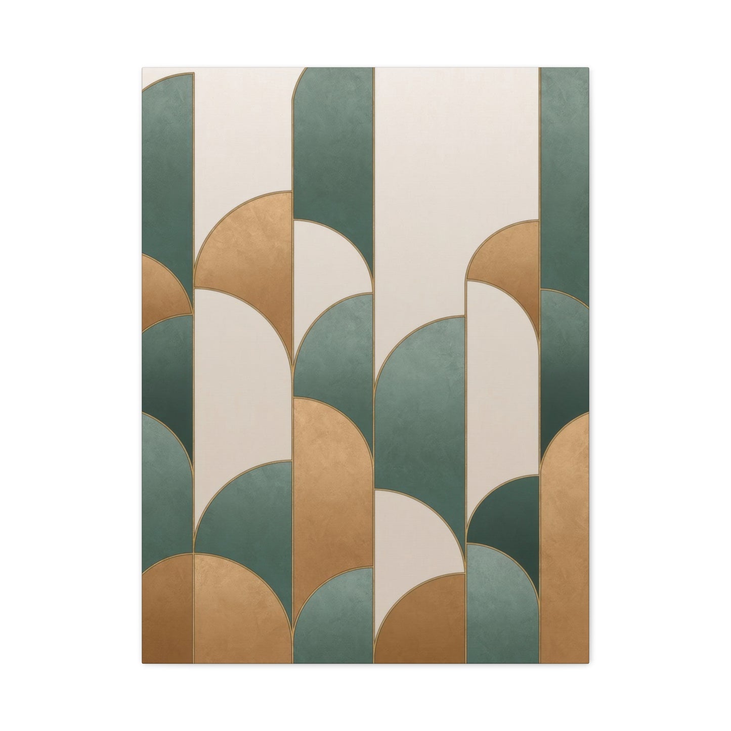
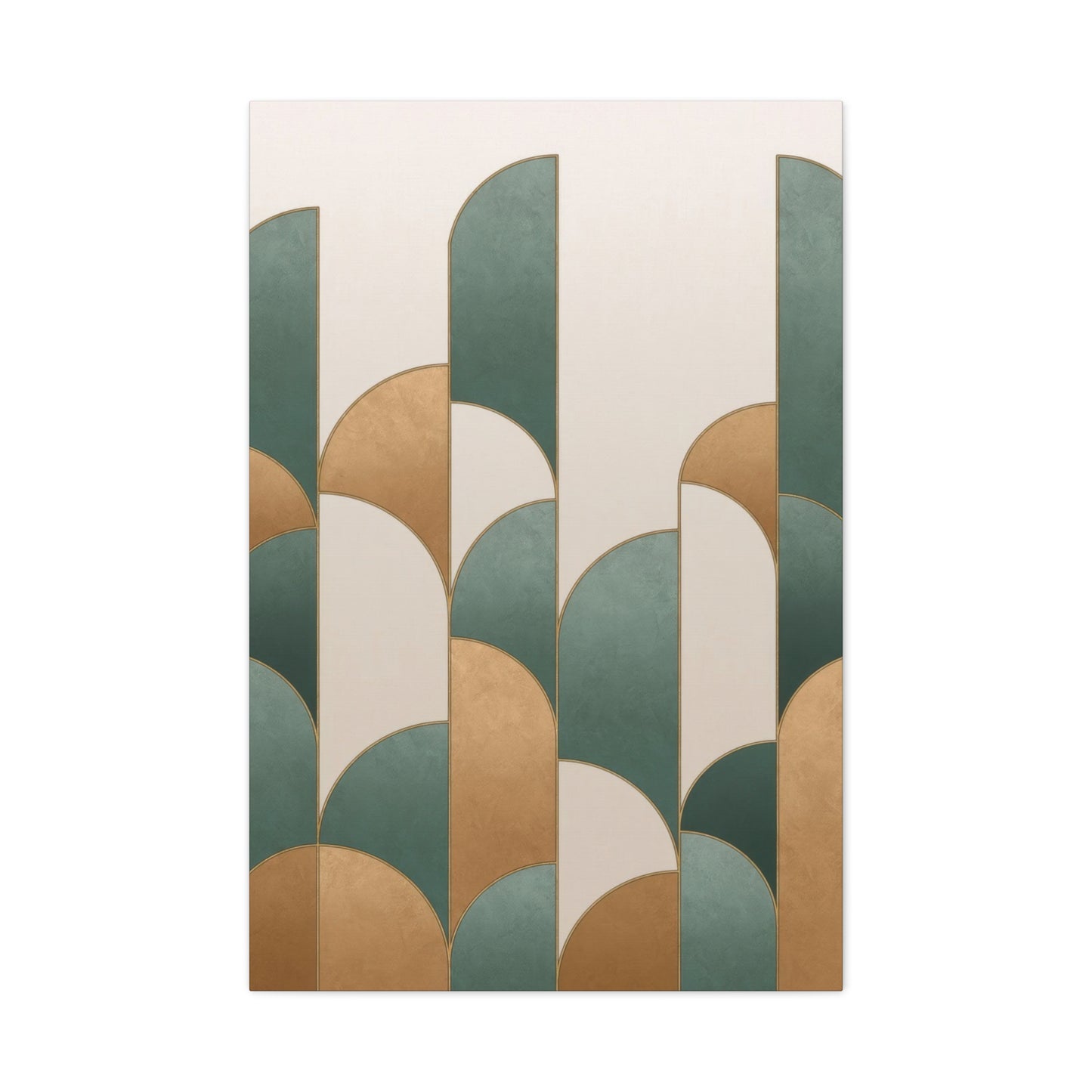
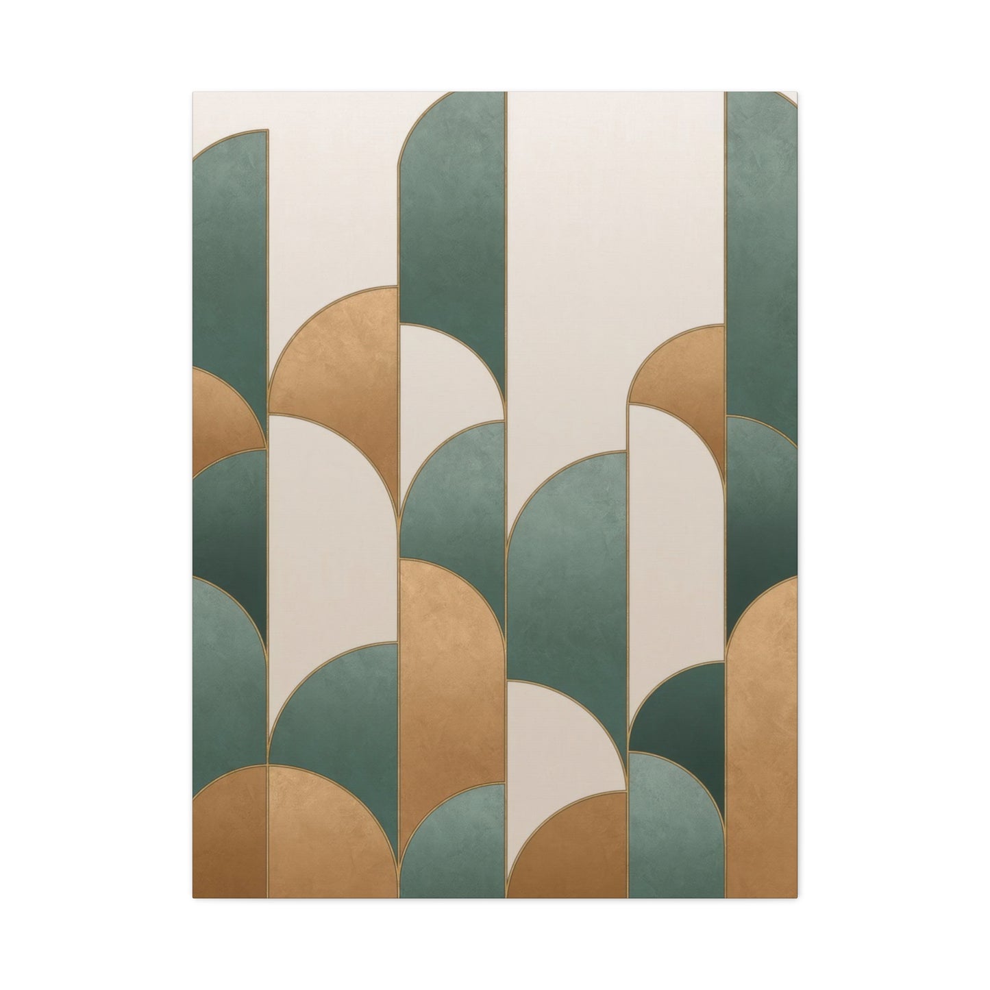
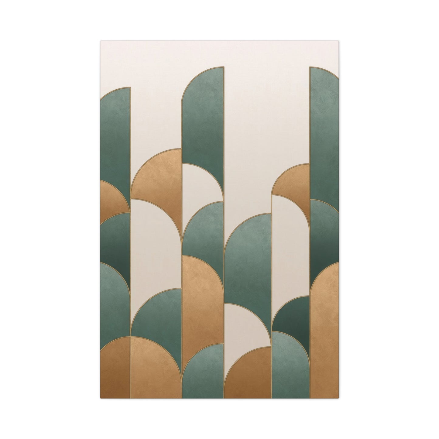
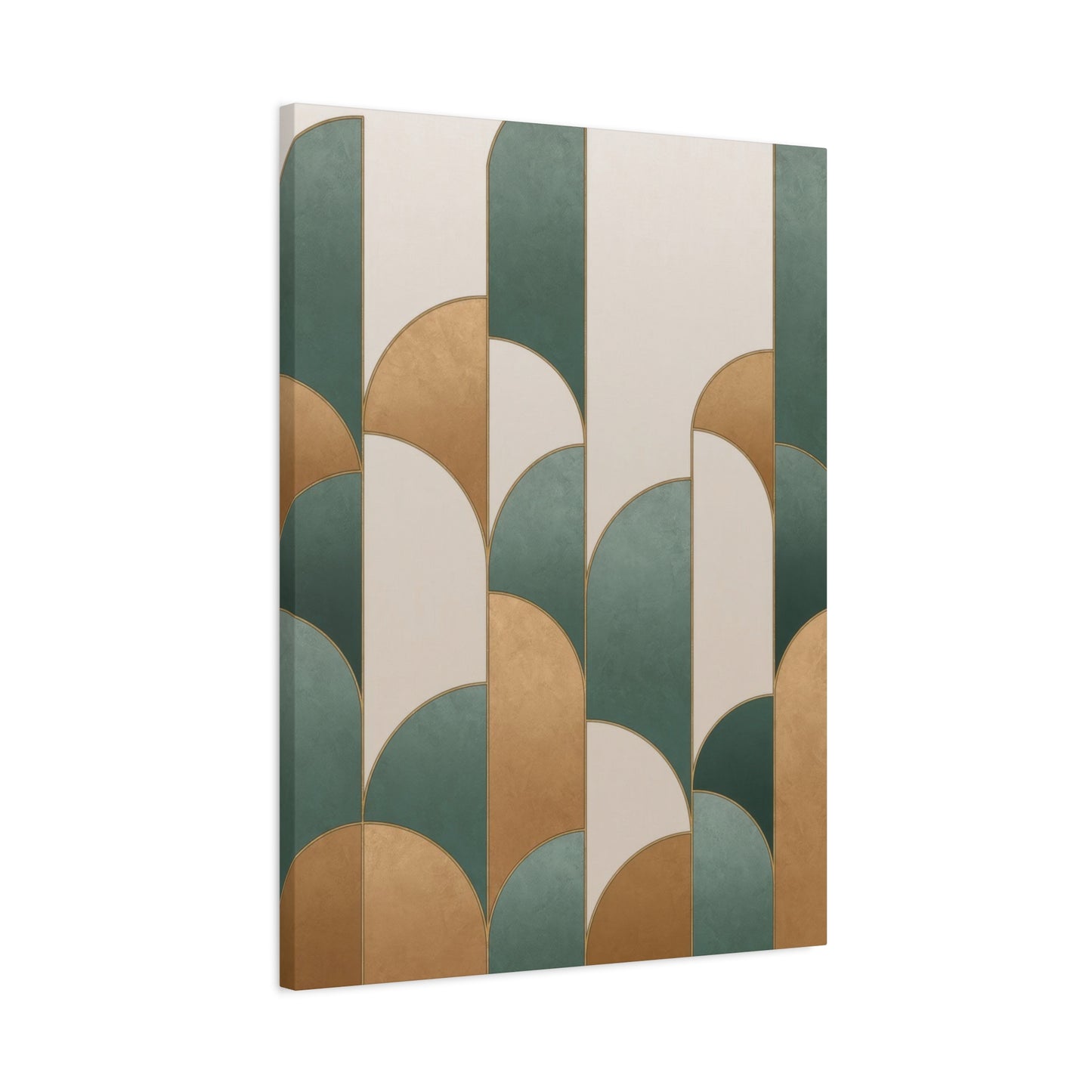
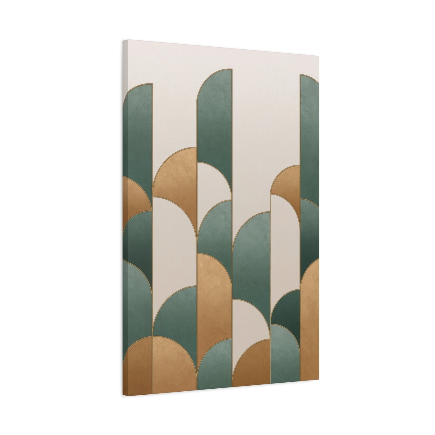
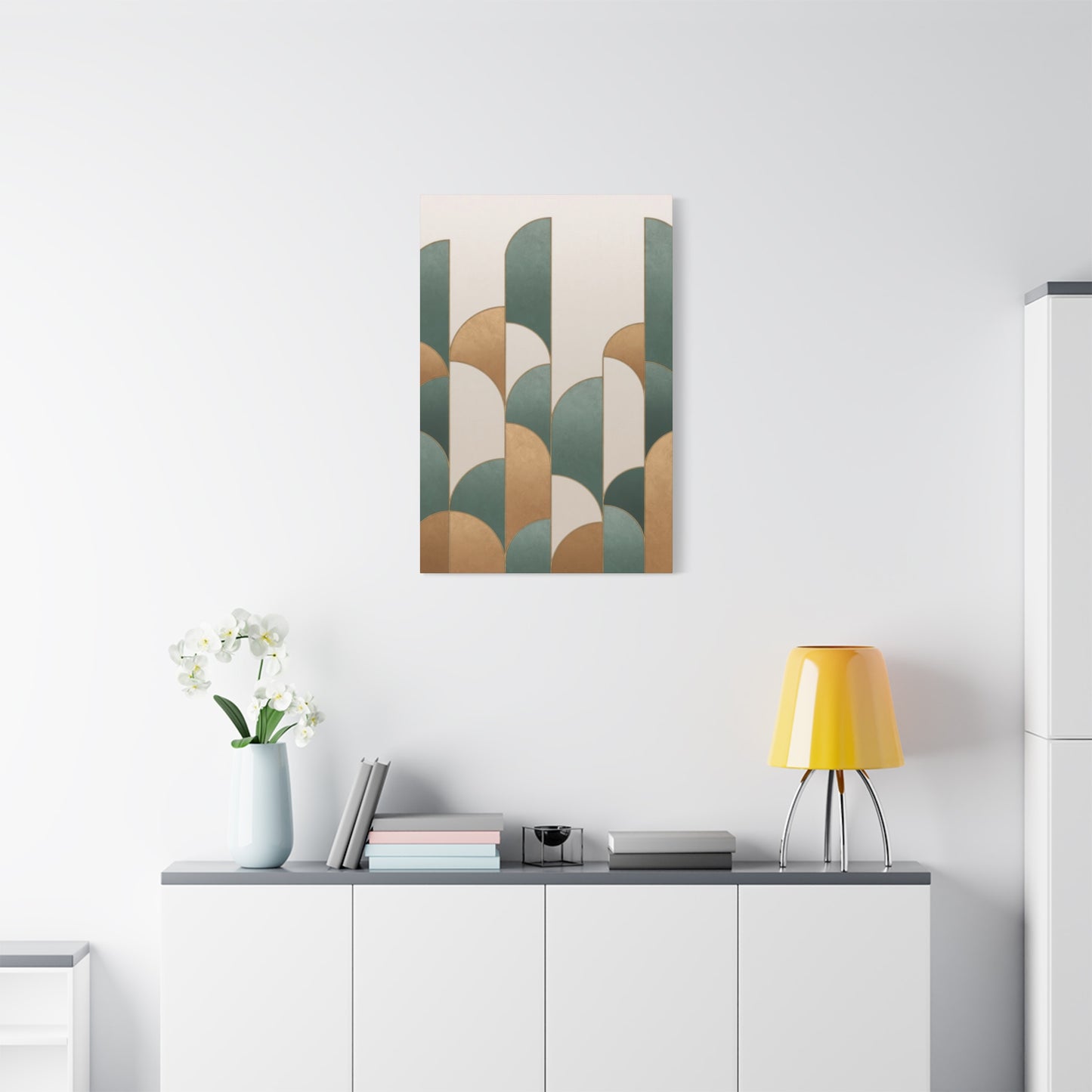
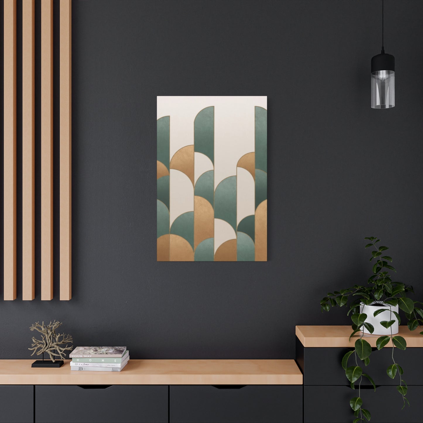
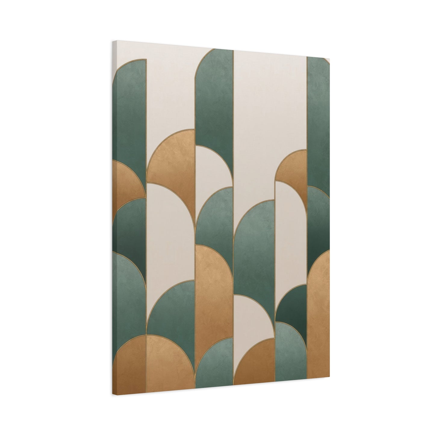
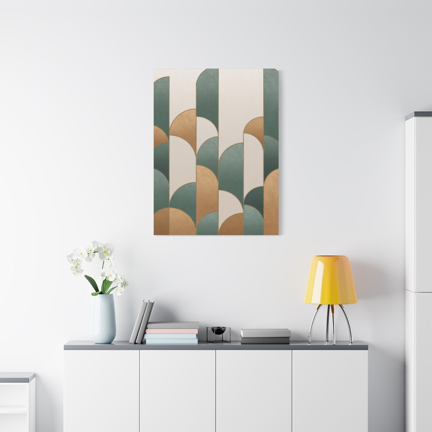
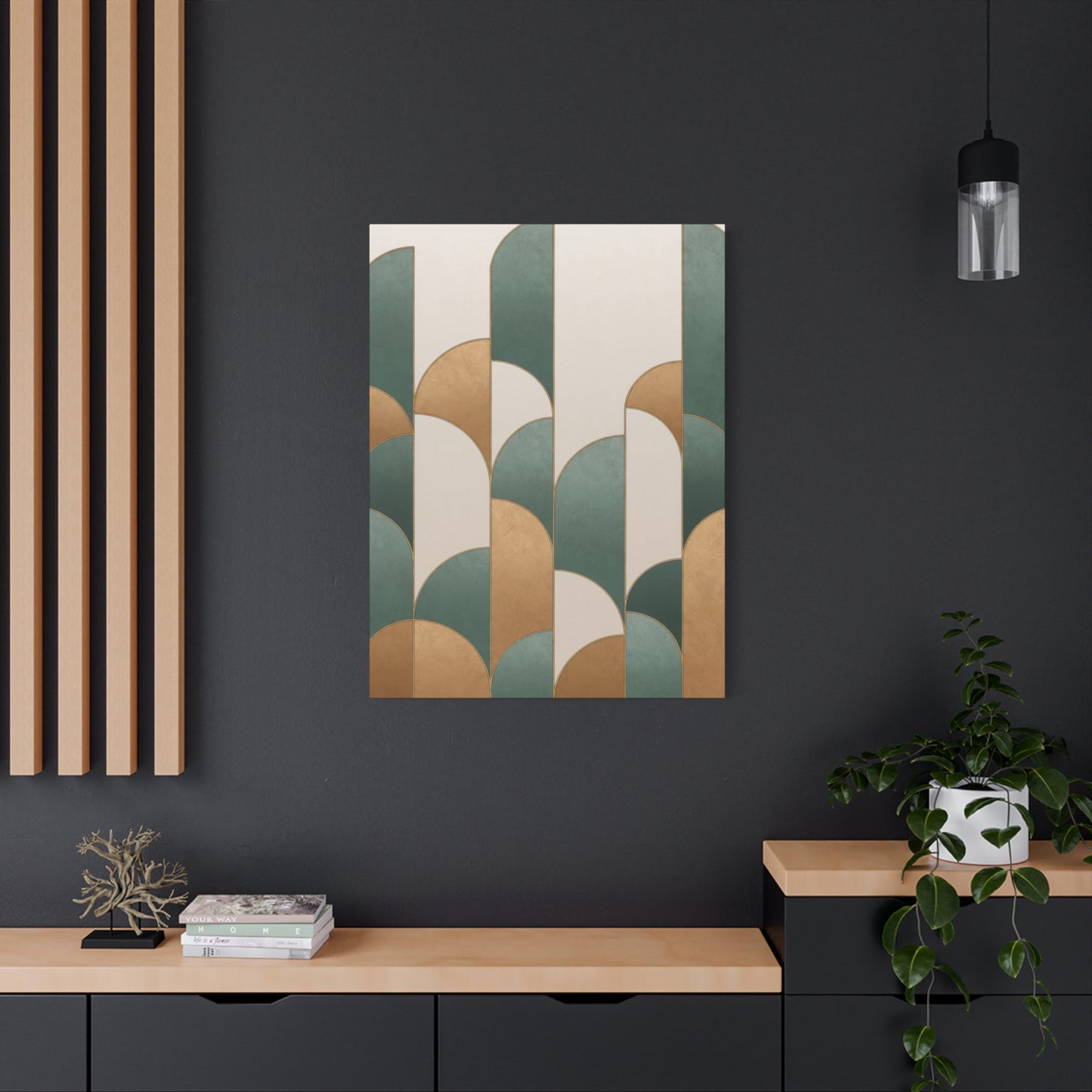
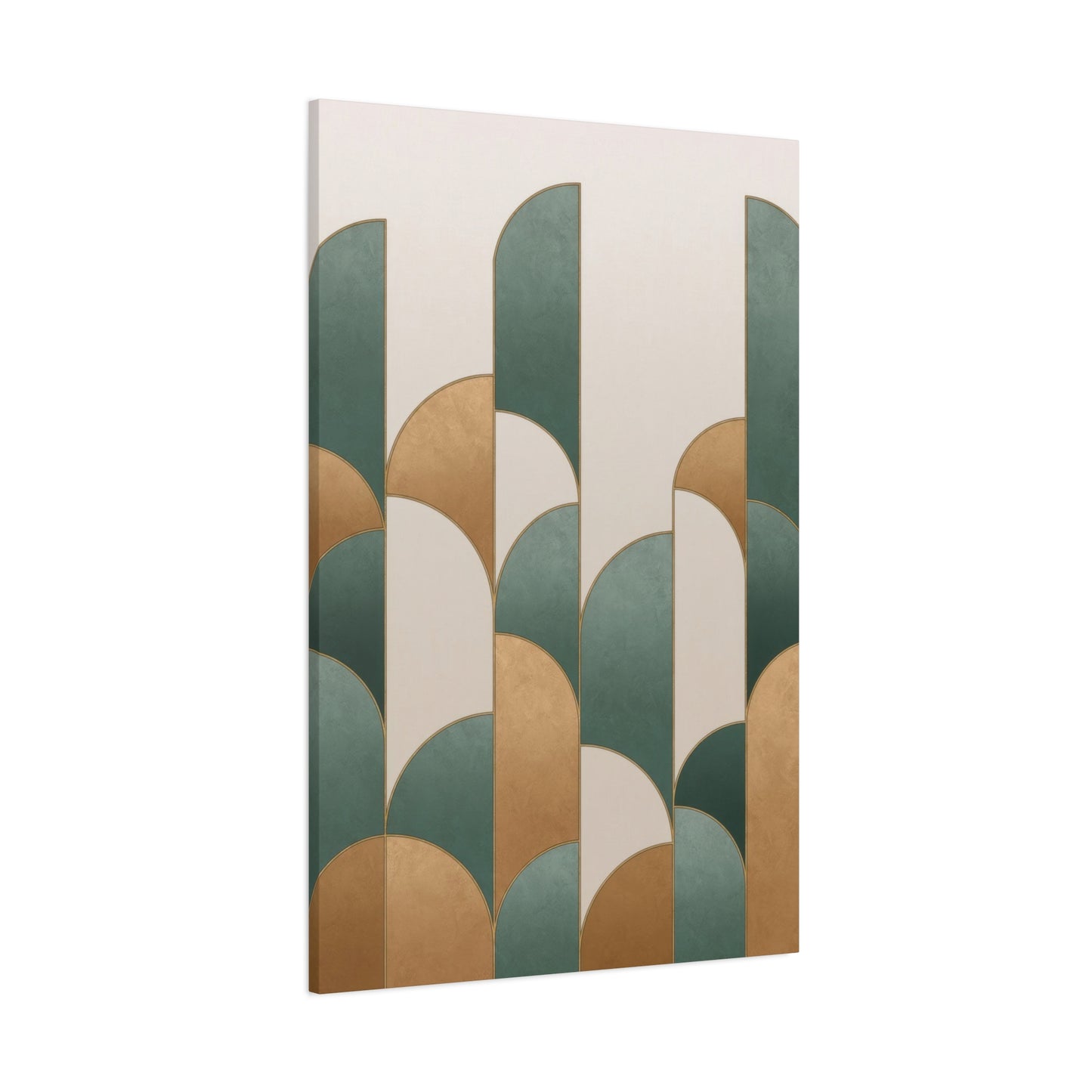
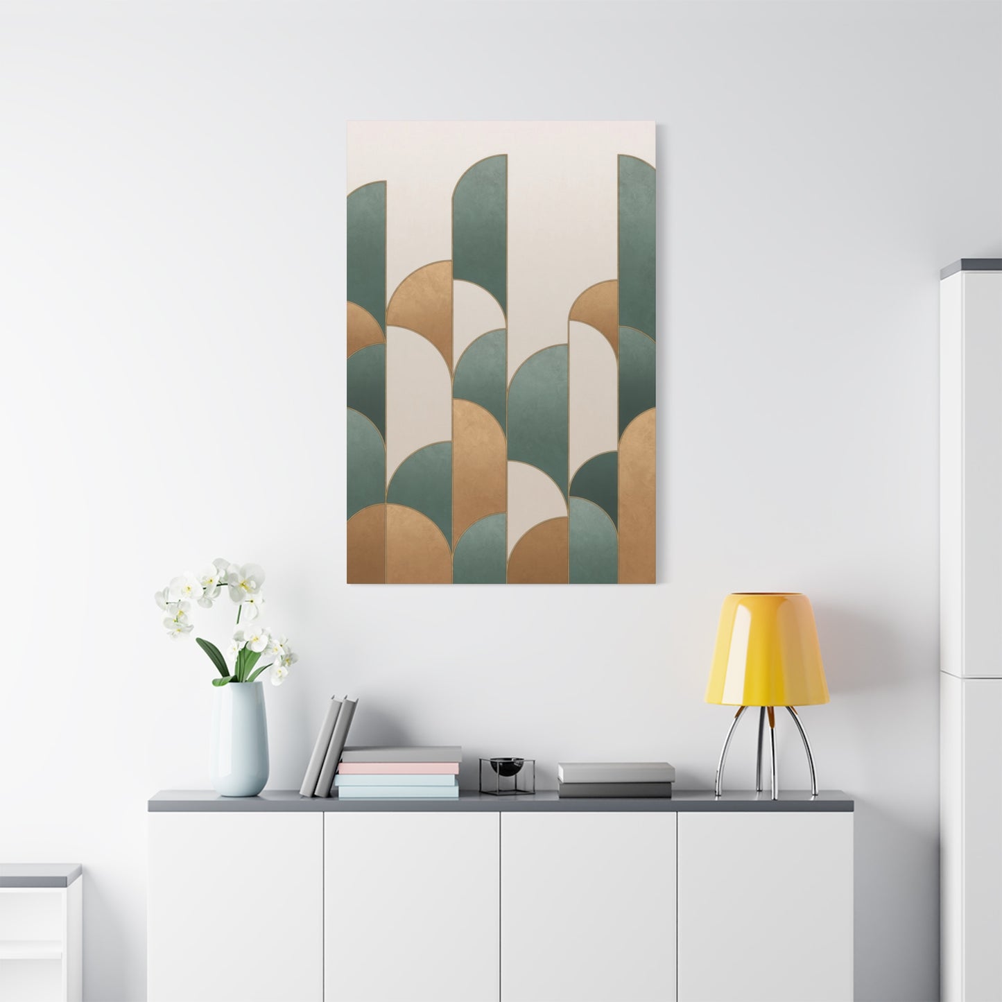
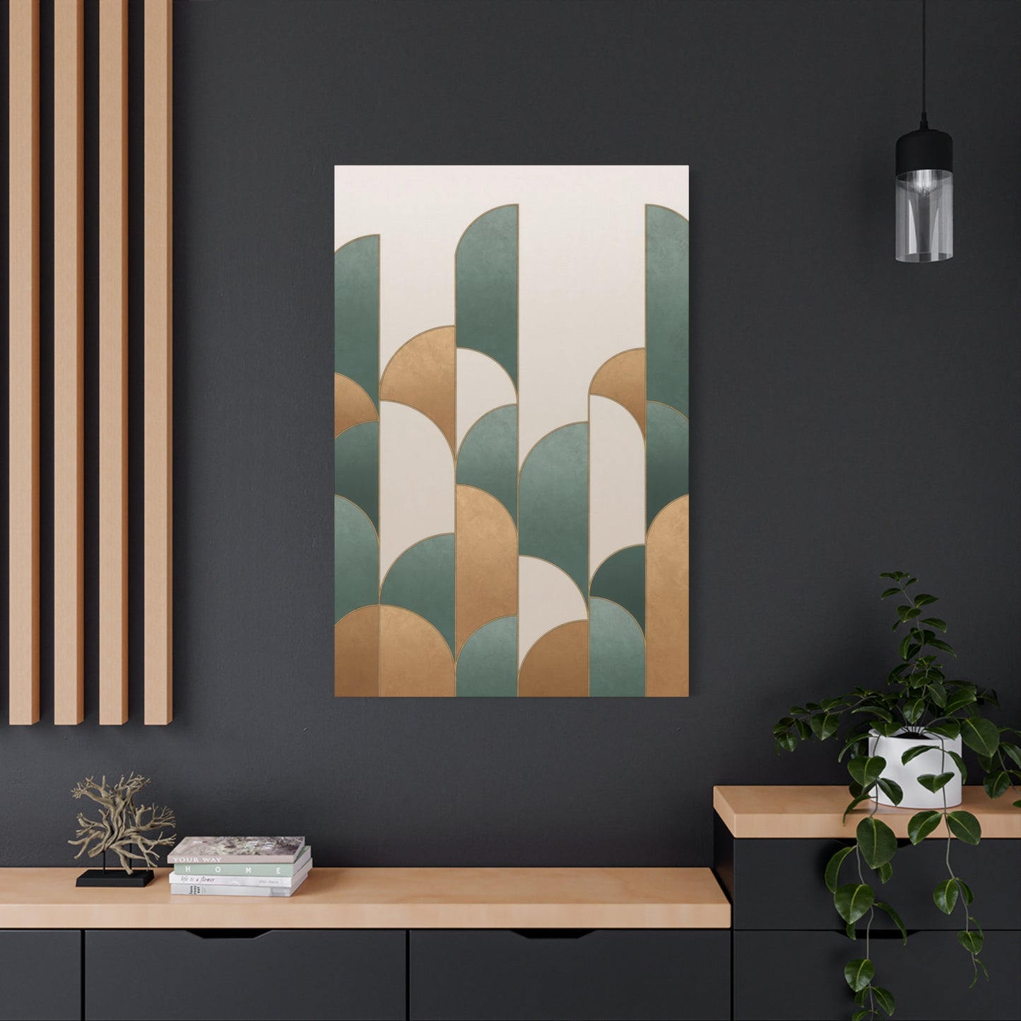
Abstract Teal Gold Opulence Wall Art & Canvas Prints
Abstract Teal Gold Opulence Wall Art & Canvas Prints
Couldn't load pickup availability
Creating Elegance with Teal and Gold: How Opulent Abstract Wall Art Transforms Your Home
The marriage of teal and gold in abstract wall décor represents one of the most captivating color combinations in contemporary interior design. This pairing effortlessly blends the calming depth of oceanic hues with the radiant warmth of precious metals, creating visual compositions that command attention while maintaining sophisticated elegance. When these two powerful colors converge on canvas, they produce an aesthetic experience that transcends ordinary decoration, transforming living spaces into curated galleries of refined taste.
The relationship between these colors operates on multiple sensory levels. Teal brings coolness, tranquility, and depth—qualities associated with natural elements like tropical waters and gemstones. Gold introduces warmth, prosperity, and luminosity, evoking images of sunlight, precious minerals, and timeless wealth. Together, they create a dynamic tension that feels both harmonious and exciting, offering viewers a visual experience that shifts depending on lighting conditions and viewing angles.
Abstract compositions featuring this color duo have gained tremendous popularity among interior designers, art collectors, and homeowners seeking to elevate their environments. The versatility of this combination allows it to adapt to various design philosophies, from minimalist modern spaces to maximalist eclectic rooms. Whether rendered in bold geometric patterns, flowing organic forms, or textured layered applications, teal and gold abstract pieces serve as focal points that anchor entire room designs.
The psychological impact of this color pairing cannot be overstated. Teal promotes mental clarity, emotional balance, and creative thinking, while gold stimulates feelings of success, confidence, and optimism. When experienced together in abstract art, these psychological effects combine to create spaces that feel both energizing and calming—a rare balance that enhances daily living experiences.
Contemporary artists working with these colors explore countless techniques to maximize their visual impact. Some employ metallic gold leaf or paint that catches and reflects light throughout the day, creating artwork that changes with natural illumination patterns. Others use layering techniques with transparent and opaque applications, building depth that invites extended viewing. Texture plays a crucial role, with many pieces incorporating raised elements, smooth glossy sections, and matte finishes that create tactile interest alongside visual appeal.
The scale of teal and gold abstract pieces varies widely, from intimate works suitable for reading nooks to expansive installations designed for double-height entryways. Regardless of size, effective compositions maintain careful consideration of color proportion, ensuring neither hue overwhelms the other unless deliberately designed for dramatic effect. This balance creates visual stability while allowing each color to showcase its unique properties.
The Luxurious Combination of Teal and Gold in Abstract Artwork
The fusion of teal and gold in abstract artwork represents a sophisticated evolution in color theory application within decorative arts. This combination draws upon centuries of artistic tradition while feeling distinctly contemporary, making it particularly appealing to collectors who appreciate both historical resonance and modern innovation. The relationship between these colors extends beyond simple complementary contrast, delving into realms of emotional resonance and cultural significance.
Artists approaching this color pairing must consider numerous technical factors to achieve optimal results. The specific shade of teal selected dramatically influences the overall composition—deeper, navy-influenced teals create moodier, more dramatic pieces, while brighter turquoise-leaning teals produce energetic, uplifting works. Similarly, gold applications range from pale champagne tones to rich, burnished copper-golds, each bringing distinct character to the finished piece.
The medium selected for creating these works significantly impacts their final appearance and longevity. Acrylic paints offer versatility and quick drying times, allowing artists to build multiple layers efficiently. Oil paints provide rich color saturation and extended working times, enabling subtle blending and gradation effects. Mixed media approaches incorporate metallic foils, resin coatings, and textural additives that enhance dimensional qualities and light interaction.
Contemporary abstract artists working with this palette often draw inspiration from natural phenomena. The way sunlight filters through ocean water, creating dancing patterns of light and shadow, informs many compositions. Geological formations featuring oxidized copper minerals against blue-green stone matrices provide another source of inspiration. These natural references ground abstract works in recognizable visual experiences while allowing artistic interpretation and stylistic freedom.
The technical execution of gold elements requires particular skill and consideration. Genuine metallic pigments and leafing materials react differently to light than standard paints, creating reflective qualities that shift with viewer position and ambient lighting. Some artists prefer working with metallic interference pigments that create subtle color shifts, while others embrace bold, highly reflective applications that dominate compositions. The choice depends on desired emotional impact and compatibility with intended display environments.
Teal bases in abstract compositions provide grounding stability that allows gold accents to shine without overwhelming viewers. This cooler foundation creates recession effects that make metallic elements appear to advance spatially, generating dimensional illusion on flat surfaces. Strategic placement of these colors creates visual pathways that guide viewer attention through compositions, establishing focal points and supporting rhythmic flow.
Successful teal and gold abstracts often incorporate neutral transitional tones that smooth color relationships and prevent jarring contrasts. Soft grays, warm whites, and muted beiges serve as breathing spaces within compositions, allowing the eye to rest between more intense color experiences. These supporting tones enhance rather than compete with primary colors, demonstrating sophisticated color management.
The scale of individual color zones within compositions affects overall impact significantly. Large fields of single colors create bold, graphic statements, while smaller, more fragmented applications generate energetic, complex visual textures. Many successful pieces employ varied scaling—expansive teal backgrounds supporting smaller, jewel-like gold accents, or inverse arrangements where golden fields host teal linear elements or organic shapes.
Crafting Sophistication with Teal and Gold Abstract Wall Décor
The process of crafting sophisticated abstract wall art using teal and gold involves careful planning, technical skill, and aesthetic intuition. Artists must balance creative spontaneity with deliberate design choices, ensuring finished pieces communicate intended messages while maintaining visual appeal. This creative process often begins with conceptual development, where artists explore themes, emotions, or experiences they wish to express through abstract visual language.
Material selection forms the foundation of successful execution. Canvas remains the most popular support, available in various weights, textures, and preparation levels. Some artists prefer the tooth of unprimed linen for textural interest, while others favor smoothly gessoed surfaces for crisp, clean color application. Alternative supports including wood panels, metal sheets, and specialty papers each offer unique properties that influence final aesthetics.
Preparation stages involve establishing compositional frameworks through sketching, digital mockups, or direct under-painting. Some artists work intuitively, allowing compositions to emerge organically through spontaneous mark-making and color application. Others plan meticulously, mapping value structures, color placements, and focal points before touching brush to surface. Both approaches produce compelling results when executed with skill and sensitivity.
Layering techniques create the depth and complexity that distinguish exceptional abstract work from superficial decoration. Initial layers establish overall value structures and color temperatures, while subsequent applications refine forms, adjust color intensities, and introduce textural variations. Many artists working with this palette employ glazing techniques, applying transparent color layers that allow underlying hues to influence surface tones, creating luminous effects impossible through opaque application alone.
The introduction of metallic elements requires timing consideration. Some artists prefer establishing complete color compositions before adding metallic accents as final highlights. Others integrate metallics throughout the layering process, allowing them to interact with subsequent applications. Each approach produces different effects—surface metallics maintain maximum reflectivity, while buried metallics create subtle shimmer beneath translucent color layers.
Textural development enhances tactile and visual interest significantly. Artists employ palette knives, textured application tools, and additive materials like modeling paste to create raised surfaces that cast shadows and catch light. Contrast between smooth, flat areas and heavily textured zones creates visual dynamics that activate compositions. In teal and gold works, texture particularly enhances metallic elements, increasing their light-catching properties through dimensional variation.
Compositional balance involves distributing visual weight appropriately throughout picture planes. Heavier, darker teal zones naturally carry more weight than lighter gold areas, requiring careful consideration of placement and proportion. Artists use color intensity, value contrast, textural complexity, and spatial relationships to achieve equilibrium that feels intentional rather than accidental.
Edge treatment and finishing processes complete the creative journey. Hard edges between color zones create graphic clarity and contemporary feel, while soft, blended transitions produce atmospheric, romantic effects. Many contemporary pieces feature combinations—strategic hard edges providing structural definition while soft blends create movement and flow. Professional finishing includes edge painting, protective varnishing, and proper backing installation that ensures longevity and presentation quality.
The Magnetic Appeal of Richness: Teal and Gold in Current Artwork
The magnetic appeal of teal and gold in current artwork stems from multiple converging factors that resonate with contemporary aesthetic sensibilities. This color combination addresses modern desires for spaces that feel both luxurious and livable, sophisticated yet accessible. Unlike overtly precious or intimidating design elements, teal and gold abstracts invite engagement while commanding respect, striking a balance that suits diverse lifestyles and personalities.
Current design trends emphasizing jewel tones and metallic accents have created ideal conditions for this palette's popularity. As interiors move away from the gray-dominated minimalism of previous decades, richer, more saturated colors have gained prominence. Teal represents this shift toward bolder hues while maintaining enough neutrality to function as a foundational color. Gold adds the luxury quotient that contemporary consumers increasingly seek in home environments.
The versatility of this combination across design styles contributes significantly to its widespread adoption. In modern settings, clean-lined teal and gold abstracts complement sleek furniture and minimal ornamentation. Traditional spaces benefit from the classical associations of both colors, with gold's historical preciousness and teal's connection to valuable pigments and dyes. Transitional interiors find perfect balance in this pairing, which bridges historical reference and contemporary execution.
Social media influence on design trends cannot be ignored when examining this palette's popularity. Highly photogenic, teal and gold pieces reproduce beautifully in digital formats, making them popular subjects for interior design content. The visual impact these colors create translates effectively through screens, driving consumer interest and market demand. This digital appeal has accelerated trend adoption beyond traditional design publication timelines.
Psychological comfort derived from this color combination enhances its appeal for residential applications. Unlike more challenging palettes that may fatigue viewers or feel oppressive in intimate spaces, teal and gold maintain freshness through varied visual experiences. The coolness of teal prevents the warmth of gold from becoming overwhelming, while gold's luminosity prevents teal from feeling cold or unwelcoming. This mutual moderation creates environments where people genuinely enjoy spending time.
The accessibility of this palette across price points democratizes luxury aesthetics. While original artwork in any medium commands investment, the reproducibility of abstract designs means teal and gold pieces exist at all market levels. High-quality prints, licensed reproductions, and affordable originals make this sophisticated look achievable regardless of budget constraints, broadening appeal across socioeconomic demographics.
Cultural associations with both colors carry positive connotations across diverse backgrounds. Gold's universal association with wealth, achievement, and celebration transcends specific cultural contexts. Teal's connections to water, healing, and natural beauty similarly resonate broadly. This cross-cultural appeal makes the combination suitable for international markets and multicultural households.
The emotional impact of living with these colors contributes to long-term satisfaction with artwork selections. Unlike trend-driven choices that quickly feel dated, the fundamental appeal of teal and gold remains stable over time. The colors possess enough complexity to prevent visual boredom while maintaining coherent aesthetic identities that don't clash with evolving tastes.
Teal and Gold: An Ideal Match for Rich Abstract Compositions
The pairing of teal and gold creates an ideal foundation for rich abstract compositions due to inherent color relationships and psychological associations. This combination operates effectively across multiple compositional approaches, from strict geometric arrangements to fluid, organic expressions. Understanding why these colors work so successfully together reveals principles applicable to broader color theory and design thinking.
Color temperature contrast forms the primary basis for this pairing's effectiveness. Teal reads as cool, creating visual recession and atmospheric depth within compositions. Gold registers as warm, advancing spatially and creating focal emphasis. This temperature opposition generates natural visual hierarchy without requiring value contrast, allowing artists to work within similar brightness levels while maintaining clear compositional structure.
Saturation relationships between these colors offer excellent control over visual intensity and emotional impact. Highly saturated versions of both colors create bold, energetic statements suitable for dramatic spaces. Desaturated, muted interpretations produce sophisticated, subtle works appropriate for contemplative environments. The ability to modulate intensity while maintaining color identity gives this palette exceptional flexibility.
The optical properties of metallic gold create unique interactions with matte teal surfaces. Gold's reflectivity changes dramatically with lighting conditions and viewing angles, creating dynamic viewing experiences that evolve throughout days and seasons. Matte teal provides stable visual anchoring against which these metallic variations register more dramatically, enhancing the sense of movement and life within static artworks.
Compositional strategies for combining these colors range from equal distribution to dramatic imbalance. Some artists favor near-equal proportions, creating harmonious visual dialogues between colors. Others employ one color as dominant field with the other providing accent punctuation, generating more theatrical effects. Both approaches succeed when executed with attention to visual weight, spatial distribution, and rhythmic patterning.
Pattern and repetition within teal and gold abstracts create visual rhythms that engage viewers beyond initial impact. Repeating geometric motifs in alternating colors establish predictable patterns that eyes follow naturally. Organic, irregular repetitions feel more spontaneous while still providing structural coherence. The interplay between pattern and variation—predictability and surprise—maintains viewer interest through extended viewing.
Negative space utilization affects how teal and gold interact within compositions. Allowing breathing room around color zones prevents visual congestion and enhances appreciation of individual hues. Strategic placement of neutral areas creates pathways through compositions, directing visual flow and establishing viewing sequences. This conscious space management elevates abstract work from random color application to considered artistic statements.
The symbolic resonance of combining these specific colors adds conceptual depth to purely visual appeal. Teal's associations with emotional balance, spiritual awareness, and creative expression complement gold's connections to success, prosperity, and divine light. Abstract works incorporating both colors can carry layered meanings that viewers interpret through personal lenses, creating individualized experiences with shared artworks.
Methods to Introduce Luxury Through Teal and Gold Abstract Wall Décor
Introducing luxury through teal and gold abstract wall art involves strategic selection, placement, and styling decisions that maximize visual impact and spatial harmony. The inherent richness of this color palette provides strong foundation for elevated aesthetics, but thoughtful implementation amplifies these qualities significantly. Understanding how to leverage this combination's strengths creates truly transformative interior experiences.
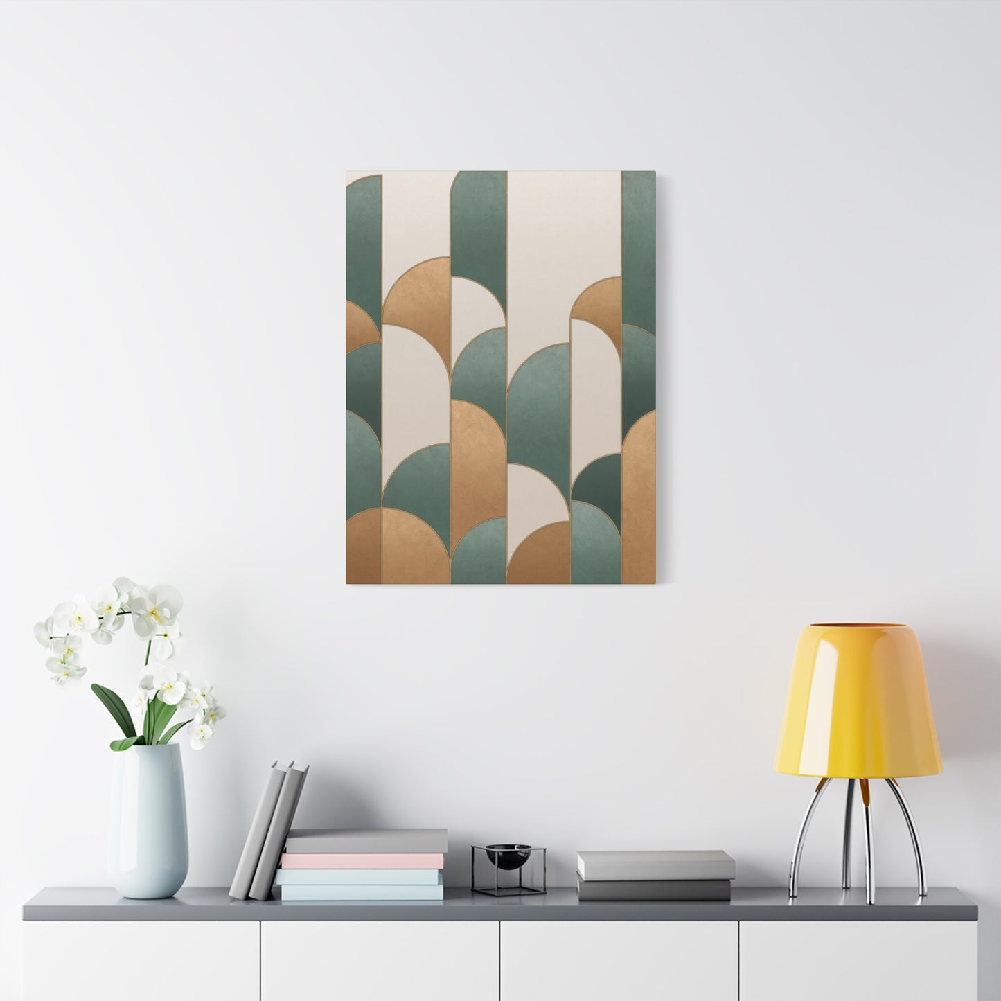
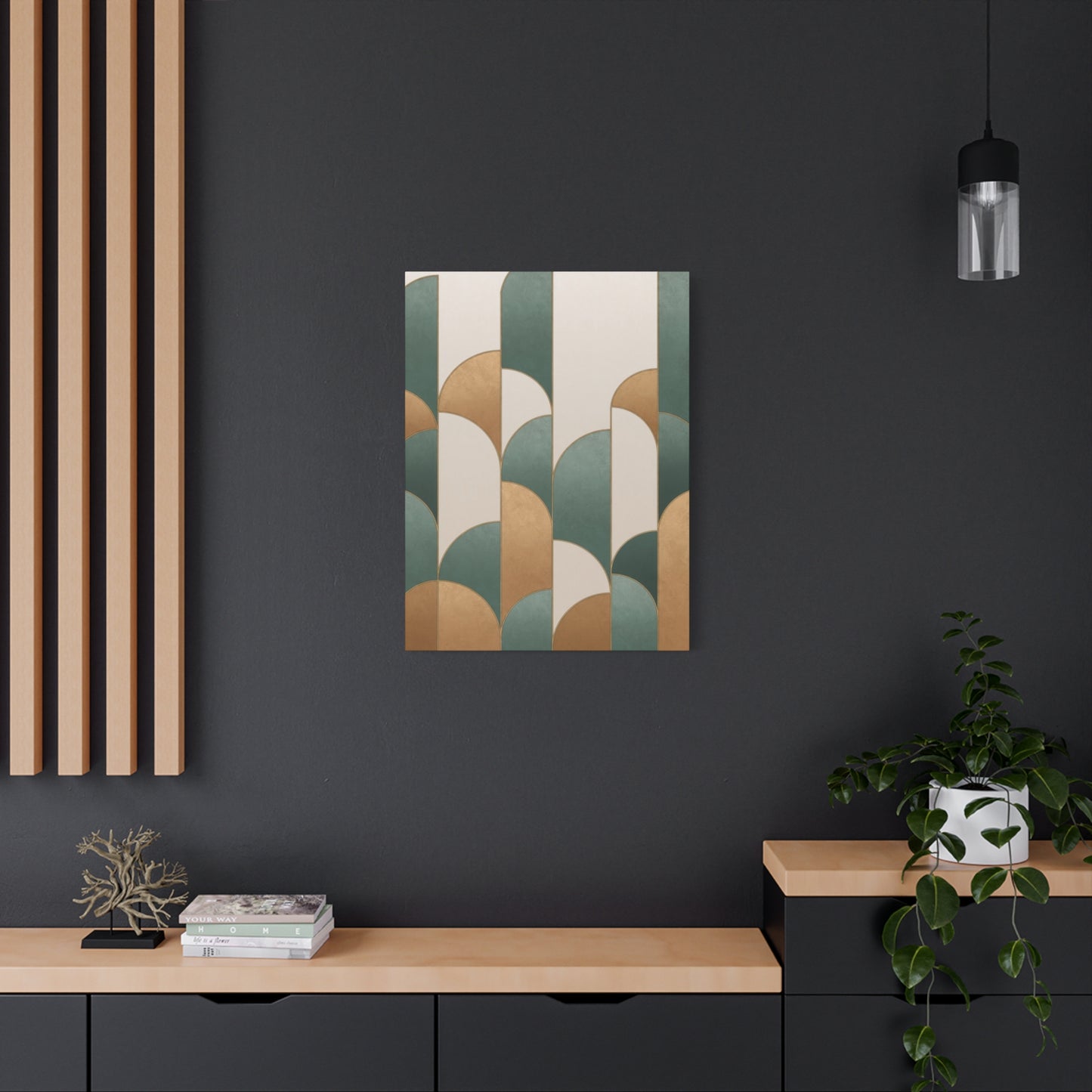
Scale consideration ranks among the most critical factors in achieving luxurious effects. Oversized statement pieces create immediate drama and establish spatial hierarchy, functioning as room anchors around which other elements organize. Large-scale abstracts demonstrate commitment and confidence, qualities associated with luxury sensibilities. However, inappropriately large pieces can overwhelm spaces, so dimensions must align with wall proportions and viewing distances.
Placement height affects both visual impact and perceived sophistication. Center-hanging artwork at eye level—typically 57 to 60 inches from floor to center—creates accessible, comfortable viewing experiences. In spaces with high ceilings, raising placement slightly can maintain appropriate relationships with architectural features. Above furniture pieces, maintaining 6 to 8 inches between frame bottom and furniture top creates visual connection without crowding.
Lighting dramatically influences how teal and gold artwork presents in spaces. Natural light creates shifting viewing experiences as sun angles change throughout days and seasons. Metallic gold elements particularly benefit from directional natural light, which activates reflective properties. Artificial lighting requires careful consideration—warm white sources enhance gold tones while potentially dulling teals, while cooler whites maintain teal vibrancy but may diminish gold richness. Adjustable lighting systems offering temperature control provide optimal flexibility.
Dedicated artwork lighting elevates presentation significantly. Picture lights mounted directly to frames provide focused illumination that highlights details and creates gallery-quality presentation. Track lighting offers flexibility for adjusting beam angles and intensities. Recessed ceiling fixtures with adjustable trims allow discreet lighting that doesn't compete visually with artwork. In all cases, LED sources offering high color rendering indices preserve true color appearances.
Framing choices significantly impact luxury perception and color presentation. Simple, high-quality frames in metallic finishes harmonize with gold elements within artwork while maintaining clean, contemporary aesthetics. Deep-set floating frames create dimensional interest and premium appearance. For certain pieces, frameless gallery wrapping with painted edges maintains modern simplicity while allowing artwork to speak without visual competition.
Companion pieces and gallery arrangements multiply impact when thoughtfully composed. Multiple teal and gold abstracts in varying sizes create cohesive installations that fill large walls impressively. Mixing this palette with complementary artworks in coordinating but not matching colors creates curated collections that demonstrate sophisticated taste. Symmetrical arrangements feel formal and traditional, while asymmetrical compositions appear more contemporary and dynamic.
Surrounding décor elements should enhance rather than compete with teal and gold artwork. Furniture in neutral tones allows art to dominate visually, while strategic accent pieces echoing artwork colors create intentional design dialogues. Metallic accessories in gold, brass, or bronze finishes reinforce precious metal elements. Textiles incorporating teal—whether in throw pillows, area rugs, or window treatments—extend color palettes beyond artwork into broader room designs.
Styling negative space around artwork demonstrates restraint and confidence associated with luxury design. Resisting urges to fill every wall surface allows featured pieces to command appropriate attention. Strategic emptiness creates visual breathing room that enhances rather than diminishes impact. This less-is-more approach requires confidence but produces sophisticated results that feel professionally designed.
Richness in Abstract Expression: The Depth of Teal and Gold
The richness inherent in abstract expressions combining teal and gold extends beyond simple color application into realms of technique, concept, and viewer experience. This depth distinguishes truly exceptional work from merely decorative pieces, elevating abstract art to meaningful cultural objects worthy of collection and contemplation. Understanding the layers of richness in this palette reveals why it continues captivating artists and audiences alike.
Material richness begins with paint quality and composition. Professional-grade pigments offer superior color saturation, lightfastness, and tinting strength compared to student or craft formulations. Genuine metallic pigments containing actual metal particles create authentic gold appearances with appropriate reflectivity and color accuracy. High-quality binders ensure proper adhesion, flexibility, and longevity, preventing cracking, yellowing, and deterioration over decades.
Textural richness adds tactile dimensions that engage viewers beyond purely optical experiences. Heavy impasto applications create sculptural surfaces where paint thickness becomes as important as color choice. Smooth, glass-like surfaces achieved through multiple thin layers and careful sanding produce entirely different effects—contemporary, refined, and pristine. Combinations of textural approaches within single compositions create complexity that rewards close examination.
Conceptual richness elevates abstract work from decoration to meaningful art. Artists imbue pieces with intentions, whether exploring emotional states, philosophical concepts, or formal aesthetic questions. Viewers bring their own interpretations, creating dialogues between maker intention and audience reception. This layered meaning-making distinguishes art from craft, creating objects that satisfy intellectually and emotionally beyond simple beauty.
Visual complexity through layering techniques creates depth that draws viewers into compositions. Transparent glazes allow multiple color layers to interact optically, producing nuanced hues impossible through single applications. Partial coverage reveals underlying layers strategically, creating histories within paintings that suggest process and time. This visual archaeology invites viewers to decode compositions, discovering new details through repeated viewings.
Symbolic richness emerges from cultural and personal associations both colors carry. Teal's connections to healing waters, precious gemstones, and spiritual awareness provide conceptual frameworks for interpretation. Gold's associations with divinity, achievement, and transformation offer additional layers. Artists consciously or unconsciously tap these symbolic reservoirs, creating works that resonate beyond immediate visual appeal.
Technical richness demonstrates through mastery of materials and processes. Skillful color mixing producing perfect custom hues, expert brush control creating precise marks, and sophisticated understanding of how different materials interact all contribute to overall quality. Technical excellence doesn't require visibility—the most skillful execution often appears effortless—but its presence elevates work significantly.
Compositional richness through sophisticated spatial relationships, rhythmic variations, and balanced asymmetries creates visual interest that sustains attention. Simple compositions risk appearing obvious or simplistic, while overly complex arrangements can feel chaotic and overwhelming. Ideal compositions find sweet spots between these extremes, offering enough interest to engage without exhausting viewers.
Emotional richness connects viewers to artworks through psychological responses and affective experiences. Colors influence moods, compositions suggest movements or stasis, and overall aesthetic character creates atmospheric effects. Successful pieces generate desired emotional states—whether energizing excitement, peaceful contemplation, or confident sophistication—through deliberate artistic choices.
Teal, Gold, and the Craft of Current Richness
The intersection of teal, gold, and contemporary expressions of luxury reflects broader cultural shifts in how we understand and value aesthetic richness. Modern interpretations of opulence have moved beyond overt displays of material excess toward more nuanced, sophisticated expressions. This evolution manifests clearly in abstract art, where color, texture, and composition communicate luxury without literal representation of wealth objects.
Contemporary approaches to luxury emphasize quality over quantity, authenticity over imitation, and meaningfulness over ostentation. Teal and gold abstracts embody these values through excellent materials, honest artistic processes, and genuine aesthetic value. This alignment with current luxury paradigms explains their popularity among discerning collectors and design-conscious consumers.
The democratization of design knowledge through digital media has elevated general aesthetic literacy, creating audiences who appreciate subtle sophistication over obvious luxury signaling. This educated viewership recognizes quality in abstract art—sophisticated color relationships, skilled technique, and thoughtful composition. Teal and gold pieces appeal to these informed sensibilities, offering complexity that rewards educated viewing.
Sustainability concerns increasingly influence luxury markets, including art collection. Original artworks represent sustainable choices compared to mass-produced décor items, offering lasting value and reduced environmental impact. Quality abstract pieces remain relevant through style changes, avoiding disposal cycles associated with trendy fast décor. This longevity aligns with luxury values emphasizing permanence and enduring quality.
Craftsmanship appreciation has surged as reactions against mass production and digital saturation. Handmade abstract artworks showcase human skill, individual artistic vision, and material knowledge increasingly rare in automated production contexts. The physical reality of painted surfaces—actual pigment layers, genuine brush marks, real metallic particles—offers authentic materiality that connects viewers to making processes and maker presence.
Personalization defines contemporary luxury experiences across categories from fashion to hospitality. Abstract art inherently offers personalization through individual interpretation and subjective response. Two viewers never experience identical reactions to abstract pieces, creating personal relationships with artworks that mass-produced items cannot replicate. This individualized experience aligns perfectly with current luxury expectations.
Investment value considerations increasingly influence art purchases, with buyers viewing quality pieces as assets rather than mere expenditures. Original abstracts by recognized artists appreciate over time, offering financial returns alongside aesthetic value. Even reproduction pieces hold value through psychological benefits—enhanced daily living experiences, increased property appeal, and personal satisfaction—justifying investment from utility perspectives.
The role of abstract art in wellness and mindfulness practices adds contemporary relevance beyond traditional decorative functions. Colors influence psychological states, and engaging with abstract forms provides meditative focusing experiences. Teal's calming properties combined with gold's energizing effects create balanced environments supporting mental health and emotional wellbeing. This functional dimension resonates with health-conscious luxury consumers.
Enhancing Environments with Teal and Gold Abstract Artwork
The power of teal and gold abstract artwork to transform environments operates through multiple mechanisms—visual impact, psychological influence, spatial definition, and atmospheric creation. Strategic deployment of this palette produces dramatic shifts in how spaces feel, function, and present to inhabitants and visitors. Understanding these transformative capabilities enables intentional environmental design that achieves specific experiential goals.
First impressions form instantly upon entering spaces, and focal artwork significantly influences these critical initial responses. Teal and gold abstracts positioned in entrance sightlines immediately communicate sophistication and attention to design quality. This visual greeting sets tones for entire home experiences, establishing expectations and creating memorable impressions that distinguish spaces from generic interiors.
Color psychology applications through strategic artwork placement affect mood and behavior in predictable ways. Teal placements in workspaces promote focus, creativity, and calm productivity. Gold elements introduce optimism and confidence without excessive stimulation. Combined, these colors create balanced environments supporting various activities from concentrated work to relaxed socializing. Artwork placement in specific zones tailors psychological effects to room functions.
Spatial perception manipulation through color application affects how room dimensions feel. Cool teals create recession effects, making walls appear farther away and rooms feel more spacious. Warm golds advance visually, creating intimacy and coziness. Strategic placement of teal-dominant pieces makes small rooms feel larger, while gold-heavy works add warmth to oversized spaces. This color temperature manipulation offers powerful design tools for addressing architectural challenges.
Light modification through reflective gold surfaces affects ambient illumination throughout spaces. Metallic elements function as secondary light sources, bouncing and redirecting natural and artificial light. Positioning metallic-rich abstracts to catch window light extends daylight deeper into interiors. Near artificial light sources, reflective artwork amplifies illumination efficiency, reducing energy requirements while creating dynamic lighting effects.
Architectural feature enhancement through complementary artwork placement draws attention to design highlights while minimizing flaws. Artwork above fireplaces emphasizes these traditional focal points. Pieces on accent walls reinforce intentional color choices. Conversely, dramatic artwork can redirect attention from problematic architectural elements, using visual interest to guide attention strategically.
Furniture arrangement often responds to artwork placement, creating cohesive spatial organizations. Large abstracts anchor seating groups, providing visual weight that balances furniture masses. Artwork establishes focal points around which furniture naturally organizes, creating conversation areas and traffic flow patterns. This spatial structuring function makes artwork active design participants rather than passive accessories.
Seasonal atmosphere adaptation occurs naturally with teal and gold abstracts due to their color associations. Cool teals feel refreshing during warm months, providing psychological temperature moderation. Warm golds become especially appealing during cold seasons, adding cozy warmth to winter environments. Unlike literally seasonal décor requiring storage and rotation, these pieces remain appropriate year-round while shifting perceptual emphases naturally.
Personal identity expression through art selection communicates values, tastes, and aspirations to inhabitants and guests. Choosing sophisticated abstract pieces signals aesthetic awareness, cultural engagement, and design commitment. Specific selections within the teal and gold palette—whether bold and dramatic or subtle and contemplative—reveal personality dimensions and create environments reflecting authentic selves rather than generic showroom aesthetics.
The Refined Nature of Teal and Gold in Modern Wall Artwork
The refinement embodied in teal and gold contemporary wall artwork reflects evolving aesthetic sensibilities that value subtlety, complexity, and intentionality over obvious displays. This refined character distinguishes sophisticated design choices from merely trendy selections, creating interiors with lasting appeal and timeless quality. Understanding what constitutes refinement in this context helps identify truly exceptional pieces worthy of investment and living alongside.
Color sophistication manifests through careful shade selection and subtle variation within color families. Rather than primary, saturated versions, refined palettes favor complex hues with underlying neutrals—teal with gray undertones rather than pure cyan, antique gold rather than bright yellow-gold. These nuanced colors feel more mature and versatile, avoiding the childlike quality of basic palette selections.
Compositional restraint distinguishes refined abstracts from busy, overworked pieces. Strategic negative space, clear focal hierarchies, and deliberate mark-making create compositions that feel edited and intentional rather than haphazard. This less-is-more approach requires artistic confidence and disciplined decision-making, qualities that elevate work beyond amateur or derivative efforts.
Surface quality excellence through meticulous execution demonstrates refinement in physical form. Even brush strokes in calculated directions, smooth color transitions without muddy blending, and clean edges where intended all reveal technical mastery. Conversely, intentional texture and expressive mark-making appear purposeful rather than accidental in refined work, showing control even in spontaneous-appearing passages.
Scale appropriateness for intended contexts reflects refined aesthetic judgment. Pieces sized correctly for display walls maintain proper visual weight without overwhelming or underwhelming spaces. Artists and collectors demonstrating refined sensibilities select dimensions that activate walls effectively while respecting architectural proportions and surrounding elements.
Material authenticity distinguishes refined choices from economical shortcuts. Genuine canvas rather than paper, quality stretcher bars maintaining proper tension, archival pigments ensuring longevity—these material choices demonstrate commitment to quality that characterizes refined taste. Even in reproduction prints, superior papers, inks, and printing processes separate refined products from cheap alternatives.
Frame selection and presentation quality significantly impact overall refinement. Museum-quality framing with archival materials, precise miters, and appropriate mat boards demonstrates respect for artwork and comprehensive aesthetic vision. Even unframed pieces benefit from professional stretching, properly painted edges, and secure hardware. These finishing details distinguish refined presentation from casual mounting.
Contextual appropriateness shows refined judgment in matching artworks to environments. Understanding which pieces suit specific architectural styles, furniture aesthetics, and functional contexts requires visual literacy and thoughtful consideration. Refined collectors avoid forcing mismatched combinations, instead selecting works that harmonize naturally with existing design elements while adding desired character.
Trend awareness balanced with timeless appeal represents refined acquisition strategy. While completely ignoring current aesthetics feels dated, slavish trend following produces quickly obsolete interiors. Refined approach involves selecting trend-adjacent pieces with enduring qualities—contemporary expressions rooted in permanent aesthetic principles. Teal and gold abstracts exemplify this balance, feeling current while drawing on established color theory and design history.
Implementing Teal and Gold for Rich Abstract Interior Aesthetics
Creating opulent abstract interiors through strategic teal and gold implementation requires comprehensive design planning that considers multiple environmental factors simultaneously. Successful execution produces cohesive spaces where artwork integrates seamlessly with architecture, furnishings, and functional requirements. This holistic approach distinguishes professionally designed interiors from haphazard décor accumulation.
Foundation establishment through primary artwork selection anchors entire room designs. Beginning with statement teal and gold abstract pieces allows all subsequent decisions to reference this central element. Colors, materials, and styles throughout spaces can then coordinate with artwork, creating intentional dialogues rather than disconnected collections. This artwork-first approach ensures coherence and purposeful design development.
Color palette extension from artwork into broader interiors creates unified aesthetic experiences. Selecting paint colors, textile hues, and accessory tones that reference but don't exactly match artwork colors produces sophisticated coordination. Pulling lighter teal values for accent walls or deeper gold tones for throw pillows demonstrates thoughtful color development rather than literal matching that can feel contrived.
Material coordination reinforces luxury messages when materials echo artwork qualities. Metallic finishes on light fixtures, cabinet hardware, or furniture legs reference gold elements without competing. Reflective surfaces like mirrors and glass tabletops create shimmer echoing metallic paint applications. Rich velvets and silks in teal tones provide luxurious texture paralleling visual richness in artwork.
Contrast management prevents monotonous single-note spaces while maintaining cohesion. Introducing neutral elements—crisp whites, warm creams, soft grays—provides visual rest between more intense color statements. These neutrals allow teal and gold moments to shine rather than competing for attention. Balancing bold and subtle creates dynamic yet comfortable environments.
Pattern mixing adds visual complexity when approached thoughtfully. Geometric patterns in rugs or pillows can reference abstract compositions without mimicking them exactly. Organic patterns in different scales create layered interest. Limiting pattern colors to palette established by artwork maintains coordination while varied scales and styles prevent repetitive monotony.
Texture variation throughout spaces creates tactile richness complementing visual opulence. Smooth leather, nubby bouclé, cool stone, warm wood—diverse textures engage multiple senses and prevent flat, one-dimensional aesthetics. This material variety reflects the textural complexity in quality abstract artwork, creating parallel experiences across different medium types.
Furniture selection considers both physical comfort and visual relationship to artwork. Silhouettes can echo compositional lines—curved sofas relating to organic abstracts, angular sectionals complementing geometric pieces. Sizes must balance artwork scale—substantial furniture pieces support large artwork appropriately, while delicate pieces suit smaller works. Color choices typically favor neutrals allowing artwork to dominate, though strategic teal or gold upholstery can create powerful connections.
Lighting layers—ambient, task, and accent—work together creating flexible atmospheres supporting various activities and moods. Dimmer controls allow intensity adjustments throughout days and for different occasions. Color temperature considerations ensure lighting enhances rather than distorts colors. Well-lit spaces showcase artwork effectively while providing comfortable illumination for practical functions.
The Symbolic Significance of Teal and Gold in Abstract Artwork
Color symbolism adds conceptual depth to abstract artwork, creating layers of meaning beyond purely visual experience. Teal and gold each carry rich symbolic histories spanning cultures, spiritual traditions, and psychological associations. Understanding these symbolic dimensions enhances appreciation and enables more meaningful connections between viewers and artworks.
Teal symbolism draws from associations with water, sky, and gemstones. As water-related color, teal suggests emotional depth, spiritual cleansing, and life-giving sustenance. Many cultures associate water with consciousness, the subconscious mind, and intuitive wisdom. Teal artwork can evoke these qualities, creating contemplative atmospheres conducive to introspection and emotional processing.
Spiritual traditions often associate teal with throat chakra energy, governing communication, self-expression, and truth-speaking. Abstract pieces emphasizing this color might symbolize finding authentic voice or expressing inner realities. This association makes teal-dominant abstracts particularly meaningful in spaces dedicated to creative work, personal development, or honest communication.
Gemstone connections link teal to turquoise, a stone valued across numerous cultures for protective and healing properties. Ancient Egyptians, Persians, and Native American peoples all treasured turquoise, attributing various powers including traveler protection, health promotion, and spiritual purification. Artworks evoking these associations through color can carry symbolic protection intentions.
Natural world connections position teal as bridge between blue sky and green earth, suggesting balance between spiritual aspiration and physical grounding. This intermediate position makes teal symbolically appropriate for spaces where multiple activities occur or where balance between competing needs exists. The color's harmonizing quality can symbolically support equilibrium in life aspects.
Gold symbolism universally connects to sun, divinity, and enlightenment across virtually all human cultures. Solar associations bring qualities of illumination, growth, vitality, and life force. Gold represents the light of consciousness, awakened awareness, and spiritual realization in many traditions. Abstract pieces featuring gold can symbolize these elevated states or aspirations toward them.
Material wealth associations with gold extend beyond literal financial value to include spiritual riches, abundance mindsets, and prosperity consciousness. Gold in artwork can represent or attract abundance in various forms—not just money but also love, opportunity, creativity, and fulfillment. This symbolic dimension makes gold-featured art popular in prosperity-focused design approaches.
Achievement symbolism links gold to success, victory, and excellence across cultures. Olympic gold medals, academic honors, and quality standards all reference gold's association with highest achievement. Artwork featuring gold can symbolize personal accomplishments or serve as visual affirmations of success goals, creating inspirational environmental messages.
Permanence and incorruptibility define gold's physical properties—it doesn't tarnish, corrode, or deteriorate. Symbolically, this represents eternal truths, unchanging values, and permanent spiritual realities. Gold in abstract art can suggest these enduring qualities, creating visual reminders of what remains constant amid life's changes.
The combined symbolism of teal and gold creates rich conceptual frameworks supporting multiple interpretations. Water and sun, earth and sky, emotion and spirit, material and transcendent—these complementary opposites find balance in this color pairing. Abstract works combining both colors can symbolize integration, wholeness, and balanced being.
Methods for Teal and Gold Abstract Artwork to Enhance Room Appearance
The capacity of teal and gold abstract artwork to elevate room aesthetics operates through specific visual mechanisms and psychological effects. Understanding these processes enables strategic artwork selection and placement that achieves maximum transformative impact. Successful elevation involves more than simply adding expensive items—it requires thoughtful integration that enhances overall environmental quality.
Visual elevation occurs first through introduction of sophisticated color relationships. Many interiors default to safe neutral schemes lacking color interest. Introducing teal and gold immediately adds richness and complexity, demonstrating design confidence and aesthetic awareness. The sophistication of this particular pairing signals intentionality rather than accidental decoration, raising perceived design quality.
Conclusion
In conclusion, Creating Elegance with Teal and Gold: How Opulent Abstract Wall Art Transforms Your Home shows that a well-chosen piece of art has the power to completely elevate the aesthetic of a space. The opulent combination of teal and gold in abstract wall art not only creates a stunning visual contrast but also introduces a layer of sophistication, depth, and warmth that is hard to achieve through other design elements. This art style effortlessly blends bold color with refined elegance, making it a transformative addition to any room that craves a touch of luxury and style.
Teal, with its rich, cool undertones, provides a sense of tranquility and refinement. It’s a color that evokes feelings of calmness and peace while still maintaining an air of mystery and richness. Gold, on the other hand, adds a layer of opulence, warmth, and shine—perfect for creating a focal point in your home. When paired together in abstract forms, teal and gold do more than just decorate a wall; they create an atmosphere of grandeur and harmony. The cool, calming nature of teal is perfectly balanced by the warmth and light of gold, allowing the art to bring both vibrancy and tranquility to a space.
What makes this style of art particularly compelling is its versatility. Whether placed in a contemporary living room, a chic dining area, or a luxurious bedroom, teal and gold abstract wall art seamlessly integrates with a wide range of interior designs. The boldness of the colors adds a modern flair, while the abstract nature allows the piece to complement both minimalist and eclectic spaces. Teal and gold’s rich, refined palette pairs beautifully with everything from sleek, modern furniture to more traditional or bohemian décor, making it a versatile choice for homeowners with varying tastes.
Another remarkable aspect of Teal and Gold Abstract Wall Art is its ability to infuse any space with energy and elegance. The abstract forms encourage movement and fluidity, capturing the eye and drawing attention to the piece without overwhelming the room. Whether the artwork features dynamic swirls, geometric shapes, or layered textures, the combination of teal and gold gives it an effortless grandeur that commands attention. At the same time, the abstract nature of the artwork allows for interpretation, inviting viewers to engage with the piece on a personal level and creating a sense of depth and intrigue within the space.
Beyond its aesthetic impact, this art style has the ability to evoke emotions of luxury and sophistication. The shimmering effect of gold combined with the calming tones of teal can transform a space into something extraordinary, enhancing the overall mood and ambiance of the room. It invites both relaxation and admiration, making it an ideal choice for spaces where you entertain, relax, or unwind. It’s the type of artwork that creates a lasting impression, not just through its beauty, but through the feelings it evokes—comfort, opulence, and a touch of the extraordinary.
Looking forward, as design trends continue to evolve, the allure of Teal and Gold Abstract Wall Art is likely to remain strong. The desire for spaces that reflect both style and serenity will keep this combination at the forefront of interior design. Whether in bold, oversized pieces or smaller, more subtle works, the combination of teal and gold will continue to offer timeless elegance that can adapt to any style or trend.
In conclusion, Teal and Gold Abstract Wall Art is more than just an art piece—it is a statement of luxury, sophistication, and modern design. Its ability to elevate any space, whether through its rich color combination, dynamic abstraction, or sheer opulence, makes it an essential element for those looking to create a home that exudes both elegance and warmth. By choosing this style of art, you’re not just decorating a wall, you’re transforming your space into an atmosphere of grace and beauty, ensuring that every room feels both inviting and extravagant.
