


Alien Movie Poster Wall Art & Canvas Prints
Alien Movie Poster Wall Art & Canvas Prints
Couldn't load pickup availability


Alien Poster Wall Art Analysis: Visual Terror and Sci-Fi Horror Marketing Mastery
The cinematic landscape of science fiction horror was forever changed when Ridley Scott's masterpiece burst onto screens in 1979. However, before audiences experienced the terror within the dark corridors of the Nostromo, they encountered something equally haunting: the film's promotional artwork. This visual representation became more than mere advertising material; it evolved into a cultural phenomenon that redefined how science fiction horror could be marketed to audiences worldwide.
The poster campaign for this groundbreaking film represents a masterclass in visual communication, demonstrating how artistic choices can convey complex themes while generating unprecedented audience anticipation. Through careful analysis of design elements, symbolic imagery, and marketing psychology, we can understand why this particular piece of promotional art continues to influence contemporary film marketing decades after its initial release.
This exploration delves into the intricate details of poster design, examining how visual elements work together to create an atmosphere of dread and mystery. From the strategic use of negative space to the psychological impact of carefully chosen imagery, every aspect of this promotional material was crafted to maximize emotional response while establishing the film's unique position within the science fiction horror genre.
Deconstructing the Mysterious Egg Imagery in Film Poster Design
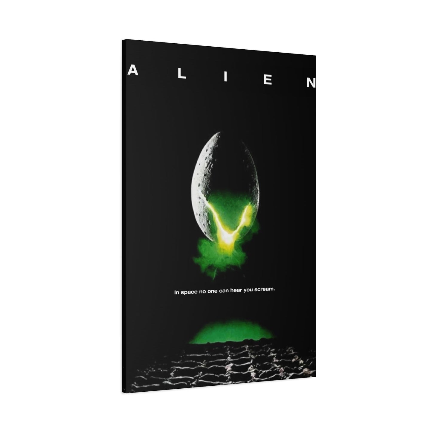
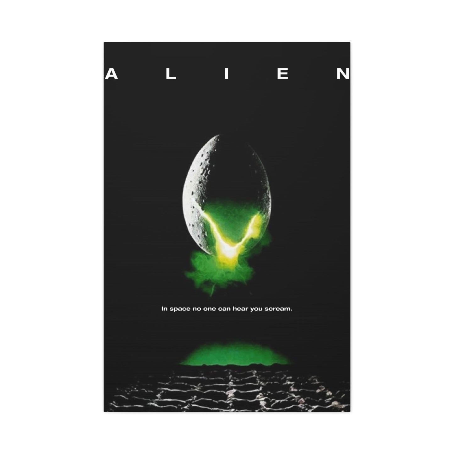
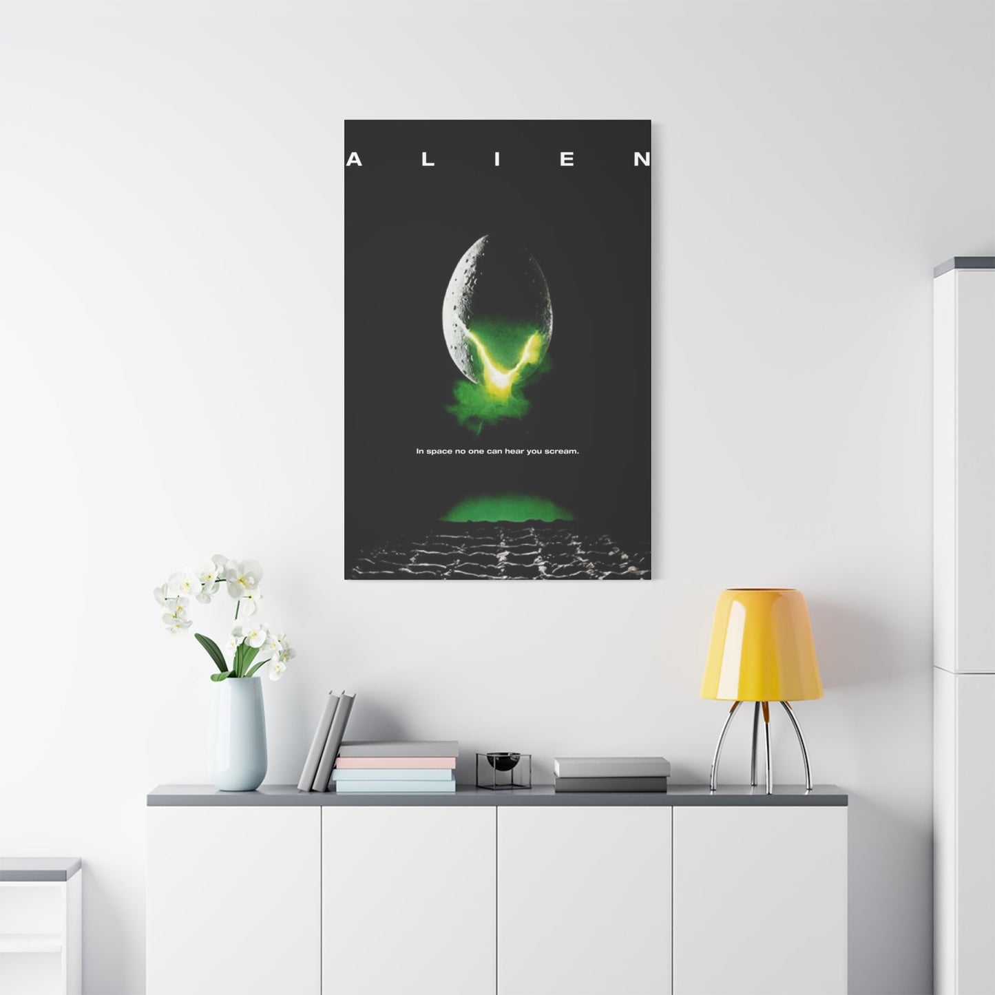
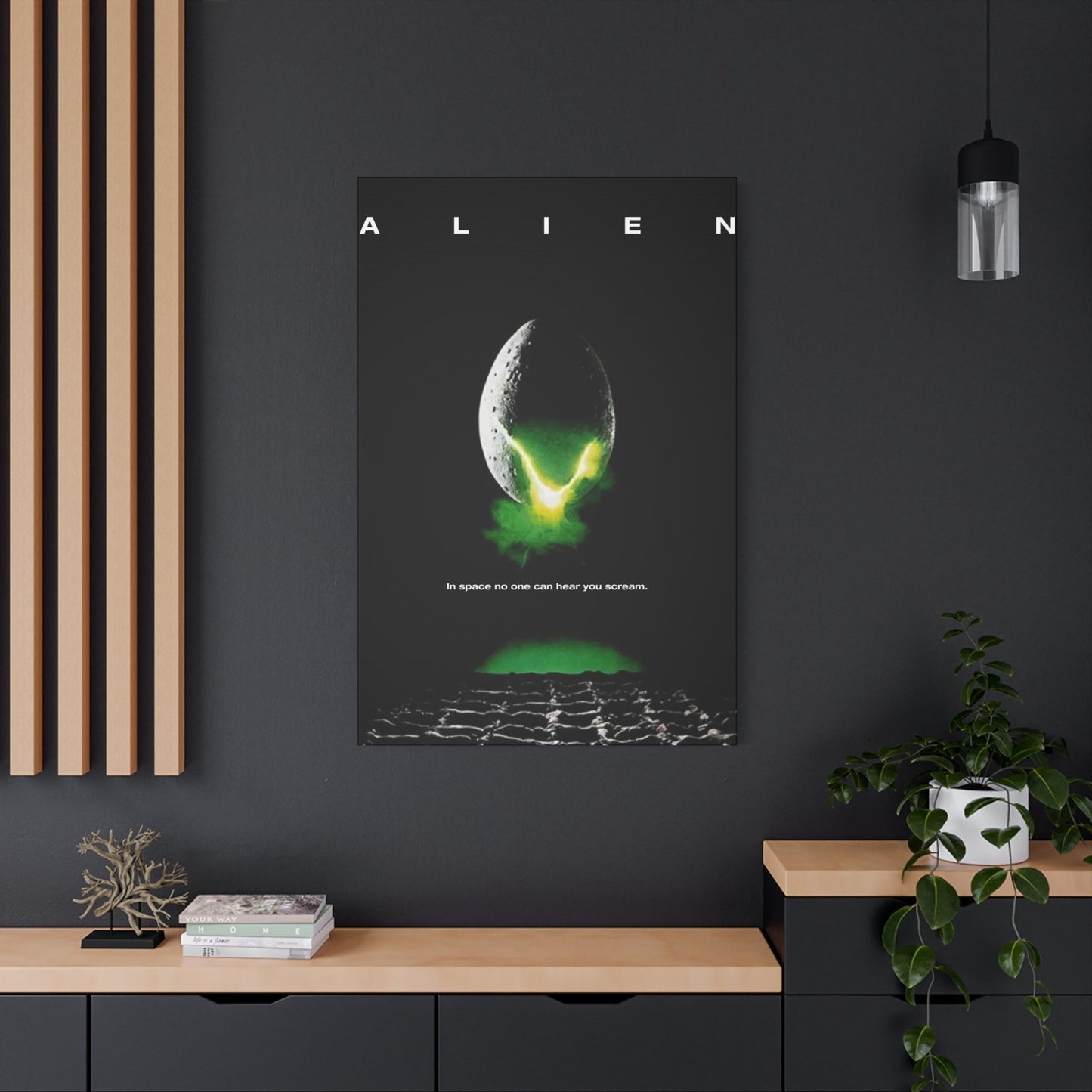
The central element of the promotional artwork presents audiences with an enigmatic ovoid form that immediately captures attention while refusing to reveal its secrets. This mysterious egg-like structure serves as the poster's focal point, drawing viewers into a visual narrative that begins long before they enter the theater. The design choice to feature this particular element demonstrates sophisticated understanding of audience psychology and the power of unexplained imagery to generate curiosity and unease.
The egg's surface texture suggests something organic yet alien, combining familiar biological elements with unsettling otherworldly characteristics. This deliberate ambiguity forces viewers to confront their own interpretations and fears, making the poster interactive in ways that traditional promotional materials rarely achieve. The lighting effects across the egg's surface create depth and dimensionality, suggesting internal activity or hidden dangers that remain tantalizingly out of reach.
Positioning within the frame emphasizes the egg's importance while maintaining visual balance. The strategic placement creates natural sight lines that guide viewer attention, ensuring that this central mystery dominates the visual experience. The surrounding negative space amplifies the egg's presence, creating an isolation effect that mirrors the film's themes of abandonment and vulnerability in hostile environments.
The choice to present this element without context or explanation reflects confidence in the imagery's ability to communicate on subconscious levels. Rather than relying on explicit horror imagery or action sequences, the design team trusted in the power of suggestion and implication. This approach demonstrates sophisticated understanding of how effective horror marketing operates through what remains unseen rather than what is explicitly shown.
Color treatment of the egg reveals careful consideration of emotional impact. Subtle variations in tone and saturation create visual interest while maintaining the mysterious quality essential to the poster's effectiveness. The interplay between warm and cool tones suggests life and death simultaneously, reinforcing the film's exploration of creation and destruction themes.
The egg's scale relationships within the composition suggest vastness and insignificance simultaneously. This paradoxical presentation reflects the film's central tension between human vulnerability and cosmic horror, preparing audiences for themes they will encounter throughout the narrative. The visual metaphor operates on multiple levels, functioning as both literal representation and symbolic gateway to deeper meanings.
Surface details invite close inspection while resisting complete understanding. This balance between revelation and concealment maintains viewer engagement across repeated viewings, a crucial factor in effective poster design. The artwork's ability to reward extended observation while maintaining its essential mystery demonstrates exceptional craftsmanship in visual communication.
Embracing Minimalism Within Horror Poster Aesthetics
The promotional artwork's approach to minimalist design principles revolutionized horror movie marketing by demonstrating that restraint could generate more powerful emotional responses than overwhelming visual complexity. This strategic simplicity allows individual elements to achieve maximum impact while creating space for viewer imagination to fill gaps with personal fears and anxieties.
Background elements are deliberately sparse, focusing attention on essential components while eliminating distractions that might diminish the poster's psychological effect. This reductive approach requires each remaining element to justify its presence through contribution to the overall emotional experience. The result is a composition where every visual decision supports the central goal of generating anticipation and unease.
Typography integration demonstrates how minimalist principles can enhance rather than compromise textual information. The restraint shown in font selection and placement allows the title to complement rather than compete with the visual imagery. This harmony between text and image creates unified communication that strengthens both elements through their interaction.
Color palette limitations force creativity within constraints, resulting in more impactful visual solutions than unlimited options might provide. The restricted range of hues creates cohesive atmosphere while ensuring that color variations carry significant meaning. Each shade contributes to the emotional landscape without overwhelming the viewer with unnecessary complexity.
Spatial relationships gain heightened importance within minimalist frameworks, as fewer elements must work harder to establish visual hierarchy and emotional flow. The careful positioning of components creates invisible connections that guide viewer attention while maintaining the essential sense of isolation and vulnerability central to the film's themes.
Negative space transforms from absence into presence, becoming an active participant in the visual narrative rather than merely empty background. This elevation of emptiness to meaningful element demonstrates sophisticated understanding of how viewers process visual information and create emotional connections with abstract concepts.
The minimalist approach challenges conventional wisdom about horror marketing, which traditionally relied on explicit imagery to generate fear responses. By proving that suggestion could outperform revelation, this poster established new paradigms for genre marketing that continue influencing contemporary promotional campaigns across multiple media platforms.
Texture and detail work within minimalist constraints to provide visual interest without compromising overall simplicity. The selective application of complex elements creates focal points that reward close examination while maintaining the broad visual impact necessary for effective poster design. This balance demonstrates mastery of visual hierarchy principles.
Strategic Shadow Implementation in Poster Art Creation
Shadow manipulation throughout the promotional artwork demonstrates sophisticated understanding of how darkness can enhance rather than obscure visual communication. The strategic deployment of shadows creates depth, mystery, and emotional resonance that transforms flat surfaces into dimensional experiences capable of generating powerful psychological responses in viewers.
Directional lighting choices establish mood and atmosphere through careful control of illumination patterns. The interplay between revealed and concealed areas creates visual tension that mirrors the film's exploration of known and unknown dangers. This sophisticated approach to light management demonstrates how technical execution can serve storytelling purposes even within static promotional materials.
Gradient transitions between light and shadow areas provide smooth visual flow while maintaining the dramatic contrasts essential to effective horror imagery. These subtle variations prevent harsh boundaries that might break viewer immersion while preserving the emotional impact of stark tonal differences. The technical skill required for such refined execution speaks to the artistic excellence underlying the poster's creation.
Shadow shapes themselves become design elements, contributing to composition balance and visual interest beyond their role in establishing three-dimensional form. The careful crafting of shadow contours creates secondary imagery that operates on subconscious levels, adding layers of meaning that reward repeated viewing and analysis.
Depth perception enhancement through shadow placement guides viewer attention through the composition while creating sense of space and dimensionality. This illusion of three-dimensional reality within two-dimensional constraints demonstrates mastery of fundamental artistic principles applied to commercial design contexts.
Atmospheric perspective achieved through shadow manipulation creates sense of environment and space extending beyond the poster's physical boundaries. This expansion of implied space allows viewers to imagine themselves within the depicted scene, increasing emotional engagement and personal investment in the visual narrative being presented.
Color temperature variations within shadow areas add complexity and visual interest while maintaining overall unity of vision. The subtle shifts between warm and cool shadow tones create emotional undertones that support the poster's psychological objectives without explicitly announcing their presence to conscious observation.
Edge quality control in shadow transitions demonstrates attention to technical detail that elevates the artwork above typical commercial poster production. The careful balance between sharp and soft edges creates visual rhythm and prevents monotony while serving the broader goals of atmosphere and mood establishment.
Examining the Legendary Tagline's Marketing Psychology
The promotional text accompanying the visual imagery represents one of cinema's most effective marketing messages, combining simplicity with profound psychological impact to create lasting cultural resonance. This carefully crafted phrase demonstrates how language can amplify visual communication while establishing thematic expectations that prepare audiences for their viewing experience.
Word choice analysis reveals deliberate selection of terms that maximize emotional impact while maintaining broad accessibility. Each word serves multiple functions, contributing to meaning, rhythm, and memorability simultaneously. The phrase's construction demonstrates understanding of how language operates on conscious and subconscious levels to influence audience behavior and expectations.
Phonetic qualities of the tagline contribute to its memorability and emotional resonance through careful attention to sound patterns and verbal rhythm. The natural cadence creates inherent musicality that makes the phrase satisfying to speak and easy to remember. This attention to auditory qualities ensures the message remains effective across different media contexts.
Psychological implications embedded within the text tap into fundamental human fears about isolation, vulnerability, and helplessness. The phrase's power derives from its ability to evoke these primal anxieties while maintaining sufficient ambiguity to allow personal interpretation and application. This universality ensures broad audience appeal across diverse demographic groups.
Contextual positioning of the tagline within the overall poster design demonstrates understanding of how text and image can work together to create unified communication. The strategic placement ensures the message complements rather than competes with visual elements while maintaining sufficient prominence to achieve its marketing objectives.
Cultural impact assessment reveals how effective taglines transcend their original promotional purpose to become part of broader popular consciousness. The phrase's adoption into common usage demonstrates its effectiveness in capturing essential themes while providing memorable shorthand for complex emotional experiences.
Comparative analysis with contemporary promotional language reveals the tagline's innovative approach to science fiction horror marketing. While other films relied on explicit descriptions of action or horror elements, this phrase achieved greater impact through implication and suggestion. This approach established new standards for genre marketing communication.
Thematic reinforcement through textual elements supports the poster's visual narrative while providing additional layers of meaning for engaged viewers. The integration of text and image creates multi-faceted communication that operates effectively for casual observers while rewarding deeper analysis and consideration.
Merging Science Fiction with Horror Visual Languages
The promotional artwork's success stems from its innovative fusion of traditionally separate genre aesthetics, creating hybrid visual language that expands possibilities for both science fiction and horror marketing. This synthesis demonstrates how established conventions can be combined and reimagined to create fresh approaches that enhance rather than compromise the effectiveness of familiar elements.
Science fiction visual elements within the poster establish futuristic context while avoiding clichéd imagery that might date the promotional material or limit audience appeal. The selective incorporation of genre markers creates sufficient familiarity for target audiences while maintaining broad accessibility for viewers less familiar with science fiction conventions.
Horror aesthetics integration occurs through subtle applications that enhance rather than overwhelm the scientific elements. This careful balance prevents the poster from falling entirely within either genre category, creating unique positioning that reflects the film's own innovative approach to blending traditionally separate storytelling modes.
Technological imagery suggestions appear through surface textures and lighting effects rather than explicit machinery or equipment depiction. This approach allows viewers to project their own technological anxieties onto the imagery while avoiding specific representations that might become quickly outdated or culturally specific.
Organic horror elements emerge through form and texture choices that suggest biological processes and anatomical references without explicit representation. This biological undertone creates unease through implication while maintaining the scientific credibility necessary for effective science fiction marketing.
Color palette decisions reflect both genres' traditional approaches while creating new combinations that serve the hybrid aesthetic. The integration of cool scientific tones with warmer organic hues creates visual tension that mirrors the film's thematic exploration of technology versus nature conflicts.
Atmospheric qualities borrowed from both genres create unique environmental feeling that serves the poster's marketing objectives while establishing expectations for the film's tone and approach. This atmospheric synthesis demonstrates how genre conventions can be combined creatively rather than simply juxtaposed.
Symbolic elements draw from both science fiction and horror iconography while creating new meanings through their combination and context. This symbolic innovation allows the poster to communicate on multiple levels while appealing to audiences familiar with either genre's traditional imagery and themes.
Mastering Composition Through Negative Space Utilization
The strategic employment of negative space throughout the promotional artwork demonstrates sophisticated understanding of how emptiness can contribute to visual communication as powerfully as rendered elements. This approach transforms absence into presence, creating compositions where what is not shown becomes as important as what is explicitly depicted.
Spatial relationships established through negative space create visual hierarchy and guide attention flow without relying on traditional compositional techniques. The careful balance between filled and empty areas generates visual tension that maintains viewer engagement while supporting the poster's atmospheric objectives.
Psychological effects of emptiness within the composition tap into fundamental human responses to isolation and uncertainty. The strategic placement of negative space creates feelings of vulnerability and exposure that align with the film's thematic content while generating emotional responses that enhance the poster's marketing effectiveness.
Breathing room provision through negative space prevents visual overcrowding while allowing individual elements to achieve maximum impact. This restraint demonstrates confidence in the strength of chosen imagery and understanding of how space can amplify rather than diminish visual communication.
Scale implications created through negative space relationships suggest vastness and insignificance simultaneously, reflecting the film's exploration of cosmic horror themes. The manipulation of spatial relationships allows viewers to experience scale anxiety without explicit size references or comparative elements.
Movement suggestion through negative space arrangement creates implied motion and energy that brings static imagery to life. The strategic placement of empty areas guides viewer attention along predetermined paths while maintaining the sense of uncertainty essential to effective horror marketing.
Balance achievement through negative space distribution demonstrates mastery of fundamental design principles applied to commercial contexts. The careful weighting of filled and empty areas creates stability while maintaining the dynamic tension necessary for engaging poster design.
Focus enhancement through negative space application eliminates distractions and concentrates attention on essential elements. This reductive approach ensures that key imagery achieves maximum impact while supporting materials remain effectively subordinated to primary communication goals.
Exploring Birth and Fear Symbolism in Visual Design
The promotional artwork's symbolic content operates on multiple levels, weaving together imagery that simultaneously evokes creation and destruction, birth and death, hope and terror. This complex symbolic framework provides depth that rewards analysis while operating effectively for viewers who engage with the imagery on purely emotional levels.
Birth imagery appears through ovoid forms and organic textures that suggest reproductive processes and new life emergence. These references create immediate recognition responses while introducing disturbing elements that subvert traditional associations with birth and creation. The result is imagery that feels familiar yet wrong, generating unease through violated expectations.
Fear symbolism emerges through implications of vulnerability, isolation, and unknown dangers lurking within seemingly protective environments. The visual metaphors tap into primal anxieties about safety and security while suggesting that apparent protection might actually represent entrapment and doom.
Maternal anxiety themes surface through imagery that simultaneously suggests nurturing and consumption, protection and predation. This dual nature reflects complex cultural attitudes toward parenthood and reproduction while tapping into fundamental fears about loss of control over one's own body and reproductive choices.
Transformation imagery suggests change and evolution while implying that such changes might be unwanted or destructive rather than beneficial. This subversion of traditional growth and development symbolism creates tension between natural processes and horror outcomes.
Containment symbolism appears through enclosed forms and limited space representations that suggest both protection and imprisonment. The ambiguity between safety and entrapment reflects broader themes about civilization versus nature and the price of security in hostile environments.
Life cycle implications within the imagery suggest natural processes while introducing disturbing variations that challenge comfortable assumptions about growth, development, and death. The corruption of familiar biological imagery creates lasting unease that extends beyond initial viewing experience.
Sexual anxiety elements emerge through reproductive imagery combined with suggestions of violation and unwanted penetration. These themes operate on subconscious levels while maintaining sufficient abstraction to avoid explicit content that might limit audience reach or acceptance.
Typography Integration and Font Selection Psychology
The textual elements within the promotional artwork demonstrate careful consideration of how letterforms can support and enhance visual communication while maintaining readability across diverse viewing contexts. The typography choices reflect understanding of how fonts convey emotional information beyond their literal content.
Font selection balances readability with atmospheric contribution, ensuring that textual information remains accessible while supporting the poster's overall mood and tone. The chosen typeface reflects both futuristic associations and timeless qualities that prevent the design from appearing dated or temporally specific.
Spatial relationships between text and imagery create unified composition where typography enhances rather than competes with visual elements. The careful positioning ensures that textual information integrates seamlessly with the overall design while maintaining sufficient prominence to fulfill marketing objectives.
Scale considerations for typography account for viewing distances and reproduction contexts, ensuring effectiveness across applications from theater displays to print advertisements. The sizing decisions reflect understanding of how text functions within broader promotional campaigns and media contexts.
Color integration of typography with the overall palette demonstrates attention to harmony and visual unity. The textual elements contribute to rather than disrupt the established color relationships while maintaining sufficient contrast for clear readability.
Hierarchical relationships between different textual elements guide reader attention and information processing while supporting marketing priorities. The visual organization of title, tagline, and credit information reflects understanding of how audiences process promotional materials.
Emotional resonance of typography choices contributes to the poster's psychological impact through letterform associations and cultural conditioning. The selected fonts carry connotations that support thematic content while appealing to target audience expectations and preferences.
Technical execution of typography demonstrates professional standards while supporting artistic vision. The quality of letterform rendering and spacing reflects attention to detail that elevates the overall promotional materials and reinforces audience confidence in the production values.
Creating Suspense Through Visual Simplicity
The promotional artwork's approach to generating suspense through simplified visual elements demonstrates how restraint can create more powerful emotional responses than complex, busy compositions. This strategic simplicity forces viewers to engage their imagination while providing just enough information to guide their speculation along desired paths.
Implication techniques used throughout the poster create sense of hidden dangers and unknown threats without explicit depiction of harmful elements. This approach allows viewer imagination to create personalized fears that may exceed what explicit imagery could achieve, resulting in more effective psychological impact.
Timing considerations within static imagery create sense of arrested motion and suspended action that suggests imminent change or revelation. The poster captures moments that feel significant while refusing to resolve the tension through explicit information or action completion.
Mystery maintenance through visual choices ensures that the poster raises questions without providing answers, creating curiosity that can only be satisfied through film viewing. This technique transforms promotional materials into puzzles that actively engage audience problem-solving instincts.
Anticipation building occurs through visual promises that suggest significant events without revealing their nature or timing. The artwork creates expectations while maintaining uncertainty about how those expectations might be fulfilled or subverted within the actual film experience.
Pacing control through composition guides viewer attention at predetermined rates while building toward emotional climax points within the static imagery. This consideration of viewing rhythm demonstrates understanding of how static images can create temporal experiences.
Revelation strategy balances information provision with mystery preservation, ensuring that viewers receive sufficient engagement without spoiling surprise elements essential to the film's effectiveness. This careful calibration requires deep understanding of audience psychology and narrative structure.
Emotional escalation through cumulative visual elements creates building intensity that culminates in maximum impact while maintaining sustainability for extended viewing periods. The poster's ability to maintain effectiveness across repeated exposure demonstrates exceptional craftsmanship.
Poster Legacy and Science Fiction Horror Marketing Evolution
The promotional artwork's influence on subsequent science fiction horror marketing campaigns demonstrates its effectiveness in establishing new paradigms for genre advertising. This legacy extends beyond immediate commercial success to encompass lasting changes in how studios approach promotional material creation for similar films.
Industry impact assessment reveals how the poster's innovative approaches became standard practices for science fiction horror marketing, influencing everything from composition strategies to color palette choices. The artwork's success validated experimental approaches that might otherwise have been considered too risky for major studio productions.
Contemporary applications of techniques pioneered in this promotional campaign can be observed across multiple media platforms and entertainment categories. The influence extends beyond film marketing to encompass television, gaming, and digital media promotional strategies.
Cultural penetration of the poster's visual language demonstrates its effectiveness in creating memorable imagery that transcends its original commercial purpose. The adoption of design elements into popular culture indicates successful communication that resonates beyond immediate marketing objectives.
Evolution tracking through subsequent campaigns shows how initial innovations were refined and adapted for different contexts while maintaining core effectiveness. This development demonstrates the poster's role in establishing foundation principles that continue guiding promotional design decisions.
Artistic recognition of the poster's design excellence has led to its inclusion in design exhibitions and academic studies, elevating commercial artwork to artistic status. This recognition validates the investment in high-quality promotional materials and their potential for lasting cultural impact.
Educational influence appears in design curricula and case studies that use the poster as example of effective visual communication. This academic adoption ensures that the artwork's innovative approaches continue influencing future generations of designers and marketers.
Commercial validation through continued effectiveness demonstrates that innovative design approaches can serve marketing objectives while achieving artistic excellence. The poster's dual success establishes precedent for investing in ambitious promotional campaigns that push creative boundaries.
Mystery Element Analysis in Egg-Centered Design
The central ovoid element functions as more than decorative imagery, serving as repository for audience speculation and emotional projection. This mysterious form operates as visual anchor point that draws attention while refusing to provide complete information about its nature or significance within the film's narrative framework.
Ambiguity creation through form selection generates multiple interpretation possibilities that engage viewers in active speculation rather than passive observation. The egg's refusal to conform to familiar categories forces audiences to confront uncertainty while projecting their own fears and curiosities onto the imagery.
Recognition triggers within the egg imagery tap into biological and cultural associations while introducing disturbing variations that subvert comfortable assumptions. This technique creates immediate connection followed by growing unease as viewers recognize that familiar elements have been corrupted or transformed.
Curiosity generation through incomplete information presentation creates compelling need for resolution that can only be satisfied through film viewing. The poster's ability to raise questions without providing answers transforms promotional materials into psychological hooks that maintain audience engagement.
Speculation encouragement through visual clues and implications allows viewers to participate in mystery construction while guiding their theories along predetermined paths. This interactive quality makes the poster experience collaborative rather than simply receptive.
Symbolic loading of the central element allows it to carry multiple meanings simultaneously, creating richness that rewards analysis while operating effectively for casual viewers. The egg's symbolic complexity ensures continued relevance and interpretive possibility across diverse audience segments.
Narrative anticipation building through mysterious imagery establishes expectations for film content while maintaining uncertainty about specific plot developments. This balance between promise and mystery demonstrates sophisticated understanding of promotional psychology and audience management.
Emotional investment creation through mystery engagement transforms viewers into active participants who develop personal stakes in revelation and resolution. This psychological involvement increases likelihood of film attendance and positive reception among engaged audiences.
Contrast Dynamics in Light and Dark Composition
The promotional artwork's manipulation of tonal contrasts creates visual drama and emotional intensity that supports marketing objectives while demonstrating artistic excellence in composition and execution. These contrast relationships operate on multiple levels to enhance both aesthetic appeal and psychological impact.
Dramatic tension creation through stark tonal variations generates visual energy that maintains viewer engagement while supporting thematic content about conflict between known and unknown elements. The interplay between light and dark areas mirrors narrative tensions within the film itself.
Depth establishment through contrast gradients creates three-dimensional illusion within two-dimensional constraints, adding visual complexity that rewards extended observation. The sophisticated handling of tonal transitions demonstrates technical skill applied to commercial purposes.
Emotional guidance through contrast placement directs viewer attention and response patterns while supporting desired psychological outcomes. The strategic positioning of light and dark elements creates subliminal communication that operates below conscious awareness levels.
Atmospheric creation through tonal relationships establishes mood and environment that extends beyond literal imagery to suggest broader contexts and implications. The careful balance of contrast elements creates immersive quality within static promotional materials.
Focus enhancement through selective contrast application ensures that essential elements achieve maximum visibility while supporting materials remain appropriately subordinated. This hierarchical approach demonstrates understanding of information prioritization within commercial contexts.
Symbolic reinforcement through light and dark imagery supports thematic content while maintaining visual appeal and commercial effectiveness. The contrast choices reflect deeper meanings while serving immediate marketing objectives.
Technical excellence in contrast execution demonstrates professional standards that enhance audience confidence in production values while supporting artistic vision. The quality of tonal rendering reflects investment in promotional materials that match the film's production standards.
Assessment of Poster Artwork
The promotional artwork's psychological effectiveness stems from its ability to trigger subconscious responses while maintaining conscious appeal, creating multi-layered communication that operates across different awareness levels. This sophisticated approach to audience psychology demonstrates understanding of how visual communication can influence behavior and emotional response.
Subconscious trigger identification reveals how imagery elements activate primal responses related to survival instincts, reproductive anxieties, and existential fears. These deep-level activations create lasting emotional impressions that extend beyond conscious poster evaluation.
Emotional response patterns generated by the artwork follow predictable sequences that guide audiences toward desired psychological states. The careful orchestration of emotional journey demonstrates understanding of how static imagery can create temporal experiences.
Memory formation enhancement through psychological impact techniques ensures that the poster creates lasting impressions that support long-term marketing objectives. The artwork's ability to create memorable experiences increases likelihood of successful audience conversion.
Anxiety production through controlled uncertainty generates appropriate stress levels that increase engagement without creating avoidance responses. This calibrated approach to psychological pressure demonstrates sophisticated understanding of optimal arousal theory in marketing contexts.
Curiosity stimulation through psychological hooks creates active engagement that transforms passive viewers into participating audiences. The poster's ability to generate questions and speculation increases psychological investment in resolution through film viewing.
Identification processes triggered by imagery allow viewers to project personal experiences and fears onto promotional materials, creating individualized connections that enhance relevance and impact. This personalization increases emotional stakes and conversion likelihood.
Behavioral influence through psychological design elements guides audience decision-making processes while maintaining perception of autonomous choice. The subtle manipulation demonstrates ethical application of psychological principles to commercial objectives.
Comparative Analysis with Contemporary Science Fiction Poster Art
The promotional artwork's position within the broader context of science fiction poster design reveals its innovative approaches and lasting influence on genre marketing standards. Comparison with contemporary and subsequent promotional materials demonstrates the artwork's exceptional qualities and industry impact.
Genre convention analysis shows how the poster both utilized and subverted established science fiction marketing tropes, creating fresh approaches that maintained audience familiarity while offering new experiences. This balance between innovation and accessibility contributed to broad appeal and commercial success.
Artistic quality assessment reveals superior execution standards that elevated commercial promotional materials to artistic status. The investment in high-quality design and production distinguished the artwork from typical studio marketing while supporting premium positioning.
Innovation identification highlights specific techniques and approaches that were novel within contemporary contexts, establishing the poster as influential precedent for subsequent campaigns. These innovations demonstrate creative risk-taking that proved commercially viable.
Cultural impact comparison shows how the poster achieved broader cultural penetration than typical promotional materials, becoming recognized artwork beyond its original commercial context. This crossover success validates investment in ambitious promotional strategies.
Technical advancement demonstration reveals how the poster utilized cutting-edge design and production techniques to achieve superior results. The technical excellence supported artistic vision while establishing new standards for promotional material quality.
Influence tracking through subsequent campaigns demonstrates how the poster's innovations were adopted and adapted across the industry, validating its effectiveness while establishing lasting legacy. This influence extends beyond immediate genre applications.
Commercial effectiveness comparison shows superior performance in generating audience interest and conversion compared to contemporary promotional campaigns. The poster's success validated experimental approaches while proving their commercial viability.
Visual Narrative Construction Through Fear Elements
The promotional artwork constructs compelling visual narrative through careful orchestration of fear elements that guide viewer emotional journey while supporting marketing objectives. This narrative approach transforms static promotional materials into engaging experiences that operate across temporal dimensions.
Story suggestion through visual elements creates implied narratives that engage viewer imagination while maintaining focus on promotional objectives. The poster's ability to suggest story without explicit depiction demonstrates sophisticated storytelling through design.
Character implication occurs through environmental and atmospheric elements that suggest presence and personality without direct representation. This technique allows audiences to project their own character interpretations while maintaining marketing flexibility.
Conflict establishment through visual tension creates dramatic foundation that promises engaging narrative experiences. The poster's ability to suggest conflict without resolution generates appropriate anticipation for film viewing.
Resolution anticipation building through incomplete visual information creates compelling need for narrative completion that can only be satisfied through film experience. This technique transforms promotional materials into story fragments that demand continuation.
Emotional arc construction guides viewer response patterns through predetermined sequences that mirror desired film experience. The careful orchestration of emotional journey demonstrates understanding of narrative pacing within static media.
Thematic preview through visual symbolism prepares audiences for film content while maintaining surprise elements essential to narrative effectiveness. This balance between preparation and mystery requires sophisticated understanding of audience psychology.
Engagement maintenance through narrative hooks ensures that promotional materials create lasting impression that supports long-term marketing objectives. The poster's ability to sustain interest demonstrates exceptional storytelling craft.
Cultural Iconography Development and Recognition
The promotional artwork's evolution into cultural icon status demonstrates its effectiveness in creating memorable imagery that transcends original commercial purpose to become part of broader cultural consciousness. This iconic development validates investment in high-quality promotional materials with lasting appeal.
Symbol recognition development shows how specific imagery elements became instantly identifiable markers for the film and broader genre categories. The creation of recognizable symbols demonstrates successful visual communication that achieves lasting cultural penetration.
Cultural adoption processes reveal how promotional imagery moved from commercial context into artistic and academic recognition, validating design excellence while establishing precedent for promotional material cultural impact.
Reference point establishment within popular culture shows how the poster became standard comparison for subsequent promotional campaigns and artistic works. This benchmark status demonstrates exceptional achievement in visual communication.
Parody and homage generation indicates successful cultural penetration as other creators reference and reimagine poster elements within new contexts. This cultural recycling demonstrates lasting relevance and impact.
Educational integration into design curricula and cultural studies programs validates artistic excellence while ensuring continued influence on future creative professionals. This academic recognition elevates commercial work to artistic status.
Collector value development in art and memorabilia markets demonstrates lasting appeal and cultural significance beyond original promotional function. The poster's transformation into collectible artwork validates investment in quality promotional materials.
Legacy influence on contemporary promotional design continues decades after original release, demonstrating lasting relevance and effectiveness. The poster's continued influence validates innovative approaches while establishing timeless design principles.
Abstract Horror Integration in Poster Design
The promotional artwork's approach to abstract horror elements demonstrates how non-literal imagery can generate more powerful fear responses than explicit horror depiction. This sophisticated approach to fear creation relies on suggestion and implication rather than graphic representation.
Abstraction techniques used throughout the poster allow viewer interpretation while guiding emotional responses toward desired outcomes. The balance between specificity and ambiguity creates personal relevance while maintaining broad appeal across diverse audience segments.
Non-literal fear generation through symbolic and suggestive imagery taps into subconscious anxieties while maintaining conscious accessibility. This approach creates lasting psychological impact that extends beyond immediate viewing experience.
Conceptual horror elements embedded within seemingly innocuous imagery create delayed recognition responses that enhance poster effectiveness through extended consideration. The artwork's ability to reveal new meanings through repeated viewing demonstrates exceptional depth.
Symbolic terror creation through familiar elements presented in unfamiliar contexts generates unease through violated expectations and disturbed assumptions. This technique creates more personal fear responses than generic horror imagery.
Implied threat suggestion through environmental and atmospheric elements creates sense of danger without explicit depiction of harmful elements. This approach allows imagination to create personalized threats that exceed what literal imagery might achieve.
Psychological symbolism integration supports horror objectives while maintaining artistic integrity and commercial appeal. The sophisticated use of symbolic elements demonstrates advanced understanding of how imagery communicates on multiple levels.
Abstract emotional manipulation through design elements guides audience response while maintaining subtlety that prevents resistance or rejection. The poster's ability to influence without obvious manipulation demonstrates exceptional craft.
Thematic Foreshadowing Through Artistic Elements
The promotional artwork functions as preview device that prepares audiences for film themes while maintaining narrative surprise elements essential to viewing experience. This sophisticated approach to thematic introduction demonstrates understanding of how promotional materials can enhance rather than compromise narrative effectiveness.
Theme introduction through visual metaphor creates conceptual framework that supports film comprehension while maintaining discovery elements that reward viewing. The poster's ability to prepare without spoiling demonstrates exceptional promotional craft.
Symbolic preparation of audience expectations guides interpretation while preserving surprise elements crucial to narrative effectiveness. This balance between preparation and mystery requires deep understanding of story structure and audience psychology.
Narrative preview through artistic choices establishes emotional and conceptual foundation that enhances film experience rather than diminishing it. The poster's supportive relationship with narrative content demonstrates sophisticated integration of promotional and creative elements.
Expectation management through thematic suggestion guides audience interpretation while maintaining flexibility for narrative surprise and subversion. This approach demonstrates understanding of how promotional materials can support rather than constrain creative content.
Conceptual framework establishment through artistic elements provides interpretive structure that enhances audience engagement with complex thematic material. The poster's educational function supports deeper appreciation while maintaining entertainment value.
Emotional preparation through thematic preview creates appropriate psychological state for optimal film reception while preserving surprise elements essential to narrative effectiveness. This sophisticated audience preparation demonstrates advanced promotional strategy.
Artistic coherence between promotional materials and film content creates unified communication that reinforces thematic elements while supporting commercial objectives. This integration demonstrates collaborative approach to creative and marketing elements.
Marketing Innovation Through Poster Design Excellence
The promotional artwork's approach to marketing communication established new paradigms for film promotion that continue influencing contemporary campaigns across multiple media platforms. This innovative approach demonstrated how artistic excellence could serve commercial objectives while achieving cultural significance.
Campaign integration strategies demonstrated how individual promotional elements could support broader marketing objectives while maintaining independent effectiveness. The poster's role within comprehensive promotional campaigns established templates for coordinated marketing communication.
Audience targeting sophistication through design choices demonstrated understanding of demographic psychology while maintaining broad appeal necessary for commercial success. This balance between specificity and universality created optimal market penetration.
Brand establishment through consistent visual identity created lasting recognition that extended beyond individual film promotion to encompass franchise development. The poster's role in brand creation demonstrates strategic thinking about long-term commercial objectives.
Media adaptation strategies showed how core design elements could be modified for different platforms while maintaining essential identity and effectiveness. This flexibility demonstrated understanding of diverse media contexts and audience behaviors.
Innovation validation through commercial success proved that experimental approaches could achieve market objectives while establishing new standards for promotional excellence. This validation encouraged continued innovation within industry promotional practices.
Influence measurement through subsequent campaign analysis reveals lasting impact on promotional design standards and practices. The poster's continued influence demonstrates exceptional achievement in commercial communication.
Professional recognition through industry awards and academic study validates artistic excellence while establishing precedent for treating promotional materials as legitimate artistic expression. This recognition elevates commercial work to cultural significance.
Conclusion
The analysis of this groundbreaking promotional artwork reveals the extraordinary depth and sophistication underlying what might initially appear to be straightforward commercial advertising material. Through careful examination of design elements, psychological impact, and cultural significance, we discover a masterwork that successfully balances artistic excellence with commercial effectiveness while establishing new paradigms for science fiction horror marketing.
The poster's innovative approach to visual communication demonstrates how restraint and suggestion can create more powerful emotional responses than explicit imagery or overwhelming complexity. By trusting in the power of minimalist design principles and the viewer's imagination, the creators achieved promotional materials that continue generating discussion and analysis decades after their initial release. This enduring fascination validates the decision to invest in artistic excellence rather than accepting conventional promotional approaches.
The psychological sophistication evident throughout the artwork's construction reveals deep understanding of how visual elements can influence audience behavior and emotional response. From the strategic use of negative space to the careful manipulation of symbolic imagery, every aspect of the poster was crafted to maximize psychological impact while maintaining broad appeal across diverse demographic groups. This level of psychological awareness in commercial contexts established new standards for promotional material effectiveness.
