


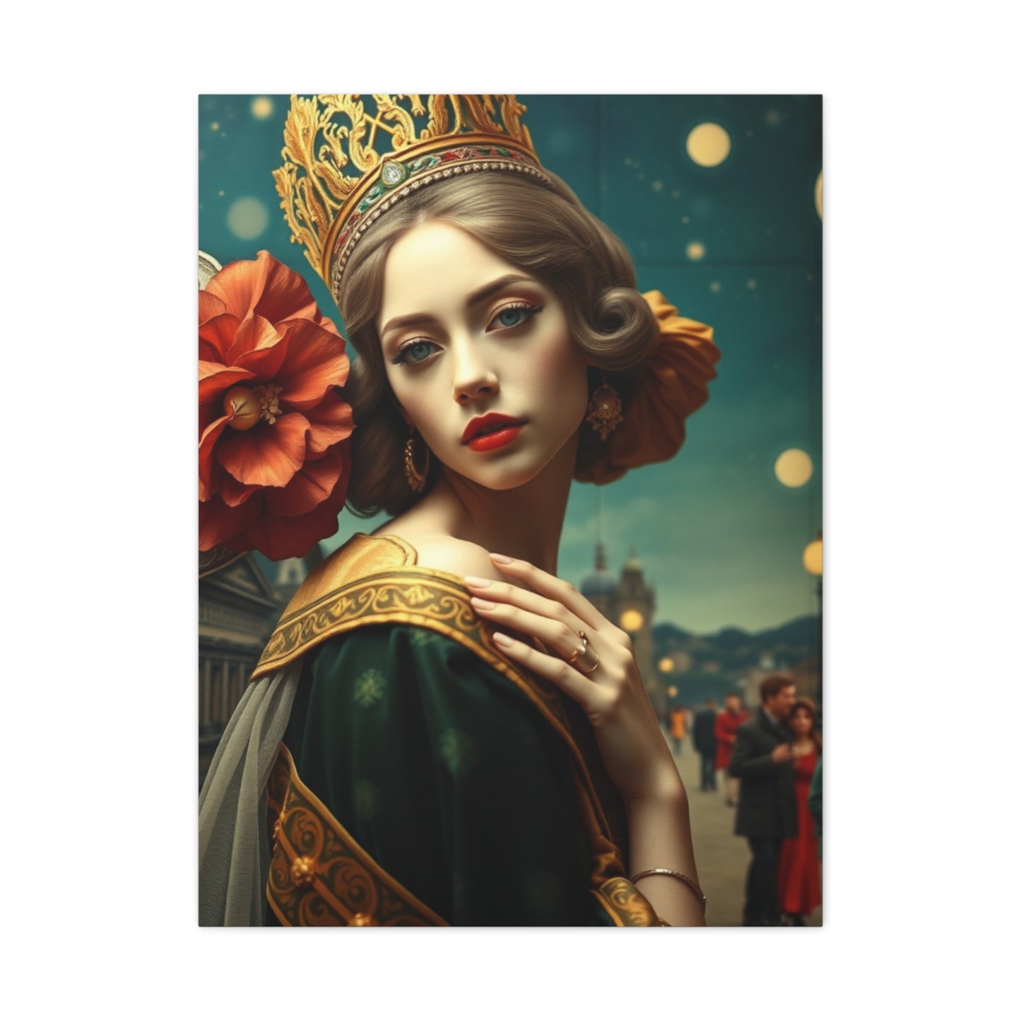
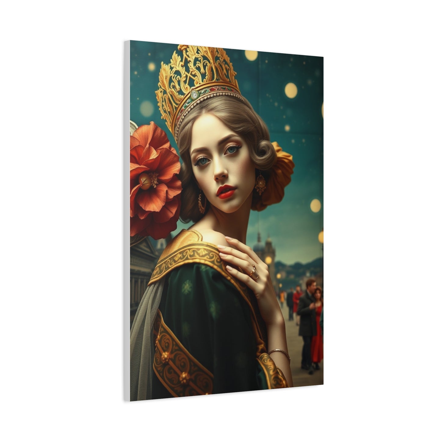
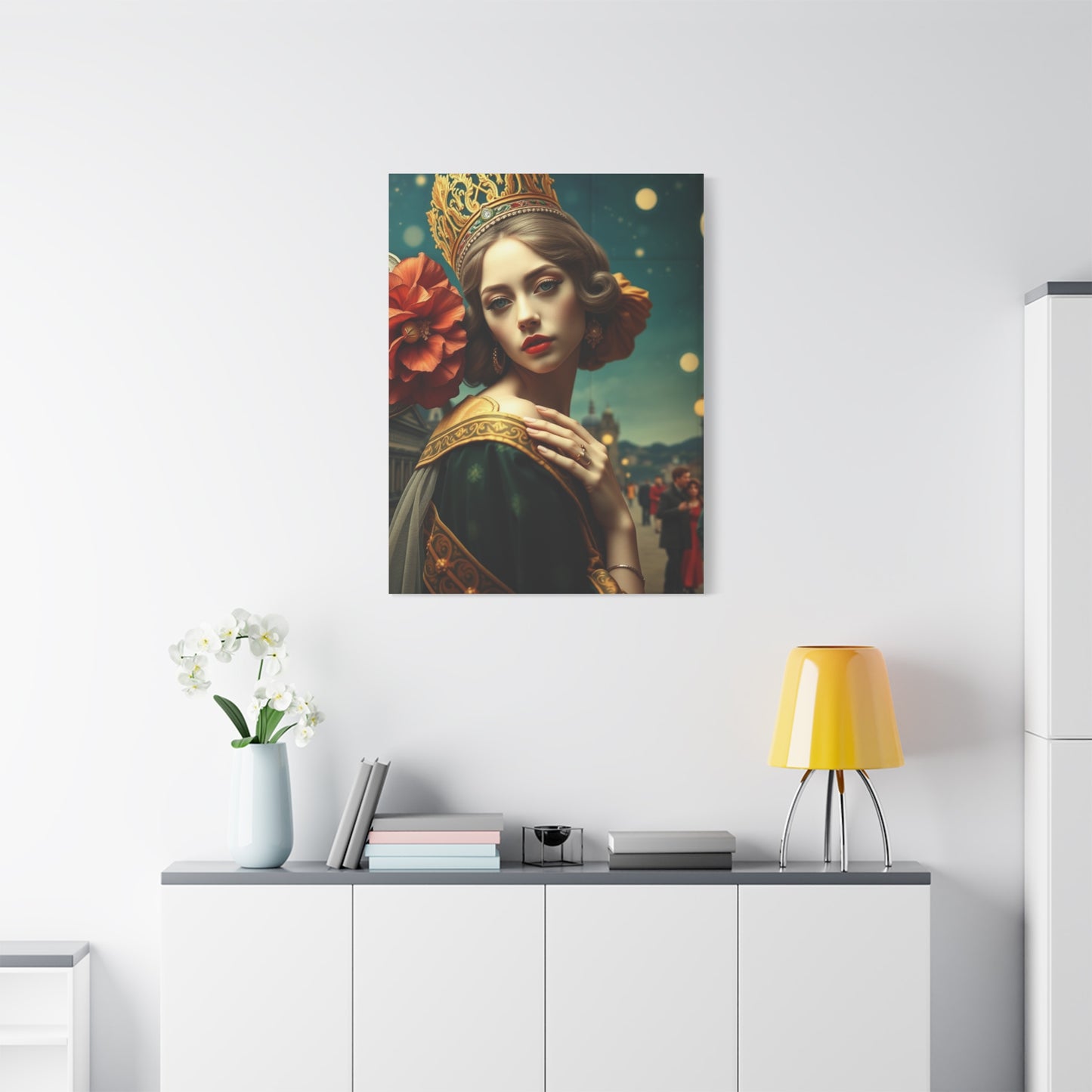
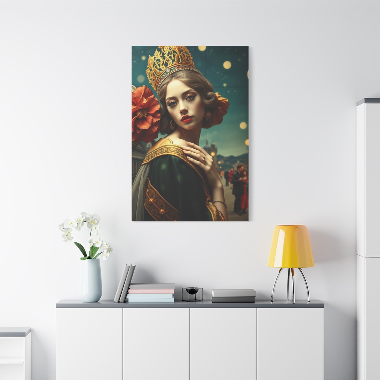
Artisan Nouveau Creation Wall Art & Canvas Print
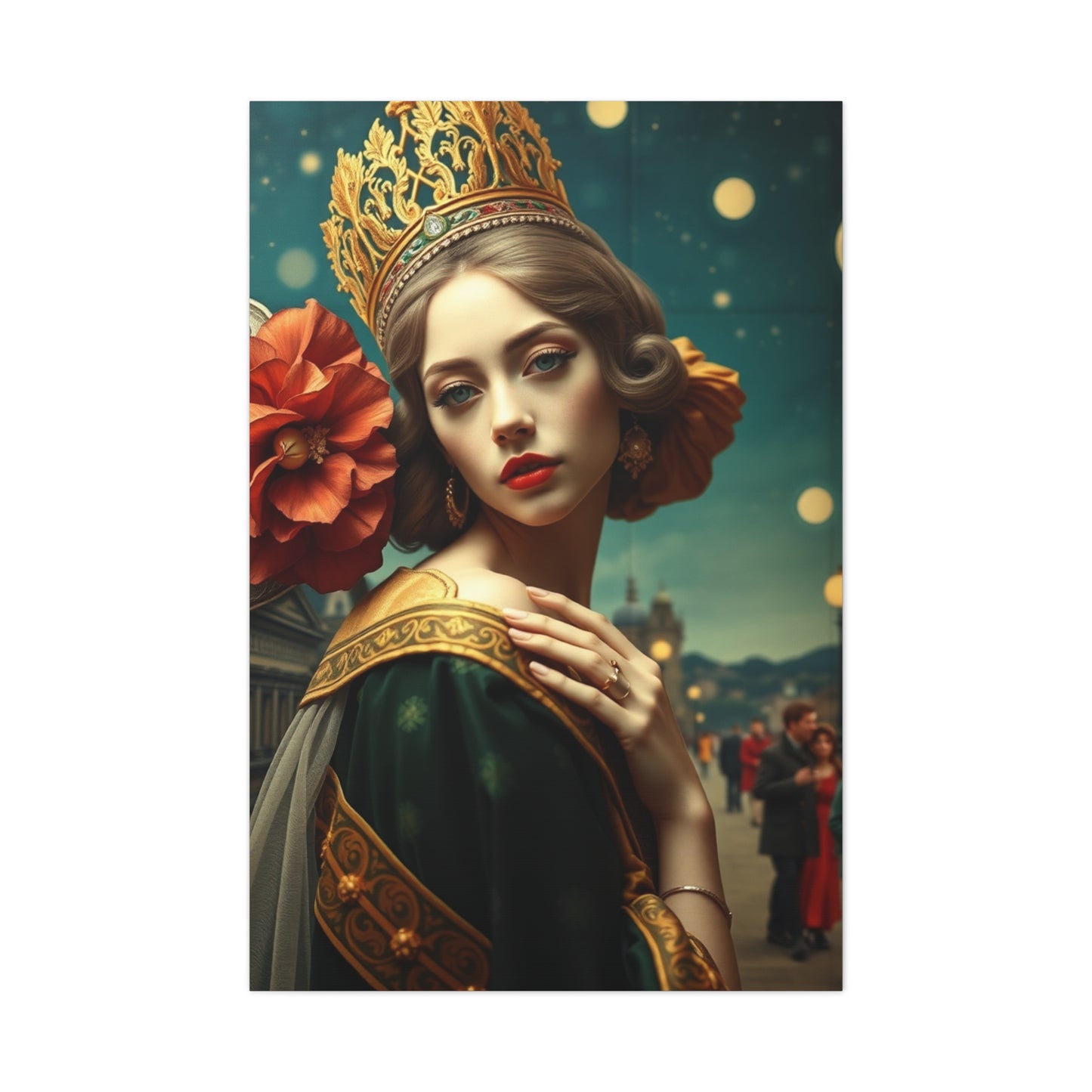
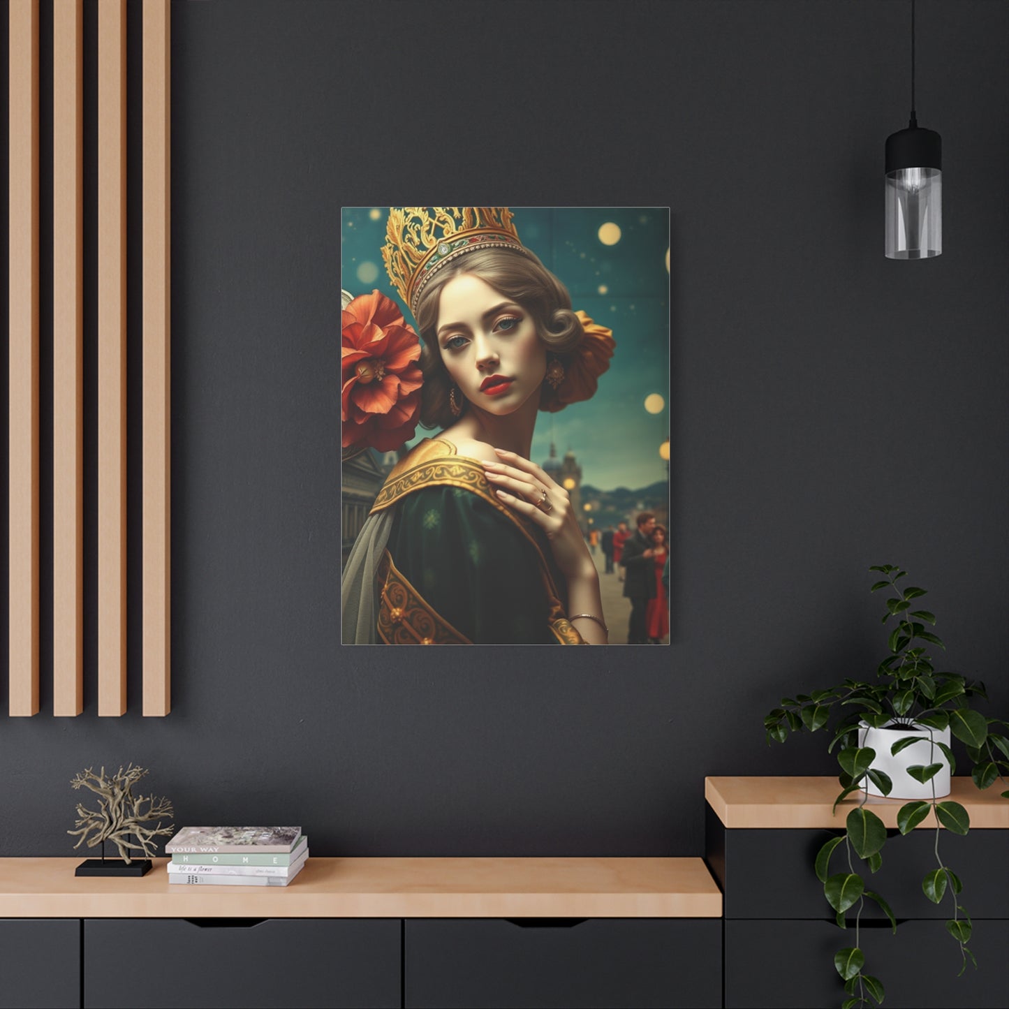
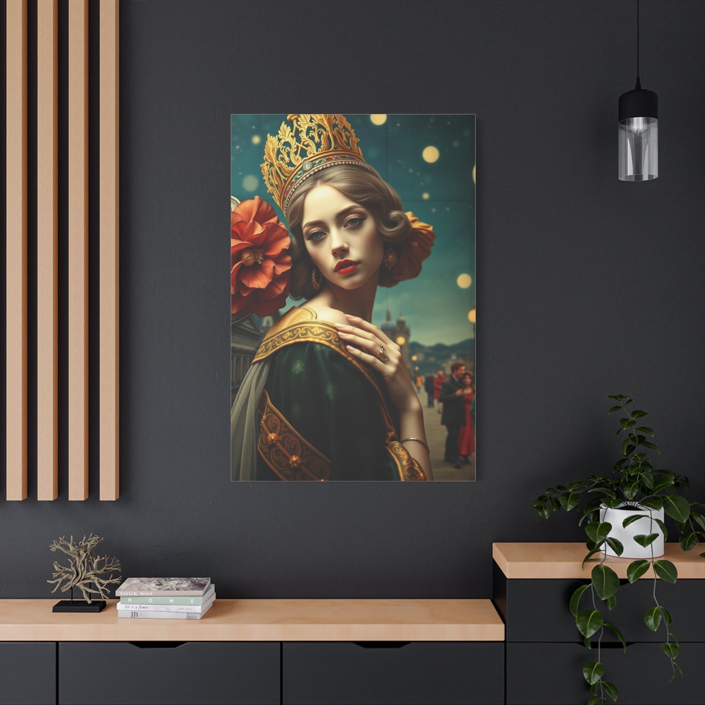
Artisan Nouveau Creation Wall Art & Canvas Print
Couldn't load pickup availability


Artisan Nouveau Creation Wall Art: A Modern Twist on the Timeless Elegance of Art Nouveau
The world of interior decoration has witnessed a remarkable resurgence of interest in styles that blend classical sophistication with contemporary sensibilities. Among these, canvas artwork drawing inspiration from the graceful curves and organic motifs of the turn-of-the-century aesthetic movement stands as a testament to enduring beauty. These pieces transform ordinary walls into captivating focal points, bringing together artistic heritage and modern living spaces in ways that feel both fresh and timeless.
Decorative Elements That Enhance Every Room
Different rooms within homes present unique opportunities and challenges for wall decoration. Living spaces, where families gather and guests are entertained, benefit from artwork that stimulates conversation while complementing existing furnishings. Canvas pieces featuring intricate patterns and rich colors create focal points that anchor seating arrangements, providing visual destinations that organize spatial flow. The absence of reflective glass surfaces means these decorations work particularly well in rooms with multiple light sources, as glare concerns disappear.
Bedroom environments call for artwork that supports rest and relaxation while expressing personal style. Softer color palettes featuring blues, greens, and neutral tones promote calming atmospheres conducive to quality sleep. Organic flowing designs create gentle visual movement that feels soothing rather than energizing. Placement above beds or on walls facing sleeping positions ensures artwork becomes part of the winding-down ritual, contributing to consistent bedtime routines that signal the brain to prepare for rest.
Dining areas provide opportunities for bolder artistic statements, as these spaces are typically used for limited durations when energy and engagement are desired. Canvas pieces incorporating warmer colors like reds, oranges, and golds stimulate appetite and conversation, enhancing the social aspects of shared meals. The formal nature of dining spaces also accommodates more elaborate designs featuring intricate details that reward sustained viewing, giving diners something to contemplate between courses.
Home offices and creative workspaces benefit from artwork that inspires without distracting. Pieces featuring balanced compositions and harmonious color relationships create visually pleasing backgrounds that support focus and productivity. The inclusion of organic forms can soften the typically technological nature of office environments, introducing natural elements that reduce stress and promote wellbeing. Strategic placement within the field of view provides opportunities for brief visual breaks that refresh attention without encouraging extended distraction.
Transitional spaces like hallways and entryways often receive less decorative attention than primary rooms, yet these areas significantly impact how homes are experienced. Canvas artwork transforms these passages into galleries, creating visual interest that makes movement through the home more engaging. Series of coordinated pieces can guide progression through spaces, establishing rhythm that makes navigation feel intuitive. Entry areas benefit particularly from striking pieces that make immediate impressions, setting tones for entire homes while welcoming residents and visitors alike.
Distinctive Canvas Artwork for Personalized Spaces
The selection of wall decorations represents an opportunity for self-expression, allowing homeowners to communicate their values, interests, and aesthetic sensibilities. Canvas pieces drawing from elegant design movements offer pathways toward creating distinctive environments that reflect individual personalities while maintaining broad appeal. The key lies in selecting specific pieces that resonate personally rather than simply following trends or choosing based on what seems universally acceptable.
Establishing personal connections with artwork requires reflection on which visual elements trigger emotional responses. Some individuals respond strongly to particular color combinations, finding certain palettes energizing while others feel calming. Shape preferences also vary—some people find geometric precision satisfying, while others prefer organic irregularity. Identifying these personal preferences through conscious attention to reactions when viewing different artworks helps narrow selections toward pieces that will provide lasting satisfaction.
The stories and meanings embedded within artwork add layers of significance beyond pure visual appeal. Pieces incorporating natural motifs might resonate with individuals who value environmental connections or find inspiration in botanical forms. Abstract compositions can attract those who appreciate leaving interpretation open, finding new meanings with each viewing. Understanding what specific designs represent or evoke allows for selections that align with personal values and interests.
Masterful Designs That Capture Artistic Heritage
The lineage of decorative arts stretches back centuries, with each era contributing distinctive approaches to beautifying functional objects and living spaces. Understanding this heritage enriches appreciation for contemporary pieces drawing inspiration from historical movements. The late nineteenth and early twentieth centuries witnessed an explosion of creativity as artists and craftspeople reacted against industrial mass production, seeking to restore beauty and individuality to everyday objects.
This period generated design philosophies emphasizing organic forms, craftsmanship, and the integration of fine and decorative arts. Practitioners looked to nature for inspiration, studying how plants grew and how natural forms could be stylized for decorative purposes. The resulting designs featured characteristic flowing lines, asymmetrical compositions, and ornamental details that transformed functional objects into works of art. These principles influenced architecture, furniture, glasswork, jewelry, and graphic design, creating a comprehensive aesthetic vision.
The color palettes favored during this era reflected both natural inspirations and contemporary artistic movements. Muted earth tones appeared alongside jewel-like greens, blues, and purples, often combined in ways that created rich visual harmonies. Gold and bronze metallic accents added luxury while maintaining organic feeling through their warm tones. These color relationships demonstrated sophisticated understanding of how hues interact, creating combinations that felt both complex and unified.
Motifs drawn from the natural world dominated these designs, with particular emphasis on flowers, vines, insects, and flowing water. These elements underwent stylization that maintained recognizability while abstracting forms for decorative purposes. Peacock feathers, dragonflies, water lilies, and wisteria appeared repeatedly, chosen for their inherent beauty and symbolic associations. The treatment of these subjects balanced naturalistic detail with decorative simplification, creating images that captured essence rather than botanical accuracy.
Typography and lettering integrated into designs from this period demonstrated the comprehensive nature of the aesthetic approach. Even text became decorative, with letters incorporating organic curves and flowing forms that made reading itself a visual experience. This integration of all elements within unified aesthetic frameworks distinguished the movement, creating cohesive presentations where every component contributed to overall artistic impact.
Canvas Prints Designed for Contemporary Living Rooms
Living rooms serve as primary gathering spaces within homes, making their decoration particularly significant in establishing overall aesthetic directions. Canvas artwork suited for these environments must balance multiple considerations—creating visual interest that engages attention while avoiding overwhelming other elements, complementing existing furnishings while maintaining distinctive presence, and appealing to household members whose tastes may differ. Successfully navigating these requirements results in spaces that feel both intentional and comfortable.
The architectural features of living spaces influence artwork selection significantly. Rooms with high ceilings can accommodate larger pieces that might overpower spaces with standard ceiling heights. The presence of fireplaces, built-in shelving, or distinctive windows creates both opportunities and constraints, as artwork must integrate with these permanent features. Color schemes established by flooring, wall colors, and major furniture pieces provide frameworks within which artwork choices should harmonize or deliberately contrast.
Furniture arrangements determine optimal locations for canvas installations. Artwork positioned above sofas or seating areas should relate proportionally to the furniture dimensions, typically spanning approximately two-thirds to three-quarters of the sofa width for balanced appearance. Multi-panel arrangements allow for customization that can match exact furniture dimensions while creating visual rhythm through repetition. The space between individual panels in multi-piece installations should remain consistent, typically between two and six inches depending on overall scale.
Lighting conditions throughout different times of day affect how artwork appears and should influence both selection and placement decisions. South-facing windows provide abundant natural light that showcases artwork beautifully but may cause fading if pieces receive direct sun exposure. North-facing orientations offer consistent, indirect light that minimizes fading concerns. Artificial lighting schemes should include provisions for artwork illumination, whether through adjustable track lighting, picture lights, or strategically positioned lamps that highlight featured pieces during evening hours.
The social functions of living spaces suggest artwork that facilitates conversation and creates welcoming atmospheres. Pieces featuring intriguing details reward closer inspection, giving guests reasons to approach and examine them more closely. Color palettes that feel inviting rather than aggressive promote comfort, while subjects that avoid controversial or overly personal content ensure broad appeal. The goal remains creating environments where people feel at ease, with artwork contributing to rather than detracting from that objective.
Creative Approaches to Canvas Wall Decoration
Moving beyond conventional single-panel installations opens numerous possibilities for distinctive displays that maximize visual impact. Gallery wall arrangements combine multiple pieces in curated collections that create unified presentations larger than individual components. This approach allows for mixing sizes, orientations, and even styles within coordinated frameworks, resulting in displays that feel dynamic and intentional. The key to successful gallery walls lies in planning layouts before installation, using paper templates to test arrangements until achieving satisfying compositions.
Asymmetrical arrangements introduce energy and movement that symmetrical displays cannot match. By varying piece sizes and positions, these layouts create visual rhythms that guide viewers' eyes across entire compositions. The organic nature of asymmetrical design complements artwork featuring flowing lines and natural motifs, reinforcing aesthetic themes through presentation methods. However, achieving balance within asymmetry requires careful attention to visual weight distribution, ensuring no single area feels too heavy or sparse.
Layering artwork with other decorative elements creates depth and complexity that purely wall-mounted pieces cannot achieve. Lean-style presentations, where canvas pieces rest on mantels or shelving rather than hanging, allow for easy rearrangement and integration with three-dimensional objects like sculptures, plants, or decorative vessels. This approach feels less permanent and more curated, suggesting collections that evolve rather than static displays unchanged over years.
Vertical stacking of multiple smaller pieces creates columns of artwork that draw eyes upward, emphasizing ceiling height and making rooms feel more spacious. This technique works particularly well in narrow wall spaces where horizontal arrangements might feel cramped. The repetition of similar sizes or shapes within vertical stacks creates cohesion while variations in imagery prevent monotony. Spacing between stacked pieces should remain consistent, typically matching the visual weight of the artwork itself.
Corner installations transform often-neglected spaces into artistic focal points. Two coordinated pieces meeting at room corners create three-dimensional effects that engage peripheral vision and make rooms feel more complete. This approach requires careful selection of complementary images that work together while remaining effective independently. Corner placements also solve practical challenges in rooms where conventional wall space is limited by windows, doors, or built-in features.
Abstract Expressions Drawing from Classical Motifs
The relationship between representation and abstraction in decorative arts has generated endless creative exploration. Contemporary canvas pieces often occupy middle ground between these extremes, extracting essential elements from recognizable forms and reconstituting them in ways that emphasize pattern, color, and composition over literal depiction. This approach maintains connections to inspirational sources while creating imagery that feels fresh and contemporary.
Abstracted floral motifs demonstrate this balance effectively, taking recognizable flower forms and simplifying them to essential curves and color relationships. Petals become graceful arcs, stems transform into sinuous lines, and natural color variations condense into bold, unified hues. The resulting imagery clearly derives from botanical sources yet transcends simple representation, creating decorative patterns that work in diverse contexts while retaining organic warmth.
Geometric interpretations of flowing organic forms present interesting contrasts between natural inspiration and mathematical precision. Curves derived from plant growth patterns become precise arcs and spirals when translated into geometric frameworks. The tension between organic origins and geometric execution creates visual interest that engages analytical and emotional responses simultaneously. These pieces appeal particularly to those who appreciate both natural world and mathematical order.
Color field approaches emphasizing broad areas of harmonious or contrasting hues create contemplative pieces that reward sustained viewing. Rather than featuring intricate details or complex compositions, these works present simplified forms that create mood through color relationships and subtle variations. The meditative quality of such pieces makes them particularly suitable for spaces intended for relaxation or reflection, where visual stimulation should support rather than demand attention.
Textural abstraction emphasizes surface qualities and material presence over representational content. These pieces highlight the physical nature of canvas itself, using printing techniques that create dimensional effects or appear to reveal underlying textures. The resulting artwork engages tactile imagination, making viewers want to touch surfaces and explore dimensional qualities. This physicality distinguishes canvas from flat paper prints, justifying the material choice through enhanced sensory engagement.
Timeless Decorative Pieces for Enduring Spaces
The longevity of interior design choices matters more as homeowners recognize the environmental and financial costs of frequent redecorating. Selecting artwork with enduring appeal rather than trend-driven pieces ensures spaces remain satisfying over extended periods. Canvas prints drawing from historical design movements possess inherent timelessness, as their aesthetic foundations have proven appealing across decades if not centuries.
Classic color palettes contribute significantly to longevity, as certain color relationships transcend temporary trends. Earth tones, deep jewel colors, and sophisticated neutrals maintain appeal regardless of what becomes fashionable in particular years. Avoiding colors strongly associated with specific eras helps prevent artwork from appearing dated as time passes. This doesn't require eliminating all contemporary color choices but rather selecting hues based on intrinsic qualities rather than current popularity.
Balanced compositions that achieve visual harmony through symmetry or carefully considered asymmetry age better than deliberately chaotic or shocking arrangements. While boldness has its place, pieces meant for long-term enjoyment benefit from compositional stability that feels resolved rather than intentionally unsettling. The human eye finds satisfaction in balance, making well-composed artwork continually pleasing even after years of daily viewing.
Quality execution ensures physical longevity that matches aesthetic endurance. Properly produced canvas prints maintain their appearance for decades with minimal care, while inferior products fade, sag, or deteriorate within years. Investing in quality pieces from reputable sources provides assurance that artwork will remain presentable long-term, avoiding the disappointment and waste of premature replacement.
The personal significance attached to artwork affects how long pieces remain satisfying. Items acquired impulsively or chosen primarily to fill empty walls often lose appeal quickly, while pieces selected thoughtfully for personal resonance maintain interest indefinitely. Taking time to identify artwork that genuinely connects personally rather than rushing to complete decoration projects leads to choices that satisfy long after installation.
Handcrafted Quality in Modern Production
The apparent contradiction between handcrafted quality and modern production methods resolves through understanding how contemporary techniques can honor traditional values. While canvas prints utilize digital printing technology, the processes involved still require human expertise and decision-making at multiple stages. This combination of technology and craftsmanship produces results that respect artistic integrity while achieving consistency and accessibility impossible through purely manual methods.
The selection and preparation of materials demonstrates where craftsmanship enters modern production. Choosing appropriate canvas weight and texture for specific images requires knowledge and experience, as different artworks benefit from different fabric characteristics. The preparation process ensuring canvas accepts ink properly and displays colors accurately involves technical understanding that develops through years of practice. These material decisions significantly impact final results, distinguishing quality producers from those cutting corners.
Color calibration represents another area where expertise proves essential. Ensuring printed colors match intended appearances requires sophisticated understanding of color theory, ink chemistry, and how different materials interact with light. Technicians must account for how colors appear on backlit screens versus how they manifest on physical canvas under varying lighting conditions. This translation process demands both technical knowledge and artistic sensibility to achieve results that satisfy aesthetic standards.
The stretching and finishing processes most clearly demonstrate handcrafted quality in canvas production. While frames may be cut using precise machinery, the actual stretching of canvas over frames requires human hands and judgment. Achieving uniform tension, creating clean corners, and ensuring artwork aligns properly cannot be fully automated without sacrificing quality. The final inspection and quality control also depend on experienced eyes identifying any imperfections that automated systems might miss.
Limited production runs and careful curation of available designs maintain exclusivity that mass production typically sacrifices. Rather than printing thousands of identical pieces for big-box retailers, quality producers offer more limited selections with controlled distribution. This approach ensures buyers acquire something special rather than decorations appearing in countless other homes, maintaining the distinctive quality that makes artwork meaningful.
Elegant Canvas Selections for Sophisticated Interiors
Creating sophisticated interiors requires restraint and discernment, qualities that manifest through careful selection of decorative elements. Canvas artwork suitable for refined spaces demonstrates these same qualities—designs that impress through subtle excellence rather than obvious showiness. The elegance emerges from harmonious color relationships, balanced compositions, and subjects that communicate cultural awareness without pretension.
Muted color palettes featuring sophisticated neutrals, dusty pastels, or deep saturated tones create refined atmospheres that feel intentional and mature. These colors suggest confidence in aesthetic choices, avoiding the need for bright hues to capture attention. The restraint demonstrated through subdued palettes paradoxically creates stronger impressions than more obvious color choices, as viewers recognize the deliberate sophistication rather than accidental blandness.
Simplified compositions that edit unnecessary details create visual clarity associated with elegance. Rather than filling every space with ornamentation, sophisticated designs embrace negative space, allowing breathing room that makes included elements more impactful. This approach mirrors broader principles in refined design—knowing what to omit proves as important as knowing what to include. The resulting artwork feels considered rather than cluttered, calm rather than chaotic.
Canvas Artwork Suited for Various Design Schemes
The versatility of canvas prints drawing inspiration from elegant design movements allows integration into diverse interior styles. While these pieces possess distinctive aesthetic characteristics, their fundamental qualities of organic forms, balanced compositions, and thoughtful color applications work across decorating approaches from traditional to contemporary. Understanding how to position these pieces within different contexts maximizes their effectiveness.
Traditional interiors featuring classic furniture, rich wood tones, and formal arrangements benefit from canvas artwork that respects these established conventions while introducing contemporary updates. Pieces incorporating familiar motifs like florals or foliage feel appropriate in traditionally decorated spaces, yet the modern presentation through canvas printing prevents environments from feeling dated. The absence of ornate frames maintains cleaner lines that lighten formality without abandoning elegance.
Contemporary minimalist spaces require artwork that makes statements without introducing clutter or visual noise. Canvas pieces featuring bold simplified forms and limited color palettes complement the restraint characterizing minimalist design. Single large-scale panels work particularly well in these contexts, providing focal points that anchor spaces without fragmenting attention across multiple pieces. The key lies in selecting work that feels substantial enough to hold its own against the expansive negative space typical in minimalist rooms.
Eclectic interiors mixing elements from various styles and periods offer opportunities for more adventurous artwork selections. Canvas pieces can provide unifying threads connecting disparate elements through color relationships or repeating motifs. Alternatively, they might introduce contrasts that highlight the intentional diversity of eclectic approaches. The flexibility of canvas presentations allows experimentation with placements and combinations that more formal framed artwork might not accommodate.
Transitional spaces bridging traditional and contemporary styles represent ideal contexts for canvas artwork drawing from historical movements with modern interpretations. These pieces embody the transitional concept themselves, honoring past aesthetic achievements while presenting them through contemporary lenses. The resulting harmony between furniture styles, architectural elements, and artwork creates cohesive environments that feel neither strictly traditional nor overtly modern but comfortably occupying middle ground.
Inspirational Design Elements for Home Environments
The psychological impacts of visual surroundings influence mood, productivity, and overall wellbeing in ways we're only beginning to fully understand. Selecting artwork that contributes positively to these effects requires consideration of how specific design elements affect human psychology. Canvas pieces incorporating organic forms, balanced compositions, and harmonious colors offer particular advantages in creating supportive environments that enhance daily life.
Organic curves and flowing lines trigger relaxation responses by recalling natural environments where humans evolved. The gentle undulations characteristic of plant growth, water movement, and cloud formations communicate safety and abundance at subconscious levels. Interior spaces dominated by angular geometry and straight lines benefit particularly from artwork introducing organic counter-elements that soften harshness and create visual relief. This balance between human-made and natural forms helps environments feel comfortable rather than sterile.
Color psychology provides frameworks for understanding how different hues influence emotional states and cognitive functions. Cool colors like blues and greens promote calmness and concentration, making them appropriate for bedrooms, home offices, and meditation spaces. Warm colors including reds, oranges, and yellows energize and stimulate, working well in social areas or spaces used for physical activity. Neutral tones create flexibility, serving as foundations that support varying moods depending on accent colors and lighting conditions.
Symmetrical compositions create feelings of stability and order that many people find reassuring. The predictability of mirrored elements provides psychological comfort, suggesting environments under control and properly maintained. However, perfect symmetry can feel static, so even symmetrical designs benefit from subtle variations that introduce interest without sacrificing fundamental balance. This approach maintains the psychological benefits of symmetry while avoiding monotony.
Distinctive Presentations That Define Personal Style
Developing recognizable personal style in interior decoration requires consistency in aesthetic choices that reflect individual sensibilities. Canvas artwork plays significant roles in establishing these visual identities, as pieces displayed prominently communicate taste levels, cultural interests, and value priorities. Curating collections that work together while allowing individual pieces to shine creates presentations that feel intentional and sophisticated.
Color story development across multiple pieces creates visual unity that ties spaces together. Selecting artwork sharing common color threads while varying in other aspects allows rooms to feel cohesive without appearing overly matched or staged. This approach provides flexibility to mix styles, subjects, and even periods while maintaining recognizable aesthetic consistency. The shared color relationships become identifying characteristics of personal style.
Thematic consistency in subject matter creates another pathway toward distinctive presentations. Collectors focusing on botanical subjects, abstract expressions, or specific artistic movements develop recognizable preferences that define their aesthetic identities. This specialization demonstrates commitment and knowledge that casual decorating cannot convey. The depth of collections focused on particular themes grows over time, with each addition reinforcing overall direction while adding new dimensions.
Mixing scales and formats within collections adds dynamism that prevents displays from feeling stagnant. Combining large statement pieces with smaller supporting works creates hierarchies that guide attention while maintaining interest across entire installations. Varying orientations between landscape, portrait, and square formats introduces rhythm and movement. These variations within overall unity demonstrate sophisticated curation that considers relationships between pieces rather than treating them as isolated elements.
Exhibition-style presentations incorporating explanatory cards or subtle labeling can enhance appreciation while reinforcing collector identity. Brief notes about artists, production techniques, or personal significance add depth that pure visual experience cannot provide. This approach transforms homes into personal galleries, suggesting owners view their spaces as evolving collections rather than simply decorated rooms.
Seasonal rotation of artwork maintains freshness while allowing larger collections to remain accessible. Rather than permanently displaying every piece simultaneously, rotating selections with changing seasons or personal moods keeps environments dynamic. This practice also protects pieces from prolonged light exposure, extending their lifespans. The anticipation of seasonal changes adds another dimension to relationships with collections.
Aesthetic Principles for Coordinated Wall Displays
Creating effective multi-piece displays requires understanding fundamental design principles governing visual relationships. The arrangement of canvas artwork follows these same principles that guide all successful composition, whether in single paintings or complex installations. Mastering these concepts enables homeowners to create professional-quality presentations that maximize the impact of individual pieces while creating unified wholes greater than component sums.
Balance remains the foundational principle, ensuring compositions feel stable rather than tilted or lopsided. Symmetrical balance creates formality and order through mirrored arrangements, while asymmetrical balance achieves stability through careful distribution of visual weight. Understanding that larger, darker, or more detailed elements carry more visual weight allows for compensation through positioning—a small piece can balance a larger one if placed farther from compositional centers.
Rhythm creates movement and guides viewers' eyes across displays through repetition and variation. Repeating similar sizes, colors, or shapes establishes patterns that create predictability and comfort. Strategic variations within established rhythms create focal points that capture attention. The spacing between elements contributes to rhythm—consistent gaps create steady beats while varied spacing introduces syncopation that adds interest.
Proportion governs size relationships between displayed pieces and between artwork and surrounding architectural elements. Individual pieces within multi-panel displays should relate proportionally, with size variations serving compositional purposes rather than appearing random. The overall dimensions of displays should correspond appropriately to wall sizes and adjacent furniture, maintaining visual harmony across entire spaces.
Innovative Canvas Designs for Forward-Thinking Spaces
While historical design movements provide rich inspiration, contemporary interpretations must evolve to remain relevant in changing contexts. The most successful pieces honor traditional principles while pushing boundaries through innovative approaches to color, composition, and subject matter. These forward-thinking designs appeal to those who appreciate heritage but resist mere reproduction, seeking artwork that feels both timeless and current.
Unexpected color combinations that depart from historical precedents create contemporary relevance while maintaining aesthetic sophistication. Pairing colors traditionally considered clashing in ways that somehow work generates visual excitement and demonstrates confident aesthetic vision. These explorations in color theory produce pieces that feel experimental yet resolved, showing that rules exist to be understood before being deliberately broken.
Hybrid approaches blending multiple aesthetic influences create unique visual languages that transcend single-source inspiration. Combining organic flowing forms with geometric precision, mixing botanical motifs with abstract elements, or integrating decorative patterns with minimalist restraint produces designs that feel genuinely original. These synthetic approaches reflect contemporary cultural reality, where influences from diverse sources merge into new aesthetic territories.
Digital manipulation possibilities expand creative options beyond what traditional techniques allowed. While maintaining printmaking as output methods, contemporary designers utilize digital tools to explore variations, test color relationships, and perfect compositions in ways that would have been impossibly time-consuming historically. This technology enables refinement levels and complexity that honor craftsmanship ideals through different means.
Conceptual depth adds layers of meaning that purely decorative pieces lack. Contemporary artwork increasingly engages with ideas beyond surface beauty, addressing themes from environmental awareness to cultural identity. These intellectual dimensions don't compromise visual appeal but rather enhance it by providing substance that sustains interest beyond initial aesthetic impact. Artwork that makes viewers think while pleasing their eyes achieves dual purposes that define meaningful contemporary design.
Canvas Artwork as Investment in Living Quality
The decision to acquire quality canvas artwork extends beyond simple decoration into investing in daily living experiences. Unlike purchases that provide temporary satisfaction, thoughtfully selected pieces contribute to wellbeing and happiness over years or decades. Understanding this long-term value proposition helps justify careful selection processes and appropriate budget allocations, recognizing that what adorns walls significantly impacts how spaces feel and function.
The cumulative effects of living surrounded by beauty manifest in subtle but meaningful ways. Entering rooms featuring artwork that genuinely appeals provides small moments of pleasure that accumulate across days and years. These micro-experiences of aesthetic satisfaction contribute to overall life quality, creating environments where people genuinely want to spend time rather than spaces they merely tolerate. The difference between houses and homes often lies precisely in these details that transform functional shelter into emotionally resonant spaces.
Quality artwork maintains and potentially increases value over time, contrasting with most furnishings that depreciate immediately upon purchase. While canvas prints don't typically appreciate like original fine art, properly maintained pieces retain their aesthetic and functional value indefinitely. This durability means cost-per-year calculations favor quality investments over cheap alternatives requiring frequent replacement. The environmental advantages of longevity also deserve consideration, as durable goods reduce waste and resource consumption associated with manufacturing and disposing of inferior products.
The psychological benefits of curated environments extend into productivity and creativity realms. Spaces that feel intentional and beautiful support mental clarity and focus, whether for professional work or personal projects. The visual stimulation provided by quality artwork engages creative thinking without creating distraction, maintaining cognitive engagement that prevents the numbness resulting from bland surroundings. These effects prove particularly valuable for those working from home, where environmental quality directly impacts professional performance.
Social dimensions of artistic home decoration include the impressions created for guests and the conversations facilitated by interesting pieces. Homes featuring thoughtful artwork signal cultural engagement and aesthetic sophistication that purely functional spaces cannot communicate. Guests feel honored when hosted in environments where attention has been paid to creating beauty, interpreting this care as respect for their presence. The artwork itself provides natural conversation topics that ease social interactions, particularly valuable when hosting diverse groups seeking common ground.
Strategic Placement Maximizing Visual Impact
Understanding optimal positioning for canvas artwork requires considering multiple factors from viewing angles to lighting conditions to spatial relationships with furniture and architectural features. Strategic placement transforms good pieces into focal points that anchor spaces and guide traffic flow while ensuring artwork receives the attention it deserves. These placement decisions prove as important as the artwork itself in determining overall effectiveness.
Eye-level positioning remains the fundamental guideline, though exact heights vary based on typical viewing situations. In spaces where people primarily stand, centering artwork approximately sixty inches from floor to center creates comfortable viewing. Dining areas or other seated contexts benefit from slightly lower positioning that aligns with seated eye levels. The key lies in avoiding placements requiring viewers to crane necks upward or stoop downward, as uncomfortable viewing positions discourage engagement with artwork.
Relationship to furniture requires careful consideration to avoid awkward gaps or overwhelming proximity. Artwork hung above sofas or consoles should maintain approximately six to twelve inches of space between furniture tops and frame bottoms, creating visual connection without appearing to rest on furniture. The width of artwork or grouped pieces should span roughly two-thirds to three-quarters of underlying furniture width, creating balanced proportions that feel intentional rather than arbitrary.
Architectural features including windows, doorways, and built-ins influence placement both as constraints and opportunities. Centering artwork between windows creates symmetry that feels satisfying, while positioning pieces adjacent to windows can balance rooms where furniture arrangements create asymmetry. Spaces above doorways often remain underutilized despite offering excellent visibility for artwork that can be enjoyed from multiple rooms. Built-in shelving and mantels provide natural display platforms where canvas pieces can lean casually or hang within architectural frameworks.
Traffic patterns affect both viewing opportunities and practical safety. Artwork positioned where people naturally pause—at hallway ends, opposite entryways, or visible from primary seating areas—receives maximum attention. Conversely, pieces placed where people rush past may go unnoticed despite quality. Practical considerations include ensuring protruding corners don't create collision hazards in tight passages and avoiding positions where doors might strike frames when opened.
Multiple viewing distances should inform placement decisions, as artwork appears differently from across rooms versus up close. Large-scale pieces reveal overall compositions from distance while rewarding approach with details invisible from afar. Positioning that allows both distant and close viewing provides richer experiences than locations permitting only single viewing distances. Consideration of primary viewing positions—where people most often sit or stand—helps prioritize these various perspectives.
Color Harmonies Creating Cohesive Environments
The sophisticated use of color represents one of the most powerful tools in creating interior environments that feel intentional and professionally designed. Canvas artwork serves as either anchor or accent within color schemes, and understanding how pieces interact with existing palettes enables selections that enhance rather than conflict with surrounding elements. Mastery of color relationships transforms spaces from collections of individual elements into unified compositions.
Monochromatic schemes utilizing various shades, tints, and tones of single hues create sophisticated unity with built-in harmony. Canvas artwork fitting these schemes reinforces color direction while adding visual interest through variations in saturation and value. The resulting environments feel cohesive and calm, with subtlety that reveals itself gradually rather than announcing itself immediately. This approach works particularly well in spaces intended for relaxation or concentration, where color variety might prove distracting.
Analogous color schemes using hues adjacent on color wheels create harmonious relationships with more variety than monochromatic approaches. Artwork incorporating two or three neighboring colors—such as blues, blue-greens, and greens—provides enough variation to maintain interest while ensuring compatibility. These schemes feel natural and comfortable, as they mirror color relationships frequently observed in nature. The gradual transitions between analogous colors create gentle visual movement that guides eyes without jarring jumps.
Complementary color schemes pairing opposites on color wheels generate maximum contrast and visual energy. Artwork featuring complementary relationships—such as orange and blue or red and green—creates dynamic focal points that command attention. However, the intensity of complementary contrasts requires careful management to avoid overwhelming spaces. Using one color as dominant with complementary accents rather than equal proportions typically achieves better balance. These schemes work well in spaces intended for activity and social engagement.
Triadic color schemes using three equidistant hues create balanced variety with visual complexity. Artwork incorporating triadic relationships demonstrates sophisticated color understanding while providing enough diversity to remain interesting over time. The key to successful triadic schemes lies in varying the proportions of included colors rather than using equal amounts, allowing one hue to dominate while others provide accent. These approaches create vibrant environments without feeling chaotic when executed thoughtfully.
Neutral foundations with accent colors represent practical approaches for those uncertain about committing to specific color schemes. Spaces decorated primarily in neutral tones gain flexibility, as accent colors introduced through artwork can change without requiring complete redecorations. This strategy allows for seasonal variations or gradual evolution of color preferences without major investments. Neutral backgrounds also ensure artwork receives full attention rather than competing with colorful walls or furnishings for visual dominance.
Textural Dimensions Enhancing Visual Experience
While color and composition typically receive primary attention when discussing artwork, texture plays equally important roles in creating rich visual experiences. Canvas material inherently possesses textural qualities that distinguish it from smooth paper prints, and understanding how to leverage these qualities enhances overall effectiveness. The interplay between visual imagery and physical texture creates dimensional experiences that engage viewers more completely than purely visual presentations.
Canvas weave visibility adds subtle texture that becomes part of artistic presentations. Finer weaves create smoother surfaces that work well for detailed imagery requiring precision, while coarser weaves add rustic character appropriate for more casual or organic subjects. The choice of canvas texture should complement rather than fight against printed imagery—delicate watercolor-style designs benefit from smoother surfaces, while bold abstract compositions can handle more pronounced weaves that add to their visual impact.
Printing techniques affect how ink sits on canvas surfaces, creating additional textural variations. Standard flat printing produces even surfaces where ink penetrates fabric uniformly, appropriate for most applications. Specialized techniques can add dimensional effects that simulate brush strokes or impasto painting methods, creating tactile elements that invite touch. These enhanced textures transform prints into objects occupying space between standard prints and original paintings, offering unique aesthetic experiences.
Gallery wrapping where images continue around canvas edges adds three-dimensional quality to wall-mounted pieces. Rather than abruptly ending at frame edges, imagery flowing onto sides creates objects rather than mere surfaces. This treatment particularly benefits abstract or pattern-based designs where edge continuity reinforces overall compositions. The depth created by stretched frames—typically ranging from three-quarters of an inch to two inches—contributes to sculptural presence that flat-mounted prints cannot achieve.
Matte versus glossy finish selections significantly impact how surfaces interact with light. Matte finishes diffuse light, reducing glare while creating understated sophistication appropriate for refined interiors. The softness of matte surfaces feels approachable and comfortable, avoiding the sharpness sometimes associated with glossy finishes. Glossy treatments intensify colors and create punchy visual impact but require careful lighting consideration to prevent problematic reflections. Semi-gloss finishes split the difference, offering color enhancement without excessive shine.
Layered visual texture within printed imagery itself creates depth that engages perception. Artwork incorporating multiple transparent layers, subtle gradations, or complex patterns rewards sustained viewing as eyes discover relationships between elements. This visual richness distinguishes quality designs from simple graphics, providing substance that maintains interest beyond initial impression. The combination of physical canvas texture and visual complexity creates multidimensional experiences that feel substantial and worthy of attention.
Seasonal Considerations for Canvas Display
The changing seasons present opportunities to refresh living spaces through artwork rotation or thematic selection that acknowledges annual cycles. While permanent installations serve important functions, incorporating seasonal awareness into canvas displays adds dynamic dimension that keeps environments feeling current and responsive to natural world rhythms. This approach need not require extensive collections, as strategic pieces can shift between locations or alternate with stored works.
Spring themes emphasizing renewal and growth align with this season's associations with rebirth and fresh starts. Canvas pieces featuring botanical subjects, pastel color palettes, or light airy compositions create atmospheres reflecting longer days and warming temperatures. The psychological lift provided by spring-appropriate artwork supports the seasonal energy many people experience as winter transitions into spring. Even in climate-controlled indoor environments, these visual cues connect inhabitants to broader seasonal patterns.
Summer artwork might embrace bolder colors, energetic compositions, and subjects evoking warmth and abundance. The longer days and increased activity levels characteristic of summer months support more stimulating visual environments. Artwork featuring warmer color temperatures—reds, oranges, yellows—reinforces seasonal associations while creating lively atmospheres appropriate for social gatherings and outdoor-focused lifestyles. The casual energy of summer can manifest in more relaxed display approaches, with pieces leaning casually on mantels rather than formally hung.
Autumn selections incorporating earth tones, harvest themes, and compositions suggesting transition prepare spaces for approaching winter while celebrating seasonal beauty. The rich colors of fall foliage—deep reds, burnt oranges, golden yellows, and warm browns—create cozy atmospheres as outdoor temperatures drop. Artwork reflecting autumn's contemplative quality supports the introspection many people naturally experience as years draw toward conclusion. These pieces bridge between summer's energy and winter's quietude.
Winter displays can embrace either cozy warmth through rich colors and intimate subjects or cool elegance through icy palettes and spare compositions. The approach depends on how inhabitants prefer experiencing winter—as season for snuggling indoors surrounded by warmth or as opportunity for stark beauty and crystalline clarity. Canvas pieces appropriate for winter months create environments supporting whichever interpretation residents prefer, making cold months more bearable through visual reinforcement of positive seasonal aspects.
Year-round pieces that transcend seasonal associations provide anchors around which seasonal rotations occur. These permanent installations feature subjects and color palettes that work regardless of season, offering stability while surrounding elements change. Abstract pieces or designs drawing from multiple natural sources rather than specific seasonal references often serve this function effectively, maintaining presence and quality while accommodating seasonal companions that come and go.
Cultural Influences Shaping Contemporary Canvas Design
The artistic movements inspiring contemporary canvas designs emerged from specific cultural contexts that shaped their aesthetic characteristics and philosophical foundations. Understanding these cultural roots enriches appreciation for modern pieces while revealing why certain design principles resonate across temporal and geographic boundaries. This historical awareness transforms artwork from mere decoration into cultural artifacts that connect present to past.
The reaction against industrialization that birthed key decorative movements reflected widespread anxiety about mass production's effects on quality and beauty. As factories churned out identical objects with mechanical efficiency, artists and craftspeople championed handmade uniqueness and the integration of beauty into functional objects. This philosophy emphasized that everyday items deserved aesthetic consideration, rejecting divisions between fine art and decorative arts. These democratic ideals remain relevant as contemporary culture grapples with similar tensions between mass production and artisanal quality.
Natural world reverence characterizing these movements reflected both scientific discoveries revealing nature's complexity and romantic reactions against urban industrial environments. Artists studied plant growth patterns, insect anatomy, and organic forms with scientific precision while interpreting findings through aesthetic lenses. The resulting designs honored natural beauty while transforming it into decorative applications. This approach resonates today as environmental awareness drives renewed appreciation for natural forms and sustainable design principles.
The internationalism of historical aesthetic movements demonstrates cross-cultural exchange and mutual influence that characterized the era. European artists drew inspiration from Asian art traditions, particularly Japanese design principles emphasizing asymmetry and negative space. This cultural blending created hybrid aesthetics that transcended national boundaries, much as contemporary globalization facilitates worldwide artistic exchange. Modern pieces continuing these traditions participate in ongoing cross-cultural dialogue that enriches design vocabulary.
Gender considerations in historical movements reveal complex dynamics around women's creative roles and recognition. While many accomplished female designers contributed significantly to these movements, their work often went uncredited or attributed to male colleagues and family members. Contemporary recognition of these historical contributions corrects past oversights while informing current conversations about artistic recognition and creative opportunities. Understanding this context adds depth to appreciation of designs that emerged from these complicated social circumstances.
The philosophical foundations emphasizing beauty's importance in daily life established principles that remain compelling. The belief that everyone deserved access to beautiful objects and that aesthetic experience improved human character seems particularly relevant as contemporary culture debates these same values. Canvas prints democratizing access to quality design fulfill precisely the ideals these historical movements championed, making beauty accessible beyond wealthy collectors.
Environmental Consciousness in Art Production and Selection
Growing awareness of human activity's environmental impacts extends into art production and consumption, with conscientious consumers seeking options aligned with sustainability values. Canvas print production involves numerous decisions affecting environmental footprints, from material sourcing through manufacturing processes to shipping and eventual disposal. Understanding these factors enables choices supporting environmental responsibility while acquiring beautiful artwork.
Material selection provides the first opportunity for environmental consideration. Organic cotton canvas grown without synthetic pesticides or fertilizers reduces agricultural pollution and protects farm worker health. Recycled polyester canvas diverts plastic waste from landfills while requiring less energy to produce than virgin polyester. Wood frames from sustainably managed forests certified by organizations ensuring responsible forestry practices protect ecosystems while supporting livelihoods dependent on forest products. These material choices increase costs modestly while significantly reducing environmental harm.
Manufacturing processes vary in environmental impact based on energy sources, waste management, and chemical use. Producers utilizing renewable energy for facility operations minimize carbon emissions compared to those relying on fossil fuels. Water-based inks reduce toxic chemical releases compared to solvent-based alternatives, improving both environmental and worker safety. Closed-loop production systems recycling process water and capturing volatile organic compounds demonstrate commitment to minimizing pollution. Seeking producers disclosing environmental practices allows consumers to support responsible operations.
Shipping considerations affect environmental footprints significantly, as transportation generates substantial emissions. Local production reduces shipping distances, decreasing fuel consumption and associated emissions. When purchasing from distant sources, considering production location relative to delivery destination helps minimize transportation impacts. Consolidating shipments rather than making multiple small orders reduces per-item shipping impacts. Though shipping considerations shouldn't override quality and aesthetic considerations, they can inform choices between otherwise comparable options.
Longevity represents perhaps the most significant environmental factor, as durable products requiring infrequent replacement conserve resources compared to disposable alternatives. Quality canvas prints lasting decades prevent repeated cycles of manufacturing, shipping, and disposing of inferior products. This durability multiplies value of initial environmental costs across extended useful lives. The emphasis on quality over cheapness ultimately serves environmental interests by reducing consumption frequency.
End-of-life disposal considerations increasingly influence conscientious purchasing decisions. Canvas pieces constructed from natural materials biodegrade more readily than synthetic alternatives, though proper disposal still requires consideration. Some producers offer takeback programs accepting old pieces for recycling or repurposing, closing loops and preventing landfill accumulation. Understanding disposal options before purchasing enables planning that prevents pieces ultimately contributing to waste problems.
Carbon offset programs offered by some producers allow consumers to neutralize emissions associated with production and shipping through supporting projects reducing atmospheric carbon. While offsets shouldn't substitute for minimizing emissions at source, they provide options for addressing unavoidable impacts. Evaluating offset program credibility ensures contributions actually deliver promised environmental benefits rather than serving merely as marketing gestures.
Conclusion:
The integration of canvas artwork drawing from elegant historical design movements into contemporary living spaces represents more than decorative choice—it constitutes an approach to daily life that prioritizes beauty, quality, and intentional living. These pieces connect inhabitants to artistic heritage spanning centuries while functioning perfectly within modern contexts, demonstrating that timeless aesthetic principles transcend temporal boundaries and remain relevant across changing cultural landscapes.
The journey toward creating spaces that truly feel like home requires investment of time, attention, and resources that our busy lives often seem unable to accommodate. Yet the returns on these investments manifest daily through enhanced mood, increased pride in surroundings, and the simple pleasure of living among beautiful objects. Canvas prints offering access to sophisticated design at various price points make this journey accessible to diverse audiences, democratizing beauty in ways that honor historical ideals about art's role in everyday life.
Quality matters profoundly in these acquisitions, as the difference between well-produced pieces and inferior alternatives becomes apparent quickly and persists throughout ownership. Selecting canvas artwork involves evaluating material quality, production methods, design sophistication, and personal resonance—considerations that require time but result in choices providing lasting satisfaction. The false economy of cheap alternatives reveals itself through rapid deterioration and aesthetic disappointment that undermines the entire purpose of acquisition.
The personal nature of artwork selection means no universal prescriptions can guide every decision. Individual responses to colors, forms, and subjects vary based on personality, experience, and current life circumstances. Trusting personal reactions while developing informed judgment through exposure to diverse options leads toward choices that genuinely enhance daily living. The goal remains finding pieces that speak personally rather than following trends or accepting others' preferences.
Creating beautifully decorated homes proceeds most successfully through phased approaches that allow for thoughtful curation rather than rushed completion. Beginning with anchor pieces for most important spaces provides foundations upon which to build, adding coordinating elements as opportunities and budgets allow. This patient methodology prevents impulsive purchases that lead to regret while ensuring each addition receives the consideration it deserves.
