


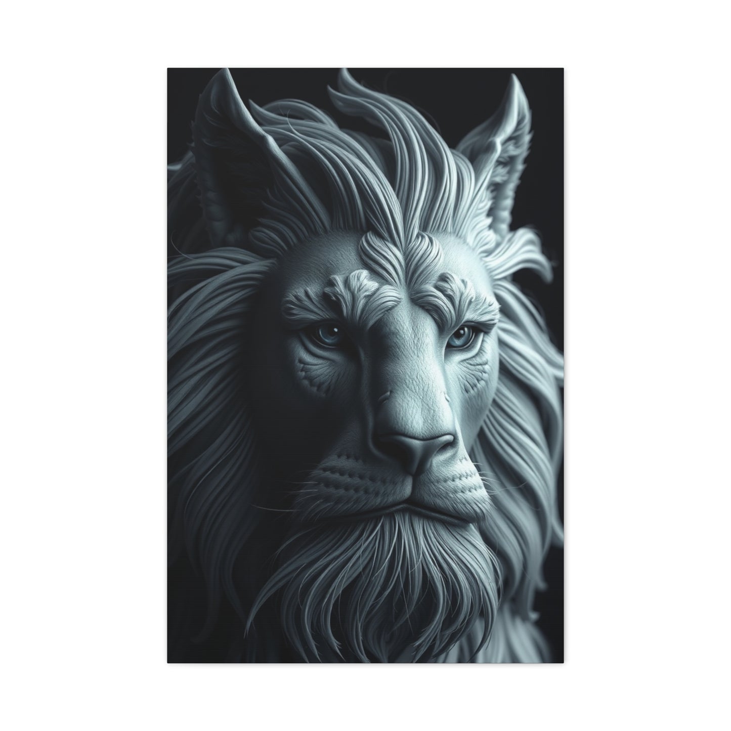
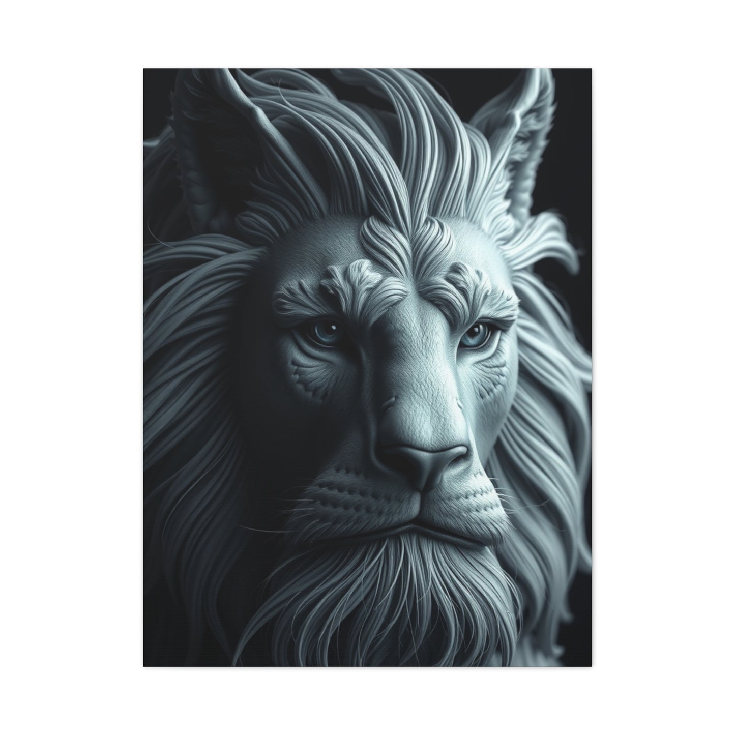
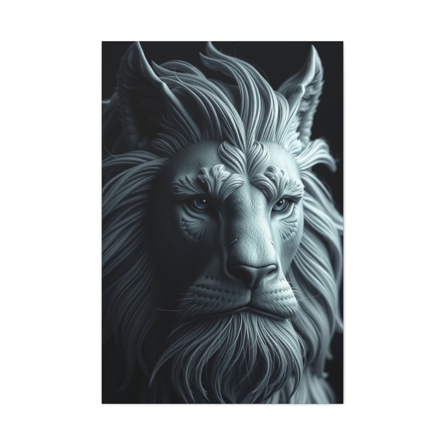
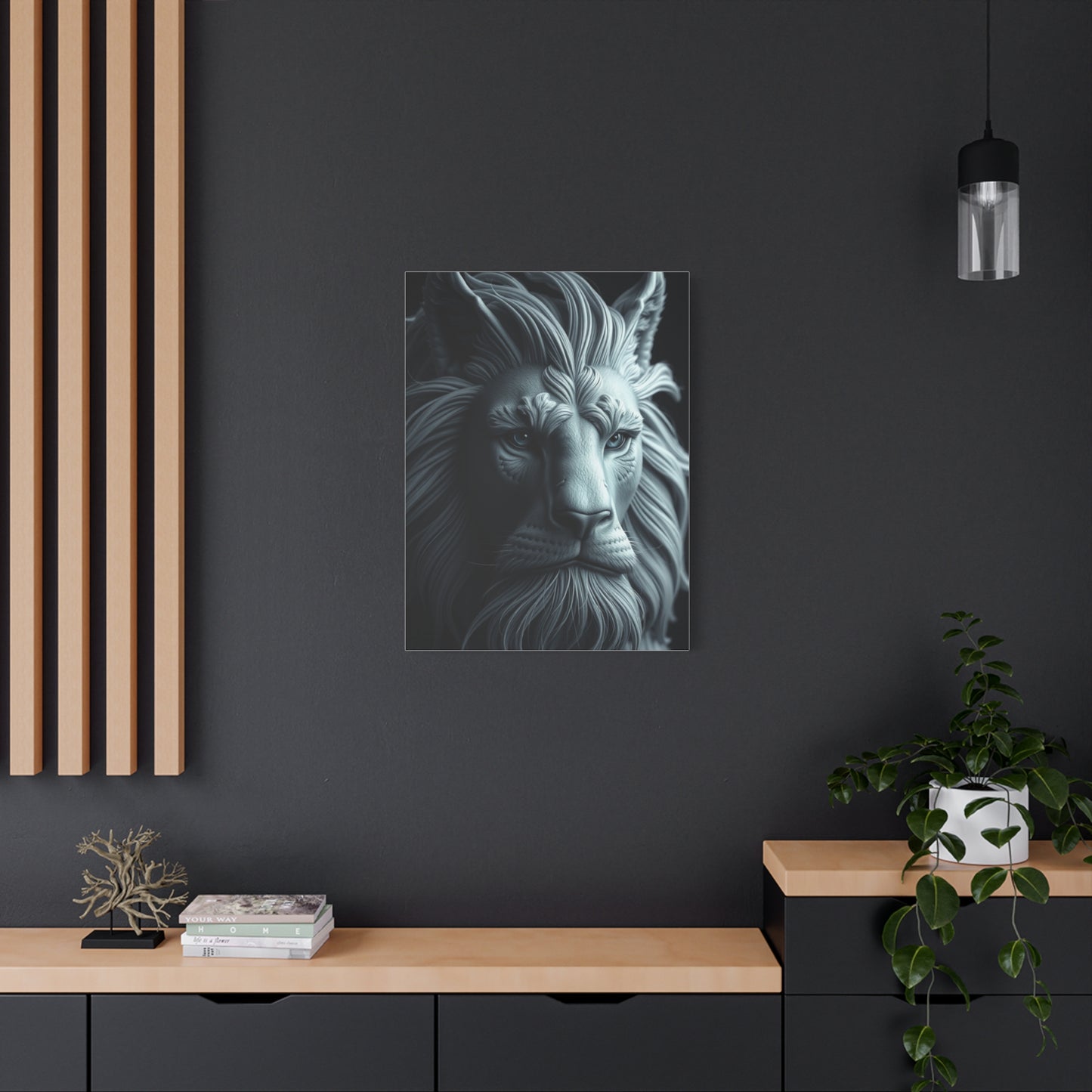
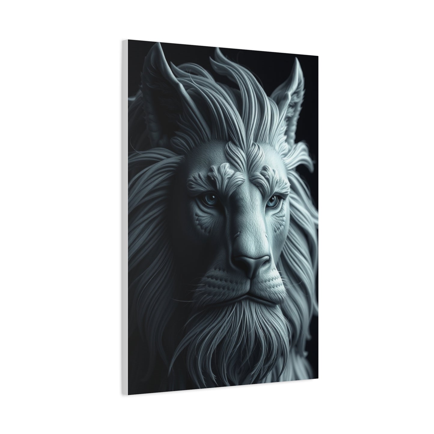
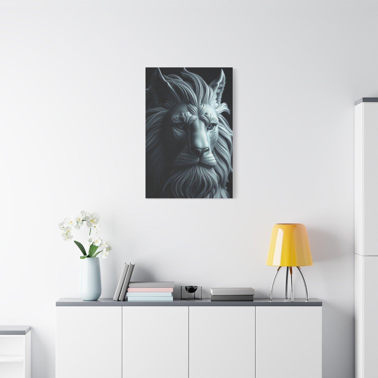
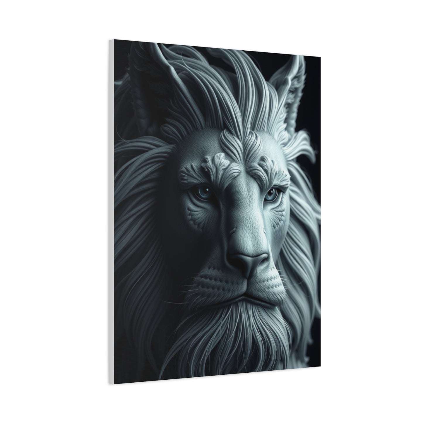
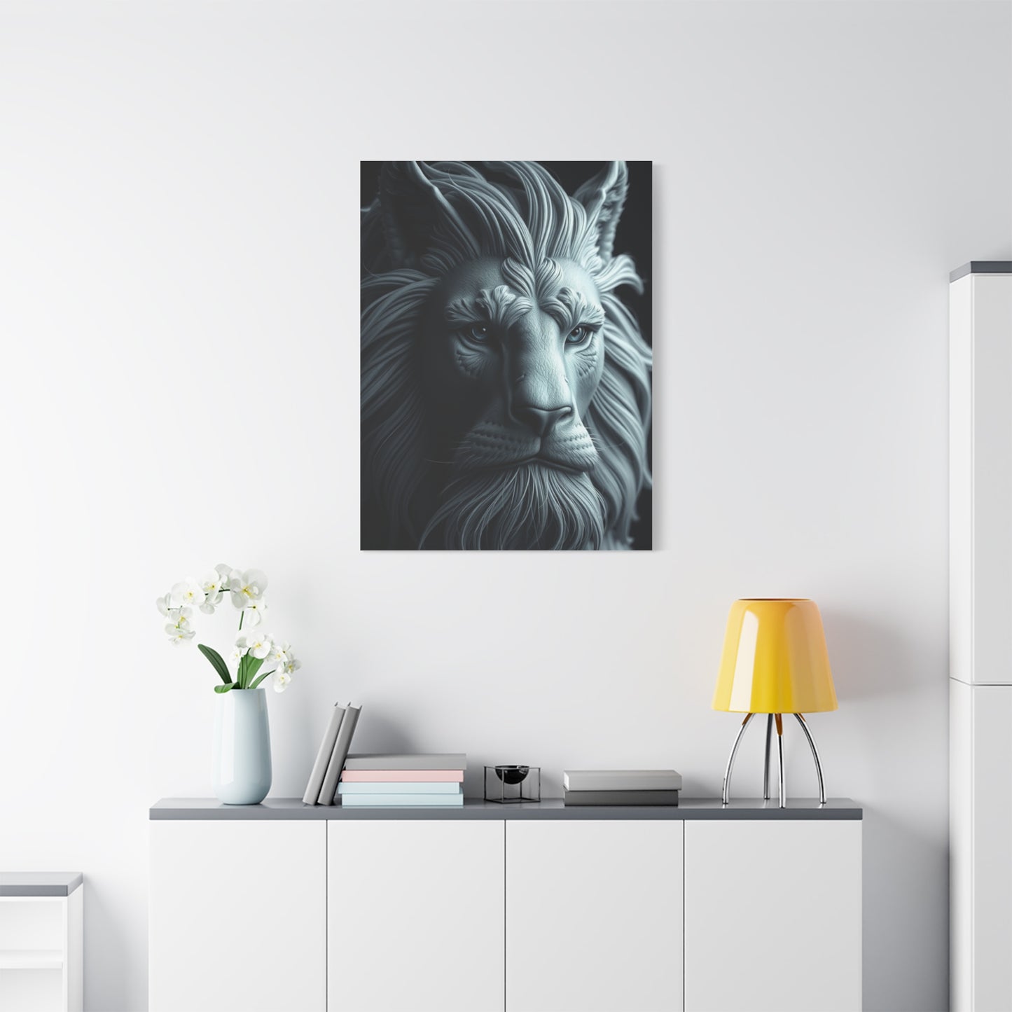
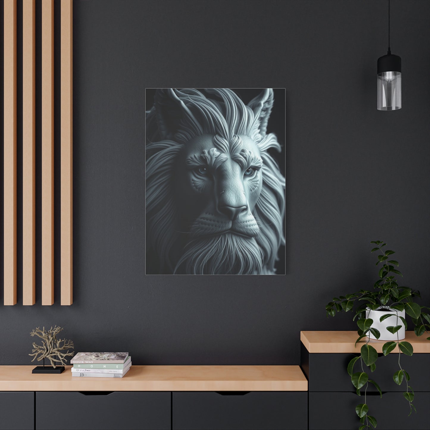
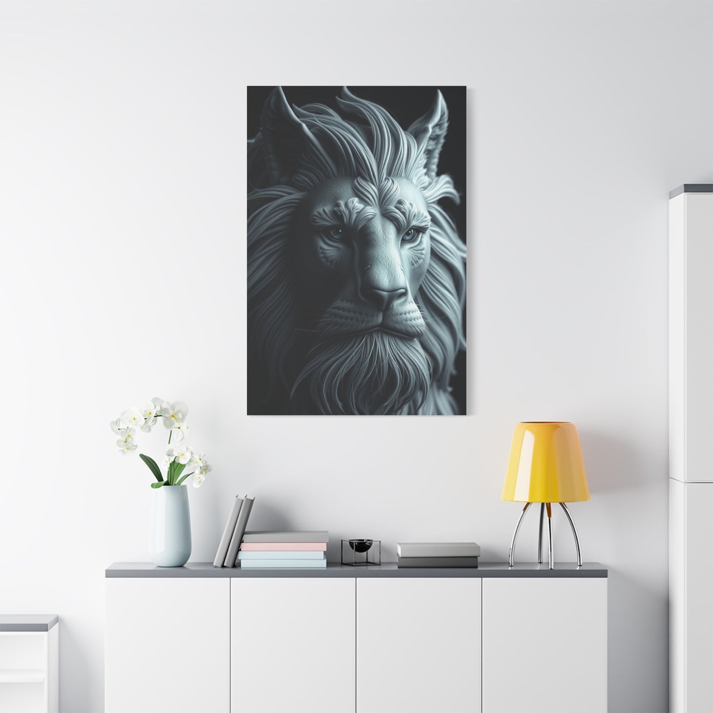
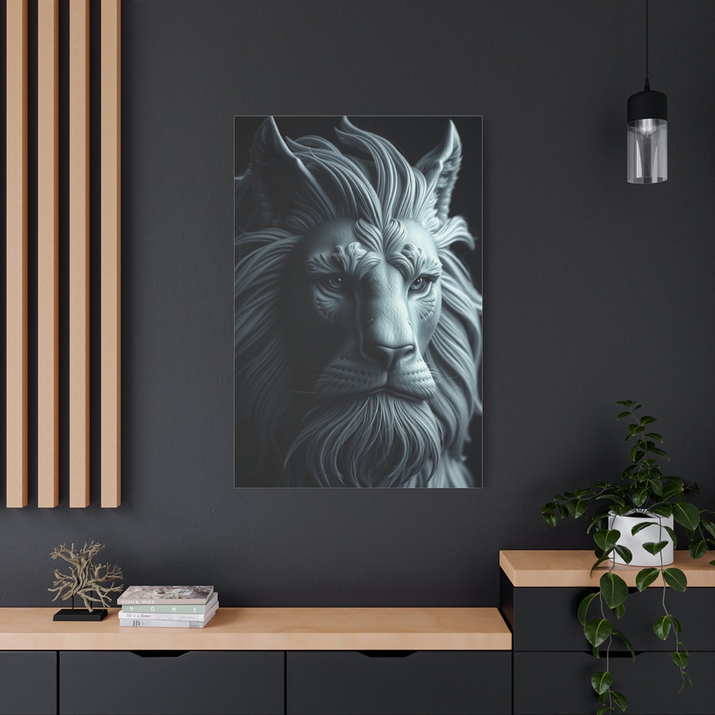
Ashen Serenity Artistry Wall Art & Canvas Print
Ashen Serenity Artistry Wall Art & Canvas Print
Couldn't load pickup availability


Ashen Serenity: Discovering the Subtle Beauty and Calming Power of Neutral Wall Art
The world of interior design has witnessed a remarkable shift toward minimalist aesthetics and neutral color palettes, with ashen tones emerging as a favorite among homeowners, decorators, and art enthusiasts. Ashen serenity artistry wall art represents more than just decorative pieces hanging on walls; it embodies a philosophy of peaceful living, mindful design, and the appreciation of subtle beauty. This sophisticated approach to wall decoration combines various shades of gray, soft whites, muted blacks, and gentle earth tones to create spaces that feel both contemporary and timeless. The popularity of these neutral-toned artworks stems from their remarkable versatility and their ability to complement virtually any interior design style while maintaining a sense of calm sophistication.
When we explore the concept of ashen serenity in wall art, we discover a fascinating intersection of artistic expression and practical design. These pieces serve as anchors in modern living spaces, providing visual interest without overwhelming the senses. The term itself evokes images of peaceful mornings, quiet contemplation, and the understated elegance found in nature's more subdued moments. From abstract compositions featuring flowing gray gradients to minimalist line drawings on cream backgrounds, from textured mixed-media pieces incorporating charcoal and silver to photographic prints capturing misty landscapes, the variety within this category is vast and continually evolving. Each piece tells its own story while maintaining that characteristic sense of tranquility that defines the genre.
The appeal of these neutral artworks extends far beyond mere aesthetic preference. In our increasingly chaotic and overstimulated world, the human psyche craves spaces of respite and calm. Ashen tones naturally create this atmosphere, offering a visual retreat from the constant bombardment of bright colors and busy patterns that characterize much of modern life. These pieces work particularly well in bedrooms, meditation spaces, home offices, and living areas where relaxation is paramount. The subtle nature of the color palette allows the artwork to remain prominent without becoming tiresome, a quality that ensures these pieces remain beloved parts of a home's decor for years rather than feeling dated or overwhelming after a short time.
Exploring Various Styles Within Ashen Serenity Wall Art
The category of ashen serenity wall art encompasses an impressive range of artistic styles, each offering unique aesthetic qualities while maintaining that signature sense of calm. Abstract expressionism translated into neutral palettes creates powerful pieces where the emotional intensity comes not from color but from gesture, texture, and composition. These works often feature sweeping brushstrokes in various shades of gray, layered to create depth and movement. The artist's hand becomes visible in the texture of the paint, the direction of marks, and the subtle variations in tone that occur when layers interact.
Minimalist line art represents another popular approach within this category. These pieces typically feature simple, elegant lines on neutral backgrounds, creating compositions that are simultaneously simple and profound. A single continuous line might trace an abstract shape, a simplified face, or a natural form, with the restraint of the execution forcing viewers to appreciate the essential qualities of the subject. The negative space becomes as important as the marks themselves, creating a dialogue between presence and absence that perfectly captures the spirit of ashen serenity.
Geometric compositions in neutral tones offer yet another avenue for artistic expression. These pieces might feature intersecting rectangles in various shades of gray, circles that create patterns through repetition and subtle variation, or angular shapes that suggest architecture or natural formations. The mathematical precision of geometric art provides a sense of order and structure that many find comforting, while the neutral color scheme prevents the composition from feeling cold or overly rigid. This style works particularly well in modern and contemporary interiors where clean lines and organized spaces are priorities.
Photographic prints exploring the ashen palette often capture misty landscapes, foggy urban scenes, or close-up details of natural textures like stone, bark, or flowing water. These images benefit from the inherent serenity of neutral tones, which allow the subject matter and composition to take center stage. A photograph of mountains shrouded in morning mist, rendered primarily in shades of gray and white, can evoke powerful feelings of peace and majesty without relying on the dramatic colors of a sunset or the vivid greens of a forest scene. The subtlety becomes the point, inviting viewers into a quieter, more contemplative experience of the natural world.
Textured mixed-media pieces combine various materials and techniques to create works with substantial physical presence. Artists might incorporate elements like canvas, paper, fabric, sand, plaster, or metal, all in coordinated neutral tones. The interplay of different textures adds visual and sometimes tactile interest that compensates for the restrained color palette. Light plays across these varied surfaces throughout the day, creating an ever-changing artwork that reveals new details depending on the angle and quality of illumination. This dynamic quality ensures that the piece remains engaging over time, offering fresh perspectives with each viewing.
The Role of Texture in Creating Depth Without Color
When working within a limited color palette, texture becomes one of the primary tools for creating visual interest and depth. Ashen serenity wall art often emphasizes textural variation as a means of adding complexity to what might otherwise be perceived as simple or flat compositions. Artists employ numerous techniques to achieve these textural effects, from traditional painting methods to innovative mixed-media approaches that push the boundaries of what wall art can be.
Impasto technique, where paint is applied thickly enough to retain brush or palette knife marks, creates dramatic shadows and highlights that change throughout the day as light moves across the artwork. Even within a monochromatic or near-monochromatic palette, these physical variations in surface height produce a richness that flat application cannot achieve. The viewer can see and sometimes even feel the artist's process, connecting with the physical act of creation in an immediate way. This tactile quality adds warmth to neutral tones that might otherwise feel cool or distant.
Layering represents another crucial technique for building depth in neutral artworks. By applying multiple translucent or semi-opaque layers of paint, artists create complex color fields where underlying layers peek through, creating unexpected tonal variations. A seemingly simple gray surface might actually contain layers of brown, blue, purple, and green, all muted and combined to create a sophisticated neutral tone that shifts subtly depending on lighting conditions and viewing angle. This approach rewards close examination and creates pieces that reveal their complexity gradually rather than immediately.
Incorporating actual three-dimensional elements transforms wall art from purely visual experiences into sculptural pieces. Artists might attach pieces of weathered wood, mount canvas at various depths, embed objects in plaster or resin, or use paper to create raised elements that cast shadows. When executed in neutral tones, these dimensional aspects create drama through form and shadow rather than color contrast. The interplay of light and shadow becomes a crucial component of the artwork itself, meaning the piece is never static but constantly evolving as natural and artificial light sources change throughout the day.
Natural materials bring their own inherent textures to wall art compositions. Stone, sand, crushed minerals, fibers, and other organic elements can be incorporated into artworks, each contributing unique textural qualities. A piece incorporating actual sand or stone dust mixed into paint or adhesive creates an immediately recognizable texture that connects viewers to memories of beaches, pathways, or natural landscapes. These materials often come in naturally neutral tones, making them perfect for ashen serenity pieces while adding authenticity and a sense of connection to the natural world.
How Neutral Wall Art Influences Room Atmosphere and Mood
The impact of wall art on the overall atmosphere of a room extends far beyond simple decoration. Ashen serenity pieces specifically influence mood and energy in ways that make them particularly suitable for certain spaces and purposes. The psychological effects begin with the immediate calming influence of neutral tones, which naturally reduce visual stimulation and create a sense of peace. Unlike bright colors that activate the nervous system and demand attention, these subdued hues allow the mind to relax and settle, creating ideal conditions for rest, concentration, or meditation.
In bedroom environments, ashen wall art contributes to the creation of restful spaces conducive to quality sleep. The absence of stimulating colors helps signal to the brain that this is a place for winding down and resting rather than activity and excitement. Pieces featuring soft gradients, gentle abstract forms, or peaceful landscape scenes reinforce this atmosphere without adding visual noise that might interfere with relaxation. Many people find that decorating their sleeping spaces with neutral art helps them disconnect from the stresses of the day and transition more easily into restorative sleep patterns.
Home offices and workspaces benefit from the focusing effect of neutral wall art. While some might assume that creative or productive spaces require bright, energizing colors, many people actually work best in environments that minimize distractions. Ashen serenity pieces provide visual interest and prevent walls from feeling stark or institutional without pulling attention away from the task at hand. The sophistication of well-executed neutral art can also lend credibility and professionalism to home-based workspaces, creating an atmosphere that helps delineate work mode from leisure mode even within a residential setting.
Living areas designed for relaxation and conversation gain particular benefits from neutral art pieces. These communal spaces often need to accommodate various activities and moods throughout the day, from morning coffee routines to evening entertaining. Neutral artworks provide a consistent, calming backdrop that supports all these functions without imposing a particular mood or atmosphere. The pieces become like good hosts—present and contributing to the overall experience without dominating or overwhelming. This versatility makes neutral art an intelligent investment for multi-purpose spaces.
Meditation rooms, yoga studios, and other dedicated wellness spaces naturally align with the principles embodied in ashen serenity art. The neutral palette supports the intention of these spaces by removing visual distractions and creating an environment where internal focus becomes easier. Practitioners of meditation often speak of the importance of external simplicity in supporting internal depth, and neutral wall art perfectly supports this principle. The subtlety of the artwork mirrors the subtle internal work of mindfulness practices, creating coherence between the physical environment and the spiritual or mental practices undertaken within it.
Selecting the Perfect Ashen Artwork for Your Space
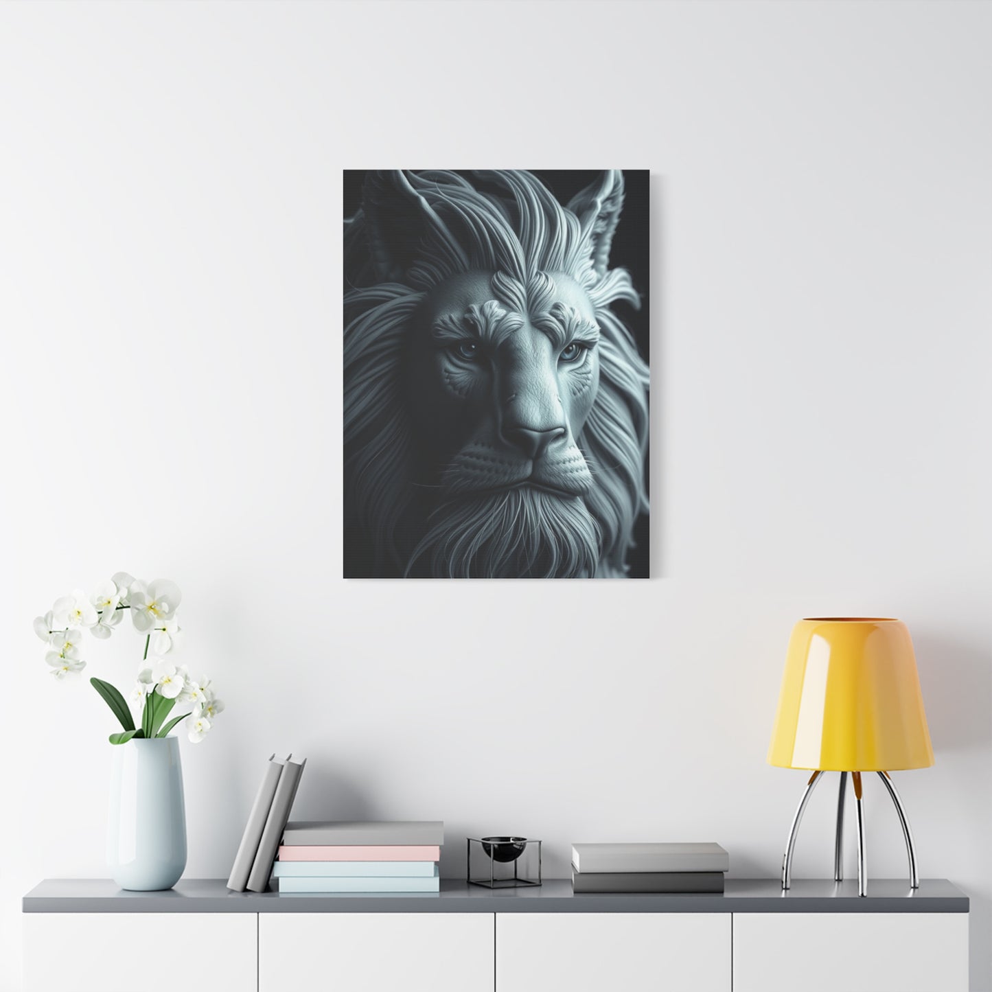
Choosing wall art is a deeply personal process that involves both aesthetic preferences and practical considerations. When selecting pieces within the ashen serenity category, certain principles can guide decisions toward choices that will remain satisfying over time. The first consideration involves scale, as the size of the artwork relative to the wall and furniture must create appropriate visual balance. A piece that is too small for a large wall may look lost and insignificant, while an oversized artwork in a small space can feel overwhelming and claustrophobic.
The concept of visual weight becomes particularly important with neutral artworks. Because these pieces rely less on color to create impact, other factors determine how much presence they have in a space. A densely textured work with high contrast between light and dark tones will have more visual weight than a subtle gradient piece, even if they are the same physical size. When selecting art, consider what level of visual impact you want in the particular location. Statement walls can accommodate pieces with significant visual weight, while smaller walls or areas with lots of other visual elements might benefit from more subtle pieces.
The existing color scheme and design style of your space should inform your art selection, though not limit it. Ashen serenity pieces work remarkably well across various design styles, from ultra-modern to traditional. However, the specific characteristics of the artwork should harmonize with other design elements. A geometric abstract piece might feel most at home in a contemporary space with clean lines, while a textured landscape photograph could complement both modern and more traditional decor. The beauty of neutral art lies in its adaptability, but thoughtful coordination ensures the best results.
Lighting conditions dramatically affect how neutral artworks appear in a space. Natural light reveals the subtle tonal variations and textural details that make these pieces special, while certain artificial lighting can flatten or alter their appearance. Before making a final decision, consider viewing potential pieces under lighting conditions similar to those in the intended location. Morning light differs from afternoon sun, and warm incandescent bulbs create different effects than cool LED lighting. A piece that glows beautifully in bright natural light might lose its magic in a dimly lit room with inadequate artificial lighting.
Creating Gallery Walls with Neutral Art Collections
Gallery walls have become increasingly popular as a way to display multiple artworks in a cohesive, curated manner. When working within the ashen serenity palette, creating gallery walls offers opportunities to build visual interest through variation while maintaining overall harmony. The key to successful gallery walls lies in balancing unity and diversity—the pieces should relate to each other while each retaining its individual character and appeal.
Starting with a central anchor piece provides a focal point around which other works can be arranged. This anchor typically represents the largest or most visually striking piece in the collection, establishing the dominant aesthetic that other pieces will complement. In a neutral gallery wall, this might be a large abstract painting with subtle tonal variations, a dramatic black and white photograph, or a textured mixed-media piece. Once the anchor is established, surrounding pieces can be selected to echo themes, textures, or compositional elements while introducing enough variation to keep the arrangement interesting.
Mixing different types of artwork within the neutral palette creates dynamic gallery walls that engage viewers on multiple levels. Combining abstract pieces with representational works, photographs with paintings, and framed prints with three-dimensional objects adds visual variety while the unified color scheme maintains coherence. This approach prevents monotony while ensuring the overall effect remains calm and sophisticated rather than chaotic. The variety invites extended viewing as the eye travels from piece to piece, discovering connections and appreciating contrasts.
The physical arrangement of pieces requires careful planning to achieve balance. While perfectly symmetrical arrangements offer one approach, asymmetrical layouts often feel more organic and contemporary. When planning the layout, consider creating a template using paper cutouts or digital tools before making holes in the wall. The goal is to achieve visual balance where the visual weight distributes evenly across the arrangement, even if the physical pieces are different sizes. Larger pieces might balance several smaller ones, and denser, darker works might balance lighter, more open pieces on the opposite side.
The Artistry Behind Creating Neutral Tone Masterpieces
Understanding the artistic process behind ashen serenity wall art deepens appreciation for these pieces and reveals the skill, intention, and creativity required to work within this seemingly simple palette. Artists who specialize in neutral tones often describe the challenge and liberation of working without the crutch of bright colors. Every decision becomes magnified in importance—the exact shade of gray, the texture of a brushstroke, the placement of a mark—because subtlety rather than boldness determines success.
The process often begins with color mixing, where artists create their custom neutral tones by combining various pigments. Pure gray can be achieved by mixing black and white, but more interesting neutrals come from combinations that include colors like burnt umber, ultramarine blue, raw sienna, or even small amounts of complementary colors that neutralize each other. These complex neutrals have undertones that add richness and prevent the flatness that can result from simple black-and-white mixing. An artist might develop a signature palette of specific neutral tones that become characteristic of their work, as recognizable as a color palette might be in another artist's practice.
Compositional decisions take on heightened importance in neutral artwork. Without color to create focal points or guide the viewer's eye, artists must rely on other elements. The arrangement of shapes, the direction and weight of lines, the distribution of light and dark values, and the creation of movement through gesture or pattern all become crucial tools. Successful neutral compositions often display masterful understanding of these fundamental principles, demonstrating that the artist has moved beyond reliance on color to achieve visual impact.
Many artists working in this realm incorporate meditative or intuitive practices into their creative process. The neutral palette naturally lends itself to contemplative creation, where the artist works in a mindful state, responding to each mark and allowing the piece to develop organically rather than forcing a predetermined outcome. This approach often results in artworks that carry the energy of calm focus, transmitting a sense of peace to viewers. The process becomes as important as the product, with the artwork serving as a record of the artist's meditative journey.
Technical experimentation pushes the boundaries of what can be achieved with neutral tones. Artists explore various application methods from traditional brushwork to pouring, dripping, scraping, stamping, and countless other techniques. Some incorporate digital tools, creating compositions on computers that are then output as prints or translated into paintings. Others work primarily with their hands, using fingers or unconventional tools to apply media. These technical explorations result in unique surface qualities and visual effects that make each piece distinctive despite working within the same general color range.
The influence of specific artistic movements and traditions informs contemporary neutral art. Japanese sumi-e ink painting, with its emphasis on capturing essence through minimal, gestural marks, provides inspiration for many contemporary artists. Scandinavian design principles of simplicity and functionality influence others. The legacy of abstract expressionism, particularly artists who worked in limited palettes, continues to resonate. Contemporary artists synthesize these influences with modern sensibilities, creating work that honors tradition while remaining firmly rooted in the present moment.
Caring for and Preserving Neutral Wall Art
Proper care ensures that ashen serenity wall art remains beautiful and intact for years or even generations. The specific care requirements depend on the medium and materials used in the artwork, but certain general principles apply across most pieces. Understanding these care practices helps protect your investment and maintain the aesthetic qualities that made the artwork appealing in the first place.
Placement decisions significantly impact artwork longevity. Direct sunlight represents one of the greatest threats to many artworks, causing fading, discoloration, and deterioration of materials over time. While neutral-toned pieces may show light damage less obviously than brightly colored works, they remain vulnerable to UV radiation. Positioning artwork away from windows or using UV-filtering glazing on framed pieces provides protection. In cases where sunlight exposure is unavoidable, rotating pieces periodically distributes any fading effects across multiple works rather than concentrating damage on a single piece.
Temperature and humidity fluctuations can cause significant damage to artwork, particularly pieces on paper or canvas. Extreme heat can cause materials to become brittle, while high humidity promotes mold growth and can cause paper to buckle or warp. Ideally, artwork should be displayed in climate-controlled environments with relatively stable temperature and humidity levels. Avoid hanging pieces near heating vents, fireplaces, or exterior walls that might experience greater temperature swings. Basements and bathrooms with high moisture levels generally make poor locations for valuable artwork.
Cleaning artwork requires a gentle touch and appropriate methods for the specific medium. Dust accumulation dulls the appearance of artwork over time, but aggressive cleaning can cause more damage than the dust itself. For framed pieces behind glass, cleaning the glass with appropriate cleaners keeps the piece looking fresh without risking the artwork. For unglazed pieces, very gentle dusting with a soft, clean brush removes surface dust. Never use water, cleaning products, or damp cloths on artwork unless you have specific knowledge that the materials can tolerate it. When in doubt, consult a professional conservator rather than risk damaging the piece.
Framing and mounting choices affect artwork preservation significantly. Acid-free mats and backing prevent chemical reactions that can discolor or damage artwork over time. Proper mounting techniques secure the piece without putting stress on the materials that could lead to warping or tearing. Many professional framers offer conservation framing services that employ archival materials and techniques designed to maximize artwork longevity. While these services cost more than basic framing, they represent worthwhile investments for valuable pieces.
Insurance documentation protects against financial loss in case of damage or theft. Photographing artwork, maintaining purchase receipts and authenticity certificates, and obtaining professional appraisals for valuable pieces creates a record that facilitates insurance claims if necessary. Some homeowners insurance policies cover artwork, but valuable collections may require additional coverage through fine art insurance policies. Taking these precautions provides peace of mind and financial protection for your art collection.
Professional conservation becomes necessary when artwork sustains damage or shows signs of deterioration. Attempting DIY repairs almost always causes more harm than good, potentially destroying value and further damaging the piece. Professional art conservators have specialized training in assessing damage, stabilizing deteriorating materials, and performing interventions that respect the artwork's integrity. While conservation services can be expensive, they represent the only responsible approach to preserving damaged artwork with any significant monetary or sentimental value.
Incorporating Natural Elements Into Neutral Art Themes
The connection between ashen serenity wall art and the natural world runs deep, with many artists drawing inspiration from nature's more subdued moments and palettes. This intersection of neutral aesthetics and natural themes creates particularly powerful pieces that resonate with our innate biophilia—the human tendency to seek connections with nature and other life forms. Incorporating natural elements into neutral art themes satisfies multiple aesthetic and psychological needs simultaneously.
Coastal themes translated into neutral palettes capture the essence of beaches, shorelines, and ocean environments without resorting to typical blues and bright beach colors. Images of weathered driftwood, smooth stones, sand textures, and misty coastal mornings all provide rich subject matter that naturally aligns with ashen tones. These pieces evoke the calming effect of time spent by water while maintaining the sophisticated neutrality that characterizes the genre. The result creates artwork that feels both peaceful and elevated, accessible yet refined.
Mountain and landscape scenes rendered in neutral tones often capture atmospheric conditions like fog, mist, or dawn light that naturally mute colors. These images convey the majesty and scale of natural environments while maintaining the visual calm essential to ashen serenity aesthetics. A mountain range disappearing into morning mist, trees emerging from fog, or a winter landscape under overcast skies all provide powerful imagery that works beautifully in neutral palettes. The subtlety of these scenes invites prolonged viewing, revealing details and nuances that more obviously dramatic images might overshadow.
Botanical subjects offer another avenue for incorporating nature into neutral art. While flowers and plants are often depicted in vibrant colors, focusing on form, structure, and subtle tonal variations creates compelling botanical artwork in neutral palettes. Close-up studies of leaves showing delicate vein structures, seed pods with interesting shapes, or arrangements of dried grasses and branches all translate beautifully into neutral-toned compositions. These pieces bring organic forms into interiors while maintaining the restrained elegance of the neutral aesthetic.
Abstract interpretations of natural phenomena allow artists to capture the essence of natural experiences without literal representation. The feeling of wind, the flow of water, the growth patterns of organic forms, or the rhythms of seasons might be expressed through abstract marks, textures, and compositions. These pieces often feel deeply connected to nature while remaining firmly in the abstract realm, offering viewers opportunities to project their own natural experiences and memories onto the work.
Geological formations and mineral textures provide particularly appropriate subject matter for neutral artwork. Stone, rock, minerals, sand, and earth naturally exist in a wide range of neutral tones, from pale limestone to charcoal basalt. Artworks exploring these materials and formations feel authentic and grounded, connecting viewers to the enduring stability of geological time. The textures and patterns found in stone—layers, cracks, erosion patterns, crystalline structures—offer endless inspiration for artists working in neutral palettes.
The changing seasons, particularly autumn and winter, provide natural color palettes that align perfectly with ashen serenity aesthetics. Bare trees against gray winter skies, fallen leaves in browns and taupes, frost patterns on windows, or snow-covered fields all embody the neutral aesthetic while clearly referencing nature. These seasonal references add temporal dimension to neutral art, connecting the timeless quality of the pieces to the cyclical rhythms of the natural world.
Creating Your Own Neutral Artwork
The accessibility of creating ashen serenity-inspired wall art allows anyone to explore this aesthetic personally, regardless of prior artistic experience. While mastering sophisticated techniques requires practice and dedication, basic approaches to creating neutral artwork provide satisfying results even for beginners. The process itself offers therapeutic benefits, while successful pieces provide personal satisfaction and customized decoration that perfectly suits your space and taste.
Beginning with simple abstract compositions removes the pressure of creating recognizable subjects, allowing focus on color, texture, and composition. Gather materials in various neutral tones—white, black, and several grays form the basic palette, though adding muted browns, taupes, or even very desaturated colors like dusty blue or sage creates more interesting results. Acrylic paint works well for beginners due to its quick drying time and water cleanup, though any painting medium can be used. Choose a canvas or heavy paper as your surface, ensuring it's appropriately sized for your intended display location.
Experimental application techniques often produce more interesting results than careful, controlled painting, particularly for abstract pieces. Try pouring diluted paint and tilting the surface to create flowing patterns. Use palette knives or credit cards to scrape paint, creating textured marks and revealing underlying layers. Sponge, stamp, or spatter paint to build complex surfaces with varied textures. Allow accidents and unexpected results to inform the developing piece rather than trying to force a predetermined outcome. The spontaneity and responsiveness required by experimental techniques often produces more dynamic results than rigid planning.
Compositional Approaches in Peaceful Gray-Toned Wall Art
Composition forms the structural backbone of visual art, determining how elements within a piece relate to each other and to the overall format. In wall art emphasizing ashen serenity, compositional decisions carry particular weight because chromatic variety cannot provide distraction from structural weaknesses. Artists must carefully consider balance, focal points, visual pathways, and spatial relationships to create engaging works within restrained palettes.
Asymmetrical balance proves especially effective in this aesthetic domain. Unlike symmetrical arrangements that can feel static, asymmetrical compositions create dynamic equilibrium through careful distribution of visual weight. A darker element in one area might balance larger expanses of lighter tones elsewhere, establishing tension and interest while maintaining overall harmony. This approach reflects natural patterns where perfect symmetry rarely occurs, contributing to the organic serenity these pieces embody.
The rule of thirds provides useful scaffolding for many successful compositions in this genre. Placing focal points or transitional areas at intersections of lines dividing the canvas into thirds both horizontally and vertically creates naturally pleasing arrangements. This principle derives from observations of how human vision naturally processes visual information, making it effective across cultures and individual preferences.
Horizon lines, whether explicit or implied, offer powerful compositional tools in ashen serenity wall art. A horizontal division creates two distinct areas that can vary in value, texture, or treatment while maintaining connection through shared palette. This approach evokes landscape traditions without requiring representational elements, allowing abstract expression to convey environmental essence.
Radial compositions emanating from central or off-center points create energy within peaceful frameworks. Subtle value shifts radiating outward establish movement that guides viewing without agitation. This compositional strategy works particularly well for pieces intended as meditation focal points, as the radiating structure naturally draws and holds attention.
Layered depth through overlapping forms adds dimensional complexity to otherwise flat surfaces. Translucent layers suggesting multiple planes create spatial ambiguity that engages viewers cognitively while remaining visually calm. This approach rewards prolonged viewing as relationships between layers reveal themselves gradually, encouraging the contemplative interaction that defines engagement with serene wall art.
Integration of Ashen Wall Art Into Diverse Interior Design Styles
The versatility of wall art featuring ashen serenity becomes apparent when considering its compatibility with various design approaches. These pieces function as chameleons in interior spaces, adapting to complement different aesthetic directions while maintaining their essential character. This adaptability makes them valuable investments for those who anticipate evolving their interior design over time.
Minimalist interiors find perfect partnership with these subdued artistic expressions. The shared philosophy of restraint and intentionality creates seamless integration where wall art enhances rather than overwhelms spaces. In minimalist settings, each element must justify its presence through function or significant aesthetic contribution. Ashen serenity pieces meet this criterion by providing visual interest without clutter, focal points without distraction.
Scandinavian design principles emphasizing natural materials, functionality, and cozy simplicity align beautifully with peaceful gray-toned wall décor. The Nordic appreciation for hygge, that untranslatable sense of warmth and contentment, finds visual expression in artwork that soothes rather than stimulates. These pieces complement light woods, natural textiles, and the abundant white surfaces characteristic of Scandinavian interiors while adding subtle depth.
Industrial aesthetics featuring exposed materials, metal fixtures, and urban edge benefit from the softening influence of ashen wall art. The juxtaposition between hard architectural elements and gentle artistic expressions creates balanced environments that feel both edgy and livable. Gray tones naturally harmonize with concrete, steel, and weathered wood, unifying industrial spaces through shared color language.
Contemporary transitional styles blending traditional and modern elements utilize these neutral artworks as bridges between different periods and approaches. Wall art in ashen palettes doesn't declare allegiance to any particular era, allowing it to mediate between antique furnishings and contemporary pieces. This neutrality facilitates eclectic combinations that might otherwise clash.
Japanese-inspired interiors rooted in wabi-sabi philosophy celebrating imperfection and transience find kindred spirits in artwork embodying ashen serenity. The acceptance of asymmetry, appreciation for natural materials, and valuing of negative space that characterize Japanese design all appear in thoughtfully executed gray-toned wall art. These pieces support the contemplative atmosphere central to Japanese aesthetic principles.
Coastal and organic modern styles incorporating natural textures and breezy palettes welcome ashen wall décor as grounding elements. While these design approaches often feature blues and greens suggesting water and vegetation, gray tones evoke weathered driftwood, smooth stones, and overcast skies that complete the natural palette. The peaceful quality inherent in these artworks reinforces the relaxed atmosphere coastal design cultivates.
Lighting Strategies to Enhance Subtle Gray-Toned Wall Art
Proper illumination dramatically affects how wall art appears and how effectively it fulfills its aesthetic and atmospheric functions. Pieces featuring ashen serenity require particularly thoughtful lighting approaches to reveal their subtle complexities and create intended ambiance. Various lighting techniques serve different purposes depending on artwork characteristics and room requirements.
Natural light provides constantly changing illumination that causes artwork to appear different throughout the day. Morning light tends cool and directional, creating distinct shadows on textured surfaces. Midday sun offers bright, neutral illumination that reveals true colors and values. Late afternoon and evening light warms, adding golden undertones that can enhance or shift gray tones. Positioning artwork to receive changing natural light adds dynamic quality as pieces reveal different characteristics with passing hours.
Picture lights mounted directly above or below artwork provide focused illumination that highlights specific pieces. These fixtures create dramatic presentation suited to formal settings or artwork deserving special attention. For ashen pieces, warm LED picture lights prevent cool grays from appearing cold or unwelcoming. Adjustable picture lights offer flexibility to direct beams precisely where desired.
Track lighting systems provide versatility through movable fixtures that can be adjusted as artwork changes or needs evolve. This approach works well in galleries and homes where art collections rotate. For illuminating multiple pieces with varied characteristics, track systems allow individual optimization for each work. Directional control ensures proper coverage without light spilling onto surrounding walls.
Recessed ceiling fixtures create ambient illumination that brightens entire spaces including wall art. While less dramatic than focused lighting, this approach provides even coverage suitable for casual display. When using recessed lighting for ashen artwork, positioning fixtures to minimize glare on glazed pieces prevents reflections that obscure delicate details.
Wall-washing techniques using fixtures positioned to graze walls with light emphasize texture by creating shadows in surface variations. This dramatic approach proves particularly effective for heavily textured ashen pieces where dimensional quality forms a primary attraction. The interplay of light and shadow across surfaces creates visual interest that changes with viewer position.
Accent lighting from table and floor lamps contributes to overall room illumination while potentially highlighting nearby wall art. This layered approach to lighting creates depth and allows adjustment of brightness for different activities and times of day. Warm lamp light in evenings provides cozy atmosphere that complements the peaceful character of ashen wall décor.
LED technology offers particular advantages for artwork illumination including energy efficiency, minimal heat production, and precise color temperature control. Cool white LEDs preserve accurate color perception, important for appreciating subtle value relationships. Warm white LEDs create inviting atmosphere while slightly shifting gray tones toward warmer perceptions. Dimmable LED fixtures provide ultimate flexibility to adjust lighting intensity for different needs.
Cultural Perspectives on Neutral Colors and Peaceful Aesthetics
Understanding how different cultures perceive and utilize neutral colors provides valuable context for contemporary appreciation of ashen serenity in wall art. While some aesthetic principles appear universal, cultural conditioning significantly influences color associations, preferences, and meanings. This global perspective enriches understanding and application of peaceful gray-toned décor.
Eastern philosophical traditions including Taoism and Zen Buddhism embrace simplicity, emptiness, and the spaces between things as essential rather than lacking. This worldview makes gray tones and minimal aesthetics not mere absence of color but positive presence of calm, balance, and potential. Wall art reflecting these principles serves contemplative purposes aligned with spiritual practices emphasizing present-moment awareness.
Japanese aesthetic concepts including shibui and wabi-sabi celebrate understated beauty, imperfection, and evidence of time and use. These philosophies find expression in art embracing natural materials, subtle colors, and asymmetrical compositions. The appreciation for patina, weathering, and impermanence makes gray tones particularly resonant as they suggest the gentle passage of time and acceptance of natural aging processes.
Scandinavian design traditions arising from cultures with limited daylight during winter months emphasize maximizing natural light through pale color palettes. Gray tones in Nordic interiors don't darken spaces but provide subtle definition while maintaining the brightness essential for wellbeing in northern climates. Wall art in ashen palettes contributes to this light-maximizing approach while adding necessary visual interest to prevent sterility.
Western modernist movements of the twentieth century embraced neutral palettes as rejection of excessive Victorian ornamentation and embrace of industrial materials and processes. Gray became associated with honesty, functionality, and sophisticated restraint. This cultural legacy continues influencing contemporary appreciation for minimalist aesthetics and artwork eschewing chromatic exuberance.
Some cultural traditions associate gray with aging, wisdom, and dignity. Silver hair and gray stone buildings acquire reverence through accumulated years and experiences. Wall art in these tones can invoke similar associations with maturity, stability, and enduring value that transcends temporary trends.
Contemporary global culture, increasingly connected through digital media, shows converging aesthetic preferences while maintaining regional variations. The worldwide popularity of minimalism, sustainable design, and wellness-focused living has elevated neutral palettes across diverse cultures. Ashen serenity in wall art speaks this international design language while remaining adaptable to local interpretations and implementations.
Emotional Responses to Subdued Color Palettes in Art
The emotional impact of color in art and environments has been extensively studied, revealing both universal patterns and individual variations in response. Gray tones occupying middle ground between extremes of light and dark evoke particular emotional qualities that make them valuable for creating specific atmospheres. Understanding these responses helps in selecting and positioning wall art to support desired feelings in different spaces.
Calm represents the most commonly reported emotional response to gray-toned environments and artwork. The absence of chromatic stimulation allows nervous systems to settle, reducing arousal and promoting relaxation. This quality makes ashen serenity pieces particularly appropriate for bedrooms, meditation spaces, and areas designated for stress reduction. The peaceful presence doesn't demand emotional reactions but provides supportive backdrop for internal processing.
Sophistication and refinement connect to restrained palettes in many viewers' perceptions. The discipline required to create compelling work without chromatic variety signals artistic mastery and intentional choice. This association makes gray-toned wall art suitable for professional environments and homes where cultivated taste is valued. The understated elegance communicates confidence that doesn't require bold display.
Melancholy or sadness can emerge in response to gray environments when they lack sufficient variation, natural light, or warming elements. This potential drawback requires attention when selecting and displaying ashen artwork. Incorporating textural interest, subtle warm undertones, and adequate lighting prevents the shift from peaceful to depressing. Context and surrounding elements significantly influence whether gray reads as serene or somber.
Stability and groundedness arise from neutral tones that don't shift with lighting changes as dramatically as saturated colors. Gray maintains relatively consistent appearance across varied illumination, creating reliable visual anchors in changing environments. This stability contributes to feelings of security and permanence, particularly valuable in times of external uncertainty.
Openness to interpretation characterizes emotional responses to artwork without strong chromatic content. Viewers project their own emotional states and associations onto relatively neutral pieces, making each interaction personal and variable. This quality transforms wall art into mirrors reflecting viewers' internal landscapes rather than imposing particular feelings. The open-ended nature supports diverse emotional needs from the same piece.
Contemplation and introspection are encouraged by artwork that doesn't overwhelm perceptual systems with stimulating input. The quiet presence of ashen pieces invites viewers to turn attention inward rather than focusing entirely on external visual experience. This quality aligns with mindfulness practices and supports psychological processes including self-reflection, problem-solving, and creative thinking.
Pairing Ashen Wall Art With Complementary Décor Elements
Wall art functions as one component within larger interior design compositions. The effectiveness of pieces embodying ashen serenity depends partly on how they interact with surrounding elements including furniture, textiles, accessories, and architectural features. Strategic pairing creates cohesive environments where individual components enhance rather than compete with each other.
Furniture selection profoundly impacts how wall art appears and functions within spaces. For ashen gray-toned pieces, furniture in complementary neutral tones creates monochromatic schemes emphasizing form and texture over color. This approach produces sophisticated, gallery-like environments where art takes center stage. Alternatively, furniture in warmer woods or bold colors provides contrast that makes both art and furnishings more noticeable, creating dynamic interplay between elements.
Textile choices including curtains, rugs, throw pillows, and upholstery introduce additional color and texture relationships. Layering various textiles in neutral palettes with the occasional accent color creates rich environments without chromatic chaos. Linen, cotton, wool, and silk each contribute distinct textural qualities that complement rather than replicate artwork textures. Patterns should be selected carefully, as busy designs can conflict with artwork, while subtle patterns add interest without distraction.
Sculptural objects and three-dimensional accessories provide dimensional contrast to two-dimensional wall art. Ceramic vessels, wooden bowls, metal sculptures, and natural objects like stones or driftwood introduce physical depth that balances flat artworks. Selecting accessories in neutral tones maintains cohesive palette while allowing diverse forms and materials to create visual interest through shape and texture rather than color.
Architectural features including moldings, built-in shelving, and fireplace surrounds frame wall art displays literally and figuratively. Painted in complementary neutrals, these elements enhance artwork presentation. White or light gray walls create gallery-like presentation, while darker walls provide dramatic contrast that makes lighter artwork pop. Accent walls in deep charcoal or black create sophisticated backdrops for ashen pieces, though this approach requires careful lighting to prevent darkness from overwhelming spaces.
Metallic accents in gold, silver, copper, or bronze introduce reflective qualities and warm or cool undertones that interact with gray-toned art. Light fixtures, hardware, mirror frames, and decorative objects in metals add sparkle and dimension. Warm metals like brass and copper complement warm grays, while silver and chrome align with cool grays. Mixed metals create eclectic contemporary aesthetic when unified through consistent finish styles like brushed or polished.
Plant life introduces organic elements that soften interiors and provide living contrast to static artworks. Green foliage appears particularly striking against neutral backgrounds, creating natural color accent without overwhelming spaces. Various plant forms from trailing pothos to architectural fiddle-leaf figs contribute different visual characters. The natural imperfection and growth patterns of plants balance the fixed compositions of wall art, creating dynamic yet peaceful environments.
Lighting fixtures themselves function as decorative elements beyond their illumination purposes. Sculptural pendant lights, elegant sconces, and artistic floor lamps contribute to overall aesthetic while serving practical functions. Selecting fixtures in complementary materials and finishes unifies design schemes. The interplay between lighting and art, where fixtures illuminate pieces while creating their own visual interest, layers functional and aesthetic considerations successfully.
Conclusion
In a world full of fast-paced living, the search for tranquility and balance within our spaces has become more important than ever. Ashen Serenity wall art, with its subdued palette of soft greys, whites, beiges, and other neutral tones, offers a gentle yet powerful way to infuse any room with a sense of calm, sophistication, and timeless elegance. By embracing the beauty of neutrality, these art pieces create an atmosphere that encourages relaxation, mindfulness, and a deeper connection with one's surroundings. Whether used in a minimalist sanctuary or as a backdrop to more vibrant accents, neutral wall art provides the perfect foundation for creating spaces that nurture both the mind and the soul.
The appeal of Ashen Serenity lies in its subtlety. Unlike bold, brightly colored artworks that demand immediate attention, neutral-toned pieces have a quiet yet commanding presence. They do not overwhelm the viewer but instead invite contemplation and introspection. The soft gradients of grey or the gentle warmth of earth tones bring an inherent softness to a room, making it feel more open, airy, and spacious. This calming aesthetic makes neutral wall art an ideal choice for creating serene environments, such as bedrooms, living rooms, or meditation spaces, where rest and relaxation are paramount.
Neutral wall art has an extraordinary ability to enhance the overall ambiance of a room by complementing and balancing other design elements. In contrast to high-contrast colors and intricate patterns, neutral tones harmonize effortlessly with a wide range of interior styles, from contemporary and minimalist to traditional and rustic. The beauty of Ashen Serenity is that it acts as both an anchor and a complementary piece in any room's design. It provides a sense of unity and cohesion to a space, allowing other decorative elements—such as furniture, textiles, or accent colors—to stand out while still contributing to the overall harmony of the room. By grounding a space with neutral art, designers and homeowners can achieve a refined, polished look that feels both effortless and intentional.
What makes Ashen Serenity particularly compelling is its versatility. These neutral-toned artworks are timeless and adaptable, easily transitioning with changing design trends and evolving tastes. While vibrant and bold art pieces may feel out of place as trends shift, neutral art maintains its relevance, providing lasting beauty and versatility. Over time, as furniture styles and color schemes change, a neutral art piece can seamlessly blend with new elements, ensuring that it remains a cherished part of the space for years to come. This timeless quality makes Ashen Serenity wall art an excellent investment for anyone looking to create a space that feels both contemporary and enduring, without the need for frequent updates or redesigns.
Beyond their aesthetic qualities, neutral wall art also carries a profound psychological impact. Studies have shown that certain colors and tones can influence mood and well-being, and the calming power of neutral shades is no exception. Soft, muted tones are known to reduce stress, promote relaxation, and foster a sense of peace. The subtlety of Ashen Serenity wall art encourages a slower pace, inviting the viewer to pause, reflect, and breathe. In spaces where individuals seek respite from the hustle and bustle of daily life—such as bedrooms, study areas, or home offices—these pieces serve as visual cues to unwind and focus. The effect is particularly potent in environments that require concentration, creativity, or emotional balance, as neutral art helps to create an atmosphere that supports mental clarity and emotional stability.
