


Azure Reverie Canvas wall art & canvas print
Azure Reverie Canvas wall art & canvas print
Couldn't load pickup availability


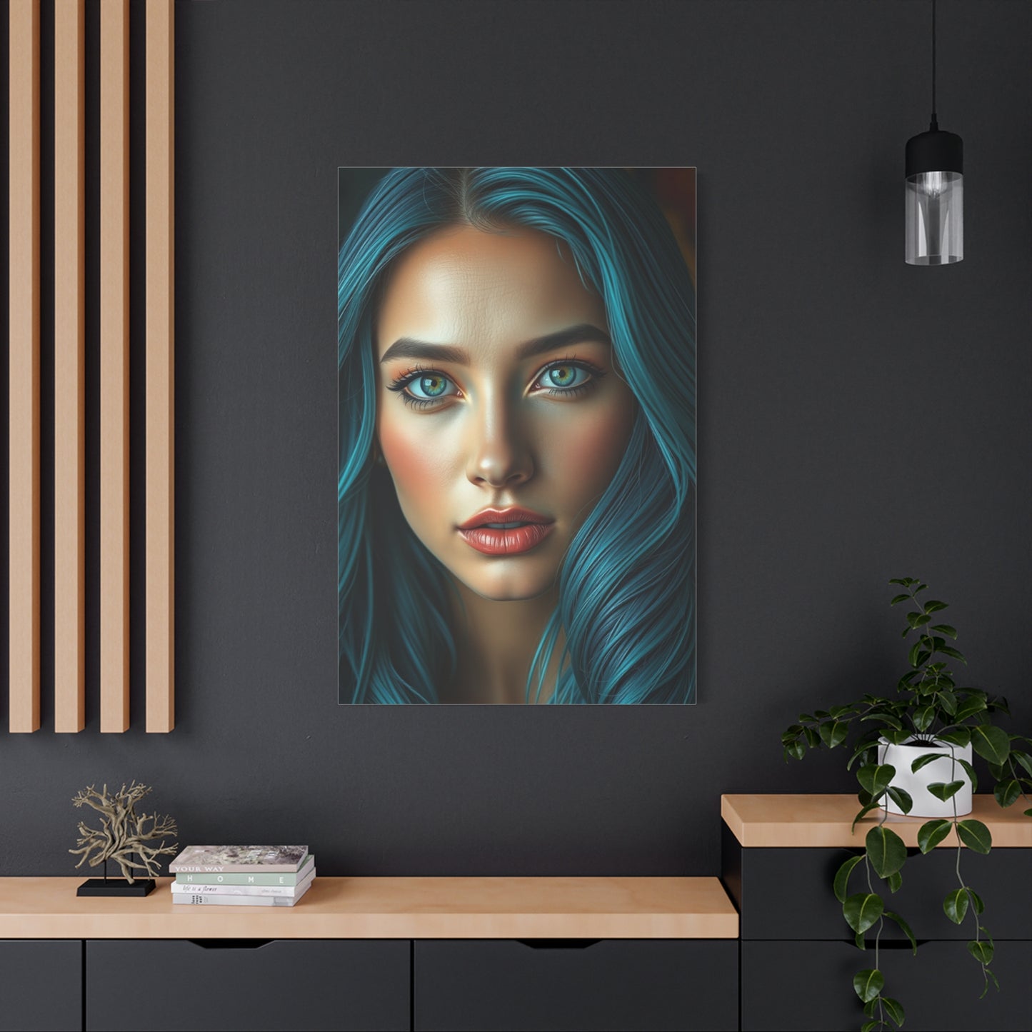
Azure Reverie Canvas Wall Art: A Deep Dive into the Calming Beauty of Ocean-Inspired Decor
The intersection of art and interior design has always been a powerful force in creating spaces that resonate with personal style and emotional comfort. When it comes to transforming your living environment into a sanctuary of peace and visual elegance, few artistic choices can match the captivating allure of blue-toned abstract compositions. These pieces offer more than mere decoration; they provide a portal to tranquility and a statement of refined taste that speaks volumes about your appreciation for aesthetic harmony.
Blue has long been celebrated in color psychology and design theory as a hue that embodies calmness, depth, and contemplative beauty. When incorporated into abstract wall art, these qualities become amplified through artistic interpretation, creating visual experiences that transcend traditional decoration. The interplay of various blue shades, from deep navy to soft sky tones, creates a dynamic yet soothing presence that can fundamentally alter the atmosphere of any room.
Contemporary homeowners and design enthusiasts are increasingly recognizing the value of selecting artwork that not only complements their existing decor but also contributes to their overall wellbeing. The choice to incorporate blue-toned abstract pieces into residential or commercial spaces represents a commitment to creating environments that nurture the soul while satisfying the eye. This approach to interior styling acknowledges that our surroundings significantly impact our mental state, productivity, and overall quality of life.
The beauty of abstract art lies in its ability to communicate without literal representation. Unlike figurative works that depict recognizable subjects, abstract compositions invite viewers to engage with color, form, and texture in a more personal and interpretive manner. This open-ended quality makes such pieces remarkably versatile, allowing them to harmonize with various design styles while maintaining their distinctive character. Whether your space leans toward modern minimalism, coastal elegance, or eclectic sophistication, the right abstract piece can serve as both an anchor and an accent.
In exploring the world of blue-toned abstract art, we discover endless possibilities for personal expression and spatial transformation. The range of available styles, from soft watercolor effects to bold geometric compositions, ensures that every individual can find pieces that resonate with their unique sensibilities. This diversity extends beyond mere aesthetic preference; it encompasses emotional resonance, functional considerations, and the practical aspects of integrating art into lived spaces.
The Tranquil Effect of Calming Canvas Wall Art
The psychological impact of color on human emotion and behavior has been extensively studied and documented by researchers across multiple disciplines. Blue consistently emerges as one of the most universally appreciated colors, associated with feelings of peace, stability, and mental clarity. When this powerful hue becomes the foundation of wall art, its effects are magnified through scale, composition, and artistic expression.
Canvas prints featuring predominately blue palettes create immediate visual anchors that draw the eye while simultaneously calming the mind. This paradoxical quality makes them exceptional focal points in spaces where you seek both aesthetic interest and emotional comfort. The texture of canvas itself adds another dimension to this experience, providing subtle depth that flat prints cannot match. Light interacts with the woven surface in ways that create gentle variations throughout the day, ensuring that your art remains dynamic rather than static.
Scientific research has demonstrated that exposure to blue environments can actually lower blood pressure, reduce heart rate, and decrease feelings of anxiety. While these studies typically focus on painted walls or lighting, the principles apply equally to substantial artworks that occupy significant portions of visual fields. A large canvas featuring calming blue tones can effectively serve as a therapeutic element within your space, contributing to stress reduction and mental restoration.
The abstraction aspect of these pieces enhances their tranquil qualities by removing the cognitive load associated with interpreting representational imagery. When viewing abstract art, the brain can relax into a state of open perception rather than actively working to identify and categorize depicted objects. This mental ease contributes to the overall sense of calm that such artwork provides, making it particularly valuable in spaces dedicated to relaxation or reflection.
Different shades of blue carry distinct emotional signatures that can be leveraged for specific atmospheric goals. Lighter tones evoke airiness, openness, and gentle serenity, making them ideal for spaces where you want to create a sense of expansion and lightness. Deeper blues suggest contemplation, stability, and sophisticated elegance, serving well in areas where you desire a more grounded, intimate ambiance. The most effective pieces often incorporate a range of blue shades, creating visual interest through tonal variation while maintaining overall chromatic harmony.
The size and placement of canvas art significantly influence its tranquil effects. Oversized pieces create immersive experiences that can transform entire walls into portals of calm, while smaller works offer concentrated moments of visual respite. The key lies in matching scale to spatial dimensions and intended impact. In compact rooms, a thoughtfully sized canvas can create the illusion of greater space through its atmospheric qualities, while in expansive areas, substantial artwork prevents walls from feeling empty or unwelcoming.
Texture plays a crucial role in how calming artwork affects viewers. Smooth, flowing compositions suggest effortless peace, while pieces featuring more visible brushwork or layered techniques add tactile interest that invites closer inspection. This engagement with texture provides an additional avenue for stress relief, as the mind finds satisfaction in exploring subtle surface variations and artistic techniques.
The framing and finishing of canvas art also contribute to its tranquil presentation. Gallery-wrapped canvases, where the image continues around the edges, create a contemporary, floating effect that enhances the dreamlike quality of abstract compositions. This presentation style eliminates visual barriers between artwork and space, allowing the piece to integrate more seamlessly into your environment.
Beyond their immediate visual impact, calming canvas prints serve as emotional anchors within spaces. They become touchstones for mental restoration, places where your eyes naturally rest during moments of stress or distraction. Over time, these pieces become associated with feelings of calm, creating Pavlovian responses that enhance their therapeutic value. Simply glancing at familiar artwork can trigger relaxation responses cultivated through repeated positive associations.
The versatility of blue-toned canvas art allows it to function across various contexts and times of day. Morning light may reveal subtle details and create energizing reflections, while evening illumination can deepen shadows and enhance the contemplative mood. This temporal quality ensures that your investment in such artwork provides continuous value, offering fresh perspectives throughout daily cycles.
Why Blue Abstract Art is Perfect for Modern Interiors
Contemporary interior design emphasizes clean lines, uncluttered spaces, and intentional element selection. Within this aesthetic framework, abstract art featuring blue palettes emerges as an ideal choice for multiple compelling reasons. The simplicity inherent in abstract compositions aligns perfectly with minimalist principles while providing necessary visual interest that prevents spaces from feeling sterile or unwelcoming.
Modern interiors often feature neutral color schemes dominated by whites, grays, and natural wood tones. These palettes create calm foundations but can benefit from strategic color injections that add personality and warmth. Blue abstract art serves this purpose brilliantly, introducing color in sophisticated ways that enhance rather than overwhelm the existing scheme. The coolness of blue complements the popular grays and whites of modern design while maintaining the overall sense of serenity these neutrals provide.
The geometric sensibilities found in many abstract pieces echo the architectural elements characteristic of modern spaces. Clean edges, balanced compositions, and thoughtful negative space within artwork mirror the design principles evident in contemporary furniture and architectural details. This visual conversation between art and environment creates cohesive, intentional spaces that feel carefully curated rather than accidentally assembled.
Material considerations play a significant role in modern design, with emphasis on quality, authenticity, and thoughtful craftsmanship. Canvas prints meet these criteria exceptionally well, offering substantial presence without pretension. The canvas medium feels honest and direct, avoiding the overly ornate qualities that conflict with modern sensibilities. When properly executed, canvas prints provide gallery-quality presentation accessible to broader audiences, democratizing art collection in ways that align with modern values.
Flexibility represents another crucial advantage of abstract blue art in contemporary settings. As design trends evolve and personal tastes shift, abstract pieces prove remarkably adaptable. Their non-representational nature means they age well stylistically, avoiding the datedness that can afflict more literal or trendy artwork. A quality abstract canvas can move with you through different homes and design phases, maintaining its relevance and appeal across decades.
Modern living spaces frequently serve multiple functions, with areas flowing into one another without traditional room divisions. In these open-concept environments, art plays an essential role in defining zones and creating visual anchors that give structure to spaces. A substantial abstract piece can effectively delineate a living area from a dining space or mark a transition between functional zones, all while maintaining the openness that makes these floor plans desirable.
The scale favored in modern design also makes abstract canvas art particularly appropriate. Contemporary spaces often feature higher ceilings and larger expanses of wall, creating opportunities for artwork that would overwhelm traditional rooms. Oversized abstract pieces rise to meet these proportions, filling vertical and horizontal space in ways that feel balanced and intentional. This scale also ensures that art maintains visibility and impact even in rooms furnished with the substantial pieces common in modern design.
Technology integration is a hallmark of contemporary living, with homes increasingly filled with screens, smart devices, and electronic interfaces. Within this digital context, physical art provides essential balance, offering analog beauty that engages viewers differently than illuminated displays. The textural reality of canvas and the handcrafted quality of painted or printed artwork create tactile counterpoints to the smooth, glowing surfaces that dominate modern life.
Sustainability concerns influence modern design choices, with many homeowners seeking environmentally responsible options. Quality canvas prints, particularly those using eco-friendly inks and materials, align with these values. Unlike mass-produced decorative objects with short lifespans, substantial artwork represents a more sustainable choice, designed to endure and maintain value rather than require frequent replacement.
The emotional intelligence of modern design recognizes that spaces must support wellbeing alongside functionality and aesthetics. Blue abstract art addresses this holistic approach by contributing to environments that nurture mental health and emotional balance. This alignment with wellness-focused design philosophy makes such artwork not merely acceptable but actively desirable within contemporary contexts.
Creating a Calm Atmosphere with Canvas Prints
Atmosphere represents the intangible quality that distinguishes houses from homes and spaces from sanctuaries. While multiple elements contribute to atmospheric creation, visual art plays a particularly powerful role in establishing and reinforcing the emotional tone of environments. Canvas prints featuring calming compositions offer accessible, impactful tools for cultivating the peaceful atmospheres that support wellbeing and contentment.
The process of creating calm through artwork begins with understanding how visual elements affect perception and emotion. Soft color transitions, flowing lines, and balanced compositions work together to create feelings of ease and comfort. When these elements appear in substantial canvas prints, their effects amplify through scale, becoming environmental features rather than mere decorative accents.
Placement strategy significantly influences how effectively artwork contributes to atmospheric goals. Positioning calming pieces in sightlines from primary seating areas ensures regular visual engagement, allowing the artwork to consistently influence mood and mental state. Similarly, placing such art opposite entry points creates immediate atmospheric establishment, setting emotional tones from the moment one enters a space.
Lighting design interacts crucially with canvas art to enhance or diminish its atmospheric contributions. Natural light reveals subtle variations in color and texture throughout the day, creating dynamic experiences that prevent visual fatigue. Artificial lighting requires more careful consideration, with both intensity and color temperature affecting how artwork appears and influences viewers. Warm white or soft white bulbs generally complement blue-toned art better than cool white or daylight bulbs, which can make colors appear harsh or flat.
The surrounding environment must support rather than contradict the atmosphere your artwork aims to create. A calming canvas print surrounded by visual clutter or jarring color contrasts will struggle to achieve its potential impact. Creating calm atmospheres requires holistic thinking, where artwork serves as a centerpiece around which other elements organize themselves in harmonious support.
Multiple pieces can work together to reinforce atmospheric goals, though this approach requires careful curation to avoid visual chaos. Gallery walls featuring thematically related works create immersive experiences that amplify the emotional impact of individual pieces. When curating such collections, maintaining some consistency in color palette, style, or mood helps ensure that the overall effect remains cohesive and atmospherically aligned.
The psychological concept of priming suggests that environmental cues influence subsequent thoughts and behaviors. Calming artwork serves as a powerful priming tool, subtly encouraging relaxed, contemplative states in those who occupy spaces. This effect operates largely below conscious awareness, making it particularly valuable for creating atmospheres that feel naturally peaceful rather than artificially imposed.
Seasonal variations in light quality and personal mood can affect how artwork contributes to atmosphere. The same piece may feel energizing and uplifting during bright summer months while offering cozy comfort during darker winter days. This seasonal versatility adds value to thoughtfully selected artwork, ensuring year-round relevance and atmospheric contribution.
Personal associations and memories become embedded in artwork over time, deepening its atmospheric influence. A canvas print that witnesses important conversations, quiet morning coffees, or evening reading sessions accumulates emotional resonance that enhances its ability to evoke specific feelings. This temporal dimension means that artwork becomes more valuable atmospherically as time passes, growing increasingly intertwined with the life lived around it.
The concept of visual rest is essential to creating calm atmospheres. In environments filled with information, stimulation, and demand, spaces where eyes can rest without processing complex information provide crucial relief. Abstract canvas art, particularly pieces featuring gentle color transitions and simple compositional structures, offers these visual resting places, contributing to overall atmospheric calm through their very simplicity.
The Power of Blue: Styling with Abstract Art
Color possesses remarkable power to influence emotion, perception, and behavior. Among the entire spectrum, blue holds a unique position as a hue associated with depth, tranquility, and timeless sophistication. When harnessed through abstract art, blue's inherent qualities become tools for creative styling that can transform ordinary spaces into extraordinary environments reflecting personal taste and design intelligence.
Styling with blue abstract art requires understanding the diverse personalities that different blue shades express. Navy and indigo suggest classic elegance and grounded sophistication, making them excellent choices for formal spaces or areas where you want to establish authority and seriousness. These deeper blues pair beautifully with brass or gold accents, creating luxury contrasts that elevate entire rooms.
Lighter blues evoke entirely different feelings and styling possibilities. Sky tones and powder blues bring airiness and gentle serenity, ideal for spaces where relaxation and ease are priorities. These softer shades work wonderfully with white, cream, and pale gray, creating cohesive palettes that feel fresh and contemporary without sacrificing warmth.
Turquoise and teal introduce energy and vibrancy while maintaining blue's inherent calmness. These blue-green hybrids bridge cool and warm palettes, offering versatile styling options that work across diverse aesthetic contexts. In coastal-themed spaces, these shades reinforce nautical elements without resorting to literal imagery. In bohemian or eclectic interiors, they provide pops of color that feel both bold and harmonious.
The abstract nature of non-representational art amplifies styling flexibility by removing literal constraints. Without depicted subjects to match or complement, abstract blue pieces can integrate into any theme or style through color relationship alone. This freedom allows for unexpected combinations and creative styling choices that might not work with representational artwork.
Texture and finish considerations expand styling possibilities further. Matte canvas prints offer subtle sophistication that blends seamlessly into refined interiors, while glossier finishes create contemporary edge suitable for modern or industrial spaces. The texture visible in brushwork or printing techniques adds another dimension to styling, with smooth compositions suggesting polished elegance and more textured works introducing artistic authenticity.
Styling with blue art involves considering not only the artwork itself but also how it interacts with surrounding elements. Furniture selection, textile choices, and decorative accessories should engage in visual conversation with featured artwork rather than competing for attention. This doesn't require exact color matching; in fact, perfect matches often feel forced or flat. Instead, seek complementary relationships where colors enhance rather than duplicate one another.
Metallic accents provide particularly effective styling tools when working with blue art. Silver and chrome echo blue's coolness, creating sleek, cohesive looks appropriate for contemporary settings. Gold and brass introduce warm contrasts that prevent blue-dominant spaces from feeling cold or unwelcoming. Copper offers a middle ground, providing warmth while maintaining some chromatic harmony with blue tones.
Pattern integration requires careful consideration when styling spaces around abstract blue art. Too many competing patterns can create visual chaos that diminishes the artwork's impact. However, thoughtfully selected patterns in complementary colors or scales can enhance rather than detract. Geometric patterns often work well with abstract art, as they share similar visual languages. Organic patterns provide interesting contrasts that can soften the sometimes stark quality of abstract compositions.
The principle of repetition strengthens styling efforts when working with distinctive artwork. Repeating the blues from your canvas in smaller doses throughout the space through pillows, throws, or decorative objects creates cohesive flow that makes the artwork feel intentionally integrated rather than arbitrarily placed. This repetition should be subtle and varied rather than excessive or identical, providing echoes rather than exact replications.
Negative space serves as a crucial styling element when featuring substantial artwork. Allowing breathing room around pieces prevents visual crowding and ensures that artwork can make its full impact. This is particularly important with abstract compositions, which often rely on the interplay between filled and empty space within the artwork itself. Surrounding such pieces with adequate negative space in the room reinforces their internal compositional logic.
Styling with blue abstract art offers opportunities to create rooms that feel both designed and livable, sophisticated yet comfortable. The key lies in balancing intentionality with ease, creating spaces that show careful thought without feeling overly studied or rigid. Blue's natural versatility and the open interpretation of abstract art combine to make this balance achievable across diverse contexts and personal styles.
A Window to Serenity Through Visual Art
The concept of art as a window extends beyond mere metaphor when considering how visual compositions can transport viewers to different emotional and mental states. Quality abstract pieces function as portals, offering escapes from immediate surroundings into realms of color, form, and contemplative beauty. This transportive quality makes carefully selected artwork invaluable in creating personal sanctuaries within the busy, often chaotic environments of contemporary life.
The window metaphor proves particularly apt for blue-toned abstract art, which frequently evokes associations with sky, water, and vast natural spaces. These connections to expansive natural elements trigger psychological responses shaped by evolutionary history. Humans are fundamentally drawn to open horizons and clear skies, which historically signaled safety, resources, and opportunities. Abstract compositions that echo these elements tap into deep-seated responses that operate below conscious awareness.
Creating this window to serenity requires more than simply hanging artwork on walls. The presentation, positioning, and integration of pieces determine whether they function as genuine portals or merely decorative elements. Artwork positioned at natural eye level when seated creates opportunities for extended engagement, allowing viewers to truly enter the visual space the art creates. Pieces hung too high or too low remain peripheral, their full potential unrealized.
The immersive quality of substantial canvas prints enhances their portal-like functions. Large-scale works can occupy enough of the visual field to effectively transport attention away from immediate surroundings, much as actual windows direct focus beyond confining walls. This immersive capacity makes size an important consideration when selecting artwork intended to provide genuine mental respite rather than simple decoration.
Abstract art's non-representational nature paradoxically strengthens its ability to serve as a window to serenity. Without literal imagery to ground perception in specific places or narratives, abstract pieces allow for more open, personal interpretation. This openness lets each viewer find their own pathways to calm, making the art more universally accessible while remaining deeply personal in its effects.
The temporal dimension of viewing art adds layers to the window metaphor. Unlike actual windows, which show continuously changing scenes determined by weather, time, and season, artwork provides consistency and reliability. This constancy offers its own form of comfort, creating dependable sources of beauty and calm that viewers can return to repeatedly. Yet quality pieces also reveal new details and qualities over time, ensuring that familiarity never becomes monotony.
Color saturation and value distribution within compositions significantly affect their window-like qualities. Pieces featuring gradual transitions and soft edges create dream-like atmospheres that ease mental transitions from active thought to contemplative rest. More contrasted works with defined shapes maintain some visual dynamism, offering windows to energized rather than fully restful states. Both serve valuable purposes depending on the specific serenity goals for different spaces.
The frame, or lack thereof, influences how effectively art functions as a portal. Heavy, ornate frames create definite boundaries between artwork and environment, emphasizing the separation. Gallery-wrapped canvases without visible frames blur these boundaries, allowing artwork to integrate more seamlessly into spaces. This integration can enhance the portal effect by reducing the sense that one is looking at an object rather than through a window.
Environmental factors surrounding artwork affect its portal qualities. Cluttered, visually noisy environments diminish art's ability to transport attention, as competing stimuli pull focus in multiple directions. Creating zones of relative calm around significant artworks enhances their effectiveness, allowing them to function as intended respite points rather than just another element in busy spaces.
The journey to serenity through visual art is both immediate and cumulative. Initial encounters with powerful pieces create instant responses, but the full potential of art as a window to peace unfolds through repeated engagement. Living with artwork allows for deepening relationships and more profound effects as pieces become woven into daily life and emotional rhythms.
Intentional viewing practices enhance art's serene qualities. Rather than glancing at pieces while rushing past, pausing for even brief moments of focused attention amplifies their effects. These micro-meditations throughout daily routines compound over time, contributing significantly to overall wellbeing and mental balance.
How Canvas Art Enhances Your Living Room
The living room occupies a central position in most homes, serving as the primary gathering space for families and guests. As such, it represents one of the most important areas to carefully consider in terms of design and atmosphere. Canvas art plays a transformative role in living room environments, offering both aesthetic enhancement and functional benefits that elevate these crucial spaces from merely comfortable to truly exceptional.
Scale becomes a primary consideration in living room art selection, as these spaces typically offer generous wall expanses and viewing distances. Artwork that appears substantial and impactful in gallery settings may disappear or feel insignificant when placed on large living room walls. Conversely, properly sized pieces create commanding focal points that anchor entire seating arrangements and establish visual hierarchies within rooms.
The positioning of canvas art relative to furniture arrangements determines much of its effectiveness in enhancing living rooms. The classic approach places substantial artwork centered above sofas, creating obvious focal points that organize rooms around central axes. This traditional arrangement remains popular because it works, providing immediate visual organization and clear design intentionality. However, alternative placements can create equally effective results with more contemporary or unexpected impact.
Gallery walls represent another powerful approach to enhancing living rooms with canvas art. Collections of related pieces create visual interest through variation while maintaining overall cohesion through thematic connections. In living rooms, gallery walls work particularly well on walls without furniture below them, where the arrangement can extend vertically without competing with other elements. These collections also offer flexibility, allowing for growth and evolution as tastes change and collections expand.
Color relationships between canvas art and existing living room palettes significantly affect overall results. Pieces that pick up existing accent colors create harmonious integration, making spaces feel thoughtfully designed. Alternatively, artwork that introduces new colors can refresh tired palettes and provide jumping-off points for broader room updates. The key lies in ensuring that color relationships feel intentional rather than accidental, whether through harmony or strategic contrast.
Lighting design dramatically affects how canvas art enhances living room spaces. Track lighting or picture lights directed at artwork create dramatic presentations that emphasize the importance of pieces while adding ambient illumination to rooms. Natural light from windows requires consideration of both how it illuminates artwork during the day and whether direct sunlight might cause fading over time. Balancing these concerns ensures that art remains vibrant while contributing maximally to room aesthetics.
The texture of canvas prints adds dimensional interest that enhances living rooms beyond what flat paper prints can achieve. This three-dimensional quality becomes particularly noticeable in person, where the interplay of light and shadow across textured surfaces creates subtle variations throughout the day. This living quality keeps artwork from feeling static, ensuring continued visual interest even for pieces viewed daily.
Living rooms frequently host diverse activities, from quiet reading to lively entertaining, and effective artwork enhances all these functions. Pieces that offer contemplative beauty support restful activities while also serving as conversation starters during social gatherings. This versatility makes canvas art particularly valuable in these multipurpose spaces, where flexibility and broad appeal are essential.
The personal expression that canvas art enables contributes significantly to making living rooms feel like home rather than showroom. Carefully selected pieces reflect owner personalities, interests, and aesthetic sensibilities, transforming generic spaces into personalized environments. This personal stamp makes living rooms more comfortable and welcoming for both residents and guests, who perceive the care and thought invested in creating the space.
Investment considerations add another dimension to how canvas art enhances living rooms. Unlike trendy decorative items that quickly date or deteriorate, quality artwork maintains and often increases in value. This makes it a smart allocation of design budgets, providing both immediate enhancement and long-term value. The enduring nature of quality canvas prints means they can move through multiple homes and design phases, offering return on investment that extends across years or decades.
The Abstract Beauty of Contemporary Wall Art
Abstract art represents one of humanity's most significant artistic developments, liberating visual expression from the constraints of literal representation. This freedom opens vast creative territories where color, form, texture, and composition become subjects themselves rather than mere tools for depicting recognizable objects. The result is artwork that engages viewers in fundamentally different ways, inviting personal interpretation and emotional response unmediated by narrative or literal meaning.
The beauty of abstract compositions lies partly in their universality. Without depicted subjects tied to specific cultures, contexts, or time periods, abstract pieces transcend particular references to speak more directly to universal human experiences of color and form. This quality makes abstract art remarkably versatile and accessible, capable of resonating with diverse viewers across vastly different backgrounds and experiences.
Compositional balance in abstract art requires sophisticated understanding of visual weight, movement, and harmony. Without the natural organizing principles that recognizable subjects provide, abstract artists must carefully construct equilibrium through pure formal means. Successful pieces demonstrate this balance clearly, creating satisfying visual experiences even when viewers cannot articulate exactly why compositions feel right. This intuitive satisfaction represents one of abstract art's most powerful qualities.
Color relationships form the heart of much abstract beauty, with hues interacting in ways that create emotional and perceptual effects beyond what any single color achieves alone. Complementary colors vibrate when placed in proximity, while analogous colors create smooth transitions and harmonious flows. Abstract artists exploit these relationships to maximum effect, creating color symphonies that affect viewers viscerally and immediately.
The variety within abstract art ensures that personal preferences can be satisfied across widely different tastes. Geometric abstraction appeals to viewers who appreciate order, clarity, and mathematical precision. Gestural abstraction speaks to those drawn to emotional expression and visible artistic process. Color field works attract viewers seeking meditative experiences and subtle perceptual shifts. This diversity means that dismissing abstract art wholesale overlooks the vast range of experiences the category encompasses.
Texture in abstract canvas art adds crucial dimensions that reproduction in other media cannot capture. The physical reality of paint layers, visible brushstrokes, or printed textures creates perceptual richness that engages both visual and near-tactile senses. This materiality grounds abstract art in physical reality even as its imagery transcends literal representation, creating productive tensions between the concrete and conceptual.
The interpretive openness of abstract art represents both its greatest strength and the quality that some viewers find challenging. Without clear subjects or narratives to grasp, some people feel uncertain about how to approach or understand abstract pieces. However, this very quality allows for personal meaning-making that representational art cannot offer. Each viewer brings their own associations, memories, and feelings to abstract work, creating unique experiences that belong to the viewer as much as to the artist.
Abstract beauty often reveals itself gradually rather than immediately. While some pieces create instant impact, others require time and repeated viewing to disclose their full qualities. This slow revelation creates deeper, more lasting relationships with artwork, as viewers discover new details and relationships that weren't apparent in initial encounters. This quality makes abstract art particularly valuable in lived spaces, where daily exposure allows for ongoing discovery.
The historical development of abstract art reflects broader cultural and philosophical shifts toward valuing internal experience and subjective perception. This alignment with modern and contemporary thought makes abstract work feel current and relevant, speaking to contemporary sensibilities in ways that more traditional approaches sometimes cannot. This temporal resonance contributes to abstract art's continued popularity and cultural significance.
Emotional directness represents another powerful aspect of abstract beauty. Without the mediating layer of recognizable imagery, color and form can affect viewers more immediately and powerfully. A blue field can simply be blueness itself, creating emotional and perceptual responses uncluttered by associations with depicted sky or water. This purity of experience offers unique aesthetic pleasures that figurative art rarely achieves.
Canvas Art for Relaxing and Reflective Spaces
Certain environments within homes serve primarily as refuges from the demands and stimulation of daily life. Bedrooms, reading nooks, meditation spaces, and quiet corners function as personal retreats where restoration and reflection can occur. The visual elements within these spaces significantly affect their success in serving these purposes, making artwork selection particularly important in rooms dedicated to rest and contemplation.
Canvas art designed for relaxing spaces must prioritize atmospheric qualities over dramatic impact. While striking visual statements work well in social areas, spaces meant for relaxation benefit from pieces that support rather than demand attention. This doesn't mean artwork should be boring or generic, but rather that it should offer beauty and interest that unfolds gradually rather than announcing itself immediately and insistently.
Color palettes in relaxing space artwork lean heavily toward cool, muted, or softly saturated tones. The calming properties of blues, soft greens, and gentle purples make them natural choices for these environments. Warmer colors can appear in relaxing space art but typically in subdued versions rather than bright, energized forms. The goal is creating visual environments that encourage nervous systems to downshift rather than remaining alert and activated.
Compositional simplicity serves relaxing spaces well, as complex, busy compositions can feel mentally demanding rather than restful. Pieces featuring generous negative space, gentle movements, and balanced arrangements create visual calm that supports the room's primary functions. This simplicity should not be confused with emptiness; the best relaxing space art offers sufficient interest to engage attention while maintaining overall serenity.
The size of artwork in reflective spaces requires careful consideration, as overly large pieces can feel overwhelming in intimate areas. Modestly sized canvases often work better in bedrooms and reading nooks, providing focal points without dominating spaces meant for inward focus rather than outward display. However, this guideline flexes with room size and personal preferences; some people find large-scale serene artwork deeply comforting and enveloping.
Multiple smaller pieces can create gallery walls that enhance relaxing spaces without overwhelming them. This approach works particularly well when pieces share thematic connections but offer subtle variations, providing visual interest through diversity while maintaining overall coherence. The arrangement should feel balanced and intentional without being rigid, much like the mental state these spaces aim to cultivate.
Natural imagery abstracted through artistic interpretation often works beautifully in relaxing spaces, connecting occupants to calming natural elements without resorting to literal landscape representation. Abstract pieces suggesting water, sky, mist, or gentle landscapes provide these connections while maintaining the sophisticated aesthetic that abstract art offers. This balance between natural reference and artistic abstraction satisfies both our need for nature connection and our appreciation for visual sophistication.
Personal resonance matters more in private, reflective spaces than in social areas. While living room art might be selected partly for guest appeal, bedroom and meditation space artwork need only please the primary occupants. This freedom allows for more personal, potentially unusual choices that might not work in shared spaces but perfectly serve individual needs and preferences.
The viewing context in relaxing spaces differs significantly from that in active areas. Bedroom art, for instance, will often be viewed while lying in bed, creating different angles and perspectives than artwork viewed while standing or sitting upright. Considering these viewing angles during selection and placement ensures that pieces work optimally in their specific contexts.
Lighting in reflective spaces should enhance artwork's calming qualities rather than creating drama or contrast. Soft, warm lighting creates cozy, intimate feelings that support relaxation, while harsh or cool lighting can undermine the serene atmosphere these spaces require. Dimmer switches allow for lighting adjustment based on time of day and specific activities, from reading to meditation to sleep preparation.
The temporal stability of artwork provides particular value in relaxing spaces. While other room elements might change seasonally or according to trend, quality canvas pieces remain constant, becoming familiar touchstones that enhance the sense of personal sanctuary. This constancy contributes to the reliable comfort that makes these spaces effective as retreats from an unpredictable world.
How to Incorporate Abstract Art Into Your Decor
Successfully integrating abstract art into existing decor requires balancing several considerations, from practical placement to aesthetic harmony. The process combines technical thinking about scale, position, and lighting with more intuitive responses to color, mood, and personal resonance. Mastering this balance allows for artwork incorporation that feels natural and intentional rather than forced or arbitrary.
Beginning with careful room assessment establishes foundations for successful art integration. Evaluating available wall space, existing color palettes, furniture arrangements, and lighting conditions provides essential information for selecting appropriate pieces. Photography can help in this assessment, as images often reveal aspects of rooms that daily familiarity obscures. Viewing your spaces through camera lenses creates helpful distance and objectivity.
Scale matching represents one of the most critical technical considerations in art incorporation. The widespread guideline suggesting artwork should occupy approximately two-thirds to three-quarters of the furniture width below it provides useful starting points for pieces positioned above sofas or beds. However, this guideline serves as a suggestion rather than a rule, with successful arrangements sometimes defying conventional proportions through confident execution.
Creating visual weight balance ensures that artwork integrates harmoniously rather than appearing oddly placed. Visual weight depends on multiple factors including size, color intensity, compositional complexity, and frame presence. A small but very dark or busy piece might carry similar visual weight to a larger but lighter, simpler work. Balancing this weight with surrounding elements prevents rooms from feeling lopsided or awkwardly arranged.
Color bridging helps new artwork feel connected to existing decor rather than appearing randomly selected. This doesn't require exact color matching, which often feels forced and flat. Instead, pulling one or two colors from artwork to echo in accessories, textiles, or smaller decor items creates sufficient visual connection to establish intentionality. These echoes should be distributed throughout spaces rather than clustered around artwork, creating flow rather than obvious matching.
Height positioning affects both the visual success and functional effectiveness of art placement. The standard guideline recommends hanging artwork so that center points sit approximately 57 to 60 inches from the floor, reflecting average eye height in museum galleries. However, furniture arrangements and specific viewing contexts may justify adjustments. The key is ensuring that artwork feels comfortably positioned for actual viewing rather than arbitrarily placed.
Grouping strategies open additional possibilities for incorporating multiple pieces into decor. Grid arrangements create ordered, contemporary looks suitable for modern spaces, while salon-style groupings introduce more organic, collected feelings appropriate for eclectic or traditional rooms. Horizontal arrangements emphasize width and ground spaces, while vertical groupings draw eyes upward and can make ceilings feel higher. Selecting appropriate grouping strategies depends on both available space and desired aesthetic effects.
Trial and error proves invaluable in determining optimal artwork placement. Before committing to nail holes, temporarily positioning pieces using painter's tape or leaning them against walls allows for experimentation without permanent consequences. Living with these temporary arrangements for several days provides opportunities to observe how artwork functions in various lighting conditions and from different viewing angles, revealing whether initial ideas work as intended.
Conclusion
In the world of interior design, few themes have the ability to transport us to a serene, peaceful state quite like the beauty of the ocean. Azure Reverie Canvas Wall Art, with its calming hues and evocative imagery, taps into this timeless connection between humans and the sea. It is more than just a decorative choice; it’s an invitation to immerse yourself in a world of tranquility, depth, and natural wonder. The soothing tones of ocean-inspired art offer a reprieve from the stresses of everyday life, creating a space that feels both grounded and expansive, calm yet full of life.
The allure of ocean-themed art lies in its ability to evoke a wide range of sensory experiences. The colors, predominantly blues, greens, and soft whites, mirror the shifting hues of the sea—whether a deep sapphire on a stormy night or a pale turquoise beneath the midday sun. These colors are scientifically proven to have calming effects on the mind and body, reducing stress and promoting a sense of relaxation. This makes ocean-inspired wall art a perfect addition to spaces designed for unwinding, such as living rooms, bedrooms, or even home offices where creativity and peace are essential.
Beyond their aesthetic appeal, ocean-inspired artworks often carry profound symbolism. The vastness of the ocean, with its mysterious depths and ever-changing surface, mirrors the complexities of life itself. The ocean can symbolize a journey—one that is both personal and transformative. For many, the sea represents infinite possibilities, new beginnings, and the idea of letting go. These themes resonate deeply in today's world, where the hustle and bustle of modern life often leads to a longing for a quieter, more peaceful existence. An Azure Reverie Canvas Wall Art piece becomes more than just decoration; it’s a visual meditation that invites reflection on life’s ebb and flow, and the balance between serenity and chaos.
The power of ocean-inspired art goes beyond its visual and symbolic appeal. It creates an atmosphere that feels expansive, much like the open sea. In smaller rooms, the sweeping vistas of ocean scenes can give the illusion of greater space, making a room feel more open and airy. The sense of scale offered by vast ocean landscapes or towering waves can draw the viewer’s eye across the canvas, inviting exploration and wonder. Even in larger rooms, the artwork serves as a visual anchor, guiding the room’s energy and helping to maintain a sense of calm equilibrium.
The versatility of ocean-themed art is another key factor in its popularity. Whether you prefer minimalist designs that highlight the movement of water through soft gradients, or more detailed depictions of crashing waves, marine life, or coastal landscapes, Azure Reverie Canvas Wall Art can adapt to any style. Its calming color palette makes it suitable for contemporary, coastal, and even rustic interiors, blending effortlessly with various decor elements. A single piece of ocean-inspired art can transform the aesthetic of a room, giving it a sense of cohesion and harmony that ties the space together.
Additionally, the connection between nature and the ocean is something that many people seek to bring into their homes. As we become more aware of the environmental issues affecting our planet, incorporating ocean-inspired art can serve as a reminder of the beauty and fragility of our natural world. It’s a subtle, yet powerful way to reconnect with nature, promoting a deeper sense of environmental awareness and stewardship. For those who live near the coast or have fond memories of time spent by the sea, ocean-themed art can evoke nostalgia and a deep emotional connection to the places that shaped their experiences.
The dynamic energy of the ocean also infuses these artworks with a sense of movement. Waves crashing on the shore, the gentle rippling of water, or even the quiet depths of the sea can be depicted with such finesse that viewers feel the motion of the water. This fluidity brings life to the artwork, creating a sense of constant change and movement. It serves as a reminder that life itself is never static, and like the ocean, we too are constantly evolving.
In conclusion, Azure Reverie Canvas Wall Art offers far more than just a visual escape. It brings the healing power of the ocean into your home, offering a sensory experience that calms the mind and enriches the soul. The colors, textures, and themes evoke a sense of peace, while the symbolism of the sea invites contemplation of life’s deeper meanings. Whether you seek to create a tranquil retreat, add a focal point to your decor, or simply bring a touch of nature’s beauty indoors, ocean-inspired art is an ideal choice. Its ability to evoke a connection with the natural world, promote relaxation, and inspire a sense of awe makes it a timeless addition to any space. Through Azure Reverie Canvas Wall Art, the vast, calming beauty of the ocean is only a glance away—transforming your space into a sanctuary of serenity and wonder.
