


Baroque Rococo Wall Art and Canvas Prints
Baroque Rococo Wall Art and Canvas Prints
Couldn't load pickup availability
Timeless Interiors: Rococo and Baroque Wall Art for a Luxurious Touch
The Rococo movement emerged in early 18th century France as a dramatic departure from the formal grandeur of Baroque style. This artistic revolution began in the salons of Paris, where aristocratic patrons sought more intimate and playful decorative elements for their private residences. Unlike its predecessor, Rococo embraced asymmetry, lighter color palettes, and organic motifs inspired by nature.
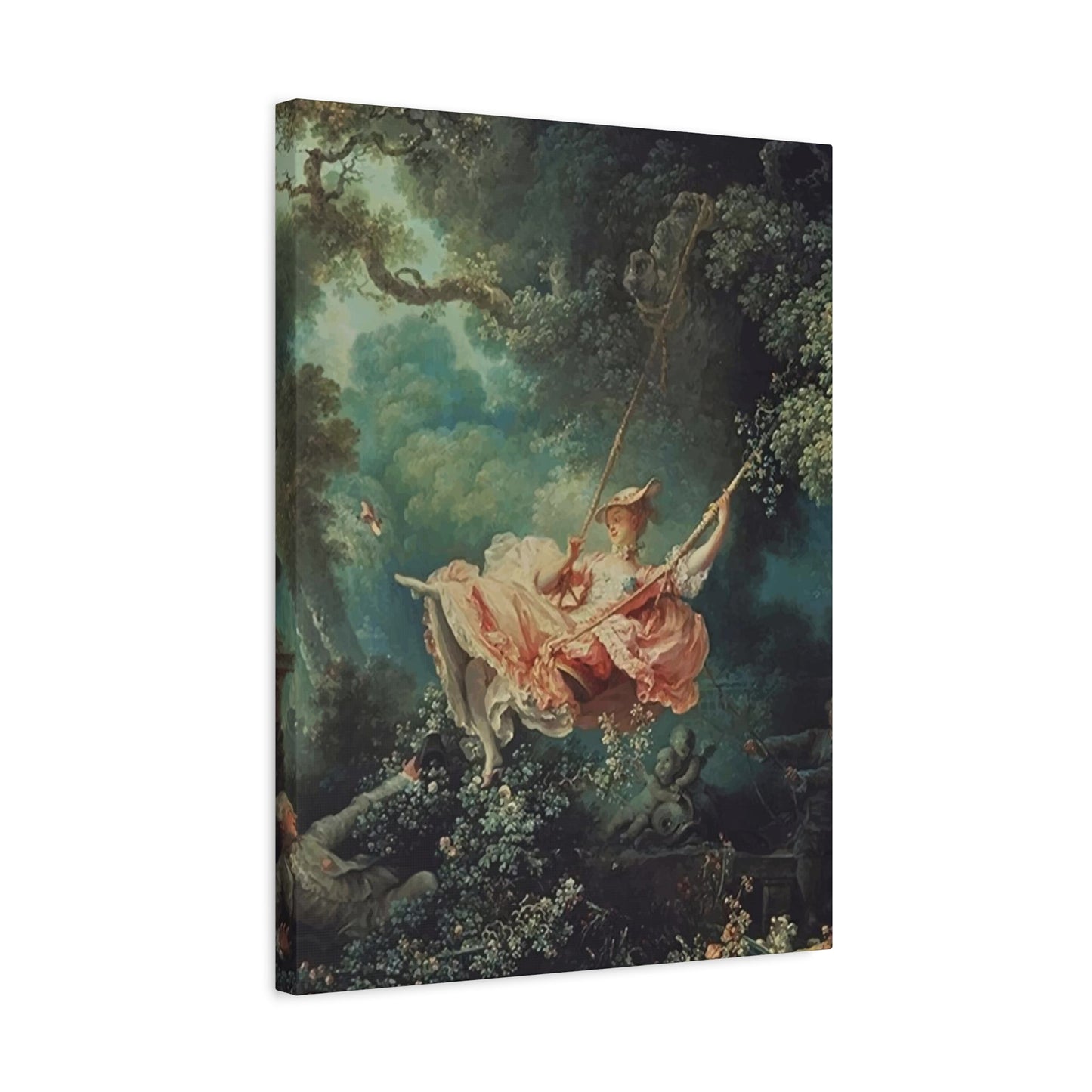
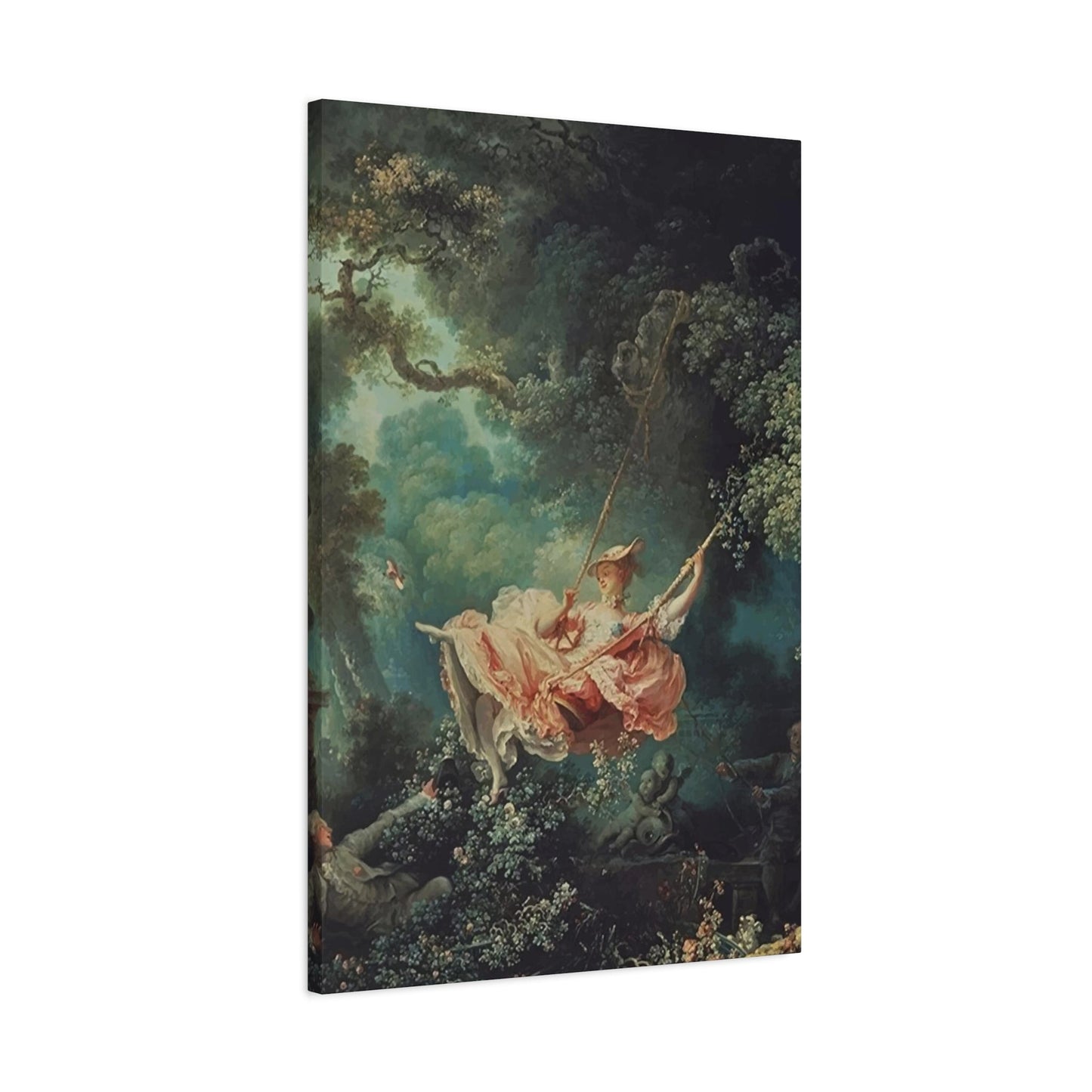
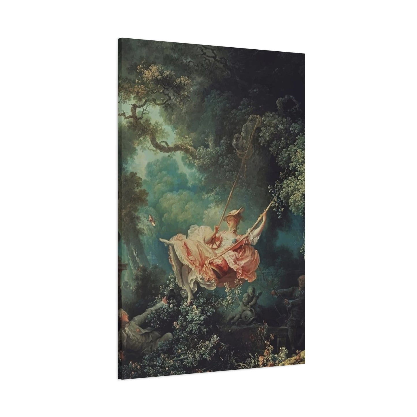
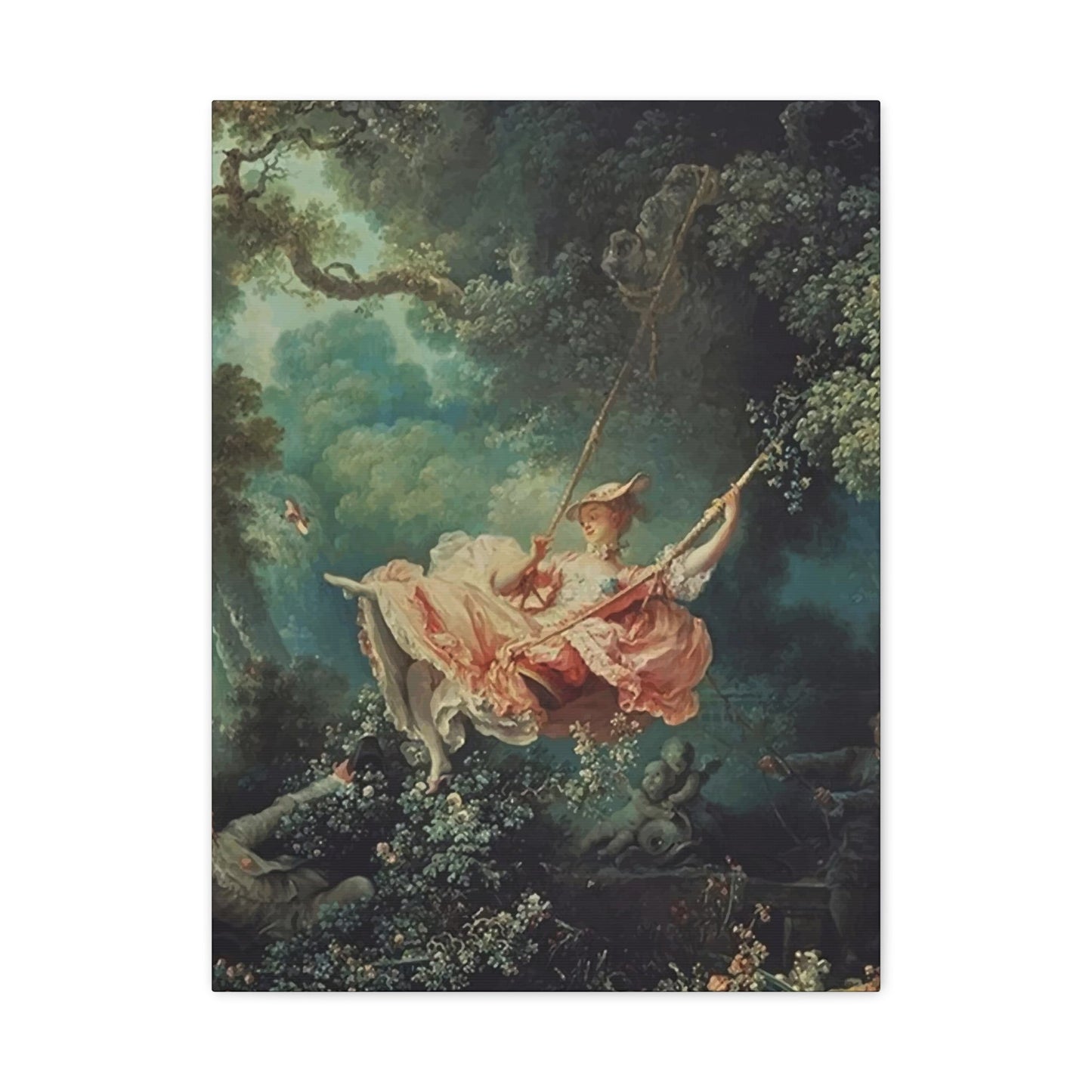
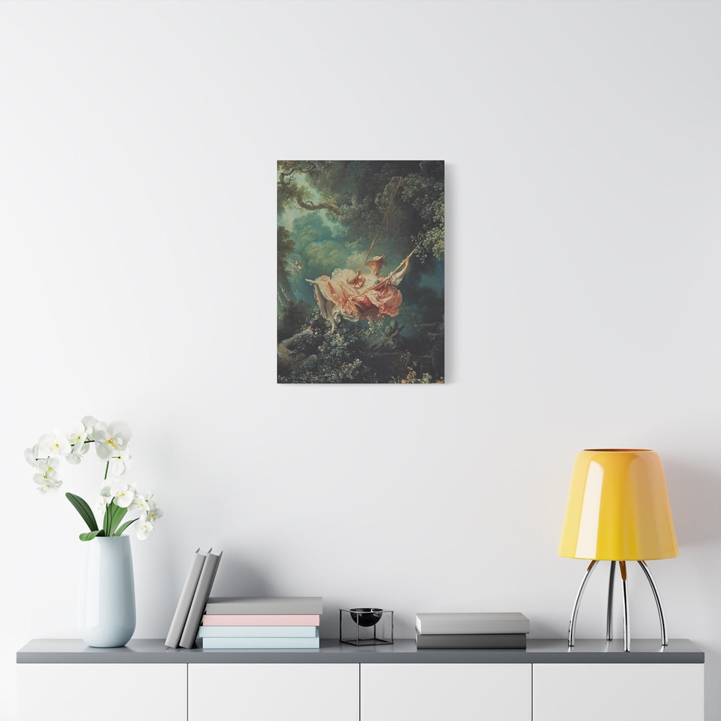
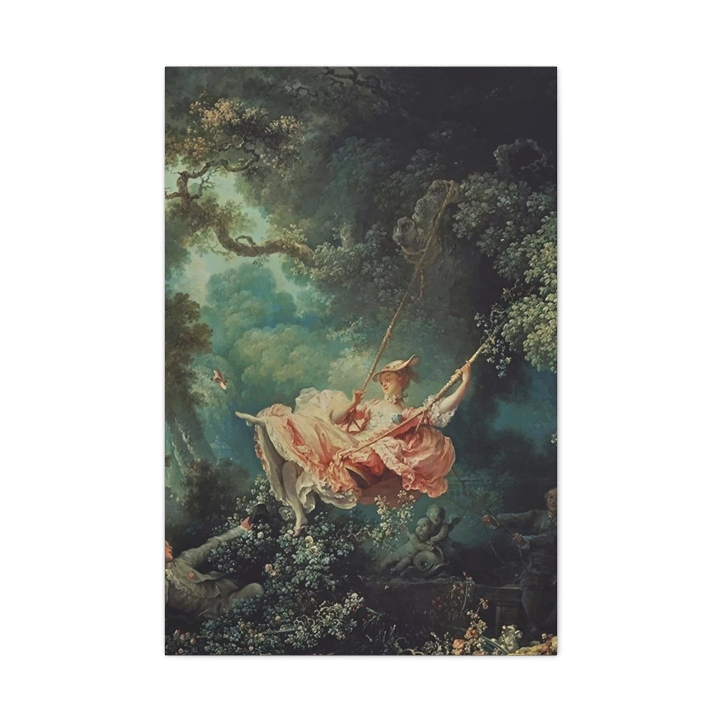
The term "Rococo" derives from the French word "rocaille," referring to the shell and rock ornaments found in Renaissance grottos. This etymology perfectly captures the movement's fascination with natural forms and decorative excess. French artists like Antoine Watteau, François Boucher, and Jean-Honoré Fragonard pioneered this aesthetic, creating works that celebrated leisure, romance, and the pleasures of aristocratic life.
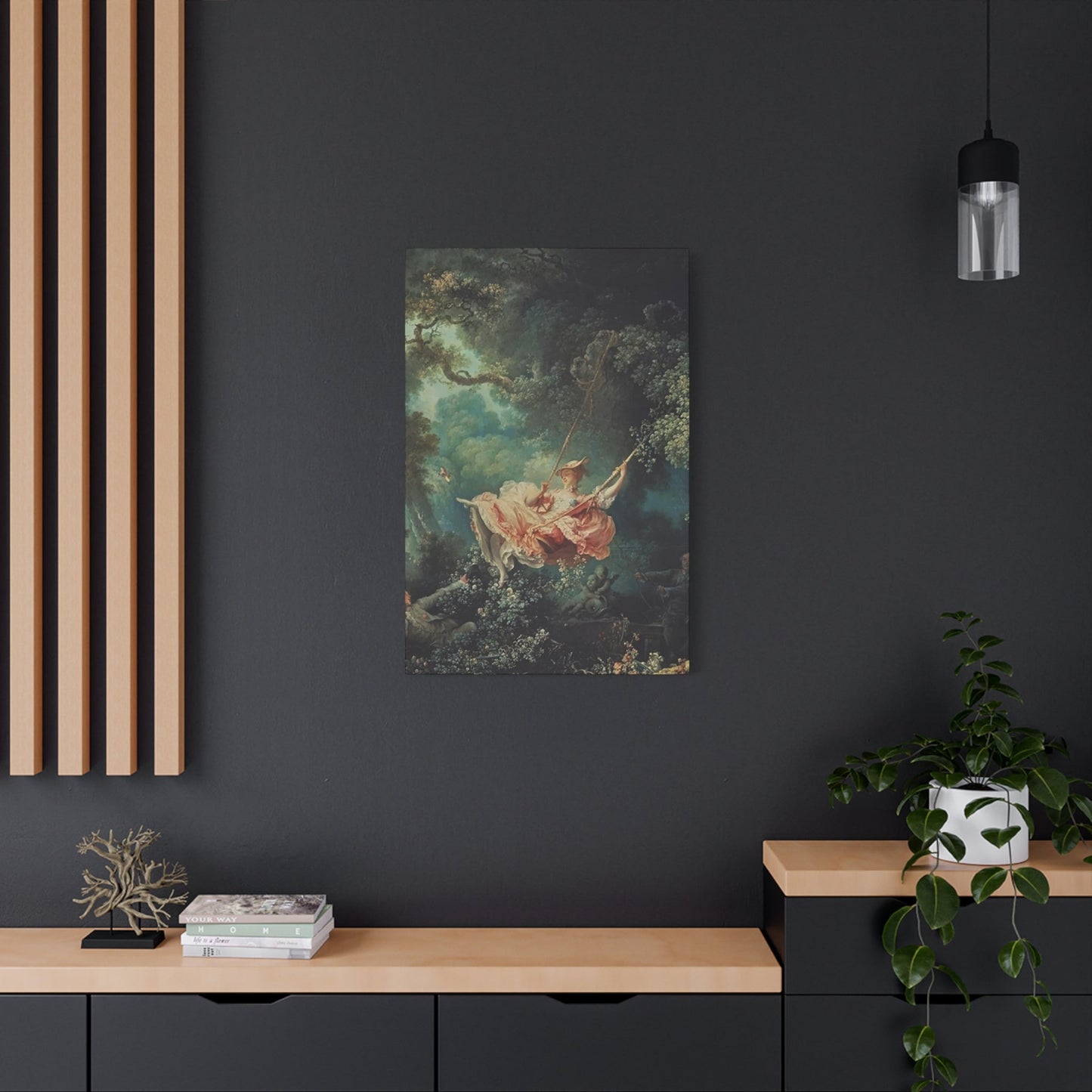
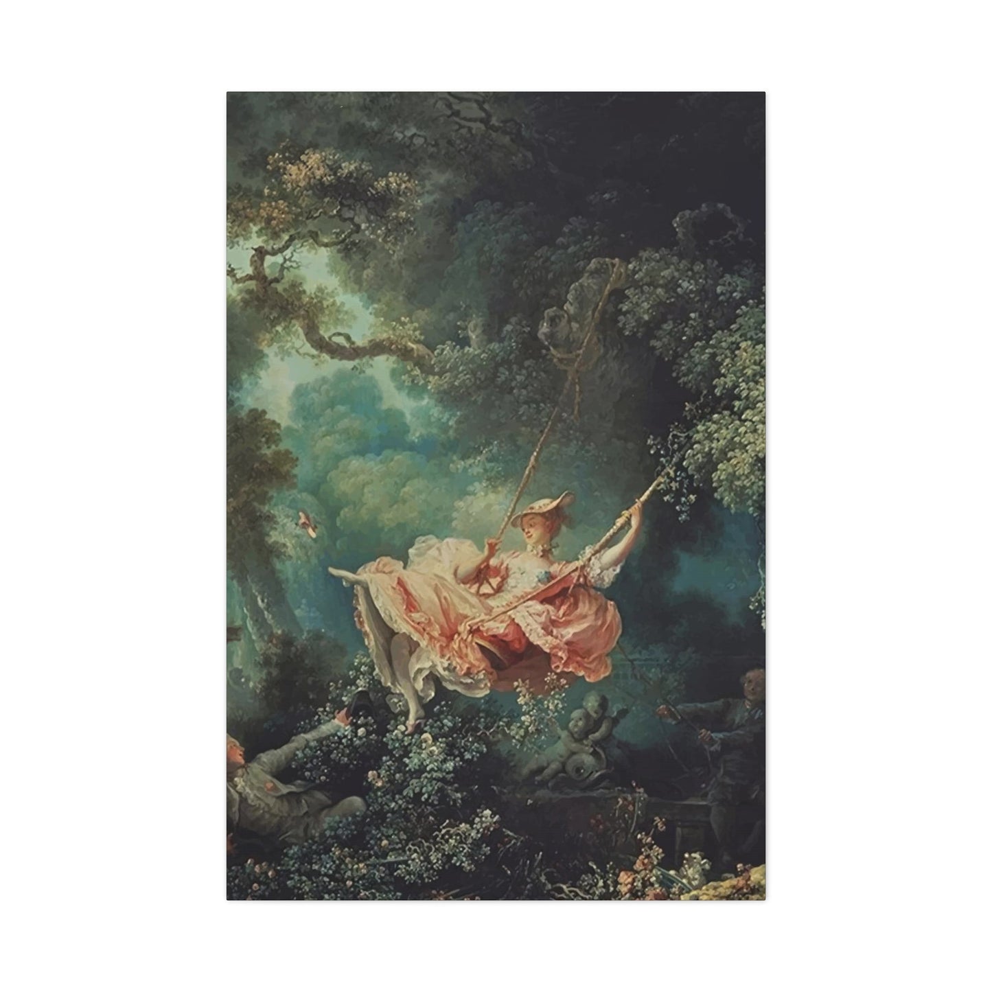
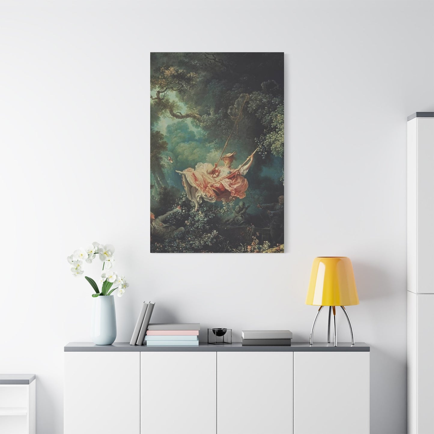
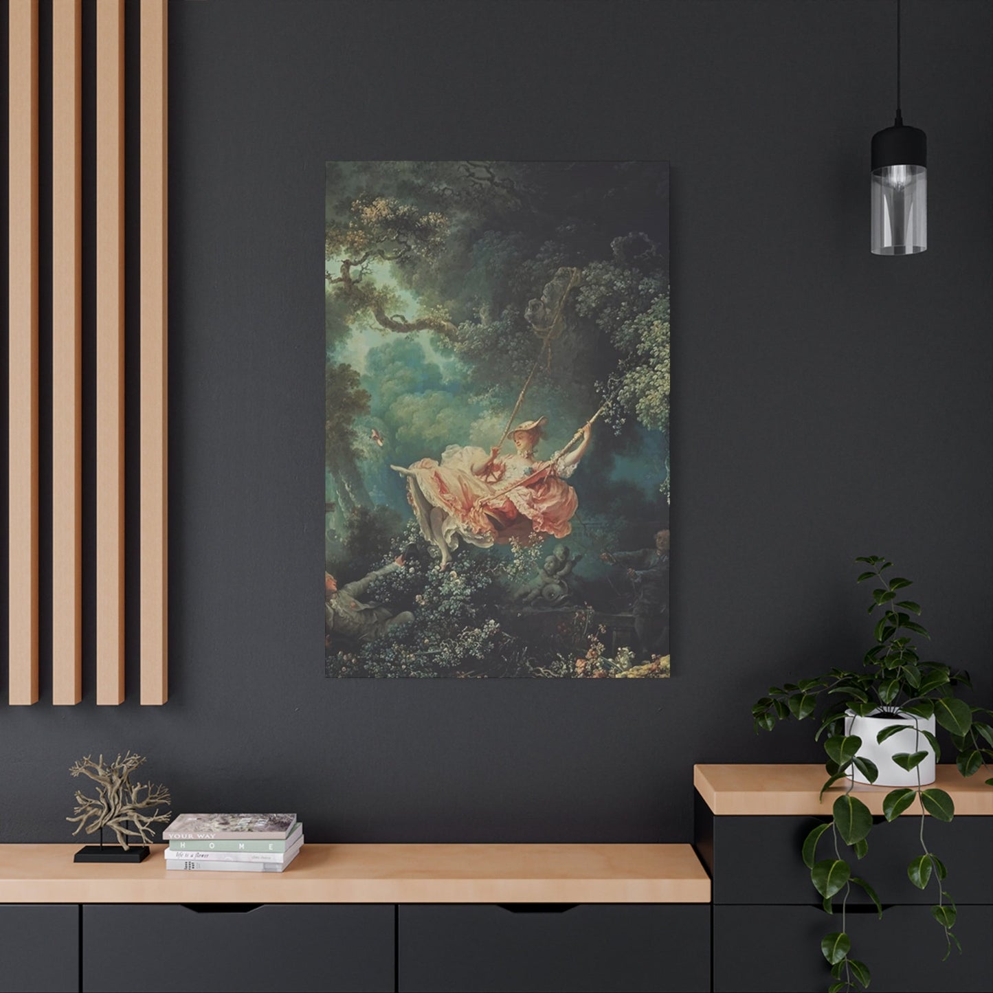
Rococo wall art typically features pastoral scenes, mythological subjects, and portraits of elegant courtiers engaged in refined activities. The palette tends toward soft pastels - rose pink, powder blue, mint green, and creamy ivory - creating an atmosphere of delicate sophistication. Ornamental elements include scrollwork, floral garlands, cherubs, and elaborate gilded frames that seem to flow organically across surfaces.
The movement's influence extended beyond France, spreading throughout Europe where it adapted to local tastes and traditions. In Germany, Rococo manifested in the elaborate church decorations of Bavaria and Württemberg. Italian artists embraced the style's theatrical qualities, incorporating dramatic lighting and emotional intensity. English interpretations remained more restrained, blending Rococo elements with existing classical traditions.
During this period, wall decoration became an art form unto itself. Wealthy patrons commissioned entire rooms to be designed as unified artistic statements, where paintings, furniture, and architectural elements worked in harmony. This holistic approach to interior design established many principles that continue to influence contemporary decorating practices.
The decline of Rococo began in the 1760s as Neoclassical ideals gained prominence. Critics dismissed the style as frivolous and morally corrupt, associating it with the decadence of the French aristocracy. However, the movement's emphasis on beauty, craftsmanship, and emotional expression left an indelible mark on Western art history.
Baroque Art Movement and Its Enduring Legacy
Baroque art originated in Rome during the late 16th century as a response to the Protestant Reformation and the Catholic Counter-Reformation. The Catholic Church sought to create art that would inspire faith and emotion in viewers, leading to a style characterized by dramatic lighting, intense emotion, and dynamic movement. This artistic revolution spread rapidly throughout Catholic Europe, influencing painting, sculpture, architecture, and decorative arts.
The Baroque aesthetic emphasized grandeur, drama, and sensory appeal. Artists like Caravaggio revolutionized painting through his use of chiaroscuro - the dramatic interplay of light and shadow - creating works of unprecedented emotional intensity. Peter Paul Rubens brought Flemish technical mastery to Baroque themes, producing canvases filled with swirling movement and rich color. Gian Lorenzo Bernini transformed sculpture into theatrical performances, capturing moments of divine ecstasy and human passion in marble.
Baroque wall art reflects these same principles on a domestic scale. Paintings from this period often depict religious scenes, mythological narratives, and historical events with theatrical grandeur. The compositions are typically asymmetrical and dynamic, drawing the viewer's eye through complex arrangements of figures and architectural elements. Rich, saturated colors - deep reds, golden yellows, royal blues, and earth tones - create a sense of opulence and weight.
The Catholic Church's patronage of Baroque artists resulted in numerous masterpieces that adorned church walls and private chapels. These works served both devotional and propagandistic purposes, reinforcing Catholic doctrine while demonstrating the Church's cultural authority. Secular patrons also embraced Baroque style, commissioning portraits, historical scenes, and allegorical works that reflected their power and sophistication.
Baroque architecture and interior design created immersive environments where every element contributed to an overall emotional effect. Painted ceilings, elaborate moldings, and strategically placed artworks transformed rooms into theatrical spaces. This integrated approach to design established the importance of considering artwork within its architectural context.
The movement's influence persisted long after its initial popularity waned. Neoclassical artists studied Baroque masters while rejecting their emotional excess. Romantic painters rediscovered Baroque drama and passion. Even contemporary artists continue to draw inspiration from Baroque's bold use of light, shadow, and emotional intensity.
Characteristics That Define Rococo and Baroque Wall Art Styles
Rococo and Baroque wall art, while related, possess distinct characteristics that reflect their different historical contexts and aesthetic philosophies. Understanding these differences helps collectors and decorators make informed choices about incorporating these styles into contemporary spaces.
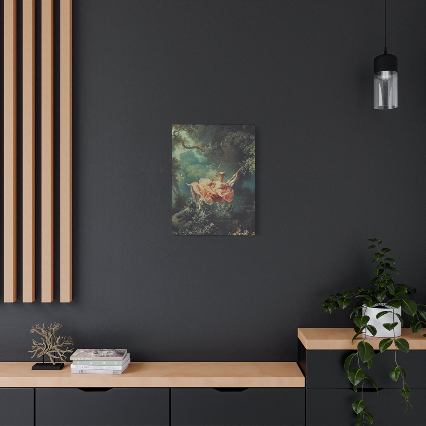
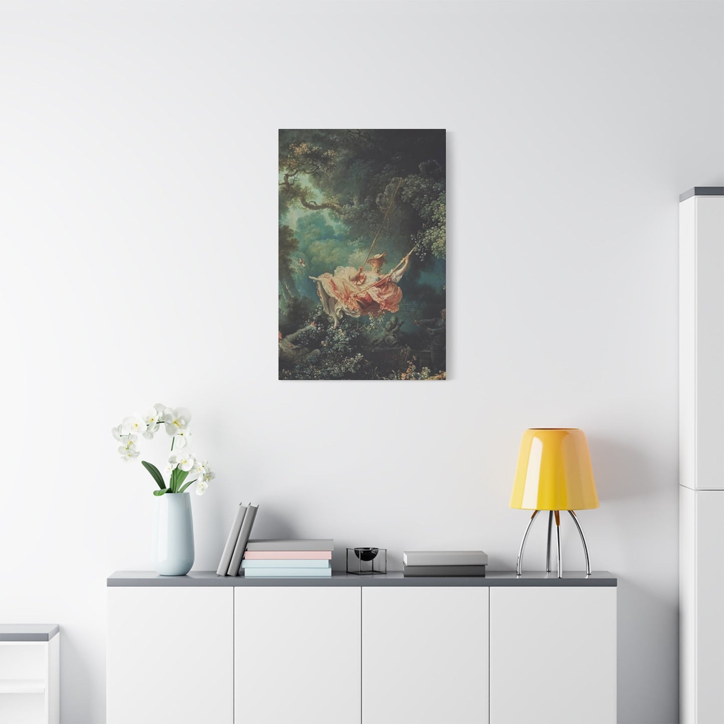
Rococo wall art prioritizes grace, elegance, and intimate charm over monumental grandeur. The color palette tends toward soft pastels and muted tones that create a sense of delicate refinement. Rose pink, powder blue, sage green, and ivory dominate Rococo compositions, often accented with gold leaf detailing. Brushwork is typically smooth and polished, concealing the artist's hand in favor of an idealized finish.
Compositionally, Rococo pieces favor asymmetrical arrangements that seem to flow naturally across the canvas. Curves predominate over straight lines, creating organic rhythms that echo natural forms. Decorative elements - shells, flowers, ribbons, and scrollwork - are integrated seamlessly into narrative scenes. Figures are typically slender and graceful, posed in elegant attitudes that suggest leisure and refinement.
Subject matter in Rococo wall art centers on themes of love, pleasure, and aristocratic leisure. Pastoral scenes depicting shepherds and shepherdesses in idyllic landscapes were particularly popular. Mythological subjects focus on stories of romance and transformation rather than heroic deeds. Portraits emphasize fashion, beauty, and social status rather than psychological depth or moral character.
Baroque wall art, by contrast, emphasizes drama, emotion, and spiritual intensity. The color palette is typically darker and more saturated, featuring deep reds, rich blues, golden yellows, and dramatic contrasts between light and shadow. Brushwork is often visible and expressive, contributing to the overall sense of energy and movement.
Baroque compositions are characteristically dynamic and asymmetrical, but in a more forceful way than Rococo arrangements. Diagonal lines create tension and movement, while strong contrasts of light and shadow (chiaroscuro) heighten dramatic effect. Figures are typically robust and muscular, caught in moments of intense action or emotion. Drapery swirls dramatically, contributing to the sense of movement and energy.
Thematically, Baroque wall art focuses on religious subjects, historical events, and mythological narratives that emphasize heroism, sacrifice, and divine intervention. Martyrdom scenes, biblical episodes, and classical stories provide opportunities for artists to explore themes of death, resurrection, and transcendence. Even secular subjects are imbued with moral significance and emotional weight.
Both styles share certain common elements that distinguish them from other artistic movements. Ornamental excess is celebrated rather than minimized, with elaborate frames, decorative moldings, and gilded accents integral to the overall effect. Craftsmanship is paramount, with attention to detail evident in every aspect of execution. Both movements view art as a total sensory experience rather than mere decoration.
Selecting Appropriate Rococo Canvas Prints for Different Room Settings
Choosing Rococo canvas prints requires careful consideration of room function, existing decor, and desired atmosphere. The delicate beauty of Rococo art can enhance various interior spaces when selected thoughtfully and positioned strategically.
Living rooms provide ideal settings for larger Rococo canvas prints that serve as focal points for conversation and relaxation. Pastoral scenes featuring elegant figures in garden settings create a sense of refined leisure that complements formal seating arrangements. Mythological subjects depicting Venus, Diana, or other classical goddesses add sophistication without overwhelming the space. Consider grouping smaller prints in series to create gallery walls that tell visual stories.
When selecting Rococo prints for living areas, consider the room's color scheme and lighting conditions. Soft pastels work beautifully in rooms with abundant natural light, where their subtle variations can be appreciated. In dimmer spaces, look for pieces with stronger color contrasts or metallic accents that will maintain visual impact. The scale should be proportionate to the room size - oversized prints can dominate smaller spaces, while tiny pieces may be lost in grand rooms.
Bedrooms benefit from Rococo's romantic and intimate qualities. Scenes of courtly love, elegant picnics, or ladies at their toilette create appropriate atmospheres for private spaces. The soft color palettes promote relaxation and rest, while the graceful figures suggest beauty and refinement. Consider positioning prints where they can be viewed from the bed, creating pleasant focal points for morning and evening contemplation.
Privacy considerations make bedrooms ideal for more personal or sensual Rococo subjects. Paintings depicting intimate moments between lovers, bathing scenes, or boudoir settings add sophistication while maintaining appropriate boundaries. The key is selecting pieces that enhance rather than distract from the room's primary function as a space for rest and intimacy.
Dining rooms can accommodate Rococo prints that celebrate pleasure and abundance. Still life paintings featuring elaborate table settings, abundant harvests, or hunting scenes reflect the room's function while adding visual interest. Portraits of elegant diners or scenes of aristocratic banquets reinforce themes of hospitality and refinement. The warm golds and soft colors typical of Rococo work beautifully with candlelight during evening meals.
Consider the viewing angles in dining rooms, where people will be seated for extended periods. Prints should be positioned at appropriate heights for comfortable viewing from chairs. Multiple smaller pieces can create visual rhythm around the room, while a single large piece can serve as a dramatic focal point above a sideboard or buffet.
Home offices and studies require careful selection to balance beauty with productivity. Rococo prints depicting scholarly pursuits, artistic creation, or quiet contemplation can inspire without distracting from work. Portraits of writers, philosophers, or artists add cultural gravitas to professional spaces. The refined elegance of Rococo style suggests sophistication and good taste to clients or colleagues.
Avoid overly romantic or frivolous subjects in professional settings, opting instead for pieces that demonstrate cultural knowledge and aesthetic discernment. The key is selecting prints that enhance the room's serious purpose while providing visual relief from work-related stress.
Hallways and entryways benefit from Rococo prints that create welcoming first impressions. Smaller pieces work well in narrow spaces, while series or collections can guide visitors through longer corridors. Subjects depicting hospitality, musical performances, or elegant gatherings set appropriate tones for spaces dedicated to greeting guests.
Consider lighting carefully in transitional spaces, where natural and artificial illumination may vary throughout the day. Rococo's subtle color variations require adequate lighting to be fully appreciated. Position prints to take advantage of available light sources while avoiding direct sunlight that could cause fading over time.
Incorporating Baroque Canvas Art into Modern Living Spaces
Integrating Baroque canvas art into contemporary interiors requires balancing dramatic historical elements with modern sensibilities. The bold grandeur of Baroque style can enhance modern spaces when approached thoughtfully and strategically.
Contemporary living rooms can benefit from Baroque's dramatic presence when balanced with clean, modern furnishings. A single large Baroque canvas can serve as a stunning focal point above a minimalist sofa or console table. The contrast between ornate historical imagery and sleek contemporary furniture creates dynamic visual tension that energizes the space. Choose pieces with strong compositional elements that can hold their own against modern architecture's clean lines.
Color coordination becomes crucial when incorporating Baroque art into modern settings. The rich, saturated colors typical of Baroque paintings can complement contemporary palettes when thoughtfully selected. Deep blues work beautifully with modern navy and white schemes. Rich reds can anchor rooms decorated in neutral tones. Golden yellow accents in Baroque pieces can tie together rooms featuring warm metallics and natural materials.
Scale considerations are paramount in modern spaces, where architectural elements tend to be more restrained than in historical periods. Baroque paintings are often compositionally complex, requiring adequate viewing distance to be properly appreciated. Position large pieces where they can be seen from multiple vantage points. Avoid crowding Baroque art with competing visual elements that might diminish its impact.
Modern bedrooms can accommodate Baroque art that emphasizes beauty, luxury, and emotional intensity without overwhelming the space's peaceful function. Religious subjects, while historically significant, may not suit contemporary bedroom settings. Instead, consider mythological scenes, portraits, or still life paintings that add sophistication without introducing inappropriate themes.
The dramatic lighting effects characteristic of Baroque painting can enhance modern bedrooms when properly illuminated. Consider installing picture lights or track lighting that emphasizes the chiaroscuro effects that make Baroque art so compelling. The interplay of light and shadow in these paintings can create changing moods throughout the day as natural and artificial light sources vary.
Kitchen and dining areas can benefit from Baroque still life paintings that celebrate abundance and sensual pleasure. Paintings depicting elaborate banquets, hunting scenes, or allegorical representations of the seasons add cultural sophistication to spaces dedicated to food preparation and consumption. The rich colors and luxurious textures typical of Baroque art complement the sensory experiences associated with dining.
Consider the practical aspects of hanging art in kitchens and dining rooms, where humidity, heat, and food preparation activities create challenging environmental conditions. Ensure adequate ventilation and avoid positioning valuable pieces directly adjacent to stoves, sinks, or areas where cooking vapors might accumulate.
Home offices can incorporate Baroque art that suggests authority, learning, and cultural sophistication. Historical portraits, allegorical subjects representing wisdom or justice, or scenes depicting scholarly pursuits can enhance professional environments. The gravitas associated with Baroque style can lend authority to business settings while demonstrating cultural refinement.
Balance is key in professional spaces, where Baroque's emotional intensity might seem overwhelming or inappropriate. Choose pieces that emphasize intellectual rather than purely emotional themes. Consider the messages conveyed by specific subjects - triumph, wisdom, justice - and how they align with professional goals and client relationships.
Modern minimalist interiors can accommodate Baroque art as powerful statement pieces that provide visual weight and historical depth. The contrast between ornate historical imagery and spare contemporary furnishings can be particularly effective when managed skillfully. Single large pieces work better than multiple smaller ones in minimalist settings, where visual complexity should be concentrated rather than dispersed.
Color Schemes and Palette Coordination for Period Art Integration
Successfully integrating Rococo and Baroque wall art into contemporary interiors requires sophisticated understanding of color theory and palette coordination. These historical styles feature distinctive color characteristics that must be harmonized with modern decorating schemes.
Rococo color palettes emphasize soft, muted tones that suggest refinement and delicacy. Rose pink, powder blue, sage green, and ivory form the foundation of most Rococo compositions, often accented with gold leaf or silver highlights. These colors work particularly well with contemporary neutral schemes, where they can provide gentle color accents without overwhelming modern sensibilities.
When incorporating Rococo pieces into neutral interiors, consider how the painting's colors will interact with existing elements. Soft pink tones in Rococo art complement gray-based decorating schemes, creating sophisticated contrast without harsh edges. Blue elements work beautifully with white and cream interiors, adding visual interest while maintaining overall serenity. Green accents in Rococo paintings can connect interior spaces with outdoor views or botanical elements.
Contemporary color trends favor complex neutrals - warm grays, mushroom browns, and sophisticated beiges - that can provide excellent backdrops for Rococo art. These modern neutrals allow the subtle color variations in historical paintings to be appreciated without competition from bold wall colors. Consider using Rococo pieces as inspiration for accent colors throughout the room, pulling pink, blue, or green tones from paintings into textiles, accessories, or floral arrangements.
Baroque color palettes tend toward greater saturation and dramatic contrast. Deep reds, royal blues, rich golden yellows, and earth tones create the bold statements characteristic of this style. These stronger colors require more careful integration into contemporary spaces, where they can provide powerful focal points or overwhelm more delicate decorating schemes.
Deep red tones in Baroque paintings can anchor contemporary rooms decorated in neutral palettes, providing warmth and visual weight without requiring major color commitments elsewhere in the space. These rich reds work particularly well in dining rooms and living areas where dramatic atmosphere is desired. Consider echoing these colors in small doses through textiles, ceramics, or floral arrangements rather than major furnishing pieces.
Royal blue elements in Baroque art can complement contemporary navy and white decorating schemes, adding historical depth to modern nautical or preppy aesthetics. These blue tones work well in studies, libraries, or offices where authoritative atmosphere is appropriate. The key is balancing the intensity of Baroque blues with adequate neutral elements to prevent overwhelming the space.
Golden yellow tones characteristic of Baroque painting can warm contemporary interiors while adding luxury and sophistication. These warm metallics work particularly well in rooms with abundant natural light, where their luminous qualities can be fully appreciated. Consider incorporating actual metallic elements - brass hardware, gold-framed mirrors, or copper accessories - to create cohesive relationships between historical art and contemporary furnishings.
Monochromatic approaches can be particularly effective when integrating period art into modern spaces. Choose paintings that emphasize single color families, then echo those colors throughout the room in varying intensities and textures. This creates sophisticated unity while allowing historical pieces to maintain their distinctive character.
Complementary color relationships offer another approach to integration. If a Baroque piece features dominant warm colors, balance it with cool-toned contemporary elements. Conversely, cool-dominated historical pieces can be warmed with contemporary accessories in complementary hues. This creates dynamic visual tension that energizes spaces while maintaining overall harmony.
Analogous color schemes, using colors adjacent to each other on the color wheel, can create more harmonious relationships between historical art and contemporary interiors. This approach works particularly well with Rococo pieces, where subtle color variations are characteristic. Building room palettes around analogous colors found in historical paintings creates sophisticated, unified environments.
Consider seasonal color variations when selecting period art for specific spaces. Rococo's pastel palettes work beautifully in spring and summer settings, where their light, airy qualities complement natural seasonal changes. Baroque's richer colors can provide warmth and comfort during autumn and winter months. Some collectors choose to rotate artworks seasonally, emphasizing different color relationships throughout the year.
Framing and Presentation Methods for Historical Art Reproductions
Proper framing and presentation are essential for maximizing the visual impact of Rococo and Baroque wall art reproductions. These historical styles have specific framing traditions that can enhance or detract from their aesthetic effectiveness.
Traditional Rococo frames reflect the movement's emphasis on organic curves and delicate ornamentation. Carved wooden frames featuring shell motifs, flowing scrollwork, and floral elements were typical of the period. These frames were often gilded with gold leaf or painted in soft colors that complemented the artwork's palette. The frame becomes an integral part of the artistic statement rather than merely a boundary.
Contemporary interpretations of Rococo framing can maintain these aesthetic principles while adapting to modern production methods and budgets. Frames with curved profiles and subtle ornamental details can evoke historical character without exact replication. Metallic finishes in gold, silver, or champagne tones can provide appropriate elegance while being more durable than traditional gilding.
For modern interiors, consider frames that bridge historical and contemporary aesthetics. Simple profiles with subtle curves or minimal ornamental details can complement Rococo artwork while fitting harmoniously into contemporary settings. The key is maintaining the refinement and elegance associated with the Rococo style while avoiding excessive ornamentation that might seem out of place.
Baroque framing traditions emphasize grandeur and drama through bold profiles and elaborate ornamentation. Heavy carved wooden frames with deep moldings and complex decorative elements were typical of the period. These frames were often gilded extensively or painted in rich colors that reinforced the artwork's dramatic impact. The frame serves as architectural element that extends the painting's presence into the surrounding space.
Contemporary Baroque-style frames can capture this dramatic presence through bold profiles and strategic use of metallic finishes. Deep moldings create strong shadow lines that emphasize the frame's three-dimensional presence. Rich colors - deep burgundy, forest green, or midnight blue - can provide dramatic contrast with both the artwork and surrounding wall colors.
Modern minimalist approaches to framing can work effectively with both Rococo and Baroque reproductions when handled skillfully. Simple black or white frames can provide clean boundaries that allow the artwork to dominate without competition from ornate framing elements. This approach works particularly well in contemporary interiors where historical framing might seem excessive or inappropriate.
Floating frames, where the artwork appears to float within a shadow box effect, can provide modern presentation while preserving the historical artwork's integrity. This approach works particularly well with canvas reproductions, where the texture and dimensionality of the original medium can be appreciated. The floating effect creates subtle drama that complements both Rococo and Baroque aesthetics.
Matting considerations become important when framing historical reproductions, particularly prints or smaller original works. Traditional matting used cream or off-white papers with simple beveled edges. Contemporary approaches can incorporate colored mats that pick up accent colors from the artwork or provide subtle contrast. Multiple mat layers can add depth and richness to the presentation.
For Rococo pieces, consider mats in soft colors that complement the artwork's delicate palette. Pale pink, powder blue, or sage green mats can create harmonious relationships while providing appropriate visual separation from frame and wall. Avoid high-contrast matting that might compete with the artwork's subtle color variations.
Baroque reproductions can handle stronger matting choices that reflect the style's dramatic character. Rich burgundy, deep blue, or forest green mats can provide powerful contrast while reinforcing the artwork's emotional intensity. Gold or silver mat edges can add luxury touches that reflect Baroque's emphasis on precious materials.
Lighting becomes crucial for proper presentation of historical art reproductions. Rococo's subtle color variations require even, gentle illumination that reveals delicate details without harsh shadows. Picture lights, track lighting, or strategically placed accent lights can enhance viewing while protecting the artwork from damaging ultraviolet radiation.
Baroque reproductions benefit from more dramatic lighting that emphasizes their chiaroscuro effects. Directional lighting can heighten the contrast between light and shadow areas, creating the dramatic atmosphere essential to Baroque aesthetic. Consider how lighting changes throughout the day and adjust artificial illumination accordingly.
Wall preparation and positioning require careful consideration for optimal presentation. Both Rococo and Baroque art benefit from being positioned at appropriate eye levels for comfortable viewing. Consider the primary viewing positions in each room and adjust hanging heights accordingly. Group arrangements should maintain adequate spacing for each piece to be appreciated individually.
Room-by-Room Placement Strategies for Maximum Visual Impact
Strategic placement of Rococo and Baroque wall art can transform individual rooms while creating cohesive visual narratives throughout the home. Each space offers unique opportunities and challenges for incorporating these historical styles effectively.
Entry halls and foyers provide ideal opportunities for creating memorable first impressions with statement pieces that establish the home's aesthetic character. A single large Baroque canvas featuring mythological or historical subjects can create dramatic focal points that welcome guests while suggesting the sophistication that awaits throughout the home. The grandeur associated with Baroque style works particularly well in these transitional spaces.
Consider the viewing angles in entry areas, where guests will approach the artwork from specific directions. Position pieces to take advantage of natural and artificial lighting while avoiding areas where shadows might diminish their impact. The goal is creating immediate visual interest that draws visitors into the home's interior spaces.
Rococo pieces work beautifully in entry halls when they emphasize hospitality and refinement. Paintings depicting elegant gatherings, musical performances, or scenes of aristocratic leisure suggest gracious living while setting appropriate tones for social interaction. The lighter palettes typical of Rococo can make smaller entry spaces feel more open and welcoming.
Living rooms offer the greatest flexibility for incorporating both Rococo and Baroque wall art, with multiple wall surfaces and varied viewing angles accommodating different approaches. Large statement pieces can serve as focal points above sofas or fireplaces, while smaller works can be grouped to create gallery walls that provide ongoing visual interest.
Consider the room's primary functions when selecting subjects and themes. Living rooms used primarily for conversation benefit from artwork that provides topics for discussion without being overly distracting. Historical portraits, mythological scenes, or allegorical subjects offer rich material for contemplation and conversation while maintaining appropriate sophistication.
For living rooms that emphasize relaxation and leisure, Rococo's emphasis on pleasure and refinement works particularly well. Pastoral scenes, elegant picnics, or musical performances create atmospheres conducive to unwinding and social enjoyment. The soft color palettes typical of Rococo complement the comfortable furnishings associated with relaxation areas.
Formal dining rooms provide excellent settings for both Rococo and Baroque pieces that celebrate abundance, hospitality, and refined pleasures. Still life paintings featuring elaborate table settings, hunting scenes, or allegorical representations of the seasons reinforce the room's function while adding cultural sophistication. The rich colors characteristic of both styles complement the warm lighting typically used during dinner parties.
Position dining room art where it can be appreciated during meals without interfering with conversation or service. Avoid placing valuable pieces where they might be damaged by food service activities. Consider how candlelight will affect the artwork's appearance during evening dining, as the warm light can enhance the golden tones typical of both styles.
Kitchens can accommodate historical art when selected and positioned carefully. Still life paintings celebrating food, abundance, or domestic virtues work well in these functional spaces. However, avoid positioning valuable reproductions where they might be exposed to cooking vapors, excessive heat, or moisture that could cause damage over time.
Breakfast areas and informal dining spaces can benefit from smaller Rococo pieces that emphasize domestic pleasure and family harmony. Scenes of children at play, family gatherings, or simple domestic activities create appropriate atmospheres for casual dining while maintaining visual interest.
Bedroom placement requires careful consideration of privacy, intimacy, and restfulness. Both Rococo and Baroque styles can enhance bedroom environments when subjects and themes are selected appropriately. Romantic scenes, portraits of beautiful individuals, or mythological subjects depicting love and beauty create suitable atmospheres for private spaces.
Consider positioning bedroom art where it can be viewed from the bed, creating pleasant focal points for morning and evening contemplation. Avoid subjects that might be overly stimulating or distracting in spaces primarily dedicated to rest and relaxation. The goal is enhancing the room's peaceful character while adding beauty and sophistication.
Master bedrooms can accommodate larger pieces that make bold statements about personal taste and cultural sophistication. Baroque pieces featuring themes of luxury, beauty, or romantic love can create dramatic focal points that enhance the room's intimate character. Rococo pieces emphasizing grace, beauty, and refined pleasure work equally well in creating sophisticated bedroom environments.
Guest bedrooms benefit from artwork that welcomes visitors while demonstrating the host's cultural refinement. Neutral subjects - landscapes, still lifes, or portraits - provide visual interest without imposing strong personal statements that might make guests uncomfortable. Both Rococo and Baroque styles can work effectively when subjects are chosen thoughtfully.
Home offices and studies require artwork that inspires productivity while demonstrating professional competence and cultural sophistication. Historical portraits, allegorical subjects representing wisdom or justice, or scenes depicting scholarly pursuits can enhance professional environments while providing visual relief from work-related stress.
Consider the messages conveyed by specific artwork when selecting pieces for professional spaces. Subjects emphasizing learning, achievement, or moral virtue send appropriate signals to clients and colleagues. Avoid overly emotional or frivolous themes that might undermine professional credibility.
Libraries and reading areas provide ideal settings for both Rococo and Baroque pieces that celebrate learning, creativity, and intellectual achievement. Portraits of writers, philosophers, or artists add cultural gravitas to spaces dedicated to reading and contemplation. Allegorical subjects representing the arts or sciences reinforce the room's serious purpose while providing visual beauty.
Creating Gallery Wall Arrangements with Mixed Period Styles
Gallery walls combining Rococo and Baroque elements with contemporary pieces require sophisticated planning to achieve visual harmony while celebrating different artistic traditions. The key lies in finding common elements that unite diverse styles while preserving their individual characters.
Begin gallery wall planning by identifying unifying elements among the selected pieces. Color relationships often provide the strongest connecting threads between different styles. Look for common color families, similar tonal values, or complementary relationships that can create visual coherence across diverse artistic approaches. A Rococo piece featuring soft blues might connect beautifully with a contemporary abstract work using similar hues.
Scale relationships become crucial when mixing historical and contemporary pieces. Baroque paintings, with their dramatic compositions and bold presence, can dominate gallery walls unless balanced carefully with appropriately scaled contemporary works. Consider using the largest piece as an anchor, then building the arrangement with smaller works that support rather than compete with the dominant element.
Rococo pieces, with their delicate details and subtle color variations, may require more intimate groupings where their refined qualities can be appreciated. Avoid overwhelming Rococo works with bold contemporary pieces that might diminish their delicate appeal. Instead, look for contemporary works that share similar sensitivity to color, line, or compositional balance.
Thematic connections can provide intellectual foundations for mixed-style gallery walls. Both Rococo and Baroque traditions include landscape, portrait, and still life subjects that can be paired with contemporary interpretations of similar themes. A Baroque portrait might work beautifully alongside a contemporary photographic portrait, creating dialogue between different artistic approaches to representing humanity.
Abstract themes - love, beauty, nature, spirituality - can connect works from different periods that explore similar ideas through different visual languages. A Rococo scene depicting romantic love might pair meaningfully with contemporary abstract work exploring similar emotional territory. The key is finding genuine connections rather than forced relationships.
Frame coordination requires delicate balance when mixing periods and styles. Identical framing can unify diverse artworks but may diminish their individual characters. Instead, consider frames that share similar proportions, materials, or colors while allowing each piece to maintain appropriate period character. Contemporary frames can work effectively with historical reproductions when they share similar visual weight and refinement.
Metallic finishes provide excellent unifying elements for mixed gallery walls. Gold, silver, or bronze tones can connect frames across different periods while maintaining individual character. Consider using metallic accents consistently throughout the arrangement while varying frame profiles and ornamental details to preserve each piece's unique character.
Layout planning should begin with floor arrangements where pieces can be moved and adjusted before committing to wall placement. Photograph different arrangements to evaluate how they work from various viewing angles. Consider how the gallery wall will be approached and viewed in the actual space, adjusting the composition to take advantage of natural sight lines.
Maintain consistent spacing between pieces to create visual rhythm and prevent the arrangement from appearing cluttered. Standard spacing of 2-3 inches between frames works well for most gallery walls, but adjust based on the specific pieces and viewing distance. Larger spaces may require increased spacing to prevent visual confusion.
Visual weight distribution requires careful attention when mixing bold Baroque pieces with delicate Rococo works and contemporary elements. Balance heavy, dark pieces with lighter ones across the arrangement. Avoid clustering all the visual weight in one area, which can make the gallery wall appear lopsided or unstable.
Lighting becomes particularly important for mixed gallery walls, where different pieces may have varying lighting requirements. Historical reproductions often benefit from warmer lighting that enhances their traditional character, while contemporary pieces might require cooler, more neutral illumination. Track lighting systems with adjustable heads can accommodate these varying needs.
Consider using multiple light sources at different angles to minimize shadows and provide even illumination across the entire gallery wall. Avoid single light sources that might create harsh shadows or emphasize some pieces while leaving others in relative darkness. The goal is creating cohesive illumination that allows each piece to be appreciated while contributing to the overall composition.
Height considerations become more complex with mixed gallery walls, where different viewing preferences for historical and contemporary art must be balanced. Traditional portrait height (57-60 inches to the center of the frame) works well for most arrangements, but adjust based on the specific pieces and room characteristics. Larger pieces may need to be positioned higher to maintain visual balance with smaller surrounding works.
Lighting Considerations for Showcasing Period Art Effectively
Proper illumination is essential for appreciating the subtle color variations, textural qualities, and artistic details that make Rococo and Baroque wall art so compelling. Different lighting approaches can dramatically affect how these historical styles are perceived and enjoyed.
Natural lighting provides ideal illumination for most historical art reproductions, revealing subtle color variations and textural details that artificial lighting might miss. However, direct sunlight can cause fading and damage over time, requiring careful positioning to take advantage of natural light while protecting valuable pieces. North-facing walls typically provide the most stable natural lighting throughout the day.
Consider how natural light changes throughout the day and seasons when positioning historical art. Morning light tends to be cooler and more directional, while afternoon light becomes warmer and more diffused. Rococo pieces, with their delicate color palettes, often appear most beautiful in soft morning or evening light that enhances their subtle variations.
Baroque paintings, with their dramatic chiaroscuro effects, can benefit from more directional natural lighting that emphasizes the contrast between light and shadow areas. However, avoid positioning these pieces where harsh direct sunlight might create glare or wash out the dramatic effects that make Baroque art so compelling.
Artificial lighting systems offer greater control over how historical art is illuminated, allowing for consistent presentation regardless of natural lighting conditions. Picture lights mounted directly on frames provide focused illumination while creating intimate viewing experiences. Choose picture lights with warm color temperatures (2700K-3000K) that enhance the golden tones typical of both Rococo and Baroque styles.
LED picture lights offer energy efficiency and longevity while producing minimal heat that won't damage artwork over time. Look for high-quality LEDs with good color rendering indices (CRI 90+) that accurately represent the subtle color variations in historical reproductions. Adjustable picture lights allow for fine-tuning the illumination angle and intensity.
Track lighting systems provide flexibility for illuminating multiple pieces or changing exhibitions over time. Individual track heads can be adjusted independently, allowing for customized illumination of each piece. This approach works particularly well for gallery walls or collections that might be rearranged periodically.
Position track lights to minimize glare and shadows while providing even illumination across the artwork surface. The ideal angle is typically 30-45 degrees from the wall, but adjust based on the specific piece and viewing positions. Avoid positioning lights where they might create reflections on glass-covered pieces or glossy canvas surfaces.
Recessed ceiling lights can provide ambient illumination that supports artwork viewing without creating competing focal points. Use narrow beam angles (15-25 degrees) to focus light on specific pieces while minimizing spill light on surrounding surfaces. Consider using multiple recessed lights for larger pieces to ensure even illumination across the entire surface.
Conclusion
Rococo and Baroque wall art brings an unparalleled sense of luxury, sophistication, and historical elegance into modern interiors. These art styles, with their intricate detailing, ornate flourishes, and dramatic compositions, transform ordinary walls into focal points that command attention and admiration. By incorporating such pieces, homeowners create spaces that feel opulent yet harmonious, blending timeless craftsmanship with contemporary design sensibilities.
The appeal of Rococo and Baroque art lies not only in its visual grandeur but also in its ability to convey emotion, narrative, and depth. Swirling patterns, gilded frames, and elaborate textures invite viewers to explore every detail, evoking a sense of wonder and cultural appreciation. Whether used in living rooms, dining areas, or entryways, these artworks elevate the ambiance, turning interiors into curated galleries of historical and artistic significance.
Beyond aesthetics, these art forms symbolize refinement, sophistication, and a celebration of beauty. Rococo’s playful elegance and Baroque’s dramatic intensity provide diverse ways to express personality and style while honoring centuries of artistic tradition. Incorporating these artworks into modern spaces bridges the past and present, creating an atmosphere where historical artistry complements contemporary comfort and functionality.
Furthermore, careful placement and styling enhance their impact. Pairing Rococo and Baroque wall art with complementary textures, muted or rich color palettes, and thoughtfully selected furniture ensures a balanced and cohesive look. Layering pieces, experimenting with symmetry, and incorporating subtle lighting can accentuate the intricate details, emphasizing both their grandeur and their relevance in today’s interiors.
Ultimately, Rococo and Baroque wall art offers more than decoration—it offers a lifestyle statement. It invites homeowners and guests alike to experience luxury, history, and artistic mastery in every glance. By integrating these timeless artworks, interiors gain depth, personality, and a sense of cultivated elegance, proving that true style lies in the thoughtful union of past artistry with modern living.
Related Blogs


Related Collections
-

Orange Cat Wall Art
The Ultimate Collection of Orange Cat Wall Art: Transforming Your Living Spaces...
-

Pablo Picasso Wall Art
Pablo Picasso Wall Art: Transforming Spaces with Masterful Creations Pablo Picasso stands...
-

Perfume Bottle Wall Art
Perfume Dreams: Artistic Wall Art Series for Stylish Spaces Perfume wall art...
-

Pig Wall Art
About Pig Wall Art Pig Wall Art – A Unique Touch for...
-

Makeup & Cosmetics Wall Art
Creative Wall Art for Makeup and Cosmetic Spaces Designing a makeup room...
-

Lavender Herb Wall Art
Lavender Herb Wall Art: Boho Designs with Natural Wood Accents Creating wall...
-

Kindness Wall Art
Inspire Daily Joy: Kindness Wall Art for Every Room in Your Home...


