


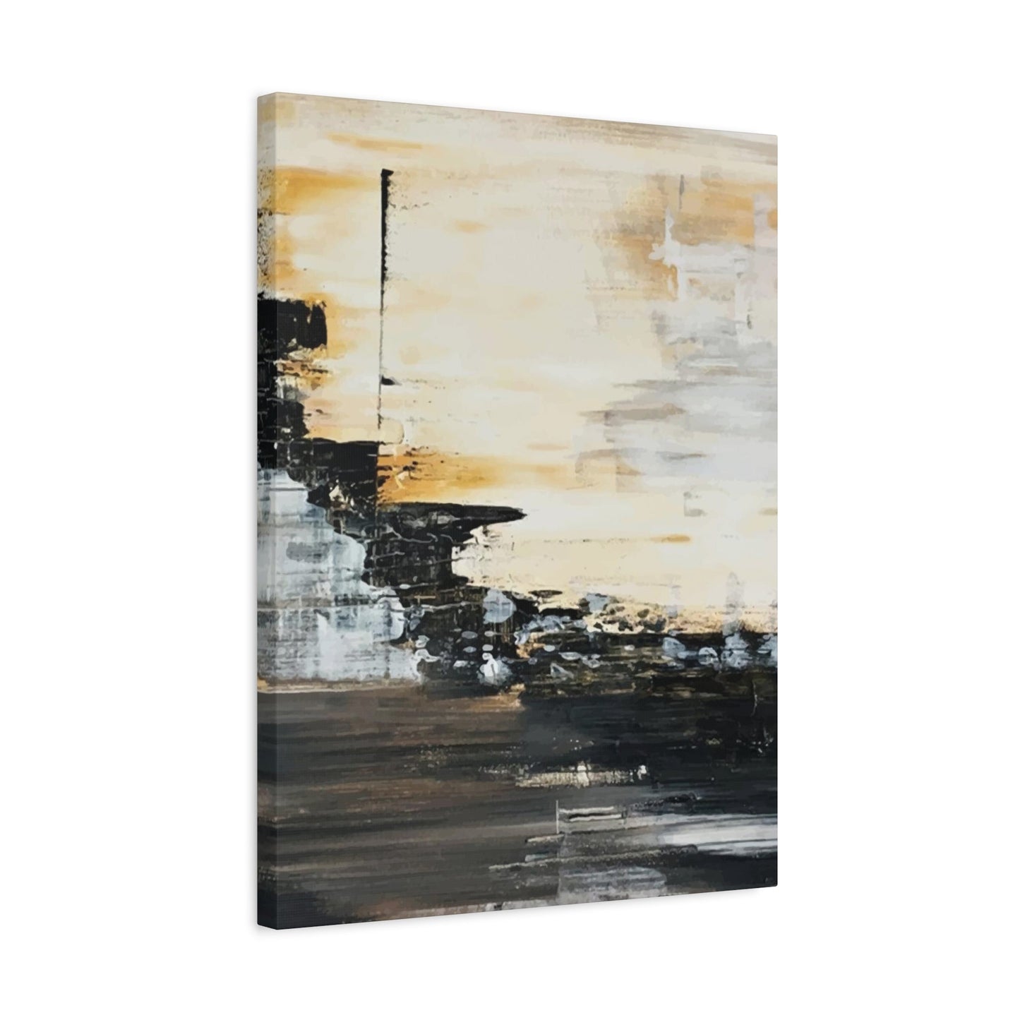
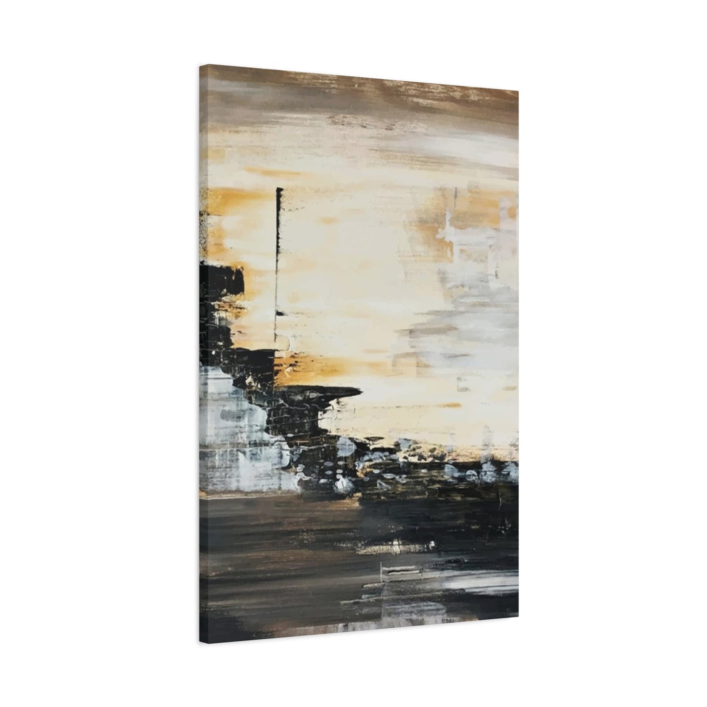
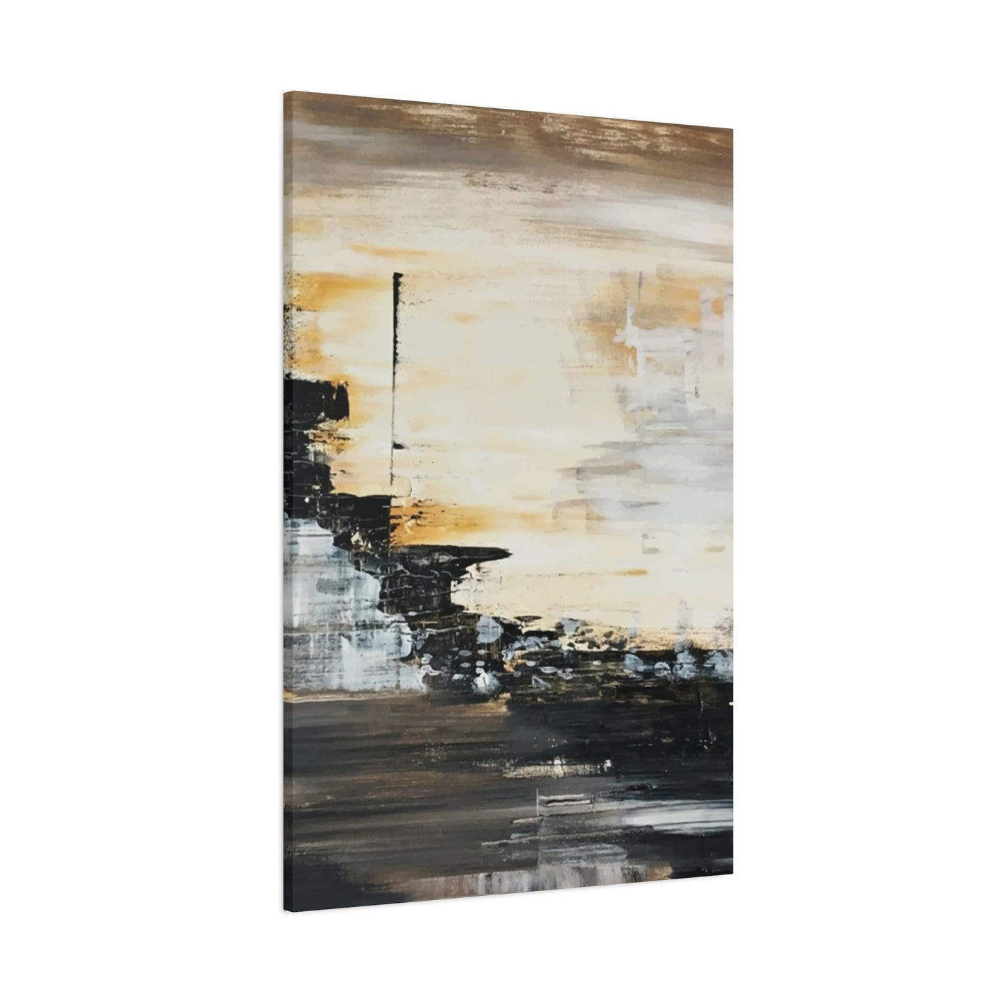
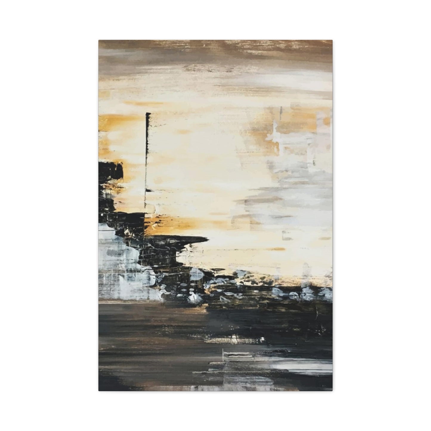
Black and Tan Wall Art & Canvas Prints
Black and Tan Wall Art & Canvas Prints
Couldn't load pickup availability
Transform Your Walls with Bold Yet Elegant Black and Tan Wall Art
There exists a primal and profound power in the deliberate absence of color. In a world saturated with a relentless spectrum of hues, the decision to render a scene in black and white is a powerful artistic statement. It is a process of distillation, of stripping away the potentially distracting veneer of color to reveal the fundamental essence of a subject. When we gaze upon a monochrome image, we are left with the core components of visual language: the sublime dance of light, the deep mystery of shadow, the purity of form, and the infinite nuance of texture.
This is the inherent magic of black and white wall art; it does not merely depict a scene, it interprets it, inviting the viewer into a more contemplative and introspective dialogue. It speaks a universal language of emotion and structure, one that transcends fleeting trends and resonates with a timeless quality. This is why a carefully chosen black and white print can serve as the sophisticated and soulful anchor for a contemporary living room, providing a quiet confidence that complements rather than competes with modern design principles.
The fear that a monochrome palette will render a space cold, sterile, or austere is a common but misplaced apprehension. This notion arises from a fundamental misunderstanding of its potential. Black and white is not a singular note; it is an entire orchestral scale of tones, from the most brilliant, ethereal whites to the most profound, velvety blacks, with a universe of grays in between. A masterful monochrome photograph or abstract piece is a study in luminosity and contrast. It can be soft and melancholic, with gentle gradations that evoke a sense of calm and nostalgia, or it can be bold and graphic, with sharp, dramatic juxtapositions that inject energy and dynamism into a room.
The secret to unlocking this vast potential lies not in the artwork alone, but in its thoughtful curation and its symbiotic relationship with the surrounding environment. It is about understanding that the print is not an isolated object but the keynote in a carefully composed symphony of texture, form, framing, and illumination. When approached with intention and a discerning eye, a monochrome scheme can achieve a level of sophistication and emotional resonance that is often elusive in more colorful arrangements, creating a living space that is not only visually striking but also deeply and enduringly elegant.
The Singular Statement: Anchoring Your Space with a Heroic Print
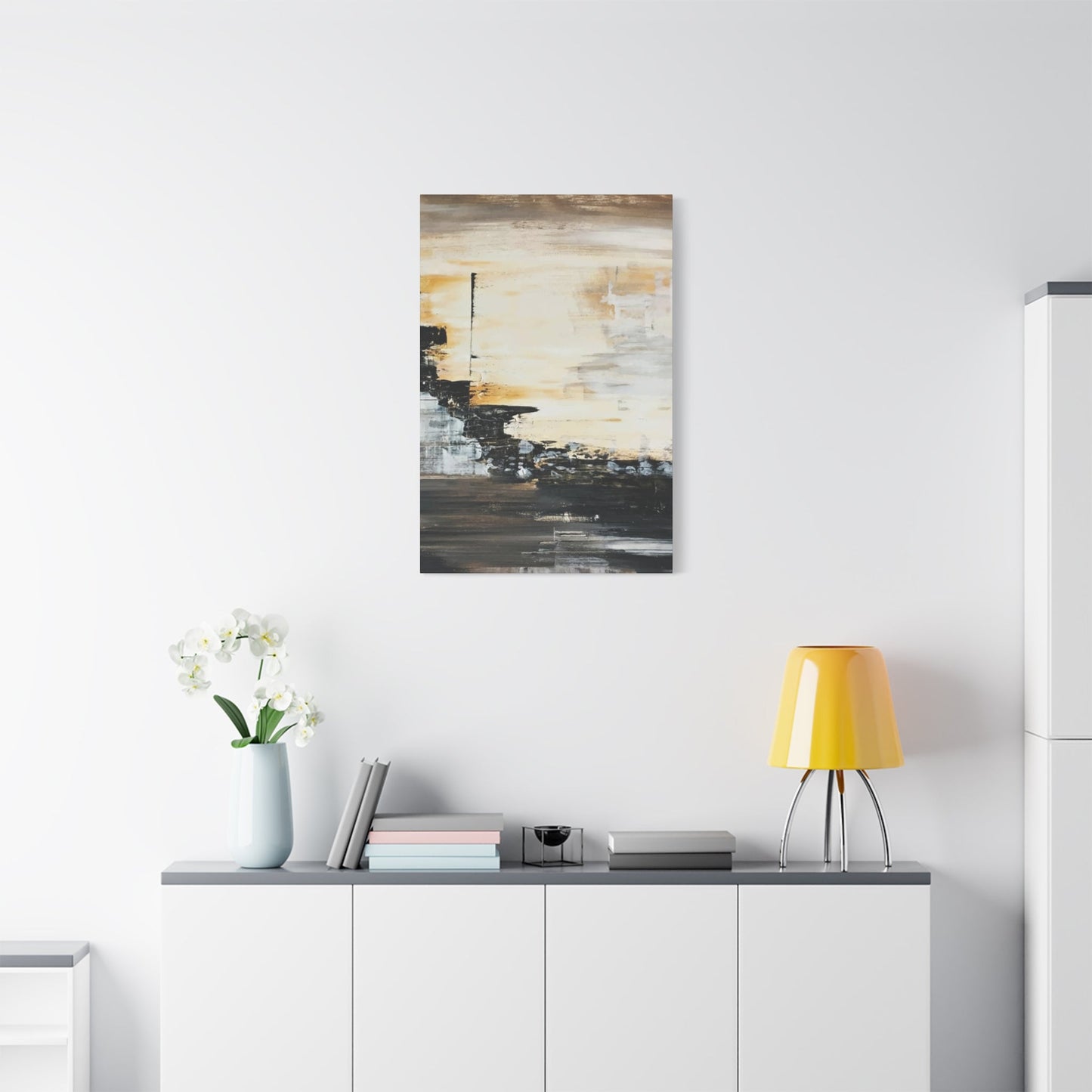
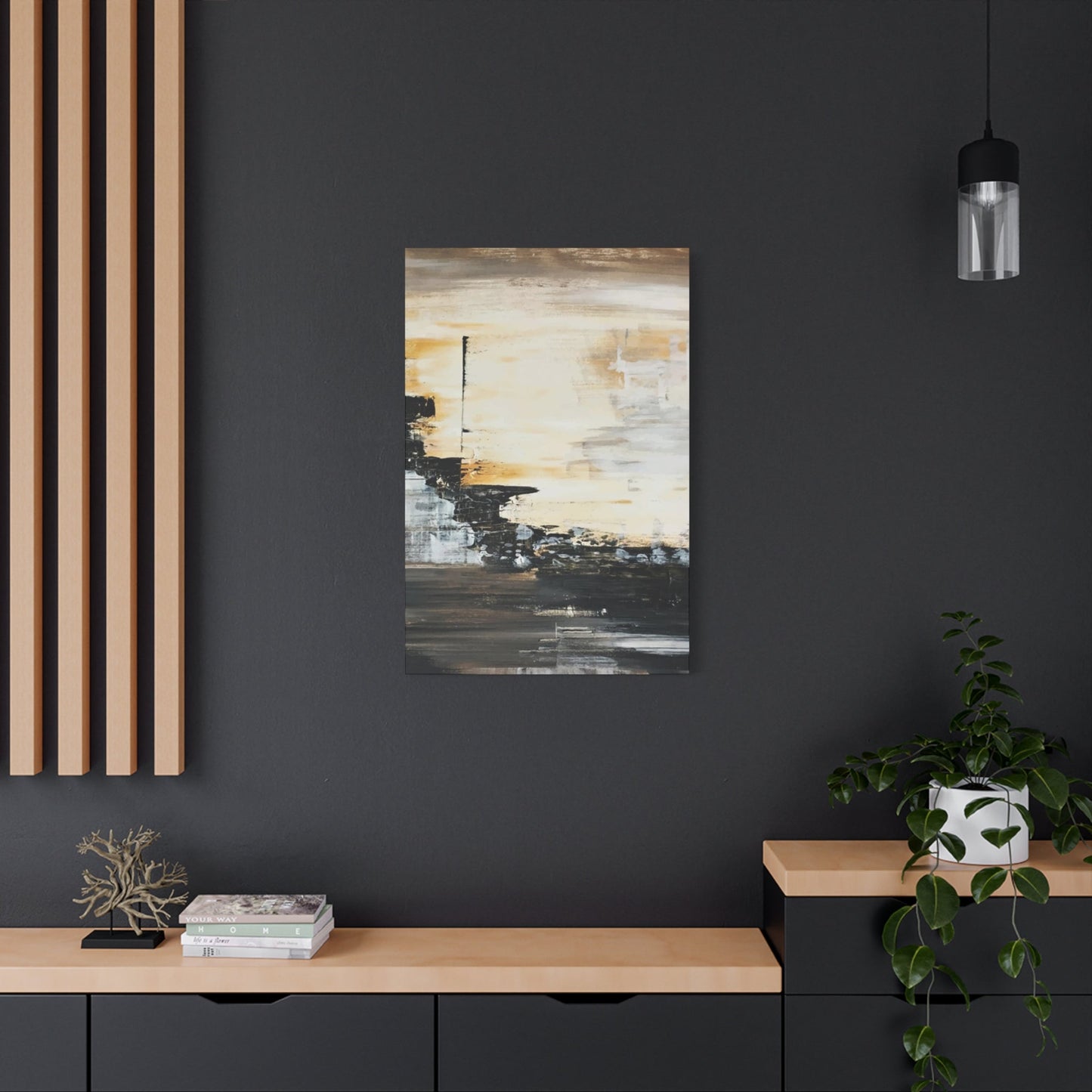
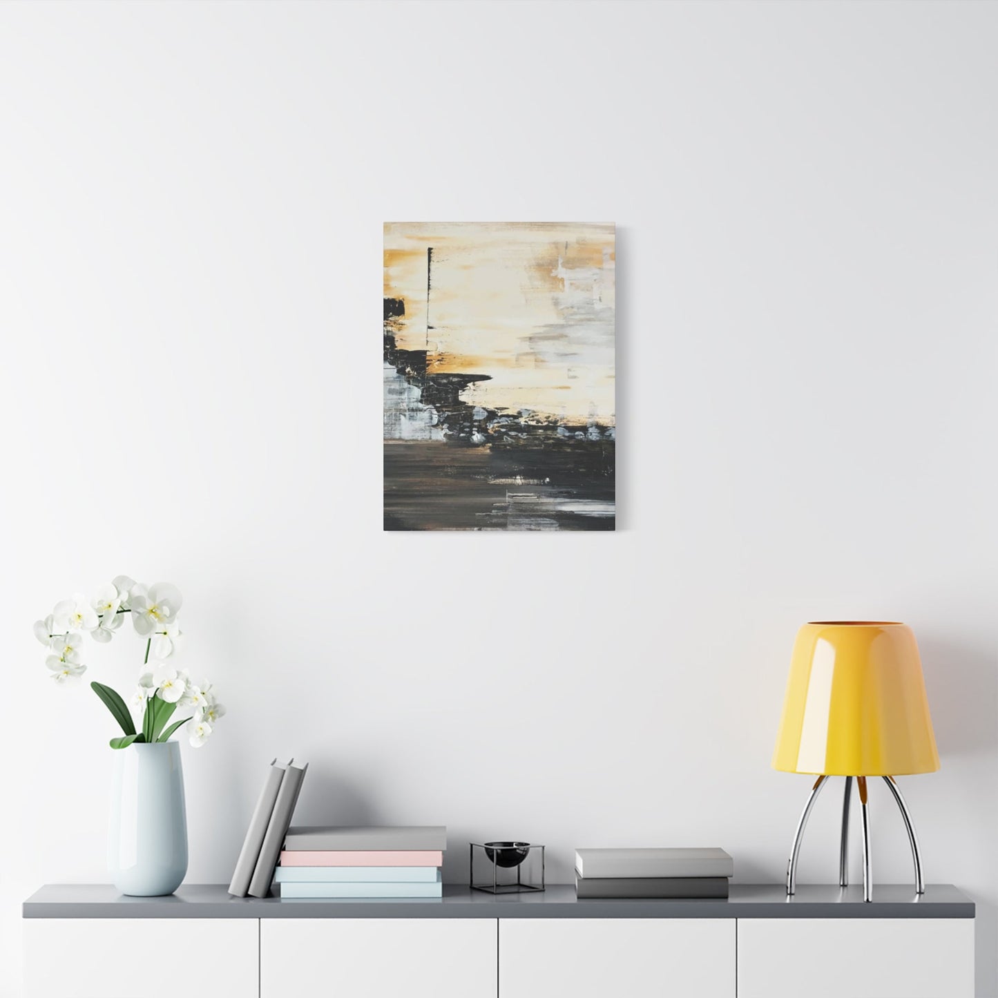
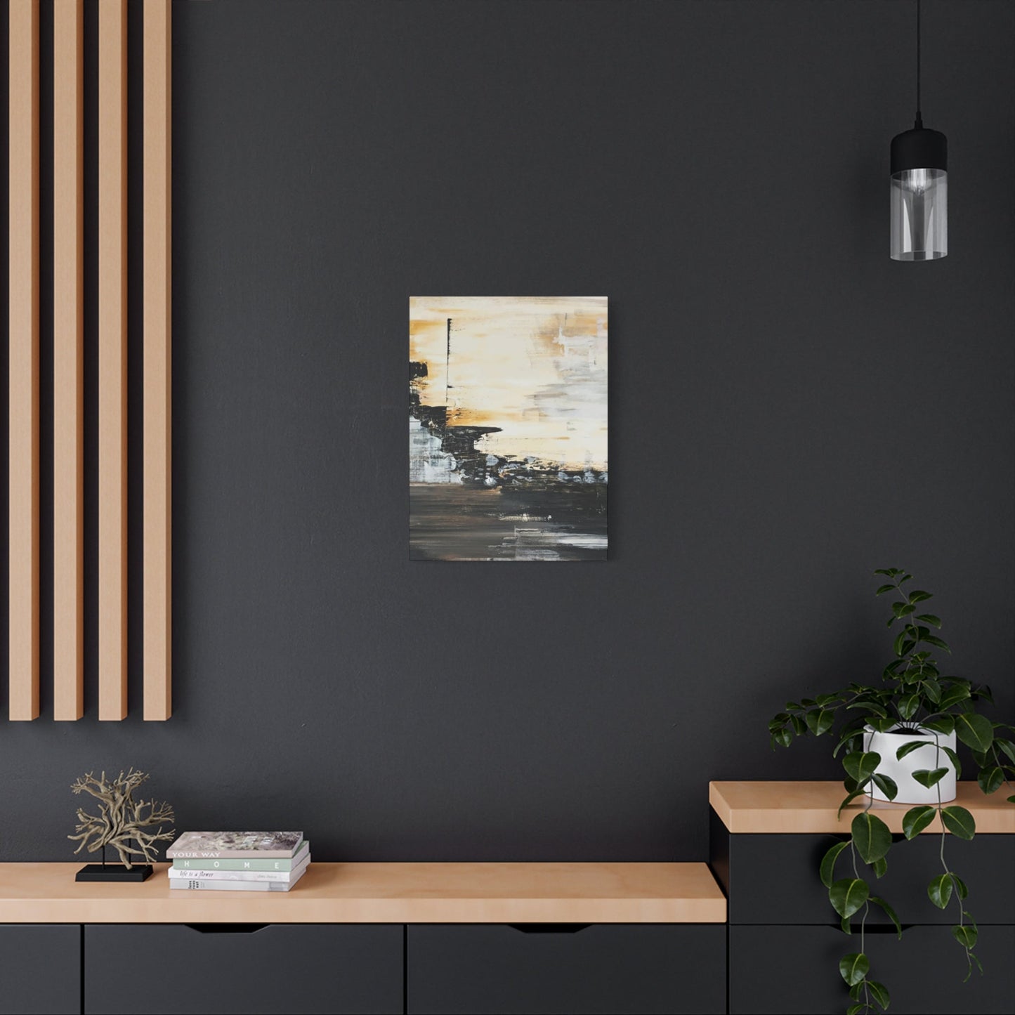
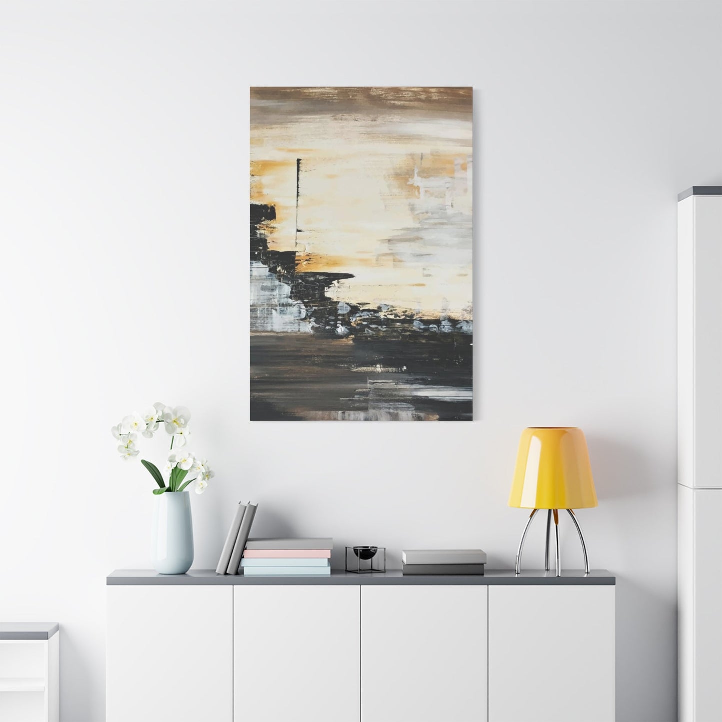
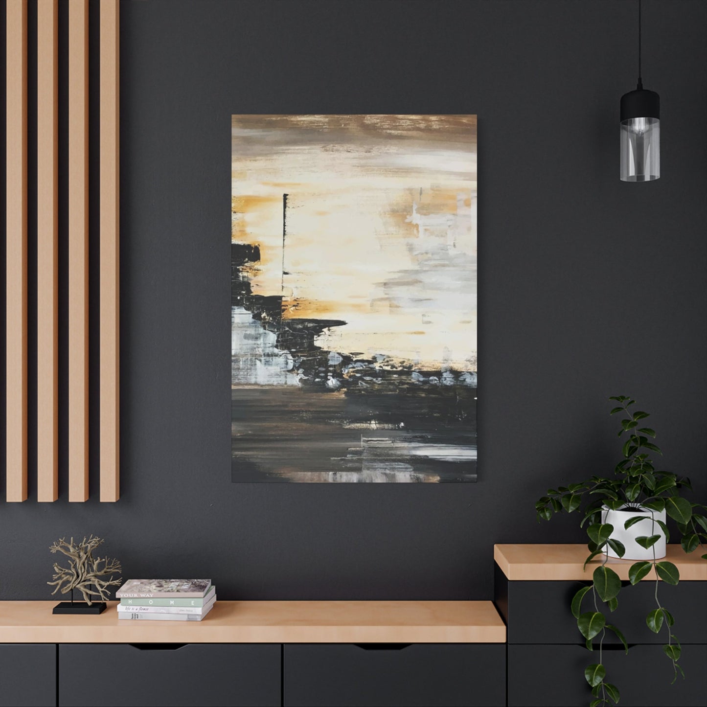
The journey into curating a living space with monochrome art should begin not with a scattered collection of small images, but with the selection of a single, heroic statement piece. This principal artwork serves as the gravitational center of the room's visual narrative, the foundational anchor around which all other decorative elements will orbit. A wall peppered with a multitude of diminutive frames often results in a cluttered, unfocused aesthetic, where the eye flits about without a place to rest, diminishing the impact of each individual piece. In contrast, one substantial, thoughtfully chosen print commands attention, establishes a definitive mood, and provides a clear thematic direction.
This approach imparts a sense of deliberate curation and luxurious spaciousness, allowing the artwork to breathe and assert its presence with authority. The general principle for scale is to select a piece that measures at least two-thirds the width of the major piece of furniture it hangs above, such as a sofa, a credenza, or a console table. This ensures the relationship between object and art feels balanced and intentional, creating a cohesive and harmonious vignette.
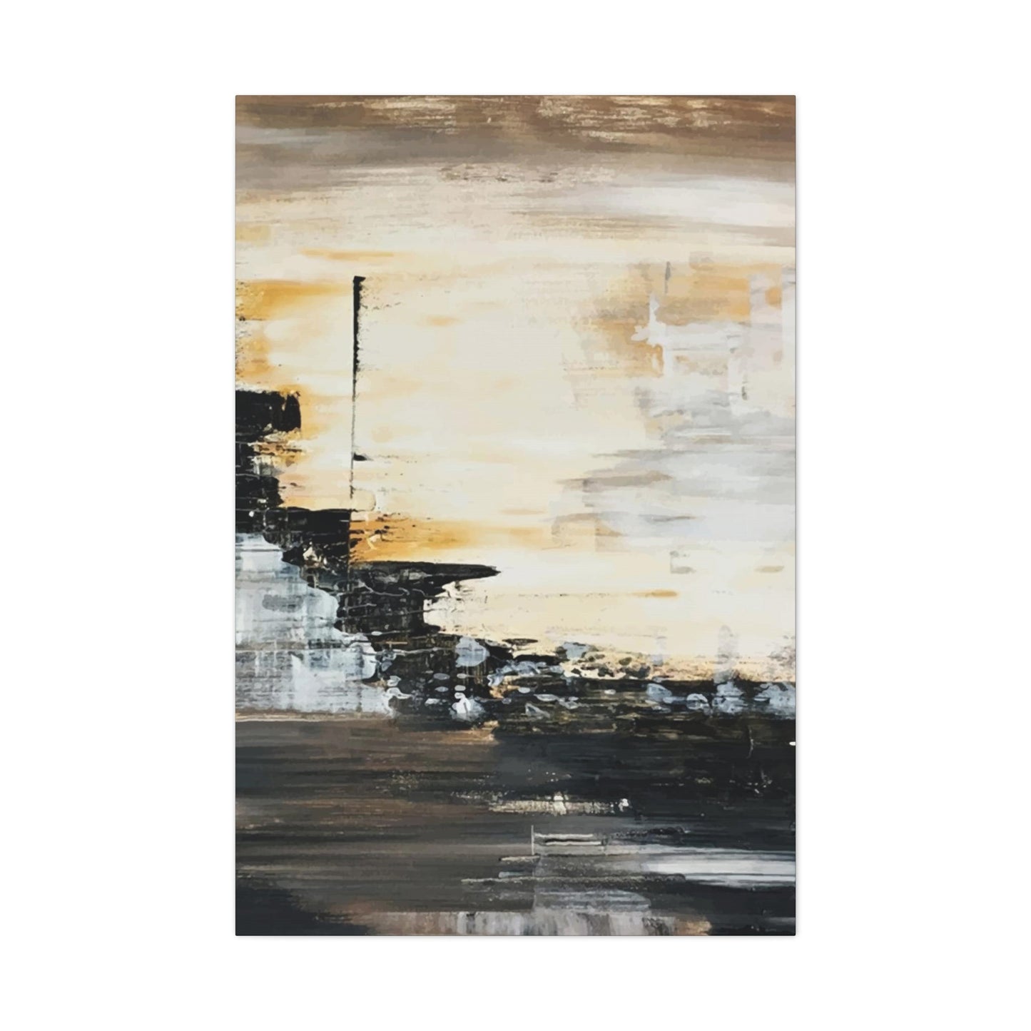
The subject matter of this keystone piece is paramount in defining the room's character. Dramatic, large-scale landscapes possess an almost transportive quality. A sweeping vista of a rugged coastline, with tumultuous waves rendered in high-contrast tones, can introduce a powerful sense of natural dynamism. Conversely, a serene image of a mist-shrouded forest or a minimalist depiction of desert dunes can instill a profound sense of tranquility and Zen-like calm. Fine-art architectural prints offer another compelling avenue.
The clean lines and geometric precision of a modernist facade, the intricate details of a classical building, or the moody, rain-slicked streets of a sprawling metropolis can lend a sophisticated, worldly air to a contemporary interior. For those inclined towards a more interpretive aesthetic, large abstract prints are an exceptional choice. A piece focused on bold, gestural brushstrokes can inject a burst of kinetic energy, while a composition of soft, nebulous forms can create a dreamy, ethereal atmosphere. The beauty of abstract art in a monochrome palette is its supreme versatility; it engages the viewer on a purely emotional and formal level, harmonizing effortlessly with various interior styles without being overly prescriptive.
The precise placement of this statement piece is as critical as its selection. The standard curatorial guideline is to hang the artwork so that its center point is approximately 145 to 150 centimeters from the floor. This aligns with the average human eye level, ensuring the piece is immediately and comfortably viewable upon entering the room. When positioning art above furniture, it is crucial to maintain a clearance of about 15 to 20 centimeters between the bottom of the frame and the top of the sofa or table.
This negative space is vital; it prevents the composition from feeling cramped and creates a clear distinction between the two elements, allowing both to be appreciated independently while still feeling connected. Furthermore, employing compositional principles like the rule of thirds within the artwork itself can enhance the overall balance of the room. By aligning a dominant horizon line or a significant vertical element within the print to an imaginary one-third division of the space, a more dynamic and visually pleasing arrangement is achieved. This meticulous attention to scale and placement elevates the artwork from a mere decoration to an integral component of the room's architectural and aesthetic identity.
The Tactile Dialogue: Weaving Texture into a Monochrome Scheme
A design scheme centered on black and white wall art presents a unique and compelling invitation to explore the rich world of texture. With the visual palette intentionally constrained, the tactile qualities of the surrounding environment come to the forefront, assuming a role of heightened importance. Introducing a diverse range of textures is the primary strategy for imbuing a monochrome space with warmth, depth, and sensory complexity, effectively warding off any potential for a sterile or one-dimensional feel. This is a dialogue between the smooth, two-dimensional plane of the artwork and the three-dimensional, tangible world of the room itself. Each textural element introduced is a new voice in the conversation, adding its own unique character and softening the hard edges often associated with contemporary design. The goal is to create a layered, enveloping space that is as pleasing to the touch as it is to the eye.
The possibilities for textural interplay are virtually limitless. Consider the soft, inviting luxury of a deep-pile wool or shag rug underfoot, its plushness providing a comforting counterpoint to the crisp lines of a graphic print. On the sofa, an assortment of cushions can become a curated collection of tactile experiences: the nubby, irregular weave of bouclé, the sumptuous smoothness of velvet, the relaxed, organic feel of raw linen, and the rugged charm of a chunky knit. A cashmere or merino wool throw, casually draped over an armchair, introduces a note of undeniable opulence and comfort. This layering of textiles is not merely decorative; it is functional, creating a cozy and inviting atmosphere that encourages relaxation. The principle of repetition is key to making these additions feel cohesive. By echoing a specific texture, such as bouclé, in several locations—a cushion, a footstool, and perhaps the trim on a curtain—the design feels deliberate and thoughtfully orchestrated.
Beyond textiles, the materials of furniture and decorative objects play a crucial role in this tactile symphony. The smooth, cool surface of a marble coffee table can stand in beautiful contrast to the warm, grainy texture of an oak side table. The sleek, reflective quality of polished chrome or brushed brass in a lamp base or decorative tray can provide a glamorous accent against the matte finish of a ceramic vase. Natural elements like sisal or jute in a rug or basketry bring an earthy, organic honesty to the space, preventing it from feeling too severe or manufactured. Even the walls themselves can participate in this dialogue; a wall with a subtle texture, such as one finished with limewash or grasscloth, can add a remarkable layer of depth behind the artwork. By consciously curating a rich palette of materials—from the rugged to the refined, the matte to the glossy, the smooth to the coarse—the homeowner transforms the living room into a sophisticated and multi-sensory environment, where the power of the monochrome artwork is amplified and enriched by the world of texture around it.
The Art of Containment: Framing Strategies for Monochrome Masterpieces
The frame that surrounds a piece of monochrome art is far more than a simple protective border; it is a critical aesthetic choice that fundamentally influences the artwork's presentation and its relationship with the surrounding space. The frame acts as a transitional element, a deliberate pause between the world depicted within the print and the reality of the room it inhabits. It can be used to make the artwork pop with graphic intensity, to allow it to blend seamlessly with the wall for a more ethereal effect, or to introduce a note of warmth and organic texture. The selection of the frame's material, color, and profile is a decision that should be made with the same level of care as the selection of the art itself, as it has the power to either elevate or undermine the entire composition. A consistent and thoughtful framing strategy is essential for achieving a polished, gallery-worthy look in a contemporary living room.
The choice of frame finish is a primary consideration. A simple, slender black frame is a classic and versatile option, particularly effective in rooms with crisp architectural details or other black metal accents. It acts to intensify the contrast within the print, making the whites appear brighter and the blacks deeper, creating a bold, graphic edge that feels decidedly modern. Conversely, a light wood frame, such as ash or pale oak, is an ideal choice for interiors with a Scandinavian, coastal, or minimalist sensibility.
This type of frame harmonizes with light-colored walls, allowing the artwork to feel airy and integrated, placing the emphasis squarely on the image itself without a hard visual border. For schemes that lean towards warmer, more organic styles like Japandi or mid-century modern, a walnut or dark oak frame is an excellent selection. The rich, warm tones of the wood provide a beautiful counterpoint to the cool palette of the monochrome print, adding a touch of natural elegance and helping to connect the artwork to other wooden furniture elements within the room.
Beyond the finish, the profile of the frame and the use of matting offer further avenues for refinement. A mat, the paperboard border between the print and the frame, serves a dual purpose. Visually, it provides breathing room for the image, preventing it from feeling crowded by the frame and adding a sense of importance and formality. Practically, it keeps the print from making direct contact with the glazing, which is crucial for archival preservation. A wide, bright white mat can dramatically enhance the perceived size and impact of a smaller print. Experimenting with different shades of off-white or even a double mat can add subtle layers of sophistication. For a more contemporary and immersive presentation, frameless options like acrylic face-mounting, where the print is bonded to the back of a sheet of acrylic, or a gallery-wrapped canvas, where the image extends around the edges of the stretcher bars, can make the artwork feel like a vibrant, object-like presence on the wall. Ultimately, the framing strategy should be a conscious reflection of both the artwork's character and the room's overall design narrative, ensuring that this final detail completes the picture perfectly.
Chromatic Whispers: The Judicious Use of Accent Hues
Embracing a black and white art scheme does not necessitate a complete abdication of color. In fact, the controlled and judicious introduction of accent hues is one of the most effective strategies for elevating a monochrome interior from merely stylish to truly captivating. In a predominantly neutral environment, even the smallest splash of color gains amplified significance. These chromatic whispers act as punctuation in the visual sentence of the room, drawing the eye, creating focal points, and infusing the space with personality and emotional resonance.
The key to success lies in restraint and intention. Rather than scattering a riot of competing colors, the goal is to select one or two complementary shades and deploy them with surgical precision, ensuring they support the starring role of the monochrome artwork rather than upstaging it. A general guideline is to limit these accent colors to approximately ten percent of the room's visible area, maintaining a sophisticated and balanced composition.
The selection of an accent palette should be a deliberate choice based on the desired mood of the living space. For a room that aims for a warm, grounded, and organic feel, earthy tones are a superb choice. A deep terracotta, a rich ochre, or a muted olive green, introduced through ceramic vases, throw cushions, or even the foliage of a houseplant, can provide a beautiful, natural counterpoint to the graphic quality of black and white art. If a sense of drama and opulence is desired, jewel tones offer unparalleled richness.
A single velvet armchair in a deep emerald green, a sapphire blue glass object on a bookshelf, or a few ruby red accents can introduce a theatrical and luxurious flair. For a more serene and calming atmosphere, soft pastels like dusty rose, sage green, or a hazy powder blue work wonders, lending a gentle and airy quality to the space that feels both modern and timeless.
The most sophisticated approach to integrating accent colors is to draw inspiration from the subtle undertones within the monochrome prints themselves. Not all black and white photography is purely neutral; many prints possess a delicate tonal cast, whether it be the cool, bluish tints of a winter landscape or the warm, sepia tones of a vintage-style portrait. Echoing these subtle hues in the room's accessories creates a deeply harmonious and cohesive scheme.
A print with soft, silvery-grey mid-tones, for instance, pairs exquisitely with accessories in brushed steel, sea-glass green, or soft lavender. Similarly, a print with warmer, brownish-black shadows would be beautifully complemented by accents of aged brass, cognac leather, or deep mustard. This technique creates a subtle and nuanced conversation between the art and the decor, resulting in a space that feels impeccably curated and thoughtfully designed, where every element works in concert to create a unified and compelling whole.
Sculpting with Light: An Illuminating Guide for Monochrome Interiors
Lighting is not a mere utility in an interior designed around black and white art; it is a primary artistic tool. The way a room is illuminated has the power to dramatically alter the mood, define shapes, and either enhance or diminish the subtle tonal gradations within a monochrome print. A well-conceived lighting plan is a layered creation, incorporating multiple sources that can be controlled independently to sculpt the environment, create dramatic contrast, and bring the artwork to life. An effective scheme moves beyond a single, central overhead fixture to embrace a triad of lighting types: ambient, task, and accent. It is this multi-layered approach that transforms a living room from a simple, functional space into a dynamic and visually engaging gallery for the art it contains, ensuring the deep blacks remain rich and the bright whites truly sing.
Ambient lighting provides the general, foundational illumination for the room. This can be achieved through flush or semi-flush ceiling fixtures, a grid of recessed downlighters, or modern cove lighting that casts a gentle, indirect glow. The goal of the ambient layer is to fill in harsh shadows and ensure comfortable visibility without flattening the perceived contrast in the artwork. It is the soft canvas upon which the other, more dramatic layers of light will be painted. Task lighting is more focused, designed to illuminate specific activities such as reading. An adjustable floor lamp positioned beside a sofa or a stylish table lamp on a side console not only provides functional light but also contributes to the room's aesthetic. These fixtures can be strategically placed to cast a pool of light that grazes the nearby artwork, adding another dimension to the visual landscape.
The most critical layer for showcasing art is accent lighting. This is where the true drama is created. A dedicated picture light mounted directly above a frame can make a statement piece the undeniable star of the room, meticulously highlighting every detail and tonal shift. Track lighting with adjustable heads offers versatility, allowing multiple pieces to be illuminated precisely. Another sophisticated technique involves using concealed LED strips along the top or bottom of a frame or within a custom niche to create a halo effect that makes the artwork appear to float. The quality of the light is also paramount. It is essential to choose light bulbs with a warm color temperature, typically in the range of 2,700 to 3,000 Kelvin, as cool-white bulbs with a higher Kelvin rating can wash out the delicate mid-tones and make the space feel clinical. Furthermore, selecting bulbs with a high Color Rendering Index (CRI) of 90 or above ensures that the full, rich spectrum of grays within the print is rendered accurately and vibrantly. Through the thoughtful interplay of these lighting layers, the homeowner can curate the room's atmosphere, drawing attention to their cherished art and sculpting a living space with the intangible but powerful medium of light itself.
Monochrome as a Foundational Design Philosophy
To approach black and white wall art merely as a decorative afterthought is to miss its profound potential. A truly sophisticated and cohesive contemporary living space can be conceived not just to accommodate monochrome art, but to be born from it. This is the shift from decoration to design philosophy, where the principles inherent in black and white imagery—contrast, form, light, and the power of omission—become the very cornerstones upon which the room is built. When embraced at this foundational level, a monochrome art collection ceases to be an accessory and instead becomes the central organizing principle, the thematic DNA that informs every subsequent choice, from the largest piece of furniture to the smallest material detail. It is a commitment to a certain kind of aesthetic clarity, an intentional paring back of the superfluous to reveal the essential and the enduring.
This approach finds natural kinship with several major design movements that share a similar ethos. Minimalism, in its pursuit of "less is more," is an obvious parallel. A living room designed with minimalist sensibilities, characterized by clean lines, uncluttered surfaces, and a respect for negative space, provides the perfect gallery-like environment for powerful black and white photography or abstract art to command attention. The art, in turn, prevents the minimalist space from feeling stark or empty, injecting it with emotion, narrative, and a point of human connection. Similarly, the raw, unadorned honesty of Brutalism, with its emphasis on exposed materials like concrete and steel, creates a dramatic and compelling backdrop for high-contrast monochrome prints. The textural grit of a board-formed concrete wall in dialogue with a finely detailed architectural photograph creates a powerful juxtaposition of scale and finish. Even the warmth and human-centric comfort of Scandinavian design, with its focus on natural light, pale woods, and cozy textiles, is beautifully complemented by the quiet gravitas of black and white art, which adds a touch of graphic sophistication that keeps the scheme from becoming overly quaint.
Adopting this philosophy means that the selection of the initial art pieces can predate the selection of the sofa or the rug. The tonal range in a chosen photograph can dictate the palette for the entire room, inspiring a scheme built on varying shades of grey, charcoal, ivory, and stone. The strong vertical lines in an abstract piece can influence the choice of a tall, slender floor lamp or floor-to-ceiling drapery. The organic, flowing forms in a nature print can be echoed in the curved silhouette of an armchair. This is a holistic method of design where the art is not placed into the room, but the room is curated around the art. It requires a measure of boldness and a clear vision, but the result is a space of extraordinary coherence and integrity, a living environment that feels less like a collection of objects and more like a single, unified, and deeply personal artistic statement.
The Art of the Focal Point: Beyond the Obvious Centerpiece
The concept of a focal point is central to successful interior design, and in a room graced with black and white art, it is the primary means of directing the viewer's experience. While the conventional approach of placing a single large "statement piece" above the sofa is a valid and often effective strategy, a more nuanced and masterful curation of the space involves thinking beyond this obvious placement. It is about understanding the architecture of the room, the natural pathways of movement, and the science of human perception to create focal points that are both intentional and, at times, delightfully unexpected. The goal is to choreograph the visual journey, creating a sense of discovery and ensuring that the art engages with the space in a dynamic and compelling manner, rather than serving as static wallpaper.
Consider the power of creating a focal point in a transitional space that is visible from the main living area. A dramatic, large-scale print hung at the end of a hallway or in an entrance foyer can act as a powerful magnet for the eye, drawing a visitor into the home and setting the aesthetic tone from the very first moment. This creates a layered experience, a promise of the sophisticated environment that lies beyond. Within the living room itself, architectural quirks can be transformed into assets.
A tall, narrow wall, often considered an awkward space, is the perfect canvas for a vertically oriented panoramic print, drawing the eye upward and emphasizing the height of the ceiling. The space above a low credenza or a fireplace can be utilized for a diptych or triptych—a single image split across two or three panels. This approach creates a powerful, cinematic effect, adding a rhythmic quality and covering a wider area with a singular artistic statement. The small gaps between the panels, known as the interstitial spaces, become part of the composition, adding to its visual complexity.
The creation of these focal points is also an exercise in understanding balance and negative space. Not every wall needs to be adorned. The strategic use of empty, or "quiet," walls is crucial for allowing the chosen focal points to have maximum impact. These visual pauses prevent sensory overload and lend a more curated, gallery-like feel to the space. When arranging a seating area, consider the sightlines from each chair. What will a person see when seated? A thoughtfully placed piece of art, even a smaller one, that directly meets the gaze from a particular vantage point can create a surprisingly intimate and engaging moment.
By moving beyond the one-size-fits-all solution of the sofa centerpiece and instead treating the entire living room as a three-dimensional canvas, one can orchestrate a series of compelling visual encounters that reveal themselves over time, making the space a continuous source of aesthetic pleasure and discovery.
Harmonizing Opposites: The Interplay of Hard and Soft Elements
A living room curated with black and white art is a masterclass in the power of contrast. This principle extends far beyond the tonal values within the artwork itself; it should inform the entire material and textural palette of the space. The most dynamic and engaging monochrome interiors are those that celebrate the juxtaposition of opposing forces, creating a rich sensory dialogue between hard and soft, smooth and rough, linear and organic. This deliberate interplay of haptic and visual textures is what infuses the room with depth, character, and a sophisticated equilibrium. The black and white art, with its own inherent contrasts, acts as the perfect catalyst and mediating element in this conversation, bridging the gap between the architectural shell of the room and the comfortable, human-scale furnishings within it.
Imagine the powerful statement made when a large, crisply framed photograph depicting the rigid geometry of a skyscraper is hung against a wall with a soft, tactile finish like Venetian plaster or a subtle grasscloth wallcovering. The hard, linear subject of the art is amplified by the yielding, organic texture of its backdrop. This is a conversation in opposites. The same principle applies to furniture.
The clean, severe lines of a minimalist, low-profile sofa can be rendered infinitely more inviting when adorned with a collection of plush, overstuffed cushions in materials like mohair or Belgian linen. A cool, smooth marble coffee table feels more grounded and approachable when placed upon a hand-knotted wool rug with a deep, irregular pile. This is the essence of creating a balanced environment: for every hard surface, there should be a soft counterpoint; for every smooth finish, a rough-hewn texture.
This philosophy of harmonization extends to form as well. A contemporary living room is often dominated by rectilinear shapes—the sofa, the coffee table, the media unit. The introduction of curved, organic forms is essential to break this rigidity and create a more fluid, natural sense of movement. A sculptural, rounded armchair, a circular side table, or a floor lamp with a sweeping arc can provide this necessary formal contrast.
The black and white art can play a role here, too. An abstract piece with soft, biomorphic shapes or a landscape photograph of rolling hills can serve as the primary source of organic form in a room dominated by straight lines. By consciously orchestrating this interplay of opposites—pairing the sleek with the nubby, the angular with the sinuous, the polished with the patinated—one creates a space that is a feast for the senses. It is a room that feels both sophisticated and comfortable, architecturally sound and deeply human, held in a perfect, harmonious tension.
Framing as Narrative: Shaping the Story of Your Artwork
The act of framing a piece of black and white art is an act of storytelling. The frame is the prologue and the epilogue, the first and last thing the eye perceives, and its character has a profound influence on how the enclosed image is interpreted. To treat framing as a mere technical necessity is to squander a vital opportunity for creative expression. A sophisticated approach views the frame as a narrative device, a tool for adding a layer of meaning, context, or even deliberate contradiction to the artwork. The choice of material, profile, and scale can recontextualize the art, shaping its emotional impact and defining its relationship to the broader design scheme of the living room. It is the crucial final step in curating not just an image, but an experience.
Consider how a frame can alter the perceived provenance and mood of a piece. A minimalist, high-contrast photograph of a modern building, when placed in a simple, thin black metal frame, reinforces its contemporary, graphic nature. It feels clean, objective, and architectural. Now, imagine that same photograph housed within a heavy, ornate, gilded frame from a bygone era. The effect is entirely different. A fascinating tension is created between the modernity of the image and the classicism of its container. This "intentional dissonance" can be a powerful design choice, suggesting a dialogue between past and present and transforming the artwork into a more complex, ironic, and thought-provoking object. It tells a story of anachronism and reinterpretation.
The narrative can also be shaped by the physical presentation. A floater frame, which creates a gap between the edge of the artwork (often a canvas or mounted print) and the frame itself, gives the piece a sense of being suspended and precious. It suggests the artwork is an object of significance, floating in its own defined space. A shadow box frame, with its significant depth, can be used to create a more sculptural, diorama-like effect, particularly for smaller prints, drawing the viewer in and emphasizing the objecthood of the piece.
When creating a gallery wall, the narrative becomes a collective one. Using identical frames for all pieces tells a story of unity, order, and cohesion, suggesting the works are part of a single, deliberate series. Conversely, a carefully curated mix of different frame styles—a few simple black frames, one in a natural wood, perhaps one in a subtle metallic finish—can tell a more eclectic, personal story. This approach suggests a collection assembled over time, reflecting a diversity of tastes and experiences, yet held together by the unifying thread of the monochrome palette. The key is that this mix must feel intentional, not random, with each frame choice complementing its specific artwork while contributing to the gestalt of the overall arrangement.
The Subtlety of Saturation: Mastering the Monochrome-Adjacent Palette
The decision to build a living room around black and white art is often misinterpreted as a mandate for a stark, colorless environment. This is a limited view. A more nuanced and deeply sophisticated approach involves mastering a "monochrome-adjacent" palette, one that explores the vast and subtle universe of desaturated color. This is not about injecting loud, declarative accents, but about layering quiet, complex "non-colors" that possess a depth and character all their own. A room composed of charcoals, slate grays, mushroom beiges, warm ivories, and deep, inky blues creates an incredibly rich and enveloping backdrop that allows the black and white art to truly shine without having to compete.
This method is about finding the color within the absence of color, creating a space that is serene, timeless, and visually complex.The foundation of this palette lies in its ability to interact with light. A simple white wall can often feel flat, but a wall painted in a very light, warm grey or a soft, stony beige will shift and change throughout the day as the natural light moves across it, revealing subtle undertones and creating a sense of gentle movement. The same is true for darker shades. A deep charcoal is not simply a dark grey; it may have undertones of blue, green, or brown that can be teased out with the right pairings.
A large, comfortable sofa upholstered in a heathered charcoal fabric, for instance, has a visual texture and depth that a solid black fabric might lack. Layering these tones is key. Imagine a palette that includes a soft gray on the walls, a deeper slate-colored rug, an ivory bouclé armchair, and curtains in a heavy, mushroom-toned linen. Each element is neutral, yet together they create a tapestry of subtle variation that is both calming and incredibly sophisticated.Within this desaturated landscape, the introduction of a single, carefully considered element of subtle color or material can have a profound impact.
This is not the loud shout of a bright yellow cushion, but the quiet whisper of a well-tended fiddle-leaf fig tree in the corner, its deep green leaves providing a point of organic vitality. It could be the warm, subtle glint of a single aged-brass floor lamp, its metallic sheen offering a counterpoint to the matte textures elsewhere in the room. It might be a collection of hand-thrown ceramic vessels in earthy, muted tones of terracotta and sand clustered on a bookshelf. Even the selection of books on a coffee table can contribute, their spines forming a mosaic of muted, complementary hues. This highly controlled and subtle approach to color ensures that the primary focus remains on the form, texture, and emotional content of the black and white art, while the surrounding environment provides a rich, complex, and deeply harmonious supporting symphony.
Choreographing Shadows: Theatrical Lighting for Artistic Effect
In a living room devoted to the nuances of a monochrome palette, lighting transcends its utilitarian function and becomes a form of theatrical choreography. It is the invisible artist that sculpts the space, directs the eye, and breathes life into the two-dimensional artworks on the walls. An effective lighting scheme is not a static, singular source, but a dynamic, layered system designed to create mood, depth, and drama. By thinking like a stage designer, one can use light to highlight key performers—the artworks—while creating an ambient mood and carving out intimate moments within the larger scene.
This is the art of painting with shadows as much as with light, transforming the living room into an immersive environment that can be tuned and adjusted to suit any occasion, from a bright, airy afternoon to a dramatic, intimate evening.The language of the theater provides a useful framework for this approach. The primary "spotlights" are, of course, the accent lights dedicated to the art. These should be precise and controlled. A narrow-beam spotlight, for instance, can be aimed to create a focused pool of light that exclusively illuminates a print, causing it to pop from a darker wall with dramatic intensity.
For a softer effect, a "wall wash" fixture can cast a broad, even sheet of light down a wall, beautifully illuminating a large piece or an entire gallery collection. The technique of "wall grazing," where a light source is placed very close to a textural surface like a brick or stone wall, can create a stunning interplay of light and shadow that adds a powerful dimension of its own.Beyond the spotlights, the overall "stage wash," or ambient lighting, sets the general mood. This should be soft, diffuse, and, crucially, dimmable. Dimmers are the single most important tool in a theatrical lighting scheme, allowing for a seamless transition from functional brightness to moody ambiance.
Cove lighting tucked into architectural details, or uplighting placed behind a large plant or piece of furniture, can contribute to this ambient layer by casting a gentle, indirect glow that reduces harsh shadows. Finally, the "practicals"—the visible lamps and fixtures—are like the props in a play. A sculptural floor lamp or a beautiful pendant light not only provides task lighting but also acts as a glowing object within the scene, contributing to the overall composition. By choreographing these different layers—the focused drama of the spotlights, the gentle mood of the wash, and the aesthetic contribution of the practicals—one can create a living space that is not merely lit, but brought to life, with every shadow and highlight playing its part in a beautifully orchestrated performance.
Conclusion
The culmination of all these design considerations—from the foundational philosophy to the final lighting cue—lies in the overarching act of curation. This is the final, discerning edit, the process of looking at the living room as a complete entity and ensuring that all the individual elements coalesce into a single, cohesive, and resonant whole. A truly well-curated space feels effortless, as if every object has found its inevitable and perfect home. This sense of cohesion is not accidental; it is the result of a rigorous attention to detail and an unwavering commitment to the central theme established by the black and white art. It involves understanding the rhythm of the room, the power of the empty space, and the continuous, evolving nature of a personal collection.
One of the most refined curatorial skills is the mastery of negative space. The empty surfaces—the "pauses" on the walls and the uncluttered expanses of floor—are just as important as the objects and artworks themselves. These spaces allow the eye to rest, preventing the room from feeling cluttered and allowing each individual piece to be appreciated more fully. When creating a gallery wall, the spacing between the frames is a critical component of the composition. A consistent 2-to-3-inch gap between each piece, for example, creates a sense of order and rhythm. The overall shape of the gallery wall should also be considered in relation to the wall it occupies, ensuring it feels balanced and contained. This respect for negative space is what lends a collection its quiet confidence and professional polish.
Cohesion is also achieved through the creation of "sightlines" and "vignettes." A sightline is the view from a specific point, such as the entrance to the room or a favorite armchair. A skilled curator considers these sightlines and arranges elements to create pleasing, balanced compositions from these key perspectives. A vignette is a small, curated grouping of objects on a surface like a console table or a bookshelf. A vignette might consist of a small framed print, a sculptural object, and a stack of art books, arranged in a way that feels balanced in terms of height, texture, and form.
These small, thoughtful moments contribute to the richness of the overall space. Finally, it is crucial to remember that a personal collection is a living entity. Curation is an ongoing process of editing, rearranging, and acquiring. As your tastes evolve, so too should your space. By continually refining the arrangement, adding new pieces that speak to you, and fearlessly editing out what no longer fits, you ensure that your living room remains not just a beautifully designed space, but a dynamic, authentic, and evolving reflection of your own personal story.
Related Blogs


Related Collections
-

Frida Kahlo Wall Art
Redefine Your Living Space with Captivating Frida Kahlo Wall Art Frida Kahlo,...
-

Faceless Portraits Wall Art
The Enigmatic World of Faceless Portraits Wall Art: A Journey Through Anonymous...
-

James Wiens Wall Art
Infuse Your Home with Colorful Landscapes: James Wiens Wall Art James Wiens’...
-

Koala Wall Art
The Ultimate Guide to Adorable Koala Wall Art: Transform Your Space with...
-

Coral Wall Art
Marine-Inspired Décor Revolution: The 2025 Coral Wall Art Movement Contemporary interior design...
-

Cincinnati Wall Art
The Genesis of a City-Wide Canvas: The Story of Cincinnati Wall Art...


