


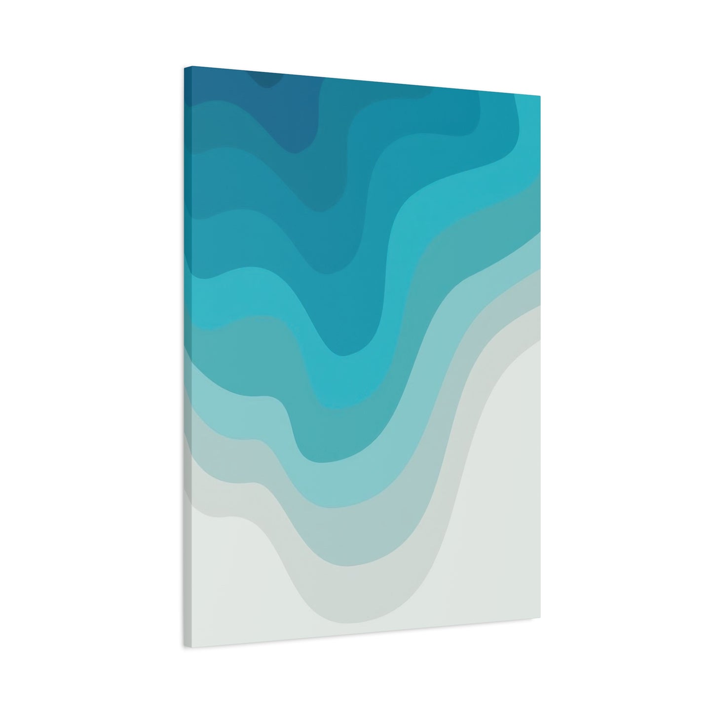
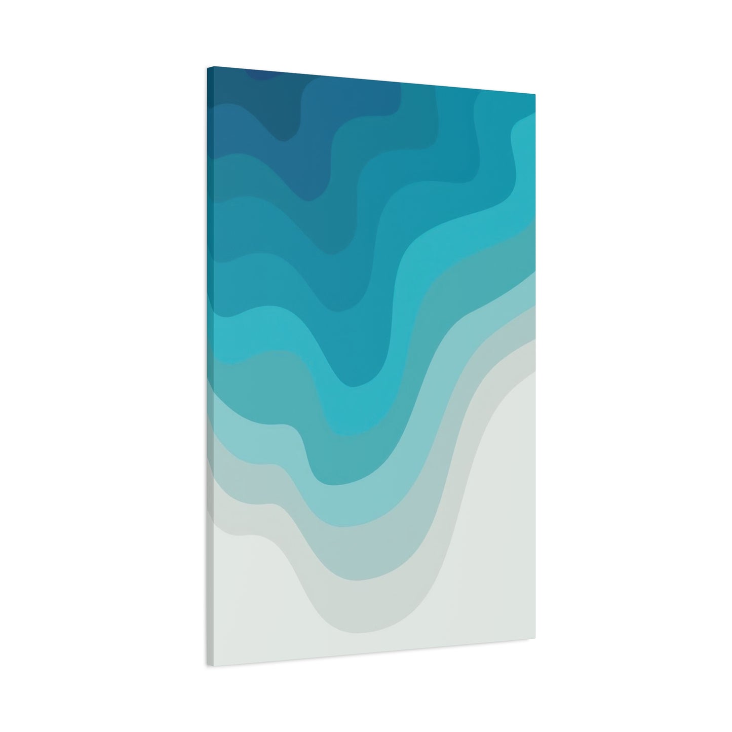
Blue Cool Layers Wall Art & Canvas Prints
Blue Cool Layers Wall Art & Canvas Prints
Couldn't load pickup availability
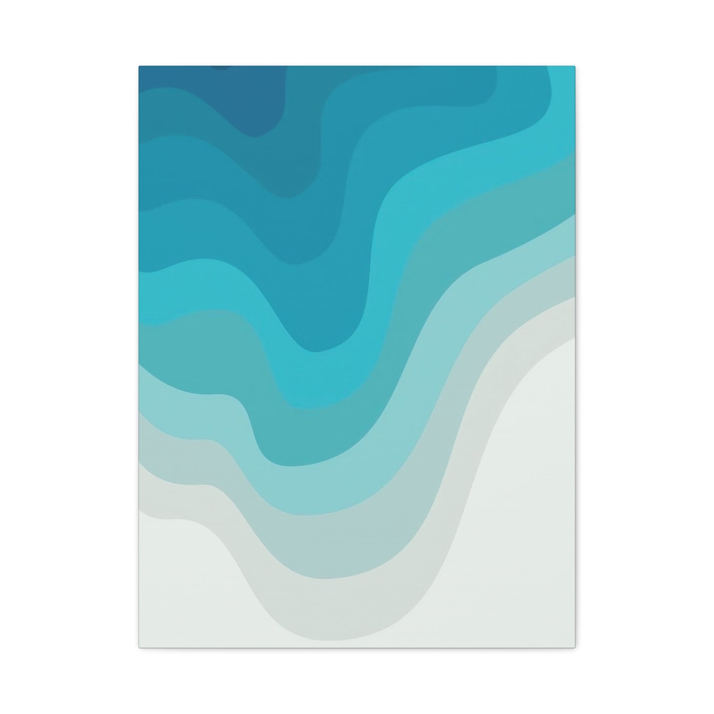


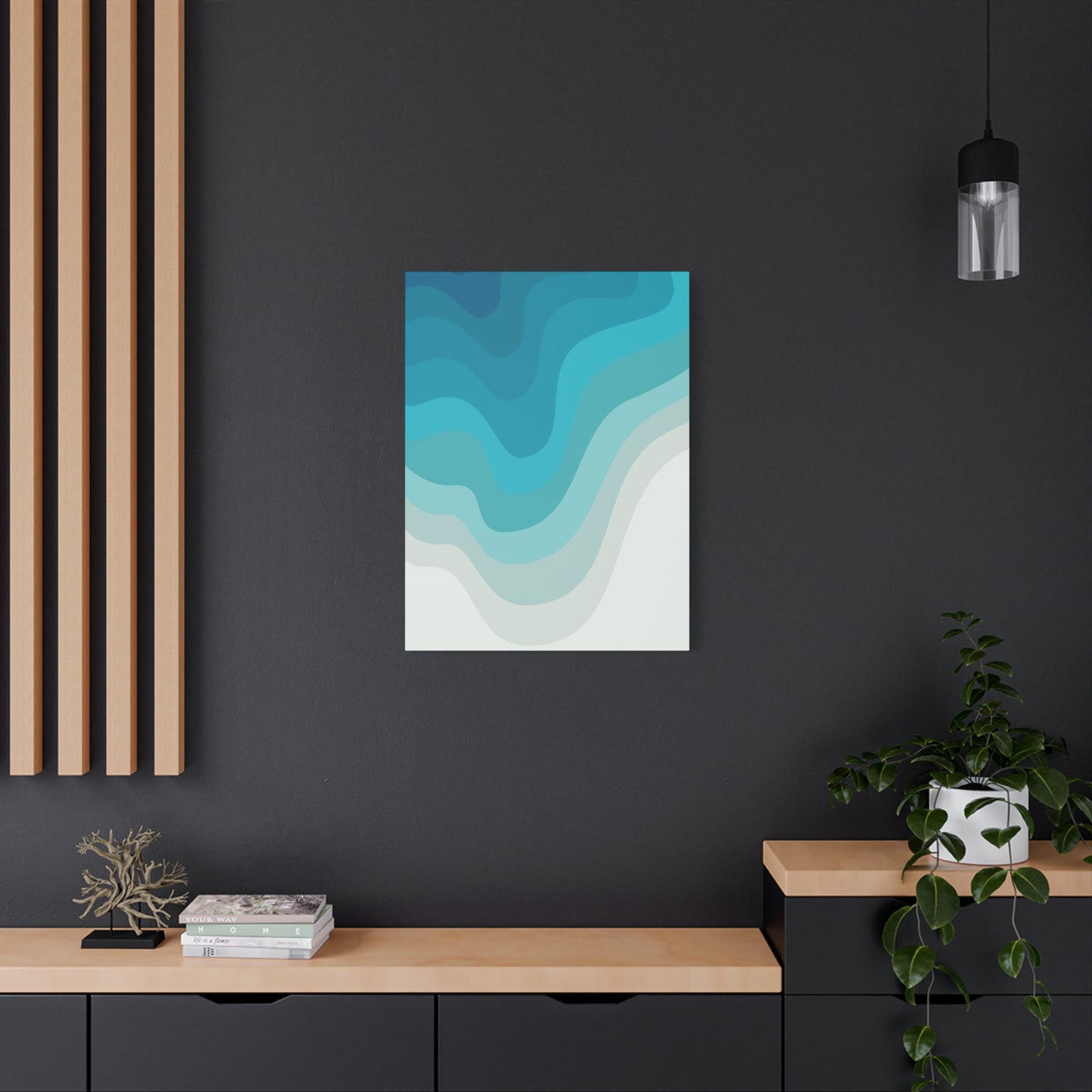
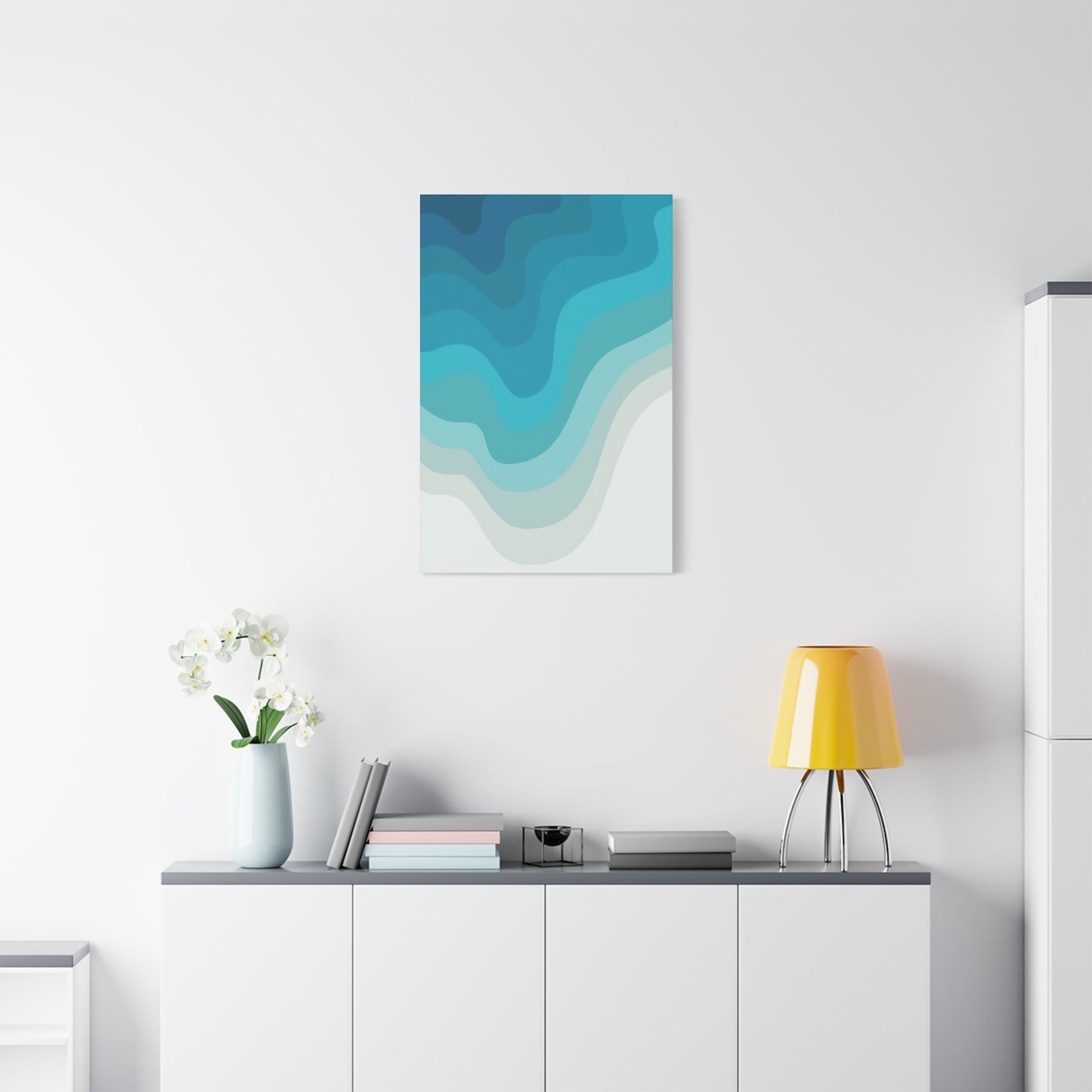
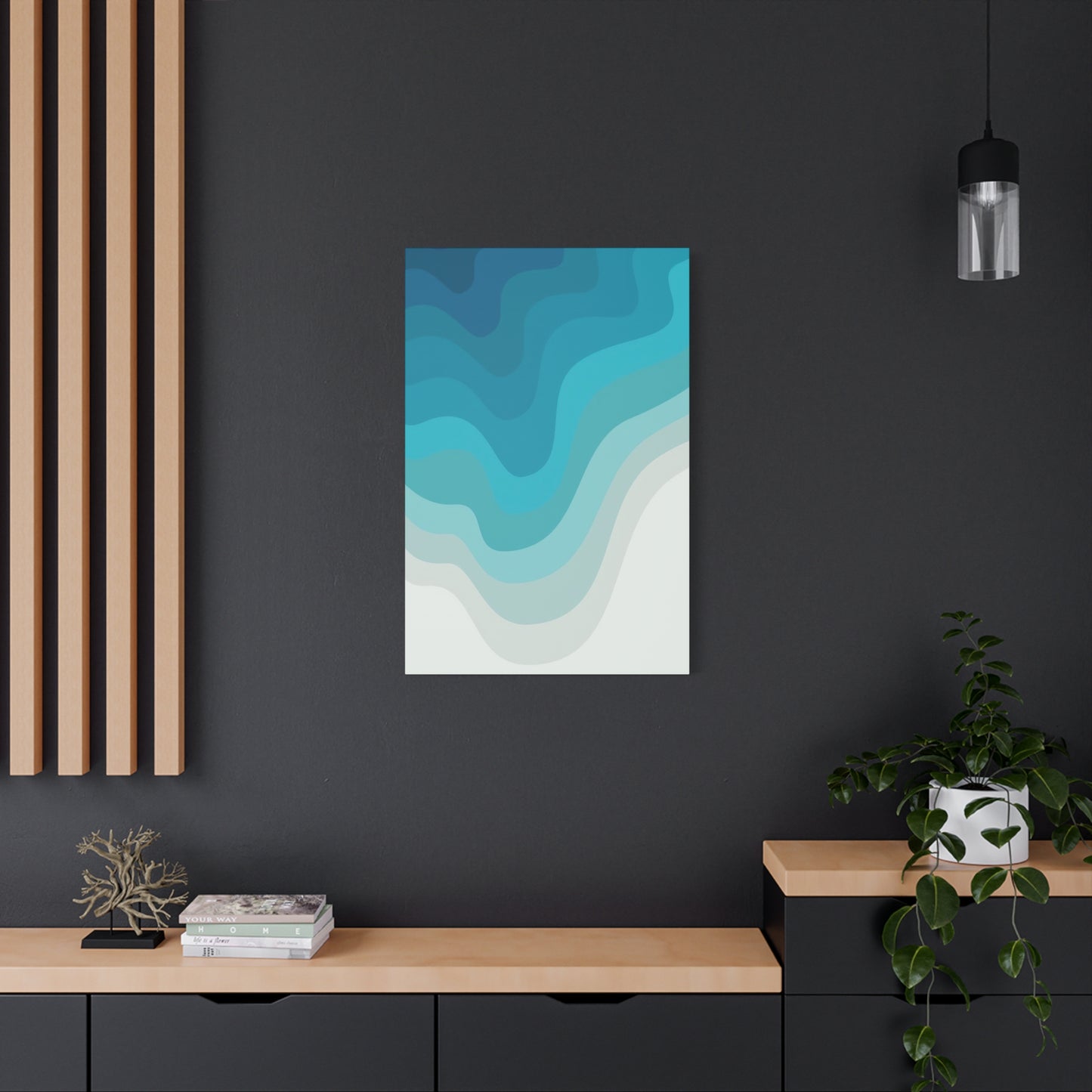
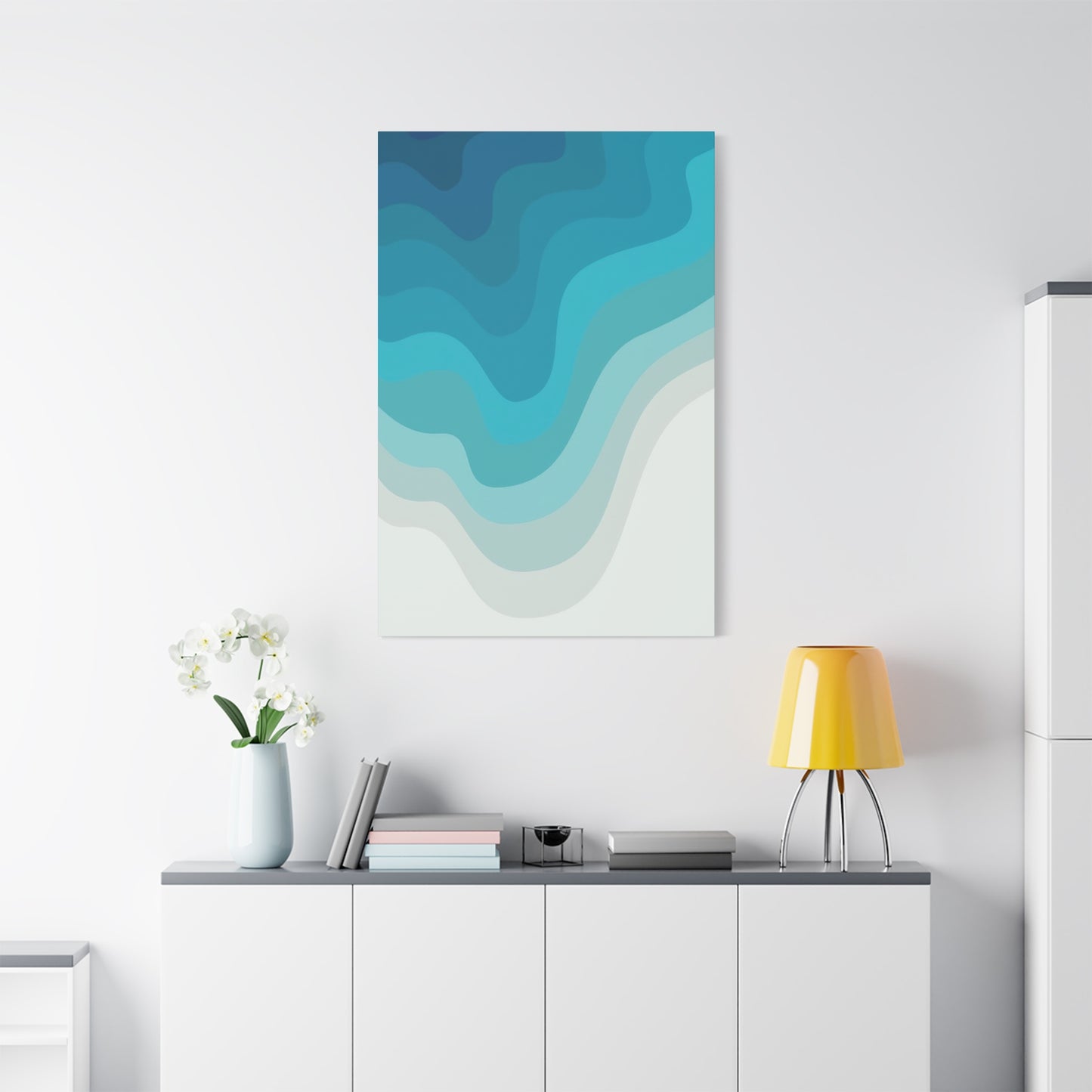
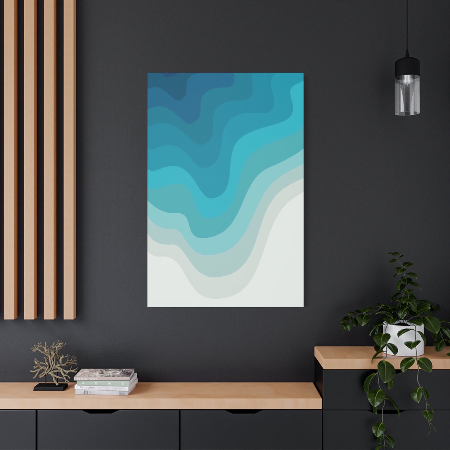
Creating Tranquility with Blue Cool Layers Wall Art: A Soothing Touch for Your Living Room or Bedroom
The world of interior decoration has witnessed a remarkable evolution in recent years, with homeowners and design enthusiasts seeking artwork that transcends traditional boundaries. Among the most captivating trends emerging in contemporary home styling is the phenomenon of blue cool layers wall art canvas prints. These sophisticated artistic pieces combine depth, dimension, and calming chromatic elements to create visual experiences that transform ordinary rooms into extraordinary sanctuaries.
Canvas prints featuring layered blue compositions have become increasingly popular due to their versatility and ability to complement various design aesthetics. Whether your home embraces minimalist principles, coastal themes, modern industrial elements, or traditional elegance, these artworks serve as focal points that anchor entire rooms while maintaining an atmosphere of tranquility and refinement.
The concept of layered artwork involves creating depth through multiple visual planes, textures, and tonal variations. When executed in cool blue palettes, these pieces evoke feelings of serenity, spaciousness, and contemplative calm. The psychological impact of blue hues combined with the dimensional quality of layered compositions creates an immersive viewing experience that engages observers on multiple sensory levels.
Interior designers have embraced these canvas prints as essential tools in their creative arsenal, recognizing their ability to establish mood, define spaces, and create cohesion within diverse decorating schemes. The cool temperature of blue tones provides a counterbalance to warm elements in a room, while the layered composition adds visual interest without overwhelming the senses.
The Artistic Foundation of Multi-Dimensional Blue Canvas Compositions
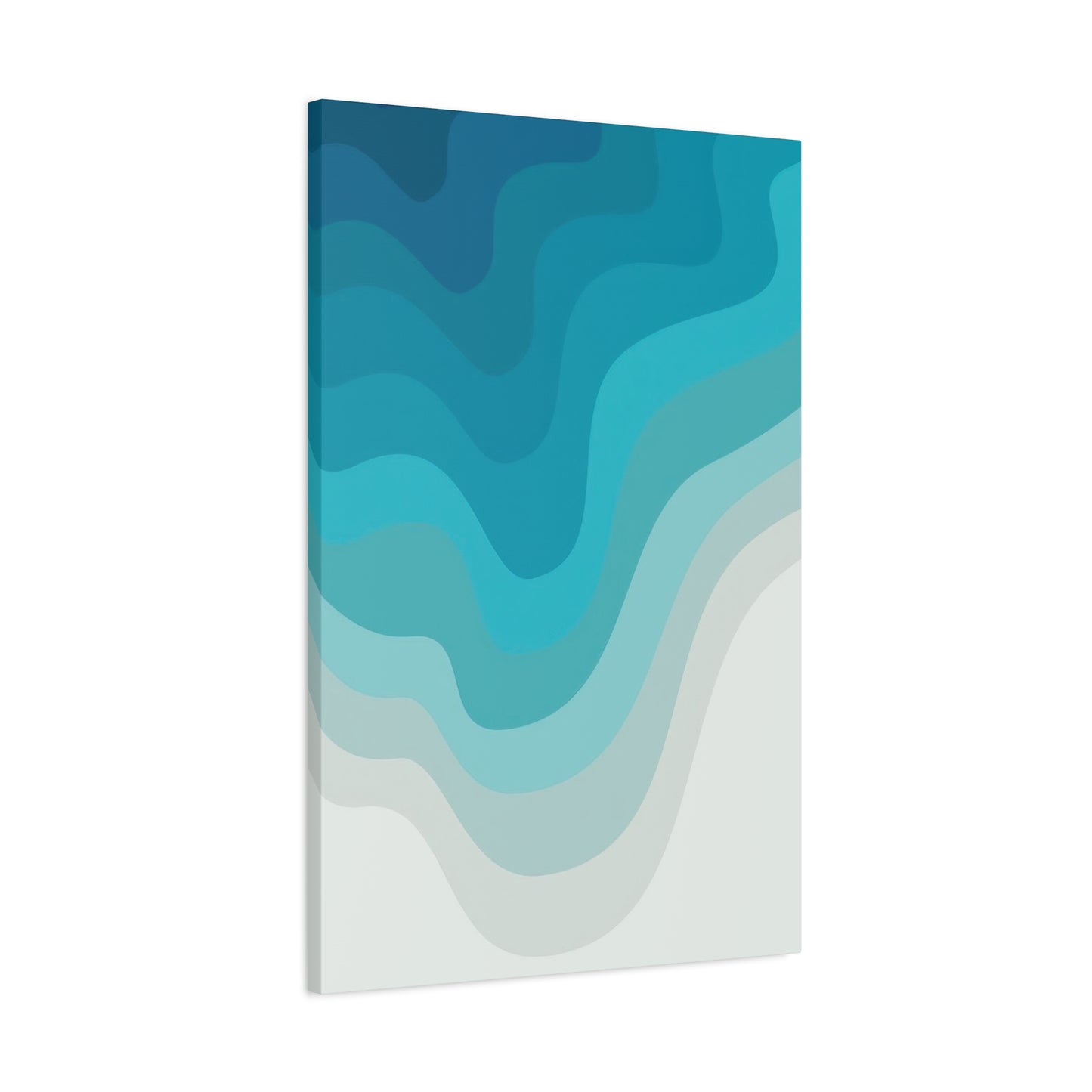
Creating layered blue artwork requires a sophisticated understanding of color theory, composition principles, and visual hierarchy. Artists who specialize in these pieces employ various techniques to achieve the depth and complexity that define this genre. The foundational concept involves building images through successive layers of paint, texture, and transparent elements that interact to create a unified whole greater than its individual components.
The artistic process typically begins with establishing a base layer that sets the tonal foundation for the entire composition. This foundational element might feature deep navy or indigo shades that provide richness and depth. Subsequent layers introduce lighter blues, including cerulean, azure, and sky tones, creating gradations that guide the viewer's eye through the composition.
Transparency and opacity play crucial roles in layered artwork. Artists manipulate these qualities to reveal glimpses of underlying layers while maintaining the integrity of surface elements. This interplay creates visual complexity that rewards extended viewing, as observers discover new details and relationships with each encounter.
Texture also contributes significantly to the dimensional quality of these canvas prints. Some artists incorporate actual physical texture through impasto techniques, where paint is applied thickly to create raised surfaces. Others achieve textural effects through careful brushwork, scraping, or the application of mixed media elements. When reproduced as canvas prints, these textural qualities are carefully preserved through high-resolution scanning and advanced printing technologies.
The composition of layered blue artwork often draws inspiration from natural phenomena. Wave patterns, geological formations, atmospheric conditions, and aquatic environments all provide rich source material for artists creating these pieces. By abstracting natural forms and reinterpreting them through layers of cool blue tones, artists create works that feel simultaneously familiar and mysteriously abstract.
Selecting Appropriate Canvas Print Dimensions for Various Room Configurations
Choosing the correct size for blue cool layers wall art canvas prints represents a critical decision that dramatically impacts the overall effectiveness of the artwork within a space. Proportion, scale, and spatial relationships all require careful consideration to achieve optimal visual balance and aesthetic impact.
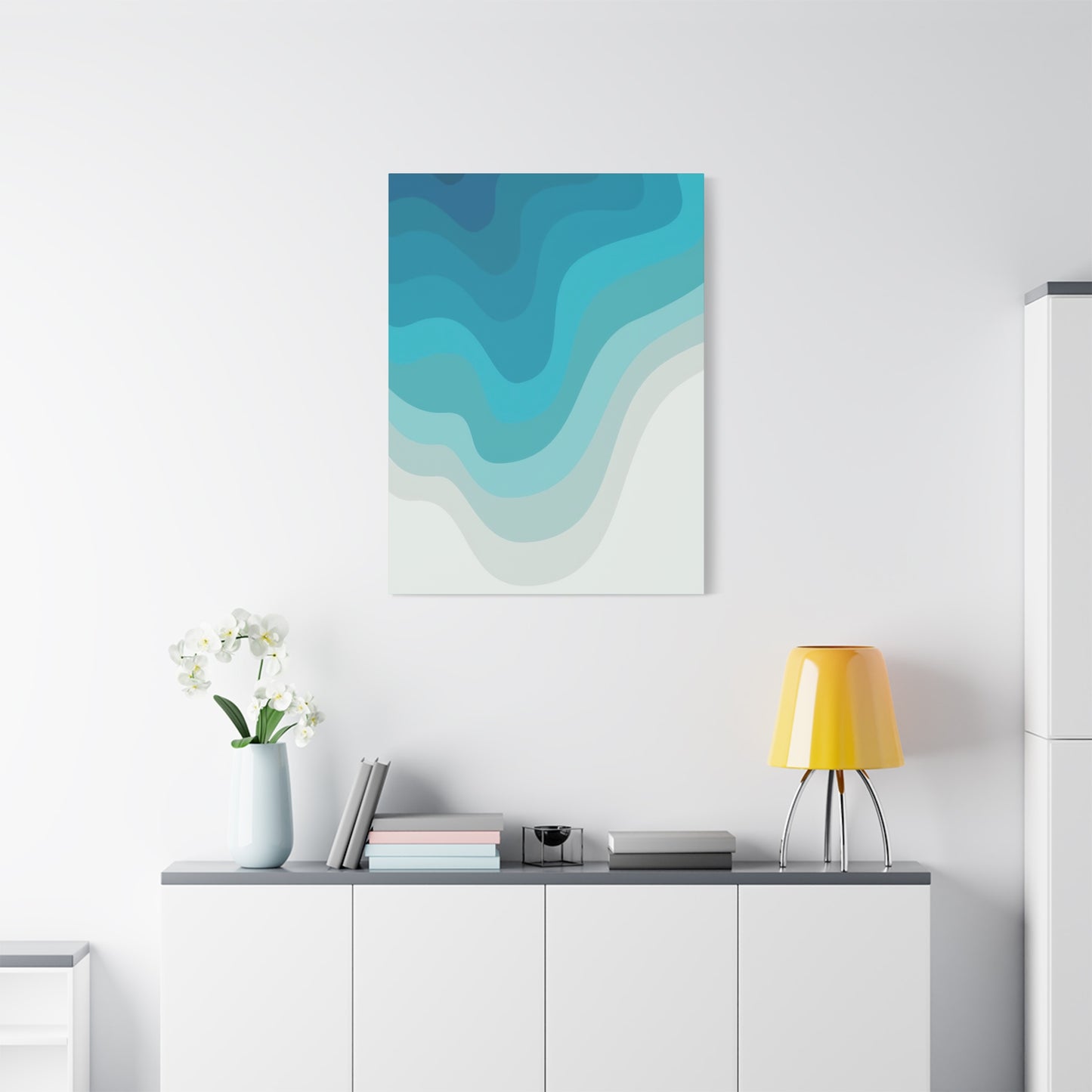
For expansive living rooms or great rooms with high ceilings, oversized canvas prints measuring sixty inches or larger create commanding focal points that anchor the space. These substantial pieces possess the visual weight necessary to maintain presence in rooms with significant square footage. Single large-scale pieces make bold statements, while triptychs or multi-panel arrangements offer flexibility in configuring the composition across wide wall expanses.
Medium-sized rooms, including standard bedrooms, dining areas, and home offices, typically accommodate canvas prints ranging from thirty to fifty inches in their largest dimension. These proportions provide sufficient visual impact without overwhelming the space. Consider the primary viewing distance when selecting sizes for these rooms. Artwork that will be observed primarily from across the room can be larger and more dramatic, while pieces viewed at closer range should maintain appropriate scale to remain comfortable and engaging.
Smaller spaces, including bathrooms, entryways, and hallways, benefit from more modest canvas dimensions, typically between sixteen and thirty inches. These compact artworks add personality and visual interest to spaces that might otherwise feel neglected. In narrow hallways, consider creating gallery-style arrangements with multiple smaller pieces rather than single large works.
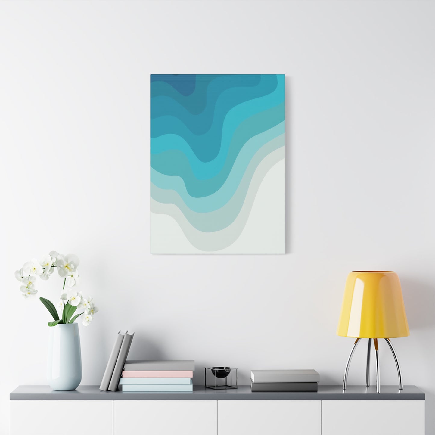
The relationship between furniture and artwork also demands attention. Above sofas and beds, canvas prints should generally span two-thirds to three-quarters of the furniture width. This proportion creates visual harmony and establishes clear relationships between architectural elements and decorative features. Artwork that is too small appears disconnected and insignificant, while oversized pieces can feel oppressive.
Ceiling height influences artwork placement and sizing decisions. In rooms with standard eight-foot ceilings, position the center of the artwork at approximately eye level, typically between fifty-seven and sixty inches from the floor. In spaces with higher ceilings, you may raise the artwork accordingly, though maintaining connection with furniture groupings remains important. Rooms with very high ceilings offer opportunities for vertical compositions that draw the eye upward and emphasize architectural grandeur.
Consider the visual weight of the artwork itself when determining appropriate sizing. Blue cool layers wall art canvas prints with bold contrast and dramatic compositions possess greater visual weight than pieces with subtle gradations and minimal contrast. Artworks with substantial visual weight can appear larger than their actual dimensions suggest, allowing for slightly smaller physical sizes while maintaining strong presence.
Material Composition and Manufacturing Processes Behind Quality Canvas Reproductions
The quality of blue cool layers wall art canvas prints depends fundamentally on the materials and production methods employed in their creation. Superior canvas prints result from careful attention to each component and manufacturing stage, from initial image capture through final finishing touches.
Canvas material selection begins with choosing between cotton, polyester, or blended fabrics. Cotton canvas offers traditional appeal with a natural texture that closely resembles materials used by fine artists for centuries. High-quality cotton canvas provides excellent color absorption and a pleasant matte finish that reduces glare. Polyester canvas, sometimes called poly-cotton blend, offers enhanced durability and resistance to environmental factors including humidity and temperature fluctuations. This synthetic option maintains dimensional stability better than pure cotton, reducing the risk of warping or sagging over time.
The weight and weave of canvas fabric significantly impact the final appearance and longevity of prints. Canvas weight is measured in ounces per square yard, with options typically ranging from eight to fifteen ounces. Heavier canvas provides better stability and a more substantial feel, though lighter weights may be appropriate for smaller prints or budget-conscious applications. The weave pattern affects surface texture, with tighter weaves producing smoother surfaces ideal for reproducing fine details, while looser weaves create more pronounced texture that adds dimensional character.
Printing technology represents another crucial factor in canvas quality. Giclée printing, utilizing high-resolution inkjet systems, has become the standard for premium canvas reproductions. These sophisticated printers employ multiple ink cartridges, often eight to twelve colors rather than the standard four, allowing for exceptional color accuracy and smooth gradations. This expanded color gamut proves particularly important when reproducing the subtle tonal variations characteristic of blue layered compositions.
Ink quality directly affects the longevity and color fidelity of canvas prints. Pigment-based inks offer superior fade resistance compared to dye-based alternatives, maintaining their vibrancy for decades when properly cared for. Archival-quality inks rated for seventy-five years or more ensure that your investment in blue cool layers wall art canvas prints remains beautiful for generations.
Integrating Layered Blue Artwork Within Diverse Interior Design Aesthetics
Blue cool layers wall art canvas prints demonstrate remarkable versatility across various interior design styles, adapting to diverse aesthetic approaches while maintaining their distinctive character. Successfully integrating these artworks requires understanding the fundamental principles of each design style and recognizing how blue layered compositions can enhance specific aesthetic qualities.
Coastal and nautical design schemes represent natural homes for blue canvas artwork. These decorating approaches draw inspiration from oceanside environments, incorporating colors and textures reminiscent of water, sand, and sky. Blue layered artwork reinforces the connection to marine environments while adding sophisticated artistic elements that elevate the style beyond predictable beach house clichés. Pair these canvas prints with natural materials including weathered wood, rope accents, and linen textiles. Light, airy spaces with white or cream walls provide ideal backdrops that allow the blue artwork to shine.
Modern minimalist interiors emphasize clean lines, uncluttered spaces, and intentional object selection. Within this aesthetic framework, blue cool layers wall art canvas prints serve as carefully curated focal points that provide visual interest without compromising the minimalist principle of restraint. Select pieces with subtle layering and sophisticated color gradations rather than busy, complex compositions. Position the artwork with generous surrounding space, allowing it to breathe and command attention through isolation rather than proliferation.
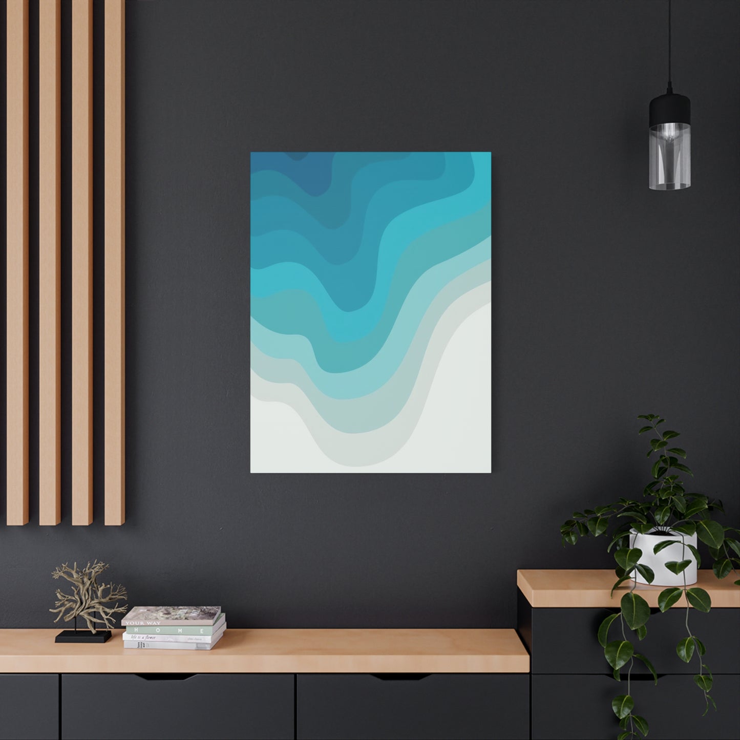
Industrial design aesthetic incorporates raw materials, exposed structural elements, and utilitarian objects into residential spaces. Blue layered artwork introduces organic softness that balances the hard edges and cool surfaces characteristic of industrial style. The contrast between refined artistic expression and raw industrial elements creates dynamic tension that energizes spaces. Consider positioning blue canvas prints against exposed brick walls or concrete surfaces to emphasize this juxtaposition.
Scandinavian design philosophy emphasizes functionality, natural materials, and connection to nature. The Nordic palette typically features white, gray, and natural wood tones punctuated by carefully selected color accents. Blue cool layers wall art canvas prints integrate seamlessly into this aesthetic, providing the accent color that brings Scandinavian spaces to life. Select pieces with clean compositions and avoid overly ornate or busy designs. The layered quality of these artworks aligns beautifully with the Scandinavian appreciation for subtle complexity within apparent simplicity.
Traditional and transitional interiors, characterized by classic furniture styles and established decorating conventions, accommodate blue layered artwork when pieces are selected thoughtfully. Opt for compositions with recognizable subject matter or arrangements that suggest landscape or abstract expressionist traditions. Frame these canvas prints in traditional wood or ornate gilt frames to bridge the gap between contemporary artistic expression and classical aesthetic sensibilities.
Contemporary eclectic spaces celebrate the mixing of diverse styles, periods, and influences. These adventurous interiors provide ideal environments for blue cool layers wall art canvas prints, where the artwork can interact with varied decorating elements. Layer the blue artwork with other art pieces, mirrors, and decorative objects to create gallery-wall arrangements that reflect personal style and collected interests.
Color Theory Fundamentals Applied to Blue-Dominant Compositions
Understanding color theory principles illuminates why blue cool layers wall art canvas prints exert such powerful aesthetic and emotional effects. The relationships between colors, their interactions, and their psychological impacts form the foundation of effective artistic composition and interior design.
Blue occupies a primary position within the color wheel, alongside red and yellow. As a cool color, blue recedes visually, creating impressions of depth and distance. This quality makes blue particularly effective in smaller rooms, where it generates feelings of spaciousness. The receding nature of blue also explains why sky and water, both typically rendered in blue tones, appear to extend into infinite distance.
Cool colors, including blue, green, and purple, share the characteristic of creating calm, restful atmospheres. These hues lower perceived temperature in spaces, making them valuable in warm climates or rooms receiving abundant sunlight. The psychological effect of cool colors includes reduced heart rate and blood pressure, contributing to environments conducive to relaxation and contemplation.
Value, referring to the lightness or darkness of a color, significantly impacts the mood and spatial perception created by blue artwork. Light-value blues, including powder blue, baby blue, and sky blue, evoke openness, innocence, and tranquility. These lighter tones work beautifully in bedrooms, nurseries, and spaces dedicated to peaceful activities. Dark-value blues, such as navy, midnight blue, and indigo, convey sophistication, security, and depth. These rich tones add drama and elegance to living rooms, libraries, and formal spaces.
Saturation describes the intensity or purity of a color. Highly saturated blues appear vivid and energetic, commanding attention and creating focal points. Less saturated blues, incorporating more gray, feel sophisticated and subtle, integrating easily into various color schemes. Blue cool layers wall art canvas prints typically employ variations in saturation across their compositions, creating visual interest through the interplay of intense and muted passages.
Complementary color relationships pair colors opposite each other on the color wheel. For blue, the complementary color is orange. While blue cool layers wall art canvas prints emphasize blue tones, the inclusion of subtle orange accents creates vibrant contrast that enlivens compositions. Many artists incorporate warm undertones or small passages of complementary color to prevent blue-dominant works from feeling cold or monotonous.
Analogous color schemes utilize colors adjacent on the color wheel. For blue, this includes green-blue (cyan or teal) and blue-purple (violet or indigo). Layered blue artwork often incorporates these analogous colors, creating harmonious gradations that guide the viewer's eye through the composition. The subtle shifts between related hues produce cohesive, soothing effects particularly appropriate for residential spaces.
Monochromatic color schemes employ various values and saturations of a single hue. Blue monochromatic compositions create serene, unified effects through their limited palette. The challenge and art of monochromatic work lies in creating sufficient contrast and visual interest using only tonal variations. Successful blue cool layers wall art canvas prints in monochromatic palettes demonstrate masterful control of value and saturation.
The Evolution of Abstract Layered Artwork in Contemporary Art Movements
The tradition of layered composition in visual art extends back through centuries of artistic practice, though contemporary approaches to this technique reflect distinctly modern sensibilities. Examining the historical development of layered artwork provides context for appreciating current manifestations including blue cool layers wall art canvas prints.
Abstract expressionism, flourishing in the mid-twentieth century, established many conventions still influencing contemporary layered artwork. Artists associated with this movement, including Mark Rothko, Jackson Pollock, and Helen Frankenthaler, explored the emotional and expressive potential of color, form, and gesture divorced from representational imagery. Rothko's color field paintings, featuring luminous rectangles of color floating against contrasting backgrounds, demonstrated how layered color could create profound emotional experiences.
The color field painting movement specifically emphasized large areas of color as primary compositional elements. These artists applied paint in thin layers, allowing underlying colors to subtly influence surface tones. This approach created depth and luminosity that solid, opaque application could not achieve. Contemporary blue layered canvas prints draw directly from this tradition, utilizing similar techniques to create atmospheric depth.
Process art and post-minimalism in the nineteen sixties and seventies emphasized artistic process and material properties over finished products. Artists associated with these movements frequently built works through accumulative processes, adding successive layers of material to create final compositions. This approach highlighted the temporal dimension of artistic creation, acknowledging that artworks develop through time rather than appearing instantaneously.
The nineteen eighties witnessed renewed interest in painting and material richness after the conceptual austerity of previous decades. Neo-expressionist artists applied paint thickly and energetically, creating highly textured surfaces that emphasized physical presence. While aesthetically different from the subtle gradations typical of blue cool layers wall art canvas prints, these works reinforced the value of material complexity and surface variation.
Contemporary digital technologies have revolutionized artistic practice while maintaining connections to traditional techniques. Digital artists create layered compositions using software that simulates traditional painting processes while offering capabilities impossible in physical media. These digital works can be reproduced as canvas prints, making sophisticated artwork accessible to broader audiences. Many blue layered canvas prints available today originate as digital creations, though their aesthetic often references traditional painting techniques.
The democratization of art through reproduction technologies represents a significant development in art history. High-quality canvas printing allows people to incorporate sophisticated artwork into their homes regardless of their ability to acquire original pieces. While some purists criticize reproductions, they undeniably expand access to artistic expression and allow more people to live with beautiful imagery.
Exploring Varied Composition Styles Within Layered Blue Artwork
Blue cool layers wall art canvas prints encompass a diverse range of compositional approaches, each creating distinct visual experiences and emotional resonances. Understanding these various styles helps in selecting artwork that best serves specific spaces and personal preferences.
Horizontal layered compositions emphasize lateral movement across the canvas, often suggesting landscape horizons, water surfaces, or stratified geological formations. These horizontal arrangements create calming, stable feelings through their emphasis on the horizon line, a fundamental element of human visual experience. Horizontal layered blue artwork particularly suits rooms with wide wall spaces, including above sofas, beds, or in great rooms with expansive dimensions.
Vertical layered compositions draw the eye upward, creating impressions of height, aspiration, and grandeur. These arrangements might suggest waterfalls, rain, or atmospheric layers in vertical space. Vertical compositions work beautifully in rooms with high ceilings, emphasizing architectural height. They also suit narrow wall spaces including beside doorways, in hallways, or flanking windows.
Circular or spiral layered compositions create focal points that draw the eye into the center of the canvas. These arrangements suggest whirlpools, roses of wind, or abstract representations of energy and motion. Circular compositions possess strong visual magnetism, making them effective as central focal points in rooms. The lack of directional emphasis in circular compositions makes them versatile for various wall orientations and viewing angles.
Fragmentary or mosaic-style layered compositions divide the canvas into sections or tiles, with each area containing distinct though related layered elements. These compositions create overall coherence through color relationships and repeated motifs while maintaining visual interest through variation. Fragmentary arrangements suit contemporary and modern interior styles, where geometric division and repetition align with aesthetic principles.
Atmospheric or misty layered compositions emphasize subtle gradations and soft transitions between tonal areas. These pieces create ethereal, dreamlike qualities through their lack of hard edges or distinct boundaries. Atmospheric blue layered artwork particularly suits minimalist and Scandinavian interiors, where subtle sophistication takes precedence over dramatic statement.
Bold contrast layered compositions juxtapose light and dark values dramatically, creating powerful visual impact. These pieces might feature deep navy or black layers punctuated by bright aqua or white elements. High-contrast compositions command attention and work effectively as focal points in larger rooms or spaces with neutral color schemes requiring dynamic accents.
Textured layered compositions emphasize surface variation, with raised or dimensional elements creating shadows and highlights across the canvas surface. These pieces engage multiple senses, inviting not just visual appreciation but also tactile interest. Textured blue layered artwork adds richness to spaces where flat, smooth surfaces predominate, providing welcome material variety.
Commercial Spaces Benefiting from Blue Layered Canvas Installations
While this discussion primarily addresses residential applications, blue cool layers wall art canvas prints also enhance commercial environments, creating welcoming atmospheres that support business objectives while demonstrating aesthetic sophistication.
Healthcare facilities including medical offices, dental practices, and therapy centers benefit enormously from blue artwork's calming properties. Patients in these environments frequently experience anxiety, and the stress-reducing effects of cool blue tones help create more comfortable experiences. The layered, abstract nature of these artworks provides visual distraction without disturbing imagery that might increase discomfort.
Corporate offices utilize blue layered canvas prints to establish professional yet welcoming atmospheres. Reception areas make critical first impressions on clients and visitors, and sophisticated artwork demonstrates organizational culture and values. Conference rooms benefit from blue artwork's properties supporting concentration and clear thinking. Individual offices become more personalized and comfortable with the addition of calming artistic elements.
Hospitality environments including hotels, restaurants, and spas create memorable experiences partly through visual design. Blue layered artwork in hotel lobbies and guest rooms supports the relaxation goals of travelers. Restaurant dining areas benefit from the appetite-compatible nature of blue, which reduces overstimulation while maintaining pleasant atmosphere. Spa environments naturally align with water-inspired blue artwork, reinforcing the connection to wellness and cleansing.
Retail spaces employ blue layered canvas prints to create sophisticated shopping environments that encourage browsing and extended visits. Boutique stores benefit from artistic elements that elevate the perceived value of merchandise. The calming effect of blue prevents the overwhelming stimulation that can drive shoppers away from stores.
Educational facilities including schools and libraries benefit from blue artwork's support of concentration and learning. Classrooms with blue elements show improved student focus and reduced behavioral issues. Libraries naturally suit blue's quiet, contemplative associations, creating environments conducive to reading and study.
Digital Creation Tools and Techniques for Producing Layered Blue Artwork
Contemporary artists increasingly utilize digital tools to create blue cool layers wall art canvas prints, combining technological capabilities with traditional artistic sensibilities. Understanding these creative processes illuminates the craft behind seemingly simple compositions.
Professional digital art software provides extensive layering capabilities that directly parallel traditional painting techniques. Artists create separate layers for each compositional element, adjusting opacity, blending modes, and layer order to achieve desired effects. This non-destructive workflow allows experimentation and revision impossible in traditional media, where each application of paint permanently alters the surface.
Brush simulation in digital painting software has advanced remarkably, with programs offering brushes that convincingly replicate watercolor, oil paint, charcoal, and numerous other traditional media. Artists creating blue layered compositions might employ soft watercolor brushes for atmospheric gradations, palette knife effects for textured passages, and precise detail brushes for refined elements. The ability to adjust brush characteristics including size, opacity, flow, and texture gives digital artists unprecedented control.
Texture application in digital artwork draws from multiple sources. Artists might scan traditional materials including canvas, paper, or fabric to create texture overlays that add surface interest to digital paintings. Photographic textures from natural sources like water surfaces, stone, or weathered materials can be incorporated and manipulated to serve artistic vision. Digital noise generators and fractal patterns create textures impossible to achieve through traditional means.
Color management in digital art creation ensures that colors appearing on screen translate accurately to final printed canvas. Professional artists work with calibrated monitors and color-managed workflows, using color profiles that account for differences between additive RGB color in digital displays and the subtractive CMYK or extended gamut colors used in printing. This technical attention ensures that the subtle blue gradations and tonal relationships created digitally reproduce faithfully in canvas prints.
Resolution requirements for canvas printing demand that digital artists work at high pixel dimensions. Professional canvas prints typically require minimum resolutions of one hundred fifty pixels per inch at final print size, with three hundred pixels per inch preferred for maximum quality. Artists creating large-scale works must manage enormous file sizes, sometimes exceeding several gigabytes for single images.
Generative and algorithmic approaches represent cutting-edge techniques in digital art creation. Artists write custom code or use specialized software to create art based on mathematical rules and randomization. These generative approaches can create complex layered compositions where multiple iterations explore variations on themes. Artists then curate the most successful results for further refinement and eventual printing.
Framing Considerations and Alternatives for Canvas Print Presentations
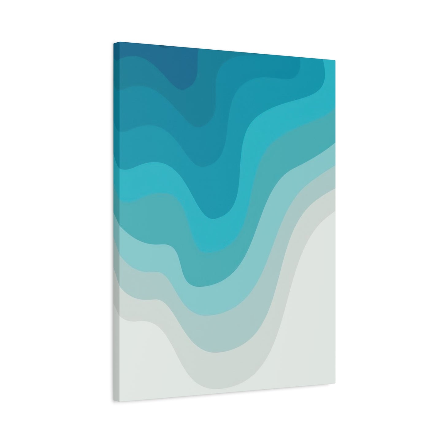
While many blue cool layers wall art canvas prints utilize gallery-wrapped presentations that eliminate the need for frames, framing options exist that enhance certain installations and aesthetic preferences. Understanding framing alternatives allows for informed decisions about artwork presentation.
Floating frames create sophisticated presentations where canvas appears to hover within a frame slightly larger than the canvas dimensions. This approach maintains the modern aesthetic of gallery-wrapped canvas while adding definition and protection. Floating frames work particularly well for canvas prints with important image information on the edges, as the frame doesn't obscure any part of the composition.
Traditional frames with mats offer classic presentations that suit traditional and transitional interiors. When framing canvas prints in this manner, ensure adequate depth in the frame to accommodate the thickness of stretched canvas. Some framers mount canvas on backing boards before matting and framing, creating flatter presentations more similar to framed prints or paintings under glass.
Shadow box frames provide deep profiles that allow dimensional artworks to rest securely within protective enclosures. For textured blue layered canvas prints or pieces incorporating three-dimensional elements, shadow box frames offer protection while maintaining visibility. The depth of shadow boxes prevents glass from contacting artwork surfaces while providing physical barriers against dust and accidental damage.
Metal frames bring contemporary industrial aesthetics to canvas presentations. Sleek aluminum or steel frames in silver, black, or bronze finishes complement modern interiors and emphasize the contemporary nature of abstract blue layered compositions. Metal frames typically feature thin profiles that add definition without competing visually with the artwork.
Wood frames offer warmth and traditional appeal, available in countless species, stains, and finishes. Natural wood tones complement blue artwork beautifully, creating harmonious pairings that feel organic and balanced. Darker woods including walnut, mahogany, and espresso-stained frames add sophistication and weight, while lighter woods like maple, ash, or whitewashed finishes maintain airiness.
Creating Cohesive Multi-Panel Arrangements with Blue Canvas Artwork
Multi-panel arrangements, including diptychs, triptychs, and larger groupings, create expansive artistic statements that transform entire walls into unified compositions. These arrangements offer flexibility, visual interest, and opportunities for creative expression beyond single canvas presentations.
Triptych arrangements divide single compositions across three canvas panels, creating unified artworks with built-in structure. Traditional triptychs feature larger central panels flanked by smaller side panels, though contemporary variations employ equal-sized panels for balanced presentations. Blue cool layers wall art canvas prints in triptych format allow subtle variations across panels while maintaining color and compositional continuity.
Spacing between panels in multi-piece arrangements significantly impacts overall effect. Minimal spacing of one to three inches creates nearly seamless compositions where panels read as unified wholes. Moderate spacing of four to six inches acknowledges individual panels while maintaining compositional unity. Wider spacing of eight inches or more emphasizes individual panels as related but distinct elements.
Horizontal panel arrangements expand artwork across wall width, creating panoramic effects particularly suited to wide wall spaces above furniture. These horizontal groupings might depict continuous scenes flowing from panel to panel or present variations on themes that create rhythm through repetition and subtle change.
Vertical panel arrangements stack canvas pieces to emphasize height and draw eyes upward. These compositions work beautifully in spaces with tall ceilings or narrow wall sections. Vertical arrangements can suggest waterfalls, rainfall, or abstract representations of ascending or descending movement.
Grid arrangements organize multiple canvas pieces into structured patterns, often featuring four, six, nine, or more panels. These grids create contemporary gallery walls with built-in organization. Each panel might contain related imagery or abstract elements that contribute to overall cohesion. Grid arrangements of blue layered canvas prints can explore variations in value, saturation, or compositional arrangement while maintaining color family unity.
Asymmetrical groupings arrange varied canvas sizes in balanced but irregular patterns. These dynamic arrangements require careful planning to achieve visual balance without rigid structure. Asymmetrical groupings suit eclectic and contemporary interiors where unexpected arrangements create interest.
Progressive arrangements organize panels to show development or transformation across the sequence. In blue layered artwork, progression might move from light to dark, simple to complex, or sparse to dense across sequential panels. These arrangements create narrative qualities that engage viewers over time.
Seasonal Decorating Integration with Permanent Blue Canvas Installations
Blue cool layers wall art canvas prints serve as excellent foundations for seasonal decorating approaches, providing permanent artistic elements around which temporary seasonal additions can rotate. This strategy maintains core aesthetic consistency while allowing refreshing changes throughout the year.
Spring decorating around blue canvas artwork incorporates fresh florals, light textiles, and renewed color accents. The perennial nature of blue allows easy pairing with spring pastels including soft yellows, pinks, and greens. Fresh flower arrangements in vases positioned near blue artwork create living complements to permanent installations. Lightweight spring textiles including linen throws and cotton pillows in complementary colors refresh spaces without requiring artwork changes.
Summer decorating emphasizes the cool, refreshing qualities of blue canvas prints. The association with water becomes particularly relevant during warm months, when blue artwork psychologically cools spaces. Bright summer accent colors including coral, turquoise, and sunny yellow pair beautifully with blue foundations. Natural summer materials including seashells, driftwood, and beach glass can be arranged near blue artwork to reinforce coastal themes.
Autumn decorating introduces warmer tones that create beautiful contrast with cool blue artwork. The complementary relationship between blue and orange makes autumn particularly interesting for blue-based interiors. Incorporate autumn elements including pumpkins, bronze and copper accents, and warm-toned textiles without removing blue canvas prints. The contrast between cool artwork and warm seasonal accents creates dynamic, engaging environments.
Winter decorating around blue canvas artwork embraces the season's cool color palette. Silver, white, and icy blue accessories harmonize naturally with blue layered compositions. Winter holiday decorating in silver and white color schemes complements blue artwork beautifully. Cozy winter textiles including velvet, faux fur, and chunky knits add textural warmth while maintaining color compatibility.
Therapeutic Applications of Blue Visual Environments in Wellness Spaces
Healthcare professionals and wellness practitioners increasingly recognize the therapeutic value of carefully designed visual environments. Blue cool layers wall art canvas prints contribute to healing and wellness objectives through multiple mechanisms grounded in environmental psychology and therapeutic design principles.
Stress reduction represents perhaps the most significant therapeutic benefit of blue environments. Medical research demonstrates that exposure to blue visual stimuli reduces cortisol levels, lowers blood pressure, and decreases heart rate. These physiological changes correspond with subjective feelings of calm and reduced anxiety. Wellness spaces including meditation rooms, yoga studios, and therapy offices benefit from blue artwork's stress-reducing properties.
Pain management surprisingly connects with environmental color choices. Studies in healthcare settings show that patients in blue rooms report lower pain levels compared to patients in rooms with different color schemes. While mechanisms remain incompletely understood, the correlation between blue environments and reduced pain perception suggests value in incorporating blue artwork into spaces where people manage chronic pain conditions.
Sleep improvement initiatives frequently incorporate blue environmental elements, though with important considerations regarding blue light exposure. Blue artwork provides daytime benefits that support healthy circadian rhythms without the disruptive blue light emissions from screens that interfere with evening sleep preparation. Bedrooms featuring blue canvas prints support relaxation without technological downsides.
Mindfulness and meditation practices benefit from visual anchors that support sustained attention without creating distraction. Blue layered artwork provides appropriate visual complexity that can serve as meditation focal points while the abstract, non-representational nature prevents narrative distraction. The flowing, layered qualities of these compositions mirror meditative breathing patterns.
Therapeutic spaces for trauma recovery require careful environmental design that promotes safety and calm without triggering distress. Blue's association with security and stability makes it appropriate for trauma therapy settings. The abstract nature of layered compositions prevents associations with specific places or events that might trigger traumatic memories.
Dementia and Alzheimer's care environments face unique design challenges in creating spaces that are calming, safe, and appropriately stimulating. Research suggests that blue environments reduce agitation in dementia patients. Abstract blue artwork provides visual interest without confusing representational imagery that might be misinterpreted.
Economic Considerations in Acquiring Quality Canvas Artwork
Understanding the economic factors involved in purchasing blue cool layers wall art canvas prints enables informed decisions that balance quality, aesthetics, and budget constraints. Various price points and acquisition strategies accommodate different financial situations while maintaining aesthetic objectives.
Production costs fundamentally influence canvas print pricing. Factors including canvas material quality, printing technology employed, ink quality, and finishing processes all impact manufacturing expenses. Higher-quality materials and processes command premium prices but deliver superior appearance and longevity. Budget-conscious buyers must weigh initial cost savings against potential earlier replacement needs.
Artist compensation represents another pricing component. Original artwork from established artists commands premium prices reflecting reputation, skill, and market positioning. Reproductions of original work typically include licensing fees paid to artists or rights holders. Public domain artwork and stock imagery avoid these licensing costs, potentially reducing prices while limiting uniqueness and artistic provenance.
Retailer markup varies significantly across different sales channels. Gallery retail spaces maintain high markups reflecting expensive real estate, curatorial expertise, and personalized service. Online retailers typically offer lower prices due to reduced overhead, though buyers sacrifice personal service and the ability to view artwork before purchase. Direct artist sales eliminate intermediary costs while supporting artists maximally.
Print size directly correlates with price, as larger dimensions require more materials and longer printing times. The relationship between size and price is typically not linear, meaning doubling dimensions doesn't double price, but significant size increases do substantially impact costs. Carefully measuring available wall space before purchase prevents paying for larger sizes than necessary.
Limited edition prints command premium prices compared to open edition reproductions. Limited editions create artificial scarcity through numbered production runs with certificates of authenticity. Collectors value this exclusivity, though practical aesthetic function remains identical between limited and open editions. Buyers must determine whether exclusivity justification warrants price premiums.
Environmental Sustainability Considerations in Canvas Print Production
Growing awareness of environmental issues motivates many consumers to evaluate the ecological impact of purchases including decorative artwork. Blue cool layers wall art canvas prints vary significantly in their environmental footprints depending on production methods and materials employed.
Canvas material sourcing represents the first environmental consideration. Organic cotton canvas grown without synthetic pesticides or fertilizers reduces agricultural pollution and protects farmworker health. Conventional cotton production consumes significant water and pesticide resources, creating environmental concerns. Recycled polyester canvas diverts plastic waste from landfills while requiring less energy than virgin polyester production.
Printing technology impacts environmental footprint through energy consumption, waste generation, and ink disposal. Water-based inks offer environmental advantages over solvent-based alternatives, producing fewer volatile organic compounds and requiring less hazardous waste disposal. LED-based printing systems consume less energy than traditional printing equipment while generating less heat.
Packaging materials contribute substantially to canvas print environmental impact. Minimal packaging using recycled cardboard and biodegradable protective materials reduces waste compared to excessive plastic packaging and foam cushioning. Some environmentally conscious retailers offer plastic-free shipping options, though these may increase damage risk during transit.
Transportation distances between production facilities and consumers significantly impact carbon footprints. Local production reduces transportation emissions compared to international shipping. However, efficient large-scale production facilities may achieve environmental efficiencies that offset transportation impacts. Carbon offset programs allow consumers to compensate for shipping emissions through investments in environmental projects.
Durability represents an often-overlooked environmental consideration. Higher-quality canvas prints lasting decades reduce the need for replacement, ultimately consuming fewer resources than cheaper products requiring frequent replacement. The environmental cost of producing one quality piece that lasts thirty years is far less than producing three lesser pieces lasting ten years each.
End-of-life disposal creates environmental challenges for canvas prints. Mixed materials including canvas, wood stretchers, staples, and hanging hardware complicate recycling efforts. Some innovative companies offer take-back programs where old canvas prints are disassembled and materials recycled or repurposed. Donation to charitable organizations extends product life while supporting community needs.
Certifications and standards help consumers identify environmentally responsible producers. Forest Stewardship Council certification indicates wood stretcher bars from sustainably managed forests. Greenguard certification confirms low chemical emissions from products. ISO environmental management certifications demonstrate systematic approaches to reducing environmental impact.
Cultural Symbolism of Blue Across Global Artistic Traditions
Blue's meaning and significance vary across cultures and historical periods, enriching the experience of blue cool layers wall art canvas prints with diverse associations and interpretations. Understanding these cultural dimensions adds depth to aesthetic appreciation.
Western traditions associate blue with authority, trustworthiness, and masculinity. Corporate branding frequently employs blue to convey stability and reliability. Historical associations connected blue with royalty and nobility due to the rarity and expense of natural blue pigments including ultramarine derived from lapis lazuli. Religious art utilized blue extensively, particularly for representations of the Virgin Mary, symbolizing purity and divine connection.
Eastern cultures attribute different meanings to blue. In Chinese tradition, blue associates with immortality, healing, and advancement. Japanese culture connects blue with cleanliness and coolness, evident in indigo textile traditions. Hindu tradition associates blue with divine figures including Krishna, representing cosmic consciousness and infinite nature.
Middle Eastern artistic traditions celebrated blue extensively through architectural tile work and decorative arts. Islamic art incorporated blue symbolizing paradise, spiritual realms, and divine presence. The distinctive blue mosques and palatial decorations throughout the Middle East demonstrate blue's cultural significance.
Pre-Columbian American cultures valued blue highly, evident in Mayan blue pigment used in murals and ceremonial contexts. This unique pigment, combining indigo and palygorskite clay, created brilliant, stable blue that survived centuries. The color associated with water, rain, and agricultural fertility in agricultural societies.
African artistic traditions employ blue variably across diverse cultures. West African indigo textile traditions created intricate patterns through resist-dyeing techniques. The deep blue cloth held social significance, indicating status and ceremonial importance. Contemporary African artists continue exploring blue in works addressing themes from tradition to globalization.
Blue Artwork's Role in Supporting Focus and Productivity in Work Spaces
Home offices and dedicated work spaces require careful environmental design to support productivity, concentration, and creative thinking. Blue cool layers wall art canvas prints contribute to optimal work environments through multiple psychological and visual mechanisms.
Cognitive performance research demonstrates that blue environmental elements enhance mental clarity and problem-solving abilities. Studies comparing work performance across different color environments consistently show improved results in blue settings compared to red or neutral alternatives. The cognitive benefits of blue extend across various task types including analytical reasoning, creative ideation, and detail-oriented work.
Visual rest represents an important yet often overlooked aspect of productive work environments. Sustained focus on computer screens or detailed documents creates eye strain and mental fatigue. Periodically shifting focus to distant objects allows eye muscles to relax and prevents strain. Blue layered artwork positioned appropriately in work spaces provides visually engaging focal points for these rest periods without offering distracting content that pulls workers away from tasks.
Creative thinking benefits from environmental factors that promote relaxed attention rather than intense focus. The calming properties of blue support the mental state where creative insights emerge. Many creative professionals report that their best ideas arrive during relaxed moments rather than forced concentration. Blue work environments facilitate this receptive mental state while maintaining enough structure to support productive work.
Video conference backgrounds increasingly matter in remote and hybrid work arrangements. Professional backgrounds create favorable impressions during virtual meetings. Blue layered canvas prints positioned behind video conference setups create sophisticated, professional backgrounds that appear intentional and polished without being ostentatious or distracting. The abstract nature prevents viewer attention from straying from the speaker to background elements.
Lighting interactions with blue artwork affect work space functionality. Blue surfaces reflect cool-toned light, which supports alertness and focus during daytime work hours. This light quality mimics natural daylight, supporting healthy circadian rhythms that maintain energy and concentration through work periods. Proper lighting design ensures that artwork enhances rather than competing with task lighting.
Work space personalization improves employee satisfaction and emotional connection to workspaces. The ability to select artwork including blue layered canvas prints for personal offices or cubicles increases sense of control and creates more comfortable environments. This personalization translates to reduced stress and improved workplace satisfaction.
Installation Planning for Gallery Wall Arrangements Featuring Blue Canvas Prints
Gallery wall arrangements featuring blue cool layers wall art canvas prints alongside other artwork, photographs, or decorative objects create personalized, dynamic wall displays. Successful gallery walls require careful planning balancing spontaneity with intentional design.
Anchor piece selection establishes the foundation for gallery wall arrangements. Choose the largest or most visually significant blue canvas print as the anchor, typically positioning it slightly off-center rather than in precise middle of the arrangement. The anchor establishes color palette, style, and scale for accompanying pieces.
Supporting elements should relate to the anchor through shared colors, subject matter, or stylistic approaches. When building gallery walls around blue layered canvas prints, supporting pieces might include photography featuring blue tones, complementary abstract works, or representational art with color harmony. Varying sizes and orientations creates visual interest while maintaining cohesion through color relationships.
Layout planning prevents installation errors and unnecessary wall holes. Create paper templates matching artwork dimensions and arrange them on the wall using removable tape. This planning process allows experimentation with various arrangements before committing to final placement. Photograph different arrangements to compare options and make informed decisions.
Spacing consistency creates cohesive gallery walls. Maintain equal distances between all pieces, typically two to four inches depending on overall arrangement size and piece dimensions. Consistent spacing prevents haphazard appearance while allowing each piece to maintain individual presence.
Frame style consistency or intentional variation impacts gallery wall cohesion. Uniform frame styles, colors, and mat treatments create polished, coordinated appearances. Deliberately varied frames create more eclectic, collected-over-time aesthetics. When mixing frame styles, maintain connections through repeated colors, materials, or proportions.
Height alignment strategies include aligning top edges, centers, or bottom edges of artwork rows. Top alignment creates clean upper boundaries while accommodating varied piece heights below. Center alignment works well for arrangements where pieces have similar heights. Bottom alignment is less common but can be effective in specific situations.
Balance in gallery walls can be achieved through symmetry or asymmetry. Symmetrical arrangements feature mirror-image or similar visual weight on both sides of central axes. Asymmetrical balanced arrangements distribute visual weight unequally while maintaining overall equilibrium through careful composition.
Conclusion:
Blue cool layers wall art canvas prints represent far more than simple decorative elements. These sophisticated artworks combine color psychology, aesthetic principles, and technical craftsmanship to create transformative effects within residential and commercial spaces. The enduring popularity of these pieces reflects fundamental human responses to color, composition, and artistic expression that transcend passing trends.
The psychological benefits of blue environments have been documented through extensive research demonstrating stress reduction, improved focus, enhanced sleep quality, and emotional well-being. These measurable physiological and psychological effects make blue artwork a valuable investment in health and quality of life rather than merely aesthetic indulgence. The layered dimensional quality adds visual complexity that engages viewers intellectually while the calming color palette soothes emotionally, creating balanced experiences that support human flourishing.
Versatility stands among the most compelling attributes of blue layered canvas prints. These artworks adapt seamlessly across diverse interior design styles from coastal to contemporary, traditional to industrial. The broad spectrum of blue shades and the infinite compositional possibilities within layered arrangements ensure that appropriate options exist for virtually any space and aesthetic preference. This versatility provides lasting value as design preferences evolve over time, with blue artwork maintaining relevance through changing decorative schemes.
The accessibility of high-quality canvas printing technology has democratized art ownership, allowing people to incorporate sophisticated imagery into their homes regardless of budget constraints. While original artwork from established artists remains beyond reach for many, contemporary canvas prints deliver exceptional quality at accessible price points. This democratization enriches lives by making beauty, inspiration, and artistic expression available to broader audiences.
Technical advancements continue improving canvas print quality, durability, and environmental sustainability. Expanded color gamuts, fade-resistant inks, and eco-friendly materials ensure that contemporary canvas prints surpass previous generations in longevity and responsible production. These improvements protect consumer investments while reducing environmental impact, aligning aesthetic choices with ethical considerations.
The process of selecting and installing blue cool layers wall art canvas prints offers opportunities for creative expression and personalization. Making intentional choices about artwork size, composition style, placement, and complementary design elements allows individuals to create living environments that reflect personal values, preferences, and aspirations. This creative engagement transforms houses into homes imbued with meaning and individual character.
Blue layered canvas prints serve as visual anchors that unify decorating schemes, establish mood, and define spaces. In open-concept floor plans, strategic artwork placement delineates functional zones without physical barriers. In traditional room layouts, carefully selected canvas prints create focal points that organize furniture arrangements and guide traffic flow. These functional benefits complement aesthetic contributions, making artwork practical as well as beautiful.
