


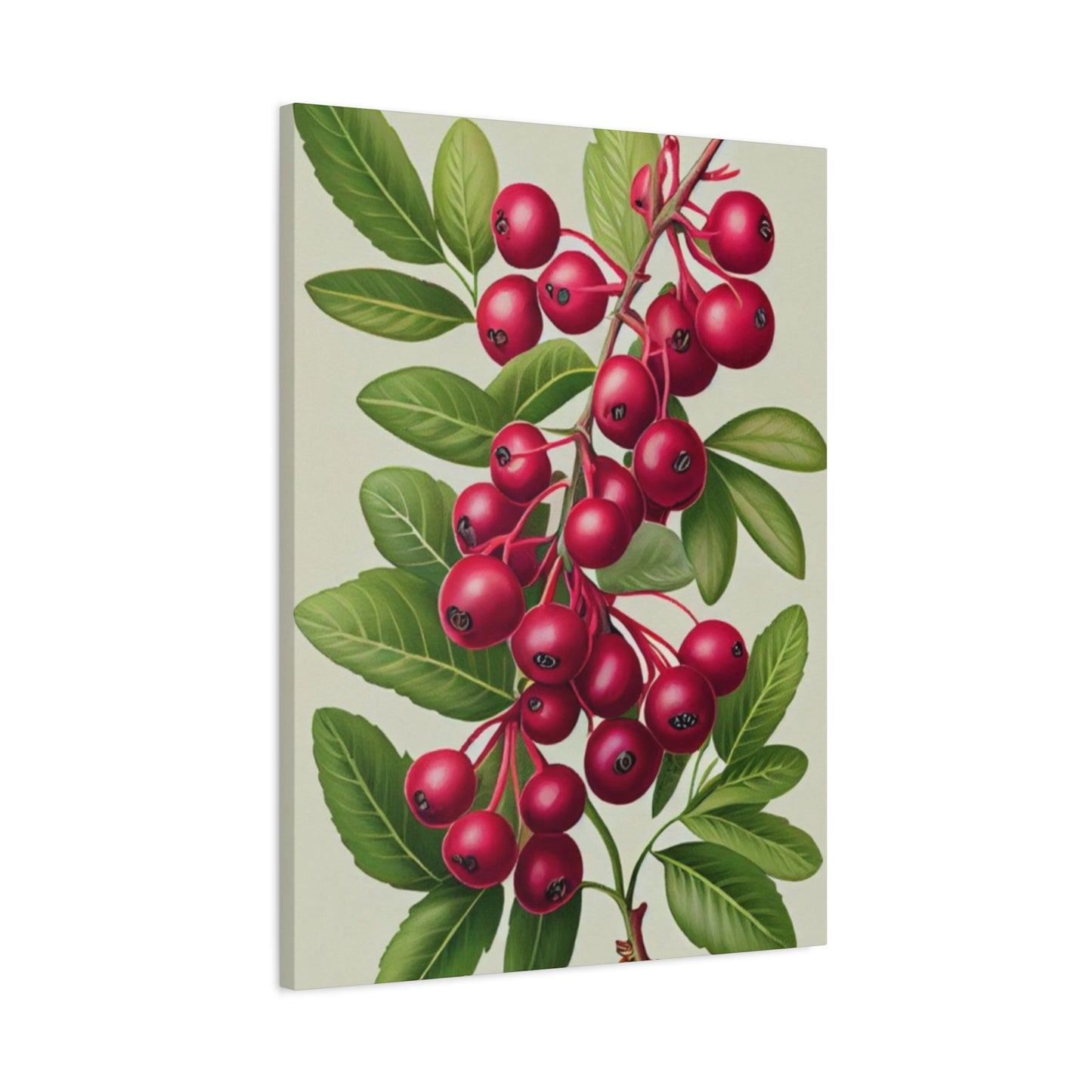
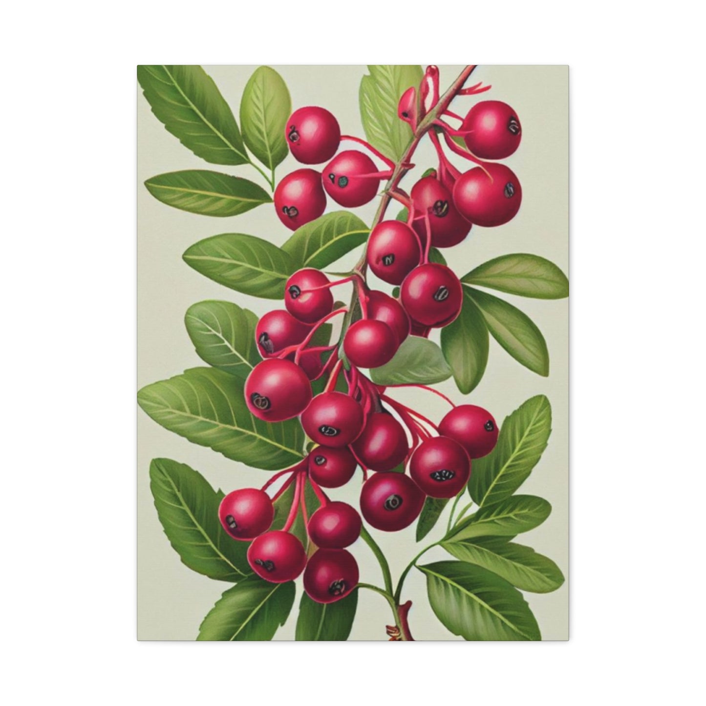
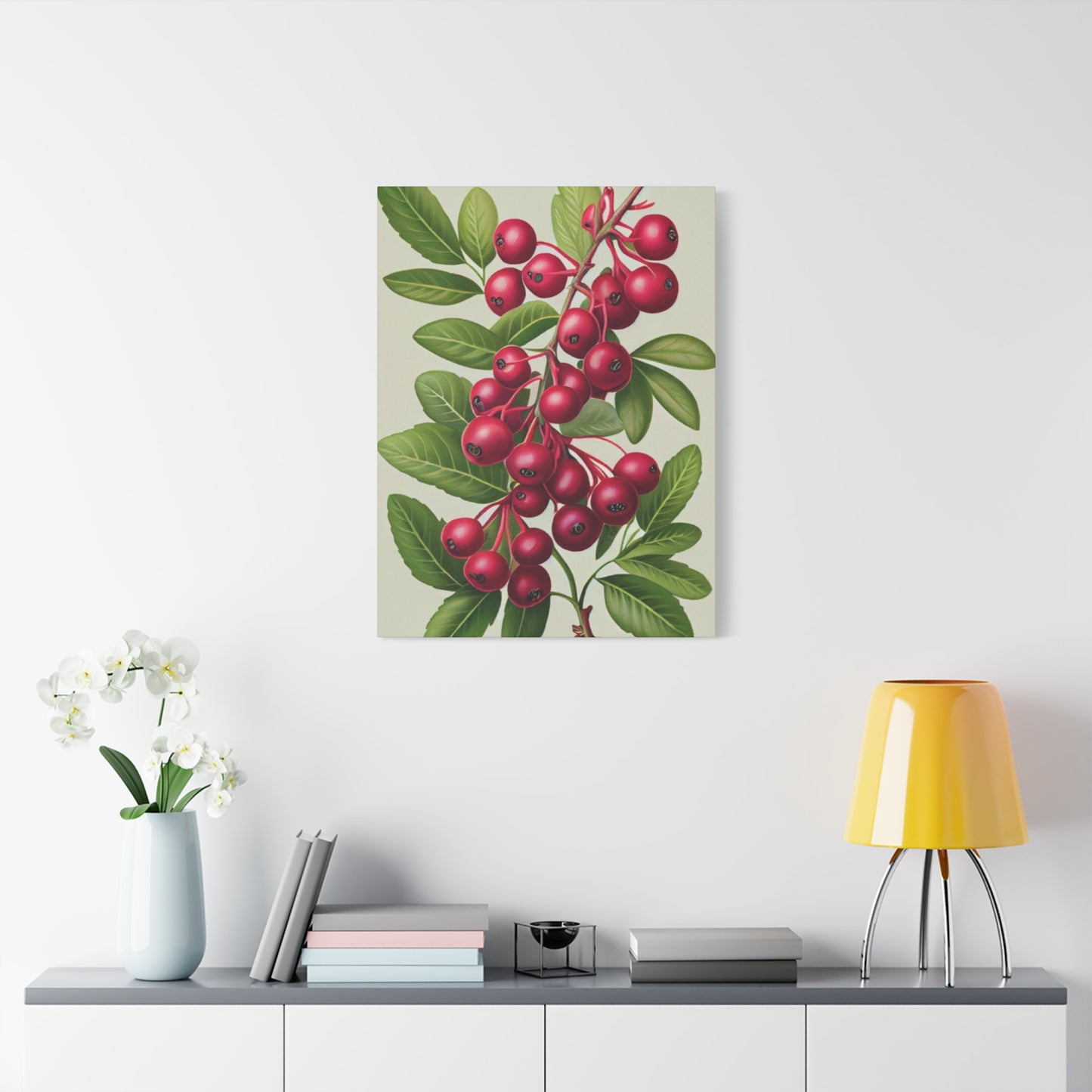
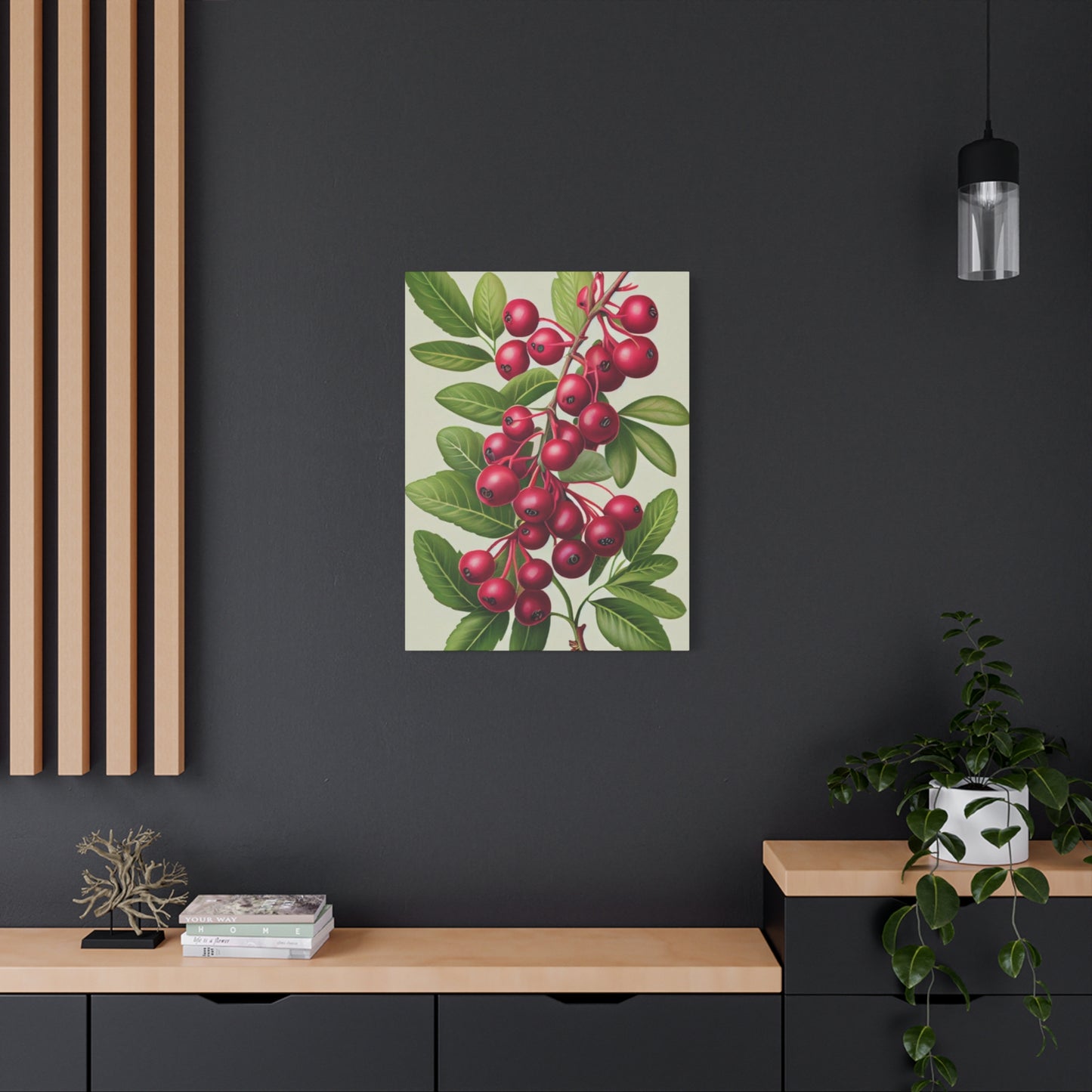
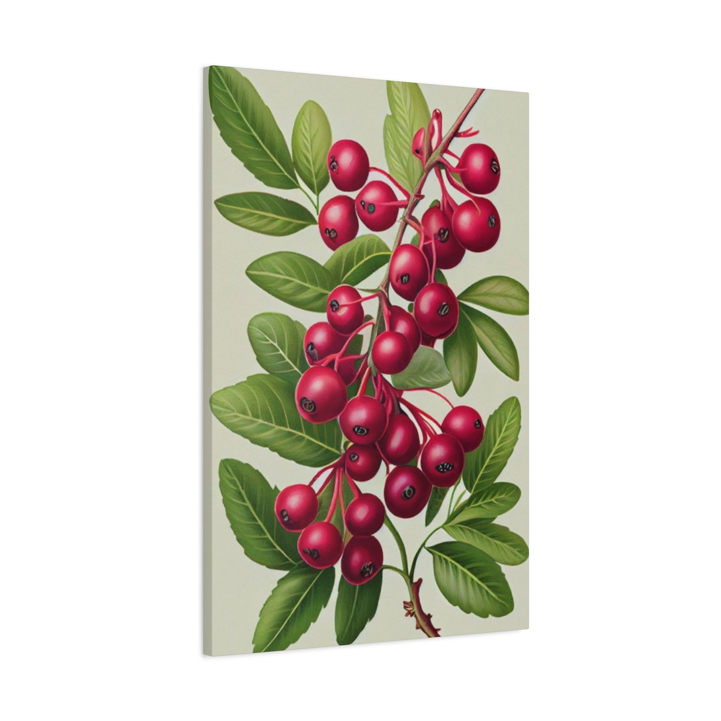
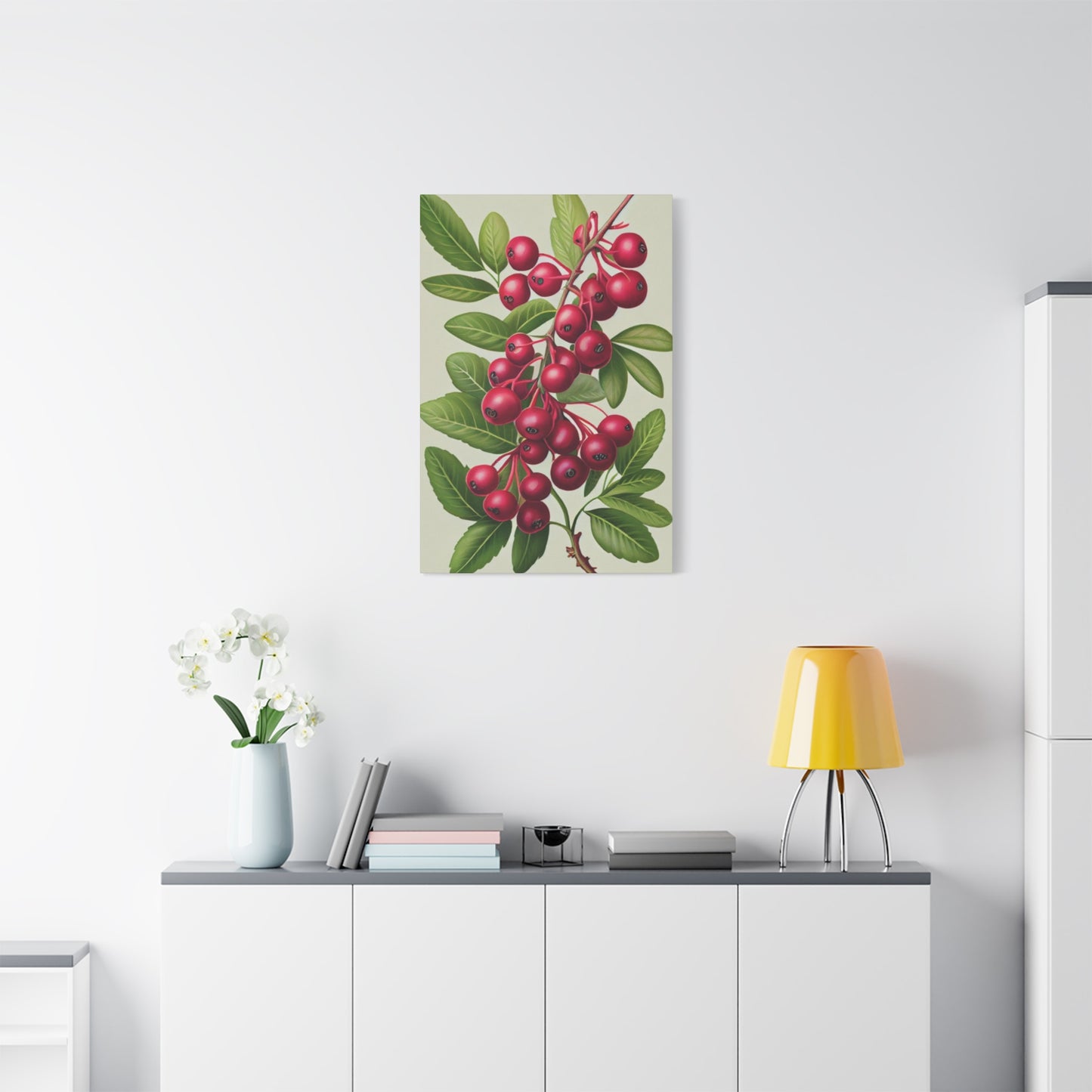
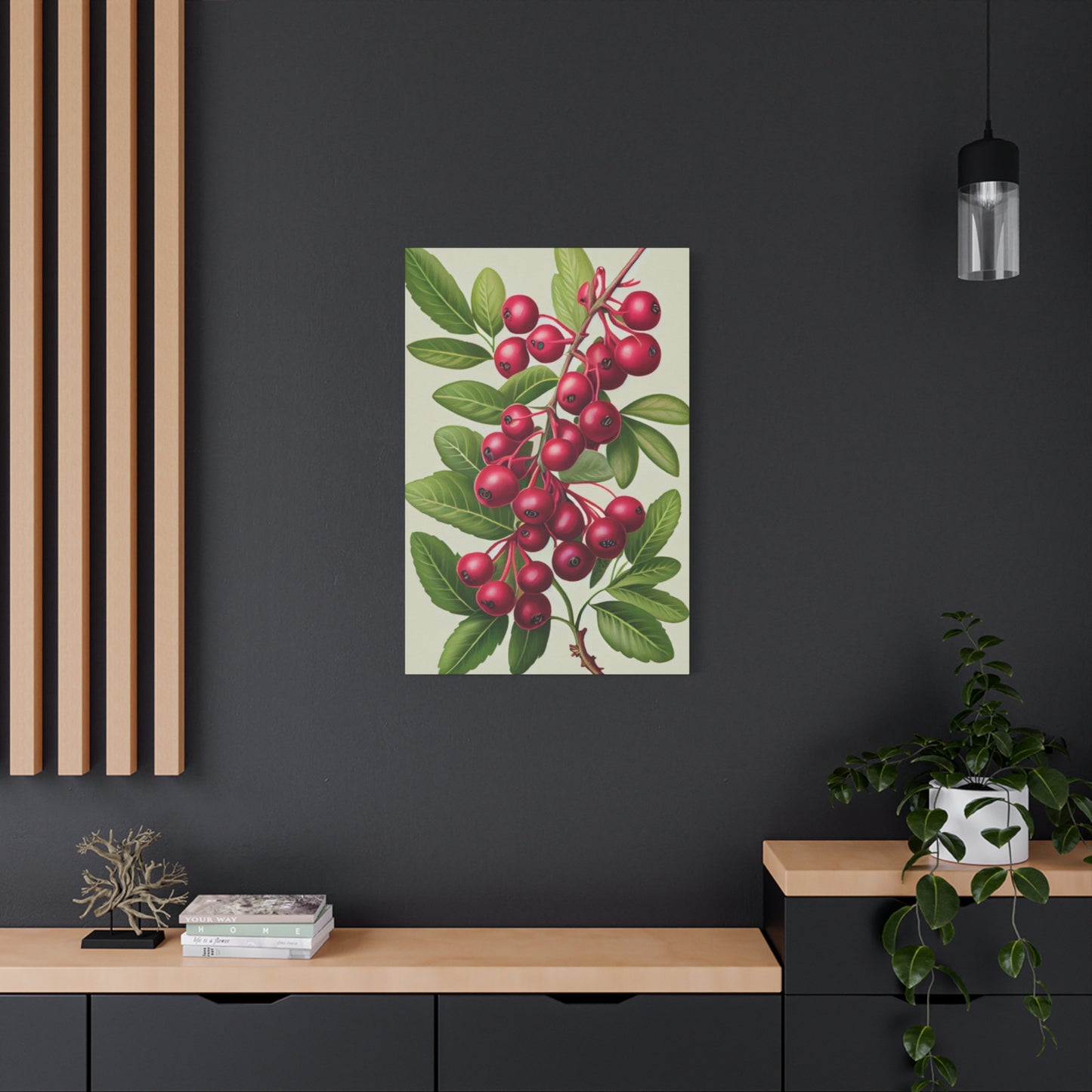
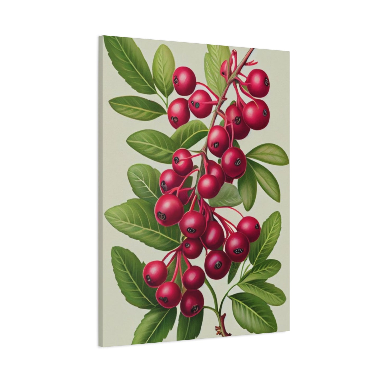
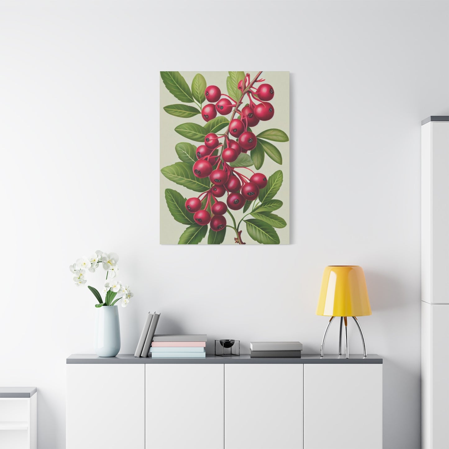
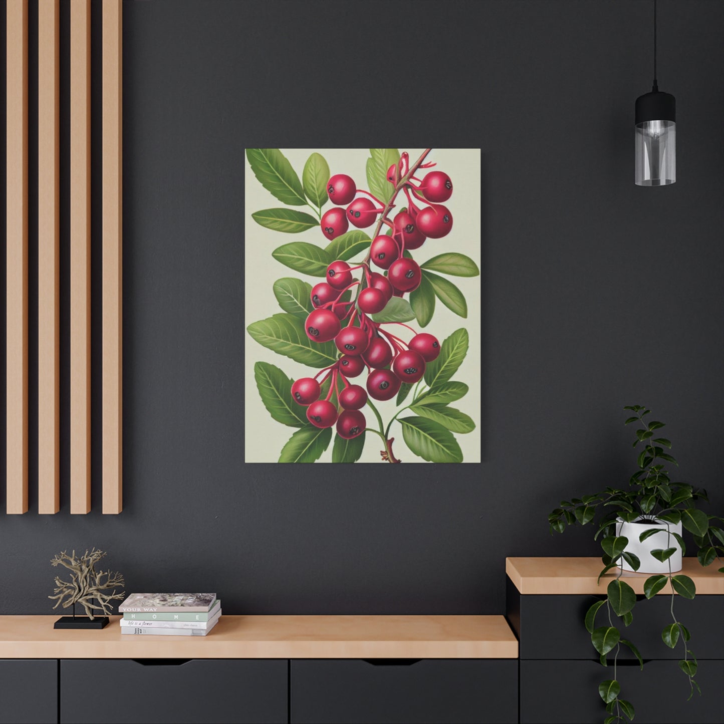
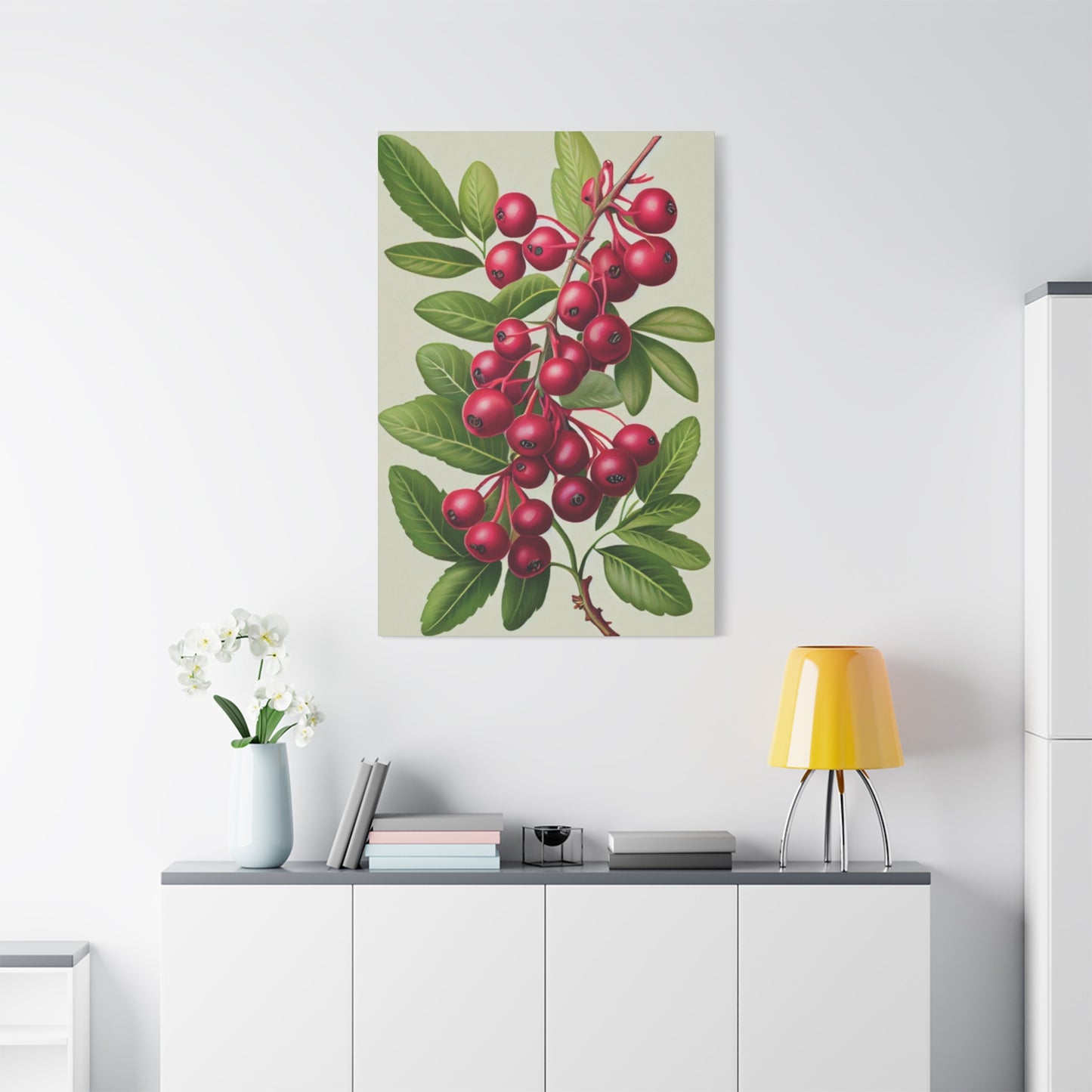
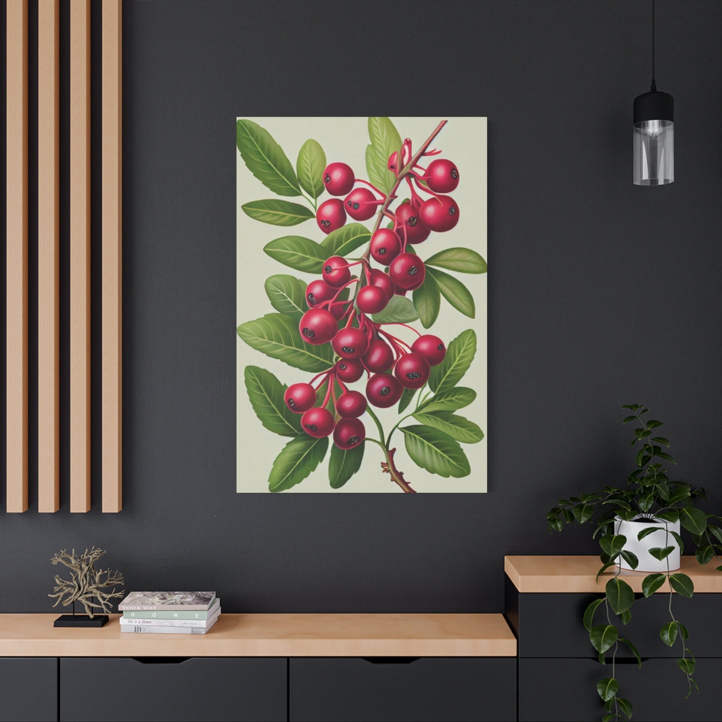
Blueberry Wall Art & Canvas Prints
Blueberry Wall Art & Canvas Prints
Couldn't load pickup availability

Blueberry Blush Wall Art: The Secret to a Chic and Cozy Home
In the ever-evolving landscape of interior design, certain color combinations emerge that capture the imagination and transform spaces in remarkable ways. The enchanting fusion of deep blueberry hues with soft blush tones has become one of the most captivating trends in contemporary wall art and home decor. This sophisticated color palette represents a perfect marriage between the calming properties of nature-inspired blues and the gentle warmth of romantic pinks, creating an aesthetic that speaks to both modern sensibilities and timeless elegance.
The phenomenon of blueberry blush wall art extends far beyond simple color coordination. It represents a fundamental shift in how we perceive and interact with our living spaces, emphasizing the importance of emotional connection to our environment. This comprehensive guide explores every facet of incorporating blueberry blush elements into your home, from understanding the psychological impact of these colors to mastering the practical aspects of implementation across various room types and design styles.
As we delve deeper into this fascinating topic, we'll discover how the subtle interplay between blueberry and blush tones can create spaces that are simultaneously energizing and soothing, modern and timeless, bold and understated. Whether you're a seasoned interior design enthusiast or someone just beginning to explore the world of home decoration, this guide will provide you with the knowledge and inspiration needed to transform your space with the captivating power of blueberry blush wall art.
The Emergence of Berry-Inspired Hues in Contemporary Interior Design
The rise of blueberry blush as a dominant force in interior design represents more than just a passing trend; it signifies a deeper cultural shift toward creating spaces that prioritize emotional well-being and psychological comfort. This color combination draws its inspiration from the natural world, specifically the rich, saturated purples and blues found in fresh blueberries, paired with the delicate pink undertones reminiscent of rose petals at dawn or the soft flush of cherry blossoms in spring.
Contemporary designers have embraced this palette because it offers unprecedented versatility in application. Unlike traditional color schemes that often lock homeowners into specific stylistic categories, blueberry blush transcends conventional boundaries. It works equally well in minimalist Scandinavian interiors as it does in maximalist bohemian spaces, adapting to various design philosophies while maintaining its distinctive character and emotional impact.
The popularity of this color combination has been significantly influenced by the growing awareness of color psychology in interior design. Research has consistently shown that our physical environment directly impacts our mental state, productivity levels, and overall sense of well-being. The blueberry blush palette taps into this understanding by combining colors that have been scientifically proven to promote relaxation, creativity, and emotional balance.
From a practical standpoint, the emergence of blueberry blush in wall art has coincided with advances in printing technology and artistic techniques that allow for more nuanced color reproduction. Artists and designers can now capture the subtle gradations and complex undertones that make this color combination so compelling, resulting in wall art pieces that truly capture the essence of natural berry hues and soft floral tones.
The influence of social media and digital platforms has also played a crucial role in popularizing blueberry blush aesthetics. Interior design enthusiasts and professional decorators regularly showcase spaces featuring these colors, creating a visual language that resonates with audiences seeking both sophistication and comfort in their living environments. This digital exposure has accelerated the adoption of blueberry blush elements across diverse geographical regions and cultural contexts.
Understanding the Sophisticated Balance of Gentle and Vibrant Elements
The magic of blueberry blush lies in its inherent contradiction and harmony. This color palette masterfully balances opposing forces, creating visual tension that keeps spaces interesting while maintaining an overall sense of tranquility and cohesion. The deep, rich blueberry tones provide grounding and stability, while the soft blush elements introduce lightness and airiness that prevents the space from feeling heavy or overwhelming.
This balance is achieved through careful attention to proportion, saturation, and placement within the overall design scheme. Successful implementation of blueberry blush wall art requires understanding how these colors interact with natural and artificial light throughout the day. Blueberry tones tend to appear more vibrant in natural daylight and softer under warm evening lighting, while blush tones maintain their gentle character but can shift from cool to warm depending on the light source.
The sophisticated nature of this color combination stems from its complexity and depth. Unlike simpler color pairings that rely on stark contrast or monochromatic harmony, blueberry blush creates visual interest through subtle variations and nuanced transitions. This complexity allows the palette to remain engaging over time, revealing new aspects and combinations as lighting conditions change and as viewers spend more time in the space.
Professional interior designers often describe blueberry blush as having an inherent intelligence, automatically adjusting to complement surrounding elements while maintaining its distinctive character. This adaptability makes it an excellent choice for homeowners who value longevity in their design choices, as the palette continues to feel fresh and relevant even as other design trends come and go.
The gentle-meets-vibrant quality of blueberry blush also makes it exceptionally photogenic, which has contributed to its popularity in the age of social media sharing. Spaces featuring this color combination photograph beautifully under various lighting conditions, maintaining their appeal whether captured in bright natural light or moody evening ambiance. This photogenic quality has made blueberry blush a favorite among design bloggers, influencers, and homeowners who enjoy sharing their living spaces online.
Creating Serene Atmospheres Through Strategic Color Application
The creation of truly serene living spaces requires more than simply choosing calming colors; it demands a thorough understanding of how different hues interact with human psychology and environmental factors. Blueberry blush wall art excels in creating peaceful atmospheres because it combines the scientifically proven calming effects of blue tones with the emotionally nurturing qualities of soft pink hues.
Research in environmental psychology has demonstrated that blue tones can lower blood pressure, reduce anxiety, and promote feelings of tranquility and focus. These physiological responses make blueberry elements particularly valuable in spaces designed for relaxation, meditation, or sleep. The inclusion of blush tones softens the sometimes stark or cold feeling that pure blues can create, adding warmth and emotional accessibility that makes spaces feel welcoming and nurturing.
Strategic application of blueberry blush elements involves considering the intended function of each space and adjusting color intensity accordingly. In bedrooms designed for rest and rejuvenation, softer variations of the palette work best, with muted blueberry tones and whisper-soft blush accents creating an environment conducive to relaxation and sleep. In living areas where gentle energy and social interaction are desired, slightly more saturated versions of these colors can maintain the calming effect while providing enough visual interest to keep the space engaging.
The timing and rhythm of color application throughout a space also contribute to its serene qualities. Gradually transitioning from deeper blueberry tones to lighter blush shades can create a visual flow that guides the eye naturally through the room, reducing visual chaos and promoting a sense of order and calm. This technique works particularly well in open floor plans where different functional areas need to feel connected yet distinct.
Lighting plays a crucial role in maximizing the serene qualities of blueberry blush wall art. Natural light enhances the depth and complexity of blueberry tones while softening blush elements, creating a dynamic interplay that changes throughout the day. Artificial lighting should be carefully chosen to complement these natural variations, with warm white LED bulbs typically providing the most flattering illumination for this color palette.
Romantic Modernism Through Contemporary Design Applications
The concept of romantic modernism represents a fascinating evolution in interior design philosophy, combining the clean lines and functional principles of modernism with the emotional warmth and sensual appeal of romantic aesthetics. Blueberry blush wall art serves as a perfect vehicle for expressing this design approach, offering contemporary sophistication while maintaining an underlying sense of romance and emotional connection.
Modern romantic spaces featuring blueberry blush elements often incorporate geometric forms and minimalist compositions that allow the colors themselves to take center stage. This approach avoids the cluttered or overly ornate associations of traditional romantic design while preserving the emotional impact and visual appeal that makes romantic spaces so compelling. The result is environments that feel both current and timeless, appealing to contemporary sensibilities while honoring enduring human needs for beauty and emotional comfort.
The application of blueberry blush in modern romantic contexts often involves large-scale wall art pieces that make bold statements without overwhelming the space. These pieces typically feature abstract or semi-abstract compositions that suggest natural forms without literal representation, allowing viewers to project their own interpretations and emotional responses onto the work. This approach aligns with modern design principles while providing the emotional accessibility that characterizes romantic aesthetics.
Texture and material selection play important roles in achieving successful romantic modernism with blueberry blush elements. Smooth, matte finishes can emphasize the sophisticated, contemporary aspects of the palette, while subtle textures and organic materials can enhance its romantic qualities. The key is finding the right balance that serves the overall design intent while honoring both modern and romantic sensibilities.
Contemporary romantic spaces often feature carefully curated collections of blueberry blush art pieces rather than single statement works. This approach allows for more nuanced color exploration and creates visual rhythm throughout the space. The curation process becomes part of the design narrative, with each piece contributing to an overall story about the intersection of modern living and romantic ideals.
Versatile Applications Across Different Living Environments
The remarkable versatility of blueberry blush wall art becomes evident when examining its successful application across diverse living environments. From intimate bedrooms to professional office spaces, this color palette demonstrates an unusual ability to adapt to different functional requirements while maintaining its distinctive character and aesthetic appeal.
In bedroom environments, blueberry blush wall art creates an atmosphere of restful sophistication. The deeper blueberry tones provide a sense of security and grounding that promotes restful sleep, while blush elements add warmth and emotional comfort. This combination is particularly effective in master bedrooms where couples seek an environment that balances masculine and feminine energies, creating a space that feels welcoming and comfortable to all occupants.
Living room applications of blueberry blush wall art often focus on creating conversation areas that feel both elegant and approachable. The palette works exceptionally well as a backdrop for entertaining, providing visual interest without competing with social interactions. In formal living rooms, deeper saturations of both colors can create dramatic focal points, while casual family rooms benefit from lighter, more playful interpretations of the palette.
Kitchen and dining room implementations of blueberry blush elements require careful consideration of food-related color psychology. Blush tones can enhance appetite and create a welcoming atmosphere for meal sharing, while blueberry accents provide sophisticated contrast that elevates the overall aesthetic. The key is maintaining balance that supports both the functional and social aspects of these spaces.
Home office applications of blueberry blush wall art tap into the productivity-enhancing properties of blue tones while incorporating blush elements that prevent the space from feeling sterile or unwelcoming. This combination can improve focus and creativity while maintaining enough warmth to support long working sessions. The palette is particularly effective in home offices that also serve guest bedroom functions, providing a professional appearance that remains comfortable and inviting.
Bathroom implementations of blueberry blush themes create spa-like environments that transform daily routines into moments of self-care and relaxation. The calming properties of both colors work synergistically in these spaces, promoting relaxation and stress relief. Waterproof art options and careful moisture consideration ensure that the aesthetic benefits don't compromise practical functionality.
The Universal Appeal of Berry and Rose Color Combinations
The enduring popularity of berry and rose color combinations speaks to something fundamental in human color perception and emotional response. These natural color relationships have appeared consistently across cultures and historical periods, suggesting an innate human appreciation for this particular palette that transcends specific design trends or cultural preferences.
From a botanical perspective, the combination of deep berry tones with soft rose hues mirrors color relationships found throughout the natural world. This biological foundation helps explain why the palette feels so inherently harmonious and comfortable to human viewers. Our evolutionary history includes extensive exposure to these color combinations in natural environments, creating positive associations that persist in contemporary design applications.
The universal appeal of blueberry blush also relates to its balanced representation of cool and warm color temperatures. This balance makes the palette accessible to individuals with different color preferences, as it provides elements that appeal to those drawn to either cool or warm color families. This broad appeal makes blueberry blush an excellent choice for shared spaces or homes with occupants who have different aesthetic preferences.
Cultural associations with berry and rose colors generally tend to be positive across diverse societies. Berries represent abundance, nourishment, and natural sweetness, while roses symbolize love, beauty, and emotional connection. These positive associations contribute to the immediate appeal of the color combination and help explain its success in creating welcoming, comfortable living environments.
The versatility of berry and rose combinations also extends to their compatibility with various other colors and design elements. This palette works harmoniously with natural materials like wood and stone, metallic accents in gold or silver tones, and other nature-inspired colors like sage green or warm cream. This compatibility makes it easier for homeowners to integrate blueberry blush elements into existing design schemes or to build upon them in future renovations.
Achieving Perfect Color Harmony in Residential Spaces
Creating perfect color harmony with blueberry blush elements requires understanding the fundamental principles of color theory while remaining sensitive to the unique characteristics of these particular hues. Successful implementation involves careful attention to proportion, saturation, and distribution throughout the space, ensuring that the colors work together to create a cohesive and visually pleasing environment.
The foundation of color harmony lies in understanding the relationship between primary, secondary, and tertiary colors within the blueberry blush palette. Blueberry tones typically contain combinations of blue and red that create complex purple undertones, while blush colors blend red and white with possible yellow undertones. Achieving harmony requires balancing these underlying color components to prevent visual discord or unexpected color interactions.
Proportion plays a crucial role in successful color harmony, with the most effective applications typically featuring one color as the dominant element and the other as an accent. In most residential applications, blush tones work well as the dominant color with blueberry elements providing dramatic contrast and visual interest. However, in spaces where deeper, more dramatic moods are desired, reversing this proportion can create compelling and sophisticated environments.
Saturation levels must be carefully coordinated to maintain harmony throughout the space. Mixing highly saturated blueberry tones with very pale blush colors can create jarring contrast that disrupts the overall harmony. Instead, successful applications typically feature colors with compatible saturation levels that create visual flow and connection between different elements of the design.
The distribution of colors throughout the space should follow natural visual patterns that guide the eye comfortably through the environment. This often involves placing the most intense color elements at natural focal points while using lighter variations to create transition areas that connect different parts of the room. Strategic placement of neutral elements can also help balance strong colors and prevent visual oversaturation.
Subtle Elegance Through Understated Design Approaches
The concept of subtle elegance represents one of the most sophisticated applications of blueberry blush wall art, requiring mastery of nuanced design techniques that create maximum impact through minimal means. This approach emphasizes the inherent beauty of the color combination while avoiding overwhelming or ostentatious display that might diminish its refined appeal.
Understated elegance with blueberry blush often involves working with muted or desaturated versions of these colors that provide gentle color interest without dominating the space. These softer interpretations maintain the essential character of the palette while creating environments that feel peaceful and refined rather than bold or dramatic. This approach is particularly effective in spaces where longevity and timeless appeal are priorities.
The technique of layering different tones and saturations within the blueberry blush family can create depth and visual interest without relying on strong contrast or bold statements. This might involve combining several pieces of wall art that explore different aspects of the color palette, creating a cohesive collection that reveals its complexity gradually rather than immediately. This layered approach rewards closer inspection while maintaining broad appeal.
Textural variation represents another important aspect of subtle elegance, with different surface treatments and artistic techniques adding visual interest without relying solely on color impact. Watercolor techniques, soft pastels, or subtle digital manipulation can create variations in opacity and texture that enhance the overall sophistication of the piece while maintaining the gentle character that defines elegant applications.
The integration of negative space and compositional restraint often distinguishes truly elegant applications from more obvious or heavy-handed approaches. Wall art pieces that allow colors to breathe through careful use of white or neutral space create opportunities for contemplation and appreciation that enhance the overall impact of the color palette. This restraint demonstrates confidence in the inherent power of the colors themselves.
Psychological Impact and Emotional Resonance in Interior Design
The psychological impact of blueberry blush wall art extends far beyond simple aesthetic appreciation, tapping into fundamental aspects of human color perception and emotional response that can significantly influence mood, behavior, and overall well-being. Understanding these psychological dimensions is crucial for maximizing the positive impact of this color palette in residential environments.
Blue tones have been extensively studied in environmental psychology, with consistent findings showing their ability to reduce stress, lower blood pressure, and promote feelings of calm and focus. The particular shade variations found in blueberry colors often include subtle purple undertones that add complexity and emotional depth while maintaining these beneficial psychological effects. This makes blueberry elements particularly valuable in spaces designed for relaxation, meditation, or concentration.
Pink and blush tones contribute their own psychological benefits, generally associated with feelings of comfort, nurturing, and emotional warmth. These colors can help counteract feelings of isolation or coldness that sometimes accompany purely cool color schemes. The combination of blueberry and blush tones creates a psychological environment that balances stimulation with relaxation, promoting both mental alertness and emotional comfort.
The emotional resonance of this color combination often relates to positive memories and associations with natural environments, childhood experiences, or romantic relationships. These unconscious connections can create immediate positive responses to spaces featuring blueberry blush elements, helping occupants feel more comfortable and emotionally connected to their environment. This emotional grounding can be particularly valuable in today's fast-paced, often stressful living conditions.
Research in color psychology also suggests that complex color combinations like blueberry blush can stimulate creativity and problem-solving abilities while maintaining the calming effects necessary for sustained mental effort. This makes the palette particularly effective in home offices, creative spaces, or study areas where both inspiration and concentration are important. The visual richness of the color combination provides enough stimulation to maintain interest without causing distraction or overwhelming the senses.
Defining Contemporary Neutral Palettes Through Innovative Color Theory
The evolution of neutral color concepts in contemporary interior design has expanded far beyond traditional beiges, grays, and whites to include complex color combinations that provide subtle impact while maintaining broad compatibility with various design elements. Blueberry blush represents a significant development in this expanded understanding of neutrals, offering sophisticated color interest that functions as a foundation rather than a focal point.
Contemporary neutral palettes recognize that true neutrality in residential spaces often requires some element of color interest to prevent environments from feeling sterile or impersonal. Blueberry blush serves this function by providing gentle color that adds warmth and personality while remaining sufficiently muted to work harmoniously with a wide range of other design elements. This quality makes it an excellent choice for homeowners who want to move beyond traditional neutrals without committing to bold or potentially dated color choices.
The concept of "new neutrals" acknowledges that our relationship with color has evolved along with our lifestyles and aesthetic preferences. Modern living often involves more time spent indoors, increased awareness of environmental psychology, and greater desire for personalized living spaces that reflect individual personality and values. Blueberry blush responds to these contemporary needs by providing color solutions that feel both current and enduring.
The sophisticated nature of blueberry blush as a neutral stems from its complexity and depth. Unlike simple color choices that can be easily categorized or replicated, this palette offers subtle variations and nuanced relationships that continue to reveal new aspects over time. This complexity prevents the boredom or dissatisfaction that sometimes develops with simpler color choices, making it an excellent long-term foundation for interior design schemes.
The practical advantages of using blueberry blush as a contemporary neutral include its compatibility with both warm and cool accent colors, its ability to complement natural materials and textures, and its photogenic qualities that make spaces look appealing under various lighting conditions. These practical benefits, combined with its aesthetic appeal, make it an increasingly popular choice among professional designers and discerning homeowners.
Sophisticated Bedroom Design Implementation Strategies
The bedroom represents perhaps the most important application space for blueberry blush wall art, as this environment directly impacts sleep quality, relaxation, and intimate relationships. Successful bedroom implementation requires careful attention to color intensity, artwork placement, and coordination with other design elements to create spaces that promote rest while maintaining visual appeal and personal expression.
Master bedroom applications of blueberry blush often focus on creating romantic yet restful atmospheres that appeal to couples with potentially different aesthetic preferences. The balanced nature of this color palette makes it particularly effective in shared spaces, as it provides elements that can appeal to those drawn to either masculine or feminine design sensibilities. The key is selecting artwork and color intensities that feel welcoming and comfortable to all occupants while maintaining sophisticated visual impact.
Color intensity considerations for bedrooms typically favor softer, more muted versions of the blueberry blush palette that promote relaxation without creating overstimulation. Artwork featuring gentle gradations between colors, watercolor techniques, or soft focus effects can provide visual interest while maintaining the peaceful atmosphere essential for quality sleep. The goal is creating environments that feel enveloping and protective rather than energizing or stimulating.
Placement strategies for bedroom wall art should consider both aesthetic impact and practical considerations related to sleep and intimacy. Large statement pieces work well as headboard alternatives or focal points on walls opposite the bed, where they can be appreciated without dominating the sleeping area. Smaller coordinated pieces can create gallery walls that add personality while maintaining appropriate scale for intimate spaces.
Lighting coordination becomes particularly important in bedroom applications, as the same artwork may need to function effectively under bright morning light, soft evening illumination, and various artificial lighting conditions. The natural color-changing properties of blueberry blush can be enhanced through strategic lighting choices that emphasize different aspects of the palette at different times of day, creating dynamic environments that adapt to daily rhythms and activities.
Professional Workspace Enhancement Through Thoughtful Color Selection
The application of blueberry blush wall art in professional workspace environments requires careful balance between aesthetic appeal and productivity considerations. Modern understanding of workplace psychology recognizes the significant impact that environmental design can have on employee satisfaction, creativity, and overall job performance, making thoughtful color selection an important investment in human resources and business success.
Home office implementations of blueberry blush elements can transform spare bedrooms, basement areas, or converted spaces into inspiring and productive work environments. The calming properties of blue tones help reduce stress and anxiety that often accompany work-related activities, while blush elements add warmth and personality that prevent spaces from feeling sterile or institutional. This combination can improve both focus and creativity while maintaining professional appearance standards.
The productivity-enhancing aspects of this color palette stem from its ability to provide visual interest without causing distraction. Unlike bold or highly saturated colors that might compete for attention with computer screens and work materials, blueberry blush creates a supportive background that reduces eye strain and mental fatigue. The subtle complexity of the palette can also stimulate creative thinking while maintaining the calm focus necessary for detailed work.
Client-facing office spaces can benefit from blueberry blush elements that create welcoming, professional atmospheres without appearing too casual or residential. The sophisticated nature of this color combination conveys competence and attention to detail while remaining approachable and comfortable for visitors. This balance is particularly valuable for professionals in creative fields, consulting, or personal services where both expertise and approachability are important.
Conference room and meeting space applications of blueberry blush can improve communication and collaboration by creating environments that feel less formal and intimidating than traditional corporate color schemes. The gentle nature of these colors can reduce tension and anxiety in group settings while maintaining professional standards. This can lead to more productive meetings and better working relationships among team members.
Room-by-Room Application Techniques and Considerations
Successful implementation of blueberry blush wall art requires understanding the unique characteristics and requirements of different room types throughout the home. Each space presents distinct challenges and opportunities that must be considered to achieve optimal aesthetic and functional results while maintaining design coherence throughout the overall living environment.
Kitchen applications of blueberry blush require careful consideration of food-related color psychology and practical maintenance requirements. While blush tones can enhance appetite and create welcoming cooking environments, they must be balanced with colors that complement food presentation and don't interfere with food safety considerations. Blueberry accents can provide sophisticated contrast while maintaining the clean, hygienic appearance important in food preparation areas.
Living room implementations offer the greatest flexibility for exploring the full potential of the blueberry blush palette, as these spaces typically accommodate various activities and lighting conditions throughout the day. Large-scale wall art can create dramatic focal points, while smaller coordinated pieces can establish rhythm and flow throughout open floor plans. The key is selecting pieces that enhance conversation and social interaction while providing visual interest during quiet moments.
Bathroom applications require special attention to moisture resistance and lighting considerations, but can create spa-like retreats that transform daily routines into moments of self-care and relaxation. The calming properties of both colors work synergistically in these intimate spaces, promoting stress relief and emotional well-being. Proper ventilation and moisture-resistant materials ensure longevity while maintaining aesthetic impact.
Dining room applications can enhance both formal entertaining and casual family meals by creating sophisticated backdrops that complement food presentation while encouraging conversation and social connection. The appetite-enhancing properties of blush tones combined with the calming effects of blueberry elements can improve the overall dining experience while adding visual elegance to meal settings.
Children's room applications require careful consideration of age-appropriate color intensities and themes while maintaining the beneficial psychological effects of the color combination. Softer versions of the palette can create nurturing environments for infants and toddlers, while more saturated applications might appeal to older children who can appreciate greater complexity and visual interest.
Advanced Color Pairing Strategies and Complementary Schemes
The sophisticated implementation of blueberry blush wall art often involves strategic pairing with complementary colors that enhance rather than compete with the primary palette. Understanding advanced color theory and contemporary design principles enables the creation of complex, layered color schemes that provide depth and visual interest while maintaining harmony and coherence throughout the space.
Neutral color pairings with blueberry blush typically involve warm or cool grays that provide grounding without interfering with the primary color relationship. Cream and ivory tones can soften the overall palette while adding brightness and lightness that prevents the space from feeling too moody or dark. The key is selecting neutrals that complement rather than compete with the subtle complexity of the blueberry blush combination.
Metallic accent integration can significantly enhance the sophistication and elegance of blueberry blush applications. Gold and brass tones warm the overall palette while adding luxury and refinement, particularly effective in formal living areas or bedrooms. Silver and chrome accents emphasize the cooler aspects of blueberry tones while maintaining contemporary appeal. Copper and rose gold elements can bridge the color temperature gap while adding warmth and richness.
Natural material coordination becomes crucial when expanding beyond the basic color palette, as wood tones, stone textures, and fabric selections can either enhance or detract from the overall design impact. Warm wood species like cherry or mahogany complement the overall warmth of the palette, while lighter woods like maple or birch can provide contrast and brightness. Natural stone elements in cream or gray tones add texture and grounding while maintaining color harmony.
Seasonal color adaptation strategies can maximize the year-round appeal of blueberry blush installations by incorporating temporary accent colors that respond to changing light conditions and seasonal preferences. Warmer accent colors during fall and winter months can enhance the cozy, intimate aspects of the palette, while cooler spring and summer additions can emphasize freshness and lightness.
The Art of Creating Emotional Connections Through Visual Design
The most successful applications of blueberry blush wall art transcend mere decoration to create genuine emotional connections between occupants and their living environments. This deeper level of design engagement requires understanding how visual elements interact with human psychology, memory, and emotional processing to create spaces that truly support well-being and personal satisfaction.
Memory association plays a crucial role in emotional design, as colors and visual compositions can trigger positive recollections and feelings that enhance overall life satisfaction. The natural origins of blueberry and blush tones often evoke memories of outdoor experiences, seasonal changes, or special moments associated with natural beauty. Leveraging these associations through thoughtful artwork selection can create immediate emotional resonance with viewers.
Personal narrative integration allows homeowners to create spaces that reflect their individual stories and experiences while benefiting from the universal appeal of the color palette. Custom artwork or carefully curated collections can incorporate personal elements while maintaining the sophisticated aesthetic impact that makes blueberry blush so appealing. This personalization creates deeper emotional investment in the space while maintaining broad aesthetic appeal.
The concept of visual comfort extends beyond simple aesthetic preference to encompass the ways that environments can reduce stress, promote relaxation, and support various daily activities. Blueberry blush applications that prioritize visual comfort consider factors like eye movement patterns, visual weight distribution, and color temperature balance to create spaces that feel naturally comfortable and supportive rather than challenging or demanding.
Seasonal emotional support through thoughtful color application can help occupants maintain positive moods and energy levels throughout changing seasons and weather patterns. The balanced nature of blueberry blush provides both the warmth needed during darker months and the freshness that enhances brighter seasons. This year-round emotional support makes the palette particularly valuable in regions with significant seasonal variation.
Gentle Expression Through Artistic Interpretation and Selection
The selection and placement of blueberry blush wall art requires sensitivity to the subtle qualities that make this color combination so appealing, avoiding heavy-handed or overly literal interpretations that might diminish its inherent elegance and emotional resonance. Successful artistic interpretation emphasizes the gentle, nuanced aspects of the palette while maintaining sufficient visual interest to create engaging and memorable spaces.
Abstract artistic approaches often prove most successful in capturing the essence of blueberry blush without resorting to literal representation that might limit interpretation or emotional response. Fluid, organic forms that suggest natural processes like flowing water, gentle breezes, or soft light can evoke the emotional qualities associated with the color palette while maintaining contemporary aesthetic standards. These abstract elements allow viewers to project their own interpretations and emotional responses onto the artwork.
Photographic interpretations of blueberry blush themes require careful attention to composition, lighting, and post-processing techniques that enhance rather than compete with the color relationships. Nature photography featuring actual berries, flowers, or landscapes can provide literal representation while maintaining artistic merit through careful attention to composition and timing. The key is avoiding overly obvious or commercial-looking imagery that might diminish the sophisticated appeal of the palette.
Mixed media approaches can add textural interest and dimensional complexity that enhances the visual appeal of blueberry blush wall art without overwhelming its gentle character. Subtle incorporation of metallic elements, fabric textures, or layered papers can create depth and visual interest while maintaining the refined aesthetic that makes this color combination so appealing. The goal is enhancing rather than masking the inherent beauty of the color relationships.
Scale considerations become particularly important when selecting artwork that will effectively communicate the gentle nature of blueberry blush while making appropriate visual impact in various room sizes and configurations. Large-scale pieces can create dramatic statements while maintaining softness through color choice and artistic technique, while smaller works might focus on intimate details that reward close inspection and contemplation.
Understanding Color Temperature and Atmospheric Influence
The successful implementation of blueberry blush wall art requires sophisticated understanding of how color temperature affects both the appearance of the artwork itself and the overall atmosphere of the space. This knowledge enables designers and homeowners to make informed decisions about artwork selection, placement, and lighting that maximize the positive impact of this color palette throughout various conditions and times of day.
Natural light variation throughout the day significantly affects the appearance and emotional impact of blueberry blush elements, with morning light typically emphasizing cooler blue undertones while afternoon and evening light brings out warmer pink and purple aspects. Understanding these natural variations allows for strategic placement that takes advantage of favorable lighting conditions while minimizing less flattering exposures. East-facing walls might emphasize morning freshness, while west-facing locations could enhance evening warmth and intimacy.
Artificial lighting selection becomes crucial for maintaining color accuracy and emotional impact during evening hours when natural light is unavailable. LED technology offers unprecedented control over color temperature, allowing homeowners to customize lighting conditions that enhance specific aspects of the blueberry blush palette. Warm white light generally enhances the romantic, intimate qualities of the color combination, while cooler light emphasizes freshness and contemporary appeal.
Seasonal atmospheric changes can dramatically affect the way blueberry blush wall art appears and feels within living spaces, with darker winter months potentially emphasizing deeper, more saturated aspects of the palette while bright summer conditions might highlight lighter, fresher interpretations. Successful implementations consider these seasonal variations and may incorporate lighting or accessory changes that maintain optimal appearance year-round.
The interaction between color temperature and spatial perception creates opportunities for using blueberry blush elements to influence the apparent size and character of rooms. Cooler blue undertones can make spaces feel larger and more open, while warmer blush elements can create intimacy and coziness. Strategic balance between these effects allows for fine-tuning the spatial experience to match functional requirements and personal preferences.
Longevity and Timeless Appeal in Contemporary Design
One of the most compelling aspects of blueberry blush wall art lies in its potential for long-term satisfaction and timeless appeal that transcends temporary design trends. This longevity stems from the fundamental nature of the color relationships involved and their deep connections to human psychology and natural environmental patterns that remain constant despite changing fashion and cultural preferences.
The timeless quality of berry and rose color combinations has been demonstrated throughout art history, appearing consistently in various cultural contexts and artistic movements without losing relevance or appeal. This historical precedent suggests that contemporary applications of blueberry blush are building upon enduring aesthetic relationships rather than following temporary trends. This foundation provides confidence for homeowners making long-term design investments.
Investment value considerations become important when selecting wall art that will remain visually appealing and emotionally satisfying over many years of daily exposure. High-quality artwork featuring thoughtful interpretations of the blueberry blush palette represents both aesthetic and financial investment that should maintain or increase value over time. The sophisticated nature of the color combination suggests broad appeal that supports resale value and long-term satisfaction.
Adaptability to changing design trends represents another crucial aspect of longevity, as successful color palettes must be able to accommodate evolving furniture styles, accessory preferences, and spatial modifications while maintaining their essential character and appeal. The neutral-like qualities of blueberry blush provide this flexibility while offering more personality and visual interest than traditional neutral options.
Maintenance and preservation considerations ensure that the long-term appeal of blueberry blush installations is supported by practical durability and resistance to fading or degradation. Quality materials and professional installation techniques protect the investment while maintaining visual impact over time. Understanding proper care and maintenance requirements helps homeowners preserve the beauty and emotional impact of their color choices for years to come.
Conclusion:
Blueberry Blush wall art offers a perfect blend of subtle elegance and warm comfort, making it an ideal choice for creating a chic and cozy atmosphere in any home. Its soft, muted tones evoke a sense of calm and sophistication, while the gentle blush hues add just the right touch of warmth to invite relaxation and intimacy. This balance transforms your living spaces into welcoming retreats that feel both stylish and soothing.
Incorporating Blueberry Blush art into your decor allows for versatile styling options, effortlessly complementing a range of interior themes—from modern minimalism to rustic charm and everything in between. The artwork’s understated beauty brings visual interest without overwhelming, enhancing the ambiance with a delicate yet confident flair.
Beyond aesthetics, Blueberry Blush wall art contributes to a sense of well-being by fostering a serene environment where you can unwind and recharge. It acts as a visual anchor that ties together textures, furnishings, and colors, creating harmony throughout your home.
Ultimately, Blueberry Blush wall art is more than just decoration—it’s a secret ingredient for achieving a home that feels both elegant and inviting. By adding this art to your space, you cultivate an environment that embraces comfort, style, and timeless beauty, making every corner of your home a true sanctuary.
