


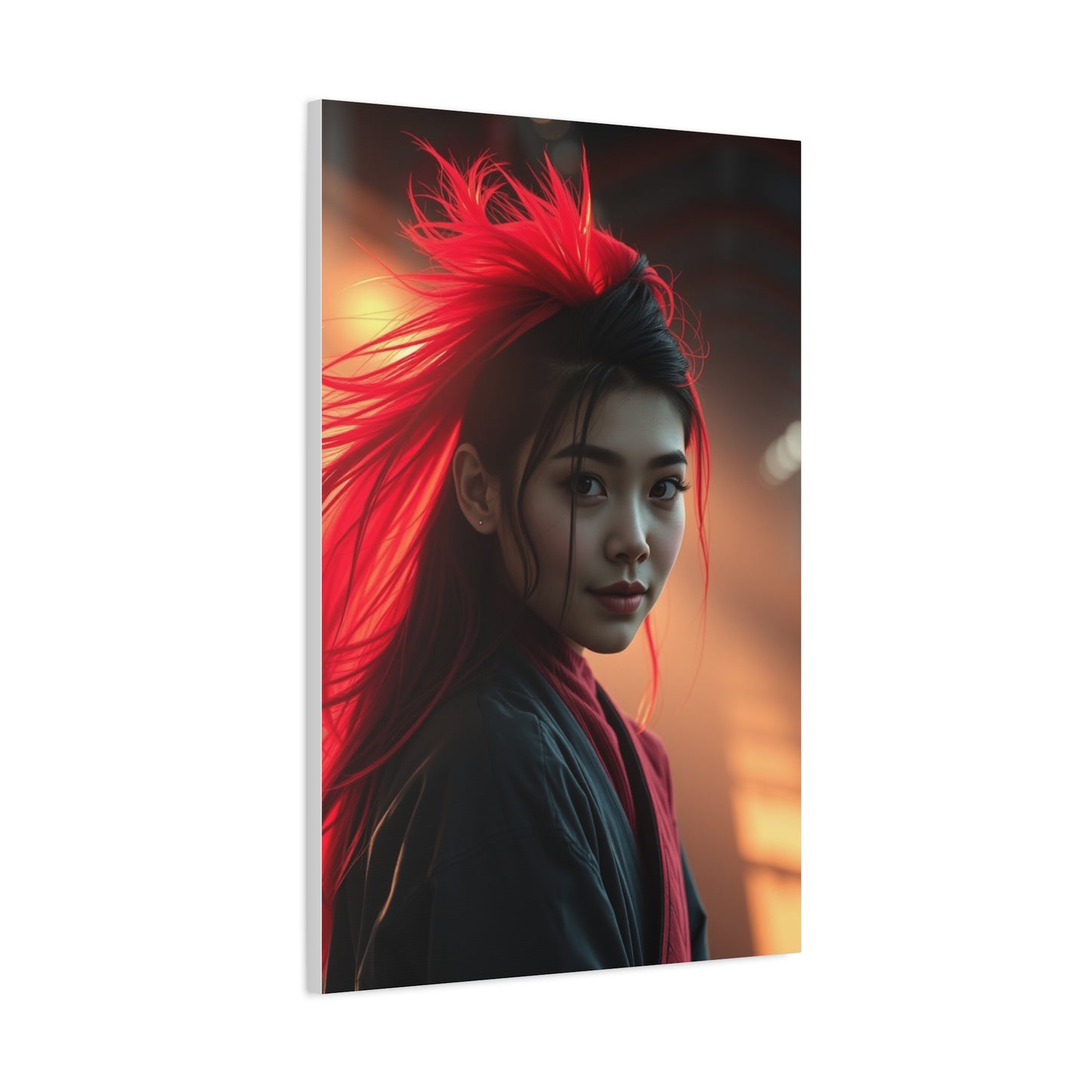
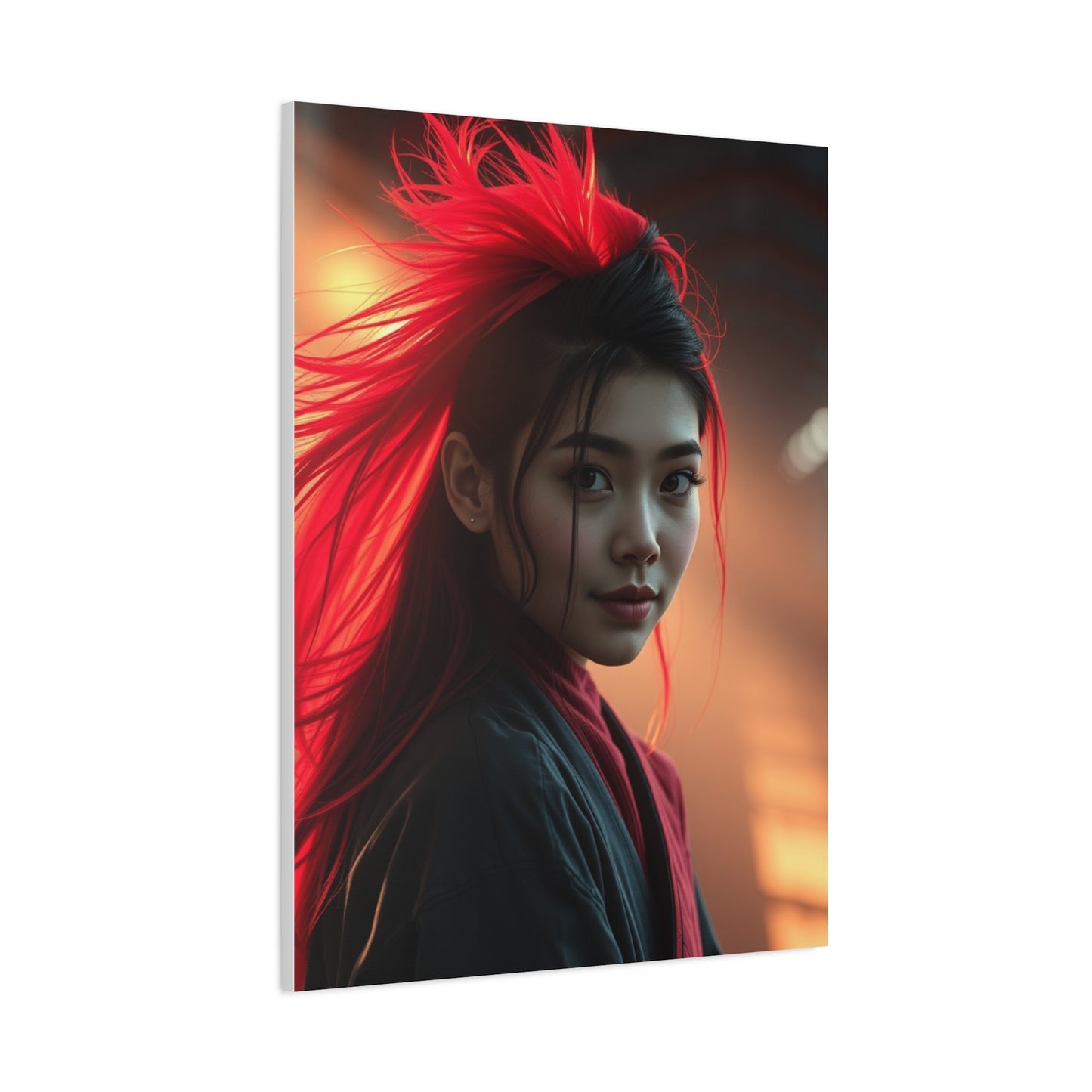
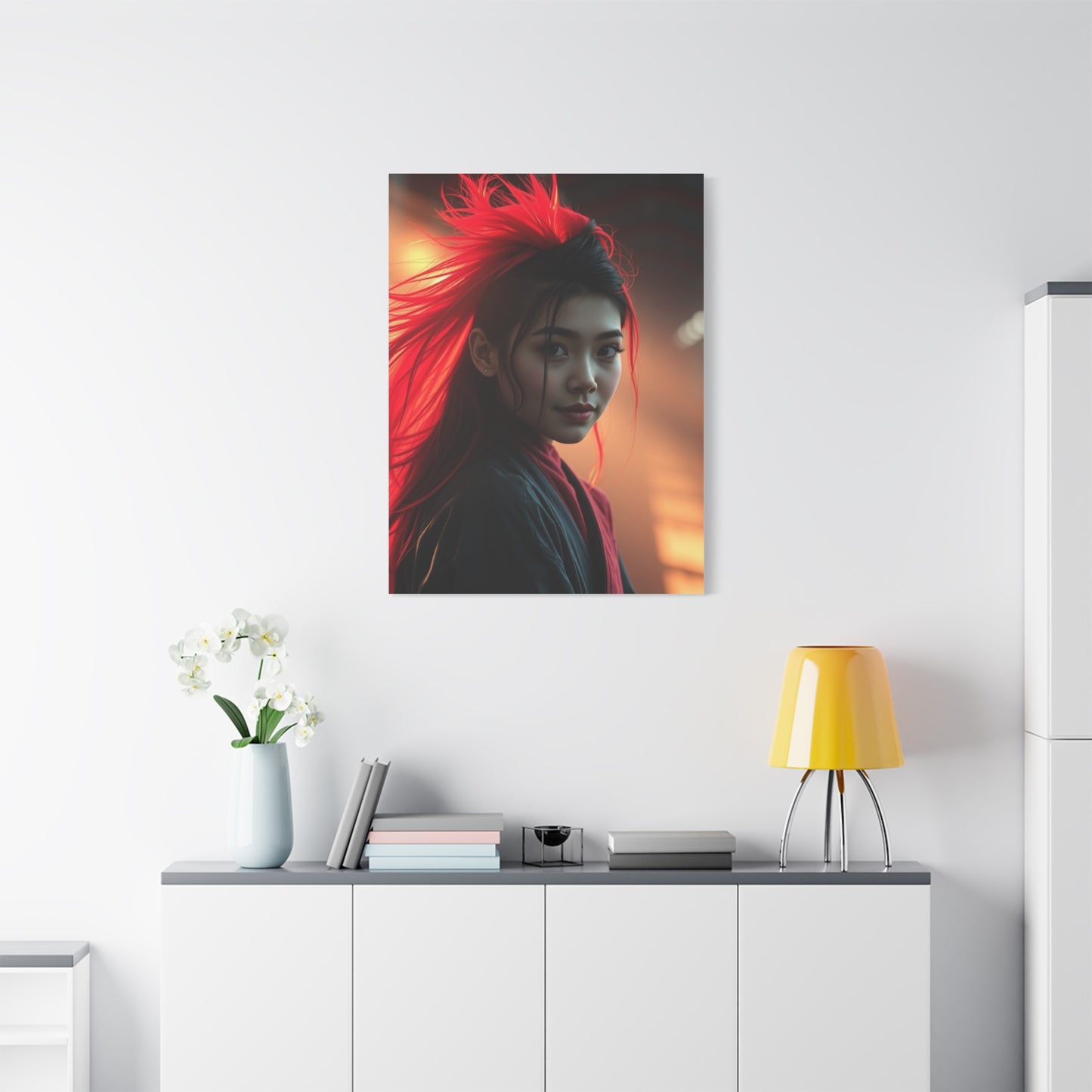
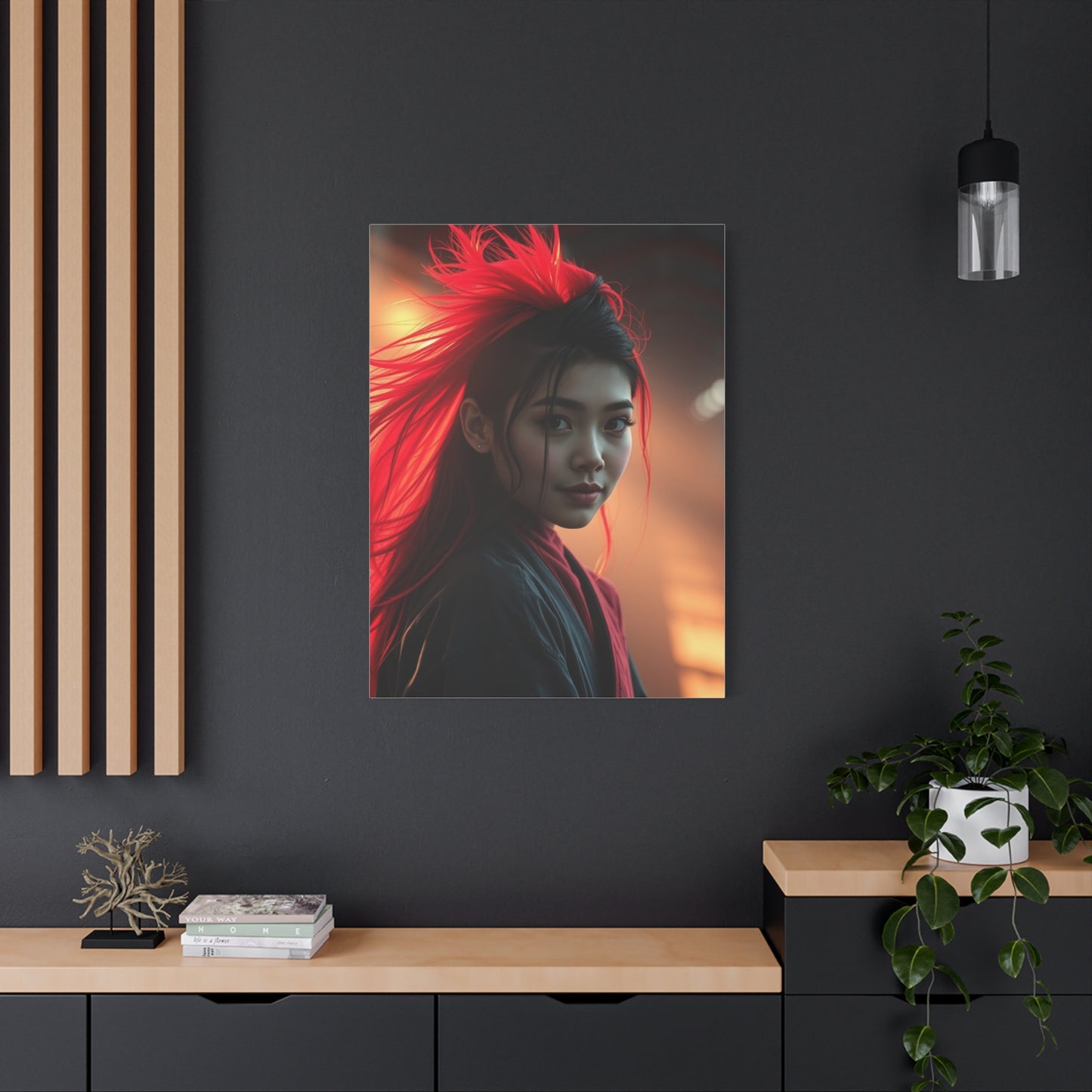
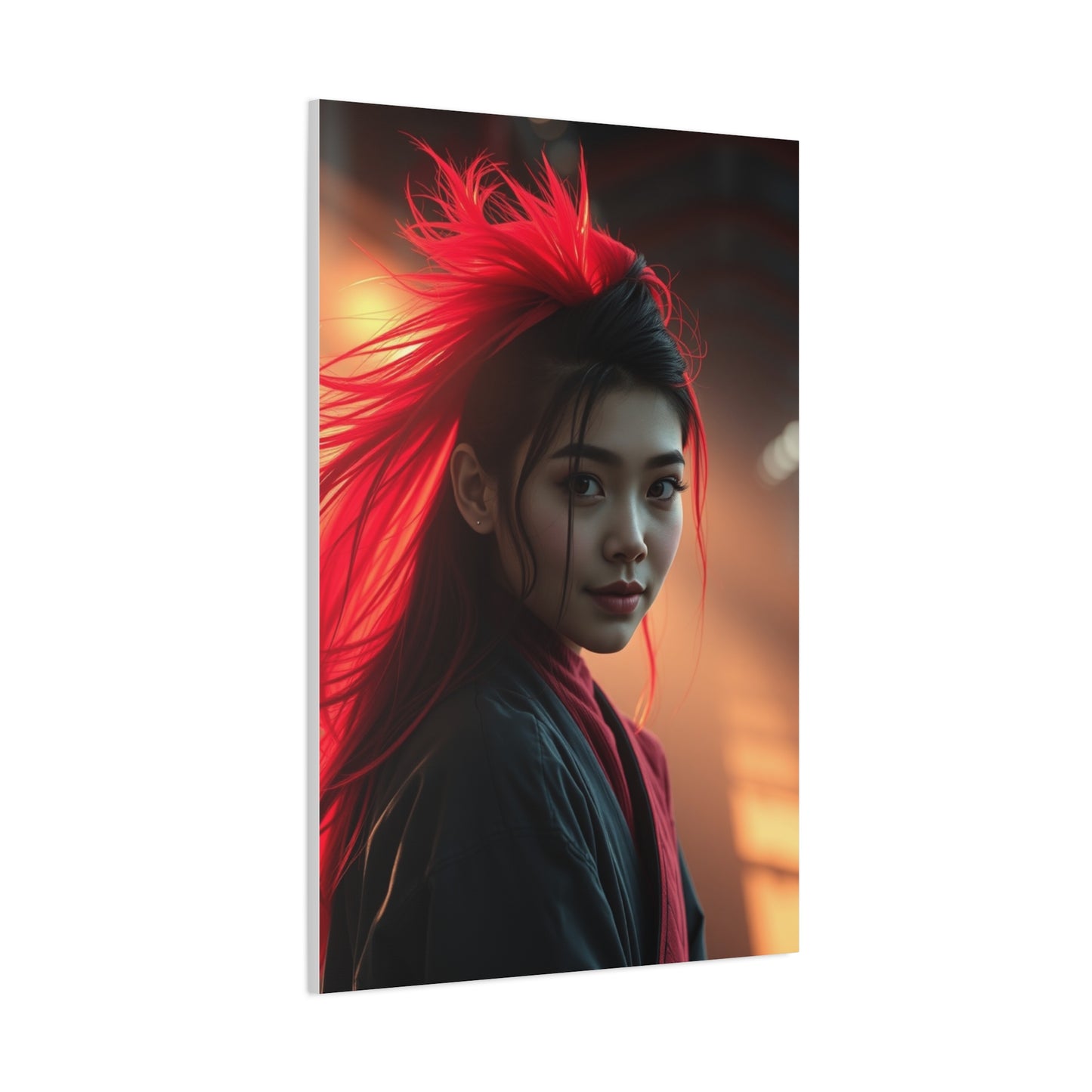
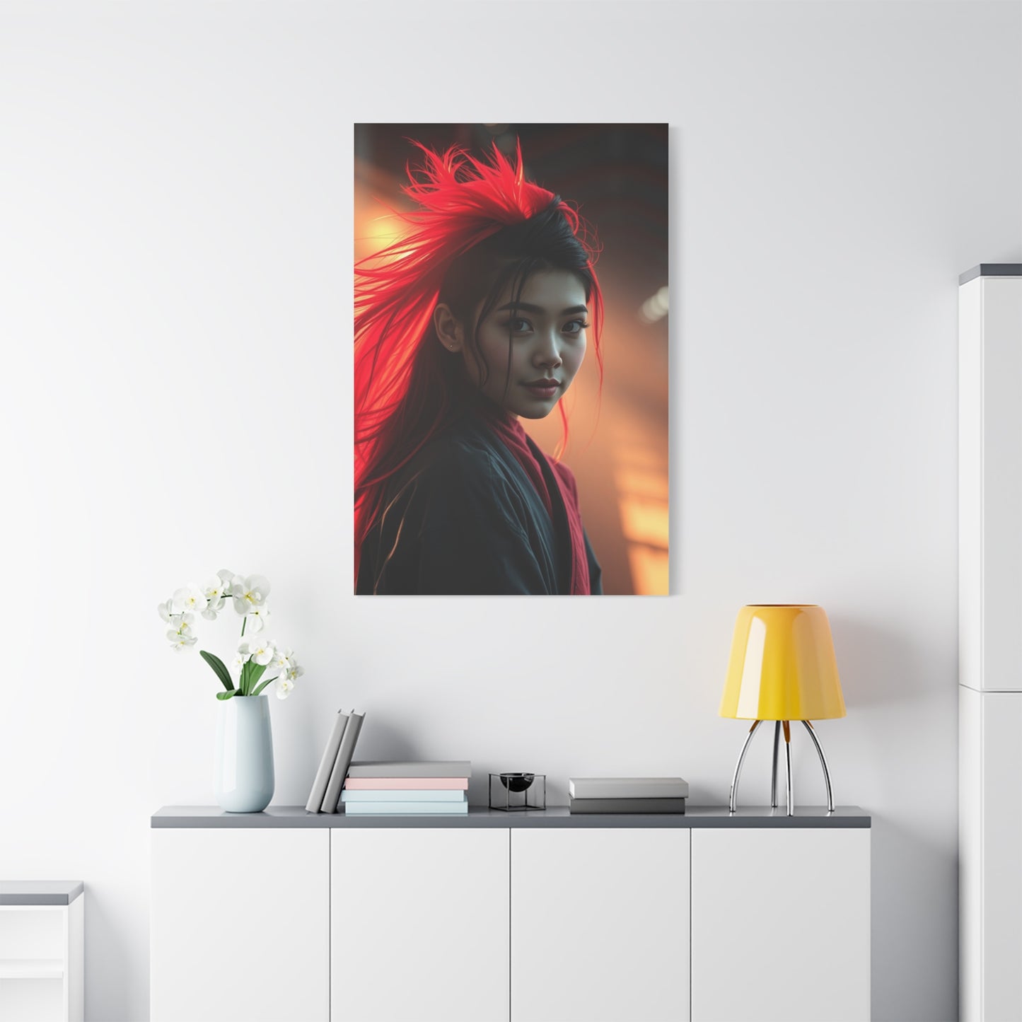
Cerise Opulence Display Wall Art & Canvas Print
Cerise Opulence Display Wall Art & Canvas Print
Couldn't load pickup availability
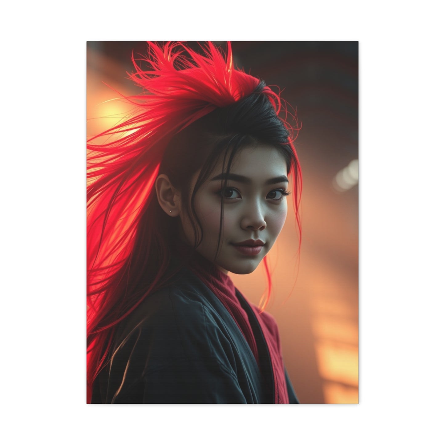


Luxury in Pink: Decorating with Cerise Opulence Display Wall Art
The world of interior design continues to evolve, embracing colors that speak volumes about personality, style, and sophisticated taste. Among the spectrum of hues that have captured the attention of design enthusiasts and homeowners alike, the rich and vibrant cerise tone stands as a testament to boldness meeting elegance. This particular shade, reminiscent of deep cherry blossoms and luxurious velvet, has become synonymous with contemporary spaces that refuse to fade into the background. When incorporated into wall art, this magnificent color transforms ordinary rooms into extraordinary showcases of personal expression and refined aesthetic sensibility.
The journey toward creating spaces that reflect individual character while maintaining visual harmony has led countless decorators to explore the dynamic potential of statement pieces. Wall art featuring this stunning crimson-pink hue offers more than mere decoration; it provides a focal point that anchors entire design schemes, influences mood, and creates lasting impressions on anyone who enters the space. The richness of this particular color family brings warmth without overwhelming, sophistication without stuffiness, and energy without chaos.
Understanding how to effectively incorporate such powerful visual elements into living spaces requires consideration of multiple factors, from room dimensions and natural lighting to existing furniture and architectural features. The beauty of working with this bold yet refined color lies in its versatility—it complements both minimalist modern aesthetics and more elaborate traditional designs. Whether displayed in a sprawling living room, an intimate bedroom, a professional office space, or a welcoming entryway, artwork featuring this distinctive shade has the power to elevate the entire environment.
Contemporary homeowners increasingly seek pieces that make definitive statements while maintaining timeless appeal. The intersection of bold color choices with artistic expression creates opportunities for truly personalized spaces that reflect cultural awareness, artistic appreciation, and design confidence. This comprehensive exploration delves into the myriad ways that artwork featuring this captivating hue can transform modern interiors, offering practical guidance alongside inspirational concepts for those ready to embrace color with conviction.
Vibrant Elegance: Cerise Opulence Canvas Prints
The marriage of vibrant color and elegant design creates a visual language that speaks to both the heart and the mind. Canvas prints featuring this stunning shade offer a perfect medium for expressing this duality, combining the tactile richness of canvas with the visual impact of bold color. The texture of canvas itself adds dimension to any artwork, creating subtle variations in how light interacts with the surface throughout the day. When this material serves as the foundation for pieces dominated by such a striking hue, the result transcends ordinary decoration to become a focal point that commands attention while maintaining sophistication.
Selecting canvas prints for modern spaces involves understanding the unique characteristics that make this medium particularly effective. Unlike traditional paper prints or digital displays, canvas brings a gallery-quality presence to residential and commercial environments. The fabric texture creates depth that flat prints cannot achieve, while the wrapping around frame edges provides a finished, professional appearance that eliminates the need for additional framing. This seamless presentation allows the artwork itself to take center stage without competing visual elements detracting from its impact.
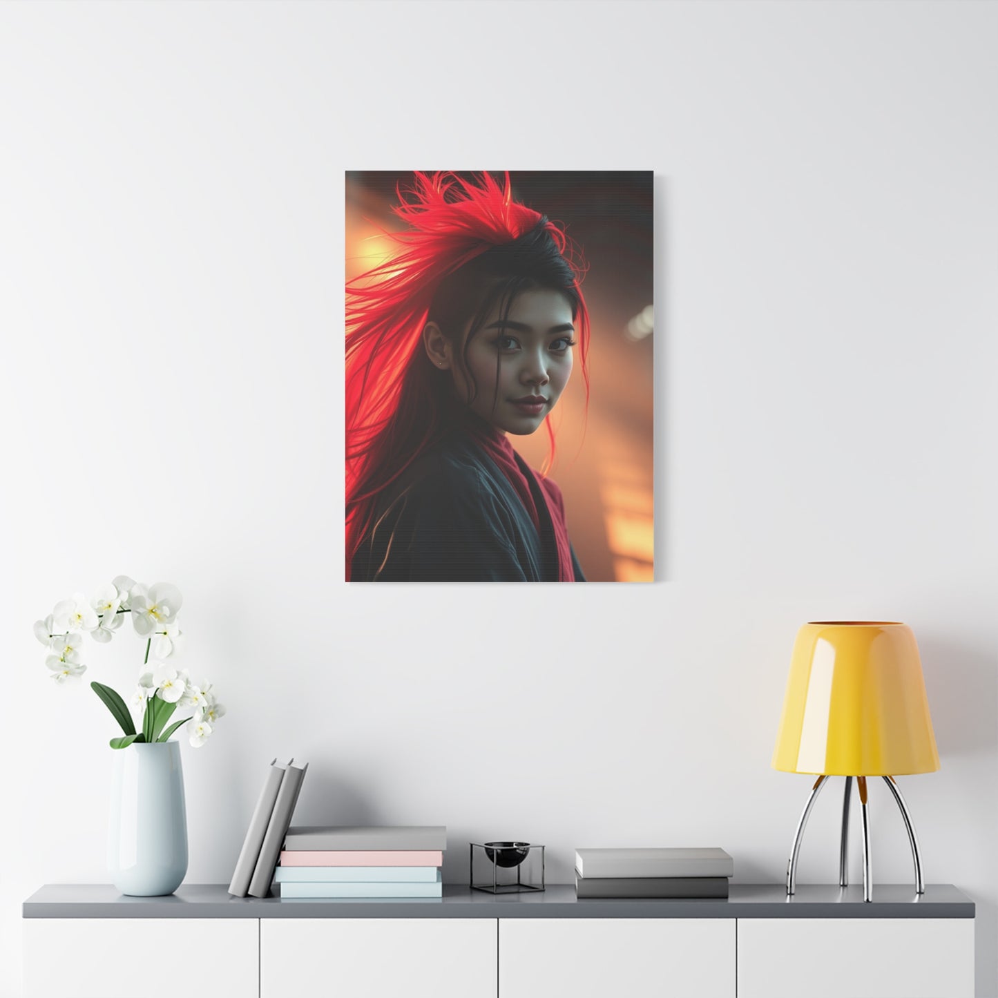
The process of choosing the right canvas print begins with assessing the space where it will hang. Room dimensions play a crucial role in determining appropriate size—oversized pieces can overwhelm smaller rooms, while modestly sized works may disappear in expansive spaces. The color intensity of this particular shade means it naturally draws the eye, so even medium-sized pieces can serve as effective focal points. Consider how natural and artificial lighting will interact with the artwork throughout the day; this vibrant tone appears different under various lighting conditions, shifting from deep and moody in dim light to brilliantly luminous when illuminated directly.
Quality considerations extend beyond mere visual appeal to encompass technical aspects of production. High-resolution printing ensures that every nuance of color and detail remains crisp and clear, while fade-resistant inks guarantee that the vibrancy endures for years. The canvas material itself should be substantial enough to maintain tension over its frame without sagging, and properly treated to resist environmental factors like humidity and temperature fluctuations. Investing in pieces created through professional printing processes ensures that the bold beauty of this color remains consistent and true to the artist's original vision.
Arrangement strategies for canvas prints offer endless creative possibilities. Single large-scale pieces create dramatic focal points that anchor entire walls, while gallery walls featuring multiple coordinated pieces allow for more complex visual narratives. When working with this bold hue, consider balancing its intensity with neutral tones in surrounding pieces or selecting complementary artworks that share similar color palettes or thematic elements. The goal remains creating cohesive visual flow that guides the eye naturally through the space while allowing each piece to maintain its individual impact.
The emotional resonance of canvas prints featuring this striking color cannot be understated. This particular shade evokes feelings of passion, creativity, and confidence—qualities that many seek to cultivate in their living and working environments. The psychological impact of color in interior spaces has been extensively documented, with warm tones like this proven to stimulate energy and conversation while maintaining enough sophistication to avoid feeling overwhelming. Choosing artwork in this color family thus becomes not merely an aesthetic decision but a strategic choice in environmental psychology.
Maintenance of canvas prints requires minimal effort while yielding maximum longevity. Regular dusting with a soft, dry cloth prevents accumulation of particles that could dull the surface over time. Avoiding direct exposure to harsh sunlight helps preserve color vibrancy, though quality fade-resistant inks significantly reduce concerns about sun damage. Humidity control in the display environment prevents canvas from warping or developing mildew, particularly important in bathrooms or basements where moisture levels fluctuate. With proper care, these pieces maintain their visual impact for decades, making them worthwhile investments in interior aesthetics.
Statement Walls: Cerise Opulence Display Art Ideas
Creating statement walls that capture attention while maintaining design integrity represents one of interior design's most satisfying challenges. When bold color serves as the foundation for these focal features, the potential for dramatic impact multiplies exponentially. Display art designed around this captivating shade offers countless opportunities to transform blank walls into conversation pieces that define entire rooms. The key lies in approaching the project with clear vision, understanding how various elements interact, and maintaining courage in color choices that might initially seem daring.
Statement walls function as the visual anchor of a room, the feature that immediately draws focus upon entering. Positioning plays a crucial role in effectiveness—the wall behind a sofa in a living room, the surface above a bed's headboard, or the first wall visible when entering a space all serve as prime locations. Once the position is selected, deciding on the scale and arrangement of artwork becomes paramount. Single oversized pieces create immediate drama and work particularly well in minimalist spaces where the art needs to carry significant visual weight. Multi-piece installations allow for more complex storytelling and can fill larger expanses without requiring enormous individual canvases.
The psychology of color placement within rooms deserves careful consideration. This vibrant shade naturally draws the eye and creates a sense of forward movement, making it ideal for walls you wish to emphasize. In contrast, placing such bold art on walls you want to de-emphasize might work against your design goals. Consider sight lines from various positions within the room—where people sit, stand, or move through the space—to ensure the artwork remains visible and impactful from multiple vantage points.
Layering techniques add sophistication to statement wall displays. Rather than mounting art flush against the wall, consider creating depth through floating frames, shadow boxes, or ledge systems that allow pieces to project slightly forward. This dimensional approach catches and plays with light in fascinating ways, creating subtle shadows that shift throughout the day and adding visual interest beyond the artwork itself. When working with this bold color, these dimensional elements help soften its impact slightly while enhancing its luxurious quality.
Complementary design elements surrounding the statement wall deserve equal attention. Furniture placement should enhance rather than obstruct views of the artwork. Side tables, lamps, and decorative objects positioned near the display wall should either harmonize with the bold color or provide intentional contrast that strengthens the overall composition. Avoid cluttering the area directly around statement artwork—allowing breathing room emphasizes its importance and prevents visual confusion.
Lighting design transforms good statement walls into exceptional ones. Dedicated picture lights, track lighting, or recessed spotlights can dramatically enhance the appearance of artwork featuring this vibrant hue. The direction and color temperature of illumination significantly affect how the color appears; warm white light enhances the richness and depth, while cool light can make the color appear more vibrant and energetic. Dimmable lighting systems offer flexibility, allowing you to adjust the intensity based on time of day, occasion, or desired mood.
Seasonal rotation strategies keep statement walls fresh and engaging over time. While the investment in quality artwork means you'll want to display pieces long-term, having a rotation system allows you to respond to changing tastes, seasons, or simply the desire for novelty. This approach works particularly well if you've invested in multiple pieces featuring variations of this stunning color—switching them periodically maintains the bold impact while preventing visual fatigue.
Luxe Interiors: Cerise Opulence Wall Art Inspiration
Luxury in interior design transcends mere expense to encompass quality, thoughtfulness, and distinctive character. Wall art featuring this sumptuous shade embodies these principles, offering visual richness that elevates spaces from merely attractive to genuinely extraordinary. Drawing inspiration from high-end design showcases, boutique hotels, and architecturally significant residences reveals countless approaches to incorporating such bold artwork into luxurious environments. The common thread among successful applications lies in confidence—the willingness to make definitive aesthetic choices and commit to them fully.
The concept of luxury has evolved significantly in recent design movements. Where once it meant ornate detailing and obvious expense, contemporary luxury often manifests through edited selections of exceptional pieces. In this context, a single stunning artwork featuring this dramatic color can convey more sophistication than an entire wall of lesser pieces. The philosophy of quality over quantity guides truly luxurious spaces, where every element serves a purpose and nothing feels superfluous or merely decorative.
Inspiration sources for incorporating this bold color into luxury interiors span historical and contemporary design movements. Art Deco's embrace of rich jewel tones provides valuable lessons in balancing boldness with elegance. Mid-century modern design demonstrates how saturated colors can coexist with clean lines and minimal ornamentation. Contemporary maximalism shows that luxury can include abundance when thoughtfully curated. Each movement offers insights applicable to modern spaces seeking to incorporate dramatic wall art.
Material quality becomes paramount in luxury applications. The difference between budget and premium canvas prints becomes immediately apparent in person—superior materials possess a presence and finish that photographs cannot fully capture. Investment in museum-quality printing, archival inks, and professional-grade canvas ensures that artwork maintains its impact indefinitely. Custom framing options, from sleek metal floating frames to hand-finished wood, add another layer of refinement that distinguishes truly luxurious installations.
Scale considerations in luxury environments often favor bold choices. Expansive walls in high-ceiling rooms demand appropriately sized artwork to maintain visual balance. While budget constraints might lead some to select smaller pieces, luxury design embraces the impact of properly scaled art. When working with this vibrant color, larger pieces amplify its emotional resonance and create the kind of memorable impact that defines exceptional interiors.
Color coordination in luxurious spaces requires nuanced understanding of how hues interact across distances and in varying light conditions. This particular shade pairs beautifully with metallic accents—brushed brass, rose gold, and copper all enhance its warmth while adding layers of visual interest. Deep charcoal and soft cream provide neutral counterpoints that allow the bold color to truly shine. Incorporating these supporting tones through furniture, textiles, and accessories creates cohesive environments where the artwork feels integrated rather than imposed.
Texture plays an equally important role in luxury interiors. The smoothness of canvas contrasts beautifully with plush velvet upholstery, nubby linen throws, and glossy lacquered surfaces. This interplay of textures prevents spaces from feeling flat or one-dimensional, adding tactile interest that invites closer inspection and physical interaction with the environment. When artwork featuring this rich color anchors a room, surrounding it with varied textures creates a sensory experience that transcends pure visual appeal.
Modern Glamour: Cerise Opulence Canvas for Stylish Spaces
The fusion of modern sensibilities with glamorous elements creates interiors that feel both current and indulgent. Canvas artwork featuring this striking shade serves as an ideal vehicle for achieving this balance, bringing color confidence and visual drama to spaces designed for contemporary living. Modern glamour rejects the notion that sophistication requires restraint, instead embracing bold choices that reflect personality and design conviction. Understanding how to incorporate such powerful pieces into stylish spaces requires examining successful examples and identifying the principles that make them effective.
Modern design principles emphasize clean lines, functional layouts, and edited aesthetics. Glamour introduces luxury materials, rich colors, and elements of surprise. The intersection of these approaches allows for spaces that feel uncluttered yet sumptuous, simple yet sophisticated. Artwork dominated by this captivating color naturally inhabits this intersection—its bold presence makes a definitive statement while the quality of execution demonstrates refined taste.
Furniture selection in modern glamorous spaces should complement rather than compete with dramatic artwork. Low-profile sofas and chairs with streamlined silhouettes provide visual rest points that make bold wall art stand out more effectively. Materials like velvet, silk, and leather add luxurious texture without overwhelming the space. Metallic finishes on furniture legs, hardware, and accent pieces create subtle connections to the richness of the artwork without literal color matching.
Spatial planning for modern glamorous rooms considers how movement through the space affects perception of the artwork. Arranging furniture to create natural sight lines toward featured pieces ensures they receive appropriate attention. Conversation areas positioned to face statement walls make the art part of the social experience rather than background decoration. In open-concept spaces, artwork placement can help define distinct zones while maintaining visual flow throughout the area.
Lighting design becomes particularly crucial in modern glamorous interiors. The interplay of natural daylight, ambient artificial light, and focused accent lighting creates dynamic environments where the appearance of artwork shifts throughout the day. Recessed lighting provides overall illumination without visual clutter, while discreet spotlights can highlight artwork after dark. Statement chandeliers or pendant lights positioned to complement rather than overshadow wall art add glamorous focal points that work in concert with the canvas pieces.
Accessorizing around bold artwork requires restraint and intention. Too many decorative objects can dilute the impact of dramatic pieces, while too few might make spaces feel incomplete. The solution lies in selecting accessories that share either the color palette or the level of visual interest with the featured artwork. Sculptural objects, oversized vases, or striking coffee table books can provide appropriate visual weight without creating competition for attention.
Color distribution throughout modern glamorous spaces helps integrate bold artwork seamlessly. Rather than allowing the canvas piece to exist in isolation, echo its hue through carefully selected accents—throw pillows, area rugs, decorative objects, or even small furniture pieces. This repetition creates visual rhythm and makes the bold color feel intentional rather than arbitrary. The key lies in proportion; these accent pieces should represent significantly less visual weight than the primary artwork to avoid overwhelming the space with color.
Artistic Drama: Cerise Opulence Display Wall Décor
Drama in interior design manifests through unexpected contrasts, bold scale, and confident color choices. Display wall décor featuring this vibrant shade inherently possesses dramatic qualities that can transform spaces from conventional to extraordinary. Harnessing this potential requires understanding the elements that contribute to dramatic impact and orchestrating them to create cohesive, powerful visual statements. The goal involves not merely decorating walls but curating experiences that evoke emotional responses and create lasting impressions.
The foundation of dramatic wall displays lies in understanding focal hierarchy. Not every wall in a space should vie for attention equally—drama requires contrast between areas of visual intensity and areas of rest. Selecting one or two walls to receive the full dramatic treatment allows those displays to shine while other walls remain relatively quiet. This approach prevents visual overwhelm and ensures that dramatic elements receive the attention they deserve.
Composition strategies for dramatic displays often embrace asymmetry and unexpected arrangements. While perfectly centered artwork has its place, drama frequently emerges from arrangements that challenge conventions. Off-center placement, ascending or descending arrangements, or intentionally unbalanced groupings create visual tension that draws and holds attention. When working with this bold color, these unconventional approaches amplify its impact without requiring additional elements.
Scale manipulation creates powerful dramatic effects. Pairing an oversized canvas featuring this vibrant shade with much smaller complementary pieces emphasizes the size differential and creates dynamic visual interest. Alternatively, grouping multiple large-scale pieces creates an immersive color experience that envelops viewers. Understanding the room's dimensions and the desired intensity of impact guides decisions about appropriate scale.
Contrast techniques extend beyond size to encompass color, texture, and subject matter. Positioning artwork dominated by this warm, energetic hue against cool-toned walls creates striking visual contrast that makes the color appear even more vibrant. Surrounding smooth canvas surfaces with textured wall treatments or three-dimensional elements adds another layer of contrast that enhances drama. Subject matter contrasts—abstract pieces alongside representational works, or organic forms paired with geometric designs—increase visual complexity and interest.
Installation techniques themselves can contribute to dramatic presentation. Floating artworks away from walls using standoffs or shadow box frames creates dimensional intrigue. Mounting pieces at unexpected heights—higher or lower than standard—disrupts expectations and demands closer attention. Gallery walls that extend from floor to ceiling maximize visual impact and create immersive experiences that transform entire walls into artistic statements.
The temporal dimension of dramatic displays deserves consideration. How does the artwork appear at different times of day? How does changing light affect its impact? Dramatic displays often benefit from designing for these temporal variations, ensuring that the presentation remains compelling whether viewed in bright morning light, soft afternoon glow, or strategic evening illumination. This consideration might influence placement decisions, selecting walls that receive favorable natural light or investing in sophisticated lighting systems that enhance the artwork after dark.
Bold Colors: Cerise Opulence Canvas Prints for Home
Embracing bold color in residential spaces represents a design philosophy that prioritizes personality and visual impact over safe neutrality. Canvas prints featuring this stunning shade offer an accessible entry point for homeowners interested in incorporating more adventurous color into their environments. The beauty of this approach lies in its flexibility—artwork can introduce bold color without the commitment required by painted walls or large furniture pieces, and can be moved or replaced as tastes evolve. Understanding how to successfully integrate such vibrant pieces into home environments requires considering practical and aesthetic factors specific to residential design.
The psychology of color in home environments significantly impacts daily experience and emotional wellbeing. This particular shade falls within the warm color family, known for stimulating energy, passion, and social interaction. These qualities make it particularly appropriate for gathering spaces like living rooms and dining areas, where the energizing influence enhances conversation and connection. In more private spaces like bedrooms or studies, the same color can inspire creativity and confidence without the overstimulation sometimes associated with more aggressive warm tones.
Room-by-room considerations help optimize placement of bold canvas prints. Living rooms typically benefit from larger statement pieces positioned above seating areas or on walls opposite entry points, where they immediately establish the room's aesthetic character. Dining rooms can accommodate dramatic artwork that becomes a focal point during meals and gatherings, contributing to the overall dining experience. Bedrooms require more careful consideration—while bold artwork can certainly succeed in sleeping spaces, positioning it where it won't be the last thing seen before sleep and first thing noticed upon waking helps prevent visual overstimulation.
Kitchen and bathroom applications of bold artwork require special consideration due to environmental factors. Humidity, temperature fluctuations, and exposure to cooking oils or aerosol products can affect artwork longevity. Selecting canvas prints specifically treated for durability in these environments, positioning them away from direct exposure to steam or heat, and maintaining proper ventilation all help protect investments in these more challenging spaces.
Home office and creative spaces often benefit tremendously from bold artwork that stimulates creativity and mental engagement. This vibrant shade proves particularly effective in these applications, providing visual interest that fights the monotony sometimes associated with work-from-home environments. Positioning artwork where it can be seen during breaks from screen time—across from desks rather than directly behind monitors—allows it to serve as a mental refresh point that reduces eye strain and maintains creative energy.
Hallways and transitional spaces offer underutilized opportunities for bold artwork. These areas often receive minimal design attention, yet they connect all other spaces and shape first impressions of homes. Gallery walls featuring this striking color can transform corridors from mere pathways into artistic experiences that guide movement through the home while building anticipation for the spaces beyond.
Family dynamics influence artwork selection and placement in residential environments. Homes with children might position valuable pieces higher on walls, out of reach of curious hands and energetic play. Pet owners should consider whether artwork placement might be vulnerable to pets jumping, rubbing, or otherwise interacting with walls. These practical considerations need not limit bold design choices but should inform decisions about positioning and protection strategies.
Sophisticated Spaces: Cerise Opulence Wall Art Ideas
Sophistication in interior design emerges from thoughtful curation, refined taste, and the confidence to make distinctive choices. Wall art featuring this opulent shade can serve as the cornerstone of sophisticated spaces when selected and displayed with appropriate care and intention. The challenge and opportunity lie in balancing the inherent boldness of the color with the restraint and editing that define sophisticated aesthetics. Success requires understanding not just what to include but equally what to omit, creating environments where every element serves a clear purpose and contributes to a cohesive vision.
The foundation of sophisticated spaces begins with color strategy. Rather than allowing bold artwork to exist in isolation, sophisticated applications integrate the color throughout the space in measured doses. This might manifest through accent pillows that echo the dominant hue, area rugs that incorporate similar tones, or decorative objects that create visual connections. The proportion remains crucial—the artwork should dominate the color story while supporting elements reinforce without overwhelming.
Material quality telegraphs sophistication immediately. The difference between inexpensive prints and gallery-quality canvas becomes apparent in person, where superior materials possess depth, texture, and presence that budget alternatives cannot match. Sophisticated spaces warrant investment in exceptional pieces that will endure aesthetically and physically for years. This investment extends to framing and mounting—professional installation using appropriate hardware ensures artwork hangs properly and safely, maintaining its appearance indefinitely.
Composition principles drawn from fine art inform sophisticated artwork arrangements. The rule of thirds, golden ratio, and principles of visual balance all apply to wall art displays. Sophisticated spaces often feature asymmetrical arrangements that nonetheless feel balanced, where visual weight rather than literal symmetry creates harmony. Understanding these principles allows for arrangements that feel effortlessly correct even when they deviate from conventional centered placement.
Negative space plays a crucial role in sophisticated design. The temptation to fill every wall should be resisted in favor of allowing breathing room around featured pieces. This restraint draws attention to the artwork itself and prevents spaces from feeling cluttered or busy. White or neutral walls surrounding bold canvas prints provide visual rest that makes the color appear even more striking by contrast.
Sophisticated spaces demonstrate awareness of design history and contemporary trends without slavishly following either. Incorporating bold color through artwork shows engagement with current design movements that favor personality and confidence over safe neutrality. Simultaneously, the quality of materials and thoughtfulness of arrangement demonstrate respect for timeless design principles that transcend momentary trends. This balance ensures spaces feel both current and enduring.
Contextual awareness separates sophisticated design from merely decorated spaces. How does the artwork relate to architectural features? Does it enhance or fight against the room's proportions? Are sight lines considered from multiple positions within the space? Sophisticated design addresses these questions thoughtfully, creating environments where every element works in concert rather than competing for attention.
Contemporary Elegance: Cerise Opulence Display Canvas
Contemporary design aesthetics emphasize clean lines, functional beauty, and honest materials. Elegance introduces refinement, grace, and a sense of effortless sophistication. The synthesis of these qualities creates spaces that feel both current and timeless, practical yet beautiful. Display canvas featuring this captivating color naturally inhabits this intersection, bringing boldness that feels appropriate to contemporary sensibilities while maintaining the refinement that defines elegant spaces. Achieving this balance requires understanding the principles underlying both aesthetics and how artwork can embody their union.
Contemporary elegance rejects the false dichotomy between simplicity and richness. Spaces can be edited and uncluttered while still incorporating luxurious elements and bold color. The key lies in curation—selecting fewer, exceptional pieces rather than numerous adequate ones. A single stunning canvas featuring this vibrant shade can provide all the visual interest a room requires, eliminating the need for additional decorative elements that might dilute its impact.
Furniture selection in contemporary elegant spaces favors pieces with architectural qualities. Sofas and chairs with clean silhouettes, exposed legs, and thoughtful proportions complement rather than compete with dramatic artwork. Materials like leather, linen, and natural wood bring organic warmth that balances the boldness of vibrant canvas pieces. Glass and metal elements add a contemporary edge while maintaining the visual lightness that characterizes elegant spaces.
Color palettes in contemporary elegant interiors typically favor restraint. Neutral backgrounds—whites, grays, beiges, and soft earth tones—provide the foundation against which bold artwork can truly shine. This doesn't mean spaces need feel colorless; rather, color becomes a carefully deployed accent rather than the dominant presence. When artwork featuring this striking shade serves as the primary color statement, supporting elements should enhance rather than compete with it.
Architectural elements receive attention equal to furnishings in contemporary elegant spaces. Millwork, flooring, and lighting fixtures all contribute to the overall aesthetic and should harmonize with featured artwork. Sleek baseboards and crown molding maintain clean lines that complement contemporary sensibilities. Hardwood or polished concrete floors provide visual foundations that ground spaces without introducing unnecessary pattern or color. Lighting fixtures serve as functional sculpture, adding visual interest through form rather than ornament.
Textile selection balances texture with simplicity. Solid-colored fabrics in luxurious materials provide tactile interest without visual competition. Subtle patterns—tone-on-tone damask, barely-there stripes, or geometric jacquards—add depth without demanding attention. When bold artwork featuring this vibrant color anchors a room, textiles should support the overall composition through complementary tones or harmonious neutrals rather than introducing competing color stories.
Art placement in contemporary elegant spaces follows principles of intentionality and breathing room. Rather than covering every available wall surface, featured pieces receive prime positioning with generous negative space surrounding them. This approach creates gallery-like presentations that elevate artwork from decoration to focal point. The restraint inherent in this approach paradoxically creates more impact than busier arrangements might achieve.
Vibrant Wall Art: Cerise Opulence for Chic Interiors
Chic interiors balance sophistication with personality, creating spaces that feel both polished and lived-in. Vibrant wall art featuring this stunning shade serves as an ideal tool for achieving this balance, introducing bold color and visual interest while maintaining the refined sensibility that characterizes chic design. Understanding what makes spaces feel chic rather than merely decorated involves examining successful examples and identifying the common elements that create that desirable quality. The incorporation of dramatic artwork plays a crucial role in this equation, providing the personality and confidence that elevate spaces beyond conventional attractiveness.
The essence of chic design lies in edited abundance—careful curation that creates richness without clutter. Vibrant artwork becomes the exclamation point in otherwise restrained environments, the element that prevents sophistication from sliding into sterility. This approach allows homeowners to express personality and take design risks without overwhelming spaces with competing elements. A single dramatic canvas featuring this bold color can transform an entire room's character, making it memorable and distinctive.
Color blocking techniques borrowed from fashion translate effectively to interior applications. Pairing vibrant artwork with solid-colored furniture and accessories creates striking visual compositions where each element maintains its identity while contributing to the overall scheme. This approach works particularly well in open-concept spaces where color blocking can help define distinct zones without physical barriers. The bold canvas serves as the anchor point from which other color decisions flow, creating visual coherence across connected spaces.
Mixing periods and styles characterizes many chic interiors, creating spaces that feel collected over time rather than purchased all at once. Vibrant contemporary artwork pairs beautifully with vintage furniture, traditional architectural details, or antique accessories. These juxtapositions create visual tension that makes spaces interesting and dynamic. The confidence required to mix seemingly disparate elements typifies chic design sensibility.
Personal collections integrated into chic spaces add layers of meaning beyond pure aesthetics. Travel souvenirs, family heirlooms, or hobby-related objects displayed alongside bold artwork create narratives that reveal something about inhabitants. This personalization distinguishes chic interiors from showroom perfection, adding warmth and authenticity that make spaces feel genuinely lived in rather than merely staged.
Flexibility characterizes chic spaces designed for real life rather than static display. Furniture arrangements that can be easily reconfigured for different occasions, lighting that adjusts to various activities and moods, and decorative elements that can be switched seasonally all contribute to dynamic environments that evolve with needs and preferences. Vibrant artwork remains the constant in these adaptable spaces, providing visual stability while surroundings shift.
The concept of effortless style applies to chic interiors just as it does to fashion. Spaces should appear pulled together without obvious signs of struggle or overthinking. This seemingly contradictory quality—spaces that look both carefully designed and completely natural—requires significant planning but hides the effort involved. Vibrant artwork featuring this striking color contributes to this effect by providing instant visual interest that elevates entire rooms without requiring elaborate supporting elements.
Luxe Canvas Prints: Cerise Opulence Display Inspiration
Luxury canvas prints represent the pinnacle of wall art quality, combining exceptional imagery with superior materials and expert craftsmanship. When featuring this opulent shade, these pieces transcend mere decoration to become investments in beauty and lasting visual impact. Drawing inspiration from high-end galleries, designer showrooms, and architecturally significant spaces reveals the myriad ways luxe canvas prints can transform interiors. Understanding what elevates canvas prints from standard to luxurious helps inform selection and display decisions that maximize their impact and longevity.
The production process for luxury canvas prints differs substantially from mass-market alternatives. Professional-grade printers using archival inks ensure color accuracy and longevity that budget processes cannot match. The canvas material itself—typically heavyweight cotton or linen blends—provides superior texture and durability. Stretching techniques that maintain proper tension without distorting imagery require expertise that distinguishes professional work from amateur attempts. These technical considerations directly impact how the finished piece appears and endures over decades.
Custom sizing options represent one advantage of luxury canvas prints. Rather than conforming to standard dimensions, pieces can be produced to fit specific spaces perfectly. This customization ensures optimal visual impact and eliminates the compromises sometimes necessary when working with pre-sized artwork. For spaces with unusual wall dimensions or specific design requirements, custom-sized pieces provide solutions that off-the-shelf alternatives cannot offer.
Limited edition prints add exclusivity that enhances perceived and actual value. Knowing that a piece exists in only a specified number of copies makes it more special than unlimited reproductions. Documentation accompanying limited editions—certificates of authenticity, artist information, edition numbers—adds tangible value while providing interesting context that enriches the ownership experience. These details matter to serious collectors and design enthusiasts who view artwork as investment as well as aesthetic enhancement.
Framing options for luxury canvas prints extend beyond basic gallery wraps to include custom floating frames, shadow boxes, and elaborate moldings. These presentations add layers of visual interest while protecting the canvas edges and creating finished appearances appropriate for the most refined interiors. Frame materials ranging from hand-finished woods to brushed metals offer opportunities to coordinate with existing decor while adding subtle luxury details that distinguish professional installations.
Collaboration with artists or designers creates opportunities for truly unique pieces that cannot be replicated. Commissioning custom work ensures absolute exclusivity while supporting artistic communities. Even when working with existing designs, consulting with designers about size, cropping, or color adjustments can yield pieces perfectly suited to specific spaces. This collaborative approach exemplifies the bespoke luxury that characterizes the highest level of interior design.
Installation expertise matters as much as the artwork itself in luxury applications. Professional art handlers understand proper mounting techniques, appropriate hardware for various wall types, and positioning strategies that optimize visual impact. They account for factors like wall texture, lighting conditions, and sight lines that amateurs might overlook. Investing in professional installation protects valuable artwork while ensuring it looks its absolute best.
Statement Art: Cerise Opulence Wall Décor for Modern Homes
Modern homes characterized by open floor plans, abundant natural light, and architectural simplicity provide ideal canvases for statement art that makes bold visual declarations. Wall décor featuring this striking shade offers exactly the kind of dramatic focal point that modern spaces need to avoid feeling cold or impersonal. The challenge involves selecting and positioning artwork that commands attention while complementing rather than overwhelming the architectural features and design elements that define contemporary residential design. Success requires balancing confidence with restraint, boldness with thoughtfulness.
The architectural characteristics of modern homes influence artwork selection significantly. High ceilings accommodate oversized pieces that would overwhelm more traditional proportions. Large windows flood spaces with natural light that makes colors appear vibrant and saturated, requiring consideration of how artwork will look under various lighting conditions throughout the day. Open sight lines mean artwork visible from multiple areas needs to work aesthetically from numerous vantage points and distances.
Material honesty in modern architecture extends to artwork selection. The texture of canvas aligns well with the emphasis on authentic materials that characterizes contemporary design. The fabric's natural variations and slight irregularities provide organic contrast to the smooth, manufactured surfaces—glass, steel, polished concrete—prevalent in modern construction. This juxtaposition of natural and industrial creates visual interest while maintaining design cohesion.
Color strategy in modern homes often relies on statement art to introduce warmth and personality into otherwise neutral palettes. Contemporary architecture frequently features whites, grays, and natural wood tones that provide calm, sophisticated backgrounds. Artwork featuring this vibrant shade injects energy and emotion into these restrained environments without requiring permanent color commitments like painted accent walls. This flexibility appeals to homeowners who appreciate change and evolution in their living spaces.
Scale relationships between artwork and furniture require careful consideration in modern open-plan homes. Statement pieces should relate proportionally to the largest furnishings in the space—sectional sofas, dining tables, or prominent architectural features. Undersized artwork disappears in expansive rooms with high ceilings, while appropriately scaled pieces create the visual weight necessary to balance architectural elements and define functional zones within open layouts.
The concept of art as architecture applies particularly well to modern homes. Large-scale pieces function almost as architectural features themselves, defining spaces and directing movement just as walls or columns might. This approach sees artwork as integral to spatial design rather than afterthought decoration applied to completed rooms. Planning for statement art early in the design process ensures proper electrical placement for lighting, appropriate wall reinforcement for heavy pieces, and optimal sight lines from key positions.
Technology integration in modern homes creates opportunities for innovative artwork display. Motorized tracks allow easy adjustment of piece positioning, LED picture lights provide focused illumination without heat damage, and environmental monitoring systems ensure optimal conditions for artwork preservation. These technological solutions align with modern design's embrace of innovation while serving the practical purpose of protecting and showcasing valuable pieces.
Artistic Impact: Cerise Opulence Canvas Prints
The concept of artistic impact encompasses both immediate visual effect and lasting emotional resonance. Canvas prints featuring this magnificent shade possess inherent qualities that maximize both dimensions of impact. Understanding what creates powerful artistic statements helps inform selection of pieces that will continue to engage and inspire long after initial installation. The goal involves not just decorating walls but creating experiences that enrich daily life and spark ongoing appreciation.
Visual hierarchy principles determine which elements in a composition receive primary attention. Artwork dominated by this bold color naturally rises to the top of any room's visual hierarchy due to the eye's attraction to vibrant, warm tones. This characteristic makes such pieces effective focal points but also demands thoughtful supporting design decisions. Other elements in the room should either complement the artwork's intensity or provide neutral counterbalances that prevent visual chaos.
Emotional resonance separates memorable artwork from forgettable decoration. Pieces that evoke genuine emotional responses—whether through subject matter, color, composition, or the memories they trigger—become valued parts of living environments rather than merely attractive objects. This vibrant shade itself carries emotional associations with passion, energy, and confidence that amplify whatever other qualities the specific imagery possesses. The combination creates artwork that impacts viewers on multiple levels simultaneously.
Cultural and historical references add intellectual dimensions to artistic impact. Understanding the artistic movements, cultural contexts, or historical moments that influenced particular pieces enriches appreciation and provides conversation starters that extend beyond surface aesthetics. Even abstract works featuring this bold color exist within artistic traditions worth exploring and understanding. This intellectual engagement transforms casual decoration into meaningful cultural participation.
Conclusion:
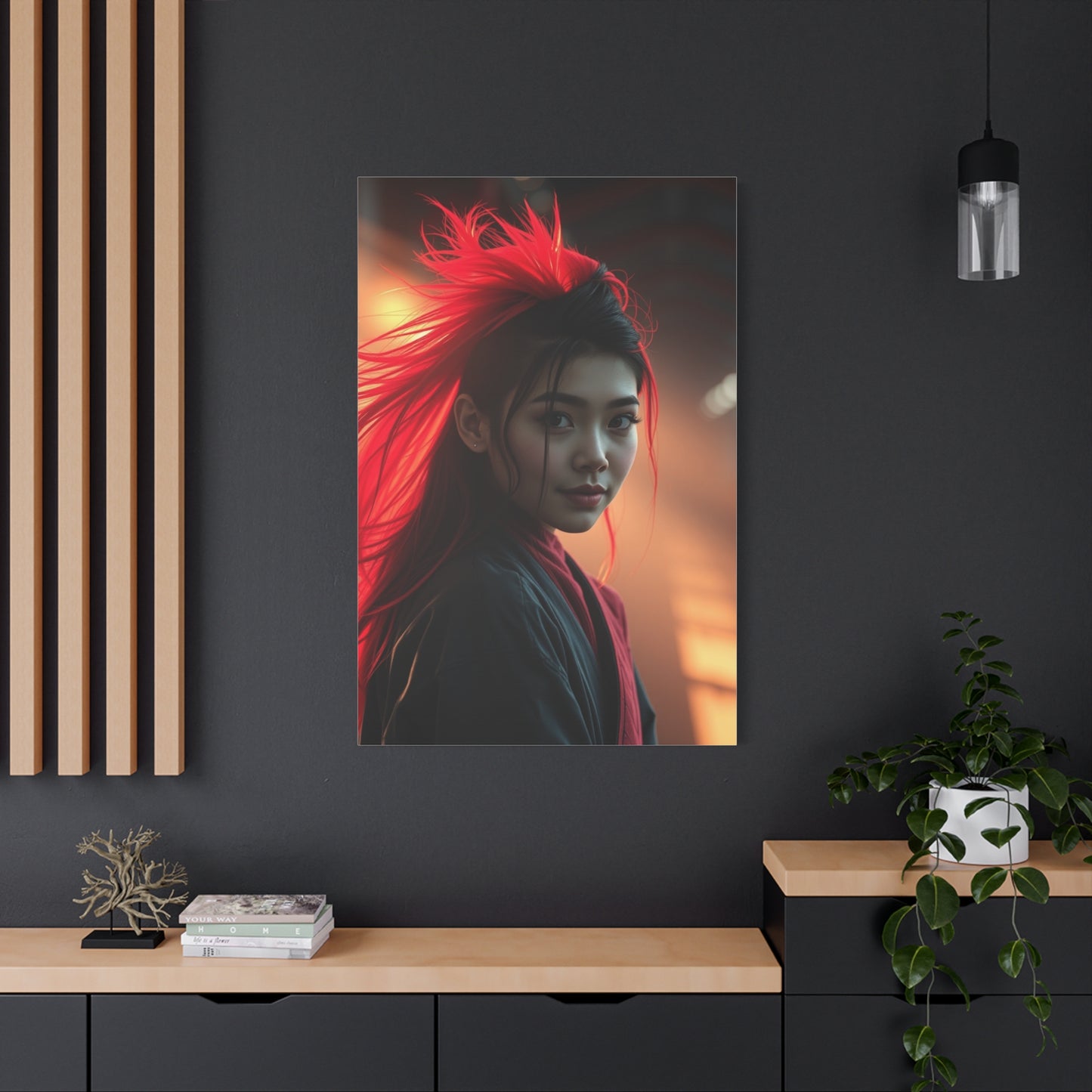
Luxury in Pink, through Cerise Opulence Display Wall Art, exemplifies the fusion of bold sophistication and modern elegance in interior design. The vibrant, deep hues of cerise provide a striking visual statement that conveys confidence, creativity, and refined taste, transforming any space into a showcase of personality and style. This particular shade of pink—rich, dynamic, and indulgent—offers far more than decorative appeal; it embodies a celebration of individuality, luxury, and emotional resonance. Integrating cerise-themed wall art into your home allows you to curate spaces that are not only visually captivating but also emotionally uplifting, fostering environments that exude warmth, vibrancy, and elegance simultaneously.
At the heart of cerise opulence lies contrast and balance. The intensity of this color demands careful pairing with complementary tones, textures, and materials to create harmonious interiors. Deep jewel tones, soft neutrals, metallic accents, and natural textures can all enhance the luxurious feel of cerise wall art while preventing overwhelming visual saturation. Artists often leverage the rich chromatic depth of cerise to accentuate intricate details, add dimension, and draw the eye to key focal points, turning the artwork into a centerpiece that commands attention without overpowering the surrounding décor. The result is a refined, contemporary aesthetic that communicates both confidence and subtle sophistication.
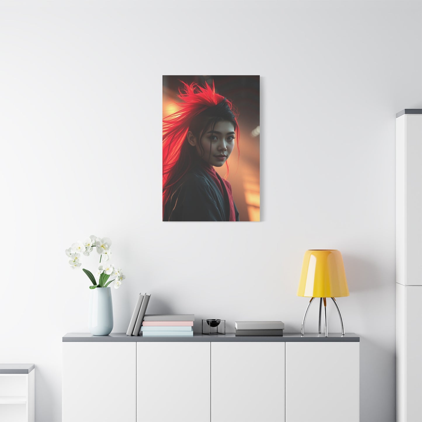
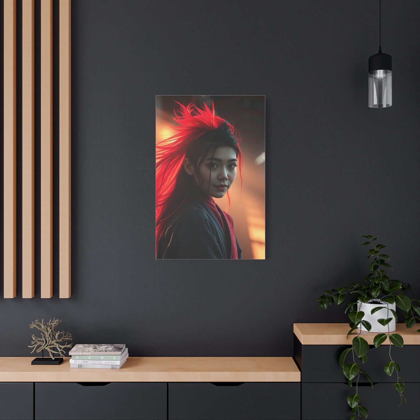
From an interior design standpoint, cerise opulence display art is exceptionally versatile. Large-scale canvases or framed works can dominate living rooms, dining areas, or bedrooms, creating a dramatic visual anchor that elevates the overall aesthetic of the space. Smaller prints, when grouped into gallery walls, provide layered textures and narrative depth, allowing the color to interact dynamically with lighting, furniture, and decorative elements. Cerise tones harmonize beautifully with gold, rose gold, brass, or silver accents, amplifying the sense of luxury and modernity. Even in minimalist interiors, a single cerise piece can inject energy, personality, and artistic depth, transforming an otherwise understated space into an environment of bold elegance.
Material choices play a crucial role in maximizing the impact of cerise opulence wall art. Canvas prints offer a soft, textured surface that enhances the richness of the color, while high-gloss or acrylic finishes can intensify vibrancy and visual depth. Framing options—from sleek modern metals to luxurious wood—add context and elevate the perceived value of the artwork, seamlessly integrating it with surrounding décor. Such thoughtful curation ensures that cerise wall art resonates with both visual appeal and tactile sophistication, making it a centerpiece that draws admiration and inspires creativity.
Lighting also amplifies the allure of cerise display art. Soft, diffused light enhances the subtle variations in tone, while directional or accent lighting can highlight textures, contours, and reflective finishes, creating a multidimensional effect. Strategically placed lighting not only accentuates the vibrancy of the cerise hue but also enhances the mood and atmosphere of the room, ensuring that the artwork becomes an immersive experience rather than a static decoration. By coordinating lighting with placement, homeowners can maximize the emotional and aesthetic impact of each piece, reinforcing its luxurious presence.
Beyond its visual appeal, cerise opulence art fosters psychological and emotional engagement. Vibrant pink hues are often associated with creativity, passion, and energy, encouraging optimism, inspiration, and a sense of comfort within living spaces. By incorporating these works into a home, individuals invite warmth, sophistication, and a bold expression of personal taste. Cerise wall art thus serves as both a decorative and emotional anchor, enriching interiors with a color that inspires confidence, joy, and refined elegance.
Ultimately, Luxury in Pink, through Cerise Opulence Display Wall Art, represents more than a decorative choice; it embodies a lifestyle of bold sophistication, emotional resonance, and timeless elegance. When thoughtfully curated, placed, and lit, these artworks transform spaces into vibrant, inviting, and luxurious environments that balance energy with refinement. By embracing cerise opulence, homeowners celebrate individuality, artistry, and the transformative power of color, allowing their interiors to become not just visually stunning but also emotionally compelling and uniquely expressive. In this way, cerise wall art transcends decoration, becoming a defining element that elevates both the aesthetic and emotional essence of the home.
