


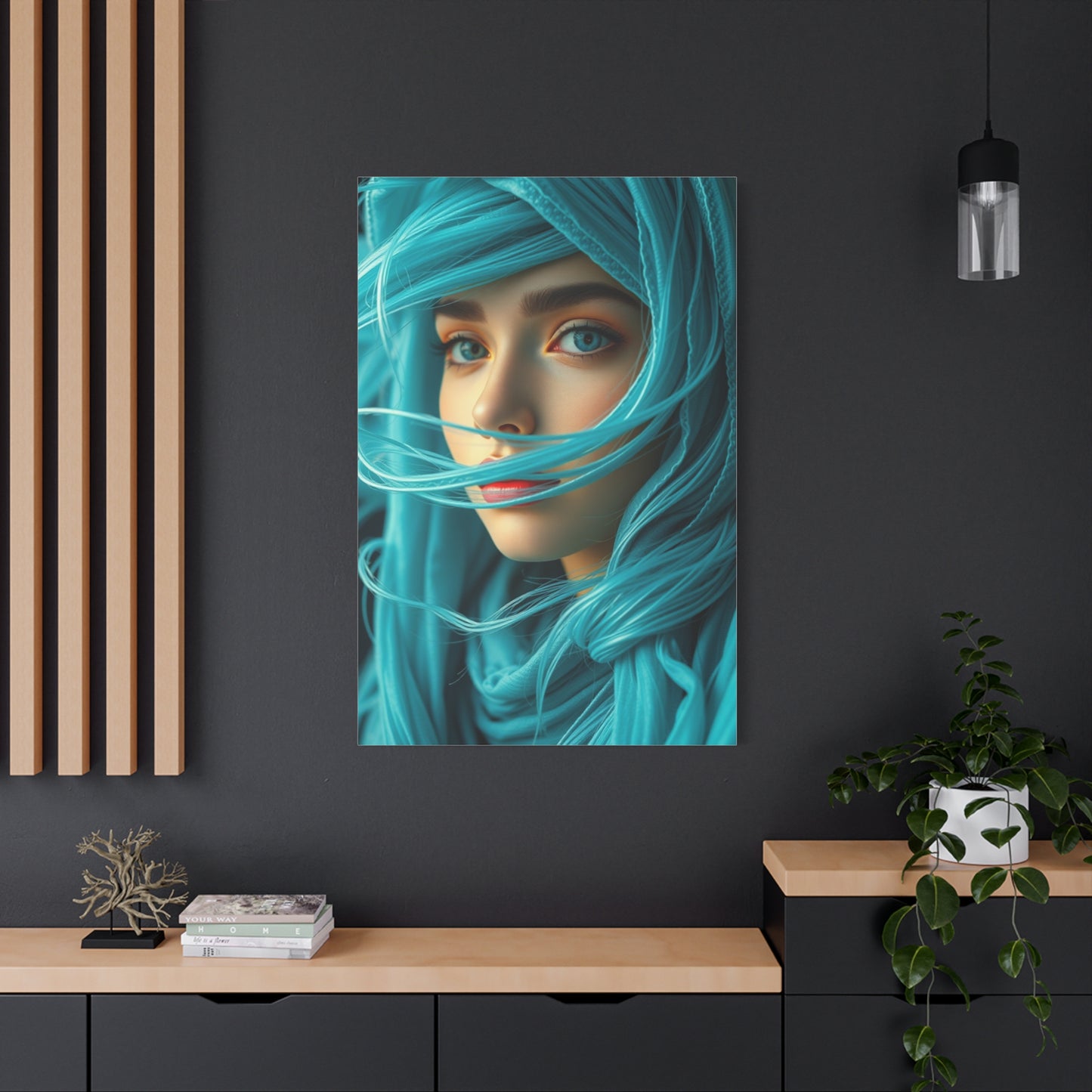
Cerulean Elegance Artwork wall art & canvas print
Cerulean Elegance Artwork wall art & canvas print
Couldn't load pickup availability


Timeless Beauty: Incorporating Elegance Artwork Wall Art into Your Home
Elegance in home décor transcends fleeting trends and temporary fashions, embodying a quality that remains perpetually relevant regardless of shifting design movements. Incorporating elegant artwork into your living spaces creates environments that feel refined, intentional, and deeply personal—spaces that age gracefully rather than appearing dated within a few years. The pursuit of timeless beauty through wall art requires understanding fundamental principles of classical design while allowing room for individual expression that makes a house feel authentically like home.
True elegance in artwork is characterized by restraint, quality, and emotional resonance rather than ostentation or obvious luxury. Elegant pieces possess a quiet confidence that doesn't demand attention through shock value or excessive ornamentation. Instead, they reward sustained viewing with layers of meaning, technical mastery, and aesthetic harmony that become more appreciated over time. When selecting elegant artwork for your home, prioritize pieces that speak to you on a personal level—artwork that you can imagine living with for decades rather than pieces chosen solely because they match current color schemes or fulfill immediate decorative needs.
The foundation of incorporating elegant artwork begins with understanding your space's architectural character and existing design language. Classical homes with traditional moldings and architectural details naturally accommodate representational artwork, landscapes, and portraiture that honor historical artistic traditions. Contemporary spaces with clean lines and minimal ornamentation provide perfect backdrops for abstract compositions, modern photography, and minimalist pieces that celebrate negative space and geometric precision. However, the most compelling interiors often juxtapose styles thoughtfully—a contemporary abstract in a traditional room or a classical landscape in a modern space—creating dynamic tension that keeps environments interesting without sacrificing cohesion.
Scale and proportion are critical considerations when incorporating elegant artwork. Undersized pieces appear tentative and fail to anchor spaces properly, while oversized artwork can overwhelm rooms and feel aggressive rather than refined. The traditional rule suggests artwork should occupy approximately two-thirds to three-quarters of available wall space above furniture, though this guideline flexes based on ceiling height, room function, and personal preference. In rooms with high ceilings, don't hesitate to embrace larger-scale pieces or vertically oriented compositions that draw the eye upward and celebrate architectural volume.
Quality supersedes quantity in elegant artwork displays. A single exceptional piece—whether an original painting, limited edition print, or museum-quality reproduction—creates more impact than multiple mediocre works scattered throughout a space. Investment in quality also extends to framing and presentation. Professional-grade frames with archival matting protect artwork while elevating its presence. Museum glass eliminates glare and UV damage, ensuring pieces maintain their beauty for generations. These details, though subtle, distinguish truly elegant installations from merely decorated walls.
Cerulean in Modern Interiors: Wall Art That Elevates Any Room
Modern interior design represents a broad and evolving aesthetic category that emphasizes clean lines, functional simplicity, and thoughtful use of color and materials to create spaces that feel both contemporary and timeless. Within this design framework, cerulean has emerged as a particularly valuable color choice, offering designers and homeowners a way to introduce vibrant yet sophisticated color without sacrificing the restraint and intentionality that defines modern aesthetics. The incorporation of cerulean through wall art in modern interiors creates opportunities for visual interest and emotional warmth that prevent these spaces from feeling cold, sterile, or overly minimalist.
The relationship between cerulean and modern design principles is rooted in the color's inherent qualities of clarity and directness. Modern design eschews unnecessary ornamentation and excessive decoration in favor of essential elements that serve clear purposes and contribute meaningfully to the overall composition. Cerulean aligns perfectly with this philosophy, as it provides substantial visual impact without requiring elaborate presentation or complex color combinations to be effective. A simple canvas featuring cerulean tones, whether in abstract or representational form, can serve as a powerful focal point in a modern interior without competing with the architectural elements and carefully selected furnishings that define these spaces.
Wall art selection in modern interiors requires careful consideration of scale, composition, and relationship to surrounding elements. Cerulean artwork in these contexts often performs best when it embraces the same principles of clarity and intentionality that govern the overall design approach. Abstract compositions featuring broad areas of cerulean, geometric interpretations of the color, or minimalist representations that distill subjects down to their essential forms all work exceptionally well in modern settings. These approaches to cerulean artwork complement the clean lines and uncluttered surfaces typical of modern interiors while providing the color and visual interest necessary to prevent spaces from feeling cold or unwelcoming.
One of the most effective strategies for incorporating cerulean wall art into modern interiors involves creating clear hierarchies of visual importance. In spaces characterized by restraint and selectivity, each element must earn its place through meaningful contribution to the overall design. A carefully chosen cerulean artwork can serve as the primary focal point in a room, with all other design decisions supporting and complementing this central element. This approach creates clear visual logic that guides the eye and helps occupants intuitively understand and navigate the space. The cerulean artwork becomes not just decoration but an integral component of the room's architectural and design narrative.
The format and framing of cerulean artwork significantly impact its effectiveness in modern interiors. Frameless gallery-wrapped canvases, where the artwork extends around the edges of the stretcher bars, align well with modern design's preference for clean edges and minimal visual interruption. When frames are used, thin profiles in metals like brushed aluminum or matte black create contemporary presentations that enhance rather than compete with the artwork itself. The goal is to allow the cerulean tones and artistic composition to take center stage while the presentation method recedes into the background, supporting without demanding attention.
Mixing Cerulean with Neutrals for Sophisticated Wall Décor
The artful combination of cerulean with neutral tones represents one of the most reliable and sophisticated approaches to creating elevated interior spaces that feel both current and enduring. Neutral colors serve as the foundation for countless successful design schemes, providing versatile backdrops that allow accent colors to shine while maintaining visual calm and flexibility. When cerulean is introduced into neutral-dominated spaces through carefully selected wall decor, the result is a balanced, layered aesthetic that avoids the coldness sometimes associated with purely neutral palettes while stopping well short of color overload that can make spaces feel chaotic or overwhelming.
Understanding the specific qualities of different neutral tones is essential for successfully pairing them with cerulean artwork. True neutrals, including white, black, and gray, offer the most versatile foundations for cerulean, as they lack warm or cool undertones that might clash or create unintended color interactions. Crisp white walls provide maximum contrast with cerulean artwork, making the blue tones appear vibrant and saturated while maintaining the fresh, clean aesthetic that many homeowners seek. This high-contrast pairing works particularly well in rooms with abundant natural light, where the interplay between bright walls and cerulean art creates dynamic, energizing environments.
Warmer neutrals, including beige, cream, tan, and greige (the gray-beige hybrid that has become immensely popular in recent years), introduce subtle color temperature considerations when paired with cerulean. The inherent coolness of cerulean can create beautiful tension with warm neutrals, with each enhancing the qualities of the other through contrast. Cerulean artwork against warm neutral walls appears even cooler and more refreshing, while the warm neutrals feel richer and more enveloping by comparison. This temperature contrast creates sophisticated, multi-dimensional color stories that reveal different qualities depending on lighting conditions and viewing angles, adding subtle complexity to otherwise simple color schemes.
Gray has emerged as perhaps the most popular neutral base in contemporary interiors, and its pairing with cerulean creates particularly elegant results. The tonal similarity between gray and blue means these colors harmonize naturally, creating monochromatic or analogous color schemes that feel cohesive and intentional. Light grays provide subtle contrast that allows cerulean artwork to stand out without jarring visual interruption, while darker charcoal grays create dramatic backdrops that make cerulean tones appear luminous and jewel-like. The specific undertones in gray paint colors matter significantly, with blue-gray or green-gray undertones creating different effects than true neutral or purple-tinted grays when paired with cerulean art.
Cerulean in Modern Interiors: Wall Art That Elevates Any Room
Cerulean blue has emerged as a defining color in contemporary interior design, offering a sophisticated alternative to traditional navy or powder blue. This distinctive shade—sitting between azure and sky blue—brings an air of tranquility and refinement to modern spaces. When incorporated through wall art, cerulean creates visual interest without overwhelming a room's aesthetic, making it an ideal choice for homeowners seeking to elevate their interiors with timeless elegance.
Modern interiors thrive on balance, and cerulean artwork provides the perfect focal point that complements minimalist and maximalist designs alike. In open-concept living spaces, a cerulean canvas can anchor an entire room, drawing the eye upward and creating a sense of vertical space. The color's inherent versatility allows it to transition seamlessly between various design styles—from Scandinavian simplicity to mid-century modern charm—making it an investment piece that adapts as your aesthetic evolves.
The beauty of cerulean wall art lies in its ability to influence a room's atmosphere without dominating it. Unlike bolder blues that can feel heavy or overwhelming, cerulean maintains a lightness that opens up spaces and promotes airflow within a design. This quality makes it particularly effective in smaller rooms or apartments where creating an illusion of spaciousness is essential. A well-placed cerulean print can make ceilings appear higher and walls seem to recede, fundamentally transforming the perception of a room's dimensions.
Contemporary artists and designers increasingly favor cerulean for its connection to nature—evoking clear skies, tropical waters, and peaceful horizons. This natural association makes cerulean artwork particularly effective in urban environments where residents crave connections to the outdoors. A single cerulean piece can serve as a visual escape, offering a moment of calm in the midst of bustling city life.
When selecting cerulean wall art for modern interiors, consider pieces that incorporate varied textures and techniques. Abstract compositions with layered cerulean tones create depth and complexity, while photographic prints featuring cerulean elements bring a crisp, contemporary edge. Mixed-media pieces combining cerulean with metallic accents or natural materials add dimensional interest that catches light throughout the day, ensuring your artwork remains dynamic from morning to evening.
The placement of cerulean artwork significantly impacts its effectiveness. In living rooms, positioning cerulean pieces opposite windows allows natural light to interact with the blue tones, creating subtle color variations throughout the day. In dining areas, cerulean art provides a calming backdrop that encourages lingering conversations. The key is treating cerulean artwork not merely as decoration but as an architectural element that shapes how we experience and move through our homes.
Mixing Cerulean with Neutrals for Sophisticated Wall Décor
The combination of cerulean blue and neutral tones represents one of interior design's most sophisticated and enduring partnerships. This pairing creates a balanced aesthetic that feels both contemporary and timeless, offering visual interest without overwhelming the senses. When cerulean artwork is introduced into a neutral-dominated space, it serves as a jewel-toned accent that elevates the entire room's design quotient while maintaining an atmosphere of refined restraint.
Neutral palettes—comprising whites, beiges, grays, and taupes—provide the perfect canvas for cerulean artwork to shine. The coolness of cerulean creates a beautiful contrast against warm neutrals like cream and sand, adding depth and dimension to what might otherwise feel flat or monotonous. Against cooler neutrals such as dove gray or greige, cerulean establishes a harmonious tonal relationship that feels cohesive and intentional. This versatility makes cerulean an excellent choice for those who appreciate neutral interiors but seek moments of color that feel organic rather than jarring.
The proportion of cerulean to neutrals significantly affects the overall aesthetic. In a predominantly neutral room, a single large cerulean canvas can serve as a powerful statement piece, creating a focal point that draws visitors into the space. Alternatively, multiple smaller cerulean prints distributed throughout a neutral environment create rhythm and movement, guiding the eye around the room and preventing visual stagnation. The key is maintaining balance—allowing the neutrals to provide stability while the cerulean offers punctuation and personality.
Texture plays a crucial role when mixing cerulean with neutrals. Layering different materials and finishes prevents the color scheme from feeling one-dimensional. Consider pairing a smooth cerulean print with textured neutral elements like linen upholstery, wool throws, or woven baskets. The interplay between the crisp, clean lines of cerulean artwork and the organic, tactile quality of neutral textiles creates sensory richness that makes spaces feel lived-in and sophisticated rather than sterile.
The undertones of your neutral palette should inform your cerulean selections. If your neutrals lean warm with beige or cream bases, choose cerulean artwork with slightly warmer undertones or pieces that incorporate secondary warm colors alongside the blue. For cool-toned neutrals dominated by grays, opt for purer cerulean shades that maintain the color temperature consistency throughout the space.
This combination proves particularly effective in transitional spaces—those areas between clearly defined rooms like hallways, entryways, and staircases. Here, cerulean artwork against neutral walls creates visual interest in often-overlooked areas while maintaining flow and cohesion throughout the home. The result is a sophisticated environment that feels thoughtfully curated, where every element serves a purpose in creating an atmosphere of calm elegance and contemporary refinement.
The Psychology of Cerulean: Peace and Focus in Art
Color psychology reveals that cerulean blue possesses unique properties that influence human emotion, cognition, and behavior in profound ways. Unlike darker blues that can feel somber or overwhelming, cerulean occupies a psychological sweet spot—calming without being sedating, uplifting without being stimulating. When incorporated into artwork, cerulean becomes more than mere decoration; it transforms into a tool for shaping the emotional landscape of our living spaces and supporting our mental wellbeing.
Research consistently demonstrates that blue hues, particularly those in the cerulean range, lower blood pressure, reduce heart rate, and decrease respiration—all physiological markers of relaxation. In our increasingly stressful world, cerulean artwork functions as a visual sanctuary, offering the nervous system a cue to downshift from heightened alertness to peaceful awareness. This makes cerulean particularly valuable in spaces where we seek respite from daily demands, such as bedrooms, reading nooks, and meditation areas.
Beyond its calming properties, cerulean uniquely supports concentration and mental clarity. Studies in environmental psychology show that cerulean tones enhance cognitive performance, particularly in tasks requiring sustained attention and creative problem-solving. Unlike reds and yellows that can create anxiety or overstimulation, cerulean maintains mental alertness while reducing mental fatigue. This dual capacity—simultaneously relaxing and focusing—makes cerulean artwork an excellent choice for home offices, study areas, and creative studios where both peace and productivity are essential.
The psychological impact of cerulean also connects to its natural associations. Humans have evolved with innate positive responses to clear skies and clean water—both represented by cerulean tones. This evolutionary connection means that cerulean artwork taps into deep-seated feelings of safety, openness, and possibility. In enclosed urban environments, cerulean pieces can satisfy our biological need for connection with natural elements, reducing symptoms of nature deficit and promoting overall psychological wellbeing.
Cerulean's psychological effects extend to social dynamics within spaces. The color promotes communication, trust, and emotional openness—qualities that make cerulean artwork valuable in living rooms and dining areas where meaningful connections occur. Unlike aggressive colors that can create tension or passive colors that may induce lethargy, cerulean facilitates the balanced, engaged presence that nurtures relationships.
Interestingly, cerulean's psychological impact varies with its presentation in artwork. Abstract cerulean compositions with fluid, organic shapes enhance relaxation and creative thinking, while geometric cerulean designs support structured thought and orderliness. Understanding these nuances allows us to select cerulean artwork that aligns with our psychological needs for specific spaces, creating environments that actively support our mental and emotional health rather than merely looking aesthetically pleasing.
Creating a Gallery Wall Around Cerulean Artwork
A gallery wall centered on cerulean artwork offers an opportunity to create a dynamic, personalized display that showcases your aesthetic sensibilities while maintaining visual cohesion. The process of building such a wall requires thoughtful planning, balancing the calming influence of cerulean with complementary elements that add depth, variety, and personal narrative. When executed successfully, a cerulean-focused gallery wall becomes the defining feature of a room—a curated collection that reflects both artistic appreciation and design sophistication.
Begin by selecting your anchor piece—typically the largest or most visually striking cerulean artwork in your collection. This foundational piece establishes the tone, style, and color intensity for the entire gallery wall. Whether you choose an abstract cerulean canvas, a photographic print featuring cerulean elements, or a mixed-media piece, this anchor should command attention while leaving room for supporting works to contribute to the overall narrative. Position this piece at eye level, slightly off-center, as perfectly centered arrangements can feel static and overly formal.
Building outward from your anchor, incorporate varying sizes and orientations of artwork to create visual rhythm. Mix horizontal and vertical pieces, intersperse smaller works between larger ones, and avoid creating obvious geometric patterns that feel contrived. The key is achieving asymmetrical balance—a arrangement that feels stable without being predictable. Include cerulean pieces in different mediums and styles: watercolor, acrylic, digital prints, and photography each bring distinct textures and visual weights that prevent monotony.
Color strategy is crucial when designing a cerulean gallery wall. While cerulean should dominate, introducing complementary and neutral elements prevents the display from feeling one-note. Consider incorporating black and white photography, neutral-toned abstracts, or artwork featuring cerulean alongside coral, gold, or warm gray accents. These supporting pieces provide visual rest stops that make the cerulean elements more impactful through contrast. Aim for roughly sixty to seventy percent cerulean dominance, with remaining pieces offering tonal variation.
Framing choices significantly influence gallery wall cohesion. For a contemporary, unified look, use identical frames in consistent colors—white, black, natural wood, or metallic finishes that complement your cerulean palette. Alternatively, mixing frame styles and finishes creates an eclectic, collected-over-time aesthetic that feels personal and curated. Regardless of approach, maintain consistency in mat width and color to create subtle unity despite frame variation.
Layout planning prevents costly mistakes. Before hammering a single nail, arrange your pieces on the floor or create paper templates to tape on the wall, allowing experimentation without commitment. Most successful gallery walls maintain relatively consistent spacing between pieces—typically two to three inches—creating a cohesive whole rather than a scattered collection. Consider the surrounding architecture, ensuring your gallery wall respects door frames, windows, and furniture placement while filling the wall space generously without crowding.
Statement Pieces: Large Cerulean Canvases for Open Spaces
Large-scale cerulean canvases possess an undeniable presence that can define and transform open living spaces in ways smaller artworks simply cannot achieve. In contemporary homes featuring expansive walls, high ceilings, and open floor plans, a substantial cerulean piece provides necessary visual weight and establishes a focal point that anchors the entire design scheme. These statement pieces do more than decorate—they create atmosphere, influence spatial perception, and communicate sophisticated aesthetic sensibilities.
The impact of scale in art cannot be overstated, particularly in open-concept environments where visual continuity and defined zones are essential. A large cerulean canvas—whether measuring four feet, six feet, or even larger—commands attention without requiring viewers to approach closely for appreciation. This immediate visual impact makes large cerulean pieces ideal for spaces viewed from multiple angles and distances, such as great rooms, lofts, and open-plan living areas where artwork must hold its own against expansive architecture.
When selecting a large cerulean canvas for open spaces, consider the emotional tone you wish to establish. Abstract compositions with sweeping cerulean gestures create movement and energy, ideal for dynamic living areas where activity and conversation flow freely. Conversely, large-scale cerulean pieces featuring subtle tonal variations and minimalist compositions promote tranquility and contemplation, making them suitable for meditation spaces or reading areas within larger rooms. The scale amplifies whatever emotional quality the artwork possesses, so choose intentionally based on your space's purpose.
Placement strategy for large cerulean canvases requires careful consideration of sight lines, lighting, and surrounding elements. In open spaces, position your statement piece where it's visible from multiple areas but doesn't compete with architectural features like fireplaces or dramatic windows. Above a sectional sofa or console table provides traditional placement, but don't overlook opportunities to float large canvases on walls perpendicular to main seating areas, creating visual interest that draws people deeper into the space.
Lighting dramatically affects how large cerulean canvases are perceived and experienced. Natural light brings out cerulean's inherent luminosity and subtle color variations, making windows-adjacent walls excellent locations. However, dedicated picture lighting—either track lighting or wall-mounted fixtures—ensures your statement piece remains impactful during evening hours. LED lights with adjustable color temperatures allow you to emphasize different aspects of the artwork, warming or cooling the cerulean tones to suit different moods and occasions.
Large cerulean canvases work best when given breathing room. In open spaces, resist the temptation to surround statement pieces with additional artwork or decorative objects. Instead, allow generous negative space around the canvas, treating the wall itself as part of the composition. This restraint amplifies the artwork's impact while demonstrating design confidence. If the space feels too empty, balance the large canvas with a single significant furniture piece or sculptural element rather than cluttering the visual field.
Balancing Warm and Cool Tones with Cerulean Art Prints
Achieving visual harmony in interiors often requires balancing warm and cool color temperatures, and cerulean art prints offer an exceptional tool for creating this equilibrium. As a cool-toned color with inherent clarity and lightness, cerulean can refresh spaces dominated by warm hues while adding complexity to cool-toned environments. Mastering the interplay between cerulean and warm tones—oranges, corals, terracottas, golds, and warm woods—results in interiors that feel dynamic yet balanced, energizing yet comfortable.
The color wheel provides foundational guidance for understanding cerulean's relationship with warm tones. Cerulean sits opposite orange in the complementary color spectrum, creating natural visual tension that draws the eye and creates vibrancy when paired. However, working with pure complementary colors can feel jarring if not carefully modulated. Instead, consider cerulean art prints that incorporate secondary warm tones like peachy coral, burnt sienna, or golden ochre. These softer warm accents bridge the temperature gap, creating sophisticated transitions that feel intentional rather than accidental.
In warm-dominated interiors featuring natural wood furniture, terracotta tiles, or warm-toned textiles, cerulean artwork functions as a cooling element that prevents spaces from feeling heavy or monotonous. The cool blue provides visual relief, refreshing the eye and creating depth through temperature contrast. A single cerulean print above a warm wood console or within a gallery wall of sepia-toned photographs can transform the entire space's energy, introducing balance without disrupting the established warm aesthetic.
Conversely, predominantly cool interiors benefit from cerulean prints that incorporate warm elements. Seek artwork featuring cerulean backgrounds with warm metallic accents, coral geometric patterns overlaying cerulean fields, or abstract pieces where cerulean and warm tones intermingle organically. These integrated pieces serve as bridges, validating both temperature ranges within your space and creating cohesion between disparate elements.
The proportion of warm to cool significantly impacts spatial perception. Cool tones like cerulean visually recede, making walls appear farther away and rooms feel more spacious. Warm tones advance, creating coziness and intimacy. By strategically placing cerulean artwork, you can manipulate these perceptions—using cerulean prints on one wall to "push back" a space in a narrow room while leaving warm-toned walls untreated, or distributing cerulean pieces throughout to open up a space that feels cramped.
Lighting profoundly affects the warm-cool balance. Natural daylight enhances cerulean's coolness, while warm incandescent or LED lighting can soften cerulean tones, making them feel less stark against warm interiors. Consider your space's primary lighting when selecting cerulean prints—spaces with abundant natural light can accommodate purer, cooler cerulean shades, while rooms relying on warm artificial lighting benefit from cerulean artwork with slightly warmer undertones that won't clash under evening illumination.
Cerulean Elegance in Minimalist Wall Décor
Minimalist design philosophy celebrates restraint, intentionality, and the profound impact of carefully chosen elements—principles that align perfectly with cerulean artwork's inherent qualities. In minimalist interiors, where every item must justify its presence through beauty, function, or emotional resonance, cerulean wall décor serves as an ideal focal point that provides color and visual interest without compromising the clean, uncluttered aesthetic that defines minimalism. The key lies in selecting and displaying cerulean pieces that embody minimalist values: simplicity, quality, and purposeful presence.
Cerulean's natural elegance makes it particularly suited to minimalist spaces. Unlike vibrant, demanding colors that compete for attention, cerulean possesses a quiet sophistication that complements rather than overwhelms minimalist environments. Its association with open skies and clear water resonates with minimalism's emphasis on space, light, and tranquility. A single cerulean canvas in a pared-down room becomes a meditation on color itself—an invitation to appreciate subtlety and nuance rather than visual excess.
When incorporating cerulean into minimalist wall décor, embrace the "less is more" principle with conviction. Rather than multiple pieces, select one exceptional cerulean artwork that truly speaks to you. This piece should be substantial enough to command attention in the negative space surrounding it, yet refined enough that it doesn't disrupt the room's serenity. Abstract minimalist compositions featuring cerulean gradients, monochromatic cerulean pieces with subtle textural variation, or simple geometric designs in cerulean tones all honor minimalist sensibilities while providing necessary visual engagement.
The relationship between cerulean artwork and negative space defines minimalist wall décor success. In minimalism, empty wall space isn't absence but presence—an active design element that allows the eye to rest and the mind to settle. When hanging cerulean pieces in minimalist interiors, err on the side of generous spacing. Allow significant breathing room around artwork, treating the surrounding white or neutral wall as an integral part of the composition. This approach amplifies the artwork's impact while maintaining the spacious, uncluttered quality essential to minimalist aesthetics.
Framing choices for minimalist cerulean décor should emphasize simplicity and quality. Opt for clean-lined frames in natural wood, matte black, or white that disappear into the background, directing attention to the artwork itself rather than the presentation. Frameless canvases or pieces with gallery wrapping—where the artwork continues around the canvas edges—offer contemporary alternatives that feel modern and unobtrusive. Avoid ornate frames, heavy matting, or decorative hanging systems that add visual complexity counter to minimalist principles.
Material quality becomes paramount in minimalist spaces where few elements compete for attention. Invest in museum-quality prints, original artwork, or professionally produced canvases that demonstrate craftsmanship and attention to detail. In minimalism, every flaw becomes visible, every shortcut apparent. High-quality cerulean artwork rewards close examination and ages gracefully, maintaining its beauty and relevance rather than feeling dated or cheaply produced.
Pairing Cerulean with Metallic Accents in Interiors
The combination of cerulean and metallic accents creates a sophisticated interplay between color and light that elevates interior design from ordinary to extraordinary. Metallics—whether gold, silver, copper, or brass—bring reflective dimension that makes cerulean artwork appear more luminous and dynamic, while cerulean provides a cool, grounding counterpoint to metallics' inherent warmth and shine. This pairing works across design styles, from glamorous contemporary to understated transitional, offering versatility that adapts to personal aesthetic preferences while maintaining cohesive elegance.
Gold accents paired with cerulean create the most dramatic and luxurious effect. The warm, rich quality of gold provides striking contrast against cerulean's coolness, evoking imagery of sunlight on water or golden hour skies. Consider cerulean artwork featuring gold leaf details, abstract pieces with gold geometric patterns, or cerulean canvases displayed in ornate gold frames. In interiors, complement cerulean artwork with gold-finished mirrors, light fixtures, or decorative accessories positioned nearby, creating visual echoes that tie the space together. This combination suits living rooms and dining areas where you wish to create an impression of refined opulence.
Silver and chrome metallics offer a cooler, more contemporary pairing with cerulean. This combination feels sleek and modern, ideal for minimalist or industrial-inspired interiors. The similar color temperature of silver and cerulean creates harmony rather than contrast, resulting in sophisticated monochromatic-leaning schemes that feel calming and cohesive. Cerulean artwork with silver metallic elements or displayed alongside silver-framed mirrors, stainless steel fixtures, and chrome hardware produces a crisp, clean aesthetic particularly effective in modern kitchens, bathrooms, and home offices.
Copper and rose gold metallics provide middle-ground warmth that complements cerulean without overwhelming it. These softer metallics have gained popularity in contemporary design for their ability to warm spaces without the formality of traditional gold or the starkness of silver. Cerulean artwork paired with copper light fixtures, rose gold frames, or copper-toned decorative objects creates an approachable sophistication—elegant without being pretentious. This combination works beautifully in bedrooms and casual living spaces where warmth and relaxation are priorities.
Brass occupies a unique position among metallics, offering vintage warmth that pairs beautifully with cerulean in both traditional and eclectic interiors. Brushed brass particularly complements cerulean, as its muted finish prevents excessive shine while maintaining metallics' reflective quality. Consider cerulean artwork displayed with brass frames, positioned near brass sconces or picture lights, or incorporated into gallery walls featuring brass-framed mirrors. This pairing evokes mid-century modern and art deco sensibilities, ideal for those drawn to vintage-inspired design.
The key to successfully pairing cerulean with metallics lies in restraint and distribution. Rather than concentrating all metallic elements in one area, distribute them throughout the space to create rhythm and flow. If your cerulean artwork includes metallic details, echo those metallics in light fixtures, hardware, and accessories positioned at varying heights and distances from the artwork. This creates subtle connections that guide the eye and unify the space without feeling contrived or overdone.
Ocean-Inspired Cerulean Art for Calming Living Spaces
Ocean-inspired cerulean artwork taps into humanity's deep psychological connection with water, bringing the calming, restorative qualities of coastal environments into our homes. Whether you live oceanside or landlocked, incorporating cerulean art with aquatic themes creates sanctuary-like living spaces that promote relaxation, reduce stress, and provide daily visual escapes from urban intensity. The key lies in selecting pieces that evoke water's essence—its movement, depth, and ever-changing nature—rather than literal representations that can feel clichéd or kitschy.
Abstract interpretations of water offer the most sophisticated approach to ocean-inspired cerulean art. Fluid, organic compositions featuring cerulean washes, gradient transitions from deep cerulean to pale aqua, or layered cerulean tones suggesting water's depth create atmospheric effects without resorting to obvious imagery. These abstractions allow viewers to project their own oceanic memories and emotions onto the artwork, making the pieces more personally meaningful than literal seascapes. Look for artwork featuring flowing lines, gentle curves, and soft edges that mimic water's natural movement and organic quality.
Photographic cerulean art brings the ocean's reality into interiors with stunning clarity and impact. Aerial photographs of turquoise waters, close-up shots of cerulean waves, or images capturing the liminal space where sky meets sea offer contemporary takes on ocean-inspired décor. These pieces work particularly well in modern and minimalist interiors where crisp, clean imagery aligns with overall design aesthetics. Large-scale ocean photography commands attention and creates immersive experiences, making viewers feel transported to coastal environments.
The calming effect of ocean-inspired cerulean art stems from multiple factors. Water imagery activates the parasympathetic nervous system, triggering relaxation responses throughout the body. The horizontal orientation common in seascapes—suggesting horizon lines and expansive views—promotes feelings of openness and freedom, counteracting the confined feeling that sometimes affects interior spaces. Cerulean's specific hue further enhances these effects, combining blue's universally calming properties with a brightness that prevents darker blues' potentially somber influence.
Placement strategies maximize ocean-inspired cerulean art's calming impact. In living rooms, position these pieces where they're visible from primary seating areas, allowing the artwork to serve as a visual focal point during relaxation time. Bedrooms particularly benefit from ocean-inspired cerulean art, as the calming associations support quality sleep and peaceful mornings. Consider placing such artwork opposite the bed where it becomes the first and last image seen daily. Bathrooms—inherently water-connected spaces—provide natural settings for ocean-inspired cerulean pieces, enhancing the room's spa-like potential.
Layering ocean-inspired cerulean art with appropriate textures and materials amplifies the coastal feeling. Pair artwork with natural fiber textiles like linen and cotton, incorporate driftwood or coral-inspired decorative objects, and choose furniture with organic shapes and light finishes that won't compete with the artwork's calming presence. However, avoid overly themed décor—anchors, nautical stripes, and seashell collections—that can make spaces feel novelty-driven rather than sophisticated. Let the cerulean artwork itself evoke the ocean while keeping surrounding elements understated and complementary.
Abstract Cerulean Prints: From Subtle Hues to Bold Statements
Abstract cerulean prints offer remarkable versatility in interior design, spanning a spectrum from whisper-soft subtle hues that blend seamlessly into backgrounds to bold, saturated statements that command immediate attention. This range allows homeowners to calibrate the visual impact of cerulean artwork according to personal preferences, room functions, and existing design schemes. Understanding how to select and display abstract cerulean prints along this spectrum enables you to harness cerulean's full expressive potential while maintaining cohesive, intentional interior design.
Subtle cerulean abstracts feature diluted, watercolor-like washes, gentle gradients, or cerulean tints mixed with whites and pale grays. These pieces provide color presence without visual dominance, making them ideal for spaces where tranquility and understatement are priorities. Bedrooms, meditation spaces, and home offices benefit from subtle cerulean abstracts that offer color interest without distraction or overstimulation. These pieces work particularly well in small rooms or spaces with abundant patterns and textures, where bolder cerulean might compete for attention and create visual chaos.
Mid-range cerulean abstracts balance presence and restraint, featuring clear cerulean tones without overwhelming intensity. These pieces typically combine cerulean with one or two additional colors—perhaps white, gray, or a warm accent—creating visual complexity while maintaining cerulean dominance. Mid-range abstracts offer the most versatile option for most interiors, providing sufficient color impact to serve as focal points while remaining adaptable to changing décor and seasonal styling. They work across nearly all room types and design styles, from transitional living rooms to contemporary dining spaces.
Bold cerulean abstracts make unequivocal statements through saturated color, large-scale application, or dramatic compositions. These pieces feature intense, pure cerulean—sometimes approaching the brightness of neon or the depth of ultramarine—demanding attention and establishing immediate visual hierarchy. Bold abstracts suit confident design schemes in spacious rooms with high ceilings and generous natural light. They excel in creative spaces, studios, and entertainment areas where energy and personality take precedence over serenity. These pieces require commitment, as they fundamentally shape a room's character and limit flexibility in surrounding décor choices.
Composition and technique significantly influence abstract cerulean prints' impact regardless of color intensity. Geometric abstracts featuring sharp lines, defined shapes, and structured compositions create order and contemporary sophistication. Organic abstracts with flowing forms, soft edges, and painterly techniques evoke emotion and movement. Layered abstracts suggesting depth and dimension through overlapping cerulean tones offer visual complexity that rewards sustained viewing. Consider how composition style aligns with your space's personality—geometric for modern, structured environments; organic for creative, expressive spaces; layered for intimate rooms where contemplation is valued.
Displaying abstract cerulean prints requires consideration of viewing distance and spatial context. Subtle pieces need closer viewing to appreciate nuance, making them suitable for smaller rooms or intimate spaces where viewers naturally approach. Bold pieces maintain impact from distance, ideal for open spaces or rooms viewed primarily from across the space. Mid-range abstracts adapt to various viewing distances, offering flexibility in placement. Additionally, consider how surrounding colors and patterns interact with your chosen cerulean abstract—subtle pieces can get lost amid busy surroundings, while bold pieces might clash with equally strong competing elements.
Cerulean Wall Art in Bedrooms for a Serene Atmosphere
The bedroom serves as our most personal sanctuary—a space dedicated to rest, rejuvenation, and intimate retreat from daily demands. Cerulean wall art proves exceptionally effective in bedrooms, leveraging color psychology and visual aesthetics to create environments that promote quality sleep, peaceful mornings, and overall wellbeing. Unlike more stimulating colors that can disrupt the bedroom's restorative purpose, cerulean's inherent calmness aligns perfectly with sleep science and creates atmospheres that support both physical rest and mental tranquility.
Cerulean's specific wavelength and visual properties make it ideal for bedroom environments. Research in color psychology and sleep science consistently demonstrates that blue hues, particularly lighter blues like cerulean, lower heart rate and blood pressure while promoting melatonin production—the hormone regulating sleep-wake cycles. Unlike darker blues that can feel heavy or cold in bedrooms, cerulean maintains these beneficial physiological effects while offering lightness and airiness that prevents spaces from feeling oppressive or cave-like. The result is a bedroom that actively supports better sleep quality rather than merely avoiding sleep disruption.
Placement of cerulean artwork within bedrooms significantly impacts its effectiveness. The wall opposite the bed—the first sight upon waking—offers prime real estate for cerulean pieces that set a peaceful tone for the day ahead. Positioning cerulean artwork here transforms the morning experience, replacing jarring alarms with visual serenity that eases the transition from sleep to wakefulness. Alternatively, placing cerulean art on the wall behind the bed creates a backdrop visible to anyone entering the room, immediately communicating the space's purpose and atmosphere. Avoid positioning highly stimulating or complex cerulean pieces where they're visible from the bed itself, as these can interfere with the mind's ability to settle before sleep.
Style considerations for bedroom cerulean art should prioritize softness and simplicity over bold statements. Abstract cerulean compositions with gentle movements, watercolor-style cerulean washes, or minimalist cerulean prints create the most sleep-conducive environments. Avoid cerulean artwork with sharp contrasts, busy patterns, or intense saturation that might prove mentally stimulating when you're trying to wind down. If incorporating figurative cerulean pieces, choose subjects with calming associations—landscapes, seascapes, or nature imagery—rather than people or dynamic scenes that might engage the mind too actively.
Lighting dramatically affects cerulean artwork's impact in bedrooms. Natural morning light brings out cerulean's luminosity, supporting wakefulness and energy as you begin the day. However, evening illumination requires careful consideration. Avoid positioning cerulean artwork where it reflects bright overhead lighting into bed, creating glare that disrupts relaxation. Instead, use soft, warm-toned ambient lighting or adjustable picture lights that allow you to control how prominently the artwork features during evening hours. Dimmer switches prove invaluable for gradually reducing visual stimulation as bedtime approaches.
Scale and quantity matter in bedroom cerulean art displays. Unlike living spaces that benefit from gallery walls or multiple pieces, bedrooms generally function better with fewer, more impactful cerulean artworks. One or two carefully chosen pieces provide sufficient visual interest without creating visual clutter that can subconsciously affect sleep quality. If using multiple cerulean pieces, maintain generous spacing and consistent themes to avoid the busy, stimulating effect that multiple disparate artworks can create.
Office Inspiration: Boosting Productivity with Cerulean Artwork
Modern workspace design increasingly recognizes that environment profoundly impacts cognitive performance, creativity, and overall productivity. Cerulean artwork offers a scientifically supported tool for optimizing home and professional offices, leveraging color's neurological effects to enhance focus, reduce mental fatigue, and support sustained cognitive performance. Unlike warmer colors that can increase heart rate and anxiety or darker tones that might induce lethargy, cerulean occupies an ideal middle ground—stimulating enough to maintain alertness while calming enough to reduce stress.
Research in environmental psychology and workplace productivity demonstrates that blue hues, particularly cerulean, enhance performance on cognitive tasks requiring sustained attention, complex problem-solving, and creative thinking. Blue light exposure—even through visual perception of blue objects like cerulean artwork—has been shown to improve reaction times, increase alertness, and enhance memory consolidation. For knowledge workers spending hours in focused work, cerulean artwork provides continuous passive cognitive support, subtly optimizing brain function throughout the workday without requiring any active engagement.
Strategic placement of cerulean artwork within office spaces maximizes productivity benefits. Position cerulean pieces within your natural sight line when looking up from work—typically straight ahead or slightly above eye level on the wall your desk faces. This allows for natural break moments where your eyes can rest on the cerulean artwork, providing mental reset opportunities that combat cognitive fatigue. These micro-breaks, lasting just a few seconds, help maintain sustained attention over longer periods and prevent the mental exhaustion that accumulates during intensive work sessions.
The style of cerulean artwork influences its effectiveness in office environments. Abstract geometric cerulean pieces support analytical and structured thinking, making them ideal for offices focused on data analysis, accounting, or technical work. Organic, flowing cerulean abstracts enhance creative thinking and problem-solving, benefiting designers, writers, and strategic planners. Landscape or horizon-themed cerulean pieces provide psychological distance and perspective, valuable for executives and managers dealing with complex decision-making. Match artwork style to the primary cognitive demands of your work for maximum alignment between environment and function.
Cerulean artwork also addresses common office design challenges. Home offices particularly benefit, as cerulean pieces help establish psychological boundaries between work and personal life within shared spaces. The presence of cerulean artwork signals "work mode" to your brain, supporting focus and professionalism even in casual home environments. In traditional office settings, cerulean artwork personalizes sterile corporate environments without appearing unprofessional, creating spaces that feel human-scaled and welcoming while maintaining appropriate workplace atmospheres.
Balancing cerulean with other office elements ensures optimal results. Pair cerulean artwork with natural wood elements, live plants, and warm metal accents to prevent offices from feeling cold or clinical. Ensure adequate lighting—both natural and artificial—so cerulean artwork remains visible and vibrant throughout the workday. In offices with multiple workers, consider how cerulean artwork contributes to overall acoustic and visual ergonomics. Properly placed artwork can help define zones, direct traffic flow, and create visual interest that prevents the monotony often associated with shared workspaces.
Conclusion:
Timeless Beauty: Incorporating Elegance Artwork Wall Art into Your Home illustrates the enduring appeal and transformative potential of sophisticated artwork in contemporary interior design. Elegance artwork, characterized by refined aesthetics, balanced compositions, and subtle sophistication, transcends trends and fads, offering a visual language that harmonizes with diverse interior styles while elevating the overall ambiance of a space. These pieces are more than decorative elements—they are expressions of taste, identity, and artistic discernment, capable of turning walls into narratives of poise, beauty, and emotional resonance.
At the core of elegance wall art lies its subtle power to enhance a room’s character without overwhelming it. Through carefully considered color palettes, refined textures, and harmonious forms, these artworks create a sense of balance, tranquility, and visual cohesion. Whether through minimalist abstractions, detailed figurative compositions, or thoughtfully executed landscapes, elegance art introduces a layer of sophistication that communicates refinement and intentionality. The artworks engage the eye, inviting contemplation, reflection, and a deeper appreciation for craftsmanship and design, making the home not merely a living space, but a curated environment of aesthetic enrichment.
From a design perspective, elegance wall art offers remarkable versatility. Large-scale canvases serve as commanding focal points in living rooms, dining areas, or entryways, establishing the visual narrative of a space. Smaller pieces or coordinated series can enhance gallery walls, corridors, or intimate corners, creating rhythm, cohesion, and thematic continuity. The neutral and refined color schemes typical of elegant artwork—muted tones, soft pastels, metallic highlights, or monochromatic layers—allow seamless integration with a variety of interior styles, from classic and traditional to modern, minimalist, or transitional. Through strategic placement and pairing with furniture, lighting, and textures, these artworks unify a room’s aesthetic while subtly reinforcing its tone and mood.
Lighting plays a critical role in maximizing the impact of elegance artwork. Soft ambient lighting enhances nuanced textures, gradients, and tonal subtleties, while targeted accent lighting emphasizes focal areas, metallic or glossy finishes, and detailed craftsmanship. The interaction of light and artwork can create depth, dimensionality, and a dynamic visual experience, ensuring that the piece evolves with the space and time of day. Thoughtful illumination transforms elegance artwork from a static decorative element into a living, breathing feature of interior design.
Emotionally, these artworks resonate with themes of serenity, refinement, and timeless sophistication. Elegance artwork fosters a sense of calm and composure, while simultaneously inspiring admiration, introspection, and aesthetic pleasure. By incorporating such pieces, homeowners create environments that feel curated, intentional, and emotionally enriching. Whether in private bedrooms, public living areas, or professional offices, elegance art conveys a sense of cultivated taste and enduring style, making a statement about the homeowner’s personality, priorities, and appreciation for beauty.
Artists working in the realm of elegance art employ diverse techniques to achieve subtlety and impact. Layered textures, delicate brushwork, fine lines, and metallic or pearlescent accents create depth and visual intrigue. The careful balance between negative space and detailed focal points ensures that each piece feels sophisticated, harmonious, and visually compelling. This combination of artistry, technical skill, and refined composition allows elegance artwork to complement a wide range of spaces, adding value both aesthetically and emotionally.
