


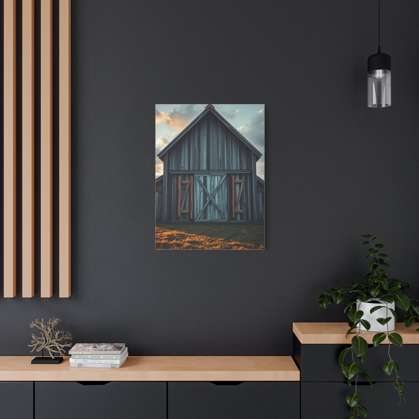
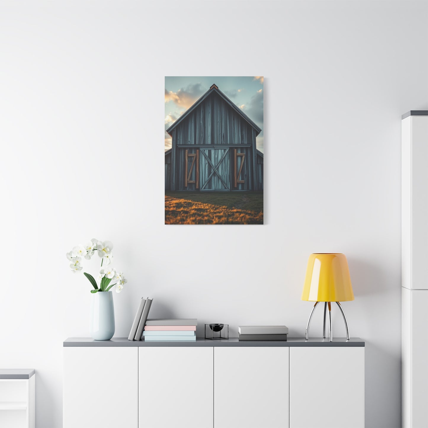
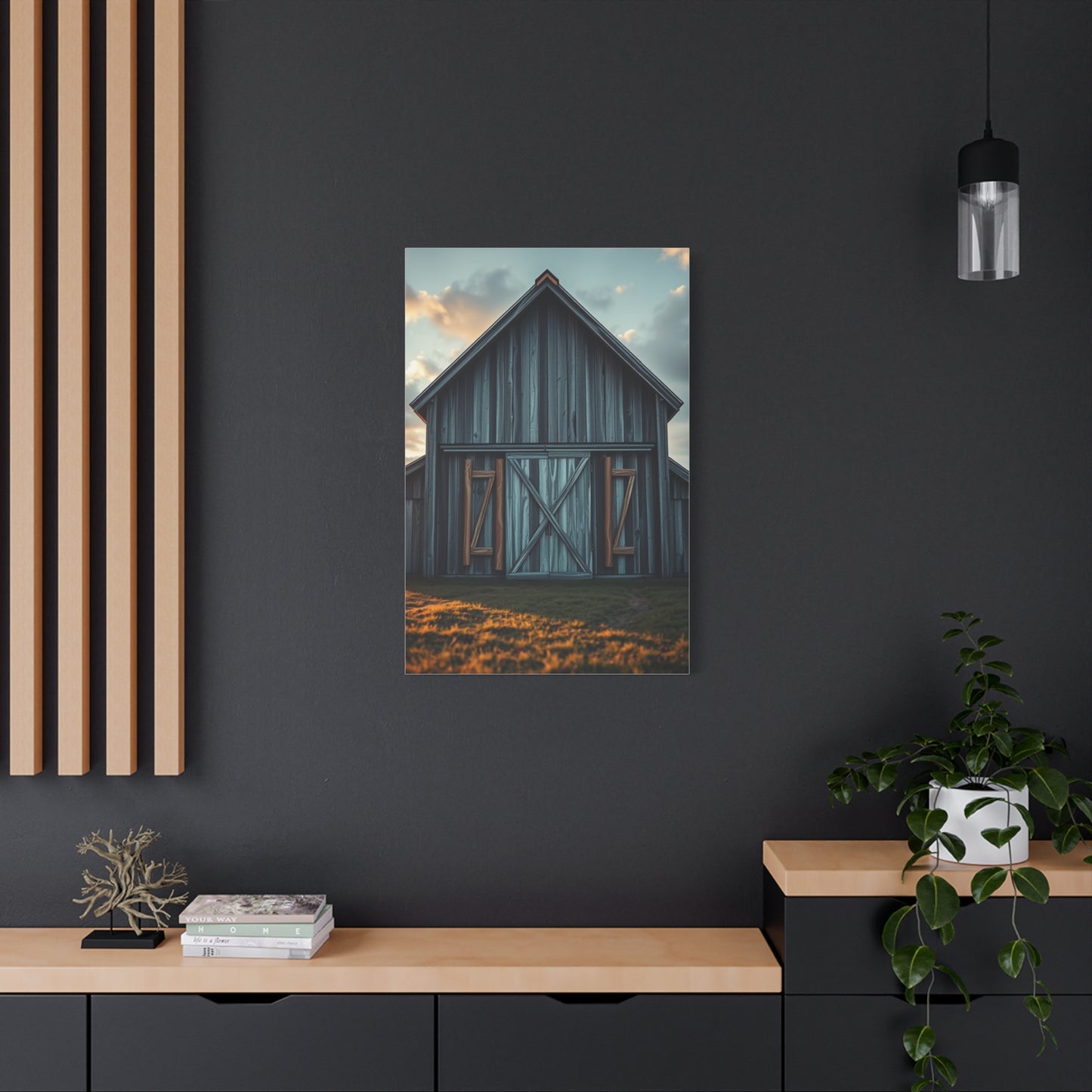
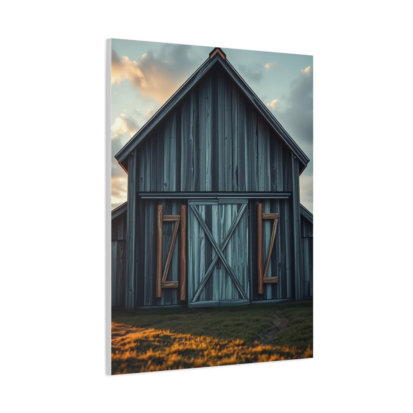
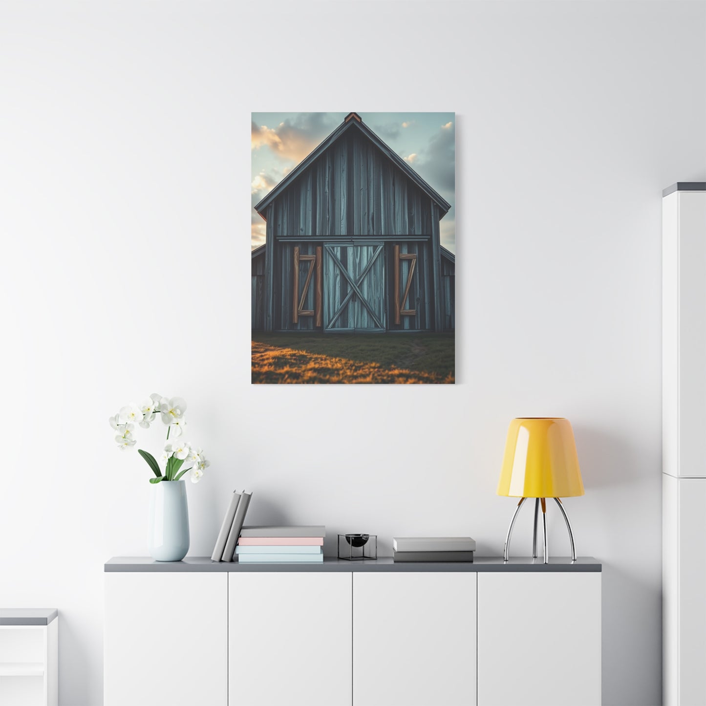
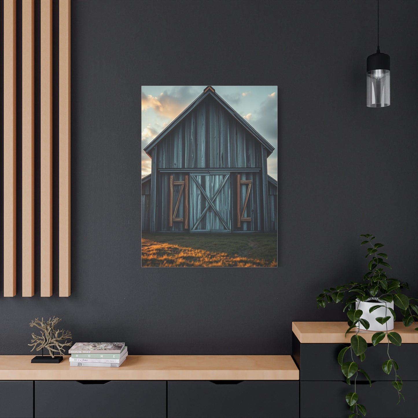
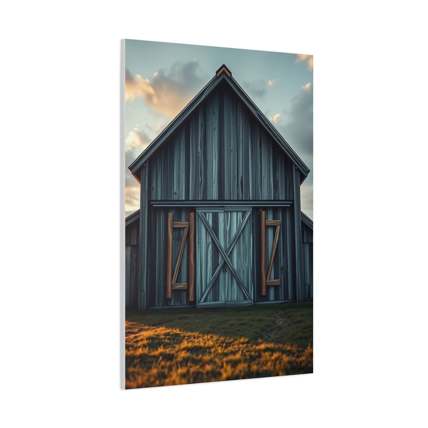
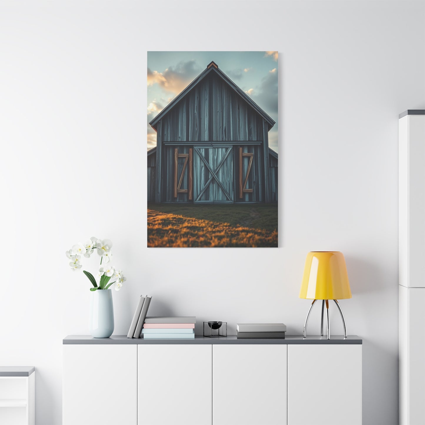
Chateau Serenity Artworks Wall Art & Canvas Print
Chateau Serenity Artworks Wall Art & Canvas Print
Couldn't load pickup availability


Refined Beauty: How Chateau Serenity Wall Art Complements Contemporary Interiors
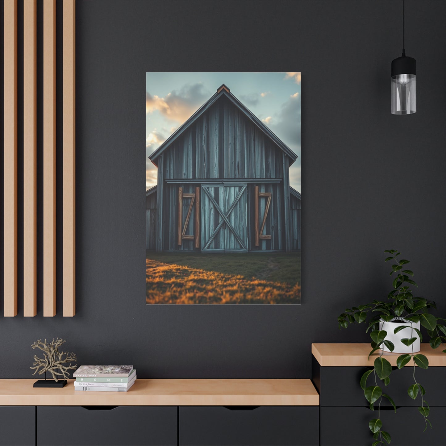
The world of interior decoration has experienced a remarkable transformation over recent decades, with wall art emerging as one of the most powerful tools for personal expression and aesthetic enhancement. Among the countless options available to homeowners and design enthusiasts, chateau serenity artworks wall art canvas print pieces have carved out a distinctive niche that combines classical elegance with contemporary sensibilities. These sophisticated art pieces draw inspiration from the timeless beauty of French countryside estates, bringing an air of tranquility and refined taste to any environment they grace.
Understanding the appeal of these artistic creations requires exploring their origins, examining their stylistic characteristics, and recognizing how they can fundamentally alter the atmosphere of residential and commercial spaces alike. The term itself evokes images of peaceful manor houses surrounded by rolling vineyards, ancient stone architecture bathed in golden afternoon light, and the unhurried elegance of European aristocratic living. When translated into canvas print format, these themes create visual narratives that speak to our collective longing for beauty, serenity, and connection with cultural heritage.
Canvas prints featuring chateau-inspired imagery have become increasingly popular as people seek to create sanctuaries within their homes, spaces that offer respite from the demands of modern life. The visual language of these artworks typically incorporates soft color palettes, architectural elements that reference historical periods, and compositional techniques that promote feelings of calm and contemplation. Whether depicting actual French estates, romanticized interpretations of countryside living, or abstract representations of classical themes, these pieces share a common goal of elevating interior environments through thoughtful artistic expression.
The manufacturing process behind quality canvas prints has evolved significantly, with modern printing technologies allowing for exceptional reproduction quality that captures subtle tonal variations and intricate details. This technological advancement means that artwork inspired by French estate aesthetics can now be produced at various price points without sacrificing visual impact, making sophisticated wall decoration accessible to a broader audience than ever before. The combination of timeless subject matter with contemporary production methods creates a unique category of decorative art that bridges past and present.
The Historical Context of French Estate Aesthetics in Contemporary Art
The enduring fascination with French chateau architecture and lifestyle has deep roots in cultural history, spanning centuries of artistic representation and literary celebration. These grand estates, which dot the countryside of various French regions, have long symbolized a particular approach to living that balances grandeur with pastoral simplicity. The architectural styles represented in these properties range from medieval fortresses to Renaissance palaces and neoclassical mansions, each period leaving its distinctive mark on the collective visual vocabulary that informs contemporary artwork.
During the Renaissance period, French nobility began constructing elaborate country estates that served both as demonstrations of wealth and as retreats from urban court life. These structures incorporated elements from Italian architectural traditions while developing uniquely French characteristics, including distinctive rooflines, symmetrical facades, and carefully planned relationships between buildings and surrounding landscapes. The aesthetic principles developed during this era continue to influence artistic representations today, with many canvas prints drawing directly from this rich architectural heritage.
The Age of Enlightenment brought additional refinement to estate design, with an emphasis on proportion, classical references, and integration with natural settings. Gardens became increasingly important as extensions of architectural vision, with formal layouts that demonstrated human ability to impose order on nature while simultaneously celebrating natural beauty. This philosophical approach to space and beauty resonates strongly with contemporary audiences seeking balance in their own environments, making artwork that references these principles particularly appealing for modern interiors.
Throughout the nineteenth century, Romantic and Impressionist movements found endless inspiration in French countryside estates and their surroundings. Artists like Claude Monet, Pierre-Auguste Renoir, and Camille Pissarro created countless works depicting manor houses, gardens, and rural landscapes that captured both physical appearance and emotional atmosphere. Their techniques for rendering light, color, and texture established visual approaches that continue to inform how contemporary artists and photographers interpret similar subjects. The influence of these artistic movements can be clearly seen in modern canvas prints that emphasize atmospheric effects and emotional resonance over strict representational accuracy.
The twentieth century brought new perspectives to chateau imagery, with photographers and painters exploring these architectural treasures through modernist and postmodernist lenses. Some artists focused on the melancholic beauty of aging structures, finding poetry in weathered stone and overgrown gardens. Others emphasized geometric patterns and abstract qualities inherent in classical architecture. This diversity of interpretive approaches means that contemporary canvas prints drawing from estate aesthetics can vary widely in style while remaining thematically connected to the same historical sources.
Understanding this historical context enriches appreciation for modern interpretations of chateau themes. When selecting wall art that references French estate aesthetics, viewers are not simply choosing decorative images but engaging with centuries of artistic tradition, architectural philosophy, and cultural values. This depth of meaning contributes to the enduring appeal of such artwork and explains why these themes continue to resonate across different design contexts and personal aesthetic preferences.
Design Principles Behind Serene Chateau-Inspired Artwork
Creating effective wall art that captures the essence of French estate serenity requires careful attention to multiple design elements working in harmony. The most successful pieces in this category demonstrate sophisticated understanding of color theory, compositional balance, spatial relationships, and emotional resonance. These foundational principles separate genuinely impactful artwork from merely decorative images, ensuring that selected pieces will continue to provide visual satisfaction over extended periods.
Color selection plays a crucial role in establishing the tranquil atmosphere characteristic of quality chateau-inspired artwork. Palettes typically draw from the soft, weathered hues found in aged architecture and natural landscapes: warm limestone tones, pale sky blues, muted greens reminiscent of aged bronze or patinated copper, and the gentle grays of weathered stone. These colors work together to create visual harmony that promotes relaxation rather than stimulation. Artists and designers often employ subtle gradations within these color families, using slight variations in tone to add depth and interest without disrupting the overall sense of calm.
The use of light within these compositions deserves particular attention, as it fundamentally shapes the emotional character of the artwork. Many effective pieces feature the quality of illumination associated with specific times of day, particularly the golden hours of early morning and late afternoon when sunlight takes on warm, diffused qualities. This attention to lighting creates atmospheric depth and suggests temporal moments that invite contemplative viewing. The interplay between illuminated and shadowed areas adds dimensional quality to essentially two-dimensional works, creating visual interest that rewards repeated observation.
Compositional structure in successful chateau-themed artwork typically emphasizes balance and proportion, reflecting the architectural principles that inform the subject matter itself. Symmetrical arrangements can create feelings of stability and timelessness, while asymmetrical compositions might suggest more dynamic relationships between elements. The placement of focal points, the use of leading lines to guide viewer attention, and the relationship between positive and negative space all contribute to the overall effectiveness of the piece. Thoughtful composition ensures that artwork remains visually engaging without becoming overwhelming or chaotic.
Textural elements provide another layer of visual interest in quality canvas prints. Even though the medium itself is two-dimensional, skilled artists create the illusion of varied surface textures through careful rendering techniques. The rough quality of ancient stone walls, the smooth finish of weathered wood, the soft appearance of distant foliage, and the reflective nature of water surfaces all contribute to sensory richness. When reproduced through high-quality printing processes, these textural qualities translate effectively to canvas, creating depth that enhances the viewing experience.
The concept of visual breathing room or negative space proves particularly important in artwork designed to promote serenity. Rather than filling every area with detail, effective pieces incorporate areas of relative simplicity that allow the eye to rest and the mind to process the composition as a whole. This might take the form of expansive skies, stretches of simplified foreground, or areas of subtle tonal variation without distinct elements. These spaces prevent visual overwhelm and contribute to the peaceful quality that makes chateau-inspired artwork particularly suitable for residential environments.
Scale relationships within the artwork also merit consideration, particularly the proportional relationships between architectural elements, landscape features, and human-scale references when present. Appropriate scaling creates believable spatial relationships that enhance the immersive quality of the piece. When viewers can intuitively understand the spatial logic of the depicted scene, they more readily experience the emotional atmosphere the artist intends to convey. This attention to realistic or intentionally stylized scale relationships distinguishes sophisticated artwork from less considered decorative images.
Material Quality and Production Techniques for Canvas Prints
The physical characteristics of canvas prints significantly impact their visual appearance, longevity, and suitability for different display environments. Understanding the materials and production methods used in creating quality wall art helps consumers make informed decisions that ensure satisfaction with their purchases over time. The canvas print industry has developed considerably in recent years, with advances in materials science and printing technology enabling unprecedented quality levels across various price ranges.
Canvas substrate selection forms the foundation of print quality, with several material options offering different characteristics. Cotton canvas provides a traditional surface with excellent texture and good color absorption properties. This natural fiber option appeals to those seeking authentic artistic qualities in their wall art. Polyester canvas offers superior durability and resistance to environmental factors like humidity, making it particularly suitable for spaces where climate control may be variable. Blend materials attempt to capture benefits from both natural and synthetic fibers, balancing traditional aesthetic qualities with enhanced practical performance.
The weight and weave pattern of canvas material affect both appearance and longevity. Heavier weight canvases provide more substantial feel and better resistance to sagging over time, particularly important for larger format prints. Weave patterns range from fine, tight textures that minimize visible texture for more photographic reproductions, to more pronounced weaves that emphasize the traditional canvas quality. The appropriate choice depends on the specific artwork being reproduced and the desired final appearance, with some images benefiting from visible texture while others require smoother surfaces.
Printing technology represents another critical factor in final quality. Giclée printing, which uses fine art inkjet techniques with archival-quality inks, has become the standard for high-quality canvas reproduction. This method can reproduce subtle color gradations and fine details with exceptional accuracy, creating prints that rival traditional artistic methods in visual complexity. The archival inks used in quality giclée printing resist fading from light exposure and environmental factors, ensuring that artwork maintains its intended appearance for decades when properly cared for.
The coating applied to finished prints provides protection while influencing final appearance. Matte finishes eliminate glare and create surface qualities similar to traditional painting media, making them popular for artwork intended to resemble original paintings. Satin finishes offer slight sheen that enhances color vibrancy while minimizing reflections, providing middle-ground options. Glossy finishes maximize color saturation and contrast but may create problematic reflections in certain lighting conditions. UV-resistant coatings add another layer of protection against fading, particularly valuable for artwork displayed in spaces with significant natural light exposure.
Stretching and mounting methods significantly impact how canvas prints present once installed. Gallery wrap techniques fold the printed canvas around stretcher bars, with the image continuing around the edges for a contemporary, frameless appearance. Museum wrap approaches use neutral-colored canvas on the sides, making the piece suitable for either frameless display or traditional framing. The quality of stretcher bars themselves matters, with premium options using kiln-dried wood that resists warping and provides stable support for the canvas surface over time.
Hardware and hanging systems deserve attention as they determine installation ease and display stability. Quality productions include appropriate hanging mechanisms pre-installed, whether traditional wire systems, sawtooth hangers, or French cleat arrangements. The choice of hanging hardware should consider the weight of the finished piece and the wall surface type in the intended display location. Professional-grade installations might incorporate additional security measures to prevent accidental displacement while maintaining adjustability for precise positioning.
Color Psychology and Palette Selection for Tranquil Spaces
The colors featured in chateau-inspired artwork play a fundamental role in creating desired emotional responses and establishing atmospheric qualities within living spaces. Understanding color psychology principles helps explain why certain palette choices prove more effective for promoting serenity and why these particular hues have become associated with refined, peaceful environments. The deliberate selection and combination of colors separate thoughtfully designed artwork from arbitrary decorative choices.
Warm neutral tones form the backbone of many successful serenity-focused color schemes, drawing from the natural patinas of aged architecture and sun-washed landscapes. Shades of cream, beige, taupe, and warm gray create foundations that feel both substantial and gentle, providing visual stability without demanding attention. These colors possess inherent versatility, working harmoniously with diverse furniture styles and existing decor elements while maintaining the understated elegance characteristic of French estate aesthetics. Their ability to reflect and soften natural light contributes to the creation of welcoming, comfortable environments.
Soft blue tones appear frequently in chateau-themed artwork, referencing both architectural elements like aged shutters and the expansive skies often featured in estate landscapes. Psychological research consistently demonstrates that blue hues promote feelings of calm and reduce perceived stress, making them ideal for spaces intended for relaxation. The particular shades employed in quality artwork tend toward muted, grayed variations rather than bright, saturated blues, ensuring that the calming effect remains subtle rather than cold or sterile. These tones pair beautifully with warm neutrals, creating balanced color relationships that feel naturally harmonious.
Muted green shades connect artwork to the natural landscapes surrounding French estates, evoking gardens, vineyards, and distant foliage. These colors bridge the gap between built environments and natural settings, bringing organic elements into interior spaces through visual representation. Psychological associations with green include growth, renewal, and balance, contributing to the restorative qualities of spaces decorated with appropriately colored artwork. The most effective applications use sophisticated, grayed greens rather than bright or artificial-looking tones, maintaining the refined aesthetic characteristic of the genre.
Warm earth tones including terracotta, sienna, and ochre reference traditional building materials and aged surfaces, adding warmth to color schemes that might otherwise feel too cool. These colors ground compositions and provide connection to historical building practices and natural pigments used in traditional decoration. Their inclusion in artwork creates subtle visual interest and prevents color schemes from becoming monotonous while maintaining overall harmony. Used judiciously, these warmer accents energize compositions without disrupting the serene atmosphere.
The strategic use of near-white and very pale tones creates breathing room within compositions and enhances the perception of light. These nearly neutral colors might appear in representations of limestone architecture, distant skies, or areas where sunlight washes out detail. Their presence prevents artwork from feeling heavy or oppressive, maintaining the airy quality associated with well-designed French interiors. The subtle variations within what initially appear as simple white areas reward close observation and contribute to visual depth.
Metallic accents appearing in some artwork reference architectural details like weathered iron gates, bronze fixtures, or the silvery quality of aged wood. These elements add sophisticated notes without relying on bright colors, maintaining cohesion with the overall muted palette. The interplay between matte and subtly reflective elements creates visual interest that changes with viewing angle and lighting conditions, adding dynamic qualities to essentially static images.
Understanding how colors interact within compositions and how entire palettes influence room atmospheres enables more strategic artwork selection. The colors present in wall art inevitably influence how we perceive spaces and how those spaces make us feel. By choosing pieces with carefully considered color relationships that align with psychological principles of serenity, we create environments that genuinely support our wellbeing rather than simply appearing aesthetically pleasing.
Architectural Elements in French Estate-Inspired Visual Art
The architectural vocabulary of French estates provides endless inspiration for visual artists, offering rich symbolic language that conveys elegance, history, and cultural refinement. Understanding the key architectural elements that appear in chateau-themed artwork enhances appreciation for these pieces and guides selection decisions for those seeking authentic representations of this aesthetic tradition. The buildings themselves tell stories of centuries-long architectural evolution and reflect philosophical approaches to the relationship between human-made structures and their environments.
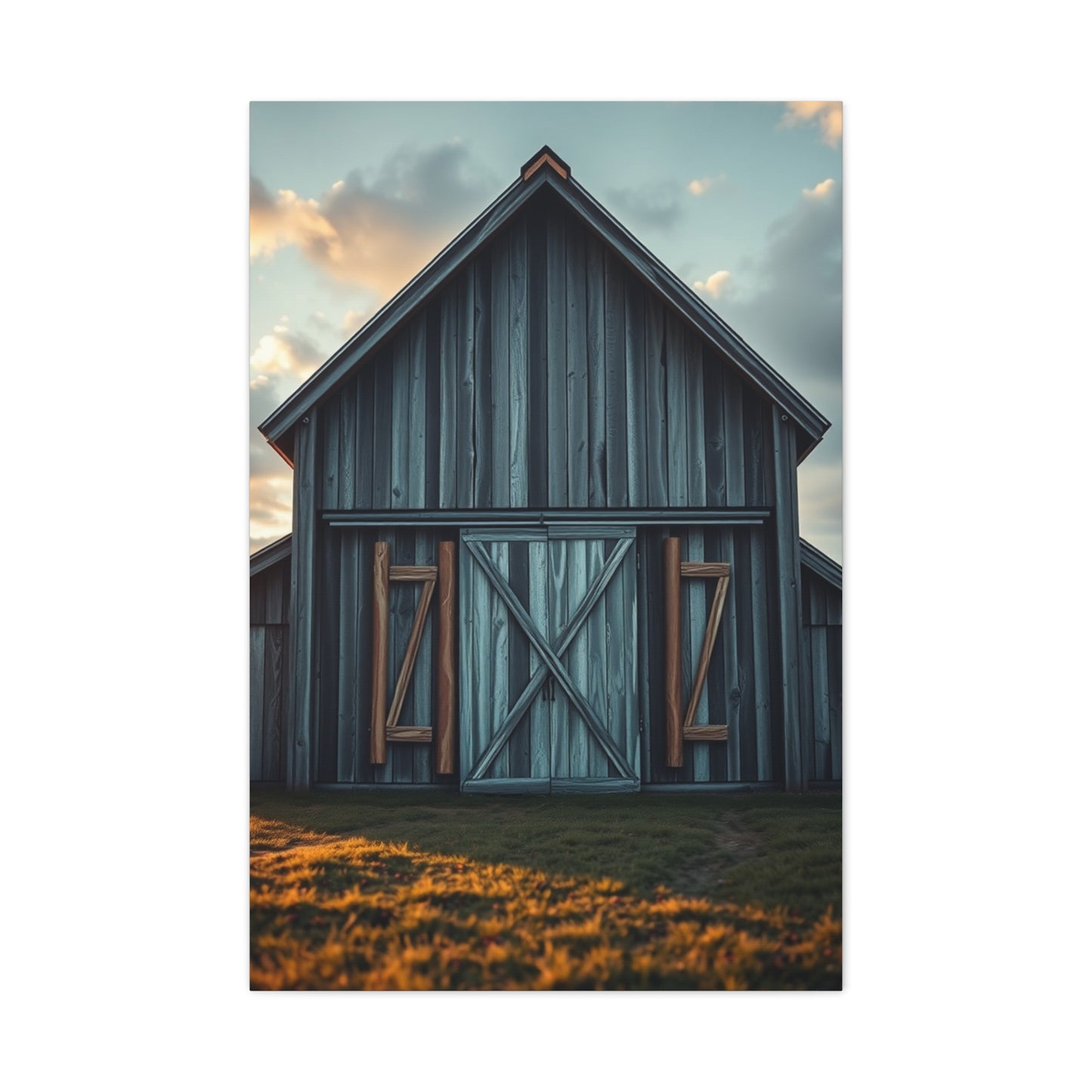
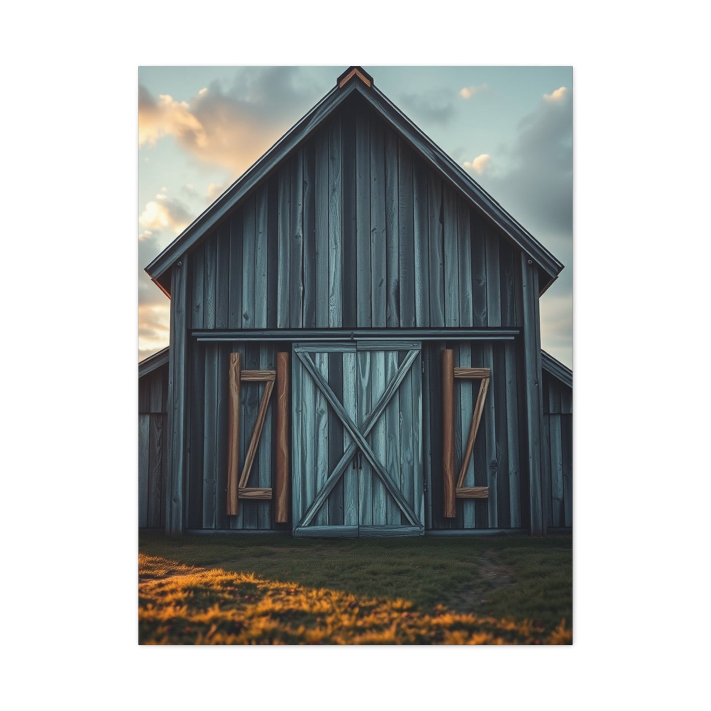
The distinctive rooflines characteristic of French architecture create immediately recognizable silhouettes that define much estate-inspired artwork. Steep slate roofs, often punctuated by dormer windows and decorative chimneys, demonstrate both practical responses to climate conditions and aesthetic choices that became defining features of regional building traditions. These rooflines create dynamic linear elements within compositions, adding visual interest to skylines while referencing specific historical periods and architectural styles. The play of light across these angled surfaces provides artists with opportunities to demonstrate technical skill while creating atmospheric effects.
Symmetrical facades represent another hallmark of classical French architecture, reflecting Enlightenment-era ideals about proportion, order, and rational beauty. This architectural philosophy translates effectively to two-dimensional artwork, where symmetrical compositions can create feelings of stability and timeless quality. The careful arrangement of windows, doors, and decorative elements across balanced facades demonstrates the human capacity for creating ordered beauty, a theme that resonates with viewers seeking similar harmony in their own environments. Even when artwork captures partial views or asymmetrical perspectives, the underlying architectural logic remains apparent.
Stone construction materials provide both structural reality and rich visual texture in quality chateau depictions. The variations in color and surface quality within aged stone walls offer artists opportunities to demonstrate mastery of subtle tonal relationships and textural rendering. Weathering patterns tell stories of time passing, with darker areas where moisture collects, lighter patches where elements have been particularly exposed, and the overall patina that develops over centuries. These surface qualities add authenticity to artwork and create visual complexity that rewards extended viewing.
Ornamental details including carved stone elements, decorative ironwork, and architectural moldings add layers of interest to compositions while referencing specific historical periods and levels of craftsmanship. Balustrades, finials, and sculptural elements break up larger architectural planes and create opportunities for dramatic lighting effects as sun and shadow play across three-dimensional surfaces. Artists skilled in capturing these details demonstrate technical ability while enhancing the sense that depicted structures possess genuine historical weight and cultural significance.
The relationship between architectural structures and their surrounding landscapes forms a crucial element in effective chateau artwork. French estate design traditionally emphasized careful integration between buildings and grounds, with structures positioned to maximize views, capture prevailing breezes, and create harmonious relationships with topography. This holistic approach to site design creates visually satisfying compositions where architecture appears to belong naturally within its setting rather than imposing itself upon the landscape. Artwork that successfully captures these relationships demonstrates understanding of broader design principles beyond simple architectural representation.
Window elements deserve particular attention as they create connections between interior and exterior spaces while adding rhythmic patterns to facades. The proportion, placement, and treatment of windows reflect both practical considerations and aesthetic choices specific to different architectural periods. Shutters, whether functional or purely decorative, add additional layers of visual interest and reference traditional approaches to climate control and security. The interplay between transparent and solid elements creates dynamic qualities as lighting conditions change throughout the day.
Entrance elements including doorways, steps, and approached paths create focal points within compositions while suggesting human scale and use. Grand entry doors flanked by decorative elements signal importance and welcome, inviting viewers to imagine moving through pictured spaces. More modest service entrances and garden gates add narrative complexity, suggesting the full functional reality of historic estates beyond their formal presentation. These human-scale elements help viewers connect emotionally with depicted architecture, imagining themselves within represented spaces.
Landscape Integration in Serene Estate Artwork
The landscapes surrounding French estates prove as visually and emotionally significant as the architectural structures themselves, providing context, atmosphere, and connection to broader natural environments. Quality artwork in this genre demonstrates sophisticated understanding of how built and natural elements interact, creating compositions where neither dominates but both contribute to overall harmony. The treatment of landscape elements separates truly accomplished artwork from simple architectural documentation, adding layers of meaning and emotional resonance.
Formal garden elements represent human attempts to organize natural growth according to aesthetic principles, creating outdoor spaces that extend architectural logic into the landscape. Geometric parterres, carefully trimmed hedges, and symmetrical plantings demonstrate control and sophistication while working with living materials. When featured in artwork, these designed landscapes reference centuries of horticultural tradition and garden design philosophy. The patterns created by formal plantings add graphic elements to compositions while their organic nature prevents rigidity, creating pleasing tension between order and natural growth.
Mature trees provide vertical elements that complement architectural structures while demonstrating the passage of time and continuity with natural processes. Ancient specimens that have witnessed centuries of estate history add gravitas to scenes, their substantial forms creating visual anchors and framing devices within compositions. The canopy structures of different tree species offer varied forms from columnar poplars to spreading oaks, each contributing distinct qualities to overall composition. Seasonal variations in foliage color and density provide artists with opportunities to evoke specific times of year and associated atmospheric conditions.
Water features including reflecting pools, fountains, and streams add movement and light-reflecting qualities to landscape compositions. The still surface of a formal basin can mirror architectural elements and sky, creating symmetrical compositions and visual expansion of space. Fountains introduce vertical elements and suggest sound even within silent visual media. Natural water courses connect estates to broader landscape systems while providing linear elements that lead viewer attention through pictured scenes. The reflective and transparent qualities of water challenge artists technically while offering rich visual rewards.
Distant landscape views create depth and context, positioning estates within broader geographic settings. Rolling hills, vineyard patterns, and far horizons suggest the agricultural productivity and natural beauty surrounding French countryside properties. These background elements establish scale relationships and create atmospheric perspective as colors become cooler and less saturated with distance. The inclusion of these broader views prevents artwork from feeling claustrophobic or overly focused on architectural details alone, maintaining connection to the larger world beyond estate boundaries.
Pathways and circulation routes guide viewer attention through compositions while suggesting movement and discovery. Gravel drives lined with specimen trees, stone paths through gardens, and informal trails into wilder landscape areas invite imaginative journeys through depicted spaces. These elements add narrative possibilities to otherwise static images, encouraging viewers to mentally explore represented environments. The interplay between formal, designed circulation and more organic pathways reflects the balance between control and nature characteristic of estate landscape philosophy.
Seasonal considerations add temporal dimensions to landscape representations, with different times of year offering distinct atmospheric and color qualities. Spring artwork might emphasize fresh growth and flowering trees, summer scenes could feature lush foliage and long shadows, autumn compositions might showcase harvest colors and golden light, while winter imagery could emphasize architectural forms revealed by bare branches. This seasonal variety allows collectors to select artwork that resonates with personal preferences or that captures the specific atmospheric qualities they wish to introduce into their spaces.
The quality of light interacting with landscape elements fundamentally shapes emotional character and visual impact. Morning mist softening distant features creates dreamy, contemplative atmospheres. Harsh midday sun might emphasize architectural solidity and cast strong shadows. Golden afternoon light warms color palettes and creates nostalgic moods. Overcast conditions can emphasize subtle color relationships and create introspective qualities. Artists skilled in capturing these varied lighting scenarios demonstrate technical mastery while creating diverse emotional possibilities within the chateau aesthetic framework.
Room-Specific Considerations for Display and Placement
Successfully integrating chateau-inspired canvas prints into living spaces requires thoughtful consideration of room function, existing design elements, and practical display factors. Different spaces within homes present unique opportunities and challenges for artwork placement, with effective integration enhancing both the artwork itself and the overall room atmosphere. Understanding these room-specific considerations enables strategic selections that maximize visual impact and contribute meaningfully to desired spatial qualities.
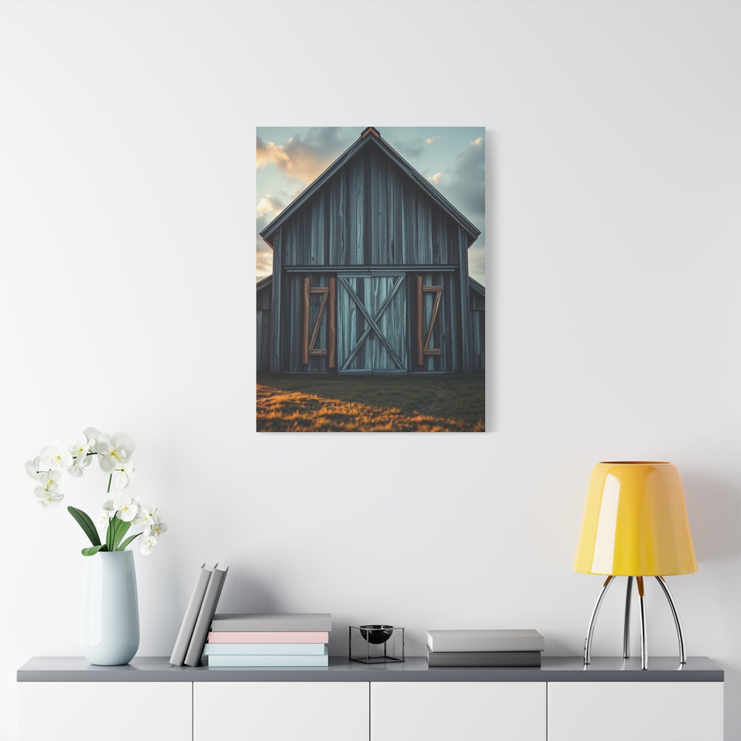
Living room environments typically offer the most flexibility for larger statement pieces, with expansive wall surfaces and comfortable viewing distances that allow appreciation of substantial artworks. These social spaces benefit from artwork that creates conversation while establishing sophisticated atmospheric tones. A single large canvas featuring a serene estate view can anchor an entire seating area, providing a focal point that draws the eye without overwhelming other design elements. Alternatively, gallery-style arrangements of multiple complementary pieces create visual interest across extended wall surfaces, allowing for more complex narrative development through related images.
The scale of living room artwork should consider viewing distances and surrounding furniture proportions. Pieces displayed above sofas or consoles should generally span at least two-thirds of the furniture width to create visually balanced relationships. Larger spaces can accommodate truly monumental pieces that make bold design statements, while more intimate rooms benefit from appropriately scaled works that create presence without dominating. The height at which artwork hangs matters significantly, with center points typically positioned at average eye level when standing, though this may adjust based on whether viewing occurs primarily while seated.
Bedroom environments benefit particularly from the calming qualities of serenity-focused artwork, with chateau themes naturally supporting restful atmospheres conducive to sleep and relaxation. Artwork positioned opposite the bed provides a focal point visible upon waking, setting atmospheric tone for the day ahead. Pieces above headboards should be sized appropriately to furniture proportions while avoiding excessive visual weight that might create subconscious discomfort. Color palettes in bedroom artwork particularly benefit from muted, harmonious tones that promote relaxation rather than stimulation.
The personal nature of bedroom spaces allows for more subjective artwork selection based on individual preferences rather than broader household consensus. This privacy creates opportunities to choose pieces with deeply personal resonance, whether depicting specific locations with emotional significance or simply capturing atmospheric qualities that support individual wellbeing. Bedroom lighting typically remains subdued compared to public spaces, making artwork with inherent luminosity or lighter overall tones more successful than darker compositions that might disappear in lower light conditions.
Dining spaces present unique opportunities to enhance social experiences through carefully selected artwork. Chateau-themed pieces in these areas can reference French culinary traditions and the cultural importance of shared meals, creating subtle thematic coherence. The artwork should complement rather than compete with table settings and food presentations, suggesting palettes and subject matter that enhance rather than clash with the varied colors and forms present during meals. Lighter, airier compositions generally work better than visually heavy pieces that might feel oppressive during extended dining experiences.
Scale considerations in dining rooms must account for furniture that dominates floor space, with artwork needing sufficient presence to balance substantial tables and seating groups. Horizontal formats often work particularly well in dining spaces, complementing the horizontal emphasis of tables and creating visual harmony. Multiple smaller pieces arranged in linear groupings can create gallery-like presentations suitable for narrower wall sections between windows or architectural features common in dining areas.
Home office environments benefit from artwork that creates focused yet comfortable atmospheres supporting productivity without inducing stress. Serenity-themed chateau artwork offers ideal qualities for these spaces, providing visual interest during breaks while maintaining calming influences that counterbalance work pressures. The specific subject matter might reference themes of reflection, solitude, or ordered beauty that metaphorically support intellectual work. Positioning artwork within easy view from desk positions allows for brief visual respites during intensive work sessions, with contemplative imagery providing mental refreshment.
The increasing prevalence of video conferencing makes background appearance significant in home office design. Artwork visible in video frames creates impressions about personal taste and professional character, with refined estate-inspired pieces conveying sophistication and cultural awareness. The positioning should avoid creating distracting backgrounds while adding visual interest that enhances rather than detracts from on-screen presence. Natural color palettes in artwork prevent problematic interactions with varying skin tones and lighting conditions common in video applications.
Hallways and transitional spaces offer opportunities to create visual narratives through sequential artwork arrangements. A series of related chateau-themed pieces can guide movement through spaces while establishing cohesive design themes that unify separate areas. These typically narrower spaces often suit vertical format artwork that emphasizes height without requiring excessive width. Lighting in hallways deserves particular attention, as these spaces often lack natural light sources, making artwork selection and supplementary lighting critical for visual success.
Size and Format Selection for Maximum Visual Impact
Determining appropriate artwork dimensions represents a crucial decision affecting both aesthetic success and practical functionality. The relationship between artwork size, viewing distance, wall dimensions, and surrounding elements determines whether pieces achieve desired impact or fail to integrate successfully into their environments. Understanding the principles governing these relationships enables confident selection decisions that result in satisfying long-term outcomes.
The concept of visual weight describes how much attention artwork commands within a space, influenced by multiple factors beyond simple physical dimensions. Actual size obviously matters, but color intensity, compositional complexity, and frame treatment also contribute to perceived visual presence. A moderately sized piece with bold colors and complex composition may carry more visual weight than a physically larger work with subtle tones and simplified forms. Balancing visual weight with surrounding elements prevents artwork from either disappearing into backgrounds or overwhelming spaces.
Standard sizing conventions in the canvas print industry typically include dimensions ranging from small accent pieces around sixteen by twenty inches through substantial statement works measuring forty-eight by seventy-two inches or larger. Custom sizing options allow for precise matching to specific spatial requirements or existing furniture dimensions. Understanding these standard sizes helps when planning purchases, as custom dimensions typically involve higher costs and longer production times compared to readily available standard formats.
Aspect ratio considerations influence how artwork relates to both subject matter and display context. Horizontal formats emphasize landscape views and create relationships with horizontal architectural elements and furniture pieces. Vertical orientations suit architectural subjects emphasizing height and work well in narrower wall sections or flanking doorways and windows. Square formats provide balanced, stable compositions that work in diverse contexts. Panoramic formats create dramatic horizontal emphasis suitable for large walls above extended furniture runs.
The viewing distance principle suggests that optimal artwork size relates to how far viewers typically stand from display surfaces. A useful guideline suggests artwork width should approximate one-half to two-thirds the viewing distance, though this varies based on compositional complexity and personal preference. Spaces where viewers pass quickly versus rooms where people linger for extended periods benefit from different size approaches, with quick-view locations supporting larger, bolder pieces and contemplative spaces accommodating more subtle works requiring closer examination.
Furniture relationships significantly influence appropriate artwork sizing. Traditional rules suggest artwork above sofas should span roughly two-thirds of furniture width, creating visual connection without exact matching that might feel overly coordinated. Pieces above consoles, sideboards, and buffets benefit from similar proportional relationships, though somewhat narrower ratios may work when multiple decorative objects appear on furniture surfaces. These guidelines provide starting points rather than absolute rules, with personal preference and specific room characteristics warranting adjustments.
Multiple-piece arrangements require careful consideration of both individual element sizes and overall composition dimensions. Diptych and triptych formats divide single images across multiple canvases, creating contemporary presentations that add visual interest through the gaps between panels. Gallery wall arrangements combine multiple separate images into larger overall compositions, requiring planning to ensure balanced relationships between elements. The spacing between pieces in multi-work installations typically ranges from two to six inches, influenced by frame treatment and desired visual effect.
Ceiling height influences appropriate artwork scale, with higher ceilings generally supporting larger pieces that maintain presence without appearing diminutive. Standard eight-foot ceilings require more careful size consideration to avoid overwhelming rooms with excessive artwork scale, while ten-foot or higher ceilings provide greater flexibility. The relationship between artwork height and available wall surface matters particularly in rooms with extensive molding, wainscoting, or other architectural features that effectively reduce usable display area.
Architectural features including windows, doors, built-in shelving, and fireplaces create parameters within which artwork must fit successfully. Careful measurement of available wall sections prevents purchasing pieces too large for intended locations, an unfortunately common mistake. Considering not just width and height but also clearances around architectural elements ensures artwork integrates cleanly into spaces rather than awkwardly overlapping trim work or crowding against adjacent features.
Budget considerations often influence size selection, as production costs typically increase with dimensions. Determining the minimum size required for intended impact helps establish budget parameters while ensuring adequate presence. Sometimes selecting slightly smaller high-quality pieces proves more satisfying than stretching budgets for larger works of lesser production quality. The balance between size and quality deserves careful consideration, as poor printing or materials negatively impact visual satisfaction regardless of impressive dimensions.
Framing and Presentation Options for Canvas Art
While many canvas prints present effectively without traditional framing, the various presentation options available each offer distinct aesthetic qualities and practical considerations. Understanding these options enables selections that complement both the artwork itself and the broader interior design context, ensuring cohesive integration that enhances rather than detracts from overall spatial aesthetics.
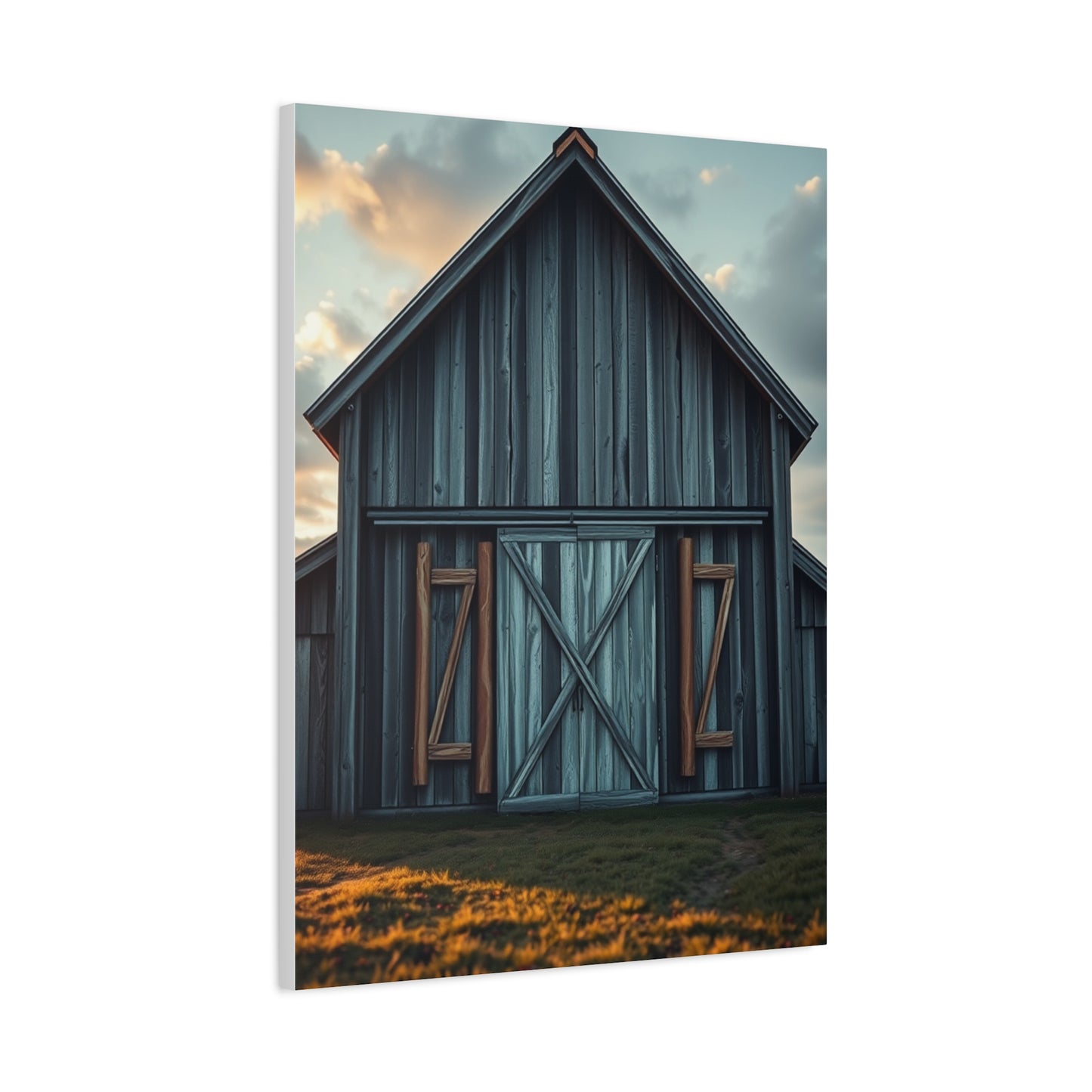
Gallery wrap presentation represents the most common contemporary approach, with printed canvas continuing around stretcher bar edges to create frameless finished products. This method emphasizes the artwork itself without additional decorative borders, creating clean, modern presentations particularly suited to contemporary and transitional interior styles. The depth of stretcher bars varies, with options typically ranging from three-quarters of an inch to two inches or more. Deeper profiles create more substantial three-dimensional presence and cast shadows that add visual interest as lighting conditions change throughout the day.
Museum wrap techniques apply neutral-colored canvas to stretcher bar sides, allowing the image to appear cleanly contained within the front surface. This approach suits artwork intended for potential framing while maintaining acceptable appearance for frameless display. The neutral sides prevent distracting image wrap-around effects that sometimes occur with gallery wrap method, particularly when source images lack appropriate edge content. This versatility makes museum wrap attractive for those uncertain about long-term framing decisions or who may move artwork between locations with different aesthetic contexts.
Traditional framing adds protective and decorative borders that can significantly enhance certain artworks while providing additional protection. Frame selection should complement rather than compete with artwork, with styles, colors, and ornamental levels appropriate to image content and overall interior design schemes. For chateau-themed artwork, frame options might range from simple contemporary designs in metallic or natural wood finishes to more ornate traditional styles that reference historical periods. The frame becomes part of the complete visual presentation, requiring thoughtful coordination with both artwork and room design.
Floating frame designs create gaps between canvas edges and frame elements, producing contemporary presentations that combine frameless immediacy with traditional framing's finished quality. This approach particularly suits gallery-wrapped canvases, with the visible canvas depth adding dimensional interest within the frame surround. Floating frames range from minimal metal designs that nearly disappear to more substantial wood constructions that create definite borders while maintaining modern sensibilities. This versatile option bridges traditional and contemporary aesthetics, working successfully in diverse design contexts.
Matting represents another presentation consideration, though less common for canvas than paper-based artwork. When employed, mats create breathing room between image and frame while allowing for dimensional differences if canvas dimensions don't perfectly match available frame sizes. Mat colors should either complement artwork palettes neutrally or intentionally reference specific colors within compositions. The width of mat borders influences overall presentation scale and can adjust visual weight to better suit specific display contexts.
The decision between frameless and framed presentations influences not only aesthetic qualities but also practical considerations including protection from physical damage and environmental factors. Frames provide edge protection that helps prevent accidental damage during handling or cleaning. They also create additional barriers against dust and environmental contaminants that might affect canvas surfaces over time. In high-traffic areas or homes with children and pets, these practical benefits may outweigh purely aesthetic considerations.
Color coordination between presentation elements and artwork requires careful attention to ensure cohesive results. Frame colors can either blend neutrally with artwork palette, creating unified presentations, or provide intentional contrast that emphasizes the boundary between artwork and surrounding space. For chateau-themed pieces with muted, sophisticated palettes, frame colors might include natural wood tones, soft metallic finishes, or painted options in complementary neutral shades. Avoiding excessive contrast prevents frames from overwhelming artwork while maintaining clear definition between pictorial space and physical wall surfaces.
The weight and mounting requirements of different presentation methods influence installation planning and wall surface compatibility. Gallery-wrapped canvases tend toward lighter weight compared to heavily framed alternatives, potentially allowing simpler mounting solutions. However, larger dimensions create substantial weight regardless of framing choices, requiring appropriate hanging hardware and wall anchor systems. Professional installation may prove worthwhile for particularly valuable or large-scale pieces, ensuring secure mounting that protects both artwork and walls.
Style consistency across multiple artworks in single spaces benefits from coordinated presentation approaches. Mixing gallery-wrapped and traditionally framed pieces within single rooms can create visual confusion unless intentionally employed as design contrast. Establishing presentation standards for artwork throughout homes or specific areas creates cohesive aesthetic experiences where individual pieces contribute to unified design narratives rather than competing for attention through inconsistent presentations.
Creating Gallery Walls with Estate-Themed Artwork
The gallery wall concept offers opportunities to combine multiple artworks into cohesive visual presentations that create greater impact than individual pieces displayed separately. Successfully executing these multi-piece installations requires planning, aesthetic sensitivity, and attention to both artistic relationships and practical installation considerations. For chateau-themed artwork, gallery walls can develop rich visual narratives that explore different aspects of estate aesthetics while maintaining overall harmony.
Thematic consistency provides the foundation for successful gallery wall compositions, with selected pieces sharing stylistic approaches, color palettes, or subject matter that creates visual relationships. For estate-inspired artwork, this might mean combining images depicting different architectural views of similar properties, seasonal variations of related landscapes, or diverse interpretations of French countryside themes. The specific nature of connections between pieces matters less than the presence of clear relationships that create coherent rather than chaotic overall impressions.
Color harmony across multiple pieces ensures visual unity while allowing for variation that maintains interest. Establishing a core palette that appears throughout selected artworks prevents jarring transitions between pieces that might fragment rather than unify the overall presentation. This doesn't require identical colors in every piece but rather complementary relationships where hues, values, and saturation levels create pleasing progressions. For serenity-focused estate artwork, this typically means maintaining muted, sophisticated tones throughout while allowing subtle variations that add richness.
Conclusion
Refined Beauty: How Chateau Serenity Wall Art Complements Contemporary Interiors emphasizes the transformative power of thoughtfully curated artwork in modern living spaces. Chateau Serenity wall art, with its refined elegance, muted palettes, and balanced compositions, exemplifies how carefully selected pieces can harmonize with contemporary design while adding depth, personality, and a subtle narrative to interiors. These artworks serve as more than decorative accents—they are visual anchors that shape the ambiance, elevate aesthetics, and reinforce a home’s sense of calm sophistication.
At the heart of Chateau Serenity wall art lies its ability to balance visual restraint with emotional resonance. The serene motifs, often inspired by architectural forms, natural landscapes, or timeless chateaus, communicate sophistication while fostering a sense of tranquility. Soft color gradients, gentle textures, and understated detail evoke calmness and introspection, creating spaces where residents and guests alike feel invited to pause and engage with the art. This equilibrium between aesthetic beauty and emotional impact allows Chateau Serenity canvases to serve as both subtle complements and central statements within contemporary interiors.
From a design perspective, Chateau Serenity wall art is remarkably versatile. Large-scale pieces anchor living rooms, dining spaces, or entryways, establishing a focal point that guides the room’s design narrative. Smaller canvases or multi-panel arrangements work well for gallery walls, hallways, or intimate corners, creating rhythm and cohesion while complementing surrounding décor elements. The muted, sophisticated palette of these works—soft neutrals, gentle pastels, and subtle metallic accents—harmonizes effortlessly with a range of contemporary interior styles, including minimalist, Scandinavian, transitional, and modern luxury spaces. When paired with sleek furniture, reflective surfaces, and textural fabrics, Chateau Serenity art elevates the overall design while maintaining a refined sense of composure.
Lighting plays a crucial role in highlighting the nuance and elegance of Chateau Serenity artworks. Soft ambient illumination enhances gradients, textures, and the subtle interplay of light and shadow, while accent lighting can draw attention to focal areas, metallic finishes, or fine brushwork. The dynamic interaction between light and canvas ensures that each piece adapts to its environment, shifting in perception throughout the day. Proper lighting reinforces the tranquil, sophisticated mood of the artwork, making interiors feel more immersive, curated, and harmonious.
Emotionally, Chateau Serenity wall art resonates with themes of calm, refinement, and timeless beauty. The serene imagery promotes mental clarity and relaxation, providing a visual retreat from the stresses of daily life. By integrating these pieces, homeowners cultivate environments that support mindfulness, aesthetic appreciation, and a sense of order. The artwork not only enhances the visual appeal of a room but also communicates a narrative of taste, intentionality, and cultivated elegance, making the space feel thoughtfully composed and emotionally inviting.
Artists employ a variety of techniques to achieve the sophisticated allure of Chateau Serenity canvases. Layered textures, delicate brushwork, subtle metallic highlights, and nuanced shading create depth, richness, and visual intrigue. Compositionally, these pieces balance negative space with focal elements, allowing the artwork to breathe while commanding attention. This combination of technical precision and creative interpretation ensures that Chateau Serenity wall art complements a wide range of interiors, adding both aesthetic and emotional value.
Ultimately, Refined Beauty: How Chateau Serenity Wall Art Complements Contemporary Interiors illustrates the power of art to harmonize design, mood, and personal expression. By integrating subtle elegance, thoughtful composition, and soothing palettes, homeowners create spaces that are visually compelling, emotionally resonant, and distinctly contemporary. Chateau Serenity canvases elevate interiors from functional living areas to curated sanctuaries of beauty and refinement.
In essence, Chateau Serenity wall art is more than décor—it is a reflection of taste, a source of tranquility, and a testament to the artistry of contemporary design. Through careful color selection, compositional balance, and textural nuance, these works transform interiors into serene, sophisticated environments. Each piece becomes a visual anchor and a narrative element, enhancing both style and experience, ensuring that modern living spaces embody elegance, calm, and enduring aesthetic charm.
