


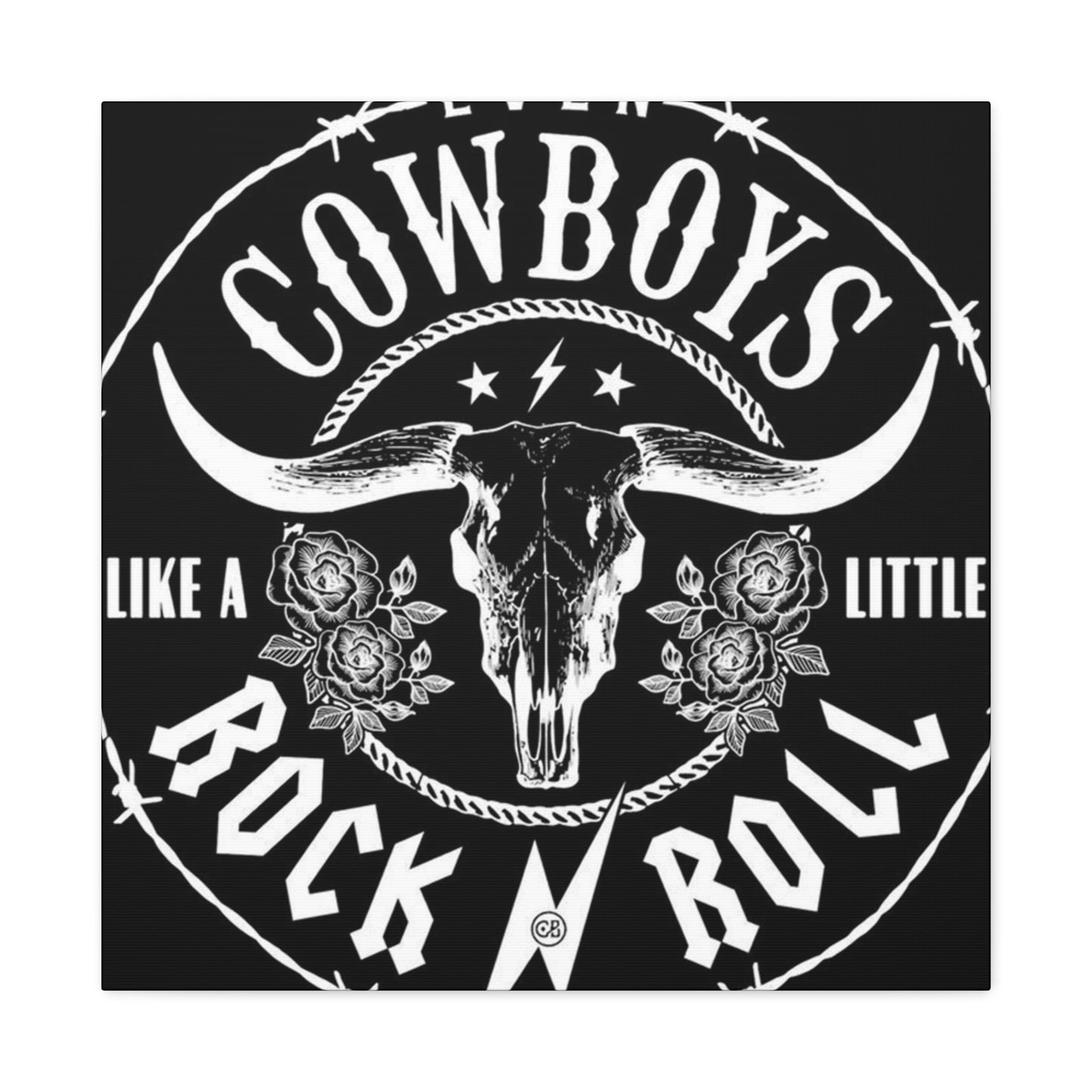
Cowboy Rock N Roll Poster Wall Art & Canvas Prints
Cowboy Rock N Roll Poster Wall Art & Canvas Prints
Couldn't load pickup availability

Decorating Your Music Room with Cowboy Rock 'n' Roll Wall Art
Rock music has always been more than just sound waves hitting your eardrums. It's a cultural movement, a rebellious spirit, and an artistic expression that transcends generations. One of the most powerful ways to capture this essence is through rock wall art, particularly the iconic posters that have become synonymous with legendary bands, unforgettable concerts, and the raw energy of musical rebellion. These visual masterpieces serve as windows into music history, allowing enthusiasts to bring the electrifying atmosphere of rock concerts directly into their homes.
The relationship between rock music and visual art has always been symbiotic. From the earliest days of rock and roll, musicians and artists understood that the visual representation of their music was just as important as the sound itself. Album covers, concert posters, and promotional materials became canvases for artistic expression, creating a rich tapestry of imagery that defined entire musical movements. Today, rock wall art continues this tradition, offering music lovers the opportunity to surround themselves with the visual language of their favorite genres and artists.
The appeal of rock wall art extends far beyond mere decoration. These pieces serve as conversation starters, mood setters, and personal statements about musical taste and cultural identity. Whether you're drawn to the psychedelic swirls of 1960s concert posters, the stark minimalism of punk rock imagery, or the elaborate fantasy worlds depicted on heavy metal album covers, there's a piece of rock wall art that speaks to every musical soul. The diversity within this genre ensures that collectors and casual enthusiasts alike can find pieces that resonate with their personal aesthetic and musical preferences.
The Untamed Spirit of Rock and Roll Through Visual Expression
Rock wall art captures the rebellious essence that has defined rock music since its inception. These visual representations embody the same energy, passion, and defiance that characterize the music itself. From the early days of rock and roll in the 1950s, when Elvis Presley's provocative performances scandalized conservative America, to the present day, where rock continues to evolve and challenge societal norms, visual artists have documented and amplified these movements through their work.
The raw energy of rock and roll finds perfect expression in poster art that refuses to conform to conventional aesthetic standards. These pieces often feature bold typography, aggressive imagery, and color schemes that demand attention. The visual language of rock wall art speaks in the same rebellious tone as the music it represents, using distressed textures, hand-drawn elements, and unconventional layouts to create pieces that feel authentic and unpolished in the best possible way.
Concert posters, in particular, have become legendary for their ability to capture the essence of live rock performances. These promotional pieces were originally created to advertise upcoming shows, but they quickly evolved into collectible art forms in their own right. The best rock concert posters manage to convey the energy and excitement of a live performance through static imagery, using dynamic compositions, explosive color combinations, and typography that seems to vibrate with musical intensity.
The artistic styles found in rock wall art often mirror the musical evolution of rock itself. Early rock and roll posters featured clean, commercial designs that reflected the genre's roots in popular entertainment. As rock music became more experimental and countercultural, the visual art followed suit, incorporating elements from fine art, underground comics, and avant-garde design movements. This evolution continues today, with contemporary rock wall art drawing inspiration from digital design, street art, and global artistic movements.
The DIY aesthetic that has always been central to rock culture finds perfect expression in poster art. Many of the most iconic rock posters were created by artists working with limited budgets and resources, leading to innovative solutions and unique artistic approaches. This grassroots creativity has become a defining characteristic of rock wall art, with collectors often preferring pieces that show evidence of their handmade origins over slick, commercial productions.
Musical Genre Evolution Through Punk to Psychedelic Visual Styles
The visual evolution of rock wall art mirrors the musical journey from punk's stripped-down aggression to psychedelia's mind-expanding complexity. Each subgenre of rock music has developed its own distinct visual language, creating a rich vocabulary of imagery that immediately identifies the musical style being represented. This visual taxonomy allows collectors and enthusiasts to navigate the vast world of rock wall art with an understanding of how different styles relate to specific musical movements and cultural moments.
Punk rock's influence on poster art cannot be overstated. Emerging in the mid-1970s as a reaction against the perceived excesses of mainstream rock, punk brought a do-it-yourself aesthetic that revolutionized both music and visual art. Punk posters embraced rough edges, cut-and-paste techniques, and deliberately amateurish typography that rejected the polished professionalism of mainstream design. This aesthetic choice wasn't accidental; it was a conscious rejection of conventional beauty standards and corporate polish, reflecting punk's anti-establishment philosophy.
The visual language of punk wall art features high contrast black and white imagery, aggressive typography that appears to be torn from newspaper headlines, and compositions that seem to vibrate with barely contained energy. Safety pins, torn fabric, and other symbols of destruction and reconstruction became recurring motifs, while photography often featured stark, unflattering portraits that emphasized authenticity over glamour. The influence of punk's visual aesthetic extended far beyond the genre itself, inspiring artists across the musical spectrum to embrace imperfection and rawness in their work.
Psychedelic rock, on the opposite end of the spectrum, created some of the most visually complex and colorfully elaborate poster art in rock history. Emerging from the counterculture movement of the 1960s, psychedelic rock posters attempted to visually represent the mind-expanding experiences associated with the music and the broader cultural movement. These pieces featured swirling patterns, impossible color combinations, and typography that seemed to melt and flow like liquid, creating optical illusions that engaged viewers in active visual experiences.
The artists who created psychedelic rock posters drew inspiration from Art Nouveau, Op Art, and various Eastern spiritual traditions, creating a unique visual language that perfectly complemented the experimental nature of the music. Concert posters for venues like the Fillmore and Avalon Ballroom in San Francisco became legendary for their artistic innovation, with artists like Rick Griffin, Victor Moscoso, and Stanley Mouse creating pieces that are now considered fine art masterpieces. These posters often required intense concentration to decipher the text, turning the act of reading into a participatory experience that mirrored the immersive nature of psychedelic music.
New Wave and post-punk movements of the late 1970s and early 1980s brought yet another visual evolution, incorporating elements of modernist design, corporate imagery, and pop art into rock wall art. These styles often featured clean lines, geometric shapes, and sophisticated color palettes that reflected the genres' intellectual aspirations and art school connections. Bands like Talking Heads and Devo worked with cutting-edge graphic designers to create visual identities that were as innovative as their music, leading to poster art that looked more like museum pieces than traditional rock promotional materials.
Visual Themes Spanning Grunge, Glam, and Raw Musical Aesthetics
The diversity of rock music has given birth to an equally diverse range of visual themes in wall art, with grunge, glam, and other movements each contributing unique aesthetic elements to the broader rock art canon. These visual themes don't exist in isolation; they interact, influence each other, and evolve over time, creating a complex web of imagery that reflects the multifaceted nature of rock culture itself.
Grunge's visual aesthetic emerged from the Pacific Northwest in the late 1980s and early 1990s, bringing with it a deliberately anti-fashion approach that celebrated imperfection and authenticity. Grunge wall art features muted color palettes dominated by earth tones, distressed textures that suggest wear and weathering, and typography that appears hand-lettered or photocopied multiple times until clarity degrades into atmospheric texture. The overall effect is one of casual indifference to conventional beauty standards, perfectly matching the musical genre's rejection of rock star glamour and commercial polish.
The visual language of grunge draws heavily from underground comic books, zine culture, and the aesthetic of used record stores and coffee shops. Collage techniques are common, with images torn from magazines and newspapers combined with hand-drawn elements to create compositions that feel spontaneous and unplanned. Photography in grunge wall art often features high contrast black and white images with harsh lighting that emphasizes texture and mood over technical perfection. This visual approach created an intimate, almost voyeuristic quality that made viewers feel like they were getting an unfiltered glimpse into the lives and minds of the musicians.
Glam rock, in stark contrast to grunge's studied casualness, embraced theatrical excess and visual spectacle as core elements of its identity. Glam rock wall art features bold, saturated colors, metallic finishes, and imagery that celebrates artifice and performance. These pieces often incorporate elements of science fiction, fantasy, and gender-bending imagery that reflected the genre's exploration of identity and sexuality. The visual style of glam rock posters borrowed from fashion photography, theater design, and fine art movements like Pop Art and Surrealism to create images that were simultaneously familiar and alien.
The typography in glam rock wall art tends toward the elaborate and decorative, often featuring custom lettering that incorporates theatrical elements like lightning bolts, stars, and other symbols of power and glamour. Color schemes frequently employ high contrast combinations like black and gold, silver and purple, or electric blue and hot pink, creating visual experiences that are as bold and unapologetic as the music itself. The overall effect is one of controlled chaos, where every element is carefully designed to create maximum visual impact while maintaining an underlying sense of sophisticated design sensibility.
Heavy metal and hard rock have developed their own distinct visual themes that emphasize power, darkness, and mythological imagery. Metal wall art often features elaborate illustrations depicting fantasy scenes, occult symbols, and imagery of war, death, and supernatural forces. The artistic style tends toward the realistic and detailed, with many pieces resembling classical paintings or comic book illustrations more than traditional rock posters. Color palettes in metal art often favor dark blues, blacks, and deep reds, with metallic accents that literally reflect the genre's name.
The influence of album cover art on wall poster design cannot be ignored when discussing visual themes in rock art. Many of the most iconic images in rock wall art originated as album covers before being adapted for poster format. This cross-pollination between different forms of rock visual art has created a rich ecosystem where images flow freely between mediums, allowing fans to experience their favorite album artwork on a larger scale while maintaining the intimate connection between music and visual art that makes rock culture so compelling.
Monochromatic Power in Black and White Rock Poster Design
The strategic use of black and white in rock poster design represents one of the most powerful and enduring approaches to creating visual impact. This monochromatic palette eliminates the potential distraction of color, forcing viewers to focus on composition, contrast, and the raw emotional content of the imagery. Black and white rock wall art has the ability to distill complex musical ideas into their most essential visual elements, creating pieces that communicate with directness and intensity that mirrors the most powerful rock performances.
The psychological impact of monochromatic design in rock wall art cannot be underestimated. Black and white imagery carries inherent associations with classic photography, film noir, and newspaper journalism, lending an air of authenticity and historical weight to rock posters. This aesthetic choice can make contemporary bands appear timeless while simultaneously connecting them to the rich history of rock photography and poster design. The absence of color also creates a sense of rawness and immediacy that perfectly complements rock music's emphasis on emotional honesty and direct communication.
Technical considerations play a significant role in the effectiveness of black and white rock poster design. The stark contrast between black and white allows for bold graphic statements that remain readable even when viewed from a distance or reproduced at small sizes. This practical advantage made black and white designs particularly popular during the early days of rock poster production, when printing technologies and budgets were limited. The aesthetic born from these practical constraints has evolved into a sophisticated design approach that continues to influence contemporary rock wall art.
Photography-based black and white rock posters often emphasize dramatic lighting, unusual angles, and high contrast processing to create images that feel more intense than their color counterparts. Concert photographers and poster designers working in monochrome must rely on composition, lighting, and moment selection to create visual interest, often resulting in more carefully considered and artistically sophisticated final products. The grain and texture inherent in black and white photography adds another layer of visual interest, creating surfaces that invite close examination and tactile appreciation.
Typography in monochromatic rock posters takes on increased importance, as it must compete for attention without the benefit of color coding or chromatic hierarchy. Designers working in black and white often develop sophisticated approaches to type treatment, using varying weights, sizes, and textures to create visual interest and information hierarchy. Hand-lettering becomes particularly effective in monochromatic designs, as the subtle variations in line weight and texture created by human hands add organic interest that contrasts beautifully with high-contrast photographic elements.
The printing and production considerations for black and white rock wall art offer both advantages and challenges. Single-color printing can be more economical, making it easier for small bands and independent venues to produce high-quality promotional materials. However, achieving rich blacks and clean whites requires careful attention to paper choice, ink density, and printing techniques. The best black and white rock posters demonstrate mastery of these technical elements, using the full range of grays available in the monochromatic spectrum to create depth and visual interest.
Contemporary black and white rock poster design continues to evolve, incorporating digital techniques that allow for even greater control over contrast and texture. Digital manipulation can create effects that were impossible or impractical with traditional darkroom techniques, allowing designers to push the boundaries of what's possible within the monochromatic palette. However, the most successful contemporary black and white rock wall art maintains connection to the aesthetic traditions that made monochromatic design so powerful in the first place.
Vibrant Palettes and Bold Graphics in Psychedelic Rock Renaissance
The resurgence of psychedelic aesthetics in contemporary rock wall art represents both a nostalgic return to the experimental visual language of the 1960s and a forward-looking embrace of digital design possibilities. Modern psychedelic rock posters combine traditional elements like swirling patterns, impossible color combinations, and optical illusions with contemporary techniques and cultural references, creating pieces that feel both timeless and utterly current. This renaissance demonstrates the enduring power of psychedelic visual language to capture the transcendent aspects of rock music experience.
Color theory plays a central role in psychedelic rock poster design, with artists deliberately choosing combinations that challenge conventional aesthetic sensibilities. Complementary colors are often pushed to extreme saturation levels, creating visual tensions that seem to make the poster surface vibrate and pulse with energy. These color choices aren't arbitrary; they're carefully calculated to create specific psychological and physiological responses in viewers, mimicking the perceptual alterations associated with the original psychedelic experience while remaining accessible to contemporary audiences.
The technical execution of psychedelic color effects has evolved dramatically since the original movement. While 1960s poster artists were limited to the color combinations possible with traditional printing techniques, contemporary designers have access to digital tools that allow for unlimited color exploration and seamless gradients. However, the most successful contemporary psychedelic rock wall art maintains connection to the handmade aesthetic of the original movement, often incorporating deliberate imperfections and analog textures that prevent the final product from feeling overly digital or sterile.
Pattern and repetition form the backbone of psychedelic visual design, with artists creating complex visual rhythms that mirror the repetitive structures found in much psychedelic rock music. These patterns often start with simple geometric forms that are then subjected to various transformations: scaling, rotation, reflection, and distortion that create increasingly complex visual compositions. The mathematical precision underlying many psychedelic patterns creates a paradoxical relationship between order and chaos that perfectly captures the controlled experimentation characteristic of psychedelic rock music.
Typography in psychedelic rock posters presents unique challenges and opportunities. Text must remain legible while participating in the overall visual experience, often requiring innovative solutions that treat letters as visual elements rather than simply informational content. Psychedelic lettering frequently employs techniques like perspective distortion, organic growth patterns, and impossible spatial relationships that force viewers to actively engage with the text in order to decode its meaning. This participatory aspect of psychedelic typography transforms the simple act of reading into an immersive experience.
The influence of digital art and new media on psychedelic rock wall art has opened up previously impossible avenues for visual exploration. Computer graphics allow for mathematical precision in pattern generation while simultaneously offering tools for organic distortion and texture application. Virtual reality and augmented reality technologies are beginning to influence static poster design, with artists creating pieces that suggest movement and dimensional depth even when printed on traditional paper substrates.
Cultural references in contemporary psychedelic rock art extend far beyond the original 1960s counterculture, incorporating elements from video games, internet culture, and global artistic traditions. This expanded cultural vocabulary allows modern psychedelic artists to speak to contemporary audiences while maintaining connection to the movement's original spirit of experimentation and consciousness expansion. The result is rock wall art that feels both nostalgically familiar and surprisingly fresh, capable of attracting both longtime fans of psychedelic aesthetics and newcomers discovering these visual languages for the first time.
Styling Living Areas with Rock and Roll Poster Collections
Creating an authentic rock and roll atmosphere in residential environments requires more than simply hanging random music posters on available wall areas. Successful integration of rock wall art into home environments demands careful consideration of scale, placement, lighting, and the relationship between different pieces within the collection. The goal is to create an environment that feels naturally evolved rather than artificially constructed, where the rock poster collection becomes an integral part of the room's personality rather than an obvious decorative afterthought.
The foundation of any successful rock wall art display begins with understanding the architectural characteristics of the room itself. High ceilings can accommodate large-scale pieces or vertical arrangements that draw the eye upward, while more intimate rooms might benefit from carefully curated smaller pieces that invite closer examination. The existing color palette of the room should inform poster selection, either through complementary color relationships or deliberate contrast that makes the rock art pop against its surroundings. Natural light sources affect how colors appear throughout the day, making it important to consider how different lighting conditions will impact the viewing experience of the rock poster collection.
Scale relationships between individual pieces and the room itself require careful consideration to avoid overwhelming smaller areas or getting lost in larger ones. A single oversized vintage concert poster can serve as a dramatic focal point in a minimalist room, while a collection of smaller pieces might be more appropriate for creating visual interest without dominating the visual field. The key is maintaining balance between the visual weight of the rock wall art and other elements in the room, ensuring that the music-inspired pieces enhance rather than compete with the overall environmental experience.
Grouping strategies for rock poster collections can follow various organizational principles, each creating different emotional and visual effects. Chronological arrangements that trace the evolution of a particular band or musical movement create narrative experiences that reward closer examination and discussion. Thematic groupings based on visual style, color palette, or musical genre can create more cohesive visual statements while still maintaining individual piece identity. Mixed approaches that combine different organizational strategies can create more complex and interesting viewing experiences that reveal new relationships between pieces over time.
Lighting design plays a crucial role in maximizing the impact of rock wall art collections. Direct spotlighting can create dramatic effects but may also cause uneven fading over time, particularly with vintage pieces that use older printing techniques and paper stocks. Indirect lighting that eliminates glare while providing even illumination allows for comfortable viewing of detailed poster elements while minimizing conservation concerns. The color temperature of artificial lighting affects how poster colors appear, with warmer lighting creating more intimate atmospheres and cooler lighting providing more accurate color reproduction.
The relationship between rock wall art and furniture placement requires strategic thinking to create viewing opportunities that feel natural rather than forced. Seating arrangements should provide comfortable viewing angles for the poster collection without making the art feel like it's on display in a museum setting. Coffee tables, side tables, and other horizontal surfaces can support books, albums, and other music-related objects that reinforce the rock theme while providing opportunities for interactive engagement with the collection.
Storage and rotation strategies become important considerations for serious collectors whose acquisitions exceed their available display area. Proper storage techniques protect non-displayed pieces from light, moisture, and physical damage while keeping them accessible for periodic rotation. Regular rotation keeps the visual environment fresh and allows different pieces to be featured throughout the year, preventing visual fatigue while maximizing the enjoyment derived from the entire collection.
Building Musical Gallery Walls for Home Environments
The concept of gallery walls has evolved from traditional fine art displays to include more eclectic and personal collections, making them perfect vehicles for showcasing rock wall art collections. Musical gallery walls offer opportunities to create complex visual narratives that combine different types of music-related artwork, memorabilia, and personal items into cohesive displays that tell stories about musical taste, concert experiences, and cultural identity. The key to successful musical gallery wall construction lies in balancing visual variety with underlying unity, creating displays that feel intentional rather than random.
Planning phase considerations for musical gallery walls begin long before any nails go into walls. Template creation using paper cutouts allows for experimentation with different arrangements without committing to specific placements or creating unnecessary wall damage. These planning templates should account for the actual dimensions of frames and mats, as well as the spacing between pieces that will allow each element to be seen clearly while contributing to the overall composition. Digital planning tools can also be helpful, particularly for complex arrangements that incorporate various sizes and orientations of rock wall art pieces.
Framework strategies for musical gallery walls can follow various organizational principles depending on the desired aesthetic outcome. Grid-based approaches create order and sophistication, making them appropriate for more formal room settings while still accommodating the rebellious nature of rock imagery. Organic arrangements that follow more natural flowing patterns can feel more casual and spontaneous, better reflecting the improvisational spirit of rock music itself. Hybrid approaches that combine structured elements with organic variation often provide the most visually interesting results, creating enough order to feel intentional while maintaining enough variety to reward extended viewing.
Size and scale variations within musical gallery walls create visual rhythm and hierarchy that guides viewer attention through the display. Large statement pieces can serve as anchors around which smaller elements are arranged, while groupings of similar-sized pieces can create visual weight that balances larger individual elements elsewhere in the arrangement. The interplay between different scales creates depth and visual interest that makes gallery walls more engaging than single large pieces, while also providing opportunities to include various types of music-related items beyond traditional posters.
Color coordination strategies for rock wall art gallery walls must balance the often bold and contrasting color palettes found in music posters with the need for overall visual coherence. One approach involves selecting pieces that share common color elements, even if their overall palettes differ dramatically. Another strategy embraces color contrast as a unifying element, deliberately choosing pieces with clashing color combinations that create energetic visual dialogue. Neutral matting and framing can help unify disparate color palettes while allowing individual pieces to maintain their visual impact.
Matting and framing decisions significantly impact both the individual appearance of rock wall art pieces and their relationships within gallery wall contexts. Consistent matting approaches can create unity among diverse pieces, while varied matting treatments can emphasize the individual character of each element. Frame selection affects both the aesthetic impact and preservation qualities of the display, with archival-quality materials becoming increasingly important for valuable or irreplaceable pieces. The visual weight of frames must be considered in relation to both individual pieces and the overall gallery wall composition.
Lighting integration for musical gallery walls requires addressing both practical visibility needs and aesthetic enhancement goals. Track lighting systems provide flexibility for illuminating complex arrangements while minimizing visual distraction from the displayed artwork. Picture lighting can provide focused illumination for individual pieces while creating dramatic shadow effects that add depth to the overall display. Natural lighting considerations become more complex with gallery walls, as different pieces within the same arrangement may have varying light sensitivity requirements that need to be balanced with visual accessibility needs.
Contemporary Home Aesthetics Meeting Musical Rebellion
The integration of rock wall art into contemporary residential design represents a fascinating collision between polished modern aesthetics and the deliberately rough, rebellious visual language of rock culture. This intersection creates opportunities for sophisticated design solutions that honor both the refined sensibilities of contemporary home design and the authentic spirit of rock music visual culture. The key lies in finding approaches that allow rock imagery to maintain its edge while contributing positively to the overall residential environment.
Minimalist design principles, when applied to rock wall art display, can actually enhance the impact of bold music imagery by providing clean, uncluttered contexts that allow posters to command full attention. The stark simplicity of minimalist environments creates dramatic contrast with the visual complexity often found in rock posters, making both the clean architectural elements and the detailed artwork more impactful. This approach requires careful selection of pieces that can hold their own against simplified surroundings without overwhelming the space or compromising the minimalist aesthetic integrity.
Material relationships between contemporary architectural elements and rock wall art create opportunities for sophisticated visual dialogue. The interaction between smooth, refined surface treatments and the rough, textured aesthetic of many rock posters can create compelling contrasts that enhance both elements. Modern materials like concrete, steel, and glass can provide neutral backdrops that allow rock imagery to pop while maintaining contemporary credibility. The key is ensuring that these material relationships feel intentional rather than accidental, creating designed environments that successfully bridge different aesthetic languages.
Color palette strategies for integrating rock wall art into contemporary settings often involve identifying shared color elements that can serve as bridges between modern furnishings and music imagery. Many rock posters incorporate black, white, and gray elements that naturally coordinate with contemporary design palettes, while pops of bold color from the artwork can provide accent elements that enliven neutral modern environments. The strategic use of color repetition throughout the room can create visual connections between disparate elements, making rock posters feel integrated rather than imposed.
Furniture selection and arrangement in contemporary rooms featuring rock wall art requires balancing clean modern lines with the visual energy of music imagery. Contemporary furniture pieces with simple geometric forms can provide visual counterpoints to the more complex compositions often found in rock posters, while maintaining the sophisticated aesthetic that contemporary design demands. The scale relationships between furniture and artwork become particularly important, as oversized contemporary furniture can diminish the impact of smaller posters, while massive vintage concert posters might overwhelm delicate modern seating pieces.
Lighting design in contemporary environments featuring rock wall art offers opportunities to create dramatic effects that enhance both the modern architectural elements and the music imagery. Contemporary lighting fixtures can provide precise illumination that reveals poster details while creating interesting shadow patterns on modern surfaces. The clean lines of contemporary light fixtures can provide visual rest areas that balance the more complex compositions of rock wall art, creating environments that feel both energetic and sophisticated.
Technology integration presents unique opportunities in contemporary homes featuring rock wall art. Modern audio systems can provide sonic backdrops that complement the visual energy of rock posters, creating multi-sensory experiences that honor both the musical and visual aspects of rock culture. Smart lighting systems can provide variable illumination that changes throughout the day, revealing different aspects of rock wall art while adapting to various room functions and moods.
Optimal Framing Solutions for Vintage Concert Posters
The preservation and presentation of vintage concert posters requires specialized framing approaches that address both conservation concerns and aesthetic considerations. These historical pieces often represent significant financial investments as well as irreplaceable cultural artifacts, making proper framing techniques essential for long-term preservation while maximizing visual impact. The challenge lies in balancing protective measures with display quality, ensuring that conservation efforts enhance rather than compromise the viewing experience.
Archival quality materials form the foundation of proper vintage poster framing, with acid-free mounting boards, UV-filtering glazing, and chemically stable adhesives preventing the deterioration that can occur when inappropriate materials interact with old paper and printing inks. The selection of archival materials must consider not only their protective qualities but also their visual impact, as off-white mounting boards may be more appropriate for aged posters than bright white alternatives that could create harsh contrast with naturally yellowed paper. Museum-quality framing materials represent a significant investment, but they're essential for preserving valuable vintage pieces for future generations.
Mounting techniques for vintage concert posters must balance security with reversibility, ensuring that pieces remain securely positioned within frames while avoiding permanent alterations that could affect future value or treatment options. Hinge mounting with Japanese tissue and wheat starch paste provides secure attachment while remaining completely reversible, making it the preferred approach for valuable pieces. Float mounting techniques that suspend posters within their frames without direct attachment create dramatic presentation effects while providing maximum preservation, though they require more complex frame construction and careful handling during installation.
Glazing selection for vintage rock poster framing involves choosing between various types of protective glass or acrylic that provide UV filtering while minimizing reflection and distortion. Museum glass offers superior clarity and UV protection but represents a significant cost increase over standard glazing materials. Acrylic alternatives provide impact resistance that may be important in busy household environments while offering UV protection comparable to museum glass at more accessible price points. The choice between glass and acrylic often depends on specific environmental factors, handling requirements, and budget considerations.
Matting decisions for vintage concert posters require balancing historical authenticity with contemporary presentation standards. Period-appropriate mat colors and proportions can enhance the historical character of vintage pieces while providing the separation from glazing that's essential for proper preservation. However, contemporary matting approaches might be more appropriate for pieces intended to integrate with modern environments, creating bridges between historical artifacts and contemporary design sensibilities. Multiple mat layers can create depth and visual interest while providing additional protection for poster edges.
Frame selection for vintage rock posters involves choosing designs that complement the historical character of the pieces while providing adequate protection and visual enhancement. Simple, understated frames often work best, allowing the posters themselves to command attention while providing elegant contexts that enhance rather than compete with the artwork. The visual weight of frames must be appropriate to the scale and significance of the posters, with more substantial pieces warranting more substantial framing treatments while smaller or more delicate pieces might be overwhelmed by heavy frames.
Environmental control considerations become particularly important when displaying valuable vintage concert posters, as fluctuations in temperature and humidity can cause paper to expand and contract, leading to buckling, tearing, or other forms of deterioration. Sealed frame packages can provide some protection from environmental fluctuations, while climate-controlled environments offer the best protection for extremely valuable pieces. The trade-offs between environmental control and accessibility must be carefully considered, particularly for pieces that are regularly handled or relocated.
Professional versus DIY framing decisions for vintage concert posters often depend on the value and condition of specific pieces, as well as the technical skills and available tools of the collector. While professional framing ensures optimal preservation and presentation, costs can be prohibitive for large collections or pieces of moderate value. DIY framing can be acceptable for reproduction pieces or less valuable originals, provided that proper materials and techniques are employed and the limitations of non-professional approaches are understood and accepted.
Creating Musical Sanctuaries in Personal Living Areas
The transformation of residential areas into music-focused environments goes beyond simple decoration to create immersive experiences that celebrate rock culture and personal musical identity. These musical sanctuaries serve as retreat areas where enthusiasts can fully engage with their passion for rock music, surrounded by visual elements that reinforce and amplify their connection to the music they love. The design of these environments requires careful consideration of how different elements work together to create cohesive experiences that feel authentic rather than artificially constructed.
Acoustic considerations play a crucial role in designing effective musical sanctuaries, as these areas are likely to be used for active music listening as well as visual appreciation of rock wall art. Sound absorption and reflection characteristics of different materials affect both the quality of music reproduction and the overall environmental experience. Hard surfaces like concrete or exposed brick can create exciting acoustic environments that emphasize the energy of rock music, while softer materials might be necessary to control excessive reverberation in smaller rooms. The placement of rock wall art can actually contribute to acoustic design, with framed pieces providing moderate sound absorption while maintaining the visual impact essential to the sanctuary concept.
Furniture selection for musical sanctuary environments should prioritize comfort for extended listening sessions while maintaining visual compatibility with rock aesthetic elements. Vintage leather seating can provide both comfort and visual authenticity, while contemporary pieces in appropriate colors and materials can create sophisticated environments that still honor rock culture values. Storage solutions for vinyl records, CDs, and music equipment must be integrated into the design scheme, providing functional benefits while contributing to the overall visual narrative of the room.
Lighting design in musical sanctuaries requires balancing various functional needs with atmospheric goals. Reading lights allow for examination of album liner notes and rock wall art details, while ambient lighting creates moods appropriate for different types of musical experiences. Colored lighting can create dramatic effects that complement specific musical genres or individual listening sessions, while avoiding the garish disco effects that might compromise the sophisticated appreciation of rock culture. Dimmer controls provide flexibility for adapting lighting to different uses and times of day.
Technology integration in contemporary musical sanctuaries extends far beyond basic stereo systems to include sophisticated audio equipment, digital music libraries, and interactive technologies that enhance the rock music experience. The visual design of these technological elements must be considered in relation to rock wall art and other design elements, ensuring that modern equipment enhances rather than competes with the carefully constructed aesthetic environment. Cable management and equipment placement require careful planning to maintain clean visual lines while providing access for system operation and maintenance.
Personal memorabilia integration allows musical sanctuaries to tell individual stories that go beyond generic rock culture references. Concert tickets, backstage passes, guitar picks, and other personal artifacts can be incorporated into displays that complement rock wall art while adding layers of personal meaning that make the environment unique to its creator. The challenge lies in balancing personal elements with broader design coherence, ensuring that individual memories enhance rather than clutter the overall environmental experience.
Ventilation and climate control considerations become important in dedicated musical sanctuary environments, particularly those housing valuable vinyl collections or sensitive electronic equipment. Temperature and humidity control protect both musical collections and rock wall art from environmental damage, while adequate air circulation prevents the stuffiness that can develop in rooms dedicated to extended listening sessions. These practical concerns must be addressed through solutions that maintain the aesthetic integrity of the carefully designed environment.
Legendary Rock Musicians in Poster Art History
The visual documentation of rock music history through poster art has created an extensive gallery of legendary performers whose images have become as iconic as their musical contributions. These posters serve as historical documents that capture not only the physical appearances of famous musicians but also the cultural contexts and aesthetic sensibilities of their respective eras. The evolution of how rock legends are portrayed in poster art reflects changing attitudes toward celebrity, rebellion, and artistic expression throughout rock music history.
Early rock and roll poster art of the 1950s and early 1960s typically featured clean, commercial imagery designed to make performers appear accessible to mainstream audiences. Promotional posters for artists like Elvis Presley, Chuck Berry, and Buddy Holly emphasized their youth, energy, and relatability while downplaying the more rebellious aspects of their music and personas. These early posters followed established entertainment industry conventions for celebrity promotion, using professional photography and conventional typography to create materials that would be acceptable to venue operators and conservative community members.
The transformation of rock poster art during the late 1960s reflected the music's evolution from popular entertainment to countercultural expression. Posters featuring artists like Jimi Hendrix, Janis Joplin, and Jim Morrison embraced the psychedelic aesthetic that matched their experimental music, using distorted imagery, impossible color combinations, and avant-garde design techniques that challenged conventional notions of celebrity representation. These posters positioned their subjects as artistic visionaries rather than mere entertainers, contributing to the elevation of rock musicians to cultural icon status.
The 1970s brought further diversification in how rock legends were portrayed in poster art, with different genres developing distinct visual approaches. Hard rock and heavy metal posters featuring artists like Led Zeppelin, Black Sabbath, and Deep Purple emphasized power, mysticism, and dark fantasy elements that matched their musical themes. Meanwhile, glam rock artists like David Bowie, T. Rex, and Roxy Music were portrayed through imagery that celebrated artifice, sexuality, and theatrical performance, creating posters that were as much about fashion and style as about musical promotion.
Punk rock's emergence in the mid-1970s brought a complete rejection of conventional celebrity poster aesthetics, with artists like the Sex Pistols, The Clash, and Ramones appearing in imagery that emphasized authenticity, rebellion, and anti-fashion statements. Punk posters deliberately avoided the glamorous portraiture common in mainstream rock promotion, instead featuring candid or deliberately unflattering photographs that reinforced the genre's anti-establishment philosophy. This aesthetic choice influenced rock poster design well beyond the punk movement itself, inspiring more realistic and less idealized approaches to musician portraiture across various genres.
Conclusion
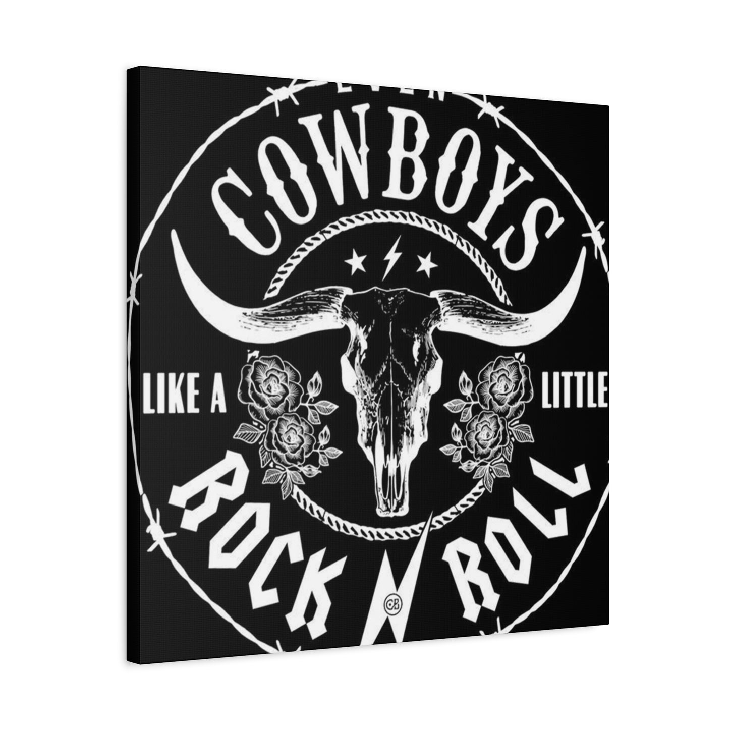
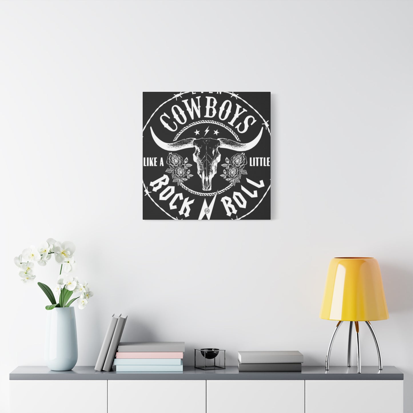
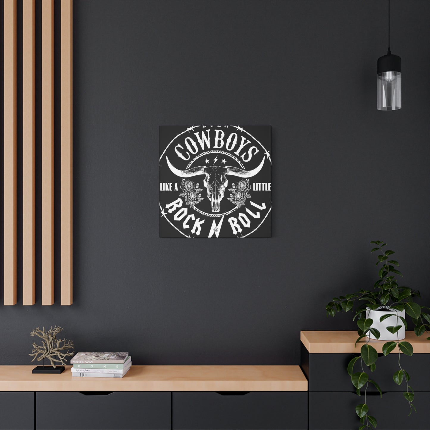
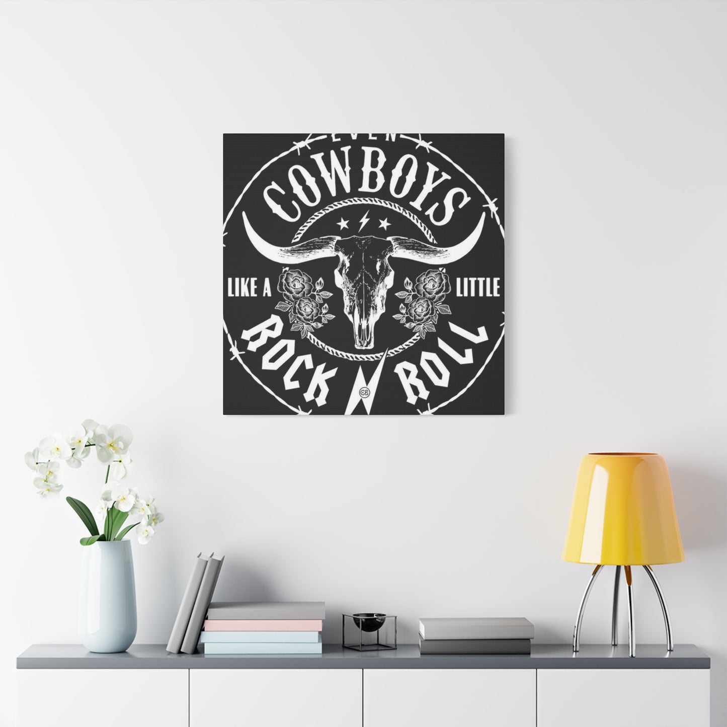
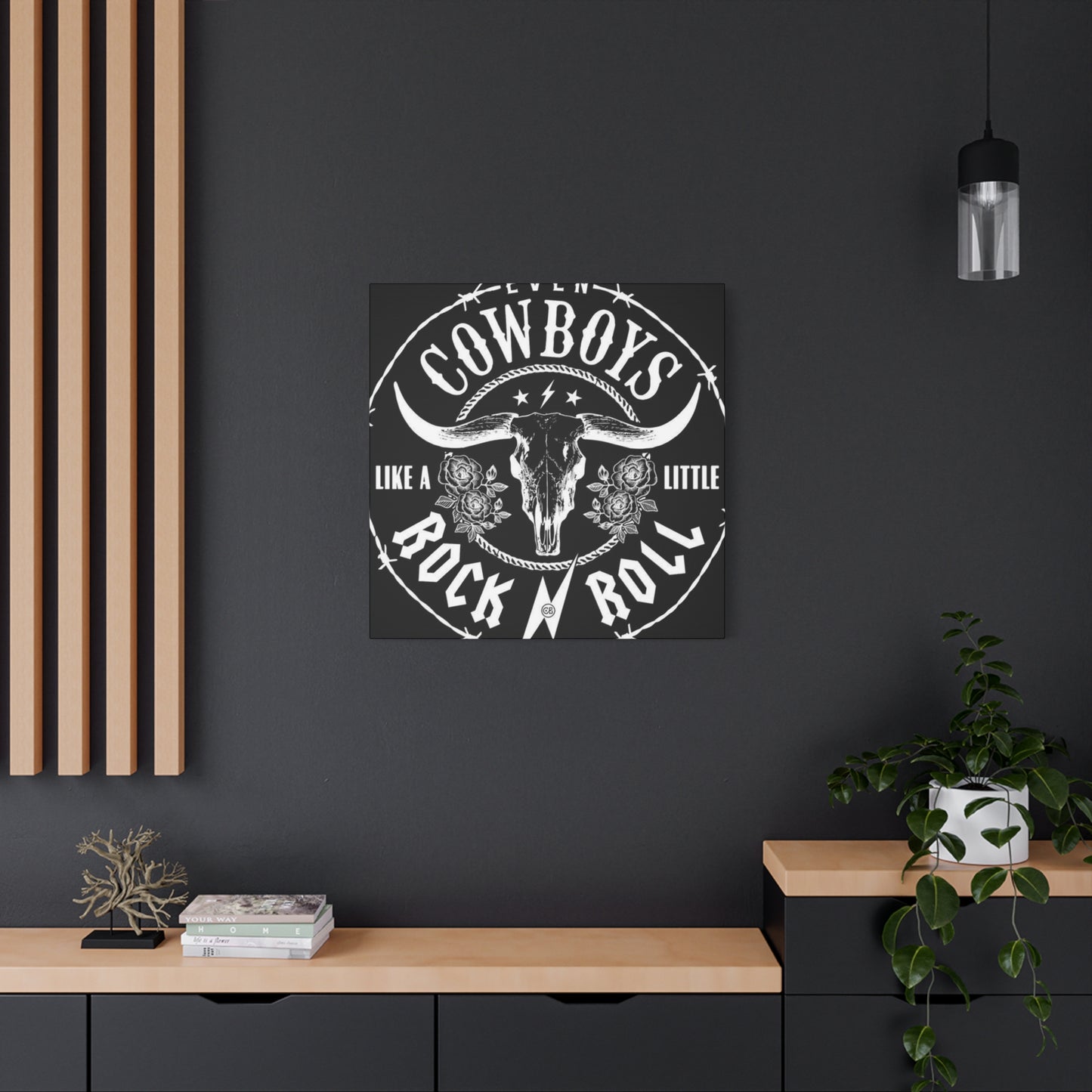
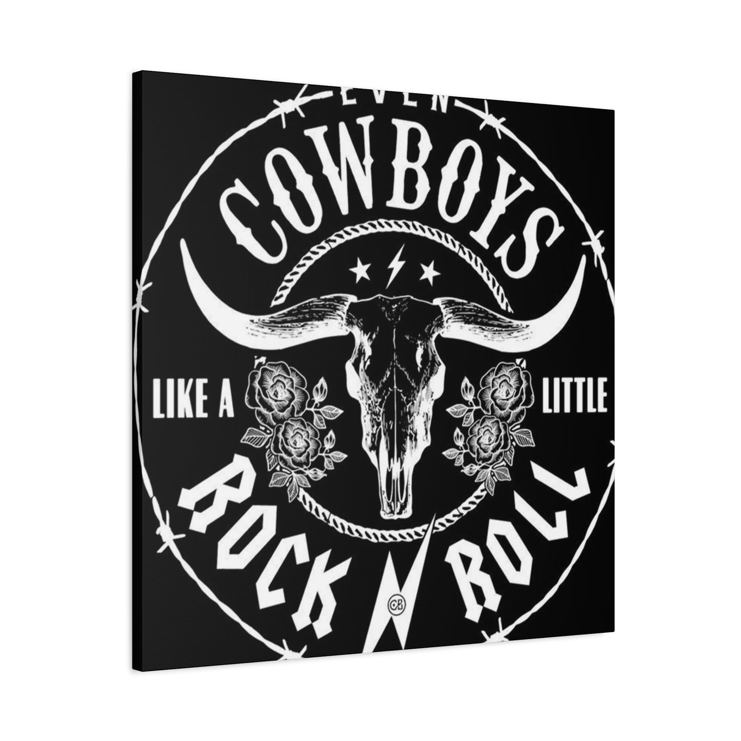
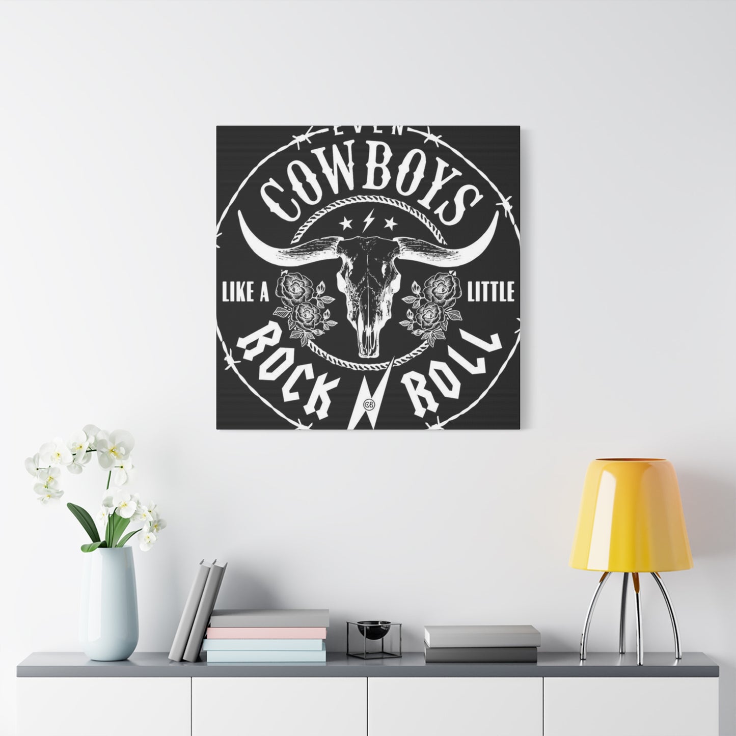
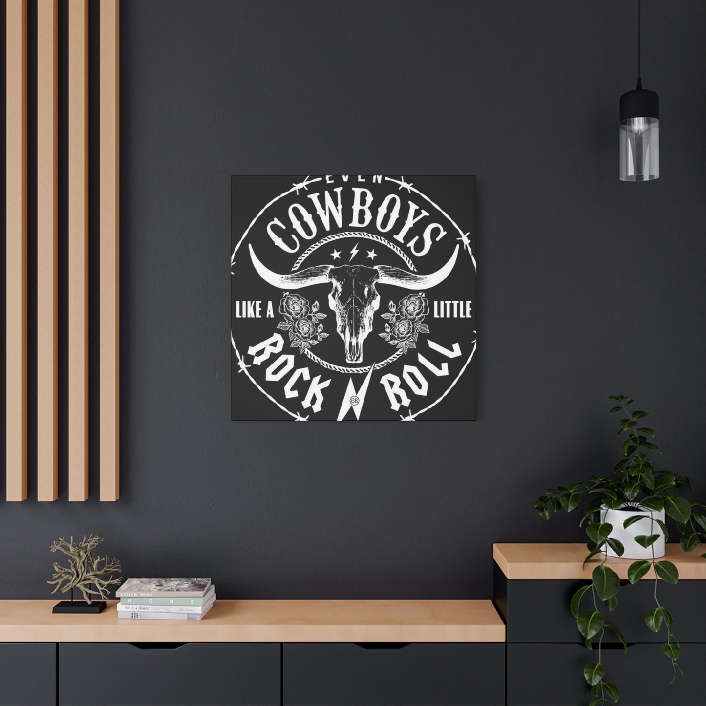
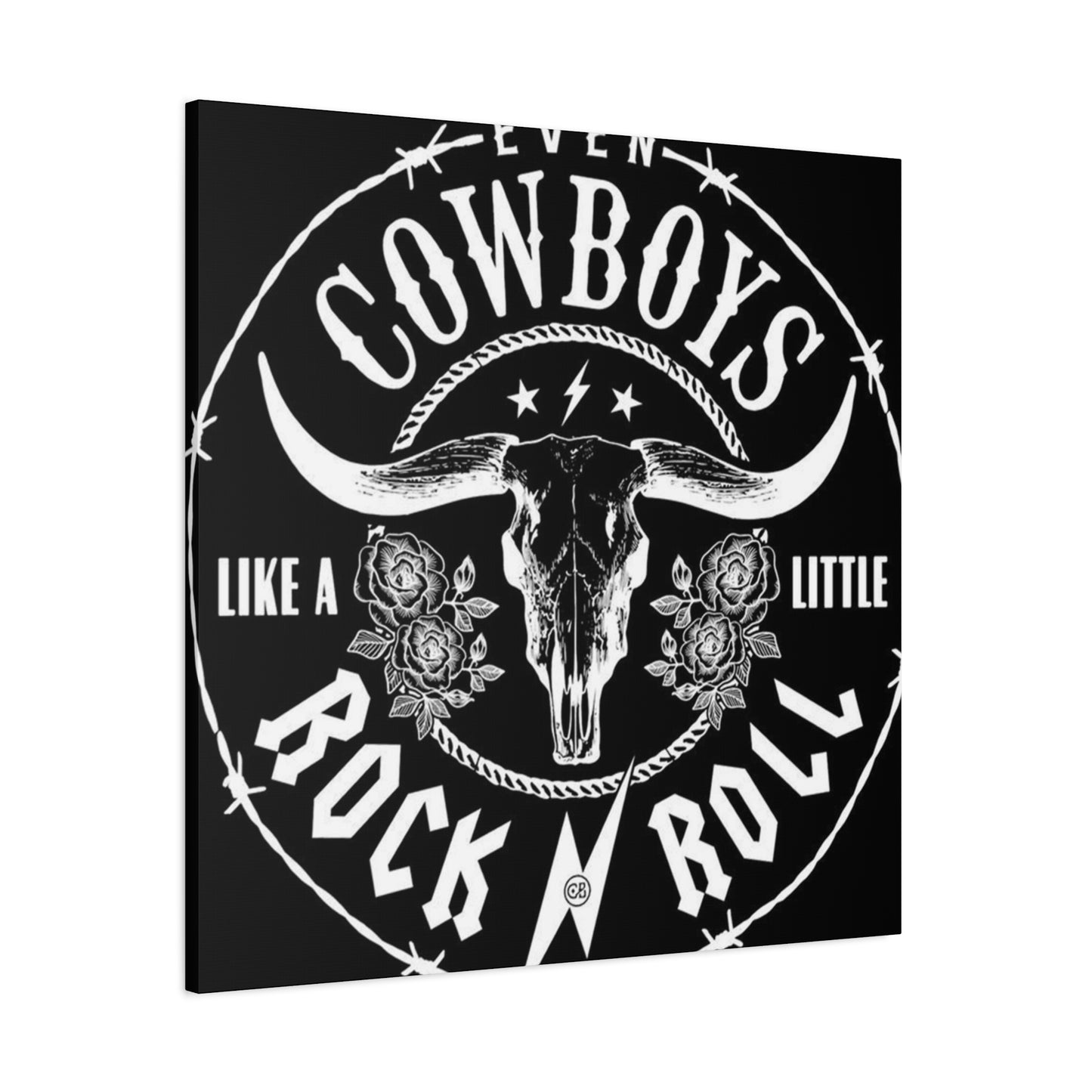
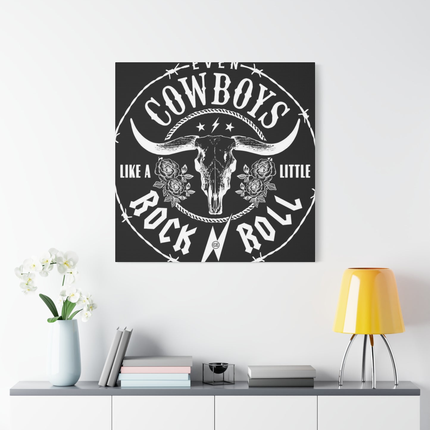
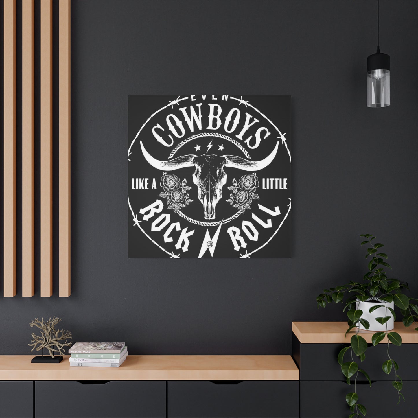
Decorating your music room with Cowboy Rock 'n' Roll wall art brings together two powerful cultural forces—the raw spirit of the Wild West and the rebellious soul of rock music. This unique fusion creates a space that not only celebrates musical heritage but also reflects personality, energy, and attitude. Whether you’re a musician, a fan of outlaw country, or simply someone who appreciates bold, unconventional decor, this style of wall art transforms your music room into an immersive, creative environment.
Cowboy Rock 'n' Roll art isn’t just about guitars and spurs—it’s a visual expression of grit, freedom, and authenticity. It captures the essence of iconic American counterculture, blending the boots-and-hats aesthetic of cowboy lore with the amplifiers, electric guitars, and rebellious icons of rock music. From Johnny Cash-inspired silhouettes to modern mashups of rodeo scenes and grunge textures, this art style tells a story of independence and artistic defiance. It makes your music room not just a place to play or listen, but a place to feel deeply connected to music’s boldest roots.
Incorporating this type of artwork adds an unmistakable edge and atmosphere to the space. Black-and-white portraits, distressed textures, neon accents, or vintage concert posters with Western themes all contribute to a dynamic visual experience. These pieces not only enhance the room’s vibe but also inspire creativity, encouraging musicians and listeners alike to tap into the same fearless energy that defines cowboy legends and rock stars alike.
From a design standpoint, Cowboy Rock 'n' Roll wall art pairs well with a variety of elements often found in music rooms. Think reclaimed wood, leather chairs, vintage amps, metal wall fixtures, and exposed brick. These textural elements ground the art in a tactile, raw environment—making the space feel authentic and lived-in, rather than overly polished. Whether you're aiming for a full-on saloon-meets-studio vibe or just want to inject some rebellious flair into a modern music nook, the versatility of this style offers plenty of creative flexibility.
In conclusion, Cowboy Rock 'n' Roll wall art is more than just decoration—it’s a bold statement that celebrates freedom, rebellion, and musical legacy. By integrating this artwork into your music room, you're creating an atmosphere that honors both the storytelling spirit of the cowboy and the electrifying pulse of rock 'n' roll. The result is a space that doesn't just sound good—it feels alive, energized, and deeply personal. For anyone passionate about music and design, this fusion offers the perfect canvas for creative expression.
