


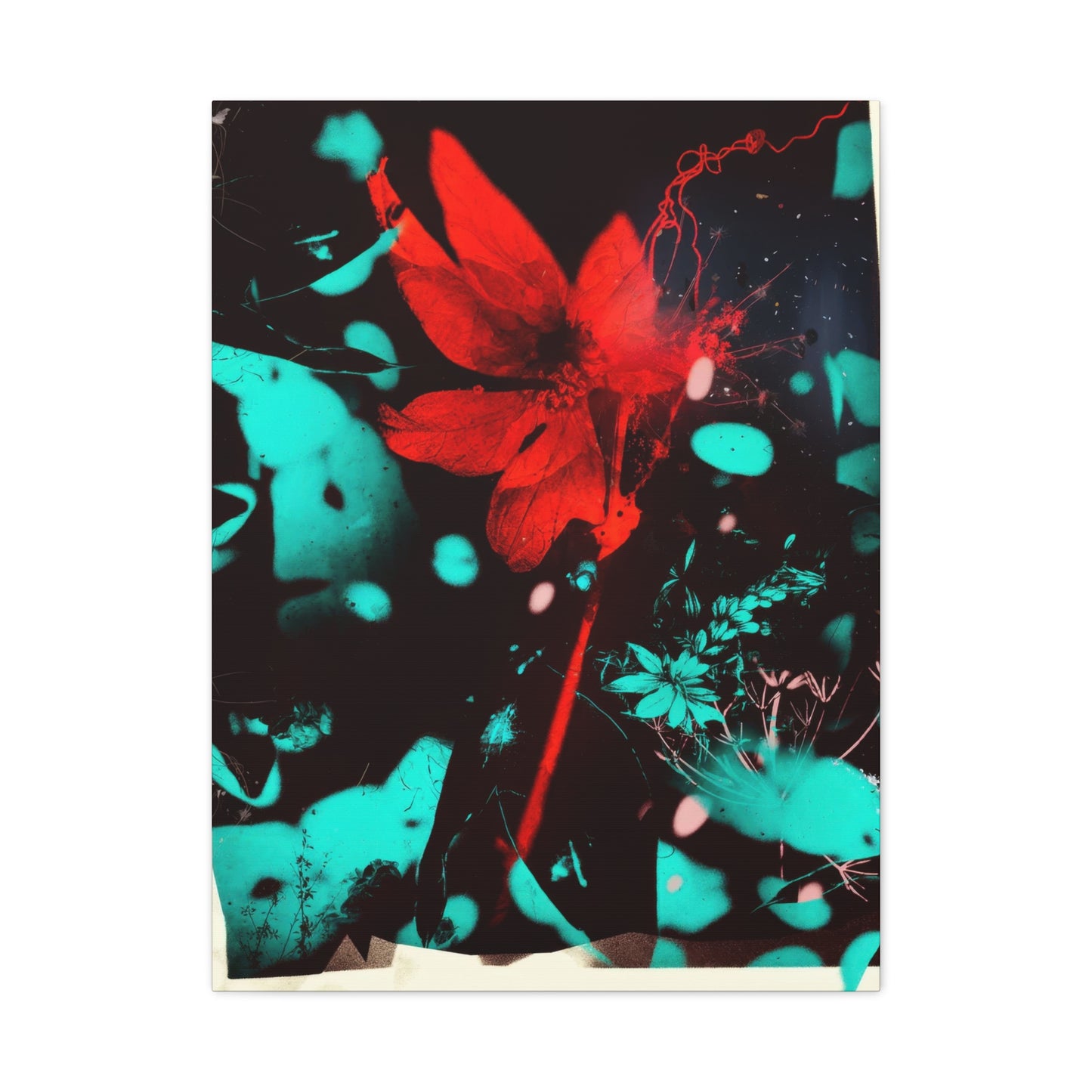
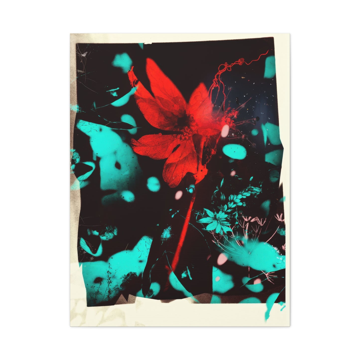
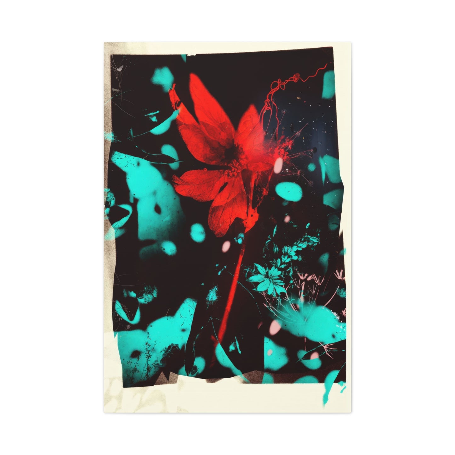
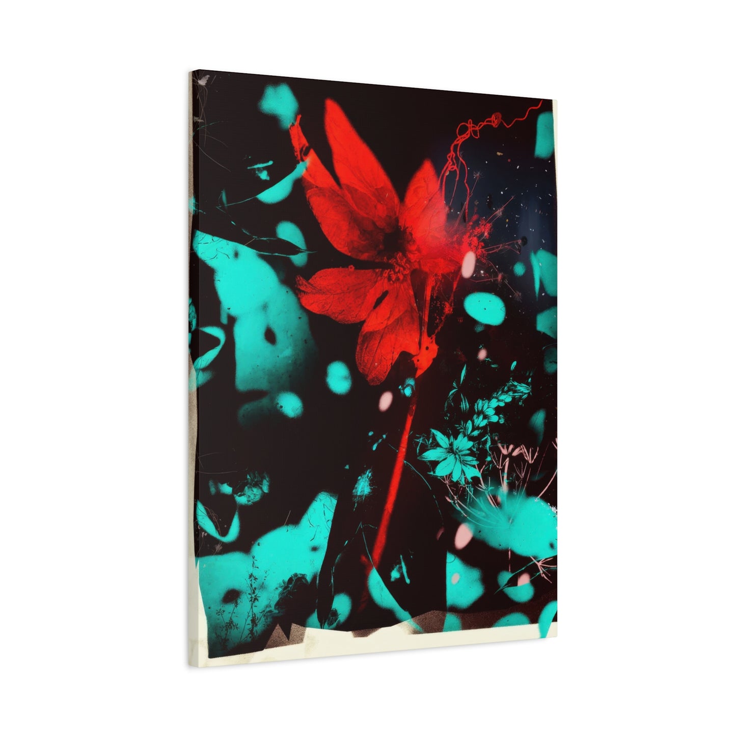
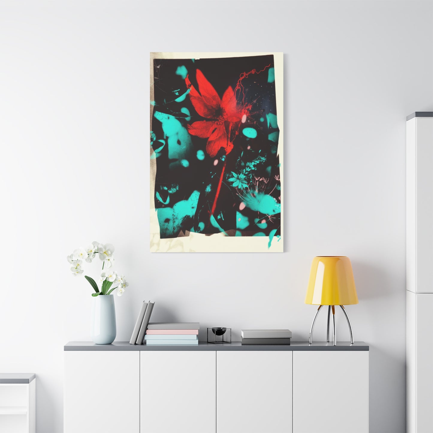
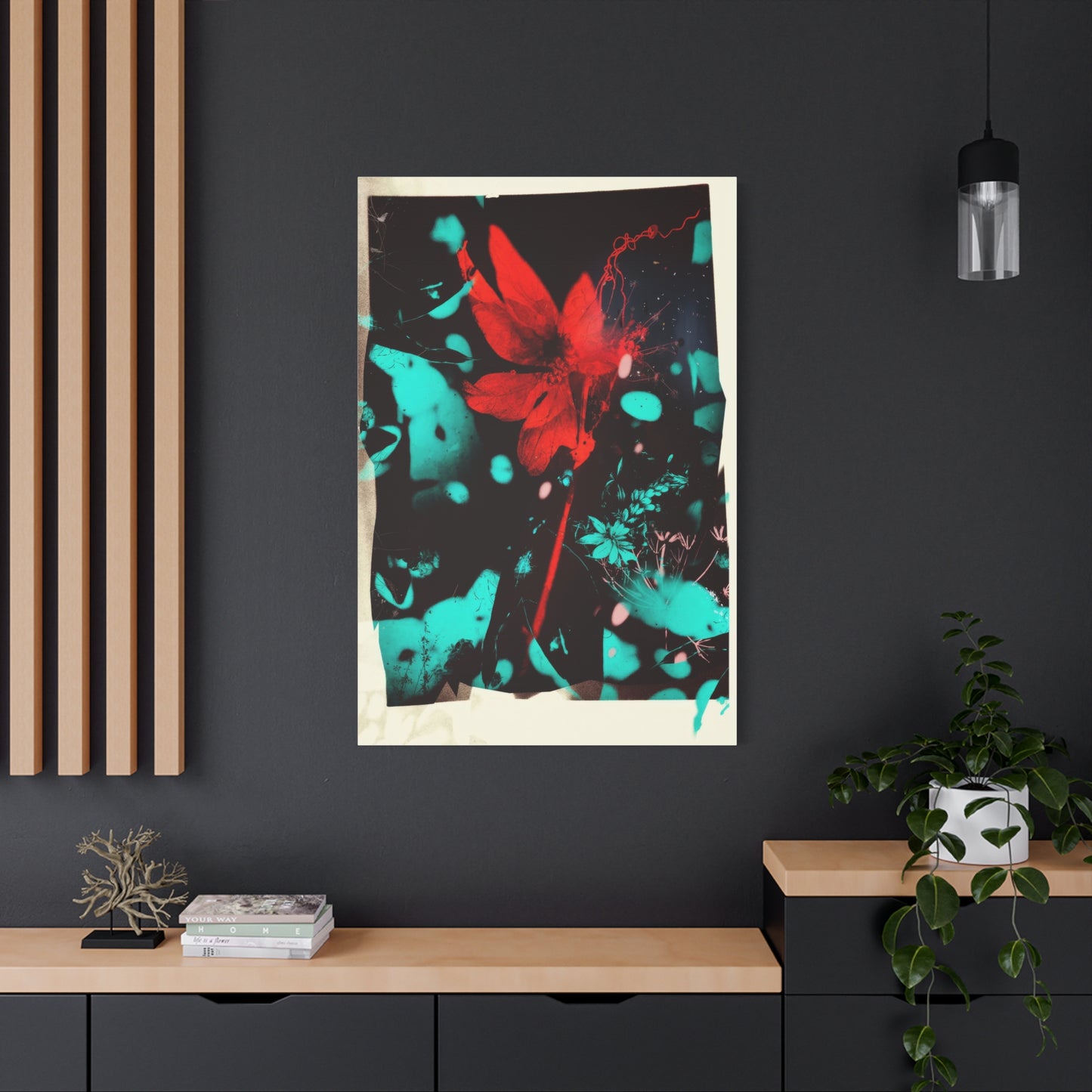
Crimson Burst Wall Art & Canvas Prints
Crimson Burst Wall Art & Canvas Prints
Couldn't load pickup availability


Abstract Drama: Understanding the Creative Process Behind Crimson Burst Wall Art
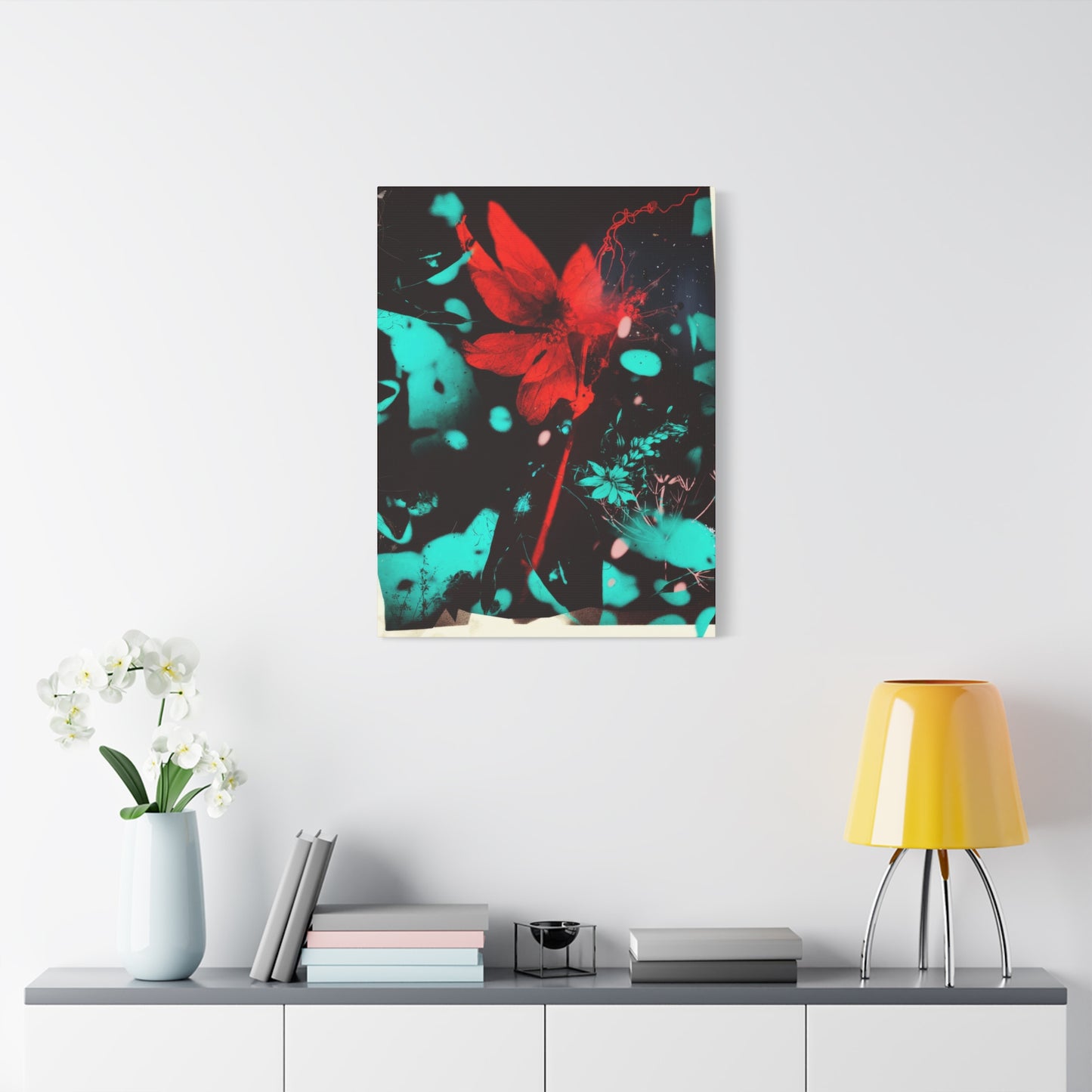
Red has always been a color that commands attention, evokes passion, and transforms ordinary spaces into extraordinary environments. Among the many artistic expressions that harness the power of this vibrant hue, crimson burst canvas prints stand out as particularly compelling choices for interior decoration. This comprehensive exploration delves into every aspect of these striking artworks, from their aesthetic appeal to their psychological impact, offering insights for homeowners, decorators, and art enthusiasts alike.
Understanding the Essence of Bold Crimson Burst Canvas Prints
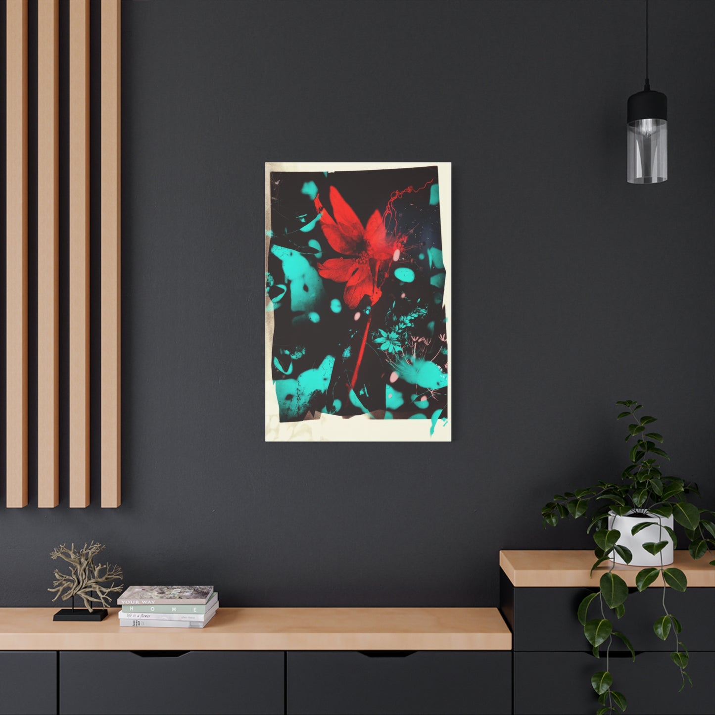
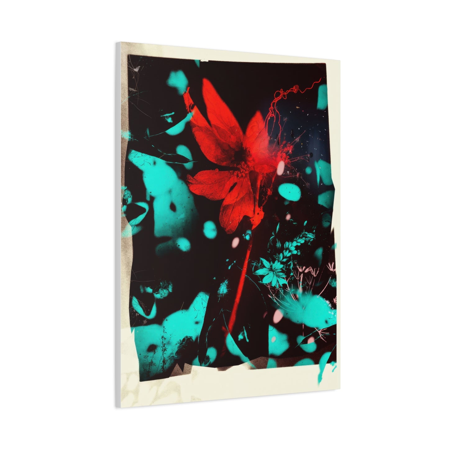
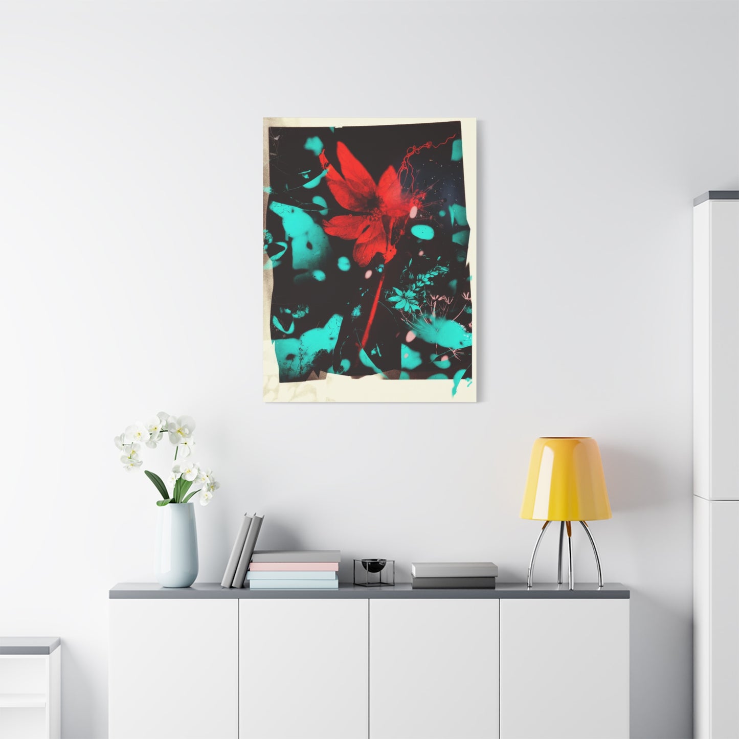
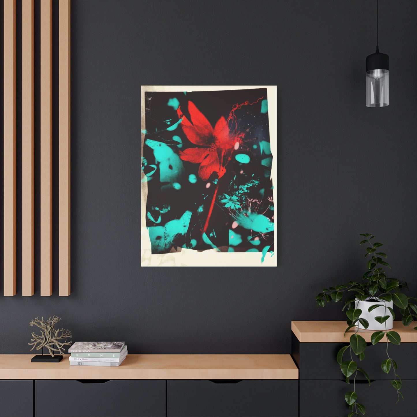
Bold crimson burst canvas prints represent more than just decorative elements; they embody a philosophy of fearless design and emotional expression. These artworks capture the explosive energy of red in its most intense form, creating focal points that immediately draw the eye and stimulate conversation. The term "burst" itself suggests movement, energy, and dynamism, qualities that are visually translated through various artistic techniques including radiating patterns, explosive compositions, and dramatic color gradients.
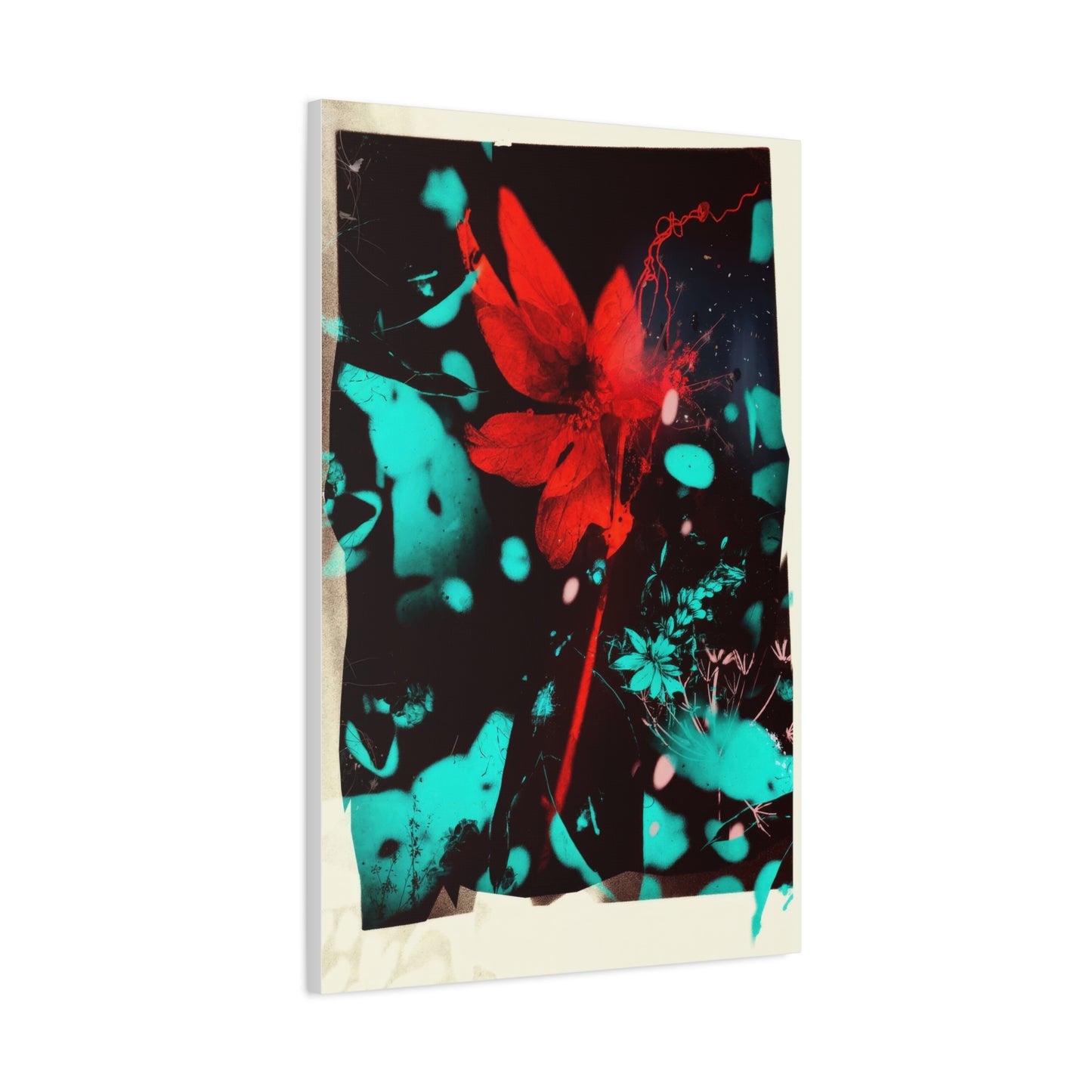
The creation of these pieces often involves sophisticated layering techniques where deeper shades of crimson are built up gradually, creating depth and dimension that flat prints simply cannot achieve. Artists working in this medium understand that true crimson is not a single shade but rather a complex family of reds that includes undertones of blue, creating a cooler, more sophisticated tone than standard bright red. When executed on canvas, these works gain additional texture and presence, with the weave of the material adding subtle complexity to the viewing experience.
Contemporary canvas printing technology has revolutionized how these artworks are produced and distributed. High-resolution digital printing allows for incredible detail and color accuracy, ensuring that the artist's original vision is faithfully reproduced. The canvas material itself contributes to the artwork's appeal, offering a traditional fine art presentation that photographs and posters cannot match. Museum-quality canvases are typically made from cotton or polyester blends, stretched over wooden frames that can be displayed without additional framing, creating a modern, gallery-wrapped appearance.
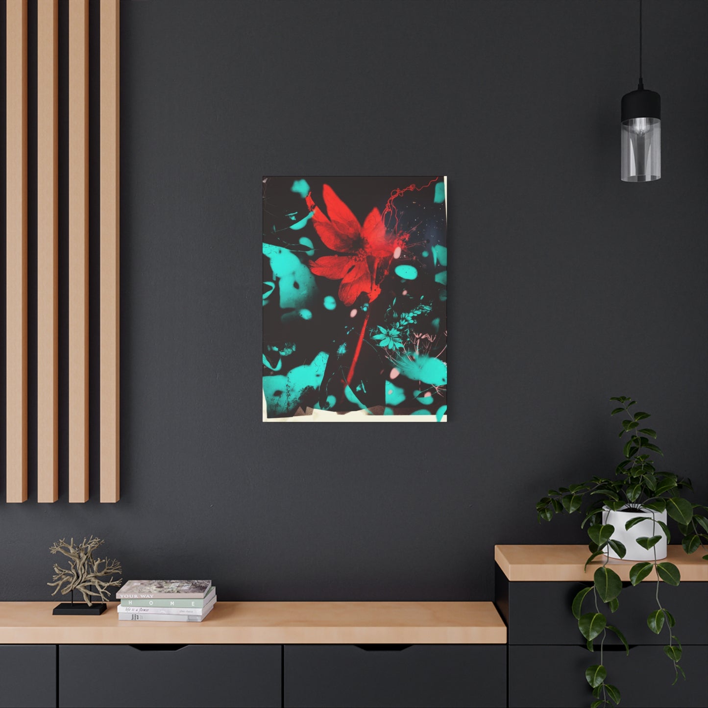
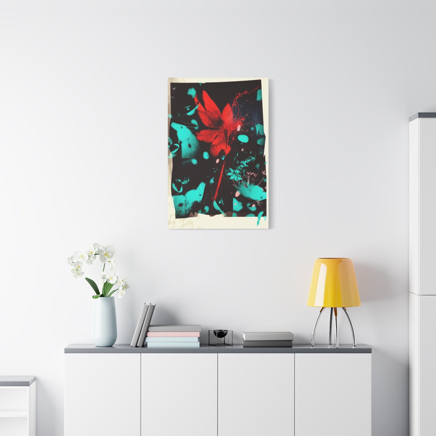
The bold nature of crimson burst designs makes them particularly suitable for spaces that need revitalization or dramatic transformation. Unlike subtle artworks that whisper, these pieces make bold statements that can anchor entire room designs. Interior designers frequently employ them as starting points for color schemes, building palettes around the various shades present in the artwork. The intensity of crimson demands careful consideration of surrounding elements, but when properly integrated, these pieces create stunning visual harmony.
From a technical standpoint, producing quality crimson burst canvas prints requires attention to color calibration and printing precision. Crimson contains complex pigment combinations that can be challenging to reproduce accurately. Professional printers use specialized color profiles and often employ twelve-color printing systems rather than standard four-color processes to achieve the rich, saturated tones that define excellent crimson artwork. This technical sophistication ensures that what arrives on your wall matches the artist's intended vision.
The appeal of these artworks extends across diverse demographic groups and design preferences. While they work beautifully in contemporary minimalist spaces where they provide necessary color and energy, they also complement more traditional interiors when selected thoughtfully. The key lies in understanding the specific characteristics of the piece and how its energy level, composition, and shade variations interact with existing décor elements.
Exploring Fiery Red Crimson Burst Wall Décor Styles
Fiery red crimson burst wall décor encompasses a wide range of stylistic approaches, each offering unique aesthetic qualities and emotional impacts. Understanding these different styles helps in selecting pieces that align with both personal taste and spatial requirements. The fiery quality refers not just to color intensity but also to the sense of movement, heat, and transformative energy that these pieces convey.
Abstract expressionist approaches to crimson burst design often feature spontaneous, gestural marks that suggest explosive movement. These pieces capture the immediacy of artistic creation, with brushstrokes, splatters, and sweeping movements frozen in time. The abstract nature allows viewers to project their own interpretations and emotions onto the work, making each viewing experience potentially different. These styles work exceptionally well in creative spaces, studios, or areas where contemplation and imagination are valued.
Geometric crimson burst compositions take a more structured approach, organizing the explosive energy within defined shapes and patterns. Radiating lines, concentric circles, and angular fragments create ordered chaos that appeals to those who appreciate both boldness and structure. These designs often incorporate mathematical precision, with carefully calculated proportions and symmetries that satisfy both aesthetic and intellectual appreciation. They prove particularly effective in professional environments, modern offices, or contemporary residential spaces where clean lines dominate.
Photographic approaches to fiery red wall décor capture natural phenomena that embody crimson burst qualities. Sunset explosions, volcanic imagery, close-ups of flowers in peak bloom, or abstract light paintings all fall within this category. These pieces bring natural beauty indoors while maintaining the dramatic impact associated with crimson burst aesthetics. The photorealistic quality can create fascinating visual tension when placed in highly designed or artificial environments, serving as reminders of natural beauty and power.
Mixed media interpretations combine multiple artistic techniques and materials, creating layered, complex pieces with substantial visual depth. Artists might incorporate metallic elements that catch light, textured passages that add tactile interest, or collage elements that introduce additional narrative layers. These sophisticated pieces often command premium prices due to their complexity and the skill required to execute them successfully. They serve as excellent investments for serious collectors and make powerful statements in upscale residential or commercial settings.
Digital art has opened entirely new possibilities for crimson burst expression. Artists working with digital tools can create effects impossible to achieve through traditional media, including perfect gradients, complex layering, and integration of photographic and illustrated elements. The precision of digital creation allows for incredibly detailed work that maintains its clarity even when printed at very large scales. Contemporary digital artists are pushing boundaries, creating crimson burst pieces that blur lines between photography, illustration, and pure abstraction.
The fiery quality in these works isn't achieved solely through color choice but also through compositional decisions that suggest movement, energy, and transformation. Diagonal lines create more dynamic energy than horizontal or vertical ones. Radiating patterns draw the eye outward from central points, creating expansive feelings. Asymmetrical compositions generate visual tension that keeps viewers engaged. Understanding these principles helps in selecting pieces that deliver the desired emotional and aesthetic impact.
The Allure of Vibrant Crimson Burst Canvas Art
Vibrant crimson burst canvas art distinguishes itself through exceptional color saturation, energetic composition, and immediate visual impact. The vibrancy referred to here encompasses not just color intensity but also the sense of life, movement, and presence that these artworks project into their surrounding spaces. This quality makes them particularly valuable for transforming bland or uninspiring environments into engaging, dynamic spaces.
Color theory plays a fundamental role in understanding vibrant crimson burst pieces. Crimson sits at a specific point on the color wheel where red incorporates blue undertones, creating a cooler, more complex shade than pure warm reds. This complexity allows crimson to work harmoniously with a broader range of colors than simpler reds. When paired with complementary colors like certain greens, the vibrancy intensifies through simultaneous contrast. When surrounded by analogous colors like oranges or purples, the crimson creates rich, harmonious color stories.
The psychological impact of vibrant crimson cannot be overstated. Research in color psychology consistently demonstrates that red hues increase heart rate, stimulate appetite, and heighten emotional responses. In the context of interior design, strategically placed vibrant crimson art can energize spaces, make them feel warmer, and create focal points that organize visual hierarchies. Dining rooms benefit from crimson's appetite-stimulating properties, while living areas gain energy and warmth that facilitate social interaction.
Technical execution distinguishes truly vibrant crimson burst art from merely colorful pieces. Artists achieve maximum vibrancy through several techniques, including underpainting with complementary colors that optically intensify surface colors, using multiple thin layers rather than single thick applications, and incorporating tonal variations that prevent the color from feeling flat. When these pieces are reproduced as canvas prints, maintaining this vibrancy requires sophisticated color management throughout the printing process.
The canvas medium itself contributes to the vibrant quality of these artworks. Unlike smooth paper or metal surfaces, canvas has texture that interacts with light in complex ways. Light striking the canvas surface at different angles reveals subtle variations in color and tone, making the artwork appear slightly different throughout the day as natural light conditions change. This dynamic quality keeps the artwork interesting and prevents it from becoming visually stagnant even after years of daily viewing.
Scale considerations are crucial when selecting vibrant crimson burst canvas art. These pieces have strong presence, so size must be proportionate to the space they occupy. In large rooms with high ceilings, substantial pieces measuring four feet or larger make appropriate statements without being overwhelmed by the architecture. Conversely, in smaller spaces, medium-sized pieces between two and three feet provide sufficient impact without dominating. Multiple smaller pieces arranged in gallery walls offer another approach, creating cumulative visual impact.
The framing or presentation method significantly affects how vibrant these pieces appear. Gallery-wrapped canvases where the image continues around the edges create modern, frameless presentations that maximize the artwork's presence. Traditional frames can either enhance or detract from vibrancy depending on their design; simple, thin frames in neutral metallic finishes typically work best, while heavy ornate frames may compete with the artwork's energy. Floating frames that create space between the canvas and frame edges offer contemporary compromise between framed and unframed presentations.
Discovering the Explosive Crimson Burst in Art
Explosive crimson burst in art represents perhaps the most dramatic and energetic manifestation of this aesthetic approach. The explosive quality suggests sudden release, intense energy, and transformative power captured in visual form. These pieces often serve as visual metaphors for passion, creativity, life force, and other powerful abstract concepts that resist literal representation.
Historical precedents for explosive red imagery in art stretch back centuries. From the dramatic red draperies in Baroque paintings that suggested power and wealth, to the revolutionary red banners in political art, to the explosive abstract expressionist works of the mid-twentieth century, red has consistently been employed when artists sought maximum impact. Contemporary crimson burst pieces inherit this rich tradition while incorporating modern sensibilities and techniques.
The compositional structure of explosive crimson burst pieces typically centers around a focal point from which energy appears to radiate outward. This might be achieved through radiating lines, gradually dissipating color intensity, fragmented shapes that scatter outward, or light effects that suggest emanation. The eye naturally follows these directional cues, creating dynamic viewing experiences where attention moves through the composition rather than settling on a single point. This movement creates visual excitement that static compositions cannot match.
Artists working in this mode often employ techniques that emphasize spontaneity and controlled chaos. Splatter techniques, pour painting, palette knife work, and gestural brushwork all contribute to the sense of explosive energy. Even when the final piece is carefully planned and executed, successful explosive crimson burst art maintains a sense of immediacy and spontaneous creation. This quality connects viewers emotionally, suggesting authenticity and unfiltered creative expression.
The symbolic dimensions of explosive crimson imagery warrant consideration. In various cultural contexts, red explosions might symbolize birth, passion, anger, revolution, celebration, or transformation. Artists may intentionally engage with these symbolic associations, or they may pursue purely aesthetic goals without specific narrative content. As viewers, we bring our own associations and interpretations, making the experience of explosive crimson burst art highly personal and subjective.
Contemporary digital manipulation techniques have expanded possibilities for creating explosive crimson effects. Artists can now simulate explosions, fractures, and energy releases with precision impossible in traditional media. Particle systems, fractal algorithms, and procedural generation methods create organic-looking explosive patterns that would require weeks of hand painting. These digital techniques don't replace traditional approaches but rather expand the toolkit available to artists pursuing explosive crimson aesthetics.
The market for explosive crimson burst art has grown substantially in recent years as interior design trends have shifted toward bolder, more personalized spaces. Homeowners increasingly reject the beige neutrality that dominated early twenty-first-century design in favor of spaces that reflect individual personality and make strong style statements. Explosive crimson pieces perfectly serve these goals, offering visual excitement and personal expression that neutral décor cannot provide.
Appreciating Rich Red Crimson Burst Wall Art
Rich red crimson burst wall art emphasizes depth, sophistication, and tonal complexity within the red spectrum. While maintaining the energy and impact characteristic of crimson burst aesthetics, these pieces lean toward more refined, nuanced expressions suitable for upscale residential and commercial environments. The richness refers to both the depth of color and the overall quality of artistic execution.
Achieving rich red tones requires understanding the subtle variations within the red family. True crimson contains blue undertones that distinguish it from orange-reds or pure spectrum reds. Within crimson itself, variations from lighter, brighter crimsons to darker, more muted versions offer diverse aesthetic possibilities. Rich red crimson burst pieces often incorporate multiple values and saturations, creating depth through tonal variation rather than relying solely on high saturation.
The artistic heritage of rich red painting extends through art history, from the sumptuous crimsons in Renaissance religious paintings to the sophisticated red abstractions of modern masters. Artists like Mark Rothko explored the emotional and spiritual dimensions of red fields, creating meditative pieces that reward contemplation. Contemporary artists working in rich red crimson burst styles inherit this tradition while bringing fresh perspectives and modern techniques to ancient color explorations.
Lighting considerations become particularly important with rich red crimson burst wall art. These pieces respond dramatically to different lighting conditions, appearing more vibrant under warm lighting and more subdued under cool lighting. Natural daylight reveals the full complexity of tonal variations, while artificial lighting can emphasize specific aspects depending on color temperature. Designers often specify adjustable lighting systems for spaces featuring prominent red artworks, allowing fine-tuning of the viewing experience.
The material quality of canvas significantly affects how rich these pieces appear. Premium cotton canvases accept ink differently than polyester blends, typically producing slightly warmer tones with more subtle texture. The weight and weave of the canvas also matter; heavier canvases around twelve ounces per square yard provide superior durability and a more substantial feel, while finer weaves create smoother surfaces better suited to detailed imagery. For rich red pieces where tonal subtlety matters, canvas quality becomes crucial.
Interior design applications for rich red crimson burst wall art span various contexts from residential to commercial. In homes, these pieces excel in spaces requiring sophistication with energy, such as dining rooms, home offices, and master bedrooms. The richness prevents them from feeling juvenile or overly casual, while the burst element maintains visual interest. In commercial contexts, they work beautifully in reception areas, conference rooms, and executive offices where they project confidence and dynamism without sacrificing professionalism.
Investment considerations apply particularly to rich red crimson burst pieces from established artists. Original works and limited edition prints in this style have demonstrated strong market performance, particularly when they feature exceptional technical execution and come from artists with growing reputations. Collectors value the combination of aesthetic appeal and financial appreciation potential, making carefully selected pieces both beautiful additions to spaces and sound investments.
The emotional resonance of rich red artwork connects to fundamental human responses to color. Red registers as the most emotionally intense color in the spectrum, triggering physiological responses including increased heart rate and heightened alertness. Rich variations modulate this intensity, creating sophisticated emotional experiences that blend excitement with contemplation. In interior environments, this translates to spaces that feel alive and engaging without being overwhelming or exhausting.
Examining Intense Crimson Burst Canvas Prints
Intense crimson burst canvas prints represent the most powerful and concentrated expressions of this artistic approach. Intensity here refers to saturation levels, compositional energy, and overall visual impact. These are not subtle pieces meant to blend into décor; they are statement works that dominate their spaces and demand attention. Understanding their characteristics helps in determining when and where they work best.
Color saturation reaches maximum levels in intense crimson burst pieces. The reds employed are as pure and vibrant as printing or painting technology allows, creating almost luminous effects. This high saturation creates strong emotional responses and makes the artwork visible and impactful even from significant distances. In large open spaces, this quality proves invaluable for creating visual anchors that organize spatial perception and guide movement through environments.
The compositional approaches in intense crimson burst works tend toward maximum dynamic energy. Diagonal compositions, radiating patterns, fragmented forms, and high contrast elements combine to create visual excitement. The eye cannot rest comfortably on these pieces but rather moves constantly through the composition, discovering new relationships and details. This restless quality makes them particularly suitable for spaces where energy and stimulation are desired rather than calm and relaxation.
Technical challenges in producing intense crimson prints center on color management and ink quality. Achieving and maintaining maximum saturation throughout the printing process requires professional-grade equipment and expertise. Consumer-level printers typically cannot reach the saturation levels necessary for truly intense crimson, and inferior inks fade noticeably within months of display. Professional printing operations use archival-quality pigment inks that maintain their intensity for decades when properly displayed away from direct sunlight.
The psychological impact of intense crimson deserves careful consideration when selecting placement locations. While energizing and exciting, intense red can become overwhelming in spaces where people spend extended periods. Bedrooms generally benefit from less intense artwork that promotes relaxation, while intense pieces thrive in transitional spaces like entryways, hallways, and staircases where viewing duration is limited. Living areas can accommodate intense crimson when balanced with calming neutral elements in the surrounding décor.
Size and intensity interact in important ways. Smaller intense crimson pieces concentrate energy into compact formats suitable for gallery walls or smaller spaces, while large intense pieces make dramatic statements in substantial rooms. An interesting approach involves using multiple smaller intense pieces arranged in grids or scattered patterns, creating cumulative intensity that can be quite powerful. This approach also offers flexibility for future rearrangement or redistribution to different spaces.
Cultural associations with intense red vary globally and understanding these variations matters in multicultural contexts. In many Asian cultures, red symbolizes luck, prosperity, and celebration, making intense red artwork particularly auspicious. Western contexts more commonly associate intense red with passion, power, and sometimes danger or warning. Middle Eastern and Latin American cultures often embrace bold colors including intense reds as normal parts of vibrant design traditions. Awareness of these associations helps in selecting artwork that resonates culturally with intended audiences.
The art market segment for intense crimson burst canvas prints has expanded significantly with the growth of online art marketplaces. Consumers can now access works from artists worldwide, with printing and shipping handled through sophisticated fulfillment networks. This democratization has made intense statement pieces accessible at various price points, from affordable reproductions to exclusive limited editions. However, the proliferation of options also requires more discernment in evaluating quality and value.
Understanding Dynamic Crimson Burst Abstract Wall Décor
Dynamic crimson burst abstract wall décor combines the energy of crimson burst aesthetics with the open-ended interpretive possibilities of abstract art. Abstraction frees the artwork from representational requirements, allowing pure exploration of color, form, composition, and emotional expression. This freedom makes abstract crimson burst pieces particularly versatile, capable of working in diverse interior styles and supporting various interpretive frameworks.
The history of abstract art provides context for understanding contemporary dynamic crimson burst pieces. Abstract expressionism, particularly the work of artists like Jackson Pollock and Willem de Kooning, established precedents for gestural, energetic abstract work. Color field painters like Mark Rothko and Barnett Newman explored how large areas of color could create emotional and spiritual experiences. Contemporary dynamic crimson burst abstract pieces inherit aspects of both traditions, combining gestural energy with attention to color's emotional power.
Compositional strategies in dynamic abstract crimson burst work vary widely. Some artists employ all-over compositions where energy and interest distribute relatively evenly across the picture plane. Others use focal point approaches where energy concentrates in specific areas while other sections provide visual rest. Asymmetrical balance creates tension and interest, while symmetrical compositions feel more stable and formal. Understanding these strategies helps in selecting pieces that match desired spatial effects.
The relationship between figure and ground, foreground and background, becomes particularly interesting in abstract crimson burst pieces. In some works, crimson elements advance visually while other colors recede, creating spatial depth. In others, the composition remains intentionally flat, celebrating the two-dimensional picture plane. Some pieces create ambiguous spatial relationships where figure and ground continually reverse depending on how attention focuses. These sophisticated spatial effects reward extended viewing and contemplation.
Texture plays an important role in dynamic abstract crimson burst canvas art. Even in prints reproducing painted originals, evidence of brushstrokes, palette knife marks, and other textural elements adds visual interest and authenticity. Some contemporary artists intentionally incorporate textural elements into digital creations, simulating traditional media effects or creating entirely new textures possible only in digital environments. The canvas substrate itself contributes texture, with its weave visible in lighter or less saturated areas.
The interpretive openness of abstract art makes it particularly suitable for commercial and public spaces where diverse audiences encounter the work. Without specific representational content that might resonate with some viewers but not others, abstract crimson burst pieces offer purely aesthetic and emotional experiences accessible to everyone regardless of cultural background or artistic knowledge. This universality explains the prevalence of abstract art in corporate and institutional settings.
Dynamic quality in these pieces often relates to actual or implied movement. Blurred edges, overlapping forms, radiating patterns, and directional brushstrokes all suggest motion. This perceived movement activates the viewing experience, preventing it from becoming static or boring. In interior spaces, this quality contributes to overall environmental energy, making spaces feel more alive and less stagnant. The dynamic quality also helps artwork hold attention over time, remaining interesting through repeated viewings.
The creative process behind dynamic abstract crimson burst pieces varies by artist. Some work spontaneously and intuitively, responding to emerging forms and relationships during creation. Others plan meticulously, creating detailed preliminary sketches and color studies before executing final pieces. Many combine both approaches, beginning with planned elements but remaining open to spontaneous developments during execution. Understanding an artist's process can deepen appreciation for their work and inform collecting decisions.
Exploring Passionate Crimson Burst Wall Art
Passionate crimson burst wall art explicitly engages with emotional dimensions of the color red and explosive compositional approaches. Passion, in this context, encompasses romantic love, creative fervor, intense dedication, and other forms of deep emotional engagement. These pieces don't merely present crimson bursts aesthetically; they aim to evoke and express passionate feelings, creating emotional resonance with viewers.
The symbolic associations between red and passion run deep in human culture and psychology. Physiologically, viewing red increases heart rate and stimulates the nervous system, creating physical correlates to emotional arousal. Culturally, red roses symbolize romantic love, red hearts represent affection, and phrases like "seeing red" connect the color to intense emotion. Passionate crimson burst wall art builds on these associations, using visual means to trigger and express emotional intensity.
Artistic techniques for conveying passion through crimson burst imagery include several approaches. Gestural, seemingly spontaneous brushwork suggests emotional immediacy and unfiltered expression. Intense color saturation amplifies emotional impact. Compositions that center on explosive focal points mirror the experience of overwhelming feeling. Contrasts between crimson and darker or lighter areas create emotional dynamics of revelation and concealment, intensity and relief. Skilled artists orchestrate these elements to create coherent emotional experiences.
The viewing experience of passionate crimson burst art can be quite personal and variable. Individual emotional histories, current mood states, and personal associations with color all influence how people respond to these pieces. A work that feels romantically passionate to one viewer might evoke creative passion or general life energy to another. This interpretive flexibility makes passionate crimson burst pieces suitable for various contexts despite their emotional intensity.
Placement considerations for passionate crimson burst wall art depend on the specific emotional qualities desired in different spaces. Romantic expressions work beautifully in private spaces like master bedrooms where they can contribute to intimate atmosphere. Creative passion pieces find natural homes in studios, offices, and other spaces dedicated to productive work. More general passionate energy pieces suit living areas, dining spaces, and anywhere convivial social interaction occurs. Understanding these nuances helps match artworks to spaces effectively.
The relationship between the artist's emotional state during creation and the viewer's emotional response proves complex and not necessarily straightforward. An artist working in a passionate state may produce work that conveys that passion, but technical skill matters as much as emotional authenticity. Conversely, coolly calculated works designed to trigger specific emotional responses can succeed without the artist experiencing those emotions during creation. The most effective passionate crimson burst pieces likely combine genuine emotional engagement with sophisticated technical execution.
Contemporary interpretations of passionate crimson burst aesthetics expand beyond traditional romantic or creative passion into broader territory. Environmental passion, social justice passion, spiritual passion, and other forms of intense dedication can all find expression through crimson burst imagery. This expansion makes the category more inclusive and relevant to diverse audiences with varying passionate interests and commitments. Artists increasingly employ crimson burst aesthetics to express various forms of dedication and intensity.
The market segment for passionate crimson burst wall art includes both original works and reproductions at various price points. Limited edition prints from established artists occupy the middle market, offering accessible entry points for collectors while maintaining some exclusivity and investment potential. Mass-produced reproductions make the aesthetic available at lower price points for broader audiences. Original works from emerging artists offer opportunities to acquire unique pieces at relatively affordable prices while supporting developing artistic careers.
Appreciating Elegant Crimson Burst Canvas for Home
Elegant crimson burst canvas for home represents a refined subset of the broader category, emphasizing sophistication, restraint, and residential appropriateness. While maintaining characteristic crimson burst energy and impact, elegant pieces modulate these qualities to work harmoniously in refined home environments. Understanding what distinguishes elegant crimson burst pieces from more aggressive expressions helps in creating sophisticated residential spaces.
Design sophistication in elegant crimson burst pieces often manifests through restraint and selectivity. Rather than maximizing intensity and impact, elegant pieces find balance points where crimson bursts create interest without overwhelming. This might involve surrounding crimson elements with substantial neutral areas, using more nuanced shades rather than maximum saturation, or employing more structured compositions that feel controlled rather than chaotic. The result maintains energy while adding refinement.
Color palette sophistication distinguishes elegant pieces from simpler expressions. Elegant crimson burst artworks often incorporate multiple related shades creating tonal depth and complexity. They might include deep burgundies, lighter rose tones, or warm oranges alongside core crimson hues. Carefully considered accent colors, often metallics like gold or copper, or sophisticated neutrals like charcoal or cream, create harmony and visual richness. These complex palettes reward closer viewing and maintain interest over time.
Compositional elegance often involves classical principles like golden ratio proportions, balanced asymmetry, and thoughtful negative space usage. While the burst element provides energy and movement, elegant pieces frame and contain this energy within refined compositional structures. This combination of vitality and control creates sophisticated aesthetic experiences that feel both exciting and composed, avoiding the extremes of boring stability or exhausting chaos.
Scale and proportion considerations matter particularly for elegant crimson burst pieces in residential contexts. These works must relate appropriately to furniture dimensions, ceiling heights, and room proportions. Design principles suggest artwork width should span roughly two-thirds to three-quarters of furniture width beneath it, creating visual connection without overpowering. In rooms with high ceilings, vertically oriented pieces or multiple pieces stacked vertically help balance proportions. Understanding these relationships prevents decorating mistakes that diminish both artwork and space.
The concept of elegance varies culturally and personally, requiring consideration of specific contexts. In minimalist design traditions, elegance emerges from simplicity, restraint, and careful selection. In maximalist approaches, elegance comes from skillful coordination of abundant elements. Elegant crimson burst pieces can support either approach when selected thoughtfully. The key lies in coherence between the artwork and its surrounding context, creating intentional, harmonious environments rather than haphazard collections.
Residential applications for elegant crimson burst canvas span various room types and functions. Living rooms benefit from these pieces as focal points above sofas or fireplaces, anchoring conversational seating arrangements. Dining rooms gain sophistication and energy that enhance social dining experiences. Home offices and studies appreciate the combination of stimulation and refinement that supports productive work. Even bedrooms can accommodate elegant crimson burst pieces when they lean toward more contemplative expressions rather than aggressive intensity.
Investment in elegant crimson burst canvas for home extends beyond financial considerations to include emotional and aesthetic returns. Living with beautiful, personally meaningful art enhances daily experience and life quality in ways that transcend monetary value. The right piece becomes part of home identity, reflecting and reinforcing the values and aesthetic sensibilities of inhabitants. This integration makes art selection deeply personal and significant, worthy of careful consideration and sometimes professional guidance.
Discovering Scarlet Explosion: Crimson Burst Art
Scarlet explosion crimson burst art emphasizes the warmer, slightly more orange-toned aspects of the red spectrum while maintaining explosive compositional characteristics. Scarlet differs from crimson through its warmer undertones, creating distinctly different aesthetic and emotional effects. Understanding these differences helps in making informed selections that achieve desired decorative and expressive goals.
The color scarlet occupies a specific position in the red family, containing more yellow and less blue than true crimson. This warmer composition creates associations with heat, fire, sunrise, and other warm phenomena. Historically, scarlet held particular significance in many cultures, often associated with wealth, power, and prestige due to the expense of scarlet dyes. Contemporary scarlet explosion pieces inherit these rich associations while engaging with modern aesthetic sensibilities.
Compositional approaches to scarlet explosion pieces often emphasize outward radiating energy, mimicking explosions, fireworks, sunbursts, or other emanating phenomena. The slightly warmer tone of scarlet compared to crimson creates different spatial effects; warm colors typically advance visually while cool colors recede, so scarlet elements tend to project forward aggressively. Artists working with scarlet explosions manipulate these effects, creating dynamic spatial relationships that activate picture planes.
The relationship between color temperature and emotional response explains some of scarlet's particular impact. Warmer reds feel more immediately accessible and energetic than cooler crimsons, which can have more mysterious or sophisticated qualities. Scarlet explosion pieces therefore tend toward exuberance and celebration rather than brooding intensity. These qualities make them particularly suitable for social spaces where cheerful energy enhances gatherings and interactions.
Technical considerations in reproducing scarlet explosion pieces center on maintaining accurate color temperature. Printing processes that shift scarlet toward cooler crimson or warmer orange tones compromise the artist's intended effect. Professional color management throughout the printing workflow ensures accurate reproduction. Viewers purchasing scarlet explosion pieces should verify color accuracy through reviews, samples, or guarantees, as significant variation exists in reproduction quality across providers.
Natural phenomena provide inspiration for many scarlet explosion pieces. Sunset colors, volcanic eruptions, autumn foliage, and certain flowers all feature scarlet explosion qualities. Artists translating these natural inspirations into abstract or semi-abstract pieces distill essential qualities while eliminating extraneous details, creating concentrated aesthetic experiences. The connection to natural phenomena makes these pieces feel organic and vital despite their often abstract presentation.
Interior design applications for scarlet explosion pieces overlap with but differ from crimson burst applications. The warmer scarlet tone coordinates beautifully with wood tones, particularly warmer woods like cherry or oak. Scarlet also harmonizes with earth tones including terracotta, sand, and chocolate, creating cohesive natural palettes. In contrast, scarlet can clash with cooler grays and blues that work well with true crimson. Understanding these color relationships prevents costly decorating mistakes.
The art market for scarlet explosion pieces includes both contemporary works and pieces inspired by historical movements. The Fauvists, particularly Henri Matisse, explored explosive color including scarlet in revolutionary ways that continue influencing contemporary artists. Mid-century modern aesthetics often incorporated bold scarlet alongside other saturated colors. Contemporary artists reference these traditions while bringing fresh perspectives, creating pieces that feel both historically grounded and completely current.
Cultural symbolism associated with scarlet varies globally and understanding these associations enriches appreciation. In Chinese culture, scarlet symbolizes good fortune and joy, making scarlet explosion pieces particularly auspicious choices. Western contexts often associate scarlet with passion and sometimes sin or transgression, creating more complex symbolic territory. Indian culture employs scarlet extensively in celebration and ceremony. These varied associations make scarlet explosion pieces rich with interpretive possibilities.
Exploring Crimson Burst: Bold Red Canvas Prints
Crimson burst bold red canvas prints represent straightforward, powerful expressions of the aesthetic without excessive complication or refinement. These are the most accessible and widely available versions of the style, offering dramatic impact at various price points. Understanding what defines bold red canvas prints helps consumers navigate extensive market options and make informed purchasing decisions.
The term bold in this context emphasizes several key characteristics. Bold pieces feature strong color saturation rather than subtle or muted tones. They employ clear, readable compositions rather than ambiguous or overly complex arrangements. Scale tends toward substantial, making clear visual statements rather than subtle suggestions. These qualities make bold red canvas prints excellent choices for consumers wanting obvious impact without requiring deep artistic knowledge to appreciate the work.
Manufacturing processes for bold red canvas prints have become increasingly sophisticated and accessible. Digital printing technology allows small production runs and even individual custom prints at reasonable costs. This accessibility democratizes art ownership, making bold statement pieces available to broader audiences than traditional fine art markets ever reached. However, quality varies significantly across producers, with factors like ink quality, canvas weight, and stretching precision making substantial differences in final product quality.
Pricing structures for bold red canvas prints reflect production methods and market positioning. Mass-produced prints from major retailers start at very affordable price points, sometimes under fifty dollars for smaller pieces. Mid-market pieces from specialized art print retailers typically range from one hundred to several hundred dollars, offering better quality materials and more curated selections. Limited editions from known artists or galleries command higher prices, sometimes thousands of dollars, justified by exclusivity, artist reputation, and investment potential.
Selection criteria for bold red canvas prints should include several considerations beyond initial visual appeal. Canvas quality matters significantly for longevity; heavier canvases around ten to twelve ounces maintain tight stretching better over time. Gallery wrapping, where the image continues around frame edges, creates more finished presentations than mirror-wrapped or solid color edges. Hanging hardware should be securely attached, with D-rings or wire systems appropriate for the piece's weight. UV-resistant inks extend display life, particularly in rooms with significant natural light.
Style versatility represents a key advantage of bold red canvas prints. Their straightforward impact allows them to work in various design contexts from contemporary to traditional, minimalist to maximalist. The key lies in proportionate scale selection and thoughtful coordination with surrounding elements. A bold red piece that overwhelms a small room might barely register in a vast open space, so matching scale to context ensures successful integration.
Online marketplaces have transformed how consumers discover and purchase bold red canvas prints. Websites display thousands of options with filtering by size, color, style, and price. Customer reviews provide quality insights, while return policies reduce purchase risk. However, screen color representation varies significantly, so pieces may look different upon arrival than they appeared online. Ordering samples or reviewing return policies protects against disappointment.
Display locations for bold red canvas prints in residential spaces span from traditional artwork positions above furniture to more creative placements. Hallways benefit from bold pieces that create visual interest in transitional spaces. Staircases offer vertical surfaces perfect for statement art. Even bathrooms and home gyms can accommodate bold red pieces, bringing energy and visual interest to utilitarian spaces. The key lies in treating every surface as potential art display space, expanding beyond conventional living room and bedroom placements.
Understanding Fiery Crimson Burst Wall Décor
Fiery crimson burst wall décor emphasizes heat, intensity, and transformative energy through visual means. The fiery quality refers both to color associations with flame and to the energetic, dynamic compositional approaches employed. These pieces create powerful presence in spaces, demanding attention and creating immediate impact. Understanding their characteristics helps in determining appropriate applications and contexts.
Visual metaphors of fire and flame inform many fiery crimson burst pieces. Dancing flames, explosive combustion, glowing embers, and radiating heat all provide conceptual frameworks that artists translate into visual form. Abstract interpretations distill essential qualities of fire including movement, energy, transformation, and danger into pure visual elements. More representational approaches might include actual flame imagery, though still typically stylized or abstracted to some degree.
Conclusion:
Abstract Drama: Understanding the Creative Process Behind Crimson Burst Wall Art delves into the intricate interplay of emotion, technique, and visual storytelling that defines contemporary abstract expression. Crimson Burst wall art is distinguished by its bold, dynamic palette, explosive forms, and textured layers, capturing the essence of artistic energy and creative intensity. These canvases go beyond mere decoration; they function as visual narratives that evoke emotion, stimulate imagination, and transform interiors into immersive artistic environments. By exploring the creative process behind such works, homeowners and art enthusiasts gain insight into how abstract drama can be harnessed to elevate both aesthetics and atmosphere in living spaces.
At the heart of Crimson Burst art is the artist’s expressive energy. Bold reds, deep crimsons, and complementary accent tones are applied with deliberate intensity, creating a sense of movement and vitality that captivates viewers. The layering of colors, interplay of shapes, and textured brushwork generate depth and complexity, inviting prolonged engagement and interpretation. Each canvas serves as a manifestation of emotional expression, translating abstract thought and internal vision into a tangible, impactful visual experience. This raw dynamism allows the artwork to function as both a focal point and an emotional anchor within any interior.
From an interior design perspective, Crimson Burst wall art offers remarkable versatility. Its vivid, energetic palette can inject vibrancy and drama into neutral spaces, creating a striking contrast that enlivens minimalist or modern interiors. Conversely, in already bold or colorful environments, it can harmonize with existing décor through complementary tones and textural resonance. Scale plays a critical role in maximizing impact: large canvases dominate walls, commanding attention and creating immersive experiences, while smaller pieces can be curated as part of a gallery arrangement, offering rhythm and cohesion across a space. Thoughtful placement ensures that the artwork balances the room’s overall composition, enhancing both visual appeal and emotional ambiance.
Color is central to the effectiveness of Crimson Burst. The dominant reds evoke energy, passion, and intensity, while nuanced variations in hue, saturation, and layering introduce depth and subtlety. These tonal choices guide the viewer’s emotional response, from exhilaration and excitement to contemplation and introspection. Additionally, the contrast between dynamic forms and surrounding negative space amplifies visual tension and intrigue, allowing the artwork to command attention without overwhelming its environment. In essence, the palette becomes both a visual and psychological instrument, shaping the perception and mood of the interior.
The creative process behind Crimson Burst wall art also highlights the balance of spontaneity and intention. While abstract expression often appears instinctual, each stroke, layer, and compositional choice reflects the artist’s mastery of technique, understanding of color theory, and sensitivity to form. This combination of calculated expertise and free-flowing expression results in a piece that is simultaneously structured and unpredictable, disciplined and emotive. Such a process ensures that the final artwork is not only visually striking but also intellectually engaging, allowing viewers to discover new interpretations with each encounter.
Beyond aesthetic appeal, Crimson Burst art conveys a narrative of creative courage and artistic exploration. It celebrates the process of translating emotion into form, intuition into composition, and abstract vision into tangible reality. Displaying such a piece in a home or office elevates the environment, inspiring creativity, reflection, and dialogue, while reinforcing the transformative power of art in shaping both mood and perception.
