


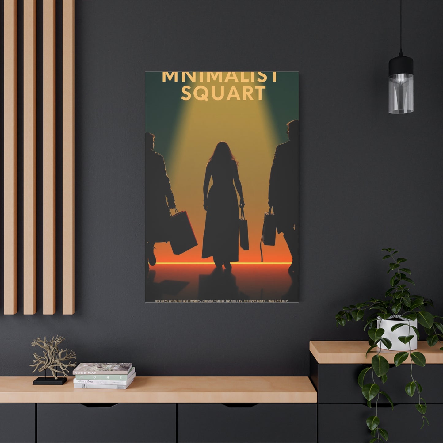
Curated Filmic Minimalism wall art & canvas print
Curated Filmic Minimalism wall art & canvas print
Couldn't load pickup availability


Curated Filmic Minimalism Wall Art: A Complete Guide to Transforming Your Space with Cinematic Elegance
The world of interior design has witnessed a remarkable transformation in recent years, with curated filmic minimalism wall art emerging as one of the most sought-after approaches to decorating modern living spaces. This distinctive aesthetic combines the sophisticated simplicity of minimalist design principles with the emotional depth and visual storytelling inherent in cinema, creating pieces that serve as both artistic statements and conversation starters. The beauty of this approach lies in its ability to distill complex cinematic moments into their most essential visual elements, producing artwork that resonates on multiple levels while maintaining an uncluttered, refined appearance that complements contemporary interiors.
Understanding the concept of filmic minimalism requires appreciating how cinema communicates through visual language, using composition, lighting, color, and framing to convey mood and narrative. When these cinematic techniques are applied to wall art with a minimalist sensibility, the result is a unique fusion that captures the essence of iconic film moments without overwhelming the viewer with excessive detail or ornamentation. This carefully balanced approach allows each piece to make a powerful impact while respecting the breathing room that minimalist design demands, creating spaces that feel both thoughtfully curated and effortlessly elegant.
The appeal of curated filmic minimalism extends far beyond mere aesthetic preference, touching on deeper psychological and emotional responses to visual stimuli. Film has always held a special place in our collective consciousness, serving as a mirror to society and a window into different worlds and experiences. By distilling these cinematic moments into minimalist compositions, artists create pieces that trigger nostalgia, spark imagination, and invite contemplation. The curation aspect is equally important, as it involves the thoughtful selection and arrangement of pieces that work together to tell a cohesive visual story while maintaining individual integrity and impact.
Cinematic Art in Contemporary Interior Design
The journey of cinematic art from movie posters to sophisticated minimalist interpretations reflects broader shifts in both film culture and interior design philosophy. Traditional movie posters served primarily promotional purposes, often featuring busy compositions with multiple characters, dramatic text, and bold graphics designed to capture attention in crowded theater lobbies. While these vintage posters have found their place in collectible markets and nostalgic decor, they represent a maximalist approach that can feel overwhelming in modern living spaces designed around principles of simplicity and intentionality.
The transformation began as designers and artists recognized the untapped potential in reimagining cinematic imagery through a minimalist lens. This shift coincided with growing appreciation for Scandinavian and Japanese design philosophies that emphasize the concept of finding beauty in simplicity and allowing each element room to breathe. Artists began experimenting with reducing iconic film scenes to their bare essentials, discovering that removing extraneous details often strengthened rather than diminished the emotional impact of the image. A single silhouette, a carefully chosen color palette, or a geometric composition could evoke an entire film narrative while maintaining the clean lines and uncluttered aesthetic that modern interiors demand.
Contemporary interior design has embraced this evolution enthusiastically, recognizing that curated filmic minimalism offers the perfect solution for homeowners and designers seeking to inject personality and cultural reference into spaces without sacrificing the serene, organized atmosphere that minimalist principles create. The approach allows film enthusiasts to celebrate their passion for cinema in ways that feel mature and sophisticated rather than juvenile or overly commercial. This aesthetic has proven particularly appealing to millennials and younger generations who grew up immersed in visual media and appreciate design that acknowledges their cultural experiences while maintaining refined sensibilities.
The digital age has accelerated this evolution, with social media platforms providing spaces for artists to showcase minimalist interpretations of beloved films and for design enthusiasts to discover and share these pieces. Online communities dedicated to film appreciation and interior design have fostered dialogue about how cinematic imagery can be thoughtfully integrated into living spaces. This exchange of ideas has led to increasingly sophisticated approaches to filmic minimalism, with artists developing signature styles and techniques that push the boundaries of how we think about representing cinema through visual art.
Minimalist Principles in Film-Inspired Art
Minimalism as an artistic movement emerged in the post-World War II era, characterized by extreme simplification of form, literal and objective approach, and the use of simple geometric shapes. When applied to film-inspired art, these principles translate into compositions that strip away everything nonessential to capture the core essence of a cinematic moment or film as a whole. The challenge and artistry lie in determining exactly what elements are truly essential and how to arrange them for maximum impact with minimum components.
The principle of negative space plays a crucial role in filmic minimalism, with empty areas of the composition serving not as voids but as active elements that give weight and breathing room to the featured subject matter. In cinematic art, this might manifest as a single figure silhouetted against an expansive background, or a minimal representation of an iconic prop placed in an otherwise empty frame. The negative space creates tension and focus, drawing the viewer's eye naturally to the intended focal point while providing a sense of calm and order that characterizes successful minimalist design.
Color theory becomes particularly important in minimalist film art, as limited palettes must work harder to convey mood, atmosphere, and narrative associations. Many artists working in this genre restrict themselves to two or three colors per piece, carefully selecting hues that capture the emotional tone of the source material while maintaining visual cohesion. Monochromatic approaches are common, using variations in value and saturation to create depth and interest without introducing additional colors. Some pieces employ bold color blocking, where distinct areas of solid color create geometric divisions that simultaneously simplify and dramatize the composition.
Typography and text, when included, must adhere to the same principles of restraint and intentionality. Rather than reproducing entire movie titles or taglines, minimalist film art might incorporate a single word, a fragment of dialogue, or a carefully selected font that evokes the film's period or style. The placement and treatment of text become deliberate design choices rather than afterthoughts, with letters sometimes serving as compositional elements themselves. The most successful pieces integrate text so seamlessly that it feels inseparable from the visual elements, contributing to rather than competing with the overall composition.
Filmic Minimalism and Its Impact on Living Spaces
The psychological impact of curated filmic minimalism in living spaces operates on multiple levels, engaging both our cognitive and emotional responses to visual stimuli. Research in environmental psychology has consistently demonstrated that our surroundings significantly influence our mental states, productivity, and overall wellbeing. Spaces cluttered with visual information can create cognitive overload, leading to stress and decreased ability to focus. Conversely, thoughtfully designed minimalist environments promote mental clarity and emotional calm by reducing the number of stimuli competing for our attention.
Filmic minimalism achieves a unique balance by providing just enough visual interest to engage the mind without overwhelming it. The recognizable cinematic references create points of connection and contemplation, offering the brain something meaningful to process while the minimalist execution prevents that processing from becoming exhausting. This combination satisfies our need for both stimulation and simplicity, creating spaces that feel alive and personal without being chaotic or demanding. The artwork serves as a form of productive visual engagement, similar to how a window with an interesting view can provide mental breaks without distraction.
The emotional resonance of film-based art taps into the powerful associations we form with cinema throughout our lives. Movies often accompany significant life moments and serve as cultural touchstones that connect us to particular times, places, and communities. Surrounding ourselves with minimalist interpretations of beloved films creates an environment rich with personal meaning and positive associations. These pieces function as visual anchors to memories and emotions, providing comfort and a sense of identity. Unlike more abstract minimalist art, filmic pieces offer narrative hooks that make them more immediately accessible and emotionally engaging for most viewers.
Color psychology plays a significant role in how these pieces influence our experience of space. The limited color palettes characteristic of minimalist design allow for precise emotional targeting through color choice. Warm tones like muted oranges and deep reds can create cozy, intimate atmospheres, while cool blues and grays promote calm and contemplation. The psychological impact compounds when these color choices align with the emotional tone of the source film, creating a subtle but powerful reinforcement of mood. A piece inspired by a noir film executed in stark blacks and grays will influence a room differently than one based on a romantic comedy rendered in soft pastels.
Creating a Cohesive Gallery Wall with Minimalist Film Art
Designing a gallery wall using curated filmic minimalism requires careful consideration of composition, balance, and thematic coherence. Unlike traditional gallery walls that might mix various styles and subjects, a successful filmic minimalist gallery maintains consistent design language while offering enough variety to create visual interest. The process begins with selecting a unifying concept that will guide your choices, whether organizing around a particular genre, director, era, time period, or visual theme such as color palette or compositional approach.
The physical arrangement of pieces demands attention to spacing, alignment, and the relationships between individual works. Professional designers often recommend starting with the largest or most visually commanding piece and building around it, creating a focal point that anchors the entire arrangement. Symmetrical layouts project order and formality, working well in spaces with classical architectural elements or formal functions. Asymmetrical arrangements feel more dynamic and contemporary, suitable for casual living areas and modern architectural contexts. Regardless of approach, maintaining consistent spacing between pieces creates visual rhythm and prevents the arrangement from feeling chaotic or haphazard.
Scale variation adds depth and interest to gallery walls, with different sized pieces creating a more engaging composition than uniform dimensions would achieve. However, scale variations must be intentional rather than arbitrary, with sizes relating to each other through mathematical ratios or clear hierarchies. A common approach involves selecting one or two large anchor pieces, several medium-sized works, and a few smaller accent pieces. The challenge lies in arranging these varied sizes so that each piece receives appropriate attention without any single work overwhelming the others or getting lost in the composition.
Color coordination across multiple pieces requires balancing unity with variety. Monochromatic approaches using different films interpreted through the same color palette create sophisticated, cohesive looks that work beautifully in minimalist interiors. Alternatively, selecting pieces that each use limited palettes but vary those palettes across the collection can work if the colors share similar saturation levels or values. Some collectors choose to organize their gallery walls chronologically by film release date, creating a visual timeline of cinema history, while others prefer to arrange pieces by color progression, creating gradients or complementary color relationships across the wall.
Customization and Personalization Options for Film Art Collections
The growing accessibility of custom artwork creation has opened new possibilities for personalizing film art collections, allowing enthusiasts to commission pieces featuring their specific favorite films, matching particular color schemes, or reflecting personal interpretations of beloved cinema. This customization transforms film art from passive consumption to active collaboration, resulting in collections that feel deeply personal and perfectly integrated with individual spaces and tastes.
Commissioning custom pieces from artists specializing in filmic minimalism begins with clear communication about vision, specifications, and expectations. Successful commissions involve sharing reference images, discussing color preferences, and explaining the context where the artwork will live. Many artists appreciate understanding the emotional connection clients have with particular films, as this informs their interpretive choices and helps them create pieces that resonate on personal levels. Discussing size requirements, framing preferences, and timeline expectations upfront prevents misunderstandings and ensures the final piece meets practical needs while fulfilling artistic vision.
Digital tools have democratized the creation of custom film art, with design software allowing individuals with basic computer skills to create their own interpretations of beloved films. Vector graphics programs enable precise geometric compositions and clean lines characteristic of minimalist design, while digital painting applications allow for more organic, textured approaches. Online communities and tutorials provide guidance for beginners, sharing techniques for simplifying complex imagery, selecting effective color palettes, and achieving professional-looking results. The accessibility of print-on-demand services means custom digital creations can be transformed into high-quality physical prints without significant investment.
Personalization extends beyond selecting which films to feature, encompassing decisions about artistic style, level of abstraction, and incorporation of personal elements. Some collectors commission pieces that blend imagery from multiple films, creating unique mashups that reflect diverse cinematic tastes. Others request specific color palettes that coordinate with existing decor, transforming film art into custom design elements tailored to particular spaces. Personal touches might include incorporating significant dates, locations, or quotes that have special meaning, creating pieces that function as both film homage and personal memento.
Material Choices and Print Quality for Long-Lasting Artwork
The physical materials and printing processes used to produce film art significantly impact both its immediate visual appeal and long-term durability, making informed choices about these technical aspects essential for building collections that maintain their beauty and value over time. Understanding the options available and their respective advantages allows collectors to make decisions aligned with their priorities, whether emphasizing archival quality, specific aesthetic effects, or budget considerations.
Paper selection influences texture, color reproduction, and longevity of printed artwork. Fine art papers manufactured specifically for archival printing use acid-free materials and neutral pH levels that prevent yellowing and degradation over decades. Smooth papers emphasize crisp lines and precise color reproduction, working beautifully for graphic minimalist designs with bold shapes and clean edges. Textured papers add subtle visual interest and can soften ultra-modern designs, introducing organic qualities that balance geometric precision. Weight matters significantly, with heavier papers feeling more substantial and resisting warping or cockling, particularly important for larger pieces or works that will be framed without mats.
Canvas prints offer alternative substrates that create different aesthetic effects and practical advantages. Stretched canvas provides gallery-style presentation with depth and texture, eliminating the need for framing while offering ready-to-hang convenience. The weave of canvas introduces organic texture that can soften the sometimes stark quality of minimalist designs, though this texture may be undesirable for pieces emphasizing smooth, graphic qualities. Canvas durability makes it suitable for high-traffic areas or homes with children and pets where glass-covered pieces might be vulnerable to breakage. Modern giclee printing on canvas achieves remarkable color accuracy and detail, though canvas generally cannot match paper for the absolute finest detail reproduction.
Placement Strategies for Maximum Impact in Different Room Types
Strategic placement of filmic minimalist art requires considering the specific characteristics and functions of different room types, as artwork that works beautifully in a formal living room might feel out of place in a bathroom or home office. Understanding how we use and experience different spaces guides placement decisions that enhance both the artwork and the rooms it inhabits, creating harmonious relationships between art, architecture, and daily life.
Living rooms serve as primary social spaces where we entertain guests, relax with family, and spend significant time, making them ideal locations for statement pieces or carefully curated gallery walls. The main seating area typically benefits from a focal point artwork positioned above the sofa or fireplace, creating a visual anchor that draws the eye and establishes the room's aesthetic tone. Scale becomes particularly important in living rooms, where substantial furniture requires appropriately sized artwork to maintain visual balance. Multiple smaller pieces arranged as a gallery wall can create similar impact to a single large work while offering more flexibility and visual interest through varied compositions.
Bedroom placement strategies should prioritize creating peaceful, personal environments conducive to relaxation and rest. The wall behind the bed provides a natural focal point, though the artwork should be visible and enjoyed from multiple positions rather than only when entering the room. Bedroom art selections often favor calming color palettes and contemplative subjects, though personal preferences should guide choices in these private spaces. Avoid overly stimulating imagery or colors that might interfere with sleep, instead selecting pieces that provide gentle visual interest and positive associations. Smaller bedrooms benefit from careful scale consideration, as oversized pieces can overwhelm limited space while too-small works may get lost against large furniture.
Home offices and workspaces require different considerations, balancing professional appearance with personal expression while supporting productivity and focus. Film art in office settings demonstrates cultural literacy and personal interests without the informal casualness of movie posters, striking an appropriate balance for professional yet personalized spaces. Placement should consider sightlines from the desk and video call backgrounds, ensuring artwork is visible and creates positive impressions without causing distracting busy backgrounds during virtual meetings. Color psychology becomes particularly relevant in workspaces, with blues and greens promoting focus and calm while warmer colors might energize creative work.
Building a Cohesive Collection Across Multiple Artists and Styles
Developing a curated collection of filmic minimalist art involves more than simply acquiring pieces you like individually; it requires vision about how multiple works will coexist and converse within your spaces. Building cohesion across different artists and styles creates collections that feel intentional and sophisticated rather than haphazard, elevating individual pieces through thoughtful relationships with their neighbors while maintaining enough variety to keep the collection interesting and dynamic.
Thematic coherence provides invisible structure that unifies diverse pieces, giving collections narrative threads that make sense of variety. Genre-based collections might focus exclusively on noir films, westerns, or science fiction, allowing visual diversity within the stylistic conventions of particular film types. Director-focused collections celebrate the work of specific filmmakers, tracing visual evolution across their careers or highlighting signature aesthetic choices. Era-based approaches might concentrate on particular decades, capturing the zeitgeist of specific periods in film history while reflecting evolving visual styles and cultural concerns. These thematic structures help guide acquisition decisions by providing clear criteria for what belongs in the collection and what, however beautiful, doesn't advance the unifying concept.
Visual consistency in execution style creates cohesion even when subject matter varies widely. Collections featuring works by a single artist naturally possess unified visual vocabulary, with consistent approaches to composition, color, and technique creating family resemblance across different film subjects. When collecting works by multiple artists, seeking consistent execution styles across creators helps maintain cohesion. Multiple pieces using similar levels of abstraction, comparable color complexity, or analogous compositional approaches will hang together more successfully than wildly varying styles regardless of subject matter. This doesn't mean every piece must look identical, but rather that they should speak similar visual languages or exist on comparable points along spectrums of abstraction, complexity, and formality.
Color coordination across collections requires planning and discipline but rewards collectors with sophisticated, gallery-quality presentations. Monochromatic collections using single-color palettes achieve powerful cohesion through color restriction, with variety coming from subject matter and compositional choices rather than color. Limited palette approaches might allow two or three colors across the entire collection, carefully selecting pieces that work within these constraints. Complementary schemes using color relationships can create energetic collections with built-in visual harmony despite apparent diversity. Some collectors organize pieces within spaces by color progression, creating rainbow arrangements or gradients that flow naturally from one work to the next.
Commissioning Custom Pieces from Contemporary Artists
Working directly with artists to commission custom film-inspired minimalist pieces offers unparalleled opportunities to create exactly the artwork you envision while supporting creative professionals and developing personal relationships within the art community. Successful commissioning requires clear communication, realistic expectations, and mutual respect between collector and artist, resulting in pieces that perfectly suit specific spaces while expressing unique artistic visions.
Finding the right artist begins with research and exploration of contemporary creators working in filmic minimalism. Online platforms showcase thousands of artists, allowing searches filtered by style, medium, and subject matter. Social media provides direct access to artists' portfolios and artistic processes, offering insights into their approaches and aesthetics. When evaluating potential artists, consider not just finished work but also their communication style and professional presentation, as these factors significantly impact the commissioning experience. Artists who respond promptly to inquiries, maintain clear pricing information, and articulate their processes inspire confidence and suggest smooth working relationships.
Initial consultation establishes project parameters, including subject matter, dimensions, color preferences, medium, and timeline. Come prepared with reference images including the source film, examples of the artist's previous work that appeal to you, and photographs of the space where the piece will hang. Be specific about practical requirements like exact dimensions needed to fit particular wall spaces or color constraints necessary to coordinate with existing decor. However, balance specificity with creative freedom, hiring artists for their vision and expertise rather than treating them as production services executing predetermined designs. The best commissions result from collaboration where collectors communicate desires and constraints while artists contribute creative problem-solving and aesthetic judgment.
Pricing discussions should happen early to ensure alignment between expectations and budgets. Custom commissions typically cost more than purchasing existing work of similar size, reflecting the additional time artists invest in consultation, concepting, and creating unique pieces. Factors influencing pricing include the artist's experience and reputation, piece complexity and size, medium and materials, and timeline urgency. Request detailed quotes that specify exactly what is included, such as number of revision rounds, framing, shipping costs, and insurance. Standard practice involves deposits upon agreeing to terms, typically 25-50 percent of total price, with balance due upon completion. Payment schedules should be clearly documented in written agreements that protect both parties and prevent misunderstandings.
The Influence of Classic Cinema on Modern Minimalist Aesthetics
The visual language of classic cinema continues to profoundly influence contemporary minimalist design, with compositional principles, lighting techniques, and aesthetic sensibilities developed by pioneering filmmakers providing enduring foundations for modern visual art. Understanding these historical connections enriches appreciation of both classic films and contemporary minimalist artwork inspired by them, revealing how cinematic innovations translate across decades and mediums.
The Golden Age of Hollywood established visual storytelling conventions that remain influential, with legendary cinematographers developing sophisticated approaches to lighting, framing, and composition that shaped public visual literacy. Directors and cinematographers understood the power of strategic simplicity, knowing that clear, uncluttered compositions communicated more effectively than busy, chaotic frames. This understanding aligns perfectly with minimalist principles, making classic cinema a natural source for minimalist artistic interpretation. The careful composition of classic films, with their thoughtful use of foreground, middle ground, and background elements, provides master classes in visual hierarchy that artists still study and reference.
Noir cinematography particularly resonates with minimalist sensibilities through its dramatic use of light and shadow, high contrast ratios, and willingness to leave large portions of frames in darkness. The chiaroscuro lighting that defines noir creates images already simplified into graphic relationships of light against dark, requiring minimal additional abstraction to achieve minimalist interpretations. Dutch angles, low key lighting, and emphasis on silhouettes all contribute to visual approaches that translate beautifully into minimalist compositions. Contemporary artists drawing on noir aesthetics tap into established visual vocabularies that audiences recognize and respond to, creating immediate emotional connections through formal qualities as much as explicit references.
European art cinema brought different sensibilities that also inform contemporary minimalism, with directors emphasizing mood and atmosphere over narrative clarity and embracing ambiguity and suggestion rather than explicit statement. Italian neorealism, French New Wave, and Scandinavian cinema all contributed to evolving visual languages that valued restraint and trusted audiences to bring their own interpretations to open-ended imagery. These movements' comfort with stillness, negative space, and long takes provided alternatives to Hollywood's more kinetic approach, expanding possibilities for how cinema could look and function. Minimalist artists drawing on art cinema traditions often create pieces emphasizing contemplation and ambiguity, inviting viewers into interpretive participation rather than passive reception.
Incorporating Film Art into Different Design Styles
Filmic minimalist art proves remarkably versatile across various interior design styles, with its clean lines and simplified compositions complementing approaches ranging from stark modernism to warmer eclectic aesthetics. Understanding how to integrate film art into different design contexts allows collectors to maintain stylistic coherence while expressing cinematic passion, creating spaces that feel intentional and unified rather than disjointed.
Modern and contemporary interiors provide natural homes for minimalist film art, with both approaches valuing clean lines, uncluttered spaces, and intentional design choices. The geometric simplicity of minimalist artwork harmonizes beautifully with modern furniture's sleek profiles and the neutral color palettes common in contemporary design. In these contexts, film art can serve as primary color sources, introducing carefully controlled pops of hue into otherwise monochromatic spaces. The cultural references in film art add personal dimension to modern interiors that sometimes risk feeling cold or impersonal, providing conversation starters and evidence of inhabitant interests without cluttering spaces with excessive personal memorabilia.
Scandinavian design, with its emphasis on simplicity, functionality, and connection to nature, pairs wonderfully with minimalist film art, particularly pieces using muted color palettes and organic forms. The Scandinavian concept of hygge, celebrating cozy contentment, aligns with the emotional warmth that film references can bring to spaces. Select film art with softer compositions and warmer colors to complement Scandinavian design's lighter woods and textile layers. The restraint inherent to both Scandinavian design and minimalist art creates cohesive environments that feel serene without being stark, comfortable without being cluttered.
Industrial interiors, characterized by exposed brick, metal fixtures, and raw materials, benefit from the contrast that refined film art provides against rough textures and utilitarian elements. The polish of minimalist artwork softens industrial edge while maintaining the overall aesthetic's masculine, urban sensibility. Black and white film art particularly suits industrial spaces, echoing the reduced color palettes while adding cultural sophistication. Metal prints or industrial-style frames create visual links between artwork and surrounding design, bridging refined artistic elements with rougher architectural features.
Eclectic and bohemian styles, seemingly at odds with minimalist principles, can successfully incorporate simplified film art when approached thoughtfully. In these more maximalist contexts, minimalist pieces provide visual relief and focal points that prevent spaces from becoming overwhelming. The negative space in minimalist compositions offers breathing room amid pattern and texture, while the recognizable film references contribute to the collected, personal feeling that defines successful eclectic design. Select frame styles and colors that coordinate with the room's varied elements, using the framing as a bridge between the artwork's simplicity and the space's complexity.
Creating Themed Collections Around Specific Cinematic Elements
Organizing film art collections around specific thematic elements creates cohesive bodies of work that explore particular aspects of cinema with depth and sophistication. These focused collections demonstrate curatorial vision while allowing for surprising juxtapositions and connections between films that might seem unrelated on surface level, revealing the visual and thematic threads that run through cinema history.
Color-based thematic collections organize pieces around particular hues or color relationships, creating visually striking installations that explore how specific colors function across different films and genres. A collection focused on red might include pieces from diverse films ranging from horror to romance, revealing how the same color creates vastly different effects depending on context and treatment. Blue collections could explore melancholy and isolation across film history, while yellow-focused pieces might trace themes of optimism, danger, or madness. These monochromatic or limited palette collections create powerful visual impact through color repetition while intellectual interest comes from diverse subject matter united by chromatic theme.
Compositional themes focus on particular framing choices or visual structures that recur across cinema, such as centered symmetry, rule of thirds, or dramatic perspective. Collections exploring symmetrical composition might juxtapose Wes Anderson's precisely balanced frames with Stanley Kubrick's formal geometries, revealing how different directors use similar structures to create distinct effects. Silhouette-focused collections celebrate the power of simplified forms, gathering pieces that reduce characters and scenes to pure shapes against contrasting backgrounds. These compositionally unified collections demonstrate visual literacy while creating installations with strong formal unity despite diverse source material.
Character-type collections organize around recurring cinematic archetypes, such as femme fatales, antiheroes, or wise mentors, tracing these figures across eras and genres. A femme fatale collection might include minimalist interpretations of characters from noir, thrillers, and contemporary cinema, revealing how this archetype adapts while retaining essential characteristics. These collections tell visual stories about recurring human types and their cinematic representations, offering opportunities for comparison and analysis while creating thematically rich installations that reward contemplation and discussion.
The Role of Negative Space in Filmic Minimalist Compositions
Negative space serves as a fundamental element in minimalist film art, functioning not as empty background but as an active compositional component that shapes how we perceive and interpret featured subjects. Understanding the strategic use of negative space deepens appreciation for minimalist aesthetics and reveals the sophisticated design thinking behind pieces that might appear simple at first glance.
The psychological impact of negative space creates feelings of calm, sophistication, and intentionality that define successful minimalist design. Surrounding a subject with ample empty space gives it room to breathe and commands attention through isolation rather than competition with other elements. This spatial generosity signals confidence and refinement, suggesting that the featured element is important enough to warrant dedicated attention without supplementary distractions. In film art contexts, negative space can represent the cinematic frame itself, acknowledging how films use framing to isolate and emphasize particular elements within larger scenes.
Compositional balance depends on sophisticated manipulation of negative space, with its distribution around subjects creating stability or tension depending on artistic intent. Centered subjects surrounded by equal amounts of negative space on all sides project formal balance and timeless stability, appropriate for classical or prestigious films. Off-center placement with unequal negative space distribution creates dynamic tension and contemporary energy, suggesting movement or directing attention in particular directions. The rule of thirds, dividing frames into nine equal parts with subjects placed at intersection points, uses negative space to create pleasing, balanced compositions that feel natural rather than static.
Negative space can suggest narrative elements without explicit depiction, functioning as implied presence or representing abstract concepts. In a piece featuring a single character surrounded by emptiness, the negative space might represent isolation, freedom, possibility, or any number of interpretations depending on context and the viewer's perspective. This ambiguity engages viewers actively in meaning-making rather than passively receiving predetermined messages. Artists can manipulate negative space color, texture, and treatment to guide these interpretations, using warm or cool tones, gradients or flat color, to subtly influence emotional responses to the emptiness itself.
Exploring Monochromatic Approaches to Film Imagery
Monochromatic color schemes, using variations of a single hue, offer powerful approaches to minimalist film art that create coherent, sophisticated compositions while allowing for surprising complexity within apparent simplicity. These restricted palettes demand careful consideration of value, saturation, and tone to create depth and interest without chromatic variety, resulting in pieces that demonstrate mastery of color relationships and compositional fundamentals.
Black and white remains the most common monochromatic approach, connecting directly to cinema's origins and to the noir and classic Hollywood films that established many visual conventions. Reducing contemporary color films to black and white through minimalist interpretation creates interesting tensions between historical aesthetic and modern subject matter, suggesting timelessness and elevating contemporary films through association with classic cinema. The stark contrast possible in black and white creates dramatic impact and graphic clarity, with silhouettes and strong value patterns communicating immediately and powerfully. Gray tones between pure black and white provide opportunities for subtle modeling and dimensional suggestion without diminishing overall graphic strength.
Blue monochromatic schemes evoke coolness, contemplation, and melancholy, making them particularly effective for films exploring themes of isolation, introspection, or sadness. Variations from pale sky blue through navy create atmospheric depth, with lighter values receding and darker tones advancing in space. Blue's association with night, water, and vast sky makes it natural choice for films featuring these settings, from maritime adventures to space exploration. The emotional temperature of blue creates distance and objectivity, appropriate for films approaching their subjects with analytical coolness rather than warm emotional immediacy.
Warm monochromatic approaches using variations of red, orange, or yellow create very different emotional effects, projecting energy, warmth, and intensity. Red monochromes carry connotations of passion, danger, and violence, working particularly well for thrillers, horror films, or intense dramas. Orange-based pieces feel warmer and more optimistic, suitable for adventure films or nostalgic subjects. Yellow monochromes can suggest happiness and optimism or, in darker variations approaching amber, create vintage, sun-faded appearances that enhance nostalgia. These warm approaches create immediate emotional impact, reaching viewers on visceral levels before intellectual engagement occurs.
Sepia and brown-toned monochromes deliberately evoke historical photography and aged film stock, creating instant associations with the past and nostalgia. These approaches work beautifully for period films or for contemporary films that artists wish to imbue with vintage character. The inherent warmth of sepia-toned pieces creates cozy, comfortable feelings appropriate for nostalgic subjects while the faded quality suggests memory and the passage of time. Modern digital techniques allow for precise control of sepia variations, from cooler brownish grays to warmer reddish browns, enabling fine-tuning of emotional effects and coordination with specific interior color schemes.
Understanding Aspect Ratios and Their Impact on Composition
Aspect ratio, the proportional relationship between width and height, fundamentally shapes compositional possibilities and influences how viewers perceive and interpret artwork. Film art particularly engages with aspect ratio as a meaningful element, as different cinematic formats employ distinct ratios that became associated with particular eras, genres, and aesthetic approaches. Understanding these relationships adds another layer of sophistication to collecting and appreciating minimalist film art.
The square format, with 1:1 aspect ratio, offers perfect symmetry and balance, creating stable, self-contained compositions that don't privilege horizontal or vertical orientation. Historically significant in both early photography and contemporary social media, squares feel simultaneously classical and contemporary. In film art contexts, choosing square formats for subjects originally filmed in other ratios makes a deliberate statement, forcing radical recomposition that emphasizes centrality and balance. Squares work beautifully for centered, symmetrical subjects and create pleasing rhythm when multiple pieces are arranged in grids.
Standard cinema ratios evolved throughout film history, with Academy ratio approximating 1.37:1 dominating early sound cinema before widescreen formats emerged in the 1950s. These narrower ratios feel more intimate and portrait-like compared to later widescreen formats, working well for character-focused pieces and compositions emphasizing verticality. Minimalist artists sometimes choose these older ratios deliberately to evoke specific cinematic periods or to create nostalgic feelings through format itself, using the frame shape as part of the historical conversation the work engages.
Widescreen formats, particularly the common 1.85:1 and anamorphic 2.39:1 ratios, dominate contemporary cinema and create dramatic horizontal compositions emphasizing sweep and scope. These wider formats excel at depicting landscapes, cityscapes, and epic scenes while creating challenges for portrait-oriented subjects. The extra width provides opportunities for compositional balance between left and right elements, creating tension and relationships across space. For minimalist interpretations, widescreen formats offer substantial negative space possibilities, allowing subjects to occupy small portions of the frame while vast emptiness stretches beside them, creating feelings of isolation or insignificance against larger forces.
The Connection Between Soundtrack and Visual Art
Film soundtracks and scores provide essential emotional and atmospheric dimensions that shape our experience and memory of cinema, creating interesting possibilities for translating auditory elements into visual minimalist art. While synesthesia, the neurological phenomenon where one sensory experience triggers another, is relatively rare, most people form strong associations between sounds and visual characteristics, allowing artists to create visual equivalents of sonic experiences that resonate with viewers on intuitive levels.
Musical genre characteristics suggest visual treatments and compositional approaches that can enhance minimalist film art inspired by score-forward movies. Jazz-influenced scores like those common in noir cinema suggest syncopated, asymmetrical compositions with elements of improvisation and unexpected placement, perhaps using irregular spacing or off-center balance. Classical orchestral scores might inspire more formal, symmetrical compositions with careful balance and harmonic color relationships. Electronic and synthesizer-heavy scores from science fiction and action films suggest geometric precision, bold color blocking, and technological aesthetics incorporating grids and digital-feeling elements.
Tempo and rhythm in film scores translate into visual rhythm through repetition, spacing, and compositional flow that guides eye movement through the piece. Fast-paced, energetic scores suggest dynamic compositions with sharp angles, diagonal lines, and active negative space that creates movement and tension. Slow, contemplative scores inspire static, balanced compositions with horizontal or vertical emphasis, calm color relationships, and generous negative space that encourages meditative viewing. The pacing of visual elements, how quickly the eye moves from one area to another, creates visual tempo analogous to musical tempo, with artists controlling this through strategic placement and emphasis.
Emotional tone and atmosphere that scores create find visual equivalents through color choice, compositional density, and the relationship between elements. Melancholic scores suggest cooler color palettes, softer edges, and compositions with subjects isolated in generous negative space. Triumphant, heroic music inspires bold, saturated colors, centered strong subjects, and stable, confident compositions. Tense, suspenseful scores translate to unsettled compositions using uncomfortable balance, sharp contrasts, and color relationships that create visual tension.
Seasonal Rotation Strategies for Dynamic Collections
Implementing seasonal rotation strategies brings dynamic energy to film art collections, preventing visual fatigue while allowing collectors to enjoy more pieces than could be displayed simultaneously. This curatorial approach treats living spaces as personal galleries with changing exhibitions, creating anticipation for seasonal transitions while ensuring the full collection receives regular appreciation rather than pieces languishing unseen in storage.
Spring rotations might emphasize films featuring renewal, growth, and optimism, using lighter color palettes with fresh greens, soft pinks, and bright yellows that echo seasonal changes in nature. Romantic comedies, coming-of-age stories, and hopeful narratives feel particularly appropriate as days lengthen and temperatures warm. Compositionally lighter pieces with generous negative space and open, airy feelings complement spring cleaning impulses and the desire for freshness after winter's heaviness. This seasonal refresh provides excellent opportunity to thoroughly clean frames and inspect pieces for any damage or deterioration that requires attention.
Summer displays can embrace bolder colors, more energetic compositions, and films associated with adventure and escape. Bright, saturated palettes, beach and travel themes, and pieces suggesting warmth and vitality align with summer's expansive, outward-focused energy. Larger formats and more numerous pieces work during seasons when homes fill with natural light and longer days allow extended viewing opportunities. Summer also offers good timing for rotating particularly valuable or light-sensitive pieces into storage, protecting them from intense sunlight while displaying more resilient works that can withstand seasonal light exposure.
Autumn rotations bring opportunity for warmer, richer color palettes featuring oranges, reds, and browns that echo fall foliage and harvest season. Films featuring introspection, mystery, or dramatic narratives feel appropriate as days shorten and attention turns inward. Nostalgic pieces and those evoking earlier cinematic periods complement autumn's reflective mood, while noir and thriller-inspired art suits darkening evening hours. This transition provides natural timing for evaluating the collection critically, considering which pieces to retire or replace and planning acquisitions to fill gaps or strengthen thematic areas.
Winter displays often favor darker, more intimate pieces with reduced color palettes appropriate for shorter days and longer nights. Film noir, classic black and white cinema, and pieces using blues and grays suit the season while creating cozy, contemplative atmospheres appropriate for increased indoor time. This season also provides opportunity to display holiday-themed pieces from beloved seasonal films, creating nostalgic connections and traditions around specific works that appear annually. The slower pace of winter allows more time for contemplation of displayed art, making it ideal season for rotating in complex pieces that reward sustained attention.
The Impact of Film Directors on Minimalist Aesthetic Choices
Individual film directors develop distinctive visual signatures throughout their careers, establishing aesthetic approaches that become recognizable and influential across cinema and related visual arts. Understanding how specific directors' stylistic choices translate into minimalist art helps collectors appreciate the deeper conversations these pieces engage with while identifying works that align with their directorial preferences and aesthetic values.
Directors known for symmetrical, formally balanced compositions inspire minimalist art emphasizing centered subjects, geometric precision, and meticulous color coordination. These filmmakers often use production design as storytelling element, creating visually distinctive worlds with consistent internal logic and aesthetic rules. Minimalist interpretations of their work naturally emphasize these formal qualities, using careful balance, precise color blocking, and geometric composition that reflects the directors' controlling visions. Collectors drawn to order, symmetry, and visual harmony find these director-inspired pieces particularly satisfying.
Visually experimental directors who push cinematic conventions inspire more adventurous minimalist interpretations that challenge traditional composition rules and color relationships. Filmmakers known for unusual framing choices, unconventional color grading, or willingness to prioritize visual impact over narrative clarity give artists license to create equally bold minimalist works. These pieces might employ unusual aspect ratios, unexpected color combinations, or compositional imbalances that create tension and demand attention. Collectors with more adventurous tastes and appreciation for artistic risk-taking gravitate toward these challenging works that make stronger statements.
Character-focused directors whose films emphasize performance and emotional intimacy inspire minimalist art centered on human figures, faces, and silhouettes rather than environmental elements or abstract concepts. The challenge in these pieces lies in capturing character essence and emotional states through minimal detail, perhaps using posture, gesture, or the fall of light across simplified forms. These works require viewers to bring their knowledge of the source films to fully appreciate the artistic choices, creating insider quality that film enthusiasts particularly value.
Building Bridges Between Fine Art and Popular Culture
Filmic minimalist art occupies a fascinating cultural position between traditional fine art and popular culture, serving as a bridge that makes artistic discourse more accessible while elevating popular entertainment to subjects worthy of serious aesthetic consideration. This hybrid status creates both opportunities and tensions that collectors and artists navigate as they position this work within broader artistic conversations and personal collections.
The democratization of art through pop culture subjects challenges traditional hierarchies that historically privileged certain subjects and approaches over others. Film art allows people without extensive art historical knowledge to engage with sophisticated minimalist aesthetics through the accessibility of film references they already understand and appreciate. This entry point into design consciousness can foster broader appreciation for artistic principles and potentially lead viewers toward engagement with more challenging contemporary art. The work serves educational function, training eyes to appreciate composition, color relationships, and conceptual approaches through familiar subject matter.
Critics of pop culture-based art sometimes dismiss it as mere decoration or commercial product lacking the seriousness and originality of work engaging with more traditional fine art concerns. These objections often reveal elitist assumptions about what subjects deserve artistic treatment and who qualifies as worthy audience for serious art. However, the most thoughtful film-inspired minimalism engages genuinely with formal aesthetic questions, using cinematic subjects as vehicles for exploring color theory, compositional strategies, and the relationship between representation and abstraction. Dismissing this work based solely on subject matter misses these substantive artistic inquiries.
The commercial success of film art creates its own tensions within art world contexts where commercial popularity sometimes raises suspicions about artistic seriousness. Work that sells well and appeals to broader audiences risks dismissal as mere illustration or poster art lacking conceptual depth. However, these market dynamics also support working artists, allowing them to sustain creative practices and continue developing their craft. The financial viability of film-inspired minimalism enables artists to pursue this aesthetic who might otherwise need to abandon creative work for more financially stable careers.
Cultural commentary possibilities within film art allow sophisticated engagement with contemporary visual culture, media consumption, and nostalgia as artistic subjects. Artists can use film references to examine how movies shape collective consciousness, influence aesthetic preferences, and create shared cultural touchstones. Minimalist interpretation itself becomes a form of commentary on cinematic imagery's saturation in contemporary life, questioning what remains essential when we strip away commercial excess and promotional purposes. These conceptual layers add seriousness and depth that elevate the work beyond simple celebration of beloved movies.
Conclusion:
The remarkable rise and sustained popularity of curated filmic minimalism wall art reflects deeper cultural shifts in how we relate to visual media, design our living spaces, and express personal identity through aesthetic choices. This distinctive approach to interior decoration succeeds because it honors multiple desires simultaneously: our connection to cinematic experiences that have shaped our lives and cultural consciousness, our attraction to clean, uncluttered design that creates calm in chaotic modern existence, and our need for living spaces that reflect personal interests and values while maintaining sophisticated aesthetic standards.
Cinema occupies a unique position in contemporary culture as both art form and shared social experience, creating powerful associations and memories that accompany us throughout our lives. Films witnessed during formative years become inseparable from those periods, triggering nostalgia and emotional responses when referenced later. The movies we discover as adults shape our understanding of artistic possibility and narrative complexity, expanding our perspectives and challenging our assumptions. By distilling these meaningful cinematic experiences into minimal visual forms, filmic minimalist art allows us to maintain connection with these important cultural touchstones in ways that feel mature and design-conscious rather than juvenile or merely commercial.
