


Deconstructed Fall Wall Art & Canvas Prints
Deconstructed Fall Wall Art & Canvas Prints
Couldn't load pickup availability


Bring the Vibrant Colors of Fall Indoors with Deconstructed Autumn Wall Art
When autumn arrives with its spectacular display of changing colors and crisp air, homeowners everywhere feel inspired to bring those warm, inviting seasonal elements indoors. Fall wall art serves as one of the most effective ways to capture the essence of this beloved season within your living spaces. The rich palette of autumn hues, from deep burgundies and golden yellows to warm oranges and earthy browns, creates an atmosphere of comfort and sophistication that transforms any room into a cozy retreat.
The beauty of incorporating seasonal artwork into your home lies in its ability to create an immediate emotional connection with the natural world outside your windows. As leaves begin their magnificent transformation and the landscape shifts from the bright greens of summer to the complex tapestry of fall colors, your interior spaces can mirror this evolution through carefully chosen wall art pieces that celebrate the season's unique character.
Modern homeowners are increasingly drawn to artwork that not only reflects seasonal changes but also maintains a sense of sophistication and contemporary appeal. This desire has led to the emergence of deconstructed and abstract approaches to fall-themed wall art, where traditional autumn motifs are reimagined through innovative artistic techniques and modern design principles. These pieces offer the perfect balance between seasonal celebration and year-round aesthetic appeal.
The versatility of fall wall art extends beyond simple decoration, serving as a foundation for creating cohesive interior design schemes that can evolve throughout the year. By selecting pieces that incorporate autumn's signature colors and themes while maintaining artistic integrity, homeowners can create spaces that feel both seasonally appropriate and timelessly elegant.
Embracing Cozy Deconstructed Fall Wall Art
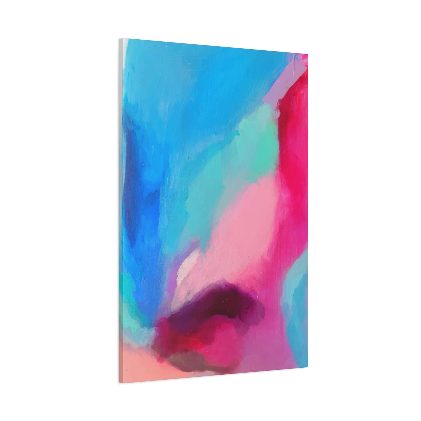
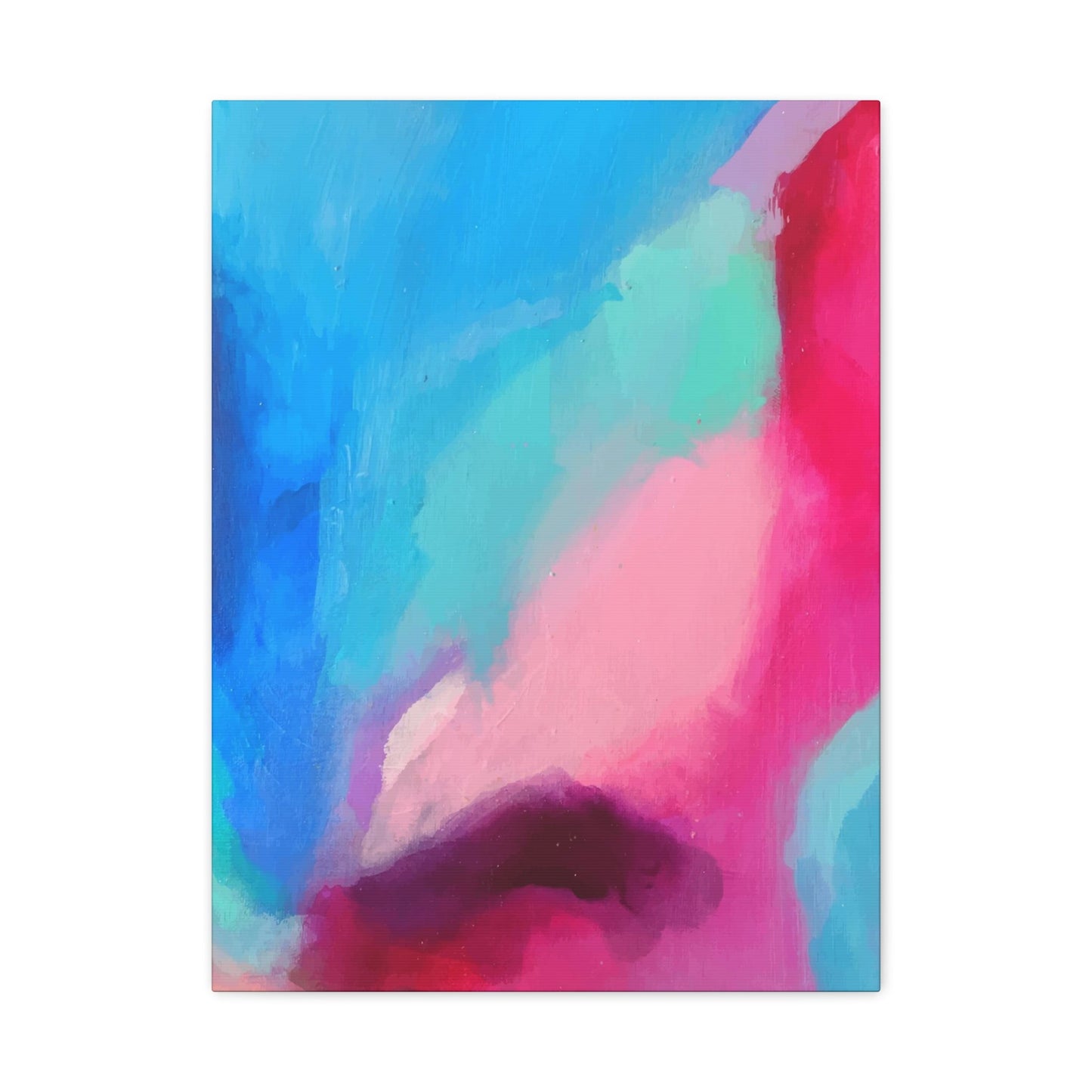
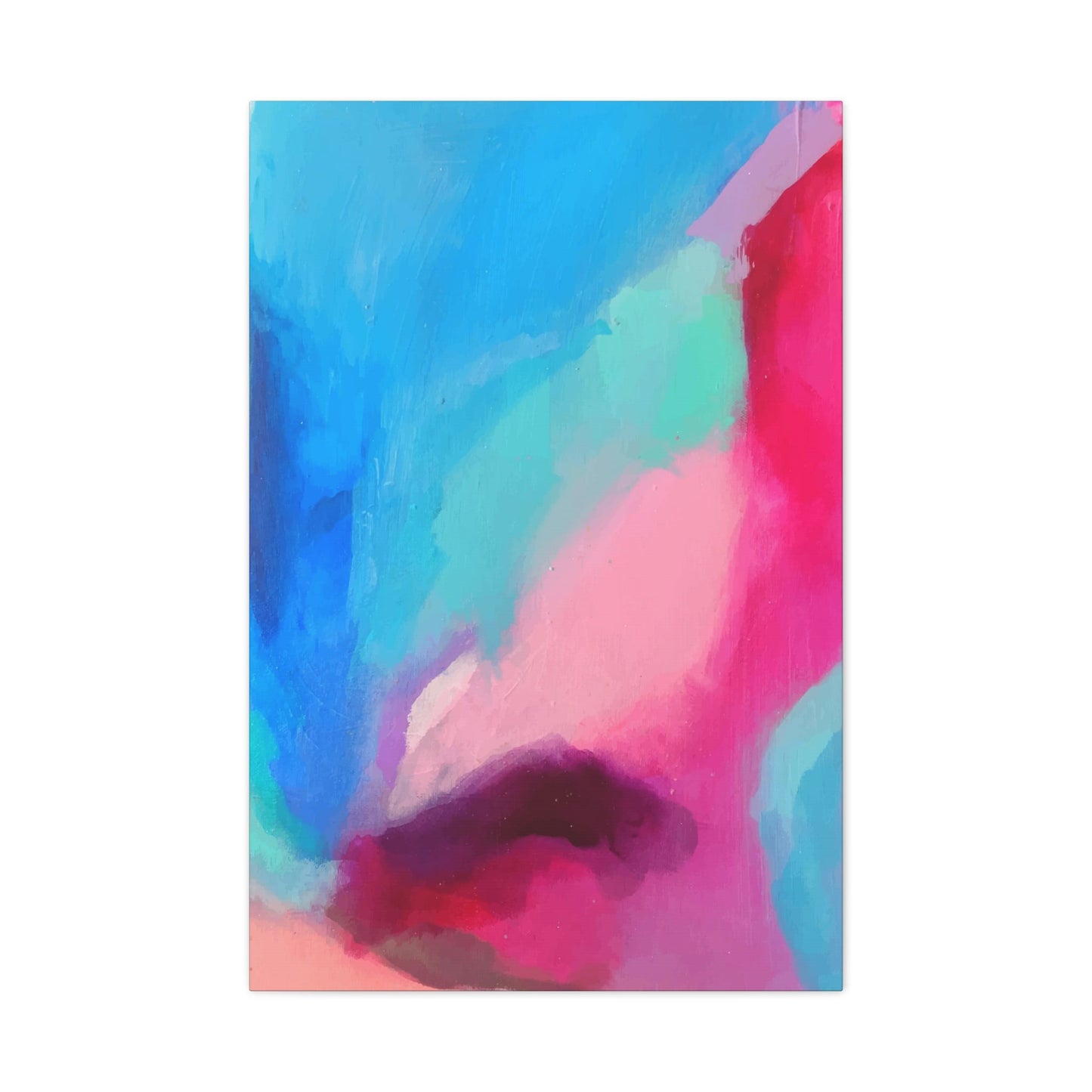
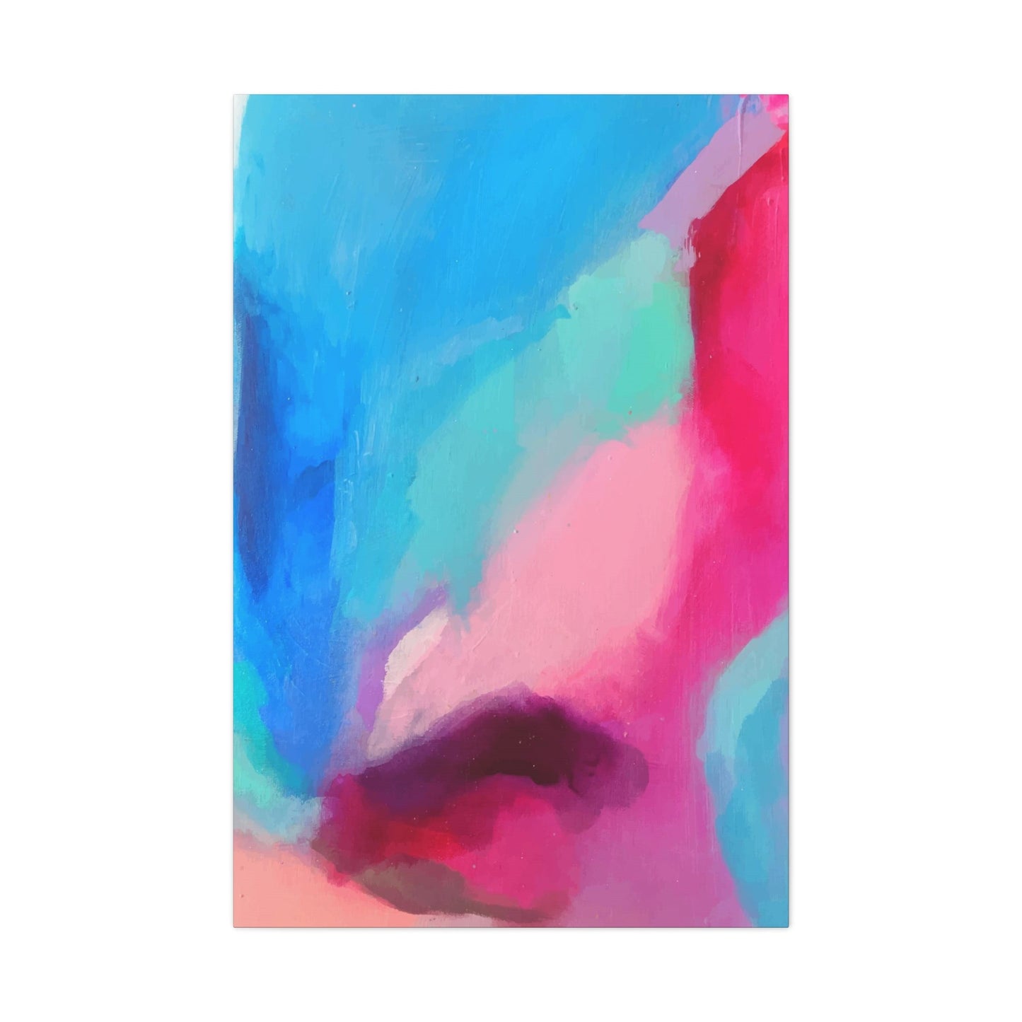
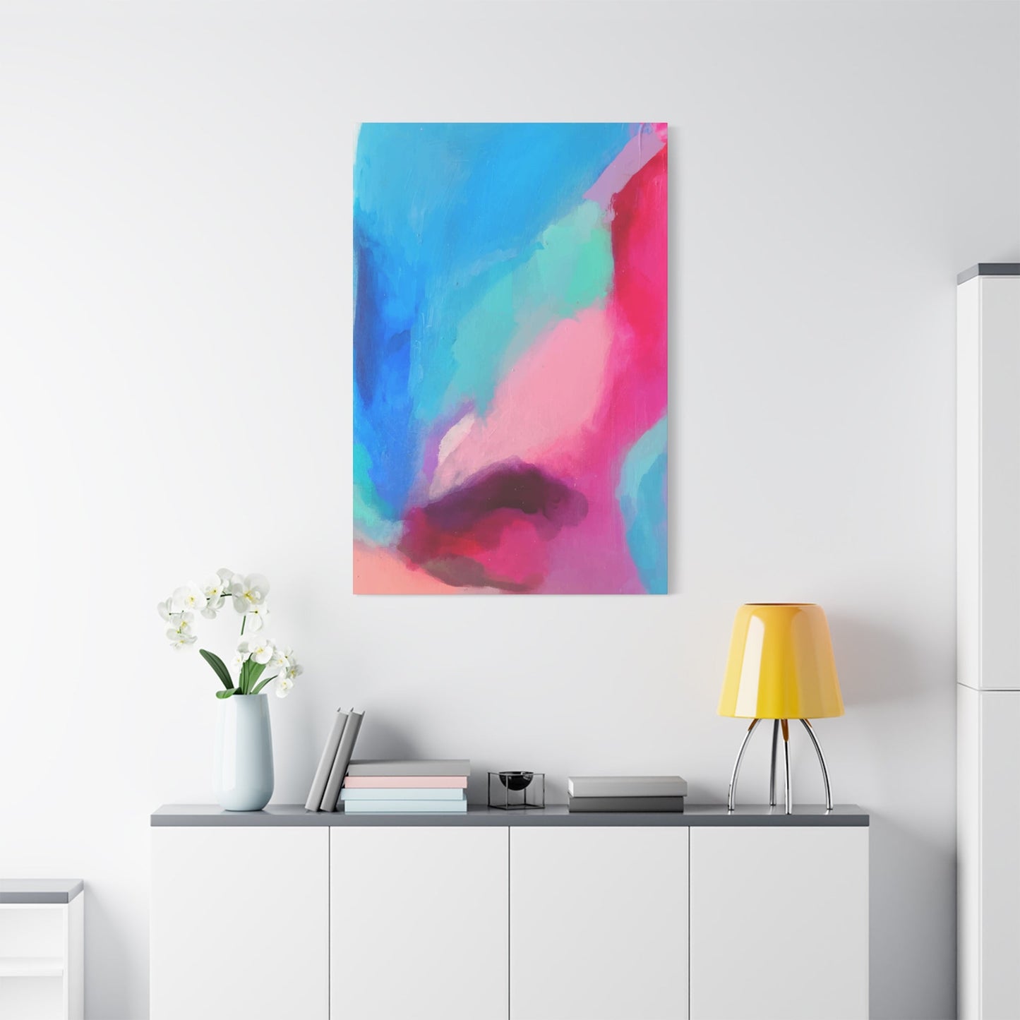
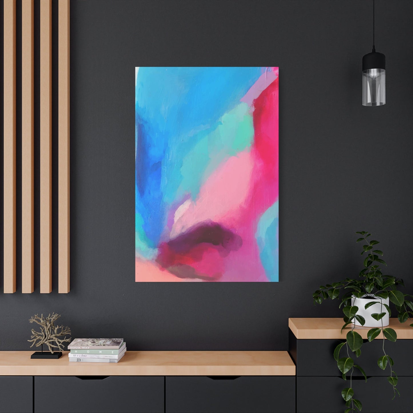
Deconstructed fall wall art represents a revolutionary approach to seasonal decoration that moves beyond literal representations of autumn imagery. This artistic style takes the essence of fall elements like leaves, branches, and seasonal colors, then breaks them down into their most fundamental components before reassembling them in unexpected and visually striking ways. The result is artwork that captures the spirit of autumn while maintaining a sophisticated, contemporary aesthetic that appeals to modern design sensibilities.
The concept of deconstruction in art allows artists to explore the underlying structures and emotions associated with fall imagery without being constrained by traditional representational techniques. Instead of depicting a perfect maple leaf in photorealistic detail, a deconstructed piece might focus on the intricate vein patterns, the subtle color gradations, or the organic curves that make autumn foliage so captivating. This approach creates artwork that feels both familiar and surprisingly fresh.
Creating a cozy atmosphere through deconstructed fall art involves selecting pieces that maintain the warmth and comfort associated with autumn while incorporating modern artistic elements. These works often feature organic shapes and flowing lines that suggest natural forms without explicitly depicting them. The color palette remains true to fall traditions, utilizing rich golds, deep reds, warm browns, and muted oranges, but applies these hues in innovative ways that create visual interest and depth.
The appeal of deconstructed fall wall art lies in its ability to function as both seasonal decoration and sophisticated artistic statement. Unlike traditional autumn artwork that might feel too specific to the season, deconstructed pieces possess a timeless quality that allows them to remain relevant and visually appealing throughout the year. This versatility makes them an excellent investment for homeowners who appreciate seasonal touches but prefer not to completely redecorate with each changing season.
When selecting deconstructed fall wall art for your home, consider pieces that incorporate multiple layers and textures to create visual depth and interest. Look for artwork that combines different media or techniques, such as pieces that layer watercolor washes over detailed line work, or compositions that mix photographic elements with abstract painted sections. These multi-dimensional approaches add complexity and sophistication to your wall displays while maintaining the cozy, welcoming feeling that makes fall decoration so appealing.
The placement of deconstructed fall art requires thoughtful consideration of both lighting and surrounding decor elements. These pieces often contain subtle details and color variations that benefit from proper illumination, whether from natural window light or carefully positioned accent lighting. Consider the existing color scheme of your room when selecting deconstructed fall pieces, choosing artwork that complements your current palette while adding seasonal warmth and visual interest.
Abstract Autumn Canvas Prints for Contemporary Spaces
Abstract autumn canvas prints offer homeowners an opportunity to incorporate fall colors and themes into their spaces while maintaining a sophisticated, contemporary aesthetic. These pieces move beyond literal representations of seasonal elements, instead using color, form, and composition to evoke the feelings and atmosphere associated with autumn. The abstract approach allows for greater versatility in placement and styling, as these works can complement a wide range of interior design styles from minimalist modern to eclectic contemporary.
The creation of effective abstract autumn canvas prints requires artists to distill the essence of fall into its most fundamental visual elements. This might involve exploring the way light filters through changing leaves, the rhythmic patterns created by falling foliage, or the subtle color transitions that occur as nature prepares for winter. By focusing on these underlying qualities rather than specific imagery, abstract artists can create works that capture the emotional resonance of autumn while offering viewers the freedom to interpret the pieces according to their own experiences and associations.
Color plays a particularly crucial role in abstract autumn canvas prints, as it often serves as the primary vehicle for conveying seasonal themes. Artists working in this style typically employ autumn's signature palette but may push these colors in unexpected directions, creating deeper saturations, subtle gradations, or bold contrasts that energize traditional fall hues. The result is artwork that feels both familiar and surprising, offering viewers the comfort of recognizable seasonal colors while challenging them to see these hues in new and innovative ways.
Texture and brushwork techniques add another layer of complexity to abstract autumn canvas prints. Many artists working in this style employ impasto techniques, where paint is applied thickly to create three-dimensional surface textures that add visual and tactile interest to the finished piece. Others might use glazing techniques to create luminous color effects that seem to glow from within the canvas, mimicking the way autumn light filters through colored leaves.
The scale and composition of abstract autumn canvas prints should be carefully considered when selecting pieces for your home. Large-scale works can serve as dramatic focal points that anchor entire rooms, while smaller pieces might be grouped together to create gallery wall displays that tell a cohesive visual story. Consider the proportions of your wall space and the scale of surrounding furniture when making these decisions, ensuring that your chosen artwork feels balanced and appropriately sized for its intended location.
When incorporating abstract autumn canvas prints into your home decor, think about how these pieces will interact with your existing furnishings and accessories. The abstract nature of these works makes them highly adaptable, but they perform best when surrounded by complementary elements that enhance rather than compete with their artistic impact. Consider pairing abstract autumn canvases with neutral furniture pieces, natural textures like wood or stone, and accessories that echo the warm color palette without overwhelming the artwork's sophisticated aesthetic.
Layered Leaves: Modern Fall Wall Decor Concepts
Modern fall wall decor that incorporates layered leaf concepts represents an evolution in seasonal decoration that combines natural inspiration with contemporary design principles. This approach takes the timeless appeal of autumn foliage and reinterprets it through modern artistic techniques that create depth, movement, and visual sophistication. The layering concept allows for complex compositions that reward closer examination while maintaining overall visual coherence from a distance.
The technique of layering in leaf-inspired wall decor can be achieved through various artistic methods, each offering unique visual and textural qualities. Some artists create physical layers by building up materials on the canvas surface, using techniques such as collage, mixed media, or sculptural elements that project from the wall. Others achieve layering effects through purely visual means, using overlapping transparent washes, strategic color placement, or innovative printing techniques that create the illusion of depth and dimension.
One particularly effective approach to layered leaf wall decor involves the use of transparency and opacity to create complex visual relationships between different elements within a composition. Artists might begin with a background layer of warm autumn colors, then overlay semi-transparent leaf silhouettes or abstract forms that suggest foliage without explicitly depicting it. Additional layers might introduce contrasting elements, detailed textures, or accent colors that add complexity and visual interest to the overall composition.
The color relationships in layered leaf wall decor require careful consideration to ensure that each layer contributes to the overall harmony of the piece while maintaining its individual character. Successful layered compositions often employ a limited color palette that includes several variations of autumn hues, allowing for rich color interactions without creating visual chaos. This might involve using different values of the same color family, or incorporating complementary colors that enhance the warmth and richness of traditional fall tones.
Modern interpretations of layered leaf decor often incorporate unexpected materials or techniques that add contemporary appeal to traditional seasonal themes. This might include the use of metallic accents that catch and reflect light, creating dynamic visual effects that change throughout the day as lighting conditions shift. Some artists incorporate digital printing techniques that allow for incredibly detailed layering effects, while others might use laser cutting or other precision techniques to create intricate leaf patterns that cast interesting shadows on the wall.
The installation and display of layered leaf wall decor requires attention to both the individual impact of each piece and its relationship to the surrounding space. These works often benefit from being displayed at eye level where viewers can appreciate the intricate details and relationships between different layers. Consider the viewing distance when selecting pieces, choosing works with appropriate levels of detail for their intended placement. Pieces meant to be viewed from across a room might emphasize bold, graphic layering effects, while those intended for closer inspection might incorporate more subtle and intricate layer relationships.
Lighting plays a crucial role in showcasing layered leaf wall decor effectively. These pieces often contain subtle details and relationships that benefit from consistent, high-quality illumination. Consider installing picture lighting or track lighting that can be adjusted to highlight specific aspects of the layering without creating harsh shadows or glare. Natural light can also enhance these pieces, particularly if positioned to take advantage of changing light conditions throughout the day that might emphasize different layers at different times.
Warming Your Home with Fall Art Prints
Creating a warm and inviting atmosphere through fall art prints involves more than simply hanging seasonal artwork on your walls. It requires a thoughtful approach to selection, placement, and integration that considers how these pieces will interact with your existing decor elements and contribute to the overall ambiance of your living spaces. Fall art prints offer an accessible and versatile way to introduce seasonal warmth into your home while maintaining the flexibility to change and update your decor as desired.
The warmth associated with fall art prints comes from several visual and emotional factors that work together to create a sense of comfort and coziness. Color temperature plays a primary role, as the warm hues typically associated with autumn naturally create feelings of comfort and security. These colors, ranging from golden yellows and rich oranges to deep burgundies and warm browns, have been shown to have psychological effects that promote relaxation and feelings of well-being.
Subject matter also contributes significantly to the warming effect of fall art prints. Images that evoke memories of cozy autumn activities, comfortable indoor spaces, or the beauty of nature during the fall season help create emotional connections that enhance the physical warmth suggested by color choices. This might include artwork depicting rustic cabins, steaming beverages, crackling fireplaces, or peaceful autumn landscapes that invite contemplation and relaxation.
The quality and finish of fall art prints can significantly impact their ability to create warmth in your living spaces. High-quality printing techniques that accurately reproduce color and detail help ensure that the warming effects of the artwork are preserved and enhanced. Consider prints that use archival inks and papers, as these will maintain their color integrity over time and continue to provide the warming effects you desire. Matte finishes often work particularly well for fall art prints, as they reduce glare and create a more intimate viewing experience.
Size and scale considerations are important when selecting fall art prints to warm your home. Larger prints can serve as focal points that anchor rooms and provide substantial visual warmth, while smaller prints might be grouped together to create gallery walls that distribute warming effects throughout a space. Consider the scale of your furniture and the size of your wall spaces when making these decisions, ensuring that your chosen prints feel proportionate and balanced within their intended locations.
The framing and presentation of fall art prints can significantly enhance their warming effects. Choose frames that complement the warm tones in your prints while adding to the overall sense of comfort and sophistication. Wood frames in warm tones like cherry, walnut, or golden oak can enhance the cozy feeling, while metal frames in bronze or copper tones might add contemporary sophistication without sacrificing warmth. Consider matting options that provide appropriate visual spacing while echoing the warm color palette of the prints themselves.
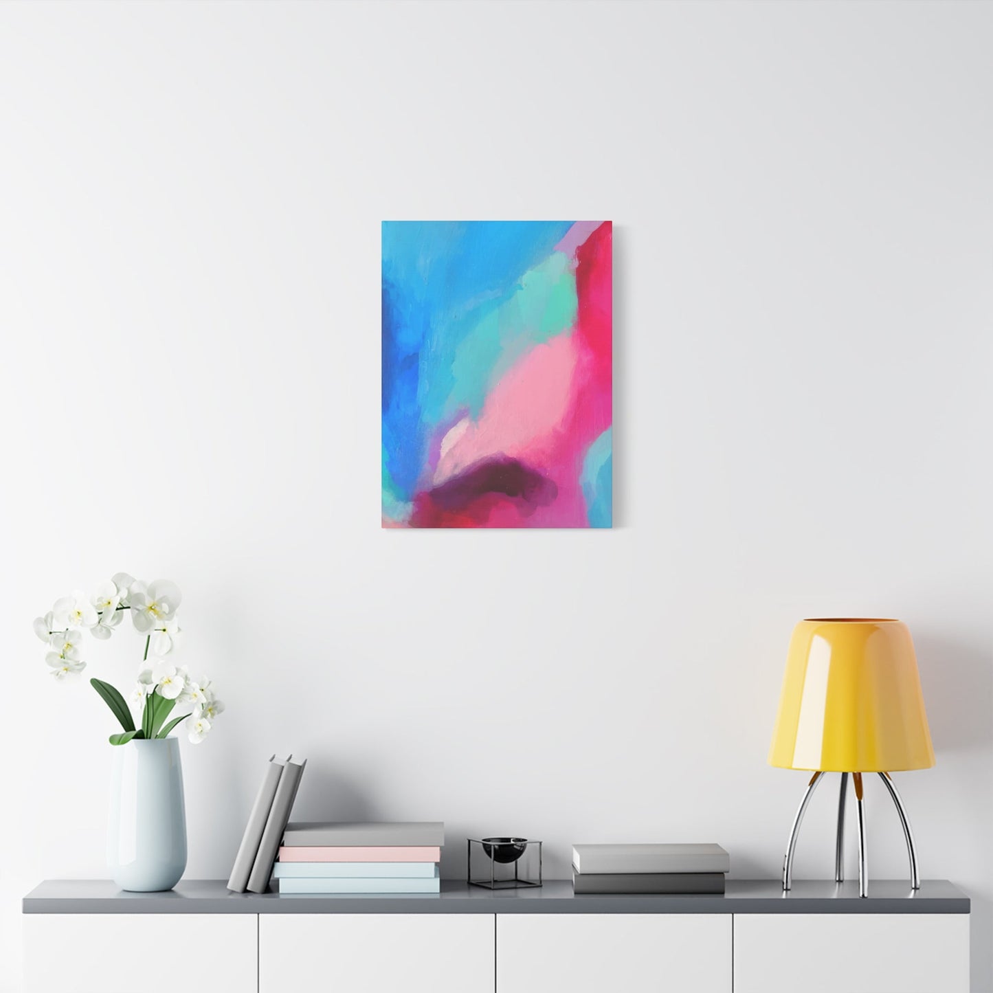
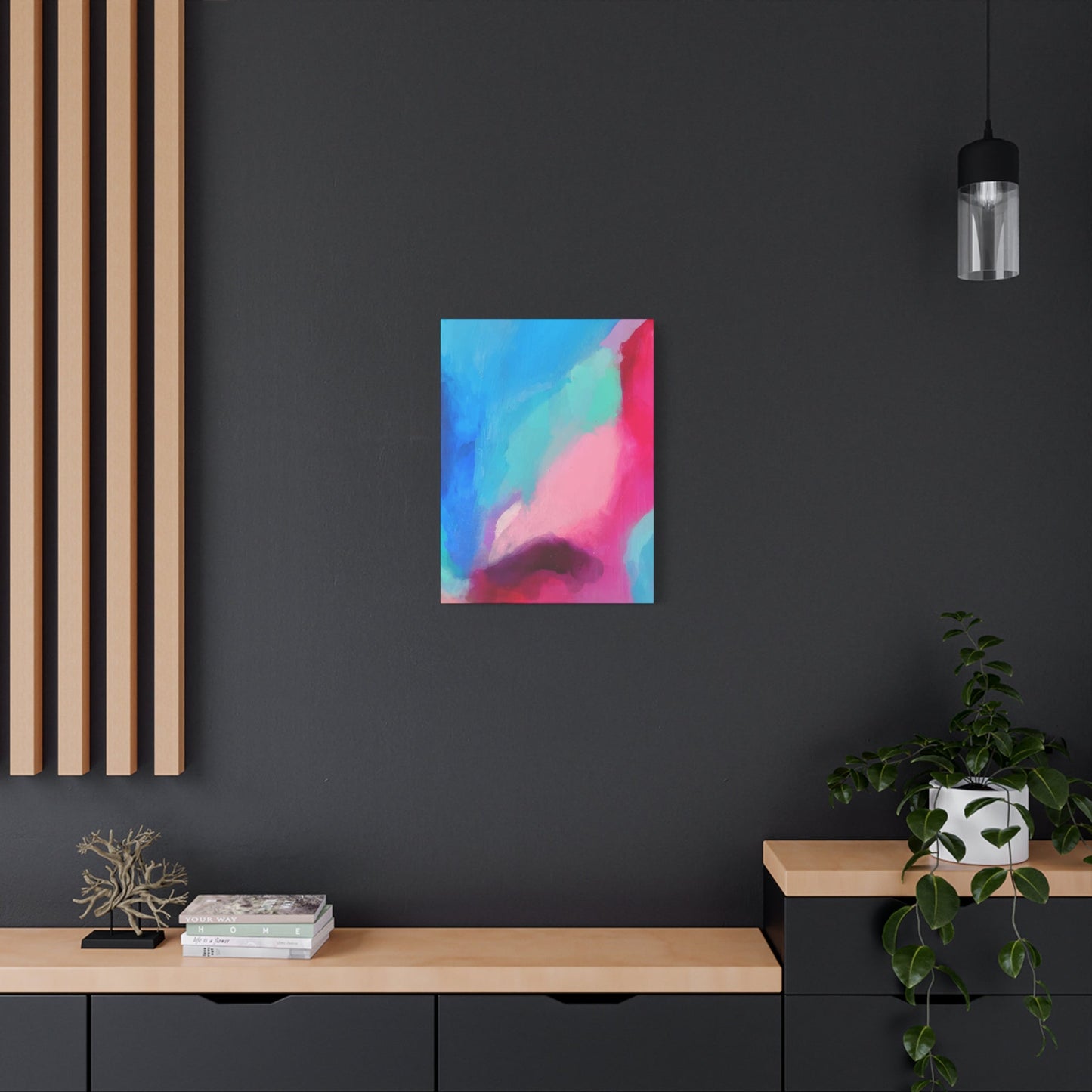
Placement strategies for fall art prints should consider both the practical aspects of viewing and the emotional impact of the artwork. Position prints at eye level for comfortable viewing, and consider the natural flow of traffic through your spaces when determining optimal placement. Group related prints together to create cohesive displays that tell visual stories, or distribute them throughout connected spaces to create a sense of continuity and warmth that flows from room to room.
Minimalist Autumn Wall Art Ideas
Minimalist autumn wall art represents a sophisticated approach to seasonal decoration that embraces the principle that less can indeed be more. This design philosophy focuses on distilling autumn's essential elements down to their most fundamental and impactful components, creating artwork that captures the season's essence through careful selection of color, form, and composition rather than through complex or busy imagery. The result is wall art that provides seasonal connection while maintaining the clean, uncluttered aesthetic that defines minimalist design.
The key to successful minimalist autumn wall art lies in identifying the most essential and emotionally resonant elements of the season and presenting them in their purest form. This might involve focusing on a single autumn leaf silhouette against a neutral background, exploring the subtle color gradations found in fall light, or creating simple geometric compositions using autumn's signature color palette. The challenge is to convey the warmth and richness of fall while adhering to minimalist principles of simplicity and restraint.
Color selection becomes particularly crucial in minimalist autumn wall art, as fewer elements must work harder to convey the desired seasonal feeling. Rather than incorporating the full spectrum of fall colors, minimalist pieces might focus on one or two carefully chosen hues that capture autumn's essence. This might involve exploring different values and saturations of a single color, such as creating a composition that uses various shades of gold to suggest autumn light, or pairing two complementary colors like deep burgundy and warm cream for maximum impact.
Negative space plays an important role in minimalist autumn wall art, as the areas left empty are as important as those that contain visual elements. The careful use of white space or neutral backgrounds allows the autumn elements to breathe and prevents the composition from feeling cluttered or overwhelming. This approach also makes minimalist pieces highly versatile, as they can adapt to various interior design styles and color schemes while maintaining their essential character.
Typography and text elements can be effectively incorporated into minimalist autumn wall art, particularly when they reinforce the seasonal theme through carefully chosen words or phrases that evoke autumn feelings and associations. Simple, clean fonts work best in minimalist compositions, and the text should be integrated seamlessly with other visual elements rather than competing for attention. Consider pieces that incorporate single words like "grateful," "harvest," or "cozy" in sophisticated typography that complements the overall design.
The materials and production methods used for minimalist autumn wall art should reflect the clean, high-quality aesthetic that defines this design approach. Look for pieces printed on premium papers with precise color reproduction and sharp detail. Simple framing options that don't distract from the artwork itself are essential, with clean-lined frames in neutral colors or natural wood tones being particularly effective choices.
When incorporating minimalist autumn wall art into your home, consider how these pieces will function within your existing minimalist decor scheme. These works should enhance rather than complicate your space, adding seasonal warmth while maintaining the serene, uncluttered feeling that makes minimalist design so appealing. Group multiple minimalist pieces carefully, ensuring that each has adequate space to be appreciated individually while contributing to a cohesive overall display.
Seasonal Vibes: Deconstructed Fall Canvas Concepts
Deconstructed fall canvas concepts represent an innovative approach to seasonal art that challenges traditional representations of autumn imagery while maintaining emotional connections to the season. This artistic philosophy involves breaking down familiar fall elements into their component parts, then reassembling them in unexpected ways that create fresh perspectives on seasonal themes. The result is artwork that feels both contemporary and timeless, offering viewers new ways to experience and appreciate the beauty of autumn.
The deconstruction process in fall canvas art can take many forms, from literal dismantling of leaf shapes into geometric fragments to more abstract explorations of the colors, textures, and patterns found in autumn landscapes. Artists working in this style might isolate specific aspects of fall imagery, such as the branching patterns of bare trees or the cellular structure of leaves, and use these elements as building blocks for more complex compositions that suggest rather than explicitly depict seasonal themes.
Color deconstruction in fall canvas art involves analyzing autumn's traditional palette and reassembling these hues in innovative combinations and applications. Rather than using fall colors in their expected contexts, deconstructed pieces might explore what happens when autumn oranges are paired with unexpected complementary colors, or when traditional warm tones are presented in cool applications that challenge viewer expectations while maintaining seasonal relevance.
Texture and surface treatment play crucial roles in deconstructed fall canvas art, as these elements can convey seasonal feelings even when imagery is abstracted beyond recognition. Artists might incorporate actual organic materials like pressed leaves or bark textures, or create painted surfaces that mimic the tactile qualities of autumn elements. The goal is to create multi-sensory experiences that engage viewers on both visual and emotional levels.
The compositional strategies used in deconstructed fall canvas art often draw from modern design principles while incorporating organic elements that reference natural autumn processes. This might involve creating grid-based compositions that contain organic shapes, using mathematical progressions to arrange color elements that suggest seasonal change, or employing architectural principles to structure pieces that feel both ordered and naturally inspired.
Scale relationships within deconstructed fall canvas art can create powerful visual effects that enhance the emotional impact of seasonal themes. Artists might juxtapose large, simplified forms with intricate detailed areas, or create pieces that appear different depending on viewing distance. These scale variations can suggest the way we experience autumn at different levels, from the grand sweep of landscape color changes to the intimate details of individual leaves and branches.
The viewing experience of deconstructed fall canvas art often rewards contemplation and closer examination, as these pieces frequently contain multiple layers of meaning and visual information that unfold over time. Consider displaying these works in locations where they can be viewed both from a distance and up close, allowing viewers to appreciate both the overall compositional impact and the detailed relationships between deconstructed elements.
Nature-Inspired Abstract Fall Prints
Nature-inspired abstract fall prints bridge the gap between representational seasonal art and pure abstraction, creating works that capture the essence of autumn's natural beauty while offering viewers the interpretive freedom that defines abstract art. These pieces draw their inspiration from the patterns, colors, textures, and rhythms found in fall landscapes, but translate these natural elements into abstract visual languages that can speak to viewers on intuitive and emotional levels.
The process of creating nature-inspired abstract fall prints often begins with careful observation of autumn's natural phenomena. Artists might study the way morning frost creates delicate patterns on fallen leaves, analyze the complex color interactions that occur during peak foliage season, or explore the rhythmic patterns created by wind moving through autumn trees. These observations then serve as inspiration for abstract compositions that capture the underlying structures and energies rather than the surface appearances of seasonal change.
Color relationships in nature-inspired abstract fall prints often reflect the complex interactions found in autumn landscapes, where warm and cool tones create dynamic tensions that energize the overall composition. Artists might explore how autumn's golden light affects the perception of color, or investigate the subtle color variations that occur within seemingly uniform areas of fall foliage. These color studies can result in abstract works that feel unmistakably autumnal while offering fresh perspectives on familiar seasonal palettes.
Pattern and rhythm play important roles in nature-inspired abstract fall prints, as these elements can convey the temporal aspects of seasonal change that make autumn so compelling. Artists might create compositions that suggest the gradual progression from green to gold to brown that characterizes leaf change, or develop rhythmic patterns that echo the way leaves fall and accumulate on forest floors. These temporal elements add narrative depth to abstract works while maintaining their non-representational character.
Organic forms and geometric structures often coexist in nature-inspired abstract fall prints, reflecting the way natural systems follow both organic growth patterns and mathematical principles. This might result in compositions that combine flowing, biomorphic shapes with more structured geometric elements, creating visual tensions that mirror the complex relationships found in natural autumn environments.
The emotional content of nature-inspired abstract fall prints often derives from their ability to evoke memories and associations with autumn experiences without explicitly depicting recognizable imagery. These works might capture the feeling of walking through fallen leaves, the contemplative mood inspired by autumn's preparation for winter, or the bittersweet beauty of seasonal transition. By working in abstract modes, artists can access these emotional territories more directly than might be possible through representational approaches.
Technical considerations for nature-inspired abstract fall prints include the selection of printing methods and materials that best serve the artistic vision while ensuring longevity and color fidelity. High-quality digital printing techniques can reproduce the subtle color gradations and complex textures often found in these works, while archival materials ensure that the emotional impact of the pieces will be preserved over time. Consider the intended display environment when selecting print specifications, choosing materials and finishes that will perform well under expected lighting and environmental conditions.
Fall Colors on Canvas: Home Decor Integration
Integrating fall colors on canvas into your home decor requires a strategic approach that considers both the immediate visual impact of seasonal artwork and its long-term compatibility with your overall design scheme. Fall colors possess inherent warmth and richness that can enhance virtually any interior space, but successful integration depends on understanding how these hues interact with existing elements and how they contribute to the overall atmosphere you wish to create.
The psychology of fall colors plays a significant role in their effectiveness as home decor elements. Warm tones like gold, orange, and deep red are known to create feelings of comfort, security, and intimacy, making them particularly effective in living spaces where relaxation and social interaction are priorities. Cooler autumn tones like deep burgundy and forest green can add sophistication and depth to spaces while maintaining seasonal relevance. Understanding these emotional associations can help guide your selection and placement of fall-colored canvas art.
Color harmony principles become essential when integrating fall colors on canvas with existing home decor elements. Consider your room's existing color palette and identify opportunities for fall canvas art to either complement or provide strategic contrast with these established colors. Monochromatic schemes using various values and intensities of single fall colors can create sophisticated, cohesive looks, while complementary color schemes that pair fall hues with their opposite colors can create dynamic, energizing environments.
The lighting conditions in your intended display areas will significantly affect how fall colors on canvas are perceived and how they interact with surrounding decor elements. Natural light tends to enhance the warmth and vibrancy of autumn colors, while artificial lighting can either support or alter their appearance depending on the color temperature of the light sources. Consider how your fall canvas art will appear under different lighting conditions throughout the day, and select pieces that perform well under your specific lighting circumstances.
Seasonal flexibility should be considered when selecting fall colors on canvas for year-round display. While autumn hues can certainly be enjoyed throughout the year, pieces that incorporate these colors in sophisticated ways that transcend literal seasonal representation will provide greater long-term satisfaction. Look for canvas art that uses fall colors as part of broader artistic statements rather than simply as seasonal decoration, ensuring that these pieces remain relevant and appealing beyond the autumn months.
The scale and placement of fall-colored canvas art within your rooms should be carefully planned to achieve optimal visual impact while maintaining good proportional relationships with furniture and architectural elements. Large-scale pieces can anchor rooms and provide substantial color impact, while smaller works might be grouped to create focal points or distributed throughout spaces to provide color continuity. Consider sight lines and natural viewing positions when determining placement, ensuring that your fall canvas art can be appreciated both as individual pieces and as contributors to overall room compositions.
Layering strategies can enhance the integration of fall colors on canvas by creating visual connections between artwork and other decor elements. This might involve selecting throw pillows, rugs, or accessories that echo colors found in your canvas art, or positioning fall-colored canvases near natural elements like wood furniture or stone accents that complement autumn's earthy palette. The goal is to create cohesive environments where fall canvas art feels naturally integrated rather than arbitrarily placed.
Statement Autumn Art for Every Room
Creating impactful statement autumn art for different rooms requires understanding how each space functions and what kind of artistic presence will best serve those functions while providing appropriate seasonal connection. Statement pieces serve as focal points that anchor rooms and set emotional tones, making their selection and placement crucial to successful interior design. Autumn-themed statement art offers the additional benefit of bringing seasonal warmth and natural beauty into interior spaces while demonstrating sophisticated aesthetic sensibilities.
Living rooms present excellent opportunities for large-scale statement autumn art that can serve as conversation pieces while providing visual warmth and sophistication. These spaces typically offer generous wall areas that can accommodate substantial artworks, and their social functions benefit from pieces that create inviting atmospheres. Consider autumn statement art that incorporates rich, warm colors and compelling compositions that reward both distant viewing and closer examination. The scale should be appropriate to the room size and seating arrangements, creating visual balance while establishing clear focal points.
Dining rooms can benefit from autumn statement art that enhances the communal and celebratory aspects of shared meals. These spaces often work well with pieces that incorporate food-related imagery or harvest themes, but sophisticated abstract works that capture autumn's abundance and warmth can be equally effective. Consider how statement art will interact with artificial lighting during evening dining, and select pieces that perform well under various lighting conditions. The placement should complement rather than compete with table settings and dining activities.
Bedroom statement autumn art should create restful, contemplative atmospheres while providing visual interest and seasonal connection. These intimate spaces often benefit from pieces that emphasize autumn's quieter, more reflective qualities rather than its more energetic aspects. Consider artwork that incorporates calming color palettes drawn from fall's earth tones, or pieces that suggest peaceful autumn scenes through abstract or impressionistic techniques. The scale should be appropriate to bedroom proportions, creating presence without overwhelming these personal spaces.
Kitchen spaces present unique challenges and opportunities for statement autumn art, as these functional areas must balance aesthetic appeal with practical considerations. Look for pieces that can withstand the humidity and temperature variations common in cooking spaces, and consider how statement art will interact with cabinetry, appliances, and work surfaces. Autumn themes work particularly well in kitchens due to their associations with harvest, cooking, and seasonal food preparation.
Home office spaces can benefit from statement autumn art that provides visual interest and seasonal connection without creating distraction from work activities. These environments often work well with pieces that incorporate autumn's contemplative qualities, perhaps through abstract compositions or minimalist approaches to seasonal themes. Consider how statement art will function as background elements during video calls or other professional activities, selecting pieces that enhance rather than overwhelm these spaces.
Entryways and hallways offer opportunities for statement autumn art that creates welcoming first impressions while providing seasonal greetings for residents and guests. These transitional spaces often have specific dimensional constraints that require careful consideration of scale and proportion. Autumn statement art in entry areas can set the tone for entire homes, making their selection particularly important for creating cohesive seasonal decorating schemes.
Bathroom spaces, while perhaps unexpected locations for statement art, can be transformed through carefully selected autumn pieces that withstand humid conditions while providing luxury and visual interest. Consider pieces that incorporate autumn's spa-like qualities, such as the peaceful feeling of forest scenes or the meditative qualities of abstract compositions inspired by seasonal change.
Exploring Color Psychology in Autumn Wall Art
Color psychology plays a fundamental role in how autumn wall art affects our emotional responses and overall well-being within interior spaces. The colors traditionally associated with fall season carry deep psychological associations that have developed through evolutionary processes and cultural experiences, making them powerful tools for creating specific moods and atmospheres in our homes. Understanding these psychological effects can guide the selection and placement of autumn wall art to achieve desired emotional outcomes.
Warm colors dominate autumn's natural palette, and these hues are known to stimulate feelings of comfort, energy, and social connection. Orange, perhaps the color most strongly associated with autumn, combines the physical energy of red with the mental stimulation of yellow, creating a color that promotes enthusiasm and creativity while maintaining approachable warmth. In autumn wall art, orange tones can energize spaces and encourage social interaction, making them particularly effective in living areas and dining spaces where family and friends gather.
Red, in its various autumn manifestations from deep burgundy to bright maple leaf scarlet, carries associations with passion, strength, and vitality. These psychological effects make red-dominated autumn wall art excellent choices for creating dramatic focal points that command attention and respect. However, the intensity of red requires careful consideration in placement and quantity, as too much can become overwhelming or aggressive. Autumn wall art that uses red as accent color rather than dominant hue often achieves the most successful balance.
Yellow and gold tones in autumn wall art tap into psychological associations with sunlight, happiness, and mental clarity. These colors can help combat the potential depression associated with shorter daylight hours as autumn progresses toward winter, making them valuable additions to homes in northern climates. Gold, in particular, carries associations with luxury and success while maintaining warm accessibility that makes it suitable for various interior design styles.
Brown and earth tones found in autumn wall art connect viewers with feelings of stability, reliability, and grounding. These colors can create psychological environments that feel secure and nurturing, making them excellent choices for bedrooms, studies, and other spaces where calm contemplation is desired. The various shades of brown found in autumn landscapes, from light tan to deep chocolate, offer extensive options for creating sophisticated color schemes that support mental well-being.
Green, though less dominant in autumn palettes, appears in various forms from the deep forest greens of evergreen trees to the olive tones of fading foliage. Psychologically, green promotes balance, harmony, and restoration, making autumn wall art that incorporates these tones valuable for creating restful environments. The particular greens associated with autumn often carry additional associations with endurance and timeless wisdom.
The combination and interaction of colors within autumn wall art pieces create complex psychological effects that can be more powerful than individual color impacts. Analogous color schemes using neighboring autumn hues create harmonious, restful feelings, while complementary combinations that pair autumn colors with their opposites can create stimulating, energizing environments. Understanding these color relationships helps in selecting artwork that will produce desired psychological effects within specific spaces.
Cultural associations also influence how colors in autumn wall art are perceived and the psychological responses they generate. In Western cultures, autumn colors are strongly associated with harvest celebrations, thanksgiving, and preparation for winter, creating psychological connections with abundance, gratitude, and family traditions. These cultural overlays add additional emotional depth to the basic psychological effects of autumn colors.
Seasonal Affective Disorder (SAD) and its related psychological challenges can be addressed partly through strategic use of color in interior environments. Autumn wall art that emphasizes warm, energizing colors can help counteract the psychological effects of reduced sunlight exposure, while pieces that capture autumn's beauty can help viewers maintain positive associations with seasonal change rather than viewing it as entirely negative.
Individual differences in color perception and psychological response mean that the selection of autumn wall art should consider personal preferences and reactions alongside general psychological principles. Some individuals may find certain autumn colors more appealing or emotionally supportive than others, making personal experimentation and observation important parts of the selection process.
Techniques for Creating Layered Visual Interest
Creating layered visual interest in autumn wall art involves sophisticated compositional strategies that build depth, complexity, and engagement through multiple levels of visual information. These techniques allow viewers to discover new details and relationships with continued observation, making artwork more rewarding and engaging over time. Successful layering creates pieces that function effectively at different viewing distances while maintaining overall compositional unity.
Physical layering techniques in autumn wall art might involve the literal application of materials at different depths to create three-dimensional surface textures that catch and reflect light in interesting ways. Artists might build up paint surfaces using impasto techniques, apply collage elements that project from the canvas surface, or incorporate mixed media materials that add textural variety and visual complexity. These physical layers can suggest the natural layering found in autumn forests, where fallen leaves accumulate in rich, textural carpets beneath trees.
Visual layering through transparency and opacity creates sophisticated depth effects that can suggest the complex visual relationships found in autumn landscapes. Artists might apply transparent glazes over opaque base colors to create luminous effects that mimic autumn light filtering through colored leaves, or use semi-transparent overlays to create color mixing effects that appear to extend beyond the canvas surface. These optical layering techniques can create the illusion of atmospheric depth that makes two-dimensional artwork feel more immersive.
Color layering strategies involve building complex color relationships through successive applications of different hues that interact to create more sophisticated final colors than could be achieved through direct application. This might involve applying warm undertones that show through cooler surface colors, creating visual vibration and depth, or building up colors gradually to achieve subtle variations that add richness and complexity to surface treatments.
Compositional layering arranges visual elements at different scales and levels of detail to create hierarchies of importance and attention that guide viewer experience. Background elements might establish overall mood and color relationships, middle ground elements could provide structural organization and major focal points, while foreground details add specific points of interest that reward closer examination. This organizational strategy mirrors the way we naturally perceive complex environments, moving from general impressions to specific details.
Pattern layering combines different types of patterns at various scales to create rich, complex surfaces that maintain visual unity while providing extensive detail for exploration. An autumn wall art piece might combine large-scale organic patterns suggesting tree branches with medium-scale patterns representing leaf clusters and fine-scale patterns depicting individual leaf textures. The successful integration of these different pattern scales creates visual richness without confusion or chaos.
Temporal layering suggests the passage of time or seasonal progression within single artworks, creating narrative depth that engages viewers intellectually as well as visually. This might involve showing the same landscape elements in different seasonal states, or suggesting the gradual changes that occur as autumn progresses from early to late season. These temporal layers add storytelling elements that make artwork more emotionally engaging.
Light and shadow layering uses contrasts in value and illumination to create depth and dimensionality while adding dramatic interest to compositions. Artists might layer areas of bright illumination over darker base tones to create effects that suggest autumn sunlight, or use shadow patterns to add structural complexity that enhances the overall composition. These lighting effects can make flat artwork appear more three-dimensional and environmentally specific.
The integration of layered elements requires careful attention to overall compositional balance and unity to prevent layering from becoming chaotic or overwhelming. Each layer should contribute to the overall artistic statement while maintaining its individual character and clarity. This requires sophisticated understanding of visual hierarchy and the ability to create complex relationships that enhance rather than compete with each other.
Viewing distance considerations become important when creating layered visual interest, as different layers may be most effective when viewed from specific distances. Successful layered autumn wall art creates compositions that function well from across rooms while offering additional detail and interest for closer examination. This multi-distance functionality makes layered pieces particularly suitable for spaces where they will be viewed from various positions.
Conclusion
Deconstructed autumn wall art offers a creative and visually striking way to bring the vibrant colors and textures of fall into interior spaces. By reimagining traditional autumn motifs—such as falling leaves, seasonal flora, and warm earthy tones—through fragmented, layered, or abstract interpretations, this style of art transforms walls into dynamic, engaging focal points. Incorporating these pieces into living rooms, dining areas, bedrooms, or offices allows homeowners to celebrate the warmth, beauty, and ever-changing character of the fall season, creating interiors that feel inviting, cozy, and full of personality.
The appeal of deconstructed autumn wall art lies in its ability to balance realism with artistic innovation. Artists capture the essence of autumn—the rich reds, oranges, and yellows, the textures of leaves, and the interplay of light and shadow—while breaking these elements into unique compositions that evoke movement and energy. The fragmented forms and layered designs create visual depth and intrigue, encouraging viewers to explore the details and experience the season in a new, imaginative way. This approach ensures that each piece is not only decorative but also intellectually and emotionally engaging.
Beyond its aesthetic impact, deconstructed autumn wall art conveys symbolic and emotional meaning. Autumn is a season of transition, reflection, and abundance, and incorporating its motifs into home décor can evoke mindfulness, gratitude, and appreciation for the cycles of nature. Each piece, whether highlighting a single leaf or a cascade of colors, tells a story of change, resilience, and the quiet beauty found in transformation, adding layers of depth and narrative to interior spaces.
From a design perspective, deconstructed autumn art is versatile and adaptable. Large-scale canvases or wall panels can serve as bold, dramatic statements, while smaller works or series arrangements provide subtle accents that enhance hallways, kitchens, or cozy reading corners. The warm, earthy color palettes harmonize with a variety of décor styles, including rustic, contemporary, eclectic, and minimalist interiors, ensuring that these artworks complement and elevate any environment.
Ultimately, deconstructed autumn wall art is more than a decorative choice—it is a celebration of color, movement, and the changing beauty of nature. By bringing the spirit of fall indoors, these pieces transform walls into spaces of warmth, inspiration, and visual delight, creating interiors that reflect the richness, vibrancy, and emotional resonance of the season.
