


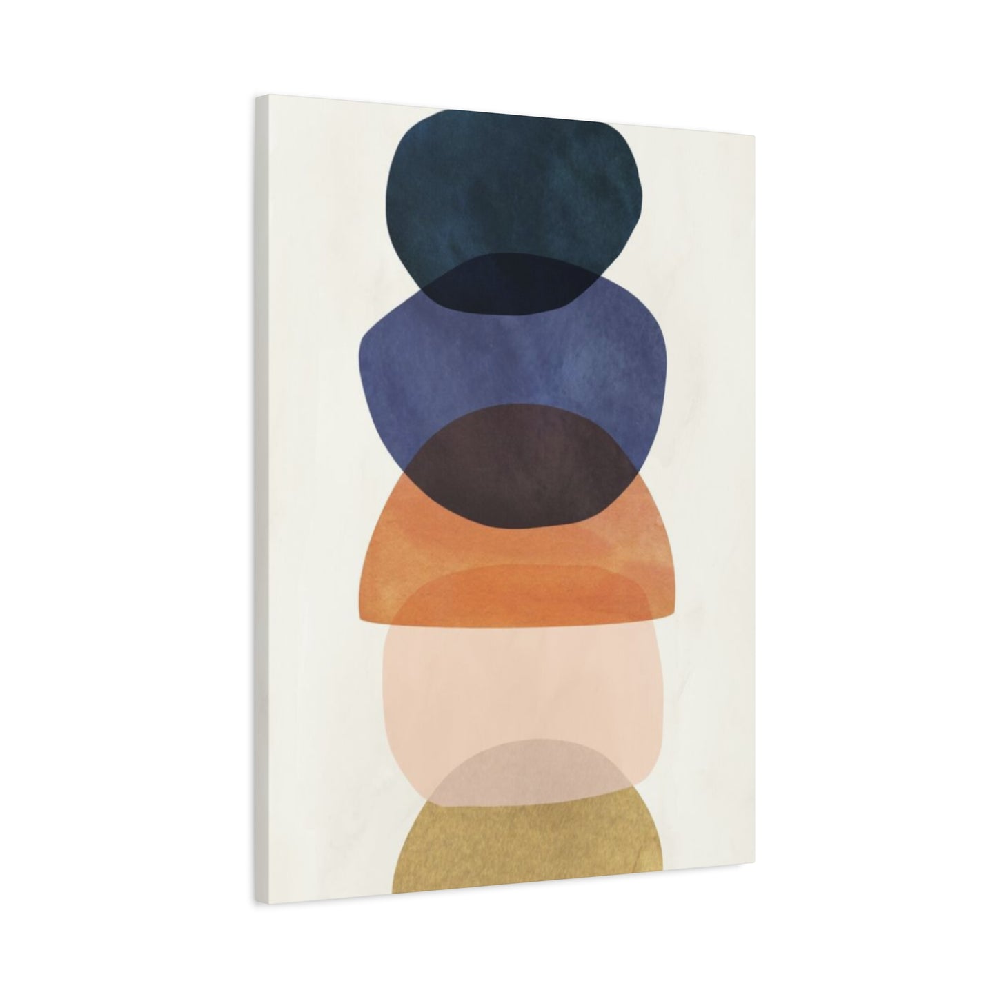
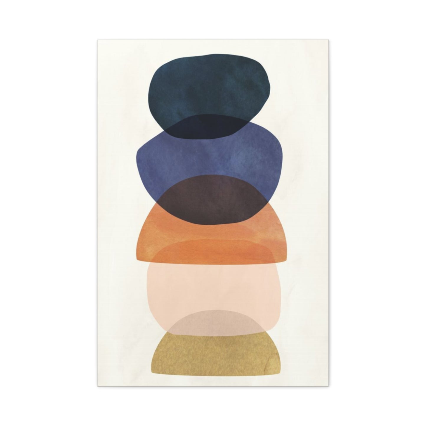
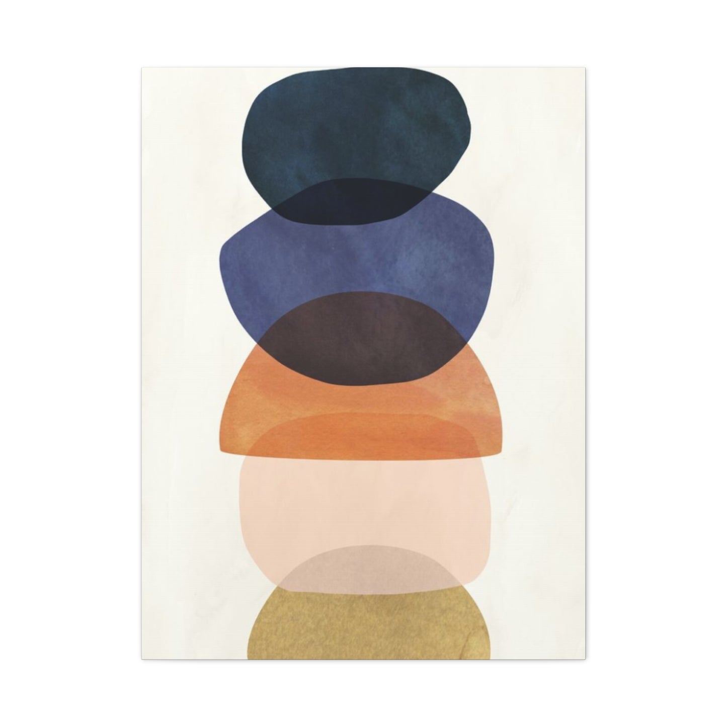
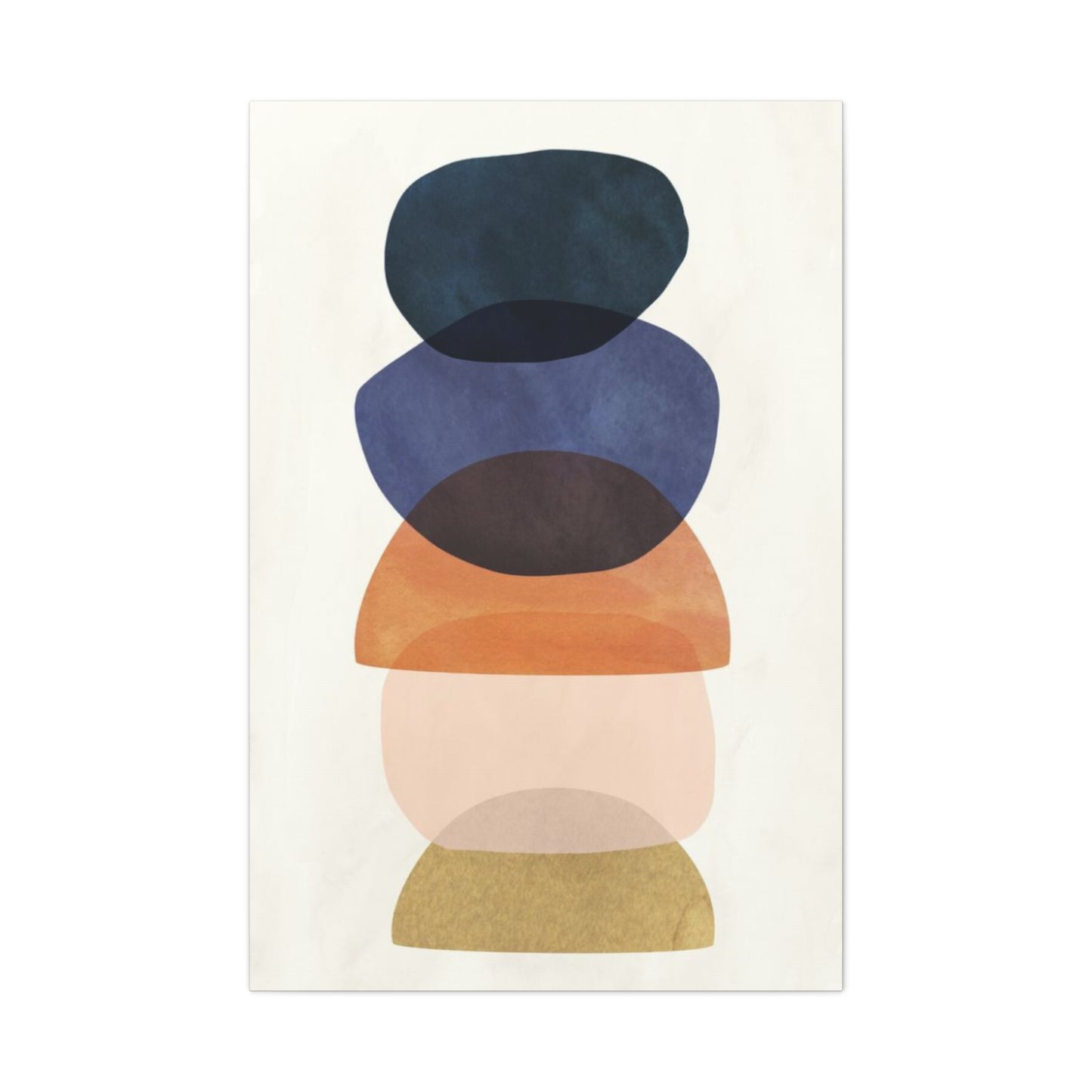
Different Colors in Olive Green Wall Art & Canvas Prints
Different Colors in Olive Green Wall Art & Canvas Prints
Couldn't load pickup availability


Mastering Olive Green Color Combinations in Wall Art for Stunning Visual Impact
The sophisticated charm of olive green has captivated artists and decorators for centuries, establishing itself as one of the most versatile and timeless colors in the world of visual arts. This muted, earthy hue possesses a unique ability to harmonize with an extensive range of color palettes, making it an exceptional choice for creating captivating wall art that enhances any environment. The psychological impact of olive green stems from its natural origins, evoking feelings of tranquility, growth, and connection to the earth while maintaining a refined elegance that appeals to contemporary sensibilities.
When incorporated into wall art, olive green serves as both a grounding force and a sophisticated accent, capable of transforming ordinary artwork into extraordinary visual statements. Its complex undertones, which blend yellow and blue with subtle hints of brown, allow it to bridge the gap between cool and warm color families seamlessly. This inherent versatility makes olive green an ideal foundation for exploring countless color combinations, each offering unique aesthetic possibilities and emotional resonances.
The growing popularity of olive green in modern wall art reflects a broader cultural shift toward embracing natural, sustainable, and calming elements in our living environments. As people seek to create sanctuaries that promote wellbeing and connection to nature, olive green emerges as a perfect solution, offering the serenity of natural landscapes while maintaining the sophistication required for contemporary artistic expression. This comprehensive exploration delves into the myriad ways olive green can be combined with other colors to create stunning wall art that speaks to both aesthetic sensibilities and emotional needs.
How Olive Green Harmonizes with Warm Color Palettes in Wall Art
The marriage between olive green and warm colors creates some of the most emotionally resonant and visually striking combinations in wall art. When olive green encounters warm hues such as burnt orange, deep amber, golden yellow, or rich terracotta, the result is a palette that exudes comfort, energy, and natural vitality. This combination works exceptionally well because olive green's earth-based foundation naturally complements the fire-inspired warmth of these colors, creating a balanced interplay between grounding stability and energetic warmth.
In practical application, olive green provides an excellent backdrop for warm-toned subjects in paintings, allowing vibrant oranges and yellows to pop without overwhelming the composition. Artists often use this technique when depicting autumn landscapes, where olive green foliage serves as a perfect counterpoint to the fiery reds and oranges of changing leaves. The depth that olive green brings to these compositions cannot be understated; it prevents warm colors from appearing too aggressive while adding sophisticated complexity to the overall palette.
The psychological impact of combining olive green with warm colors in wall art extends beyond mere aesthetic appeal. This combination evokes feelings of hearth and home, creating artwork that makes viewers feel welcomed and comfortable. The earthy stability of olive green grounds the excitement of warm colors, resulting in pieces that energize without overwhelming. This makes such combinations particularly effective in living areas where people gather, as the artwork contributes to an atmosphere of warmth and conviviality.
Contemporary artists have embraced this color relationship in various forms, from abstract expressionist pieces that blend olive green and warm ochres in dynamic brushstrokes to more representational works that use these colors to capture the essence of Mediterranean landscapes or autumn scenes. The key to successful implementation lies in understanding the proportional relationship between these colors—olive green typically works best as either a dominant base color with warm accents or as a supporting player that enhances warm focal points.
Harmonious Pairings of Olive Green with Neutral Color Schemes in Artistic Expression
The relationship between olive green and neutral tones represents one of the most sophisticated and versatile approaches to color combination in wall art. Neutral colors—including various shades of gray, taupe, mushroom, and soft whites—provide a perfect canvas for olive green to express its full range of characteristics. This pairing creates artwork that is both calming and engaging, offering visual interest without overwhelming the viewer or competing with other decorative elements in a room.
When olive green is combined with warm neutrals like taupe and mushroom, the result is a palette that feels organic and naturally harmonious. These combinations work particularly well in contemporary wall art where the goal is to create pieces that complement modern furnishings while adding depth and interest. The subtle complexity of olive green prevents neutral-based artwork from appearing bland, while the neutrals allow the green to shine without competition from other strong colors.
Cool neutrals, particularly various shades of gray, create an entirely different but equally compelling relationship with olive green. This combination tends to feel more modern and sophisticated, with the gray providing a clean backdrop that allows the organic qualities of olive green to stand out. Artists working in minimalist styles often gravitate toward this combination because it offers visual interest while maintaining the clean, uncluttered aesthetic that defines contemporary art movements.
The practical benefits of olive green and neutral combinations in wall art extend to their incredible versatility in various decorating schemes. Such artwork can easily adapt to changing color trends and seasonal updates, as neutral bases remain timelessly appealing while olive green adds just enough character to prevent the piece from fading into the background. This adaptability makes neutral-olive combinations particularly valuable for those who prefer to invest in artwork that will remain relevant and appealing for years to come.
Professional artists often use this color combination to create subtle gradients and tonal variations that add depth and dimensionality to their work. The relationship between olive green and neutrals allows for sophisticated shading techniques that create the illusion of three-dimensional form on two-dimensional surfaces. This makes the combination particularly effective in abstract works where form and color interaction are the primary focus rather than representational subject matter.
Olive Green and Earth-Toned Combinations Creating Natural Harmony in Wall Art
The pairing of olive green with earthy hues represents perhaps the most natural and intuitively pleasing color combination available to artists and art enthusiasts. Earth tones—including rich browns, warm siennas, deep umbers, and golden ochres—share olive green's connection to the natural world, creating combinations that feel organic and harmonious. This relationship works because all these colors can be found together in natural settings, from forest floors to desert landscapes, making their combination in wall art feel authentic and grounding.
When olive green is combined with chocolate browns and deep umbers, the resulting palette evokes the rich, loamy soil of fertile gardens and ancient forests. This combination works exceptionally well in wall art intended for spaces where people seek comfort and connection to nature. The depth and richness of these combinations create artwork that feels substantial and enduring, qualities that are particularly appealing in an era of rapid change and digital overwhelm.
Warmer earth tones like sienna and ochre create a different but equally compelling relationship with olive green. These combinations tend to feel more energetic and optimistic while maintaining the grounding qualities that make earth-tone palettes so appealing. Artists working in these color ranges often find that their work has a timeless quality that transcends temporary style trends, making such pieces valuable long-term investments for collectors and decorators alike.
The technical aspects of working with olive green and earth tones require understanding how these colors interact in different mediums and lighting conditions. In oil paintings, these colors often blend beautifully, creating subtle transitions and rich depths that are difficult to achieve with more contrasting color combinations. Watercolor artists find that olive green and earth tones flow naturally together, creating organic shapes and gradations that enhance the medium's inherent fluidity.
Digital artists and photographers working with these color combinations often focus on capturing the subtle variations in tone and saturation that make earth-tone palettes so compelling. The challenge lies in avoiding muddiness while maintaining the rich, complex relationships that make these combinations so appealing. Success requires careful attention to the balance between different earth tones and the specific shade of olive green being used.
Creating Dynamic Contrast with Olive Green and Bold Color Accents in Wall Art
The strategic use of olive green with bold accent colors creates some of the most visually striking and memorable wall art combinations. When paired with vibrant hues such as electric blue, bright coral, shocking pink, or brilliant yellow, olive green serves as a sophisticated anchor that prevents these bold colors from overwhelming the composition. This approach allows artists to create pieces that are both attention-grabbing and refined, appealing to viewers who appreciate drama without sacrificing elegance.
The success of olive green and bold color combinations lies in the principle of complementary contrast. While olive green is inherently calm and grounding, bold accent colors provide the energy and excitement that create visual tension and interest. The key is achieving the right balance—typically, olive green serves as the dominant color with bold accents used sparingly but strategically to create focal points and guide the viewer's eye through the composition.
Contemporary abstract artists often employ this approach to create pieces that command attention while remaining sophisticated enough for professional environments. The olive green provides a mature, professional foundation while bold accents add personality and energy. This combination works particularly well in corporate art collections where pieces need to be engaging without being distracting or overwhelming.
The psychological impact of combining olive green with bold accents creates artwork that energizes viewers while maintaining a sense of stability and groundedness. This makes such combinations particularly effective in environments where creativity and productivity are important, such as studios, offices, or creative workspaces. The bold accents stimulate mental activity while the olive green provides the calm foundation necessary for sustained focus and concentration.
Technical considerations when working with olive green and bold accent combinations include understanding how different mediums handle color intensity and saturation. Acrylic paints allow for the brilliant color intensity needed for effective bold accents while maintaining the subtle complexity of olive green. Digital artists must pay careful attention to color calibration to ensure that bold accents maintain their impact while olive green retains its sophisticated character across different viewing devices and printing processes.
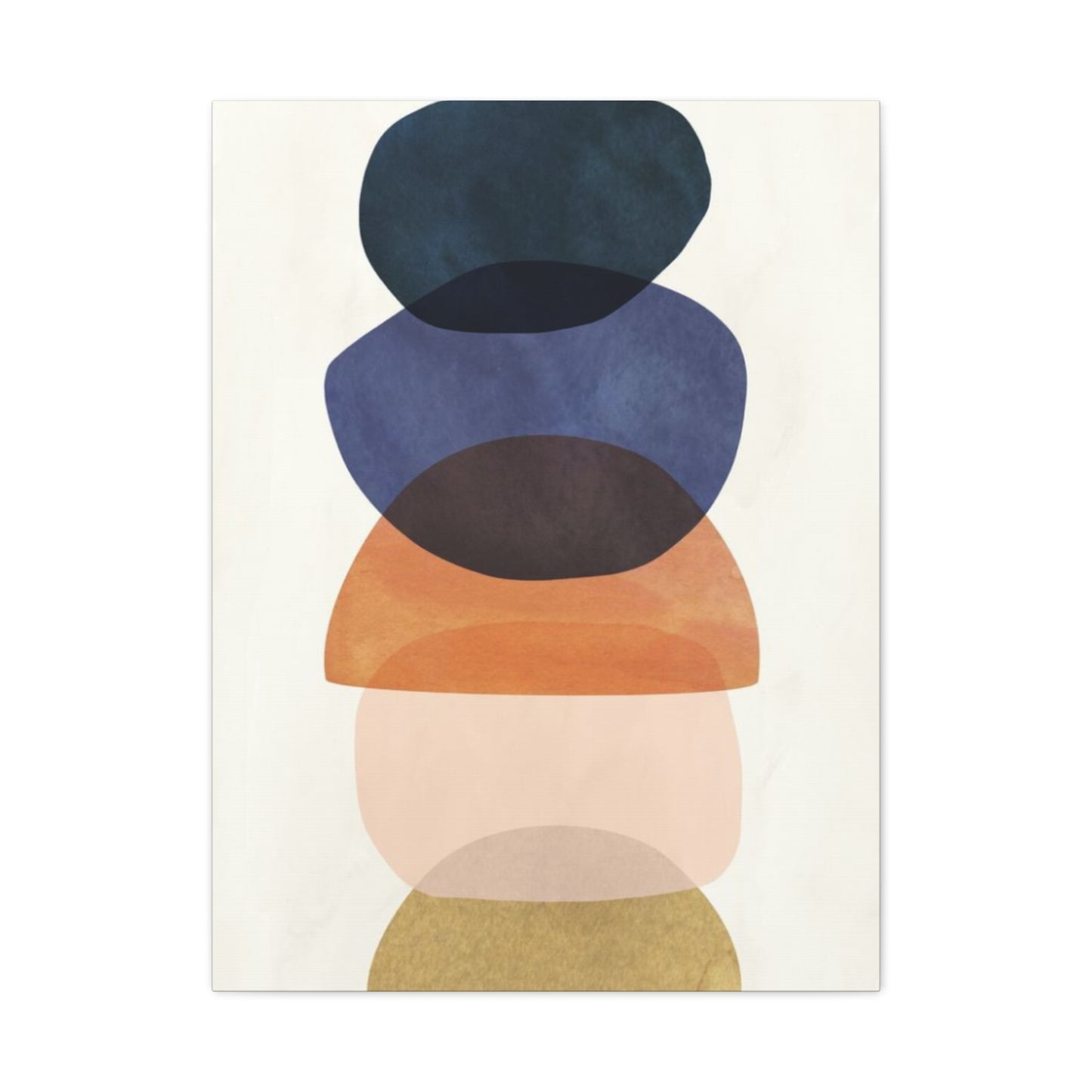
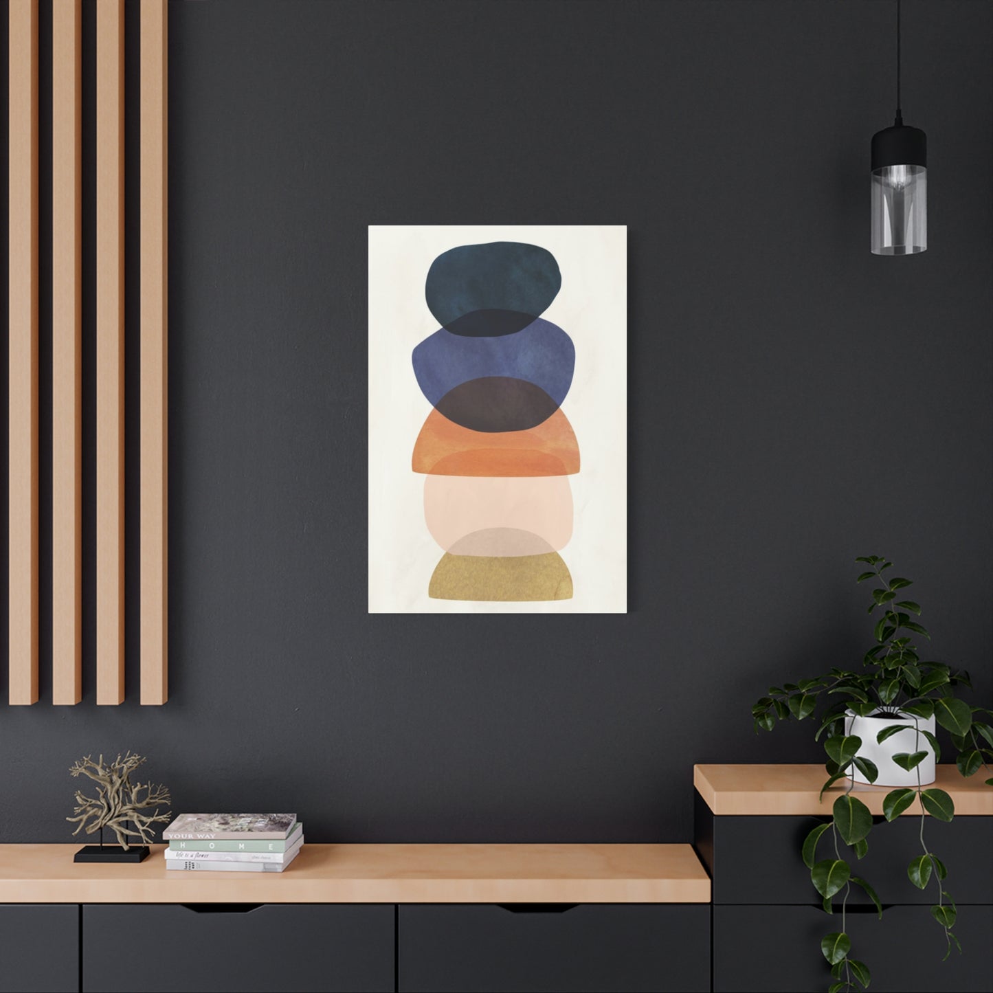
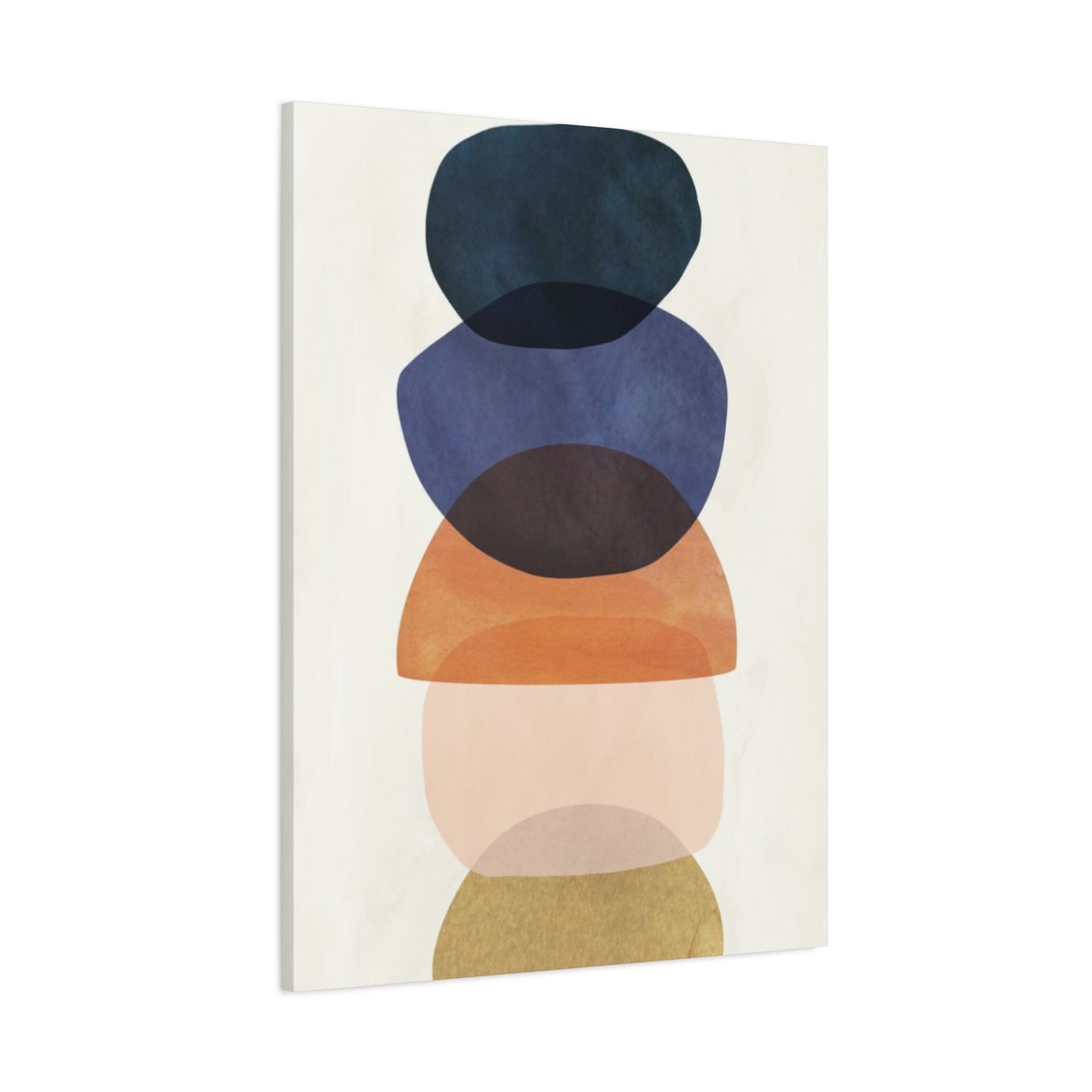
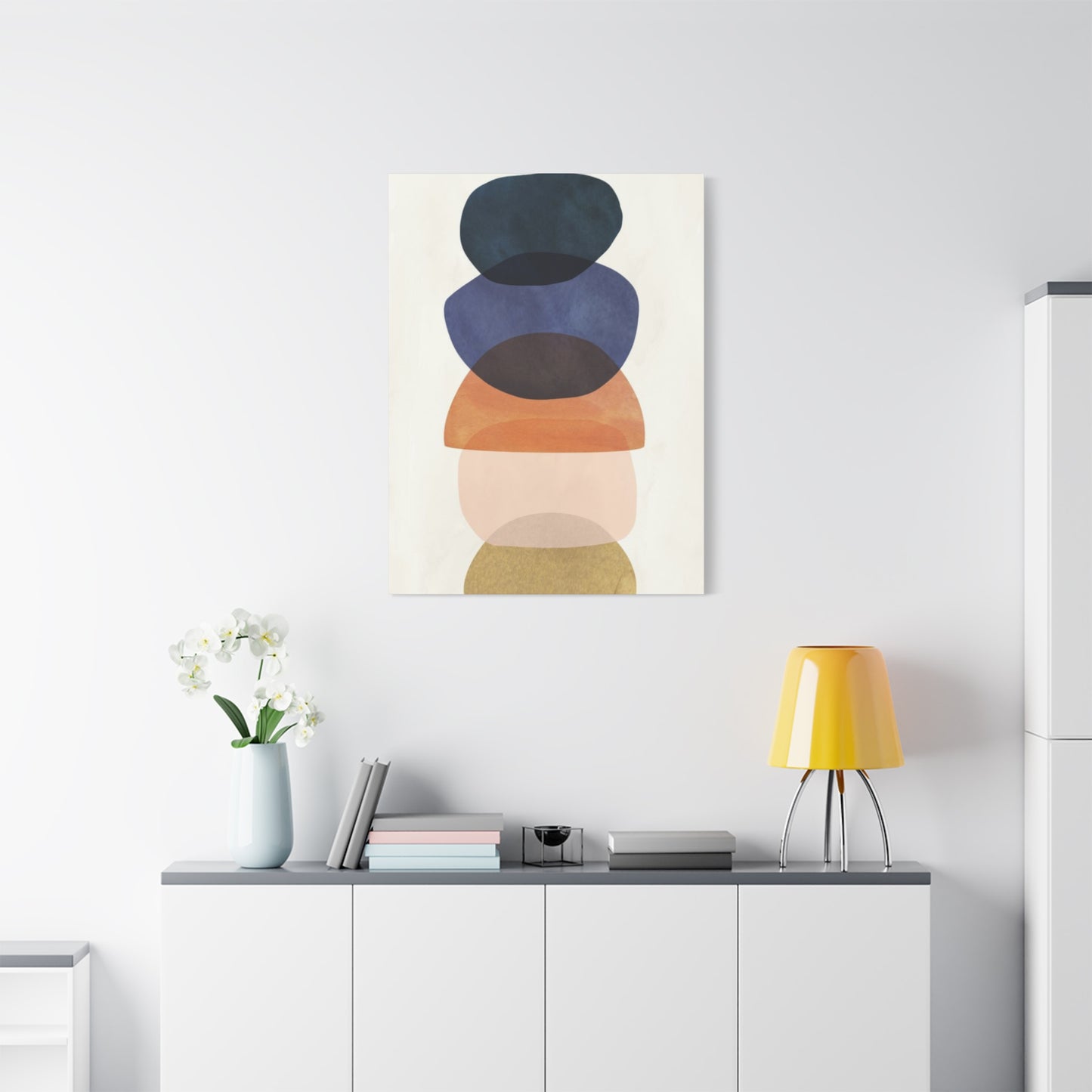
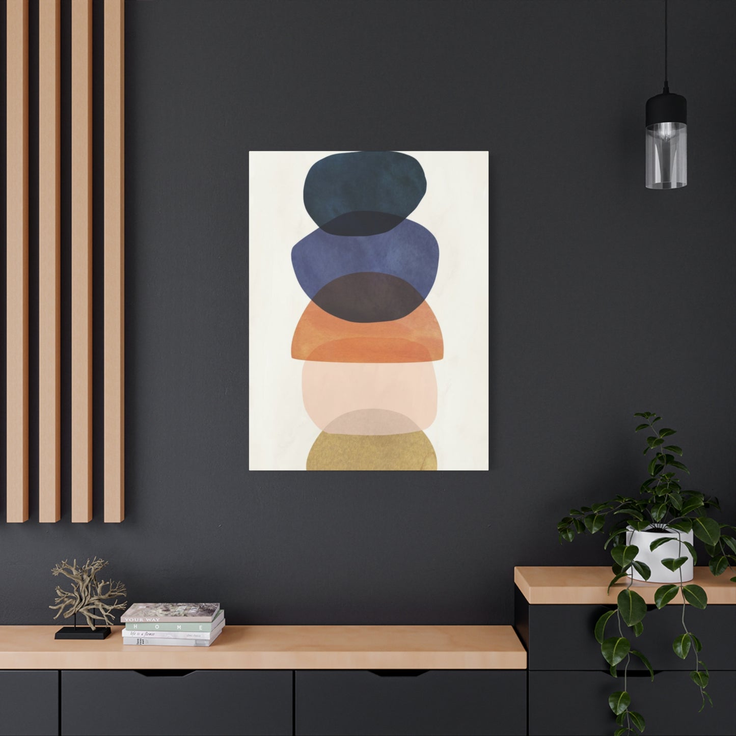
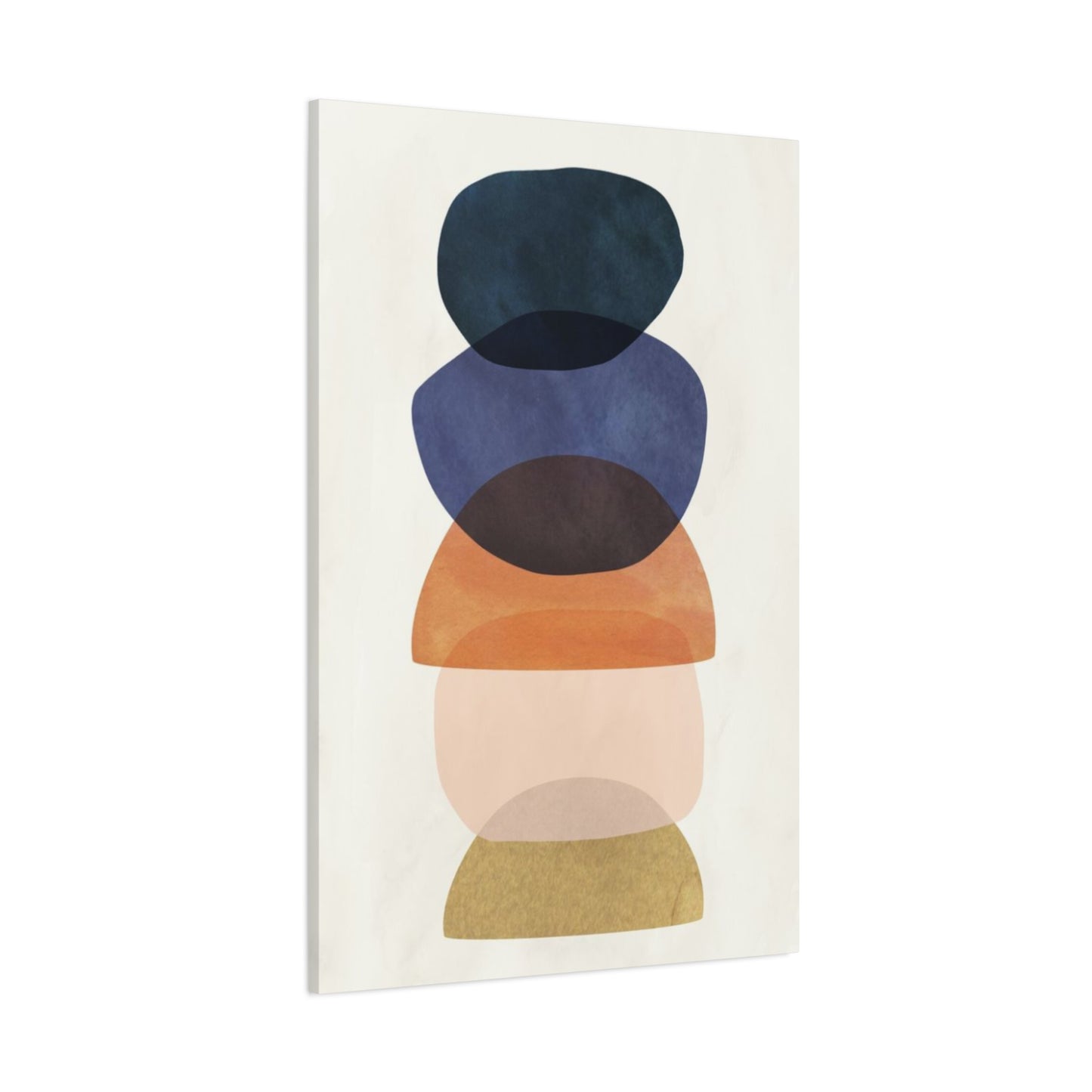
The Serene Combination of Olive Green with Blue Tones in Wall Art
The relationship between olive green and various shades of blue creates some of the most psychologically calming and visually harmonious combinations in wall art. This pairing works on multiple levels—both colors are associated with nature and tranquility, and their combination evokes images of peaceful landscapes where green vegetation meets blue skies or water. The result is artwork that promotes relaxation and mental clarity while maintaining visual interest and sophistication.
When olive green is paired with deep navy blues, the combination takes on a more dramatic and sophisticated character. This pairing works particularly well in traditional and transitional decorating schemes where the goal is to create pieces that feel both classic and contemporary. The depth of navy blue provides a rich contrast to olive green while maintaining the overall calming effect that makes this color combination so appealing for residential and commercial applications.
Lighter blue tones, including powder blue, sky blue, and soft aqua, create a different but equally appealing relationship with olive green. These combinations tend to feel more casual and approachable while maintaining the peaceful qualities that make blue-green palettes so popular. Artists working with these lighter combinations often focus on creating pieces that evoke feelings of spring renewal and natural growth, making them particularly appealing for spaces where people seek inspiration and rejuvenation.
The technical aspects of combining olive green with blue tones require understanding how these colors interact in different lighting conditions. Natural daylight tends to enhance the harmony between these colors, while artificial lighting can sometimes shift their appearance and alter the balance of the composition. Successful artists working with these combinations test their work under various lighting conditions to ensure that the intended effect is maintained across different viewing environments.
Watercolor artists particularly appreciate the natural flow and blending possibilities that blue and olive green combinations offer. The transparency of watercolor allows for subtle gradations and atmospheric effects that enhance the peaceful, contemplative qualities of these color relationships. Oil painters often use these combinations to create landscapes and seascapes that capture the serene beauty of natural environments.
Soft and Romantic Effects of Olive Green with Pastel Color Combinations in Wall Art
The combination of olive green with pastel shades creates artwork that is both sophisticated and romantic, offering a fresh alternative to more traditional pastel color schemes. When olive green is paired with soft pinks, lavender, peach, or butter yellow, the result is a palette that feels contemporary and elegant while maintaining the gentle, soothing qualities that make pastels so appealing. This combination works because olive green adds depth and grounding to what might otherwise be an overly sweet or insubstantial color scheme.
Soft pink and olive green create a particularly appealing combination that challenges traditional color conventions while remaining universally attractive. This pairing works well in both abstract and representational artwork, offering artists the opportunity to explore themes of natural beauty and romantic idealism. The sophistication of olive green prevents the pink from appearing childish, while the pink softens olive green's more serious characteristics, creating a balanced and appealing result.
Lavender and olive green combinations evoke the peaceful beauty of Mediterranean landscapes where olive groves meet fields of lavender. This color relationship has become increasingly popular in contemporary wall art as people seek to bring elements of natural beauty and tranquility into their living environments. The combination works particularly well in bedroom and bathroom settings where the goal is to create a calming, spa-like atmosphere.
The technical challenges of working with olive green and pastel combinations include maintaining color integrity while achieving the desired softness and delicacy. Watercolor artists often find this combination particularly rewarding because the medium's transparency allows for subtle color interactions that enhance the gentle quality of pastel palettes. Acrylic painters must be more careful with color mixing and application to avoid overwhelming the delicate pastel tones with the more robust character of olive green.
Digital artists working with these combinations often focus on creating artwork that has a dreamy, ethereal quality. The challenge lies in maintaining the sophisticated character of olive green while allowing pastel tones to maintain their soft, romantic appeal. Success requires careful attention to saturation levels and the balance between different color areas within the composition.
High-Contrast Drama: Olive Green with Brilliant Color Combinations in Wall Art
Creating high-contrast combinations with olive green and brilliant colors results in wall art that demands attention while maintaining sophisticated appeal. When olive green is paired with colors like bright red, electric orange, or vibrant purple, the contrast creates visual excitement and energy that can transform any environment. The key to success with these dramatic combinations lies in understanding how to balance the intensity of brilliant colors with olive green's more subdued character.
Bright red and olive green create one of the most classic high-contrast combinations in art, evoking everything from Christmas themes to sophisticated contemporary abstracts. This combination works because the colors are nearly complementary on the color wheel, creating natural tension and visual interest. The earthiness of olive green grounds the intensity of bright red, preventing the combination from appearing garish while maintaining its dramatic impact.
Electric orange paired with olive green creates a combination that is both energetic and sophisticated, perfect for contemporary wall art in modern environments. This pairing works particularly well in abstract compositions where the goal is to create pieces that energize and inspire viewers. The natural quality of olive green balances the artificial intensity of electric orange, creating combinations that are exciting without being overwhelming.
Vibrant purple and olive green represent a more unexpected but equally effective high-contrast combination. This pairing creates artwork that is both sophisticated and mysterious, appealing to viewers who appreciate drama and originality. The combination works particularly well in evening environments where artificial lighting can enhance the richness of both colors.
The psychological effects of high-contrast olive green combinations include increased alertness and energy, making such artwork particularly effective in areas where creativity and productivity are important. However, the sophistication of olive green prevents these combinations from being overstimulating, making them suitable for environments where people spend extended periods of time.
Luxurious Appeal of Olive Green with Metallic Accents in Wall Art
The incorporation of metallic elements with olive green creates wall art that exudes luxury and sophistication while maintaining an organic, natural foundation. Gold, silver, copper, and bronze accents transform olive green-based artwork into pieces that catch and reflect light, adding depth and richness that elevates any artistic composition. This combination appeals to those who appreciate both natural beauty and refined elegance, creating artwork that serves as both visual focal points and investment pieces.
Gold accents with olive green create perhaps the most luxurious and timeless combination available to artists and collectors. The warmth of gold complements olive green's earthy character while adding a level of sophistication that makes artwork suitable for the most elegant environments. This combination works particularly well in oil paintings where metallic leaf or paint can be applied to create genuine shimmer and depth that changes with viewing angle and lighting conditions.
Silver and platinum accents create a more contemporary and minimalist relationship with olive green, appealing to those who prefer modern aesthetics while maintaining connection to natural elements. This combination works particularly well in abstract compositions where metallic elements can be used to create geometric patterns or flowing organic forms that complement olive green's natural character.
Copper accents bring warmth and earthiness to olive green combinations, creating artwork that feels both luxurious and approachable. The natural oxidation properties of copper can add interesting visual elements over time, making such pieces living artworks that continue to evolve and develop character. This combination works particularly well in rustic or industrial decorating schemes where the goal is to combine natural elements with refined finishing touches.
The technical aspects of incorporating metallic elements with olive green require understanding how different metals interact with paint mediums and how they respond to various lighting conditions. Proper application techniques are crucial for achieving professional results that maintain their appeal over time. Conservation considerations are also important, as some metallic materials may interact with other paint components or environmental factors in ways that affect long-term stability.
Sophisticated Monochromatic Effects of Olive Green with Black and White Elements
The combination of olive green with black and white elements creates artwork that is both sophisticated and timeless, offering a refined approach to color that appeals to traditional and contemporary tastes alike. This classic three-color palette allows olive green to serve as the connecting element between the stark contrast of black and white, creating compositions that are visually striking without being overwhelming. The result is artwork that commands attention while maintaining the elegance necessary for sophisticated environments.
When used as accent colors, black and white can dramatically enhance olive green's natural characteristics, creating depth and definition that might not be possible with color alone. Black shadows and accents give olive green forms more dimension and substance, while white highlights bring forward the lighter, more optimistic aspects of the color. This interplay creates artwork with strong visual impact and clear compositional structure.
The graphic potential of olive green, black, and white combinations makes them particularly appealing for contemporary wall art where clean lines and strong visual statements are valued. These combinations work exceptionally well in minimalist environments where each element must contribute meaningfully to the overall aesthetic. The natural quality of olive green prevents the stark black-and-white contrast from feeling cold or impersonal.
Abstract artists often gravitate toward these combinations because they allow for exploration of form and composition without the complications of complex color relationships. The limited palette forces focus on other artistic elements such as texture, shape, and balance, often resulting in more powerful and focused artwork. This approach appeals to collectors who appreciate sophisticated restraint and artistic discipline.
The historical precedent for olive green, black, and white combinations extends back through centuries of artistic tradition, making contemporary works in this palette part of a larger artistic conversation. This connection to art history adds depth and significance to modern interpretations while ensuring that such pieces maintain their relevance and appeal over time.
Abstract Color Theory: Olive Green in Contemporary Wall Art Palettes
The role of olive green in abstract art represents one of the most sophisticated applications of color theory in contemporary wall art. Abstract artists appreciate olive green's unique position in the color spectrum—complex enough to provide visual interest while neutral enough to serve as a foundation for more experimental color relationships. This versatility makes olive green an essential component in modern abstract palettes where the goal is to create emotional and visual impact through pure color and form relationships.
In abstract compositions, olive green often serves as a transitional color that bridges different areas of a composition while maintaining visual flow and coherence. Its earth-based character provides stability in compositions that might otherwise feel chaotic or disconnected, while its subtle complexity prevents monotony in more minimalist approaches. This dual nature makes olive green particularly valuable for artists working in contemporary abstract styles.
The psychological impact of olive green in abstract art relates to its ability to evoke natural associations while remaining sufficiently removed from literal representation to allow for personal interpretation. Viewers often find abstract works featuring olive green calming and contemplative, making such pieces particularly effective in environments where stress reduction and mental clarity are important considerations.
Color field painters have embraced olive green for its ability to create atmospheric effects and subtle gradations that add depth and interest to large-scale compositions. The color's natural complexity allows for rich variations in tone and saturation that can create the illusion of vast, contemplative environments that invite extended viewing and meditation.
The technical considerations for using olive green in abstract art include understanding how it interacts with various mediums and application techniques. Acrylic artists find that olive green maintains its character well in both thick impasto applications and thin glazing techniques, while oil painters appreciate the color's ability to blend smoothly with both warm and cool palettes. Digital artists must pay careful attention to color calibration to ensure that olive green's subtle complexity is maintained across different viewing platforms.
Creative Exploration of Olive Green in Modern Artistic Movements
The adoption of olive green in modern artistic movements reflects broader cultural trends toward environmental consciousness, natural beauty, and sophisticated color appreciation. Contemporary artists working in various styles and mediums have embraced olive green as a sophisticated alternative to brighter, more attention-seeking colors, creating artwork that appeals to viewers seeking both aesthetic beauty and emotional resonance.
Minimalist artists appreciate olive green's ability to provide visual interest without overwhelming simplicity that defines the movement. The color's natural complexity allows for subtle variations and gradations that add depth to minimalist compositions while maintaining the clean, uncluttered aesthetic that characterizes this artistic approach. This makes olive green particularly valuable for artists working in contemporary minimalist styles.
Environmental artists often incorporate olive green into their work as a way of highlighting humanity's connection to the natural world. The color's associations with plant life and growing things make it an natural choice for artwork that explores themes of sustainability, conservation, and environmental awareness. This application gives olive green-based artwork additional meaning and relevance in contemporary discussions about climate change and environmental responsibility.
Neo-expressionist artists have found olive green valuable for its emotional neutrality combined with its sophisticated character. Unlike colors that carry strong emotional associations, olive green allows viewers to project their own feelings and experiences onto the artwork while providing a stable, grounding foundation for more expressive artistic elements. This psychological flexibility makes olive green particularly effective in contemporary expressive art.
The commercial success of olive green in contemporary wall art reflects broader cultural appreciation for sophisticated, nature-based aesthetics that provide alternatives to the bright, aggressive colors often associated with digital culture. As people seek to create more calming, natural environments in their homes and workplaces, olive green-based artwork provides an effective solution that combines aesthetic appeal with psychological benefits.
Warm Color Harmonies: Olive Green with Red and Orange Tones in Artistic Expression
The combination of olive green with warm red and orange tones creates some of the most emotionally engaging and visually dynamic wall art compositions available to contemporary artists and collectors. This color relationship draws upon the natural harmony found in autumn landscapes, where olive-toned evergreens provide a sophisticated backdrop for the brilliant reds and oranges of changing deciduous foliage. The result is artwork that captures the emotional richness and natural beauty of seasonal transitions while maintaining year-round appeal and relevance.
When olive green is paired with deep, rich reds, the combination evokes feelings of warmth, comfort, and natural abundance. This pairing works particularly well in traditional and transitional decorating schemes where the goal is to create artwork that feels both classic and contemporary. The earth-based character of olive green provides a sophisticated foundation that prevents rich reds from appearing overwhelming, while the reds add energy and warmth that enliven olive green's more contemplative qualities.
Orange tones, ranging from soft peach to vibrant tangerine, create different but equally compelling relationships with olive green. Lighter orange shades tend to produce more gentle, optimistic combinations that work well in casual living environments, while more intense orange tones create dramatic contrasts that command attention and energize viewers. The key to success lies in understanding how different intensities of orange interact with olive green's complex undertones.
The technical aspects of combining olive green with red and orange tones require careful attention to color temperature and saturation balance. Artists working in oil paints often find that these combinations blend beautifully, creating rich, organic transitions that enhance the natural quality of the color relationship. Acrylic painters must be more careful to maintain color integrity while achieving smooth transitions and avoiding muddiness in mixed areas.
Contemporary artists working with these combinations often focus on creating pieces that capture the energy and optimism of natural growth cycles while maintaining sophisticated appeal for adult audiences. The emotional resonance of olive green with red and orange combinations makes them particularly effective for artwork intended to create welcoming, energizing environments where people gather and connect.
Subtle Elegance: Olive Green with Cream and Beige in Refined Wall Art
The pairing of olive green with cream and beige represents one of the most sophisticated and universally appealing color combinations in contemporary wall art. This elegant relationship creates artwork that exudes refinement and understated luxury while remaining warm and approachable. The combination works because both cream and beige share olive green's natural, earth-based character while providing lighter, more luminous elements that create visual balance and prevent compositions from becoming too dark or heavy.
Cream tones, with their subtle warmth and soft luminosity, create particularly harmonious relationships with olive green. This combination evokes the sophisticated elegance of natural materials like aged parchment and weathered stone, making it particularly appealing for artwork intended to complement classic and traditional decorating schemes. The softness of cream prevents olive green from appearing too serious while adding a touch of luxury that elevates the overall aesthetic.
Beige tones offer a slightly more casual but equally sophisticated relationship with olive green. The broader range of beige shades—from cool mushroom tones to warm taupe—allows for greater variety in artistic expression while maintaining the fundamental harmony that makes this color combination so appealing. Artists often appreciate the flexibility that beige provides in creating subtle gradations and atmospheric effects.
The psychological impact of olive green with cream and beige combinations creates artwork that promotes relaxation and contemplation while maintaining visual interest. These combinations work particularly well in bedroom and study environments where the goal is to create calm, peaceful atmospheres that support rest and concentration. The natural quality of these earth-toned palettes helps create connections to the natural world even in urban environments.
Professional artists working with these combinations often focus on creating subtle textural effects and gradual tonal transitions that add depth and interest to what might otherwise be a monochromatic composition. The challenge lies in maintaining visual engagement while working within a relatively narrow color range. Success requires careful attention to value relationships and compositional structure to ensure that artwork remains compelling despite its restrained palette.
Energetic Combinations: Olive Green and Yellow Creating Vibrant Wall Art
The pairing of olive green with various shades of yellow creates some of the most energizing and optimistic color combinations available in wall art. This relationship draws upon the natural harmony found in spring landscapes where new green growth emerges alongside bright yellow flowers and golden sunlight. The combination works on both emotional and visual levels, creating artwork that lifts spirits and energizes viewers while maintaining the sophisticated character that olive green brings to any composition.
Bright, pure yellows create the most dramatic and energizing relationship with olive green, resulting in artwork that commands attention and radiates optimism. This combination works particularly well in contemporary abstract pieces where the goal is to create maximum visual impact through pure color relationships. The earth-based stability of olive green provides the perfect foundation for yellow's exuberant energy, creating balance that prevents the combination from becoming overwhelming.
Softer yellow tones, including butter yellow and pale gold, create more gentle but equally appealing relationships with olive green. These combinations tend to feel more sophisticated and suitable for formal environments while maintaining the positive, uplifting qualities that make yellow such an appealing accent color. The subtlety of these lighter yellows allows olive green's natural complexity to remain prominent while adding warmth and luminosity to the overall composition.
Golden yellow tones create particularly rich and luxurious combinations with olive green, evoking images of autumn sunlight filtering through olive groves or golden wheat fields bordered by evergreen hedgerows. This combination appeals to viewers who appreciate both natural beauty and sophisticated elegance, making it particularly effective for artwork intended to serve as long-term investments in home or office environments.
The technical considerations for combining olive green with yellow require understanding how these colors interact in different lighting conditions and mediums. Natural daylight tends to enhance the harmony between these colors, while artificial lighting can sometimes shift their appearance and alter the balance of the composition. Successful artists test their work under various lighting conditions to ensure consistent visual impact.
Rustic Charm: Earthy Olive Green with Traditional Tones in Canvas Artwork
The combination of earthy olive green with traditional rustic tones creates wall art that embodies timeless appeal and natural authenticity. This color palette draws inspiration from rural landscapes, weathered barns, and aged natural materials, creating artwork that speaks to our deep connection with the land and traditional ways of life. When olive green is paired with colors like barn red, weathered brown, golden wheat, and sage gray, the result is artwork that feels both nostalgic and timelessly relevant.
Barn red and olive green represent perhaps the most iconic rustic color combination, evoking images of pastoral farmland and traditional agricultural life. This pairing works because both colors are derived from natural materials and have been used together in rural architecture and folk art for centuries. The earthiness of olive green provides a perfect complement to the warmth and energy of barn red, creating artwork that feels authentic and rooted in tradition.
Weathered brown tones, including various shades of raw umber and burnt sienna, create rich, organic combinations with olive green that evoke the textures and colors of aged wood, leather, and stone. These combinations work particularly well in canvas prints and oil paintings where texture and surface quality can enhance the rustic aesthetic. The depth and richness of these earth-tone combinations create artwork that feels substantial and enduring.
Golden wheat and amber tones add warmth and optimism to rustic olive green palettes while maintaining the natural, agricultural character that defines this aesthetic approach. These combinations work particularly well in kitchen and dining room environments where the goal is to create warm, welcoming atmospheres that celebrate food, family, and traditional values. The golden tones prevent rustic combinations from becoming too dark or somber while maintaining their authentic character.
The appeal of rustic olive green combinations extends beyond mere nostalgia to address contemporary desires for authenticity and connection to natural processes. In an increasingly digital world, artwork that celebrates traditional craftsmanship and natural beauty provides important psychological benefits, creating environments that feel grounded and real rather than artificial or temporary.
Contemporary Cool: Olive Green with Gray Variations in Modern Wall Art
The sophisticated pairing of olive green with various gray tones represents one of the most contemporary and versatile approaches to color combination in modern wall art. This elegant relationship creates artwork that feels both current and timeless, appealing to viewers who appreciate sophisticated restraint and subtle beauty. The combination works because both colors share a complex, nuanced character that prevents simple categorization while offering endless possibilities for artistic exploration and expression.
Light gray tones create airy, sophisticated combinations with olive green that work particularly well in minimalist and contemporary environments. These combinations feel fresh and modern while maintaining the natural quality that makes olive green so appealing. The coolness of light gray provides an interesting contrast to olive green's warmer undertones, creating visual tension that adds interest without overwhelming the composition's fundamental harmony.
Medium gray shades offer more substantial presence while maintaining the sophisticated character that makes gray and olive green combinations so appealing to contemporary tastes. These combinations work well in both residential and commercial environments where the goal is to create artwork that feels professional and refined without being cold or impersonal. The natural quality of olive green prevents gray-based palettes from feeling sterile or unwelcoming.
Charcoal and dark gray tones create more dramatic but equally sophisticated relationships with olive green, resulting in artwork that commands attention while maintaining contemporary appeal. These combinations work particularly well in modern loft environments and contemporary offices where bold but refined artwork is needed to create focal points and visual interest. The depth of dark grays enhances olive green's natural richness while maintaining overall sophistication.
The technical advantages of working with olive green and gray combinations include their incredible versatility across different mediums and applications. These combinations reproduce well in various printing processes, making them particularly valuable for contemporary artists who work across multiple platforms including digital prints, canvas reproductions, and original paintings. The neutral character of these palettes also ensures that artwork remains relevant despite changing decorating trends.
Sophisticated Luxury: Olive Green with Jewel-Tone Combinations in Wall Art
The pairing of olive green with rich jewel tones creates wall art that embodies both sophistication and luxury while maintaining the natural grounding that makes olive green so appealing. When combined with colors like sapphire blue, emerald green, ruby red, and amethyst purple, olive green serves as a sophisticated foundation that allows these brilliant colors to shine without overwhelming the composition. The result is artwork that feels both opulent and refined, appealing to collectors who appreciate both dramatic visual impact and subtle sophistication.
Sapphire blue and olive green create one of the most striking and sophisticated jewel-tone combinations available to contemporary artists. The deep, rich character of sapphire blue provides a luxurious contrast to olive green's earthy foundation, creating artwork that feels both grounding and elevating. This combination works particularly well in formal environments where the goal is to create pieces that command respect and attention while maintaining sophisticated appeal.
Emerald green paired with olive green creates a more subtle but equally elegant combination that explores the full range of green's expressive possibilities. This monochromatic approach allows artists to create rich, complex compositions that celebrate green's natural beauty while avoiding the visual complications that can arise from multi-color palettes. The depth and variation possible within this green-based approach make it particularly appealing for sophisticated collectors.
Ruby red tones create dramatic but refined combinations with olive green that evoke both passion and sophistication. The earth-based character of olive green prevents ruby red from appearing overwhelming while allowing the red to maintain its dramatic impact. This combination works particularly well in dining room and living room environments where the goal is to create artwork that energizes and inspires conversation.
Amethyst purple offers a more mysterious but equally luxurious relationship with olive green, creating artwork that intrigues viewers while maintaining sophisticated appeal. This combination works particularly well in contemporary abstract pieces where the goal is to create emotional impact through pure color relationships. The natural quality of olive green grounds purple's more mystical associations while allowing both colors to maintain their individual character.
Natural Inspiration: Olive Green with Nature-Based Color Palettes
The use of olive green in nature-inspired color palettes represents one of the most authentic and psychologically satisfying approaches to wall art creation. These combinations draw directly from natural environments where olive green appears alongside other earth tones, sky colors, and seasonal variations, creating artwork that feels genuine and emotionally resonant. The result is wall art that brings the calming, restorative qualities of natural environments into interior surroundings while maintaining sophisticated artistic merit.
Forest-inspired palettes that combine olive green with deep forest greens, rich browns, and golden highlights create artwork that captures the essence of woodland environments. These combinations work particularly well for viewers who seek to create connections with nature within urban or suburban settings. The psychological benefits of forest-inspired artwork include stress reduction, improved concentration, and enhanced feelings of wellbeing and connection to the natural world.
Desert palettes that pair olive green with warm terra cotta, sage gray, and golden sand tones create artwork that evokes the austere beauty of arid landscapes while maintaining sophisticated appeal. These combinations work particularly well in contemporary southwestern decorating schemes and minimalist environments where the goal is to create calm, contemplative atmospheres that celebrate natural beauty without overwhelming the observer.
Ocean-inspired combinations that blend olive green with various blues, sea foam greens, and sandy beiges create artwork that captures the peaceful, rhythmic qualities of coastal environments. These palettes work particularly well in bathrooms and bedrooms where the goal is to create calming, spa-like atmospheres that promote relaxation and restoration. The natural harmony between these colors reflects their common occurrence in coastal ecosystems.
Mountain palettes that combine olive green with slate grays, stone blues, and snow whites create artwork that evokes the majestic, contemplative qualities of alpine environments. These combinations appeal to viewers who appreciate both natural grandeur and sophisticated restraint, creating pieces that work well in both residential and commercial environments where impressive yet calming artwork is desired.
Conclusion
Mastering olive green color combinations in wall art offers a sophisticated and versatile way to create stunning visual impact in any space. Olive green, with its earthy yet elegant undertones, brings a sense of calm, warmth, and natural beauty that complements a wide range of interior styles—from modern minimalist to rustic and bohemian aesthetics. When paired thoughtfully with other colors, olive green can enhance the depth, mood, and harmony of a room, making wall art not only a decorative feature but also a powerful design element.
The key to working with olive green lies in understanding its unique versatility. It pairs beautifully with neutrals like beige, cream, and soft gray, creating a balanced and understated backdrop that allows the art to shine without overwhelming the space. For bolder statements, olive green combines well with rich jewel tones such as deep purples, burnt orange, or mustard yellow, adding vibrancy and energy to the artwork. This balance between subtlety and boldness allows olive green to anchor compositions that are both eye-catching and soothing.
Incorporating olive green into wall art also brings a connection to nature, evoking the colors of lush foliage, olive groves, and serene landscapes. This natural association enhances the calming ambiance of a room and invites feelings of tranquility and groundedness. Whether used as a dominant color or an accent, olive green helps convey a sense of organic beauty and timeless elegance.
Moreover, olive green’s adaptability makes it suitable for various mediums and styles, from abstract paintings and botanical prints to geometric patterns and mixed media pieces. This flexibility allows artists and homeowners alike to experiment with different textures, contrasts, and themes while maintaining cohesive and impactful designs.
In conclusion, mastering olive green color combinations in wall art is a creative journey that enriches your living environment with depth, harmony, and natural charm. By thoughtfully blending olive green with complementary hues, you can achieve striking visual effects that elevate your décor and create inviting, balanced spaces. Embrace the versatility of olive green to craft wall art that not only beautifies your walls but also fosters a serene and sophisticated atmosphere.
