


Exquisite Chromatic Tableau
Exquisite Chromatic Tableau
Couldn't load pickup availability


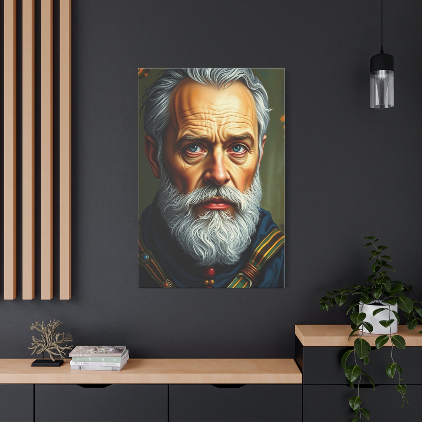
Exquisite Chromatic Tableau: Complete Guide to Color Mastery in Art and Design
The world of color represents one of the most fascinating aspects of visual perception and artistic expression. When we discuss an exquisite chromatic tableau, we are exploring the intricate relationships between hues, their psychological impacts, and the technical mastery required to create visually stunning compositions. Color theory forms the foundation of all visual arts, from traditional painting to modern digital design, and understanding its principles is essential for anyone seeking to create compelling visual experiences.
The study of color begins with understanding the visible spectrum of light. When white light passes through a prism, it separates into the familiar rainbow of colors that our eyes can perceive. This natural phenomenon reveals the fundamental truth that color is essentially light at different wavelengths. The human eye contains specialized cells called cones that respond to different wavelengths, allowing us to perceive millions of distinct color variations. This biological capability makes the creation and appreciation of an exquisite chromatic tableau possible.
In practical terms, color theory encompasses several key concepts that artists and designers must master. The color wheel, first developed by Sir Isaac Newton, organizes colors in a circular arrangement that demonstrates their relationships. Primary colors cannot be created by mixing other colors and serve as the foundation for all other hues. Secondary colors result from mixing two primary colors, while tertiary colors emerge from combining primary and secondary colors. This systematic organization helps creators understand how colors interact and influence one another.
The temperature of colors plays a crucial role in establishing mood and atmosphere within any composition. Warm colors such as red, orange, and yellow evoke feelings of energy, passion, and warmth. They tend to advance in visual space, appearing closer to the viewer. Cool colors including blue, green, and purple create sensations of calm, tranquility, and distance. They recede visually, creating depth and perspective. Mastering the balance between warm and cool tones is essential for creating a truly exquisite chromatic tableau that engages viewers on multiple levels.
Value refers to the lightness or darkness of a color, independent of its hue. This concept proves absolutely critical in creating contrast, dimension, and focal points within artwork. Artists manipulate value by adding white to create tints, black to create shades, or gray to create tones. The strategic use of value contrast can make certain elements pop forward while pushing others back, creating a sense of three-dimensional space on a two-dimensional surface. A well-executed chromatic tableau demonstrates sophisticated understanding of value relationships.
Saturation describes the intensity or purity of a color. Highly saturated colors appear vivid and bold, while desaturated colors appear muted and subdued. Artists often adjust saturation to create specific moods or to direct viewer attention. A composition might feature mostly desaturated colors with strategic pops of high saturation to create focal points. This technique proves particularly effective in creating visual hierarchy and guiding the viewer's eye through the artwork.
Evolution of Color Usage in Art
The history of color in art reflects technological advances, cultural shifts, and evolving aesthetic philosophies. Understanding this evolution provides valuable context for contemporary creators seeking to develop their own exquisite chromatic tableau. From prehistoric cave paintings to modern digital art, the use of color has continuously expanded in complexity and sophistication.
Prehistoric artists worked with a remarkably limited palette derived from natural earth pigments. Ochres provided yellows, reds, and browns, while charcoal supplied black. Despite these limitations, cave paintings demonstrate sophisticated understanding of form and the expressive power of color. The famous Lautrec cave paintings in France showcase how ancient artists used available pigments to create dynamic representations of animals and hunting scenes. This early work proves that an exquisite chromatic tableau need not rely on extensive color variety but rather on skillful application of available resources.
Ancient Egyptian art introduced more systematic color usage governed by symbolic conventions. Egyptian artists used color formulaically, with specific hues carrying predetermined meanings. Green symbolized fertility and regeneration, blue represented the divine and celestial realm, while red indicated chaos or vitality. The Egyptians developed methods for creating more stable and varied pigments, including Egyptian blue, considered the first synthetic pigment. Their flat, decorative approach to color created distinctive visual language that remained consistent for millennia.
Greek and Roman artists expanded the available color palette and developed more naturalistic approaches to representation. They created pigments from various minerals, plants, and even marine creatures. The famous Tyrian purple, derived from sea snails, became so valued that it symbolized imperial power. Roman frescoes demonstrate sophisticated color mixing and the use of perspective, though their full chromatic range has been partially lost to time and deterioration. These classical civilizations laid groundwork for understanding color relationships and spatial representation.
The medieval period saw color usage heavily influenced by religious symbolism and the constraints of available materials. Illuminated manuscripts showcase intricate color work using gold leaf and precious pigments. The expense of certain colors, particularly ultramarine blue made from lapis lazuli, affected their usage and symbolic importance. Churches featured stained glass windows that transformed light into brilliant chromatic displays, creating spiritual experiences through color. Medieval artists worked within strict iconographic traditions while developing technical innovations in pigment creation and application.
Color Harmony and Compositional Balance
Creating harmonious color relationships forms the cornerstone of any successful exquisite chromatic tableau. Color harmony occurs when colors work together to create a pleasing, balanced composition that engages viewers without causing visual discord. Understanding various color harmony systems provides artists with structured approaches to color selection while leaving room for creative interpretation and innovation.
Monochromatic harmony uses variations of a single hue, relying on changes in value and saturation to create interest. This approach creates inherently unified compositions with subtle sophistication. Artists working monochromatically must develop strong skills in manipulating value and texture to prevent monotony. Monochromatic schemes often evoke specific moods effectively, from the calm of various blues to the energy of different reds. This harmony type proves particularly effective when the goal is creating elegant, cohesive visual statements.
Analogous harmony employs colors that sit adjacent to each other on the color wheel. These naturally related hues create smooth, comfortable color transitions. An analogous scheme might include blue, blue-green, and green, or red, red-orange, and orange. This approach allows for more variety than monochromatic harmony while maintaining strong unity. Analogous harmonies frequently appear in nature, which partly explains their visual comfort. Successful analogous compositions typically designate one color as dominant, with others serving supporting roles.
Complementary harmony pairs colors opposite each other on the color wheel, such as red and green, blue and orange, or yellow and purple. These combinations create maximum contrast and vibration when placed at full saturation beside each other. Complementary schemes generate energy and demand attention. However, they require careful handling to avoid visual chaos. Artists often adjust the value or saturation of one or both complements to achieve balance. When used skillfully, complementary harmony produces some of the most dynamic and memorable chromatic tableaus.
Split-complementary harmony offers a variation on complementary schemes with slightly less tension. Instead of using colors directly opposite on the wheel, this approach uses a base color and the two colors adjacent to its complement. For example, blue might pair with red-orange and yellow-orange rather than orange itself. This arrangement maintains strong contrast while providing more color variety and flexibility. Split-complementary schemes often feel more sophisticated and less obvious than straight complementary pairings.
Triadic harmony uses three colors evenly spaced around the color wheel, such as red, yellow, and blue, or orange, green, and purple. These schemes offer bold contrast and color variety while maintaining balance. Triadic harmonies can feel vibrant and energetic but require careful management to prevent chaos. Typically, one color dominates while the others provide accents. This approach appears frequently in art that aims to feel playful, dynamic, or richly colorful.
Cultural Significance of Color Across Societies
Color carries profound cultural meanings that vary dramatically across different societies and historical periods. Creating an exquisite chromatic tableau requires awareness of these associations, especially when working for diverse audiences or exploring cultural themes. What signifies joy in one culture might represent mourning in another. Understanding these nuances prevents unintended miscommunication and allows artists to leverage color's symbolic power deliberately.
White symbolizes purity, cleanliness, and innocence in Western cultures, explaining its prevalence in wedding dresses and medical settings. However, white represents death and mourning in many Eastern cultures, particularly in China, India, and Japan. Traditional funeral garments in these societies are often white, creating exactly opposite associations from Western usage. This dramatic difference illustrates why cultural awareness matters in color selection for global audiences.
Red carries intense but varied meanings across cultures. In China, red symbolizes luck, prosperity, and happiness. Brides traditionally wear red, and red envelopes contain monetary gifts during celebrations. In Western contexts, red often represents passion, danger, or urgency. In South Africa, red signifies mourning. In India, red symbolizes purity and fertility, explaining its prominence in bridal attire. These varied associations require careful consideration when creating work for multicultural contexts.
Black suggests formality, sophistication, and power in Western fashion and design. However, it also represents mourning and death in Western funeral traditions. In ancient Egypt, black symbolized fertility due to the life-giving black silt deposited by the Nile. In Hinduism, black sometimes represents evil or negativity, though this varies by context. The complexity of black's meanings demonstrates how context and cultural background shape color interpretation.
Yellow holds varied significance across cultures. In Western contexts, yellow often represents happiness, optimism, and caution. In Japan, yellow traditionally represented courage and was associated with warriors. In China, yellow held imperial associations, reserved for the emperor. In many Latin American countries, yellow can represent death or mourning. In Thailand, yellow connects with Monday and the current king. These diverse associations show how geography and history create distinct color meanings.
Creating Depth and Dimension Through Color
Achieving a convincing sense of three-dimensional space on a two-dimensional surface represents one of art's great challenges. An exquisite chromatic tableau uses color strategically to create illusions of depth, volume, and atmospheric perspective. Mastering these techniques allows artists to guide viewer perception and create engaging, believable spatial environments.
Atmospheric perspective, also called aerial perspective, uses color to create the illusion of distance. This natural phenomenon occurs because atmospheric particles scatter light, causing distant objects to appear lighter, cooler, and less saturated than near objects. Leonardo da Vinci studied and documented this effect extensively. Artists apply this principle by making background elements progressively cooler, lighter, and less detailed. Mountains in the distance appear blue or purple, regardless of their actual color. This technique powerfully suggests depth and has been used since Renaissance times.
Warm and cool contrast creates spatial depth through color temperature. Warm colors naturally appear to advance toward the viewer, while cool colors recede. Placing warm colors in foreground elements and cool colors in background elements enhances depth perception. However, sophisticated artists sometimes reverse this expectation deliberately to create unusual spatial effects or draw attention to specific elements. Understanding the standard effect allows for both predictable depth creation and intentional rule-breaking.
Saturation also affects perceived depth. Highly saturated colors appear closer than desaturated ones. This principle explains why distant objects appear grayer or hazier. Artists can enhance depth by using bold, saturated colors in the foreground and progressively desaturating colors as elements move into the background. This technique works in combination with atmospheric perspective to create convincing spatial recession.
Color contrast creates focal points and suggests dimensional relationships. Areas of high contrast draw the eye and appear more important or closer. Low contrast areas recede and feel less significant. Strategic contrast placement guides viewer attention through a composition while creating spatial hierarchy. An exquisite chromatic tableau balances contrast carefully, creating clear focal points without losing unity.
Modeling with color involves showing form and volume through color variation rather than value alone. While traditional chiaroscuro relies primarily on light-to-dark gradations, color modeling uses temperature shifts and hue variations to suggest three-dimensional form. A sphere might transition from warm highlights to cool shadows, suggesting volume through temperature rather than only through value change. This approach creates more vibrant, colorful form description.
Color in Various Artistic Mediums
Different artistic mediums present unique opportunities and challenges for creating an exquisite chromatic tableau. Each medium has characteristic color qualities, technical requirements, and expressive possibilities. Understanding how color functions across various mediums allows artists to choose appropriate materials for their vision and to push medium-specific boundaries creatively.
Oil painting offers unparalleled flexibility in color manipulation. The slow drying time allows extensive blending, creating smooth gradations and subtle color transitions. Oil paints can be applied thickly for textured impasto effects or thinned to near transparency for delicate glazes. The medium's richness and depth have made it the preferred choice for centuries of master painters. Oil colors remain vibrant as they dry, maintaining their mixed appearance. However, certain pigments dry faster than others, and some colors yellow with age, requiring technical knowledge for long-term color stability.
Watercolor produces luminous, transparent color effects impossible in opaque media. The white of the paper shines through watercolor washes, creating characteristic glow. Watercolorists work from light to dark, building color through successive layers. The medium demands decisive execution, as overworking can create muddy results. Watercolor's fluidity creates beautiful color bleeds and granulation effects. Mastering water-to-pigment ratios and timing remains essential for controlling this unpredictable but rewarding medium.
Acrylic paint combines aspects of both oil and watercolor. It can be used thickly like oil or thinned to watercolor-like transparency. Acrylics dry quickly, preventing extensive blending but allowing rapid layering. The colors shift slightly as they dry, typically becoming darker. Once dry, acrylics become water-resistant, allowing overpainting without disturbing lower layers. The medium's versatility and user-friendliness have made it popular for contemporary artists. However, some painters find acrylic colors less rich than oils.
Pastels offer pure, vibrant color applied directly without dilution or mixing with medium. The colors remain vivid because no binder dulls the pigment. Soft pastels allow blending and layering, creating atmospheric effects. Hard pastels and pastel pencils enable detailed work. The medium's characteristic soft, velvety appearance suits certain subjects beautifully. However, pastel artwork requires fixative and careful handling to prevent smudging. The physical texture of tooth on paper holds the pigment and affects final appearance.
Digital painting provides ultimate flexibility in color manipulation. Artists can adjust colors instantly, experiment without wasting materials, and access millions of colors. Undo functions allow fearless experimentation. Layer systems enable complex color interactions and non-destructive editing. However, digital color appears in emitted light rather than reflected light, creating different visual qualities than traditional media. Some artists find digital work less tactile and immediate than physical painting. Others embrace digital possibilities to create effects impossible in traditional media.
Advanced Color Techniques for Professional Artists
Developing mastery in color usage requires understanding advanced techniques that separate competent work from truly exquisite chromatic tableaus. Professional artists employ sophisticated strategies to achieve precise effects, solve compositional problems, and express complex ideas through color. These techniques build upon fundamental color knowledge, applying it with refinement and intention.
Color keying establishes an overall tonal approach that unifies a composition. High-key works use predominantly light values, creating airy, optimistic feelings. Low-key works emphasize dark values, creating drama or mystery. Mid-key works balance light and dark. Within these frameworks, artists can use full color range while maintaining tonal consistency. Film and photography borrowed this terminology from painting, where it remains relevant for creating mood and unity.
Limited palette mastery allows artists to do more with less. Working with restrictions forces creative problem-solving and ensures harmony. Masters like Anders Zorn became famous for achieving full color range with just four colors. This approach teaches color relationships deeply, as artists must mix nearly every color they use. Limited palettes also create signature looks, making artists' work recognizable. Contemporary artists often use limited palettes to establish brand identity and stylistic consistency.
Chromatic grays offer sophisticated alternatives to mixing black with white. By combining complements or mixing all three primaries, artists create complex grays with subtle color biases. These grays harmonize naturally with other colors in the composition since they contain those same hues. Chromatic grays appear richer and more interesting than simple black-white mixtures. They also maintain the luminosity often lost when black enters mixtures.
Color discord uses intentionally clashing colors to create tension or discomfort. While harmony remains the goal for most work, discord serves specific expressive purposes. Artists might use discord to represent psychological disturbance, create visual energy, or subvert viewer expectations. Fauvists and Expressionists employed discord deliberately. Understanding harmony deeply allows artists to break rules purposefully rather than accidentally.
Underpainting establishes color foundation before final painting begins. A colored ground influences all subsequent layers, creating unity. Some artists use complementary underpainting, painting forms in colors opposite from intended final colors. Orange underpainting might show through final blue passages, creating vibration. Other artists use monochromatic underpainting to establish values, then add color in later stages. Each approach offers different advantages for workflow and final appearance.
Broken color technique places unmixed color strokes beside each other rather than blending them smoothly. This creates vibrancy and visual interest beyond what smooth blending achieves. Impressionists popularized this approach, but it remains relevant across styles. Broken color suits subjects requiring energy and light effects. It also prevents colors from becoming muddy through over-mixing, maintaining vividness throughout the painting process.
Color Trends and Contemporary Approaches
The world of color constantly evolves, with new trends emerging from fashion, design, technology, and cultural shifts. An exquisite chromatic tableau exists within this changing landscape, sometimes embracing current trends and sometimes deliberately countering them. Understanding contemporary color trends provides context for artistic choices and helps creators position their work within or against prevailing aesthetics.
Pantone's Color of the Year influences design industries globally. Each annual selection reflects cultural movements and zeitgeist. Recent selections like Very Peri and Viva Magenta represent attempts to capture collective moods and forward-looking attitudes. While fine artists need not follow commercial trends slavishly, awareness of these selections provides insight into color zeitgeist. These colors often filter into popular culture broadly, affecting viewer expectations and associations.
Maximalist color approaches have gained popularity as reactions against earlier minimalist trends. Maximalism embraces color abundance, pattern mixing, and bold combinations that previous eras might have considered excessive. This trend celebrates visual richness and reflects desires for joy and stimulation. Artists working in maximalist modes create exuberant chromatic tableaus that overwhelm and delight simultaneously. This approach requires confident handling to avoid chaos, but when executed well, delivers unforgettable visual experiences.
Neon and fluorescent colors have resurged in contemporary art and design. These ultra-saturated, artificial hues create futuristic, energetic effects. Digital media displays neons effectively, contributing to their popularity. Traditional artists use fluorescent paints and pigments to achieve similar effects. Neon colors often evoke 1980s nostalgia while simultaneously feeling cutting-edge. They work particularly well for night scenes, urban environments, and subjects exploring technology or artificiality. However, fluorescent pigments often lack lightfastness, presenting archival challenges.
Muted earth tones represent another significant contemporary trend. These desaturated, natural colors create calm, organic aesthetics. Influenced by Scandinavian design and wellness movements, earth tone palettes suggest authenticity and environmental consciousness. Terracotta, sage, ochre, and warm grays dominate this trend. Artists using earth tones create sophisticated, restrained chromatic tableaus that feel timeless rather than trendy. This approach suits subjects exploring nature, history, or contemplative themes.
Gradient and ombre effects have become increasingly popular, facilitated by digital tools that make creating smooth color transitions effortless. Sunset-inspired gradients moving through warm color ranges appear frequently. These smooth transitions create contemporary, often ethereal effects. While gradients risk appearing decorative or superficial, skilled artists integrate them meaningfully into compositions. The technique works particularly well for atmospheric effects, lighting situations, and abstract explorations.
Monochrome photography and single-color painting have gained renewed interest. Stripped of color variety, these works focus attention on form, texture, value, and composition. Contemporary monochrome work often explores conceptual ideas about perception, reduction, and essentialism. Some artists choose monochrome to create distance from reality, while others find it reveals truth more clearly than full color. This approach creates striking, memorable chromatic tableaus through restraint rather than abundance.
Scientific Understanding of Color Perception
The science behind how humans perceive color informs artistic practice, allowing creators of exquisite chromatic tableaus to understand the mechanisms underlying viewer responses. Color perception involves complex interactions between light, eyes, brain, and even cultural conditioning. Appreciating these processes helps artists predict effects and leverage perceptual phenomena intentionally.
The human eye contains two types of photoreceptor cells in the retina. Rods function primarily in low light conditions and do not perceive color. Cones function in brighter light and enable color vision. Most humans possess three types of cones, each sensitive to different wavelength ranges corresponding roughly to red, green, and blue. The brain interprets signals from these cones to construct our experience of color. This trichromatic vision allows humans to distinguish millions of color variations.
Color blindness results from absent or malfunctioning cone types. The most common form, red-green color blindness, affects approximately eight percent of males and less than one percent of females. People with this condition struggle to distinguish reds from greens. Blue-yellow color blindness exists but occurs more rarely. Complete color blindness, where individuals see only in grayscale, is extremely rare. Understanding color blindness encourages artists to consider accessibility, ensuring important distinctions don't rely solely on color differences.
Metamerism describes how colors can appear identical under certain lighting conditions while looking different under others. This occurs because different combinations of wavelengths can stimulate cones identically. Two fabrics might match perfectly in store lighting but appear different in daylight. Artists must consider lighting conditions where work will display. Museum and gallery lighting differs significantly from home or office lighting, potentially affecting color appearance. Professional artists often check work under multiple lighting conditions.
The Purkinje effect describes how color perception shifts in dim lighting. As light levels decrease, reds appear to darken faster than blues. This explains why red flowers seem to disappear at twilight while blue flowers remain visible longer. Artists depicting low-light scenes can leverage this effect for realism. The phenomenon results from the shift from cone vision to rod vision as lighting dims, with rods being more sensitive to blue-green wavelengths.
Chromatic adaptation allows the visual system to adjust to different lighting conditions, maintaining relatively stable color perception. Under warm incandescent lighting, the brain compensates, and white objects still appear white rather than orange. This remarkable ability helps humans function across varied lighting environments. However, it complicates color work, as artists must account for their own adaptation when mixing colors. Working in consistent lighting conditions helps maintain accurate color judgment.
Emotional Expression Through Color Selection
Color functions as powerful emotional language in visual art. An exquisite chromatic tableau leverages color's emotional resonances to communicate feelings, establish atmosphere, and create psychological depth. Understanding the emotional dimensions of color allows artists to speak directly to viewers' feelings, often bypassing verbal cognition to create immediate visceral responses.
Joy and optimism find expression through bright, warm colors with high saturation and value. Yellows, oranges, and warm pinks create feelings of happiness and energy. Compositions emphasizing these colors feel celebratory and positive. Artists depicting joyful subjects naturally gravitate toward these colors, but they can also use them ironically or to create contrast with darker content. The intensity and proportion of happy colors affects whether work feels genuinely joyful or overwhelming and manic.
Melancholy and sadness manifest through cool colors, particularly blues and purples, often at lower saturations and values. Desaturated colors suggest emotional withdrawal or depression. Monochromatic blue compositions create profound sadness. However, artists must handle these colors carefully to avoid cliché. Some contemporary artists explore sadness through unexpected color choices, proving that emotional expression need not follow obvious paths. The key lies in color relationships and context rather than individual color meanings.
Anger and aggression find expression through intense reds and harsh contrasts. High saturation reds, particularly when combined with blacks or sharp value contrasts, create feelings of danger and hostility. Clashing color combinations contribute to aggressive moods. Artists exploring themes of violence, conflict, or psychological disturbance often employ these intense, uncomfortable color relationships. The goal involves making viewers feel tension viscerally through color before consciously understanding content.
Peace and tranquility emerge from harmonious color relationships, often in cool or neutral ranges. Analogous color schemes in blues and greens create calm. Low contrast and even value distribution prevent visual conflict. Desaturated colors feel more peaceful than highly saturated ones. Artists creating meditative or spiritual work often use these peaceful palettes. The challenge involves creating interest within calm constraints, using subtle variations to prevent monotony while maintaining tranquil overall effect.
Anxiety and tension result from discord, unexpected combinations, and visual instability. Colors that clash create unease. Unusual color choices for familiar subjects create disorientation. High contrast and complex compositions contribute to anxious feelings. Expressionist artists used disturbing color relationships to externalize internal psychological states. Contemporary artists continue using color to evoke anxiety, particularly when addressing modern stress, environmental concerns, or social issues.
Nostalgia often employs faded, vintage-looking colors. Desaturated warm tones suggest old photographs or memories. Specific color combinations evoke particular eras through cultural associations. Sepia tones reference early photography. Technicolor-inspired palettes evoke mid-century aesthetics. Artists manipulating color to create nostalgic feelings connect viewers to past experiences or collective cultural memories. This approach requires understanding target audience's associations with specific color treatments.
Environmental Factors Affecting Color Appearance
The appearance of color is never absolute but always exists in context. Environmental factors dramatically influence how viewers perceive colors in an exquisite chromatic tableau. Successful artists consider these variables, ensuring work appears as intended or deliberately manipulating environmental factors to enhance effects. Understanding environmental influences allows greater control over viewer experience.
Lighting quality profoundly impacts color appearance. Natural daylight provides full spectrum illumination, revealing colors most accurately. However, natural light varies by time of day, weather, and season. Morning light appears cooler and clearer than warm afternoon light. Overcast days produce even, diffused light while sunny days create harsh contrasts. Artists working from life must account for changing natural light, either working quickly or returning to same conditions. Those creating work for specific locations should consider lighting conditions there.
Artificial lighting comes in various types, each affecting color differently. Incandescent bulbs produce warm, yellow-orange light that enhances warm colors while dulling cool ones. Fluorescent lights vary in color temperature but traditionally produced cool, greenish light that flatters blues while deadening reds. LED lighting now dominates, with color temperature ranging from warm to cool. Gallery and museum lighting is carefully controlled, typically using neutral, high-quality sources. Artists should view work under intended display lighting before considering it finished.
Surface texture interacts with light to affect color perception. Glossy surfaces reflect light directly, creating highlights and intense colors. Matte surfaces scatter light, producing even, softer color appearances. The same pigment appears more saturated when glossy than when matte. Artists choose finishes strategically based on desired effects. Highly textured surfaces create shadows and variations across single color areas, adding visual complexity. Understanding texture-light interactions helps artists predict final appearance.
Surrounding colors dramatically affect color perception through simultaneous contrast. A neutral gray appears warmer beside blue than beside orange. Colors appear lighter against dark backgrounds and darker against light backgrounds. Smart artists use these effects deliberately, placing colors strategically to enhance intended perceptions. Museum wall colors are chosen carefully to complement without competing with artwork. Artists can recommend display conditions or create work considering typical exhibition contexts.
Viewing distance changes color perception significantly. Details visible up close may blend optically from distance. Impasto texture reads as color variation close up but unified tone from afar. Pointillist paintings demonstrate this dramatically, with distinct dots blending into forms from viewing distance. Digital displays present similar considerations, with individual pixels invisible from normal viewing distances. Artists must consider intended viewing distance throughout creation, testing work from appropriate distances.
Historical Color Making and Pigment Development
The history of how humans create color reveals fascinating stories of chemistry, trade, and innovation. Understanding pigment history enriches appreciation of color in art and informs contemporary practice. Many historical pigments remain in use, while others have been replaced by safer or more stable alternatives. Knowledge of pigment properties helps artists make informed material choices for creating exquisite chromatic tableaus.
Natural earth pigments represent humanity's oldest colors. Ochres provide yellows, oranges, reds, and browns through iron oxide variations. Umber and sienna offer brown tones. These pigments appear in prehistoric cave paintings and remain available today due to excellent lightfastness and low cost. Their slightly muted, warm nature suits certain aesthetic approaches. Contemporary artists often use earth pigments for permanence and connection to art historical tradition.
Egyptian blue, the first synthetic pigment, was created around 2500 BCE. This copper-based blue served Egyptian artists for millennia before the formula was lost. Modern analysis has reconstructed the manufacturing process, revealing sophisticated understanding of materials and chemistry. Egyptian blue recently gained renewed interest due to its unique infrared fluorescence properties. This ancient pigment demonstrates how long humans have sought to expand available color ranges artificially.
Ultramarine blue, derived from lapis lazuli stone, once cost more than gold. Artists reserved this precious blue for only the most important elements, typically Virgin Mary's robes in religious paintings. The stone had to be imported from Afghanistan, and extensive processing was required to extract usable pigment. In 1826, synthetic ultramarine was developed, making this brilliant blue accessible to all artists. Historical paintings show restrained ultramarine usage compared to contemporary work employing it freely.
Tyrian purple, extracted from Mediterranean sea snails, required thousands of mollusks per gram of dye. This made purple extremely expensive, explaining its association with royalty and wealth. The exact shade became lost when production ceased during medieval times. Recent efforts have recreated Tyrian purple, revealing it as a brilliant reddish purple. This history explains purple's persistent luxury associations across cultures that knew of this rare dye.
Vermilion provided brilliant red color made from mercury and sulfur. Chinese artists used vermilion for thousands of years. European artists adopted it during medieval period. However, vermilion can darken over time, particularly in light exposure, and mercury toxicity raises safety concerns. Many artists have transitioned to cadmium red or modern synthetic alternatives. Historical vermilion passages sometimes appear darkened in old paintings, showing pigment instability effects.
Lead white served as the primary white pigment for centuries despite its toxicity. Its excellent handling properties, opacity, and flexibility made it essential for oil painting. Lead white reacts with sulfur compounds to form black lead sulfide, causing darkening in polluted environments. Health concerns led to development of safer alternatives. Titanium white, developed in the early 20th century, now dominates due to excellent opacity and safety. Some traditionalist artists still prefer lead white's unique properties despite risks.
Color Photography and Digital Imaging
Photography's relationship with color has evolved dramatically from early experimental processes to today's sophisticated digital imaging. Creating exquisite chromatic tableaus through photography requires understanding both technical color management and artistic color usage. Photography captures and interprets reality through color, but photographic color is never purely objective, always involving choices that shape final appearance.
Early color photography presented immense technical challenges. Autochrome plates, introduced in 1907, created color images through screen of dyed potato starch grains. Results appeared impressionistic and required long exposures. Kodachrome film, introduced in 1935, provided more practical color photography through complex multilayer dye process. Each color photography method rendered colors distinctively, creating characteristic looks that now evoke specific historical periods.
Modern color film consists of multiple layers sensitive to different wavelengths. Each layer contains corresponding color dyes that form during development. Film choice significantly affects color rendering. Some films emphasize warm tones while others favor cool. Saturation, contrast, and grain characteristics vary by film stock. Photographers choose films based on subject matter and desired aesthetic, recognizing film as interpretive medium rather than neutral recording tool.
Digital sensors capture color through filter arrays covering photosites. Most cameras use Bayer pattern filters with twice as many green-sensitive sites as red or blue, matching human eye sensitivity. Demosaicing algorithms interpret sensor data to create full-color images. This technical process affects color rendering. Different camera manufacturers use distinct algorithms and color science, creating characteristic color signatures. Understanding these technical foundations helps photographers make informed camera choices.
White balance correction adjusts color to compensate for light source color temperature. Cameras can set white balance automatically, use presets for typical situations, or allow manual setting. Correct white balance renders neutral colors neutrally. However, photographers sometimes deliberately choose incorrect white balance for creative effects, warming or cooling images intentionally. Understanding white balance provides control over overall color temperature and mood.
Raw file formats preserve maximum color information and editing flexibility. Unlike processed formats like JPEG, raw files contain minimally processed sensor data. Photographers develop raw files using software, making decisions about white balance, exposure, contrast, and color rendering. This workflow provides unprecedented control over final color appearance. Professional photographers typically shoot raw for important work despite larger file sizes and processing requirements.
Color grading in post-processing allows photographers to establish distinctive color aesthetics. Digital darkroom tools enable selective color adjustments, split toning, color lookups, and complex color manipulation. Film emulation presets simulate historical film stocks. Contemporary photographers develop signature color treatments that distinguish their work. This creative color manipulation parallels how painters choose and mix colors, demonstrating photography's artistic dimensions beyond documentary recording.
Color spaces in photography determine available color range and file behavior. sRGB suits web display and provides broad compatibility. Adobe RGB offers wider gamut for professional workflows. ProPhoto RGB provides maximum color information but requires careful handling. Photographers choose appropriate color space based on intended use and output requirements. Maintaining consistent color space usage throughout workflow prevents unintended color shifts.
Abstraction and Non-Representational Color Usage
Abstract art liberates color from representational constraints, allowing exploration of color relationships and effects independently. Creating exquisite chromatic tableaus through abstraction emphasizes color's inherent qualities rather than its descriptive functions. Abstract artists have pioneered color understanding, treating color as subject rather than merely tool for depicting subjects.
Color field painting emerged in the mid-20th century, featuring large areas of flat color with minimal variation. Artists like Mark Rothko and Barnett Newman explored color's emotional and spiritual dimensions through simplified compositions. Rothko's characteristic blocks of color create meditative, atmospheric effects. The scale and simplicity focus attention on color relationships and viewer psychological responses. This approach demonstrates how reduction can increase color impact rather than diminishing it.
Hard-edge abstraction employs precisely defined color areas with sharp boundaries. This style emphasizes geometric shapes and exact color relationships. Artists like Ellsworth Kelly and Frank Stella explored how specific colors in particular relationships create visual effects. Hard-edge work requires precise execution and careful color selection. The clean geometry prevents distraction from color interactions, making color relationships primary content.
Lyrical abstraction features more gestural, fluid color application. Artists in this mode use color expressively while avoiding representational reference. The process of applying color becomes visible and important. Drips, pours, gestural marks, and organic shapes create dynamic color distributions. This approach celebrates color's physical properties and emotional resonances while maintaining abstract focus.
Systematic color organization guides some abstract artists. Josef Albers studied how colors affect one another through his Homage to the Square series, placing colors in consistent formats to reveal interaction effects. This methodical approach treats color investigation scientifically while producing aesthetically compelling results. Such systematic exploration has contributed significantly to color theory understanding while producing valuable artworks.
Color gradients feature prominently in much abstract work. Smooth transitions between colors create atmospheric, meditative effects. Digital tools make creating perfect gradients simple, but hand-painted gradients reveal process and human touch. Some abstract artists create entire paintings of subtle gradients, exploring how slowly changing color affects perception and emotion. This minimalist approach forces attention to subtle color shifts often overlooked in more complex work.
Kinetic and op art explore perceptual effects through precise color relationships. Artists create optical vibration, apparent movement, or spatial ambiguity through specific color combinations. Complementary colors at full saturation placed in geometric patterns create intense visual effects. These works demonstrate color's power to affect perception dramatically. Creating such work requires deep understanding of color interaction and optical phenomena.
Contemporary abstract artists often combine multiple approaches, mixing gesture with geometry, representation with abstraction. They may use color symbolically while maintaining abstract composition. Digital tools enable new abstract color explorations impossible in traditional media. The boundary between abstraction and representation remains porous, with many artists working in interstitial spaces where color functions both abstractly and descriptively.
Color in Cultural and Religious Contexts
Color carries profound significance in religious and ceremonial contexts across cultures. Understanding these meanings enriches artwork addressing spiritual themes and prevents unintended disrespect when working with culturally significant subjects. An exquisite chromatic tableau dealing with religious or ceremonial subjects requires sensitivity to traditional color symbolism while potentially offering fresh interpretations.
Christianity developed extensive color symbolism through centuries of church tradition. White represents purity and holiness, used for Christmas and Easter. Red symbolizes martyrdom and the Holy Spirit, appropriate for Pentecost and saints' feast days. Purple indicates penitence and preparation, used during Advent and Lent. Green represents ordinary time and growth. Gold signifies divine glory and heaven. Ecclesiastical art respects these conventions while sometimes subverting them for theological or artistic reasons.
Buddhist traditions assign meaning to five primary colors representing Buddha's teachings. Blue represents wisdom and universal compassion. White signifies purity and spiritual liberation. Yellow represents rootedness and renunciation. Red symbolizes life force and achievement. Green represents balance and harmony. Tibetan Buddhist art employs vibrant colors following these principles. Mandalas demonstrate sophisticated color symbolism and precise color placement following religious requirements.
Hindu color symbolism connects to deities and spiritual concepts. Saffron represents fire and purity, appearing in monks' robes and religious flags. Red signifies sensuality and passion but also purity in certain contexts. Brides traditionally wear red. Blue associates with Krishna and represents infinity and the divine. Green represents life and happiness. Yellow connects with knowledge and learning. Hindu festival celebrations feature exuberant color usage, from colored powders during Holi to elaborate decorations for Diwali.
Islamic art tradition historically emphasized geometric pattern over representational imagery, creating sophisticated color usage within abstract frameworks. Blue holds special significance, appearing prominently in mosque decoration. Green associates with paradise and the Prophet Muhammad. Geometric patterns in tiles, carpets, and architectural decoration demonstrate masterful color coordination. Calligraphy in Islamic art often features elaborate color enhancement, elevating sacred texts visually.
Native American traditions vary significantly by tribe and region, but many assign spiritual significance to cardinal directions and associated colors. Black, white, red, and yellow frequently represent four directions, with specific meanings varying by tradition. Ceremonial objects and clothing follow traditional color usage conveying specific meanings. Contemporary Native American artists negotiate between traditional color usage and modern artistic freedom, sometimes maintaining conventions and sometimes deliberately breaking them to comment on cultural change.
African spiritual traditions encompass diverse color symbolism varying by culture and geography. Many West African traditions assign specific meanings to colors in ceremonial contexts. White may represent spiritual purity or ancestors. Red might symbolize life force or danger. Black could indicate maturity and spiritual power. Contemporary African artists often reference traditional color symbolism while addressing modern themes, creating dialogue between tradition and change.
Jewish tradition assigns meaning to colors in various contexts. Blue features prominently, historically derived from tekhelet dye. White represents purity and simplicity, explaining its prevalence in religious garments. Gold appears in religious objects symbolizing divine presence. The lighting of candles in Jewish ceremony creates warm color associations with spiritual observance. Contemporary Jewish artists explore how traditional color symbolism operates in modern contexts.
Conclusion:
Exquisite Chromatic Tableau: Complete Guide to Color Mastery in Art and Design illuminates the transformative power of color in visual expression and interior aesthetics. Color is far more than a decorative tool; it is a universal language that conveys mood, emotion, symbolism, and narrative. From subtle tonal harmonies to bold, contrasting palettes, mastery of color allows artists and designers to craft immersive experiences that captivate the eye, influence perception, and elevate spaces. This comprehensive exploration of chromatic principles demonstrates how understanding hue, saturation, contrast, and composition can reshape the way we experience art and design, both on canvas and within living environments.
At its core, color mastery engages both intellect and emotion. Colors evoke psychological responses, influence energy, and establish atmosphere. Warm tones like reds, oranges, and golds stimulate vitality, passion, and excitement, while cool blues, greens, and purples inspire calm, introspection, and serenity. By thoughtfully applying these principles in wall art, designers and homeowners can create spaces that are visually cohesive, emotionally resonant, and experientially dynamic. Each canvas or tableau becomes a narrative of light and hue, inviting viewers to explore subtle nuances and interpretive depth within every brushstroke.
The versatility of chromatic expression ensures that Exquisite Chromatic Tableau is applicable across diverse artistic and interior design contexts. Bold, saturated canvases serve as dramatic focal points in modern or minimalist spaces, while muted, pastel palettes harmonize with sophisticated, layered interiors. Abstract compositions leverage unexpected color juxtapositions to challenge perception and spark curiosity, whereas realistic interpretations demonstrate the elegance of naturalistic tones. In each case, color functions as both a unifying and transformative element, seamlessly integrating artistic expression with the character of the surrounding environment.
Color is also inherently symbolic. Across cultures and traditions, hues carry layered meanings — red signifies passion or courage, blue evokes tranquility or wisdom, and green conveys growth or renewal. In a chromatic tableau, these associations amplify the narrative power of the artwork, allowing colors to communicate stories, concepts, and emotion beyond the literal form. For interiors, this symbolic richness adds dimension, providing homeowners with the opportunity to curate spaces that reflect personal values, moods, or aspirational themes.
From a technical perspective, color mastery involves not only selection but also composition and interaction. Artists manipulate contrast, layering, gradient, and saturation to create depth, focus, and harmony within a piece. Complementary and analogous schemes guide the viewer’s gaze, enhance balance, and establish rhythm across the canvas. The use of light and shadow further enriches chromatic expression, transforming flat surfaces into multidimensional tableaux that engage perception and encourage prolonged visual exploration. This attention to detail ensures that color is not simply applied; it is orchestrated, resulting in dynamic compositions that resonate with both sophistication and emotional impact.
In addition, the application of color in design extends beyond aesthetic appeal to influence the overall ambiance of a space. Interiors adorned with expertly curated chromatic artworks achieve equilibrium between energy and serenity, vibrancy and subtlety. Strategic placement of color-rich canvases can define zones within open-plan spaces, complement architectural features, or harmonize with textures and furnishings. The interplay of hue, material, and light allows homeowners to craft immersive environments where each element contributes to a holistic sensory experience.
