


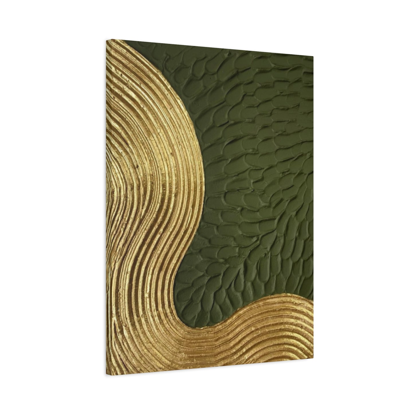
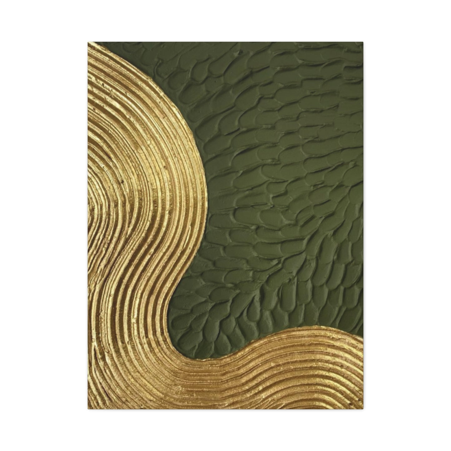
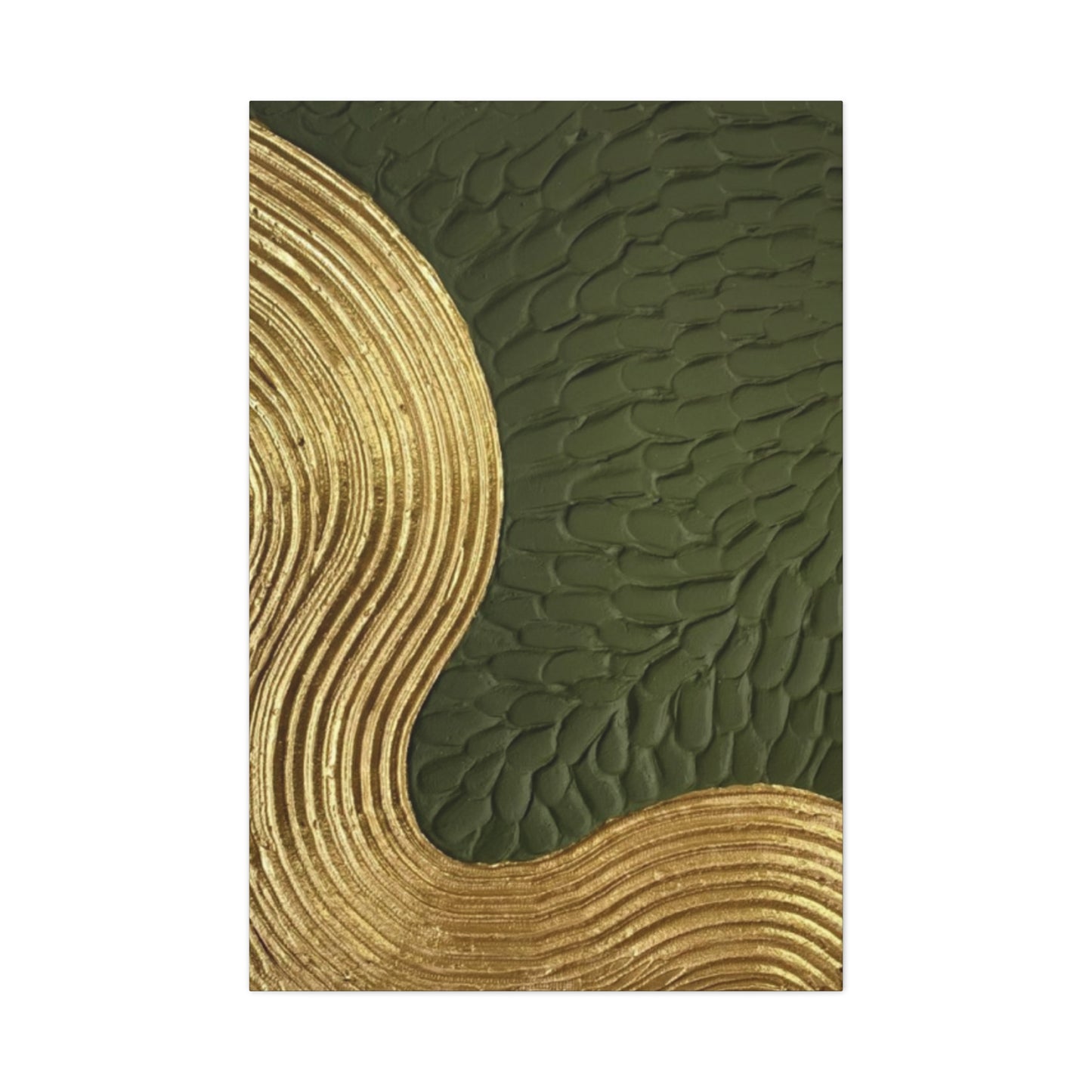
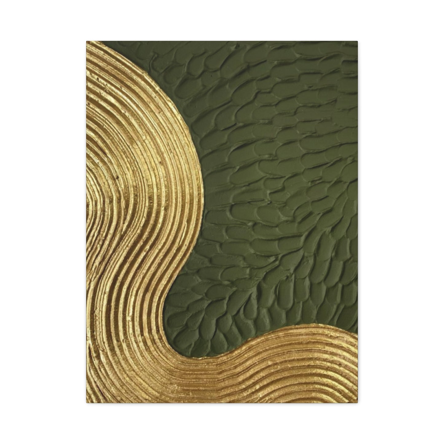
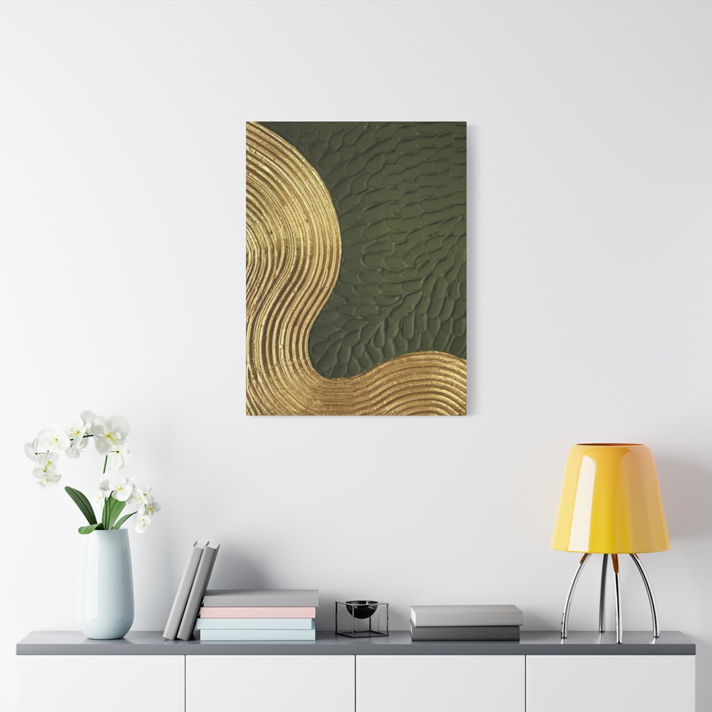
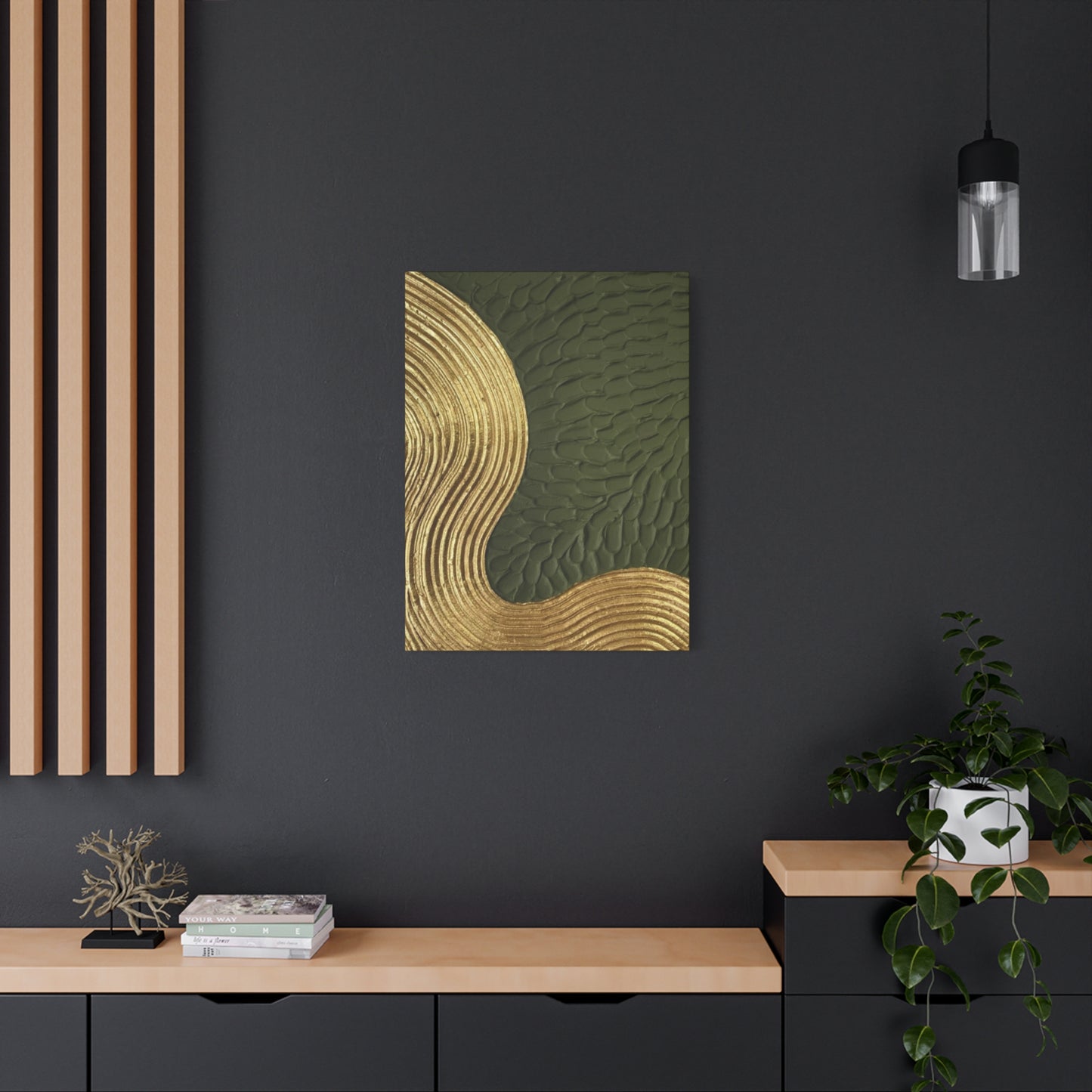
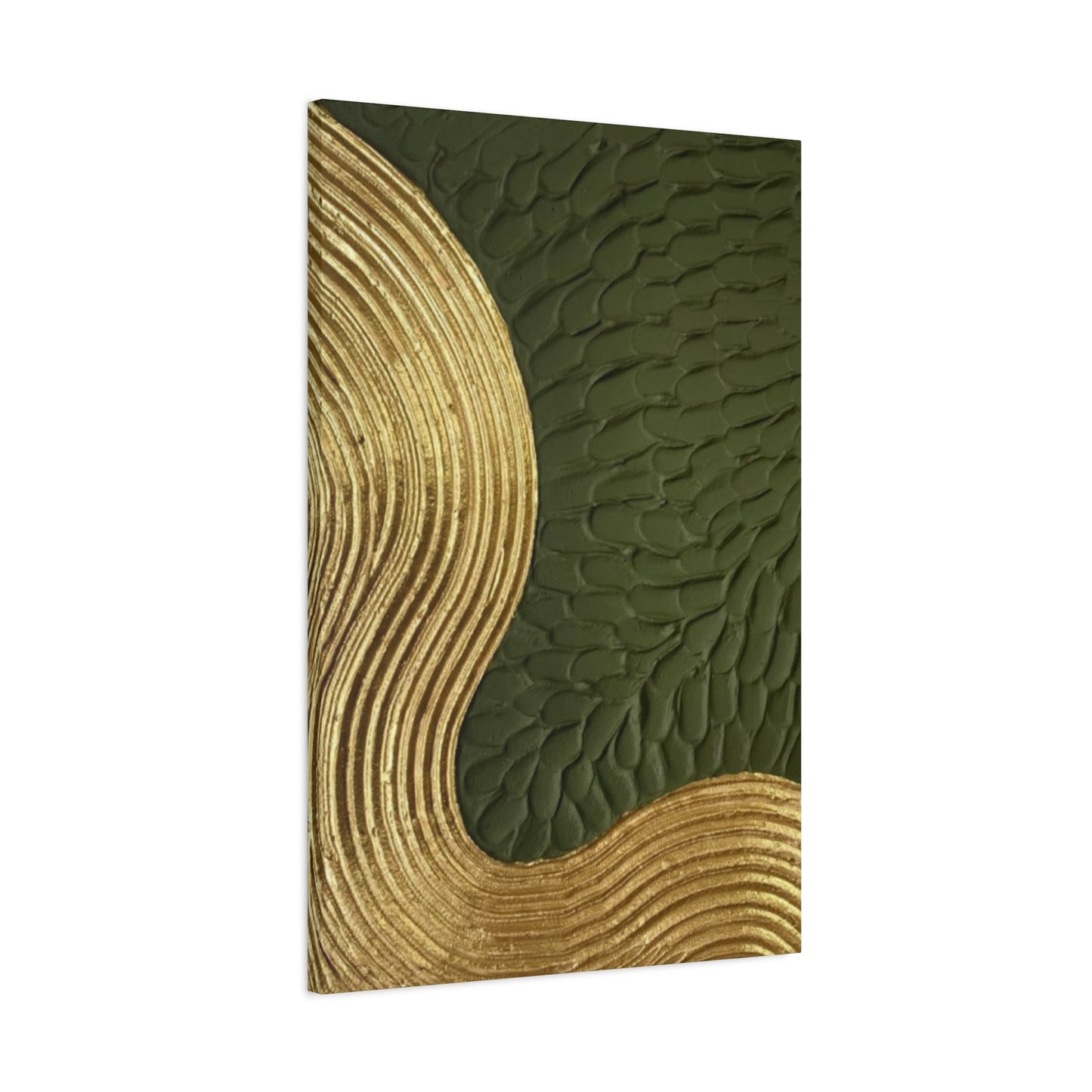
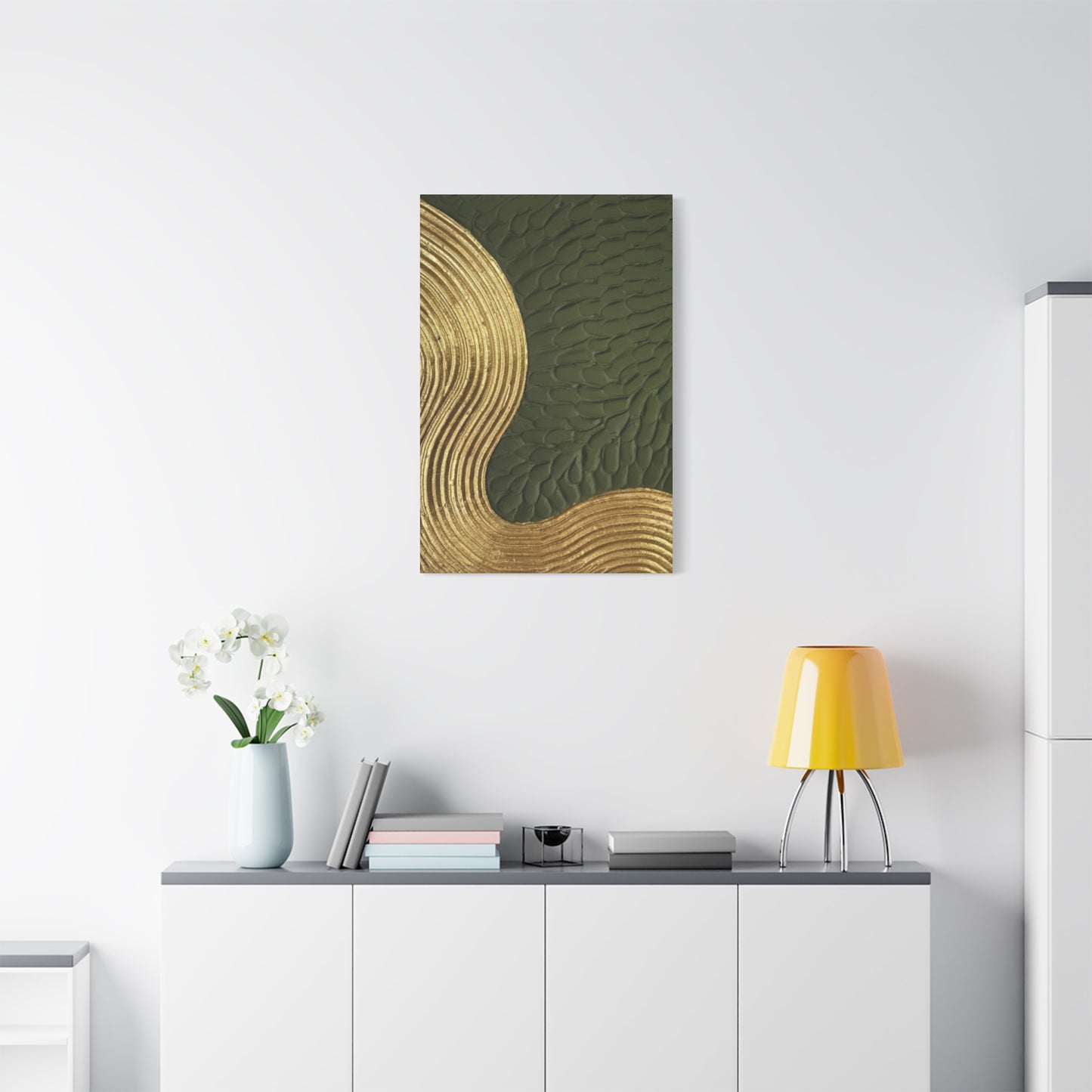
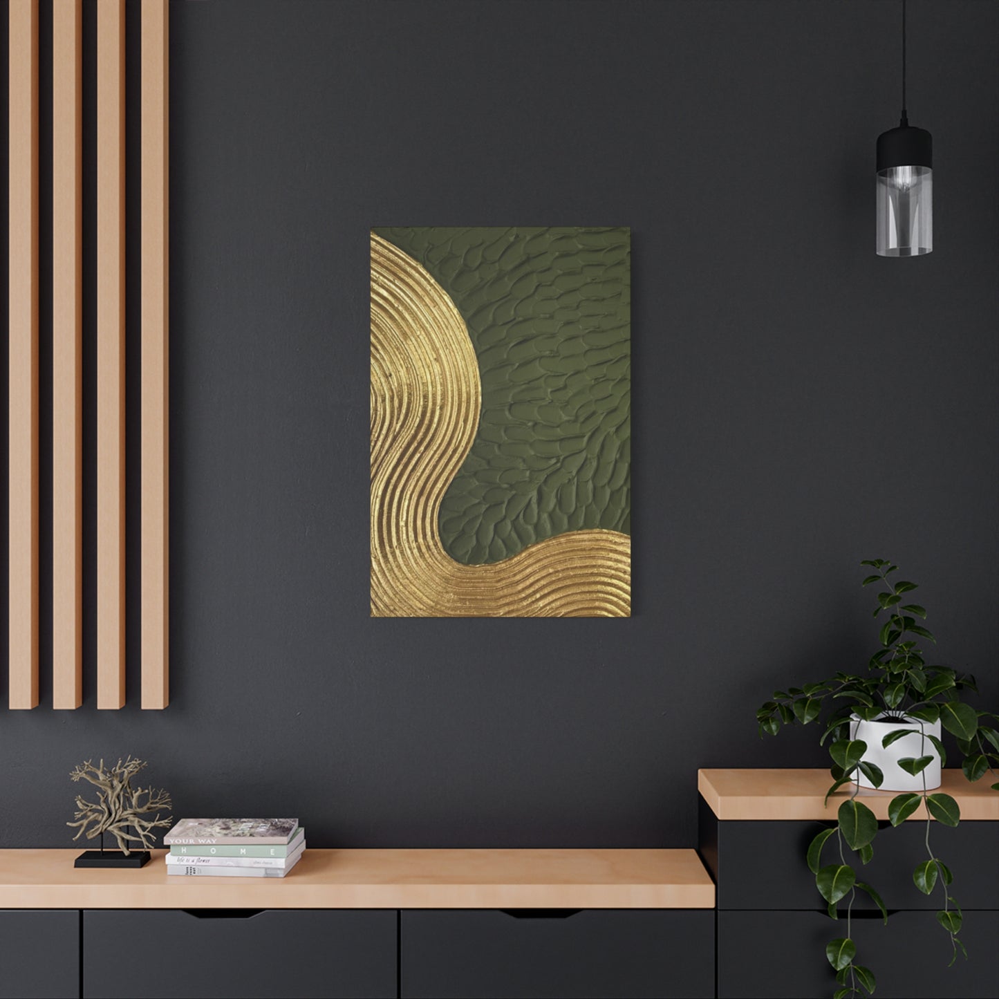
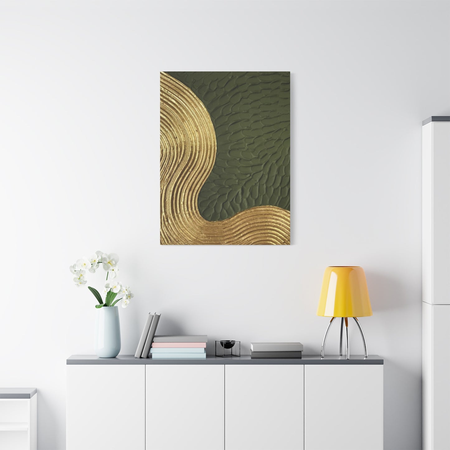
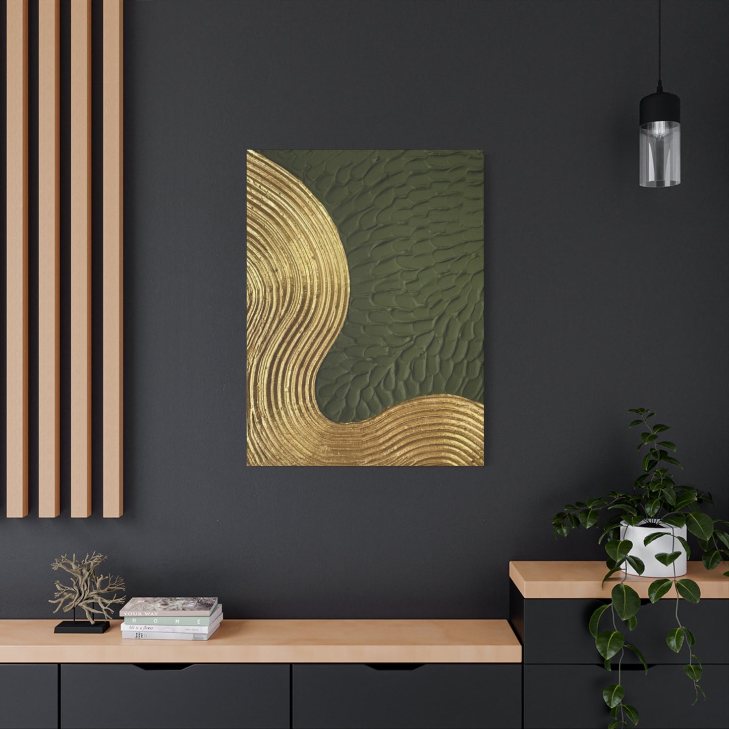
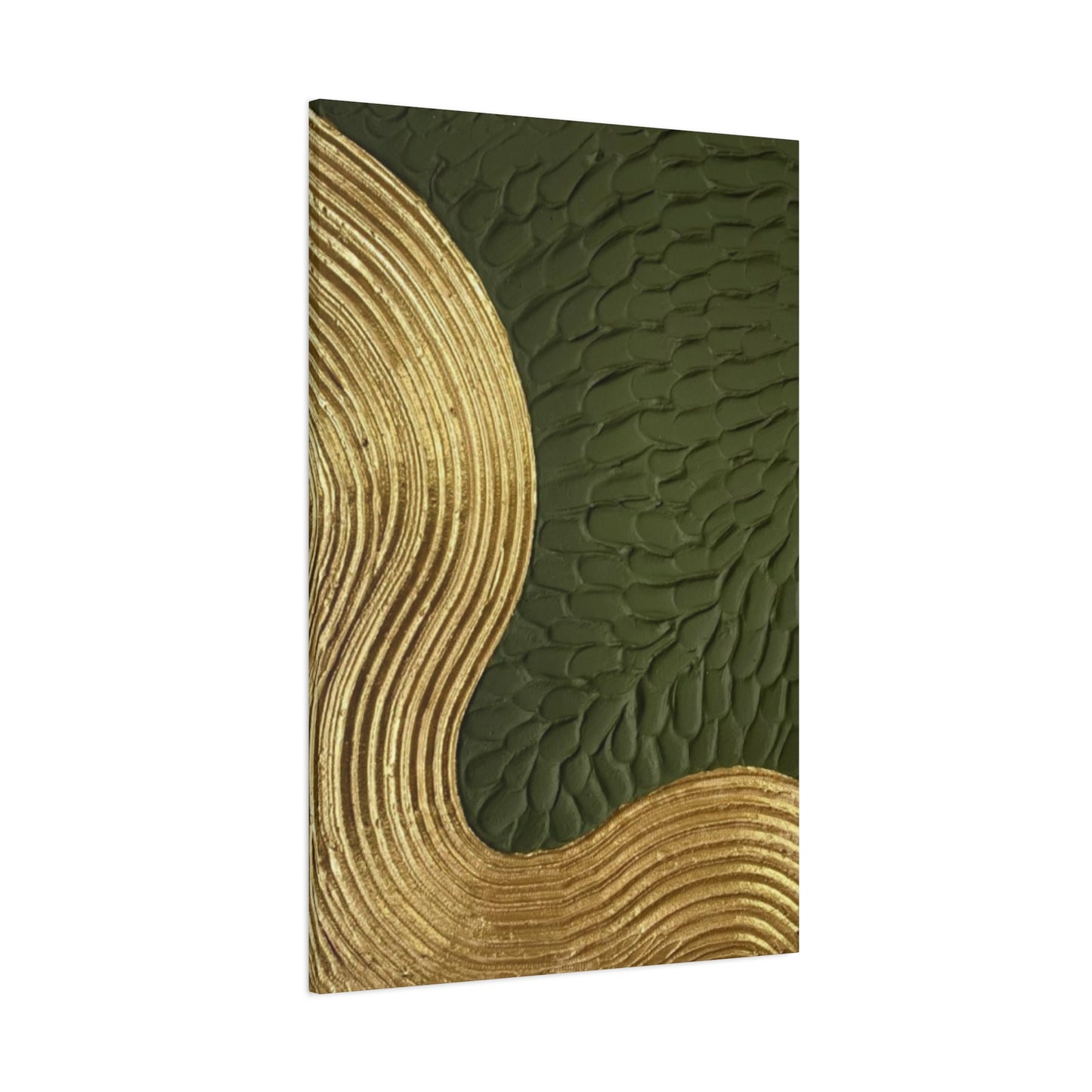
Golden & Olive Green Color Drawing Wall Art & Canvas Prints
Golden & Olive Green Color Drawing Wall Art & Canvas Prints
Couldn't load pickup availability

Golden Olive Green Wall Art: Complete Guide to Nature-Inspired Home Decorating
Golden olive green wall art represents one of the most sophisticated and versatile color combinations in contemporary home decoration. This harmonious blend of warm golden undertones with the calming essence of olive green creates visual compositions that resonate deeply with our innate connection to nature. The popularity of this color palette has surged in recent years as homeowners seek to create tranquil, earth-connected environments that offer respite from the digital world's overwhelming stimuli.
The psychological impact of golden olive green wall art extends far beyond mere aesthetic appeal. Research in color psychology demonstrates that green hues promote relaxation, reduce eye strain, and foster emotional balance, while golden tones add warmth, optimism, and energy to any room. When combined, these colors create a perfect equilibrium that makes occupants feel both grounded and uplifted simultaneously.
This color combination draws inspiration from natural landscapes where golden sunlight filters through olive groves, creating dappled patterns of light and shadow. Mediterranean regions, known for their ancient olive trees and sun-drenched hillsides, provide endless inspiration for artists and decorators working with this palette. The result is wall art that brings the serenity and timeless beauty of these landscapes into our homes.
Golden olive green wall art works exceptionally well across various artistic styles, from abstract expressionism to realistic botanical illustrations. Artists often use this palette to create pieces that feel both contemporary and timeless, appealing to diverse tastes and decorating preferences. The versatility of these colors allows for subtle, sophisticated compositions as well as bold, statement-making pieces that command attention.
The growing trend toward sustainable and eco-conscious living has further elevated the popularity of golden olive green wall art. This palette directly connects to themes of environmental awareness, natural living, and sustainable design practices. Homeowners who choose this color scheme often appreciate its association with organic materials, renewable resources, and ecological harmony.
Drawing with Earthy Tones: Artistic Techniques and Applications
Drawing with earthy tones, particularly golden olive green combinations, requires understanding the subtle interplay between warm and cool undertones. Artists working in this palette must master the delicate balance between the yellow-based warmth of golden hues and the blue-based coolness inherent in olive green. This balance creates depth, dimension, and visual interest that captures viewers' attention while maintaining overall harmony.
Traditional drawing mediums excel when working with earthy tone palettes. Colored pencils allow for precise color layering and blending, enabling artists to achieve the subtle gradations characteristic of golden olive green compositions. Pastels provide rich, velvety textures that capture the organic feel of natural materials, while charcoal and graphite can create dramatic contrasts and define structural elements within the composition.
The technique of cross-hatching becomes particularly effective when working with golden olive green palettes. By varying the direction, density, and pressure of pencil strokes, artists can create complex color mixing effects that would be difficult to achieve through other methods. This approach is especially valuable when depicting natural subjects like foliage, tree bark, or landscape elements where organic textures are paramount.
Watercolor techniques offer another dimension to earthy tone artwork. The transparent nature of watercolor allows colors to interact and blend in unpredictable ways, creating the organic, flowing effects that characterize natural phenomena. Golden olive green watercolor paintings often feature wet-on-wet techniques that produce soft, atmospheric effects reminiscent of morning mist or dappled sunlight.
Digital drawing platforms have revolutionized the creation of earthy tone artwork. Artists can now experiment with color combinations instantaneously, adjusting hue, saturation, and brightness to achieve perfect golden olive green harmonies. Digital tools also allow for easy replication and modification of successful color schemes, making it simpler to create series or collections of related works.
Contemporary artists often combine traditional and digital techniques, creating hybrid works that leverage the best aspects of both approaches. This might involve creating initial sketches with traditional media, then scanning and enhancing them digitally, or printing digital compositions onto textured papers that add tactile dimensions to the finished piece.
The importance of understanding color temperature cannot be overstated when working with golden olive green palettes. Artists must recognize how different lighting conditions affect color perception and adjust their techniques accordingly. Natural daylight reveals the true character of these colors, while artificial lighting can shift the balance toward warmer or cooler interpretations.
Olive Green Aesthetic Decor: Creating Cohesive Design Schemes
Olive green aesthetic decor represents a sophisticated approach to home decoration that emphasizes natural harmony, understated elegance, and timeless appeal. This design philosophy centers on the premise that our living environments should reflect and enhance our connection to the natural world, creating sanctuaries that promote well-being and peace.
The foundation of successful olive green aesthetic decor lies in understanding the color's versatility and its ability to serve as both a neutral background and a statement accent. Unlike more saturated greens that can overwhelm or dominate, olive green possesses enough gray undertones to function as a sophisticated neutral while maintaining its connection to nature. This characteristic makes it an ideal choice for creating balanced, harmonious decorating schemes.
Incorporating olive green aesthetic decor begins with selecting key anchor pieces that establish the room's overall tone and direction. These might include large-scale wall art featuring golden olive green themes, upholstered furniture in complementary earth tones, or architectural elements like painted accent walls. Once these foundational elements are in place, additional layers can be added to build depth and visual interest.
Texture plays a crucial role in olive green aesthetic decor. Natural materials like jute, linen, wool, and raw wood complement the organic feel of the color palette while adding tactile interest. Woven baskets, ceramic pottery, and stone accessories further enhance the natural theme while providing functional storage and display options.
Lighting considerations are paramount when implementing olive green aesthetic decor. Natural light brings out the true character of olive green, revealing its complex undertones and creating dynamic color shifts throughout the day. Artificial lighting should be carefully selected to complement rather than compete with the natural color variations. Warm white LED fixtures often provide the best results, avoiding the harsh blue undertones of cooler lighting that can make olive green appear muddy or lifeless.
Plant life forms an essential component of olive green aesthetic decor. Living plants not only complement the color scheme naturally but also contribute to improved air quality and psychological well-being. Consider incorporating plants with silvery-green foliage like eucalyptus, sage, or olive trees in containers that coordinate with the overall design scheme.
The principles of minimalism often inform olive green aesthetic decor, emphasizing quality over quantity and allowing each carefully selected piece to shine. This approach prevents the accumulation of visual clutter while ensuring that every element contributes meaningfully to the overall composition. The result is a curated, intentional environment that feels both sophisticated and welcoming.
Wall Art in Golden Hues: Exploring Warm Color Harmonies
Wall art in golden hues brings warmth, energy, and sophistication to any living environment. These pieces serve as focal points that can transform the entire atmosphere of a room, creating inviting gathering areas that encourage relaxation and conversation. The psychological effects of golden colors are well-documented, with research showing their ability to stimulate creativity, promote optimism, and create feelings of comfort and security.
The spectrum of golden hues available to artists and decorators ranges from pale, creamy yellows to rich, burnished golds with bronze undertones. Each variation within this range offers unique decorating possibilities and emotional resonances. Lighter golden tones create airy, cheerful atmospheres ideal for kitchens, breakfast nooks, and children's rooms, while deeper golden shades provide dramatic sophistication suitable for formal dining rooms, libraries, and master bedrooms.
Metallic golden accents within wall art add dimension and luxury to compositions. These might include gold leaf applications, metallic paint techniques, or incorporated materials like brass or copper elements. The reflective qualities of metallic surfaces create dynamic visual effects that change throughout the day as natural and artificial light sources shift and change intensity.
The historical significance of golden hues in art cannot be overlooked. From ancient Egyptian tomb paintings to Byzantine mosaics to Renaissance religious art, gold has long symbolized divinity, prosperity, and eternal value. Contemporary wall art in golden hues draws upon this rich cultural heritage while adapting these traditional associations for modern living environments.
Creating effective wall art in golden hues requires understanding how these colors interact with different base materials and surface treatments. Canvas preparations, paper selections, and substrate choices all influence the final appearance of golden pigments. Artists often experiment with various priming techniques and surface textures to achieve specific effects, from smooth, luminous finishes to rough, organic textures that catch and reflect light irregularly.
The integration of golden hued wall art into existing decorating schemes requires careful consideration of surrounding colors and materials. Golden tones pair beautifully with deep blues, creating dramatic complementary contrasts, while combinations with greens produce harmonious, nature-inspired palettes. Neutral backgrounds in whites, grays, and beiges allow golden artwork to take center stage without competing visual elements.
Contemporary trends in golden hued wall art often incorporate mixed media approaches, combining traditional painting techniques with collage, photography, and digital elements. These hybrid approaches create rich, layered compositions that offer multiple points of visual interest and reward closer examination. The result is artwork that remains engaging over time, revealing new details and subtleties with continued viewing.
Nature-Inspired Color Art: Bringing the Outdoors Inside
Nature-inspired color art celebrates the incredible diversity and beauty of natural color palettes while bringing the psychological benefits of outdoor environments into our homes. This artistic approach recognizes that humans have an innate connection to natural settings and that incorporating these color relationships into our living environments can significantly impact our well-being, productivity, and overall quality of life.
The study of natural color relationships reveals sophisticated harmonies that have evolved over millions of years. From the subtle gradations found in sunset skies to the complex interplay of colors in autumn foliage, nature provides an endless source of inspiration for artists and decorators. These naturally occurring combinations often feature the golden olive green palettes that have become increasingly popular in contemporary home decoration.
Creating effective nature-inspired color art requires careful observation of natural phenomena and an understanding of how colors behave under different lighting conditions. Artists must learn to see beyond obvious color relationships to perceive the subtle undertones and transitional hues that give natural scenes their depth and authenticity. This observational skill development often involves spending time outdoors with sketching materials, capturing color notes and relationships for later studio work.
The seasonal cycle provides a rich source of inspiration for nature-inspired color art. Spring palettes feature fresh, vibrant greens combined with delicate flower colors, while summer compositions might emphasize deeper, more saturated tones. Autumn offers spectacular displays of golden, orange, and red hues, often set against olive and bronze green backgrounds, while winter scenes provide opportunities to explore subtle gray and blue relationships with occasional warm accent colors.
Botanical subjects form a cornerstone of nature-inspired color art. Artists working in this genre must understand plant structure, growth patterns, and seasonal changes to create convincing and beautiful compositions. The challenge lies in capturing not just the visual appearance of plant subjects but also their essential character and life force. This requires going beyond simple color matching to understand the underlying principles that govern natural color relationships.
Landscape-inspired pieces offer opportunities to work with broader color harmonies and atmospheric effects. These compositions might capture the golden hour lighting conditions that create dramatic color shifts across natural landscapes, or the subtle color variations found in different geographical regions. Mediterranean landscapes, with their characteristic olive groves and golden hillsides, provide particularly rich inspiration for artists working with golden olive green palettes.
The incorporation of texture and surface treatment becomes crucial in nature-inspired color art. Natural surfaces are rarely smooth or uniform, instead featuring complex textures that interact with light in interesting ways. Artists must develop techniques for suggesting these surface qualities while maintaining overall compositional coherence and visual appeal.
Contemporary approaches to nature-inspired color art often incorporate photographic elements, digital manipulation, and mixed media techniques. These approaches allow artists to capture and interpret natural color relationships in new ways, creating pieces that feel both authentic and contemporary. The key is maintaining the essential spirit and harmony of natural color relationships while adapting them for modern artistic expression.
Golden Green Vibes: Psychological Impact and Mood Enhancement
Golden green vibes represent more than just aesthetic choices; they create powerful psychological environments that can significantly influence mood, productivity, and overall well-being. The combination of golden warmth with green's calming properties produces a unique emotional resonance that appeals to our deepest psychological needs while creating environments that feel both energizing and peaceful.
Color psychology research demonstrates that green hues activate the parasympathetic nervous system, promoting relaxation and reducing stress hormones like cortisol. When combined with golden tones, which stimulate creativity and optimism, the result is a color combination that simultaneously calms and energizes. This dual action makes golden green palettes ideal for environments where people need to feel both relaxed and alert, such as home offices, creative studios, and meditation areas.
The biophilic design movement recognizes humans' innate connection to natural environments and seeks to incorporate natural elements into built spaces. Golden green color schemes directly support biophilic design principles by mimicking the color relationships found in natural settings. This connection to nature can reduce blood pressure, improve concentration, and enhance overall psychological well-being.
Different shades within the golden green spectrum produce varying psychological effects. Lighter, more yellow-leaning combinations create cheerful, optimistic atmospheres that encourage social interaction and creative thinking. These palettes work particularly well in communal areas like kitchens, family rooms, and children's playrooms. Deeper, more olive-toned combinations promote contemplation and focus, making them ideal for libraries, bedrooms, and meditation areas.
The temporal aspects of golden green vibes deserve consideration. These colors change dramatically under different lighting conditions throughout the day, creating dynamic environments that shift and evolve. Morning light brings out the golden aspects, creating energizing atmospheres perfect for starting the day, while evening light emphasizes the green components, promoting relaxation and preparation for rest.
Cultural associations with golden green combinations vary across different societies but generally remain positive. In Western cultures, these colors often evoke associations with prosperity, growth, and natural abundance. Eastern philosophies might connect these palettes with balance, harmony, and spiritual growth. Understanding these cultural dimensions helps inform decorating decisions and ensures that color choices align with intended psychological effects.
The physiological impact of golden green vibes extends beyond psychological effects. Studies suggest that exposure to green hues can reduce eye strain and visual fatigue, particularly important in our screen-dominated world. The addition of golden tones provides sufficient contrast and visual interest to prevent the monotony that can occur with single-color schemes, maintaining visual engagement while supporting eye comfort.
Seasonal Affective Disorder (SAD) and other light-related mood disorders may benefit from exposure to golden green color schemes. The warm golden components can partially compensate for reduced natural light during darker months, while the green elements provide psychological connections to growth and renewal. While not a replacement for proper medical treatment, these color environments can provide supportive atmospheric conditions for mental health management.
Creating effective golden green vibes requires understanding the interplay between color, light, and space. Wall art serves as a crucial component in establishing these atmospheres, providing focal points that anchor the color scheme while contributing to the overall psychological impact. The key is selecting pieces that not only feature appropriate colors but also evoke the desired emotional responses through their subject matter, composition, and artistic treatment.
Simple Olive Wall Drawings: Minimalist Approaches to Natural Beauty
Simple olive wall drawings represent the essence of minimalist artistic expression, capturing the fundamental beauty of natural forms through careful reduction and distillation. This approach recognizes that powerful artistic statements often emerge not from complexity but from the skillful elimination of non-essential elements, leaving only what truly matters for emotional and aesthetic impact.
The philosophy behind simple olive wall drawings aligns with broader minimalist movements in art and design. These movements emphasize that beauty lies not in abundance but in careful selection and presentation. By focusing on essential forms, colors, and relationships, artists can create works that feel both contemporary and timeless, appealing to viewers across different cultural backgrounds and personal preferences.
Line quality becomes paramount in simple olive wall drawings. Each mark must serve a specific purpose, whether defining form, suggesting texture, or creating movement within the composition. Artists working in this style often spend considerable time developing their line-making skills, learning to create expressive, confident strokes that convey maximum information with minimal means. The goal is achieving economy of expression without sacrificing emotional impact or visual interest.
The selection of subject matter for simple olive wall drawings requires careful consideration. Botanical subjects like olive branches, leaves, and simple geometric forms derived from natural shapes often work well. The challenge lies in identifying the essential characteristics that define these subjects and eliminating everything else. This process of distillation requires deep observation and understanding of the subject's fundamental nature.
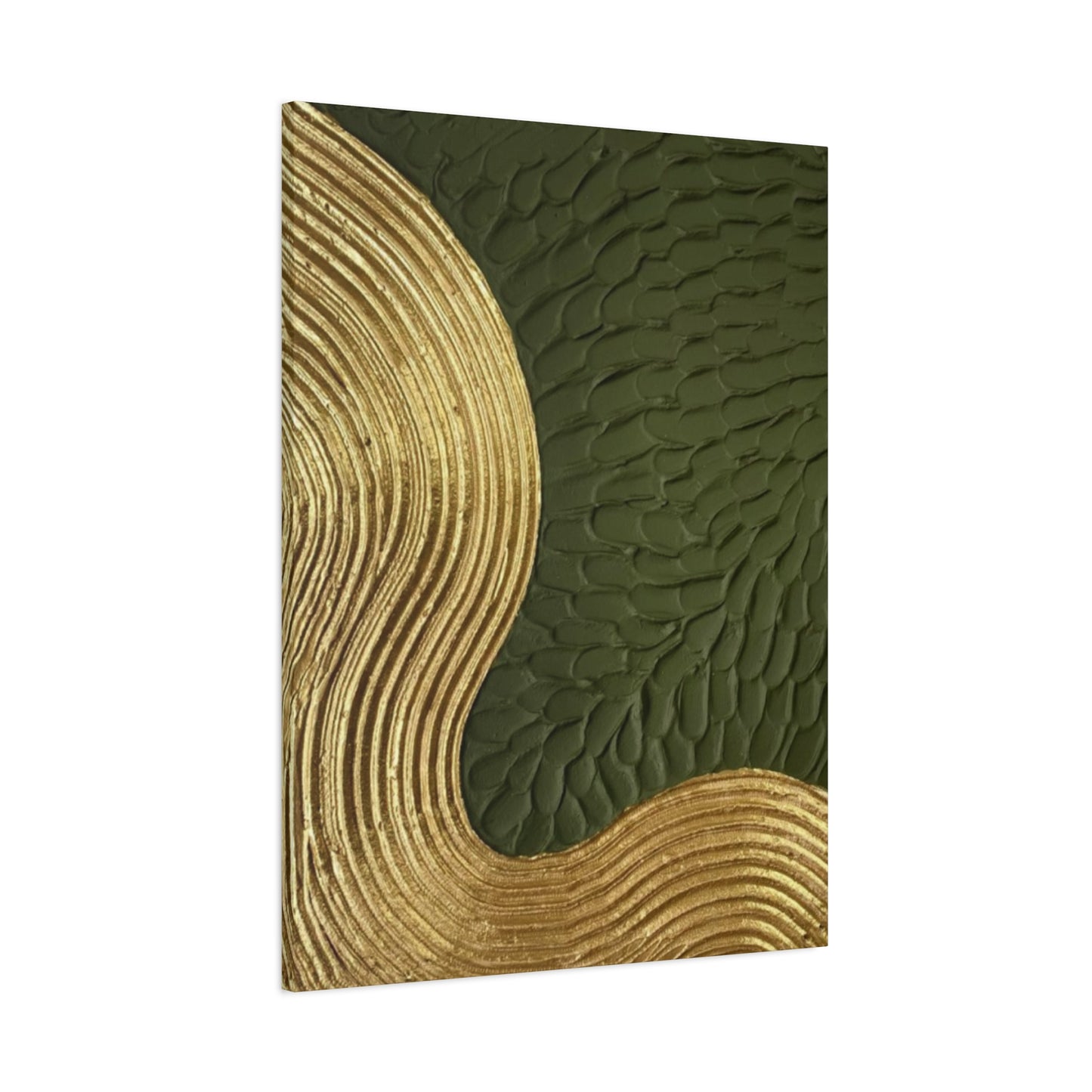
Color application in simple olive wall drawings typically involves limited palettes that maximize impact through careful relationships rather than variety. The golden olive green combination provides sufficient range for creating sophisticated compositions while maintaining overall harmony and unity. Artists might use only three or four closely related colors, relying on value and temperature variations to create depth and interest.
Composition principles become especially important in minimalist approaches. With fewer elements to work with, each component must be perfectly placed to achieve maximum effect. The rule of thirds, golden ratio, and other classical composition guidelines often inform these decisions, though artists may choose to violate these rules for specific expressive purposes. The key is making deliberate, informed decisions about every element within the composition.
The production process for simple olive wall drawings often involves extensive preliminary work. Artists might create dozens of thumbnail sketches, exploring different arrangements and approaches before committing to a final composition. This preparation phase allows for experimentation and refinement without the pressure of working on the final piece, resulting in more confident and successful finished works.
Contemporary digital tools offer new possibilities for creating simple olive wall drawings. Vector graphics software allows for precise control over line quality and color application, while maintaining the ability to easily modify and refine compositions. Digital approaches also enable easy reproduction and scaling, making artworks accessible to wider audiences through print-on-demand services and online galleries.
The framing and presentation of simple olive wall drawings requires careful attention to ensure that the minimalist aesthetic is maintained throughout the viewing experience. Clean, simple frames that don't compete with the artwork often work best, while mounting and matting decisions should support rather than distract from the artistic statement. The goal is creating a total presentation that feels cohesive and intentional.
Art with Green-Gold Touch: Sophisticated Color Combinations
Art with green-gold touch represents a refined approach to color harmony that leverages the sophisticated interplay between cool and warm undertones. This color combination has appeared throughout art history in various forms, from Renaissance paintings featuring golden highlights on green drapery to contemporary abstract compositions that explore these relationships in new ways. The enduring appeal of this palette lies in its ability to create visual richness while maintaining overall harmony and balance.
The technical aspects of creating art with green-gold touch require understanding color mixing principles and the behavior of different pigments. Traditional oil painting techniques offer particular advantages for this palette, as oils allow for extended working times and subtle color blending. Artists can build up layers of transparent glazes, creating depth and luminosity that would be difficult to achieve with more opaque mediums. The slow drying time of oils also permits ongoing adjustments and refinements throughout the painting process.
Acrylic painting techniques adapted for green-gold palettes often involve working wet-into-wet to maintain color freshness and prevent muddiness. Artists might use medium additions to extend working time and improve blendability, or employ glazing techniques with transparent colors to build up complex color relationships. The key is maintaining color purity while achieving smooth transitions between different hues and values.
The psychological sophistication of green-gold color combinations stems from their complex emotional associations. The green components evoke natural growth, healing, and renewal, while golden elements suggest prosperity, wisdom, and spiritual illumination. Together, these associations create artworks that feel both grounding and uplifting, appealing to viewers' desires for both security and inspiration.
Historical examples of successful green-gold combinations provide valuable reference points for contemporary artists. Vermeer's use of golden light on green fabrics creates some of the most memorable passages in Western art, while Islamic decorative arts often feature intricate patterns combining these colors in sophisticated geometric arrangements. Studying these historical precedents helps contemporary artists understand the full potential of this color relationship.
The cultural significance of green-gold combinations varies across different traditions but generally maintains positive associations. In Chinese culture, these colors might represent prosperity and growth, while Celtic traditions could associate them with the fertile earth and sacred groves. Understanding these cultural dimensions helps artists create works that resonate with diverse audiences while respecting traditional meanings and associations.
Modern applications of green-gold color combinations often incorporate contemporary materials and techniques. Mixed media approaches might combine traditional painting with metallic leaf, photography, or digital elements. These hybrid techniques create rich, layered compositions that reward close examination while maintaining overall visual coherence. The challenge lies in balancing innovation with respect for the timeless appeal of this classic color relationship.
Environmental considerations increasingly influence contemporary approaches to green-gold artwork. Artists may choose eco-friendly materials and production methods that align with the natural associations of their color palette. This might involve using natural pigments, sustainable substrates, or production methods that minimize environmental impact. The goal is creating artwork that embodies environmental consciousness while maintaining artistic integrity and visual appeal.
The market appeal of art with green-gold touch reflects broader consumer trends toward natural, sophisticated, and timeless home decoration. These pieces often serve as investment purchases that maintain their relevance and appeal over time. The versatility of this color combination allows artworks to adapt to changing decorating trends while retaining their essential character and beauty.
Soft Tones, Strong Impact: Balancing Subtlety and Presence
Soft tones, strong impact represents a sophisticated artistic philosophy that recognizes the power of subtlety in creating memorable and emotionally resonant artwork. This approach challenges the common assumption that bold, high-contrast compositions are necessary for visual impact, instead demonstrating how carefully calibrated soft color relationships can create equally powerful but more nuanced artistic statements.
The technical challenge of achieving strong impact with soft tones lies in mastering subtle color relationships and value structures. Artists must develop sensitivity to minute color variations and learn to create compelling compositions without relying on dramatic contrasts. This requires extensive practice and refined observational skills, as the margin for error becomes much smaller when working within narrow color ranges.
Color temperature becomes crucial when working with soft tone palettes. Even slight shifts toward warmer or cooler temperatures can significantly impact the overall feel of a composition. Artists must learn to see and manipulate these subtle temperature variations to create depth, movement, and visual interest within their restricted color ranges. The golden olive green palette provides an ideal testing ground for developing these skills, as it offers sufficient range for experimentation while maintaining overall harmony.
The psychological impact of soft tone artwork often proves more enduring than pieces relying on immediate visual shock. Viewers may initially be drawn to bold, high-contrast works, but soft tone pieces tend to maintain interest over longer periods. These works reveal their subtleties gradually, rewarding continued observation and creating deeper emotional connections with viewers.
Lighting considerations become paramount when displaying soft tone artwork. These pieces often require carefully controlled lighting to reveal their subtle color relationships and prevent them from appearing washed out or muddy. Natural daylight typically provides the best viewing conditions, but artificial lighting must be carefully selected and positioned to support rather than compete with the artwork's delicate color harmonies.
The production process for soft tone artwork often involves extensive color mixing and testing. Artists might create multiple color swatches to explore relationships before beginning the final piece, ensuring that every color choice contributes meaningfully to the overall composition. This preparation phase is crucial for success, as corrections become much more difficult once work has begun on the final piece.
Contemporary applications of soft tone approaches often incorporate digital tools that allow for precise color control and easy experimentation. Artists can test color combinations virtually before committing to physical materials, saving time and resources while enabling more extensive exploration of possibilities. However, the challenge lies in translating digital color relationships to physical media, as different materials and printing processes can significantly alter color appearance.
The commercial success of soft tone artwork reflects growing consumer sophistication and desire for subtle, sophisticated home decoration. These pieces often appeal to collectors and decorators who appreciate nuanced artistic statements and prefer artwork that enhances rather than dominates their living environments. The timeless quality of soft tone approaches also makes these pieces good long-term investments.
Environmental factors increasingly influence soft tone artwork creation and display. Artists must consider how their chosen colors will respond to different lighting conditions, humidity levels, and air quality over time. This might influence material choices, protective coatings, or display recommendations to ensure that the subtle color relationships remain stable and visible throughout the artwork's lifespan.
The educational value of soft tone approaches extends beyond individual artistic development. These techniques teach valuable lessons about observation, patience, and the power of restraint in artistic expression. Students working with soft tone palettes often develop greater sensitivity to color relationships and learn to find beauty in subtle variations rather than relying on obvious contrasts.
Elegant Green Wall Decor: Timeless Sophistication in Home Design
Elegant green wall decor represents the pinnacle of sophisticated home design, combining timeless color principles with contemporary aesthetic sensibilities. This approach to wall decoration recognizes green's unique position in the color spectrum as both a calming neutral and a vibrant natural hue, making it ideal for creating environments that feel both peaceful and alive.
The foundation of elegant green wall decor lies in understanding the various personalities that different green hues can express. Forest greens convey strength and stability, making them ideal for libraries and formal sitting areas. Sage greens offer gentle sophistication perfect for bedrooms and meditation areas. Olive greens provide earthy warmth suitable for dining rooms and gathering areas. Each variation requires different supporting elements and lighting considerations to achieve its full potential.
The integration of elegant green wall decor with existing architectural elements requires careful planning and consideration. Crown molding, wainscoting, and built-in furniture can either enhance or compete with green wall treatments depending on their finish colors and proportional relationships. Successful integration often involves creating subtle tonal relationships between different elements rather than stark contrasts that could fragment the visual field.
Lighting design becomes crucial for elegant green wall decor success. Green hues can appear dramatically different under various lighting conditions, shifting from warm and inviting to cool and sterile depending on the light source's color temperature and intensity. Natural light brings out green's true character and creates dynamic color shifts throughout the day, while artificial lighting must be carefully selected to support rather than fight the chosen green tones.
The selection of complementary materials and finishes requires understanding how different textures and surfaces interact with green hues. Natural wood finishes often enhance green's organic character, while metallic accents can add luxury and sophistication. Fabric selections must consider both color harmony and texture contrast to create rich, layered environments that reward both visual and tactile exploration.
Scale and proportion considerations become especially important when implementing elegant green wall decor. Large-scale applications require careful attention to color saturation and undertones to avoid overwhelming occupants, while small-scale applications might benefit from slightly more saturated tones to ensure adequate visual presence. The goal is achieving appropriate visual weight and impact for the specific application and room size.
The psychological effects of elegant green wall decor extend beyond immediate aesthetic appeal. Green hues have been shown to reduce eye strain, lower stress levels, and promote feelings of balance and harmony. These effects can significantly improve the quality of daily life for occupants, making elegant green wall decor an investment in both aesthetic beauty and personal well-being.
Maintenance considerations for elegant green wall decor vary depending on the specific materials and finishes chosen. Paint finishes might require periodic touch-ups to maintain their appearance, while fabric wall coverings may need professional cleaning. Planning for long-term maintenance helps ensure that elegant green wall treatments continue to provide beauty and satisfaction over many years of use.
Seasonal considerations can influence the success of elegant green wall decor. Colors that appear perfect during spring and summer might feel different during fall and winter months when natural light conditions change. Understanding these seasonal variations helps inform initial color selections and might suggest supplementary lighting or accent pieces to maintain optimal appearance year-round.
The investment value of elegant green wall decor reflects its timeless appeal and broad market acceptance. Unlike trendy color choices that might date quickly, elegant green treatments tend to maintain their relevance and appeal over extended periods. This makes them wise choices for homeowners concerned about both immediate satisfaction and long-term property value.
Advanced Color Theory for Golden Olive Green Compositions
Advanced color theory for golden olive green compositions requires deep understanding of complex color relationships, optical phenomena, and psychological associations that influence how viewers perceive and respond to artwork. This knowledge enables artists to create sophisticated compositions that leverage scientific principles to achieve specific emotional and aesthetic effects.
The color wheel position of golden olive green reveals its unique characteristics and potential relationships with other hues. Positioned between yellow and green on the traditional color wheel, this palette occupies a harmonious zone that allows for both analogous relationships with nearby colors and complementary contrasts with violets and purples. Understanding these relationships enables artists to create compositions that feel both harmonious and visually exciting.
Simultaneous contrast effects become particularly important when working with golden olive green palettes. Colors appear different depending on their surrounding context, and these effects can be used deliberately to enhance or modify color appearance. A golden tone might appear more yellow when surrounded by green, or more orange when placed against blue backgrounds. Mastering these optical phenomena allows artists to fine-tune their color relationships for maximum impact.
The concept of color temperature takes on added complexity within golden olive green compositions. While golden tones generally read as warm and green tones as cool, the specific temperature relationships depend heavily on undertones and surrounding colors. Artists must learn to see and manipulate these subtle temperature variations to create depth, atmosphere, and emotional resonance within their compositions.
Chromatic adaptation describes how our visual system adjusts to different lighting conditions, affecting color perception over time. This phenomenon has significant implications for golden olive green artwork, as pieces may appear differently under various lighting conditions or after extended viewing periods. Understanding chromatic adaptation helps artists create works that maintain their intended impact across different viewing situations.
The Purkinje effect describes how color perception changes under different light levels, with reds appearing darker and blues appearing brighter in dim conditions. This effect can significantly impact golden olive green compositions displayed under variable lighting conditions. Artists must consider these perceptual shifts when creating works intended for specific display environments or lighting situations.
Color constancy refers to our ability to perceive colors as relatively stable despite changing lighting conditions. However, this perceptual mechanism has limits, and extreme lighting changes can dramatically alter color appearance. Golden olive green compositions must be designed with consideration for the lighting conditions under which they will be viewed to maintain their intended character and impact.
Metamerism describes the phenomenon where colors appear identical under one lighting condition but different under another. This effect can be particularly problematic for golden olive green palettes, as the complex mixture of warm and cool undertones may respond differently to various light sources. Artists must test their color mixtures under multiple lighting conditions to ensure consistent appearance.
The role of value structure in golden olive green compositions cannot be overstated. While color relationships create emotional impact and visual interest, value relationships provide the underlying structure that makes compositions readable and compelling. Artists must learn to see past color to perceive underlying value patterns, ensuring that their compositions work on both chromatic and achromatic levels.
Contemporary color theory increasingly incorporates digital color models and display technologies. Artists working with golden olive green palettes must understand how their colors will translate across different media, from traditional pigments to digital displays to print reproduction. Each medium has its own color gamut and limitations that affect how golden olive green relationships appear to viewers.
Historical Significance of Golden and Green Color Palettes in Art
The historical significance of golden and green color palettes in art stretches back to humanity's earliest artistic expressions, reflecting deep cultural, spiritual, and aesthetic values that have remained remarkably consistent across diverse civilizations and time periods. These colors have carried profound meaning throughout history, appearing in religious art, royal portraits, landscape paintings, and decorative arts across virtually every culture.
Ancient Egyptian art provides some of the earliest examples of sophisticated golden and green color usage. Gold represented the flesh of the gods and eternal life, while green symbolized rebirth, fertility, and the afterlife. Egyptian wall paintings and decorative objects frequently combined these colors to create compositions that expressed both earthly beauty and spiritual transcendence. The technical mastery required to create and preserve these colors demonstrates their cultural importance.
Byzantine art elevated the use of golden and green combinations to new heights of spiritual expression. Mosaics in churches like Ravenna's San Vitale showcase intricate patterns combining gold leaf with various green tones, creating luminous effects that seemed to bring divine light into sacred environments. These works established traditions that influenced religious art throughout Europe for centuries.
Islamic decorative arts developed sophisticated approaches to golden and green color combinations, often incorporating these hues into geometric patterns of remarkable complexity and beauty. The mathematical precision of Islamic designs provided frameworks for exploring color relationships that influenced decorative arts traditions from Spain to Central Asia. These patterns continue to inspire contemporary artists and designers working with similar palettes.
Medieval illuminated manuscripts frequently employed golden and green combinations to create richly detailed botanical illustrations and decorative borders. The development of new pigment sources and application techniques during this period expanded the range of achievable effects, leading to increasingly sophisticated color relationships. These works established many of the botanical art traditions that continue today.
Renaissance painting brought new understanding of color theory and optical phenomena to golden and green palette usage. Artists like Leonardo da Vinci and Jan van Eyck developed innovative techniques for creating luminous effects with these colors, often using complex layering methods to achieve unprecedented realism and atmospheric depth. These technical innovations influenced painting traditions for centuries.
The Dutch Golden Age produced some of history's most masterful applications of golden and green color relationships. Painters like Vermeer and Rembrandt created intimate domestic scenes that featured subtle but powerful color harmonies, often incorporating golden light effects with green fabrics, plants, or background elements. These works demonstrated how sophisticated color relationships could enhance narrative and emotional content.
Impressionist painters revolutionized approaches to golden and green palettes by emphasizing direct observation of natural light effects. Artists like Monet and Renoir developed techniques for capturing the fleeting color relationships found in natural settings, particularly the golden light filtering through green foliage. These innovations influenced landscape painting traditions worldwide.
Arts and Crafts movement artists embraced golden and green combinations as expressions of their philosophy connecting art with nature and craftsmanship. Designers like William Morris created textile and wallpaper patterns that featured sophisticated botanical designs in these colors, establishing decorative traditions that continue to influence contemporary home decoration.
Art Nouveau movements across Europe incorporated golden and green palettes into their organic, nature-inspired designs. Artists and designers created everything from architectural elements to jewelry that celebrated natural forms through sophisticated color relationships. These works demonstrated how traditional color combinations could be reinterpreted for contemporary audiences.
Contemporary artists continue to explore golden and green combinations, often referencing historical traditions while incorporating modern materials and techniques. Digital art, installation work, and mixed media approaches offer new possibilities for these timeless color relationships, ensuring their continued relevance for future generations.
Seasonal Color Variations in Golden Olive Green Themes
Seasonal color variations in golden olive green themes reflect the natural world's constant transformation throughout the yearly cycle, offering artists and decorators opportunities to create dynamic, ever-changing environments that respond to nature's rhythms. Understanding these seasonal shifts enables the creation of artworks and decorating schemes that feel fresh and relevant throughout the year while maintaining overall coherence and harmony.
Spring interpretations of golden olive green themes typically emphasize fresh, vibrant qualities that suggest new growth and renewal. The golden components might lean toward brighter, more yellow-based hues that evoke early morning sunlight and emerging foliage. Olive green tones often appear lighter and more yellow-tinted, reflecting the tender new leaves and grass of early spring. Artists working with spring themes might incorporate more white and pale yellow accents to enhance the feeling of lightness and optimism.
Summer variations of golden olive green palettes tend toward deeper, more saturated expressions that reflect the full maturity of natural growth cycles. Golden tones might shift toward warmer, more orange-based hues that suggest the intensity of summer sunshine, while olive greens deepen and develop more blue undertones. These combinations create rich, luxurious effects that feel abundant and fully developed, perfect for creating environments that celebrate natural plenty.
Final Thoughts
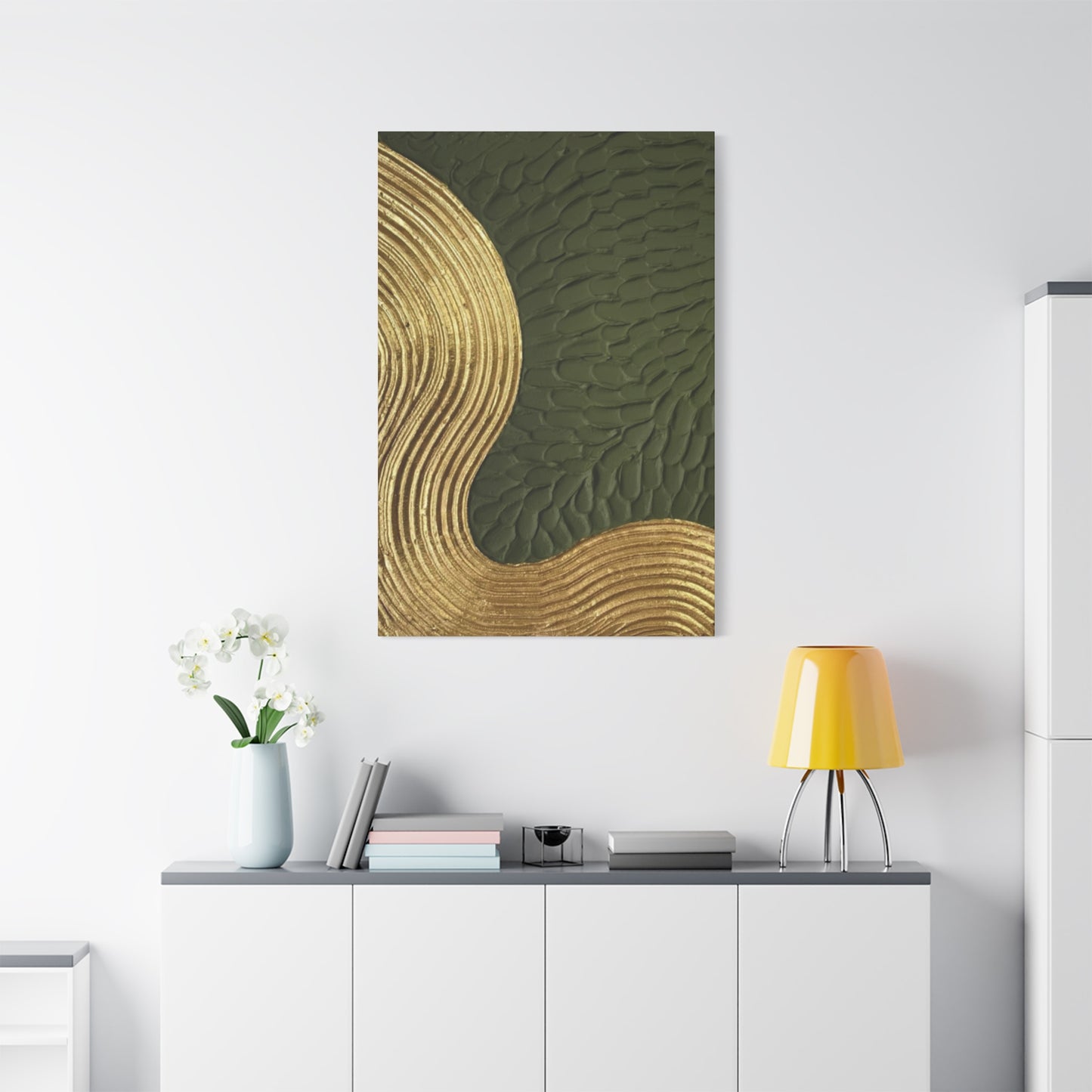
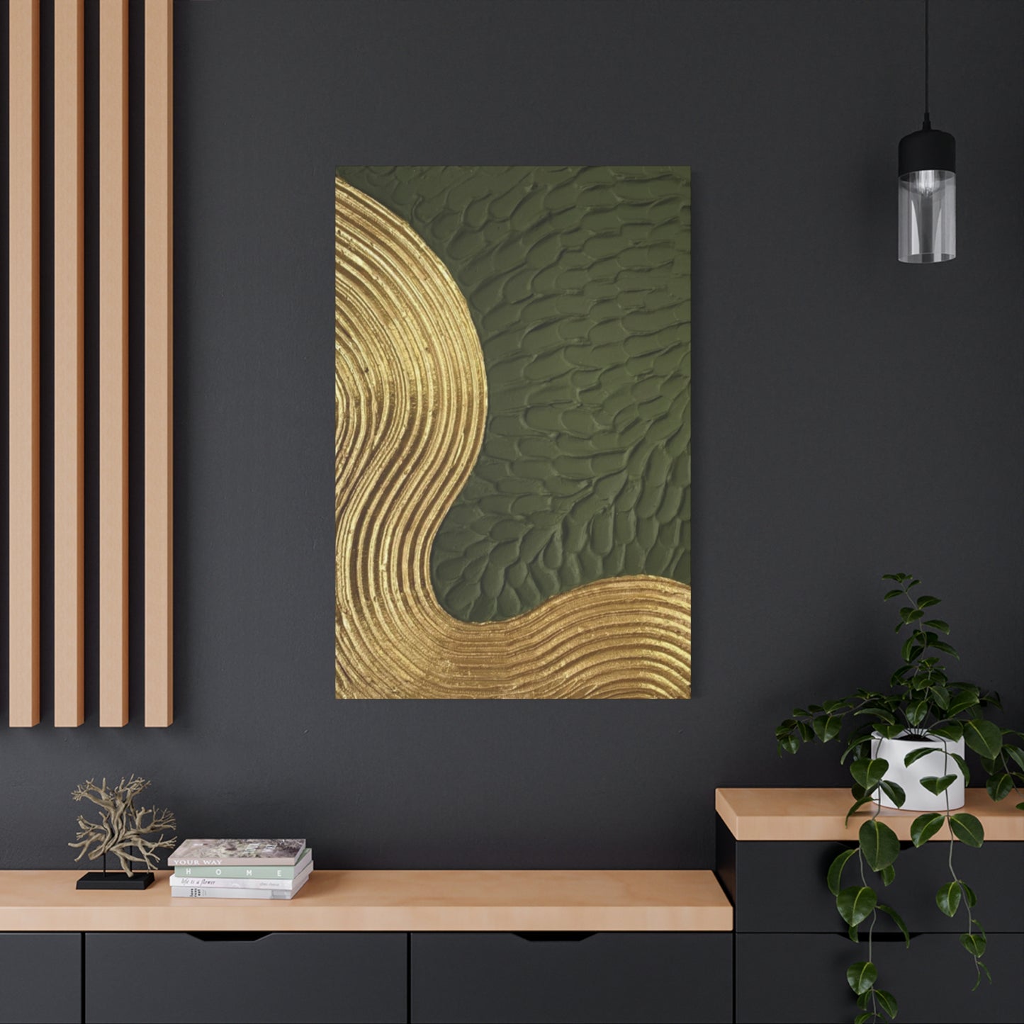
Golden olive green wall art offers a beautiful fusion of earthy tones and subtle luxury, making it an exceptional choice for nature-inspired home decorating. This unique color palette combines the grounded, calming qualities of olive green with the warm, radiant glow of gold accents, creating a harmonious balance that enhances any living space. Whether your style leans toward modern minimalism or rustic charm, golden olive green art adds depth, sophistication, and a natural vibe to your décor.
One of the most appealing aspects of this color combination is its versatility. Olive green grounds a room with its organic, soothing presence, while gold highlights inject warmth and elegance. Together, they create an inviting atmosphere that feels both fresh and timeless. Incorporating golden olive green wall art can anchor your design theme, serving as a focal point or a complementary accent to other natural elements like wood, plants, and textured fabrics.
When decorating with golden olive green art, consider layering textures and materials to amplify the nature-inspired aesthetic. Soft linens, woven baskets, and ceramic pots paired with your wall art bring tactile richness, making your space feel lived-in and cozy. Adding touches of greenery through plants further enhances the connection to nature, reinforcing the calming effect of the color palette.
In essence, golden olive green wall art is more than just a decorative choice—it’s a way to bring tranquility, warmth, and organic beauty into your home. By thoughtfully incorporating these hues into your décor, you create a sanctuary that celebrates nature’s elegance while reflecting your personal style.
