


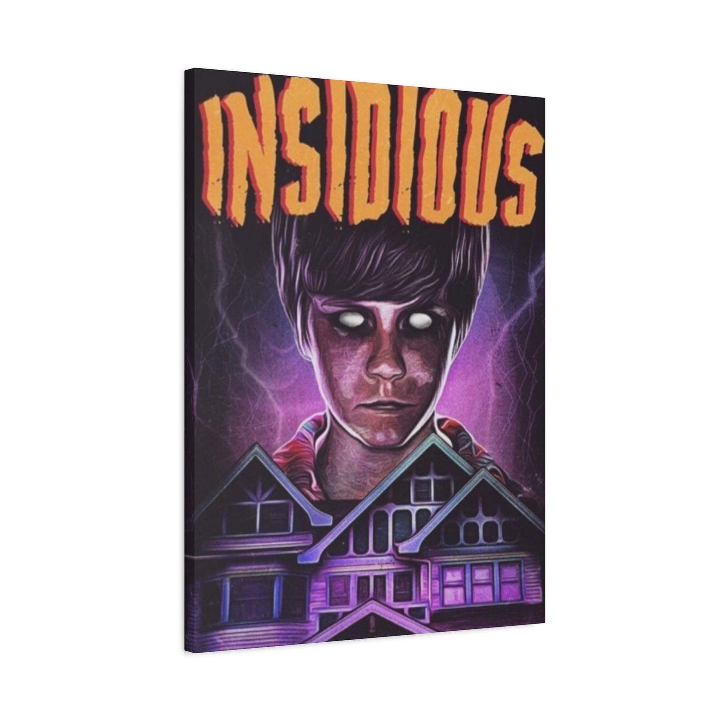
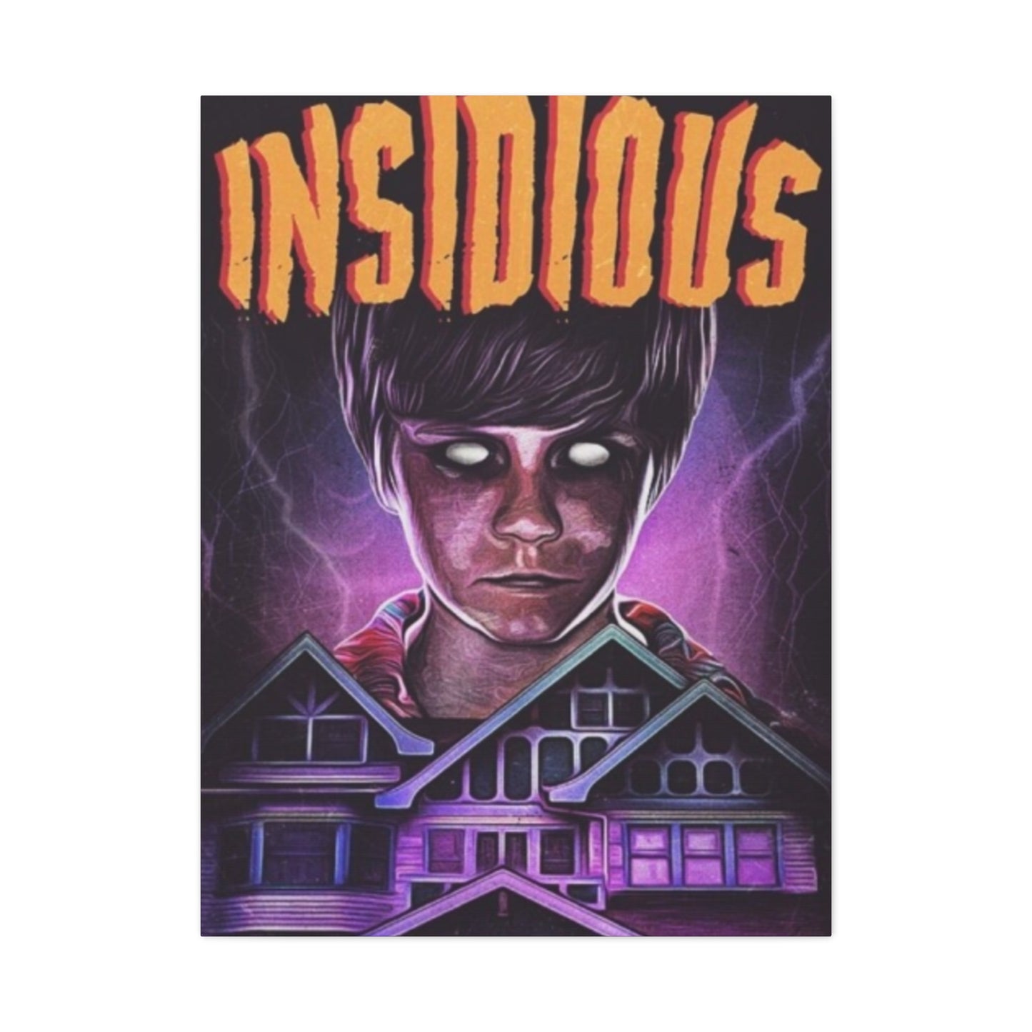
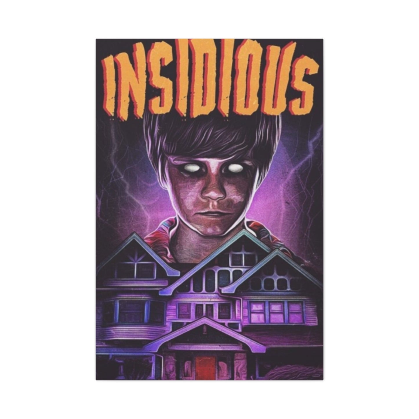
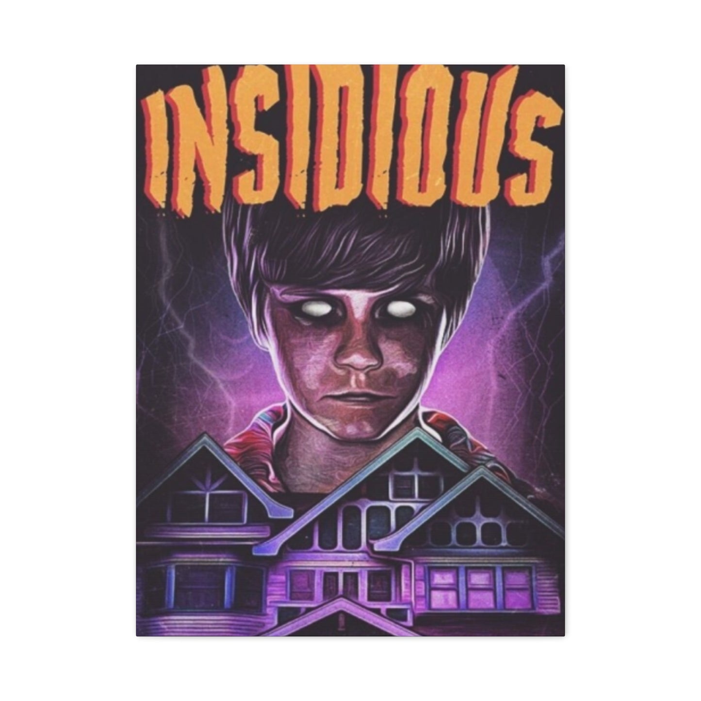
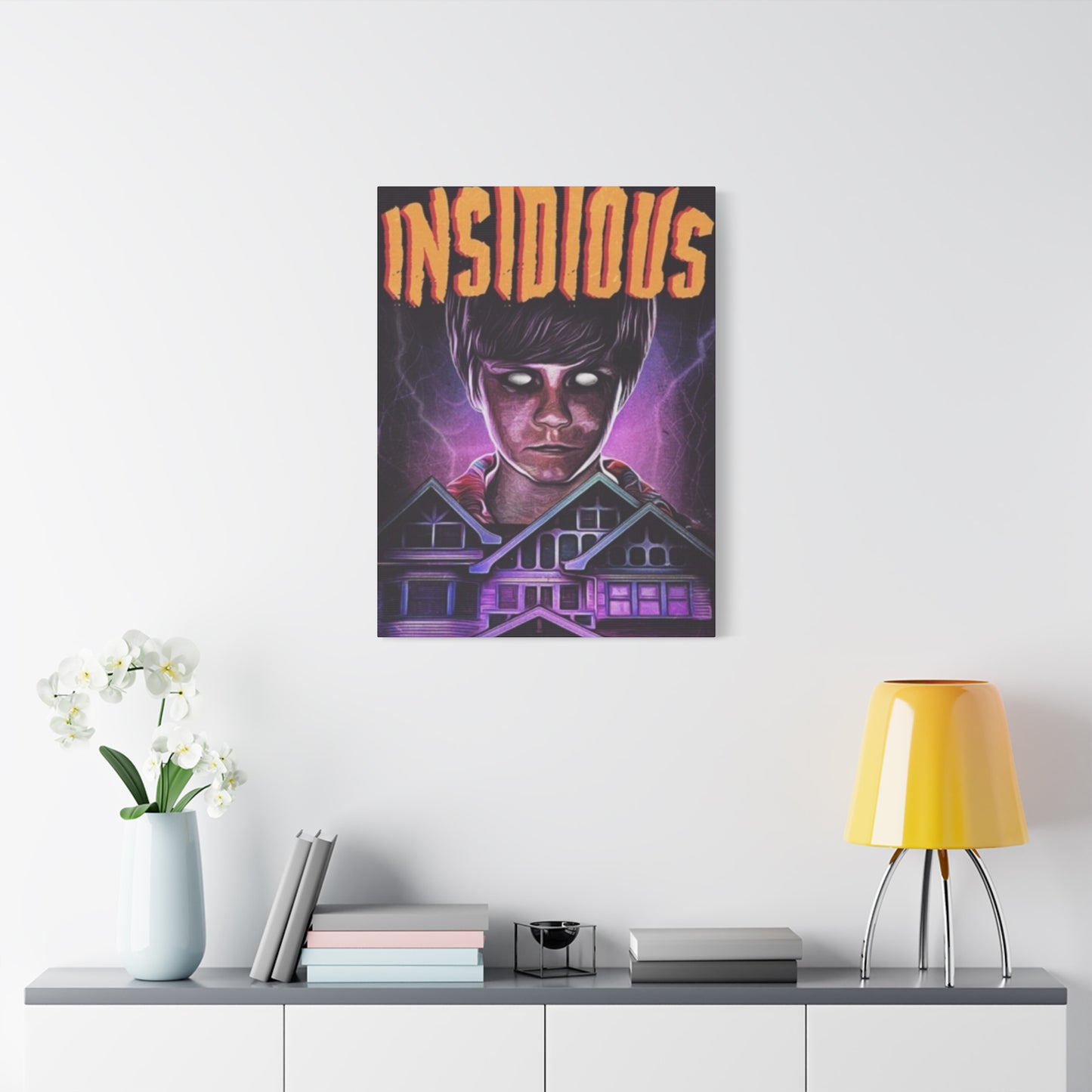
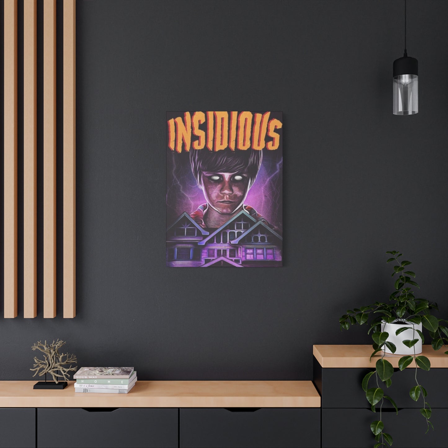
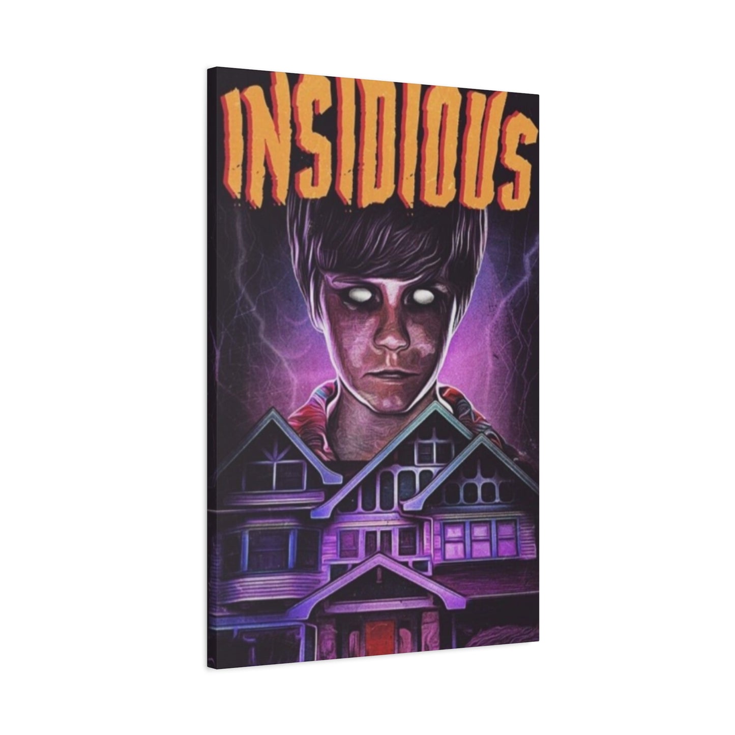
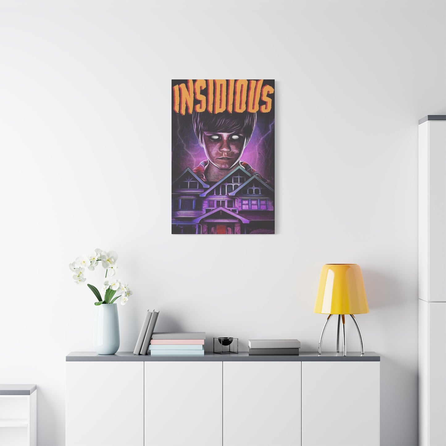
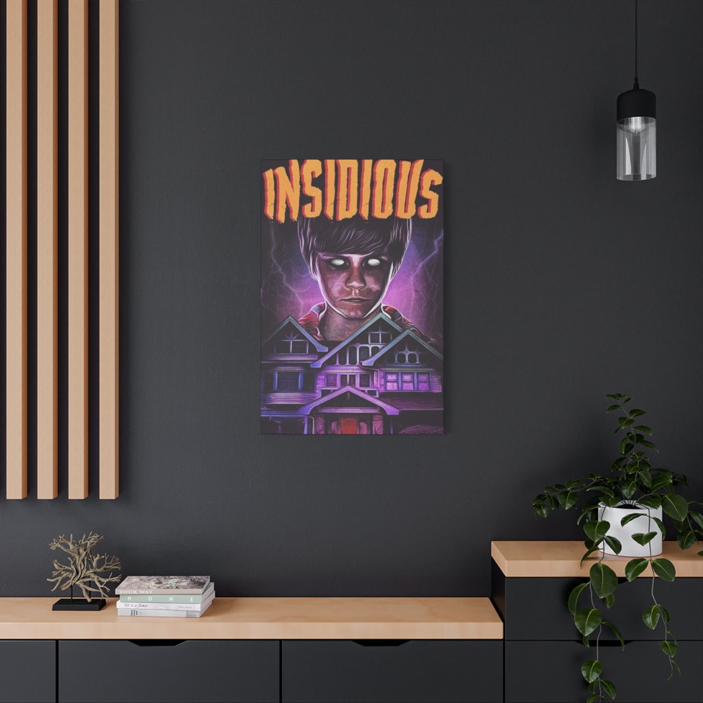
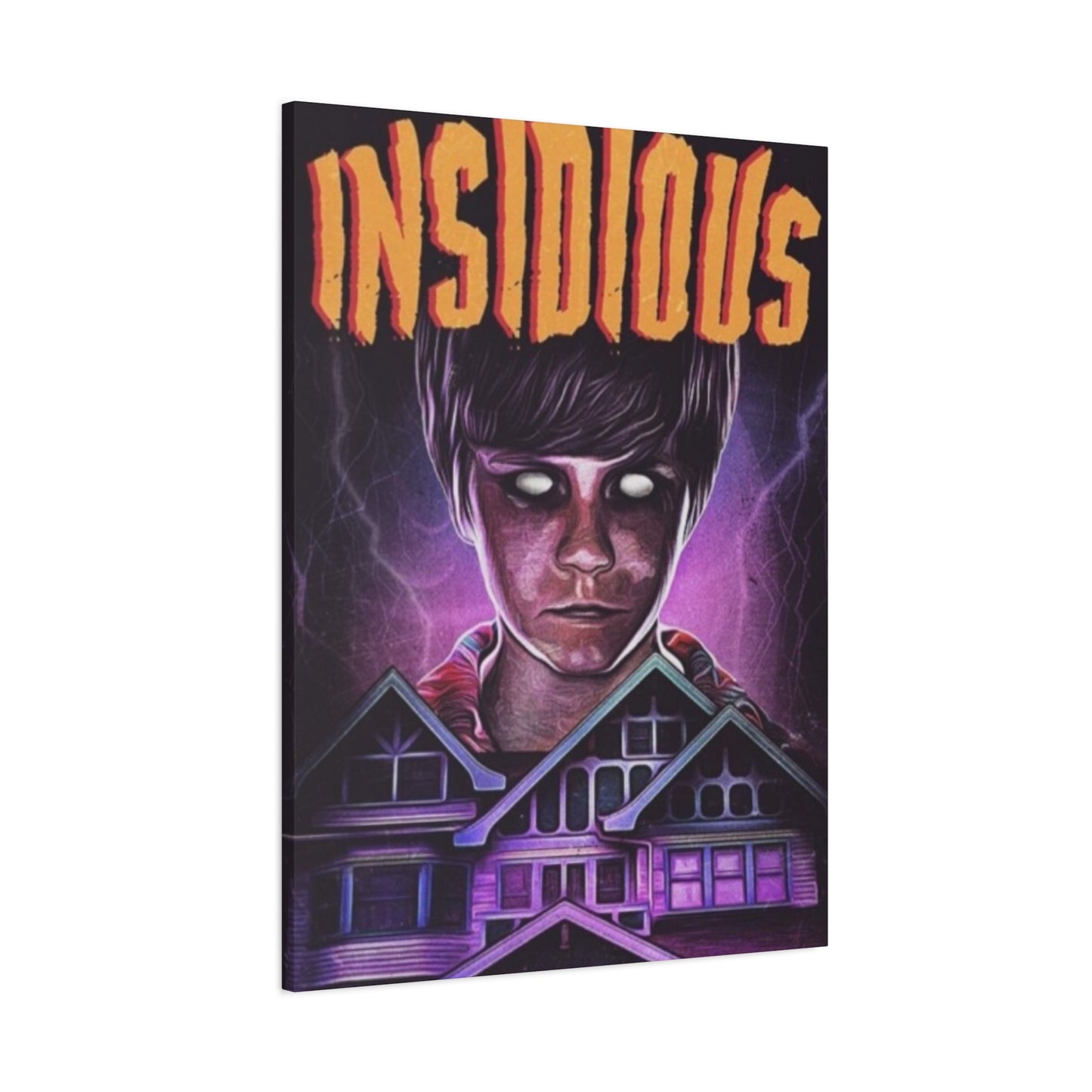
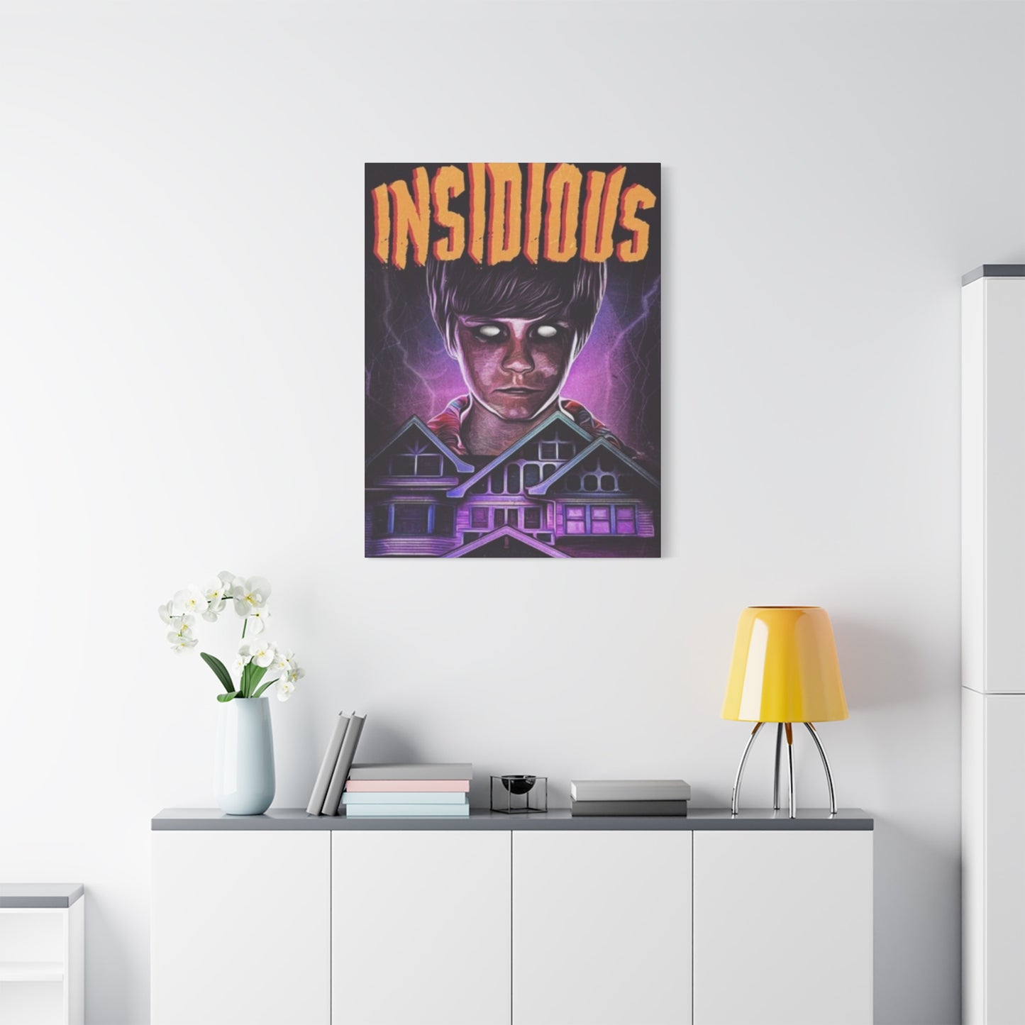
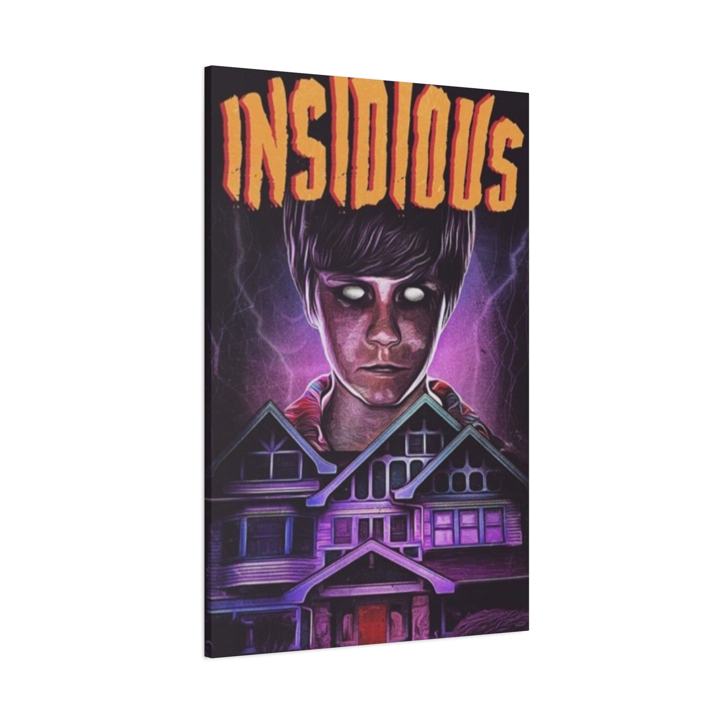
Insidious Horror Movie Poster Wall Art & Canvas Prints
Insidious Horror Movie Poster Wall Art & Canvas Prints
Couldn't load pickup availability


A Cinematic Nightmare: The Artistic Depth of Insidious Horror Film Poster Wall Art
The world of horror cinema has given birth to countless iconic images that haunt our collective consciousness, and among these spine-chilling visuals, the poster artwork from the supernatural thriller series stands as a masterpiece of psychological terror. These striking wall decorations have transcended their original marketing purpose to become coveted pieces of contemporary art that horror enthusiasts proudly display in their personal spaces. The visual language employed in these promotional materials captures the essence of dread, utilizing shadow, color, and composition to evoke an immediate visceral response from viewers.
Horror movie posters serve a unique function in the entertainment landscape, acting as gateways to the terrifying experiences awaiting audiences. Unlike promotional materials for other film genres, these artistic creations must walk a delicate line between revealing enough to intrigue potential viewers while concealing the true horrors that unfold within the narrative. The artwork from this particular supernatural franchise has mastered this balance, creating images that simultaneously attract and repel, drawing curious eyes while sending shivers down spines.
The cultural impact of horror film promotional art extends far beyond theater lobbies and multiplex walls. These images have infiltrated popular culture, becoming recognizable symbols that communicate complex ideas about fear, the supernatural, and human vulnerability. Collectors and casual fans alike seek out these pieces to adorn their living spaces, transforming ordinary rooms into shrines celebrating the darker aspects of cinematic storytelling. The popularity of such decorative items speaks to our complicated relationship with fear and our desire to confront the unknown from the safety of our own homes.
The Evolution of Supernatural Thriller Poster Design
The artistic approach to promoting supernatural horror films has undergone remarkable transformation throughout cinema history. Early examples from the golden age of horror relied heavily on lurid illustrations and sensationalized imagery designed to shock audiences unaccustomed to graphic content. These vintage promotional pieces featured exaggerated depictions of monsters, victims, and supernatural phenomena rendered in bold colors that screamed danger and forbidden thrills. The artistic style reflected the cultural attitudes of their time, when horror was considered lowbrow entertainment designed primarily to titillate rather than to explore deeper psychological themes.
As filmmaking techniques evolved and audiences became more sophisticated, the visual language of horror promotion adapted accordingly. The transition from illustrated posters to photographic compositions marked a significant shift in how studios approached marketing scary movies. Photography lent an air of authenticity to the promotional materials, suggesting that the horrors depicted might exist in the real world rather than in the realm of pure fantasy. This evolution coincided with the rise of psychological horror, where the true terror stemmed not from visible monsters but from unseen threats and the fragility of the human mind.
The modern era of horror film promotion has embraced minimalism and suggestion over explicit depiction. Contemporary designers understand that what audiences imagine often proves more frightening than what can be shown directly. This philosophy manifests in poster designs that employ negative space, strategic lighting, and subtle visual cues to create atmospheric dread. The promotional artwork for this particular supernatural franchise exemplifies this approach, using composition and color theory to establish mood rather than relying on shocking imagery to capture attention.
Digital manipulation and advanced graphic design software have expanded the possibilities for creating compelling horror imagery. Artists can now seamlessly blend photographic elements with illustrated components, creating surreal compositions that could never exist in reality. These hybrid images possess an uncanny quality that enhances their disturbing impact, placing familiar elements in unfamiliar contexts or distorting reality in subtle ways that trigger discomfort in viewers. The technical precision available to modern designers allows for the creation of images that burrow into the subconscious, establishing lasting impressions that linger long after the initial viewing.
The Artistic Merit of Horror Film Poster Design
Horror movie posters deserve recognition as legitimate works of graphic art that employ sophisticated design principles to achieve their effects. The best examples transcend their commercial origins to become valuable pieces worthy of museum exhibition and critical analysis. These designs demonstrate mastery of composition, color theory, typography, and visual storytelling while operating within the specific constraints of commercial film promotion. The challenge of creating imagery that simultaneously attracts and disturbs requires remarkable skill and artistic vision that shouldn't be dismissed simply because the work originates in commercial rather than fine art contexts.
The collaborative nature of poster creation brings together diverse creative talents including photographers, illustrators, graphic designers, and marketing strategists. Each contributor brings specialized expertise to the project, resulting in work that synthesizes multiple artistic disciplines into cohesive visual statements. The best horror posters emerge from productive tensions between artistic vision and commercial requirements, with designers finding innovative solutions that satisfy both aesthetic and marketing objectives. This collaborative, constraint-driven creative process often produces more interesting results than pure artistic expression unconstrained by practical considerations.
Many renowned artists have contributed to horror film promotion throughout cinema history, bringing fine art sensibilities to commercial projects. The involvement of respected illustrators, photographers, and designers has elevated the overall quality of horror poster art while simultaneously expanding these artists' creative ranges. The genre's emphasis on mood, atmosphere, and emotional impact provides opportunities for artistic exploration that more conventional commercial work might not permit. This cross-pollination between commercial and fine art worlds has enriched both domains, challenging assumptions about artistic legitimacy and the relationship between art and commerce.
Collecting horror film posters has evolved into a serious pursuit with its own community of dedicated enthusiasts, scholars, and dealers. The most desirable pieces command significant prices in the collectibles market, with rare or particularly well-designed examples achieving values comparable to recognized works of fine art. This economic validation reflects growing recognition of these pieces' artistic and cultural significance beyond their original promotional function. Museums and academic institutions have begun incorporating horror posters into their collections and exhibitions, acknowledging these works' importance in documenting both film history and the evolution of graphic design.
Building a Horror Poster Collection
Starting a collection of horror film posters can seem daunting given the vast range of available material spanning over a century of cinema history. New collectors should begin by identifying specific areas of interest whether particular franchises, time periods, directors, or visual styles that personally resonate. Focusing collection efforts creates coherence and makes the acquisition process more manageable while allowing collectors to develop genuine expertise in their chosen specialization. This focused approach also helps establish collecting goals and budgets, preventing the common pitfall of acquiring pieces indiscriminately without clear direction.
Understanding the difference between original theatrical posters and various reproduction formats proves essential for collectors concerned with authenticity and value. Original posters printed for theatrical exhibition typically command premium prices due to their historical significance and relative scarcity. These pieces were produced in limited quantities for specific release windows and were intended to be disposable marketing materials rather than collectibles. Reproductions, reprints, and officially licensed decorative posters offer affordable alternatives that allow enthusiasts to display favorite imagery without the expense of original materials, though they lack the investment value and historical authenticity of genuine theatrical issues.
Condition assessment plays a crucial role in determining poster value and desirability, with collectors learning to evaluate factors including tears, creases, fading, staining, and previous repair attempts. Theatrical posters were working materials subjected to rough handling during distribution and display, making pristine examples increasingly rare and valuable. Understanding grading standards helps collectors make informed purchasing decisions and set realistic expectations regarding condition relative to age and rarity. Professional restoration can improve the appearance of damaged pieces, though extensive restoration may actually decrease value in the eyes of purist collectors who prefer original condition even when imperfect.
The collector community provides valuable resources including specialized dealers, auction houses, online marketplaces, and fellow enthusiasts who can offer guidance, authentication services, and opportunities to acquire desirable pieces. Engaging with this community through collector forums, social media groups, and in-person events helps newcomers learn market values, identify reputable dealers, and discover upcoming opportunities to expand their collections. Networking with other collectors can lead to private sales, trades, and access to pieces that never reach the open market, making community participation valuable beyond the educational benefits.
The Commercial Market for Horror Film Artwork
The market for horror movie posters has expanded significantly in recent decades, evolving from niche collector interest into a substantial commercial sector with sophisticated infrastructure. Specialized dealers and auction houses now focus specifically on film poster sales, employing experts who can authenticate pieces, assess condition, and provide valuation services. Major auction events featuring rare and desirable posters attract serious collectors willing to pay premium prices for exceptional pieces, while online marketplaces have democratized access to less expensive material. This market development has increased liquidity while providing collectors with multiple acquisition and liquidation channels.
Pricing for horror posters varies enormously based on factors including rarity, condition, historical significance, visual appeal, and association with particularly beloved or influential films. Original posters from classic horror films of the 1930s and 1940s can command five or six-figure sums when they appear at auction in excellent condition. More recent material remains affordable, with posters from films of the past few decades often available for modest sums. The market rewards exceptional visual design regardless of the associated film's commercial or critical success, with striking imagery from obscure productions sometimes achieving surprising values based purely on aesthetic merit.
Investment potential attracts some collectors to horror poster acquisition, with rare pieces demonstrating significant appreciation over time. However, collecting purely for investment purposes carries risks, as the market remains subject to changing tastes, economic conditions, and the unpredictable nature of collectibles markets generally. Successful investing requires deep knowledge of the material, strong networks within the collector community, and the financial resources to acquire top-tier pieces. Most collectors find that combining genuine passion for the material with awareness of market dynamics creates the most satisfying and potentially profitable approach.
Licensed reproduction posters have created a separate market segment serving enthusiasts who prioritize decoration over collecting rare originals. Publishers produce high-quality reproductions of classic posters alongside new artwork inspired by beloved films, making iconic imagery accessible at affordable prices. While these pieces lack the historical significance and investment potential of original theatrical posters, they fulfill the practical need for displayable artwork and introduce new generations to classic horror imagery. This reproduction market coexists peacefully with the original poster market, serving different consumer needs without significantly affecting values for authentic vintage material.
Preservation and Conservation of Paper-Based Horror Art
Proper preservation ensures that horror posters remain in the best possible condition for future enjoyment and potential resale. Paper-based artwork faces numerous environmental threats including light exposure, humidity fluctuations, temperature extremes, pollutants, and simple aging processes that cause chemical degradation over time. Understanding these threats allows collectors to implement protective measures that significantly extend the lifespan of their pieces. Professional conservators can provide guidance on best practices for storage and display, helping collectors avoid common mistakes that lead to preventable damage.
Light exposure represents one of the most significant dangers to poster preservation, as both visible light and ultraviolet radiation cause fading and chemical breakdown of paper and inks. Minimizing light exposure through careful display location and limiting illumination duration helps protect vulnerable artwork. When artificial lighting proves necessary, LED sources produce less damaging radiation than traditional incandescent or fluorescent options. UV-filtering glazing in frames blocks harmful radiation while allowing visible light to pass through, providing protection for displayed pieces without eliminating their visibility. Conservation-grade framing materials including acid-free mats and backing boards prevent chemical damage from materials in contact with the poster.
Climate control maintains stable environmental conditions that prevent the expansion, contraction, and chemical processes that cause deterioration. Humidity levels between 30-50 percent prevent both the excessive dryness that makes paper brittle and the moisture that encourages mold growth and chemical reactions. Temperature stability matters more than absolute temperature, with consistent cool conditions being ideal. Fluctuations in temperature and humidity cause physical stress as materials expand and contract at different rates, leading to warping, cracking, and delamination. Climate-controlled storage and display environments represent significant investments but prove essential for protecting valuable collections.
Professional conservation services can address damage through various restoration techniques including cleaning, deacidification, tear repair, and backing reinforcement. Ethical conservation follows principles of reversibility, using techniques and materials that don't permanently alter the original poster and can be undone if necessary. Extensive restoration may be appropriate for severely damaged pieces that would otherwise be unviewable, though collectors should understand that heavy restoration can affect market value. Documentation of any conservation work including photographs and detailed records of procedures and materials used provides important provenance information and helps future owners understand the piece's history and current condition.
Digital Art and the Future of Horror Promotion
Digital creation tools have fundamentally transformed the process of designing horror movie posters while simultaneously expanding the range of possible effects and approaches. Modern designers work primarily in digital environments that offer unlimited experimentation without material costs or destructive consequences. Multiple variations can be generated rapidly, allowing clients to compare different approaches before committing to final versions. This flexibility encourages creative exploration while also potentially leading to design-by-committee approaches that smooth away distinctive choices in favor of market-tested safety. The challenge for contemporary designers involves leveraging digital capabilities while maintaining artistic vision and courage.
Three-dimensional modeling and rendering software enables the creation of impossible imagery that exists only in digital space. Designers can construct elaborate scenes with precise control over every element including lighting, materials, perspective, and atmospheric effects. This capability proves particularly valuable for supernatural horror where depicting otherworldly entities or impossible situations forms the core of the imagery. Photorealistic rendering techniques can make entirely digital creations indistinguishable from photography, while stylized approaches can achieve distinctive looks impossible through traditional methods. The seamless integration of 3D elements with photographic components creates hybrid images that blur boundaries between real and imagined.
Animation and motion graphics have become increasingly important in film promotion, with static posters often serving as keyframes for animated versions deployed across digital platforms. Designers now create imagery with awareness that it may need to function both as traditional static posters and as bases for motion graphics. This dual purpose affects compositional choices and the organization of visual elements, requiring consideration of how components might move, transform, or reveal themselves in animated versions. The line between poster design and motion graphics continues to blur as digital distribution replaces physical theatrical exhibition as the primary promotional channel.
Artificial intelligence and machine learning technologies represent emerging tools that may dramatically impact horror poster creation in coming years. AI systems can already generate imagery from text prompts, analyze successful designs to identify effective patterns, and assist designers through automated tasks including object removal, style transfer, and intelligent selection. While current AI capabilities cannot replace human creative vision and cultural understanding, they offer powerful augmentation for human designers. The integration of AI tools raises important questions about authorship, originality, and the role of human creativity in commercial art production that the design community continues to debate.
The Relationship Between Poster Art and Film Content
The connection between promotional imagery and the actual film it represents exists on a complex spectrum ranging from faithful representation to creative interpretation to outright deception. Studios must balance the desire to accurately represent their product with the need to create compelling marketing materials that attract audiences. Sometimes the most effective promotional imagery emphasizes aspects of the film that occupy relatively minor screen time but provide more striking visual hooks than the main narrative. This calculated mismatch between promotion and content has long generated audience frustration while remaining common practice in commercial filmmaking.
Iconic horror posters sometimes achieve greater cultural penetration than the films they promote, with imagery becoming recognizable even to people who have never seen the associated movie. This phenomenon creates interesting situations where the poster effectively becomes the primary text, with the film serving as extended footnote to the more famous promotional material. The promotional image crystallizes narrative and thematic elements into a single powerful composition that communicates more efficiently than hours of film footage. This dynamic elevates the poster designer's role from commercial artist creating disposable marketing materials to visual storyteller crafting enduring cultural artifacts.
The evolution of poster campaigns across a film franchise demonstrates how promotional strategies adapt to changing circumstances including shifting creative direction, audience expectations, and market conditions. Early entries in a franchise might take experimental approaches while later installments fall into established visual formulas that signal continuity and brand recognition. Comparing posters across a series reveals how studios position each new entry while attempting to maintain franchise identity. These campaigns represent fascinating case studies in visual communication and brand management within the entertainment industry.
Misleading promotional campaigns that promise content
Retry
W
Continue
or experiences significantly different from what the actual film delivers represent an ethical gray area in entertainment marketing. Some classic horror posters dramatically oversold their modest films, featuring elaborate painted scenes of mayhem that bore little resemblance to the low-budget productions they advertised. While modern audiences might view this as dishonest marketing, these exaggerated promises reflected industry standards of an era when theatrical exhibition represented a more speculative entertainment experience. Contemporary marketing faces stricter truth-in-advertising standards while still employing strategic emphasis and creative interpretation to position films in the most commercially favorable light possible.
Typography and Lettering in Horror Poster Design
The textual elements of horror posters serve dual functions, conveying necessary information while contributing to the overall aesthetic and emotional impact of the composition. Font selection communicates volumes about the film's tone, era, and specific subgenre before audiences consciously process the actual words. Distressed typefaces suggesting decay, damage, or age immediately signal horror content while evoking specific associations with deterioration and mortality. Sharp, angular letterforms create aggressive, threatening impressions that complement violent or action-oriented horror, while flowing, organic letters might suggest psychological or supernatural themes that blur boundaries between reality and nightmare.
Custom lettering designed specifically for individual films allows designers to create unique typographic solutions that become integral parts of franchise branding. These bespoke letterforms can incorporate thematic elements including visual motifs, symbolic imagery, or stylistic choices that reinforce narrative content. The investment in custom typography signals major studio productions while helping distinguish the film from competitors in crowded marketplace. Successful custom lettering achieves the difficult balance of appearing fresh and distinctive while remaining sufficiently readable to function effectively in promotional contexts where audiences must quickly grasp essential information.
The spatial relationship between typography and imagery requires careful orchestration to create unified compositions rather than separate graphic layers awkwardly coexisting. Integrated approaches where text appears to interact with illustrated or photographic elements create more sophisticated and visually interesting results. Letters might cast shadows that match the lighting in the scene, appear reflected in glossy surfaces, or seem physically affected by depicted events such as blood splatter or supernatural energy. These integration techniques strengthen the overall composition while demonstrating design sophistication that elevates the work above basic text-over-image layouts.
Hierarchy within textual information guides viewer attention through multiple levels of content including title, tagline, credits, and release information. Size, weight, color, and positioning establish clear reading order while ensuring that the most important information achieves maximum prominence. Horror posters often feature bold, dramatic title treatments that dominate the composition, with supporting text rendered in more subtle treatments that don't compete for attention. Taglines receive special consideration as they must be simultaneously prominent enough to be noticed and integrated enough not to disrupt visual flow, requiring designers to find elegant solutions to these competing demands.
The Influence of Exploitation Cinema on Poster Aesthetics
The exploitation film movement of the 1960s through 1980s produced some of the most memorable and outrageous horror poster designs in cinema history. Operating outside mainstream studio systems, exploitation producers and distributors embraced sensational marketing that promised transgressive content unavailable in conventional entertainment. The posters for these films featured lurid imagery and provocative copy designed to shock potential audiences while generating controversy that served as free publicity. This aggressive, boundary-pushing approach influenced the broader horror marketing landscape, demonstrating that daring creative choices could cut through marketplace clutter and capture audience attention.
Exploitation poster aesthetics embraced excess and spectacle, rejecting the restraint and subtlety that characterized prestige film promotion. Bright, saturated colors competed for attention alongside multiple striking images crammed into single compositions that violated conventional design principles. This maximalist approach reflected the films' own rejection of good taste and respectability in favor of delivering visceral thrills to audiences seeking entertainment that mainstream cinema wouldn't provide. The visual chaos of exploitation posters paradoxically created distinctive looks that have become highly sought after by contemporary collectors who appreciate their unrestrained creative energy and period authenticity.
The typography of exploitation posters reflected their aggressive marketing strategies through bold, often crude letterforms that shouted rather than spoke to potential viewers. Headlines promised shocking content through explicit language that tested boundaries of acceptable commercial speech. Multiple taglines and selling points covered available space, creating dense informational fields that contrasted sharply with the minimalist approaches of art cinema promotion. This textual density communicated desperation to attract audiences while also conveying the films' anything-goes attitudes toward content and presentation.
Contemporary horror promotion continues to draw inspiration from exploitation aesthetics, with some modern campaigns deliberately evoking vintage exploitation styles through retro design choices. This nostalgic approach appeals to audiences familiar with exploitation cinema history while introducing younger viewers to visual vocabularies they might not otherwise encounter. The appropriation of exploitation aesthetics by mainstream productions represents both homage and irony, as major studios employ styles originally developed by outsider filmmakers working in opposition to the corporate entertainment industry. This cultural recycling demonstrates how marginal creative movements can eventually influence and be absorbed by the mainstream they originally defined themselves against.
Minimalism and Restraint in Modern Horror Marketing
While exploitation aesthetics favor excess and explicit depiction, an opposing tendency toward minimalism has emerged as a powerful force in contemporary horror poster design. Minimalist approaches employ spare compositions, limited color palettes, and strategic use of negative space to create atmospheric dread through suggestion rather than explicit representation. This restrained aesthetic reflects confidence that audiences possess sufficient genre literacy to fill in gaps with their imaginations, creating personalized terrors more effective than anything designers could explicitly show. The minimalist movement represents sophisticated marketing that respects audience intelligence while creating visually striking images that stand out in crowded media environments.
Negative space functions as an active design element in minimalist horror posters rather than simply representing empty areas around primary subjects. The voids in these compositions carry psychological weight, suggesting unseen threats and creating visual tension through absence rather than presence. Viewers naturally attempt to resolve incomplete compositions, mentally populating empty spaces with imagined horrors that exist only in their minds. This participatory aspect engages audiences more deeply than passive viewing of explicit imagery, creating memorable experiences that linger after the initial encounter.
Limited color palettes in minimalist designs create immediate visual impact while establishing specific moods and emotional tones. Monochromatic schemes reduce compositions to essential elements, stripping away distracting details to focus attention on core concepts. The restriction of colors to two or three carefully chosen hues creates bold, graphic looks that reproduce effectively across media and scales. This approach also ensures strong visual performance in thumbnail sizes crucial for digital distribution, where complex, detailed imagery may become illegible when reduced to phone screen dimensions.
Symbolic representation replaces literal depiction in many minimalist horror posters, with simple icons or abstract shapes standing in for complex narrative elements. A single visual motif can efficiently communicate genre, theme, and tone while leaving specific plot details mysterious. This symbolic approach creates versatile imagery that can be deployed across multiple marketing materials without revealing story points that might diminish theatrical experience. The puzzle-like quality of minimalist symbolic posters can generate audience discussion and speculation, creating grassroots marketing momentum as people debate the meanings and implications of cryptic imagery.
The Role of Famous Artists and Designers in Horror Promotion
Throughout cinema history, various renowned artists have contributed to horror film promotion, bringing prestigious reputations and distinctive visual styles to commercial projects. The involvement of celebrated illustrators, painters, and graphic designers elevated the cultural status of film posters while providing these artists with access to wide audiences beyond gallery contexts. This cross-pollination between fine art and commercial design enriched both domains, challenging artificial distinctions between high and low art while demonstrating that commercial constraints can stimulate rather than inhibit creative excellence.
Certain designers have become celebrated within film poster collecting communities for their consistently excellent work across multiple projects. These individuals developed signature styles recognizable to informed viewers while adapting their approaches to suit different films and marketing requirements. The best film poster designers balance personal artistic vision with commercial effectiveness, creating work that satisfies both aesthetic and business objectives. Their careers demonstrate that commercial art can represent legitimate creative expression rather than mere craft execution following predetermined formulas.
The Polish poster school represents perhaps the most celebrated national tradition in film poster design, with Polish artists creating remarkably bold and experimental promotional materials from the 1950s through 1980s. Working within unique cultural and political circumstances that gave them unusual creative freedom, these designers produced posters that functioned as artistic statements rather than conventional marketing materials. Their work influenced international poster design while demonstrating how cultural context shapes creative possibilities. Horror films received particularly striking treatments from Polish designers who employed surreal, symbolic approaches that created disturbing atmospheres through unconventional visual strategies.
Contemporary designer collaborations bring fresh perspectives to horror promotion as studios commission work from artists whose primary reputations exist outside film marketing. Illustrators from comics, gallery artists, and graphic designers from other commercial sectors contribute distinctive visual voices that help films stand apart from generic promotional treatments. These collaborations generate publicity value beyond the posters themselves, as the involvement of respected artists signals creative ambition and attracts audiences interested in distinctive visual aesthetics. Limited edition artist prints have become valuable collectibles in their own right, creating additional revenue streams while building cultural cachet for the associated films.
Regional Distribution Variations and International Poster Designs
The same film often receives dramatically different promotional treatments in various international markets, reflecting local aesthetic preferences, cultural sensitivities, and marketing strategies. Studios commission separate poster designs for major territories including domestic, European, Asian, and Latin American releases, with each version tailored to appeal to regional tastes and expectations. Comparing international variations reveals fascinating differences in how various cultures approach horror imagery and what visual strategies prove most effective in different contexts. These regional variations also provide collectors with multiple versions of poster art for the same film, each offering unique perspectives on the material.
Japanese poster designs frequently favor illustrated approaches even for contemporary films that receive photographic treatments in other markets. The Japanese design tradition emphasizes bold graphics, dynamic compositions, and distinctive color palettes that create immediate visual impact. Text integration follows different conventions, with vertical and horizontal elements combining in ways that appear exotic to Western eyes. The overall effect often achieves greater artistic sophistication than straightforward promotional materials from other regions, making Japanese editions particularly prized by international collectors who appreciate their design excellence.
European poster traditions vary significantly between countries, with some nations favoring artistic approaches while others employ more conventional commercial strategies. French posters often demonstrate sophisticated design sense with emphasis on composition and typography, while German materials might take darker, more intense approaches reflecting different cultural attitudes toward horror content. Italian poster artists developed distinctive styles during the giallo boom of the 1970s and 1980s, creating lurid, sexually charged imagery that pushed boundaries further than most international markets would accept. These national variations create rich collecting opportunities while documenting how the same content can be packaged in radically different ways for different audiences.
The adaptation of promotional materials for international markets involves more than simple translation, requiring cultural localization that accounts for different symbolic associations, taboos, and aesthetic preferences. Imagery considered effective in one culture might offend or confuse audiences in another, necessitating complete reconceptualization rather than superficial modification. Studios must balance the desire for consistent international branding with the need to optimize marketing effectiveness in each territory. The tension between global standardization and local customization represents an ongoing challenge in international film distribution that poster design exemplifies in particularly visible ways.
Horror Poster Art in Academic and Critical Discourse
Academic study of horror film posters has grown substantially in recent decades as scholars recognize these materials as cultural artifacts worthy of serious analysis. Film studies, visual culture studies, and graphic design programs increasingly incorporate poster analysis into curricula, examining how these commercial images function rhetorically, aesthetically, and culturally. This scholarly attention validates poster design as legitimate subject for academic inquiry while generating critical vocabulary for discussing and evaluating these works. The integration of commercial visual culture into academic discourse challenges traditional hierarchies that privileged fine art over commercial production.
Semiotic analysis reveals how poster imagery encodes complex meanings through visual signs and symbols that communicate genre, tone, and content to culturally literate viewers. Scholars examine how specific visual elements trigger associations based on cultural knowledge and genre conventions, creating efficient communication that operates largely on unconscious levels. This approach demonstrates the sophisticated visual literacy audiences bring to movie-going experiences and how designers strategically deploy imagery to activate specific responses. Understanding the semiotic dimension of poster art illuminates both conscious design choices and cultural assumptions embedded in seemingly straightforward promotional materials.
Feminist, queer, and critical race theories provide frameworks for examining how horror posters represent gender, sexuality, race, and power. Scholars analyze patterns of representation including the frequent positioning of women as victims or objects of the male gaze, the encoding of queer identity as monstrous, and the racialized construction of threats and heroes. These critical approaches reveal how promotional imagery participates in broader cultural conversations about identity and difference, sometimes challenging and sometimes reinforcing dominant ideologies. The analysis of representation in horror posters connects these commercial materials to larger questions about media influence and cultural power.
The preservation of poster art by museums and archives reflects growing recognition of these materials' historical and cultural value. Major institutions have developed substantial collections that document the evolution of film marketing and graphic design while preserving examples that might otherwise be lost as disposable commercial materials. These collections support scholarly research while making materials available to public audiences through exhibitions and online databases. The institutional validation represented by museum collection establishes poster art's place in cultural heritage worthy of preservation for future generations.
The Tactile Experience of Physical Poster Ownership
Despite the digital transformation of media consumption, physical poster ownership retains special appeal that virtual imagery cannot fully replicate. The material presence of a poster possesses qualities including scale, texture, and physical substance that create different experiences from viewing images on screens. Large format printing produces impressive visual impact unachievable at typical screen sizes, with fine details and subtle color variations becoming visible that would be lost in digital reproduction. The physical object exists in the same space as the viewer rather than behind glass or screens, creating a different relationship between observer and artwork.
The texture of paper stock contributes significantly to the aesthetic experience of poster art, with different finishes creating varying visual and tactile effects. Glossy finishes enhance color saturation and create surface sheen that catches light, producing dynamic viewing experiences that change based on viewing angle and ambient lighting. Matte finishes offer subtler appearances with less surface reflection, creating more contemplative viewing experiences that emphasize the imagery itself over material presence. Textured papers including linen or canvas finishes add physical dimension that enhances the handcrafted quality of illustrated posters while lending gravitas to photographic images.
The permanence of physical posters creates different ownership experiences from digital files that exist as ephemeral data easily lost or deleted. A physical poster represents a commitment and an investment that digital saving cannot match, with the decision to purchase and display artwork carrying more weight than clicking a save button. This commitment creates stronger emotional connections between collectors and their acquisitions, with physical objects accumulating personal history and memories associated with acquisition circumstances and the periods during which they've been displayed. The material degradation that occurs over time paradoxically enhances rather than diminishes this connection, as signs of age become marks of shared history between object and owner.
The display of physical posters transforms living spaces in ways that digital alternatives cannot replicate. A large format poster commands physical space and visual attention, becoming a focal point that influences the entire room's atmosphere. Visitors naturally engage with physical artwork differently than with images on screens, often pausing to examine details and discuss the pieces. This social dimension enhances the value of physical ownership, as displayed collections communicate personal identity while facilitating conversations and connections with guests who share similar interests.
DIY and Fan-Created Horror Poster Art
Beyond official studio productions, a vibrant culture of fan-created poster art has emerged, with talented artists producing unofficial designs that often rival or surpass official promotional materials in creativity and execution. These independent artists work without studio oversight or commercial constraints, creating purely artistic interpretations that prioritize aesthetic vision over marketing considerations. Fan artists often bring deeper knowledge of and passion for the source material than commercial designers working to deadlines and client specifications, resulting in work that resonates strongly with dedicated horror communities. The internet and social media have provided platforms for these artists to share their work, build audiences, and sometimes parlay fan art success into professional opportunities.
The aesthetics of fan-created horror posters frequently draw inspiration from vintage promotional styles, with many artists specifically evoking the look of 1970s and 1980s hand-painted poster art. This nostalgic approach reflects both genuine appreciation for classic design traditions and awareness that contemporary official posters often favor conservative, focus-grouped approaches over distinctive artistic visions. By recreating vintage aesthetics, fan artists tap into collective nostalgia while demonstrating technical skills required to emulate traditional illustration techniques. The resulting work appeals to collectors seeking alternatives to modern minimalist approaches that dominate contemporary official releases.
Limited edition artist prints have created a substantial market where fan creators can monetize their work while maintaining creative control. Print-on-demand services and small-scale screen printing operations make short run production economically viable, allowing artists to sell directly to audiences without requiring major financial investment or distribution infrastructure. The limited nature of these releases creates collectibility and urgency that drives sales while keeping production manageable for independent creators. This market has enabled numerous artists to build sustainable practices creating fan art for horror and other genre entertainment properties.
The legal status of fan-created poster art exists in gray areas, as the work depicts copyrighted characters and properties without authorization from rights holders. While studios technically could pursue legal action against fan artists, most adopt informal tolerance policies recognizing that fan art builds community engagement and maintains interest in properties between official releases. The line between acceptable fan expression and commercial infringement remains subjectively determined, with enforcement typically reserved for cases involving large-scale commercial operations or works that directly compete with official merchandise. This uneasy détente allows fan creativity to flourish while preserving studio rights to control their properties when they choose to assert those rights.
The Relationship Between Horror Posters and Other Media
Horror poster aesthetics have influenced and been influenced by visual approaches from adjacent media including comic books, video games, album covers, and book covers. These cross-media exchanges create shared visual vocabularies that transcend specific formats while allowing each medium to develop specialized conventions suited to its particular requirements. Comic book horror benefits from artists who understand both sequential storytelling and single-image impact, with many comics creators also producing poster art that translates their narrative sensibilities into standalone compositions. The bold graphics and dramatic lighting common in horror comics directly inform poster design approaches that must communicate instantly without motion or duration.
Video game promotional materials face similar challenges to film posters in conveying interactive experiences through static imagery. Horror games in particular must suggest atmosphere, gameplay mechanics, and narrative context while establishing genre credentials and differentiating themselves from competitors. The convergence of gaming and cinema aesthetics has created increasingly cinematic game marketing that borrows heavily from film poster conventions while developing game-specific visual strategies. As gaming continues growing in cultural importance, its promotional approaches increasingly influence film marketing, creating productive cross-pollination between entertainment sectors.
Heavy metal and horror punk album artwork shares horror cinema's fascination with macabre imagery, morbid themes, and transgressive content. The visual aesthetics of extreme music subcultures and horror fandom overlap significantly, with many artists working across both domains. Album covers offer opportunities for more explicit and experimental visual approaches than film posters intended for general public display, pushing boundaries and exploring extreme imagery that commercial film marketing would avoid. This more radical visual culture influences horror cinema promotion even when direct imitation proves impossible, expanding the overall aesthetic vocabulary available to designers.
Book cover design for horror fiction faces the challenge of representing narrative content through symbolic imagery without the photographic reference points available to film marketers. Publishers often employ illustrated or abstract approaches that suggest tone and theme rather than depicting specific scenes or characters. The typography and compositional strategies developed for horror book covers have influenced film poster design, particularly in the literary horror subgenre where prestige considerations favor sophisticated, understated promotional approaches. The cross-pollination between publishing and cinema enriches both fields while serving audiences that consume horror across multiple media formats.
Creating Immersive Environments with Horror Decor
While individual horror posters make strong statements, creating comprehensive themed environments through coordinated decoration elevates casual fandom to lifestyle commitment. Dedicated horror enthusiasts transform entire rooms or homes into shrines celebrating their passion, with carefully selected posters forming the foundation of larger decorative schemes. These immersive environments might focus on specific franchises, eras, subgenres, or create eclectic assemblages representing diverse interests within horror cinema. The creation of themed spaces allows for creative expression while surrounding oneself with constant reminders of beloved entertainment properties.
Color coordination and thematic consistency transform random poster collections into cohesive design statements. Grouping pieces with similar palettes creates visual harmony while allowing for dynamic contrasts between different sections of displays. Thematic organization around specific concepts including particular monsters, time periods, or visual styles creates narrative coherence that rewards closer examination. The overall effect transcends mere accumulation to become curated environment that tells stories about the collector's interests and aesthetic values. Thoughtful curation demonstrates commitment and sophistication that distinguishes serious enthusiasts from casual fans.
Supplemental decorative elements including props, models, and three-dimensional objects add depth and variety to poster-dominated spaces. Vintage horror magazines, monster models, replica props, and other memorabilia create textural variety while reinforcing thematic content. Lighting design dramatically affects how these environments feel and function, with options ranging from bright illumination that showcases collections clearly to moody atmospheric lighting that emphasizes horror themes over visibility. The integration of sound through curated music playlists or ambient soundscapes creates multisensory experiences that fully immerse inhabitants and visitors in horror atmospheres.
The social functions of horror-themed spaces include providing venues for like-minded friends to gather, screening parties for classic and new horror films, and impressing fellow enthusiasts with the depth and quality of collections. These spaces become destinations within social networks, drawing people together through shared interests while providing conversation starters through the displayed materials. The pride collectors take in their environments motivates continued refinement and expansion, creating ongoing projects that provide lasting satisfaction beyond the initial acquisition phase. The space itself becomes an artwork expressing personal identity through careful assembly and display of meaningful objects.
Horror Posters in Commercial Spaces
Beyond residential display, horror movie posters appear in various commercial contexts where they serve both decorative and branding functions. Entertainment venues including theaters, video stores, and arcade establishments naturally embrace horror imagery that signals their industry affiliation while creating atmospheric environments. The visual impact of horror posters attracts attention in commercial contexts, with the striking imagery cutting through visual clutter to draw potential customers. Businesses unrelated to entertainment sometimes employ horror posters ironically or as conversation pieces, using the unexpected context to create memorable customer experiences.
Bars and restaurants targeting younger demographics or alternative clientele sometimes feature horror decor including vintage movie posters that establish casual, edgy atmospheres. The retro appeal of classic horror promotional art fits naturally with establishments seeking to project countercultural credibility or differentiate themselves from mainstream competitors. The visual interest provided by authentic vintage posters or high-quality reproductions creates talking points for patrons while filling wall space more interestingly than generic decorative artwork. This commercial application introduces horror imagery to audiences who might not actively seek such material in residential contexts.
Retail environments including clothing boutiques, record shops, and specialty stores employ horror posters to establish brand identity and appeal to target demographics. The cultural associations of horror fandom including independence, nonconformity, and appreciation for darker aesthetics align with brands seeking to project alternative identities. The commercial success of horror-themed retail demonstrates the mainstream viability of imagery once considered strictly subcultural, with mass market retailers increasingly incorporating horror elements during seasonal promotions. This commercial proliferation has made horror imagery more visible throughout society while potentially diluting the transgressive edge that originally attracted many fans.
Museums and gallery exhibitions have begun incorporating horror movie posters into their programs, recognizing these materials as significant examples of commercial art and cultural artifacts documenting entertainment history. These institutional contexts reframe posters from disposable marketing materials into objects worthy of preservation, study, and aesthetic appreciation. Gallery exhibitions often feature original vintage pieces displayed under conservation conditions that emphasize their status as valuable artifacts. The museum context invites serious critical engagement with material that might be dismissed as lowbrow popular culture in other settings, challenging distinctions between high and low art.
Conclusion
The artistic and cultural significance of horror film poster design extends far beyond its commercial origins as disposable marketing material created solely to sell movie tickets. These striking visual compositions represent sophisticated applications of graphic design principles, psychological insight, and cultural understanding synthesized into powerful images that haunt collective consciousness. The evolution of horror poster art across cinema history documents changing aesthetic sensibilities, technological capabilities, and cultural attitudes toward fear, death, and the supernatural. From hand-painted illustrations of classic monster movies through photographic compositions of modern psychological thrillers to digitally manipulated images of contemporary supernatural franchises, poster design has continuously adapted while maintaining core functions of attraction, communication, and atmospheric establishment.
The enduring appeal of horror posters as decorative artwork transcends their original purpose, with collectors and enthusiasts recognizing these pieces as legitimate artistic expressions worthy of preservation and display. The visual impact achieved through strategic use of color, composition, lighting, and typography creates viewing experiences that reward repeated examination while maintaining initial emotional punch. Whether displayed individually as focal points or grouped into comprehensive collections, horror posters transform residential and commercial spaces while signaling the owner's identity and cultural affiliations. The physical presence of these artworks creates different experiences from digital imagery, with scale, texture, and material substance contributing to their aesthetic appeal.
The horror poster collecting community represents a vibrant subculture united by shared appreciation for these visual artifacts and the films they represent. Collectors develop expertise in authentication, condition assessment, and market valuation while forming social networks that facilitate acquisition, discussion, and celebration of prized pieces. The commercial market supporting this community has matured into a sophisticated ecosystem including specialized dealers, auction houses, and reproduction publishers serving diverse interests and budget levels. This economic infrastructure validates the cultural significance of horror promotional art while creating opportunities for both serious investment and casual collecting.
Looking forward, horror poster design faces both challenges and opportunities as media consumption patterns shift and new technologies emerge. The diminishing importance of theatrical exhibition threatens traditional poster functions while digital distribution creates new possibilities for dynamic, interactive promotional materials. However, the fundamental human desire for tangible objects and the collector impulse ensuring continued demand for physical posters regardless of their practical marketing utility suggest that poster art will endure in some form. The creative tension between commercial requirements and artistic ambition will continue generating compelling imagery that captures imagination while serving business objectives.
The influence of horror poster aesthetics extends throughout visual culture, affecting adjacent media including video games, comic books, music packaging, and book design. This cross-pollination enriches all involved domains while creating shared visual vocabularies that transcend specific platforms. The future promises continued evolution as designers balance respect for genre traditions with impulses toward innovation and experimentation. Whatever forms horror promotion eventually takes, the legacy of classic poster design will continue informing visual approaches while inspiring new generations of artists drawn to the challenge of representing fear, mystery, and the supernatural through powerful static imagery that captures attention and refuses to be forgotten.
