


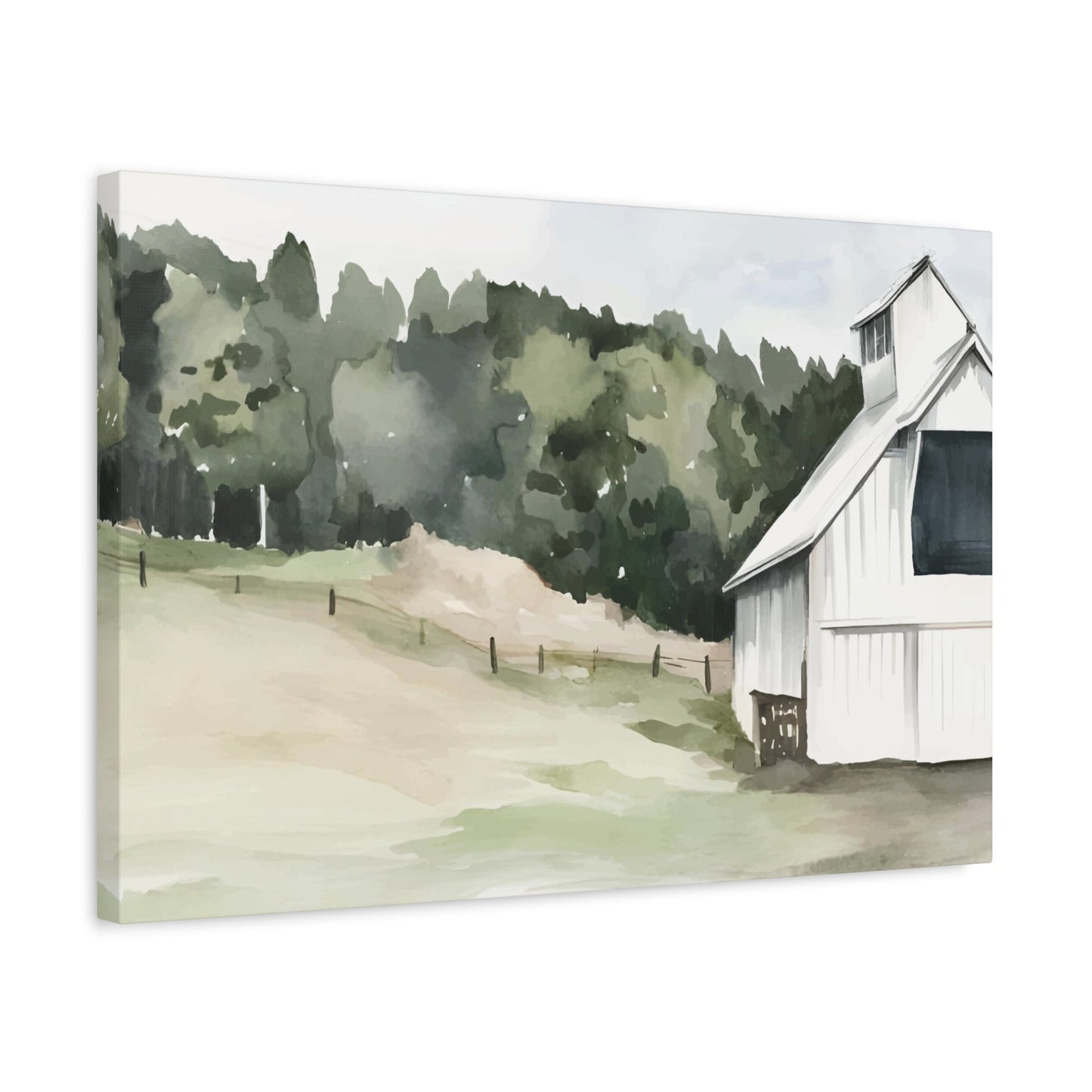
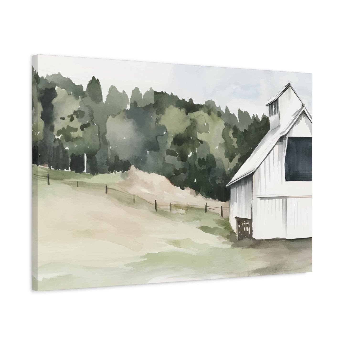
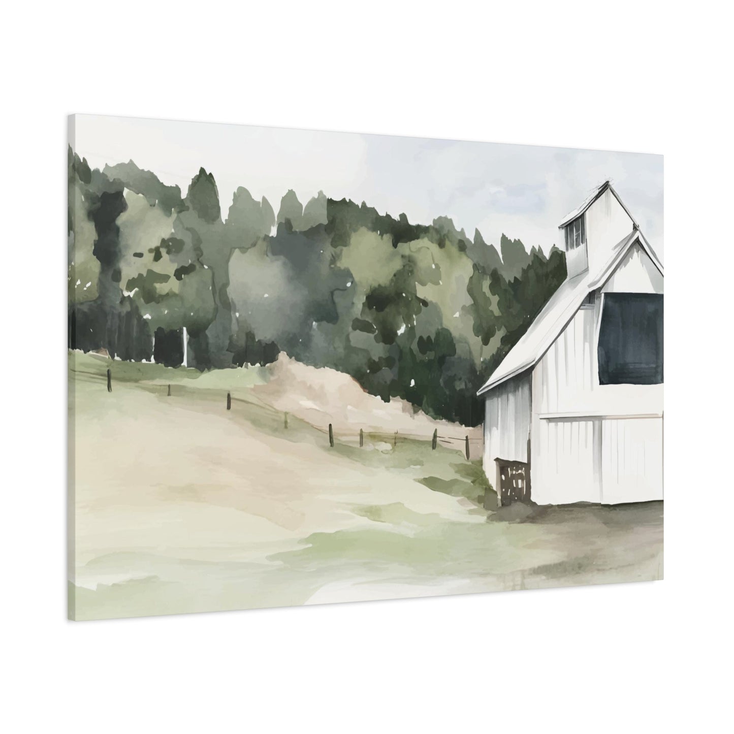
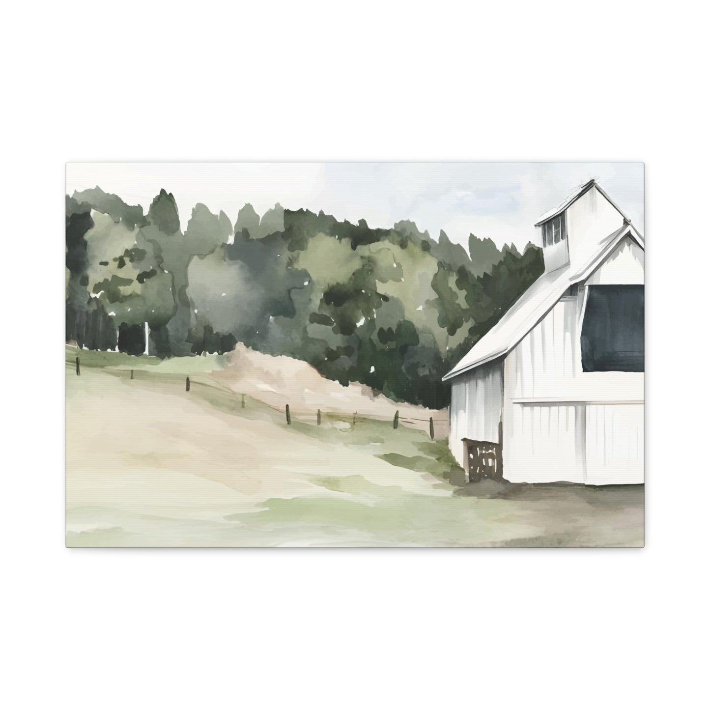
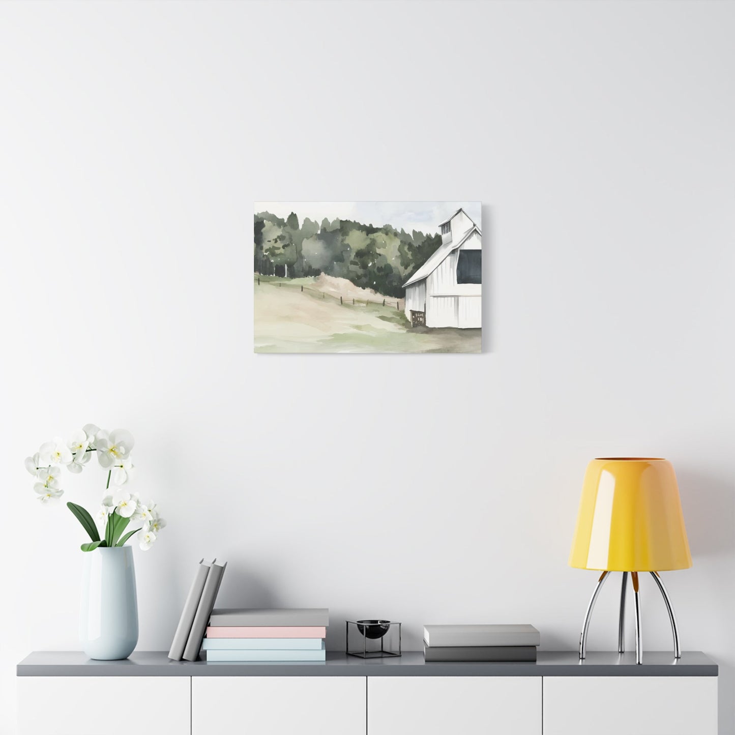
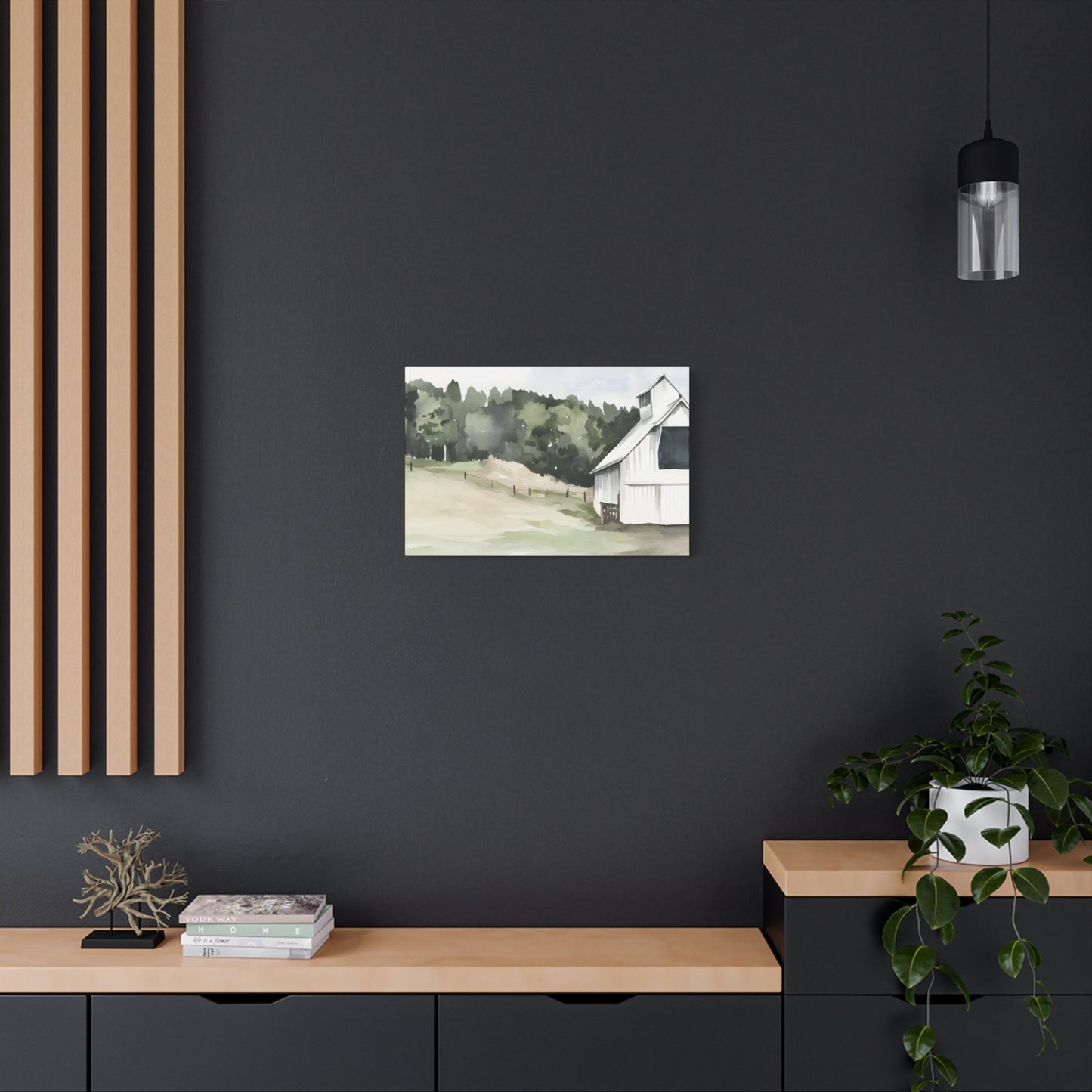
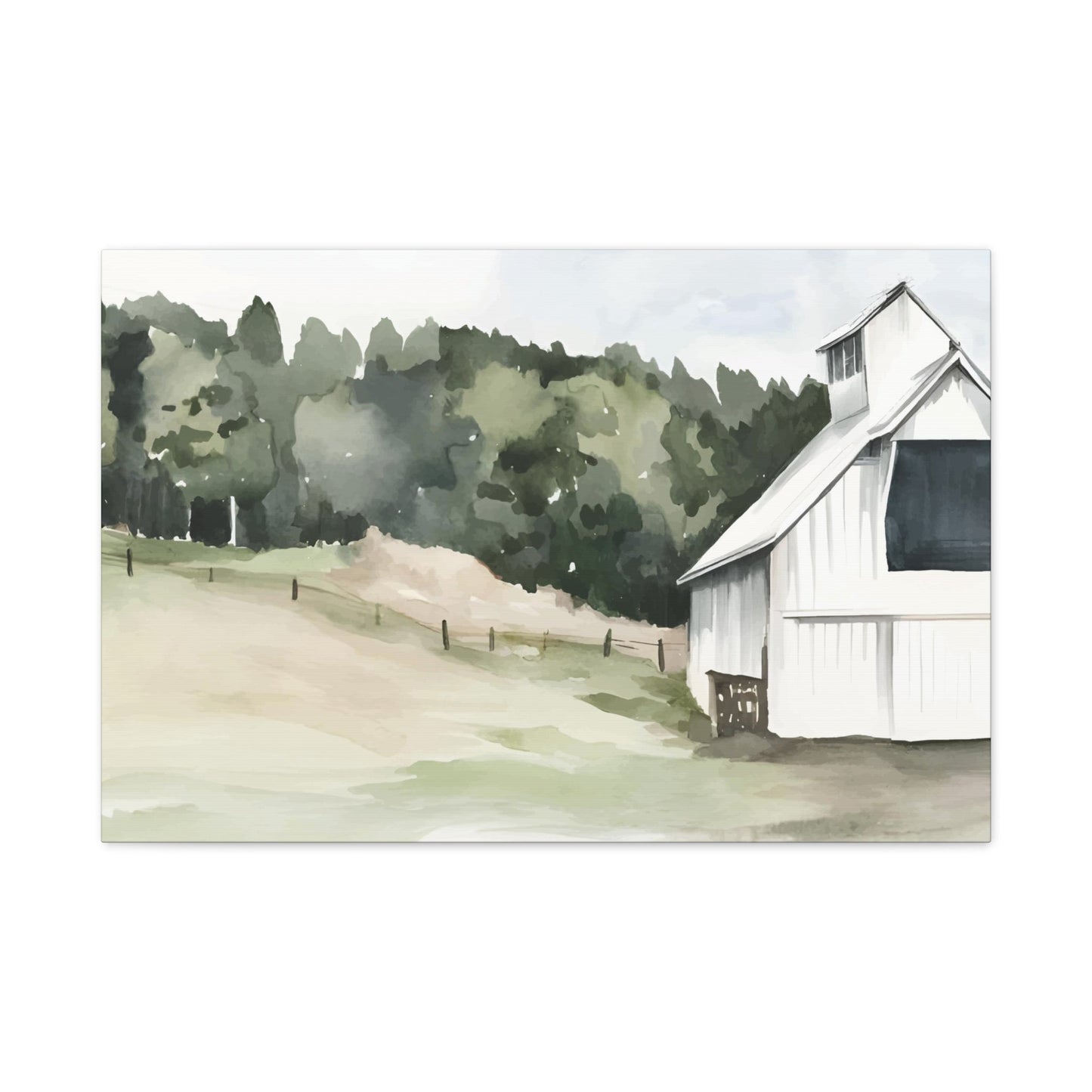
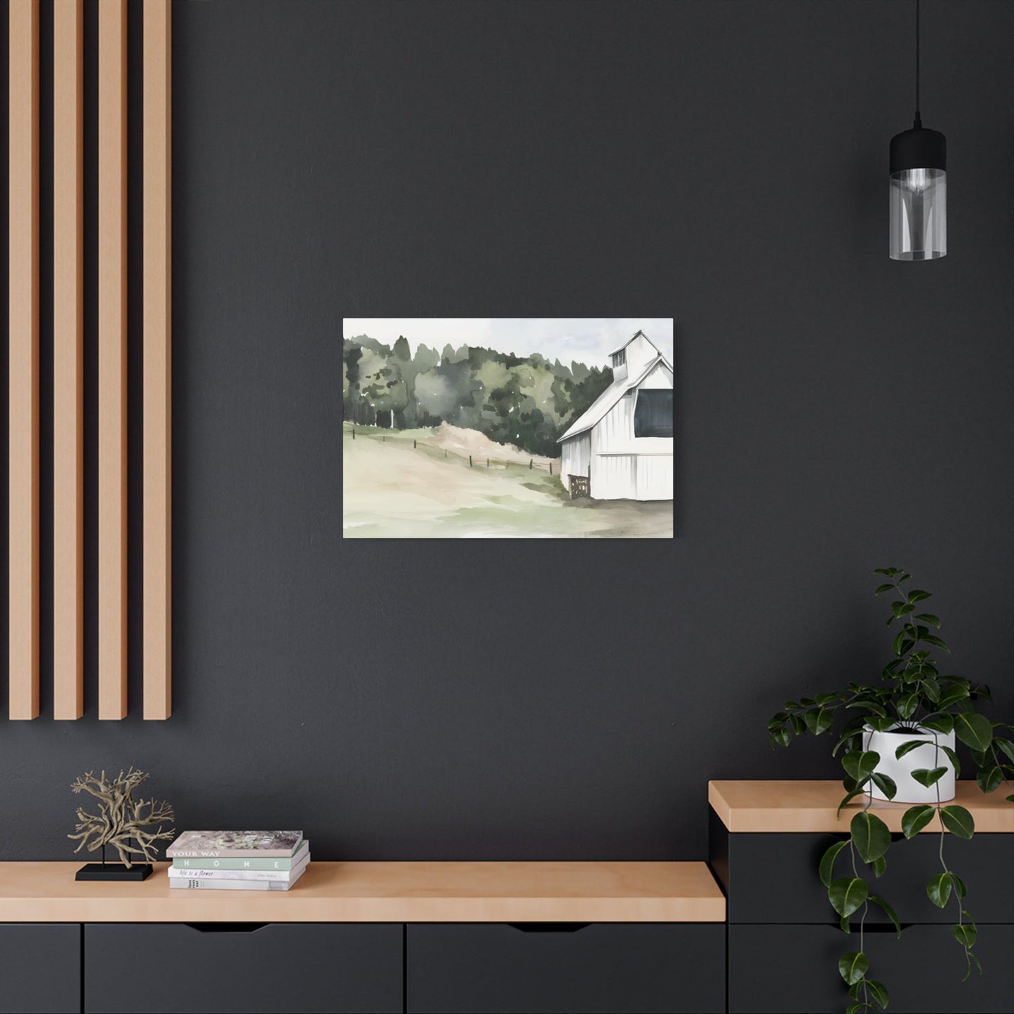
Jennifer Parker Wall Art & Canvas Prints
Jennifer Parker Wall Art & Canvas Prints
Couldn't load pickup availability


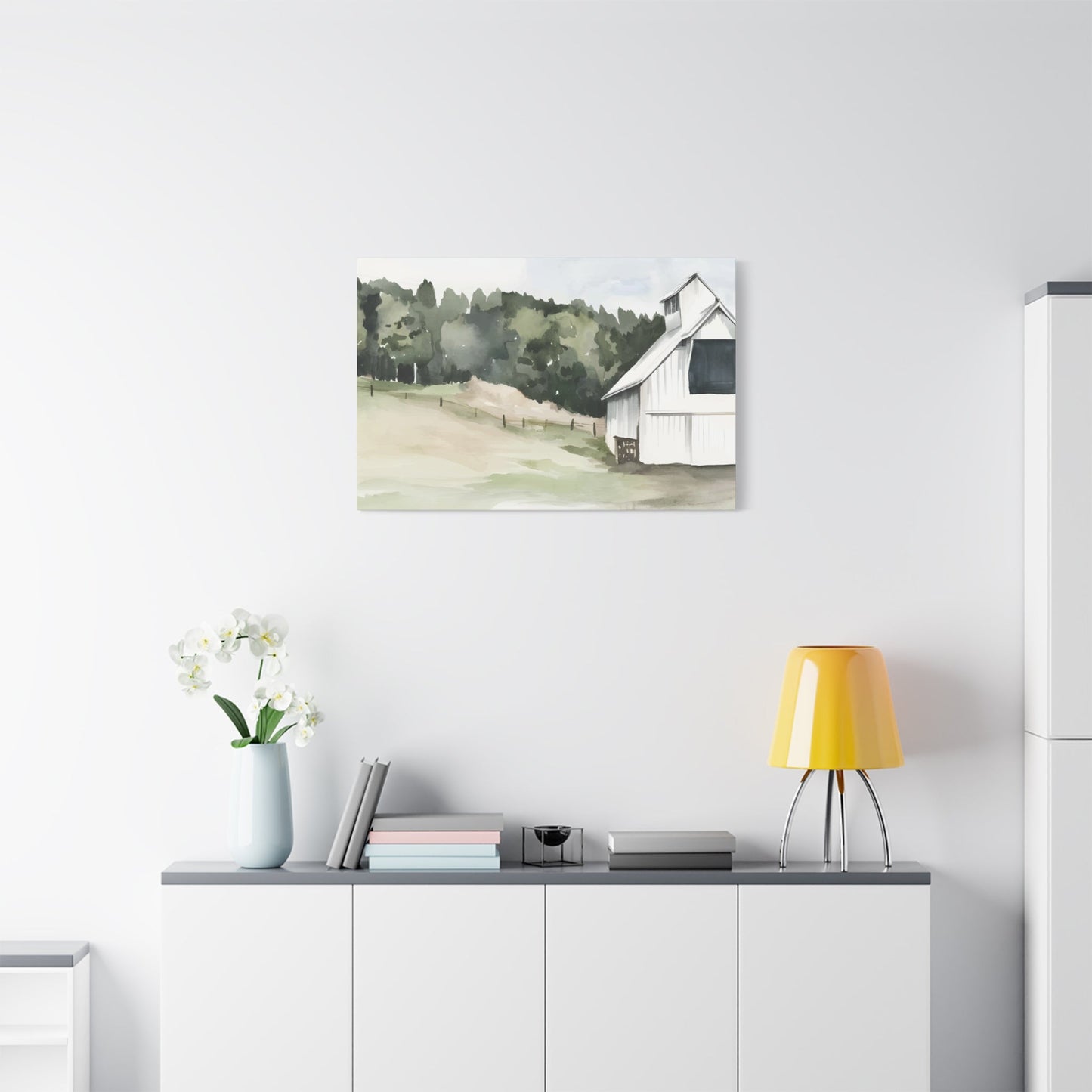
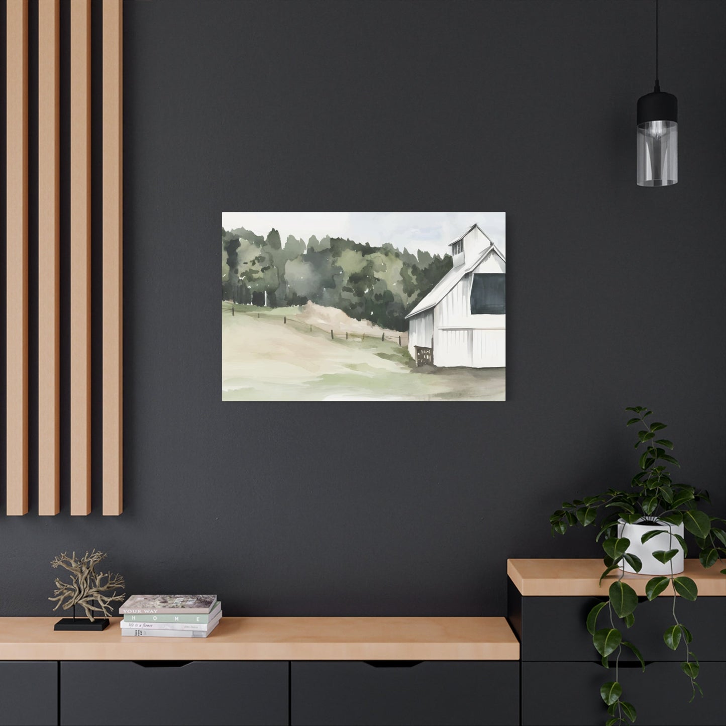

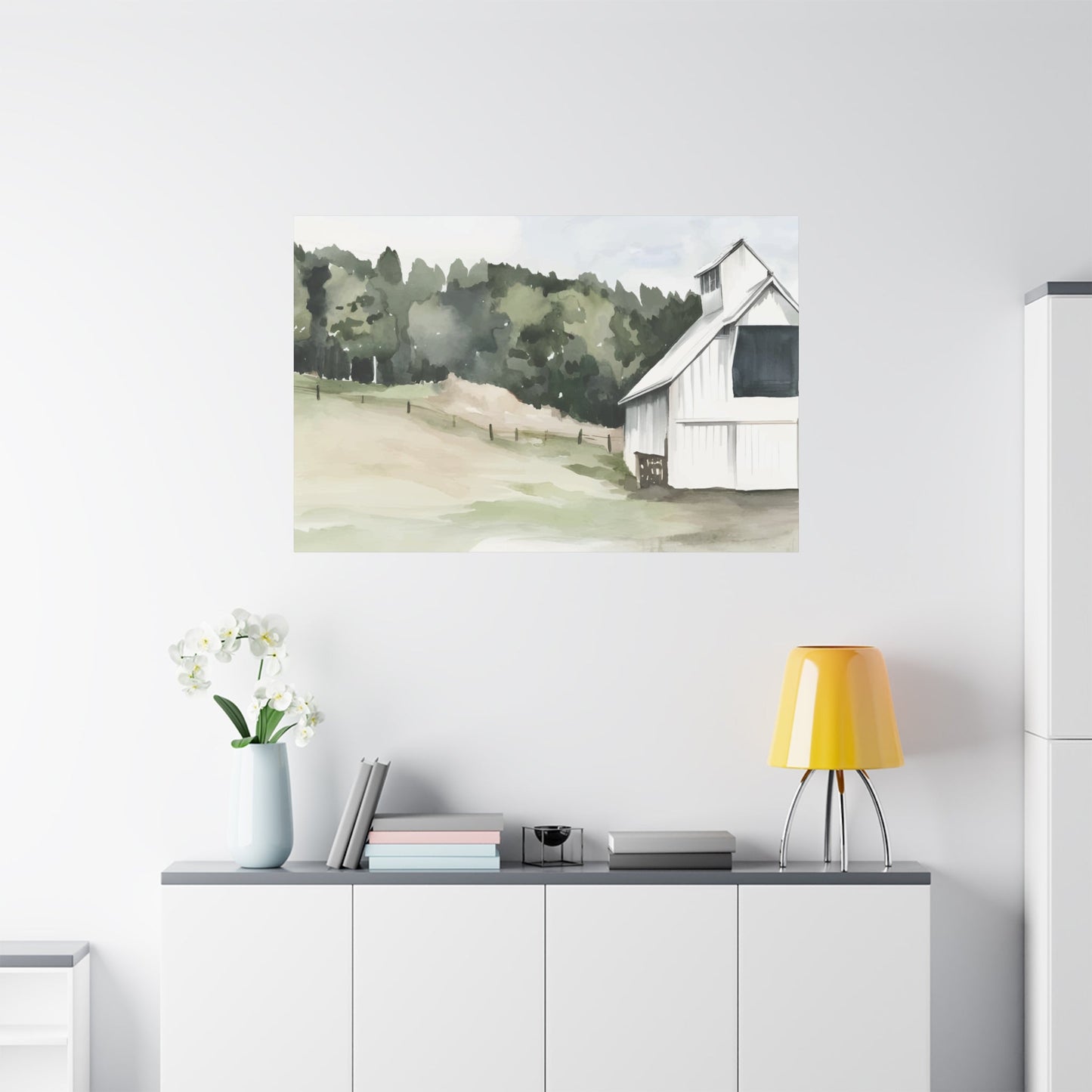
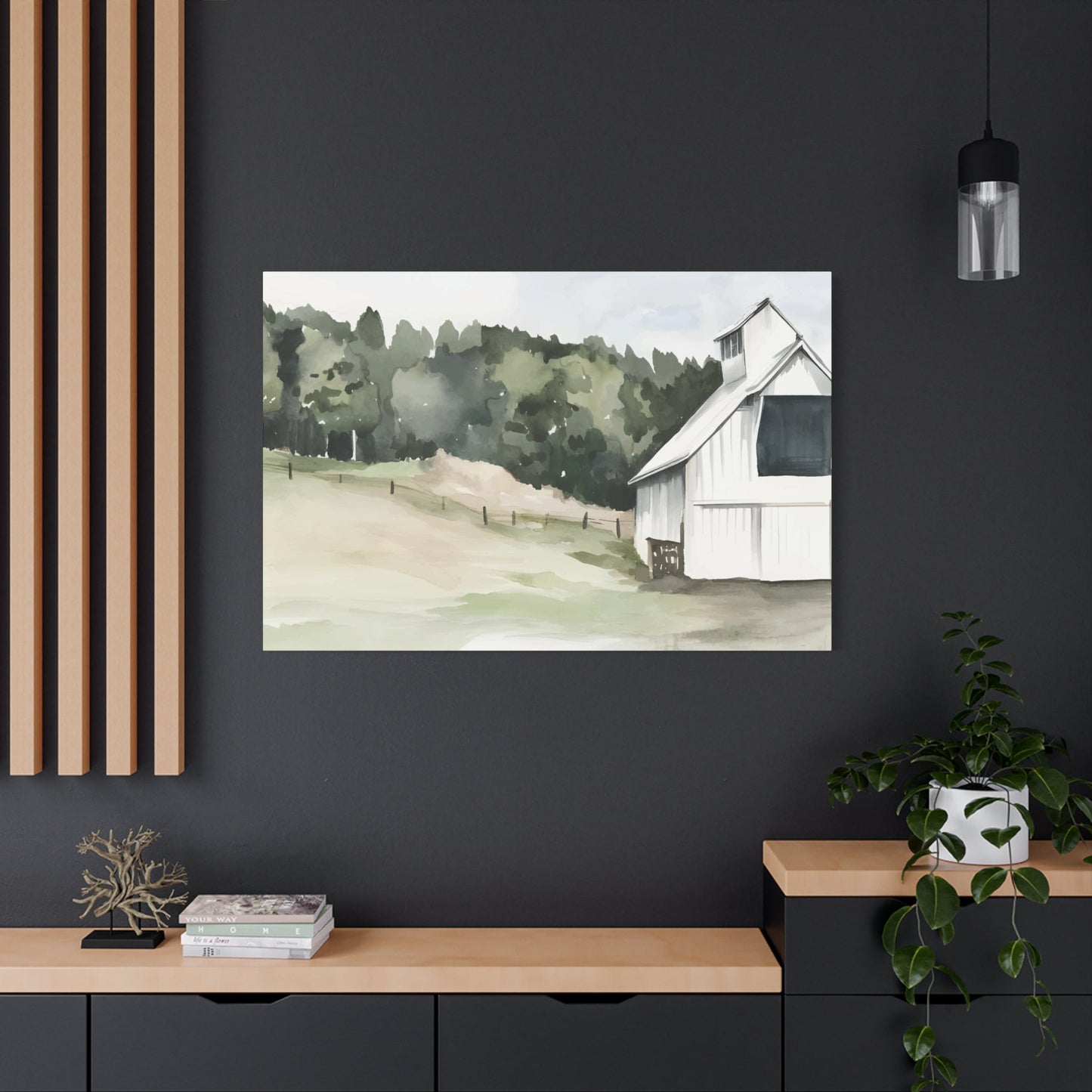
Versatility of Jennifer Parker Wall Art in Different Decor Styles
Color serves as the fundamental language through which Jennifer Paxton Parker communicates emotion, mood, and atmosphere in her distinctive canvas creations. Her masterful understanding of chromatic relationships transforms ordinary wall surfaces into captivating visual narratives that speak directly to the viewer's psychological and emotional responses. The artist's sophisticated palette selections demonstrate an intuitive grasp of how different hues interact with natural and artificial lighting throughout various times of day, creating dynamic visual experiences that evolve with changing environmental conditions.
Parker's approach to color theory extends beyond traditional artistic conventions, incorporating elements of environmental psychology and biophilic principles that recognize humanity's innate connection to natural environments. Her careful selection of earth tones, forest greens, ocean blues, and sunset oranges creates harmonious compositions that promote feelings of tranquility and connection to the natural world. These chromatic choices serve multiple purposes, simultaneously enhancing the aesthetic appeal of residential and commercial environments while contributing to occupants' overall wellbeing and mental clarity.
The artist's sophisticated understanding of temperature relationships between warm and cool tones enables her to create visual depth and dimensional interest within her compositions. Warm golden hues advance toward the viewer, creating focal points and areas of emphasis, while cooler blue and green tones recede, establishing atmospheric perspective and creating the illusion of greater spatial depth. This masterful manipulation of color temperature allows her artwork to function as visual windows, expanding perceived room dimensions and creating more open, breathable environments.
Parker's color selections also demonstrate remarkable sensitivity to contemporary lifestyle preferences and current trends in residential aesthetics. Her palette choices complement popular architectural elements, furniture styles, and decorative accessories commonly found in modern homes, ensuring seamless integration into existing design schemes. The artist's ability to balance trending colors with timeless natural hues ensures her artwork remains relevant and appealing across changing fashion cycles and evolving personal preferences.
Curating Natural-Themed Gallery Collections for Maximum Visual Impact
Developing a cohesive nature-themed gallery arrangement using Jennifer Paxton Parker's diverse portfolio requires careful consideration of thematic consistency, visual balance, and narrative flow. The process begins with selecting pieces that share common elements such as seasonal themes, habitat types, or species families while maintaining sufficient visual variety to prevent monotony or repetitive patterns. Successful gallery arrangements tell compelling stories about natural environments, seasonal cycles, or specific ecological relationships that engage viewers intellectually and emotionally.
The spatial arrangement of multiple pieces demands attention to scale relationships, color harmonies, and compositional balance across the entire wall surface. Larger statement pieces typically anchor the arrangement, providing visual weight and establishing dominant themes, while smaller complementary works fill supporting roles, adding detail, texture, and nuanced color variations. The most effective arrangements create visual rhythms through repetition of shapes, colors, or themes while maintaining enough variation to sustain viewer interest across extended viewing periods.
Proper spacing between individual pieces ensures each artwork receives adequate visual breathing room while maintaining overall collection cohesion. Professional gallery standards suggest maintaining consistent gaps between frames, typically ranging from two to four inches depending on the overall scale of the arrangement and the dimensions of the surrounding architectural features. This systematic approach to spacing creates clean, organized presentations that allow each piece to contribute meaningfully to the overall visual narrative.
Thematic groupings within larger collections can focus on specific aspects of Parker's natural subjects, such as seasonal progressions, habitat diversity, or species relationships. Water-themed collections might combine her lake scenes, river landscapes, and ocean vistas to create immersive aquatic environments. Bird-focused arrangements could showcase her diverse avian subjects, from majestic herons to delicate songbirds, creating ornithological studies that appeal to nature enthusiasts and casual observers alike.
Culinary Enhancement Through Nature-Inspired Kitchen Wall Displays
Kitchen environments benefit significantly from Jennifer Paxton Parker's food and nature-themed artwork, which adds warmth, vitality, and visual interest to these frequently used gathering locations. Her botanical prints, fruit studies, and garden scenes create positive associations with fresh, healthy ingredients while enhancing the overall ambiance of culinary preparation and dining experiences. The psychological impact of natural imagery in food preparation areas cannot be understated, as these visual connections to growing, harvesting, and seasonal abundance enhance appetite appeal and create more enjoyable cooking experiences.
Parker's vegetable garden scenes and herb studies provide particular relevance in kitchen settings, creating visual connections between fresh ingredients and their growing environments. These pieces serve educational purposes for family members interested in gardening, sustainable food production, or seasonal eating patterns while simultaneously providing aesthetic enhancement to functional cooking areas. The artist's realistic yet stylized approach to botanical subjects ensures these pieces maintain artistic integrity while serving practical decorative purposes.
Color coordination between Parker's artwork and kitchen design elements requires careful attention to existing cabinetry finishes, countertop materials, and appliance colors. Her earth-tone palette naturally complements popular kitchen color schemes, including warm wood finishes, natural stone countertops, and stainless steel appliances. The organic colors in her botanical pieces can bridge potential conflicts between different material finishes, creating more cohesive and harmonious overall design schemes.
Lighting considerations in kitchen environments demand special attention due to the combination of task lighting, ambient illumination, and natural daylight from windows. Parker's pieces respond beautifully to varied lighting conditions, with her realistic color selections maintaining accuracy under different light sources. The artist's understanding of how natural colors shift under artificial illumination ensures her kitchen artwork remains visually appealing throughout different times of day and seasons.
The placement of food-related artwork requires sensitivity to kitchen workflow patterns and cleaning considerations. Positions away from direct cooking areas reduce exposure to grease, steam, and food particles while maintaining visual accessibility during meal preparation activities. Strategic placement near dining areas, breakfast nooks, or kitchen islands maximizes viewing opportunities while protecting artwork from potentially damaging kitchen activities.
Sophisticated Silhouette Artistry and Minimalist Aesthetic Appeal
Jennifer Paxton Parker's silhouette and outline artworks represent a masterful exploration of minimalist artistic principles, demonstrating how reduced visual elements can create maximum emotional and aesthetic impact. These pieces showcase her ability to distill complex natural forms into their most essential visual components, creating striking compositions that rely on shape, proportion, and negative elimination rather than detailed realistic representation. The sophisticated simplicity of her silhouette work appeals to contemporary aesthetic preferences while maintaining timeless artistic qualities.
The psychological impact of silhouette artwork stems from the viewer's active participation in completing visual information. When presented with simplified outline forms, human perception automatically fills in missing details based on personal experience and memory, creating personalized interpretations that vary among different viewers. This participatory aspect makes Parker's silhouette pieces particularly engaging, as each observer brings unique perspectives and associations to their viewing experience.
Her charcoal silhouettes demonstrate exceptional technical skill in achieving smooth, consistent line quality and precise edge definition. The medium's inherent versatility allows for subtle gradations between pure black silhouettes and more nuanced tonal variations that suggest dimensional form without destroying the essential simplicity of the silhouette concept. This technical mastery ensures her pieces maintain professional quality standards while exploring creative possibilities within minimalist constraints.
The versatility of silhouette artwork makes these pieces particularly valuable for contemporary residential and commercial environments. Their simplified visual vocabulary allows them to integrate successfully into diverse design schemes without competing with other decorative elements or overwhelming existing color relationships. This adaptability makes Parker's silhouette pieces excellent choices for transitional decorating situations or environments where occupant preferences may change over time.
Modern architectural environments particularly benefit from the clean lines and reduced visual complexity characteristic of silhouette artwork. The geometric precision and minimalist aesthetic of contemporary buildings create ideal backdrops for Parker's simplified natural forms, establishing interesting contrasts between organic subject matter and architectural geometry. These juxtapositions create dynamic visual tension that enhances both the artwork and the surrounding architectural features.
Thoughtful Gift Selection from Parker's Canvas Print Collection
Jennifer Paxton Parker's diverse portfolio provides exceptional opportunities for selecting meaningful, personalized gifts that reflect recipients' interests, aesthetic preferences, and living environments. The process of choosing appropriate pieces requires consideration of the recipient's lifestyle, existing decorative preferences, and the specific occasions or relationships being celebrated. Her nature-themed subjects offer universal appeal while allowing for specific selections that demonstrate thoughtfulness and personal attention to individual preferences.
For individuals with established interests in particular natural environments or wildlife species, Parker's specialized collections provide opportunities for highly targeted gift selections. Bird enthusiasts might appreciate her detailed avian studies, while gardening lovers could value her botanical prints or seasonal landscape pieces. These subject-specific selections demonstrate gift-giver awareness of recipient interests while providing lasting decorative value for their living environments.
The various size options available in Parker's canvas print collections accommodate different gift-giving situations and budget considerations. Smaller pieces provide affordable options for casual gift-giving occasions while maintaining the same artistic quality and visual impact as larger statement pieces. Multiple small prints can be grouped together for more substantial gifts or given separately for various occasions throughout the year, creating ongoing connections between gift-giver and recipient.
Professional presentation considerations include framing options, protective packaging, and accompanying informational materials that enhance the gift-giving experience. High-quality framing elevates the perceived value of the artwork while ensuring long-term protection and professional presentation. Detailed information about the artist, the specific subject matter, and care instructions demonstrates thoughtfulness and provides recipients with meaningful context for their new artwork.
Corporate gift-giving situations benefit from Parker's professional quality artwork and nature themes that avoid potentially controversial subject matter while maintaining broad appeal across diverse recipient populations. Her pieces provide sophisticated alternatives to typical corporate gifts, offering lasting value and daily appreciation rather than consumable items that provide only temporary satisfaction. The universal appeal of natural subjects ensures appropriateness across different cultural backgrounds and personal preferences.
Achieving Balance Between Minimalist and Bold Artistic Statements
Jennifer Paxton Parker's artistic portfolio demonstrates exceptional ability to navigate the delicate balance between minimalist restraint and bold visual impact, creating pieces that satisfy diverse aesthetic preferences and design requirements. Her approach to this balance involves careful manipulation of compositional elements, color intensity, scale relationships, and detail density to achieve optimal visual weight for different applications and environments.
The artist's minimalist tendencies appear in her sophisticated use of negative imagery, where empty canvas areas become active compositional elements rather than passive background features. This strategic employment of visual breathing room allows focal subjects to command attention without overwhelming viewers or competing with surrounding environmental elements. The resulting compositions achieve maximum impact through careful elimination of unnecessary details rather than through additive complexity.
Bold elements in Parker's work typically manifest through strategic color placements, dramatic scale contrasts, or unexpected compositional arrangements that surprise and engage viewers. These bold choices demonstrate artistic confidence while maintaining overall composition harmony through careful attention to balance, proportion, and visual flow. The artist's ability to incorporate dramatic elements without destroying overall composition unity requires exceptional skill and artistic maturity.
Her mastery of this balance makes her artwork particularly suitable for contemporary residential environments where occupants often desire visual interest without overwhelming complexity. Modern lifestyle preferences tend toward cleaner, more organized visual environments, but complete minimalism can feel cold or impersonal. Parker's balanced approach provides sufficient visual stimulation to maintain interest while avoiding the chaos or clutter that characterizes less disciplined artistic approaches.
The scalability of her balanced aesthetic allows individual pieces to function effectively in various architectural contexts, from intimate residential settings to expansive commercial applications. Smaller pieces maintain their visual integrity and emotional impact even in confined locations, while larger statement pieces can anchor substantial architectural features without overwhelming the surrounding environment. This versatility makes her artwork valuable for diverse applications and changing needs over time.
Avian-Themed Artwork for Contemporary Living Environments
Jennifer Paxton Parker's heron and bird-themed artwork represents some of her most compelling and emotionally resonant work, capturing the grace, dignity, and natural beauty of these magnificent creatures in their native habitats. Her ability to portray avian subjects with both anatomical accuracy and artistic interpretation creates pieces that appeal to bird enthusiasts, nature lovers, and art collectors while maintaining broad decorative appeal for general residential applications.
The symbolic significance of bird imagery in human culture adds layers of meaning to these artistic selections, as different species carry various cultural associations and emotional resonances. Herons, with their patient, contemplative hunting behavior and elegant proportions, suggest qualities of mindfulness, patience, and natural wisdom that resonate with contemporary lifestyle preferences. These symbolic associations make Parker's heron pieces particularly appropriate for meditation areas, reading nooks, or other quiet contemplative environments.
Her technical approach to feather texture, anatomical proportion, and natural posturing demonstrates deep observational skills and commitment to authentic representation. The artist's ability to capture the subtle variations in plumage patterns, the graceful curves of necks and wings, and the alert expressions characteristic of different bird species creates compelling portraits that maintain viewer interest through extended observation periods.
The color palettes in Parker's bird artwork tend toward natural, muted tones that complement contemporary color schemes while avoiding the harsh brightness or artificial colors that might clash with existing decorative elements. Her sophisticated understanding of how natural bird coloration changes under different lighting conditions ensures these pieces maintain visual appeal throughout various times of day and seasonal lighting variations.
Compositional arrangements featuring multiple bird species can create engaging ornithological studies that serve educational purposes while providing aesthetic enhancement. These grouped arrangements work particularly well in family areas where they can spark conversations about wildlife, conservation, or personal nature experiences. The artist's attention to scale relationships between different species ensures realistic proportional representations that maintain scientific accuracy alongside artistic appeal.
Temperature Relationships and Atmospheric Effects in Natural Artwork
The sophisticated interplay between warm and cool color temperatures in Jennifer Paxton Parker's artwork creates dynamic visual experiences that shift and evolve under different lighting conditions and viewing circumstances. Her masterful understanding of how color temperature affects emotional response enables her to craft pieces that promote specific moods and psychological states, from energizing morning inspiration to calming evening relaxation.
Warm color dominance in her sunset landscapes, autumn foliage studies, and golden-hour wildlife scenes creates inviting, comfortable atmospheres that encourage viewer engagement and emotional connection. These pieces generate feelings of warmth, comfort, and positive energy that make them particularly effective in gathering areas, family rooms, and other social environments where welcoming atmospheres enhance interpersonal connections and shared experiences.
Cool-toned pieces featuring blue skies, water scenes, and winter landscapes provide balancing visual relief and promote feelings of calm, contemplation, and peaceful reflection. These cooler works function effectively in bedrooms, study areas, and other private environments where tranquil atmospheres support rest, concentration, and personal reflection. The psychological cooling effect of blue and green dominance can also provide visual relief in warm climates or sun-exposed room orientations.
Her skillful combination of warm and cool elements within individual compositions creates sophisticated color harmonies that avoid the potential monotony of single-temperature dominance while maintaining overall composition unity. Strategic placement of contrasting temperature accents creates focal points, suggests dimensional depth, and guides viewer attention through carefully planned visual pathways across the composition surface.
The seasonal variations in Parker's temperature relationships reflect natural annual cycles, creating opportunities for rotating artwork selections to complement changing weather patterns and seasonal decorative themes. Summer pieces might emphasize cooler blues and greens to provide psychological relief from heat, while winter selections could feature warmer tones to counterbalance cold weather and shorter daylight hours.
Optimizing Compact Living Areas with Scaled Artistic Solutions
Jennifer Paxton Parker's mini canvas offerings provide exceptional opportunities for enhancing smaller living environments without overwhelming limited wall areas or competing with essential functional elements. These compact pieces maintain the same artistic quality and visual impact as larger works while accommodating the spatial constraints and proportional requirements of apartments, studios, and other space-limited residential situations.
The strategic placement of multiple small pieces can create visual interest and personality in compact areas while avoiding the space-consuming impact of single large statement pieces. Grouping several mini canvases in grid patterns, linear arrangements, or asymmetrical clusters allows for creative display options that can adapt to changing furniture arrangements and evolving personal preferences without requiring major wall modifications or professional installation services.
Color coordination becomes particularly important in smaller environments where artwork has greater proportional impact on overall visual atmosphere. Parker's natural palette selections work exceptionally well in compact areas because earth tones and natural colors tend to expand perceived dimensions rather than contracting visual boundaries. Her sophisticated color relationships help create more open, breathable atmospheres in potentially cramped or confined living situations.
The affordability of mini canvas options enables experimental decorating approaches and seasonal rotation possibilities that might not be practical with larger, more expensive pieces. Multiple small pieces can be moved, regrouped, or temporarily removed to accommodate changing needs or preferences without significant financial considerations, making them particularly appropriate for temporary living situations or frequently changing environments.
Lighting considerations in compact areas require special attention due to limited natural light sources and potentially conflicting artificial illumination from multiple functional purposes. Parker's pieces respond well to various lighting conditions, maintaining color accuracy and visual appeal under different illumination scenarios commonly found in smaller residential environments.
Harmonious Integration of Botanical and Wildlife Artistic Elements
The successful combination of Jennifer Paxton Parker's botanical prints with her animal artwork requires careful attention to thematic consistency, compositional balance, and natural relationship accuracy to create coherent collections that reflect authentic ecological connections. These mixed arrangements can illustrate natural habitat relationships, seasonal cycles, or specific ecosystem characteristics while maintaining artistic unity and visual appeal.
Authentic ecological relationships provide the strongest foundation for combining plant and animal subjects, as these natural associations create logical narrative connections that enhance viewer understanding and appreciation. Woodland scenes might combine Parker's forest floor botanical studies with her deer, rabbit, or bird portraits to create comprehensive habitat representations. Wetland themes could integrate her marsh plant studies with heron, duck, or frog artwork to illustrate complete aquatic ecosystem relationships.
Color harmony between botanical and animal pieces requires attention to seasonal coordination and natural coloration accuracy to maintain realistic environmental representation. Spring combinations might feature fresh green foliage with young animal portraits, while autumn arrangements could combine golden leaf studies with wildlife in winter preparation behaviors. These seasonal correlations create temporally accurate representations that reflect natural annual cycles.
Scale relationships between plant and animal subjects should reflect proportional accuracy found in natural environments, ensuring realistic size comparisons that maintain educational value alongside aesthetic appeal. Oversized botanical prints paired with diminutive wildlife images can create confusing proportional relationships that undermine the ecological authenticity these combinations are intended to represent.
The arrangement of mixed botanical and wildlife pieces can follow various organizational principles, from formal geometric patterns to more organic, naturalistic groupings that suggest random natural distributions. Formal arrangements work well in structured architectural environments, while organic groupings complement more casual, comfortable decorative schemes. The choice between these approaches should reflect overall environmental aesthetics and personal preferences.
Contemporary Architectural Harmony with Natural Silhouette Artwork
Jennifer Paxton Parker's charcoal silhouettes demonstrate exceptional compatibility with modern architectural environments, where their clean lines, geometric precision, and minimalist aesthetic principles complement contemporary design philosophies while introducing organic natural elements. The stark contrast between architectural geometry and natural forms creates dynamic visual tension that enhances both the artwork and the surrounding structural features.
Modern architectural emphasis on clean lines, open areas, and reduced decorative complexity provides ideal backdrops for silhouette artwork, where simplified forms can achieve maximum visual impact without competing with architectural details or overwhelming spatial relationships. The monochromatic nature of silhouette pieces allows them to integrate seamlessly into neutral color schemes commonly found in contemporary residential and commercial environments.
The scalability of silhouette artwork makes these pieces particularly valuable in modern architectural contexts where room proportions may vary significantly between different functional areas. Large statement silhouettes can anchor substantial wall surfaces in open-concept living areas, while smaller pieces can provide intimate focal points in more confined areas such as hallways, powder rooms, or transitional zones between different functional areas.
Lighting design in contemporary architecture often emphasizes dramatic contrasts, directional illumination, and adjustable intensity levels that work exceptionally well with silhouette artwork. The high contrast inherent in silhouette compositions responds beautifully to varied lighting conditions, creating different moods and visual effects throughout different times of day and various functional requirements.
The timeless quality of silhouette artwork ensures long-term compatibility with evolving architectural trends and changing decorative preferences. While specific contemporary styles may shift over time, the fundamental aesthetic principles underlying modern architecture are likely to remain consistent, making Parker's silhouette pieces valuable long-term decorative investments.
Professional Illumination Techniques for Natural Scene Enhancement
Proper lighting design plays a crucial role in maximizing the visual impact and emotional resonance of Jennifer Paxton Parker's nature scenes, requiring careful attention to illumination angle, intensity, color temperature, and reflection management. The artist's sophisticated understanding of how natural colors behave under different lighting conditions informs optimal display strategies that preserve color accuracy while enhancing dimensional depth and textural interest.
Natural daylight provides the most accurate color representation for Parker's work, as her palette selections are typically developed under natural illumination conditions. Positioning artwork to receive indirect natural light eliminates glare problems while providing optimal color rendition throughout daylight hours. North-facing walls often provide the most consistent natural illumination without the harsh directional effects that can create viewing difficulties or fade sensitive pigments.
Artificial lighting options require careful selection to maintain color accuracy and avoid unwanted color shifts that can distort the artist's intended palette relationships. LED illumination systems with high color rendering indices provide excellent color accuracy while generating minimal heat that could potentially damage canvas materials or accelerate color fading. Adjustable intensity controls allow for optimal illumination levels during different viewing periods and various functional requirements.
Directional accent lighting can enhance the dimensional qualities of canvas textures while creating dramatic focal effects that draw viewer attention to specific pieces or sections within larger collections. Picture lighting systems, track lighting arrangements, or strategically positioned floor or table lamps can provide controlled illumination that enhances artwork visibility without creating glare or reflection problems.
The integration of artwork lighting with overall room illumination requires coordination to avoid competing light sources or conflicting color temperatures that can create viewing difficulties. Dimming controls and layered lighting systems allow for adjustable illumination scenarios that can emphasize artwork during focused viewing periods while reducing prominence during other functional activities.
Display Format Selection for Optimal Aesthetic Impact
The choice between traditional framing and gallery wrap presentation methods for Jennifer Paxton Parker's artwork significantly affects both aesthetic impact and practical installation considerations. Each approach offers distinct advantages depending on the specific piece, intended environment, and personal aesthetic preferences, requiring careful evaluation of multiple factors to achieve optimal results.
Gallery wrap presentation creates clean, contemporary appearances that work particularly well with modern architectural environments and minimalist decorative schemes. This frameless approach allows artwork edges to wrap around canvas stretcher bars, creating dimensional depth and eliminating visual boundaries that might compete with the artistic content. The resulting clean lines and geometric precision complement contemporary furniture styles and architectural details.
Traditional framing options provide opportunities for color coordination, style integration, and protective enhancement that can significantly affect overall visual impact and long-term preservation. Frame selection should complement rather than compete with artistic content, with neutral colors and simple profiles typically providing the most versatile options. High-quality matting materials can provide additional color coordination opportunities while protecting artwork edges from direct frame contact.
The architectural context significantly influences appropriate display format selection, as formal traditional environments may benefit from classic framing approaches while contemporary settings often favor clean gallery wrap presentations. Mixed approaches within single environments require careful attention to consistency and intentional variation to avoid appearing random or uncoordinated.
Budget considerations affect format selection, as gallery wrap presentation typically costs less than high-quality framing while potentially providing equal or superior aesthetic impact depending on the specific environmental context. However, framing offers superior protection against environmental factors and physical damage, making it valuable for high-traffic areas or environments with potential hazards.
Installation requirements differ significantly between framed and unframed presentations, with gallery wraps typically requiring simpler hanging hardware and offering more flexibility for height adjustments or repositioning. Framed pieces may require more substantial wall anchors and professional installation services, particularly for larger or heavier pieces.
Seasonal Decorative Coordination with Floral Collections
Jennifer Paxton Parker's floral collections provide exceptional opportunities for seasonal decorative rotation that can refresh living environments throughout the annual cycle while maintaining consistent artistic quality and aesthetic coordination. Her diverse botanical portfolio includes species and arrangements appropriate for spring awakening themes, summer abundance displays, autumn harvest celebrations, and winter contemplative moods.
Spring selections might emphasize fresh green growth, delicate blossoms, and emerging foliage that reflects seasonal renewal and growing energy. These pieces create optimistic, forward-looking atmospheres that complement spring cleaning activities, fresh decorative accessories, and lighter color schemes that many people prefer as daylight hours increase and outdoor activities become more appealing.
Summer arrangements could feature abundant blooms, rich foliage, and garden scenes that celebrate peak growing season vitality and outdoor living preferences. Bold colors and lush compositions reflect summer energy while providing visual connections to gardening activities, outdoor entertaining, and extended daylight hours that characterize this season in most climates.
Autumn collections emphasizing harvest themes, changing foliage, and seasonal transitions create cozy, contemplative atmospheres appropriate for indoor activities and preparation for winter months. Warm color palettes featuring golden, orange, and red tones complement seasonal decorative accessories and create psychological warmth during cooling weather periods.
Winter botanical selections might focus on evergreen subjects, dried flower arrangements, or simplified compositions that reflect seasonal dormancy while maintaining visual interest during months when natural outdoor beauty may be limited. These pieces can provide needed natural connections during periods of reduced outdoor activity and limited daylight exposure.
The practical aspects of seasonal rotation require consideration of storage requirements, installation logistics, and budget implications. Multiple seasonal collections represent significant investments, but the psychological and aesthetic benefits of changing displays can justify these costs for individuals who value seasonal environmental variety and fresh decorative experiences.
Professional Environment Enhancement Through Calming Natural Imagery
Jennifer Paxton Parker's nature-themed artwork provides exceptional opportunities for enhancing professional office environments with imagery that promotes mental clarity, emotional balance, and positive workplace atmospheres. Research consistently demonstrates the psychological benefits of natural imagery in work environments, including reduced stress levels, improved concentration, and enhanced creative problem-solving capabilities.
The selection of appropriate pieces for professional environments requires consideration of industry context, client interactions, and employee preferences to ensure artwork enhances rather than distracts from productive work activities. Parker's more contemplative pieces, such as tranquil water scenes, peaceful forest landscapes, or elegant wildlife portraits, typically work well in professional settings where calm, focused atmospheres support optimal performance.
Color coordination with existing office design elements, including furniture finishes, carpet colors, and equipment appearances, ensures seamless integration that enhances overall environmental coherence. Parker's natural palette selections typically complement neutral office color schemes while adding sufficient visual interest to prevent sterile, impersonal atmospheres that can negatively affect employee morale and client perceptions.
The positioning of artwork in office environments should consider viewing angles, lighting conditions, and functional workflow patterns to maximize positive impact while minimizing potential distractions. Pieces visible from work stations can provide occasional visual relief during intensive tasks, while artwork in meeting areas or reception spaces can create positive impressions for visitors and clients.
Professional installation and maintenance considerations include security concerns, cleaning accessibility, and potential damage from office activities. High-quality framing and protective glass may be necessary in high-traffic areas or environments where physical contact is possible. Regular cleaning schedules and periodic condition assessments ensure artwork maintains professional appearance standards over extended periods.
Scale Considerations for Dramatic Statements versus Subtle Enhancement
The strategic selection between large statement canvases and smaller subtle prints from Jennifer Paxton Parker's portfolio requires careful evaluation of architectural proportions, functional requirements, and desired aesthetic impact levels. Each scale option serves different purposes and creates distinct visual effects that can significantly influence overall environmental character and viewer experience.
Large statement pieces function as architectural focal points that can anchor substantial wall areas while creating dramatic visual impact that establishes room character and emotional tone. These substantial works require adequate viewing distances and appropriate proportional relationships with surrounding furniture and architectural features to achieve optimal aesthetic balance without overwhelming the environment or creating visual competition problems.
The commanding presence of large-scale artwork demands careful consideration of subject matter appropriateness, as dramatic presentations amplify both positive and potentially distracting elements within the composition. Parker's most successful large pieces typically feature simple, powerful subjects with clear focal points and minimal background complexity that maintains viewer engagement without creating visual chaos.
Smaller subtle prints serve different functions, providing intimate viewing experiences, supporting larger focal pieces, or creating personal connections in more confined viewing situations. These pieces work particularly well in areas where close viewing is typical, such as reading nooks, hallway galleries, or personal office environments where individual appreciation takes precedence over dramatic architectural impact.
Budget considerations significantly affect scale selection decisions, as large statement pieces typically require greater financial investment while smaller prints provide more affordable options for experimental purchases or multiple piece collections. The cost-per-visual-impact ratio varies significantly between scales, requiring evaluation based on individual priorities and available resources.
Installation requirements differ substantially between large and small scale options, with statement pieces often requiring professional hanging services and substantial wall anchoring systems. Smaller pieces typically offer greater installation flexibility and repositioning possibilities, making them appropriate for frequently changing environments or temporary living situations.
Preservation and Maintenance Strategies for Canvas Print Longevity
Proper care and maintenance of Jennifer Paxton Parker's canvas prints ensures long-term color stability, structural integrity, and continued aesthetic appeal throughout extended ownership periods. Understanding the specific requirements and vulnerabilities of canvas printing technology enables owners to implement protective strategies that maximize artwork lifespan while maintaining optimal display conditions.
Environmental factors significantly affect canvas print longevity, with excessive humidity, temperature fluctuations, and direct sunlight exposure representing the primary threats to long-term stability. Optimal display environments maintain consistent temperature ranges between 65-75 degrees Fahrenheit with relative humidity levels between 45-55 percent. These conditions minimize expansion and contraction cycles that can stress canvas materials while preventing moisture-related problems such as mold growth or adhesive failure.
Direct sunlight exposure accelerates color fading and can cause irreversible damage to both canvas materials and printed inks. Ultraviolet filtering window films, protective glass, or strategic positioning away from direct sun exposure provides essential protection against photochemical degradation. Even indirect natural light should be monitored, as cumulative exposure effects can cause gradual color shifts over extended periods.
Regular cleaning and maintenance routines prevent accumulation of dust, pollutants, and other contaminants that can affect both appearance and long-term preservation. Gentle dusting with soft, lint-free cloths removes surface particles without damaging canvas textures or printed surfaces. Professional cleaning services may be necessary for more substantial cleaning requirements or stubborn contamination problems.
Physical protection against accidental contact, impact damage, or environmental hazards requires consideration of display location, traffic patterns, and potential risk factors. High-traffic areas, homes with active children or pets, and locations near potential moisture sources require additional protective measures such as protective glazing, strategic positioning, or alternative display locations.
Storage considerations for pieces not currently displayed include proper support systems, protective wrapping, and climate-controlled environments that prevent damage during non-display periods. Flat storage positions prevent gravitational stress on canvas materials, while appropriate wrapping materials protect against dust accumulation and potential physical damage during handling or transportation.
Color Harmony and Environmental Integration Principles
The successful integration of Jennifer Paxton Parker's artwork into existing decorative schemes requires sophisticated understanding of color theory, proportion relationships, and visual balance principles that create harmonious rather than competing design elements. Her natural palette selections provide excellent foundations for color coordination, but optimal results require careful attention to specific hue relationships, saturation levels, and value contrasts within the broader environmental context.
Monochromatic coordination strategies utilize different shades, tints, and tones of similar colors to create sophisticated unified appearances that avoid potential color conflicts while maintaining visual interest through subtle variation. Parker's pieces featuring dominant blue themes can coordinate with existing blue elements in furniture, fabrics, or architectural details while providing textural and compositional variety that prevents monotonous single-color dominance.
Complementary color relationships create dynamic visual tension and enhanced color vibrancy through strategic placement of opposite color wheel positions. Parker's warm sunset scenes can dramatically enhance cool blue room schemes, while her forest green pieces can intensify red or orange environmental elements. These high-contrast relationships require careful balance to avoid overwhelming visual competition.
Analogous color schemes utilize adjacent color wheel positions to create gentle, harmonious progressions that feel natural and comfortable to most observers. Parker's earth-tone pieces work exceptionally well in analogous schemes, as natural color relationships typically follow these harmonic progressions in actual environmental contexts.
The consideration of existing lighting conditions significantly affects color appearance and coordination success, as artificial illumination can shift color perception and create unexpected harmony or conflict issues. Testing artwork under various lighting scenarios ensures successful color integration across different functional periods and seasonal variations in natural light availability.
Proportion and scale relationships between artwork colors and environmental elements affect visual balance and overall design success. Large areas of intense color can overwhelm smaller spaces, while subtle colors may disappear in expansive environments. Achieving appropriate color proportion requires evaluation of both artwork size and color intensity relative to surrounding design elements.
Textile and Material Coordination Strategies
The successful coordination of Jennifer Paxton Parker's artwork with existing textile elements, furniture finishes, and architectural materials requires understanding how different surface textures, patterns, and material characteristics interact visually to create either harmonious integration or problematic competition. Her natural subject matter and earth-tone palettes typically coordinate well with organic materials, natural fibers, and traditional furniture finishes.
Fabric pattern coordination requires careful attention to scale relationships between textile designs and artistic compositions to prevent visual conflict or overwhelming complexity. Large-scale botanical prints in artwork can compete with similarly scaled floral fabrics, while smaller repeated patterns in textiles typically complement Parker's more naturalistic artistic approaches. The key lies in achieving appropriate scale variation rather than direct pattern matching.
Natural material coordination capitalizes on Parker's realistic color selections that typically match actual wood tones, stone colors, and other organic material characteristics found in furniture and architectural elements. Her forest scenes coordinate naturally with wood furniture finishes, while her water scenes complement stone countertops and ceramic accessories through authentic natural color relationships.
Synthetic material coordination requires more careful attention, as manufactured materials may display colors that don't exist naturally and could conflict with Parker's naturalistic palette selections. However, many contemporary synthetic materials attempt to replicate natural appearances and can coordinate successfully when color matching is carefully considered.
The consideration of surface texture relationships between canvas artwork and surrounding materials affects overall visual harmony and sensory experience. Smooth canvas surfaces provide textural contrast to rough stone or heavily textured fabrics, while the subtle canvas weave can coordinate with similar textile textures in upholstery or window treatments.
Metallic accent coordination involves balancing the warm or cool undertones in Parker's pieces with existing metal finishes in lighting fixtures, furniture hardware, and decorative accessories. Her warm-toned pieces coordinate naturally with brass and bronze finishes, while cooler pieces work well with silver, chrome, or pewter metallic elements.
Conclusion
Jennifer Paxton Parker's remarkable wall art collection represents a sophisticated fusion of artistic excellence, natural beauty, and practical decorative functionality that transforms ordinary living and working environments into inspiring, emotionally resonant locations. Her masterful understanding of color relationships, compositional balance, and natural subject matter creates artwork that serves multiple purposes simultaneously, providing aesthetic enhancement, psychological benefits, and meaningful connections to the natural world that increasingly characterizes contemporary lifestyle preferences.
The diverse range of subjects, scales, and artistic approaches within Parker's portfolio ensures appropriate options for virtually any decorative requirement, from dramatic architectural focal points to intimate personal viewing experiences. Her ability to balance minimalist restraint with bold visual impact creates pieces that satisfy diverse aesthetic preferences while maintaining timeless appeal that transcends changing fashion trends and evolving personal tastes.
The technical quality and artistic integrity evident throughout her canvas print collection demonstrates professional standards that justify investment considerations while providing lasting value that extends far beyond temporary decorative trends. Her sophisticated understanding of how artwork functions within broader environmental contexts ensures successful integration into existing design schemes while offering flexibility for future decorative evolution and changing personal preferences.
The psychological and emotional benefits associated with natural imagery in residential and commercial environments have been extensively documented through research in environmental psychology and biophilic design principles. Parker's authentic representation of natural subjects provides these documented benefits while maintaining artistic quality that satisfies aesthetic requirements and personal preferences for beautiful, meaningful decorative elements.
Her artwork's versatility extends beyond simple decorative functionality to encompass educational value, conversation-starting potential, and opportunities for personal reflection and emotional connection with natural environments. These multiple benefit layers justify the investment in quality wall art while providing ongoing value appreciation that extends throughout ownership periods and changing life circumstances.
The accessibility of her work through various size options, price points, and display formats ensures that quality natural wall art remains available to diverse economic situations and living arrangements. This democratic approach to art accessibility reflects contemporary values while maintaining uncompromising quality standards that preserve artistic integrity and long-term satisfaction.
In conclusion, Jennifer Paxton Parker's wall art collection offers exceptional opportunities for individuals seeking to enhance their personal environments with meaningful, beautiful, and psychologically beneficial artwork that celebrates the natural world while satisfying contemporary aesthetic preferences and practical decorative requirements. The investment in her pieces represents a commitment to personal environmental quality that provides ongoing satisfaction, psychological benefits.
