


Keys Of Piano Drawing Painting Wall Art & Canvas Prints
Keys Of Piano Drawing Painting Wall Art & Canvas Prints
Couldn't load pickup availability

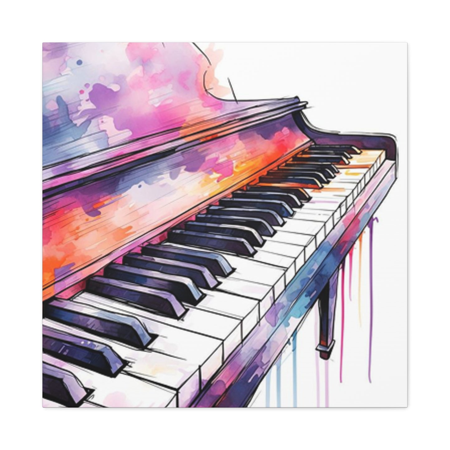


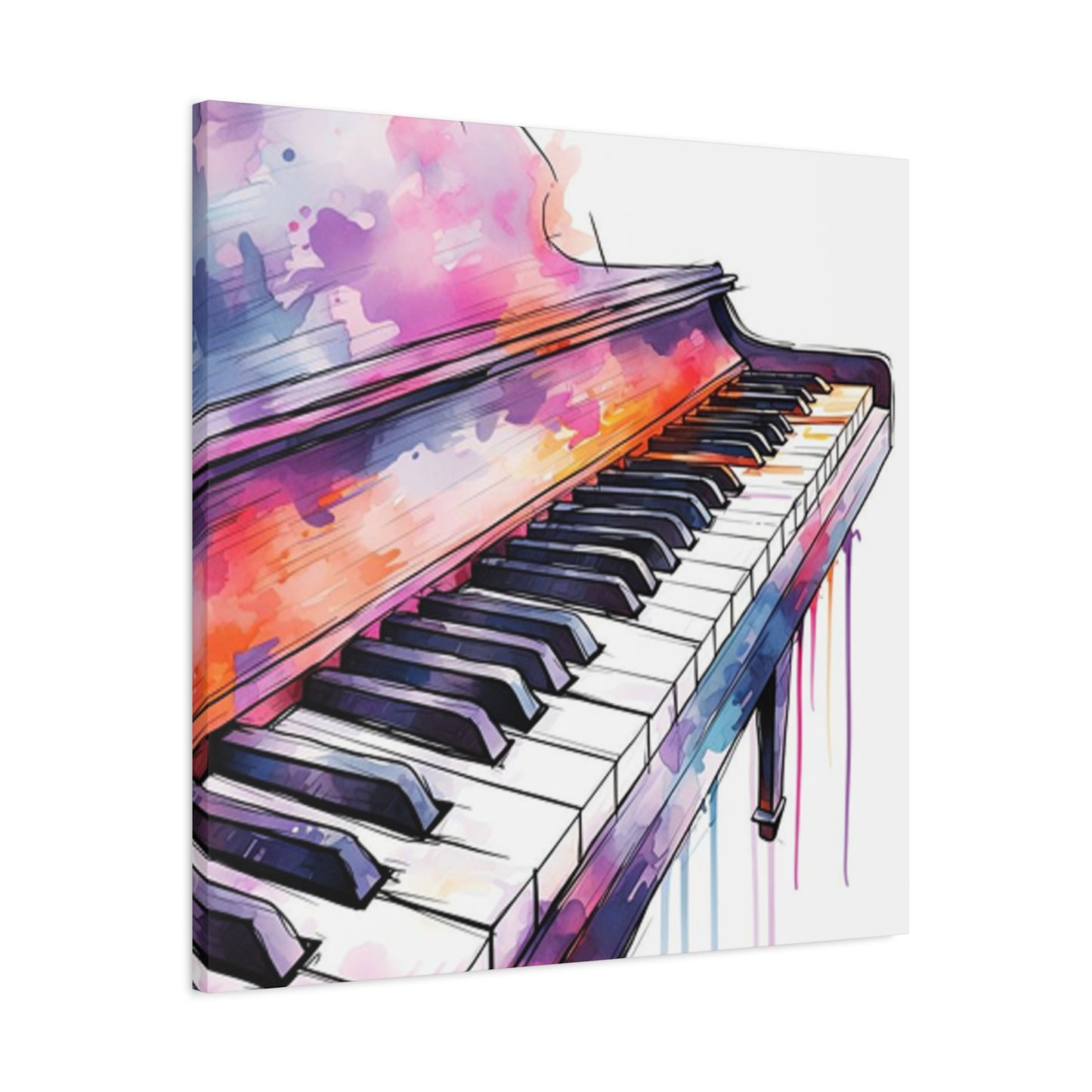
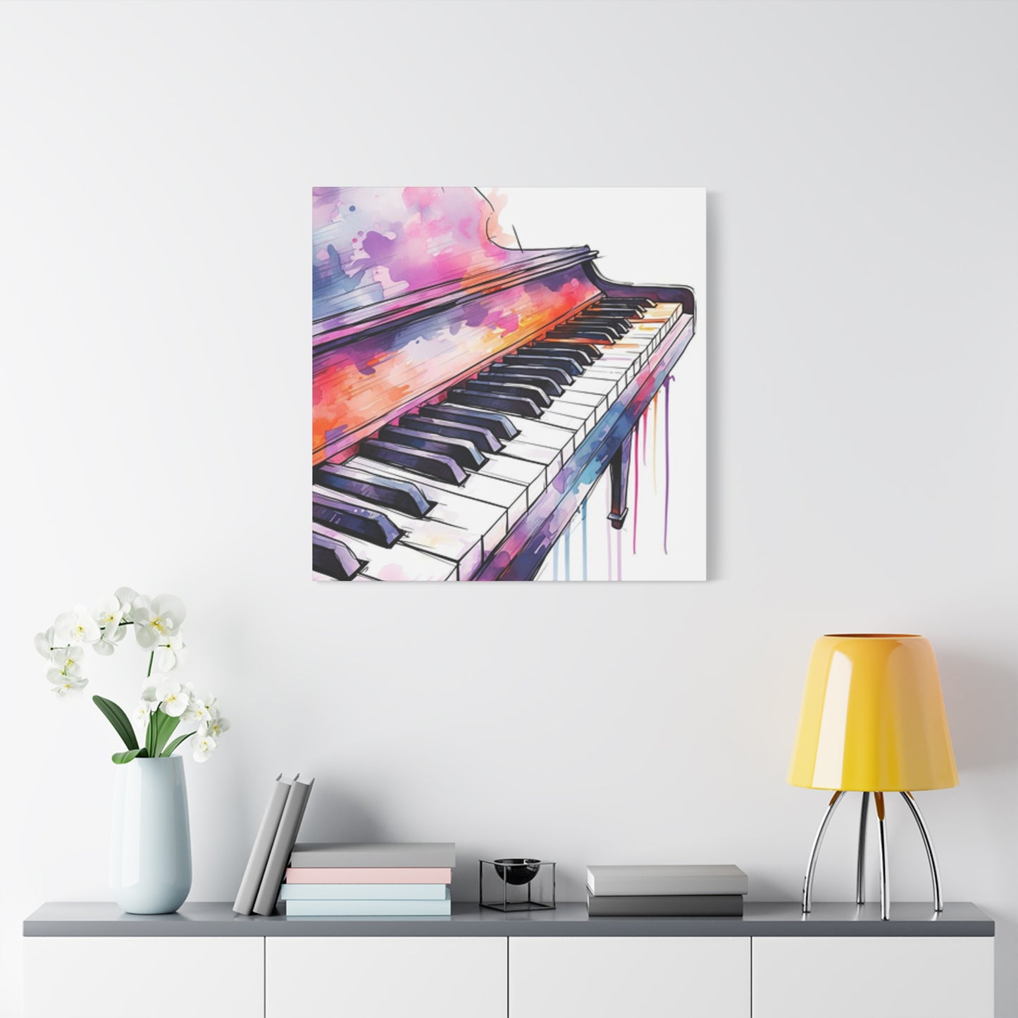
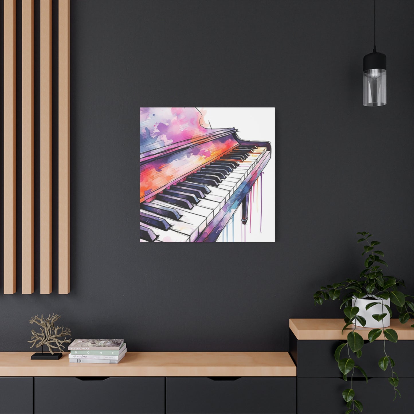

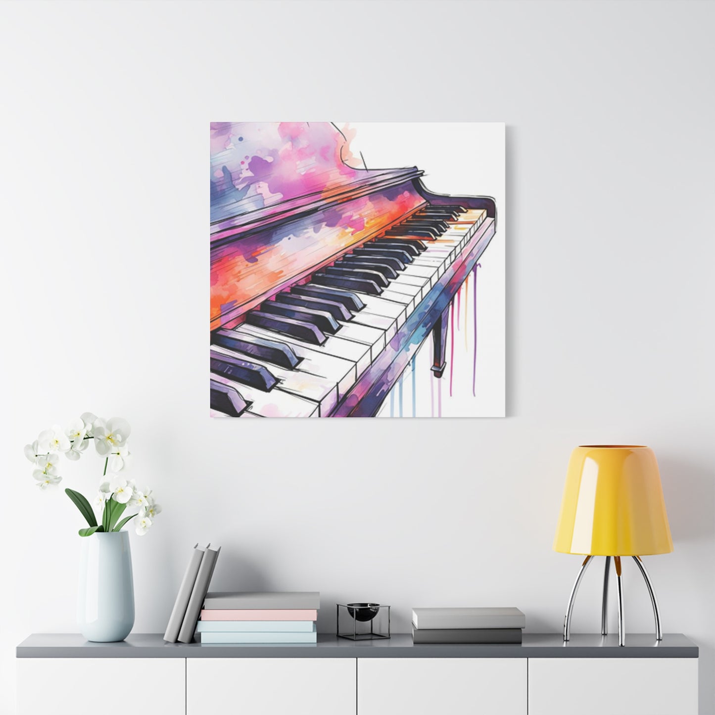
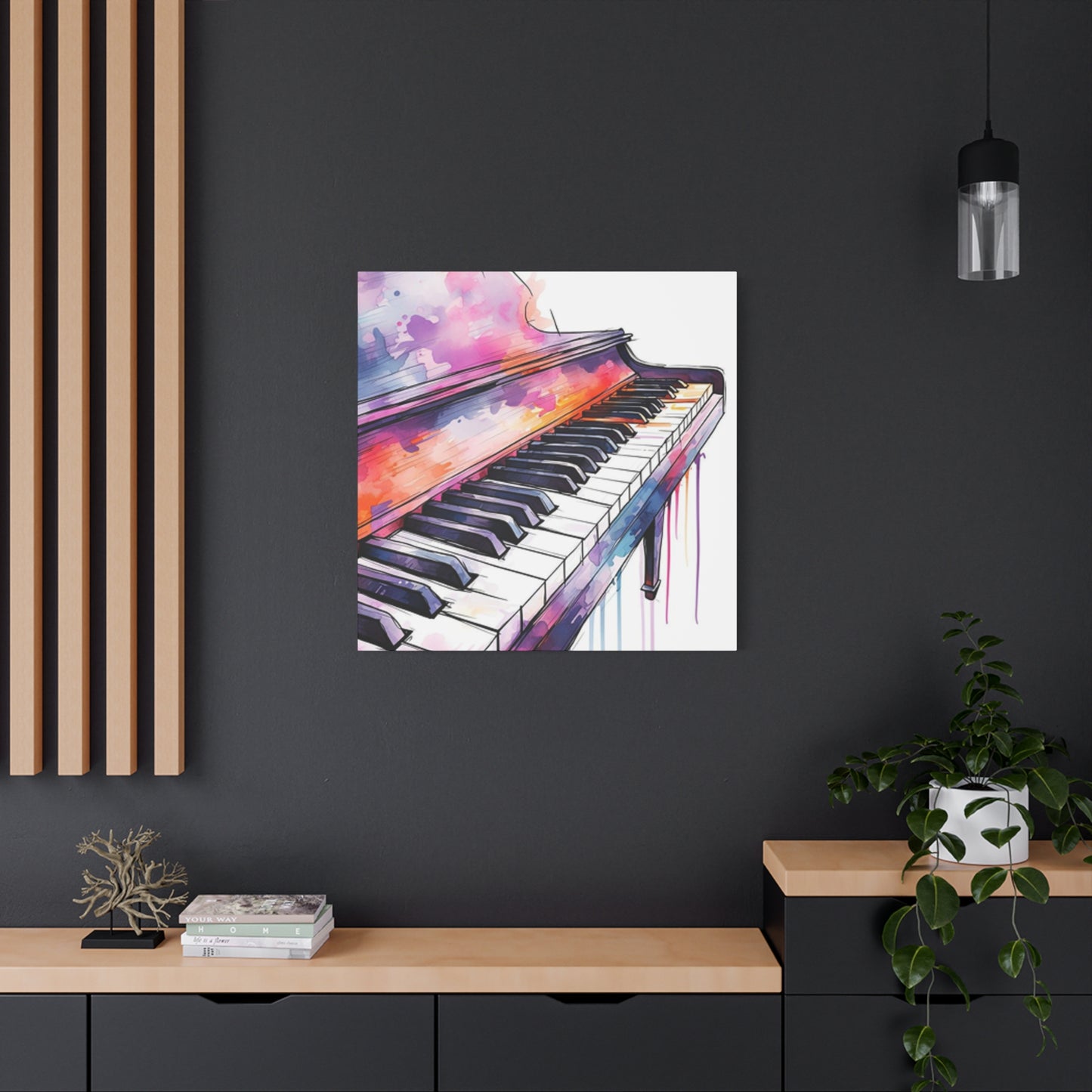
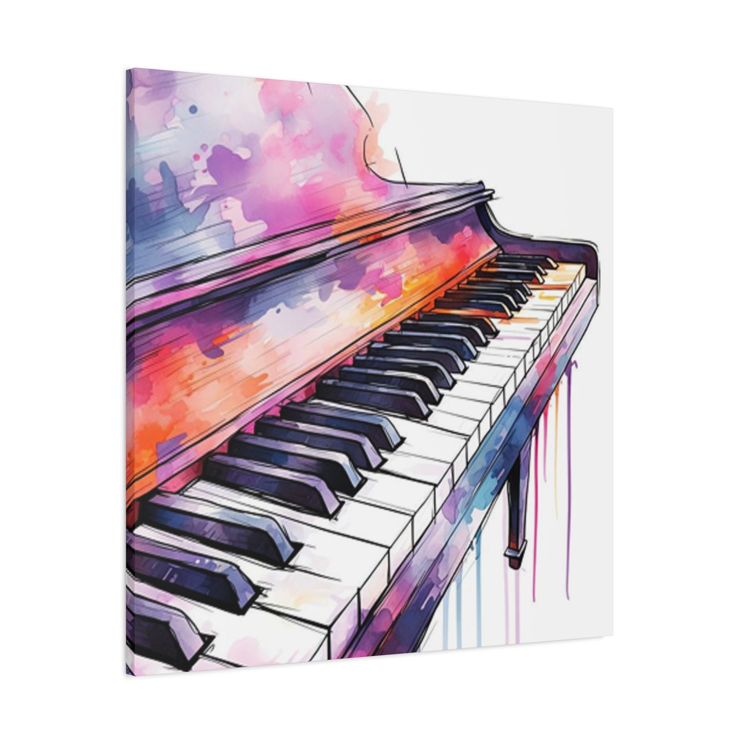
A Symphony on the Wall: Transform Your Home with Piano Keys Drawings Painting Wall art
Piano keys possess an inherent visual magnetism that transcends their musical function. The striking contrast between black and white keys creates a rhythmic pattern that artists have celebrated for centuries. This monochromatic harmony offers endless possibilities for creative exploration, whether through pencil sketches, vibrant paintings, or sophisticated wall art installations. The geometric precision of piano keys combined with their cultural significance makes them an ideal subject for artistic interpretation across multiple mediums and styles.
The aesthetic beauty of piano keys lies in their perfect balance between simplicity and complexity. Each key represents a specific note, yet together they form an intricate system capable of producing infinite melodies. Artists are drawn to this duality, finding inspiration in the way these simple rectangular shapes can evoke powerful emotions and memories. The repetitive pattern of keys provides both structure and freedom, allowing creators to experiment with perspective, color, texture, and composition while maintaining a recognizable focal point that resonates with viewers on multiple levels.
Throughout art history, musical instruments have served as powerful symbols of creativity, culture, and human expression. Piano keys specifically represent accessibility to music, the bridge between silence and sound, and the potential for creating beauty through disciplined practice. When rendered in visual art, these keys carry symbolic weight that extends beyond their physical appearance. They can represent harmony, discord, complexity, precision, or the passage of time. This rich symbolism makes piano key artwork particularly meaningful for music lovers, musicians, and anyone who appreciates the intersection of visual and auditory arts.
Materials Required for Drawing Piano Keys
Beginning any artistic project requires proper preparation and the right tools. For drawing piano keys, the selection of materials significantly impacts the final result. Quality graphite pencils ranging from hard leads like 2H for light sketching to soft leads like 6B for deep shadows provide the range needed to capture the dimensional qualities of piano keys. A good eraser, preferably both a kneaded eraser for subtle lifting and a vinyl eraser for clean removal, becomes essential for creating highlights and correcting mistakes. Blending stumps or tortillons help smooth graphite and create realistic gradients across the key surfaces.
Paper selection plays a crucial role in the success of piano key drawings. Smooth bristol board works excellently for detailed, precise work where clean lines are paramount. Medium-tooth drawing paper provides enough texture to hold graphite while still allowing for smooth blending. For artists who prefer working on toned paper, gray or tan sheets can reduce the workload by providing a middle value, requiring only the addition of highlights and shadows. The weight of the paper matters too, with heavier stock preventing buckling and allowing for more aggressive erasing and reworking.
Additional tools enhance the drawing process considerably. A ruler or straightedge ensures the geometric precision that piano keys demand, particularly when establishing the initial framework. Drafting tape secures paper to the working surface, preventing unwanted movement during detailed work. A sharpener capable of maintaining fine points on pencils becomes indispensable for rendering crisp edges where black keys meet white keys. Some artists find that white charcoal pencils or gel pens prove useful for adding bright highlights on toned paper, creating that polished, reflective quality authentic piano keys possess.
Basic Techniques for Sketching Piano Keys
The foundation of any successful piano key drawing begins with accurate observation and measurement. Real pianos have specific proportions that, when captured correctly, immediately communicate authenticity to viewers. White keys measure approximately six inches in length and seven-eighths of an inch in width on standard acoustic pianos. Black keys sit roughly two-thirds of the way up the white keys and measure about half the width. Understanding these proportions helps artists create convincing representations regardless of scale or perspective.
Starting with light construction lines prevents the frustration of needing to erase heavy marks later. A systematic approach works best, beginning with a horizontal line representing the front edge of the keyboard, then adding vertical divisions for each white key. The spacing between these keys should remain consistent, with small gaps representing the spaces between keys. Once the white key framework exists, adding black keys becomes straightforward. These keys sit in groups of two and three, following the musical pattern that repeats across the keyboard. The grouping pattern helps viewers recognize the subject immediately as piano keys rather than generic rectangles.
Creating depth and dimension transforms flat shapes into three-dimensional objects. Piano keys recede into the instrument, requiring attention to perspective principles. The visible sides of white keys gradually narrow as they move toward the back of the keyboard. Black keys cast shadows on the surface beneath them and on adjacent white keys. The front edges of keys catch light differently than their tops, requiring tonal variation to appear realistic. Careful observation of how light interacts with actual piano keys provides valuable information for rendering these subtle but crucial details.
Advanced Drawing Methods for Realistic Piano Keys
Achieving photorealistic piano key drawings demands meticulous attention to surface qualities and light behavior. Piano keys possess slight reflectivity, particularly when well-maintained and polished. This characteristic means they reflect surrounding environment subtly in their surfaces. Capturing these reflections requires careful value control, using light touches to suggest rather than boldly state these environmental influences. The ivory or plastic material of white keys has a specific quality distinct from the ebony or synthetic material of black keys, requiring different rendering approaches.
Texture adds authenticity to piano key drawings. New piano keys have smooth, almost glassy surfaces, while older instruments show wear patterns where fingers repeatedly contact the keys. These wear marks typically appear as slight discoloration or smoothing in the center portions of frequently played keys. Including such details tells a story about the instrument's history and use. Scratches, dust accumulation in the cracks between keys, and slight yellowing of white keys all contribute to creating a sense of realism that elevates artwork from merely accurate to truly convincing.
Shadow work separates competent drawings from exceptional ones. The shadows between keys create the rhythm and pattern that makes piano keys visually interesting. These shadows are darkest in the gaps between keys where light cannot reach. The undersides of black keys create secondary shadows on the white keys below. Understanding that shadows have variations in value rather than being uniformly dark helps create depth. The ambient light in a scene affects shadow intensity, with brightly lit scenes showing less dramatic shadows than dramatically lit compositions.
Color Theory Applications in Piano Key Paintings
While piano keys might seem limited to black and white, painting them opens worlds of color possibilities. The base tones can incorporate subtle color variations rather than pure monochrome. White keys can contain hints of warm yellows, cool blues, or gentle grays depending on lighting conditions and surrounding environment. These color variations make paintings feel more alive and dynamic than strictly black-and-white renderings. The reflected colors from nearby objects, whether sheet music, the pianist's clothing, or room decor, all influence key coloration subtly.
Black keys offer surprising color complexity when observed carefully. True black rarely exists in nature or manufactured objects. Piano black keys typically contain deep blues, purples, or browns within their dark values. Highlights on black keys might show warm amber tones or cool steel grays depending on the light source. Exploring these color nuances creates richness and depth that flat black cannot achieve. Glazing techniques, where thin translucent layers of color overlay one another, prove particularly effective for building these complex darks while maintaining luminosity.
Background color choices dramatically affect how piano keys read in a composition. Warm backgrounds push cool key tones forward visually, while cool backgrounds can make warm-toned keys pop. Complementary color schemes create vibration and energy, while analogous schemes provide harmony and calm. The color temperature of the lighting in a painting influences everything, with warm golden light creating entirely different color situations than cool blue illumination. Artists working in color should create small color studies before committing to large paintings, testing different schemes to find the most effective emotional and visual impact.
Acrylic Painting Techniques for Piano Keys
Acrylics offer versatility and convenience for painting piano keys, drying quickly and allowing for layering and corrections. The fast-drying nature means artists can build up complex color and value structures efficiently. Starting with a toned ground often helps, providing a middle value that makes both lights and darks easier to judge. A neutral gray or warm tan underpainting eliminates the intimidation of blank white canvas while providing a base that can show through in places, creating visual interest.
Blocking in major shapes and values establishes the composition quickly. Using larger brushes for this stage prevents getting lost in details prematurely. The goal involves establishing where keys sit spatially, where major shadows fall, and the overall value structure of the piece. This stage should look rough and unfinished, serving as a roadmap for subsequent refinement. Squinting at the reference image helps identify these major value masses by simplifying details into broader shapes.
Refinement happens gradually through successive layers. Each pass over the painting adds more specific information, sharper edges, and subtle color variations. Thin glazes of color can modify large areas without completely obscuring underlying work. Opaque applications build up highlights and brightest areas. The edges where black keys meet white keys demand particular attention, requiring steady hands and possibly the use of fine liner brushes or even masking techniques for crisp results. The final stages involve adding the smallest details: reflections, texture, and adjusting values for maximum impact.
Oil Painting Approaches for Piano Key Art
Oil paint's slow drying time provides distinct advantages when rendering the subtle gradations and blended transitions found in piano keys. The extended working time allows for smooth value transitions and careful edge control. Artists can work wet-into-wet, blending colors directly on the canvas surface to create seamless gradients. This technique proves particularly effective for capturing the gentle curves and dimensional qualities of three-dimensional keys.
Traditional oil painting often employs a layered approach, working from thin to thick and dark to light. The first layers establish composition and major dark values using paint thinned with solvent. These thin washes dry relatively quickly, providing a foundation for subsequent applications. Middle tones come next, building up the form and establishing local colors. Final layers add highlights, refined details, and accent notes using thicker paint application. This methodical progression prevents muddiness and allows for great control over the final appearance.
Glazing techniques excel in oil painting, where transparent or semi-transparent layers overlay dried paint underneath. This method creates luminous shadows and complex color interactions impossible to achieve through direct mixing alone. A glaze of transparent blue over a dried brown area creates a rich, dark tone different from directly mixing blue and brown. Multiple glazes build depth and richness, particularly effective in the black keys where complex darks add sophistication. Each glaze layer must dry completely before applying the next, requiring patience but rewarding it with unparalleled depth.
Watercolor Methods for Piano Key Illustrations
Watercolor's transparent nature presents unique challenges and opportunities when painting piano keys. The traditional approach of working light to dark means careful planning to preserve white areas, as white paint typically isn't used in pure watercolor technique. Masking fluid becomes a valuable ally, protecting white key highlights and allowing free brushwork in surrounding areas. Once masking fluid dries, artists can work confidently, knowing protected areas will remain pristine.
Wet-on-wet techniques create beautiful, soft transitions useful for subtle shading on key surfaces. Wetting an area with clean water before applying pigment allows colors to bloom and blend naturally. This approach works wonderfully for suggesting the gentle curvature of key tops or the soft shadows between keys. Controlling water amount becomes critical, as too much creates uncontrollable blooms while too little prevents proper blending. Practice and experience teach the right balance for desired effects.
Layering in watercolor requires patience as each layer must dry completely before applying the next. Building values gradually through multiple thin washes creates more luminous results than attempting to achieve dark values in single applications. Each layer should have purpose, whether adding shadow, adjusting color temperature, or increasing value contrast. Lifting techniques, where damp brushes or sponges remove pigment from dried layers, help recover lights or soften edges. Salt, alcohol, and other additives create interesting textures that might suggest worn key surfaces or add visual interest to backgrounds.
Creating Perspective in Piano Key Artwork
Perspective principles govern how piano keys appear when viewed from various angles. Straight-on views present keys as simple rectangles with minimal perspective challenge. However, angled views require understanding one-point or two-point perspective. When viewing a keyboard from an angle, the keys appear to recede toward a vanishing point on the horizon line. The spaces between keys narrow as they move away from the viewer, and the visible sides of keys become progressively smaller.
Foreshortening affects key appearance dramatically. Keys viewed from the side appear much shorter than their actual length. Keys tilted toward or away from the viewer compress or extend based on their angle. This spatial compression requires careful observation and measurement to depict convincingly. Using construction lines that converge toward vanishing points helps maintain accurate proportions throughout the drawing or painting. Regular checking against the reference ensures perspective remains consistent.
Atmospheric perspective adds depth to piano key artwork, particularly in pieces showing extensive keyboard lengths. Keys nearest the viewer should have stronger contrast, sharper edges, and more saturated colors. Keys in the distance become progressively lighter, softer, and less saturated. This mimics how atmosphere affects our vision over distance, even in relatively short spans. While a piano keyboard isn't extremely long, applying subtle atmospheric perspective enhances the three-dimensional illusion and guides the viewer's eye through the composition.
Composition Strategies for Piano Key Art
Strong composition separates memorable artwork from forgettable images. The rule of thirds provides a reliable starting point, placing points of interest along lines that divide the canvas into thirds both horizontally and vertically. Positioning the keyboard along these lines rather than dead center often creates more dynamic compositions. The intersection points where these lines cross serve as powerful focal point locations, ideal for placing areas of highest contrast or detail.
Leading lines guide viewers through artwork, and piano keys naturally provide strong linear elements. The parallel lines of keys create movement across the composition, potentially drawing eyes toward a focal point. Diagonal arrangements prove more dynamic than purely horizontal placements, adding energy and visual interest. Breaking the pattern somewhere in the composition creates a focal point, whether through an opened music book, a pianist's hands, or unusual lighting that highlights specific keys.
Negative space deserves equal consideration with positive elements. The areas around and between keys contribute significantly to overall impact. Dark backgrounds can make white keys glow luminously, while light backgrounds might showcase the elegance of black key silhouettes. Balancing filled and empty spaces prevents compositions from feeling cramped or sparse. Consider how the eye moves through the entire rectangle of the artwork, not just within the keys themselves. Every part of the composition should serve the whole, contributing to the intended mood and message.
Incorporating Hands and Figures with Piano Keys
Adding hands to piano key artwork introduces narrative and human connection. Hands tell stories about the pianist, revealing age, experience, emotion, and intention through their position and gesture. Young hands appear smooth and tentative, while experienced pianists show confident positioning and possibly age marks. The specific keys being touched, the curve of fingers, and tension or relaxation in the hand all communicate something about the music being played and the person playing it.
Accurate hand anatomy proves essential for convincing integration. Hands consist of complex structures with multiple joints, allowing varied positions and gestures. Understanding bone structure beneath the skin helps artists draw hands in any position. The way fingers naturally curve when playing piano differs from their resting state. Weight transfer through fingertips creates slight compression, and tendons become visible on the backs of hands during certain movements. Reference photos of actual pianists provide invaluable information for capturing these authentic details.
Lighting and value relationships must work cohesively between hands and keys. Hands cast shadows on keys, and keys reflect light back onto hand undersides. These interactions root hands in the scene rather than looking pasted on. The color temperature of skin tones should relate harmoniously to key colors, influenced by the same light source. Hands might also introduce new colors into the composition, providing relief from the monochrome key palette and adding warmth and life to the artwork.
Abstract Interpretations of Piano Keys
Abstract approaches free artists from literal representation, allowing emotional and conceptual exploration of piano key themes. Keys might fragment, repeat, overlap, or distort in ways impossible in reality. Colors can explode beyond naturalistic limits, with neon pinks, electric blues, or acid greens replacing traditional black and white. The pattern and rhythm of keys serve as launching points for explorations of movement, music visualization, or pure design.
Cubist influences might show piano keys from multiple viewpoints simultaneously, fragmenting and reassembling them in complex compositions. Expressionist approaches might exaggerate colors and distort proportions to convey emotional states associated with piano music. Minimalist interpretations might reduce keys to their most essential elements, creating powerful statements through simplicity and restraint. Each abstract approach offers unique possibilities for personal expression while maintaining enough recognition for viewers to connect with the piano key reference.
Mixed media techniques expand abstract possibilities dramatically. Collaging actual sheet music, newspaper reviews of concerts, or found objects onto painted piano keys creates rich textural and conceptual layers. Three-dimensional elements might project from the surface, literalizing the idea of keys as physical objects. Digital manipulation can create effects impossible through traditional media alone. The key to successful abstract work lies in maintaining some thread of connection to the source material while pushing into new expressive territories that pure representation cannot reach.
Digital Art Techniques for Piano Key Imagery
Digital platforms offer unprecedented flexibility for creating piano key artwork. Software like Photoshop, Procreate, or Illustrator provides tools that work differently from traditional media but can achieve equally impressive results. Digital brushes can mimic traditional media or create entirely new effects impossible with physical tools. Layers allow non-destructive editing, letting artists try variations without committing until satisfied. Undo functions eliminate the fear of mistakes, encouraging bold experimentation.
Vector-based programs like Illustrator excel at the geometric precision piano keys demand. Creating perfectly parallel lines, uniform spacing, and crisp edges becomes trivial compared to hand methods. Vector artwork scales infinitely without quality loss, making it ideal for designs intended for various sizes. The clean, graphic quality of vector art suits contemporary aesthetic preferences and works beautifully for design applications like posters, logos, or merchandise.
Raster programs like Photoshop or Procreate excel at painterly effects and photorealistic rendering. Pressure-sensitive tablets allow natural drawing and painting gestures, translating hand movements into digital marks. Custom brushes can create textures and effects tailored specifically to piano key surfaces. Blending modes and adjustment layers provide color and value control far beyond traditional media capabilities. Digital artwork can incorporate photographic elements, creating hybrid images that blur boundaries between photography, painting, and illustration.
Black and White Piano Key Drawings
Monochromatic artwork focusing on value rather than color offers timeless elegance. Black and white piano key drawings emphasize form, light, and shadow without the complexity of color relationships. This limitation becomes freeing, allowing artists to focus entirely on value accuracy and edge quality. The tonal range from pure white to deepest black provides all the information needed to create convincing three-dimensional illusions.
Graphite offers an accessible and versatile medium for monochromatic work. Its range of values, from light silvery grays to rich blacks, maps well to piano key subjects. Charcoal provides bolder, more dramatic marks with intense blacks and soft, blendable grays. Conte crayon combines qualities of both, offering control and intensity. Each medium has distinct characteristics that affect the final artwork's personality. Graphite tends toward precision and detail, charcoal toward expression and atmosphere, conte toward something between these extremes.
High-contrast approaches create dramatic, graphic impact. Pushing values to extremes, minimizing middle tones, creates bold statements with strong visual punch. This approach suits contemporary aesthetics and reproduces well for prints or digital applications. Conversely, subtle value gradations create gentle, nuanced pieces that reward close viewing. These quieter works often convey sophistication and technical mastery through their restraint and precision. Both approaches have merit, and choosing between them depends on the intended emotional impact and viewing context.
Adding Musical Elements to Piano Key Art
Sheet music provides rich visual elements that complement piano keys beautifully. Musical notation has its own aesthetic appeal, with flowing staff lines, rhythmic note patterns, and dynamic markings creating visual interest. Incorporating readable music allows musically literate viewers to "hear" the piece while viewing, adding another dimension to the experience. The specific piece chosen might have significance, perhaps a famous composition or personally meaningful song.
Musical symbols beyond standard notation can enhance compositions. Clefs, particularly the elegant treble and bass clefs used in piano music, provide immediately recognizable icons. Dynamic markings like forte and piano, tempo indications, and expression markings all carry visual and conceptual interest. Stylizing these elements, perhaps enlarging them or using them as background patterns, creates layers of meaning and visual texture without obscuring the primary piano key focus.
Integrating these elements requires thoughtful composition. Music might appear on a stand behind keys, as scattered sheets around them, or transparently overlaid on the keys themselves. The balance between legibility and integration affects viewer experience significantly. Completely readable music draws attention away from keys momentarily, while abstracted musical elements serve primarily as texture and pattern. Neither approach is inherently better, each serves different artistic intentions and creates different viewing experiences.
Incorporating Lighting Effects in Piano Key Art
Lighting dramatically affects mood and visual impact in piano key artwork. Soft, diffused lighting creates gentle, peaceful atmospheres suitable for contemplative pieces. Harsh, directional lighting creates drama through strong contrasts and defined shadows. The quality, direction, color, and intensity of light all contribute to the emotional tone and practical visibility of keys within the composition.
Spotlight effects focus attention dramatically. A bright light illuminating specific keys against darker surroundings creates natural focal points and suggests performance or practice moments. The falloff from bright to dark guides viewer attention powerfully. Backlighting creates silhouettes and rim lighting effects, emphasizing shapes and creating atmospheric mystery. Side lighting reveals texture and dimension through the shadows it casts, ideal for emphasizing the three-dimensional nature of keys.
Multiple light sources add complexity and interest. Warm candlelight combined with cool window light creates temperature contrasts that add depth and richness. The interplay of different colored lights produces complex color situations on the nominally black-and-white keys. Reflected light, bouncing from walls, ceilings, or other surfaces, fills shadows and adds subtlety to lighting schemes. Mastering light observation and representation elevates artwork significantly, as lighting often makes the difference between flat, lifeless images and dynamic, engaging pieces.
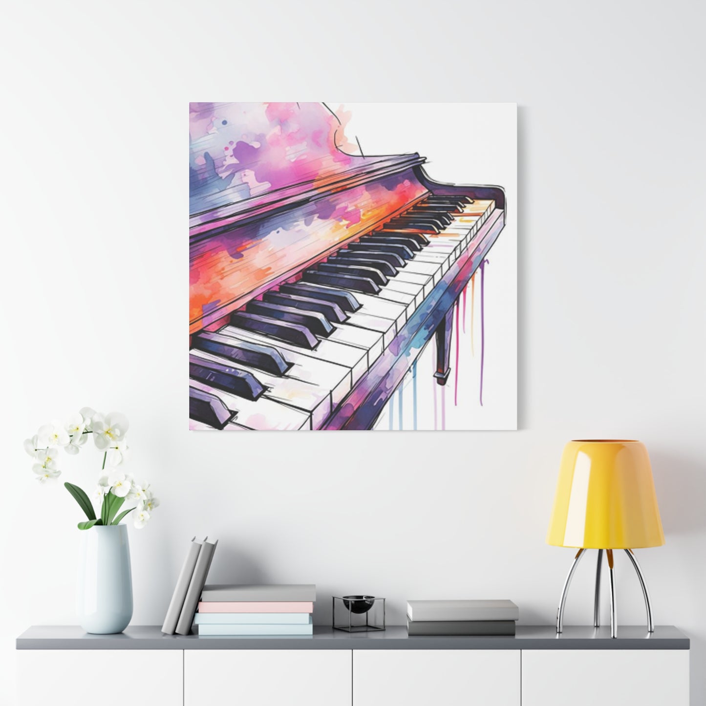
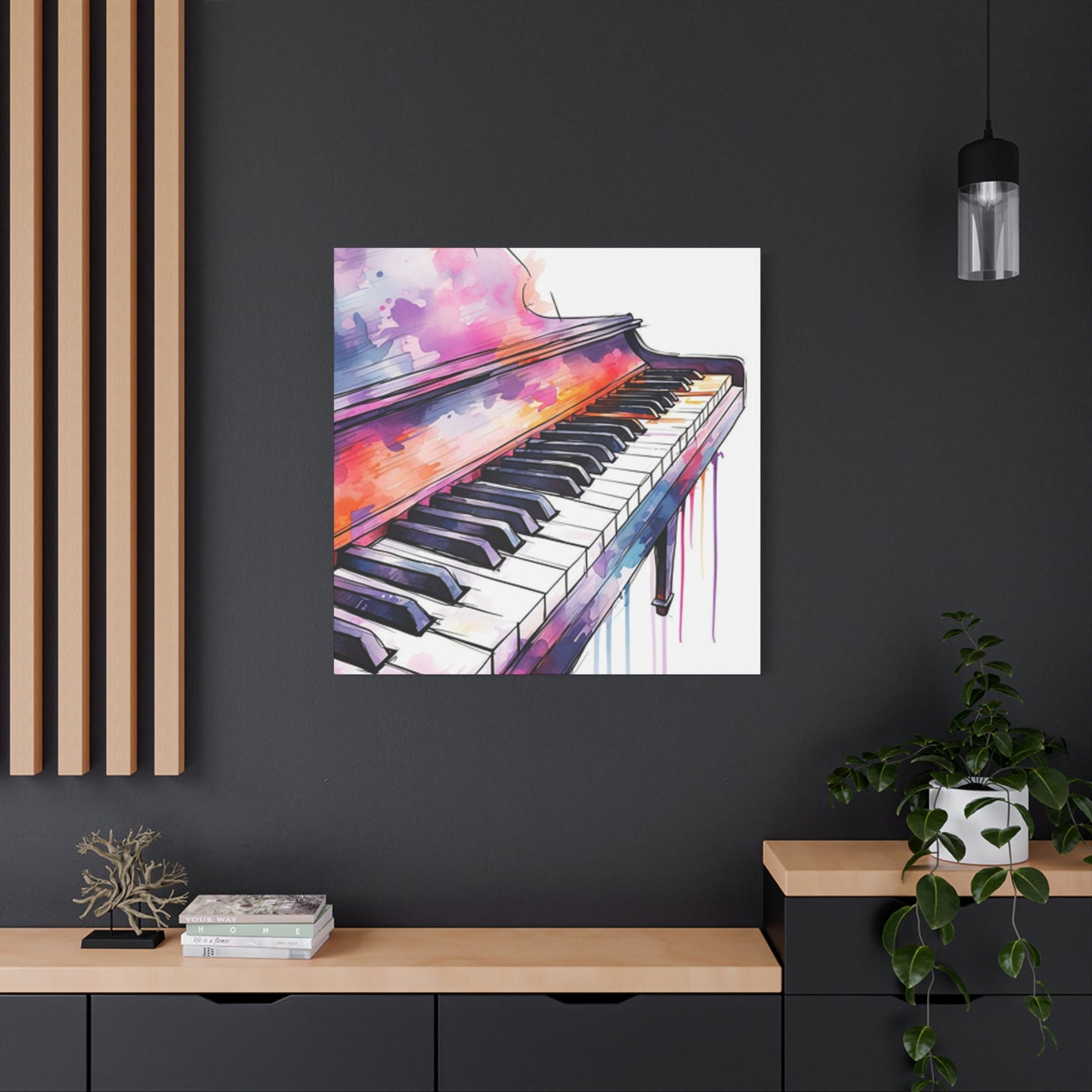
Wall Art Sizing and Scale Considerations
The intended display location significantly influences artwork size and format decisions. Large walls in spacious rooms accommodate and even demand substantial artworks that make bold statements. Small intimate spaces suit smaller, more detailed pieces that reward close viewing. Measuring the wall space before creating artwork prevents the disappointment of finished pieces that don't fit their intended locations properly.
Aspect ratio affects how piano keys read visually. Horizontal panoramic formats naturally suit keyboard representations, allowing multiple octaves to display across the composition. Vertical formats create different energy, perhaps focusing on fewer keys with more surrounding context or tilting perspective dramatically. Square formats provide balanced, centered compositions that work well in many design contexts. The chosen format should support the compositional intent and work within the constraints of the display space.
Series and groupings offer interesting display possibilities. Multiple smaller pieces arranged together create visual impact exceeding their individual sizes while maintaining flexibility in arrangement. Triptychs, where three related pieces form a unified composition, suit piano key subjects well, perhaps showing close-up detail, mid-range view, and pulled-back context in three panels. These arrangements add sophistication and allow for more complex storytelling than single images can achieve alone.
Framing and Presentation Options for Piano Art
Framing choices significantly impact how artwork appears and how viewers receive it. Traditional frames with ornate detailing suggest classical music connections and formal presentation. Simple, modern frames focus attention on the artwork itself without competing for visual attention. Float mounting, where artwork appears suspended within the frame with space around edges, adds contemporary sophistication and literally gives the piece breathing room.
Glass or acrylic glazing protects artwork from dust, moisture, and touch damage but introduces reflections that can interfere with viewing. Anti-reflective glass minimizes this issue but increases cost substantially. Some artwork, particularly pieces with heavy texture or dimensional elements, benefits from remaining unglazed, allowing direct appreciation of surface qualities. The viewing environment helps determine whether glazing proves necessary, with high-traffic areas or humid conditions making protection more important.
Matting provides visual breathing room and prevents artwork from touching glass directly. Mat color affects artwork appearance dramatically. White or off-white mats create clean, gallery-like presentations. Black mats add drama and sophistication, particularly for high-contrast pieces. Colored mats can complement or contrast with artwork colors, either harmonizing or energizing the presentation. Double matting, with a thin inner mat in a contrasting color, adds subtle sophistication and can pull out specific colors from the artwork.
Creating Piano Key Art for Commercial Spaces
Commercial applications present specific requirements and opportunities. Restaurants, hotels, music schools, and performance venues all potentially seek piano key artwork that fits their aesthetic and thematic needs. Understanding the space's style, color scheme, and clientele helps create appropriate pieces that enhance rather than clash with existing design. Durability becomes more important in public spaces where artwork faces higher exposure and potential damage.
Sizing for commercial spaces typically means thinking bigger than residential contexts. Large statement pieces anchor lobbies and dining rooms, while series of medium pieces might line hallways. The viewing distance matters significantly, with pieces meant for long-distance viewing requiring bolder, simpler compositions than pieces viewed up close. Color schemes should complement interior design while maintaining enough independence to remain interesting and avoid appearing merely decorative.
Reproduction rights and licensing become relevant for commercial artwork. Original pieces command higher prices but limit sales to single clients. Offering limited edition prints makes artwork accessible to multiple venues at lower price points while maintaining value through scarcity. Understanding licensing, copyright, and reproduction rights protects both artist and client interests. Written agreements clarifying ownership, reproduction rights, and usage terms prevent future disputes and establish professional credibility.
Piano Key Art for Music Studios and Practice Rooms
Music education environments benefit aesthetically and psychologically from appropriate artwork. Piano key imagery in these spaces reinforces the learning focus while making rooms more visually appealing. Student artwork displays build community and pride, while professional pieces inspire and demonstrate excellence. The specific imagery might include practice motivation themes, famous composer portraits integrated with keys, or abstract pieces that create energy and enthusiasm.
Durability proves essential in high-use educational settings. Children and teenagers can be hard on environments, making robust materials and construction necessary. Laminated prints, acrylic panels, or canvas giclees withstand handling better than delicate drawings under glass. Mounting methods should allow for cleaning without damaging artwork. Bright, energetic colors and engaging compositions hold attention better than subdued pieces, particularly for younger students.
Customization opportunities abound in educational settings. Incorporating the studio name, motivational text, or specific musical concepts creates personalized pieces with educational value. Student participation in creating installation pieces builds investment and community. Changing displays regularly keeps environments fresh and interesting, showcasing different student work or rotating professional pieces to maintain visual interest throughout long-term attendance.
Vintage and Antique Piano Key Aesthetics
Historical piano aesthetics offer rich inspiration for artwork with nostalgic charm. Victorian-era pianos featured ornate carvings, gilt details, and distinctive ivory keys with characteristic aging patterns. Capturing this period aesthetic requires researching historical instruments and period styling. Sepia tones, aged paper effects, and vintage typography all contribute to authentic period feeling in artwork featuring antique piano elements.
Weathering and patina tell stories of instruments lived with over generations. Yellowed ivory keys, worn spots where fingers repeatedly contacted surfaces, and the accumulated grime in crevices all indicate age and use. These imperfections add character and authenticity that pristine modern instruments lack. Rendering these details requires careful observation and subtle technique, building up layers of texture and value variation that suggest history without overwhelming the fundamental piano key structure.
Nostalgic styling appeals to broad audiences with emotional resonance. Memories of childhood piano lessons, grandparents' homes, or historical periods create connections between viewers and artwork. Marketing vintage-styled piano key art requires understanding this emotional appeal and target audiences who appreciate nostalgia and historical aesthetics. Venues like antique shops, vintage-themed restaurants, and historical societies present natural markets for this style of artwork.
Modern and Contemporary Piano Key Art Styles
Contemporary aesthetics favor clean lines, bold contrasts, and minimalist approaches. Modern piano key art might reduce the subject to its most essential elements, creating striking designs through simplicity. Geometric abstraction based on key patterns creates sophisticated decorative art that reads as design as much as representation. These pieces suit modern interiors with their emphasis on space, light, and uncluttered aesthetics.
Mixed media and experimental techniques push piano key imagery in new directions. Combining photography with painting, incorporating unexpected materials like metal or wood fragments, or introducing digital manipulation creates fresh interpretations. Street art influences bring graffiti aesthetics, bold graphics, and urban energy to piano key subjects. Pop art approaches might repeat, color-shift, or otherwise transform keys in ways referencing consumer culture and mass media.
Installation and dimensional work moves piano key art off walls entirely. Three-dimensional key sculptures, suspended hanging pieces, or interactive installations invite viewer participation and spatial experience beyond traditional artwork provides. These approaches suit galleries, corporate atriums, and public art contexts where bold statements and experiential art create memorable impacts. While more complex to execute and install, dimensional work commands attention and higher values reflecting its ambition and impact.
Creating Piano Key Art on Various Surfaces
Traditional canvas and paper remain popular painting surfaces but hardly exhaust possibilities. Wood panels provide rigid, stable surfaces that won't warp or require stretching. The natural grain might show through thin paint layers, adding textural interest. Priming prevents absorption and provides appropriate tooth for paint adhesion. Wood's durability suits outdoor or high-traffic installations better than canvas.
Metal surfaces, particularly aluminum and copper, accept paint beautifully and add luminosity through their reflective qualities. These surfaces suit contemporary aesthetics and withstand environmental stresses well. Acrylic paints adhere well after proper surface preparation. Metal's smooth surface allows fine detail and creates interesting effects when incorporated intentionally into the design. The industrial quality adds contemporary edge to finished pieces.
Found objects and repurposed materials add conceptual depth to piano key artwork. Painting keys on actual salvaged piano parts creates meta-art that references its subject through material choice. Canvas made from vintage sheet music, piano key jewelry components, or other music-related found objects adds layers of meaning. Sustainability and environmental consciousness resonate with contemporary audiences, making reclaimed material artwork particularly appealing.
Teaching Piano Key Drawing to Beginners
Breaking complex subjects into manageable steps makes piano key drawing accessible to beginners. Starting with basic rectangular shapes removes intimidation while establishing fundamental structure. Students learn proportional relationships between key dimensions before addressing perspective or shading. Simple frontal views eliminate perspective complexity initially, building confidence through achievable early successes.
Demonstration proves invaluable in teaching visual arts. Showing the process step-by-step while explaining thinking and decision-making helps students understand not just what to do but why. Common mistakes can be addressed preemptively, and students see that even experienced artists work through challenges and make corrections. Video demonstrations allow pausing and reviewing, particularly helpful for complex steps requiring careful observation.
Progressive complexity builds skills systematically. Early exercises might involve copying diagrams rather than working from reference photos. As skills develop, photographic references introduce real-world complexity gradually. Eventually, students work from life, observing actual piano keyboards and translating three-dimensional reality to two-dimensional surfaces. This progression prevents overwhelming beginners while providing continuous challenge as skills improve.
Advanced Piano Key Rendering Techniques
Photorealistic rendering demands exceptional observational skills and technical control. Artists must see and reproduce minute value shifts, color nuances, and surface textures that casual observers miss. Building these skills requires extensive practice and willingness to work slowly and methodically. Every surface reflection, every shadow transition, every textural detail must be carefully considered and accurately rendered.
Material studies help artists understand how light interacts with different substances. Ivory, plastic, ebony, and synthetic materials all reflect and absorb light differently. Studying these materials separately from the complexity of complete piano key renderings builds understanding that transfers to more complex compositions. Small practice pieces focusing specifically on material qualities prove more beneficial than repeatedly attempting complete renderings without this foundational knowledge.
Patience and persistence separate advanced work from intermediate attempts. Photorealistic rendering cannot be rushed, requiring hours or days spent on small sections. Regular breaks prevent eye fatigue that causes value judgment errors. Comparing work to reference frequently catches mistakes early before significant time investment. Accepting that achieving mastery requires completing many pieces, not just one or two attempts, maintains motivation through the inevitable frustrations of learning complex skills.
Color Palette Development for Piano Art
Color choice profoundly affects emotional impact and viewer response. Warm palettes with reds, oranges, and yellows create energetic, passionate, or joyful moods. Cool palettes with blues, greens, and purples evoke calm, contemplation, or melancholy. Understanding color psychology helps artists make intentional choices that support their conceptual and emotional goals.
Limited palettes often create stronger, more cohesive artwork than unlimited color access. Restricting choices to three to five colors forces harmony and prevents muddy, unfocused results. Monochromatic schemes using one hue at various saturations and values create sophisticated unity. Analogous schemes with colors adjacent on the color wheel provide harmony with subtle variety. Complementary schemes with opposite colors create vibration and energy through contrast.
Temperature contrasts add depth and interest even within limited palettes. Warm and cool versions of similar values placed adjacently create visual vibration that draws attention. Using predominantly cool colors with strategic warm accents, or vice versa, creates focal points and guides viewer attention. Understanding that black and white also have temperature variations, with some blacks leaning warm and others cool, helps artists make nuanced choices that elevate final results.
Marketing and Selling Piano Key Artwork
Identifying target markets focuses efforts and resources effectively. Piano teachers, music students, musicians, and music schools form obvious primary markets. Interior designers seeking music-themed art for themed restaurants, recording studios, or music venues provide another market segment. General art consumers who appreciate the aesthetic appeal of piano keys without specific musical connections broaden the potential audience considerably.
Online platforms have democratized art sales significantly. Etsy, Society6, Redbubble, and similar marketplaces allow artists to reach global audiences with minimal upfront investment. Social media platforms, particularly Instagram and Pinterest, showcase visual art effectively and build followings that convert to sales. An artist website provides professional presence and credibility while offering complete control over presentation and terms. Email lists allow direct communication with interested collectors, building relationships that support ongoing sales.
Pricing artwork appropriately balances fair compensation for time and materials against market realities and competitive positioning. Tracking time and material costs establishes baseline pricing that ensures profitability. Researching comparable artists' prices prevents significant under or overpricing. Original work commands higher prices than prints, with prices scaling based on size, complexity, and artist reputation. Starting with accessible price points builds a collector base while gradually increasing prices as demand and reputation grow.
Protecting and Preserving Piano Key Artwork
Proper handling prevents damage to valuable artwork. Always wash and dry hands before touching art to prevent oil and dirt transfer. Hold pieces by edges or frames rather than touching painted surfaces. When moving artwork, carry it supported from beneath rather than holding only top edges. Cover pieces during transport with protective materials, ensuring nothing contacts surfaces directly.
Environmental factors significantly affect artwork longevity. Direct sunlight fades pigments over time, particularly with watercolors and some printing inks. High humidity encourages mold growth and paper degradation. Extreme temperature fluctuations cause materials to expand and contract, potentially damaging the artwork. Displaying art in climate-controlled spaces away from direct light preserves it best. UV-protective glazing offers additional protection for valuable pieces.
Professional conservation becomes necessary when damage occurs or valuable pieces require preservation. Conservators have specialized training in stabilizing and repairing artwork using archival materials and reversible techniques. While expensive, professional conservation protects investment in valuable artwork. Preventive conservation through proper storage, handling, and display prevents damage more cost-effectively.
Conclusion
Piano keys wall art, in all its forms — from hand-drawn sketches to abstract paintings and modern digital prints — embodies the seamless harmony between music and visual design. It transcends traditional artistic boundaries, transforming one of the most iconic symbols of musical expression into a captivating visual narrative. Whether you’re a musician, an art lover, or simply someone drawn to elegant and rhythmic aesthetics, piano key imagery offers an extraordinary way to infuse emotion, sophistication, and creative rhythm into your living or working spaces.
The piano, often considered the heartbeat of classical and contemporary music alike, symbolizes balance, order, and creativity. Its alternating black and white keys reflect the duality inherent in life and art — simplicity and complexity, silence and sound, structure and improvisation. When these keys become the subject of wall art, they carry this symbolism into interior design. A well-chosen piano keys artwork doesn’t just decorate; it composes an atmosphere. Each line, brushstroke, or photographic detail resonates with the rhythm of emotion, drawing the viewer into a space where sight and sound converge.
In traditional homes or spaces rich in warm textures, piano key paintings rendered in charcoal, watercolor, or oil can create a nostalgic yet refined ambiance. They echo the grace of vintage instruments and the timeless charm of live performance. In contrast, minimalist or modern interiors benefit from bold, abstract representations of piano keys. These often employ geometric forms, metallic highlights, or vivid contrasts, emphasizing the rhythmic structure of the piano through contemporary design language. Whether realistic or conceptual, the motif remains powerful — a visual melody that harmonizes effortlessly with diverse décor styles.
The placement of piano key wall art is equally significant. Above a piano, it naturally reinforces the thematic unity of the room, enhancing both aesthetic and emotional resonance. In living rooms, hallways, or music studios, a large canvas or framed print can act as a dynamic centerpiece, inviting conversation and reflection. Smaller prints arranged in a gallery wall format can create rhythm and flow, mirroring the arrangement of notes on a musical staff. No matter the setting, this artwork’s presence evokes a quiet sophistication — an unspoken reminder of the universal language of music.
Lighting, too, plays a crucial role in elevating the visual and emotional impact of piano key art. Soft, directional lighting can emphasize the texture of brushstrokes, the gleam of polished keys, or the interplay of shadow and light within a monochromatic palette. When paired with subtle ambient sound or positioned near a musical instrument, the experience becomes immersive, transforming the space into a sanctuary of inspiration.
Beyond aesthetics, piano key wall art carries profound emotional meaning. It symbolizes creativity, discipline, and passion — the essence of artistic pursuit. For musicians, it serves as a tribute to the countless hours spent perfecting technique and expressing emotion through melody. For art collectors or enthusiasts, it represents harmony and balance — the meeting point of precision and freedom. In both cases, the imagery celebrates the universality of artistic expression, reminding viewers that creativity is not confined to one medium but can transcend and connect multiple forms of art.
Moreover, piano key imagery adapts beautifully across a variety of mediums. From hand-painted canvases to high-resolution photography and mixed-media collages, each interpretation adds a unique layer of meaning. Some artists incorporate musical notes, lyrical excerpts, or vibrant color splashes to represent sound visually, while others strip the design down to its purest form — a minimalist interplay of black and white lines. This versatility ensures that piano-inspired wall art can complement any room, from elegant home offices to lively music lounges or serene creative corners.
Ultimately, piano keys wall art is more than decoration — it’s a visual symphony. It resonates with those who appreciate structure and artistry, blending emotion and intellect into a singular aesthetic experience. It invites us to pause, reflect, and feel — to remember that every note, every line, and every brushstroke carries intention and story. Whether you’re celebrating the discipline of classical music or the spontaneity of jazz, these artworks capture the shared essence of creation: expression without boundaries.
By incorporating piano keys drawing, painting, or wall art into your interior design, you open your space to the beauty of sound translated into form. It becomes a daily reminder of rhythm, harmony, and inspiration — the silent music that fills your home with creativity and soul. In every key and every stroke lies an invitation: to listen with your eyes and feel with your heart.
