


Large Abstract Surfing Wave Wall Art & Canvas Prints
Large Abstract Surfing Wave Wall Art & Canvas Prints
Couldn't load pickup availability
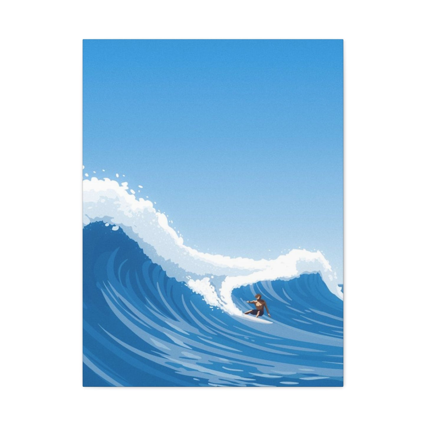
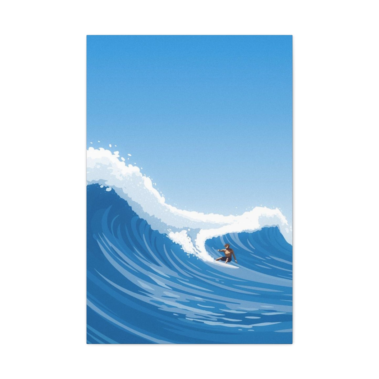
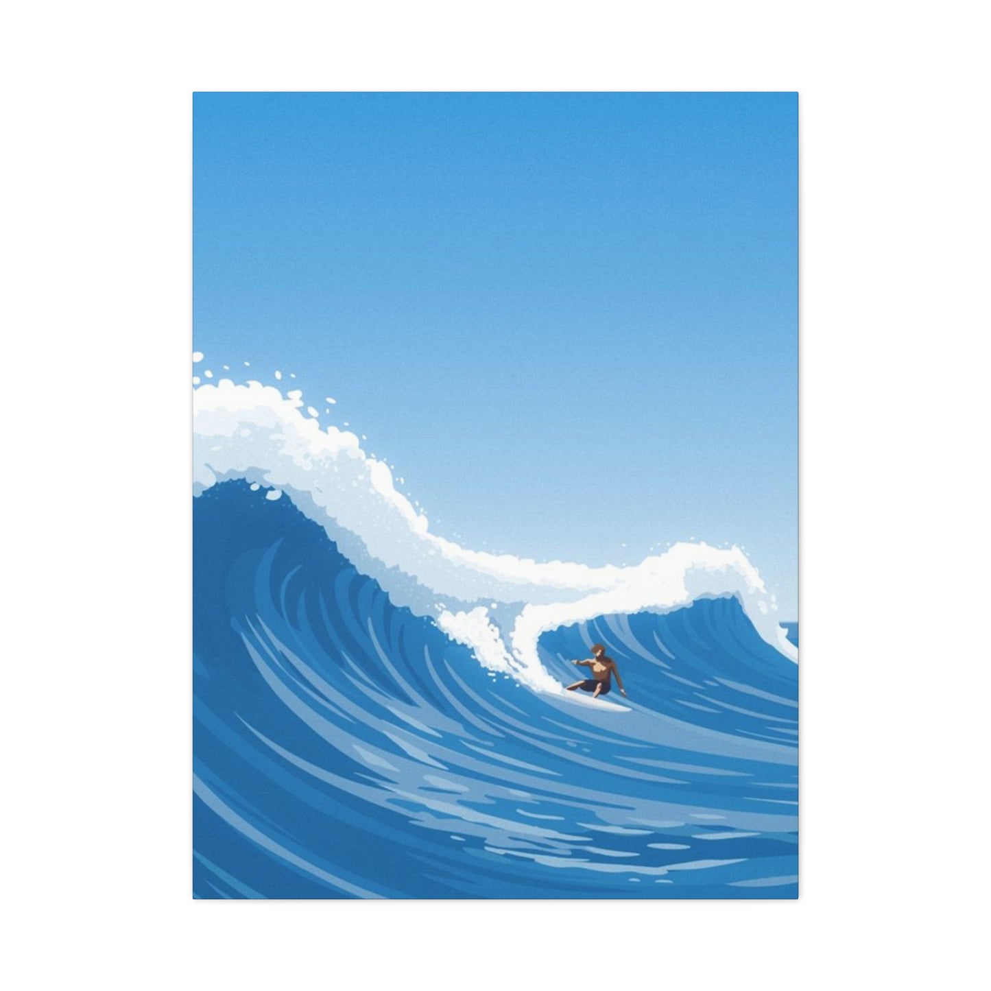

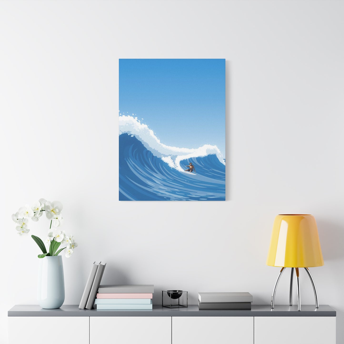
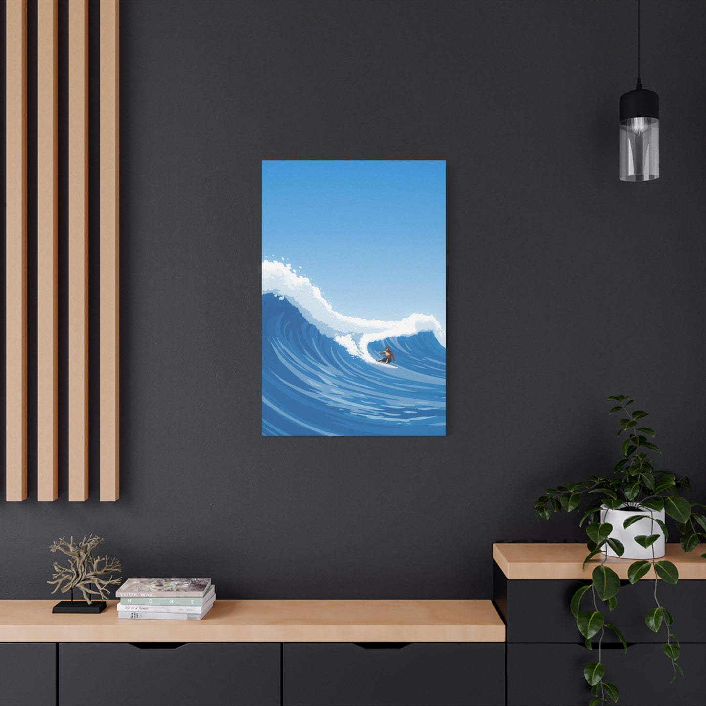
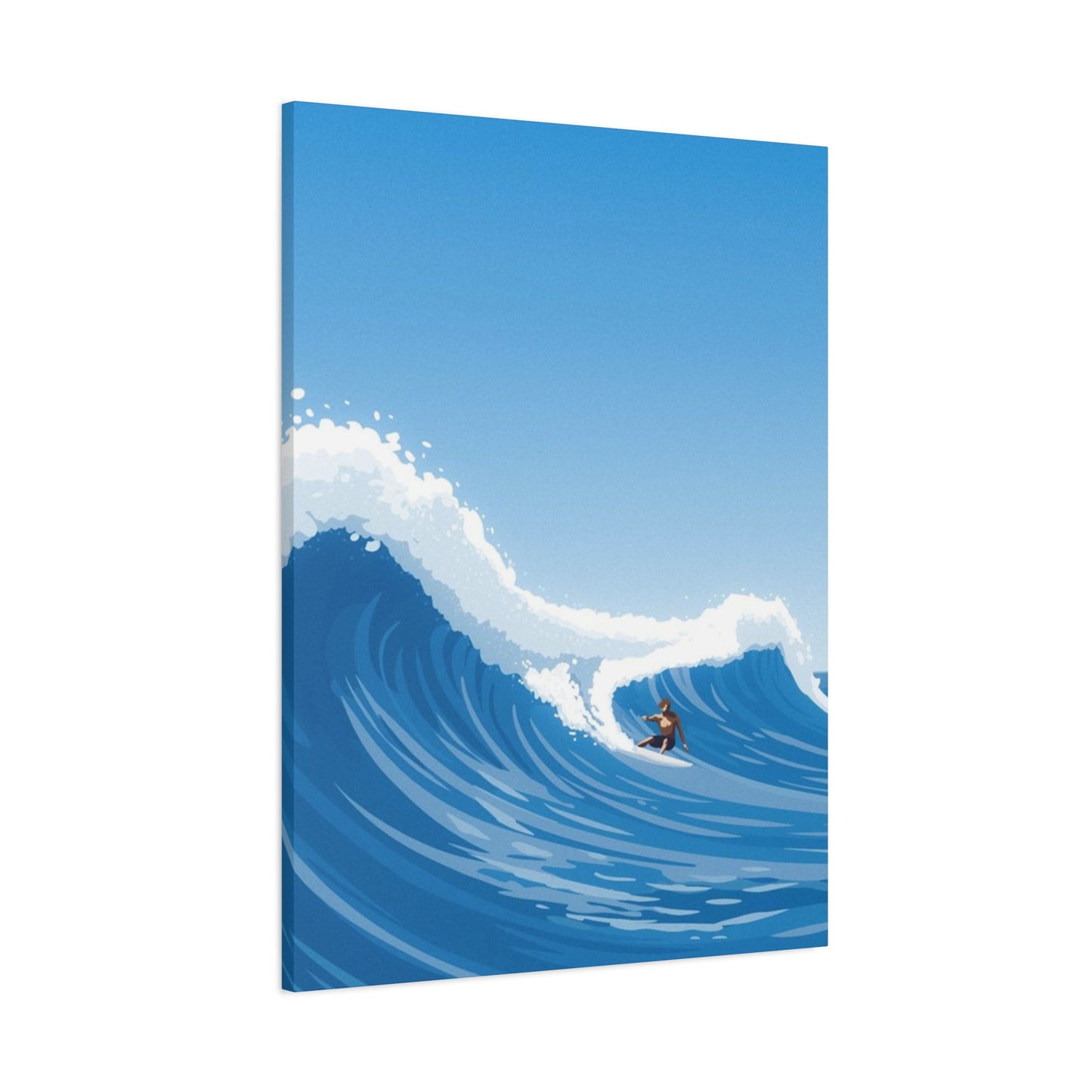
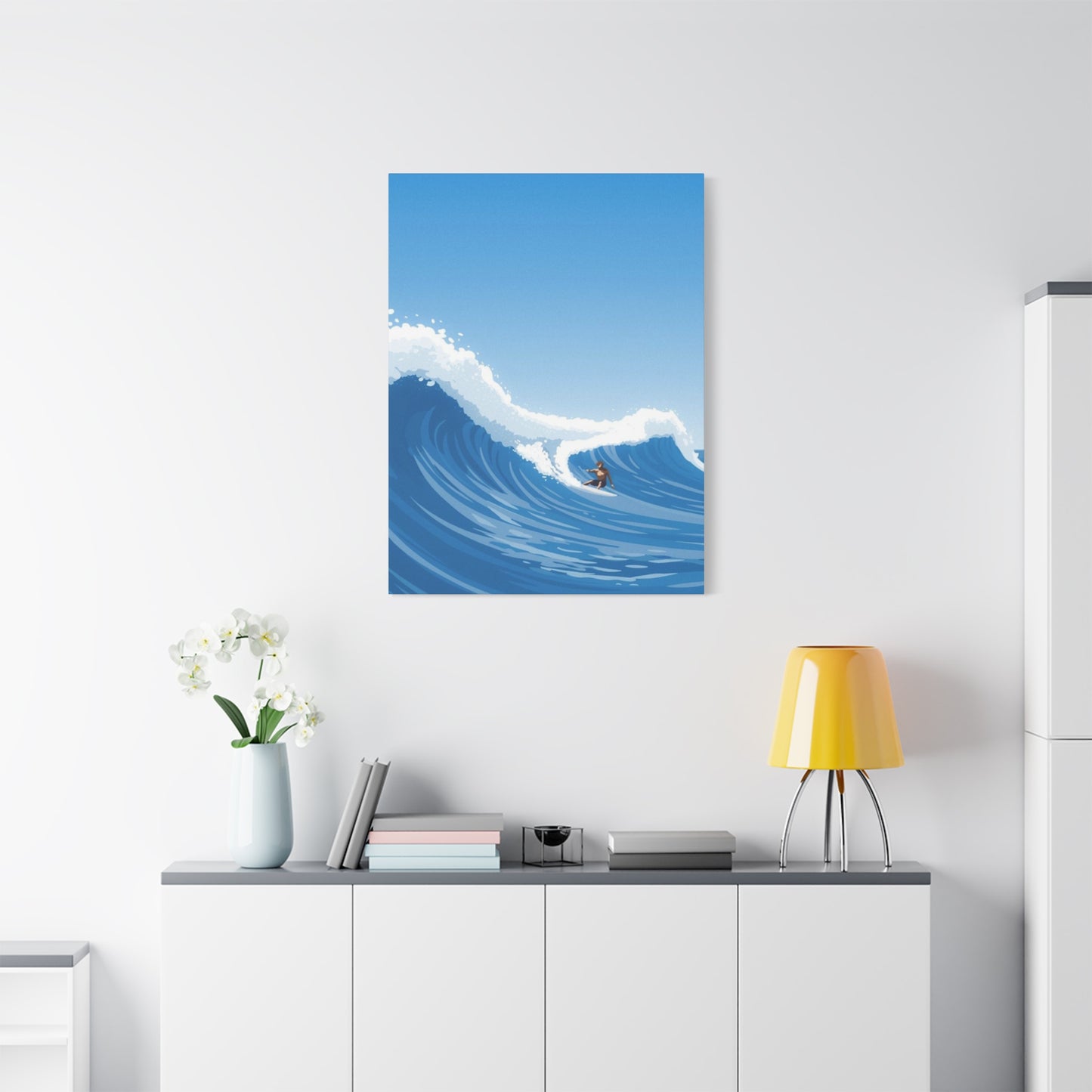
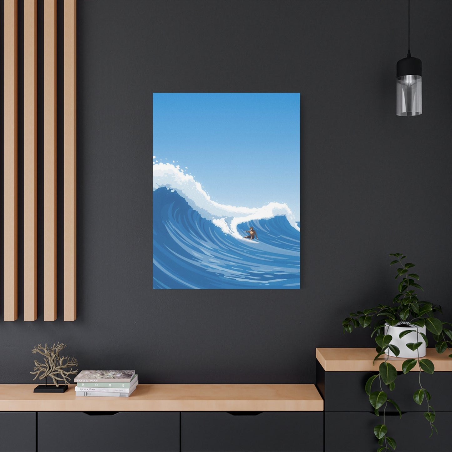
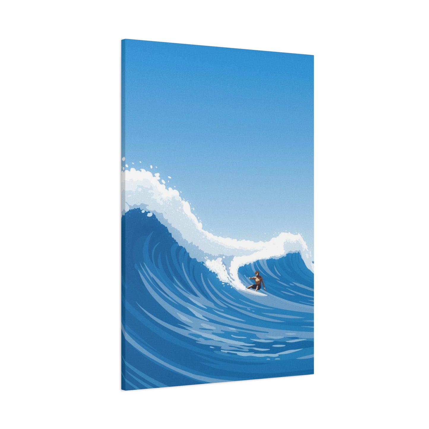
Large Abstract Surfing Wave Wall Art Canvas Prints: Transform Your Space with Ocean-Inspired Masterpieces
The allure of ocean waves has captivated humanity for centuries, representing power, freedom, and the untamed beauty of nature. Large abstract surfing wave wall art canvas prints have emerged as one of the most sought-after decorative elements in modern interior design, bringing the dynamic energy of the sea into homes, offices, and commercial spaces. These stunning visual pieces combine the raw magnificence of oceanic movements with artistic interpretation, creating focal points that command attention and inspire contemplation.
When selecting artwork for your living space, few choices can match the transformative impact of oversized wave-themed canvas prints. These pieces serve multiple purposes beyond mere decoration, functioning as windows to coastal serenity, conversation starters, and powerful expressions of personal style. The abstract nature of these artworks allows them to transcend traditional landscape photography, offering interpretations that range from photorealistic captures to completely reimagined oceanic visions painted with bold strokes and imaginative color palettes.
The popularity of surfing culture has expanded far beyond coastal communities, becoming a global phenomenon that represents an adventurous lifestyle and connection to natural forces. Large canvas prints featuring abstract wave imagery tap into this cultural zeitgeist, appealing to surf enthusiasts, ocean lovers, and anyone drawn to the aesthetic power of water in motion. These pieces bring the thrill and tranquility of the beach into any environment, regardless of geographic location.
Understanding the appeal of these artistic creations requires examining both their visual impact and psychological effects. Research in environmental psychology suggests that images of natural elements, particularly water, can reduce stress levels and promote feelings of calmness. Large-scale presentations amplify these benefits, creating immersive visual experiences that transport viewers mentally to coastal environments. The abstract quality adds layers of interpretation, allowing each observer to find personal meaning within the swirling forms and dynamic compositions.
Understanding the Appeal of Ocean Wave Artwork in Contemporary Spaces
The human connection to water runs deep in our evolutionary history and cultural consciousness. Ocean wave artwork resonates with viewers on multiple levels, tapping into primal associations with the source of life, adventure, and the sublime power of natural forces. In contemporary interior design, these pieces have transcended seasonal trends to become timeless additions that enhance various aesthetic approaches from minimalist to maximalist, coastal to urban industrial.
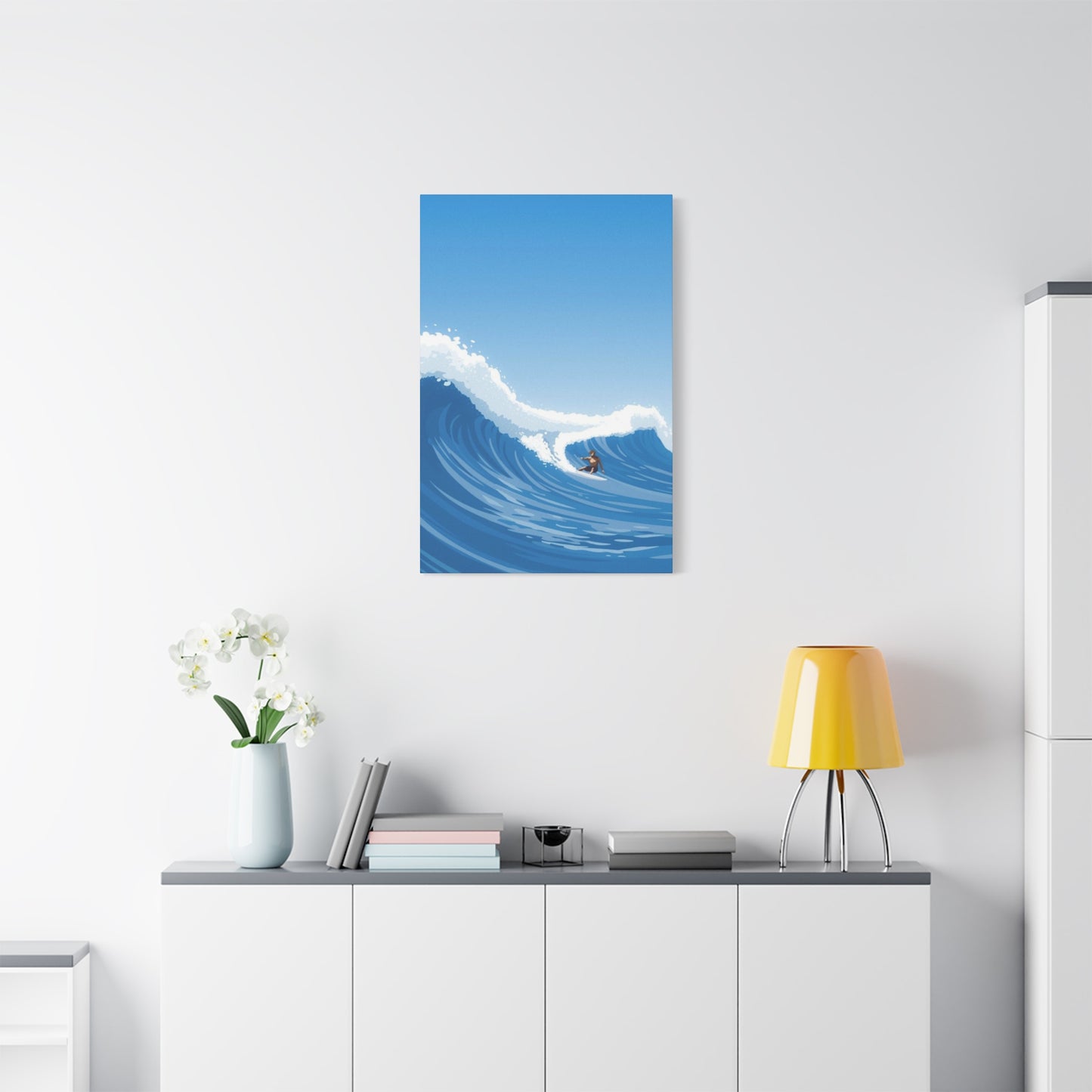
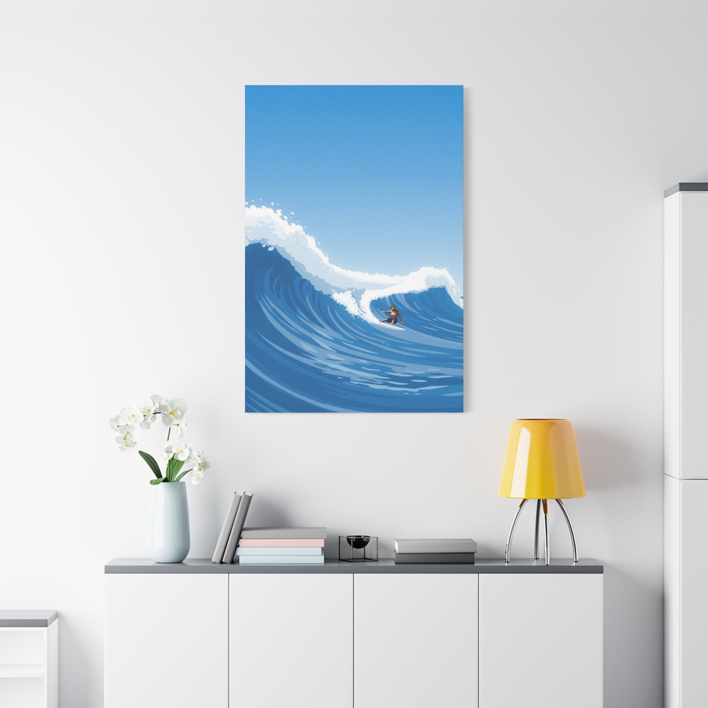
Large format presentations of wave imagery create dramatic focal points that anchor entire rooms. Unlike smaller decorative items that might get lost among other elements, oversized canvas prints demand attention and establish visual hierarchy within a space. The scale itself communicates importance and intentionality, suggesting that the homeowner or designer has made a deliberate choice to celebrate oceanic themes prominently.
Abstract interpretations of wave forms offer advantages over purely representational artwork. While realistic photographs capture specific moments with technical precision, abstract renditions allow for emotional amplification and creative freedom. Artists can emphasize certain aspects of wave dynamics, exaggerate colors beyond natural spectrums, or deconstruct the familiar form into geometric or expressionistic compositions that challenge perception while maintaining recognizable connections to the source inspiration.
The versatility of wave-themed canvas prints makes them suitable for diverse settings. In residential environments, they work beautifully in living rooms, bedrooms, home offices, and even bathrooms, where the water theme creates natural thematic coherence. Commercial applications include hospitality venues, corporate offices, wellness centers, and retail spaces where the calming yet energizing presence of ocean imagery supports various business objectives from guest relaxation to creative thinking.
Color psychology plays a significant role in the appeal of these artworks. Traditional ocean palettes featuring blues, teals, and aquamarines evoke coolness, tranquility, and expansiveness. These hues can make spaces feel larger and more serene, particularly valuable in urban environments where natural vistas may be limited. Contemporary abstract approaches might incorporate unexpected color combinations, such as warm sunset tones, dramatic blacks and whites, or even completely reimagined palettes that challenge conventional wave representation while maintaining dynamic movement.
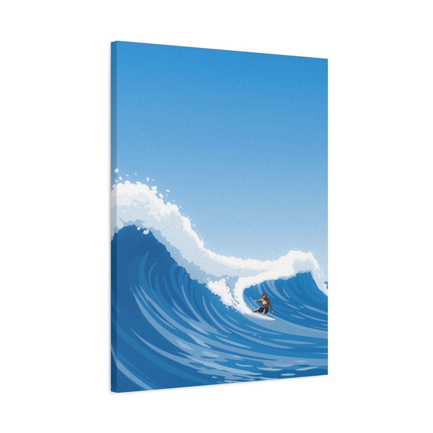
The texture and depth achievable in quality canvas prints add another dimension to the viewing experience. Unlike flat poster prints, canvas stretched over frames creates subtle three-dimensionality, with light playing across the woven surface to enhance visual interest. High-quality printing techniques can reproduce brushstrokes and layering effects that mimic original paintings, adding perceived value and artistic authenticity to the piece.
Collecting wave artwork also connects homeowners to broader cultural movements celebrating ocean conservation and environmental awareness. As climate change threatens coastal ecosystems, art featuring oceanic themes can serve as beautiful reminders of what we stand to lose, potentially inspiring more sustainable lifestyle choices. This deeper significance adds meaning beyond aesthetics, allowing owners to feel their decor choices reflect their values.
The Artistic Elements That Define Exceptional Wave Canvas Prints
Creating compelling wave artwork requires mastery of multiple artistic elements that work in harmony to produce visually striking and emotionally resonant pieces. Understanding these components helps buyers appreciate quality and make informed purchasing decisions when selecting large canvas prints for their spaces.
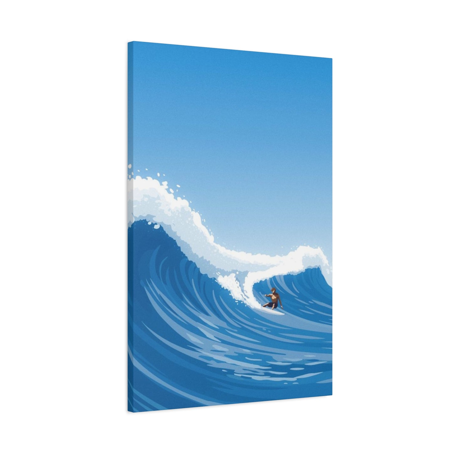
Composition forms the foundation of successful wave imagery. The arrangement of elements within the frame determines how the eye moves through the piece and where attention focuses. Strong compositions in wave art often utilize diagonal lines that create dynamic tension and suggest movement. The classic breaking wave shape, with its curling crest and cascading water, naturally provides this diagonal energy. Skilled artists position these elements to lead viewers through the composition, often creating depth through overlapping forms and varying scales of wave formations.
Color selection dramatically impacts the mood and energy of wave artwork. Traditional approaches might faithfully reproduce the color spectrum observed in natural ocean environments, ranging from deep navy blues in the troughs to seafoam whites at the crests, with variations depending on lighting conditions, water clarity, and surrounding sky colors. Abstract interpretations liberate artists from these constraints, allowing exploration of non-naturalistic palettes that might emphasize specific emotional responses or aesthetic preferences.
Monochromatic wave prints in black and white offer sophisticated alternatives that work exceptionally well in modern and minimalist interiors. The absence of color focuses attention on form, texture, and tonal contrast. These pieces often feel more dramatic and graphic, with sharp definitions between light and dark areas creating bold visual statements. Grayscale wave imagery can appear more timeless and versatile, complementing a wider range of existing color schemes without introducing competing hues.
Warm-toned wave abstractions incorporating oranges, reds, and golds evoke sunset or sunrise coastal scenes, bringing energizing warmth to spaces. These pieces work particularly well in rooms that might otherwise feel cool or stark, balancing architectural elements like concrete, steel, or abundant windows that flood spaces with natural light. The juxtaposition of fire tones against water imagery creates interesting conceptual tension that adds conversational depth to the artwork.
Experimental color approaches might use jewel tones, pastels, or even neon palettes to create surreal wave interpretations that prioritize aesthetic impact over naturalistic representation. These bold choices appeal to collectors seeking unique pieces that make unambiguous statements about personal style and willingness to embrace unconventional design approaches.
Texture representation distinguishes exceptional wave artwork from mediocre attempts. Ocean water presents complex textural challenges, with smooth glassy surfaces, rippling patterns, explosive foam, and misty spray all occurring simultaneously in breaking waves. Artists must capture this variety while maintaining cohesive visual unity. Some approaches emphasize smooth, almost liquid-looking surfaces with subtle gradations, while others build up visible texture through painting techniques or digital effects that simulate impasto brushwork.
Light handling separates good wave art from extraordinary pieces. Ocean water's translucency allows light to penetrate, creating luminous effects particularly visible in thin curtains of water as waves curl. Backlighting through cresting waves creates brilliant highlights and reveals internal structures within the water mass. Skilled artists understand how to manipulate highlights and shadows to create convincing three-dimensionality and capture the ephemeral quality of light interacting with moving water.
Scale relationships within the composition affect perceived drama and impact. Artwork featuring massive wave faces with tiny surfers or boats emphasizes the ocean's awesome power and humanity's small place within natural forces. Conversely, closer perspectives that fill the entire frame with wave details create immersive experiences, allowing viewers to feel surrounded by water rather than observing from safe distances.
Movement representation challenges artists to convey dynamic action within static media. Effective wave artwork suggests motion through directional elements like spray trajectories, flowing water patterns, and compositional lines that imply the wave's travel direction. Some artists use motion blur effects or multiple exposures to emphasize kinetic energy, while others prefer frozen moment clarity that captures precise detail at the peak of action.
Selecting the Perfect Size for Maximum Visual Impact
Choosing appropriate dimensions for wave canvas prints significantly influences their effectiveness as decorative elements. Size considerations involve more than simple aesthetic preferences, requiring careful evaluation of room dimensions, viewing distances, existing furnishings, and intended visual impact.
Large-scale artwork typically begins at dimensions around forty by sixty inches, though truly oversized pieces might extend to seventy-two inches or even larger on the longest dimension. These substantial sizes create commanding presences that function as room focal points rather than supplementary decorative accents. The dramatic scale transforms walls into feature elements, particularly effective in spaces with high ceilings or expansive wall areas that might otherwise feel empty or unfinished.
Proportional relationships between artwork and wall space follow general design principles suggesting that canvas prints should occupy roughly two-thirds to three-quarters of the available wall width above furniture pieces like sofas or beds. This proportion creates visual balance, preventing the artwork from appearing lost on an oversized wall or overwhelming the available space. In open wall applications without furniture below, greater flexibility exists, though maintaining some margin between the canvas edges and wall boundaries typically produces more polished results.
Room size directly influences appropriate canvas dimensions. Spacious rooms with generous square footage can accommodate and benefit from the largest available prints, which might appear overwhelming in more compact spaces. However, conventional wisdom suggesting small rooms require small art deserves reconsideration. In certain contexts, oversized artwork in modest spaces creates dramatic impact and can actually make areas feel larger by drawing the eye upward and creating strong focal points that organize the visual field.
Viewing distance affects perceived size and detail visibility. Artwork intended for observation from across large rooms benefits from bolder compositions, stronger contrasts, and larger-scale elements within the image. Pieces positioned in spaces where viewers will approach closely can successfully incorporate finer details and subtler tonal variations that reward intimate inspection. Multi-panel installations allow for even greater total dimensions while maintaining manageable individual panel sizes.
Ceiling height considerations prove particularly important when selecting canvas dimensions. Standard eight-foot ceilings limit vertical artwork dimensions, while contemporary spaces with nine-foot, ten-foot, or vaulted ceilings open possibilities for taller formats. Vertical orientation wave prints can emphasize ceiling height, drawing the eye upward and creating illusions of additional space. Horizontal orientations typically feel more stable and peaceful, working well above furniture or in spaces where width exceeds height.
Panel configurations offer alternatives to single large canvases. Diptych presentations split images across two panels, while triptychs use three sections. These multi-panel approaches provide flexibility in fitting artwork to available wall space, allow for interesting negative space between sections, and can be more manageable to transport and install than equivalently sized single pieces. Some designs intentionally create distinct compositions for each panel that work independently while contributing to an overall theme, while others split continuous images across multiple canvases.
Grouping multiple smaller wave-themed prints creates gallery wall effects that can fill large areas while maintaining variety. This approach works well for collectors who appreciate different artistic interpretations of wave themes or who want to combine wave imagery with complementary coastal elements like beach scenes, marine life, or surf culture references. Careful planning of layouts ensures cohesive visual flow while allowing individual pieces to maintain distinct identities.
Weight considerations accompany size decisions, as larger canvases become progressively heavier. Installation requirements escalate with dimensions, potentially necessitating professional hanging services, specialized hardware, or reinforced mounting points. Canvas prints offer advantages over framed artwork in this regard, typically weighing less than equivalently sized pieces behind glass due to the lighter stretched canvas construction.
Material Quality and Printing Techniques That Ensure Longevity
The technical aspects of canvas print production significantly impact visual quality, durability, and value retention. Understanding manufacturing processes and material choices helps buyers identify superior products worth investment compared to inferior alternatives that might deteriorate quickly or fail to accurately reproduce artwork.
Canvas substrate options begin with the choice between cotton and polyester blends. Pure cotton canvas provides traditional texture and appearance familiar from historical painting, with natural fibers creating characteristic weave patterns. High-quality cotton canvas accepts ink beautifully and produces rich color saturation. Polyester-cotton blends offer enhanced durability and resistance to environmental factors like humidity, potentially extending lifespan in challenging display environments. Pure polyester canvas, while less traditional, provides maximum stability and resistance to warping or sagging over time.
Canvas weight, measured in ounces per square yard, indicates thickness and durability. Professional-grade canvas typically ranges from eight to twelve ounces, with heavier weights providing superior stability and resistance to deterioration. Lightweight canvas might save manufacturing costs but can develop visible stretching or waviness over time, particularly in large formats where greater material stress occurs.
Printing technology determines color accuracy, detail resolution, and longevity. Giclée printing represents the gold standard for fine art reproduction, utilizing archival pigment inks and high-resolution inkjet technology. The term giclée, derived from French meaning to spray or squirt, describes the precise ink application method that produces smooth gradations and exceptional detail. These prints can achieve resolutions exceeding twelve hundred dots per inch, capturing subtle nuances that lesser printing methods miss.
Pigment-based inks offer superior lightfastness compared to dye-based alternatives, resisting fading from ultraviolet exposure for decades when properly displayed. Archive-quality pigment inks can maintain color integrity for seventy-five to over one hundred years under normal indoor display conditions. This longevity protects investment value and ensures artwork remains vibrant throughout its display life. Dye-based inks, while potentially offering brighter initial colors, typically fade significantly within just a few years, particularly when exposed to direct sunlight.
Color management throughout the production process ensures printed output accurately matches original artwork intentions. Professional printing facilities utilize calibrated color spaces, regularly maintain equipment calibration, and often produce proof prints for artist approval before final production runs. This attention to color fidelity matters particularly for wave artwork, where subtle variations in ocean blues and greens significantly impact mood and realism.
Protective coatings applied after printing provide additional defense against environmental damage. Ultraviolet-resistant varnishes or sprays help prevent fading while also making canvas surfaces easier to clean and more resistant to moisture and pollutants. Some coatings add subtle texture or sheen modifications, with options ranging from matte finishes that minimize glare to glossy treatments that enhance color vibrancy and depth perception.
Stretcher frame construction affects how well canvas maintains proper tension and appearance over time. Premium frames use kiln-dried solid wood rather than composite materials, with proper bracing to prevent warping. Corner joints should feature secure construction, often using both glue and staples or specialized joining hardware. Frames should include hanging hardware appropriate to canvas size and weight, securely attached to handle long-term stress.
Gallery wrap stretching technique, where canvas extends around frame edges rather than being visible only on the front surface, creates finished presentations that eliminate need for additional framing. Image continuation around edges provides contemporary aesthetic appeal and allows wall-mounting without borders or mats. Alternative approaches might use neutral colored edges or mirror the image edges for different visual effects.
Fastening methods securing canvas to frames impact appearance and adjustability. Staples on the back or sides remain invisible and allow for professional appearance. Some premium products include expansion wedges in frame corners, allowing canvas tension adjustments over time to eliminate any sagging that might develop. This feature particularly benefits large prints where material stress is greatest.
Incorporating Wave Art into Various Interior Design Styles
The versatility of ocean wave canvas prints allows successful integration across diverse interior design aesthetics. Understanding how these pieces complement different stylistic approaches helps maximize their decorative impact while maintaining cohesive overall design schemes.
Coastal and nautical interiors represent natural homes for wave-themed artwork, where oceanic imagery reinforces overarching design narratives. In these spaces, wave prints contribute to layered storytelling that might include weathered wood finishes, rope details, seashell collections, and blue-white color palettes reminiscent of beaches and seaside villages. Large abstract wave canvases serve as anchoring focal points that establish the coastal theme definitively while providing sophisticated artistic elements that elevate beyond literal beach decor.
Modern and contemporary spaces benefit from wave artwork's clean lines and potential for bold color statements. Minimalist interiors particularly suit abstract wave interpretations with simplified compositions and limited color palettes. Monochromatic wave prints in spaces dominated by neutral tones create striking contrasts without introducing chromatic complexity. The organic forms of waves provide welcome relief from the angular geometry prevalent in modern furniture and architecture, introducing natural elements that soften industrial edge.
Scandinavian design aesthetics embrace natural elements, light color palettes, and clean simplicity that align beautifully with certain wave art approaches. Soft, muted interpretations of ocean scenes in pale blues, grays, and whites complement the Nordic preference for bringing outdoor beauty inside while maintaining uncluttered visual environments. The emphasis on natural materials in Scandinavian interiors finds echoes in canvas construction itself, with organic cotton and wood frames aligning with the style's values.
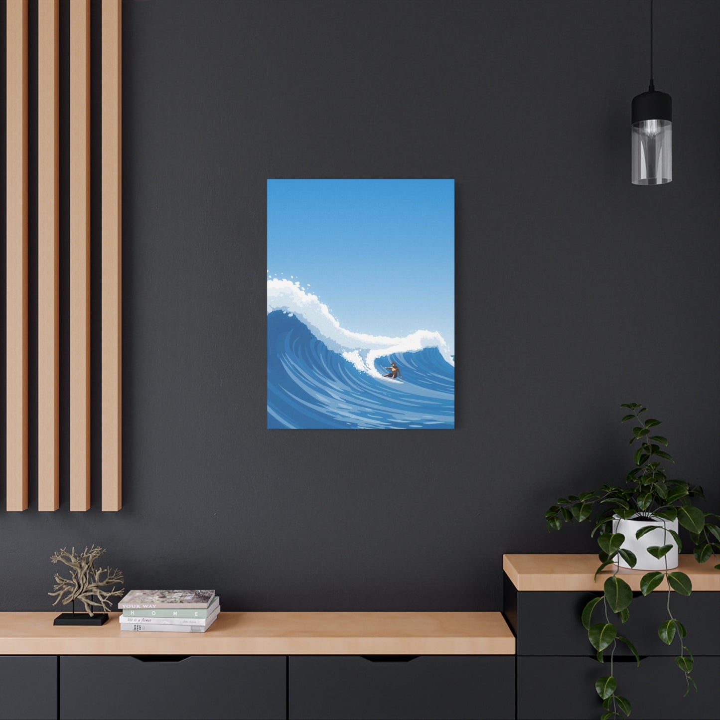
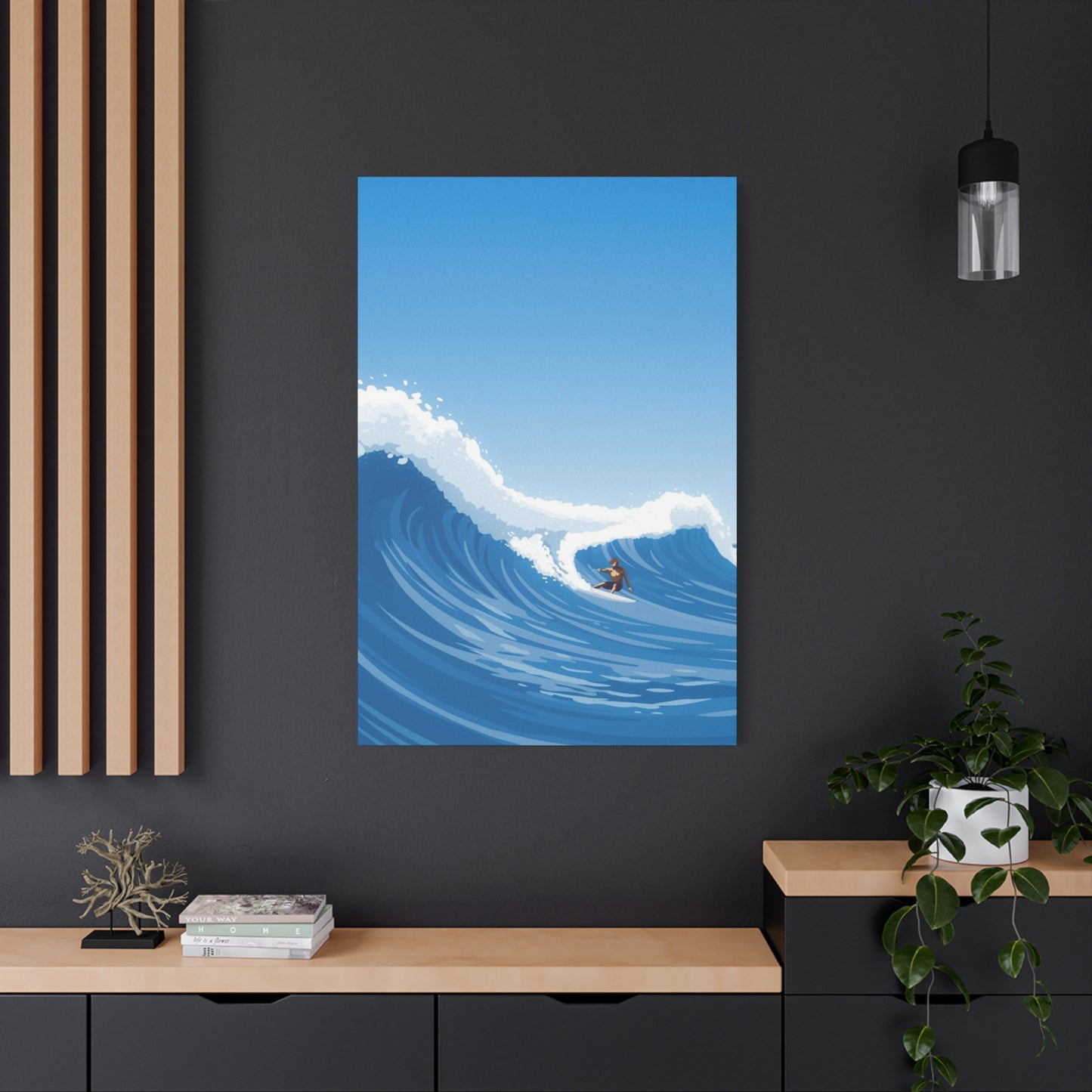
Industrial interiors featuring exposed brick, concrete, metal elements, and raw textures benefit from the softening influence of wave imagery. The juxtaposition between hard architectural elements and fluid water forms creates interesting visual dialogues. Darker, more dramatic wave interpretations with strong contrasts match the bold character of industrial spaces without appearing delicate or out of place. Oversized dimensions complement the generous proportions typical of converted loft spaces and warehouse-style homes.
Traditional and transitional designs can successfully incorporate wave art by selecting pieces with more classic color palettes and refined compositions. While abstract expressionist wave paintings might clash with formal traditional furnishings, more realistic or impressionistic interpretations can bridge aesthetic gaps. Framing options matter more in traditional contexts, where gallery-wrapped edges might appear too casual compared to more formal framing treatments with decorative moldings and mats.
Bohemian and eclectic interiors welcome diverse artistic expressions, making them particularly receptive to unique wave interpretations. Bold color choices, experimental compositions, and mixed media approaches that might overwhelm more restrained spaces find comfortable homes in boho environments. The free-spirited nature of surf culture aligns well with bohemian values, creating natural thematic harmony. Layering wave prints with other collected artwork, textiles, and global decorative elements produces rich visual environments that celebrate artistic diversity.
Tropical and resort-style interiors emphasize vacation aesthetics and relaxation, making wave imagery thematically perfect. These spaces might incorporate more vibrant color interpretations, perhaps featuring tropical water tones like turquoise and aquamarine. Pairing wave art with lush plant life, natural materials, and breezy fabrics creates immersive resort atmospheres that transport inhabitants mentally to vacation destinations year-round.
Zen and meditation spaces utilize wave imagery for its calming properties and associations with natural rhythms. Subtle, contemplative interpretations in soothing colors support the peaceful atmospheres these environments cultivate. The cyclical nature of waves speaks to Buddhist concepts of impermanence and continuous change, adding philosophical depth to aesthetic choices. Minimalist presentations without competing decorative elements allow artwork to serve as focal points for meditation practice.
Office and workspace environments benefit from wave art's ability to reduce stress while maintaining professional appearance. Research suggests natural imagery in work settings improves focus, creativity, and emotional wellbeing. Abstract presentations feel appropriately professional while providing mental breaks that distant coastal scenes might offer through windows. Color choices can either energize with bold contrasts or calm with serene palettes, depending on workspace function.
Emotional Impact of Ocean Imagery
The colors dominating wave artwork significantly influence psychological responses and emotional experiences within spaces. Understanding color psychology helps buyers select pieces that support desired atmospheric qualities and emotional tones in their environments.
Blue dominates ocean imagery as water's primary perceived color, though actual hue varies tremendously based on depth, lighting, suspended particles, and surrounding environment. Psychologically, blue associates strongly with calmness, stability, trust, and contemplation. In interior spaces, blue tones can lower blood pressure, slow respiration, and reduce feelings of anxiety. Darker navy blues suggest depth, mystery, and sophistication, while lighter sky blues evoke openness, freshness, and tranquility. These qualities make blue-dominant wave prints excellent choices for bedrooms, meditation spaces, or any environment where relaxation represents a primary goal.
Green appears in ocean water where shallow depths allow light penetration to reveal sandy bottoms or where algae and phytoplankton color the water. Psychologically, green connects to nature, growth, harmony, and renewal. The presence of green tones in wave artwork creates balanced, refreshing feelings that work well in spaces where rejuvenation and vitality are desired. Teal and turquoise, combining blue and green qualities, offer hybrid psychological benefits associating with both water depth and living natural systems.
White appears in wave crests, foam, and spray, representing the aeration of water during turbulent motion. White conveys purity, cleanliness, simplicity, and new beginnings. In wave compositions, white typically provides highlights and contrast, creating dynamic energy through its interaction with darker water tones. Artwork dominated by white foam or spray feels lighter and more energetic than pieces emphasizing deep water colors, potentially better suited to spaces needing invigoration rather than deep calm.
Aqua and cyan tones evoke tropical paradise waters, calling to mind Caribbean seas and exotic vacation destinations. These luminous colors create optimistic, escapist feelings that work beautifully in spaces designed for relaxation and fantasy. The brightness of these hues can enliven neutral color schemes while maintaining cool temperature associations that prevent spaces from feeling overly warm.
Gray appears in stormy ocean scenes or can dominate abstract interpretations. Psychologically neutral, gray suggests sophistication, timelessness, and contemplation. Grayscale wave artwork provides dramatic impact without introducing strong chromatic influences, making these pieces extremely versatile for spaces with established color schemes. The range from light silver to deep charcoal allows for varied mood creation within monochromatic palettes.
Warm tones including oranges, reds, golds, and pinks appear in sunset or sunrise wave imagery, or in purely abstract interpretations. These colors energize and stimulate, creating warmth and excitement. In spaces that might otherwise feel cold due to northern exposure or cool architectural materials, warm-toned wave art provides necessary color temperature balance. The unexpected juxtaposition of warm colors with water imagery creates interesting visual tension that commands attention.
Purple and violet occasionally appear in wave artwork, either representing specific atmospheric conditions or serving purely artistic purposes. These hues combine blue's calm with red's energy, resulting in associations with luxury, creativity, and spirituality. Purple-toned wave prints make distinctive choices that stand out from conventional ocean color palettes, appealing to collectors seeking unique pieces.
Black provides dramatic contrast and depth in wave compositions, defining shadows, suggesting nighttime conditions, or creating graphic simplification in abstract works. Black associates with sophistication, power, mystery, and elegance. Wave prints incorporating significant black elements feel more dramatic and intense than lighter alternatives, working well in spaces where bold statements align with overall design intentions.
Multicolor approaches incorporating diverse hues beyond natural water colors create energetic, contemporary feelings. These pieces appeal to collectors comfortable with bold artistic expression and spaces that can accommodate chromatic complexity. The colors might represent emotional interpretations of the ocean experience rather than literal representation, prioritizing feeling over accuracy.
Color saturation levels affect intensity of emotional response. Highly saturated colors appear vibrant and energetic, demanding attention and creating excitement. Desaturated or muted colors feel more sophisticated and restrained, producing contemplative rather than stimulating effects. Understanding personal responses to saturation helps buyers select wave art matching their temperament and space requirements.
Installation and Placement Strategies for Optimal Display
Proper installation and thoughtful placement dramatically impact how wave canvas prints function within spaces. Strategic decisions regarding location, height, lighting, and surrounding elements maximize visual impact while protecting artwork investment.
Wall selection establishes foundational context for artwork display. Focal walls represent the natural choice for large canvas prints, typically the first wall visible when entering a room or the wall facing primary seating areas. In living rooms, this often means the wall behind or opposite the sofa. In bedrooms, the wall behind the bed provides traditional placement that creates visual balance and establishes the bed as the room's anchor point. Unexpected placements like hallway terminus walls or above staircases can create dramatic moments in transitional spaces often overlooked for significant artwork.
Hanging height follows general rules placing artwork centers approximately fifty-seven to sixty inches from the floor, matching average eye level. This guideline applies to spaces where viewers primarily stand or move through rooms. In seating areas where artwork will be viewed primarily while sitting, slightly lower positioning may improve the viewing experience. Very large pieces might require adjusted placement to ensure tops don't approach ceiling too closely, which can create uncomfortable visual compression.
Spatial relationships with furniture require consideration to create cohesive groupings. Canvas prints displayed above sofas, console tables, or beds should relate proportionally to the furniture beneath. General recommendations suggest artwork width should measure between two-thirds and three-quarters of furniture width to create visual balance. Vertical clearance between furniture top and artwork bottom typically ranges from six to twelve inches, allowing breathing room without creating disconnection between elements.
Corner placement offers alternatives for artwork that might otherwise compete with architectural features like fireplaces or large windows on primary walls. Corners can handle artwork spillover onto adjacent walls, creating wraparound effects that immerse viewers in the imagery. This approach works particularly well with multi-panel installations where sections can extend around corners to emphasize dimensional qualities.
Lighting dramatically affects how artwork appears and can elevate presentation quality significantly. Natural daylight provides ideal illumination, revealing colors accurately and creating dynamic display as sunlight shifts throughout the day. However, direct sunlight poses fading risks, even for archival-quality prints, necessitating window treatments that diffuse or redirect harsh rays. Northern light exposure provides consistent, gentle illumination without dramatic intensity changes throughout the day.
Artificial lighting requires careful planning to achieve gallery-quality presentation. Track lighting with adjustable fixtures allows precise artwork illumination from optimal angles. Positioning lights approximately thirty degrees from vertical prevents glare while providing even coverage. LED technology offers advantages including minimal heat generation that won't damage canvas over time, extended bulb life reducing maintenance, and excellent color rendering when high CRI bulbs are selected.
Picture lights mounted directly above or on frames provide elegant dedicated illumination. These fixtures work well for formal installations and ensure artwork remains visible even when ambient room lighting is dimmed. However, heat generation from traditional incandescent picture lights can damage artwork, making LED conversion preferable.
Accent lighting using wall washers or spot lights integrated into room lighting plans highlights artwork while contributing to overall ambiance. This approach treats canvas prints as architectural features deserving emphasis within lighting design rather than adding afterthought illumination. Dimmer controls allow adjustment matching different activities and times of day.
Avoiding glare and reflections requires attention to both light source positioning and canvas surface characteristics. Angled lighting prevents direct reflection into typical viewing positions. Matte or satin canvas finishes minimize reflectivity compared to glossy surfaces. Testing various lighting angles during installation ensures satisfactory appearance from primary viewing locations.
Grouping multiple pieces requires planning to achieve cohesive arrangements. Maintaining consistent spacing between canvases creates organized, intentional appearance. Common spacing ranges from two to six inches depending on piece sizes and available wall space. Aligning elements along common horizontal or vertical axes produces more polished results than haphazard placement. Creating templates from paper or cardboard allows experimentation with arrangements before committing to wall holes.
Environmental considerations protect artwork longevity. Avoid placing canvas prints where they will receive direct heat from radiators, vents, or fireplaces, as temperature fluctuations can damage canvas and accelerate fading. High humidity environments like bathrooms require extra precaution, though canvas generally handles modest humidity better than paper-based artwork. Maintaining consistent moderate temperature and humidity supports long-term preservation.
Security and stability matter particularly for large, valuable pieces. Wall anchors appropriate to wall construction type ensure secure mounting capable of handling artwork weight long-term. Hollow walls require toggle bolts or other anchors that distribute load across larger areas than simple picture hooks. Masonry walls need appropriate plugs and screws. Professional installation may be worthwhile for particularly large or valuable pieces to ensure proper support and perfect leveling.
Maintenance and Care for Long-Term Beauty
Proper maintenance ensures wave canvas prints retain their visual appeal and physical integrity throughout their display life. Understanding care requirements and implementing simple protective measures maximizes artwork investment value.
Regular dusting prevents accumulation that can dull colors and become embedded in canvas texture over time. Soft, dry microfiber cloths gently wiped across surfaces remove loose dust without damaging prints or protective coatings. Feather dusters also work well for light maintenance, though ensuring thorough coverage requires care. Dusting frequency depends on environmental conditions, with dustier environments requiring more frequent attention. Monthly dusting typically suffices for most display conditions.
Avoiding moisture contact protects against potential damage including ink running, canvas warping, or mold development. Canvas prints should never be cleaned with wet cloths or spray cleaners unless specifically approved by manufacturers. Even minor dampness can cause canvas fibers to swell and contract unevenly, potentially creating visible distortions. Spills should be immediately blotted with dry absorbent materials and canvas allowed to air dry thoroughly before replacing if removed from walls.
Handling canvas requires care to avoid damage to stretched surface or frame structure. Always grasp frames rather than touching canvas surfaces directly, as oils from skin can transfer and potentially affect appearance over time. When moving large pieces, support should be distributed along bottom and side edges rather than stressing top corners or hanging hardware. Never allow canvases to bend or flex significantly, as this stresses both canvas and frame potentially creating permanent deformation.
Protecting against direct sunlight represents the single most important preservation measure. Even archival-quality pigment inks gradually fade with prolonged ultraviolet exposure. Window films or treatments that filter UV rays allow natural light while reducing damage potential. Alternatively, positioning artwork on walls that don't receive direct sun exposure avoids the issue entirely. Rotating displayed artwork periodically prevents uneven fading if some pieces receive more light exposure than others.
Climate control supports longevity by preventing environmental extremes that stress materials. Moderate, consistent temperature and humidity prove ideal, roughly matching comfortable human living conditions. Avoid positioning artwork where it will experience temperature fluctuations from heating and cooling system vents, radiators, or drafty windows. Excessive humidity encourages mold growth on canvas and wooden frames, while extreme dryness can make materials brittle and prone to cracking.
Protective coatings may require periodic renewal depending on product type and environmental conditions. Removable varnishes applied as final protective layers can be professionally cleaned and reapplied if they become damaged or clouded. Permanent coatings applied during manufacturing typically don't require renewal but should be preserved through gentle cleaning and careful handling.
Storage requires attention when artwork is not displayed. Canvas should be stored in climate-controlled environments, ideally upright rather than stacked horizontally to avoid pressure points. If horizontal storage is necessary, pieces should be well-padded with acid-free materials between layers. Never roll canvas prints, as this stresses the stretched surface and can crack protective coatings or damage image layer. Original packaging often provides good storage protection if artwork needs temporary removal from display.
Inspection for developing issues allows early intervention before minor problems become serious damage. Periodically examine canvas for signs of sagging, which appears as loose or wavy surface texture. This sometimes occurs naturally over time as canvas fibers relax and can often be corrected using adjustable corner wedges if frames include them. Check frame corners for separation or damage. Look for any discoloration, spots, or other irregularities in the printed image that might indicate environmental damage requiring remediation.
Professional conservation services should be consulted for valuable pieces showing significant deterioration or damage. Attempting amateur restoration of quality artwork often causes additional harm. Conservators possess specialized knowledge and materials for repairing canvas tears, restretching warped pieces, addressing fading, and performing other corrective measures while preserving artwork integrity.
Insurance considerations may apply to valuable artwork collections. Documenting pieces with photographs and purchase records, noting dimensions, artist information, and acquisition costs supports insurance claims if loss or damage occurs. Some homeowners policies include artwork coverage, while significant collections may justify specialized fine art insurance providing broader protection and higher coverage limits.
The Creative Process Behind Abstract Wave Artwork
Understanding artistic approaches to creating wave imagery enhances appreciation for finished pieces and helps collectors evaluate quality and artistic merit. The creative journey from concept to completed artwork involves numerous decisions and technical skills that distinguish exceptional pieces from mundane attempts.
Inspiration sources for wave artists vary tremendously, ranging from direct observation of ocean conditions to imaginative interpretations of water's fundamental qualities. Many surf and ocean artists spend considerable time immersed in coastal environments, studying wave formation, light interaction with water, color variations under different atmospheric conditions, and the dynamic energy of breaking swells. This firsthand experience informs artistic interpretation with authentic understanding impossible to achieve through indirect research alone.
Photography often serves as reference material or starting point for painted or digital wave artwork. Artists might capture thousands of wave images, selecting exceptional moments that capture perfect curls, dramatic lighting, or interesting compositional elements. These photographs provide accurate detail for realistic elements while allowing artistic license in color, composition, and stylistic interpretation. Some artists work entirely from photographic reference, essentially translating captured moments into different media, while others use photos merely as jumping-off points for completely reimagined compositions.
Plein air painting represents traditional approach where artists work outdoors directly observing subjects. Creating wave art this way presents significant challenges given water's constant motion and changing light conditions. However, the immediacy and energy captured through direct observation often produces uniquely vital artwork impossible to replicate from photographs in studio settings. Quick studies and color notes made on location can inform later larger studio pieces combining observational authenticity with refined composition.
Studio work allows controlled creation with time for refinement, experimentation, and development of complex compositions. Artists working in traditional media like oils or acrylics build up layers, adjusting colors, modifying compositions, and developing the surface texture that contributes to finished impact. The physical process of manipulating paint creates unique surfaces impossible to perfectly replicate through digital means, though modern printing technology increasingly narrows this gap.
Digital creation opens possibilities unavailable in traditional media, allowing perfect undoing of unsatisfactory elements, infinite experimentation with color variations, and combination of photographic elements with painted components. Digital artists might begin with photographs, apply filters and effects, add painted layers, incorporate textures, and continuously adjust until achieving desired results. The flexibility of digital workflow supports rapid iteration and exploration of multiple creative directions from single starting points.
Abstract approaches require different creative thinking than representational art. Rather than faithfully recording observable reality, abstract artists interpret essential qualities of subjects, potentially exaggerating, simplifying, or completely reimagining forms while maintaining recognizable connections to inspiration sources. The degree of abstraction exists on a spectrum from slightly stylized realistic work to completely non-representational pieces that evoke wave feelings through color and form without depicting recognizable water at all.
Color theory guides palette selection to achieve desired emotional impacts and visual harmony. Complementary colors create vibrant contrast, while analogous schemes produce harmonious, unified feelings. Artists might limit palettes to two or three hues for bold graphic impact or employ full color ranges for complex, nuanced work. Understanding how colors interact, which combinations create discord versus harmony, and how to use color temperature to suggest depth and atmosphere represents fundamental artistic knowledge applied specifically to oceanic subjects.
Composition principles including rule of thirds, leading lines, balance, and focal point creation organize visual elements effectively. Strong compositions guide viewer attention through the artwork in intended ways, creating visual flow that feels natural and satisfying. In wave imagery, the natural curves and directional movement of water provide powerful compositional elements when properly utilized. Artists must decide what to emphasize, where to position the horizon if included, how much to show of the wave structure, and what surrounding elements if any to incorporate.
Textural development adds dimensional quality that enhances visual interest and can suggest the physical nature of water. Traditional painters might use impasto techniques, building up thick paint layers that create actual three-dimensional surface relief. Palette knife application produces different textures than brushwork. Digital artists simulate texture through layering techniques, applying textured overlays, or using specialized brushes that mimic traditional media effects.
Final Thoughts:
Large abstract surfing wave wall art canvas prints offer a dynamic and captivating way to bring the energy and beauty of the ocean into your living space. These masterpieces go beyond traditional seascapes by capturing the movement, power, and fluidity of waves through bold colors, sweeping lines, and imaginative interpretations. As we reflect on the impact of such artwork, it becomes clear why ocean-inspired abstract pieces remain a popular choice for transforming interiors into vibrant, inspiring environments.
One of the most striking features of large abstract surfing wave art is its ability to convey motion and emotion simultaneously. Unlike realistic ocean paintings, abstract art invites viewers to experience the raw energy and rhythm of the surf without being bound to literal depictions. This freedom allows the artist to express the wave’s force, grace, and unpredictability in innovative ways, creating visual narratives that resonate on both emotional and aesthetic levels. Displaying such artwork in your home brings a sense of vitality and fluidity that invigorates any room.
The boldness and scale of large canvas prints make them perfect statement pieces. Whether in a living room, hallway, or office, these artworks command attention and become focal points around which the rest of the decor can revolve. Their size and vibrant composition add depth and dimension, making spaces feel more expansive and lively. This effect is particularly effective in modern interiors that emphasize open floor plans and minimalist furnishings, where the artwork adds color, texture, and personality.
Color plays a vital role in abstract surfing wave art. Blues, teals, and whites evoke the ocean’s natural hues, while splashes of contrasting colors—such as fiery oranges or deep purples—introduce excitement and warmth. This rich palette offers versatility, allowing the artwork to harmonize with coastal-themed decor or serve as a bold accent in more eclectic or contemporary settings. Thoughtful lighting further enhances these colors, highlighting textures and brushstrokes that give the wave its dynamic character.
Abstract surfing wave wall art also connects deeply with themes of freedom, adventure, and the natural world. Surfing itself is a symbol of harmony between human and nature, embodying balance, courage, and flow. By incorporating this theme into your decor, you invite these positive qualities into your living environment. The artwork encourages a mindset of resilience and adaptability, reminding us to navigate life’s challenges with grace and energy, much like riding the ocean’s waves.
In addition to its aesthetic and symbolic appeal, large abstract surfing wave art offers incredible flexibility in styling. It pairs beautifully with natural materials like driftwood, rattan, and linen, which complement its organic inspiration. Accents such as sea glass, shells, or nautical elements can further enhance the coastal vibe. At the same time, the bold abstraction allows it to stand strong alongside modern metals and sleek surfaces, bridging the gap between nature and urban sophistication.
Sustainability considerations also come into play when selecting art. Many artists creating ocean-inspired works are committed to environmental awareness, using eco-friendly paints and sustainable canvases. Supporting these creators not only enhances your home decor but also contributes to the preservation of the very oceans that inspire the art. This conscious choice adds an ethical dimension to your aesthetic, enriching your living space with purpose and mindfulness.
Emotionally, large abstract surfing wave wall art can evoke a range of responses—from calm and tranquility to exhilaration and joy. This versatility makes it ideal for diverse spaces, whether you want to create a peaceful retreat or a lively social area. The artwork’s fluid forms and vibrant colors stimulate creativity and relaxation, making it a powerful tool for shaping the ambiance of your home.
In conclusion, large abstract surfing wave wall art canvas prints are more than just decorative elements—they are ocean-inspired masterpieces that transform spaces with energy, elegance, and emotion. Their bold presence, rich color palettes, and dynamic forms invite a deep connection to nature’s beauty and rhythm, offering a unique way to personalize and elevate your interior design.
As you consider adding these captivating pieces to your home, think about how they can best complement your existing decor and lifestyle. Whether you choose a single dramatic canvas or a curated collection, abstract surfing wave art promises to infuse your space with the vibrant spirit of the ocean and the timeless allure of artistic expression.
