


Minimalist Wall Art & Canvas Prints
Minimalist Wall Art & Canvas Prints
Couldn't load pickup availability


Minimalist Wall Art: The Ultimate Guide to Simple Elegance and Modern Style
Minimalist art represents a revolutionary approach to visual expression that emerged in the late 1950s and gained momentum throughout the 1960s. This artistic movement fundamentally challenges traditional notions of complexity in favor of simplicity, clarity, and purposeful reduction. The core philosophy behind minimalist artwork revolves around the concept that less truly is more, creating powerful visual impact through deliberate restraint rather than elaborate ornamentation.
The fundamental characteristics of minimalist art begin with the strategic use of clean lines and geometric forms. These elements serve as the backbone of minimalist compositions, creating order and harmony within the visual field. Unlike traditional art forms that may incorporate intricate details and busy patterns, minimalist pieces rely on the power of suggestion and the viewer's imagination to fill in the gaps. This approach creates a meditative quality that allows observers to experience a sense of calm and contemplation when viewing the artwork.
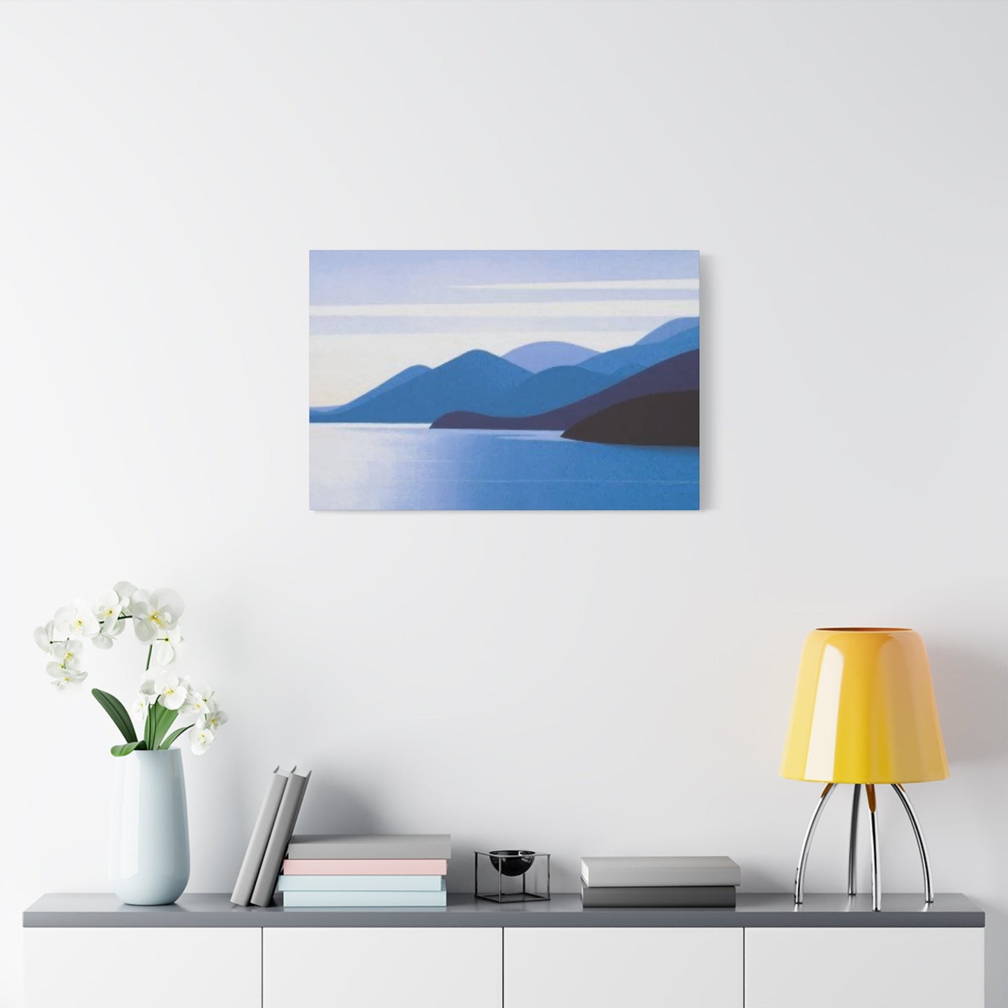
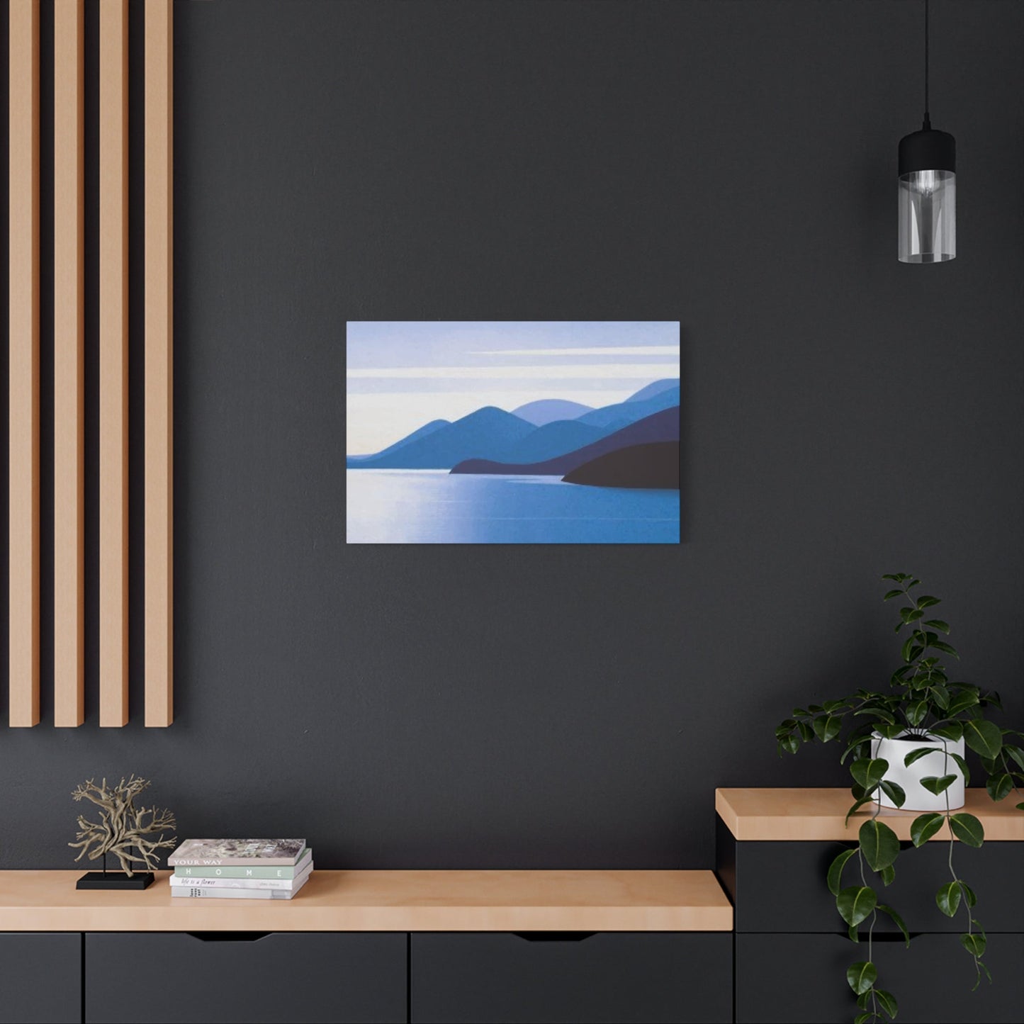
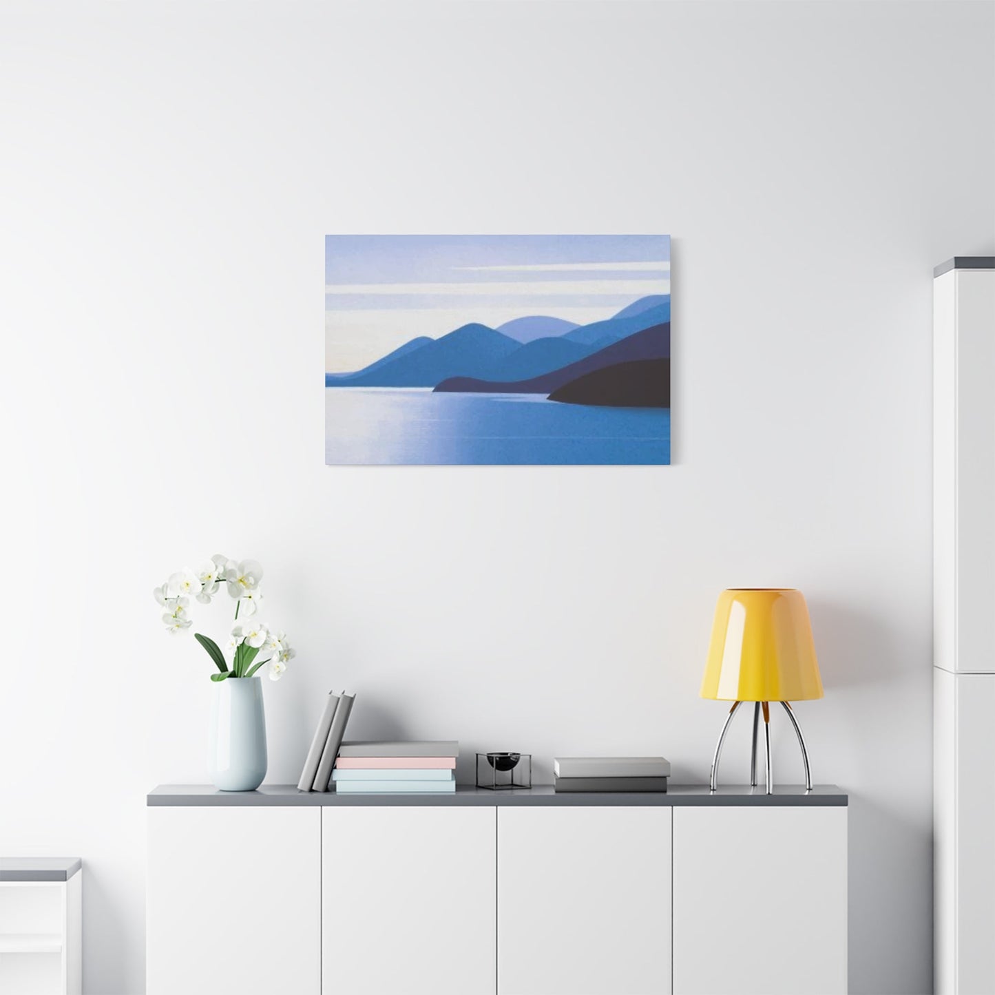
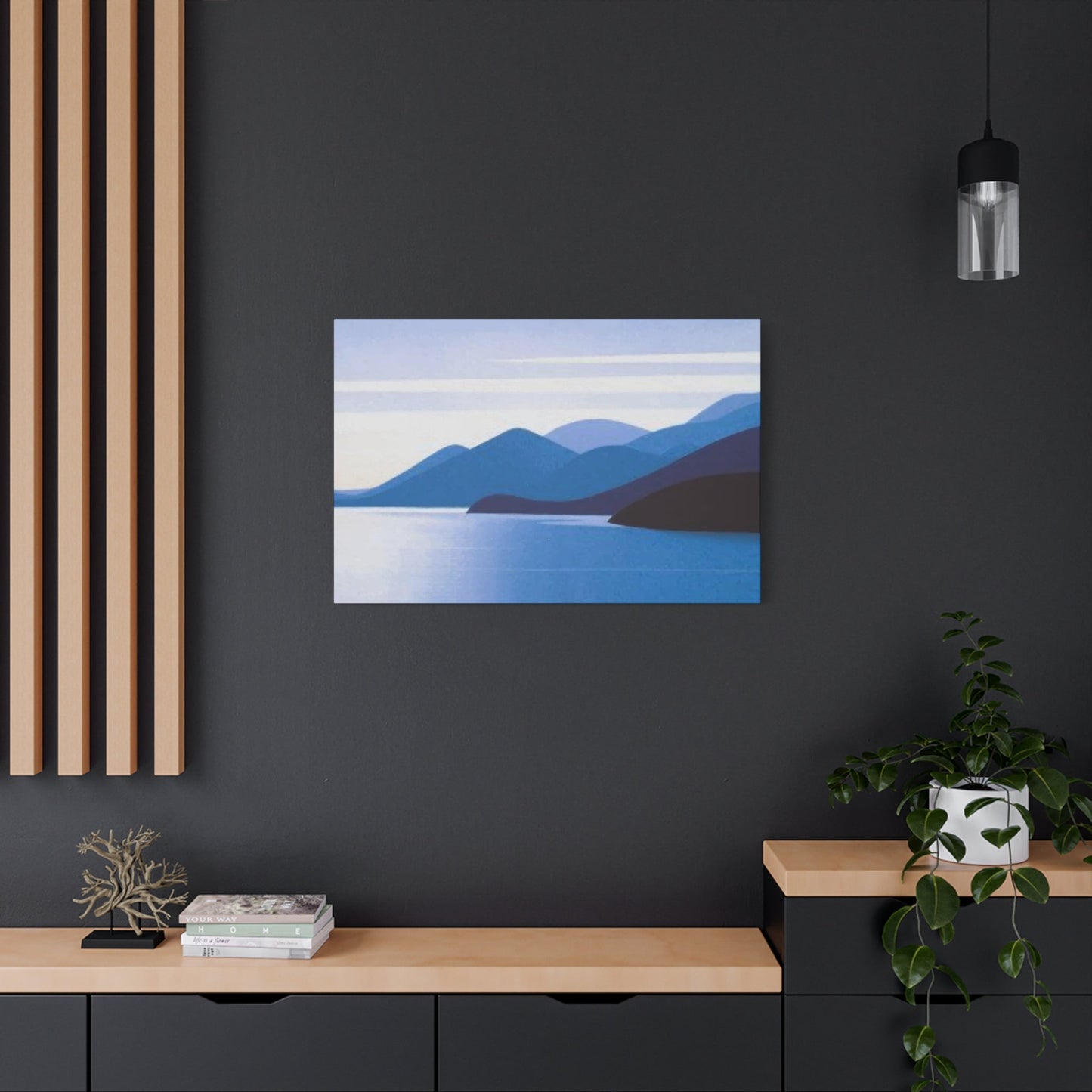
Color palettes in minimalist art typically embrace neutral tones, monochromatic schemes, or carefully selected accent colors that serve specific purposes within the composition. The strategic limitation of color choices prevents visual overwhelm and maintains the serene atmosphere that minimalist art is known for. These restrained color choices also ensure that minimalist pieces can seamlessly integrate into various living environments without clashing with existing decor elements.
Texture plays a subtle yet crucial role in minimalist art, often serving as the primary source of visual interest when color and form are intentionally simplified. Artists may incorporate different materials, surface treatments, or printing techniques to add depth and tactile appeal to otherwise simple compositions. This approach ensures that minimalist pieces maintain visual engagement despite their apparent simplicity.
The concept of intentionality permeates every aspect of minimalist art creation. Each element within a minimalist composition must serve a specific purpose and contribute to the overall harmony of the piece. This careful consideration extends to the placement of forms, the selection of colors, and even the amount of negative space incorporated into the design. Nothing is accidental or superfluous in true minimalist artwork.
Scale and proportion become particularly important in minimalist art because there are fewer elements to work with overall. The relationship between different components within the composition must be carefully balanced to create visual harmony and prevent any single element from overwhelming the others. This attention to proportion extends to how the artwork relates to its surrounding environment when displayed.
Modern minimalist art often incorporates contemporary themes and concepts while maintaining the movement's core principles. This evolution allows minimalist art to remain relevant and appealing to contemporary audiences while honoring its historical foundations. The integration of modern technology and printing techniques has also expanded the possibilities for creating and reproducing minimalist artwork.
Mastering the Art of Styling Minimalist Prints
Successfully incorporating minimalist prints into your living environment requires a thoughtful approach that considers both the artwork itself and the surrounding context. The process begins with understanding how minimalist pieces function within a room and how they can enhance rather than compete with existing design elements. This understanding forms the foundation for creating cohesive and visually appealing displays that maximize the impact of minimalist artwork.
The selection process for minimalist prints should align with the overall aesthetic and functional goals of the room. Consider the existing color scheme, furniture styles, and architectural features when choosing pieces. Minimalist prints work best when they complement rather than contrast sharply with their surroundings. This doesn't mean everything must match perfectly, but rather that there should be a sense of visual harmony and intentional coordination.
Framing choices significantly impact how minimalist prints are perceived and how well they integrate into the surrounding environment. Simple, clean frames in neutral colors typically work best with minimalist artwork, as ornate or decorative frames can detract from the simplicity of the piece itself. Consider the width of the frame in relation to the size of the print, ensuring that the frame enhances rather than overwhelms the artwork.
Placement considerations extend beyond simply finding wall area to hang artwork. The height at which prints are hung, their relationship to furniture and architectural features, and the viewing angles from different positions within the room all influence how the artwork is experienced. Standard gallery height recommendations suggest hanging artwork so that the center of the piece sits approximately 57 to 60 inches from the floor, but this may need adjustment based on room proportions and furniture placement.
Grouping multiple minimalist prints requires careful attention to spacing, scale relationships, and visual balance. When creating gallery walls or clusters of minimalist artwork, maintain consistent spacing between pieces to create a cohesive appearance. The spacing should be proportional to the size of the prints, with larger pieces typically requiring more breathing room than smaller ones.
Lighting plays a crucial role in how minimalist prints are perceived and appreciated. Natural light can enhance the subtle variations in tone and texture that are often present in minimalist artwork, while artificial lighting should be carefully positioned to avoid glare or harsh shadows. Consider both the quality and direction of light when positioning minimalist prints, as these factors can dramatically affect the viewer's experience of the artwork.
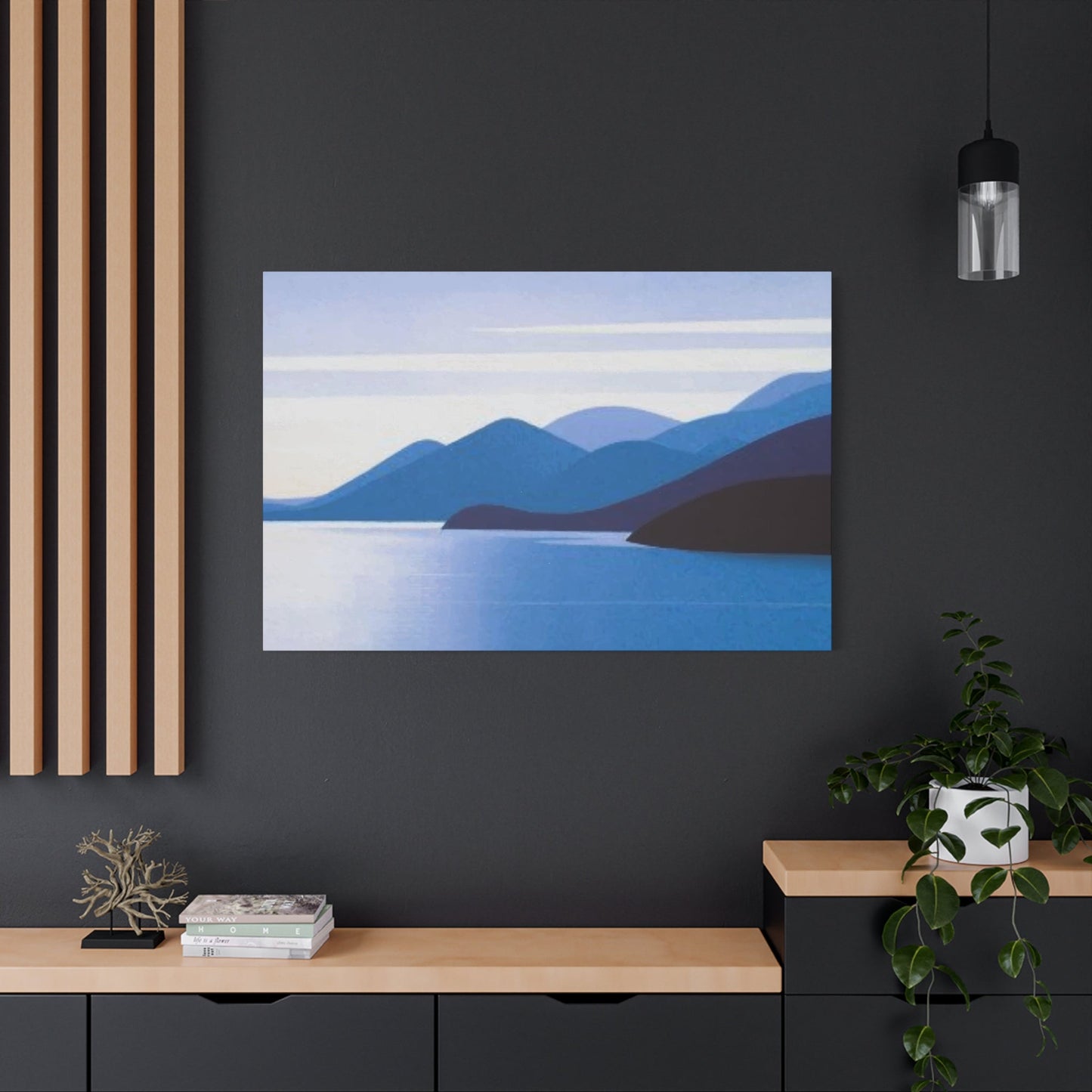
The surrounding wall color and texture can either enhance or detract from minimalist prints. Neutral wall colors typically provide the best backdrop for minimalist artwork, allowing the pieces to stand out without competition. However, carefully chosen accent walls or textured surfaces can sometimes complement minimalist prints when done thoughtfully.
Creating visual breathing room around minimalist prints is essential for maintaining the sense of calm and simplicity that these pieces are designed to evoke. Avoid overcrowding walls with too many elements, and ensure that each piece has adequate negative area around it to be properly appreciated. This principle applies whether displaying a single statement piece or multiple coordinated prints.
Optimal Room Selections for Minimalist Wall Art
Different rooms within the home present unique opportunities and challenges for displaying minimalist wall artwork. Understanding how each area functions and the specific needs of occupants helps determine the most appropriate minimalist pieces for each location. The key is matching the artwork's characteristics with the room's purpose and atmosphere.
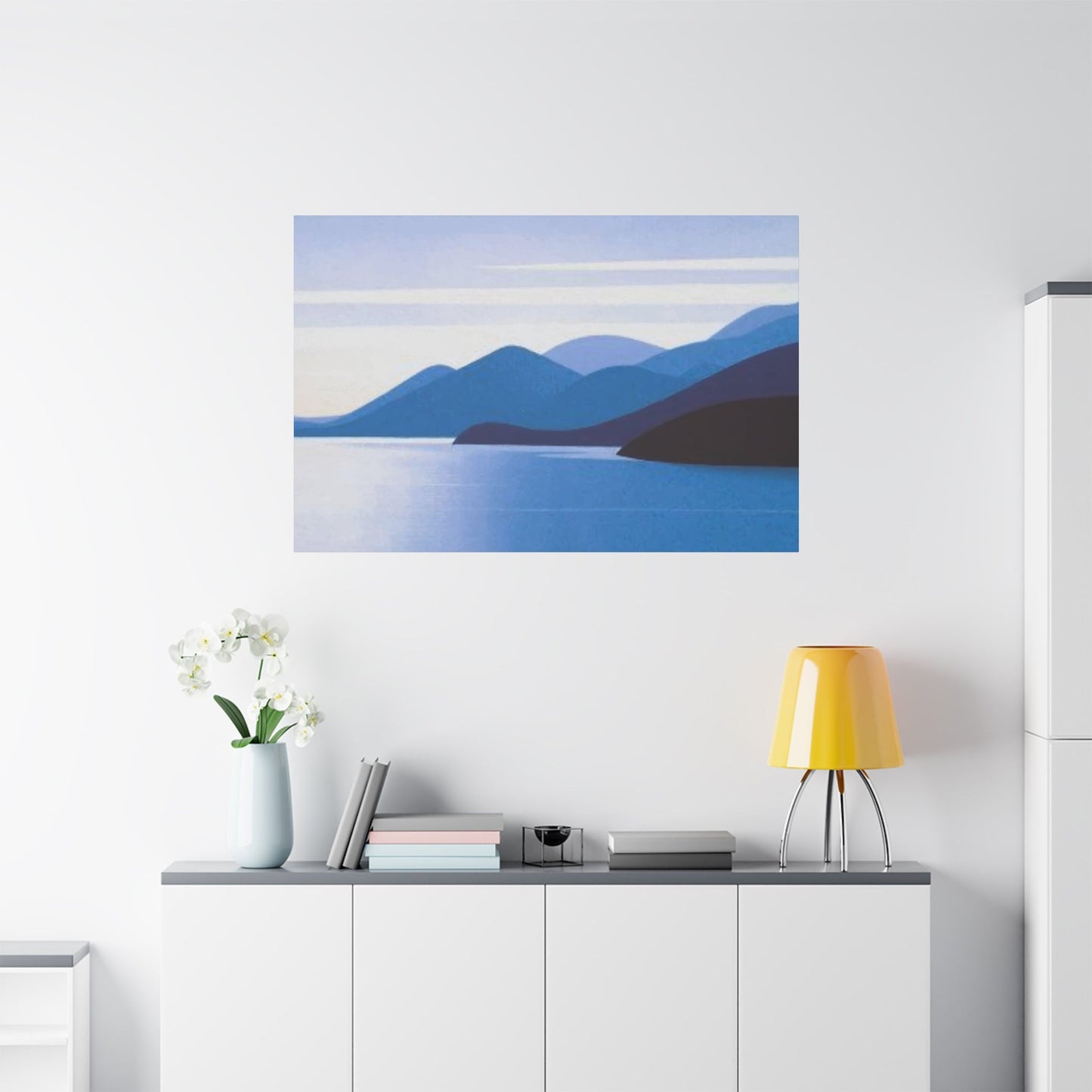
Living rooms serve as primary gathering areas where families and guests spend considerable time together. Minimalist art in these areas should create a welcoming atmosphere while maintaining visual interest without being overwhelming. Larger statement pieces often work well above sofas or focal furniture, while smaller coordinated pieces can be grouped to create visual interest on accent walls. The artwork should complement the overall design scheme while adding personality and sophistication to the environment.
Bedrooms require artwork that promotes relaxation and tranquility, making them ideal candidates for minimalist pieces. The calming nature of minimalist art naturally aligns with the restorative function of bedroom environments. Consider pieces with soft, muted tones or simple geometric forms that won't overstimulate the senses before sleep. The positioning of bedroom artwork should create a sense of balance without overwhelming the restful atmosphere.
Kitchen areas present unique challenges due to practical considerations like moisture, heat, and cooking odors. Minimalist prints in kitchens should be positioned away from direct exposure to steam and grease while still contributing to the overall aesthetic. Simple, clean designs that echo the functional nature of kitchen environments often work particularly well in these areas.
Bathroom environments can benefit from minimalist artwork that embraces the clean, functional aesthetic of these areas. Moisture considerations are paramount, so proper framing and positioning away from direct water exposure are essential. Simple line drawings, geometric patterns, or nature-inspired minimalist pieces can add personality to bathroom environments without competing with the functional elements.
Home office environments represent excellent opportunities for incorporating minimalist wall art that promotes focus and creativity without distraction. The clean lines and uncluttered aesthetic of minimalist pieces can help maintain a professional atmosphere while adding visual interest to work environments. Consider pieces that inspire calm concentration rather than those that might prove distracting during important tasks.
Dining rooms benefit from minimalist artwork that creates an elegant backdrop for meals and entertaining. The artwork should complement the dining experience without overwhelming conversation or food presentation. Carefully chosen minimalist pieces can elevate the dining experience while maintaining the sophisticated simplicity that characterizes successful minimalist design.
Hallways and transitional areas offer opportunities to create visual continuity throughout the home using minimalist artwork. These areas can serve as galleries for collections of related minimalist pieces or as locations for single statement works that provide visual interest during passage between rooms. The scale of artwork in these areas should be proportional to the width and length of the corridor or transition area.
Entryways and foyers benefit from minimalist artwork that creates a positive first impression while setting the tone for the rest of the home. These pieces should be welcoming yet sophisticated, providing a preview of the aesthetic sensibilities that characterize the entire living environment. The artwork in entryways often serves as an introduction to the homeowner's personal style and taste.
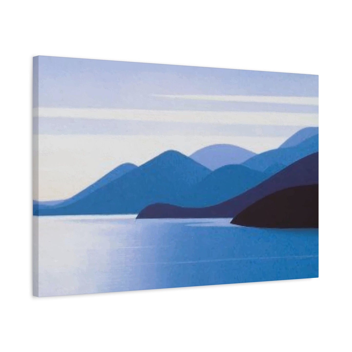
The Timeless Appeal of Black and White Minimalist Designs
Black and white minimalist designs represent the purest expression of minimalist aesthetic principles, stripping away the complexity of color to focus entirely on form, composition, and contrast. This monochromatic approach creates artwork that transcends temporary trends and color preferences, resulting in pieces that maintain their relevance and appeal across changing design movements and personal tastes.
The psychological impact of black and white artwork differs significantly from colorful pieces, often evoking feelings of sophistication, elegance, and timeless style. The absence of color forces viewers to focus on other elements within the composition, such as line quality, form relationships, and tonal variations. This focused attention can create a more contemplative viewing experience that encourages deeper engagement with the artwork.
Contrast serves as the primary tool for creating visual interest in black and white minimalist designs. The interplay between light and dark areas within the composition creates drama and depth without relying on color variations. Artists working in this medium must master the subtle gradations between pure black and white, utilizing the full spectrum of gray tones to create sophisticated and engaging compositions.
The versatility of black and white minimalist designs makes them particularly valuable for homeowners who frequently update their living environments or those who prefer decor flexibility. These pieces can seamlessly integrate into virtually any color scheme or design style, serving as consistent elements that anchor changing seasonal or decorative updates. This adaptability makes black and white minimalist art a wise long-term investment for any home.
Different printing techniques and materials can dramatically affect how black and white minimalist designs are perceived and experienced. The choice between glossy and matte finishes, different paper textures, and various printing methods all contribute to the final appearance and tactile quality of the artwork. Understanding these technical aspects helps in selecting pieces that will best serve their intended purpose and environment.
The historical significance of black and white art forms adds depth and cultural weight to contemporary minimalist designs. From early photography to abstract expressionism, many significant art movements have embraced monochromatic approaches, creating a rich tradition that contemporary minimalist artists continue to explore and expand upon. This historical context adds intellectual depth to black and white minimalist pieces.
Geometric forms take on particular significance in black and white minimalist designs, where the absence of color places greater emphasis on shape and structure. Simple circles, squares, triangles, and their interactions become the primary vehicles for visual communication. The precision and clarity of geometric forms align perfectly with minimalist principles while creating striking visual impact in monochromatic compositions.
Typography-based black and white minimalist designs offer unique opportunities for combining visual and verbal communication. Carefully selected fonts, letter spacing, and word positioning can create powerful artistic statements that function both as artwork and as meaningful textual content. The interplay between readability and visual aesthetics requires careful balance to achieve successful results.
Minimalism's Revolutionary Impact on Contemporary Living Environments
The integration of minimalist principles into contemporary living environments represents a fundamental shift in how people approach home design and personal expression. This transformation extends far beyond simple aesthetic preferences to encompass lifestyle choices, psychological well-being, and environmental consciousness. Modern minimalism in residential settings reflects broader cultural movements toward intentional living and sustainable practices.
Contemporary living environments that embrace minimalist principles typically feature clean architectural lines, uncluttered arrangements, and carefully curated decorative elements. Minimalist wall art plays a crucial role in these environments, serving as focal points that add personality and visual interest without disrupting the overall sense of calm and order. The artwork must strike a delicate balance between making a statement and maintaining the serene atmosphere that characterizes successful minimalist living environments.
The relationship between minimalist art and natural light becomes particularly important in contemporary settings where large windows and open floor plans are common features. Minimalist pieces must be positioned to take advantage of changing light conditions throughout the day, allowing the artwork to evolve and reveal different characteristics as lighting shifts. This dynamic interaction between art and environment creates living, breathing decorative elements that change subtly over time.
Technological integration in contemporary homes presents both opportunities and challenges for minimalist wall art display. Smart lighting systems can be programmed to highlight artwork at specific times or adjust to enhance viewing conditions. However, the visual clutter of technological devices must be carefully managed to maintain the clean aesthetic that minimalist design demands. The artwork itself can sometimes serve to balance or soften the hard edges of technological elements.
Material choices in contemporary minimalist environments often emphasize natural textures, sustainable options, and high-quality finishes that improve with age rather than deteriorate. Minimalist wall art should complement these material choices, potentially incorporating similar textures or finishes that create visual harmony with architectural and decorative elements throughout the home.
Color coordination in contemporary minimalist environments requires particular attention to undertones and subtle variations that might not be immediately apparent. The seemingly simple color palette of minimalist designs can actually involve complex relationships between warm and cool undertones, requiring careful selection to ensure harmony with existing elements like flooring, furniture, and architectural features.
The concept of mindful consumption aligns closely with both minimalist aesthetic principles and contemporary environmental consciousness. Choosing minimalist wall art represents a commitment to quality over quantity, investing in pieces that will provide long-term satisfaction rather than temporary decorative solutions. This approach reduces waste while creating more meaningful connections between homeowners and their decorative choices.
Open floor plans common in contemporary architecture require minimalist artwork to function across multiple sight lines and viewing distances. A piece that looks perfect from the living room might appear different when viewed from the kitchen or dining area. This multi-perspective requirement adds complexity to selection and placement decisions, requiring careful consideration of how artwork will be perceived from various locations within the home.
Exploring the Depths of Abstract Minimalist Canvas Prints
Abstract minimalist canvas prints represent a fascinating intersection between the conceptual freedom of abstract art and the disciplined restraint of minimalist principles. These pieces challenge traditional notions of representation while maintaining the clean aesthetic and purposeful simplicity that characterizes successful minimalist design. The canvas medium adds texture and tactile appeal that can enhance the viewing experience and create stronger connections between artwork and observers.
The creation of abstract minimalist canvas prints involves careful consideration of how abstract elements can be simplified without losing their essential character or emotional impact. Artists working in this medium must master the art of suggestion, using minimal elements to evoke complex ideas or emotions. This requires a deep understanding of how viewers psychologically and emotionally respond to different forms, colors, and compositions.
Color relationships in abstract minimalist canvas prints become particularly critical when the number of elements within the composition is intentionally limited. Each color choice carries greater weight and must serve multiple purposes within the overall design. The interaction between colors, their relative proportions, and their positioning within the composition all contribute to the final emotional and aesthetic impact of the piece.
Texture plays an enhanced role in abstract minimalist canvas prints compared to prints on other media. The woven surface of canvas naturally adds visual and tactile interest that can complement the simplified aesthetic of minimalist design. Different canvas textures, from fine to coarse weaves, create varying effects that can be matched to the specific needs of different abstract compositions.
The scale considerations for abstract minimalist canvas prints differ from those of representational artwork because abstract elements don't have inherent size references. A simple circle or line could theoretically represent anything from a microscopic detail to a cosmic phenomenon. This flexibility allows for creative interpretation while requiring careful attention to how the scale of abstract elements relates to the surrounding environment.
Layering techniques in abstract minimalist canvas prints must be approached with particular care to avoid contradicting minimalist principles. When multiple elements or colors are layered, each layer must contribute meaningfully to the overall composition without creating visual complexity that undermines the minimalist aesthetic. This requires sophisticated understanding of how different elements interact visually and emotionally.
The permanence and archival qualities of canvas prints make them particularly suitable for abstract minimalist artwork intended for long-term display. High-quality canvas and printing techniques ensure that these pieces will maintain their appearance and impact over time, making them worthwhile investments for homeowners committed to minimalist aesthetic principles.
Contemporary printing technologies have expanded the possibilities for creating abstract minimalist canvas prints that were not available to earlier generations of artists. Digital printing allows for precise color control, subtle gradations, and complex layering effects while maintaining the essential simplicity that defines minimalist art. These technological advances have democratized access to high-quality abstract minimalist artwork.
Harnessing the Power of Negative Areas in Artistic Composition
The strategic use of negative areas represents one of the most sophisticated and powerful techniques in minimalist art composition. Often misunderstood as simply empty or unused areas, negative zones actually function as active compositional elements that shape how viewers perceive and interact with artwork. Mastering the use of negative areas is essential for creating minimalist pieces that achieve maximum impact with minimal elements.
Negative areas in minimalist art serve multiple simultaneous functions that contribute to the overall effectiveness of the composition. They provide visual rest areas that prevent overwhelming the viewer, create emphasis for positive elements by providing contrast, and establish rhythm and movement through their proportional relationships with other compositional elements. Understanding these multiple functions allows for more sophisticated and effective use of negative areas in minimalist designs.
The psychological effects of negative areas extend beyond simple visual perception to influence emotional and mental responses to artwork. Generous negative areas can create feelings of calm, openness, and contemplation, while compressed negative areas might generate tension or intensity. The proportion of negative to positive areas within a composition directly influences the emotional tone and viewing experience of the artwork.
Cultural variations in the perception and appreciation of negative areas affect how different audiences respond to minimalist artwork. Eastern aesthetic traditions, particularly those influenced by Zen philosophy, often embrace negative areas as essential elements equal in importance to positive forms. Western traditions have historically emphasized positive elements, though contemporary minimalist movements have increasingly recognized the value of negative areas.
Technical considerations for incorporating negative areas into minimalist compositions include understanding how different printing and display methods affect the perception of empty areas. The color and texture of backgrounds, the quality of paper or canvas, and lighting conditions all influence how negative areas appear and function within the overall composition. These technical factors must be carefully managed to achieve the intended artistic effects.
The mathematical and proportional relationships between negative and positive areas can be guided by classical principles such as the golden ratio or rule of thirds, though minimalist art often explores more unconventional proportional relationships. The key is achieving visual balance and harmony while maintaining the essential simplicity that characterizes minimalist aesthetic principles.
Dynamic negative areas that seem to shift or move depending on viewing angle or lighting conditions add complexity and interest to minimalist compositions without violating the movement's core principles. These effects can be achieved through careful positioning of elements, strategic use of subtle tonal variations, or incorporation of materials that interact differently with light throughout the day.
The relationship between negative areas and the surrounding environment becomes particularly important when minimalist artwork is displayed in homes or other living environments. The negative areas within the artwork must harmoniously relate to the negative areas in the room itself, such as empty wall areas, open floor plans, or uncluttered furniture arrangements. This harmony creates a seamless integration between artwork and environment.
Creative DIY Approaches to Minimalist Wall Art
Creating your own minimalist wall art offers unique opportunities for personal expression while maintaining the essential simplicity and elegance that characterizes this artistic movement. DIY approaches to minimalist art can be both cost-effective and deeply satisfying, allowing creators to develop pieces that perfectly match their specific aesthetic needs and personal preferences. The key to successful DIY minimalist art lies in understanding and applying core minimalist principles while working within individual skill levels and resource constraints.
Planning forms the foundation of any successful DIY minimalist art project, requiring careful consideration of the intended final result before beginning the creative process. This planning phase should include decisions about size, color palette, materials, and installation requirements. Taking time to visualize the finished piece and its integration into the intended environment helps ensure that the creative process remains focused and purposeful rather than meandering or excessive.
Material selection for DIY minimalist art projects should prioritize quality over quantity, choosing fewer materials of higher quality rather than attempting to incorporate numerous different elements. Basic materials such as high-quality paper, canvas, acrylic paints, or digital printing supplies can be combined in sophisticated ways to create professional-appearing results. The limited material palette aligns with minimalist principles while making projects more manageable for DIY creators.
Geometric forms provide accessible starting points for DIY minimalist art projects because they don't require advanced drawing or painting skills to execute successfully. Simple circles, squares, triangles, and lines can be combined in endless variations to create sophisticated compositions. These basic forms can be created using templates, measuring tools, or even everyday objects as guides, making them achievable for creators with varying skill levels.
Color mixing and selection represent critical skills for DIY minimalist art projects, particularly when working with limited palettes characteristic of minimalist design. Understanding how colors interact, how to create subtle variations within monochromatic schemes, and how to achieve consistent results across multiple pieces requires practice and attention to detail. Starting with pre-mixed colors or working entirely in black and white can simplify this aspect for beginning creators.
Digital tools and software can significantly expand the possibilities for DIY minimalist art creation, allowing for precise control over elements like symmetry, proportion, and color relationships. Free and affordable digital art programs provide sophisticated capabilities that were previously available only to professional artists. These tools also allow for easy experimentation and revision without wasting physical materials.
Assembly and finishing techniques can make the difference between amateur-appearing DIY projects and professional-quality results. Proper mounting, framing, and surface preparation ensure that DIY minimalist art pieces look polished and sophisticated when completed. Investing time in learning proper finishing techniques pays dividends in the final appearance and longevity of completed projects.
Documentation and refinement of successful DIY techniques enables creators to build upon their successes and develop personal styles within minimalist frameworks. Keeping records of successful color combinations, effective techniques, and particularly pleasing compositions helps develop consistency and confidence in future projects. This documentation also allows for creating series or collections of related pieces.
Maximizing Impact in Compact Living Environments
Compact living environments present unique challenges and opportunities for incorporating minimalist wall art effectively. The limited physical dimensions of smaller homes, apartments, or rooms require careful consideration of scale, proportion, and visual weight to achieve maximum impact without overwhelming the available area. Successful integration of minimalist art in compact environments can actually enhance the sense of spaciousness and create more visually appealing and comfortable living areas.
Scale relationships become particularly critical in compact environments where artwork must be proportioned appropriately to avoid dominating or disappearing within the available wall area. Pieces that are too large can make small rooms feel cramped and claustrophobic, while pieces that are too small may lack sufficient visual presence to make meaningful contributions to the overall aesthetic. Finding the optimal balance requires careful measurement and visualization before making final selections.
Vertical arrangements can maximize the impact of minimalist art in compact environments by drawing the eye upward and creating the illusion of greater height within rooms with limited floor area. Tall, narrow pieces or vertically arranged groupings of smaller pieces can enhance the perceived dimensions of compact rooms while maintaining the clean aesthetic that characterizes successful minimalist design.
Multi-functional artwork that serves dual purposes can be particularly valuable in compact living environments where every element must justify its presence. Minimalist pieces that incorporate storage elements, lighting features, or other functional components provide practical benefits while maintaining aesthetic appeal. This approach aligns with minimalist principles of purposefulness while maximizing utility in limited areas.
Light-colored minimalist artwork can help reflect natural and artificial light throughout compact environments, creating brighter and more spacious feeling areas. Pieces featuring white, cream, or pale neutral backgrounds can serve as informal light reflectors that enhance the overall illumination of compact rooms while maintaining sophisticated aesthetic appeal.
Strategic positioning of minimalist artwork in compact environments often involves unconventional placement that maximizes visual impact while respecting the practical needs of daily living. Consider placing artwork above doorways, in narrow hallway areas, or in corners that might otherwise be overlooked. These alternative positions can create surprising visual interest while making efficient use of available wall area.
Creating visual breathing room around minimalist artwork becomes even more important in compact environments where the temptation to fill every available area can lead to cluttered and overwhelming results. Maintaining adequate negative areas around each piece ensures that the artwork can be properly appreciated while preserving the sense of openness that makes compact living environments feel comfortable and inviting.
The relationship between minimalist artwork and furniture placement requires particular attention in compact environments where every square foot must be utilized efficiently. Artwork should complement rather than compete with furniture arrangements, potentially serving to balance asymmetrical furniture groupings or provide visual anchors for floating furniture arrangements common in small living areas.
Harmonizing Minimalist Art with Existing Decorative Elements
Successfully combining minimalist wall art with existing decorative elements requires a sophisticated understanding of visual relationships, color harmony, and proportional balance. The goal is creating cohesive environments where minimalist artwork enhances rather than conflicts with other decorative choices while maintaining the essential simplicity and elegance that characterizes effective minimalist design. This integration process demands careful consideration of how different elements interact visually and emotionally.
Color coordination between minimalist artwork and existing decorative elements forms the foundation for successful integration. The limited color palettes typical of minimalist art can either complement or clash with existing color schemes, depending on how carefully the relationships are managed. Understanding undertones, saturation levels, and color temperatures helps ensure that minimalist pieces work harmoniously with existing textiles, furniture finishes, and architectural elements.
Texture relationships play a crucial role in how minimalist artwork interacts with surrounding decorative elements. The smooth, clean surfaces typical of minimalist pieces can provide appealing contrast to textured elements like woven fabrics, natural wood grains, or stone surfaces. Alternatively, incorporating subtle textures within minimalist artwork can create harmony with textured decorative elements while maintaining the essential simplicity of minimalist design.
Style consistency doesn't require matching every element exactly, but rather creating visual relationships that feel intentional and harmonious rather than accidental or conflicting. Minimalist artwork can successfully coexist with various decorative styles when the integration is approached thoughtfully, considering factors like scale relationships, color connections, and shared aesthetic principles.
Proportional relationships between minimalist artwork and existing decorative elements significantly impact the overall visual success of combined arrangements. Large minimalist pieces can balance substantial furniture elements, while smaller minimalist works might complement delicate decorative objects. The key is achieving visual equilibrium that feels stable and intentional rather than unbalanced or competitive.
Transitional elements can help bridge potential gaps between minimalist artwork and existing decorative elements that might not naturally harmonize. These might include neutral-colored accessories, simple decorative objects, or additional minimalist pieces that create visual connections between different stylistic elements within the same environment.
Lighting considerations become particularly important when combining minimalist artwork with other decorative elements because the same lighting that enhances the artwork must also flatter the surrounding decorative choices. This might require adjusting fixture positions, adding supplementary lighting, or repositioning elements to optimize the lighting conditions for all components of the decorative scheme.
Seasonal adaptability allows minimalist artwork to work successfully with changing decorative elements throughout the year. The timeless quality of well-chosen minimalist pieces enables them to provide consistency while seasonal accessories, textiles, and other temporary decorative elements change around them. This adaptability makes minimalist artwork a valuable long-term investment for evolving decorative schemes.
Influential Creators in the Minimalist Art Movement
The minimalist art movement has been shaped by numerous influential creators whose pioneering work established the foundations and continuing evolution of this significant artistic approach. Understanding the contributions of these artists provides valuable context for appreciating contemporary minimalist artwork while inspiring new directions for personal exploration of minimalist principles. These creators have demonstrated how powerful artistic statements can emerge from deliberate simplicity and purposeful restraint.
Donald Judd stands among the most significant figures in minimalist art history, developing revolutionary approaches to sculpture and installation that challenged traditional artistic categories. His work emphasized industrial materials, precise fabrication, and mathematical relationships between forms, creating pieces that embodied minimalist principles while pushing the boundaries of what art could be. Judd's theoretical writings also helped establish the intellectual framework for understanding and appreciating minimalist art.
Agnes Martin created luminous paintings that explored the spiritual and emotional potential of minimalist approaches to abstract art. Her subtle grid compositions and delicate color relationships demonstrated how minimalist techniques could evoke profound emotional responses while maintaining essential simplicity. Martin's work bridges the gap between abstract expressionism and minimalism, showing how personal expression can thrive within minimalist constraints.
Dan Flavin revolutionized the use of artificial light as an artistic medium, creating installations using standard fluorescent lighting fixtures that transformed architectural areas into immersive artistic experiences. His work demonstrated how everyday industrial materials could be transformed into sophisticated artistic statements through careful selection, positioning, and contextual awareness. Flavin's light installations continue to influence contemporary approaches to minimalist environmental art.
Sol LeWitt developed systematic approaches to minimalist art creation that separated conception from execution, establishing protocols that could be followed by others to create artworks. His wall drawings and sculptural concepts demonstrated how minimalist art could be both highly personal and universally accessible, existing as ideas that could be realized in multiple locations and contexts. LeWitt's work has particular relevance for contemporary digital and reproducible art forms.
Ellsworth Kelly created paintings and sculptures that reduced natural forms to their essential geometric components, demonstrating how minimalist techniques could capture the essence of complex natural phenomena. His work bridges representational and abstract approaches while maintaining the clean aesthetic and purposeful simplicity that characterizes successful minimalist design. Kelly's color relationships continue to influence contemporary minimalist artwork.
Robert Morris explored the relationship between minimalist objects and their surrounding environments, creating sculptures and installations that required active participation from viewers to complete their meaning. His theoretical writings about minimalist art helped establish critical frameworks for understanding how these works function differently from traditional artistic forms. Morris's emphasis on viewer experience remains relevant for contemporary minimalist art.
Contemporary creators continue to expand minimalist principles into new media and contexts, incorporating digital technologies, sustainable materials, and global cultural perspectives that weren't available to earlier generations of minimalist artists. These contemporary practitioners demonstrate how minimalist principles can evolve while maintaining their essential character and continuing relevance for new generations of artists and art appreciators.
The influence of these creators extends beyond the art world into architecture, design, and lifestyle choices, demonstrating the broad cultural impact of minimalist principles. Their work continues to inspire new approaches to creativity, problem-solving, and aesthetic decision-making across various fields and disciplines.
The Art of Typography in Minimalist Wall Displays
Typography-based minimalist wall art represents a sophisticated fusion of verbal communication and visual design principles that can create powerful artistic statements while maintaining the essential simplicity characteristic of minimalist aesthetic approaches. These pieces combine the intellectual accessibility of written language with the emotional impact of carefully considered visual design, resulting in artwork that functions on multiple levels simultaneously.
Font selection forms the foundation of successful typographic minimalist art, requiring careful consideration of how different typefaces communicate personality, emotion, and meaning beyond their literal content. Sans-serif fonts often align well with minimalist principles due to their clean lines and lack of decorative elements, though carefully selected serif fonts can also work effectively when their character matches the intended artistic message. The key is choosing fonts that enhance rather than distract from the overall minimalist aesthetic.
Letter spacing and word positioning become crucial design elements in typographic minimalist art where fewer elements must carry greater visual and communicative weight. Strategic manipulation of spacing can create visual interest, establish hierarchy, and guide viewer attention through the composition. These technical considerations require understanding how typography functions as both communication tool and design element.
The relationship between text and negative areas takes on particular significance in typographic minimalist art where the positioning of words within the overall composition directly influences both readability and aesthetic appeal. Generous white or neutral backgrounds can enhance the impact of carefully chosen words while creating the sense of calm and spaciousness that characterizes successful minimalist design.
Color choices for typographic minimalist art must balance readability requirements with aesthetic considerations, ensuring that text remains easily legible while contributing to the overall visual harmony of the piece. Monochromatic approaches often work particularly well, using subtle variations in tone or intensity to create visual interest without compromising the essential simplicity of the design.
Content selection for typographic minimalist art should align with minimalist principles, favoring concise, meaningful statements over lengthy texts. Single words, brief phrases, or carefully chosen quotations often prove most effective, allowing viewers to absorb both the visual and verbal content without overwhelming complexity. The verbal content should complement rather than compete with the visual design elements.
Scale considerations for typographic minimalist art involve balancing readability requirements with aesthetic proportions, ensuring that text is appropriately sized for both its intended viewing distance and its visual impact within the composition. Text that is too small may lose impact and readability, while text that is too large might overwhelm the composition or the surrounding environment.
Cultural and linguistic considerations affect how typographic minimalist art is perceived and appreciated by different audiences. The same text might carry different connotations or emotional weights across different cultural contexts, while non-Latin alphabets might require different approaches to achieve successful minimalist results. These considerations become particularly important for artwork intended for diverse or international audiences.
Integration of typographic minimalist art into living environments requires attention to how the verbal content relates to the function and atmosphere of different rooms or areas. Inspirational messages might work well in personal areas like bedrooms or home offices, while more universal themes might be better suited to common areas like living rooms or entryways.
Understanding Color Psychology in Minimalist Compositions
The psychological impact of color in minimalist art takes on heightened significance due to the intentionally limited palettes and reduced compositional elements that characterize this artistic approach. When fewer colors are present within a composition, each color choice carries greater emotional and psychological weight, requiring sophisticated understanding of how different hues, saturations, and combinations affect viewer perception and emotional response.
Warm colors in minimalist compositions tend to create feelings of intimacy, energy, and comfort, making them suitable for living areas where social interaction and relaxation are prioritized. However, the intensity and saturation of warm colors must be carefully controlled in minimalist contexts to avoid overwhelming the composition or contradicting the calm aesthetic that characterizes successful minimalist design. Subtle warm tones often prove more effective than bold, saturated warm colors.
Cool colors typically align well with minimalist principles, naturally creating feelings of calm, spaciousness, and contemplation that complement the meditative qualities often associated with minimalist art. Blues, greens, and cool grays can enhance the sense of tranquility while providing sophisticated color interest that doesn't compete with the essential simplicity of minimalist compositions.
Neutral colors form the backbone of many successful minimalist color schemes, providing sophisticated backgrounds and foundations that allow other elements to shine while maintaining visual harmony. The subtle variations within neutral color families offer rich opportunities for creating depth and interest without departing from minimalist principles. Understanding the undertones within neutral colors helps ensure successful combinations and environmental integration.
Color temperature relationships significantly impact how minimalist compositions are perceived and how they interact with their surrounding environments. Consistent color temperatures throughout a piece create harmony and unity, while strategic contrast between warm and cool temperatures can create visual interest and focal points without adding complexity through additional colors or forms.
Saturation levels in minimalist color palettes require particular attention because highly saturated colors can easily overwhelm compositions with limited elements. Muted or desaturated versions of colors often prove more suitable for minimalist applications, providing color interest while maintaining the subdued aesthetic that characterizes successful minimalist design.
Monochromatic color schemes represent the purest expression of minimalist color principles, exploring the full range of possibilities within a single color family. These approaches require sophisticated understanding of how different values, saturations, and temperatures within a single color can create visual interest and emotional depth without relying on color contrast for impact.
Cultural associations with specific colors can influence how minimalist artwork is perceived and appreciated by different audiences. Colors that have positive associations in one cultural context might carry different meanings in another, requiring consideration of the intended audience and display context when making color choices for minimalist compositions.
Environmental color interactions become particularly important for minimalist artwork because the limited color palettes make the relationship between the artwork and its surroundings more noticeable and significant. The colors within minimalist art must work harmoniously with existing wall colors, furniture finishes, and architectural elements to create cohesive and visually appealing results.
Final Thoughts
Mountain stream wall art captures the serene and refreshing essence of nature’s flowing beauty, offering a unique way to bring tranquility and vitality into your home. As we conclude this reflection on the transformative power of these artworks, it’s clear that incorporating scenes of mountain streams can create a soothing sanctuary that reconnects you with the natural world.
There’s something inherently calming about the gentle movement of water winding through rocky landscapes, framed by lush greenery or snow-capped peaks. Mountain stream art translates this peaceful rhythm into visual form, allowing you to invite the restorative qualities of nature indoors. The flowing water symbolizes clarity, renewal, and continuous movement—qualities that inspire both relaxation and rejuvenation.
One of the greatest benefits of mountain stream wall art is its versatility. Whether your home leans toward rustic charm, modern minimalism, or cozy cottage style, the natural imagery complements and enhances a variety of interior aesthetics. The colors found in these scenes—soft blues, greens, and earth tones—blend seamlessly with neutral palettes while adding subtle pops of color and texture.
Beyond aesthetics, mountain stream art can profoundly affect the mood of a space. The imagery encourages mindfulness, offering a visual retreat from the stresses of daily life. It fosters a sense of balance and harmony, reminding us to flow with life’s changes just as a stream flows over stones and around bends. This emotional connection makes such artwork more than decoration; it becomes a meaningful element of your home’s atmosphere.
In terms of placement, mountain stream wall art works beautifully in living rooms, bedrooms, bathrooms, or any area where calm and rejuvenation are desired. Larger canvases can serve as stunning focal points, while smaller prints can complement a gallery wall or be grouped for a cohesive nature-inspired theme.
Quality is key in showcasing the delicate details and vibrant colors that make mountain stream art so captivating. Opt for high-resolution prints on durable materials, such as canvas or fine art paper, to ensure your investment remains vivid and inspiring over time.
In summary, mountain stream wall art is a timeless and versatile choice for anyone looking to infuse their home with nature’s peaceful energy. It brings beauty, calm, and a sense of flow that enhances both your living space and well-being. Embrace the soothing presence of flowing water and let your walls tell a story of natural grace and renewal.
