


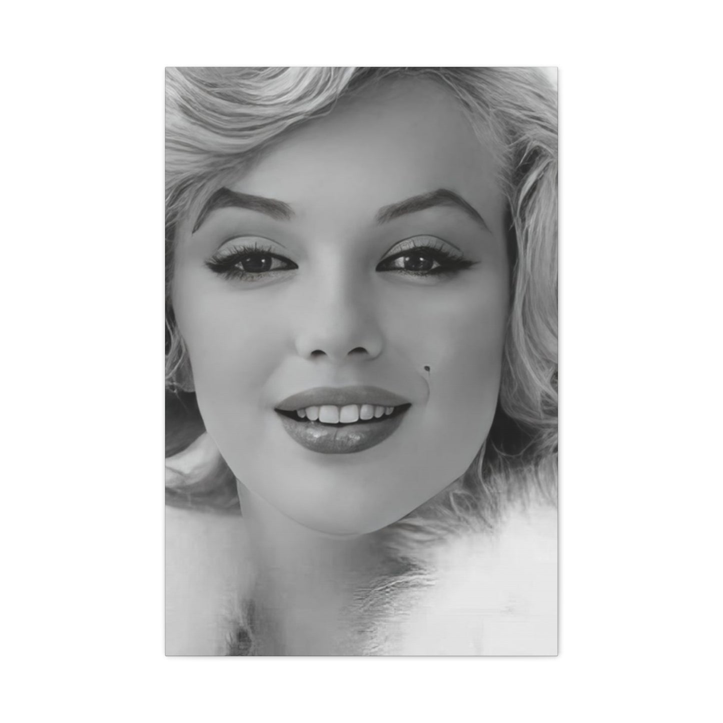
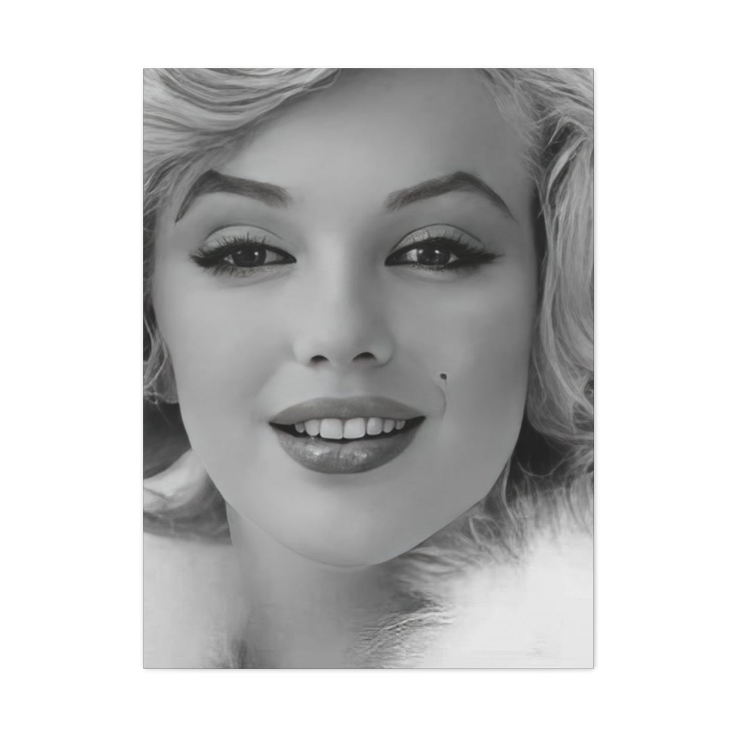
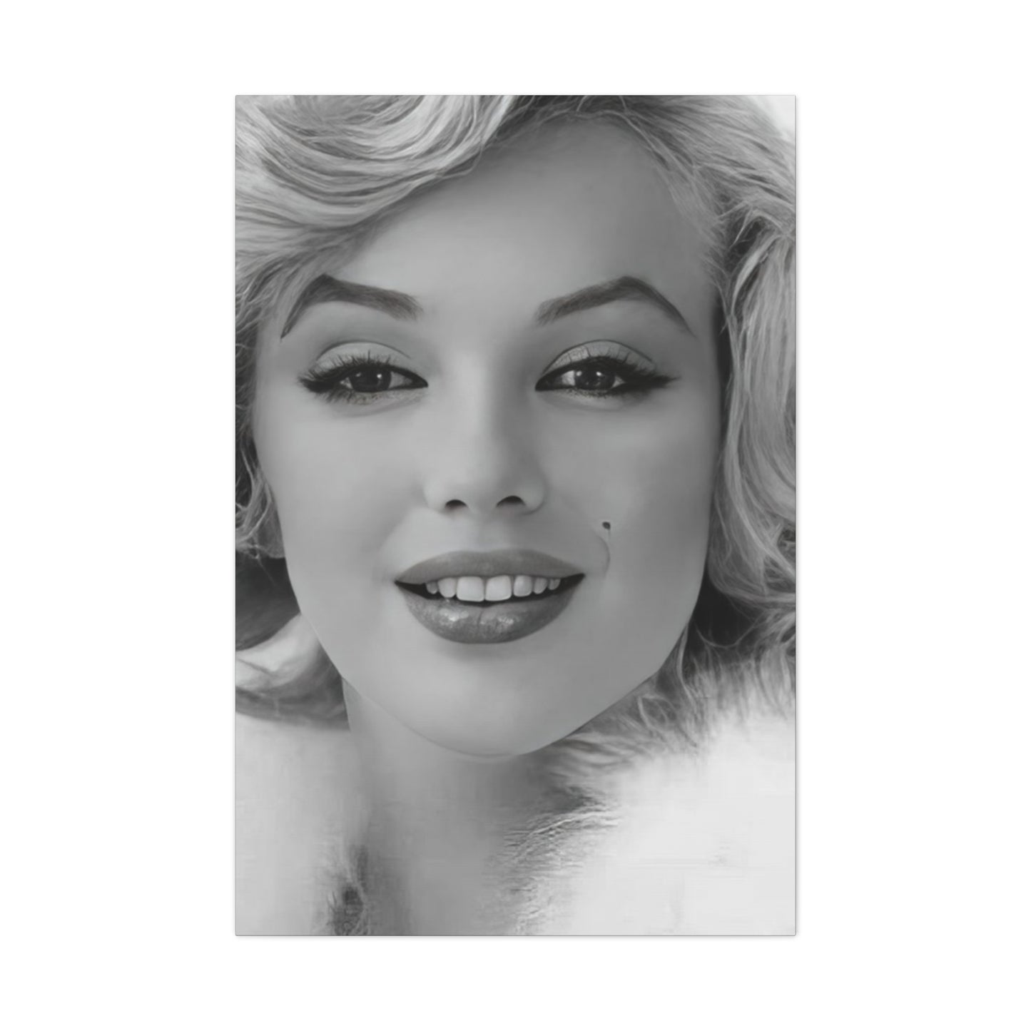
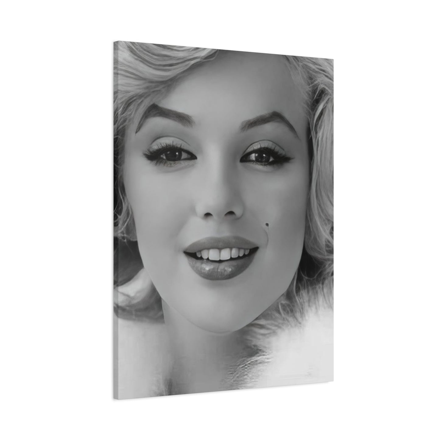
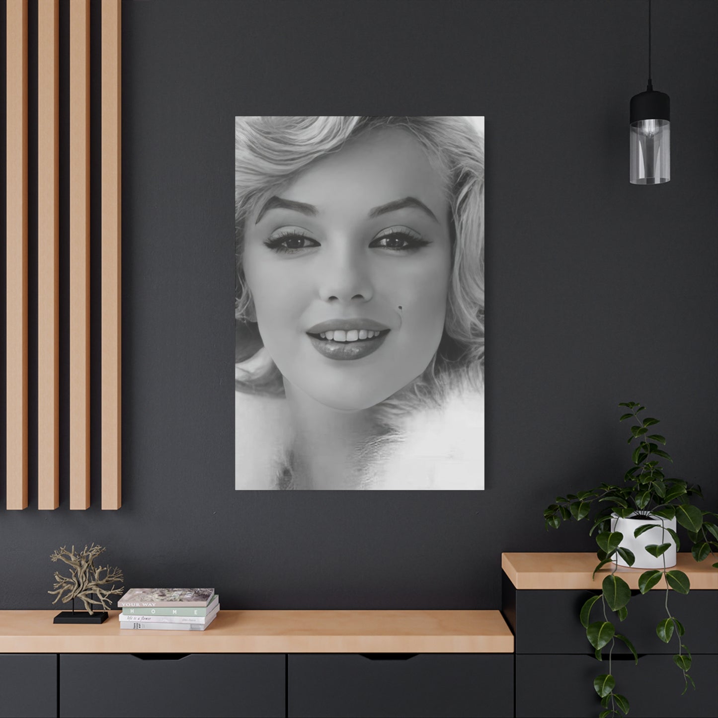
Monochrome Beautiful Face Of Marilyn Monroe Wall Art & Canvas Prints
Monochrome Beautiful Face Of Marilyn Monroe Wall Art & Canvas Prints
Couldn't load pickup availability


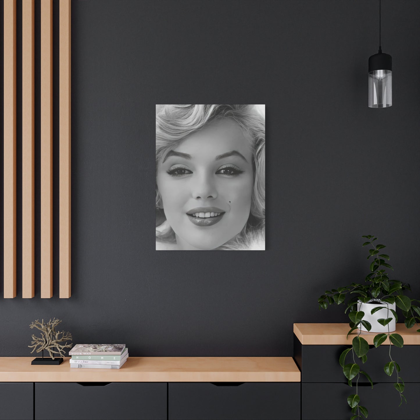
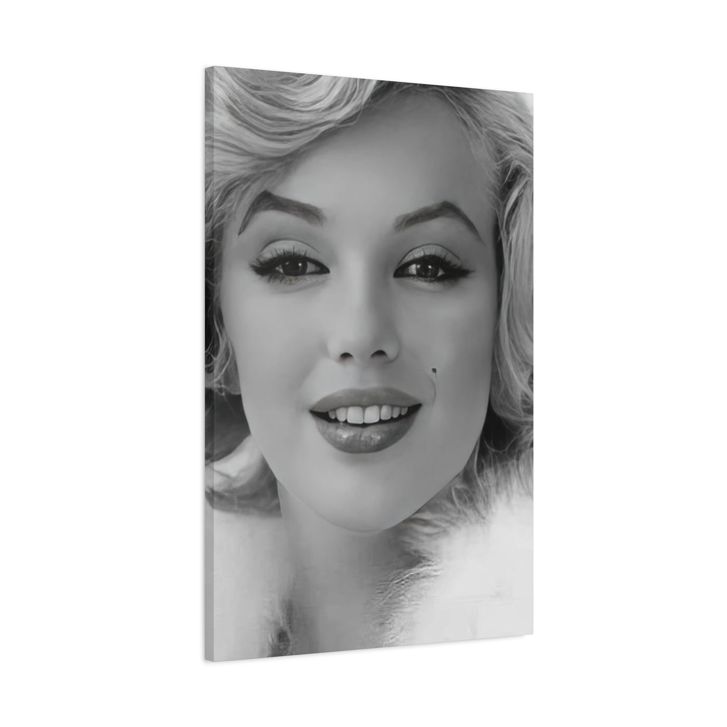
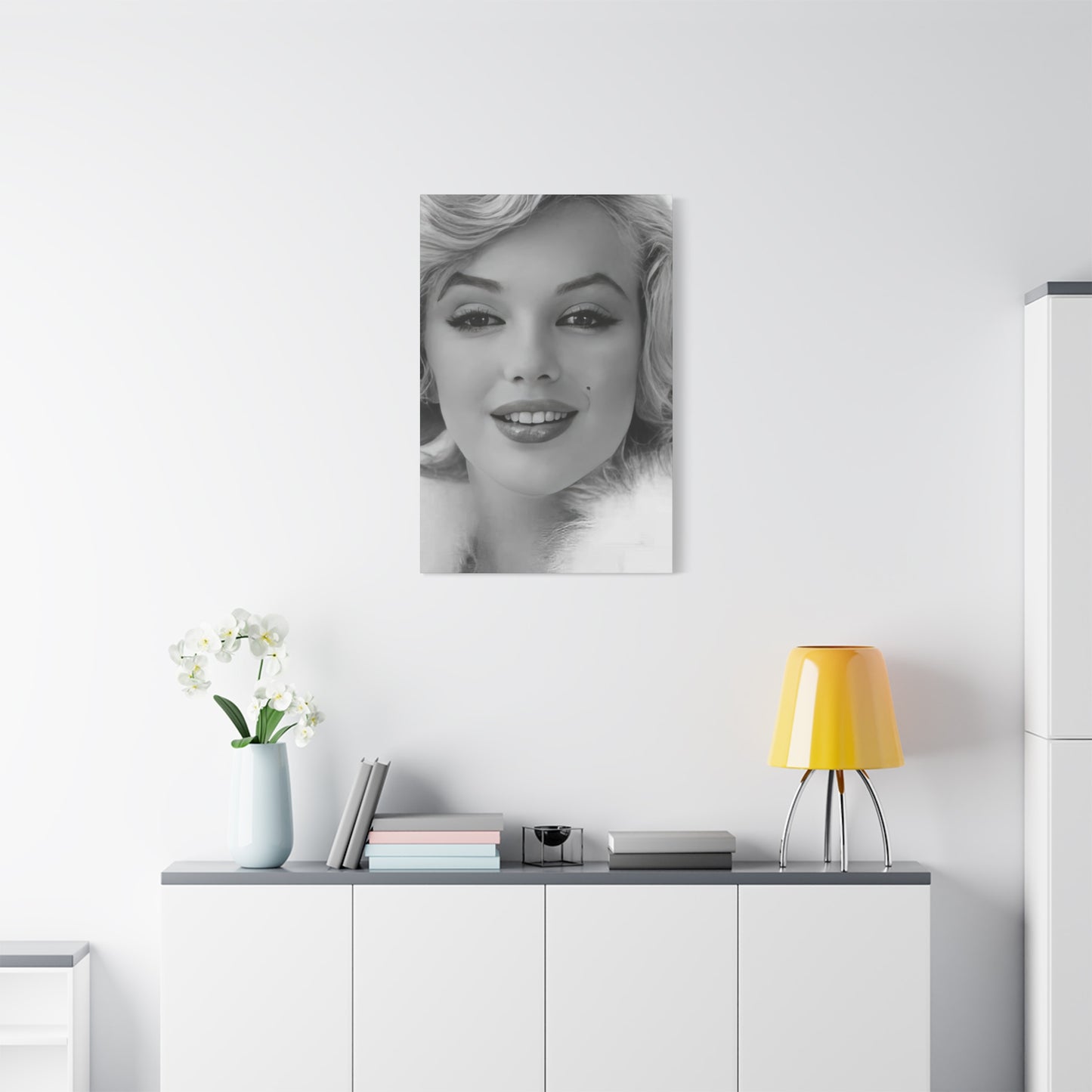
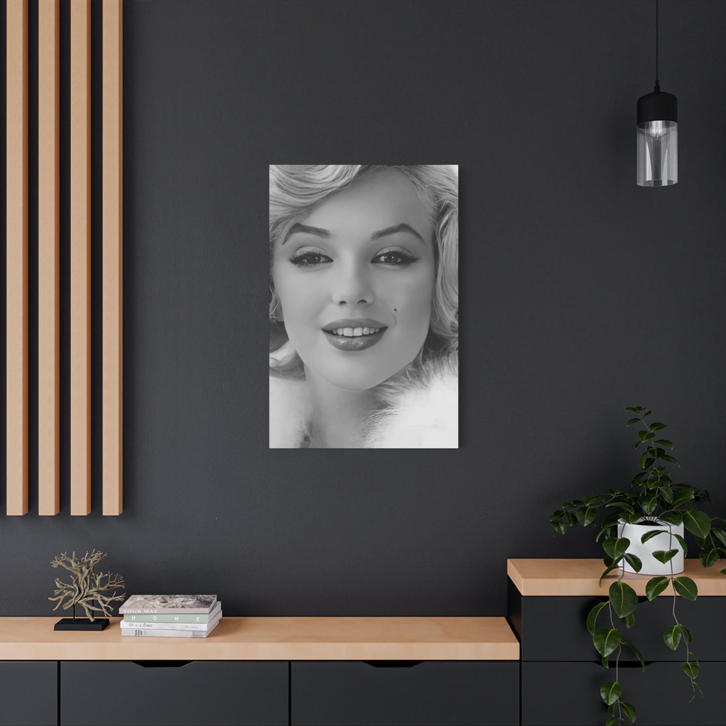

Timeless Elegance: Beautiful Marilyn Monroe Face Art for Modern Living Spaces
The enduring appeal of classic Hollywood glamour continues to captivate art enthusiasts and interior designers around the world. Among the most sought-after pieces in contemporary home decoration are monochrome portraits that capture the essence of golden age cinema. These striking visual representations blend nostalgic charm with modern aesthetic sensibilities, creating focal points that elevate any living environment. The intersection of vintage celebrity imagery and minimalist color palettes produces artwork that transcends temporary trends while maintaining relevance across generations.
Black and white portraiture possesses a unique ability to emphasize facial features, emotional expressions, and the timeless quality of its subjects. When applied to iconic figures from entertainment history, this artistic approach strips away temporal context, allowing viewers to connect with the pure essence of beauty and charisma. The absence of color directs attention to form, shadow, and the subtle nuances of expression that define memorable faces. This artistic technique has experienced a remarkable resurgence in recent years as homeowners seek sophisticated alternatives to conventional decorative options.
The marriage of classic imagery with contemporary printing technology has revolutionized how we bring historical glamour into modern spaces. High-quality reproduction methods preserve every detail while offering durability and versatility previously unavailable to art collectors. These advancements have democratized access to museum-quality visual presentations, enabling anyone to curate gallery-worthy displays within their personal environments. The transformation of celebrity photography into accessible art pieces represents a significant shift in how we commemorate cultural icons.
Legacy of Hollywood's Golden Era Icon
Few figures in entertainment history have maintained such persistent cultural relevance decades after their time. The subject of these monochrome artworks represents more than just physical beauty; she embodies an era of glamour, complexity, and the American dream. Her journey from humble beginnings to international stardom created a narrative that continues to resonate with audiences worldwide. The contradictions within her public persona and private struggles have only deepened the fascination surrounding her legacy.
The visual documentation of her career provides an extensive catalog of expressions, poses, and moments that photographers captured throughout her life. Each image tells a story of ambition, vulnerability, triumph, and the pressures of fame. The most compelling photographs freeze moments of genuine emotion, capturing something beyond manufactured celebrity. These authentic glimpses into her personality explain why her image remains commercially viable and emotionally powerful.
Contemporary artists and photographers continue finding inspiration in her aesthetic, reinterpreting classic poses through modern lenses. The simplicity of black and white presentation allows these reinterpretations to honor the original while adding contemporary artistic sensibilities. This ongoing creative dialogue between past and present demonstrates how certain figures transcend their original context to become perpetual sources of inspiration. The reduction to monochrome essentials paradoxically makes the imagery feel more immediate and accessible.
Her influence extends far beyond entertainment into fashion, art, and cultural studies. Academic analysis of her career reveals layers of meaning about gender, power, and the construction of public identity. Yet alongside this scholarly attention exists a more intuitive appreciation for the visual power of her image. The combination of intellectual depth and immediate aesthetic appeal makes her an ideal subject for artistic representation. Wall decorations featuring her likeness serve multiple functions simultaneously, providing visual interest while inviting contemplation.
The specific photographs that have become iconic often capture contradictions that defined her public image. Moments of playful sensuality coexist with expressions of surprising vulnerability. This emotional range prevents the imagery from becoming one-dimensional or merely decorative. Viewers respond not just to surface beauty but to the complex humanity visible in her expressions. The monochrome treatment intensifies this connection by removing distractions and focusing attention on facial details that reveal character.
Historical Context Behind the Imagery
Understanding the cultural moment that produced these iconic images enriches appreciation for their artistic significance. The mid-twentieth century represented a particular confluence of technological advancement, social change, and evolving media landscapes. Photography was asserting itself as a legitimate art form while simultaneously becoming more accessible to commercial applications. The entertainment industry leveraged these developments to create unprecedented levels of celebrity visibility and audience connection.
Studio portrait photography during this period adhered to specific conventions regarding lighting, composition, and subject presentation. Photographers employed dramatic lighting techniques borrowed from film noir cinematography, creating high-contrast images with distinctive shadow patterns. These technical choices weren't merely aesthetic; they conveyed emotional tone and constructed specific narratives about the subjects. The resulting images functioned as both documentation and artistic interpretation, blurring boundaries between commercial and fine art photography.
The collaborative relationship between photographers and subjects during this era often produced remarkable results. Unlike contemporary celebrity photography, which frequently emphasizes spontaneity and candid moments, studio sessions allowed for careful construction of image and meaning. Subjects worked with photographers to develop visual presentations that aligned with their public personas while occasionally revealing unexpected dimensions. These sessions could extend for hours, producing extensive contact sheets from which select images would emerge as definitive representations.
Magazine culture played a crucial role in disseminating these images and establishing their iconic status. Publications devoted extensive coverage to entertainment personalities, creating demand for fresh imagery while simultaneously canonizing certain photographs through repeated reproduction. The most successful images balanced immediate visual impact with enough ambiguity to support varied interpretations. They functioned as blank screens onto which audiences could project their desires, fantasies, and cultural anxieties.
The transition from color to black and white photography, or the deliberate choice of monochrome over color, carried specific artistic and commercial implications. Black and white was associated with seriousness, artistry, and timelessness, while color photography initially seemed more suited to commercial applications. This distinction has softened considerably, but the perception of black and white as more artistic persists. Contemporary monochrome reproductions benefit from this association, positioning themselves as refined aesthetic choices rather than mere celebrity merchandise.
Artistic Elements of Monochrome Portraiture
The technical aspects of black and white photography create distinctive visual characteristics that color images cannot replicate. The absence of chromatic information forces greater attention to tonal range, contrast, and the relationship between light and shadow. Photographers working in monochrome must think differently about composition, considering how elements will translate into grayscale values. This constraint often leads to more deliberate artistic choices and compositions with stronger visual impact.
Contrast ratios define the emotional tenor of monochrome images. High-contrast photographs with deep blacks and bright whites create drama and intensity, while low-contrast images with predominantly gray tones suggest subtlety and ambiguity. The most effective portraits employ a range of tonal values to create depth and dimension, guiding the viewer's eye through the composition. Facial features emerge through careful management of highlights and shadows, with lighting placement determining which aspects receive emphasis.
Texture becomes significantly more important in monochrome photography. Without color to differentiate materials and surfaces, textural information provides necessary visual interest and variety. The grain of film or the texture of printing surfaces adds another dimension to the viewing experience. In contemporary reproductions on various materials, these textural considerations remain relevant, affecting how light interacts with the finished piece and how the image reads from different distances.
The simplification inherent in monochrome presentation can actually increase emotional impact by removing potentially distracting elements. Viewers focus on facial expressions, body language, and compositional elements without processing color relationships. This focused attention creates more direct emotional connections between subject and viewer. The universality of monochrome imagery also contributes to its timeless quality, as it lacks the color palettes that might date an image to a specific period.
Photographic grain and sharpness affect how we perceive monochrome portraits. Fine-grain images with crisp detail emphasize every feature, creating almost hyper-real presentations. Images with visible grain or slight softness can feel more romantic or nostalgic, suggesting historical distance or dream-like qualities. Contemporary printing technologies allow precise control over these characteristics, enabling artistic choices about how to present historical images for modern audiences.
Black and White Art in Interior Spaces
Color psychology has long recognized that chromatic choices significantly impact mood and perception within environments. The absence of color in monochrome artwork creates a different psychological dynamic, one that emphasizes form, balance, and subtlety. Black and white pieces function as visual anchors that don't compete with other design elements, allowing them to integrate seamlessly into diverse decorative schemes. This versatility makes them particularly valuable in contemporary interior design.
The neutrality of monochrome artwork paradoxically allows it to make strong visual statements without dominating a space. These pieces can serve as sophisticated focal points that draw attention through composition and subject matter rather than chromatic intensity. The restraint inherent in black and white presentation suggests refinement and intentionality, qualities that many homeowners seek to project through their decorative choices. This perception positions monochrome art as an accessible luxury that elevates surrounding spaces.
Human visual systems respond differently to monochrome imagery than to color photographs. The absence of chromatic information can actually increase the visibility of fine details and tonal gradations that might otherwise go unnoticed. Viewers often spend more time examining monochrome images, as the eye continues searching for information that color would typically provide. This extended engagement makes black and white portraiture particularly effective for spaces where people gather and linger.
The emotional associations of black and white extend beyond individual pieces to influence perceptions of entire rooms. Spaces featuring predominantly monochrome artwork often feel more gallery-like, sophisticated, and curated. This aesthetic can make residential interiors feel more intentional and design-forward without requiring extensive renovation or expensive furnishings. The strategic placement of carefully chosen monochrome pieces transforms ordinary rooms into visually compelling environments.
Research into aesthetic preferences suggests that black and white artwork appeals across demographic boundaries more successfully than many color-saturated alternatives. The timeless quality of monochrome presentation means these pieces avoid appearing dated or tied to specific design trends. This longevity makes them sound investments for homeowners concerned about the lasting appeal of their decorative choices. The ability to remain visually fresh across years and even decades distinguishes quality monochrome artwork from more ephemeral decorative options.
Material Considerations for Wall Art Production
The substrate on which an image is reproduced profoundly affects its visual characteristics and longevity. Traditional paper prints offer affordability and familiarity, but contemporary alternatives provide distinct advantages for different applications. Material selection should consider factors including display location, lighting conditions, desired aesthetic effects, and long-term durability requirements. Each option presents unique benefits and limitations that influence the final appearance and functional performance of the artwork.
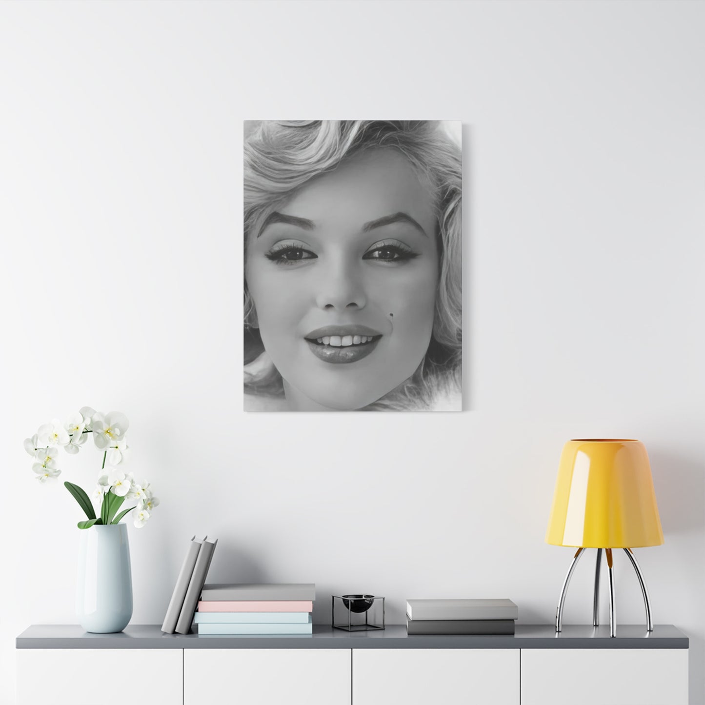
Stretched material remains among the most popular choices for contemporary wall art reproduction. This approach eliminates the need for separate framing while creating a three-dimensional object that projects from the wall. The wrapping of the image around the edges provides a finished appearance from all viewing angles. The texture of the material adds visual interest and affects how light interacts with the surface, creating subtle variations in appearance depending on viewing position and lighting conditions.
The weave of fabric surfaces introduces textural elements that can enhance or detract from image reproduction depending on the source material and printing technique. Fine weaves preserve detail effectively while adding a subtle texture that distinguishes these reproductions from photographic prints. Coarser weaves create more pronounced texture that can add artistic character but may obscure fine details. The choice depends on the specific image and the desired balance between textural interest and faithful reproduction.
Protective coatings applied during the production process significantly impact durability and appearance. These treatments can provide resistance to moisture, ultraviolet light, and physical contact while affecting surface finish. Glossy coatings enhance color saturation and contrast but may create reflections that interfere with viewing under certain lighting conditions. Matte or satin finishes reduce reflections and create more subdued presentations that work well in spaces with varied lighting. The selection should consider the specific display environment and viewing priorities.
Wood panel substrates offer distinctive aesthetic characteristics and exceptional rigidity. The natural grain patterns visible through lighter areas of the image create unique visual effects that blend photographic imagery with natural materials. This combination appeals to those seeking organic elements in their decor while maintaining clean, modern presentations. The substantial weight and thickness of wood panels communicate quality and permanence, positioning them as premium options within the market.
Metal printing represents an innovative approach that produces luminous, durable artwork with distinctive visual properties. The reflective qualities of metal surfaces create depth and brilliance impossible to achieve with other substrates. Images appear to glow with internal light, particularly in pieces featuring strong highlights. The modern aesthetic of metal prints suits contemporary interiors while the extreme durability makes them practical for high-traffic areas or commercial installations. The higher cost reflects the specialized production process and premium materials.
Size Selection and Spatial Planning
Artwork dimensions significantly impact both visual presence and integration within existing spaces. Undersized pieces can appear lost on large walls, while oversized artwork may overwhelm rooms and create visual imbalance. Effective size selection requires consideration of wall dimensions, viewing distances, and the surrounding architectural context. The goal is achieving presence without dominance, allowing the artwork to enhance the space rather than compete with it.
The general principle suggests that artwork should occupy roughly two-thirds to three-quarters of the available wall space in a given area. This proportion ensures sufficient visual impact without appearing cramped or disproportionate. However, this guideline requires adjustment based on specific circumstances, including furniture placement, ceiling height, and the presence of other decorative elements. Multiple smaller pieces can be combined to create the visual weight of a single larger work while offering increased flexibility.
Viewing distance plays a crucial role in determining appropriate artwork size. Pieces intended to be viewed from across a room should be significantly larger than those positioned in areas where viewers will be nearby. The level of detail in the image also influences ideal viewing distances and therefore appropriate sizes. Highly detailed images reward close examination and may be more effective in modest sizes, while bold, graphic compositions benefit from larger presentations that allow their impact to register from a distance.
Ceiling height affects how artwork relates to the overall space and influences optimal positioning and sizing decisions. Standard eight-foot ceilings require different approaches than the ten or twelve-foot heights found in many contemporary constructions. Taller spaces can accommodate larger artworks and permit hanging at heights that would feel awkward in rooms with lower ceilings. The vertical center of artwork should typically align with average eye level, though this rule admits exceptions in specific circumstances.
Multiple-piece installations offer creative solutions for filling large wall areas while maintaining visual interest through varied compositions. Triptychs and other multi-panel arrangements allow for expansive total dimensions while breaking the visual field into more manageable segments. The spacing between panels affects how viewers perceive the overall composition, with closer spacing creating unified presentations and wider gaps emphasizing individual elements. These arrangements require careful planning to ensure balanced, cohesive results.
Style Integration Across Design Aesthetics
The versatility of monochrome celebrity portraiture allows integration into diverse interior design schemes, from traditional to ultra-contemporary. The key lies in understanding how the artwork interacts with surrounding elements and making intentional choices about placement, framing, and supporting decor. Successful integration creates visual dialogue between the artwork and its environment, enhancing both rather than creating conflict.
Minimalist interiors provide ideal settings for bold monochrome portraiture. The clean lines and restrained color palettes characteristic of minimalist design allow artwork to function as a primary visual element without competition from busy patterns or saturated colors. The simplicity of the surrounding environment directs attention to the artwork, enabling full appreciation of compositional details and emotional content. This pairing feels natural and mutually reinforcing, with each element strengthening the impact of the other.
Industrial aesthetics, with their emphasis on raw materials and utilitarian objects, create interesting juxtapositions with glamorous portraiture. The contrast between refined beauty and rough textures generates visual tension that can be highly effective when carefully managed. Exposed brick, concrete surfaces, and metal fixtures provide grounding contrast that makes the polished sophistication of portrait photography more striking. This combination appeals to those seeking spaces that blend different historical periods and aesthetic sensibilities.
Mid-century modern interiors share historical connections with the golden age of Hollywood, creating natural affinities between period furniture and vintage celebrity imagery. The clean lines and organic curves characteristic of mid-century design complement the elegant compositions found in classic portraiture. Color palettes from this era, including warm woods, muted earth tones, and selective use of bold accent colors, provide harmonious backdrops for monochrome artwork. This stylistic alignment creates cohesive environments that feel authentically period-appropriate while remaining relevant to contemporary tastes.
Contemporary eclectic interiors, which deliberately mix elements from various periods and styles, can successfully incorporate vintage portraiture as part of their visual narrative. The key to successful eclectic design lies in finding common threads that unite disparate elements, such as consistent color palettes, repeated shapes, or shared emotional tones. Monochrome portraiture contributes timeless elegance that can anchor more adventurous decorative choices, providing visual stability amid calculated chaos.
Traditional and transitional interiors require more careful consideration when incorporating contemporary art reproductions. The formality characteristic of traditional design can clash with the informality of unframed material prints, suggesting the need for more conventional framing treatments. However, the classic beauty of vintage portraiture often resonates with traditional sensibilities, creating opportunities for successful integration when presentation aligns with the overall aesthetic. Transitional spaces, which blend traditional and contemporary elements, offer particular flexibility for incorporating diverse artwork.
Placement Strategies for Maximum Impact
Strategic artwork placement transforms good pieces into room-defining focal points. The relationship between artwork and surrounding architectural features, furniture, and traffic patterns determines effectiveness. Successful placement considers sightlines, lighting, and how the artwork contributes to the overall functional and aesthetic goals of the space. The same piece can read completely differently depending on its location and context.
Living rooms typically benefit from artwork positioned above sofas or fireplace mantels, creating natural focal points that anchor seating arrangements. The artwork should relate proportionally to the furniture beneath it, with the bottom edge positioned approximately six to eight inches above the sofa back. This spacing creates visual connection without awkward proximity. In rooms with high ceilings, slightly higher placement prevents the artwork from feeling cramped while maintaining appropriate relationship to the furniture.
Dining areas provide excellent opportunities for substantial artwork that commands attention without interfering with function. Positioning pieces above buffets or sideboards creates elegant presentations that contribute to the ambiance during meals. The formality of dining spaces often complements the sophistication of classic portraiture, creating environments that feel special and intentionally curated. Lighting considerations become particularly important in dining areas, as these spaces frequently feature adjustable lighting that should enhance rather than obscure the artwork.
Bedroom artwork selection and placement should consider the intimate nature of these spaces and their role as personal retreats. Many people prefer calming, harmonious artwork in bedrooms, though dramatic pieces can create striking effects in larger spaces. Positioning above headboards provides natural focal points while ensuring the artwork remains visible from other areas of the room. The emotional content of bedroom artwork matters significantly, as these are the images residents will see first thing each morning and last thing before sleep.
Hallways and corridors, often neglected in decorative planning, offer valuable opportunities for artwork display. These transitional spaces benefit from visual interest that transforms them from mere passages into gallery-like experiences. The linear nature of hallways suits series of related pieces or single elongated works. Lighting becomes particularly important in these often poorly illuminated spaces, requiring thoughtful installation of dedicated picture lights or strategic positioning near existing light sources.
Office and workspace environments benefit from artwork that provides visual relief during intensive work while projecting professionalism to clients or colleagues. The specific imagery should consider the nature of the work and the desired atmospheric qualities. Creative professionals might embrace bolder, more unconventional choices, while traditional business settings may require more conservative selections. Positioning artwork within the sightline from the primary work position allows for visual breaks that can reduce eye strain and mental fatigue.
Lighting Techniques for Artwork Enhancement
Proper illumination transforms artwork from mere decoration into dynamic visual experiences. Lighting affects color perception, reveals details, and creates emotional atmosphere that enhances or diminishes the impact of the piece. Multiple approaches exist for artwork lighting, each with specific advantages and appropriate applications. The investment in quality lighting returns dividends in enhanced artwork presentation and overall space ambiance.
Dedicated picture lights mounted directly above or below artwork provide focused illumination that emphasizes the piece while creating dramatic effects in surrounding areas. These fixtures come in various styles, from traditional brass lights to sleek LED strips, allowing coordination with overall design aesthetics. The distance between light source and artwork affects the spread and evenness of illumination, requiring adjustment based on artwork size and desired effects. Picture lights work particularly well for highlighting specific pieces in otherwise moderately lit rooms.
Track lighting systems offer flexibility by allowing multiple fixtures on a single track with individual adjustment for direction and focus. This approach suits spaces with multiple artworks or situations where display arrangements change periodically. The industrial appearance of track systems complements contemporary and industrial aesthetics while potentially clashing with traditional designs. LED technology has dramatically improved the quality of track lighting while reducing heat output and energy consumption.
Recessed spotlights provide architectural lighting solutions that maintain clean ceiling lines while effectively illuminating artwork. These require planning during construction or renovation, as installation involves ceiling penetrations and electrical work. The resulting clean aesthetic appeals to those favoring minimal visual clutter. Beam angles, light temperature, and dimming capabilities require careful specification to ensure appropriate artwork illumination. Professional consultation often proves valuable when designing systems using recessed lighting.
Natural lighting creates constantly changing illumination conditions that bring artwork to life in unique ways throughout the day. However, sunlight contains ultraviolet radiation that can damage artwork over time, requiring protective measures or acceptance of gradual fading. Positioning artwork away from direct sun exposure while allowing ambient natural light provides a balance between preservation and attractive presentation. The changing quality of natural light throughout seasons and times of day creates dynamic viewing experiences that artificial lighting cannot replicate.
Color temperature significantly affects how artwork appears and how spaces feel. Warm light sources enhance warmer tones while potentially dulling cooler colors, while cool lighting does the reverse. For monochrome artwork, these effects are less pronounced but still relevant, as different color temperatures affect the perception of gray tones and overall contrast. Many contemporary fixtures offer adjustable color temperature, allowing optimization for specific artworks and changing preferences.
Production Quality Indicators and Selection Criteria
Distinguishing superior reproductions from mediocre alternatives requires understanding quality markers that affect both immediate appearance and long-term satisfaction. Price alone provides insufficient guidance, as production costs and retail markups vary considerably across vendors. Informed buyers evaluate multiple factors to ensure purchases meet expectations and justify their investment. The differences between quality tiers often become more apparent over time as inferior products degrade or disappoint.
Print resolution determines the sharpness and detail visible in finished pieces. High-resolution source files and printing processes maintain clarity at close viewing distances, while low-resolution production appears soft or pixelated. The required resolution increases with artwork size, as larger pieces receive closer examination over larger surface areas. Reputable producers specify resolution in dots per inch, with 300 DPI representing minimum standards for quality work. Lower resolutions might suffice for pieces viewed exclusively from distance, but compromising on this metric often leads to disappointment.
Color accuracy and tonal range reflect printing technology and process control during production. For monochrome artwork, this manifests as smooth gradations between tones without banding or posterization. Deep, rich blacks and clean, bright whites create the contrast necessary for impactful presentation. Inferior printing produces muddy shadows and weak highlights that flatten the image and reduce visual interest. Sample viewing or detailed product photography helps assess these qualities before purchase.
Material quality significantly affects both appearance and durability. Heavy, tightly woven fabrics provide superior surfaces for printing compared to thin, loosely woven alternatives. The base material should feel substantial and resist stretching or distortion. Wood frames or stretcher bars should be solid, properly joined, and free from warping or defects. Metal and wood substrates should be appropriately thick and finished to prevent corrosion or degradation. Physical handling reveals quality differences that photographs cannot convey.
Coating application protects artwork while affecting its appearance. Quality protective finishes should be evenly applied without runs, bubbles, or clouding. These treatments should not significantly alter the intended appearance of the piece unless specific effects are desired. The coating should flex with the substrate without cracking or peeling over time. Inferior applications degrade relatively quickly, compromising protection and appearance. Manufacturer specifications about protective treatments indicate attention to quality and longevity.
Packaging and shipping methods reflect overall production values and concern for customer satisfaction. Quality producers use appropriate protective materials and sturdy boxes that prevent damage during transit. Corners receive extra protection, and pieces arrive securely packaged without excessive movement within containers. Instructions for unpacking and installation demonstrate attention to customer experience. Damage during shipping indicates inadequate protection and creates frustration that mars the acquisition experience.
Customization Options and Personalization Possibilities
Many producers offer modification options that allow buyers to tailor pieces to specific requirements and preferences. These customization opportunities range from basic size adjustments to substantial artistic interventions. Understanding available options and their implications helps buyers create truly personalized pieces that perfectly suit their spaces and tastes. The balance between standardization and customization affects pricing, production timelines, and ultimate satisfaction.
Dimensional customization represents the most commonly requested modification, allowing buyers to specify exact measurements that optimize fit within their spaces. This flexibility proves particularly valuable for challenging wall configurations or specific furniture relationships. Some producers accommodate custom sizing within certain ranges, while others operate exclusively with predetermined dimensions. The ability to order precise sizes eliminates compromise between available options and ideal measurements, though custom work typically incurs premium pricing.
Image cropping and composition adjustments allow focus on specific portions of source photographs. Tighter crops emphasize facial features and eliminate peripheral elements, while wider presentations provide context and environmental information. Some buyers prefer centered compositions while others favor off-center positioning that creates dynamic balance. These choices significantly affect the emotional impact and stylistic character of finished pieces. Producers with flexible workflows accommodate compositional requests more readily than those relying on standardized production.
Color treatment modifications create variations from standard monochrome presentations. Sepia toning adds warmth and vintage character, while cool toning creates contemporary industrial aesthetics. Selective colorization, which retains color in specific areas while rendering the remainder monochrome, produces distinctive artistic effects. Adjustments to contrast levels change the overall feel from high-drama to soft and subtle. These modifications require artistic judgment to ensure successful results that enhance rather than compromise the original imagery.
Material and finish selection allows matching artwork to specific design aesthetics and functional requirements. Choosing between matte and glossy finishes affects reflection management and overall appearance. Substrate options ranging from traditional to innovative materials create different visual and tactile experiences. Gallery wrap depths on stretched material pieces affect the three-dimensional presence of the artwork. Frame style selection for traditionally mounted pieces ensures coordination with existing decor. These choices accumulate to create distinctly personalized results.
Text addition creates commemorative pieces or personalizes artwork for gift-giving. Adding names, dates, or meaningful phrases transforms generic reproductions into customized keepsakes. Font selection, sizing, and positioning require careful consideration to ensure additions enhance rather than detract from the overall composition. This modification particularly appeals to those creating themed spaces or commemorating specific occasions. The permanence of text addition demands certainty about desired content before proceeding.
Framing and Presentation Alternatives
The decision between framed and frameless presentation significantly affects artwork appearance and integration within spaces. Each approach offers distinct advantages and creates different visual impressions. Understanding these differences enables informed choices that align with aesthetic preferences and practical requirements. The presentation method should enhance the artwork while coordinating with surrounding design elements.
Traditional framing provides protective benefits while adding substantial visual weight and formality to presentations. Frame materials, profiles, and finishes offer nearly unlimited customization possibilities. Classic wood frames suit traditional interiors and add warmth, while metal frames create contemporary industrial aesthetics. The mat board creates visual breathing room between image and frame, affecting how viewers perceive the artwork. This traditional approach communicates respect for the artwork and attention to proper presentation.
Floating frames create contemporary presentations where the artwork appears suspended within the frame perimeter. This technique works particularly well with material prints, allowing edge images to remain visible while providing frame protection and definition. The gap between artwork and frame creates intriguing shadow lines that add depth and dimensionality. This modern approach balances the finished appearance of framing with the casualness of frameless presentation. The style coordinates well with contemporary and transitional interiors.
Gallery wrapping eliminates framing entirely by extending the image around the edges of stretched material supports. This frameless approach creates clean, modern presentations that project from walls as three-dimensional objects. Edge treatment options include extending the image, solid colors, or mirrored reflections of the main composition. The absence of framing allows the artwork itself to dominate without competition from decorative borders. This presentation method particularly suits contemporary and minimalist aesthetics while reducing overall costs.
Shadow box framing creates substantial depth that makes artwork appear as treasured objects rather than mere wall decoration. This approach works particularly well for pieces with three-dimensional elements or those deserving special emphasis. The deep profiles create dramatic shadow lines and significant physical presence. Traditional shadow boxes use wood, while contemporary versions employ metal or acrylic materials. This presentation method communicates importance and creates focal points that command attention.
Acrylic face mounting produces sleek, modern presentations with distinctive luminous qualities. The artwork is mounted to acrylic sheets that protect while adding depth and brilliance. Light refracts through the acrylic, creating internal glow that enhances vibrancy. This premium presentation method suits contemporary interiors and creates gallery-quality results. The substantial weight and thickness communicate quality and represent significant investments. The glossy surfaces require careful positioning to manage reflections.
The Role of Iconic Imagery in Personal Identity Expression
The artwork displayed within personal spaces communicates volumes about occupant identity, values, and cultural affiliations. Decorative choices function as nonverbal communication that visitors interpret consciously and unconsciously. Understanding these signaling dynamics enables more intentional curation that authentically represents personal identity while creating desired impressions. The relationship between self-expression and audience awareness creates productive tension that shapes collecting behavior.
Generational identity often manifests through artwork selections that reference shared cultural touchstones. Baby boomers gravitating toward imagery from their formative years express connection to that historical moment and its cultural products. Younger generations displaying vintage imagery may signal appreciation for aesthetic qualities divorced from personal memory, or ironic engagement with past cultural moments. The same image can mean radically different things depending on the collector's age and relationship to the depicted era. This generational coding creates insider dynamics where age cohorts recognize shared references.
Gender performance and identity expression frequently involve decorative choices that align with or subvert conventional expectations. Traditional femininity might embrace romantic, soft imagery while rejecting overtly sexual representations. Alternative femininity could reclaim pin-up imagery as empowering rather than objectifying. Masculine spaces historically avoided celebrity portraiture outside of sports contexts, though contemporary gender fluidity has relaxed these constraints. The navigation of these conventions reveals how decorative choices intersect with complex identity negotiations.
Cultural sophistication and educational attainment signal through artwork selections that demonstrate knowledge of art history, cultural studies, or critical theory. The ability to discuss the cultural significance of displayed imagery, referencing academic discourse or artistic movements, elevates decoration beyond mere prettiness. This intellectual engagement with popular culture distinguishes informed appreciation from uncritical consumption. The line between genuine interest and performative sophistication remains blurry, with observers making judgments based on limited information.
Professional identity extends into residential spaces through decorative choices that align with occupational cultures. Creative professionals might display provocative or unconventional artwork that signals their artistic sensibilities. Corporate professionals may favor more conservative selections that communicate reliability and establishment values. Entrepreneurs often embrace imagery suggesting ambition, success, and aspirational living. These professional alignments operate subtly but influence how visitors perceive the occupant's career identity and seriousness.
Lifestyle aspirations manifest through imagery depicting the life circumstances or qualities owners desire. Glamorous celebrity portraiture can represent aspirational beauty, fame, or the sophisticated urban lifestyle associated with entertainment culture. The gap between current circumstances and depicted lifestyle creates motivational tension that some find energizing and others find depressing. The self-awareness to recognize this dynamic allows more intentional choices about whether aspirational imagery serves positive or negative psychological functions.
Geographical and Cultural Variations in Reception
The interpretation and appreciation of celebrity imagery varies considerably across cultures and geographical regions. These differences reflect varying relationships with American popular culture, distinct aesthetic traditions, and divergent attitudes toward celebrity and fame. International markets for Hollywood imagery reveal complex patterns of cultural exchange and varying degrees of American cultural influence. Understanding these dynamics enriches appreciation for the global circulation of imagery.
Western European markets demonstrate sophisticated engagement with Hollywood history, viewing it as cultural heritage requiring preservation and study. The intellectual tradition of film criticism and cultural studies frames engagement with celebrity imagery differently than in American contexts. European collectors often emphasize artistic and historical significance over simple fan appreciation. This scholarly approach positions collecting as cultural preservation rather than mere decoration. The distinction between high and low culture, though eroding, maintains more influence than in American contexts.
Asian markets, particularly in Japan and South Korea, exhibit intense enthusiasm for Western pop culture including vintage Hollywood imagery. The aesthetic of Western beauty and glamour holds particular appeal in cultures with distinct beauty standards. The imagery functions as aspirational reference and connection to global culture. However, specific celebrities resonate differently based on their presence in local media markets and cultural exports. The enthusiastic embrace of Western imagery coexists with fierce pride in domestic cultural products, creating complex hybrid aesthetic environments.
Latin American cultures maintain passionate engagement with Hollywood glamour rooted in historical patterns of cultural exchange. Classic films enjoyed extensive distribution throughout Latin America, creating shared cultural vocabulary around Hollywood stars. The emotional expressiveness valued in Latin cultures aligns well with dramatic portraiture emphasizing beauty and passion. Contemporary interest reflects both nostalgia for a earlier era of Mexican cinema's golden age and ongoing Hollywood influence. The imagery connects to broader themes of romance, beauty, and aspirational living.
Middle Eastern markets approach Western celebrity imagery with complexity reflecting tensions between modernization and tradition. Urban, cosmopolitan populations embrace Hollywood culture as connection to global modernity. Conservative segments view Western imagery with suspicion as representing cultural imperialism and morally problematic values. The result is fragmented markets where certain demographics enthusiastically consume Western culture while others reject it. Gender representation in imagery becomes particularly fraught given varying cultural standards regarding appropriate female representation.
African markets demonstrate growing interest in both Western celebrity culture and homegrown entertainment industries. Historical colonial relationships shaped access to American media, with English and French-speaking regions showing distinct patterns. Contemporary digital media has dramatically expanded access to global culture, creating more uniform youth engagement with international celebrities. However, economic constraints limit purchases of decorative artwork, with markets remaining relatively small compared to Western and Asian regions. The potential for growth remains substantial as middle classes expand across the continent.
Creating Gallery Wall Collections and Arrangements
The assembly of multiple artworks into cohesive presentations requires careful planning regarding selection, arrangement, and installation. Gallery walls transform collections into unified statements exceeding the sum of individual pieces. However, poorly executed attempts create visual chaos that diminishes rather than enhances spaces. Success requires balancing unity and variety while managing practical challenges of layout and installation.
Thematic coherence provides the foundation for successful gallery walls. Collections might unite around monochrome aesthetics, specific historical periods, particular subjects, or formal visual characteristics. The common thread creates visual harmony while allowing individual pieces to maintain distinct identities. Overly strict adherence to themes can feel rigid while insufficient connection produces incoherence. The optimal balance permits enough variety to maintain interest without sacrificing overall unity. The theme needn't be obvious to casual observers, serving primarily as a curatorial organizing principle.
Size variation adds visual interest while creating hierarchical relationships within collections. A single dominant piece establishes focus with supporting smaller works creating context and elaboration. Alternatively, similar-sized pieces create democratic arrangements without clear focal points. The specific approach should consider the space and desired atmosphere. Symmetrical arrangements feel formal and traditional while asymmetrical layouts suggest contemporary sensibilities. The underlying grid governing placement might be visible or subtly implied depending on installation strategy.
Spacing between pieces significantly affects overall perception. Closer spacing creates unified fields reading as single elements from distance, while wider gaps emphasize individual pieces and relationships between them. Standard spacing ranges from two to four inches, though particular situations justify deviations. Consistent spacing throughout creates order and intentionality while variable spacing can feel haphazard unless carefully controlled. The negative space surrounding the entire arrangement also requires consideration, with adequate margins preventing cramped feelings against ceilings or adjacent walls.
Layout planning before installation prevents errors requiring patching and repainting. Full-scale paper templates facilitate experimentation with arrangements without wall damage. Digital planning tools enable virtual arrangement though the inability to physically manipulate templates limits utility. Floor layouts provide another approach, arranging pieces on the ground to establish relationships before transferring to vertical surfaces. These planning methods require time investment but dramatically improve outcomes while reducing installation stress.
Installation sequencing affects efficiency and final results. Working from center outward or establishing baseline alignments creates reference points for positioning remaining pieces. Laser levels maintain horizontal and vertical alignment across multiple pieces. Patience during installation prevents misalignments requiring corrections. Having assistance for larger installations provides additional perspectives and extra hands for holding pieces during positioning. The incremental progress creates satisfaction while building toward completed visions.
Conclusion:
The integration of monochrome celebrity portraiture into contemporary living spaces represents far more than simple decoration. These compelling visual elements connect us to cultural history while providing sophisticated aesthetic experiences that elevate everyday environments. The journey from mid-century photography studios to modern homes involves technological advancement, changing artistic sensibilities, and evolving relationships with popular culture. Yet certain fundamental appeals remain constant across decades: the power of beautiful faces, the nostalgia for glamorous eras, and the human need for visual enrichment in personal spaces.
The democratization of art reproduction has transformed what was once available only to wealthy collectors into accessible options for anyone seeking to curate meaningful personal environments. This accessibility should not be mistaken for lack of value or significance. The careful selection, placement, and presentation of artwork demonstrates cultural awareness and aesthetic sensibility regardless of price points. The distinction between authentic engagement and mere consumption lies not in expenditure but in the thoughtfulness applied to curatorial decisions. Those who understand why particular pieces speak to them and how those pieces contribute to desired atmospheric qualities practice genuine appreciation.
The enduring popularity of particular cultural icons reveals deep currents in collective consciousness that transcend individual taste. These figures represent aspirational qualities, historical moments, and cultural values that continue resonating across generations. The imagery carries multiple layers of meaning available to various forms of engagement, from pure aesthetic appreciation to complex cultural analysis. The capacity to support diverse interpretations while maintaining immediate visual power explains sustained commercial viability and cultural relevance. New audiences continually discover these images, finding fresh meanings while connecting to established traditions of appreciation.
The technical aspects of contemporary reproduction deserve appreciation alongside artistic dimensions. The marriage of historical imagery with modern production methods enables presentation quality that honors original artistry while providing practical durability. The range of available substrates, sizes, and customization options allows precise matching of artwork to specific spaces and aesthetic visions. Understanding these technical considerations enables informed purchasing that balances quality, cost, and functional requirements. The knowledge empowers consumers to make choices aligning with priorities rather than accepting whatever manufacturers offer.
Environmental consciousness increasingly influences all consumption decisions including decorative artwork. The tension between desire for beautiful objects and commitment to sustainability creates challenging negotiations. However, the fundamental durability and timeless aesthetics of quality monochrome portraiture align well with sustainable consumption principles. Pieces purchased thoughtfully and cared for properly provide decades of visual pleasure, amortizing their environmental costs across extended lifespans. The rejection of disposable decoration in favor of enduring quality represents genuine environmental responsibility regardless of specific production methods.
The psychological impacts of living with particular imagery deserve serious consideration in an era of increasing awareness about how environments affect wellbeing. The faces we see daily influence our emotional states, self-perceptions, and relationships with broader culture. Choosing imagery that genuinely speaks to us rather than following transient trends creates more authentic environments supporting psychological health. The cumulative effect of thoughtful curation across all aspects of our living spaces contributes significantly to overall life satisfaction and sense of home.
Looking forward, the intersection of classic imagery with advancing technology promises continued evolution in how we bring these powerful visuals into our lives. Emerging display technologies, improved reproduction methods, and new artistic interpretations will generate fresh approaches to familiar subjects. Yet the fundamental human responses to beauty, charisma, and the frozen moments captured in classic photography will endure. These timeless elements ensure that monochrome celebrity portraiture will maintain relevance regardless of changing technologies and aesthetic movements.
