


Monochrome City Skyline NYC Skyline Wall Art & Canvas Prints
Monochrome City Skyline NYC Skyline Wall Art & Canvas Prints
Couldn't load pickup availability


New York City Monochrome Skyline Wall Art: Bringing Urban Elegance Into Your Living Space
The allure of New York City has captivated artists, photographers, and designers for generations. Among the most striking ways to celebrate this iconic metropolis is through monochrome skyline canvas prints that capture the architectural magnificence and urban energy of the city. These artistic representations have become increasingly popular as homeowners and interior designers seek sophisticated ways to incorporate metropolitan aesthetics into residential and commercial spaces.
Black and white photography and artwork possess a timeless quality that transcends passing trends. When applied to cityscapes, particularly the instantly recognizable silhouette of New York City, these monochromatic pieces create dramatic focal points that anchor entire rooms. The absence of color directs attention to form, composition, contrast, and architectural detail, allowing viewers to appreciate the structural beauty of Manhattan's legendary buildings without distraction.
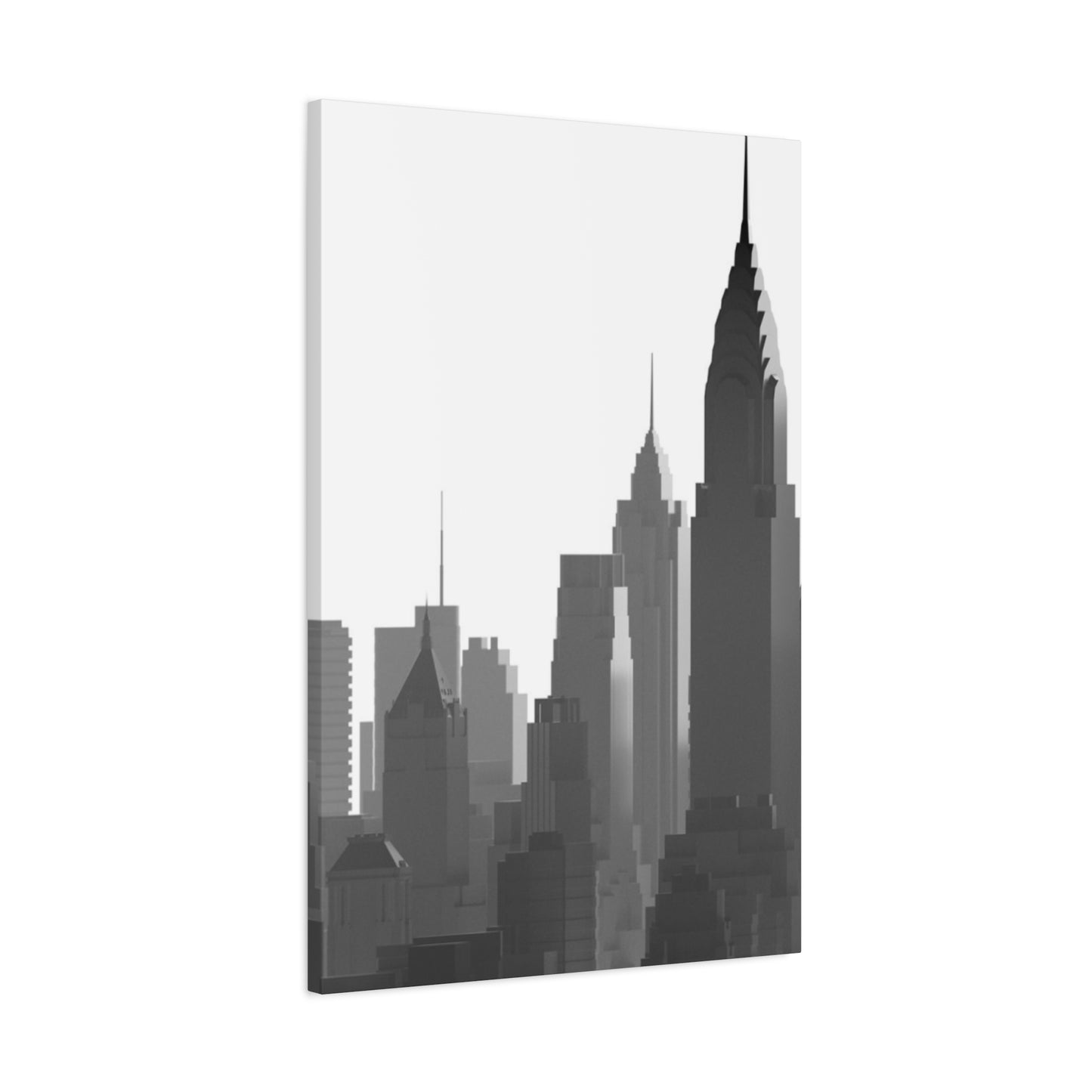
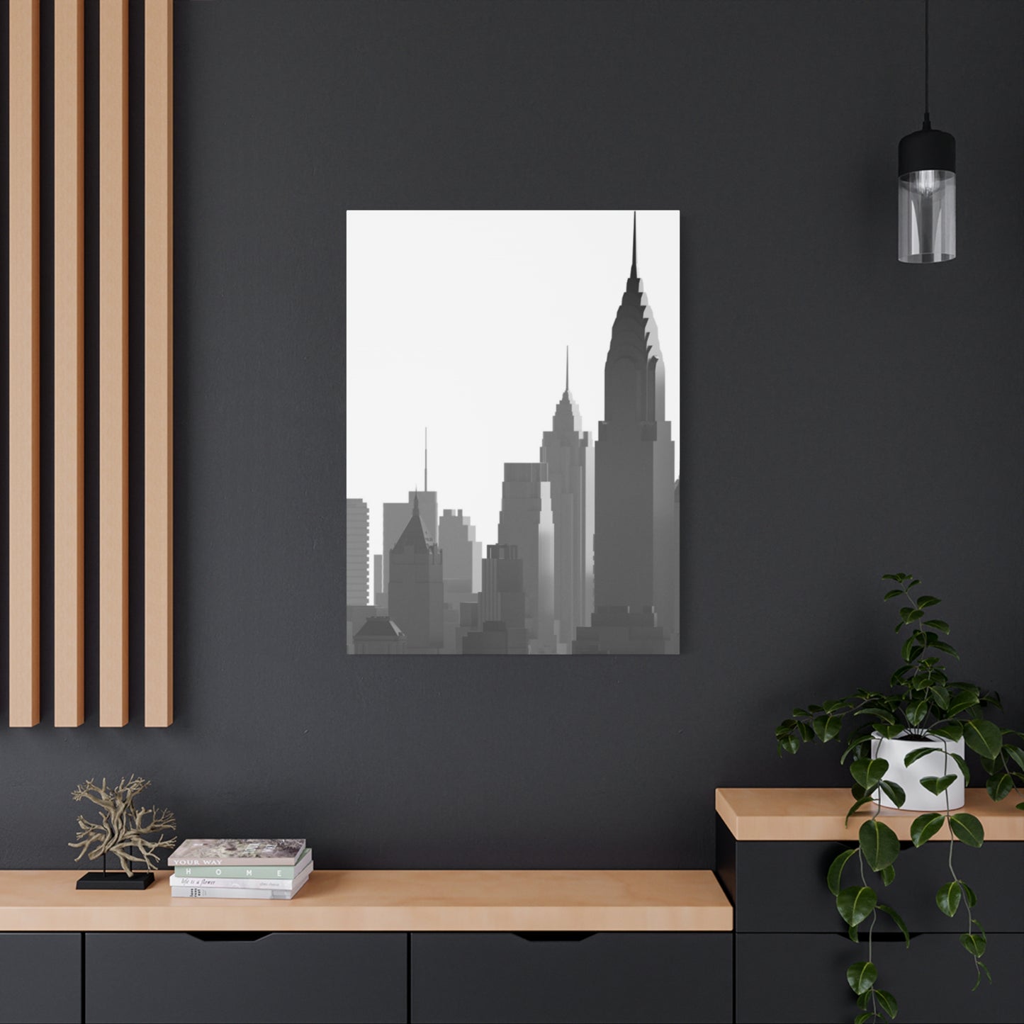
Canvas prints offer distinct advantages over traditional framed photographs or posters. The texture of canvas adds depth and dimension to images, creating a gallery-quality appearance that elevates any space. Unlike paper prints that can appear flat or generic, canvas wraps around wooden frames to create a three-dimensional effect that stands away from the wall. This construction method eliminates the need for additional framing, providing a clean, contemporary presentation that complements various decorating styles.
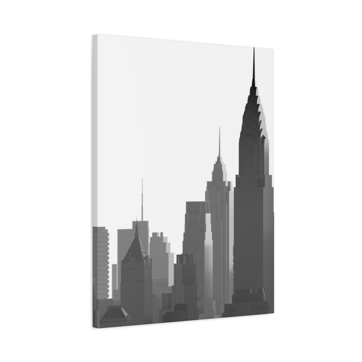
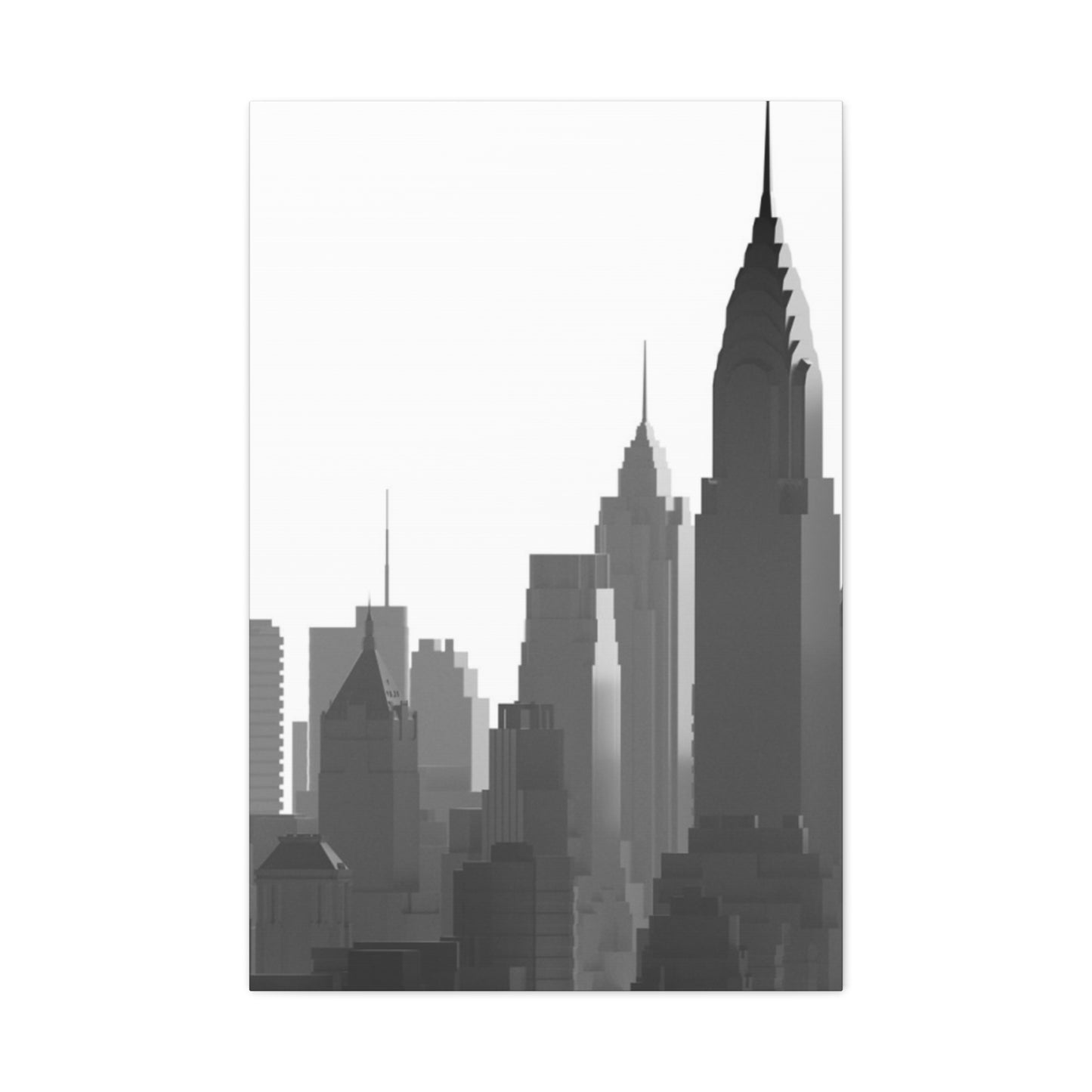
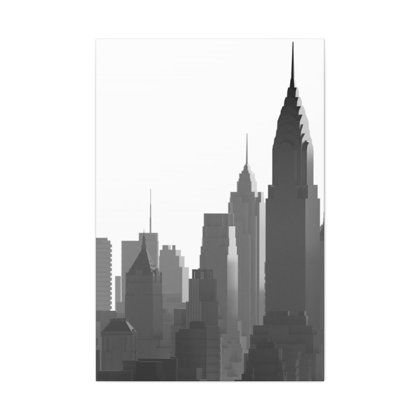
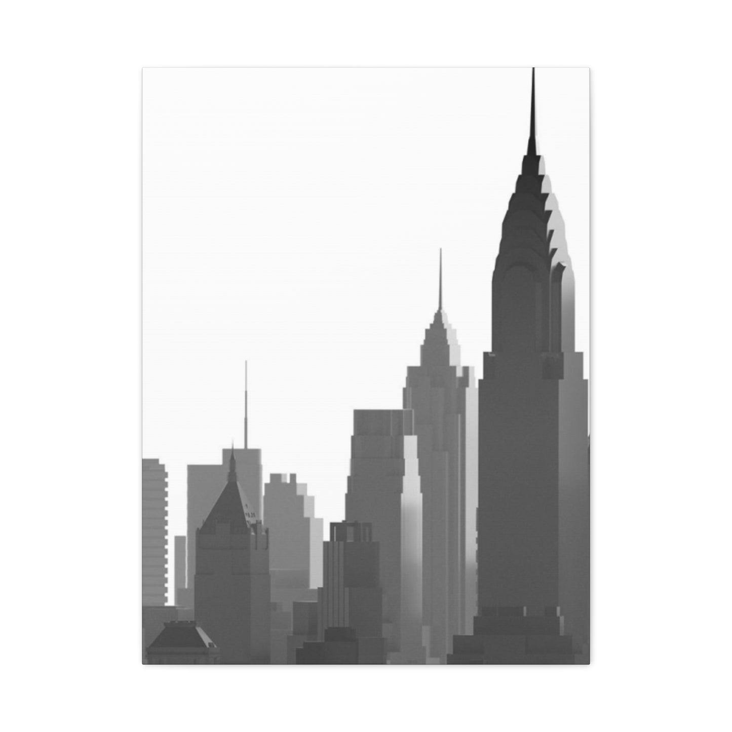
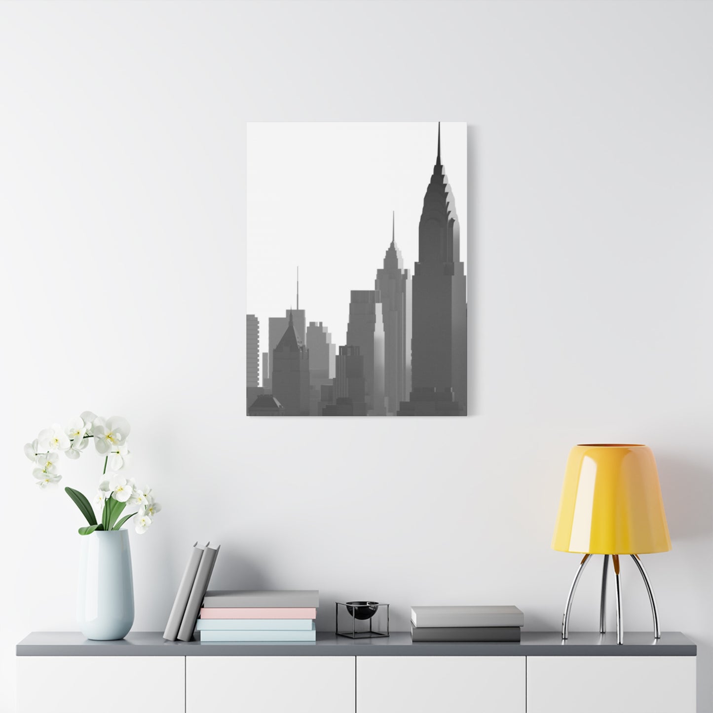
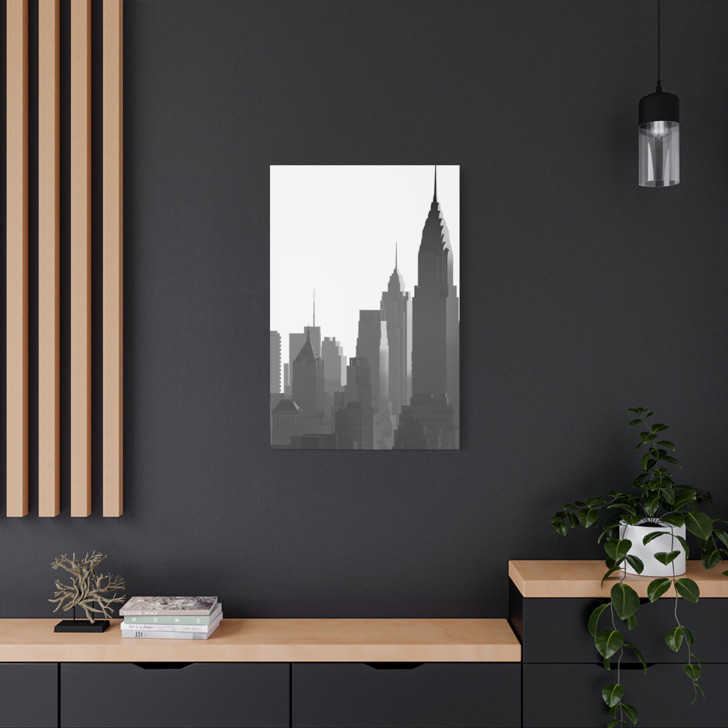
The New York City skyline represents more than just buildings clustered together. It symbolizes ambition, innovation, architectural achievement, and the vibrant energy of urban life. From the Art Deco elegance of the Chrysler Building to the modernist lines of One World Trade Center, each structure contributes to a collective visual narrative. Monochrome interpretations of this skyline strip away the distractions of color to reveal the essential character of these architectural icons.
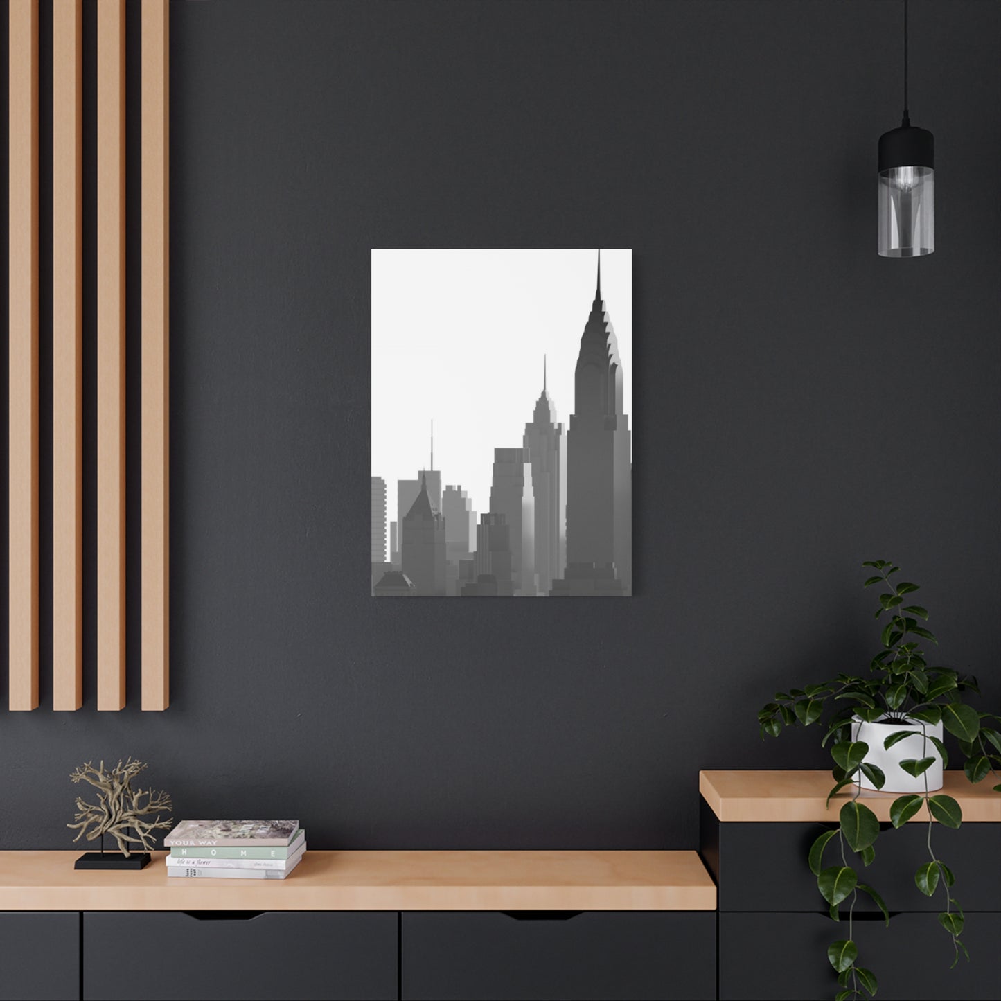
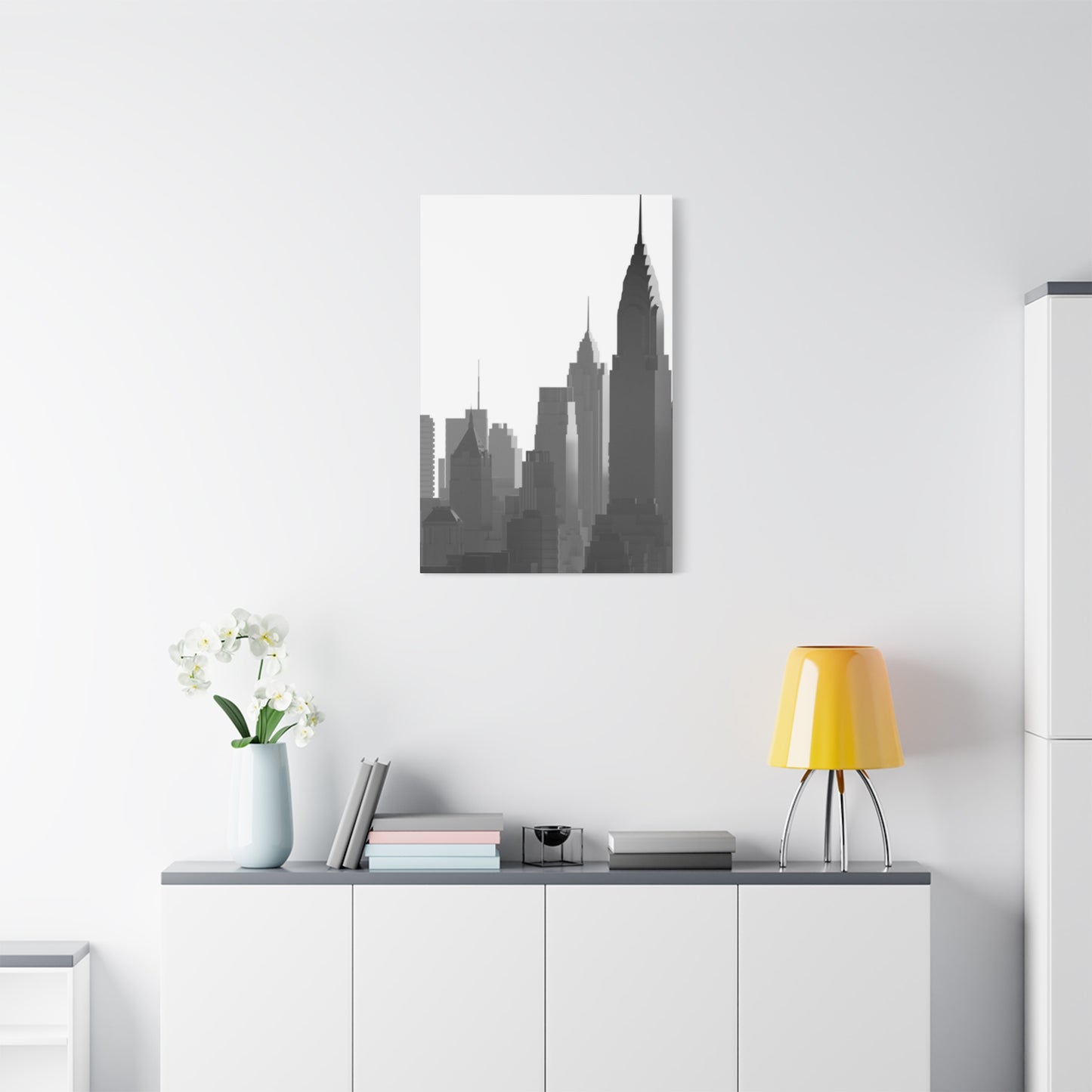
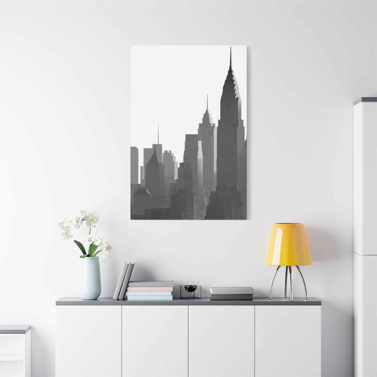
Interior designers frequently recommend monochrome artwork for its versatility and sophistication. Black and white prints coordinate effortlessly with virtually any color palette, making them ideal for spaces that undergo periodic updates or seasonal refreshment. Whether your decor leans toward minimalist Scandinavian design, industrial loft aesthetics, traditional elegance, or eclectic bohemian style, a carefully chosen monochrome skyline print integrates seamlessly.
Large-scale canvas prints create particularly impressive statements in living rooms, offices, hotel lobbies, and corporate spaces. The expansive format mirrors the grandeur of the cityscape itself, allowing viewers to immerse themselves in the metropolitan atmosphere. Multiple panel installations, sometimes called triptychs or multi-panel sets, can span entire walls to create breathtaking panoramic displays that transform ordinary rooms into gallery-like environments.
Photography techniques play crucial roles in creating compelling monochrome skyline images. Long exposure captures blur moving clouds while keeping buildings sharp, adding ethereal quality to urban scenes. Golden hour and blue hour photography, when converted to black and white, produces dramatic contrast between illuminated buildings and darkening skies. Careful attention to composition ensures that iconic structures occupy strategic positions within the frame, guiding the viewer's eye through the image.
Architectural Highlights Within The Manhattan Skyline
Manhattan's skyline represents over a century of architectural evolution, showcasing styles from various eras that collectively create one of the world's most recognizable urban profiles. The Empire State Building, completed in 1931, remains an enduring symbol of American ambition and Art Deco design excellence. Its distinctive setback silhouette was dictated by zoning laws of the era, creating the stepped profile that has become iconic. In monochrome representations, the building's limestone facade and vertical lines create striking geometric patterns that emphasize its soaring height.
The Chrysler Building, another Art Deco masterpiece, features elaborate ornamentation that translates beautifully into black and white imagery. The stainless steel crown with its triangular windows and radiating terraced arches catches light in ways that create natural contrast in photographs. Built in 1930 as the headquarters for the Chrysler Corporation, this skyscraper held the title of world's tallest building for only eleven months before being surpassed by the Empire State Building. Despite its brief reign, the Chrysler Building's distinctive appearance has made it one of the most beloved structures in the skyline.
One World Trade Center, also known as the Freedom Tower, represents resilience and renewal. Standing at 1,776 feet to symbolize the year of American independence, this building's reflective glass surfaces create interesting challenges and opportunities for photographers. In monochrome images, the tower's geometric simplicity contrasts with the ornate details of older neighbors, illustrating the evolution of architectural philosophy across decades. The building's chamfered edges cause it to appear different from various vantage points, adding visual interest to skyline compositions.
The Woolworth Building, completed in 1913, introduced Gothic Revival architecture to the skyscraper form. Its terra cotta facade features intricate detailing that remains visible in high-quality photographic prints. Often called the "Cathedral of Commerce," this structure brought European architectural traditions to American commercial buildings. In black and white photographs, the building's cream-colored exterior translates to luminous tones that help it stand out among darker neighbors.
Rockefeller Center represents a different architectural approach, emphasizing Art Deco principles through a complex of buildings rather than a single tower. The centerpiece, 30 Rockefeller Plaza, features clean vertical lines and setback design that photograph beautifully from street level or elevated positions. The entire complex, built during the Great Depression, demonstrated faith in urban development during economically challenging times. Monochrome images of Rockefeller Center often include the famous skating rink and surrounding structures, creating comprehensive urban compositions.
The Flatiron Building, though modest in height compared to modern skyscrapers, occupies a special place in architectural history and popular imagination. Its unique triangular shape, designed to fit an awkwardly shaped lot at the intersection of Fifth Avenue and Broadway, created one of the most photographed buildings in the world. The Beaux-Arts structure's distinctive profile makes it instantly recognizable in skyline views, particularly when captured from southern vantage points. Black and white photographs emphasize the building's sculptural quality and the way its narrow edges seem to slice through the surrounding urban fabric.
Design Principles For Monochrome Urban Photography
Converting color photographs to black and white involves more than simply removing color information. Skilled photographers and digital artists understand that different colors possess varying luminance values that don't always translate predictably to grayscale. Red objects and green objects with similar brightness in color may render as nearly identical gray tones without proper conversion techniques. Professional black and white processing involves selectively adjusting how different color channels translate to gray tones, ensuring that important elements maintain visual separation and contrast.
Tonal range refers to the spectrum from pure black to pure white and all the gray values between. Compelling monochrome images utilize the full tonal range, incorporating deep shadows, bright highlights, and a variety of midtones. Flat images with limited tonal range appear dull and lack visual impact. Skyline photography benefits from dramatic tonal contrast, with dark buildings silhouetted against bright skies or illuminated structures glowing against evening darkness. Photographers often use graduated neutral density filters or digital processing to balance exposure between bright skies and darker ground elements.
Composition in skyline photography follows classical artistic principles while accommodating the unique characteristics of urban landscapes. The rule of thirds suggests dividing the frame into a three-by-three grid and placing important elements along these lines or at their intersections. In skyline compositions, the horizon line typically occupies either the lower third or upper third of the frame rather than bisecting the image down the middle. This asymmetrical approach creates more dynamic compositions than centered horizons.
Leading lines guide the viewer's eye through an image toward important focal points. In urban photography, roads, bridges, waterways, and building edges can all serve as leading lines. The Manhattan Bridge or Brooklyn Bridge cables create strong diagonal lines that draw attention into the frame and toward the skyline beyond. River edges or shorelines provide natural horizontal leading lines that anchor compositions and provide stability to otherwise vertical-heavy images.
Symmetry and patterns emerge naturally in architectural photography. Repeating windows, uniform building facades, and regular structural elements create visual rhythms that please the eye. Some photographers emphasize these patterns through careful framing and perspective choices, while others deliberately break symmetry to create tension and interest. In monochrome work, patterns become especially prominent because color no longer competes for attention.
Negative space refers to empty or minimally detailed areas of an image, often skies or water in skyline photography. Rather than being wasted space, these areas provide visual rest and emphasize the importance of positive elements like buildings. Monochrome skyline images often feature substantial areas of sky, especially when dramatic cloud formations or sunset lighting create interesting textures and tones. The interplay between negative space and the detailed complexity of the skyline creates balance within the composition.
Perspective distortion affects how buildings appear in photographs. Wide-angle lenses exaggerate perspective, making nearby objects appear much larger than distant ones and causing vertical lines to converge toward the top of the frame. This distortion can create dynamic, dramatic images but may also make buildings appear to lean backward. Tilt-shift lenses correct for this convergence, keeping vertical lines parallel and creating a more architectural, documentary appearance. Each approach serves different artistic intentions, and the choice depends on the desired aesthetic outcome.
Selecting Canvas Material And Construction Quality
Canvas substrate choices significantly impact both the appearance and durability of printed artwork. Cotton canvas represents the traditional choice, offering a natural fiber texture that resembles artist's painting canvas. The surface texture creates a slight tooth that catches light and adds dimension to images. Cotton canvas accepts ink well and produces excellent color reproduction, which remains important even in monochrome work where subtle tonal gradations determine quality. High-quality cotton canvas should be tightly woven with consistent texture across the entire surface.
Polyester canvas provides an alternative with certain advantages. This synthetic material resists moisture better than cotton, making it more suitable for humid environments like bathrooms or coastal homes. Polyester canvas maintains dimensional stability, meaning it's less likely to expand or contract with humidity changes that could eventually cause sagging or warping. The surface texture of polyester canvas can be manufactured to closely mimic cotton while offering enhanced durability. For commercial installations where longevity is paramount, polyester often represents the superior choice.
Canvas weight, measured in ounces per square yard, indicates thickness and durability. Lighter canvases around 8 ounces work adequately for smaller prints but may appear insubstantial for larger works. Medium weight canvases between 10 and 12 ounces offer good balance between quality appearance and reasonable cost. Heavy canvases at 14 ounces or more provide premium feel and enhanced durability but increase both material costs and shipping weights. For fine art reproductions intended to last decades, heavier canvases justify their additional expense.
Primer or gesso coating prepares canvas to receive ink. This layer prevents ink from soaking directly into canvas fibers, which would cause colors to appear dull and muddy. Proper priming creates a smooth, receptive surface that allows ink to sit atop the canvas while maintaining vibrancy. Multiple thin coats of primer produce better results than single thick applications. The primer itself should be acid-free to prevent yellowing and degradation over time.
Stretcher bars form the wooden frame over which canvas wraps. These bars should be made from kiln-dried wood to prevent warping and should be thick enough to provide substantial profile depth. Bars measuring 1.5 inches thick create noticeable wall projection that enhances the three-dimensional quality of the artwork. Thicker 2-inch bars work well for very large prints where additional support becomes necessary. The corners where stretcher bars meet should feature proper joints, either mortise and tenon or mitered with additional reinforcement, rather than simple butt joints that can separate over time.
Gallery wrap construction refers to the method of wrapping printed canvas around stretcher bars so the image continues around the edges. This technique eliminates the need for external framing and creates a clean, contemporary presentation. The challenge involves ensuring that important image elements don't disappear around the edges. Photographers and printers must account for the wrap-around area when composing and sizing images. Mirror wrapping, where edge portions reflect nearby image areas, provides one solution. Alternative approaches include extending the image naturally or using solid color edge wrapping.
Corner folding techniques affect both appearance and durability. Properly executed corners should be neatly folded without bunching or puckering canvas material. The folded canvas should be secured with staples driven into the back of stretcher bars rather than sides, maintaining clean edge appearance. Professional-quality construction places staples precisely and uses enough of them to prevent canvas from pulling away from the frame over time. Visible staples on sides indicate lower quality construction.
Image Resolution Requirements
Inkjet printing technology dominates the fine art reproduction market, offering excellent color accuracy and tonal gradation suitable for monochrome imagery. These printers work by spraying microscopic droplets of ink onto canvas surfaces in precise patterns. Professional wide-format printers accommodate large canvas widths, enabling the production of substantial wall art pieces without seams. The number of ink colors used by the printer affects its ability to reproduce subtle tonal variations. While basic printers use four colors, professional devices may employ eight, ten, or twelve ink colors, including multiple gray tones specifically for black and white printing.
Pigment-based inks provide superior longevity compared to dye-based alternatives. Pigment inks contain microscopic solid particles suspended in liquid carrier, while dye inks fully dissolve into liquid. Pigments adhere to canvas surfaces rather than soaking in, resulting in better color saturation and resistance to fading. Museum-quality pigment inks can last over a century without noticeable degradation when properly displayed and cared for. This longevity makes them essential for artwork intended as heirloom pieces or commercial installations where replacement would be costly.
Resolution refers to the density of image information, typically measured in pixels per inch. For canvas prints, resolution requirements differ somewhat from paper prints because the canvas texture naturally softens fine details. Generally, resolution between 100 and 150 pixels per inch produces acceptable results for canvas prints viewed from normal distances. Higher resolution becomes necessary for very large prints intended for close viewing or when source images will be substantially enlarged. Insufficient resolution produces blurry or pixelated results where individual pixels become visible.
Image file formats affect both quality and file size. TIFF files offer uncompressed or losslessly compressed image data, preserving maximum detail and tonal information. These large files are ideal for print production. JPEG files use lossy compression that reduces file sizes by discarding information deemed less noticeable to human vision. While convenient for sharing and storage, heavily compressed JPEGs can introduce artifacts and banding in smooth tonal gradations. For fine art printing, TIFF or high-quality JPEG files provide necessary image quality.
Color space considerations remain important even for black and white prints. RGB color space, used by digital cameras and displays, represents colors through combinations of red, green, and blue channels. Professional printing often converts images to CMYK color space, which represents the cyan, magenta, yellow, and black inks used by printers. However, many fine art printers work directly with RGB files, performing internal conversion optimized for their specific ink sets. Grayscale color mode dedicates all image data to luminance information without color channels, though some printers achieve better black and white results by maintaining RGB files and using color inks to produce neutral grays.
Interior Design Integration Strategies
Scale represents one of the most important considerations when selecting wall art for specific spaces. A general guideline suggests that artwork should occupy roughly two-thirds to three-quarters the width of the furniture piece it hangs above. For sofas measuring seven feet wide, art pieces between 50 and 63 inches wide create appropriate visual balance. However, this guideline isn't absolute, and bolder design choices might intentionally exceed or fall short of these proportions for specific aesthetic effects.
Vertical versus horizontal orientation affects how artwork interacts with architectural elements and furniture arrangements. Horizontal pieces complement long sofas, sideboards, and console tables, emphasizing width and creating visual expansion in narrow rooms. Vertical pieces draw the eye upward, making rooms appear taller and working well in spaces with high ceilings or above narrow furniture pieces like side tables. Square formats offer versatility but require careful placement to avoid appearing awkwardly positioned in rectangular spaces.
Multi-panel installations allow customization of overall dimensions and create dynamic visual interest. Three-panel triptychs are most common, though two-panel diptychs or five-panel arrangements also work well. Panels might present a single panoramic image divided across multiple canvases or related images that work together thematically. The spacing between panels affects the overall impression; closer spacing creates a more unified image while wider gaps emphasize individual panels. Maintaining consistent spacing between all panels creates cohesive appearance.
Height placement significantly impacts how artwork integrates with a room. The traditional guideline suggests hanging art so the center point sits at average eye level, approximately 57 to 60 inches from the floor. This standard works well in rooms where people primarily stand. In dining rooms where people sit for extended periods, lowering artwork creates better visual connection. Conversely, artwork in two-story foyers or above stairwells may hang higher to accommodate the architecture and viewing angles.
Color coordination extends beyond matching artwork to existing room colors. Monochrome skyline prints offer particular flexibility because their neutral palette coordinates with virtually any color scheme. The black and white tonality can pull together diverse room colors by providing a unifying element. Alternatively, monochrome art can provide visual rest in rooms with busy color patterns or bold accent colors. The key involves considering the overall visual weight and balance rather than literal color matching.
Lighting design dramatically affects how artwork appears and how it impacts a room. Natural light from windows changes throughout the day and seasons, causing artwork to appear different at various times. Direct sunlight should be avoided as it can fade prints over time, though UV-filtering glass or coatings provide some protection. Artificial lighting allows more control, with track lighting or picture lights providing focused illumination. LED options minimize heat generation while offering various color temperatures from warm to cool.
Surrounding decor should complement rather than compete with artwork. In minimalist spaces, a monochrome skyline print might serve as the primary visual focus, with surrounding elements kept simple to avoid distraction. In maximalist or eclectic spaces, the artwork joins a conversation with other decorative elements, contributing to an overall aesthetic rather than dominating. The sophistication of architectural photography particularly suits contemporary, modern, industrial, and urban-themed interiors.
Evolution Of Architectural Photography
Architectural photography emerged alongside photography itself in the mid-nineteenth century. Early photographers were drawn to buildings as subjects because their immobility accommodated the long exposure times required by primitive cameras. These early images documented architectural achievements and preserved records of structures that might be modified or demolished. The documentary aspect of architectural photography established its importance beyond purely artistic considerations.
Technical limitations of early photography influenced aesthetic choices that persist today. Large format cameras using glass plate negatives produced highly detailed images with excellent tonal range. The slow photographic processes required careful consideration of composition and exposure, as each image represented significant effort and expense. This methodical approach encouraged thoughtfulness that contrasts with modern digital photography's instant feedback and virtually unlimited exposures.
Black and white photography dominated the medium until color processes became practical in the mid-twentieth century. This long black and white tradition established aesthetic preferences and visual language that continue influencing contemporary monochrome work. Early photographers like Ansel Adams developed zone system techniques for controlling tonal relationships, creating prints with full tonal range from deep blacks to bright whites. These technical and aesthetic foundations inform current black and white digital processing.
New York City became a favorite subject for architectural photographers due to its rapid development and concentration of innovative buildings. Photographer Berenice Abbott documented the city during the 1930s, creating an invaluable record of the urban environment during a period of dramatic change. Her direct, frontal approach emphasized buildings' geometric qualities and architectural details. Abbott's work influenced subsequent photographers and helped establish documentary architectural photography as an art form.
Andreas Feininger photographed New York extensively during the mid-twentieth century, creating iconic images that shape how people visualize the city. His dramatic use of telephoto lenses compressed perspective and emphasized the density of Manhattan's development. Feininger's work demonstrated how technical choices like lens selection fundamentally affect photographic interpretation. His images frequently featured strong geometric compositions and dramatic tonal contrast characteristic of the period's aesthetic preferences.
Modern architectural photography diverged into documentary and interpretive approaches. Documentary work prioritizes accurate representation of buildings as constructed, often commissioned by architects to record their completed projects. This work requires technical precision, careful attention to perspective, and lighting that reveals architectural intent. Interpretive photography treats buildings as subjects for artistic exploration, emphasizing mood, atmosphere, and subjective response over objective documentation. Both approaches contribute valuable perspectives on architecture.
Digital photography revolutionized architectural photography through immediate feedback, easy manipulation, and elimination of film costs. Photographers can now experiment extensively, reviewing results instantly and adjusting technique accordingly. Digital sensors capture wider dynamic range than film, recording detail in both shadows and highlights that would be impossible with traditional materials. Post-processing software provides unprecedented control over tonal relationships, contrast, and selective adjustments to different image areas.
Stylistic Variations In Black And White Cityscapes
High contrast black and white creates dramatic impact through strong opposition between dark and light elements. This approach minimizes midtone grays, pushing tones toward either black or white. Buildings silhouetted against bright skies exemplify this style, with architectural forms reduced to stark shapes. High contrast work emphasizes graphic quality and bold composition over subtle tonal gradations. This style suits contemporary interiors with clean lines and uncluttered aesthetics.
Low contrast monochrome explores subtle tonal variations within a compressed range. Rather than deep blacks and bright whites, these images feature predominantly gray tones with limited tonal separation. The result creates atmospheric, contemplative mood suggesting fog, haze, or overcast conditions. This approach requires strong composition since tonal drama cannot compensate for weak arrangements. Low contrast work suits spaces seeking understated elegance and sophisticated restraint.
Film grain aesthetics deliberately introduce the texture characteristic of traditional film photography. While digital photography naturally produces smooth tones, added grain creates vintage character and tactile quality. The grain texture becomes particularly visible in sky areas and shadows. This technique evokes nostalgia for analog photography while adding visual interest to potentially flat areas. Excessive grain can appear amateur, but judicious application enhances character without overwhelming the image.
Infrared photography captures wavelengths beyond visible light, creating surreal appearances with bright white foliage and nearly black skies. Though originally requiring special film, digital cameras can be modified to capture infrared light. In urban environments, infrared photography produces unusual results as different building materials reflect infrared light differently. The dramatic contrast between dark skies and bright clouds creates otherworldly atmosphere. These images work well as conversation pieces in spaces embracing unconventional aesthetics.
Selective focus and shallow depth of field, though more common in other photographic genres, occasionally appear in artistic architectural work. Using wide apertures to blur backgrounds while keeping foreground architecture sharp creates three-dimensional effect and directs attention to specific buildings. This technique requires longer lenses and works best when specific buildings deserve emphasis rather than presenting the entire skyline equally. The approach creates painterly quality differentiating the work from typical architectural documentation.
Long exposure photography captures time passing rather than frozen moments. Moving clouds blur into streaks while stationary buildings remain sharp. Water surfaces smooth into glass-like reflections. Traffic trails create light streaks through streets. These techniques require neutral density filters to enable long exposures during daylight hours. The resulting images blend temporal elements with spatial documentation, creating contemplative quality that transcends literal representation.
Minimalist composition strips away all non-essential elements to emphasize fundamental relationships between basic forms. Simple arrangements of building shapes against empty sky exemplify this approach. The resulting images resemble abstract art more than documentary photography. This style requires discipline to exclude interesting but distracting elements and patience to find viewpoints yielding clean compositions. Minimalist work suits contemporary spaces valuing simplicity and visual clarity.
Room-Specific Placement Recommendations
Living rooms serve as primary gathering spaces where families relax and entertain guests. Artwork in these rooms should create welcoming atmosphere while reflecting the inhabitants' interests and style. A monochrome skyline print above the main seating area provides sophisticated focal point that grounds the room. Large-scale pieces measuring five to six feet wide make appropriate statements without overwhelming comfortable residential spaces. Multiple smaller panels arranged in groups offer alternative approaches, creating visual interest through arrangement variation.
Dining rooms benefit from artwork that stimulates conversation without distracting from meals and social interaction. Urban skyline prints introduce cosmopolitan sophistication appropriate for spaces associated with entertaining and special occasions. The artwork should hang low enough to be visible to seated diners but high enough to avoid interference with table settings and serving activities. Consider the view from seated positions when determining height placement. Dimmable lighting allows adjustment for different occasions, with brighter illumination highlighting artwork during pre-dinner socializing and dimmer settings creating intimate atmosphere during meals.
Bedrooms require calming artwork that promotes relaxation and restful sleep. While dramatic high-contrast images can energize public spaces, bedrooms often benefit from subtler tonal ranges and peaceful compositions. Skyline views during twilight hours or foggy mornings create serene atmospheres conducive to rest. The size should be proportional to the bed it hangs above, generally two-thirds the width of a queen or king headboard. Personal connection to the depicted city matters more in private spaces, making skyline art particularly suitable for bedrooms of those with meaningful relationships to New York City.
Libraries and reading rooms benefit from sophisticated artwork that complements the intellectual atmosphere of book-filled spaces. Urban architectural photography pairs naturally with libraries, as both celebrate human achievement and cultural sophistication. The contemplative quality of reading rooms suits thoughtful photographic work that rewards extended viewing. Consider lighting carefully to avoid glare on both artwork and reading materials. The artwork should complement rather than compete with the books themselves, with monochrome prints offering neutral presence that doesn't overwhelm colorful book spines.
Home theaters and media rooms require artwork considerations different from other spaces. When screens are retracted or covered, wall art becomes visible and contributes to the room's aesthetic. However, reflection and light considerations become paramount, as artwork positioned where it reflects in screens creates viewing problems. Darker, lower-contrast images work better in these controlled lighting environments than bright, high-contrast pieces that might create eyestrain in darkened rooms. Consider how the artwork appears under the specific lighting conditions used during media viewing.
Commercial Space Applications
Corporate offices utilize skyline artwork to project professional image and urban business sophistication. Reception areas and lobbies make particularly strong statements with large-scale monochrome prints that immediately communicate the company's aesthetic values. Conference rooms benefit from inspirational imagery that stimulates creative thinking and ambitious planning. Executive offices often feature personalized art selections reflecting individual taste while maintaining corporate professionalism. Open plan work areas can use artwork to define zones and add visual interest to potentially monotonous environments.
Hotels and hospitality venues employ artwork to create memorable guest experiences and reinforce brand identity. Monochrome skyline prints work particularly well in urban hotels where the artwork connects to the surrounding city location. Lobby installations create Instagram-worthy moments that guests photograph and share, providing organic marketing. Guest rooms feature appropriately scaled artwork that enhances comfort without overwhelming the space. Restaurants and bars within hotels use dramatic architectural photography to establish sophisticated atmosphere that elevates the dining experience.
Restaurants and cafes utilize wall art to create ambiance supporting their culinary concept and target demographic. Urban skyline imagery suits contemporary restaurants, wine bars, and upscale casual dining establishments. The sophistication of monochrome photography appeals to design-conscious diners who appreciate aesthetic attention throughout their experience. Large-scale installations can become signature elements that distinguish the venue from competitors. The durability of canvas prints makes them practical for commercial environments where daily cleaning and maintenance are necessary.
Medical and dental offices increasingly recognize that artwork affects patient comfort and perception of care quality. Calming skyline images depicting cities during peaceful hours create more welcoming environments than stark clinical spaces. Waiting rooms benefit from engaging artwork that provides positive distraction from anxiety about upcoming procedures. Treatment rooms might feature ceiling-mounted or strategically positioned prints visible from examination chairs or beds. The professionalism conveyed by sophisticated architectural photography aligns with the expertise patients expect from healthcare providers.
Law firms and financial services companies project stability, success, and trustworthiness through their office environments. Monochrome skyline artwork reinforces these associations, with the enduring architecture of New York City symbolizing institutional permanence and achievement. Client-facing conference rooms make particularly important statements, with artwork selection contributing to overall impression of competence and success. Partner offices often feature substantial pieces that convey status and personal accomplishment. The neutral palette of monochrome prints coordinates with the conservative color schemes typical in these professional environments.
Photography Techniques For Capturing Skylines
Viewpoint selection fundamentally determines the character and composition of skyline photographs. Classic Manhattan skyline views from Brooklyn Heights Promenade or Brooklyn Bridge Park present southern facing perspectives with the East River providing foreground separation. These elevated positions allow compressed perspective using telephoto lenses while including waterfront context. Alternative viewpoints from Roosevelt Island or Long Island City present different building relationships and lighting conditions. Each location offers unique compositional opportunities requiring scouting and planning.
Time of day dramatically affects lighting quality, color, and atmosphere. Golden hour shortly after sunrise or before sunset provides warm, directional light that emphasizes building dimension through shadows and highlights. Blue hour during twilight offers ethereal light quality and opportunity to balance ambient light with artificial building illumination. Midday sun creates harsh contrast and overhead lighting that flattens architectural features, generally avoided by serious photographers. Nighttime photography captures illuminated buildings against dark skies, requiring longer exposures and careful exposure balancing.
Weather conditions create varied moods and visual effects in skyline photography. Clear days produce crisp detail and strong contrast between buildings and sky. Overcast conditions provide soft, even lighting without harsh shadows, though potentially resulting in less dramatic images. Fog and mist add atmospheric quality and sense of depth through reduced visibility at distance. Dramatic cloud formations add visual interest to sky areas and opportunities for dynamic compositions. Post-storm clearing often produces exceptional light quality and dramatic skies.
Seasonal variations affect both lighting and environmental context for skyline photography. Winter months feature lower sun angles creating longer shadows and warmer light quality even during midday hours. Bare trees in foreground parks create different compositions than summer foliage. Spring and fall offer moderate temperatures for comfortable shooting and foliage in transitional states. Summer's higher sun angles and frequent haze can challenge photography but provide opportunities for dramatic thunderstorm approaches. Seasonal timing decisions should align with desired aesthetic outcomes.
Lens selection determines perspective, compression, and field of view. Wide-angle lenses capture expansive views including foreground elements and broad sky areas, though they can distort buildings near frame edges. Normal focal length lenses approximate human vision perspective, creating natural-looking images. Telephoto lenses compress perspective, making distant buildings appear larger and stacked more densely. This compression creates dramatic effect in skyline photography, emphasizing the vertical density of urban development. Each focal length serves different creative visions.
Tripod stability becomes essential for optimal sharpness, particularly during marginal lighting conditions requiring slower shutter speeds. Even minor camera movement during exposure creates blur that compromises image quality. Professional tripods provide stable platforms while offering adjustment flexibility for composition refinement. Carbon fiber models reduce weight for location photography. Ball heads allow quick position adjustments while three-way heads provide precise control for architectural work. Remote shutter releases eliminate camera shake from physically pressing the shutter button.
Creating Multi-Panel Skyline Installations
Panoramic scene division across multiple panels requires careful planning to ensure visual coherence. The image must be divided at logical points that don't awkwardly bisect important buildings. Compositional flow should guide the eye across panels naturally without jarring interruptions. Equal panel sizing creates formal, balanced arrangements while varied dimensions introduce dynamic asymmetry. Digital planning tools allow visualization of different division schemes before committing to printing, ensuring satisfaction with the layout.
Spacing between panels affects whether they read as unified image or related but distinct pieces. Narrow gaps of one to three inches maintain visual continuity, with the image flowing across breaks. Wider spacing of four to eight inches emphasizes individual panels while maintaining relationship through shared subject matter. Consistent spacing across all gaps creates intentional, designed appearance versus randomly placed pieces. The overall installation width including gaps must fit the intended wall space with appropriate margins.
Panel arrangement geometry extends beyond simple horizontal rows. Staggered heights create visual rhythm and dynamic composition, with certain panels raised or lowered relative to others. This approach works particularly well with three or five panels where the center piece rises above flanking elements. Grid arrangements organize panels in multiple rows, creating impressive large-scale installations. Asymmetrical arrangements might cluster panels toward one side or create irregular patterns. Each arrangement strategy communicates different aesthetic and must suit both the imagery and installation space.
Center point alignment ensures professional appearance regardless of arrangement style. For horizontal rows, aligning either top edges, bottom edges, or centerlines keeps the installation visually organized. Staggered height arrangements typically align centerlines so panels relate to consistent horizontal axis. Grid arrangements require both horizontal and vertical alignment of rows and columns. Using levels and measurement tools prevents crooked installation that undermines the desired effect. Professional installers use laser levels for precision across expansive installations.
Tonal consistency across panels becomes critical for multi-panel installations. Printing all panels simultaneously ensures identical color calibration and ink conditions. If panels must be printed separately, maintaining consistent source files and printing specifications helps minimize variation. Even slight differences in tone or contrast become obvious when panels hang adjacent to each other. Requesting test strips or proofs allows verification of consistency before committing to full production.
Frame profile matching across all panels creates unified appearance. Mixing different canvas depths or edge treatments appears disorganized and unintentional. All panels should feature identical stretcher bar depth, edge wrapping style, and finishing. This consistency extends to hanging hardware, with all panels using the same mounting system. Visual consistency in physical construction allows the imagery itself to command attention without distraction from mismatched production.
Installation planning should occur before purchasing artwork to ensure compatibility with available space. Measure walls carefully accounting for furniture, architectural details, and visual breathing room. Mock up the installation using paper templates at actual size to verify scale and placement. Consider viewing distances and angles, ensuring the installation looks appropriate from all positions where it will be seen. Account for lighting positions, electrical outlets, and other practical concerns that might affect placement options.
Framing And Presentation Alternatives
Traditional framing with protective glazing offers maximum protection for valuable artwork but fundamentally changes the canvas print experience. Glass or acrylic glazing protects against dust, moisture, and physical contact while introducing reflective surfaces that can complicate viewing. Spacers hold glass away from canvas surface to prevent contact while creating shadow gap. Frame molding contains the entire package, adding architectural element and formal presentation. This approach suits conservative spaces valuing traditional artwork presentation over contemporary aesthetics.
Float mounting creates gallery presentation where canvas appears suspended within a deeper frame box. The canvas mounts to a hidden support structure while the frame surrounds it with visible gap between canvas edge and frame. This technique emphasizes the canvas as three-dimensional object rather than flat image. Float mounting works particularly well for canvas with painted or mirrored edges, allowing those details to remain visible. The technique conveys sophistication and careful curation.
Museum mounting or gallery mounting indicates simple presentation without external framing. The gallery-wrapped canvas hangs directly against the wall with only hanging hardware visible. This clean, contemporary presentation emphasizes the artwork itself without additional embellishment. The approach suits modern and minimalist interiors where ornamental framing would appear incongruous. Museum mounting places all aesthetic responsibility on the artwork itself without support from decorative frames.
Shadow boxes create deep frames that set artwork significantly away from walls. These boxes might be several inches deep, creating dramatic three-dimensional effect. The depth accommodates thick canvases or allows layered presentations with additional elements. Shadow boxes suit eclectic or maximalist interiors where dimensional variety adds visual interest. The technique can make modestly sized artwork command more wall presence through expanded overall footprint.
Metal framing systems provide sleek, contemporary alternative to traditional wood frames. Aluminum frames offer clean lines, minimal visual weight, and various finish options including brushed metal, powder-coated colors, or matte black. These frames particularly suit industrial, modern, or minimalist interiors. The metal construction provides strength for large format work while maintaining slender profiles that don't visually overwhelm the artwork. Many metal framing systems use mechanical joining rather than traditional joinery, creating precise corners.
Reclaimed wood frames introduce rustic character and environmental consideration through repurposed materials. Barn wood, pallet wood, or salvaged lumber creates one-of-a-kind frames with authentic age and patina. These frames suit farmhouse, rustic, industrial, and eclectic interiors. The weathered wood character creates interesting contrast with crisp photographic prints. Each frame possesses unique grain patterns, knots, and imperfections that add character. Sustainable-minded consumers appreciate repurposing materials that might otherwise be discarded.
Canvas floater frames specifically designed for gallery-wrapped canvas create a floating appearance where canvas sits within the frame without touching it. These frames feature a recessed rabbet that accepts canvas depth, with the frame surrounding rather than overlapping the canvas edge. Various profiles from minimalist to ornate accommodate different aesthetic preferences. Floater frames provide finished presentation while maintaining the contemporary sensibility of gallery-wrapped canvas.
Gifting Skyline Canvas Artwork
Occasion appropriateness varies with artwork selection and recipient preferences. New home or apartment moves represent ideal gifting opportunities, as recipients need artwork for bare walls. Anniversaries might commemorate trips to cities or locations where couples met. Graduation gifts can celebrate accomplishments while inspiring ambition. Retirement presents might honor careers spent in specific cities. Office promotions or new positions welcome artwork appropriate for professional spaces. The key involves matching the gift to both occasion and recipient's personal style.
Personalization options transform generic skyline prints into meaningful, customized gifts. Including buildings significant to recipients, such as where they lived or worked, adds personal connection. Custom framing in recipients' preferred colors or styles shows extra consideration. Adding text elements like dates, quotes, or names creates one-of-a-kind pieces. Some services incorporate recipient photos within cityscape compositions for ultimate personalization. The effort invested in customization demonstrates thoughtfulness beyond simply purchasing artwork.
Size considerations depend on intended installation space. Questioning gift recipients about available wall space provides practical information ensuring the gift will actually be used. Standard sizes offer versatility as recipients can choose final placement. Oversized pieces make dramatic statements but require substantial wall space and strong mounting. Smaller works provide flexibility for apartments or cluttered spaces. Multiple smaller panels allow recipients to arrange them according to their space and preferences.
Style matching requires understanding recipients' decorating preferences and existing decor. Traditional interiors might appreciate subtle toning or classic framing. Modern spaces welcome bold contrast and minimalist presentation. Eclectic tastes allow experimental approaches and creative interpretation. Color schemes guide decisions about monochrome versus color prints and frame finishes. Subtly inquiring about favorite colors, decorating magazines they read, or styles they admire provides guidance without revealing surprise gift plans.
Budget considerations range from affordable smaller prints to substantial investment pieces. Quality varies significantly across price points, with professional photography and printing commanding premium prices. Machine-printed items from discount sources lack the quality and longevity of professional production. Mid-range options balance cost and quality for most gifting situations. High-end custom pieces suit milestone occasions or important relationships. Establishing budgets before shopping prevents disappointment or overspending.
Presentation packaging enhances the gifting experience beyond the artwork itself. Professional gift wrapping services create impressive presentations with appropriate materials. Sustainable packaging using reusable fabric wraps or recycled materials appeals to environmentally conscious recipients. Including cards explaining the artwork's significance or the artist's background adds context. Some vendors provide special gift packaging designed to protect artwork during transport while looking attractive. The unveiling experience contributes to recipient satisfaction and appreciation.
Timing delivery ensures gifts arrive appropriately for occasions without premature spoiling of surprises. Custom orders requiring production time must account for processing, printing, and shipping. Rush orders might be available at premium cost for last-minute needs. Seasonal shipping during holidays experiences delays requiring early ordering. International shipping adds complexity through customs procedures and extended transit times. Tracking capabilities allow monitoring shipments and anticipating arrival for gift presentation planning.
Return and exchange policies provide protection when gifts don't quite match expectations. Reputable vendors offer satisfaction guarantees allowing returns or exchanges within specified timeframes. Custom personalized pieces may be non-returnable due to their unique nature. Understanding policies before purchasing prevents disappointment if adjustments become necessary. Gift receipts without pricing information allow recipients to initiate exchanges independently if needed.
Conclusion
Few subjects embody sophistication and timeless appeal quite like the New York City skyline. Its soaring architecture, glittering lights, and unmistakable energy have made it an enduring muse for artists and designers around the world. In the realm of home décor, New York City monochrome skyline wall art offers more than just a visual representation of an iconic city—it brings an entire atmosphere of ambition, elegance, and modernity into your living space. Each print becomes a window into the city that never sleeps, allowing you to experience its pulse and character no matter where you are.
Monochrome skyline art captures New York City in its purest form. Stripped of color, the city’s silhouette takes on a deeper meaning—its skyscrapers, bridges, and bustling streets reduced to shades of black, white, and gray. This simplicity creates a sense of sophistication and balance that harmonizes effortlessly with any interior style. The absence of color directs focus to form, texture, and contrast, revealing the intricate beauty of urban design. Whether it’s the Empire State Building reaching into the clouds or the Brooklyn Bridge stretching across the horizon, each element becomes a timeless symbol of human achievement and architectural brilliance.
Integrating New York City skyline wall art into your home allows you to merge modern aesthetics with emotional resonance. For those who admire the elegance of minimalist design, monochrome art serves as the perfect anchor—a sleek visual that complements contemporary décor without overwhelming it. The grayscale palette pairs beautifully with neutral walls, glass furniture, or metallic accents, giving rooms an elevated, gallery-like feel. On the other hand, in more eclectic or industrial spaces, it adds structure and refinement, grounding the room in sophistication while enhancing its artistic character.
What makes New York City monochrome art truly special is the emotion it evokes. There’s a quiet drama in the interplay of light and shadow across its skyline—an echo of the city’s rhythm, resilience, and restless energy. For many, it represents aspiration and opportunity; for others, nostalgia and memory. It can be both bold and serene, modern and timeless. Hanging such an artwork in your home doesn’t just beautify the space—it also creates a personal connection to the spirit of urban life, one defined by creativity, ambition, and endless possibilities.
