


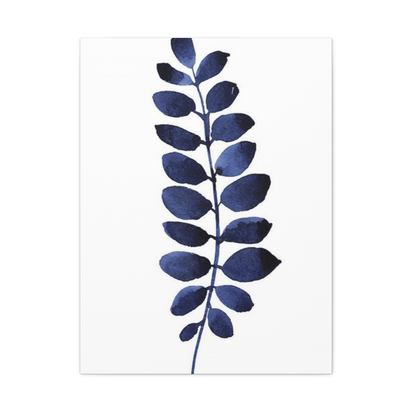
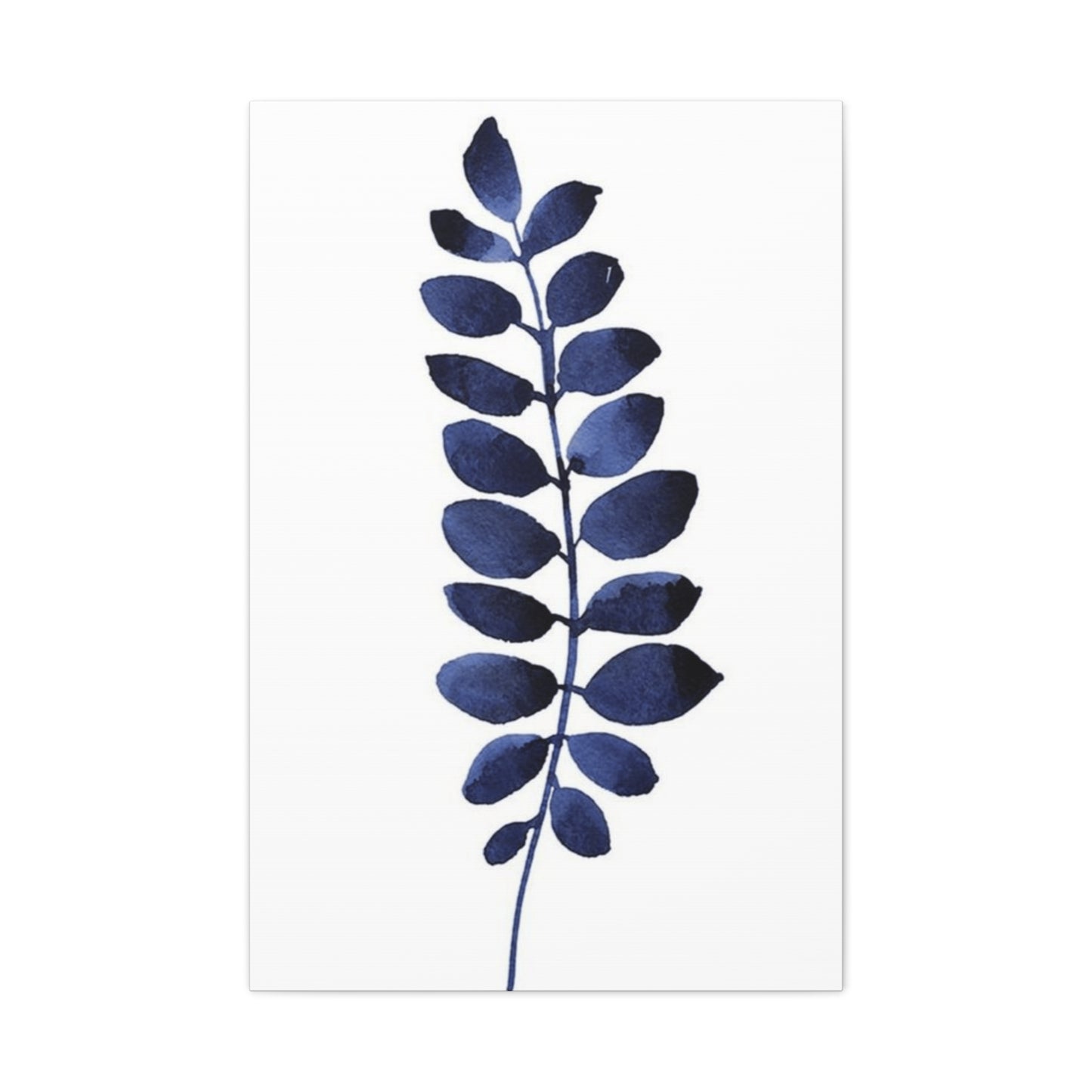
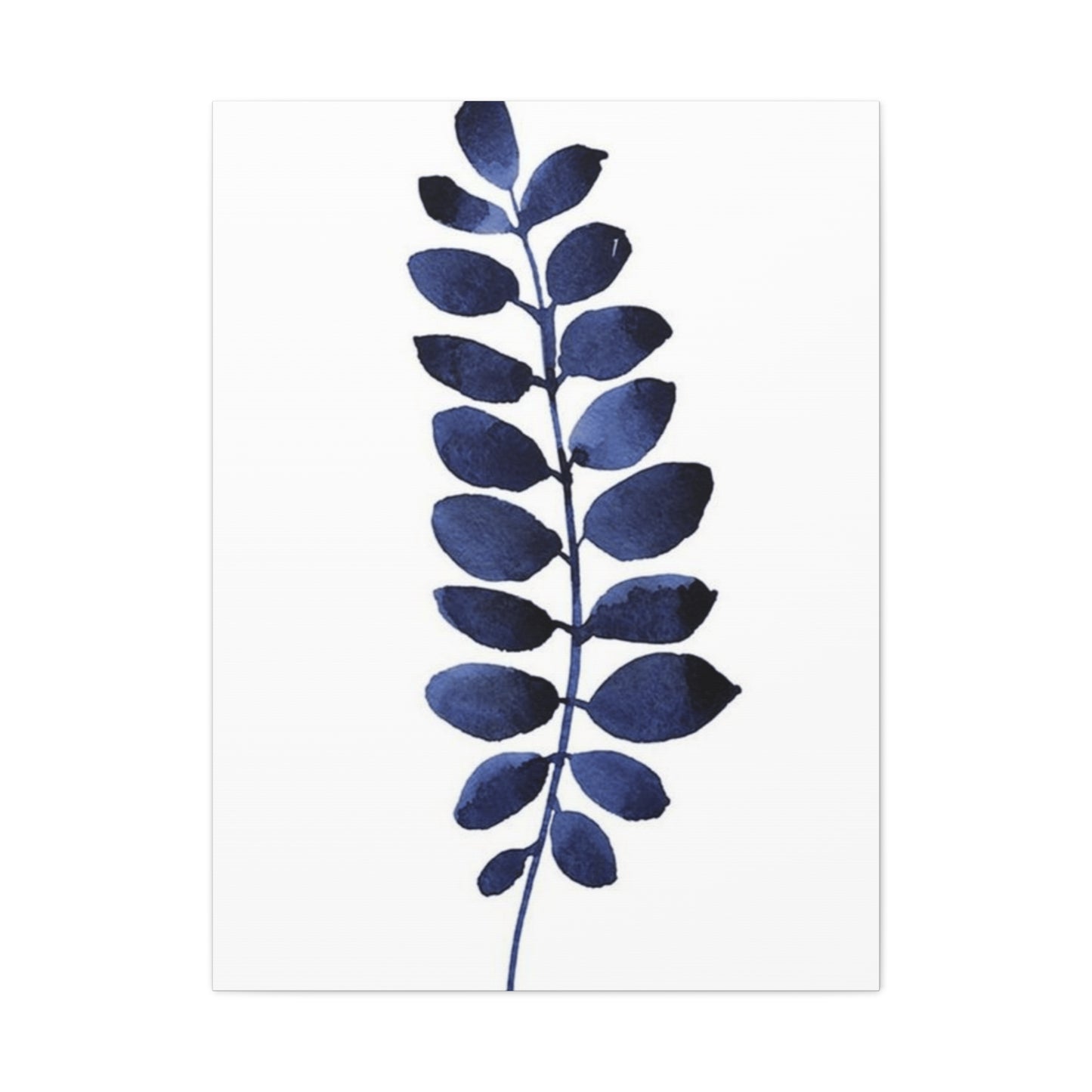
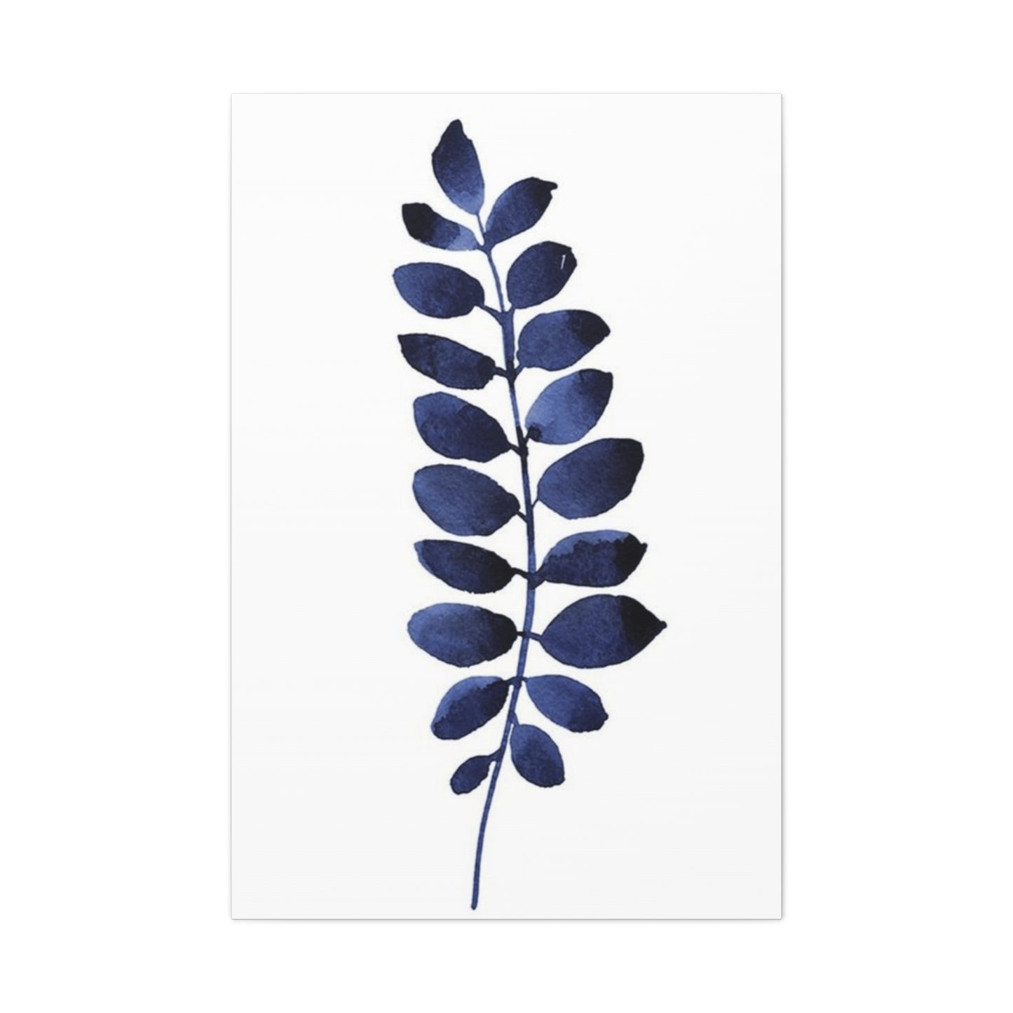
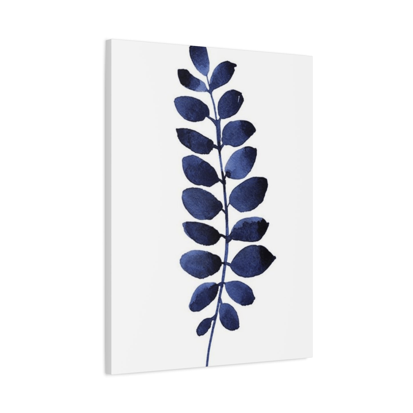
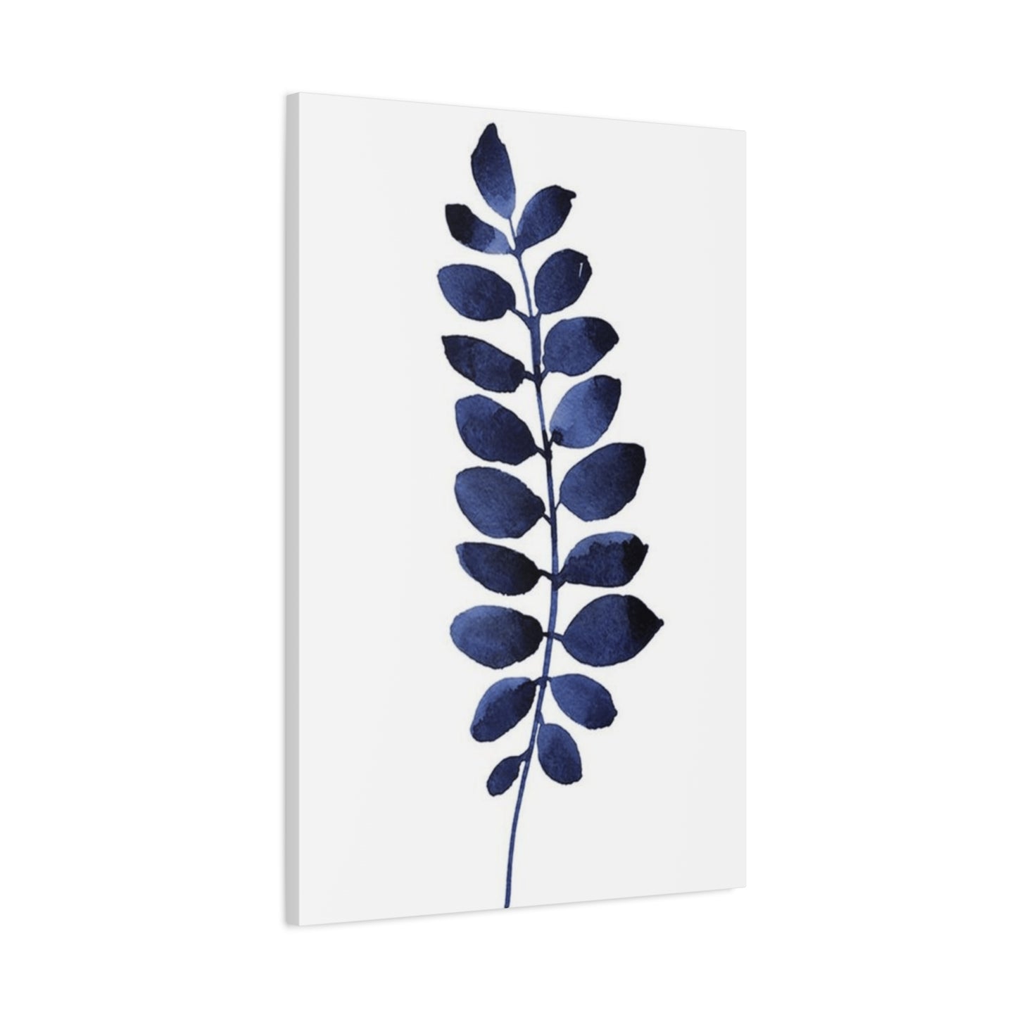
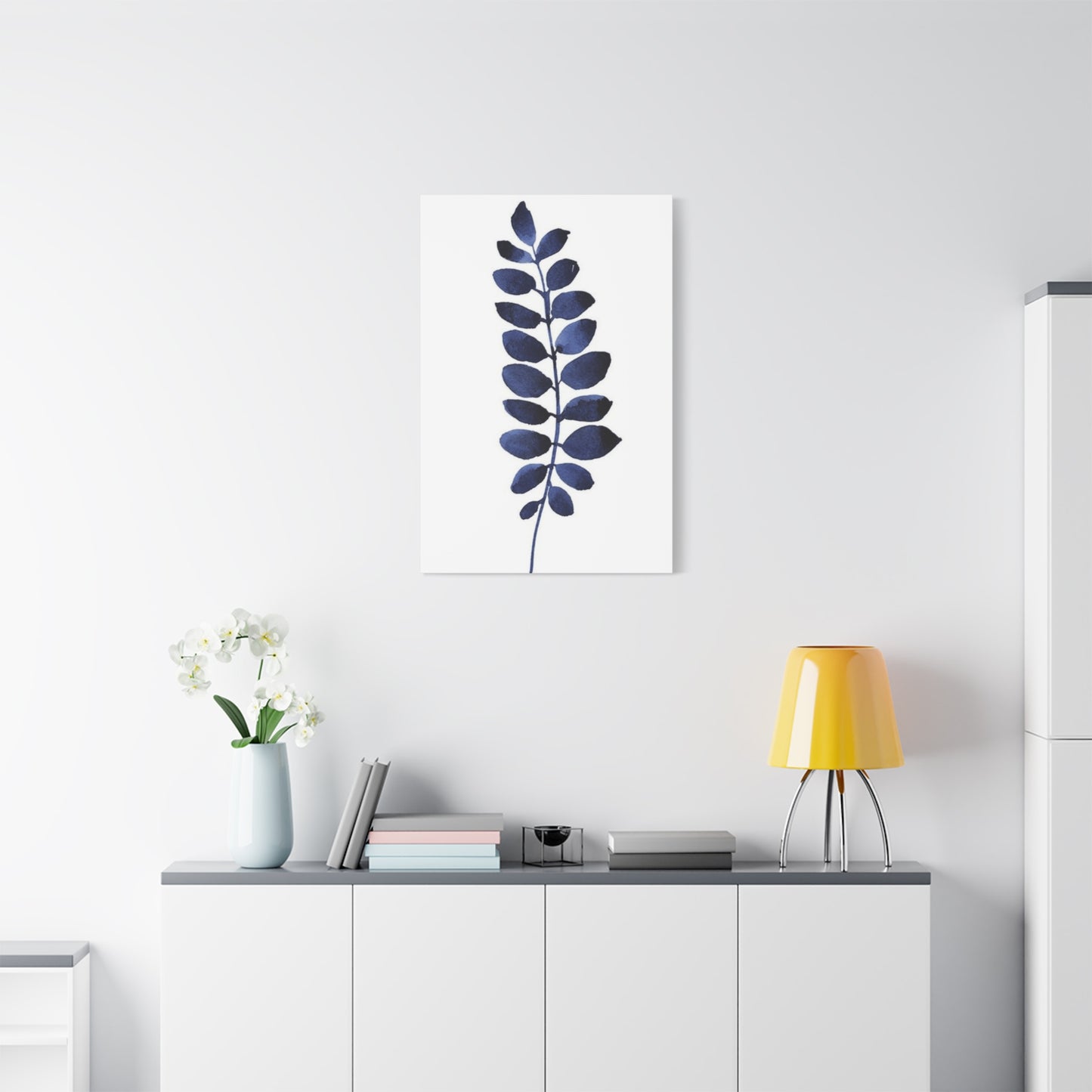
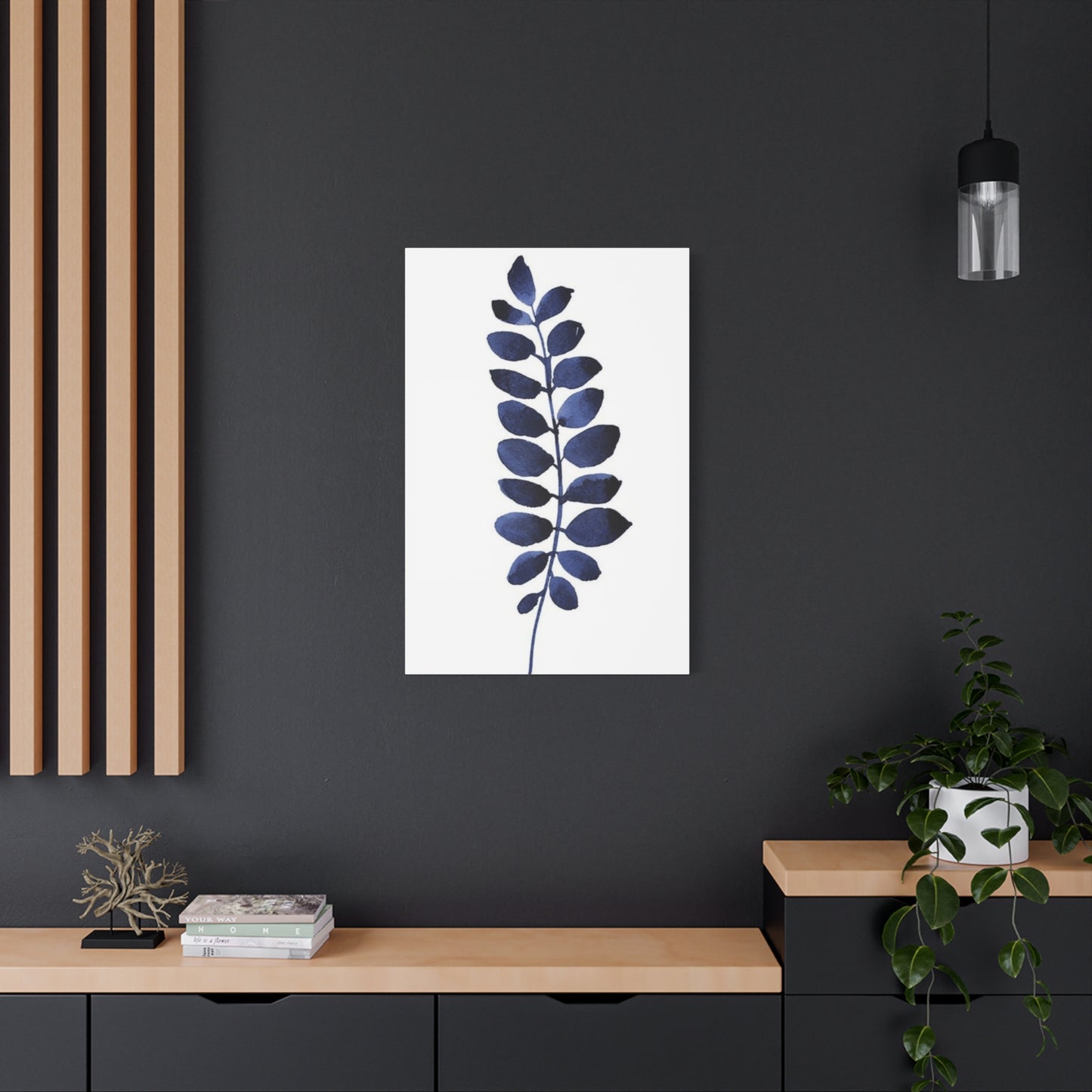
Navy Blue Plant Leaves Wall Art & Canvas Prints
Navy Blue Plant Leaves Wall Art & Canvas Prints
Couldn't load pickup availability
Nature Meets Style: Navy Blue Plant Leaves Wall Art for Contemporary Homes
Decorating your living space with carefully selected artwork can dramatically change the atmosphere of any room. When you choose to incorporate deep blue botanical designs into your interior scheme, you're making a sophisticated statement that resonates with contemporary design principles while maintaining a connection to the natural world. The richness of navy tones combined with organic leaf patterns creates a visual experience that feels both grounded and elevated.
Navy blue has long been recognized as a color that conveys depth, stability, and quiet confidence. When applied to botanical imagery, this particular shade transforms ordinary plant depictions into something extraordinary. The darkness of the color allows the intricate details of leaves and foliage to emerge with remarkable clarity, creating shadows and highlights that add dimensional interest to flat surfaces.
Interior designers frequently recommend this color palette for clients who want to achieve a balanced look that doesn't feel overwhelming. The combination works exceptionally well in various settings, from residential bedrooms to professional office spaces. Unlike brighter colors that can dominate a room, this deeper tone provides visual weight without demanding constant attention.
The psychological impact of this color combination shouldn't be underestimated. Blue tones are known to promote feelings of tranquility and mental clarity, while botanical elements connect us to the outdoor environment. Together, they create an atmosphere conducive to relaxation, concentration, and emotional well-being. Many people find that rooms decorated with these elements become their favorite retreats within their homes.
When selecting pieces for your walls, consider how the navy blue botanical theme can complement your existing furniture and accessories. This color works beautifully with natural wood tones, whether light oak or dark walnut. It also pairs exceptionally well with neutral palettes, providing just enough contrast to create interest without clashing. Metallic accents in gold, brass, or copper create stunning combinations with navy backgrounds.
The versatility of this design approach means you can adapt it to virtually any room in your home. Living rooms benefit from larger statement pieces that draw the eye and anchor seating arrangements. Bedrooms become more restful with smaller, coordinated pieces arranged in thoughtful groupings. Even bathrooms and hallways can be transformed with carefully placed botanical artwork in these rich tones.
Bring Calm with Navy Plant Leaf Art
Creating a peaceful environment in your home requires thoughtful consideration of every design element. The artwork you choose plays a particularly important role in establishing the mood of each space. When you select pieces featuring plant leaves rendered in deep blue shades, you're incorporating elements that naturally promote serenity and mental ease.
The human brain responds positively to representations of nature, even in stylized or abstracted forms. This biological response stems from our evolutionary history spent primarily outdoors. By bringing these natural forms indoors, especially in calming color schemes, we can trigger relaxation responses that help counteract the stress of modern life. The specific choice of navy blue amplifies this effect because it's reminiscent of twilight skies and deep water, both naturally calming environments.
Placement of these calming pieces requires strategic thinking. In living areas where families gather, positioning artwork at eye level when seated creates an opportunity for natural viewing without demanding attention. In bedrooms, placing pieces where they're visible from the bed but not directly in the line of sight when lying down allows for optional viewing that supports relaxation without stimulation.
The scale of your chosen pieces also impacts their calming effect. Oversized canvases can create a sense of immersion, making viewers feel surrounded by nature. Smaller pieces arranged in collections offer variety and visual interest that encourages gentle eye movement and mindful observation. Both approaches have merit, and the choice depends on your room dimensions and personal preferences.
Consider the level of detail in the botanical representations you select. Highly detailed, realistic depictions encourage close examination and contemplation, which can be wonderfully meditative. More simplified, abstract interpretations provide visual rest and allow the mind to wander freely. Mixing both styles throughout your home creates dynamic interest while maintaining overall cohesion through consistent color choices.
Lighting plays a crucial role in how these calming artworks perform in your space. Natural daylight brings out subtle variations in navy tones, revealing depths and nuances that might not be visible under artificial light. Evening lighting creates different effects, often making the blue tones appear richer and more enveloping. Installing adjustable lighting allows you to control the mood throughout the day.
The frame selection for your botanical pieces can either enhance or diminish their calming effect. Simple, clean-lined frames in neutral colors keep attention focused on the artwork itself. Ornate frames might distract from the peaceful quality you're trying to achieve. Consider frameless mounting for a contemporary look that maximizes the visual impact of the botanical imagery.
Sophisticated Nature-Inspired Canvas Prints
Sophistication in interior design comes from making deliberate choices that reflect both personal taste and an understanding of design principles. Nature-inspired canvas prints in navy blue tones offer a perfect vehicle for achieving this refined aesthetic. These pieces bridge the gap between traditional botanical illustration and modern artistic expression.
The history of botanical art stretches back centuries, with detailed plant drawings serving both scientific and aesthetic purposes. Contemporary interpretations of this tradition maintain respect for the careful observation that characterized historical botanical illustration while incorporating modern design sensibilities. The result is artwork that feels both timeless and current.
Canvas as a medium contributes significantly to the sophisticated appearance of these pieces. Unlike paper prints that require glass protection, canvas has a substantial physical presence that adds perceived value and quality. The texture of canvas also interacts beautifully with navy blue pigments, creating subtle variations in color saturation that add visual interest.
When evaluating different canvas prints, pay attention to the quality of the reproduction process. High-resolution printing ensures that fine details remain crisp and colors stay true to the artist's intention. Gallery-wrap stretching, where the image extends around the edges of the frame, creates a finished look that doesn't require additional framing. This contemporary presentation method enhances the sophisticated appearance of the piece.
The subject matter you choose within the botanical category allows for personal expression while maintaining sophistication. Large tropical leaves create drama and boldness. Delicate ferns and smaller foliage offer gentler visual impact. Mixed arrangements combining various plant types provide complexity and interest. Each approach can be equally sophisticated when executed with attention to composition and color harmony.
Consider how these nature-inspired pieces relate to architectural features in your space. Artwork positioned to complement windows, doorways, or built-in shelving creates intentional visual relationships that demonstrate thoughtful design. Similarly, coordinating the scale of artwork with furniture dimensions prevents either element from overwhelming the other.
The arrangement of multiple canvas prints requires careful planning to achieve a sophisticated result. Symmetrical layouts convey formality and order, appropriate for traditional spaces or formal rooms. Asymmetrical arrangements feel more relaxed and contemporary while still maintaining visual balance through careful attention to spacing and alignment. Gallery walls combining various sizes can be sophisticated when unified by consistent framing and color themes.
Navy Blue Botanical Art for Modern Spaces
Modern design emphasizes clean lines, uncluttered spaces, and intentional simplicity. Botanical artwork in navy blue tones aligns perfectly with these principles while adding the organic element that prevents modern spaces from feeling cold or impersonal. This combination represents the evolution of modernism toward warmer, more livable interpretations.
The modern aesthetic values negative space, and botanical subjects naturally incorporate this principle. The shapes of leaves and stems create interesting silhouettes against backgrounds, with the empty space around them becoming as important as the forms themselves. Navy blue backgrounds provide enough contrast to make these shapes clearly defined while maintaining visual softness.
Material choices in modern spaces often include glass, metal, and smooth stone surfaces. Botanical canvas art provides textural contrast that softens these hard materials without contradicting modern design principles. The organic shapes of plants offer visual relief from the geometric forms that dominate modern architecture and furniture.
Color palettes in modern interiors tend toward neutrals with carefully chosen accent colors. Navy blue functions beautifully in this context, providing depth and interest without the intensity of brighter accent colors. It's sophisticated enough for minimalist sensibilities while still adding personality and warmth to the space.
Modern design also embraces the concept of biophilic design, which recognizes the human need for connection with nature. Incorporating botanical imagery satisfies this need in spaces where living plants might not be practical. The stylized nature of artistic representations fits more naturally into modern aesthetics than attempts at photorealistic nature imagery.
The scale relationships in modern design tend toward bold statements rather than collections of smaller items. Large-scale botanical canvases meet this preference perfectly, creating focal points that command attention without clutter. When multiple pieces are used, they're typically arranged with generous spacing that maintains the sense of openness crucial to modern style.
Functionality is paramount in modern design, and artwork serves the function of making spaces more livable and emotionally satisfying. Botanical pieces in navy tones fulfill this role admirably, providing visual interest and emotional connection without demanding maintenance or creating practical concerns. This practical beauty epitomizes modern design philosophy.
Wall Art That Blends Nature and Style
Successfully combining natural elements with stylish presentation requires a delicate balance. The goal is to celebrate organic beauty while presenting it in ways that feel intentional and design-forward. Botanical wall art in navy blue achieves this synthesis by taking inspiration from nature and filtering it through an artistic lens that emphasizes form, color, and composition.
The process of creating effective botanical art involves selecting specific plant specimens, studying their structural characteristics, and then making artistic decisions about how to represent them. Some artists emphasize botanical accuracy, capturing every vein and texture with precision. Others abstract the essential forms, simplifying shapes while maintaining recognizable plant characteristics. Both approaches can successfully blend nature and style.
Color manipulation is one of the primary ways artists transform botanical subjects into stylish artwork. Natural plant colors span from various greens to occasional flowers in other hues. By rendering leaves and foliage in navy blue instead of their natural colors, artists immediately shift the work from representation toward artistic interpretation. This color choice signals that the piece is about design as much as documentation.
Composition choices further enhance the stylish quality of botanical artwork. Traditional botanical illustration centered specimens against plain backgrounds for scientific clarity. Contemporary botanical art might crop in tightly on a single dramatic leaf, create overlapping arrangements of multiple plants, or play with scale relationships that feel unexpected. These compositional strategies engage viewers aesthetically rather than just informationally.
The integration of these pieces into your overall room design requires consideration of how nature-inspired art relates to other decorative elements. Rooms that include natural materials like wood, stone, or fiber create harmonious environments for botanical artwork. The addition of living plants enhances the nature connection while the artwork provides year-round botanical interest that doesn't require care.
Style in interior design reflects personal identity and cultural awareness. Choosing botanical artwork demonstrates appreciation for environmental beauty and suggests values aligned with sustainability and natural living. The specific choice of navy blue adds layers of meaning, suggesting depth, stability, and a connection to maritime or twilight themes that resonate differently than brighter colors would.
The physical presentation of wall art contributes significantly to its stylish impact. Professional mounting, whether directly to walls or using sleek hanging systems, ensures pieces hang perfectly level and secure. Proper spacing between multiple pieces creates breathing room that allows each work to be appreciated individually while contributing to an overall aesthetic effect.
Deep Blue Leaves, Bold Wall Statements
Making bold design choices demonstrates confidence and vision. While many people gravitate toward safe, neutral options for fear of making mistakes, truly memorable spaces require moments of visual boldness. Botanical imagery featuring leaves in deep blue tones provides an opportunity for bold statement-making that remains sophisticated rather than garish.
Boldness in design comes not just from color intensity but from scale, placement, and the courage to let certain elements dominate. A large canvas featuring oversized leaf forms in rich navy tones immediately establishes itself as a focal point that organizes the visual hierarchy of a room. Everything else in the space relates to this central element, creating cohesion through intentional subordination.
The psychology of bold design choices is fascinating. Rooms with clear focal points feel more resolved and purposeful than spaces where visual interest is evenly distributed. The human eye seeks points of emphasis, and when we provide them intentionally, viewers experience satisfaction and comfort. Bold wall statements fulfill this psychological need while expressing personality.
Deep blue as a color choice for bold statements works because it has sufficient intensity to command attention while possessing enough subtlety to avoid overwhelming spaces. Unlike bright reds or yellows that can dominate through sheer vibrancy, navy blues dominate through depth and richness. The effect is powerful but not aggressive, confident but not loud.
Leaf forms lend themselves to bold presentation because of their inherent structural interest. The curves, points, and varied shapes of different leaf types create dynamic silhouettes that remain visually engaging. Large-scale representations emphasize these structural qualities, turning familiar natural forms into semi-abstract compositions that reward extended viewing.
Creating a bold wall statement requires thinking beyond single pieces to consider how artwork relates to its surrounding wall space. A large botanical canvas might be most effective when given generous empty wall space around it, allowing the piece to breathe and dominate without competition. Alternatively, a bold piece might anchor a gallery wall where smaller surrounding pieces defer to the central statement.
The room context determines how bold is appropriate. In minimalist spaces with limited decorative elements, a single bold botanical piece might provide all the visual interest needed. In rooms with more layers of design detail, bold artwork needs sufficient visual weight to hold its own against other elements. Understanding this balance is key to successful bold statements.
Canvas Prints with a Touch of Navy Elegance
Elegance in design is often described as refined beauty that appears effortless. Achieving this quality requires careful attention to detail and a willingness to edit away elements that don't contribute to the desired effect. Canvas prints featuring botanical subjects with navy blue coloring offer a foundation for elegant spaces when selected and displayed with discernment.
The concept of elegance has evolved over time, but certain principles remain constant. Restraint is one such principle – elegant design doesn't try to do too much or incorporate too many competing ideas. A canvas print with a clear botanical subject rendered in a limited color palette embodies this restraint. The viewer's attention isn't scattered across numerous elements but can appreciate the beauty of the central subject.
Quality materials contribute significantly to elegant presentation. High-quality canvas has a pleasant texture and substantial weight that cheaper alternatives lack. Professional stretching over wooden frames ensures the canvas remains taut without warps or sags. Quality inks maintain color vibrancy and resist fading, ensuring the piece retains its beauty over time. These quality indicators might not be consciously noticed by viewers, but they contribute to an overall impression of elegance.
The navy blue color choice enhances elegance through its association with tradition and refinement. Navy has long been considered a sophisticated alternative to black, providing similar depth and formality while feeling slightly warmer and more approachable. In the context of botanical art, navy elevates subjects that might feel casual or informal in other color treatments.
Framing decisions impact the elegant quality of canvas prints significantly. For pieces where elegance is paramount, consider frames that complement without competing. Simple profiles in complementary colors work well. Alternatively, frameless gallery-wrapped canvases can appear elegantly contemporary when the edges are cleanly finished. Ornate frames risk overwhelming the elegant simplicity of the botanical subject.
Placement at appropriate heights ensures elegant presentation. The standard guideline of hanging art so its center is at eye level works for most situations, though adjustments may be needed for particularly large or small pieces. In rooms where people are typically seated, lowering artwork slightly ensures comfortable viewing. Precision in hanging demonstrates attention to detail that reinforces elegant presentation.
Elegant spaces often feature carefully curated collections rather than single pieces. When assembling a collection of botanical canvas prints with navy elements, maintaining consistency in style, framing, and spacing creates the cohesive look that elegance requires. Too much variety can appear cluttered, while thoughtful variation within a unified theme demonstrates sophisticated design thinking.
Nature's Beauty in Rich Navy Hues
The natural world provides endless inspiration for artistic expression. Leaves, flowers, branches, and other botanical elements have been artistic subjects for millennia. Contemporary artists continue this tradition while bringing fresh perspectives through modern techniques and unexpected color choices. Rendering natural beauty in rich navy tones represents one such contemporary interpretation.
The translation from natural green foliage to navy blue artistic representation involves more than simple color substitution. Artists must consider how the change affects perception of form, depth, and texture. Navy blue tones can emphasize shadows and contours in ways that green might not, creating more dramatic three-dimensional effects on two-dimensional surfaces.
Rich navy hues possess depth that lighter colors cannot match. Multiple layers of blue pigment build intensity that draws viewers in, encouraging closer examination. This depth creates visual complexity that rewards extended viewing, with subtle variations in tone and saturation becoming apparent over time. The richness of the color elevates the subject matter, transforming simple leaf forms into objects worthy of contemplation.
The contrast between the organic irregularity of botanical forms and the consistent richness of navy coloring creates interesting visual tension. Natural forms are inherently imperfect, with variations and asymmetries that make each leaf unique. The uniform application of rich navy tones provides a unifying element that organizes these organic variations into coherent artistic compositions.
Different plant species offer distinct structural characteristics that interact differently with navy blue rendering. Large, smooth leaves like magnolia or fiddle-leaf fig create bold, simplified forms where the rich color can pool and intensify. Compound leaves with multiple leaflets create more complex patterns where navy tones can vary across the composition. Delicate ferns and grasses allow the background to show through, creating lacework effects.
The emotional response to nature's beauty in rich navy hues differs from responses to more literal color representations. While natural green foliage connects viewers to outdoor experiences and specific memories, navy blue interpretations feel more meditative and abstract. This shift allows viewers to appreciate form and composition without the immediate associations that more representational colors might trigger.
Incorporating pieces that present nature's beauty in these unexpected color schemes demonstrates design confidence and artistic sensibility. It shows willingness to move beyond literal interpretation toward more conceptual approaches. This sophistication in choosing artwork reflects broader aesthetic awareness that typically extends to other design decisions throughout a space.
Plant Leaves Meet Timeless Navy Blue
The intersection of specific botanical subjects with carefully chosen colors creates unique aesthetic opportunities. When plant leaves – symbols of growth, vitality, and natural cycles – are rendered in timeless navy blue, the result bridges temporal categories. The subject connects to the ancient human relationship with plants, while the color treatment feels both classic and contemporary.
Navy blue has maintained consistent popularity across design eras for good reason. Unlike trend-driven colors that feel dated after a few years, navy possesses qualities that transcend temporal limitations. Its sophistication works in traditional settings, its depth suits dramatic contemporary spaces, and its versatility allows it to function in transitional styles that blend multiple influences.
Plant leaves as artistic subjects similarly transcend trends. While specific plants may gain or lose popularity in home decor, the general category of botanical imagery remains consistently appealing. Leaves represent concepts universally valued across cultures and time periods – growth, renewal, natural beauty, and connection to the earth.
The pairing of these two timeless elements creates artwork with staying power. Unlike pieces tied to specific design moments that may eventually feel dated, botanical subjects in navy blue have the potential to remain relevant through multiple design cycles. This longevity makes them wise investment choices for those building permanent art collections.
The timeless quality also means these pieces can successfully transition between different rooms and even different homes over time. A canvas that works beautifully in a apartment bedroom could later enhance a house study or office. This adaptability adds practical value to the aesthetic appeal, making these pieces more than just decoration but rather portable elements of personal style.
Understanding the timeless nature of this combination empowers confident design decisions. Rather than worrying about whether choices will feel outdated quickly, you can commit to pieces you genuinely love, knowing their appeal will endure. This confidence often leads to bolder choices that better express personal taste rather than safer options chosen primarily for their neutrality.
Timeless design doesn't mean static or boring. Within the category of botanical leaves in navy blue, enormous variety exists in terms of specific plants depicted, artistic styles employed, and compositional approaches taken. This variety allows for personal expression and room-specific customization while maintaining the overarching timeless appeal of the fundamental combination.
Subtle yet Striking Botanical Wall Art
Achieving impact without aggression represents an advanced design skill. Subtle yet striking pieces walk the line between background decoration and dominant focal points, creating interest without overwhelming. Botanical wall art in navy tones often occupies this valuable middle ground, offering enough visual interest to elevate spaces while maintaining enough restraint to coexist peacefully with other design elements.
Subtlety in botanical art often comes from composition choices that emphasize negative space and simplified forms. Rather than filling the entire canvas with dense foliage, subtle pieces might feature a single stem or leaf with generous space around it. The navy blue tones provide enough contrast to make the subject visible and interesting while avoiding the loudness of brighter colors.
The striking quality emerges from the inherent beauty of the botanical forms and the richness of the color treatment. Even relatively simple compositions become striking when executed with attention to detail and quality. The curve of a single leaf, the delicate structure of a fern frond, or the bold shape of a tropical plant can captivate attention when rendered with skill.
This balance of subtle and striking makes these pieces exceptionally versatile in various room settings. In minimalist spaces, they provide necessary visual interest without contradicting the overall restraint. In busier rooms with multiple design elements, they contribute without competing for dominance. This adaptability makes them valuable tools in creating cohesive interior designs.
The viewing experience of subtle yet striking pieces evolves over time. Unlike loudly decorative pieces that make their full impact immediately, these more nuanced works reveal their qualities gradually. Initial viewing registers the pleasing overall composition. Subsequent viewings allow appreciation of specific details, color variations, and the skill of execution. This layered experience keeps pieces from becoming visually exhausted.
Lighting significantly affects how subtle yet striking pieces perform in spaces. Direct lighting can emphasize their striking qualities, making colors pop and forms clearly defined. Ambient lighting allows their subtle nature to emerge, letting them blend more seamlessly into overall room atmospheres. Controllable lighting gives you the flexibility to adjust the piece's impact based on mood and occasion.
When arranging multiple pieces, maintaining the subtle yet striking balance requires careful attention to visual weight distribution. Too many competing elements can tip into visual chaos. Too much restraint might result in spaces that feel incomplete. The goal is creating visual interest that engages without overwhelming, drawing the eye around the space in a pleasant rhythm.
Navy Blue Foliage for Chic Interiors
Chic interior design represents contemporary elegance with an emphasis on current trends while maintaining timeless sensibility. Creating chic spaces requires awareness of contemporary design movements, quality materials, and sophisticated color coordination. Navy blue foliage artwork serves as an excellent component in achieving chic aesthetics through its combination of natural inspiration and refined color treatment.
The definition of chic has evolved, but certain characteristics remain consistent. Chic spaces feel curated rather than decorated, with each element appearing intentionally selected rather than arbitrarily placed. Artwork featuring navy foliage contributes to this curated feeling when chosen to complement specific furniture pieces, architectural features, or color schemes.
Contemporary chic design often incorporates biophilic elements, recognizing that connection to nature enhances living spaces both aesthetically and psychologically. Foliage imagery satisfies this requirement in a stylized way that feels more sophisticated than literal nature photography. The navy blue treatment elevates the botanical subject beyond simple nature representation into artistic territory.
Color coordination is crucial in chic interiors, and navy blue functions beautifully in numerous color schemes. It pairs elegantly with blush pinks and soft grays for feminine sophistication. It combines powerfully with whites and creams for crisp, clean looks. It complements warm metallics like brass and copper for luxurious effects. This versatility makes navy foliage art adaptable to various chic color directions.
The texture and materiality emphasized in chic design extends to artwork selection. Canvas provides appropriate texture that aligns with the emphasis on tactile interest common in chic spaces. The slight irregularity of canvas weave contrasts nicely with smooth furniture surfaces, polished metals, and other refined materials typical of chic interiors.
Scale relationships in chic design tend toward bold statements balanced with restraint in other areas. A large navy foliage piece might serve as the bold element in an otherwise restrained room. Alternatively, a collection of smaller coordinated pieces might provide visual interest without any single dominant element. Either approach can achieve chic results depending on the specific space and surrounding elements.
Chic design embraces both traditional and contemporary elements in thoughtful combinations. Navy foliage artwork bridges these categories effectively. The botanical subject has traditional roots in decorative arts, while the specific color treatment and contemporary presentation methods feel current. This blend of old and new epitomizes the chic aesthetic.
Minimalist Leaf Prints with a Navy Twist
Minimalism as a design philosophy emphasizes reduction to essential elements. In minimalist spaces, every object must justify its presence through function or significant aesthetic contribution. Leaf prints featuring navy blue coloring can successfully inhabit minimalist environments when they exhibit the restraint and intentionality that minimalism requires.
The minimalist approach to botanical art favors simplified forms over detailed representations. A single leaf shape rendered in clean lines against a contrasting background embodies minimalist principles. The navy color provides necessary visual interest without the complexity that multicolored pieces would introduce. This restraint keeps the piece from overwhelming the spare aesthetic of minimalist spaces.
Negative space becomes an active design element in minimalist leaf prints rather than simply background. The empty areas around the botanical subject contribute as significantly to the composition as the subject itself. Navy blue subjects against white or light backgrounds maximize this negative space relationship, creating clean, easily understood visual compositions.
The limited color palette of minimalist leaf prints aligns perfectly with minimalist interior color schemes, which typically feature neutral bases with minimal accent colors. Navy blue can serve as the primary accent color throughout a space, with the leaf print providing a focal point that ties the color scheme together. This unified approach strengthens the overall design cohesion that minimalism requires.
Material choices in minimalist design emphasize quality over quantity, and this applies to artwork selection. A single high-quality canvas print with excellent color saturation and sharp printing detail better serves minimalist principles than multiple lower-quality pieces. The inherent quality of the piece must be sufficient to justify its presence in the carefully edited minimalist environment.
The installation of leaf prints in minimalist spaces requires particular attention to precision. Perfectly level hanging at exactly the right height demonstrates the intentionality that minimalism demands. Any sloppiness in installation contradicts the careful control that defines minimalist aesthetics. Professional mounting systems or careful manual installation ensures this precision.
Minimalist leaf prints with navy coloring create opportunities for what design theorists call "points of visual interest" – places where the eye naturally rests within an otherwise spare environment. These points prevent minimalist spaces from feeling stark or empty while maintaining the overall restraint that makes minimalism appealing. The botanical subject provides organic relief from geometric furniture and architectural forms.
Add Depth with Navy Blue Plant Art
Creating visual depth in rooms transforms flat walls into dynamic elements of interior design. Navy blue plant art contributes to perceived depth through several mechanisms, making spaces feel more complex and interesting than their actual dimensions might suggest. Understanding these depth-creating effects helps in strategic placement and selection of botanical artwork.
The inherent depth of navy blue as a color creates immediate spatial interest. Darker colors appear to recede, making walls seem farther away than they actually are. This optical effect can make rooms feel larger and more spacious, particularly valuable in smaller living spaces. Plant subjects in navy blue thus serve functional as well as aesthetic purposes in space perception.
Layering within the botanical imagery itself contributes additional depth. Overlapping leaves, shadows cast by foliage, and variations in color saturation from light to dark navy all create the illusion of three-dimensional space on flat canvas surfaces. Skilled artistic rendering emphasizes these depth cues, rewarding viewers with the satisfying illusion of looking into space rather than at a flat surface.
The placement of navy blue plant art in relation to other room elements creates depth through spatial layering. Artwork positioned behind furniture creates visual layers that make rooms feel more complex. Multiple pieces hung at slightly different distances from the wall add physical depth variation. These strategic placement choices multiply the depth-creating effects beyond what the artwork alone provides.
Color relationships between navy blue artwork and surrounding wall colors significantly impact depth perception. Navy art on light walls creates strong contrast that emphasizes the artwork's visual recession. Navy art on darker walls creates subtler effects, with the artwork blending more into the wall plane while still providing textural and subject interest. Both approaches create depth but in different ways.
The relationship between foreground furniture and background artwork creates crucial depth cues in interior spaces. When viewers can easily perceive that artwork exists on a different spatial plane than furniture, rooms feel more dimensional. Clear sightlines that allow simultaneous viewing of foreground and background elements strengthen this depth perception.
Lighting strategies enhance the depth-creating properties of navy blue plant art. Spotlighting or picture lighting creates pools of light that draw attention to artwork while creating shadow areas that recede. This lighting-created contrast adds another layer of depth perception. Ambient lighting that gently illuminates artwork without harsh contrasts creates subtler depth effects.
Perfect Canvas for Calm and Cool Spaces
Certain rooms in every home serve as retreats from activity and stress. Bedrooms, reading nooks, meditation spaces, and quiet sitting areas all benefit from design choices that promote calmness and cool, collected atmospheres. Botanical canvas art in navy tones serves as an ideal decorative element in these calm and cool spaces.
The color psychology of navy blue strongly supports calm environments. Blue wavelengths have been shown to lower blood pressure and heart rate, creating physiological relaxation in addition to psychological effects. The darker value of navy amplifies these effects while avoiding the potential coldness of lighter blues. This makes navy an excellent choice for spaces dedicated to rest and recuperation.
Cool color schemes, which include blues, greens, and purples, create different atmospheric effects than warm colors like reds, oranges, and yellows. Cool schemes tend to feel more restful and less stimulating, appropriate for spaces where relaxation is the primary goal. Navy blue botanical art naturally reinforces cool color schemes and can help establish them in spaces that might otherwise lack color direction.
The subject matter of botanical imagery contributes significantly to calm atmospheres. Plants represent growth and life but at a pace that feels peaceful rather than frenetic. Unlike animals or human subjects that might introduce implied motion or narrative, botanical subjects remain static and contemplative. This stillness translates into the emotional effect of the artwork.
Canvas texture adds subtle visual interest that enriches calm spaces without creating stimulation. The slight irregularity of woven canvas provides enough surface variation to prevent sterility while maintaining the overall serenity that calm spaces require. This textural element allows walls to feel finished and considered without becoming visually busy.
The appropriate scale of canvas art for calm spaces tends toward moderate rather than extreme. Oversized pieces can feel overwhelming in spaces meant for relaxation. Very small pieces might feel insignificant and create visual searching. Medium-sized canvases, roughly proportional to the furniture they relate to, typically work best in creating balanced, calm environments.
Thematic consistency across multiple pieces strengthens the calm atmosphere. Rather than mixing diverse subjects and styles, calm spaces benefit from botanical artwork that shares a common approach. Consistent color treatment in navy tones, similar plant types, or unified artistic styles create visual harmony that supports the room's peaceful purpose.
Stylish Navy Leaves to Refresh Your Room
Room refreshment doesn't always require major renovations or furniture replacement. Strategic additions of new artwork can dramatically transform spaces, providing updated looks without substantial investment or disruption. Navy leaf artwork offers an effective refresh option that introduces contemporary style while remaining compatible with existing decor.
The refresh concept recognizes that rooms can feel stale or outdated even when their basic elements remain functional and attractive. This staleness often stems from visual familiarity rather than actual deterioration. Introducing new artwork interrupts this familiarity, causing us to see familiar spaces with fresh eyes. The new piece becomes a focal point that recontextualizes everything around it.
Navy leaves as a refresh choice work across different existing color schemes. If your room currently features warm neutrals, navy leaves introduce cool contrast that adds dimension. If cool grays dominate, navy leaves deepen the color story without contradicting it. This flexibility makes navy botanical art a relatively safe choice when refreshing without completely redesigning.
The stylish quality of navy leaf art ensures that refreshing your room doesn't mean settling for purely functional updates. The sophistication and contemporary appeal of these pieces elevate spaces rather than simply changing them. This quality aspect means your refresh enhances your room's design level rather than just providing novelty.
Seasonal refreshment strategies might incorporate navy botanical art as part of transitional decor. While lighter, brighter pieces might dominate summer months, introducing deeper navy tones for fall and winter adds appropriate seasonal depth. The botanical subject maintains nature connection year-round even as the specific color treatment shifts seasonal emphasis.
The psychological impact of room refreshment shouldn't be underestimated. New visual elements in familiar spaces can improve mood, increase satisfaction with living spaces, and provide renewed appreciation for homes. These psychological benefits come at a fraction of the cost of major renovations, making artwork addition one of the most cost-effective home improvement strategies.
Strategic placement of refreshing navy leaf pieces requires consideration of existing room focal points. If furniture arrangement already creates a clear focal point, new artwork should complement rather than compete with it. If the room lacks a clear focal point, bold navy botanical art can establish one, organizing the entire space around this new visual anchor.
Nature Meets Navy: Art for Every Wall
The versatility of botanical art in navy tones means appropriate pieces exist for virtually every wall in your home. Understanding how to select and place these pieces in different contexts maximizes their impact and creates cohesive design throughout your living space. From public areas to private retreats, nature meeting navy creates beautiful possibilities.
Entry halls and foyers benefit from navy botanical art that makes strong first impressions. These transition spaces set the tone for the entire home, and sophisticated nature-inspired pieces immediately communicate design awareness. The welcoming quality of botanical subjects combined with the confident depth of navy creates inviting yet impressive entry experiences.
Living room walls, typically the largest and most visible in homes, can accommodate substantial navy botanical pieces that anchor seating arrangements and define conversation areas. Over sofas, above mantels, or on feature walls, these pieces provide necessary visual weight that grounds living spaces without the formality of traditional landscape or portrait paintings.
Dining areas benefit from navy botanical art that enhances the dining experience without distracting from social interaction. The calm nature of botanical subjects and the sophisticated navy color create pleasant visual environments that complement rather than compete with meals and conversations. Placement at appropriate heights ensures comfortable viewing from seated positions.
Kitchen walls often get neglected in artwork placement, yet kitchens are heavily used spaces that benefit from visual interest. Navy botanical art suited to kitchen environments might feature culinary herbs or vegetables in artistic renderings. The navy color treatment elevates these practical plants into art objects appropriate for display.
Home office walls require artwork that supports concentration and productivity while providing visual breaks during work. Navy botanical pieces serve this purpose beautifully, offering nature connection that research shows supports cognitive function while avoiding the distraction that more complex or colorful artwork might create.
Bedroom walls should feature artwork that promotes relaxation and contributes to restful environments. Navy botanical pieces excel in this context, combining the calming effects of blue tones with the gentle nature connection of botanical subjects. Placement where artwork is visible but not directly in the sleeping line of sight works best.
Bathroom walls, often overlooked for artwork due to moisture concerns, can actually accommodate canvas pieces with proper ventilation. Navy botanical art brings spa-like sophistication to bathrooms, transforming purely functional spaces into more pleasant environments. Tropical plants or water-loving species make thematically appropriate subjects.
Hallways and corridors provide opportunities for creating gallery-style arrangements of multiple navy botanical pieces. These often-neglected spaces become interesting visual journeys when thoughtfully decorated. Consistent framing and spacing create cohesive looks that make hallways feel like intentional design features rather than afterthoughts.
Conclusion
In contemporary home design, balancing natural beauty with modern aesthetics can be a challenge, but Navy Blue Plant Leaves Wall Art achieves this balance effortlessly. The deep, calming tones of navy blue paired with the organic shapes of leaves create a sophisticated fusion of style and nature. These artworks elevate any space, turning walls into focal points that are both visually striking and emotionally soothing. By incorporating navy-toned botanical art into your home, you bring together elegance, serenity, and contemporary flair in one harmonious statement.
The appeal of plant-inspired wall art lies in its ability to connect us to nature, even within urban or minimalist interiors. Navy blue leaves offer a fresh, modern take on botanical themes, merging the tranquility of greenery with the depth and refinement of a darker palette. Unlike traditional green foliage, navy tones create a bold, stylish contrast that complements a wide range of furniture, textiles, and wall colors. Whether displayed in living rooms, bedrooms, offices, or entryways, these artworks inject a sense of calm, focus, and contemporary sophistication.
One of the most compelling aspects of navy blue plant leaf art is its versatility. In minimalist or modern spaces, a single large-scale canvas can serve as a statement piece, drawing attention while maintaining a sense of understated elegance. In eclectic or layered interiors, multiple smaller prints can be arranged in a gallery wall, providing rhythm and movement that guide the eye across the room. The combination of organic shapes and refined color ensures that the artwork enhances rather than overwhelms, creating a sense of balance that is essential to contemporary design.
Color, texture, and form work together to maximize the impact of these pieces. Navy blue conveys calm, sophistication, and stability, while the intricate leaf patterns bring life and visual interest to the space. Textured brushstrokes, layered inks, or subtle gradients add depth, making each piece appear almost three-dimensional. The interplay of light on these surfaces further enhances the sense of movement and vitality, drawing viewers into the natural elegance captured on the canvas.
Lighting is especially important in emphasizing the beauty of navy blue plant art. Soft ambient lighting can enhance the depth of darker hues, while directional lighting can highlight the delicate contours and patterns of the leaves. The resulting effect transforms walls into immersive experiences, allowing your home to feel both grounded and vibrant. The artwork’s ability to interact with light and shadow mirrors the dynamic qualities of nature itself, creating a living, breathing presence within your interior.
Beyond visual appeal, navy blue plant leaves wall art carries emotional and symbolic significance. Plants are universally associated with growth, renewal, and vitality, while navy blue evokes stability, confidence, and introspection. Together, they offer a reminder of resilience, calm, and balance—qualities that are especially valuable in contemporary life. By choosing this artwork, you create a home environment that not only looks beautiful but also nurtures wellbeing, mindfulness, and focus.
Decoratively, navy blue leaf art integrates seamlessly with a variety of interior elements. Wooden furnishings, neutral textiles, metallic accents, and minimalist décor all complement the sophisticated tones of the artwork. It can serve as a central focal point or a subtle accent, allowing homeowners to experiment with scale, framing, and placement to achieve a customized design that reflects personal taste and lifestyle.
Ultimately, Navy Blue Plant Leaves Wall Art is more than a decorative accessory—it is a statement of modern elegance, a bridge between nature and style, and a source of calm inspiration within your home. By incorporating these artworks, you transform ordinary walls into curated spaces that celebrate contemporary design while honoring the organic beauty of the natural world.
With every glance, the deep navy hues and flowing leaf patterns remind you of the harmony between structure and softness, sophistication and serenity, style and nature. Your living space becomes not only visually compelling but emotionally restorative, a place where contemporary design and natural beauty coexist seamlessly. In this way, navy blue plant leaves wall art elevates your home into a sanctuary of balance, creativity, and modern elegance.
